VISUALIZING NUMBERS
VISUALIZING NUMBERS
GLOSSARY
σ The Greek letter sigma, which in statistics often represents the standard deviation of a population.
algorithmic bias An implicit or explicit bias in software resulting in inconsistent or incorrect outputs.
artificial neural networks A statistical machine-learning method that mimics biological neurons in order to learn patterns in data.
Bayesian networks A graph of nodes and edges built with statistical priors which weight the importance of each piece of information in order to calculate the statistical likelihood of an outcome from a set of plausible inputs.
data-ink ratio A data visualization concept designed to maximize information while minimizing unnecessary content that may distract from the message.
decision tree A tree-like chart that splits complex classification problems into a series of decisions and their possible outcomes. Multiple decision trees are used in machine learning.
deep learning An extension of machine learning where the algorithm determines which features are important to learn without the need for human intervention, but with deeper and more complex networks.
dimensionality reduction A method of abstracting complex data into a simpler view for easier human interpretation.
genetic algorithms Machine-learning method that uses the biological concept of ‘fitness’ to determine winning solutions to a problem.
Gestalt laws Principles of human visual perception that aid the understanding of how to present informative data visualizations.
Internet of Things The addition of ‘smart’ features to primarily mundane domestic or industrial equipment such as fridges or kettles so that they can communicate with a server or with each other.
learning algorithms A computational method that is able to improve its performance of an objective function through trial and error.
scatter plot A plot of two continuous variables on x and y axes.
support vector machines A machine-learning method of mapping data patterns into high-order dimensions to maximize the classification of data into two groups.
BIG DATA
the 30-second calculation
Big data is a generic term that was first used in the 1990s to describe large and complicated datasets. These sets of data can also contain images and sounds as well as numbers. The datasets are so large that they need to be analysed often by using multiple computers all working together at the same time. Increasing world-wide access to the internet, the development of the Internet of Things (the online connection of devices to each other) and the increasing use of digital technologies in our homes and vehicles means that the amount of data being generated around the world on an hourly basis is simply staggering. In 2017 there were an estimated 3.4 billion internet users; it’s estimated that by 2025 more than 70 billion devices will be connected to the Internet of Things. Because of the size of the datasets there are challenges in how to capture, store, transfer, analyse, visualize and manage the information. The data is often described in terms of the quantity (or volume), the types of data (or variety), the speed at which the data is being generated (or velocity) and the quality of the data (or veracity). Big data presents big challenges and many organizations are investing heavily in working out how to manage these challenges into the future.
3-SECOND COUNT
Big data describes sets of data which are so large that they cannot be analysed by traditional data processing means.
3-MINUTE TOTAL
Big data can be used to model behaviour, trends and interactions. The types of datasets available are being used to determine the travel pathways through our cities, trends in health and well-being, and what we watch, wear and consume.
RELATED TOPIC
See also
3-SECOND BIOGRAPHY
KEVIN ASHTON
1968–
British technologist who first used the phrase ‘Internet of Things’ in 1999
30-SECOND TEXT
Niamh Nic Daéid
As big data grows bigger, so do the challenges of managing and visualizing it.

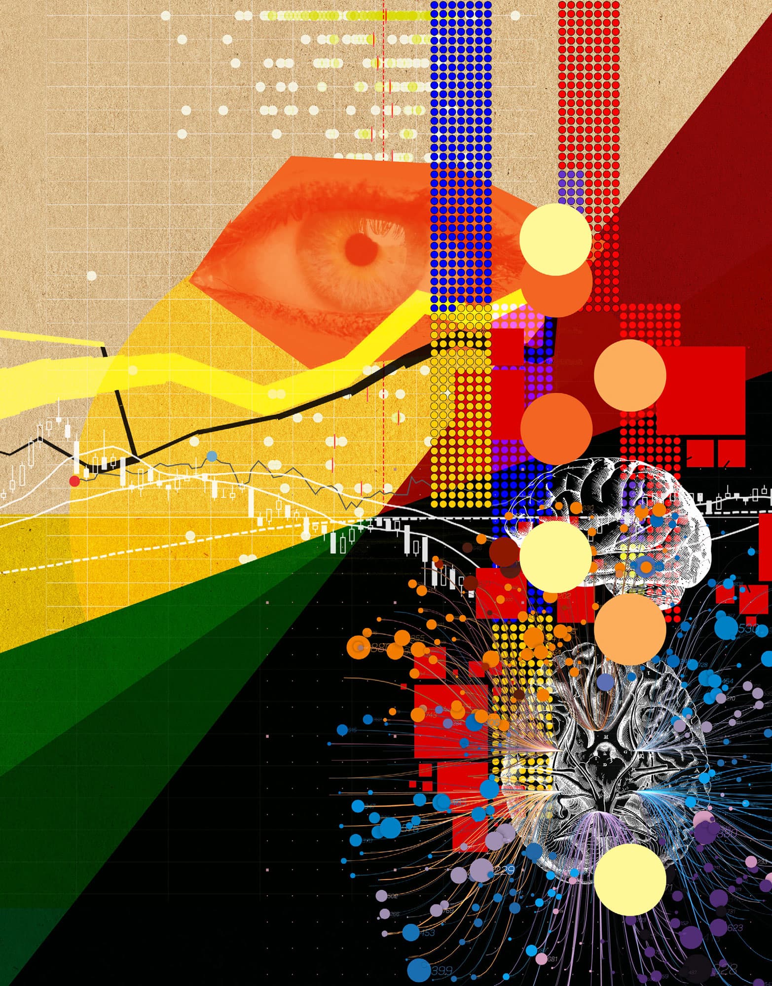
ARTIFICIAL INTELLIGENCE
the 30-second calculation
Primarily a feature of science fiction where robots are talkative slaves fulfilling the needs of their human owners, artificial intelligence (AI) is portrayed as being able to have human-like high level functions. This form of AI – the point at which a computer is deemed to be sentient – is referred to as ‘true’ AI. It is open to debate how far from true AI we are, partly down to how it is defined, but research in this area is accelerating, as is the computational power available to it. Currently, AI mostly refers to ‘deep learning’ where complex, multilayered, learning algorithms feed results between the many tens to hundreds of layers in an optimized manner to dissect the input data into useful, human interpretable features. These multilayered architectures are mostly impenetrable and uninterpretable, leading to their often being termed ‘black boxes’. Computer vision is one of the largest areas using this methodology to extract features from pictures or videos to better aid categorization and linking of photos or video footage. Examples are in autonomous vehicles or ‘driverless cars’, which scan the road to help them identify where to place the car, avoid obstructions and obey traffic signals. As with all machine learning methods, AI involves extensive training from large, known input datasets containing the features of interest.
3-SECOND COUNT
Artificial intelligence (AI) is the concept where computers become capable of performing mentally challenging tasks previously only possible by humans.
3-MINUTE TOTAL
The algorithms used in AI are extremely sensitive, and can end up learning underlying patterns which are intrinsic to the data but not explicitly described within it, leading to ‘algorithmic bias’. An example of this occurred when an AI trained on the hiring practices of a large multinational company rejected female candidates because of historical gender inequalities in the industry.
RELATED TOPICS
See also
3-SECOND BIOGRAPHY
ALAN TURING
1912–54
British mathematical genius who devised the Turing Test – a standard by which a computer could be called intelligent
30-SECOND TEXT
Christian Cole
Self-driving cars use artificial intelligence to interpret the world around them. They have learned to identify obstacles and to ‘read’ traffic signals or signs.

MACHINE LEARNING
the 30-second calculation
Typical computer programs cannot do tasks that they were not programmed to do. Machine learning methods are taught specific tasks through performing functions that optimize their success in completing the tasks, just like human trial and error. Machine learning can be supervised and unsupervised. In supervised learning the algorithm is provided categorical data and it tries to optimize the distinction between the categories. A typical example is an email spam filter which decides whether email is ‘spam’ or ‘not spam’ based on knowledge gained from the user marking certain emails as spam. Supervised learning methods require a computationally expensive training stage where the algorithm is given a large set of labelled examples, and it iteratively learns the features of the dataset until it stops improving. The learned algorithm is then provided with new, unlabelled examples and is tested to see how well it can predict the labels of the new examples. This is then its calculated accuracy. Unsupervised learning algorithms classify data without the use of human-defined labels. The methods usually cluster data into subsets sharing similar features. Typically this is done by abstracting the data and minimizing/maximizing the differences between adjacent elements. These methods are able to identify patterns in the data and help reduce its complexity.
3-SECOND COUNT
Machine learning is a branch of computational statistics where a computer program learns its own rules without being given explicit rules by a human.
3-MINUTE TOTAL
Many aspects of our digital lives are dependent on machine learning. We can speak to our smartphone or digital assistant, which has been trained with machine learning to interpret our voices as text or commands. Its accuracy is astonishing considering the range of voices and accents that we all have. Online photo albums will automatically identify faces and features so that we can find all the photos with Aunt Mary or cars in among all the thousands of images in our collections.
RELATED TOPICS
See also
3-SECOND BIOGRAPHY
ARTHUR LEE SAMUEL
1901–90
American computing pioneer who coined the term ‘machine learning’ in 1959
30-SECOND TEXT
Christian Cole
Machine learning is all around us in the digital world, performing many mundane but useful tasks such as blocking spam emails.

DATA VISUALIZATION
the 30-second calculation
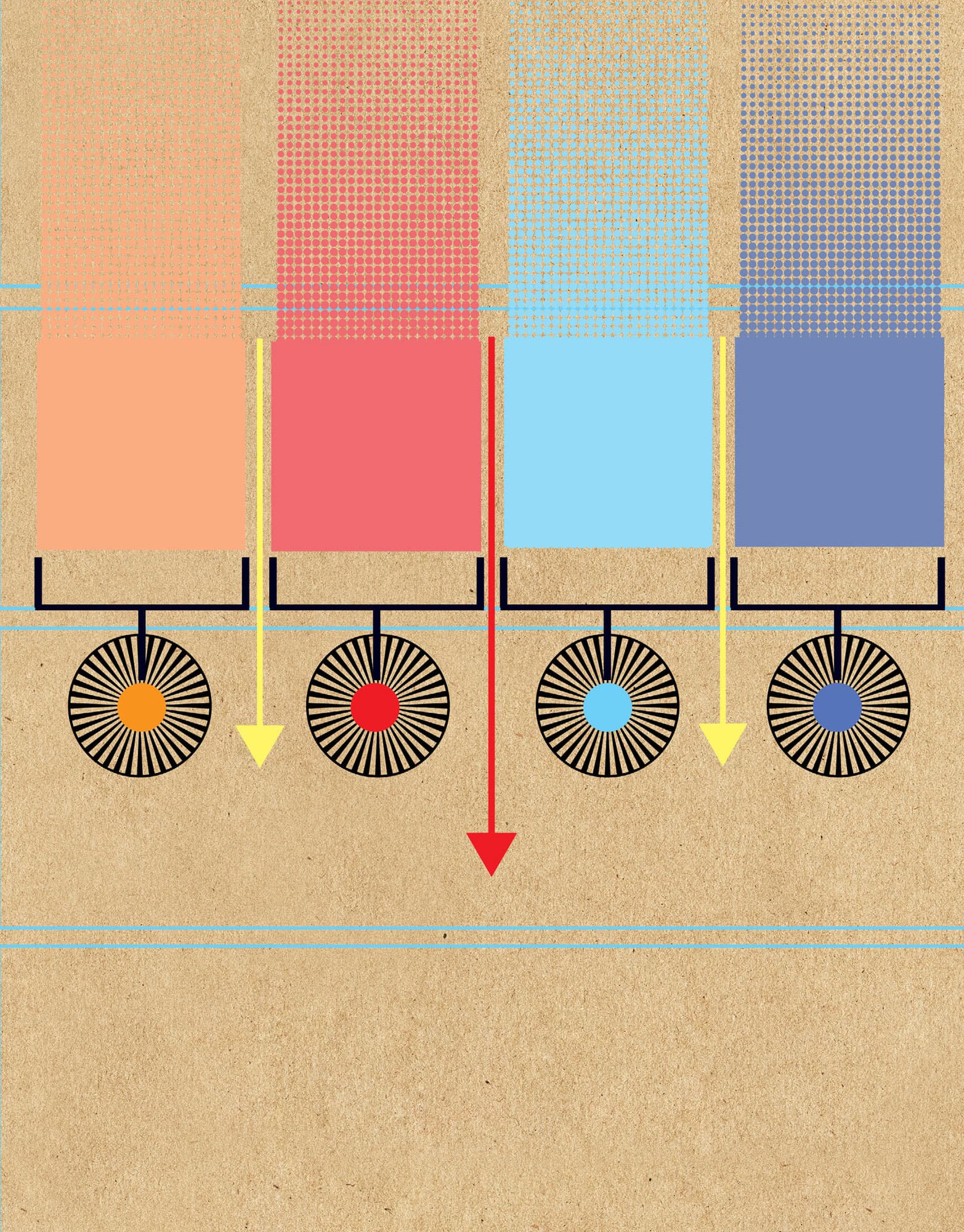
Visually representing data is a complex dialogue between the presenter and the observer. Choices made by the presenter can have a very strong influence on how the information is understood by the observer. Likewise, human perception means different ways of presenting the same data can make it easier or harder to interpret. A good data visualization is one where understanding is intuitive to the untrained observer and allows them to make further deductions from the data. It uses visual communication theories as a foundation to bring out the best of the data. In the era of big data and artificial intelligence, data visualization has become increasingly useful and important in order to aid the interpretation of complex datasets. Particularly as data visualization can be automated via computer programs and presented in applications for user exploration. Many advances are being made to make good data visualization available within common programming languages such as Python and R. There are several rules and best practices for making good visualizations. The colours and shapes used can transform a boring figure into something impactful. ‘Less is more’ is a good mantra. Edward Tufte’s data-ink ratio rule is a great guide; ink that does not convey data should be removed.
3-SECOND COUNT
Data visualization is a technical domain that combines visual communication theory, data science and graphic art; it is more than just plotting graphs.
3-MINUTE TOTAL
Data journalism is a large growth area for media organizations as their audiences become more demanding for clear analyses of complex topics. For example, election night visuals on TV and online have been transformed in recent years, driven in part by specialist websites.
RELATED TOPICS
See also
3-SECOND BIOGRAPHY
EDWARD ROLF TUFTE
1942–
American statistician and author of The Visual Display of Quantitative Information. Credited with developing the ‘data-ink ratio’ term
30-SECOND TEXT
Christian Cole
Data visualization has a rich history in representing complex information in ways that are attractive and understandable.
USING SHAPE & COLOUR
the 30-second calculation
Presenting quantitative data in ways that are interesting, intuitive and meaningful is not as easy as it looks. As anyone who has had their brain tortured by optical illusions can attest, a person’s perception can be fooled into seeing something that is not there. In comes visual communication theories (VCT): a collection of neuro-psychological observations that try to explain how the brain perceives what it sees. These laws govern how best to represent information by taking into account intrinsic knowledge of shape and colour. The Gestalt (unified whole) laws, developed in the early 1900s by Max Wertheimer, are based around how the mind tries to group objects together as best as possible in order to create structure within what is observed. The groupings occur in several ways: similarity (objects of similar shape or colour are related); continuation (the eye will follow a curve or line); closure (despite an object not being fully complete, if enough of it is drawn it will be perceived as a whole); proximity (objects close together are more related than those far apart); and figure and ground (the perception of there being a foreground distinct from a background). With these rules and theories a designer or data scientist can make intuitively meaningful visualizations of data. It is equally possible to use this knowledge to intentionally confuse and mislead an observer.
3-SECOND COUNT
Visual theory dictates how humans perceive objects and colours; when visualizing or presenting information, shape and colour help the viewer to interpret the data correctly.
3-MINUTE TOTAL
Through evolution our eyes have adapted to respond to different wavelengths of light differently, hence we see in colour. People with normal colour perception are most sensitive to the green part of the visible light spectrum. However, ‘colour blind’ people have different colour sensitivities and colours in visualizations need to be chosen carefully so that everyone can see them. Most software packages have colour palettes that are suitable for this or there are online tools which can help.
RELATED TOPIC
See also
3-SECOND BIOGRAPHY
MAX WERTHEIMER
1880–1943
Born in Austro-Hungarian Prague (now Czech Republic), Wertheimer was a psychologist who developed – together with colleagues Wolfgang Köhler and Kurt Koffka – the phi phenomenon into Gestalt psychology
30-SECOND TEXT
Christian Cole
Can you see a triangle in front of three white circles? Choice of shape and colour can lead the eye to see patterns and aid understanding.

COMPARING NUMBERS
the 30-second calculation
When comparing two or more numbers we normally determine the absolute differences. So for the numbers 51, 200 and 36 it is clear that 200 is the biggest and 36 is the smallest, right? Well, it depends. Absolute numbers can hide a lot of things that humans do not like to think about, such as uncertainty, error, range or precision. The number 51 can be represented in several different ways: 51.04, 51 +/- 3 or 50, all of which have more or less the same meaning but imply something about the source of the information. The first implies the number was measured with high precision, the second that there is some uncertainty in the measurement and the third that the second digit is probably not reliable. When comparing numbers it is important to think about what the numbers represent and what units the numbers are quoted in: 51 milligrams vs 200 grams vs 36 kilograms, 36kg is the largest weight. Or for 51 car accidents in Dundee vs 200 in Birmingham vs 36 in Swansea, there are four times more accidents in Birmingham than Dundee, but Birmingham is seven times larger. This suggests there are more accidents per capita in Dundee than Birmingham. Before being able to compare numbers meaningfully, their provenance, measurement error, precision, units and whether they are summary statistics must be presented as well.
3-SECOND COUNT
Comparing numbers is something we do intuitively all the time as humans (‘Does my sister have more sweets than me?’), but doing it meaningfully is hard.
3-MINUTE TOTAL
Context is important when comparing numbers, but can be lost if a number represents a summary statistic like an average. For example, 51 is the mean of both ranges 49, 50, 54 and 2, 4, 147, yet the two ranges would not be considered similar and nor should the means. Next time someone quotes numbers at you, make sure to ask them for the details.
RELATED TOPICS
See also
30-SECOND TEXT
Christian Cole
Numbers are used to represent many things from weights and scales to car crashes. Knowing what they mean allows us to make valid comparisons and informed decisions.

TRENDS
One of the questions that we most commonly want to ask when faced with statistical data is: what is the underlying pattern (if any)? Trends indicate some tendency for the value of one variable to influence the value of another. Any trend found can then be used to understand the behaviour of the system being measured. A positive trend (or positive correlation) between two variables indicates that, at least on average, as one variable increases so does the other. An example could be the weight of a bunch of bananas increasing as the number of bananas in a bunch increases. For a negative trend (or negative correlation), if one variable gets bigger then the other tends to get smaller. To determine the existence of a trend between two variables, we often make a ‘scatter plot’ of the data/measurements. This is done by drawing a graph in which the values of the two variables are along the two axes. Points are then plotted on the graph to represent the pairs of data values (in the above example, the number of bananas and the weight of the bunch). We then look for a line that fits the data best in some way – sometimes called a ‘trend line’ – for example, using linear regression. Various statistical tests exist for determining the strength and statistical significance of such trends. In the business world, seeking these trends is known as ‘trend analysis’.
3-SECOND COUNT
Trends are patterns in statistical data that indicate some relationship between two (or more) quantities. They can be obtained by visualizing (plotting) the data or by applying statistical tests.
3-MINUTE TOTAL
Determining trends in measurements is important in a wide range of areas, from predicting future market behaviour in economics to assessing the effectiveness of treatment strategies in medicine. These trends can be positive or negative, can be visualized graphically and can be tested for using a variety of different statistical methods.
RELATED TOPIC
See also
LINEAR REGRESSION & CORRELATION
3-SECOND BIOGRAPHIES
ADRIEN-MARIE LEGENDRE & CARL FRIEDRICH GAUSS
1752–1833 & 1777–1855
French and German mathematicians who pioneered the least squares method of seeking trends in data
30-SECOND TEXT
David Pontin
There is a positive trend between the number of bananas in a bunch and the weight of the bunch.

RANGES
the 30-second calculation
In statistics, the range of a dataset is a measure of the spread of this data. As the range uses only two values (the smallest and the largest data values), it cannot be used as the only measure of quantifying the spread, since it ignores a large amount of information associated with the data, such as the presence of outliers (observation values distant from all other observations, which can affect the values of the range). To address these limitations, other common measures of data spread are used in combination with the range: the standard deviation, the variance and the quartiles. The range of a dataset can be used to obtain a quick but rough approximation for the standard deviation. To approximate the standard deviation (μ) one can apply the so-called ‘range rule’, which states that the standard deviation of a dataset is approximately one fourth of the range of the data. The applicability of this ‘range rule’ is associated with the normal distributions, which can describe a large variety of real-world data and which ensure that 95% of the data is within two standard deviations (lower or higher) from the mean. Therefore, most of the data can be distributed over an interval that has the length of four standard deviations. Even if not all data is normally distributed, it is usually well behaved so that the majority falls within two standard deviations of the mean.
3-SECOND COUNT
The range of a dataset describes the spread of the data and is defined as the difference between the highest and lowest observed values in the set.
3-MINUTE TOTAL
The range is used to obtain a basic understanding on the spread of various data points: from the student grades in a test (where the lowest/highest grades are important to identify weakest/strongest students in the class), to employees’ salaries in a company (where lowest/highest salaries should match employees’ skills and performance).
RELATED TOPICS
See also
3-SECOND BIOGRAPHY
JOSEPH PRIESTLEY
1733–1804
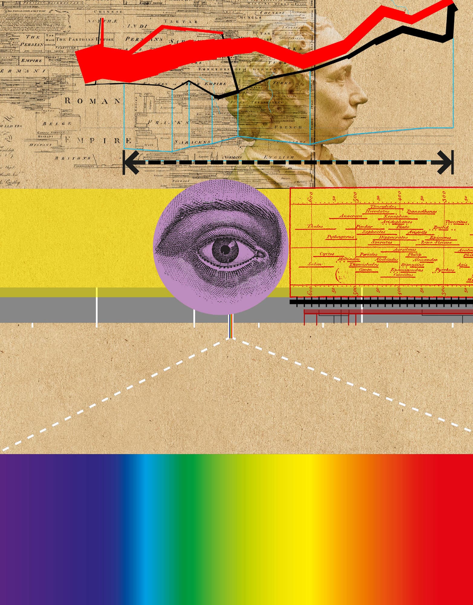
English theologian and scientist who was one of the first to visualize historical data. In his Chart of Biography (which included 2,000 names between 1200 BCE and 1750 CE), he used horizontal lines to describe the lifespan of various individuals
30-SECOND TEXT
Raluca Eftimie
The range of a dataset is given as the difference between the smallest and largest values in the dataset.
QUARTILES
the 30-second calculation
In statistics, the quartiles are values that divide an (ordered) observation dataset into four subintervals on the number line. These four subintervals contain the following data: (1) the lowest 25% of data; (2) the second lowest 25% of data (until the median value); (3) the second highest 25% of data (just above the median); (4) the highest 25% of data. The three points that separate these four subintervals are the quartiles: Q1, the lower quartile, is the point between subintervals (1) and (2); Q2, the second quartile, is the point between subintervals (2) and (3); Q3, the upper quartile, is the point between subintervals (3) and (4). These quartiles tell us what numbers are higher than a certain percentage of the rest of the dataset. The quartiles are one of the statistical measures that describe the spread of a dataset (in addition to the range, variance and standard deviation). However, unlike other measures, they also tell us something about the centre of the data (as given by the median Q3). The spread of data can also be characterized by the interquartile range (IQR), which is the difference between the 3rd and 1st quartile: IQR 5 Q3 2 Q1. The IQR can be used to calculate the outliers, those extreme values at the low and/or high ends of the dataset.
3-SECOND COUNT
Quartiles are cut points that divide the range of a probability distribution or the observations in a sample into four groups of approximately equal sizes.
3-MINUTE TOTAL
Quartiles are useful because they offer information about the centre of the data, as well as its spread. For example, they can be used to obtain a quick understanding of students’ grades in a test (where the lower 25% of students might fail the test, while the upper 25% of the students might obtain bonus points).
RELATED TOPICS
See also
3-SECOND BIOGRAPHY
SIR ARTHUR LYON BOWLEY
1869–1957
British statistician who in 1901 published Elements of Statistics, which included graphical methods for finding the median and the quartiles
30-SECOND TEXT
Raluca Eftimie
The three quartiles divide any given dataset into four sub-intervals.