
The concept of trend is absolutely essential to the technical approach to market analysis. All of the tools used by the chartist—support and resistance levels, price patterns, moving averages, trendlines, etc.—have the sole purpose of helping to measure the trend of the market for the purpose of participating in that trend. We often hear such familiar expressions as “always trade in the direction of the trend,” “never buck the trend,” or “the trend is your friend.” So let’s spend a little time to define what a trend is and classify it into a few categories.
In a general sense, the trend is simply the direction of the market, which way it’s moving. But we need a more precise definition with which to work. First of all, markets don’t generally move in a straight line in any direction. Market moves are characterized by a series of zigzags. These zigzags resemble a series of successive waves with fairly obvious peaks and troughs. It is the direction of those peaks and troughs that constitutes market trend. Whether those peaks and troughs are moving up, down, or sideways tells us the trend of the market. An uptrend would be defined as a series of successively higher peaks and troughs; a downtrend is just the opposite, a series of declining peaks and troughs; horizontal peaks and troughs would identify a sideways price trend. (See Figures 4.1a-d.)
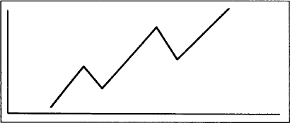
Figure 4.1a Example of an uptrend with ascending peaks and troughs.
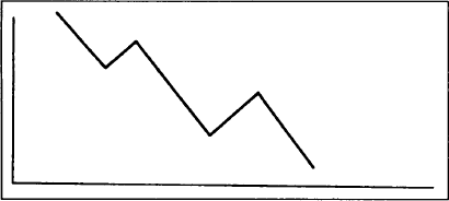
Figure 4.1b Example of a downtrend with descending peaks and troughs.
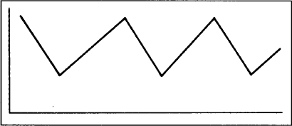
Figure 4.1c Example of a sideways trend with horizontal peaks and troughs. This type of market is often referred to as “trendless.”
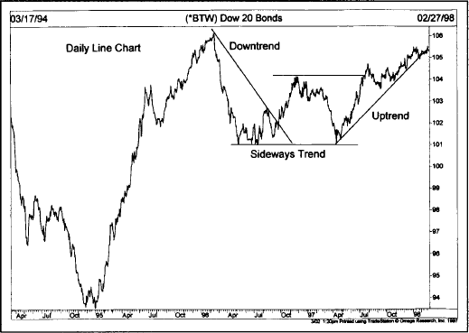
Figure 4.1d Example of a downtrend turning into an uptrend. The first portion to the left shows a downtrend. From April 1996 to April 1997, the market traded sideways. During the summer 1997, the trend turned up.
We’ve mentioned an uptrend, downtrend, and sideways trend for a very good reason. Most people tend to think of markets as being always in either an uptrend or a downtrend. The fact of the matter is that markets actually move in three directions—up, down, and sideways. It is important to be aware of this distinction because for at least a third of the time, by a conservative estimate, prices move in a flat, horizontal pattern that is referred to as a trading range. This type of sideways action reflects a period of equilibrium in the price level where the forces of supply and demand are in a state of relative balance. (If you’ll recall, Dow Theory refers to this type of pattern as a line.) Although we’ve defined a flat market as having a sideways trend, it is more commonly referred to as being trendless.
Most technical tools and systems are trend-following in nature, which means that they are primarily designed for markets that are moving up or down. They usually work very poorly, or not at all, when markets enter these lateral or “trendless” phases. It is during these periods of sideways market movement that technical traders experience their greatest frustration, and systems traders their greatest equity losses. A trend-following system, by its very definition, needs a trend in order to do its stuff. The failure here lies not with the system. Rather, the failure lies with the trader who is attempting to apply a system designed for trending markets into a nontrending market environment.
There are three decisions confronting the trader—whether to buy a market (go long), sell a market (go short), or do nothing (stand aside). When a market is rising, the buying strategy is preferable. When it is falling, the second approach would be correct. However, when the market is moving sideways, the third choice—to stay out of the market—is usually the wisest.
In addition to having three directions, trend is usually broken down into the three categories mentioned in the previous chapter. Those three categories are the major, intermediate, and near term trends. In reality, there are almost an infinite number of trends interacting with one another, from the very short term trends covering minutes and hours to superlong trends lasting 50 or 100 years. Most technicians, however, limit trend classifications to three. There is a certain amount of ambiguity, however, as to how different analysts define each trend.
Dow Theory, for example, classifies the major trend as being in effect for longer than a year. Because futures traders operate in a shorter time dimension than do stock investors, I would be inclined to shorten the major trend to anything over six months in the commodity markets. Dow defined the intermediate, or secondary, trend as three weeks to as many months, which also appears about right for the futures markets. The near term trend is usually defined as anything less than two or three weeks.
Each trend becomes a portion of its next larger trend. For example, the intermediate trend would be a correction in the major trend. In a long term uptrend, the market pauses to correct itself for a couple of months before resuming its upward path. That secondary correction would itself consist of shorter waves that would be identified as near term dips and rallies. This theme recurs many times—that each trend is part of the next larger trend and is itself comprised of smaller trends. (See Figures 4.2a and b.)
In Figure 4.2a, the major trend is up as reflected by the rising peaks and troughs (points 1, 2, 3, 4). The corrective phase (2-3) represents an intermediate correction within the major uptrend. But notice that the wave 2-3 also breaks down into three smaller waves (A, B, C). At point C, the analyst would say that the major trend was still up, but the intermediate and near term trends were down. At point 4, all three trends would be up. It is important to understand the distinction between the various degrees of trend. When someone asks what the trend is in a given market, it is difficult, if not impossible, to respond until you know which trend the person is inquiring about. You may have to respond in the manner previously discussed by defining the three different trend classifications.
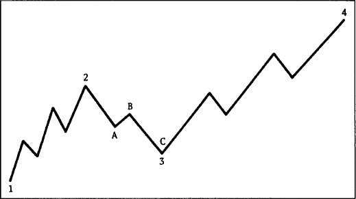
Figure 4.2a Example of the three degrees of trend: major, secondary, and near term. Points 1, 2, 3, and 4 show the major uptrend. Wave 2-3 represents a secondary correction within the major uptrend. Each secondary wave in turn divides into near term trends. For example, secondary wave 2-3 divides into minor waves A-B-C.
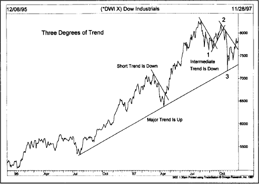
Figure 4.2b The major trend (over a year) is up during 1997. A short term correction occurred during March. An intermediate correction lasted from August to November (three months). The intermediate correction broke down into three short term trends.
Quite a bit of misunderstanding arises because of different traders’ perceptions as to what is meant by a trend. To long term position traders, a few days’ to a few weeks’ price action might be insignificant. To a day trader, a two or three day advance might constitute a major uptrend. It’s especially important, then, to understand the different degrees of trend and to make sure that all involved in a transaction are talking about the same ones.
As a general statement, most trend-following approaches focus on the intermediate trend, which may last for several months. The near term trend is used primarily for timing purposes. In an intermediate uptrend, short term setbacks would be used to initiate long positions.
In the previous discussion of trend, it was stated that prices move in a series of peaks and troughs, and that the direction of those peaks and troughs determined the trend of the market. Let’s now give those peaks and troughs their appropriate names and, at the same time, introduce the concepts of support and resistance.
The troughs, or reaction lows, are called support. The term is self-explanatory and indicates that support is a level or area on the chart under the market where buying interest is sufficiently strong to overcome selling pressure. As a result, a decline is halted and prices turn back up again. Usually a support level is identified beforehand by a previous reaction low. In Figure 4.3a, points 2 and 4 represent support levels in an uptrend. (See Figures 4.3a and b.)
Resistance is the opposite of support and represents a price level or area over the market where selling pressure overcomes buying pressure and a price advance is turned back. Usually a resistance level is identified by a previous peak. In Figure 4.3a, points 1 and 3 are resistance levels. Figure 4.3a shows an uptrend. In an uptrend, the support and resistance levels show an ascending pattern. Figure 4.3b shows a downtrend with descending peaks and troughs. In the downtrend, points 1 and 3 are support levels under the market and points 2 and 4 are resistance levels over the market.
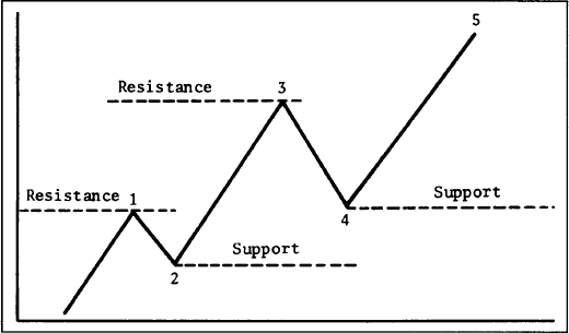
Figure 4.3a Shows rising support and resistance levels in uptrend. Points 2 and 4 are support levels which are usually previous reaction lows. Points 1 and 3 are resistance levels, usually marked by previous peaks.
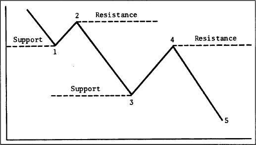
Figure 4.3b Shows support and resistance in a downtrend.
In an uptrend, the resistance levels represent pauses in that uptrend and are usually exceeded at some point. In a downtrend, support levels are not sufficient to stop the decline permanently, but are able to check it at least temporarily.
A solid grasp of the concepts of support and resistance is necessary for a full understanding of the concept of trend. For an uptrend to continue, each successive low (support level) must be higher than the one preceding it. Each rally high (resistance level) must be higher than the one before it. If the corrective dip in an uptrend comes all the way down to the previous low, it may be an early warning that the uptrend is ending or at least moving from an uptrend to a sideways trend. If the support level is violated, then a trend reversal from up to down is likely.
Each time a previous resistance peak is being tested, the uptrend is in an especially critical phase. Failure to exceed a previous peak in an uptrend, or the ability of prices to bounce off the previous support low in a downtrend, is usually the first warning that the existing trend is changing. Chapters 5 and 6 on price patterns show how the testing of these support and resistance levels form pictures on the charts that suggest either a trend reversal in progress or merely a pause in the existing trend. But the basic building blocks on which those price patterns are based are support and resistance levels.
Figures 4.4a-c are examples of a classic trend reversal. Notice, in Figure 4.4a, that at point 5 prices failed to exceed the previous peak (point 3) before turning down to violate the previous low at point 4. This trend reversal could have been identified simply by watching the support and resistance levels. In our coverage of price patterns, this type of reversal pattern will be identified as a double top.
So far we’ve defined “support” as a previous low and “resistance” as a previous high. However, this is not always the case. This leads us to one of the more interesting and lesser known aspects of support and resistance—their reversal of roles. Whenever a support or resistance level is penetrated by a significant amount, they reverse their roles and become the opposite. In other words, a resistance level becomes a support level and support becomes resistance. To understand why this occurs, perhaps it would be helpful to discuss some of the psychology behind the creation of support and resistance levels.
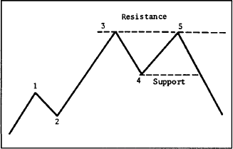
Figure 4.4a Example of a trend reversal. The failure of prices at point 5 to exceed the previous peak at point 3 followed by a downside violation of the previous low at point 4 constitutes a downside trend reversal. This type of pattern is called a double top.
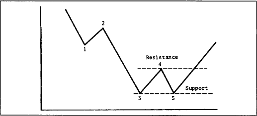
Figure 4.4b Example of a bottom reversal pattern. Usually the first sign of a bottom is the ability of prices at point 5 to hold above the previous low at point 3. The bottom is confirmed when the peak at 4 is overcome.
Figure 4.4c Example of a bottom reversal. During January 1998 prices retested the December support low and bounced off it, forming a second support level. The upside penetration of the middle resistance peak signaled a new uptrend.
To illustrate, let’s divide the market participants into three categories—the longs, the shorts, and the uncommitted. The longs are those traders who have already purchased contracts; the shorts are those who have already committed themselves to the sell side; the uncommitted are those who have either gotten out of the market or remain undecided as to which side to enter.
Let’s assume that a market starts to move higher from a support area where prices have been fluctuating for some time. The longs (those who bought near the support area) are delighted, but regret not having bought more. If the market would dip back near that support area again, they could add to their long positions. The shorts now realize (or strongly suspect) that they are on the wrong side of the market. (How far the market has moved away from that support area will greatly influence these decisions, but we’ll come back to that point a bit later.) The shorts are hoping (and praying) for a dip back to that area where they went short so they can get out of the market where they got in (their break even point).
Those sitting on the sidelines can be divided into two groups—those who never had a position and those who, for one reason or another, liquidated previously held long positions in the support area. The latter group are, of course, mad at themselves for liquidating their longs prematurely and are hoping for another chance to reinstate those longs near where they sold them.
The final group, the undecided, now realize that prices are going higher and resolve to enter the market on the long side on the next good buying opportunity. All four groups are resolved to “buy the next dip.” They all have a “vested interest” in that support area under the market. Naturally, if prices do decline near that support, renewed buying by all four groups will materialize to push prices up.
The more trading that takes place in that support area, the more significant it becomes because more participants have a vested interest in that area. The amount of trading in a given support or resistance area can be determined in three ways: the amount of time spent there, volume, and how recently the trading took place.
The longer the period of time that prices trade in a support or resistance area, the more significant that area becomes. For example, if prices trade sideways for three weeks in a congestion area before moving higher, that support area would be more important than if only three days of trading had occurred.
Volume is another way to measure the significance of support and resistance. If a support level is formed on heavy volume, this would indicate that a large number of units changed hands, and would mark that support level as more important than if very little trading had taken place. Point and figure charts that measure the intraday trading activity are especially useful in identifying these price levels where most of the trading took place and, consequently, where support and resistance will be most likely to function.
A third way to determine the significance of a support or resistance area is how recently the trading took place. Because we are dealing with the reaction of traders to market movement and to positions that they have already taken or failed to take, it stands to reason that the more recent the activity, the more potent it becomes.
Now let’s turn the tables and imagine that, instead of moving higher, prices move lower. In the previous example, because prices advanced, the combined reaction of the market participants caused each downside reaction to be met with additional buying (thereby creating new support). However, if prices start to drop and move below the previous support area, the reaction becomes just the opposite. All those who bought in the support area now realize that they made a mistake. For futures traders, their brokers are now calling frantically for more margin money. Because of the highly leveraged nature of futures trading, traders cannot sit with losses very long. They must put up additional margin money or liquidate their losing positions.
What created the previous support in the first place was the predominance of buy orders under the market. Now, however, all of the previous buy orders under the market have become sell orders over the market. Support has become resistance. And the more significant that previous support area was—that is, the more recent and the more trading that took place there—the more potent it now becomes as a resistance area. All of the factors that created support by the three categories of participants—the longs, the shorts, and the uncommitted—will now function to put a ceiling over prices on subsequent rallies or bounces.
It is useful once in a while to pause and reflect on why the price patterns used by chartists, and concepts like support and resistance, actually do work. It’s not because of some magic produced by the charts or some lines drawn on those charts. These patterns work because they provide pictures of what the market participants are actually doing and enable us to determine their reactions to market events. Chart analysis is actually a study of human psychology and the reactions of traders to changing market conditions. Unfortunately, because we live in the fast-paced world of financial markets, we tend to rely heavily on chart terminology and shortcut expressions that overlook the underlying forces that created the pictures on the charts in the first place. There are sound psychological reasons why support and resistance levels can be identified on price charts and why they can be used to help predict market movements.
A support level, penetrated by a significant margin, becomes a resistance level and vice versa. Figures 4.5a-c are similar to Figures 4.3a and b but with one added refinement. Notice that as prices are rising in Figure 4.5a the reaction at point 4 stops at or above the top of the peak at point 1. That previous peak at point 1 had been a resistance level. But once it was decisively penetrated by wave 3, that previous resistance peak became a support level. All of the previous selling near the top of wave 1 (creating the resistance level) has now become buying under the market. In Figure 4.5b, showing declining prices, point 1 (which had been a previous support level under the market) has now become a resistance level over the market acting as a ceiling at point 4.
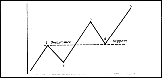
Figure 4.5a In an uptrend, resistance levels that have been broken by a significant margin become support levels. Notice that once resistance at point 1 is exceeded, it provides support at point 4. Previous peaks function as support on subsequent corrections.

Figure 4.5b In a downtrend, violated support levels become resistance levels on subsequent bounces. Notice how previous support at point 1 became resistance at point 4.

Figure 4.5c Role reversal at play. Once the early 1997 resistance peak was broken, it reversed roles to become a support level. A year later, the intermediate price decline found support right at that prior resistance peak which had become new support.
It was mentioned earlier that the distance prices traveled away from support or resistance increased the significance of that support or resistance. This is particularly true when support and resistance levels are penetrated and reverse roles. For example, it was stated that support and resistance levels reverse roles only after a significant penetration. But what constitutes significant? There is quite a bit of subjectivity involved here in determining whether a penetration is significant or not. As a benchmark, some chartists use a 3% penetration as a criteria, particularly for major support and resistance levels. Shorter term support and resistance areas would probably require a much smaller number, like 1%. In reality, each analyst must decide for himself or herself what constitutes a significant penetration. It’s important to remember, however, that support and resistance areas only reverse roles when the market moves far enough away to convince the market participants that they have made a mistake. The farther away the market moves, the more convinced they become.
There is a tendency for round numbers to stop advances or declines. Traders tend to think in terms of important round numbers, such as 10, 20, 25, 50, 75, 100 (and multiples of 1000), as price objectives and act accordingly. These round numbers, therefore, will often act as “psychological” support or resistance levels. A trader can use this information to begin taking profits as an important round number is approached.
The gold market is an excellent example of this phenomenon. The 1982 bear market low was right at $300. The market then rallied to just above $500 in the first quarter of 1983 before falling to $400. A gold rally in 1987 stopped at $500 again. From 1990 to 1997, gold failed each attempt to break through $400. The Dow Jones Industrial Average has shown a tendency to stall at multiples of 1000.
One trading application of this principle is to avoid placing trading orders right at these obvious round numbers. For example, if the trader is trying to buy into a short term market dip in an uptrend, it would make sense to place limit orders just above an important round number. Because others are trying to buy the market at the round number, the market may never get there. Traders looking to sell on a bounce should place resting sell orders just below round numbers. The opposite would be true when placing protective stops on existing positions. As a general rule, avoid placing protective stops at obvious round numbers.
In other words, protective stops on long positions should be placed below round numbers and on short positions, above such numbers. The tendency for markets to respect round numbers, and especially the more important round numbers previously referred to, is one of those peculiar market characteristics that can prove most helpful in trading and should be kept in mind by the technically oriented trader.
Now that we understand support and resistance, let’s add another building block to our arsenal of technical tools—the trendline. (See Figures 4.6a-c.) The basic trendline is one of the simplest of the technical tools employed by the chartist, but is also one of the most valuable. An up trendline is a straight line drawn upward to the right along successive reaction lows as shown by the solid line in Figure 4.6a. A down trendline is drawn downward to the right along successive rally peaks as shown in Figure 4.6b.
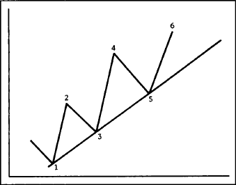
Figure 4.6a Example of an up trendline. The up trendline is drawn under the rising reaction lows. A tentative trendline is first drawn under two successively higher lows (points 1 and 3), but needs a third test to confirm the validity of the trendline (point 5).
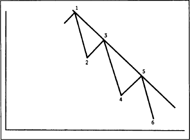
Figure 4.6b A down trendline is drawn over the successively lower rally highs. The tentative down trendline needs two points (1 and 3) to be drawn and a third test (5) to confirm its validity.
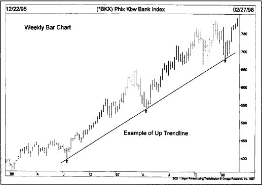
Figure 4.6c Long term up trendline at work. The up trendline was drawn upward and to the right along the first two reaction lows (see arrows). The third low at the start of 1998 bounced right off the rising trendline, thereby keeping the uptrend intact.
The correct drawing of trendlines is a lot like every other aspect of charting and some experimenting with different lines is usually necessary to find the correct one. Sometimes a trendline that looks correct may have to be redrawn. But there are some useful guidelines in the search for that correct line.
First of all, there must be evidence of a trend. This means that, for an up trendline to be drawn, there must be at least two reaction lows with the second low higher than the first. Of course, it always takes two points to draw any straight line. In Figure 4.6a, for example, only after prices have begun to move higher from point 3 is the chartist reasonably confident that a reaction low has been formed, and only then can a tentative up trendline be drawn under points 1 and 3.
Some chartists require that the peak at point 2 be penetrated to confirm the uptrend before drawing the trendline. Others only require a 50% retracement of wave 2-3, or that prices approach the top of wave 2. While the criteria may differ, the main point to remember is that the chartist wants to be reasonably sure that a reaction low has been formed before identifying a valid reaction low. Once two ascending lows have been identified, a straight line is drawn connecting the lows and projected up and to the right.
So far, all we have is a tentative trendline. In order to confirm the validity of a trendline, however, that line should be touched a third time with prices bouncing off of it. Therefore, in Figure 4.6a, the successful test of the up trendline at point 5 confirmed the validity of that line. Figure 4.6b shows a downtrend, but the rules are the same. The successful test of the trendline occurs at point 5. To summarize, two points are needed to draw the trendline, and a third point to make it a valid trendline.
Once the third point has been confirmed and the trend proceeds in its original direction, that trendline becomes very useful in a variety of ways. One of the basic concepts of trend is that a trend in motion will tend to remain in motion. As a corollary to that, once a trend assumes a certain slope or rate of speed, as identified by the trendline, it will usually maintain the same slope. The trendline then helps not only to determine the extremities of the corrective phases, but maybe even more importantly, tells us when that trend is changing.
In an uptrend, for example, the inevitable corrective dip will often touch or come very close to the up trendline. Because the intent of the trader is to buy dips in an uptrend, that trendline provides a support boundary under the market that can be used as a buying area. A down trendline can be used as a resistance area for selling purposes. (See Figures 4.7a and b.)
As long as the trendline is not violated, it can be used to determine buying and selling areas. However, at point 9 in Figures 4.7a-b, the violation of the trendline signals a trend change, calling for liquidation of all positions in the direction of the previous trend. Very often, the breaking of the trendline is one of the best early warnings of a change in trend.
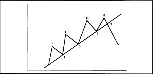
Figure 4.7a Once the up trendline has been established, subsequent dips near the line can be used as buying areas. Points 5 and 7 in this example could have been used for new or additional longs. The breaking of the trendline at point 9 called for liquidation of all longs by signaling a downside trend reversal.

Figure 4.7b Points 5 and 7 could have been used as selling areas. The breaking of the trendline at point 9 signaled an upside trend reversal.
Let’s discuss some of the refinements of the trendline. First, what determines the significance of a trendline? The answer to that question is twofold—the longer it has been intact and the number of times it has been tested. A trendline that has been successfully tested eight times, for example, that has continually demonstrated its validity, is obviously a more significant trendline than one that has only been touched three times. Also, a trendline that has been in effect for nine months is of more importance than one that has been in effect for nine weeks or nine days. The more significant the trendline, the more confidence it inspires and the more important is its penetration.
Trendlines on bar charts should be drawn over or under the entire day’s price range. Some chartists prefer to draw the trendline by connecting only the closing prices, but that is not the more standard procedure. The closing price may very well be the most important price of the day, but it still represents only a small sample of that day’s activity. The technique of including the day’s price range takes into account all of the activity and is the more common usage. (See Figure 4.8.)
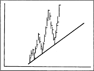
Figure 4.8 The correct drawing of a trendline should include the entire day’s trading range.
Sometimes prices will violate a trendline on an intraday basis, but then close in the direction of the original trend, leaving the analyst in some doubt as to whether or not the trendline has actually been broken. (See Figure 4.9.) Figure 4.9 shows how such a situation might look. Prices did dip under the trendline during the day, but closed back above the up trendline. Should the trendline be redrawn?

Figure 4.9 Sometimes an intraday violation of a trendline will leave the chartist in doubt as to whether the original trendline is still valid or if a new line should be drawn. A compromise is to keep the original trendline, but draw a new dotted line until it can be better determined which is the truer line.
Unfortunately, there’s no hard and fast rule to follow in such a situation. Sometimes it is best to ignore the minor breach, especially if subsequent market action proves that the original line is still valid.
As a general rule, a close beyond the trendline is more significant than just an intraday penetration. To go a step further, sometimes even a closing penetration is not enough. Most technicians employ a variety of time and price filters in an attempt to isolate valid trendline penetrations and eliminate bad signals or “whipsaws.” One example of a price filter is the 3% penetration criteria. This price filter is used mainly for the breaking of longer term trendlines, but requires that the trendline be broken, on a closing basis, by at least 3%. (The 3% rule doesn’t apply to some financial futures, such as the interest rate markets.)
If, for example, gold prices broke a major up trendline at $400, prices would have to close below that line by 3% of the price level where the line was broken (in this case, prices would have to close $12 below the trendline, or at $388). Obviously, a $12 penetration criteria would not be appropriate for shorter term trading. Perhaps a 1% criterion would serve better in such cases. The % rule represents just one type of price filter. Stock chartists, for example, might require a full point penetration and ignore fractional moves. There is tradeoff involved in the use of any type of filter. If the filter is too small, it won’t be very useful in reducing the impact of whipsaws. If it’s too big, then much of the initial move will be missed before a valid signal is given. Here again, the trader must determine what type of filter is best suited to the degree of trend being followed, always making allowances for the differences in the individuals markets.
An alternative to a price filter (requiring that a trendline be broken by some predetermined price increment or percentage amount) is a time filter. A common time filter is the two day rule. In other words, to have a valid breaking of a trendline, prices must close beyond the trendline for two successive days. To break an up trendline, therefore, prices must close under the trendline two days in a row. A one day violation would not count. The 1-3% rule and the two day rule are also applied to the breaking of important support and resistance levels, not just to major trendlines. Another filter would require a Friday close beyond a major breakout point to ensure a weekly signal.
It was mentioned earlier that support and resistance levels became the opposite once violated. The same principle holds true of trendlines. (See Figures 4.10a-c.) In other words, an up trendline (a support line) will usually become a resistance line once it’s decisively broken. A down trendline (a resistance line) will often become a support line once it’s decisively broken. This is why it’s usually a good idea to project all trendlines as far out to the right on the chart as possible even after they’ve been broken. It’s surprising how often old trendlines act as support and resistance lines again in the future, but in the opposite role.
Trendlines can be used to help determine price objectives. We’ll have a lot more to say about price objectives in the next two chapters on price patterns. In fact, some of the price objectives addressed that are derived from various price patterns are similar to the one we’ll cover here with trendlines. Stated briefly, once a trendline is broken, prices will usually move a distance beyond the trendline equal to the vertical distance that prices achieved on the other side of the line, prior to the trend reversal.

Figure 4.10a Example of a rising support line becoming resistance. Usually a support line will function as a resistance barrier on subsequent rallies, after it has been broken on the downside.

Figure 4.10b Very often a down trendline will become a support line once it’s been broken on the upside.
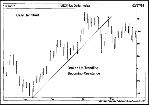
Figure 4.10c Trendlines also reverse roles. On this chart, the broken up trendline became a resistance barrier on the following rally attempt.
In other words, if in the prior uptrend, prices moved $50 above the up trendline (measured vertically), then prices would be expected to drop that same $50 below the trendline after it’s broken. In the next chapter, for example, we’ll see that this measuring rule using the trendline is similar to that used for the well-known head and shoulders reversal pattern, where the distance from the “head” to the “neckline” is projected beyond that line once it’s broken.
This brings us to another interesting use of the trendline—the fan principle. (See Figures 4.11a-c.) Sometimes after the violation of an up trendline, prices will decline a bit before rallying back to the bottom of the old up trendline (now a resistance line). In Figure 4.11a, notice how prices rallied to but failed to penetrate line 1. A second trendline (line 2) can now be drawn, which is also broken. After another failed rally attempt, a third line is drawn (line 3). The breaking of that third trendline is usually an indication that prices are headed lower. In Figure 4.11b, the breaking of the third down trendline (line 3) constitutes a new uptrend signal. Notice in these examples how previously broken support lines became resistance and resistance lines became support. The term “fan principle” derives from the appearance of the lines that gradually flatten out, resembling a fan. The important point to remember here is that the breaking of the third line is the valid trend reversal signal.
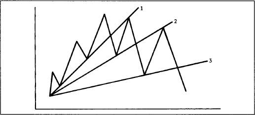
Figure 4.11a Example of the fan principle. The breaking of the third trendline signals the reversal of a trend. Notice also that the broken trendlines 1 and 2 often become resistance lines.

Figure 4.11b The fan principle at a bottom. The breaking of the third trendline signals the upside trend reversal. The previously broken trendlines (1 and 2) often become support levels.

Figure 4.11c Fan lines are drawn along successive peaks as shown in this chart. The breaking of the third fan line usually signals the start of the uptrend.
In examining the three lines in the fan principle, it’s interesting to note how often the number three shows up in the study of technical analysis and the important role it plays in so many technical approaches. For example, the fan principle uses three lines; major bull and bear markets usually have three major phases (Dow Theory and Elliott Wave Theory); there are three kinds of gaps (to be covered shortly); some of the more commonly known reversal patterns, such as the triple top and the head and shoulders, have three prominent peaks; there are three different classifications of trend (major, secondary, and minor) and three trend directions (up, down, and sideways); among the generally accepted continuation patterns, there are three types of triangles—the symmetrical, ascending, and descending; there are three principle sources of information—price, volume, and open interest. For whatever the reason, the number three plays a very prominent role throughout the entire field of technical analysis.
The relative steepness of the trendline is also important. In general, most important up trendlines tend to approximate an average slope of 45 degrees. Some chartists simply draw a 45 degree line on the chart from a prominent high or low and use this as a major trendline. The 45 degree line was one of the techniques favored by W. D. Gann. Such a line reflects a situation where prices are advancing or declining at such a rate that price and time are in perfect balance.
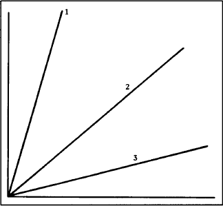
Figure 4.12 Most valid trendlines rise at an angle approximating 45 degrees (see line 2). If the trendline is too steep (line 1), it usually indicates that the rate of ascent is not sustainable. A trendline that is too flat (line 3) suggests that the uptrend is too weak and probably suspect. Many technicians use 45 degree lines from previous tops or bottoms as major trendlines.
If a trendline is too steep (see line 1 in Figure 4.12), it usually indicates that prices are advancing too rapidly and that the current steep ascent will not be sustained. The breaking of that steep trendline may be just a reaction back to a more sustainable slope closer to the 45 degree line (line 2). If a trendline is too flat (see line 3), it may indicate that the uptrend is too weak and not to be trusted.
Sometimes trendlines have to be adjusted to fit a slowing or an accelerating trend. (See Figure 4.13 and Figures 4.14a and b.) For example, as shown in the previous case, if a steep trendline is broken, a slower trendline might have to be drawn. If the original trendline is too flat, it may have to be redrawn at a steeper angle. Figure 4.13 shows a situation where the breaking of the steeper trendline (line 1) necessitated the drawing of a slower line (line 2).

Figure 4.13 Example of a trendline that is too steep (line 1). The original up trendline proved too steep. Often the breaking of a steep trendline is only an adjustment to a slower and more sustainable up trendline (line 2).
In Figure 4.14a, the original trendline (line 1) is too flat and has to be redrawn at a steeper angle (line 2). The uptrend accelerated, requiring a steeper line. A trendline that is too far away from the price action is obviously of little use in tracking the trend.
In the case of an accelerating trend, sometimes several trendlines may have to be drawn at increasingly steeper angles. In my experience, however, where steeper trendlines become necessary, it is best to resort to another tool—the moving average—which is the same as a curvilinear trendline. One of the advantages of having access to several different types of technical indicators is being able to choose the one most appropriate for a given situation. All of the techniques covered in this book work well in certain situations, but not so well in others. By having an arsenal of tools to fall back on, the technician can quickly switch from one tool to another that might work better in a given situation. An accelerated trend is one of those cases where a moving average would be more useful than a series of steeper and steeper trendlines.
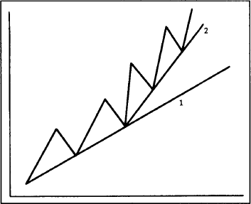
Figure 4.14a Example of an up trendline that is too flat (line 1). Line 1 proved too slow as the uptrend accelerated. In this case, a second and steeper trendline (line 2) should be drawn to more closely track the rising trend.
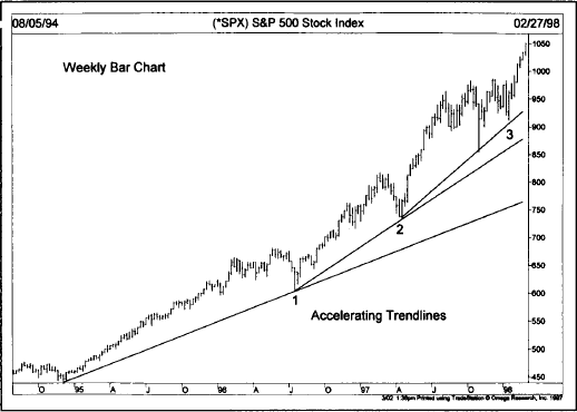
Figure 4.14b An accelerating uptrend requires the drawing of steeper trendlines as shown in this chart. The steepest trendline becomes the most important one.
Just as there are several different degrees of trend in effect at any one time, so is there a need for different trendlines to measure those various trends. A major up trendline, for example, would connect the low points of the major uptrend, while a shorter and more sensitive line might be used for secondary swings. An even shorter line can measure the short term movements. (See Figure 4.15.)

Figure 4.15 Different trendlines are used to define the different degrees of trend. Line 1 in the above example is the major up trendline, defining the major uptrend. Lines 2, 3, and 4 define the intermediate uptrends. Finally, line 5 defines a shorter term advance within the last intermediate uptrend. Technicians use many different trendlines on the same chart.
The channel line, or the return line as it is sometimes called, is another useful variation of the trendline technique. Sometimes prices trend between two parallel lines—the basic trendline and the channel line. Obviously, when this is the case and when the analyst recognizes that a channel exists, this knowledge can be used to profitable advantage.
The drawing of the channel line is relatively simple. In an uptrend (see Figure 4.16a), first draw the basic up trendline along the lows. Then draw a dotted line from the first prominent peak (point 2), which is parallel to the basic up trendline. Both lines move up to the right, forming a channel. If the next rally reaches and backs off from the channel line (at point 4), then a channel may exist. If prices then drop back to the original trendline (at point 5), then a channel probably does exist. The same holds true for a downtrend (Figure 4.16b), but of course in the opposite direction.
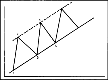
Figure 4.16a Example of a trend channel. Once the basic up trendline is drawn (below points 1 and 3) a channel, or return, line (dotted line) can be projected over the first peak at 2, which is parallel to the basic up trendline.

Figure 4.16b A trend channel in a downtrend. The channel is projected downward from the first low at point 2, parallel to the down trendline along the 1 and 3 peaks. Prices will often remain within such a trend channel.
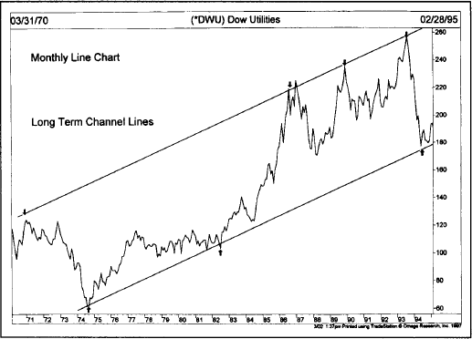
Figure 4.16c Notice how prices fluctuated between the upper and lower parallel channels over a period of 25 years. The 1987, 1989, and 1993 tops occurred right at the upper channel line. The 1994 bottom bounced off the lower trendline.
The reader should immediately see the value of such a situation. The basic up trendline can be used for the initiation of new long positions. The channel line can be used for short term profit taking. More aggressive traders might even use the channel line to initiate a countertrend short position, although trading in the opposite direction of the prevailing trend can be a dangerous and usually costly tactic. As in the case of the basic trendline, the longer the channel remains intact and the more often it is successfully tested, the more important and reliable it becomes.
The breaking of the major trendline indicates an important change in trend. But the breaking of a rising channel line has exactly the opposite meaning, and signals an acceleration of the existing trend. Some traders view the clearing of the upper line in an uptrend as a reason to add to long positions.
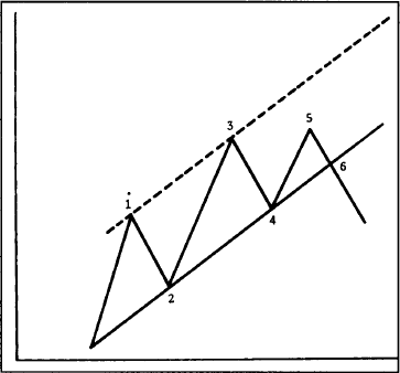
Figure 4.17 The failure to reach the upper end of the channel is often an early warning that the lower line will be broken. Notice the failure to reach the upper line at point 5 is followed by the breaking of the basic up trendline at point 6.
Another way to use the channel technique is to spot failures to reach the channel line, usually a sign of a weakening trend. In Figure 4.17, the failure of prices to reach the top of the channel (at point 5) may be an early warning that the trend is turning, and increases the odds that the other line (the basic up trendline) will be broken. As a general rule of thumb, the failure of any move within an established price channel to reach one side of the channel usually indicates that the trend is shifting, and increases the likelihood that the other side of the channel will be broken.
The channel can also be used to adjust the basic trendline. (See Figures 4.18 and 4.19.) If prices move above a projected rising channel line by a significant amount, it usually indicates a strengthening trend. Some chartists then draw a steeper basic up trendline from the last reaction low parallel to the new channel line (as demonstrated in Figure 4.18). Often, the new steeper support line functions better than the old flatter line. Similarly, the failure of an uptrend to reach the upper end of a channel justifies the drawing of a new support line under the last reaction low parallel to the new resistance line over the past two peaks (as shown in Figure 4.19).

Figure 4.18 When the upper channel line is broken (as in wave 5), many chartists will redraw the basic up trendline parallel to the new upper channel line. In other words, line 4-6 is drawn parallel to line 3-5. Because the uptrend is accelerating, it stands to reason that the basic up trendline will do likewise.

Figure 4.19 When prices fail to reach the upper channel line, and a down trendline is drawn over the two declining peaks (line 3-5), a tentative channel line can be drawn from the low at point 4 parallel to line 3-5. The lower channel line sometimes indicates where initial support will be evident.
Channel lines have measuring implications. Once a breakout occurs from an existing price channel, prices usually travel a distance equal to the width of the channel. Therefore, the user has to simply measure the width of the channel and then project that amount from the point at which either trendline is broken.
It should always be kept in mind, however, that of the two lines, the basic trendline is by far the more important and the more reliable. The channel line is a secondary use of the trendline technique. But the use of the channel line works often enough to justify its inclusion in the chartist’s toolkit.
In all of the previous examples of uptrends and downtrends, the reader has no doubt noticed that after a particular market move, prices retrace a portion of the previous trend before resuming the move in the original direction. These countertrend moves tend to fall into certain predictable percentage parameters. The best known application of the phenomenon is the 50% retracement. Let’s say, for example, that a market is trending higher and travels from the 100 level to the 200 level. Very often, the subsequent reaction retraces about half of the prior move, to about the 150 level, before upward momentum is regained. This is a very well-known market tendency and happens quite frequently. Also, these percentage retracements apply to any degree of trend—major, secondary, and near term.
Besides the 50% retracement, there are minimum and maximum percentage parameters that are also widely recognized—the one-third and the two-thirds retracements. In other words, the price trend can be divided into thirds. Usually, a minimum retracement is about 33% and a maximum about 66%. What this means is that, in a correction of a strong trend, the market usually retraces at least a third of the previous move. This is very useful information for a number of reasons. If a trader is looking for a buying area under the market, he or she can just compute a 33-50% zone on the chart and use that price zone as a general frame of reference for buying opportunities. (See Figures 4.20a and b.)

Figure 4.20a Prices often retrace about half of the prior trend before resuming in the original direction. This example shows a 50% retracement. The minimum retracement is one-third and the maximum, two-thirds of the prior trend.
The maximum retracement parameter is 66%, which becomes an especially critical area. If the prior trend is to be maintained, the correction must stop at the two-thirds point. This then becomes a relatively low risk buying area in an uptrend or selling area in a downtrend. If prices move beyond the two-thirds point, the odds then favor a trend reversal rather than just a retracement. The move usually then retraces the entire 100% of the prior trend.
You may have noticed that the three percentage retracement parameters we’ve mentioned so far—50%, 33%, and 66%—are taken right from the original Dow Theory. When we get to the Elliott Wave Theory and Fibonacci ratios, we will see that followers of that approach use percentage retracements of 38% and 62%. I prefer to combine both approaches for a minimum retracement zone of 33-38% and a maximum zone of 62-66%. Some technicians round off these numbers even further to arrive at a 40-60% retracement zone.
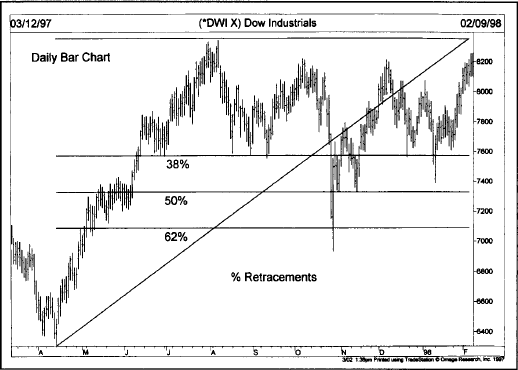
Figure 4.20b The three horizontal lines mark the 38%, 50%, and 62% retracement levels measured from the April 1997 low to the August high. The first decline fell to the 38% line, the second decline to the 62% line, and the third near the 50% line. Most corrections will find support in the 38% to 50% retracement zones. The 38% and 62% lines are Fibonacci retracements and are popular with chartists.
Students of W. D. Gann are aware that he broke down the trend structure into eighths—1/8, 2/8, 3/8, 4/8, 5/8, 6/8, 7/8, 8/8. However, even Gann attached special importance to the 3/8 (38%), 4/8 (50%), and 5/8 (62%) retracement numbers and also felt it was important to divide the trend into thirds—1/3 (33%) and 2/3 (66%).
Speaking of thirds, let’s touch on another technique that combines the trendline with percentage retracements—speedlines. This technique, developed by Edson Gould, is actually an adaptation of the idea of dividing the trend into thirds. The main difference from the percentage retracement concept is that the speed resistance lines (or speedlines) measure the rate of ascent or descent of a trend (in other words, its speed).
To construct a bullish speedline, find the highest point in the current uptrend. (See Figure 4.21a.) From that high point on the chart, a vertical line is drawn toward the bottom of the chart to where the trend began. That vertical line is then divided into thirds. A trendline is then drawn from the beginning of the trend through the two points marked off on the vertical line, representing the one-third and two-thirds points. In a downtrend, just reverse the process. Measure the vertical distance from the low point in the downtrend to the beginning of the trend, and draw two lines from the beginning of the trend through the one-third and two-thirds points on the vertical line. (See Figures 4.21a and b.)

Figure 4.21a Examples of speed resistance lines in an uptrend. The vertical distance from the peak to the beginning of the trend is divided into thirds. Two trendlines are then drawn from point 1 through points 2 and 3. The upper line is the 2/3 speedline and the lower, the 1/3. The lines should act as support during market corrections. When they’re broken, they revert to resistance lines on bounces. Sometimes these speedlines intersect price action.
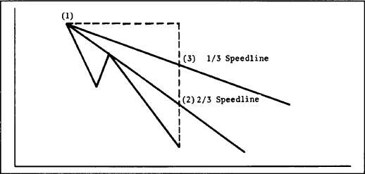
Figure 4.21b Speedlines in a downtrend.
Each time a new high is set in an uptrend or a new low in a downtrend, a new set of lines must be drawn (because there is now a new high or low point). Because the speedlines are drawn from the beginning of the trend to the one-third and two-thirds points, those trendlines may sometimes move through some of the price action. This is one case where trendlines are not drawn under lows or over highs, but actually through the price action.
If an uptrend is in the process of correcting itself, the downside correction will usually stop at the higher speedline (the 2/3 speedline). If not, prices will drop to the lower speedline (the 1/3 speedline). If the lower line is also broken, prices will probably continue all the way to the beginning of the prior trend. In a downtrend, the breaking of the lower line indicates a probable rally to the higher line. If that is broken, a rally to the top of the prior trend would be indicated.
As with all trendlines, speedlines reverse roles once they are broken. Therefore, during the correction of an uptrend, if the upper line (2/3 line) is broken and prices fall to the 1/3 line and rally from there, that upper line becomes a resistance barrier. Only when that upper line is broken would a signal be given that the old highs will probably be challenged. The same principle holds true in downtrends.
Charting software also allows the drawing of Gann and Fibonacci fan lines. Fibonacci fan lines are drawn in the same fashion as the speedline. Except that Fibonacci lines are drawn at 38% and 62% angles. (We’ll explain where those 38% and 62% numbers come from in Chapter 13, “Elliott Wave Theory.”) Gann lines (named after the legendary commodity trader, W.D. Gann) are trendlines drawn from prominent tops or bottoms at specific geometric angles. The most important Gann line is drawn at a 45 degree angle from a peak or trough. Steeper Gann lines can be drawn during an uptrend at 63 3⁄ 4 degree and 75 degree angles. Flatter Gann lines can be drawn at 26 1⁄ 4 and 15 degree lines. It’s possible to draw as many as nine different Gann lines.
Gann and Fibonacci lines are used in the same way as speedlines. They are supposed to provide support during downward corrections. When one line is broken, prices will usually fall to the next lower line. Gann lines are somewhat controversial. Even if one of them works, you can’t be sure in advance which one it will be. Some chartists question the validity of drawing geometric trendlines at all.
These are variations of the trendline that don’t rely on extreme highs or lows. Instead, internal trendlines are drawn through the price action and connect as many internal peaks or troughs as possible. Some chartists develop a good eye for this type of trendline and find them useful. The problem with internal trendlines is that their drawing is very subjective; whereas the rules for drawing of more traditional trendlines along the extreme highs and lows are more exact. (See Figure 4.21c.)
Another important building block is the reversal day. This particular chart formation goes by many names—the top reversal day, the bottom reversal day, the buying or selling climax, and the key reversal day. By itself, this formation is not of major importance. But, taken in the context of other technical information, it can sometimes be significant. Let’s first define what a reversal day is.
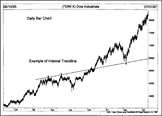
Figure 4.21c Internal trendlines are drawn through the price action connecting as many highs and lows as possible. This internal trendline drawn along the early 1996 highs provided support a year later during the spring of 1997.
A reversal day takes place either at a top or a bottom. The generally accepted definition of a top reversal day is the setting of a new high in an uptrend, followed by a lower close on the same day. In other words, prices set a new high for a given upmove at some point during the day (usually at or near the opening) then weaken and actually close lower than the previous day’s closing. A bottom reversal day would be a new low during the day followed by a higher close.
The wider the range for the day and the heavier the volume, the more significant is the signal for a possible near term trend reversal. Figures 4.22a-b show what both would look like on a bar chart. Note the heavier volume on the reversal day. Also notice that both the high and low on the reversal day exceed the range of the previous day, forming an outside day. While an outside day is not a requirement for a reversal day, it does carry more significance. (See Figure 4.22c.)
The bottom reversal day is sometimes referred to as a selling climax. This is usually a dramatic turnaround at the bottom of a down move where all the discouraged longs have finally been forced out of the market on heavy volume. The subsequent absence of selling pressure creates a vacuum over the market, which prices quickly rally to fill. The selling climax is one of the more dramatic examples of the reversal day and, while it may not mark the final bottom of a falling market, it usually signals that a significant low has been seen.

Figure 4.22a Example of a top reversal day. The heavier the volume on the reversal day and the wider the range, the more important it becomes.
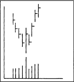
Figure 4.22b Example of a bottom reversal day. If volume is especially heavy, bottom reversals are often referred to as “selling climaxes.”
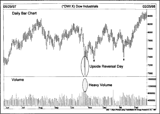
Figure 4.22c The chart action of October 28, 1997 was a classic example of an upside reversal day or a “selling climax.” Prices opened sharply lower and closed sharply higher. The unusually heavy volume bar for that day added to its importance. Two less dramatic upside reversal days (see arrows) also marked price bottoms.
This type of reversal pattern shows up on weekly and monthly bar charts, and with much greater significance. On a weekly chart, each bar represents the entire week’s range with the close registered on Friday. An upside weekly reversal, therefore, would occur when the market trades lower during the week, makes a new low for the move, but on Friday closes above the previous Friday’s close.
Weekly reversals are much more significant than daily reversals for obvious reasons and are watched closely by chartists as signaling important turning points. By the same token, monthly reversals are even more important.
Price gaps are simply areas on the bar chart where no trading has taken place. In an uptrend, for example, prices open above the highest price of the previous day, leaving a gap or open space on the chart that is not filled during the day. In a downtrend, the day’s highest price is below the previous day’s low. Upside gaps are signs of market strength, while downside gaps are usually signs of weakness. Gaps can appear on long term weekly and monthly charts and, when they do, are usually very significant. But they are more commonly seen on daily bar charts.
Several myths exist concerning the interpretation of gaps. One of the maxims often heard is that “gaps are always filled.” This is simply not true. Some should be filled and others shouldn’t. We’ll also see that gaps have different forecasting implications depending on which types they are and where they occur.
There are three general types of gaps—the breakaway, runaway (or measuring), and exhaustion gaps.
The Breakaway Gap. The breakaway gap usually occurs at the completion of an important price pattern, and usually signals the beginning of a significant market move. After a market has completed a major basing pattern, the breaking of resistance often occurs on a breakaway gap. Major breakouts from topping or basing areas are breeding grounds for this type of gap. The breaking of a major trendline, signaling a reversal of trend, might also see a breakaway gap.
Breakaway gaps usually occur on heavy volume. More often than not, breakaway gaps are not filled. Prices may return to the upper end of the gap (in the case of a bullish breakout), and may even close a portion of the gap, but some portion of the gap is often left unfilled. As a rule, the heavier the volume after such a gap appears, the less likely it is to be filled. Upside gaps usually act as support areas on subsequent market corrections. It’s important that prices not fall below gaps during an uptrend. In all cases a close below an upward gap is a sign of weakness. (See Figures 4.23a and b.)
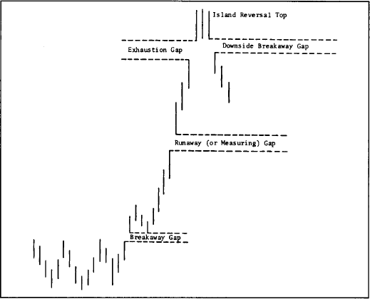
Figure 4.23a The three types of gaps. The breakaway gap signaled the completion of the basing pattern. The runaway gap occurred at about the midway point (which is why it is also called the measuring gap). An exhaustion gap to the upside, followed within a week by a breakaway gap to the downside, left an island reversal top. Notice that the breakaway and runaway gaps were not filled on the way up, which is often the case.
The Runaway or Measuring Gap. After the move has been underway for awhile, somewhere around the middle of the move, prices will leap forward to form a second type of gap (or a series of gaps) called the runaway gap. This type of gap reveals a situation where the market is moving effortlessly on moderate volume. In an uptrend, it’s a sign of market strength; in a downtrend, a sign of weakness. Here again, runaway gaps act as support under the market on subsequent corrections and are often not filled. As in the case of the breakaway, a close below the runaway gap is a negative sign in an uptrend.

Figure 4.23b The first box shows an “exhaustion” gap near the end of the rally. Prices falling below that gap signaled a top. The second box is a “measuring” gap about halfway through the downtrend. The third box is another “exhaustion” gap at the bottom. The move back above that gap signaled higher prices.
This variety of gap is also called a measuring gap because it usually occurs at about the halfway point in a trend. By measuring the distance the trend has already traveled, from the original trend signal or breakout, an estimate of the probable extent of the remaining move can be determined by doubling the amount already achieved.
The Exhaustion Gap. The final type of gap appears near the end of a market move. After all objectives have been achieved and the other two types of gaps (breakaway and runaway) have been identified, the analyst should begin to expect the exhaustion gap. Near the end of an uptrend, prices leap forward in a last gasp, so to speak. However, that upward leap quickly fades and prices turn lower within a couple of days or within a week. When prices close under that last gap, it is usually a dead giveaway that the exhaustion gap has made its appearance. This is a classic example where falling below a gap in an uptrend has very bearish implications.
This takes us to the island reversal pattern. Sometimes after the upward exhaustion gap has formed, prices will trade in a narrow range for a couple of days or a couple of weeks before gapping to the downside. Such a situation leaves the few days of price action looking like an “island” surrounded by space or water. The exhaustion gap to the upside followed by a breakaway gap to the downside completes the island reversal pattern and usually indicates a trend reversal of some magnitude. Of course, the major significance of the reversal depends on where prices are in the general trend structure. (See Figure 4.23c.)
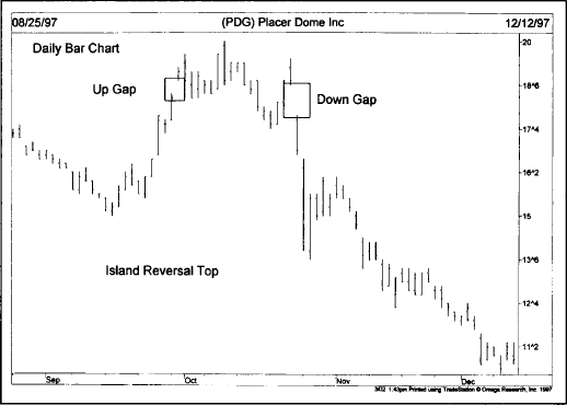
Figure 4.23c The two gaps on this daily chart form an “island reversal” top. The first box shows an up gap after a rally. The second box shows a down gap three weeks later. That combination of gaps usually signals an important top.
This chapter introduced introductory technical tools that I consider to be the building blocks of chart analysis—support and resistance, trendlines and channels, percentage retracements, speed resistance lines, reversal days, and gaps. Every technical approach covered in later chapters uses these concepts and tools in one form or another. Armed with a better understanding of these concepts, we’re now ready to begin a study of price patterns.