
Most technicians in the financial markets use a multidimensional approach to market analysis by tracking the movement of three sets of figures—price, volume, and open interest. Volume analysis applies to all markets. Open interest applies primarily to futures markets. Chapter 3 discussed the construction of the daily bar chart and showed how the three figures were plotted on that type of chart. It was stated then that even though volume and open interest figures are available for each delivery month in futures markets, the total figures are the ones generally used for forecasting purposes. Stock chartists simply plot total volume along with the accompanying price.
Most of the discussion of charting theory to this point has concentrated mainly on price action with some mention of volume. In this chapter, we’ll round out the three dimensional approach by taking a closer look at the role played by volume and open interest in the forecasting process.
Let’s begin by placing volume and open interest in their proper perspective. Price is by far the most important. Volume and open interest are secondary in importance and are used primarily as confirming indicators. Of those two, volume is the more important.
Volume is the number of entities traded during the time period under study. Because we’ll be dealing primarily with daily bar charts, our main concern is with daily volume. That daily volume is plotted by a vertical bar at the bottom of the chart under the day’s price action. (See Figure 7.1.)
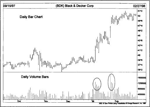
Figure 7.1 Notice that the volume bars are noticeably larger as prices are rallying (see circles). That means that volume is confirming the price rise and is bullish.
Volume can be plotted for weekly bar charts as well. In that case, total volume for the week would simply be plotted under the bar representing that week’s price action. Volume is usually not used, however, on monthly bar charts.
The total number of outstanding or unliquidated contracts at the end of the day is open interest. In Figure 7.2, open interest is the solid line plotted on the chart under its corresponding price data for the day, but above the volume bars. Remember that official volume and open interest figures are reported a day late in the futures markets and are, therefore, plotted with a one day lag. (Only estimated volume figures are available for the last trading day.) That means that each day the chartist plots the high, low, and closing price bar for the last day of trading, but plots the official volume and open interest figures for the previous day.
Open interest represents the total number of outstanding longs or shorts in the market, not the sum of both. Open interest is the number of contracts. A contract must have both a buyer and a seller. Therefore, two market participants—a buyer and a seller—combine to create only one contract. The open interest figure reported each day is followed by either a positive or negative number showing the increase or decrease in the number of contracts for that day. It is those changes in the open interest levels, either up or down, that give the chartist clues as to the changing character of market participation and give open interest its forecasting value.
How Changes in Open Interest Occur. In order to grasp the significance of how changes in the open interest numbers are interpreted, the reader must first understand how each trade produces a change in those numbers.
Every time a trade is completed on the floor of the exchange, the open interest is affected in one of three ways—it increases, decreases, or stays unchanged. Let’s see how those changes occur.
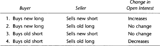
In the first case, both the buyer and seller are initiating a new position and a new contract is established. In case 2, the buyer is initiating a new long position, but the seller is merely liquidating an old long. One is entering and the other exiting a trade. The result is a standoff and no change takes place in the number of contracts. In case 3, the same thing happens except this time it is the seller who is initiating a new short and the buyer who is only covering an old short. Because one of the traders is entering and the other exiting a trade, again no change is produced. In case 4, both traders are liquidating an old position and the open interest decreases accordingly.
To sum up, if both participants in a trade are initiating a new position, the open interest will increase. If both are liquidating an old position, the open interest will decline. If, however, one is initiating a new trade while the other is liquidating an old trade, open interest will remain unchanged. By looking at the net change in the total open interest at the end of the day, the chartist is able to determine whether money is flowing into or out of the market. This information enables the analyst to draw some conclusions about the strength or weakness of the current price trend.
The futures technician incorporates volume and open interest information into market analysis. The rules for the interpretation of volume and open interest are generally combined because they are so similar. There are, however, some distinctions between the two that should be addressed. We’ll begin here with a statement of the general rules for both. Having done that, we’ll then treat each one separately before combining them again at the end.
If volume and open interest are both increasing, then the current price trend will probably continue in its present direction (either up or down). If, however, volume and open interest are declining, the action can be viewed as a warning that the current price trend may be nearing an end. Having said that, let’s now take a look at volume and open interest separately. (See Figure 7.2.)

Figure 7.2 A daily chart of crude oil futures shows volume and open interest (solid line). The open interest line is rising as prices are falling, which is bearish.
The level of volume measures the intensity or urgency behind the price move. Heavier volume reflects a higher degree of intensity or pressure. By monitoring the level of volume along with price action, the technician is better able to gauge the buying or selling pressure behind market moves. This information can then be used to confirm price movement or warn that a price move is not to be trusted. (See Figures 7.3 and 7.4.)
To state the rule more concisely, volume should increase or expand in the direction of the existing price trend. In an uptrend, volume should be heavier as the price moves higher, and should decrease or contract on price dips. As long as this pattern continues, volume is said to be confirming the price trend.

Figure 7.3 The upside price breakout by McDonalds through the November 1997 peak was accompanied by a noticeable burst of trading activity. That’s bullish.
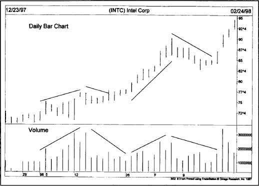
Figure 7.4 The volume bars are following Intel’s price uptrend. Volume is heavier as prices are rising, and drops off as prices weaken. Notice the burst of trading activity during the last three days’ price jump.
The chartist is also watching for signs of divergence (there’s that word again). Divergence occurs if the penetration of a previous high by the price trend takes place on declining volume. This action alerts the chartist to diminishing buying pressure. If the volume also shows a tendency to pick up on price dips, the analyst begins to worry that the uptrend is in trouble.
During our treatment of price patterns in Chapters 5 and 6, volume was mentioned several times as an important confirming indicator. One of the first signs of a head and shoulders top occurred when prices moved into new highs during the formation of the head on light volume with heavier activity on the subsequent decline to the neckline. The double and triple tops saw lighter volume on each successive peak followed by heavier downside activity. Continuation patterns, like the triangle, should be accompanied by a gradual drop off in volume. As a rule, the resolution of all price patterns (the breakout point) should be accompanied by heavier trading activity if the signal given by that breakout is real. (See Figure 7.5.)
In a downtrend, the volume should be heavier during down moves and lighter on bounces. As long as that pattern continues, the selling pressure is greater than buying pressure and the downtrend should continue. It’s only when that pattern begins to change that the chartist starts looking for signs of a bottom.
By monitoring the price and volume together, we’re actually using two different tools to measure the same thing—pressure. By the mere fact that prices are trending higher, we can see that there is more buying than selling pressure. It stands to reason then that the greater volume should take place in the same direction as the prevailing trend. Technicians believe that volume precedes price, meaning that the loss of upside pressure in an uptrend or downside pressure in a downtrend actually shows up in the volume figures before it is manifested in a reversal of the price trend.
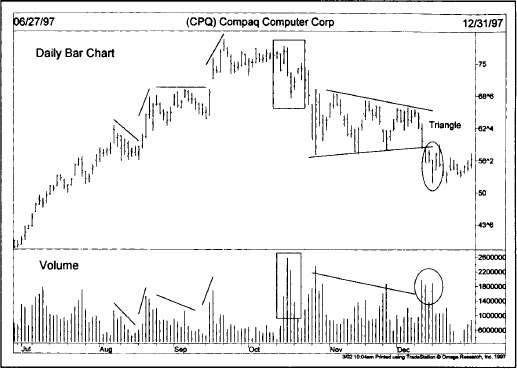
Figure 7.5 The first half of this chart shows a positive trend with heavier volume on up days. The box at the top shows a sudden downturn on heavy volume—a negative sign. Notice the increase in trading as the continuation triangle is broken on the downside.
Technicians have experimented with many volume indicators to help quantify buying or selling pressure. Trying to “eyeball” the vertical volume bars along the bottom of the chart is not always precise enough to detect significant shifts in the volume flow. The simplest and best known of these volume indicators is on balance volume or OBV. Developed and popularized by Joseph Granville in his 1963 book, Granville’s New Key to Stock Market Profits, OBV actually produces a curving line on the price chart. This line can be used either to confirm the quality of the current price trend or warn of an impending reversal by diverging from the price action.
Figure 7.6 shows the price chart with the OBV line along the bottom of the chart instead of the volume bars. Notice how much easier it is to follow the volume trend with the OBV line.
The construction of the OBV line is simplicity itself. The total volume for each day is assigned a plus or minus value depending on whether prices close higher or lower for that day. A higher close causes the volume for that day to be given a plus value, while a lower close counts for negative volume. A running cumulative total is then maintained by adding or subtracting each day’s volume based on the direction of the market close.
It is the direction of the OBV line (its trend) that is important and not the actual numbers themselves. The actual OBV values will differ depending on how far back you are charting. Let the computer handle the calculations. Concentrate on the direction of the OBV line.
The on balance volume line should follow in the same direction as the price trend. If prices show a series of higher peaks and troughs (an uptrend), the OBV line should do the same. If prices are trending lower, so should the OBV line. It’s when the volume line fails to move in the same direction as prices that a divergence exists and warns of a possible trend reversal.
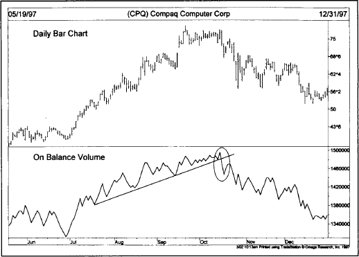
Figure 7.6 The line along the bottom shows on balance volume (OBV) for the same Compaq chart. Notice how much easier it was to spot the downturn in October 1997.
The on balance volume line does its job reasonably well, but it has some shortcomings. For one thing, it assigns an entire day’s volume a plus or minus value. Suppose a market closes up on the day by some minimal amount such as one or two tics. Is it reasonable to assign all of that day’s activity a positive value? Or consider a situation where the market spends most of the day on the upside, but then closes slightly lower. Should all of that day’s volume be given a negative value? To resolve these questions, technicians have experimented with many variations of OBV in an attempt to discover the true upside and downside volume.
One variation is to give greater weight to those days where the trend is the strongest. On an up day, for example, the volume is multiplied by the amount of the price gain. This technique still assigns positive and negative values, but gives greater weight to those days with greater price movement and reduces the impact of those days where the actual price change is minimal.
There are more sophisticated formulas that blend volume (and open interest) with price action. James Sibbet’s Demand Index, for example, combines price and volume into a leading market indicator. The Herrick Payoff Index uses open interest to measure money flow. (See Appendix A for an explanation of both indicators.)
It should be noted that volume reporting in the stock market is much more useful than in the futures markets. Stock trading volume is reported immediately, while it is reported a day late for futures. Levels of upside and downside volume are also available for stocks, but not in futures. The availability of volume data for stocks on each price change during the day has facilitated an even more advanced indicator called Money Flow, developed by Laszlo Birinyi, Jr. This real-time version of OBV tracks the level of volume on each price change in order to determine if money is flowing into or out of a stock. This sophisticated calculation, however, requires a lot of computer power and isn’t readily available to most traders.
These more sophisticated variations of OBV have basically the same intent—to determine whether the heavier volume is taking place on the upside (bullish) or the downside (bearish). Even with its simplicity, the OBV line still does a pretty good job of tracking the volume flow in a market—either in futures or stocks. And OBV is readily available on most charting software. Most charting packages even allow you to plot the OBV line right over the price data for even easier comparison. (See Figures 7.7 and 7.8.)
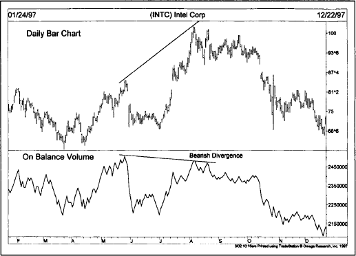
Figure 7.7 An excellent example of how a bearish divergence between the on balance volume line (bottom) and the price of Intel correctly warned of a major downturn.
We’ve already mentioned the problem of the one day lag in reporting futures volume. There is also the relatively awkward practice of using total volume numbers to analyze individual contracts instead of each contract’s actual volume. There are good reasons for using total volume. But how does one deal with situations when some contracts close higher and others lower in the same futures market on the same day? Limit days produce other problems. Days when markets are locked limit up usually produce very light volume. This is a sign of strength as the numbers of buyers so overwhelm the sellers that prices reach the maximum trading limit and cease trading. According to the traditional rules of interpretation, light volume on a rally is bearish. The light volume on limit days is a violation of that principle and can distort OBV numbers.
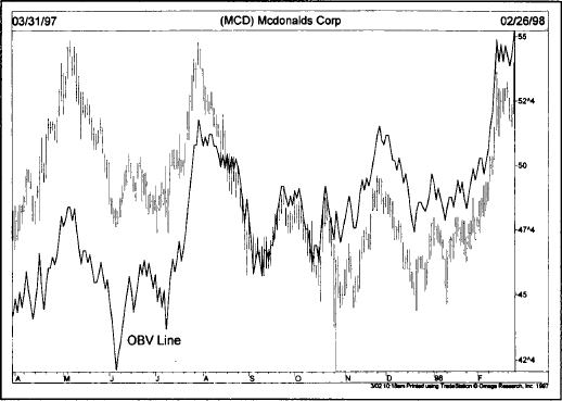
Figure 7.8 Overlaying the OBV (solid line) right over the price bars makes for easier comparison between price and volume. This chart of McDonalds shows the OBV line leading the price higher and warning in advance of the bullish breakout.
Even with these limitations, however, volume analysis can still be used in the futures markets, and the technical trader would be well advised to keep a watchful eye on volume indications.
The rules for interpreting open interest changes are similar to those for volume, but require additional explanation.
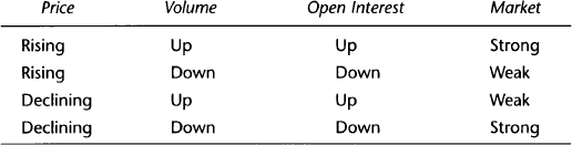
1. With prices advancing in an uptrend and total open interest increasing, new money is flowing into the market reflecting aggressive new buying, and is considered bullish. (See Figure 7.9.)
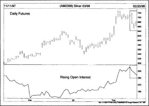
Figure 7.9 The uptrend in silver prices was confirmed by a similar rise in the open interest line. The boxes to the right show some normal liquidation of outstanding contracts as prices start to correct downward.
2. If, however, prices are rising and open interest declines, the rally is being caused primarily by short covering (holders of losing short positions being forced to cover those positions). Money is leaving rather than entering the market. This action is considered bearish because the uptrend will probably run out of steam once the necessary short covering has been completed. (See Figure 7.10.)
3. With prices in a downtrend and open interest rising, the technician knows that new money is flowing into the market, reflecting aggressive new short selling. This action increases the odds that the downtrend will continue and is considered bearish. (See Figure 7.11.)
4. If, however, total open interest is declining along with declining prices, the price decline is being caused by discouraged or losing longs being forced to liquidate their positions. This action is believed to indicate a strengthening technical situation because the downtrend will probably end once open interest has declined sufficiently to show that most losing longs have completed their selling.

Figure 7.10 An example of a weak price rebound in gold futures. The price rise is accompanied by falling open interest, while the price decline shows rising open interest. A strong trend would see open interest trending with price, not against it.
Let’s summarize these four points:
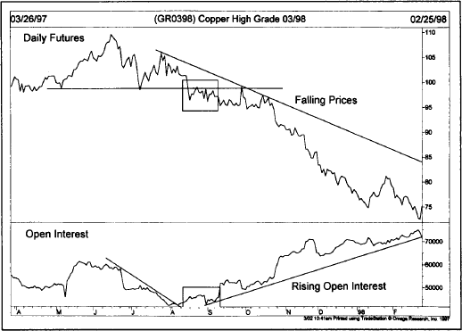
Figure 7.11 The downturn in copper during the summer of 1997 and the subsequent price decline was accompanied by rising open interest. Rising open interest during a price decline is bearish because it reflects aggressive short selling.
In addition to the preceding tendencies, there are other market situations where a study of open interest can prove useful.
1. Toward the end of major market moves, where open interest has been increasing throughout the price trend, a leveling off or decline in open interest is often an early warning of a change in trend.
2. A high open interest figure at market tops can be considered bearish if the price drop is very sudden. This means that all of the new longs established near the end of the uptrend now have losing positions. Their forced liquidation will keep prices under pressure until the open interest has declined sufficiently. As an example, let’s assume that an uptrend has been in effect for some time. Over the past month, open interest has increased noticeably. Remember that every new open interest contract has one new long and one new short. Suddenly, prices begin to drop sharply and fall below the lowest price set over the past month. Every single new long established during that month now has a loss.
The forced liquidation of those longs keeps prices under pressure until they have all been liquidated. Worse still, their forced selling often begins to feed on itself and, as prices are pushed even lower, causes additional margin selling by other longs and intensifies the new price decline. As a corollary to the preceding point, an unusually high open interest in a bull market is a danger signal.
3. If open interest builds up noticeably during a sideways consolidation or a horizontal trading range, the ensuing price move intensifies once the breakout occurs. This only stands to reason. The market is in a period of indecision. No one is sure which direction the trend breakout will take. The increase in open interest, however, tells us that a lot of traders are taking positions in anticipation of the breakout. Once that breakout does occur, a lot of traders are going to be caught on the wrong side of the market.
Let’s assume we’ve had a three month trading range and that the open interest has jumped by 10,000 contracts. This means that 10,000 new long positions and 10,000 new short positions have been taken. Prices then break out on the upside and new three month highs are established. Because prices are trading at the highest point in three months, every single short position (all 10,000 of them) initiated during the previous three months now shows a loss. The scramble to cover those losing shorts naturally causes additional upside pressure on prices, producing even more panic. Prices remain strong until all or most of those 10,000 short positions have been offset by buying into the market strength. If the breakout had been to the downside, then it would have been the longs doing the scrambling.
The early stage of any new trend immediately following a breakout is usually fueled by forced liquidation by those caught on the wrong side of the market. The more traders caught on the wrong side (manifested in the high open interest), the more severe the response to a sudden adverse market move. On a more positive note, the new trend is further aided by those on the right side of the market whose judgment has been vindicated, and who are now using accumulated paper profits to finance additional positions. It can be seen why the greater the increase in open interest during a trading range (or any price formation for that matter), the greater the potential for the subsequent price move.
4. Increasing open interest at the completion of a price pattern is viewed as added confirmation of a reliable trend signal. The breaking of the neckline, for example, of a head and shoulders bottom is more convincing if the breakout occurs on increasing open interest along with the heavier volume. The analyst has to be careful here. Because the impetus following the initial trend signal is often caused by those on the wrong side of the market, sometimes the open interest dips slightly at the beginning of a new trend. This initial dip in the open interest can mislead the unwary chart reader, and argues against focusing too much attention on the open interest changes over the very short term.
Let’s summarize some of the more important elements of price, volume, and open interest.
One final situation not covered so far that deserves mention is the type of dramatic market action that often takes place at tops and bottoms—blowoffs and selling climaxes. Blowoffs occur at major market tops and selling climaxes at bottoms. In futures, blowoffs are often accompanied by a drop in open interest during the final rally. In the case of a blowoff at market tops, prices suddenly begin to rally sharply after a long advance, accompanied by a large jump in trading activity and then peak abruptly. (See Figure 7.12.) In a selling climax bottom, prices suddenly drop sharply on heavy trading activity and rebound as quickly. (Refer back to Figure 4.22c.)
Our treatment of open interest would not be complete without mentioning the Commitments of Traders (COT) Report, and how it is used by futures technicians as a forecasting tool. The report is released by the Commodity Futures Trading Commission (CFTC) twice a month—a mid-month report and one at month’s end. The report breaks down the open interest numbers into three categories—large hedgers, large speculators, and small traders. The large hedgers, also called commercials, use the futures markets primarily for hedging purposes. Large speculators include the large commodity funds, who rely primarily on mechanical trend-following systems. The final category of small traders includes the general public, who trade in much smaller amounts.
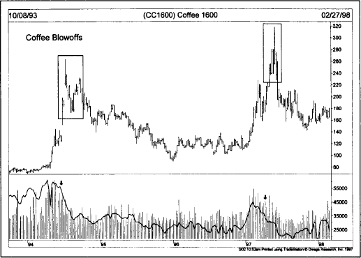
Figure 7.12 A couple of blowoff tops in coffee futures. In both cases, prices rallied sharply on heavy volume. The negative warnings came from the decline in open interest (solid line) during both rallies (see arrows).
The guiding principle in analyzing the Commitments Report is the belief that the large commercial hedgers are usually right, while the traders are usually wrong. That being the case, the idea is to place yourself in the same positions as the hedgers and in the opposite positions of the two categories of traders. For example, a bullish signal at a market bottom would occur when the commercials are heavily net long while the large and small traders are heavily net short. In a rising market, a warning signal of a possible top would take place when the large and small traders become heavily net long at the same time that the commercials are becoming heavily net short.
It is possible to chart the trends of the three market groups, and to use those trends to spot extremes in their positions. One way to do that is to study the net trader positions published in Futures Charts (Published by Commodity Trend Service, PO Box 32309, Palm Beach Gardens, FL 33420). That charting service plots three lines that show the net trader positions for all three groups on a weekly price chart for each market going back four years. By providing four years of data, historical comparisons are easily done. Nick Van Nice, the publisher of that chart service, looks for situations where the commercials are at one extreme, and the two categories of traders at the other, to find buying and selling opportunities (as shown in Figures 7.13 and 7.14). Even if you don’t use the COT Report as a primary input in your trading decisions, it’s not a bad idea to keep an eye on what those three groups are doing.
Our coverage of open interest has concentrated on the futures markets. Open interest plays an important role in options trading as well. Open interest figures are published each day for put and call options on futures markets, stock averages, industry indexes, and individual stocks. While open interest in options may not be interpreted in exactly the same way as in futures, it tells us essentially the same thing—where the interest is and the liquidity. Some option traders compare call open interest (bulls) to put open interest (bears) in order to measure market sentiment. Others use option volume.

Figure 7.13 This weekly chart of S&P 500 futures shows three buy signals (see arrows). The lines along the bottom show the commercials (solid line) heavily net long and the large speculators (dashed line) heavily net short at each buy signal.
Volume figures for the options markets are used essentially the same way as in futures and stocks—that is, they tell us the degree of buying or selling pressure in a given market. Volume figures in options are broken down into call volume (bullish) and put volume (bearish). By monitoring the volume in calls versus puts, we are able to determine the degree of bullishness or bearishness in a market. One of the primary uses of volume data in options trading is the construction of put/call volume ratios. When options traders are bullish, call volume exceeds put volume and the put/call ratio falls. A bearish attitude is reflected in heavier put volume and a higher put/call ratio. The put/call ratio is usually viewed as a contrary indicator. A very high ratio signals an oversold market. A very low ratio is a negative warning of an overbought market.
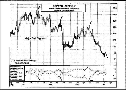
Figure 7.14 This weekly chart of copper futures shows three sell signals marked by the arrows. Each sell signal shows net long positions by the two categories of speculators and a net short position by the commercials. The commercials were right.
Options traders use open interest and volume put/call figures to determine extremes in bullish or bearish sentiment. These sentiment readings work best when combined with technical measures such as support, resistance, and the trend of the underlying market. Since timing is so crucial in options, most option traders are technically oriented.
That concludes our coverage of volume and open interest, at least for now. Volume analysis is used in all financial markets—futures, options, and stocks. Open interest applies only to futures and options. But, since futures and options are traded on so many stock market vehicles, some understanding of how open interest works can be useful in all three financial arenas. In most of our discussions so far, we’ve concentrated on daily bar charts. The next step is to broaden our time horizon and to learn how to apply the tools we’ve learned to weekly and monthly charts in order to perform long range trend analysis. We’ll accomplish that in the next chapter.