Chapter 3: Control Charts for Variables
Variables Control Chart Review
JMP Variables Control Chart Platforms
ISQC Example 6.3 Piston Ring Diameter
ISQC Example 6.4 Piston Ring Diameter
ISQC Example 6.5 Loan Processing Costs
ISQC Example 6.6 Resistivity of Silicon Wafers
ISQC Example 6.11 Vane Height of an Aerospace Casting
Operating Characteristic Curve
3-Way Control Chart and Variance Components
Overview
This chapter illustrates how to generate control charts using examples from Chapter 6, “Control Charts for Variables,” of Introduction to Statistical Quality Control (ISQC), as well as some of the fundamental ideas behind statistical process control (SPC).
These control chart techniques are presented for data measured on a quantitative scale and are referred to as variable control charts. They include the and Range, and Standard Deviation, and Individual Measurement and Moving Range control charts.
Two JMP platforms are highlighted in this chapter: the Control Chart Builder and the Control Chart.
Variables Control Chart Review
Most books on control charts are partitioned into two buckets: control charts for variable data and control charts for attribute data. This distinction is important to select the most effective control chart to adequately represent the data of interest. In general, variable data is a measurement that is obtained on a continuous scale, such as temperature, pressure, or thickness. For a thorough discussion of measurement scales, see Chapter 2 in Ramírez and Ramírez (2009).
The most common control charts for variable data include the and Range, the and Standard Deviation, and the Individual Measurement and Moving Range (XmR). The first Shewhart control chart, the and Range, is the landmark chart of SPC as we have come to know it today. This chart is appropriate when the natural grouping of the measurements taken in a process is greater than one, also referred to as the subgroup size, n. The chart plots the subgroup averages and is used to understand the homogeneity of a process by determining if the subgroup-to-subgroup averages are consistent, as compared to the within-subgroup variation. The Range chart plots the subgroup ranges (maximum value – minimum value) and looks for consistent within-subgroup variation from subgroup to subgroup.
The and Standard Deviation chart is also used to monitor subgroup averages and within-subgroup variation. However, instead of using the subgroup ranges, the chart displays the sample standard deviation to monitor the variation within each subgroup. It is a more appropriate choice when the number of measurements in a subgroup is larger (for example, n>=5). The control limits for the chart are calculated using an estimate of the within-subgroup variation (ranges or standard deviations).
The third chart that is covered in this chapter is the one for individual measurements, referred to as XmR. This chart is appropriate when the natural subgroup size is one, and the data are continuous in nature. For example, if one thickness measurement is taken per hour or per equipment run, then an XmR chart is appropriate. The control limits for this chart are constructed from an estimate of the variation from consecutive moving ranges.
The control charts described here are built on statistical assumptions, including the basic model for the observations yi = µ + εi, where εi ~ i.i.d. N(µ, σ). Although these charts are robust to moderate departures in these assumptions, we emphasize several examples from ISQC to understand the impact of certain departures on the performance of the chart. For example, a 3-way control chart is used to widen inappropriately tight limits on an chart due to a lack of independence among the subgroup measurements, and probability limits from a lognormal distribution are used to accommodate a skewed distribution.
JMP Variables Control Chart Platforms
Two platforms are used to create variables control charts such as and Range, and Standard Deviation, and XmR charts. One is the legacy Control Chart platform and the other one is the Control Chart Builder. The Control Chart Builder is part of the new generation of JMP quality tools, which makes it easier to design, create, and evaluate control charts. These platforms were introduced in Chapter 2. In this chapter, we focus on the use of these platforms for variables data. Table 3.1 provides a summary of the features we find most useful from both platforms.
Table 3.1 Comparison of Features for JMP Variables Control Chart Platforms
|
Feature |
Control Chart Builder |
Control Chart |
|
Control chart types |
and Range and Standard Deviation XmR |
and Range and Standard Deviation XmR |
|
Save limits |
In Column and in new Table |
In Column and in new Table |
|
Save summaries |
Yes |
Yes |
|
Save sigma |
No |
Yes |
|
Annotation features |
Using the Annotate tool |
Using the Annotate tool |
|
Interactivity |
Yes |
Yes |
Note that throughout the remainder of this chapter the term XBar is used for .
Examples from ISQC Chapter 6
The examples presented here from Chapter 6 of ISQC, and their emphasis, are shown in Table 3.2. The examples are reproduced using JMP as are shown in ISQC. For some examples, additional output not provided in ISQC is shown to illustrate JMP functionality or elaborate on important points considered by the authors.
Table 3.2 Summary of Examples from Chapter 6 of ISQC
|
ISQC Example Number |
JMP Table Name |
JMP Platform |
Key Points |
|
6.1 Flow Width
|
Control Chart XBar and Range and Phase Chart |
Apply runs tests and save limits to new data. Add box plots to graphs. Produce an OC curve for an XBar chart and create a Phase Chart. | |
|
6.3, 6.4 Piston Ring Diameter |
Chapter 3 – ISQC Table 6.3, 6.4 |
Control Chart Builder XBar and Standard Deviation |
Save control limits. Use variable subgroup sizes for control limits. |
|
6.5 Loan Processing Cost |
Chapter 3 – ISQC Table 6.6 |
Control Chart IR (XmR) |
Create an XmR chart and apply runs tests. |
|
6.6 Resistivity of Silicon Wafers |
Chapter 3 – ISQC Table 6.8 |
Control Chart IR (XmR) and JMP Script |
Fit normal and lognormal distributions to data and generate lognormal probability limits. |
|
6.11 Vane Height of Aerospace Casting |
Chapter 3 – ISQC Table 6.11 |
Control Chart Builder 3-way chart and Variability/ |
Create control limits for hierarchical data and perform variance components analysis. |
ISQC Example 6.1 Flow Width
In this example, we show how to construct an XBar and Range chart using the legacy Control Chart platform in JMP because this platform has the ability to add box plots to the control chart. The data in Table 6.1 of ISQC consists of Flow Width measurements for a hard-bake process used with photolithography in semiconductor manufacturing. For each of 25 runs, a single measurement is taken on five wafers. Therefore, the natural subgroup is one run of the process equipment, and the subgroup size is five wafers or n = 5.
The following steps illustrate how to construct the control chart using the Control Chart platform:
1. Open the JMP table Chapter 3 - ISQC Table 6.1.jmp, which has variables called Sample Number, Wafer Number, and Flow Width (microns). Sample Number is the subgroup variable and Flow Width (microns) is the measurement.
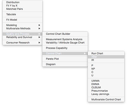
2. Select Analyze ► Quality and Process ► Control Chart ► XBar (Figure 3.1).
Figure 3.1 JMP Menu Selections for XBar and Range Chart
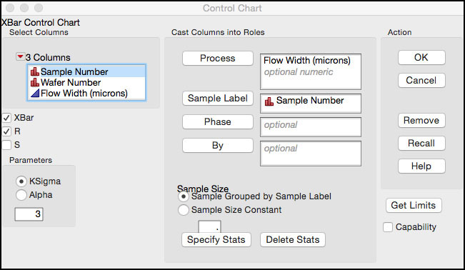
3. When the XBar control chart launch window appears (Figure 3.2), select Flow Width (microns) as the Process variable. Then select Sample Number and click Sample Label to identify the subgroup variable.
Figure 3.2 Column Selections for XBar and Range Chart
4. Click OK to create the control chart.
Figure 3.3 XBar and Range Control Chart for Flow Width
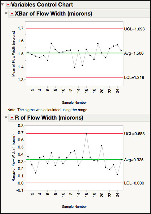
The chart in Figure 3.3 corresponds to Figure 6.2 in ISQC. The Range chart is interpreted first, and because there are no points beyond the control limits, the within-subgroup variation appears to be consistent. Similarly, there are no points outside of the limits for the XBar chart, and we can say that the process is in a state of control. Note that the process capability analysis for this data, which is discussed in ISQC Chapter 6, is presented in Chapter 5 in this book.
New Data Added
ISQC Table 6.2 shows 20 additional runs of the process with five wafers each, for a total of 100 observations. We want to see if the process is still in control using the control limits established from the first 25 runs. To apply the limits to the new data, we have to save the control limits that were established for the previous chart.
The following steps illustrate how to save the control limits in JMP for the control chart in Figure 3.3 and apply them to new data:
1. Click on the red trianno, bogle next to the Variables Control Chart title at the top of the window. This brings up a menu (Figure 3.4). There are two options available to save the limits: in Column saves them to a column property in the JMP table containing the original data, while in New Table saves them to a new JMP table.
Figure 3.4 Saving Control Limits for Variables Charts
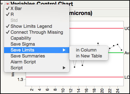
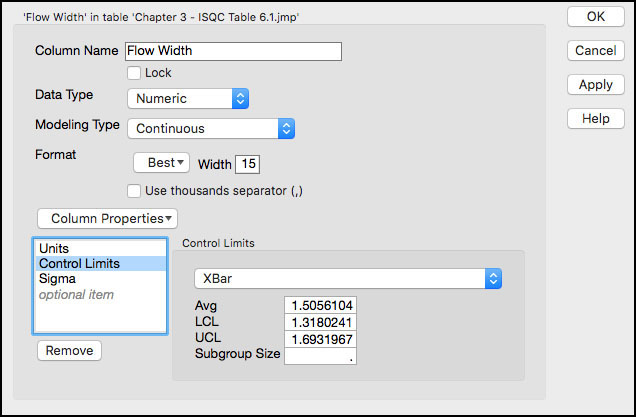
2. To save the limits to a column, select Save Limits ► in Column. To view the limits, just right-click on the column heading name Flow Width (microns) in the JMP table and select Control Limits from the Column Properties drop-down menu. In addition, the value of the estimated standard deviation used to compute the limits is also saved as a Sigma column property. The saved column properties are shown in Figure 3.5.
Figure 3.5 Control Limits Saved in Column Properties
3. To update the control chart with new data, open a new JMP table and paste the new data to it. Save the table as Chapter 3 - ISQC Table 6.2.jmp. The new table has 100 (20 subgroups of size, n = 5) rows of data.
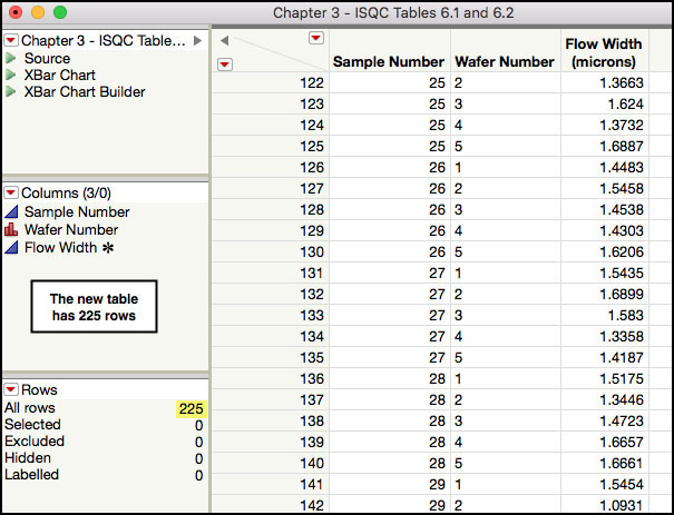
4. Make sure Chapter 3 - ISQC Table 6.1.jmp is open and selected. From the main menu bar, select Tables ► Concatenate. The Concatenate dialog box appears with the Chapter 3 - ISQC Table 6.1.jmp added to the window on the right (Figure 3.6a). To add the new data, select Chapter 3 - ISQC Table 6.2.jmp from the selection list and click Add. Enter the output table name as Chapter 3 - ISQC Tables 6.1 and 6.2 and click OK. A portion of the resulting table is shown in Figure 3.6b.
Figure 3.6a Concatenating Two JMP Tables
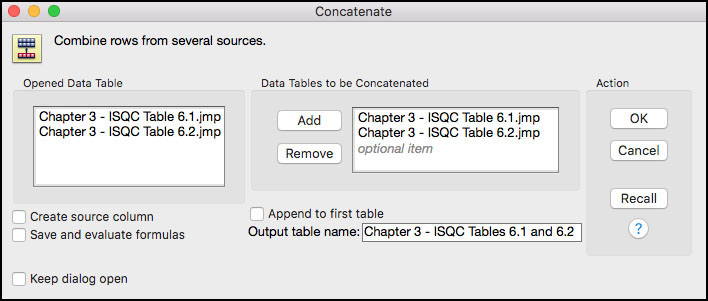
Figure 3.6b Concatenated JMP Tables 6.1 and 6.2
5. Optional: Alternatively, to add new data to the chart, click the JMP table Chapter 3 - ISQC Table 6.1 and select Rows ► Add Rows from the main JMP menu bar. A window appears and you can enter the number of rows we want to add (100) to the table and then click OK. Now select all the new rows that were added, rows 126 to 225, and copy and paste new rows of data from a data source, such as Excel, or another JMP table.
6. To view the control chart with the new data, repeat steps 2 through 3 from the previous example. The limits on the control chart should be the same limits shown in Figure 3.3.
Figure 3.7 Updated XBar and Range Control Chart for Flow Width
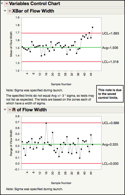
The chart in Figure 3.7 corresponds to Figure 6.4 of ISQC. The Range chart implies that the within-subgroup variation is consistent because no points are above the upper control limit (UCL). However, there are two points above the UCL for the XBar chart and there appears to be a run of points above the centerline. To aid in the visual assessment for patterns among the subgroup averages, a variety of runs tests can be turned on in the chart. The commonly used Western Electric rules are listed as Test 1, Test 2, Test 5, and Test 6. Refer to the online documentation for a complete description of the different runs tests.
|
|
JMP Note 3.1: Click on the point above the UCL in the XBar chart to identify it in the JMP table. |
7. To turn on runs tests, click on the red triangle next to the XBar of Flow Width (microns) title bar and select Show Zones. Then go back and select Tests ► All Tests (Figure 3.8). This applies the eight Nelson runs tests, as it is shown in Figure 3.9.
Figure 3.8 Turn on Runs Tests for XBar Chart
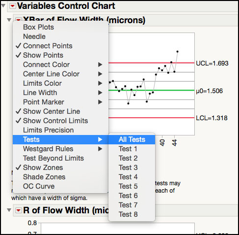
Figure 3.9 XBar Chart for Flow Width with Runs Tests
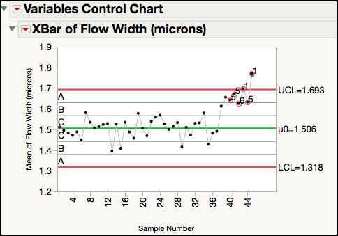
The visual assessment is confirmed, with two points labeled above the UCL and violations for Test 5 and Test 6 (Figure 3.9). It might be helpful to look at the distribution for each subgroup to further evaluate the new data. This is accomplished by adding box plots for each subgroup, which shows the range of the five measurements.
|
|
JMP Note 3.2: Select a point in the chart and right-click to see the Chart Options menu. This menu allows you to apply Tests, Test Beyond Limits, Show Zones, and so on.
|
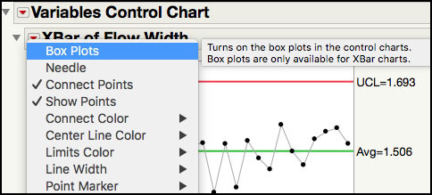
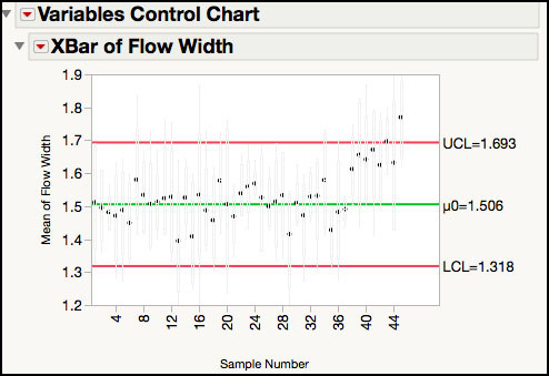
8. To add box plots to the XBar chart, click on the red triangle next to the XBar of Flow Width (microns) title bar and select Box plots, as shown in Figure 3.10a. The control chart with box plots is shown in Figure 3.10b.
Figure 3.10a Adding Box Plots to Control Chart
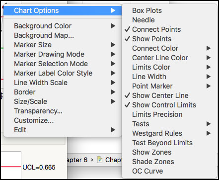
Figure 3.10b XBar Chart for Flow Width with Box Plots
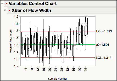
9. The default box plots in Figure 3.10b are light gray. To change the color of the box plots to black, use the script Box Plot Line Color Black.jsl. With the control chart window active, open the script Box Plot Line Color Black.jsl, and run it by pressing CTRL-R (Command-R on a Mac).
10. The script changes the color of the boxes to black as shown in Figure 3.10c, which corresponds to Figure 6.5 of ISQC Chapter 6.
|
|
JMP Note 3.3: The default color of the boxes can be changed to black with the JMP script, Box Plot Line Color Black.jsl |
Figure 3.10c Updated XBar Chart for Flow Width with Black Box Plots
Note that with the exception of the box plots, the XBar and Range chart in this example can be generated using the Control Chart Builder. The next example showcases the Control Chart Builder.
ISQC Example 6.3 Piston Ring Diameter
In this example, we show how to construct an XBar and Standard Deviation chart using the Control Chart Builder in JMP. As mentioned earlier, the Control Chart Builder, part of the new generation of JMP quality tools, makes it easier to design and evaluate control charts. The Control Chart Builder has a similar drag-and-drop interface to the Graph Builder, which allows the user to quickly visualize charts and change the limits calculations, for example, on the fly.
The data set consists of inside diameter measurements for forged automobile engine piston rings (ISQC Table 6.3). For each of 25 runs, a single measurement is taken on five piston rings. Therefore, the natural subgroup is one run of the process equipment, and the subgroup size is n = 5. Later in this example, we show what happens when the subgroup sizes are unequal.
The following steps illustrate how to construct the control chart using the Control Chart Builder platform:
1. Open Chapter 3 – ISQC Table 6.3.jmp, which has variables called Sample Number, Piston Ring Number, and Inside Diameter (mm). Sample Number is the subgroup variable and Inside Diameter (mm) is the measurement.
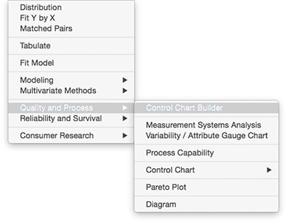
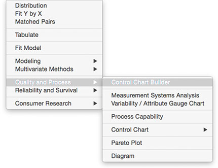
2. Select Analyze ► Quality and Process ► Control Chart Builder (Figure 3.11). The Control Chart Builder launch window appears.
Figure 3.11 Launching Control Chart Builder
3. Drag Sample Number from the left-hand window to the Subgroup zone (X axis). Similarly, drag Inside Diameter (mm) from the left-hand window to the Y zone (Y axis) (Figure 3.12).
Figure 3.12 Launch Window for Control Chart Builder
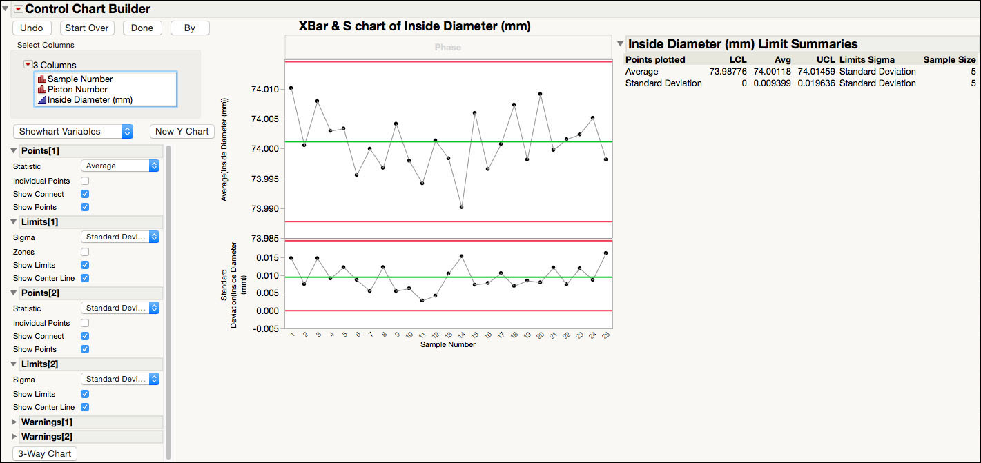
4. The XBar and Range chart appears first in the window. To change it to an XBar and standard deviation chart, select Standard Deviation from the drop-down list next to Sigma and under Limits[1]. Then select Standard Deviation from the drop-down list next to Statistic and under Points[2]. Finally, when the chart has all the required features, click Done in the upper left corner of the window (Figure 3.13).
Figure 3.13 XBar and S Chart for Piston Data
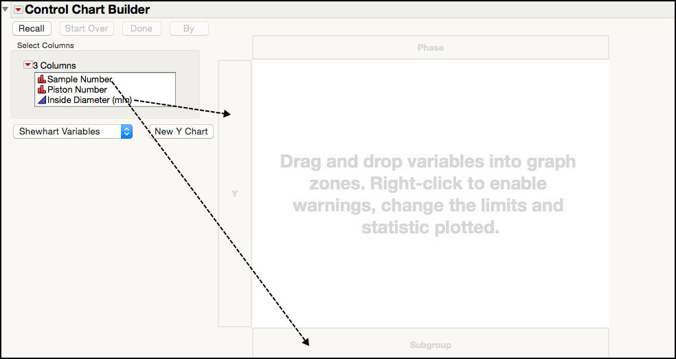
Figure 3.13 corresponds to ISQC Figure 6.17. In this figure, the standard deviation chart is plotting the sample standard deviation for each subgroup and shows that the within-subgroup variation is consistent, with no points outside of the control limits. The XBar chart is plotting the subgroup averages and does not show any points outside of the control limits. If these limits are appropriate to apply to future subgroups, then they can be saved to the column properties in the JMP table using the Control Chart Builder.
5. The control limits can be saved to the column properties of the JMP table by clicking on the small red triangle at the top of the window and selecting Save Limits ► in Column (Figure 3.14).
Figure 3.14 Saving Control Limits for Piston Data XBar and S Chart
ISQC Example 6.4 Piston Ring Diameter
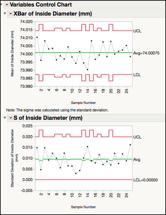
Sometimes the subgroup size is not constant in the data that we want to plot on a control chart. This could occur for a variety of reasons; for example, perhaps data could not be obtained for all samples in a subgroup or the sampling scheme might depend on a dynamic production schedule. In any event, the control limits for both charts will be impacted since they depend on the subgroup size, n. The Control Chart platform will automatically adjust the control limits for variable subgroup size.
1. Open Chapter 3 – ISQC Table 6.4.jmp, which has variables called Sample Number, Piston Ring Number, and Inside Diameter (mm). This data is similar to Chapter 3 – ISQC Table 6.3.jmp; however, some of the subgroup results have been removed to create variable subgroup sizes.
2. Select Analyze ► Quality and Process ► Control Chart ► XBar. When the XBar Control Chart launch window appears, select Inside Diameter (mm) as the Process variable. Then select Sample Number and click Sample Label to identify the subgroup variable.
3. Click OK to create the control chart. Figure 3.15 corresponds to ISQC Figure 6.18.
Figure 3.15 XBar and S Chart for Piston Data with Variable Subgroup Sizes

|
Statistics Note 3.1: The reason the control limits vary is because they are a function of the sample size, and in Figure 3.15 the number of samples in each subgroup varies. |
ISQC Example 6.5 Loan Processing Costs
In this example, we show how to construct an Individual Measurement and Moving Range (XmR) chart using the Control Chart Builder platform in JMP. The data set consists of the cost of processing loan applications at a bank. The quantity tracked is the average weekly processing costs, which represents the ratio of the total weekly cost and the number of loans processed during the week. Because the bank is interested in the average weekly cost, the natural subgroup is one week of data and the subgroup size is n = 1. When the subgroup size n = 1, an XmR control chart is an appropriate choice.
The following steps illustrate how to construct the control chart using the Control Chart Builder:
1. Open Chapter 3 – ISQC Table 6.6.jmp, which has variables called Weeks and Cost x.
Weeks is the subgroup variable and Cost x is the measurement.
2. Select Analyze ► Quality and Process ► Control Chart Builder (Figure 3.16).
Figure 3.16 Launching Control Chart Builder
3. Drag Cost x from the left-hand window to the Y zone (Y axis). Similarly, drag Weeks from the left-hand window to the Subgroup zone (X axis) (Figure 3.17).
Figure 3.17 Launch Window for Control Chart Builder
The Individual and Moving Range chart appears in the window, reflecting how quickly charts can be generated with the Control Chart Builder. The Points[1] menu shows Individual under Statistic, while the Limits[1] menu shows Moving Range under Sigma. The control limits appear under the Cost x Limit Summaries report.
Figure 3.18 Individual & Moving Range Chart for Cost x Data
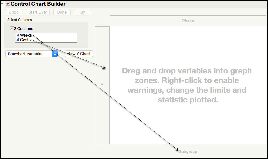
Figure 3.18 corresponds to ISQC Figure 6.19. This chart can also be generated using the Control Chart platform.
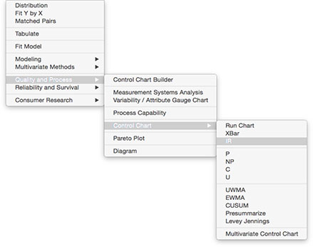
1. Select Analyze ► Quality and Process ► Control Chart ► IR (Figure 3.19).
Figure 3.19 Launching Control Chart for XmR

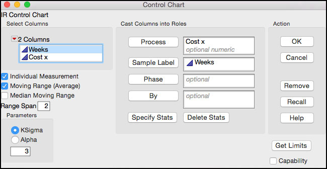
2. When the IR Control Chart launch window appears, select Cost x as the Process variable. Then select Weeks and click Sample Label to identify the subgroup variable.
Figure 3.20 Launch Window for XmR for Cost x
In this launch window, there are several options available for determining how the standard deviation is calculated, which is used to calculate the control limits for the individuals chart. The default settings (that is, Moving Range (Average) and a Range Span = 2) are selected by default when the launch window appears. The standard deviation can be derived using the average moving range or the median moving range, as shown by the options located in the left-hand side of the window. Although the average moving range is typically used, the median moving range might be more robust to outliers. The span of the moving ranges can also be specified. Once again, while a span of 2 is the most common choice, a larger span might be used to incorporate more variation into the estimate.
3. To produce the control chart, click OK.
Figure 3.21 XmR Control Chart for Cost x Data
In Figure 3.21, the Moving Range chart monitors the short-term variation by plotting the consecutive differences in two adjacent results. For this parameter, there are no points that exceed the upper control limit. The Individual Measurement control chart monitors the process mean and, because there are no points outside of the control limits, the process output is stable.
|
|
Statistics Note 3.2: Some people do not find value in evaluating the Moving Range chart because it is thought to provide redundant information that can be obtained from the Individuals control chart. However, there is a subtle difference in the monitoring objectives for the two charts. It is possible to have a moving range that exceeds the upper control limit, but it does not produce a signal on the Individual Measurement control chart and vice versa. For example, in the chart in Figure 3.21, it is possible that the difference between two consecutive costs can exceed 25.44, with both costs falling within 279.79 and 321.21 (for example, (315 – 285) = 30). Conversely, two consecutive points might exceed the UCL but be in control in the Moving Range chart with a UCL of 25.44 (for example, (324 – 323) = 1). |
4. More subtle shifts in the mean can be examined by turning on the runs tests. This is accomplished by clicking on the red triangle next to the Individual Measurement of Cost x title bar and selecting Show Zones and then going back and selecting Tests ► All Tests. This applies the eight Nelson runs tests. Because there are no violations, the control chart is not reproduced here.
ISQC Example 6.6 Resistivity of Silicon Wafers
In this example, we show how to construct an Individual Measurement and Moving Range (XmR) chart using the Control Chart platform in JMP. The data set consists of resistivity measurements of 25 silicon wafers after an epitaxial layer is deposited in a single-wafer deposition process. Because a resistivity measurement is taken on a single wafer per run, the natural subgroup size is n = 1. The assumption of normality is explored, and a lognormal transformation of the data is used for process monitoring using an XmR chart. Note that in JMP the XmR chart is called the IR chart.
The following steps illustrate how to evaluate the distributional assumptions and construct the control chart using the Control Chart platform:
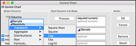
1. Open Chapter 3 – ISQC Table 6.8.jmp, which has variables called Sample Number, Resistivity, and log(Resistivity). Sample Number is the subgroup variable, Resistivity is the measurement, and log(Resistivity) is the natural log transformation of the Resistivity measurements.
2. Select Analyze ► Distribution. A launch window appears. Select Resistivity and log(Resistivity) and select Y, Columns to add them to the window. Click OK when you are done. The histograms are shown in Figure 3.22.
Figure 3.22 Distributions for Wafer Resistivity Data

3. To add normal probability plots to Figure 3.22, click on the red triangle at the top of the window next to the Resistivity label while holding down the Ctrl key and select Normal Quantile Plot from the drop-down menu. Normal quantile plots are added above each histogram.
4. To rearrange the graphs, click on the red triangle next to Distributions at the top of the window, select Arrange in Rows, enter 2 in the dialog box that appears, and click OK.
Figure 3.23 Normal Probability Plots for Resistivity and log(Resistivity)

The normal probability plots are displayed above the histograms for each response (Figure 3.23). These displays can be evaluated to determine the best fit for the data at hand. If the data in the probability plot falls along the straight line and within the provided bands, then the distribution is a good approximation to the data set. For wafer resistivity, the normal plot for the log-transformed data appears to provide a slightly better fit than that for the untransformed data. In addition, the histogram and the box plot are more symmetrical around the mean for the log-transformed data, suggesting a departure from the normal distribution. In Figure 3.23 the normal probability plot for Resistivity corresponds to ISQC Figure 6.22, while the one for log(Resistivity) corresponds to ISQC Figure 6.23.
There are two ways to control chart wafer resistivity using the lognormal distribution. The first way involves charting the log, base e, transformed data using an XmR control chart, which is shown here. A second approach, using lognormal probability limits, is discussed in the Statistical Insights section in this chapter.
5. From the main menu, select Analyze ► Quality and Process ► Control Chart ►IR.
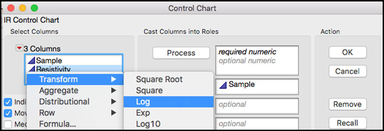
6. A launch window appears. Select log(Resistivity) as the Process variable. Then select Sample and click Sample Label to identify the subgroup variable. Click OK when you are done. The chart is shown in Figure 3.24.
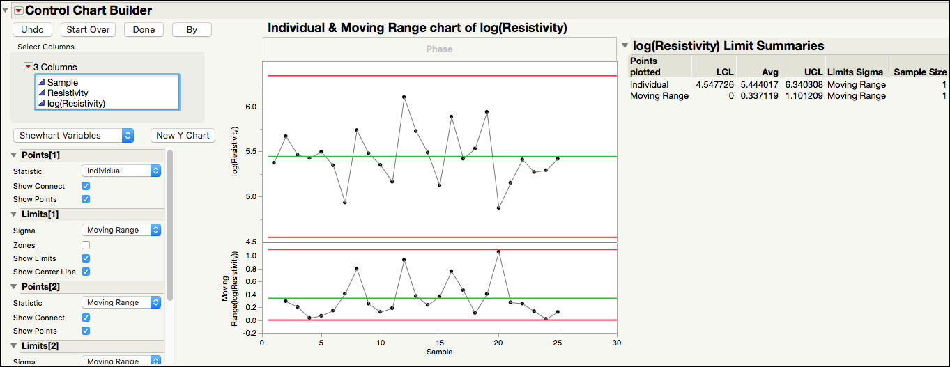
Figure 3.24 XmR Chart for log(Resistivity)


The Moving Range chart of the transformed data, shown in Figure 3.24 (ISQC Figure 6.24), no longer has any points above the upper control limit and the Individual chart shows no violations of runs tests.
We can also use the Control Chart Builder to generate the control chart in Figure 3.24, as follows:
1. From the main menu, select Analyze ► Quality and Process ► Control Chart Builder.
2. Drag log(Resistivity) from the left-hand window to the Y zone (Y axis). Similarly, drag Sample from the left-hand window to the Subgroup zone (X axis). Figure 3.25 shows the XmR chart.
Figure 3.25 Control Chart Builder XmR Chart for log(Resistivity)
ISQC Example 6.11 Vane Height of an Aerospace Casting
In this example, we show how easy it is to construct a 3-way chart using the Control Chart Builder platform in JMP. The data set consists of vane height measurements on 20 aerospace castings, which are used in a gas turbine jet aircraft engine. Data on vane heights are collected by randomly selecting five vanes on each casting produced. Since five measurements are taken per casting, the natural subgroup size is n = 5. An XBar and Standard Deviation control chart is adapted for this sampling scheme using a 3-way chart.
The following steps illustrate how to create a 3-way chart using the Control Chart Builder platform:
1. Open Chapter 3 – ISQC Table 6.11.jmp, which has variables called Sample Number, Vane, and Vane Height. Sample Number is the subgroup variable and Vane Height is the measurement.
2. Select Analyze ► Quality and Process ► Control Chart Builder. A launch window appears. Drag Sample Number from the left-hand window to the Subgroup zone (X axis). Similarly, drag Vane Height from the left-hand window to the Y zone (Y axis).
The XBar and Range charts appear first in the window. To change it to an XBar and standard deviation chart, select Standard Deviation from the drop-down list next to Sigma and under Limits[1]. Then select Standard Deviation from the drop-down list next to Statistic and under Points[2]. Finally, select Standard Deviation from the drop-down list next to Sigma and under Limits[2]. To turn on the runs tests, right-click in the control chart and select Warnings ► Tests ► Test 1.
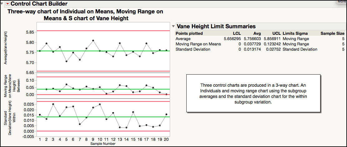
Figure 3.26 XBar and Standard Deviation Chart for Vane Height Data
In Figure 3.26, the standard deviation chart displays the sample standard deviation for each subgroup and shows that the within-subgroup variation is consistent, with no points outside of the control limits. The XBar chart is plotting the subgroup averages and shows many points outside of the control limits. The control limits for the XBar chart must be adjusted to include the subgroup-to-subgroup variation, using a 3-way control chart.
3. Click 3-Way Chart at the lower left-hand side of the window. Select Moving Range on Means from the drop-down list next to Statistic and under Points[2]. Then select Moving Range from the drop-down list next to Sigma and under Limits[2]. Finally, select Standard Deviation from the drop-down list next to Statistic and under Points[3] and click Done when you are finished.
Figure 3.27 3-Way Control Chart for Vane Height Data

The 3-way chart in Figure 3.27 (ISQC Figure 6.27) gets its name because three control charts are displayed. The first two charts are Individual Measurement and Moving Range charts for the subgroup averages, which display the short-term Casting-to-Casting variation, and the third chart is the standard deviation chart for the within-casting variation. The control limits for the subgroup averages are much wider than the ones previously calculated, and there are no longer any out-of-control points. The control limits for the standard deviation chart remain unchanged from the ones presented previously.
Statistical Insights
In this section, we elaborate on some of the examples provided in ISQC Chapter 6. The examples highlighted in this section include several important concepts we have encountered over our many years of applying SPC successfully to a variety of industries. For most of these examples, additional output not provided in ISQC is included to illustrate JMP functionality or further elaborate on important points.
Operating Characteristic Curve
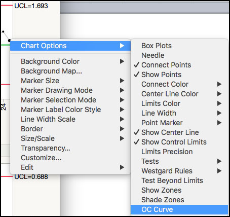
The operating characteristic (OC) curve (see ISQC Section 6.2.6) shows the probability, β, of not detecting a mean shift (ISQC equation 6.19) with the next subgroup when three sigma limits are used. The curve is usually shown with β on the Y axis and the mean shift, k, on the X axis. For the control chart shown in Figure 3.3 (ISQC Figure 6.2), the OC curve is easily obtained by right-clicking on any chart point and selecting OC Curve from the resulting menu or by clicking on the red triangle next to XBar of Flow Width and choosing OC Curve from the menu (Figure 3.28).
Figure 3.28 Control Chart Options for Flow Width
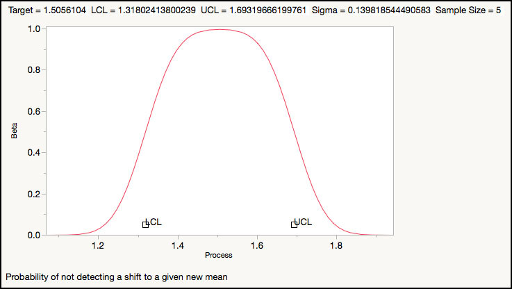
JMP produces a 2-sided OC curve, corresponding to the lower and upper control limits (Figure 3.29). At the top of the OC curve, we see the control chart parameters: target or CL = 1.51, LCL = 1.31, UCL = 1.69, sigma = 0.14, and subgroup size n = 5. At the target value of 1.51, the probability of not detecting a shift is 1, but as we move away from the target in either direction, the probability decreases to 0 at around 1.2 for the lower side and 1.8 for the upper side. The value of 1.8 corresponds to a shift of about 0.3 microns, which is equivalent to 2 standard deviations.
Figure 3.29 OC Curve for the Flow Width XBar Chart.
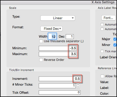
The OC curve can be presented in a more generic fashion, with a target = 0 and standard deviation = 1, by clicking on the Target value and entering 0 and on the Sigma value and entering 1. The control limits can be calculated as LCL = 0 –k/√n = 0 –3/√5 = -1.34; UCL = 0 + 3/√5= 1.34. We also need to scale the X axis in units of sigma by double-clicking the X axis and setting the Minimum =-3.5, the Maximum =3.5, and the Increment =0.5 in the X Axis Settings window, as shown in Figure 3.30a.
|
|
Statistics Note 3.3: So why look at the OC curve at all? The OC curve is used to evaluate the sensitivity of the control chart in the units of the data. For example, shifts of 0.3 microns or more will be detected with a high probability (β < 0.044). However, the probability of not detecting a shift of 0.1 microns is about 93% (β = 0.933) or the probability of detecting the shift is only 7%. |
Figure 3.30a X Axis Setting for OC Curve
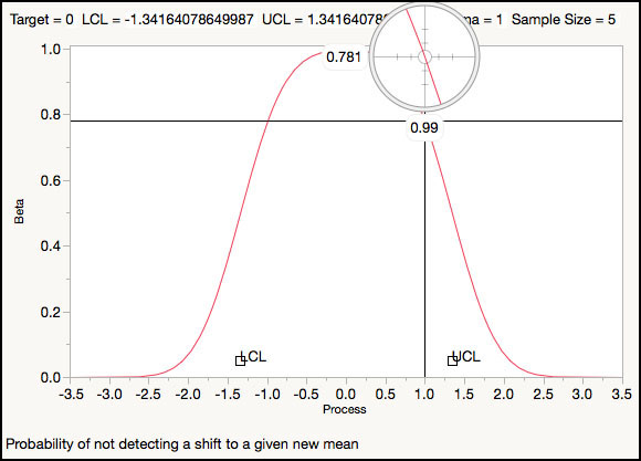
The crosshair tool can be used to read the value of β for a given σ shift. If the shift is 1σ, then for n = 5 the probability of not detecting a mean shift is β=0.781 (Figure 3.30b) or the probability of detecting a 1σ shift is only 1-β=0.219. The curve to the right of 0 is the same as the n = 5 curve of Figure 6.13 in ISQC Section 6.2.6, from which, for a 1σ shift, as Montgomery points out, “we have β=0.75, approximately.”
Figure 3.30b OC Curve for Standardized ±3 Control Limits for n = 5
Phase Chart
The additional data in ISQC Example 6.1 showed a shift in the process from an average of 1.506 microns to about 1.56 microns. What if we want to construct a chart that displays two sets of limits, one for the original data and one for the additional data? This can be accomplished using a phase chart, where each phase represents a section of the data. The JMP data set Chapter 3 - ISQC Example 1 Phase Chart.jmp contains the combined data of ISQC Tables 6.1 and 6.2 with an additional column, Source, to denote the source of the data: Original (ISQC Table 6.1) or Additional (ISQC Table 6.2). The following steps illustrate how to create a phase chart using the Control Chart Builder platform:
1. Open Chapter 3 - ISQC Example 1 Phase Chart.jmp, which has variables called Source, Sample Number, Wafer Number, and Flow Width. Sample Number is the subgroup variable and Flow Width is the measurement.
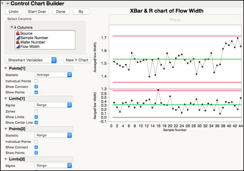
2. Select Analyze ► Quality and Process ► Control Chart Builder. A launch window appears. Drag Sample Number from the left-hand window to the Subgroup zone (X axis). Similarly, drag Flow Width from the left-hand window to the Y zone (Y axis). The XBar and Range chart appears first in the window (Figure 3.31).
Figure 3.31 XBar and R Chart for Combined Flow Width Data
3. To change the chart to a XBar and Range Phase chart, drag Source from the left-hand window to the Phase zone at the top of the XBar chart, as shown in Figure 3.32.
Figure 3.32 Drag Source to the Phase Area
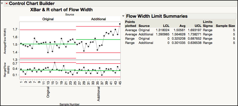
This calculates limits for both the original data and the additional data, as shown in Figure 3.33.
Figure 3.33 Phase Control Chart for Combined Flow Width Data

The two Range charts show that the two groups of data have similar average ranges, as shown by the green lines. The XBar charts show that the average of the additional data is larger than the average of the original data, and there is a similar spread between the LCL and UCL. From the Limits Summaries table, we can calculate the average difference between the additional and original data as is 1.565- 1.506 = 0.059 microns.
Lognormal Probability Limits
Even though the process behavior chart is robust to departures from normality (see ISQC Section 6.2.5 or Wheeler and Chambers (1992) Section 4.3), there are situations where the normality assumption should be examined more closely. In ISQC Example 6.6, we demonstrated how to create an XmR control chart using the log-transformed wafer resistivity results (see Figure 3.24). Although the limits might be more appropriate to monitor wafer resistivity, it is more difficult to visually interpret the results in the natural log scale. To alleviate this problem, wafer resistivity might also be charted in the original units using the lognormal distribution. It does require several extra steps to set up the control chart, but interpretation of trends and unusual points is easier.
The following steps show how to evaluate the distribution of the data using the lognormal distribution directly and how to generate a limits table using a script for the Individual Measurement and Moving Range control chart. Note that the limits for the Moving Range chart do not need to be altered to accommodate the skew in the data.
1. Open Chapter 3 – ISQC Table 6.8.jmp.
2. Select Analyze ► Distribution. A launch window appears. Select Resistivity and select Y, Columns to add it to the window. Click OK when you are done.
3. Click on the red triangle next to Resistivity and select Continuous Fit ► Lognormal from the drop-down menu. The parameters for the fitted distribution appear in the window, with a drop-down menu labeled Fitted LogNormal. To add a lognormal probability plot, select Diagnostic Plot from the drop-down menu. The parameter estimates, and diagnostic plot are shown in Figure 3.34.
Figure 3.34 Lognormal Probability Plot for Wafer Resistivity
The lognormal probability plot is used to evaluate the appropriateness of the distribution for the data in a similar manner as the normal probability plot. The points should fall along the straight line and be mostly contained within the bands. The control limits are obtained using the parameter estimates for the lognormal distribution and the lognormal quantiles associated with “3σ” probabilities for a normal distribution, 0.135% (LCL) and 99.865% (UCL). These quantiles are easily obtained from JMP.
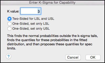
4. Click on the red triangle next to Fitted LogNormal and select Set Spec Limits for K Sigma. A dialog box appears (Figure 3.35), which prompts you for the K value and the desired limits (one- or two-sided). Tail probabilities corresponding to K standard deviations are computed and the probabilities are converted to quantiles from the lognormal distribution. To calculate 3σ control limits, enter 3 in the K Value box, select Two-Sided for LSL and USL.
Figure 3.35 Dialog Box for Lognormal Probability Limits

5. Click OK. The limits are shown in Figure 3.36.
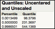
Figure 3.36 Lognormal Probability Limits for Resistivity Data
The requested quantiles are displayed and a capability analysis launches using the calculated limits (Figure 3.36). The lognormal quantiles associated with 3![]() limits are 98.3795 (LCL) and 543.1370 (UCL). While the K sigma approach for obtaining the limits does not require you to memorize the exact percentiles, it does not automatically produce the centerline (CL) needed for the control chart. To obtain the CL for the control chart, the quantile for the 50% percentile must be calculated from the lognormal distribution.
limits are 98.3795 (LCL) and 543.1370 (UCL). While the K sigma approach for obtaining the limits does not require you to memorize the exact percentiles, it does not automatically produce the centerline (CL) needed for the control chart. To obtain the CL for the control chart, the quantile for the 50% percentile must be calculated from the lognormal distribution.
6. Click on the red triangle next to Fitted LogNormal and deselect Quantiles and then select Quantiles. A dialog box appears allowing up to three probabilities. Enter 0.5 in the first field for the CL and 0.0013499 and 0.9986501 in the other two fields for the LCL and UCL (these two values are the Percentiles in Figure 3.36). Click OK.
Figure 3.37 Lognormal Centerline and Limits

Now that we have the lognormal limits (Figure 3.37), we must add them as Column Properties for the Resistivity variable in the JMP table and rerun the control chart, as we did in previous examples. Alternatively, we can use a JMP script to automatically calculate the lognormal quantiles and save them to a JMP table, which can be used to create the control chart.
7. Open Lognormal Quantile Limits.jsl and run the script. The limits are automatically calculated and placed in a JMP table. The table name is Chapter 3 – ISQC Table 6.8 Limits.
8. Save the table as Chapter 3 – ISQC Table 6.8 Limits.
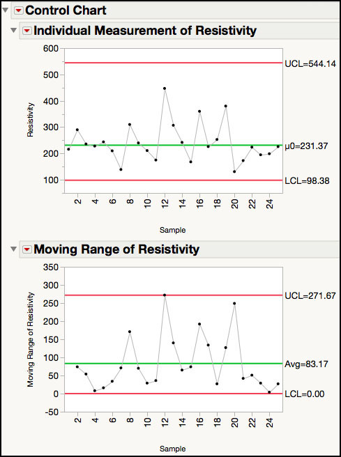
9. Select Analyze ► Quality and Process ► Control Chart ►IR. In the launch window, select Resistivity as the Process variable. Then select Sample and click Sample Label to identify the subgroup variable. Click Get Limits, select the control limits JMP table that we saved in Step 8, and click Open. Click OK. The chart is shown in Figure 3.38.
Figure 3.38 XmR Control Chart for Resistivity using Lognormal Limits
The control limits for the XmR control chart are now adjusted using the lognormal distribution and maintain the original scale of the data. In Figure 3.38, the limits are asymmetric around the centerline, which reflects the skew of the lognormal distribution. Note that only the limits for the Individual Measurement chart have changed. The limits on the Moving Range chart remain the same.
|
|
Statistics Note 3.4: There are times when the normality assumption should not be ignored and a more appropriate distribution should be used to calculate control limits. Some things to consider include excessive skew in the data, data that is close to a natural boundary condition (for example, 0 or 100), and normal-based limits that are non-sensible, such as negative values for a positive quantity. Appropriate distributions are well-documented for many physical and scientific phenomena. |
The chart in Figure 3.38 can also be generated using the Control Chart Builder platform.
1. Select Analyze ► Quality and Process ► Control Chart Builder.
2. Drag Resistivity from the left-hand window to the Y zone (Y axis). Similarly, drag Sample from the left-hand window to the Subgroup zone (X axis).
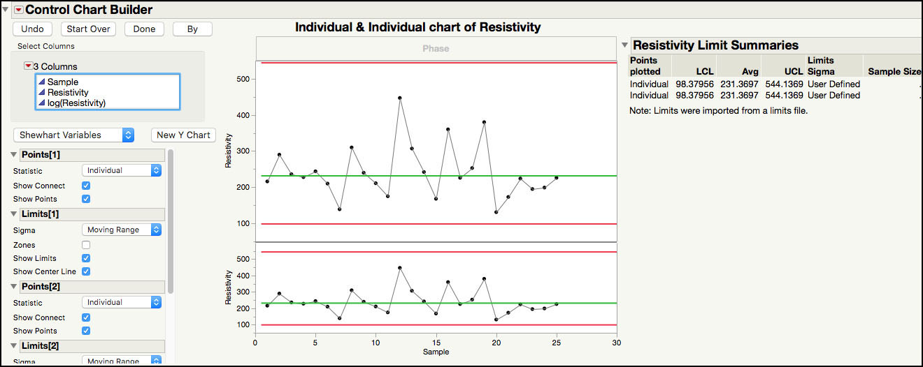
3. Once the chart appears, click on the red triangle next to the Control Chart Builder title, and select Get Limits as shown in Figure 3.39.
Figure 3.39 XmR Control Chart for Resistivity using Lognormal Limits
4. Then select the control limits JMP table that we saved in Step 8 in the previous example and click Open. Click OK. The chart with lognormal limits is shown in Figure 3.40. The Resistivity Limits Summaries report shows a note indicating that limits were imported from a limits file.
Figure 3.40 XmR Control Chart for Resistivity using Lognormal Limits

3-Way Control Chart and Variance Components
In ISQC Example 6.11, we observed many subgroup means that were outside of the control limits on the original XBar chart. For this data set, the violations are not due to assignable cause variation but to using the wrong source of within subgroup variation in the calculation of the control limits for the means. For each subgroup, because all five measurements are taken on the same casting, the assumption of independent samples might not hold. A violation of independent samples might deflate the within-subgroup variation and result in limits that are too narrow on the XBar chart.
There are many processes that require the use of 3-way charts to accommodate this issue, and they are usually easy to spot. As is the case with this example, almost all of the subgroup means will be outside of the control limits. However, there might be cases where it isn’t as obvious. A variance components analysis (VCA) of the data can add insight into the between- and within-subgroup variation. A VCA can be done in JMP using the Fit Model platform within the Analyze menu, or the Variability / Attribute Gauge Chart platform in the Quality and Process menu.
The following steps illustrate how to perform a variance components analysis using the Variability / Attribute Gauge Chart platform:
1. Open Chapter 3 – ISQC Table 6.11.jmp, which has variables called Sample Number, Vane, and Vane Height. Sample Number is the subgroup variable and Vane Height is the measurement.
2. Select Analyze ► Quality and Process ► Variability / Attribute Gauge Chart. A launch window appears.
3. Highlight Sample Number in the left-hand window and click Y, Response. Similarly, highlight Vane Height and click X, Grouping. Click OK. The default variability chart appears (Figure 3.41).
Figure 3.41 Default Variability Chart for Vane Height
The top graph shows the raw data, organized by subgroup, while the bottom graph shows the standard deviation estimates for each subgroup. There are many options that can be adjusted on the default output.
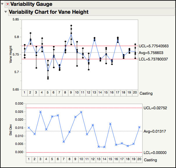
4. Hold down Alt and click on the red triangle at the top of the window. A menu for all of the available options is displayed (Figure 3.42a). For example, to re-create the XBar and Standard Deviation charts in the Options window, click Connect Cell Means, XBar Control Limits, and S Control Limits. Then click OK. The output is shown in Figure 3.42b.
Figure 3.42a Re-creation of the XBar and Standard Deviation Chart
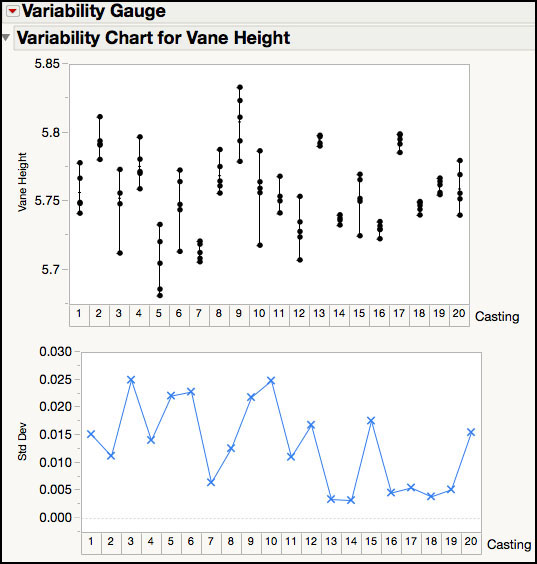
Figure 3.42b Re-creation of the XBar and Standard Deviation Chart

This is a similar chart to the one shown in Figure 3.26. However, because this is a variance components analysis, let’s remove the bottom chart and the control limits for the top chart.
5. Hold down Alt and click on the red triangle to launch the Options window. Deselect XBar Control Limits, S Control Limits, and Std Dev Chart. Select Variance Components and click OK. The results are shown in Figure 3.43.
Figure 3.43 Variance Components Analysis of Vane Heights
The variance components output includes an Analysis of Variance (ANOVA) table, where subgroups are treated as a fixed effect, and a Variance Components Estimates table, where the subgroups are treated as random effects. The F Ratio in the ANOVA is large and indicates that at least one of the subgroup averages is different from the overall mean, based on the within-subgroup variation. This result supports the many out-of-control points in the XBar chart.
The variance component analysis of this data reveals that the subgroup-to-subgroup (casting-to-casting) variation accounts for 75% of the total variation, while the within-subgroup (vane-to-vane) variation accounts for 25% of the total variation. It is difficult to provide an exact cutoff for what percent of the subgroup-to-subgroup variation will result in the need for a 3-way chart. However, in the authors’ experience, when a process is in control and the samples are independent, a VCA will result in a subgroup-to-subgroup variance component that contributes 1% or less to the total variation. If there is assignable cause variation with some out-of-control points, the subgroup variation might account for 25% of the total. Any subgroup contribution of 50% or more to the total variation is highly suspect, and the reader should consider the use of a 3-way control chart.
|
Statistics Note 3.5: Whenever the subgroup size is > 1, the data hierarchy structure should be investigated to set meaningful control limits for the XBar chart. When the subgroup-to-subgroup variation is substantially larger than the within-subgroup variation, the XBar limits will be too tight and there will be many points outside of the control limits. This occurs in many batch processes, where multiple measurements are taken per each run of a batch (for example, rolled goods, semiconductor wafers, and vats of chemicals). |
Rational Subgrouping
Rational subgrouping is a key concept when designing efficient process behavior charts because, depending on how the subgroups are organized, different signals might appear or not appear in the charts. ISQC Section 6.2.2 discusses the important rational subgroups play “in the use of XBar and R charts”, and Section 5.6 of Wheeler and Chambers (1992) provides a good description of the issues you might face if the subgroups are not matched to the structure present in the data.
In their article Designing Insightful Process Behavior Charts, Ramírez and Zangi (2014) define rational subgrouping as “the process of organizing the data into groups of like things that reflect the context and sources of variation present in the data.” They use the injection molding example of Section 5.6 of Wheeler and Chambers to demonstrate how easy it is to use the Control Chart Builder to investigate different organizations of the data and how “the careful design of the process behavior chart can reveal patterns that a “default” software chart might mask.” They also point out that “even when the charts are designed carefully, it is important to rationally think about the allocation of the different sources of variation to subgroups.”
