Chapter 6: Process Health Assessment
Process Health Assessment Review
JMP Platforms for Process Health Assessments
Process Health Assessment Using the Control Chart Builder
Process Health Assessment Using the Process Screening Platform
Process Health Assessment Using the Process Capability Platform
Overview
This chapter illustrates how to assess the health of a process by evaluating the stability and capability of the process parameters. The concepts will be illustrated using the Process Screening platform in JMP, which was introduced in version 13, and examples based on a composite data set from a number of sources. The techniques presented in this chapter apply to measurements using a continuous scale.
Process Health Assessment Review
In this chapter, we illustrate techniques to carry out a process health assessment or PHA. The inspiration for this chapter is the addition of the Process Screening platform, introduced in JMP version 13. There is not a one-to-one connection between this chapter and a specific chapter in ISQC 7th edition, like there is for the other chapters in this book. However, many ideas found in this chapter were discussed in ISQC chapters. For example, SPC for variables data was presented in ISQC Chapter 6 and Process Capability was discussed in ISQC Chapter 7.
There are two key dimensions to assessing the health of a process which include, evaluating the capability and the stability of the process parameters. In order to evaluate the process capability, a parameter must have a specification or performance limits. As was previously discussed in Chapter 5 in this book (ISQC Chapter 8), process capability indices, such as Pp or Ppk are often used to determine how well a parameter meets its specification limits. A capable process is one that has a high probability of meeting the specification and produces no, or very little defective units. ISQC Chapter 8 defines a capable process as one with Ppk > 1.
|
|
Statistics Note 6.1: Process capability indices have two notations depending on how the standard deviation, sigma, is estimated. If sigma is estimated using a long-term estimate of variation, then the index uses P (performance), giving Pp or Ppk. The formula for Pp is , where s is the sample standard deviation. If sigma is estimated using a short-term variation estimate, the index uses C (capability), giving Cp or Cpk. The formula for Cp is , where is the short-term estimate from a XBar and R chart. For an IR the short-term is estimated using . See also Section 8.3 in ISQC Chapter 8. |
Process stability is traditionally assessed by looking for violations of runs tests, such as, Western Electric Rules, on a Shewhart control chart. If runs tests violations are present, then the process is deemed to be unstable, otherwise the process is stable. While this approach has a long history of use and is straight forward, it has several limitations. For example, examining the stability of many parameters would be difficult since it would require someone to view and examine many control charts and summarize their outcome. An even bigger challenge relates to the false alarms associated with the use of these tests. Britt, Ramírez, and Mistretta (2016) quantify the false signaling rates for Nelson rules 1 through 4, when n = 30 to n = 100 subgroups are plotted on an XmR chart. They point out that the false signaling rate is as high as 50% for n=100.
Process stability metrics were proposed by Ramírez and Runger (2006) to quantify the stability of a parameter. One such metric is the Stability Ratio (SR); which is a measure of the long-term to short-term variation, SR = σ2long-term / σ2short-term. The long-term variation can be estimated using the overall sample variation, s2, using all the data, while the short-term variation is estimated from the within-subgroup variation that is used to construct the control limits in a Shewhart chart. For example, for an XmR chart, the estimate of short-term variation is given by and the stability ratio . If the process is stable, operating with common cause variation, then these two estimates of variation will be similar and SR will be close to 1. However, if the process is unstable, operating with special cause variation, then the long-term variation will be larger than the short-term variation and SR > 1. Ramírez and Runger use an approximate test of significance based on the F-distribution to classify the performance of a parameter as stable or unstable. The performance of the SR Test is documented in Britt, Ramirez, and Mistretta for random noise and step shifts in the mean using an XmR chart for a different number of subgroups from n = 30 to n = 100. As of JMP version 13, the SR is classified, by default, using a value of 1.5 for all sample sizes. If SR < 1.5 then the parameter is stable; otherwise it is unstable. Section 6.4 of ISQC Chapter 6 also discusses the impact of process instability on estimates for sigma.
For a given parameter, the Stability Ratio can be combined with Ppk to determine the health of the process. The outcome of the two assessments results in four distinct process states. In theory, a continuous improvement strategy would accompany each of the four process states. An ideal situation occurs when the parameter is classified as capable (Ppk > 1.33) and stable (SR <1.5). Since the process is meeting customer requirements in a predictable manner, the focus is on maintaining this state of performance. In contrast, the least ideal situation occurs when the parameter is incapable (Ppk < 1.33) and unstable (SR >1.5). Some suggest that the process should first be brought into a state of control and then re-engineered to meet specifications. Another scenario occurs when the parameter is incapable (Ppk < 1.33) and stable (SR <1.5). This might result in a potential yield issue. In this scenario, the process is performing to its potential but might require extra resources to meet customer demand. Finally, the parameter might be capable (Ppk > 1.33) and unstable (SR >1.5). Unfortunately, this scenario is often ignored, since the product is within specification. However, in this situation, an effort should be made to reduce variation and increase the predictability of the process. In ISQC Section 7.5, Montgomery provides actions to taken to improve the process for the four process states.
JMP Platforms for Process Health Assessments
The Process Screening platform is used to assess the process capability and process stability of multiple process parameters. In addition, the Stability Ratio is available in the Process Capability and the Control Chart Builder platforms. These platforms were introduced in Chapter 2. In this chapter, we focus on the use of these platforms for continuous data. Table 6.1 provides a summary of the features we find most useful in each one.
Table 6.1 Overview of JMP Features for Process Health Assessment Platforms
|
JMP Feature |
Process |
Process |
Control Chart |
|
Process Stability Metrics |
Stability Ratio, Control Chart Alarm Rates and Alarm Counts, Latest Alarm. |
Stability Ratio |
Stability Ratio |
|
Process Capability Metrics |
Ppk, Cpk, Out of Spec count and rate, Spec Centered Mean, Spec Scaled Standard |
Cpk, Cpl, Cpu, Cp, Cpm, Ppk, Ppl, Ppu, Pp, Nonconformance (actual and estimated) |
Cpk, Cpl, Cpu, Cp, Cpm, Ppk, Ppl, Ppu, Pp, Nonconformance (actual and estimated). |
|
Process Performance Graph |
Yes |
Yes (called Process Performance Plot) |
No |
|
Control Charts |
Thumb nail of charts in platform or link to Control Chart |
N/A |
XmR, Xbar & Range, Xbar & Std Dev, 3-Way Chart. |
|
Process Capability Graphs |
Goal Plot in platform or link to Process |
Goal Plot, Capability Box Plots, Capability Index Plot, Normalized Box Plots, Histograms overlaid with specifications and normal distribution. |
Histograms overlaid with specifications and normal distribution. |
|
Number of |
One or many |
One or many |
One |
|
Links to other platforms |
Process Capability & Control Chart Builder |
N/A |
N/A |
|
Column Properties |
Requires Spec Limits. |
Spec Limits are preferred but not required. |
Requires Spec Limits. |
|
Process shifts and drifts |
Metrics and graphs provided to detect a step change or drift in the process mean, using other techniques. |
N/A |
N/A |
Examples for Chapter 6
As was noted previously, there is not a one-to-one connection between this chapter and a corresponding chapter in ISQC. Therefore, the data presented here is a composite from data in Ramirez (2016), exercise data sets from ISQC Chapter 10 and simulated data. We loosely refer to this JMP table name as Semiconductor. The specification limits for each process variable were set to illustrate a given process state. The same JMP table will be used in all examples presented in this chapter. However, the specific parameters were selected to illustrate different concepts and highlight important features of the Process Screening platform.
Table 6.2 Overview of Process Health Assessment Examples
|
JMP |
Column Name |
JMP Platform |
Key Points |
|
Chapter 6 – |
E |
Control Chart |
Perform PHA for a stable and capable parameter |
|
Chapter 6 – |
D |
Control Chart |
Perform PHA for an unstable and capable parameter |
|
Chapter 6 – |
A |
Control Chart |
Perform PHA for a stable and incapable parameter |
|
Chapter 6 – |
J |
Control Chart |
Perform PHA for an unstable and incapable parameter |
|
Chapter 6 – |
A through J |
Process Screening |
Perform PHA for ten parameters; graphical and statistical output. |
|
Chapter 6 – |
A through J |
Process Capability |
Perform PHA for ten parameters and show key features of this platform. |
Process Health Assessment Using the Control Chart Builder
In this section, we will show how to carry out a process health assessment for a single parameter using the Control Chart Builder. The JMP data table contains 10 parameters to assess the overall health of this process. Each parameter has a specification that represents an internal release limit. The data includes one hundred measurements and is assumed to represent 4 months of manufacturing output. For each parameter, a subgroup size of n = 1 is appropriate and therefore, an XmR chart is used for monitoring purposes. We will illustrate the analysis for four parameters (E, D, A and J) in Chapter 6 – Semiconductor 6.1 and discuss their outcomes.
1. Open the JMP table Chapter 6 – Semiconductor 6.1.jmp, which has variables called Sample ID, A, B, C, D, E, F, G, H, I, and J. In this table, Sample ID is the subgroup variable, and A through J are the process parameters.
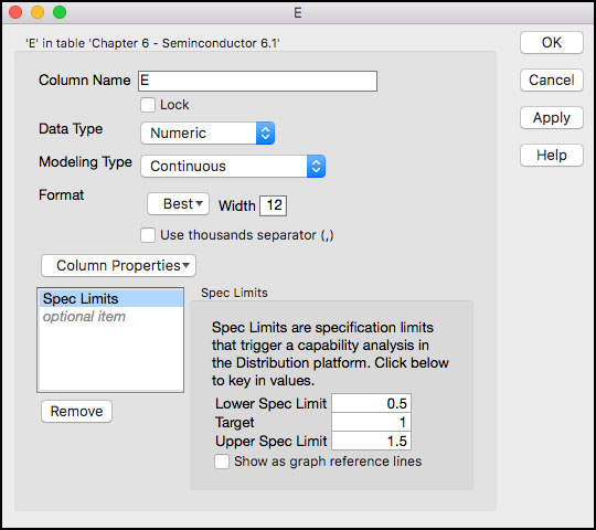
2. Double click on column E. The Column Information window will appear. Select Column Properties ► Spec Limits. Ensure that the specification limits are included: LSL = 0.5, Target = 1, USL = 1.5; otherwise enter them in the appropriate fields and then click OK. (see Figure 6.1).
Figure 6.1 Column Information for Parameter E
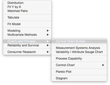
3. Select Analyze ► Quality and Process ► Control Chart Builder (Figure 6.2).
Figure 6.2 Launching the Control Chart Builder
4. From the Columns Window on the left-hand side, drag parameter E to the Y zone. Click Warnings(1) and select Tests 1 and 2 (Figure 6.3).
Figure 6.3 Control Chart Builder Output for Parameter E

5. Click Done when finished. The output is shown in Figure 6.4.
Figure 6.4 PHA for Parameter E

The output shown in Figure 6.4 can be used to assess the health for parameter E in terms of its capability and stability. The process capability index Ppk is used to determine if the process is capable. In JMP, by default, a process is capable if its Ppk ≥ 1.33, but this value can be changed to accommodate different levels of capability. Since Ppk = 2.24, Parameter E can easily meet its specification limits, LSL = 0.5 and USL = 1.5. The histogram in Figure 6.4 indicates that the data is well within the specification, but slightly off target, toward the USL. If the process can be centered to the target = 1, then Ppk = Pp = 3.1. The Nonconformance table indicates that none of the results exceed the specification limits and none are expected to, based on probability calculations using the normal distribution approximation.
Process stability is assessed using the Stability Ratio. Recall, the Stability Ratio measures the long-term variation (overall sigma) to the short-term variation (within sigma). The long-term variation is estimated using the sample variance, or “overall sigma” in Figure 6.4: s2 = 0.0537162. The short-term sigma is estimated from the moving range control chart using , or “within sigma” in Figure 6.4, s2MR = 0.0526372. Finally, SR = s2 / s2MR = 0.0537162 / 0.0526372 = 1.04.
For a stable process operating with common cause variation, SR = 1 and, SR > 1 for an unstable process, operating with special cause variation. JMP proposes a default critical value for SR of 1.5 to determine if a process is stable or not. A more accurate critical value can be obtained by obtaining the critical value from an F-distribution using the degrees of freedom described in Ramírez and Runger (2006). For this parameter, which uses an XmR chart and N = 100, the F-critical is the quantile associated with F0.95, (100-1), 0.62(100-1) = F0.95, 99, 61.38 =1.48. Since the Stability Ratio for parameter E is 1.04 < 1.48, the parameter is stable. The control chart also indicates that the behavior is stable over time, with most points randomly bouncing around the mean, and no violations in Test 1 or Test 2.
|
|
Statistics Note 6.2: The critical value for the Stability Ratio for a parameter monitored using an XmR control chart can be estimated using the 95% quantile associated with an F-distribution with n−1 and 0.62(n−1) numerator and denominator degrees of freedom, respectively. |
The overall assessment for parameter E is Capable and Stable. This is an ideal situation and the focus should be on maintaining this level of performance over time.
6. Repeat Step 3 and from the Columns Window on the left-hand side, drag parameter D to the Y zone. Click Warnings(1) and select Tests 1 and 2. Click Done when finished. The output is in Figure 6.5.
Figure 6.5 PHA for Parameter D

This output shown in Figure 6.5 can be used to assess the health for parameter D, in terms of its capability and stability. Since Ppk = 1.73 ≥ 1.33, Parameter D can meet its specification limits, LSL = 10 and USL = 90. The histogram in Figure 6.5 shows that the data is well within the specifications and is on target. The Nonconformance table indicates that none of the results exceed the specification limits and none are expected to, based on probability calculations using the normal distribution approximation.
For process stability, the long-term variation is estimated using the sample variance, or “overall sigma” in Figure 6.5: s2 = 7.215212. The short-term sigma is estimated from the moving range control chart using , or “within sigma” in Figure 6.5, s2MR = 5.74782. Finally, SR = s2 / s2MR = 7.215212 / 5.74782 = 1.58. Since the sample size is also N = 100 for this parameter, the default critical value of 1.5 can be replaced by the more accurate value of 1.48. The Stability Ratio for parameter D is 1.58, which is greater than 1.48, so the parameter is unstable. The control chart also indicates that the behavior is unstable over time, with several points outside of the control limits and a run of 15 points above the centerline.
The overall assessment for parameter D is Capable and Unstable. Although the results are within the specification limits, the spurious data points might be indicative of extraneous variation in the process, which could eventually result in an out-of-specification point. The run of fifteen points above the centerline is also suspicious.
7. Repeat Step 3 and from the Columns Window on the left-hand side, drag parameter A to the Y zone. Click Warnings(1) and select Tests 1 and 2. Click Done when finished. The output is shown in Figure 6.6.
Figure 6.6 PHA for Parameter A

This output shown in Figure 6.6 can be used to assess the health for parameter A, in terms of its capability and stability. Since Ppk = 0.98 < 1.33, Parameter A is incapable of meeting its specification limits, LSL = 60 and USL = 90. The histogram in Figure 6.6 shows that the data is close to the upper specification, and slightly below target. The Nonconformance table indicates that 2% (n=2) of the results exceeded the specification limits and 0.1666% are expected to, based on probability calculations using the normal distribution approximation.
For process stability, the long-term variation is estimated using the sample variance, or “overall sigma” in Figure 6.6: s2 = 4.39572. The short-term sigma is estimated from the moving range control chart using , or “within sigma” in Figure 6.6, s2MR = 4.52362. Finally, SR = s2 / s2MR = 4.39572/ 4.52362 = 0.94. Since the sample size is also N = 100 for this parameter, the default critical value of 1.5 can be replaced by the more accurate value of 1.48. The Stability Ratio for parameter A is 0.94, which is less than 1.48, so the parameter is stable and operating with common cause variation. Note that the one point outside of the control limit might be a false signal or indicative of a smaller shift in the mean.
The overall assessment for parameter A is Incapable and Stable. This means that the process is doing its best, as designed. Since the parameter is closer to target, the capability can be more significantly improved by reducing the overall variation.
8. Repeat Step 3 and from the Columns Window on the left-hand side, drag parameter J to the Y zone. Click Warnings(1) and select Tests 1 and 2. Click Done when finished. The output is in Figure 6.7.
Figure 6.7 PHA for Parameter J

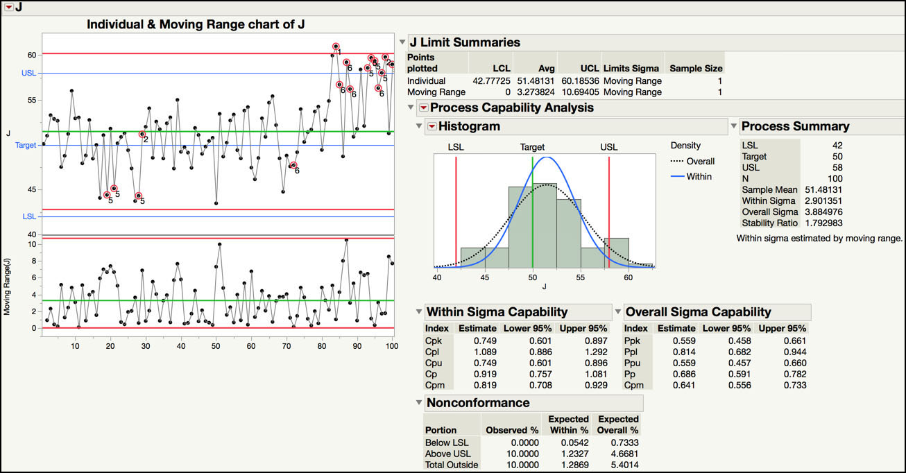
The output shown in Figure 6.7 can be used to assess the health for parameter J, in terms of its capability and stability. Since Ppk = 0.58 < 1.33, Parameter J is incapable of meeting its specification limits, LSL = 42 and USL = 58. The histogram in Figure 6.7 shows that the data is close to, or outside of, the specifications, and slightly above target. The Nonconformance table indicates that 10% (n = 10) of the results exceeded the specification limits and 5.4% are expected to, based on probability calculations using the normal distribution approximation.
For process stability, the long-term variation is estimated using the sample variance, or “overall sigma” in Figure 6.7: s2 = 3.884972. The short-term sigma is estimated from the moving range control chart using , or “within sigma” in Figure 6.7, s2MR = 2.901352. Finally, SR = s2 / s2MR = 3.884972/ 2.901352 = 1.79. Since the sample size is also N = 100 for this parameter, the default critical value of 1.5 can be replaced by the more accurate value of 1.48. The Stability Ratio for parameter J is 1.79, which is greater than 1.48, so the parameter is unstable and operating with special cause variation. The control chart shows several runs tests violations and, a closer examination, shows a potential shift in the mean at the end of the series.
The overall assessment for parameter J is Incapable and Unstable. This is the most undesirable situation. Some experts suggest trying to first bring the process into a state of control and then trying to re-center the process.
|
|
JMP Note 6.1: The specification limits must be specified in the Spec Limits Column Property to produce the process capability and process stability metrics using the Control Chart Builder. |
Process Health Assessment Using the Process Screening Platform
In this section, we will show how to carry out a process health assessment for many parameters using the Process Screening platform. We will use the same JMP data table, Chapter 6 – Semiconductor 6.1.jmp, which contains 10 parameters to assess the overall health of this process. Recall, each parameter has a specification that represents an internal release limit. The data includes one hundred measurements and it is assumed to represent 4 months of manufacturing output. For each parameter, a subgroup size of n = 1 is appropriate and therefore, an XmR chart is used for monitoring purposes.
The following steps illustrate how to use the Process Screening platform.
1. Open Chapter 6 – Semiconductor 6.1.jmp, which has variables called Sample ID, A, B, C, D, E, F, G, H, I, and J. In this table, Sample ID is the subgroup variable, and A through J are the PHA parameters.
2. Make sure that all parameters have their specification limits included in the Spec Limits Column Properties in the JMP table. This can be verified by double clicking on the column label (for example, A and selecting Column Properties ► Spec Limits). Alternatively, we can click on the * symbol next to each column name in the Columns panel in the left-hand side of the JMP table. A list of the column properties will pop up. We can select Spec Limits to view the limits entered (Figure 6.8).
Figure 6.8 Identifying Column Properties

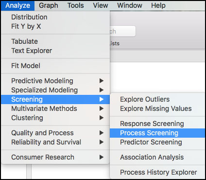
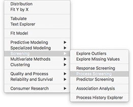
3. From the main menu, select Analyze ► Screening ► Process Screening (Figure 6.9).
Figure 6.9 Launching the Process Screening Platform
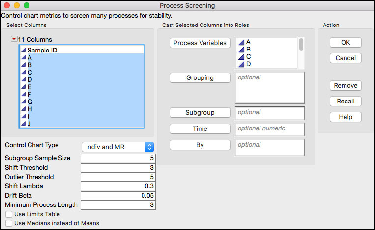
4. A launch window will appear. In the left-hand window, click A and hold the shift key and select J, so they all parameters are highlighted and then click Process Variables. Make sure that Control Chart Type is set to Indiv and MR. Leave the default settings for the remaining fields. Some of these will be discussed later in this section.
Figure 6.10 Launch Window for Process Screening
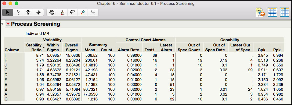
5. Click OK when finished. The default output contains the Stability Ratio, the within and overall estimates of variability, alarm rates for runs tests, and capability information (Figure 6.11).
Figure 6.11 Process Screening Default Output
6. Click on the red triangle next to the Process Screening banner at the top of the window to bring up a list of options. A brief description of some of the options that we will illustrate in this chapter is shown below. To launch the online help, click on the ? at the top of the window and then click anywhere in the default output shown in Figure 6.11.
Figure 6.12 Process Screening Platform Options
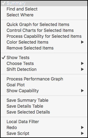
a. Quick Graph for Selected Items: produces thumbnail size graphs for all parameters selected in the Summary table. The plots contain the control limits and specification limits, if the y-axis scale permits them.
b. Control Charts for Selected Items: launches the Control Chart Builder, which contains default output of control chart with runs tests engaged, and the process capability analysis and stability ratio metrics.
c. Process Capability for Selected Items: launches the Process Capability platform, which contains default output of process capability indices, Stability Ratio information, Goal Plot, Capability Box Plots, and Capability Index Plot.
d. Show Tests: shows or hides the information associated with Nelson test excursions, for example, Alarm Rate, Alarm Counts, and Latest Alarm, in the Summary table.
e. Choose Tests: used to select the specific Nelson rules (1 through 8) or Range excursions to include in the Summary table.
f. Shift Detection: provides options for detecting shifts in the parameter over time, after outliers are removed. Shift detection includes step changes in the mean, greater or equal to one within-sigma unit, using outlier-correction and an exponentially weighted moving average (EWMA) smoothing approach for the individual observations. Options include adding shift detection statistics to the Summary table and graphs.
g. Process Performance Graph: produces a graph that plots Ppk versus the Stability Ratio for all parameters included in the Summary table. The graph is divided into four quadrants: Stable & Capable, Capable but Unstable, Incapable but Stable and Incapable and Unstable. The default boundary to classify a parameter as Capable is Ppk ≥ 1.33; while the default boundary to classify a parameter as Stable is Stability Ratio ≤ 1.5. These default boundaries can be changed.
h. Process Performance Graph Boundaries: this option is added to the menu shown in Figure 6.12, once the Process Performance Graph is selected. A window is launched to change the Ppk and Stability Ratio boundaries to create the four quadrants.
i. Show Capability: shows or hides the information associated with the Capabilities in the Summary table. By default, all are shown except for Spec Centered mean and Spec Scaled Dev.
7. From the red triangle at the top of the window, select Process Performance Graph. Highlight the parameters in the Summary table by clicking on I and then G, while holding the shift key. Right-click in the Process Performance Graph and select Row Label from the menu. The output is shown in Figure 6.13.
Figure 6.13 Process Performance Graph
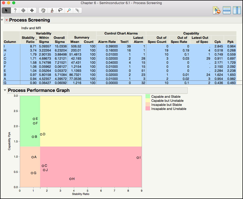
The Summary table in Figure 6.13 is ordered by the Stability Ratio, where the most unstable parameter (largest value) is shown first and the most stable process (smallest value) is shown last. For example, for process parameter I, SR = s2 / s2MR = 15.03362/ 5.093572 = 8.71, which would be classified as unstable. In addition, since Ppk = 0.964, Parameter I is also incapable. Therefore, Parameter I is in the most undesirable quadrant: Incapable and Unstable. Note Cpk = 2.845, is also calculated using the average moving range, and is considered the potential capability if the process is stable. Additional information for Parameter I in the Summary table includes the Mean = 506.52, the sample size Count = 100, the Alarm Rate = 0.39 (= 39 / 100) for Test 1, number of Test1 signals = 39, and the Latest Alarm for a Test 1 signal occurred in the last point. Also, no points were included in the Out of Spec Count, the Out of Spec Rate is zero and the Latest Out of Spec is missing.
|
|
Statistics Note 6.3: The Stability Ratio can also be calculated as a function of the capability indices. That is, . For parameter I |
While the individual statistics are useful, the Process Performance Graph in Figure 6.13 makes it much easier to view and interpret this information. This graph plots a parameter’s Ppk versus its Stability Ratio. It is easy to see that B, E, and F are in the ideal state, D is capable but not stable, A and G are incapable but stable, and C, H, J and I are in the most undesirable state, Incapable and Unstable. We can see that for this process Ppk ranges from less than 0.5 to almost 2.5; while the Stability Ratio takes on values from a low of 0.9 all the way up to 8.7.
8. With all the parameters still highlighted, as is shown in Figure 6.13, click the red triangle at the top of the window, and select Quick Graph for Selected Item.
Figure 6.14 Quick Graph of Parameters A through

The graph in Figure 6.14 shows trend plots for the parameters, where the green lines represent the control limits for the Individuals charts. Some plots also include the specification limits, using blue dashed lines, if the scale of the Y axis allows it. From this plot, we can get a sense for the stability for each of the parameters. For example, parameters A, B, E, F, and G appear to be relatively stable about their centerlines. However, parameter H and I appear to have cycles and are nonstationary and J is trending up at the end of the series. A closer examination of the behavior can be made using the Control Chart Builder output.
9. From the red triangle at the top of the window, select Control Charts for Selected Item. Make sure all the parameters are still highlighted, as is shown in Figure 6.13. The output is in Figure 6.15.
Figure 6.15 Control Chart Builder Output for Parameter H

The control charts for the selected parameters will appear in the same window. The scroll bar can be used to move up and down the window. In Figure 6.15 the default output is shown for parameter H. All of the Nelson rules are automatically selected. Some or all of these can be turned off by selecting Show Control Panel from the red triangle next to the parameter label (H) and clicking on Warnings[1] and Tests and then deselecting the undesired tests. The control chart will be automatically updated. The stability ratio and process capability metrics are shown in the right-hand side of the output. Note this output is the same as the one discussed in the last section, Process Health Assessment Using the Control Chart Builder.
The control chart for Parameter H has many Nelson rule violations. Recall the alarm rate was 16%, or 16 out of 100 subgroups, from Figure 6.13. The Stability Ratio for H is 3.74, which means that the long-term variation is approximately four times as large as the short-term variation. These two results indicate excessive variability from a process operating with common cause variation, randomly about its mean. A closer examination of the charts shows a non-random trend, with cycles or drifts up and then down. This data stream seems to represent an autocorrelated nonstationary process.
The process capability for Parameter H shows that the process mean is closer to the LSL, with Ppl = Ppk = 0.268. Even if the process is centered between the specifications, Pp = 0.535, which is still very low. Nineteen out of 100 results are below the LSL and 21.88% are predicted to be outside of the specification limits, using the normal distribution approximation. This parameter was found in the incapable and unstable quadrant of the Process Performance Graph.
Parameter J was also in the incapable and unstable quadrant. The control chart for Parameter J is shown in Figure 6.16. It is obvious that the process mean shifted upward around observation 80. The Stability Ratio for the entire series is 1.79, which is greater than the critical value of 1.48. This means that the process is operating with special cause variation. The index Ppk = 0.56, and there were 10 out of 100 results that exceeded the upper specification limit of 58. Prior to the shift around n = 80, the process appeared to be on target and meeting the specification limits.
Figure 6.16 Control Chart Builder Output for Parameter J
The shifts and drifts in the plots can be further explored using the tools within the Process Screening platform.
10. Go back to the Process Screening platform by clicking on it. From the red triangle at the top of the window select Shift Detection ► Largest Upshift, Largest Downshift and Shift Graph.
11. In the Process Summary table, highlight Parameter I, H, and C and then select Quick Graph for Selected Items, from the main menu.
12. From the red triangle at the top of the window select Shift Detection ► Show Shifts in Quick Graphs. The output is shown in Figure 6.17.
Figure 6.17 Shift Detection Output for Parameters C, H and I
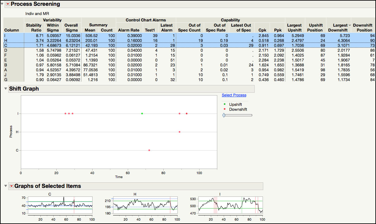
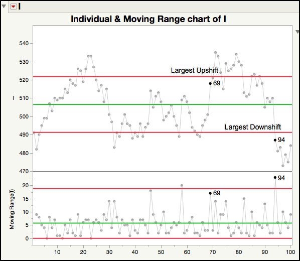
The shift detection statistics are added to the last four columns in the Summary table, shown in Figure 6.17, and the Shift Graph is shown below the table, with markers located at the local peaks of the shifts. For example, for Parameter I, the largest upshift occurred at subgroup 69 and is 5.29 within-sigma units, while the largest downshift occurred at subgroup 94 and is 5.72 within-sigma units. Although the graph of Parameter I shown below the Summary table can be used to visualize the location and size of each shift, it is easier to study them using the control chart output. From within the Control Chart Builder output, after removing the runs tests, position your pointer over the points and locate and click on the point for subgroup 69. Holding the Ctrl key, do the same for subgroup 94. Right-click and select Rows ► Row Label.
|
|
JMP Note 6.2: In the Shift Graph, green markers indicate upshifts and red markers indicate downshifts. The markers are located at the local peaks of the shifts. |
In Figure 6.18, it is easier to see the upward step change in the mean that occurred at subgroup 69. The subgroup is also highlighted in the JMP table and we can see that the results directly preceding the 69th subgroup are around 500 and at the 69th subgroup, they increase to 518 and higher. Similarly, the results directly preceding the 94th subgroup are around 510 and then drop to 487 and lower, starting at the 94th subgroup.
Figure 6.18 Largest Upshift and Downshift for Parameter I in the XmR Chart
The Shift Graph in Figure 6.17 shows upward and downward shifts that have a size that exceeds the number of within-sigma units specified by the Shift Threshold (three by default, which you can see if you however over the diamond in the slider). For this data set, it includes shifts that exceed 3 within-sigma units for Parameters I, H and C, and they are shown in the same order as the Summary table. For Parameter I there are four additional downward shifts. Three of them occur between subgroups 20 and 30 and one occurs around subgroup 88 prior. In order to see the locations where a shift of 4 or greater within-sigma units occurs, right-click on the diamond in the slider bar and select Set Value …. In the dialog box enter 4 and click OK. The Shift Graph shown in Figure 6.19 is the graph that appears after we click OK. Now Parameter I only has one additional downshift that is at least 4 within-sigma units, occurring around subgroup 30.
|
|
JMP Note 6.3: The Shift Graph does not show the positions of Largest Upshift and Largest Downshift values that appear in the Summary table if the shifts are less than the specified Shift Threshold number of within-sigma units in magnitude. |
Figure 6.19 Shift Graph for Parameters C, H and I

13. From the red triangle at the top of the Process Screening window (Figure 6.17) deselect all options associated with upshifts and downshifts. Next select Shift Detection ► Drift Summaries.
14. Right-click in the Summary table and select Sort By Column… and select Mean Abs Drift from the drop-down list and click OK.
15. Highlight the first three parameters I, J and H, in the Summary table and select Shift Detection ► Drift Graph Selected.
Figure 6.20 Drift Summaries for Parameters H, I and J

The Drift Summaries output is shown in Figure 6.20. Three columns are added to the end of the Summary table, which include the Mean Up Drift, the Mean Down Drift and the Mean Abs Drift. Parameters I, J, and H have the largest drifts. Incidentally, these also have the largest Stability Ratios. For example, for Parameter I, the average of the positive drifts as Mean Up Drift is 0.0218, the average of the negative drifts as Mean Down Drift is -0.031, and the Mean Abs Drift is 0.0526, which is the average of the absolute value of the positive and negative drifts.
|
|
Statistics Note 6.4: Shift detection is not designed to detect slow drifts in the mean. JMP uses the classic double-exponential smoothing model of Holt. As Sall (2018) points out “the smoother is being used for characterization, rather than forecasting, and “the future is known” with off-line data”. One smother is used to estimate the current level, while the other is used to estimate the slope of the drift. |
The Drift Graphs shown in Figure 6.20 provides a trend order plot of the data with a plot of drifts right below it. In the Drift plot, the shaded red areas indicate a downward drift, and the shaded green areas indicate an upward drift. For example, for Parameter I, the data series begins with an upward drift from subgroup 1 through 23, a downward drift through subgroup 45, an upward drift through subgroup 80, and then a downward drift through subgroup 100. In this plot, the first drift is the largest up drift and last drift is the largest down drift. Below each Drift graph, JMP displays the three parameters used in the double-smoother: the within sigma estimate (5.0936), the smoothing constant alpha (0.9) for the level smoother, and the smoothing constant beta (0.05) for the slope smoother.
We are going to turn our attention to the process capability functionality in the Process Screening platform.
1. From the red triangle, select Show Capability ► Spec Centered Mean and Spec Scaled Std Dev.
2. From the red triangle select Goal Plot. Highlight all of the columns in the Table Summary and right-click in the Goal Plot and select Row Label from the drop-down menu. The output is shown in Figure 6.21.
Figure 6.21 Process Capability Goal Plot for Semiconductor Data
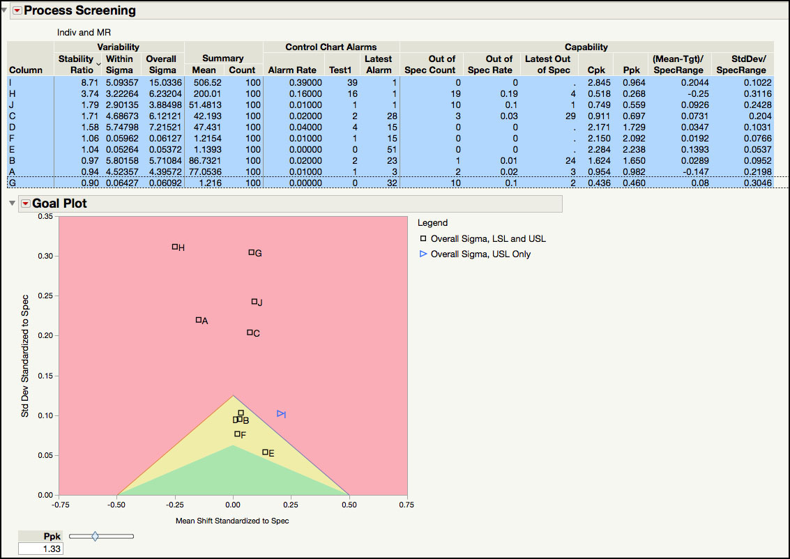
Two more process capability indices are added to the Summary table, as is shown in Figure 6.21. The first new column, (Mean – Tgt)/SpecRange, is the same as the Mean Shift Standardized to Spec, and the second column, StdDev/SpecRange, is the same as the Std Deviation Standardized to Spec in the Process Capability platform.
|
|
JMP Note 6.4: The mean shift and the standard deviation standardized to the specification limits for the jth column are defined as follows: |
These two new capability statistics are used to create the Goal Plot shown in Figure 6.21, where the Spec Centered Mean is plotted on the X axis and the Spec Centered Standard Deviation is plotted on the Y axis. Notice that the legend in this plot indicates that all parameters have a lower and upper specification limit, indicated by Overall Sigma, LSL and USL, except for Parameter I, which only has an upper limit, indicated by Overall Sigma, USL only. The larger the absolute value of the Spec Centered Mean the more off-centered the process mean is from its target value.
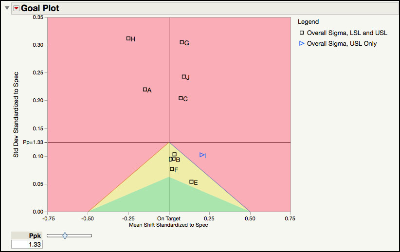
In Figure 6.22, the reference line on the X axis at zero indicates a process mean equal to its target value, positive values mean that the mean is higher than the target value and negative values mean that the mean is lower than the target value. The process mean for Parameter H is the farthest from its target value, with a value of the Spec Centered Mean = (200−205)/(215−195) = -0.25 . Since a target value is not included in the JMP table, the target value was calculated as the center of the specification limits. The mean for Parameter F is the closest to its target value: Spec Centered Mean = (1.2154 – 1.2) / (1.6 – 0.8) = 0.019. In Figure 6.22, the reference line on the Y axis at 0.2 is where Pp = Ppk = 1.33, for a perfectly centered process. The process capability increases below this line and decreases above it. For example, Parameter H has the largest Spec Centered Standard Deviation: 6.232 / (215 – 195) = 0.3116. In contrast, Parameter E has the lowest Spec Centered Standard Deviation: 0.05372 / (1.5 – 0.5) = 0.0537.
Figure 6.22 Goal Plot Revised with Reference Lines
|
|
JMP Note 6.5: For parameters that only have an upper specification, and do not have a target, the Spec Centered Mean, which is the x coordinate in the Goal Plot, is defined as . For process parameter I, in Figures 6.21 and 6.22 this gives . |
The Goal Plot has three shades of color. The red shaded area indicates where Ppk < 1.33 (the default value shown under the label in the slider). The yellow shaded area in the triangle indicates where 1.33 < Ppk < 2.66 ( = 1.33 x 2). The greed shaded area in the triangle is where Ppk > 2.66. No parameters are in the green shaded area; however, 4 parameters are in the shaded yellow area. Parameter E has a Ppk = 2.238, while Parameter D has Ppk = 1.729. The Ppk for the six parameters in the red shaded area are below 1.33. For example, Parameter H and Parameter C have a Ppk = 0.268 and Ppk = 0.697, respectively. Additional information can be included in the Goal Plot, such as a contour for the defect rate.
3. From the red triangle next to the Goal Plot label (Figure 6.21) select Defect Rate Contour.
4. A window will launch. In the field type 0.005 (Figure 6.23) and click OK when finished.
Figure 6.23 Defect Rate Contour for Semiconductor Data
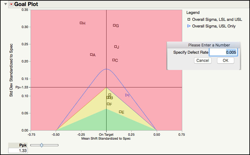
A blue line is added to the Goal Plot in Figure 6.23, which indicates the region where the estimated defect rate is less than the specified defect rate. The defect rate is estimated using the normal distribution. In Figure 6.23, below the blue line is where the defect rate is less than 0.005 or 0.5%; outside of the blue line is where the defect rate is greater than 0.5%. Five of the parameters (C, A, J, G, and H) might result in defect rates that exceed 0.5%.
5. In the Summary table, click H in the Column field (Figure 6.21). Alternatively, the parameter can also be selected in this table by clicking on its label in the Goal Plot. From the red triangle next to the Process Screening label select Process Capability for Selected Items. The partial output is shown in Figure 6.24.
Figure 6.24 Partial Process Capability Output for Parameter H
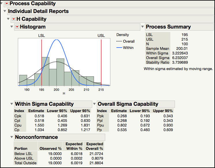
The Process Capability platform is launched from the Process Screening platform when this option is selected. Figure 6.24 shows the partial Process Capability output for Parameter H. This includes a Process Summary with the specification limits; sample size, within and overall sigma, and the Stability Ratio. The process capabilities indices are reported along with 95% confidence intervals, and the expected percent of nonconformance is calculated using the within and the overall sigma.
Process Health Assessment Using the Process Capability Platform
In this section, we will show how to carry out a process health assessment for many parameters using the Process Capability platform. We will use the same JMP data table, which contains 10 parameters to assess the overall health of this process. Recall, each parameter has a specification that is represents an internal release limit. The data includes one hundred measurements and represents several months of manufacturing. For each parameter, a subgroup size of n = 1 is appropriate and therefore, an XmR chart is used for monitoring purposes.
The following steps illustrate how to use the Process Capability platform.
1. Open Chapter 6 – Semiconductor 6.1.jmp, which has variables called Sample ID, A, B, C, D, E, F, G, H, I, and J. In this table, Sample ID is the subgroup variable, and A through J are the PHA parameters.
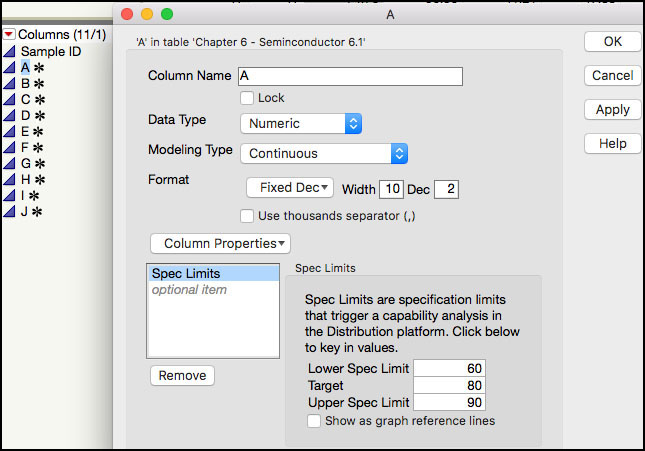
2. Make sure that all parameters have their Spec Limits included as Column Properties in the JMP table. This can be verified by double-clicking on the column label (for example, A and selecting Column Properties ► Spec Limits (Figure 6.25)). Alternatively, we can click on the * symbol next to each column name in the Columns panel in the left-hand side of the JMP table. A list of the column properties will pop up. We can select Spec Limits to view the limits entered.
Figure 6.25 Identifying Column Properties
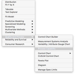
3. Select Analyze ► Quality and Process ► Process Capability (Figure 6.26).
Figure 6.26 Launching the Process Capability Platform
4. A launch window will appear. In the left-hand window, click A and hold the shift key and select J, so they all parameters are highlighted and then click Y, Process. Leave the default settings for the remaining fields (Figure 6.27).
Figure 6.27 Launch Window for Process Capability Platform
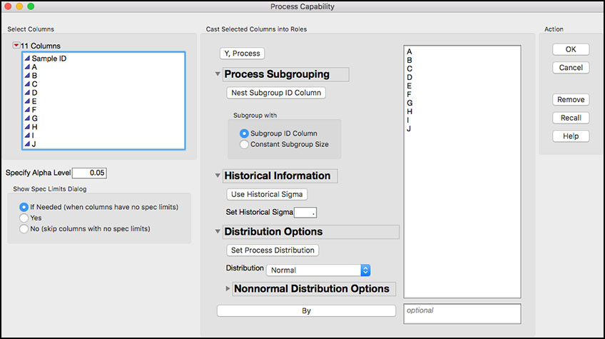
Note the dialog window has some unique features. The Distribution Options allows the user to identify different distributions for each parameter, such as, the normal, lognormal, gamma, or best fit. For more information see the online help.
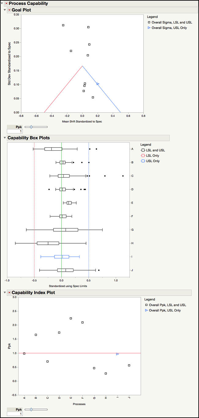
5. Click OK when finished. The default output is shown in Figure 6.28.
Figure 6.28 Process Capability Default Output for Semiconductor Data
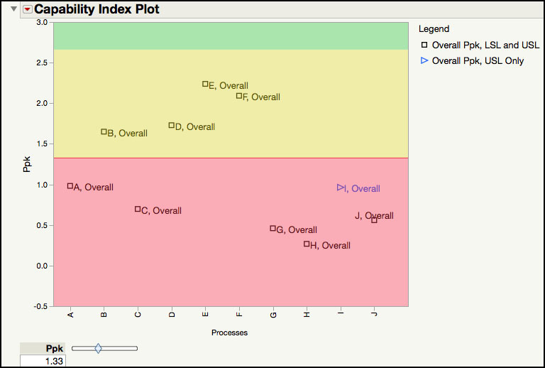
6. Click on the red triangle next to the Capability Index Plot and select Shade levels and Label Overall Sigma Points. Move the Ppk slider to 1.33 or alternatively, click in the box and type 1.33.
Figure 6.29 Capability Index Plot for Semiconductor Data
The default output for the Process Capability platform shown in Figure 6.28 includes the Goal Plot, Capability Box Plots, and Capability Index Plot. The Goal Plot was discussed extensively in the last section using the Process Screening platform (see discussion of Figure 6.21, Figure 6.22 and Figure 6.23). Since the options are the same in the Process Capability platform, it is not discussed further in this section.
The Capability Box Plots in Figure 6.28 show box plots for Parameter A through Parameter J, where the data and the specification limits are centered to their target values and scaled by the specification range. If the target value is centered between the lower and upper specification limits, then the green lines in the plot represent the standardized specification limits. For parameters where the target is not centered, only one of the dotted green lines represent the standardized specification limit, which is closer to the target value. The opposite green line represents the same distance in the opposite direction. From this plot, we can see that Parameters B, D, E, and F have the narrowest boxes, while Parameters G and H have the widest ones. We can also see that Parameter B, D, F and I are performing closest to their target values.
The Capability Index Plot in Figure 6.29 shows Ppk for each parameter. The legend on the right hand side shows different plotting symbols for those parameters with a 2-sided specification and those with a 1-sided specification. The shaded red area in the plot indicates Ppk < 1.33; the yellow shaded area is where 1.33 < Ppk < 2.66; and, the green area shows the parameters with Ppk > 2.66. This plot makes it easy to see the lower and higher performing Parameters. For example, Parameter E has the largest Ppk, while Parameter H has the lowest Ppk. There are six parameters with Ppk < 1.33 and four parameters with Ppk > 1.33.
The Process Capability platform has several other important options, including access to the Process Performance Graph.
7. Click on the red triangle next to the Process Capability banner at the top of the window to bring up a list of platform options (Figure 6.28). A brief description for some of the options that we will illustrate in this section is shown below. To launch the online help, click on the ? at the top of the window and then click anywhere in the default output shown in Figure 6.28.
Figure 6.30 Process Capability Platform Options
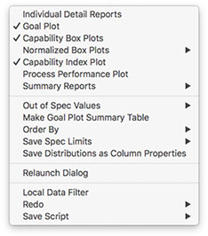
a. Individual Detail Reports: produces individual reports for each parameter, which includes the histogram, process summary information, process capability indices using within sigma and overall sigma and nonconformance estimates.
b. Goal Plot: produces a plot using the spec-normalized mean shift on the X axis and the spec-normalized standard deviation on the Y axis. The Ppk slider can be used to change the goal lines. The default is set to Ppk = 1.
c. Capability Box Plots: produces box plots for each parameter that are centered by their target value and scaled by specification range. The plot is helpful for comparing parameters with respect to their specification limits.
d. Normalized Box Plots: produces box plots for each parameter that are centered by their mean value and scaled by their standard deviation. The green lines are the normalized specification limits. The plot is helpful for comparing parameters with respect to their specification limits
e. Capability Index Plot: shows the Ppk for all parameters, where Ppk is plotted on the Y axis and each parameter name is on the X axis. If a non-normal distribution was used, it appears in the label for the parameter.
f. Process Performance Plot: produces a graph that plots Ppk versus the Stability Ratio for all parameters included in the Summary table. The graph is divided into four quadrants: Stable and Capable, Capable but Unstable, Incapable but Stable and Incapable and Unstable. The default boundary to classify a parameter as Capable is Ppk ≥ 1.33; while the default boundary to classify a parameter as Stable is Stability Ratio ≤ 1.5. These default boundaries can be changed.
g. Summary Reports: produces a table containing specifications, mean, standard deviation estimates, Stability Ratio, capability indices, and nonconformance statistics.
h. Out of Spec Values: this option is used to highlight and color any out-of-spec values in the JMP data table.
i. Make Goal Plot Summary Table: creates a JMP table for the information shown in the Goal Plot. The table includes the spec-normalized mean shift and its spec-normalized standard deviation.
8. From the red triangle at the top of the window, select Individual Detail Reports.
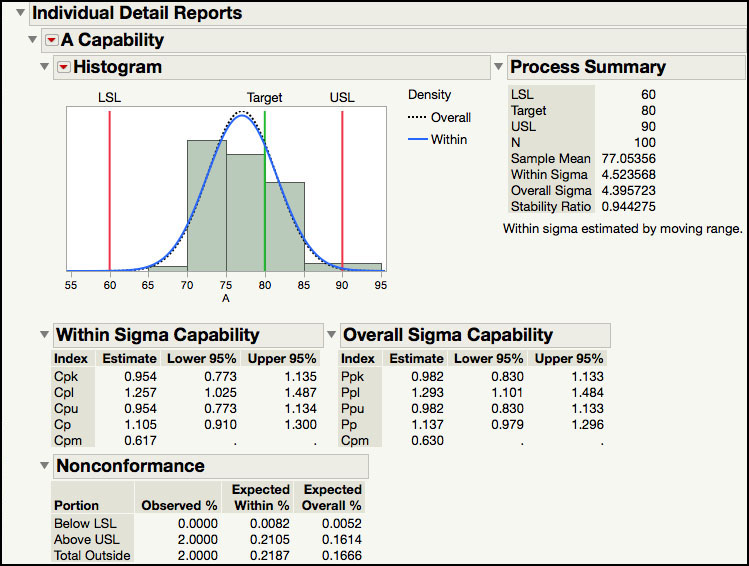
Figure 6.31 Individual Detail Report for Parameter A
9. From the red triangle at the top of the window, select Normalized Box Plots ► Overall Sigma Normalized Box Plots. From the red triangle next to Process Capability select Order By ► Overall Sigma Ppk Descending. The output is shown in Figure 6.32.
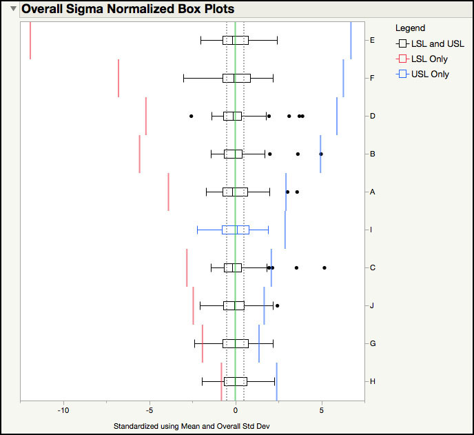
Figure 6.32 Overall Sigma Normalized Box Plots
The Individuals Details Report for Parameter A is shown in Figure 6.31. Note the Stability Ratio and the components that comprise it are provided in the Process Summary section. Process capability indices using the overall sigma and within sigma are also presented. Note this output was discussed in the previous two sections and is not further discussed here. (See discussions related to Figure 6.4, Figure 6.6, or Figure 6.15, for example.)
The Overall Sigma Normalized Box Plots in Figure 6.32 shows the data and specifications normalized using the parameter’s mean and standard deviation. The data and specification limits are standardized to a mean = 0 and a standard deviation = 1. The legend on the right-hand side uses different box colors that represent if the parameter has a 1- or 2-sided specification limit. For the Semiconductor data, all parameters have a 2-sided specification with the exception of Parameter I, which only has a USL. The blue lines in the plot are the standardized upper specification limits and the red lines are the standardized lower specification limits. The gray dotted lines are drawn at ± 0.5σ; which contains 50% of the distribution, using the normal distribution. This plot also makes it easy to see which parameters are performing well and which ones are too close to their specifications. For example, Parameter E, F, and D are at the top of the list, while Parameter J, Parameter G and Parameter H are at the bottom.
10. From the red triangle at the top of the window in Figure 6.28, select Process Performance Plot. Change the default for Ppk from 1 to 1.33. From the red triangle next to Process Performance Plot select Label Points.
Figure 6.33 Process Performance Plot in Process Capability Platform

11. From the top of the window (Figure 6.28), select Summary Reports ► Overall Sigma Summary Report. Note leave it ordered by descending Ppk.
Figure 6.34 Overall Sigma Summary Report for Semiconductor Data

The Process Performance Plot is shown in Figure 6.33. This graph highlights the two dimensions of process health, Stability and Capability. Using the parameter’s Ppk and Stability Ratio, the parameters are distributed in four quadrants. The ideal parameters (Capable and Stable) are shown in the green shaded region of the plot, where Ppk > 1.33 and Stability Ratio < 1.5. The Incapable and Unstable parameters are in the red-shaded region, where Ppk < 1.33 and Stability Ratio > 1.5. The legend also provided information about the parameter’s specifications. This plot was discussed in great detail in the last section, using the Process Screening platform (see the discussion for Figure 6.13, for example).
The Overall Sigma Capability Summary Report is in Figure 6.34. It contains the specification limits, sample mean, overall sigma, Stability Ratio, Ppk, Cpm, and estimated and actual percent of points outside of the specification limits. The report is ordered using Ppk, from largest to smallest. For example, Parameter E has Ppk = 2.238, Stability Ratio = 1.04 and 0% of observed or expected values outside of the specifications. In contrast, Parameter H has Ppk =0.268, Stability Ratio = 3.74 and 19% of observed points outside of the specifications. Note the summary report can easily be exported to a JMP table by right clicking inside of the table and selecting Make Into Data Table.
The Process Capability platform can be used to identify out-of-spec results in the JMP table.
12. From the red triangle at the top of the window (Figure 6.28), select Out of Spec Values ► Color Out of Spec Values.
Figure 6.35 Out of Spec Values in JMP Table

The JMP table highlighting the out-of-specification results is shown in Figure 6.35. In this table values shaded blue are above the USL, while red shading indicates results that are below the LSL. For example, the fourth result for Parameter G of 1.33 is above the USL = 1.3, while the eighth value for Parameter H of 188 is below the LSL = 195. If the rows are also selected, then a subset table can be created for all rows with one or more out-of-spec results.
Statistical Insights
The previous sections have shown how easy it is to assess the health of our processes using the two dimensions of capability, voice of the customer, and stability, voice of the process, via the Process Screening or Process Capability platforms. In addition, the Process Performance Graph allows us to focus our improvements activities by helping visualize where in the four quadrants of Stable and Capable; Capable but Unstable; Incapable but Stable; and Incapable and Unstable, our processes fall. These four quadrants are what Wheeler and Chambers (1992) describe as the four possibilities for any process.
|
|
Statistics Note 6.5: Wheeler and Chambers (1992) describe the four possibilities for any process as: ● Ideal State —in control and 100% conforming, ● Threshold State —in control but not conforming, ● Brink of Chaos —out of control but 100% conforming, ● State of Chaos —out of control and not conforming. |
A process in the Stable and Capable is in the ideal state where we predictably meet specifications. In the Capable but Unstable we are in a predictability issue because, even though our process meets specifications, it cannot do it in a predictable way. The Incapable but Stable situation presents us with a yield issue where the process does not meet the specifications but at least we can predict how our yields will be impacted. Finally, a process that is in the Incapable and Unstable quadrant puts us in a double trouble situation, where the process cannot meet specifications and is unpredictable.
Ideally, we want all our processes to be in the ideal state, and we should focus our improvement efforts in those processes that do not fall in that state. How do we decide which of the processes that have a predictability issue, yield issue, or are in the double trouble state should be tackled first? Ramírez (2018) points out that, in addition to the two dimensions of capability and stability that are displayed in the Process Performance Graph, we can make the size of each point proportional to a third dimension that reflects additional information about the process. This will help us decide which processes we should tackle first, based on their impact on dimensions like yield or sales, for example. A somewhat hidden feature in the Process Screening Platform allows us to do just that.
Figures 6.13 and 6.33 shows the Process Performance Graph for the 10 processes in the data set Chapter 6 – Semiconductor 6.1.jmp. We have 4 processes (C, H, I, J) in the double trouble state, two processes (A, G) that have a yield issue, one process (D) with a predictability issue, and 3 processes (B, E, F) in the ideal state. Which of the 4 processes in the double trouble state should be undertaken first? This is where additional information about our processes is helpful. For each process parameter in the data set Chapter 6 – Semiconductor 6.1.jmp, we are going to use accumulated cost of goods (ACG), in thousands of dollars, to vary the size of the points in the Process Performance Graph.
The Process Screening platform has an option that allows the size of the points to be a function of a third variable, ACG in this example. The following steps illustrate how to access and use this option in the Process Capability platform.
1. Open Chapter 6 – Semiconductor 6.1.jmp, which has variables called Sample ID, A, B, C, D, E, F, G, H, I, and J. In this table, Sample ID is the subgroup variable, and A through J are the PHA parameters.
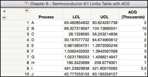
2. Open Chapter 6 - Semiconductor 6.1 Limits Table with ACG.jmp, which has variables called Process, LCL, UCL, and ACG (Figure 6.36). The columns LCL and UCL are the lower and upper control limits for the individual measurements charts, corresponding to each process defined by the Process column. The column ACG is the accumulated costs of goods, in thousands of dollars, for each of the process steps defined by column Process.
Figure 6.36 Semiconductor Data Limits Table with Accumulated Cost of Goods
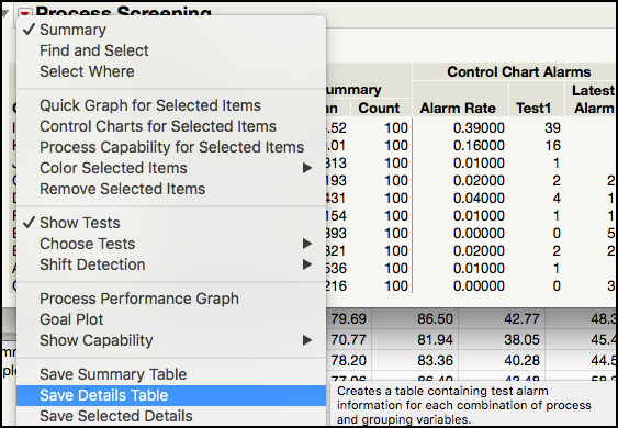
3. Alternatively, to create the Semiconductor 6.1 Limits Table with ACG shown in Figure 6.36, we can save the lower and upper control limits for the individual measurements charts by clicking on the red triangle next to Process Screening and selecting Save Details Table (Figure 6.37).
Figure 6.37 Saving Control Limits
4. The resulting table is displayed in Figure 6.38. From this table we can subset the LCL and UCL for each process parameters to create the dataset Chapter 6 - Semiconductor 6.1 Limits Table with ACG.jmp in Figure 6.36.
Figure 6.38 Details Table with Control Limits for Semiconductor Data

5. Now launch the Process Screening platform from select Analyze ► Screening ► Process Screening, as shown in Figure 6.39.
Figure 6.39 Launching the Process Screening Platform
6. As we did before, in the left-hand window of the dialog window shown in Figure 6.40, click A and hold the shift key and select J, so they all parameters are highlighted and then click Process Variables. Make sure that Control Chart Type is set to Indiv and MR. Click Use Limits Table. This option will allow us to use the information in the Chapter 6 - Semiconductor 6.1 Limits Table with ACG.jmp table that includes the ACG variable. Click OK when finished.
Figure 6.40 Launch Window for Process Screening

7. A launch window appears (Figure 6.41) to select the limits table. Select Chapter 6 - Semiconductor 6.1 Limits Table with ACG.jmp. Click OK when finished.
Figure 6.41 Choose Limits Table Dialog Window

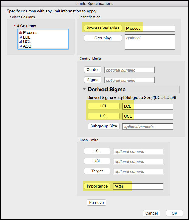
By default, the following window will populate the Process Variable, LCL and UCL. We now select ACG and click the Importance field at the bottom of the window, as shown in Figure 6.42. Click OK when finished.
Figure 6.42 Limits Specifications Table Dialog Window
The Process Screening report appears sorted by the Importance variable ACG. From the red triangle at the top of the window, select Process Performance Graph. Highlight the parameters in the Summary table by clicking on B and then I, while holding the shift key. Right-click in the Process Performance Graph and select Row Label from the menu. Figure 6.43 shows the Process Performance Graph, which is similar to Figure 6.13, but with the size of the points proportional to the values in the Importance column ACG. The large the circle, the more ACG associated with that process.
Figure 6.43 Process Performance Graph With Points Sized by ACG

The Process Screening Summary table, shown in Figure 6.43, includes the Importance value for each process parameter. As was noted in Step 9, the table is sorted by the Importance value, instead of the Stability Ratio. The parameters in Double Trouble (Incapable and Unstable) are the ones that should be scrutinized first. These parameters can be further prioritized using the ACG variable, in parenthesis, resulting in the following ordering: H ($7K) & C ($5K) and J ($1K) & I ($0.5K). Not only are parameters H and C incapable and unstable, but they also have larger accumulated cost of goods. In contrast, Parameters I and J, which are also in Double Trouble, have the lowest ACG. If it is not possible to provide resources to improve the performance of these four parameters simultaneously, then efforts might focus on H and C.
The Incapable and Stable quadrant should be considered next, since it might result in a yield issue. Using the ACG, Parameter G ($8K) has more Importance than Parameter A ($2K), and has the second highest ACG among all parameters. Once again, if resources are limited then Parameter G should move to the top of the list.
Parameter B ($10K), which has the highest importance, or ACG, is in the ideal quadrant. This is the ideal situation and efforts should be placed on maintaining its current performance. Since E ($3K) and F ($3K) are also in the ideal quadrant, focus should also be placed on maintenance. The last parameter, D ($2K), which is capable but unstable, and has a lower ranked Importance, should be closely monitored to ensure that it doesn’t slip to a lower performance quadrant.