Chapter 5: Process and Measurement System Capability Analysis
Process and Measurement System Capability Analysis Review
JMP Process Capability and MSA Platforms
ISQC Example 8.1 Bursting Strength of Glass Containers –
Example 8.2 Bursting Strength of Glass Containers – Cpl
ISQC Example 8.3 Process Centering
ISQC Example 8.4, 8.5 & 8.6 Confidence Intervals for CP & Cpk
ISQC Example 8.7 Measuring Gauge Capability
ISQC Table 8.7 Thermal Impedance Data for Gauge R&R Experiment
ISQC Table 8.13 Attribute Gauge Capability Analysis
ISQC Example 8.8 Meeting Customer Specifications
ISQC Example 8.9 Designing a Six Sigma Process
ISQC Example 8.12 Constructing a Tolerance Interval
Process Capability Indices for Nonnormal Data
Process Capability Indices and Sample Size
EMP for Measurement System Analysis
Overview
This chapter illustrates how to evaluate the capabilities of your processes and measurement systems using examples from Chapter 8, Process and Measurement System Capability Analysis, of Introduction to Statistical Quality Control (ISQC), and includes discussions, tips and statistical insights on alternative ways to carry out these assessments.
These assessment techniques are mostly used with data measured on a continuous scale and complement the information obtained from the control charting activities previously discussed.
Several JMP platforms are highlighted in this Chapter including Distribution, Control Chart and the Control Chart Builder, Measurement System Analysis, and Variability / Attribute Gauge Chart.
Process and Measurement System Capability Analysis Review
In this chapter, two types of capability analysis are explained in detail. The first type of capability relates to how well the output of a process meets the stated requirements. This scenario is referred to as process capability and common statistical approaches are found under the banner of process capability analysis. As Montgomery points out, conducting this analysis throughout the product cycle is useful in order to minimize variability and increase product quality.
Many metrics have been developed to quantify the capability of the process and all of them use the stated requirements, or customer requirements, in the form of specification limits and a measure of process variability. The most common process capability index is Cp = (USL – LSL) / 6σ, which measures the full width of the specification to the variation in the process. In the equation, LSL is the lower specification limit, and USL is the upper specification limit. Recall, for a normally distributed variable, 99.73% of the population values fall within XBar ± 3 σ, or equivalently, most of the spread of the distribution is represented by 6σ. However, this metric does not take into account where the process mean is centered.
Another popular process capability index is Cpk = min {Cpl, Cpu}, where Cpl = (μ – LSL) / 3σ and Cpu = (USL – μ) / 3σ. Unlike Cp, this metric takes into account where the process mean is centered and will reflect the performance of the mean to the closest specification limit. Note if the process mean is centered between the two-sided specification limits then Cp = Cpk. When there is only a one-sided specification limit the Cpk becomes Cpl for a LSL, or Cpu for a USL.
Many variations to these two basic metrics are documented in the literature. ISQC Chapter 8 describes different ways to estimate σ in the process capability equations, including the use of the sample standard deviation, an estimate from an appropriate control chart, or from quantile estimates from the raw data or a specified distribution. Confidence intervals and tests on process capability ratios provide ways to incorporate the effects of smaller sample sizes on the estimates and ways to determine if our processes are meeting minimum performance requirements, or more lofty goals, such as, 6σ process performance, Cpk ≥ 2.
The other type of capability analysis described in this chapter has to do with the performance of the measurement system. Discussions and common statistical approaches are found under a number of banners, including, measurement system analysis (MSA), gauge R&R or Evaluating the Measurement Process (EMP). All of these approaches provide ways to quantify the error associated with the measurement system and further evaluate its contribution to the total variation, as well as its impact on performance indices.
The typical MSA study involves a number of operators, who measure the same parts, multiple times using the same measurement system or gauge. The repeatability of the measurement system is the variation from multiple measurements taken by the same operator measuring the same part, using the same gauge. Reproducibility is the variation from multiple measurements taken by different operators measuring the same part, using the same gauge. In other words, the different operators represent the reproducibility of the gauge and, the repeated measures of the same part by the same operator represents the repeatability of the gauge. The total variation in this type of study is typically represented using σ2total = σ2part + σ2gauge, where σ2gauge = σ2reproducibility + σ2repeatability. Variance components analysis can be used to estimate these variance components and determine their contribution to the total variation.
When the outcome of a measurement system is an attribute, such as good/bad or poor/average/excellent, an attribute gauge analysis can be used to determine the quality of the method. The study design, once again, includes different operators and a number of inspection items that need to be classified. It is helpful to predetermine the inspection items to include items from all of the ranking categories used. The analysis for this study is focused on determining the level of consistency among the operators to classify the items the same way. If the classification of the item is predetermined, then the analysis can also quantify the effectiveness of the measurement systems.
JMP Process Capability and MSA Platforms
Several platforms can be used to generate a process capability analysis in JMP, including Distribution, Control Chart and Control Chart Builder. These platforms were introduced in Chapter 2, and a detailed summary is shown in Table 5.1. In this chapter, we emphasize the Distribution platform for this type of analysis. However, the other platforms are illustrated for completeness. Note there is a Process Capability platform, found under Analyze ► Quality and Process. This platform is not discussed in detail in this chapter, since it is more useful when we want to compute capability indices for many parameters and compare the results. The Process Screening platform is another tool to calculate capability indices for many parameters. Both of these platforms are reviewed in Chapter 6 in this book.
Table 5.1 Overview of Features for JMP Process Capability Platforms
|
JMP Feature |
Process Capability |
Distribution |
Control Chart |
Control Chart Builder |
|
Probability |
Many continuous distributions are available and can be used to calculate process capability indices and limits. Can compare different distributions. |
Many continuous and discrete distributions are available and can be used to calculate process capability indices and limits. |
Many continuous and discrete distributions are available and can be used to calculate process capability indices and limits. |
None available. Normal distribution is assumed behind the scenes. |
|
Descriptive |
Basic summary statistics are available to view. Includes the Stability Ratio. |
Many summary statistics are available to view. Does not include the Stability Ratio. |
Many summary statistics are available to view. Does not include the Stability Ratio. |
Limited to the mean and standard deviation estimates. Includes the Stability Ratio. |
|
Process Capability Indices (PCI) |
Cp, Cpk, Cpm, Cpl, Cpu |
Cp, Cpk, Cpm, Cpl, Cpu |
Cp, Cpk, Cpm, Cpl, Cpu |
Cp, Cpk, Cpm, Cpl, Cpu |
|
Estimation of sigma used in PCI calculations |
Within or overall sigma. |
Long term, specified, or control chart estimate. |
Long term or control chart estimate. A value can be specified for calculation of limits. |
Long term or control chart estimate. A value can be specified for the calculation of limits. |
|
Process Capability Confidence Limits |
For all indices and when both within sigma and overall |
For all indices but only when long term sigma is used. Not available for Fitted Distributions. |
For all indices but only when long term sigma is used. Not available for Fitted Distributions. |
For all indices and when both within sigma and overall sigma estimates of variation are used. |
Similarly, JMP has several platforms to carry out the analysis of measurement systems. The Measurement System Analysis platform is dedicated to gauge studies for continuous data, while the Variability / Attribute Gauge Chart platform can handle both continuous and attribute data. A summary of the features in these platforms is shown in Table 5.2.
Table 5.2 Overview of Features for JMP Measurement System Analysis Platforms
|
JMP Feature |
Measurement System Analysis |
Variability / Attribute Gauge Chart |
|
Response Type |
Continuous only |
Continuous or Attribute |
|
Control Charts |
XBar & Range and XBar and S charts |
XBar limits on a Variability Chart and S chart |
|
Variance Components Models |
EMP: Main effect, crossed, crossed with two-factor interaction, nested, crossed then nested and nested then crossed for up to 3 Gauge R&R: see Variability / Attribute Gauge Chart. |
Main effect, crossed, nested, crossed then nested, nested then crossed. |
|
MSA Method |
EMP & Gauge R&R |
Gauge R&R |
|
Available Statistics |
EMP: Variance Components Test-retest and probable error, intraclass correlation coefficients, effective resolution and recommended measurement precision, measurement system classification. |
Variability: Variance Components, AIAG output, P/T ratio, Discrimination Ratio, Misclassification Probabilities Bias and linearity. |
|
Available Plots |
XBar and Range control charts, Parallelism Plots, Bias Comparison Test-Retest Comparison, |
Variability Chart (control limits can be added for XBar and Std Dev), Mean Plots, Std Dev Plots. |
Examples from ISQC Chapter 8
The examples from Chapter 8 of ISQC presented in this chapter are shown in Table 5.3. We show how to reproduce these examples using JMP. For some examples, additional output not provided in ISQC is shown to illustrate JMP functionality or elaborate on important points considered by the authors.
Table 5.3 Summary of Examples from ISQC Chapter 8
|
ISQC Example / Table Number |
JMP |
JMP Platform |
Key Points |
|
8.1 Bursting Strength of Glass Containers |
Distribution |
Assess distribution fit using different tools and calculate process | |
|
8.2 Bursting Strength of Glass Containers |
Distribution |
Calculate process capability indices using the different platforms. | |
|
8.3 Process Centering |
Chapter 5 – ISQC Exercise 8.3 |
Distribution |
Illustrate the use of Cpm for off centered processes. |
|
8.4, 8.5, 8.6 Confidence Intervals for PCIs |
Chapter 5 – ISQC Exercise 8.4 |
Distribution |
Compute confidence intervals for Cp and Cpk. |
|
8.7 Part Measurement Data |
Chapter 5 – ISQC Table 8.6 |
Measurement System Analysis |
Analyze data from a Gauge R&R study with a continuous response. |
|
Table 8.7 Thermal Impedance Data |
Chapter 5 – ISQC Table 8.7 |
Measurement System Analysis |
Analyze data from a Gauge R&R study with a continuous response. Re-analyze as an EMP. |
|
Table 8.13 Attribute Gauge Capability Analysis |
Chapter 5 – ISQC Table 8.13 |
Variability / Attribute Gauge Chart |
Analyze data from a Gauge R&R with an attribute response. |
|
8.8, 8.9, 8.12 Setting Specification Limits |
Chapter 5 – ISQC Exercise 8.8, 8.12 |
Distribution |
Compute statistically based specification |
ISQC Example 8.1 Bursting Strength of Glass Containers –
In this example, we will show how to evaluate the Bursting Strengths for glass containers using histograms, probability plots and descriptive statistics. The data in Table 8.1 of ISQC consists of the bursting strengths for 100 glass containers, measured in pounds per square inch (psi). The following steps illustrate how to begin a process capability analysis using the Distribution platform in JMP.
1. Open the JMP table Chapter 5 – ISQC Table 8.1.jmp, which has variables called Glass Container and Burst Strength (psi). In this table, Glass Container is a generic label for the ith glass container and Burst Strength (psi) is the variable of interest.
2. Select Analyze ► Distribution (Figure 5.1).
Figure 5.1 JMP Menu Selections for a Process Capability Analysis

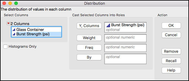
3. When the launch window appears, select Burst Strength (psi) as the Y, Columns (response) variable and click OK when finished.
Figure 5.2 JMP Menu Selections for Distribution Platform
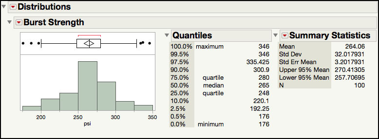
4. In order to change the default orientation of the histogram from vertical to horizontal, select the red triangle next to Distributions and select Stack. The resulting histogram and statistics is shown in Figure 5.3. Note this option can be set as default in the preferences.
Figure 5.3 Histogram and Default Output for Burst Strength
5. From the red triangle next to Burst Strength (psi), select Continuous Fit ► Normal. This will add the Fitted Normal details in the right-hand side of the output window.
6. From the red triangle next to Fitted Normal, select Set Spec Limits for K Sigma and enter 3 in the Enter K-Sigma for Capability dialog box (Figure 5.4).
Figure 5.4 Dialog Window for K-Sigma Capability Limits

7. Click OK when finished.
Figure 5.5 Process Capability Limits for Burst Strength

The histogram in Figure 5.5 corresponds to Figure 8.2 in ISQC. The default output in JMP includes an outlier box plot above the histogram, the quantiles, and a few summary statistics. Additional summary statistics can be added to the output by selecting Customize Summary Statistics under Display Options, from the red triangle next to the Burst Strength (psi) label. Also, the normal fit and all of the corresponding output can be removed by selecting Remove Fit from the drop-down list for the Fitted Normal.
The sample estimates for the mean and standard deviation are used to calculate the process capability limits given in ISQC Example 8.1. These limits are manually calculated using the mean ± 3σ, or 264.06 ±3(32.02). This calculation can be automated in JMP by fitting a normal distribution to the data and then calculating the corresponding “K Sigma” limits. For this exercise, K = 3 and the corresponding limits are provided by the quantiles that represent the 0.00135 and 0.99865 percentiles of the normal distribution, 168 psi, and 360 psi. By design, these limits contain 99.73% of the values in a normal distribution, as shown in ISQC Figure 8.1.
In using these computations, we assume that the normal distribution appropriately represents the Burst Strength data. While the histogram provides a visual way to assess the normal fit, probability plots are also very useful to assess the fit of a distribution to the data. This plot can easily be added to the output shown in Figure 5.5.
8. From the red triangle next to Fitted Normal, select Diagnostic Plot.
Figure 5.6 Normal Probability Plot of Burst Strength

The normal probability plot in Figure 5.6 is similar to ISQC Figure 8.4. The confidence limits (red dashed lines) shown in Figure 5.6, represent 95% confidence bands for the normal probability line and can be used to visually assess the fit of the distribution to the data. These limits can be removed by deselecting Confidence Limits from the drop-down menu shown in Figure 5.6. As is discussed in ISQC Chapter 8, the normal probability plot can be used directly to estimate the probability of exceeding a given Burst Strength value. This is done by locating the corresponding y-axis value for a given x-axis value. For example, a Burst Strength of about 200 psi, is located at approximately 0.02 or 2% on the normal probability axis, indicating that 2% of the results are below 200 psi and 98% are above 200 psi. The Crosshairs tool can be used to read off the probability value of a selected Burst Strength value.
As Montgomery points out, selecting the most appropriate distribution to represent the data is important in order to proceed with process capability assessments. In addition to using probability plots, he discusses the use of additional descriptive statistics, skewness and kurtosis, and goodness-of-fit tests, such as the Shapiro-Wilk test. The following steps illustrate how to add these items to the previous JMP output.
9. Click on the red triangle next to the Fitted Normal and select Goodness of Fit. This will add the Shapiro-Wilk W Test to the Fitted Normal output.
Figure 5.7 Normal Distribution Goodness-of-Fit Test for Burst Strength

10. From the red triangle next to Burst Strength (psi), select Customize Summary Statistics and check the boxes next to Skewness and Kurtosis and then click OK. You can also select this from the red triangle next to summary statistics.
Figure 5.8 Skewness and Kurtosis for Burst Strength
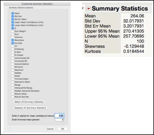
The Goodness-of-fit test for the Burst Strength data is shown in Figure 5.7 and since the p-value = 0.2525 > 0.05, we assume that the normal distribution is an appropriate distribution to model this variable. The skewness = -0.129 and kurtosis = 0.518, shown in Figure 5.8, also suggest that the data are symmetrical about its mean, and that the mass in the tails is similar to that for a normal distribution (for a normal distribution the skewness and kurtosis are 0). Note these statistics are not presented for the Burst Strength data in ISQC Chapter 8. The choice of an appropriate distribution will be further discussed in the Statistical Insights section of this chapter.
|
|
JMP Note 5.1: The Distribution platform has many tools to help evaluate the normality assumption for a given variable. Under the Fitted distribution report these include Diagnostic Plot, Density Curve and Goodness of Fit. |
Example 8.2 Bursting Strength of Glass Containers – Cpl
In this example, we will show how to compute process capability indices for the Bursting Strengths for glass containers using the data in ISQC Table 8.1. Recall this data consists of the bursting strengths for 100 glass containers, measured in psi. The following lower specification limit is provided for the burst strength: LSL = 200 psi. We will use several platforms for this computation and we begin with the Distribution platform.
1. Open the JMP table Chapter 5 – ISQC Table 8.1.jmp, which has variables called Glass Container and Burst Strength (psi). In this table, Glass Container is a generic label the ith glass container and Burst Strength (psi) is the variable of interest.
2. Select Analyze ► Distribution.
3. When the launch window appears, select Burst Strength (psi) as the Y, Columns (response) variable and click OK when finished.
4. Click on the red triangle next to the Burst Strength (psi) label above the histogram and select Capability Analysis from the menu. A dialog box appears. Enter 200 in the Lower Spec Limit field. Leave the distribution selection to Normal and the method to estimate to the standard deviation as Long Term Sigma (Figure 5.9).
Figure 5.9 Dialog Box for Capability Analysis for Burst Strength
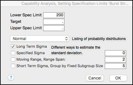
5. Click OK when finished (see Figure 5.10).
Figure 5.10 Process Capability Indices for Burst Strength

The process capability index, Cpl = 0.667, shown in Figure 5.10 matches the result in ISQC Example 8.2. Since there is only one specification limit, Cpk = Cpl = 0.667. The estimated fallout, or probability of being below the LSL, is 2.2709%. This calculation is done by finding the area to the left of a normal Z-score = (μ–LSL)/σ = (264.06 – 200)/32 = 2.001. For a normal distribution, the Z-score is also computed as 3Cpl = 3(0.667) = 2.001 Note the Z-score can be added to the output by selecting Z Bench from the drop-down menu, when the red triangle next to Capability Analysis is selected. In addition, the output includes the projected PPM (parts per million defects) and the Sigma Quality level. The PPM is simply the multiplication of the probability of being below LSL and 106; or 0.022709x106 = 22, 709. The Sigma Quality level is calculated as Z Bench + 1.5 = 3.501. This quantity is often used in Six Sigma programs and is used to describe the quality of the process output. Burst Strength is a “3.5 sigma” process.
|
|
JMP Note 5.2: The process capability analysis output includes Cpk, Z-score, % Actual results out of specification and an estimate of the PPM and Sigma Quality, based on the Normal Distribution (default). |
|
|
Statistics Note 5.1: The Z bench values are standardized distances to the specifications in standard deviation units. For example, the process distance to the upper specification limit, USL, is (USL–μ). If we standardize this distance by the standard deviation, σ, we get Z USL =(USL–μ)/σ. The Z LSL is calculated as Z LSL =(μ–LSL)/σ. |
The Capability Analysis output also includes the percent of actual Burst Strength results that are below the LSL. This can be found at the top of the output, right under the Capability Analysis banner. We see that 3% of the N = 100 results are less than 200 psi. We can easily locate these results in the JMP table as follows.
6. Click on the histogram bar below the LSL in in the output window. The bar is highlighted and the results are highlighted in the JMP table (Figure 5.11).
Figure 5.11 Locating Burst Strength Results Below the LSL

7. In order to subset the table with the selected rows, highlight the JMP table and from the main menu select Tables ► Subset. Complete appropriate selections in the dialog window and click OK when finished. Default settings were kept for the output in Figure 5.12.
|
|
JMP Note 5.3: Double-clicking the selected histogram bar generates the subset table directly. |
Figure 5.12 Subset of Burst Strength Results Less Than the LSL
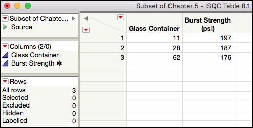
The interactivity in the Distribution platform makes it easy to locate data shown in the histogram or box plot. Once the rows are highlighted, the Rows information in the bottom left-hand side of the JMP table can be used to confirm the number of highlighted rows, which are 3 for this example. Two of the three values are visible in the table shown in Figure 5.11. However, we must scroll down in order to locate the third result. If the table is difficult to navigate, with many rows and/or columns, many rows are highlighted, or there is a need to do further analysis on these results, then a subset table should be created. The subset table in Figure 5.12 shows the three results that are below the LSL: 197 psi, 187 psi, and 176 psi for Glass Containers 11, 28 and 62, respectively.
Within the Distribution platform, there are several ways to obtain a Capability Analysis. We illustrated how to use Capability Analysis from the menu above the histogram. Alternatively, a Normal distribution can be fit from this same menu and from the Fitted Normal drop-down menu, Spec Limits can be selected and populated. Finally, the Spec Limits, located in the Column Properties for Burst Strength (psi) in the JMP table, can be populated. When Distribution is launched, the Capability Analysis will be included as part of the default output.
|
|
JMP Note 5.4: In order to facilitate a process capability analysis in the different platforms, it is helpful to use the Spec Limits Column Property in the JMP table. This information is saved as metadata for the column and it will be used automatically every time a capability analysis is requested. |
The Process Capability platform, one of the new generation quality tools within JMP, can also be used to calculate process capability indices, especially if we have several responses to analyze. Below we illustrate how to generate the process capability indices in Figure 5.10 using the Process Capability Platform.
1. Open, or highlight, the JMP table Chapter 5 – ISQC Table 8.1.jmp.
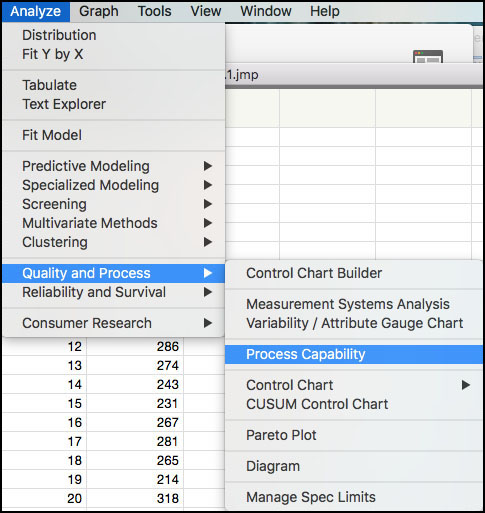
2. Choose Analyze ► Quality and Process ► Process Capability as shown in Figure 5.13.
Figure 5.13 Selecting the Process Capability Platform
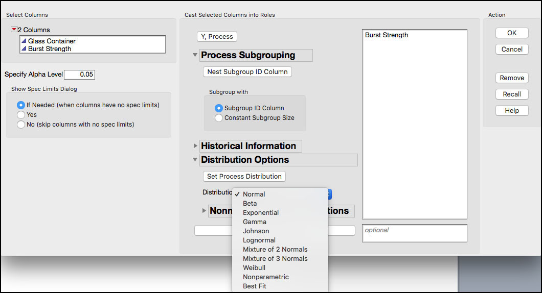
3. When the dialog window appears, select Burst Strength (psi) as the Y, Process. Open the Distribution Options to reveal the Normal distribution as the default (Figure 5.14). Note the continuous distribution options, including the Best Fit. Click OK when finished.
Figure 5.14 Process Capability Platform Dialog Window
4. By default, if the column has no Spec Limits property, the Spec Limits window comes up (Figure 5.15). Enter the LSL=200 in the LSL field. Click OK when done.
Figure 5.15 Spec Limits Window

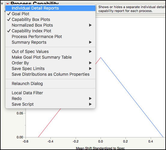
5. By default, the Process Capability platform does not show a summary with the process capability indices (in Chapter 6 we illustrate some of the output in this platform). To generate a report with the capability indices, click on the red triangle next to Process Capability, and select Individual Detail Reports as shown in Figure 5.16.
Figure 5.16 Selecting Individual Details Reports in the Process Capability Report
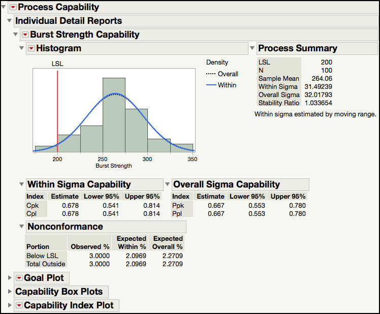
The Individual Detail Reports (Figure 5.17) shows the LSL and histogram of the burst strength data, overlaid with two normal densities that are generated using the Within and Overall Sigma. The Within Sigma is estimated using a moving range of size 2, and the Overall Sigma is estimated using all the data. The Process Summary shows the LSL, the sample size, the sample mean, the overall sigma, the within sigma, and the Stability Ratio. (See Chapter 6 for a detailed explanation and examples of the Stability Ratio.) Two capability reports are included, the Within Sigma Capability and the Overall Sigma Capability. These reports show the Cpk and Cpl, along with 95% confidence limits, calculated using the within sigma standard deviation, and the overall sigma standard deviation. Finally, a Nonconformance report details the actual percent below the LSL, and the expected percent, within and overall, estimated using the normal distribution.
Figure 5.17 Individual Details Reports in the Process Capability Report
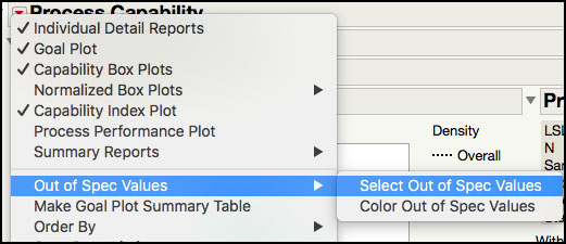
6. To identify the out of spec observations, click on the red triangle next to Process Capability, and select Out of Spec Values ► Select Out of Spec Values (Figure 5.18).
Figure 5.18 Selecting Out of Spec Values
7. The selected out of spec values are shown in the histogram (Figure 5.19), similar to the histogram in Figure 5.11. Double-clicking the selected histogram bar allows one to generate a subset table like the one shown in Figure 5.11.
Figure 5.19 Selected Out of Spec Values

JMP has several additional platforms that compute process capability indices. Before moving on to the next ISQC example, we will show how to use the Control Chart and Control Chart Builder platforms to calculate process capability indices. The use of these two platforms requires the identification of a control chart type that is appropriate for the data structure. Although no data structure is provided for ISQC Table 8.1, in the description of ISQC Table 8.5, there are 20 subgroups of size n = 5 and an XBar and Range chart was constructed.
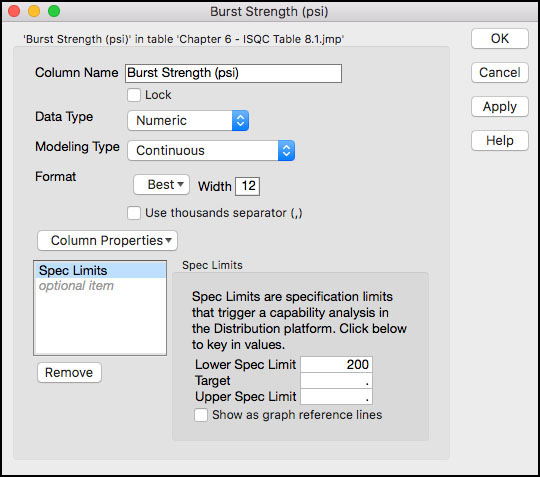
1. Open Chapter 5 – ISQC Table 8.5.jmp. Right-click on Burst Strength (psi) and select Column Properties ► Spec Limits. A dialog box will appear. Enter 200 in the Lower Spec Limit field (Figure 5.20) and then click OK when finished. An asterisk will appear next to Burst Strength (psi) under Columns, in the left-hand side of the table, indicating the presence of a column property.
Figure 5.20 Burst Strength Column Properties Window
2. Select Analyze ► Quality and Process ► Control Chart ► XBar.
3. A launch window will appear. Highlight Burst Strength (psi) from the left hand window and click Process and then highlight Sample from the left hand window and click Sample Label. Finally, click the button next to Capability, in the lower right-hand side of the dialog window (Figure 5.21).
Figure 5.21 Launch Window for XBar Chart for Burst Strength
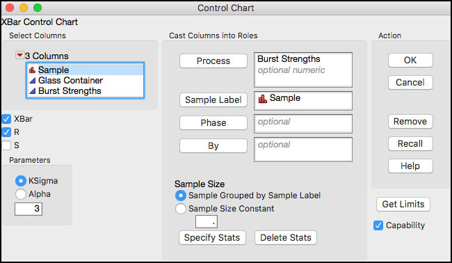
4. Click OK when finished. The output is shown in Figure 5.22.
Figure 5.22 Control Chart Capability Analysis for Burst Strength
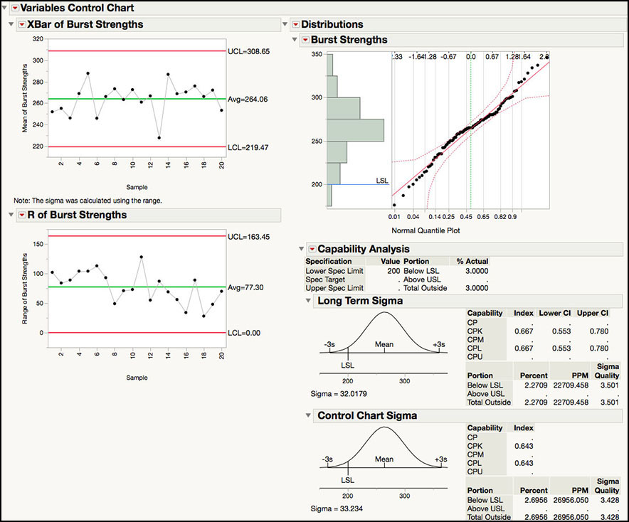
The default output is shown in Figure 5.22. The XBar and Range control charts are shown on the left-hand side of the output window, while the Capability Analysis is shown on the right-hand side. The drop-down menu next to the Burst Strength label above the histogram provides the same options as the similar drop-down menu in the Distribution platform. For example, summary statistics can be added, different distributions can be fit to the data, and statistical intervals can be computed.
The Capability Analysis under Long Term Sigma includes the same output as was shown for the Distribution platform in Figure 5.10. Note the Z-scores can be added to the output in Figure 5.22 by selecting Z Bench from the Capability Analysis drop-down menu. The Cpl is 0.667, using the long-term sigma estimate. The long-term sigma uses the sample standard deviation, s = 32.0179, to estimate the standard deviation used in the denominator of Cpl.
The Control Chart Sigma output provides statistics that use the same standard deviation used in the calculation of the XBar control limits: Average Range / d2 = 77.30 / 2.326 = 33.234. When the process is in control, these two estimates will be similar and so will the two estimates of Cpl. However, when the process is out-of-control, the long term sigma will be larger than the control chart sigma and its corresponding estimate of Cpl will be less than the Control Chart Sigma Cpl. This issue is discussed further in Chapter 6 of this book. In this example, the two estimates of the standard deviations are similar, and the control chart Cpl = 0.643. The control charts in Figure 5.22 are shown in ISQC Figure 8.12, and the Cpl is in ISQC Section 8.4.
The following steps illustrate how to produce the Capability Analysis using the Control Chart Builder platform.
1. Highlight Chapter 5 – ISQC Table 8.5.jmp by clicking on it. Note this table should include the specification limits in the column properties for Burst Strength (see Step 1 from previous example).
2. Select Analyze ► Quality and Process ► Control Chart Builder.
3. When the dialog window appears, select Sample and drag it onto the Subgroup zone (X axis) and then select Burst Strength (psi) and drag it onto the Y zone (Y axis).
Figure 5.23 Control Chart Builder Capability Analysis for Burst Strength

The default output from Control Chart Builder is shown in Figure 5.23. Once again, the XBar and Range control charts are shown in the left-hand side of the output, while the Capability Analysis is on the right-hand side. The output differs slightly from what was presented in Figure 5.22 for the Control Chart platform. For example, the options in the drop-down menus are more limited. The red triangle next to Process Capability Analysis includes options to add or remove the histogram, process summary, nonconformance information, and process capability indices. Note the Z-scores (Z Benchmark) can be added to the output using this menu. The Histogram drop-down menu allows us to manipulate the features of the histogram, such as, showing the density curves and specification limits. Also, the process capability labels are slightly different in the Control Chart Builder. The Overall Sigma Capability metrics are the same as Long Term Sigma metrics in Figure 5.22 and the Within Sigma Capability section is the same as the Control Chart Sigma section in the same figure.
The Process Summary report includes estimates of the two different standard deviations used in the two calculations. This is the same output produced by the Process Capability platform. The Overall Sigma is 32.02, while the Within Sigma is 33.23. The Stability Ratio, which was introduced in in JMP version 13, is the ratio of these two variances, that is, 32.022 / 33.232 = 0.93. As was previously stated, when the process is in control the two standard deviations, or equivalently, variances, estimates should be similar and the Stability Ratio will be close to 1. On the other hand, when the process is out-of-control Overall Sigma > Within Sigma and the Stability Ratio will be greater than 1. This metric will be discussed in detail in Chapter 6 of this book.
ISQC Example 8.3 Process Centering
In this example, we calculate another process capability index called Cpm. This index more effectively incorporates where a process is centered relative to its specification limits. A parameter must have a 2-sided specification in order to calculate it. A specific data set to illustrate this example is not available in ISQC Example 8.3, so a simulated data set was created based on the processes in ISQC Figure 8.11 The simulated data includes 100 observations for two responses, where Response 1 ~ N(50, 52) and Response 2 ~ N(57.5, 2.52). The specification limits for this example are LSL = 35 and USL = 65 and the Target value = 50. A description of the Cpm index and equations can be found in ISQC Section 8.3.4.
The following steps illustrate how to compute Cpm using the Distribution platform.
1. Open Chapter 5 – ISQC Example 8.3.jmp, which has variables called Sample Number, Response (center=50) and Response (center=57.5).
2. From the main menu select Analyze ► Distribution.
3. When the dialog box appears, select Response (center=50) and Response (center=57.5) as the Y, Columns (response) variable and click OK when finished.
4. From the red triangle next to Distributions select Stack. From the red triangle next to Response (center=50), deselect Display Options ► Quantiles and Outlier Box Plot and select Continuous Fit ► Normal. Repeat for Response (center=57.5).
Figure 5.24 Cpm Index for Centered and Off-Centered Processes
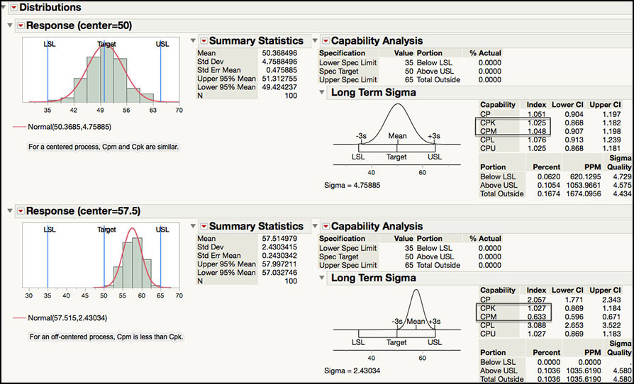
The JMP output for the centered and off-centered processes is shown in Figure 5.24. The Cpm statistics are similar as those shown in ISQC Example 8.3. For the centered process Cpm is approximately 1, while for the off-centered process Cpm is 0.63. As Montgomery points out in ISQC Section 8.3.4, since both of these processes have a Cpk ≈ 1, this index is not able to discern the differences in the performance of the two processes within the specification limits. However, the Cpm index better reflects the off-target performance of the second process. Not only does the off-centered process have a smaller Cpm relative to the Cpm of the centered process, but it is also smaller than its Cpk index. Where keeping a process on target is desired, Cpm should be added to the arsenal of summary statistics used to monitor the quality of a process.
ISQC Example 8.4, 8.5 & 8.6 Confidence Intervals for CP & Cpk
In these examples, confidence intervals and tests for process capability indices are shown. Since no specific data are provided in ISQC Chapter 8, data were simulated using parameters that closely match the output in ISQC Example 8.4, Example 8.5, and Example 8.6. Specific details can be found in the Formula and Column Properties for the response of interest in the corresponding JMP tables.
The following steps illustrate how to construct confidence intervals for process capability indices using the Distribution platform. We begin with ISQC Example 8.4.
1. Open Chapter 5 – ISQC Example 8.4.jmp, which has variables called Sample Number and Response.
2. From the main menu, select Analyze ► Distribution.
3. When the launch window appears, select Response as Y, Columns and click OK when finished.
4. From the red triangle next to Distributions select Stack. From the red triangle next to Response, deselect Display Options ► Quantiles and Outlier Box Plot.
Figure 5.25 Confidence Interval for Cp for ISQC Example 8.4

The output in Figure 5.25 shows Cp = 2.295 for a process with a mean = 50.7, standard deviation = 1.74 and LSL = 38 and USL = 62. With n = 20 observations, the 95% confidence interval for the estimate of Cp is (1.571, 3.018). The confidence interval takes into account the sampling error and sample size. Even though the estimated Cp = 2.295, it can be as low as 1.571 or as high as 3.018, with 95% confidence. These simulated data results are very similar to the estimated Cp and 95% confidence interval in ISQC Example 8.4.
The Cp confidence intervals calculated in JMP agree with the formulas shown in ISQC equation 8.19 and are, by default, 95% confidence intervals. We now illustrate ISQC Example 8.5.
1. Open Chapter 5 – ISQC Example 8.5.jmp, which has variables called Sample Number and Response.
2. From the main menu, select Analyze ► Distribution.
3. When the launch window appears, select Response as Y, Columns and click OK when finished.
4. From the red triangle next to Distributions, select Stack. From the red triangle next to Response, deselect Display Options ► Quantiles and Outlier Box Plot. The results are shown in Figure 5.26.
Figure 5.26 Confidence Interval for Cpk for ISQC Example 8.5

The output in Figure 5.26 shows Cpk = 1.335 for a process with a mean = 49.92, standard deviation = 2.02 and USL = 58. With n = 20 observations, the 95% confidence interval for the estimate of Cpk is (0.888, 1.779). The interval takes into account the sample size and the sampling error. Even though the estimated Cpk = 1.335, it can be as low as 0.888 or as high as 1.779, with 95% confidence. These simulated data results are very similar to the estimated Cpk and 95% confidence interval in ISQC Example 8.5.
The Cpk confidence intervals calculated in JMP agree with the formulas shown in ISQC equation 8.21 and are, by default, 95% confidence intervals. We now illustrate ISQC Example 8.6.
|
|
Statistics Note 5.2: The Cpk can be thought of as the standardized distance, in units of standard deviation, to the nearest specification. |
1. Open Chapter 5 – ISQC Example 8.6.jmp, which has variables called Sample Number, Response 1 and Response 2.
2. From the main menu select Analyze ► Distribution.
3. When the launch window appears, select Response 1 and Response 2 as the Y, Columns (response) variable and click OK when finished.
4. From the red triangle next to Distributions, select Stack. While holding down the control key (command on a Mac), from the red triangle next to Response 1 deselect Display Options ► Quantiles and Outlier Box Plot and select Continuous Fit ► Normal. The output is shown in Figure 5.27.
Figure 5.27 Hypothesis Test for H1: Cp > 1.33

The intent of ISQC Example 8.6 is to determine if a Supplier meets the qualification criteria of having Cp of at least 1.33, for a given parameter. The test Cp ≥ 1.33 is a one-sided test of hypothesis, and we reject the null hypothesis if the estimated Cp exceeds the criterion for n=70 in ISQC Table 8.4, of 1.33x1.10=1.45. The output shown in Figure 5.27 includes process capability indices Cp, and their 95% confidence intervals, for two different responses. For Response 1, Cp = 1.331 and the 95% confidence interval is (1.109, 1.552). Based on the criterion listed above, the Supplier would not be qualified since the Cp is less than 1.45. As Montgomery points out, even though Cp = 1.331, in order to demonstrate that the capability is at least 1.33, the estimated Cp “will have to exceed 1.33 by a considerable amount.” We can also see that the lower confidence limit for Response 1 is 1.109, which is substantially below 1.33.
The results for Response 2, in Figure 5.27, show Cp = 1.818 and the 95% confidence interval is (1.515, 2.120). Since the estimate for Cp > 1.46, we have demonstrated that Cp is at least 1.33. Therefore, the supplier met the qualification criterion. In addition, the lower confidence limit is 1.515, > 1.33, which suggests that, with 95% confidence, the process capability for Response 2 is at least 1.515.
ISQC Example 8.7 Measuring Gauge Capability
In this example, we will show how to conduct an analysis of data from a Gauge R&R study. The study design included twenty units of a product, where one process operator measured each unit two times using one instrument. The data consists of a total of 40 observations and it is organized in a vertical manner, where all 40 observations are included in one column and identified appropriately.
The following steps illustrate how to analyze this data set using the Measurement Systems Analysis platform.
1. Open Chapter 5 – ISQC Table 8.6.jmp, which has variables called Part Number, Measurement Number and Result. The Part Number indicates an actual part and has a Nominal modeling type. Note that each part number appears twice. The Measurement Number is the first or second time it was measured, and the Result is the measurement obtained from the gauge.
2. Select Analyze ► Quality and Process ► Measurement Systems Analysis (Figure 5.28).
Figure 5.28 Launching the Measurement Systems Analysis Platform

3. The EMP Measurement System Analysis launch window appears (Figure 5.29). Select Result and click Y, Response, and then select Part Number and click Part, Sample ID. Select EMP for MSA Method and Range for Chart Dispersion Type and Main for Model Type.
Figure 5.29 Launch Window for EMP Measurement Systems Analysis
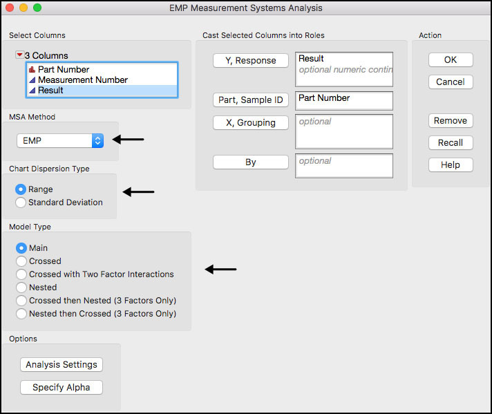
A few of the fields in the interface are further defined:
◦ MSA Method: two options are provided, EMP (Evaluating the Measurement Process) and Gauge R&R. The two different options produce different ways of summarizing the results, different statistical tests, and different graphics. Note Gauge R&R produces the same output as the Variability / Attribute Gauge Chart platform. See JMP help for more details.
◦ Chart Dispersion Type: designates the type of chart for showing variation. If EMP is selected for MSA, then XBar and Range or XBar and S control charts are automatically displayed. If Gauge R&R is selected for MSA, only S charts are available.
◦ Model Type: specifies the type of variance components model fit to the results, in order to estimate the different sources of variation in the study.
4. Click OK when done. The output is shown in Figure 5.30.
Figure 5.30 Default Output for MSA EMP Analysis

The default output shown in Figure 5.30 matches the control charts in ISQC Figure 8.14. As Montgomery points out, in a measurement study we expect the XBar chart to have many points that exceed the control limits. Recall, the XBar limits are calculated using an estimate of variation from the Range chart. In this study design, the Range chart represents the measurement error, so the XBar chart is a visual representation of the measurement error (control limits) and the part-to-part variation. An estimate of measurement error can be obtained from the Range chart using the average Range and the control chart constant d2. In ISQC Example 8.7, σgauge = 1.0 / 1.128 = 0.887.
Further analyses of this study are presented in the text following ISQC Example 8.7, including a description of P/T ratio (precision to tolerance), variance components and the discrimination ratio (DR). We will continue this example by switching to the Gauge R&R MSA method in this platform. Note additional output produced by the EMP MSA method is discussed in the Statistical Insights section, later in this chapter.
5. Re-launch the Measurement Systems Analysis by selecting Redo ► Relaunch Analysis from the red triangle next to Measurement Systems Analysis for Result in Figure 5.30. Alternatively, activate the JMP table and repeat Step 2 above.
6. When the launch window appears, select Result and click Y, Response, and then select Part Number and click Part, Sample ID. Select Gauge R&R for MSA Method and Main Effect for Model Type.
Figure 5.31 Launch Window using Gauge R&R MSA Method
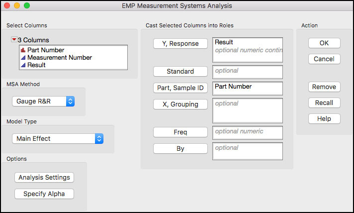
7. Click OK when finished. A number of options are available using the red triangle next to Variability Gauge as shown in Figure 5.32.
Figure 5.32 Options for Gauge R&R MSA Method

8. Select Gauge Studies ► Gauge RR from the drop-down menu in Figure 5.32. A dialog box will appear. Leave the tolerance entry method as LSL and/or USL. Type 6 into the field for K, Sigma Multiplier and ensure that LSL = 5 and USL = 60. Note the specification limits were imported from the Result’s Column Properties in the JMP table.
Figure 5.33 Dialog Window for Gauge Studies ► Gauge R&R Option

9. Click OK when finished.
10. Next select Variance Components, Gauge Studies ► Discrimination Ratio and Gauge Studies ► Misclassification Probabilities from the drop-down menu in Figure 5.32. Finally, deselect Variability Chart and Std Dev Chart.
Figure 5.34 Selected Output for Gauge R&R MSA Method

Much of the available output for a Gauge R&R analysis is shown in Figure 5.34. The Precision / Tolerance Ratio = 0.09448 is in the last row of the output under the Gauge R&R banner. This number implies that the gauge error is 9.448% of the tolerance (USL – LSL). Montgomery points out that a P/T ratio of 0.1 or less indicates adequate gauge capability. Note the JMP P/T result is slightly different from the P/T of 0.09673 (= 5.32/55) shown in ISQC Section 8.7.1. This is due to the two different methods of estimating the Gauge R&R error: Rbar/d2 (1.0/1.128 = 0.8865248) in ISQC and EMS (expected mean square) estimate (0.8660254) in JMP.
The variance component estimates are found under the Variance Components banner and under the Variance Components for Gauge R&R banner. The variance component estimates for part variation and gauge error are identical in both sections of the output; however, the first banner also provides an estimate of the total variation and the square root of the variance component. The variance component break down, σ2total = σ2part + σ2gauge, shows that 10.3065 = 9.5566 + 0.7500. These estimates are slightly different from what is presented in ISQC Section 8.7.1, 10.05 = 9.26 + 0.79, due to the different estimation methods and roundoff error.
Estimates for the two measures shown in ISQC equations 8.26 and 8.27 are also found under the Variance Components or Variance Components for Gauge R&R banners. Both of these measures are ratios (or equivalently % = 100*ratio) of the specific variance component to the total variation and can be found in the % of Total columns in both tables. (For example, ρpart = 92.7% = 9.5566 / 10.3065 and ρgauge = 7.3% = 0.7500/ 10.3065.) These numbers are expressed as ratios in ISQC Section 8.7, ρgauge = 0.0786 and ρart = 1 - 0.0786 = 0.9214, and differ slightly from the JMP output.
The Discrimination Ratio (DR) is provided in the JMP output. It provides a measure of the relative usefulness of a given measurement for a specific product. Guidelines suggest that when the DR is less than 2, the measurement system cannot adequately detect production variation and the measurement process needs improvement, and if DR is greater than 4 then the measurement system adequately detects production variation. Figure 5.34 shows a Discrimination Ratio of 5.15, while ISQC Section 8.7.1 shows DR = 24.45. It should be noted that two different equations were used for these calculations. For ISQC see equation 8.29 and for JMP see Wheeler (2005).
The Misclassification Probabilities are included at the bottom of Figure 5.34. Although these were not presented for ISQC Example 8.7, the topic is addressed in ISQC Section 8.7.4. We also find these calculations to provide useful information, when the study includes representative part-to-part variation. These calculations show the probability for a good part being rejected or a bad part being accepted, which can happen whenever measurement error is greater than zero. These two corresponding probabilities are found next to the labels P(Good part is falsely rejected) and P(Bad part is falsely accepted). The formulas for these two misclassification probabilities are given in ISQC equations 8.36 and 8.37.
Finally, the output under Variance Components for Gauge R&R comes from the Auto Industry Action Group (AIAG) of the American Society for Quality. It is included here for completeness. An interesting discussion of this analysis can be found in Wheeler (2009).
|
|
JMP Note 5.5: The JMP Measurement System Analysis (MSA) offers three options for computing variance components and, by default, selects the best analysis option for the data. The three options are Expected Mean Squares (EMS), Restricted Maximum Likelihood (REML), and Bayesian. |
ISQC Table 8.7 Thermal Impedance Data for Gauge R&R Experiment
In this example, we show how to conduct an analysis of data from another Gauge R&R study. The study design included ten units of a product, where three inspectors measured each unit three times using one instrument. The data consists of a total of 90 observations and it is organized in a vertical manner, where all 90 observations are included in one column and identified appropriately.
The following steps illustrate how to analyze this data set using the Measurement System Analysis platform. Note this example is further discussed in the Statistical Insights section of this chapter.
1. Open Chapter 5 – ISQC Table 8.7.jmp, which has variables called Part Number, Operator, Test Number Thermal Impedance. The Part Number indicates an actual part and has a Nominal modeling type. Note that each part number is repeated nine times. The operator represents the three inspectors in the study and it also has a Nominal modeling type. The test number represents the first, second, or third time it was measured, and the thermal impedance is the measurement obtained from the gauge.
2. Select Analyze ► Quality and Process ► Measurement System Analysis.
3. When the launch window appears, select Thermal Impedance and click Y, Response and then select Part Number and click Part, Sample ID and select Operator and click X, Grouping. Select Gauge R&R for MSA Method and Crossed for Model Type (Figure 5.35). When finished click OK.
Figure 5.35 Launch Window for MSA with Part and Operator
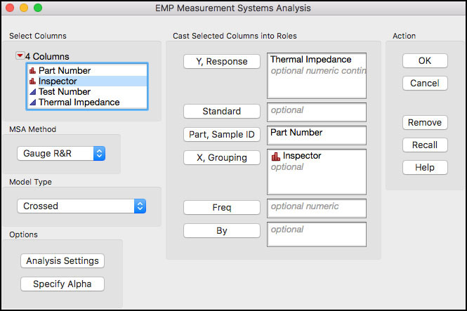
4. From the red triangle next to Variability Gauge select Gauge Studies ► Gauge RR from the drop-down menu. A dialog box will appear. Leave the tolerance entry method as LSL and/or USL. Type 6 into the field for K, Sigma Multiplier and ensure that LSL = 18 and USL = 58. Note the specification limits were imported from the Thermal Impedance’s Column Properties in the JMP table.
5. Next, from the same menu, select Variance Components and deselect Variability Chart and Std Dev Chart. Click OK when finished.
Figure 5.36 Analysis Output for Thermal Impedance Gauge R&R
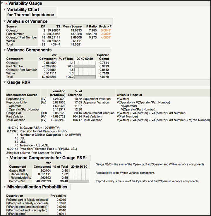
ISQC Section 8.7.2 uses the Analysis of Variance (ANOVA) method to analyze the data from ISQC Table 8.7. We selected a Crossed model type in Figure 5.35 because every operator measured the same 10 parts three times, resulting in Operator, Part and Operator*Part terms. The ANOVA table is provided at the top of the output shown in Figure 5.36 and matches ISQC Table 8.8. Note the Expected Mean Squares are not provided in this platform. The Part Number exhibits the largest variation and results in the largest F Ratio = 162.270.
The variance component estimates are found under the Variance Components banner and under the Variance Components for Gauge R&R banner. The variance component estimates for part variation and gauge error are identical in both sections of the output; however, the first banner breaks out the Reproducibility components (Operator and Operator*Part Number) also provides an estimate of the total variation and the square root of the variance components. The variance component break down, σ2total = σ2part + σ2gauge, shows that 50.0963 = 48.2926 + 1.8037. These estimates agree with what is presented in ISQC Section 8.7.2, 48.29 + 1.80 = 50.09. The % of Total columns, indicate that the part-to-part variation contributes 96.4% to the total variation, while the gauge error contributes 3.60%. All components that contribute to the Gauge R&R appear to contribute in a similar manner, with Operator = 1.1%, Operator*Part Number = 1.5% and Within (repeatability) = 1.0%.
The Precision / Tolerance Ratio = 0.20145 is in the last row of the output under the Gauge R&R banner. This number implies that the gauge error is 20.145% of the tolerance (USL – LSL). Montgomery points out that a P/T ratio of 0.1 or less indicates adequate gauge capability. The JMP output shows P/T = 0.20145, in agreement with the P/T equation . Note that the reported P/T = 0.27 shown in ISQC Section 8.7.2 is incorrect. This is the value one would obtain if one uses the gauge variance 1.8037 in the formula instead of the gauge standard deviation. In other words, the P/T was calculated as 6 × 1.8037 / (58−18)=0.27.
Once again, the Misclassification Probabilities are included at the bottom of Figure 5.36. These calculations show the probability for a good part being rejected or a bad part being accepted, which can happen whenever measurement error is greater than zero. These two corresponding probabilities are found next to the labels P(Good part is falsely rejected) and P(Bad part is falsely accepted).
ISQC Table 8.13 Attribute Gauge Capability Analysis
In this example, we will show how to analyze data generated from a Gauge R&R study, where the response of interest is attribute in nature, such as, good/bad or class a / class b / class c. The study design in ISQC Table 8.13 shows a study for a bank that uses underwriting to analyze mortgage loan applications. Each underwriter must analyze the relevant information and classify the application into one of four categories: Decline (decline the applicant of funding), Fund – 1 (fund, but higher risk applicant), Fund-2 (fund, lower risk applicant) and Fund-3 (fund, lowest risk applicant). Three underwriters, John, Sue, and Fred, were asked to classify 30 applications twice.
The JMP table has a total of 60 rows, with columns for the application number (Application), the correct classification of the application (Classification), the first or second review of each application (Review Number) and a column each for Sue’s, Fred’s, and John’s classification of the application (Sue, Fred, John). The following steps illustrate how to analyze this data using the Variability / Attribute Gauge Chart platform.
1. Open Chapter 5 – ISQC Table 8.13.jmp, which has variables called Application, Classification, Review Number, Sue, Fred, and John. Note that Classification, Sue, Fred, and John have a Nominal modeling type.
2. Select Analyze ► Quality and Process ► Variability / Attribute Gauge Chart.
3. When the launch window appears, first select Attribute for Chart Type. Next select Sue, Fred, and John and click Y, Response. Select Classification and click Standard. Then select Application and click X, Grouping (Figure 5.37).
Figure 5.37 Launch Window for Attribute Gauge Study

4. Click OK when finished.
The output for this analysis is too large to capture in one figure and therefore, will be presented in sections. Figure 5.38a shows a plot of the % Agreement for each of the thirty applications and then for each underwriter. The blue lines in the plots show the agreement rates for the underwriters for each application and the red lines in the plots show the effectiveness rates, or agreement to the standard, for the underwrites for each application. In order to locate the applications with high or low rates, click on the points in the first figure to highlight them in the JMP table then use Tables ► Subset. The data in Figure 5.38b show the raw data associated with the highest and lowest effectiveness. For example, for Application 7, all underwriters classified it as ‘Fund-3’, which also matches the standard classification of ‘Fund-3’. For Application 1, three of the 6 attempts classified it as ‘Fund-3’, 2 as ‘Fund-2’ and 1 as ‘Fund-1’; and, the standard classification is ‘Fund-1’.
Figure 5.38a Default Output for Attribute Gauge Study

Figure 5.38b Data Subset for High Effectiveness

Figure 5.38b Data Subset for Low Effectiveness

The information in the bottom graph in Figure 5.38a is summarized next in the JMP output in an Agreement Report. As is shown in Figure 5.38c, Sue’s agreement is 61.48%, Fred’s agreement is 59.26%, and John’s agreement is 60.74%. These numbers represent the underwriter’s agreement with himself or herself and the other underwriters for a given application, summed up over all of the applications. Sue, Fred, and John have similar performance, with approximately a 60% agreement. The overall agreement is 23.33%, with 7 out of 30 matches; and with 95% confidence, this rate goes from 11.79% to 40.93%.
Figure 5.38c Agreement Report for Attribute Gauge Study

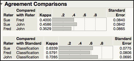
The next piece of output, shown in the first part of Figure 5.38d, looks at agreement between all of the pairwise comparisons of the underwriters. It uses a Kappa statistic to quantify the level of agreement. The Kappa statistic can take on values between 0 and 1. Kappa values closer to 1 indicate agreement and Kappa values closer to 0 suggest less agreement. The Kappa statistics do not seem to support a high level of agreement between any two underwriters, with all values less than 0.5. The bottom part of the output in Figure 5.38d shows agreement for each underwriter with the standard. Since John has the highest Kappa statistic (0.73), he has the highest agreement between his classifications and the standard. Sue has the next highest Kappa (0.63) followed by Fred (0.58).
Figure 5.38d Agreement Comparison for Attribute Gauge Study
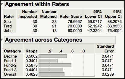
The output in Figure 5.38e appears next in the JMP output. The first table shown provides information about the agreement level for each underwriter with themselves. For example, Sue’s two classifications for a given application matched each other for 23 of the 30 applications, which results in a Rater Score = 23 / 30 = 75.67%. John had the lowest Rater Score of 60% because he only matched 18 of the 30 applications. These estimates agree with the estimates presented at the top of ISQC Table 8.14. However, the 95% confidence intervals are slightly different because JMP confidence intervals are score confidence intervals, while the ones in Table 8.14 are based of the F distribution. The bottom table in Figure 5.38e, Agreement across Categories, shows Kappa statistics for the agreement in classification over that which would be expected by chance. All the kappa statistics are < 0.51 indicating that there is no strong agreement between the raters.
Figure 5.38e Agreement Comparison for Attribute Gauge Study
The final output is shown in Figure 5.38f. The Effectiveness Report is only available when a standard is used and provides information about the consistency between the classification and the standard. The first table shows the correct and incorrect classifications for each category and underwriter. Note these counts include the replicates for each application, using all 60 results for each underwriter. Therefore, the standard included 8 (4x2) Decline, 14 (7x2) Fund-1, 20 (10x2) Fund-2 and 18 (9x2) Fund-3. For example, Sue correctly classified 6 ‘Decline’, 8 ‘Fund-1’, 15 ‘Fund-2’ and 15 ‘Fund-3’, for a total of 44 correct classifications. She incorrectly classified 2 ‘Decline’, 6 ‘Fund-1’, 5 ‘Fund-2’ and 3 ‘Fund-3’, for a total of 16 incorrect classifications.
Figure 5.38f Effectiveness Report for Attribute Gauge Study

In the second table in Figure 5.38f, Sue’s Effectiveness score is 44 / 60 = 73.33%. Based on all of the attempts, John has the highest Effectiveness rate of 48 / 60 = 80% and Fred’s is the lowest, 42 / 60 = 70%. The last table in Figure 5.38f shows the misclassification rates, where the rows represent the standard and the columns contain the levels given by the underwriters. For the three underwriters, there are a total of 46 incorrect classifications, with 11 ‘Fund-1’ incorrectly classified as ‘Fund-2’ and 11 ‘Fund-1’ incorrectly classified as ‘Fund-3’. I this case, a standard result of ‘Fund-1’ had the most misclassifications (11+11=22).
Some of the output presented in Figures 5.38a through Figure 5.38f can be found in the output shown in ISQC Table 8.14. For example, the Within Appraisers and Between Appraiser information in ISQC is also shown in Figure 5.38c and Figure 5.38e. We agree with Montgomery’s conclusion, that “there is not great agreement in this study.”
ISQC Example 8.8 Meeting Customer Specifications
In this example, we provide a data set to illustrate the concepts in ISQC Example 8.8. The specification limits for the length of the Final Dimension is 12 ±0.10. The following steps illustrate how to analyze this data set using the Distribution platform.
1. Open Chapter 5 – ISQC Example 8.8.jmp, which has variables called Assembly Number, Part 1, Part 2, Part 3, Part 4, and Final Dimension.
2. From the main menu, select Analyze ► Distribution.
3. When the launch window appears, highlight Part1, Part2, Part3, Part4, and Final Dimension and click Y, Columns. When finished, click OK.
4. From the red triangle next to Part 1, hold the control key (command on Mac) and deselect Display Options ► Quantiles. Next, while holding the control key (command on Mac), select Display Options ► Customize Summary Statistics. When the dialog box comes up, click Variance and then click OK. The output is shown in Figure 5.39.
Figure 5.39 Output for ISQC Example 8.8
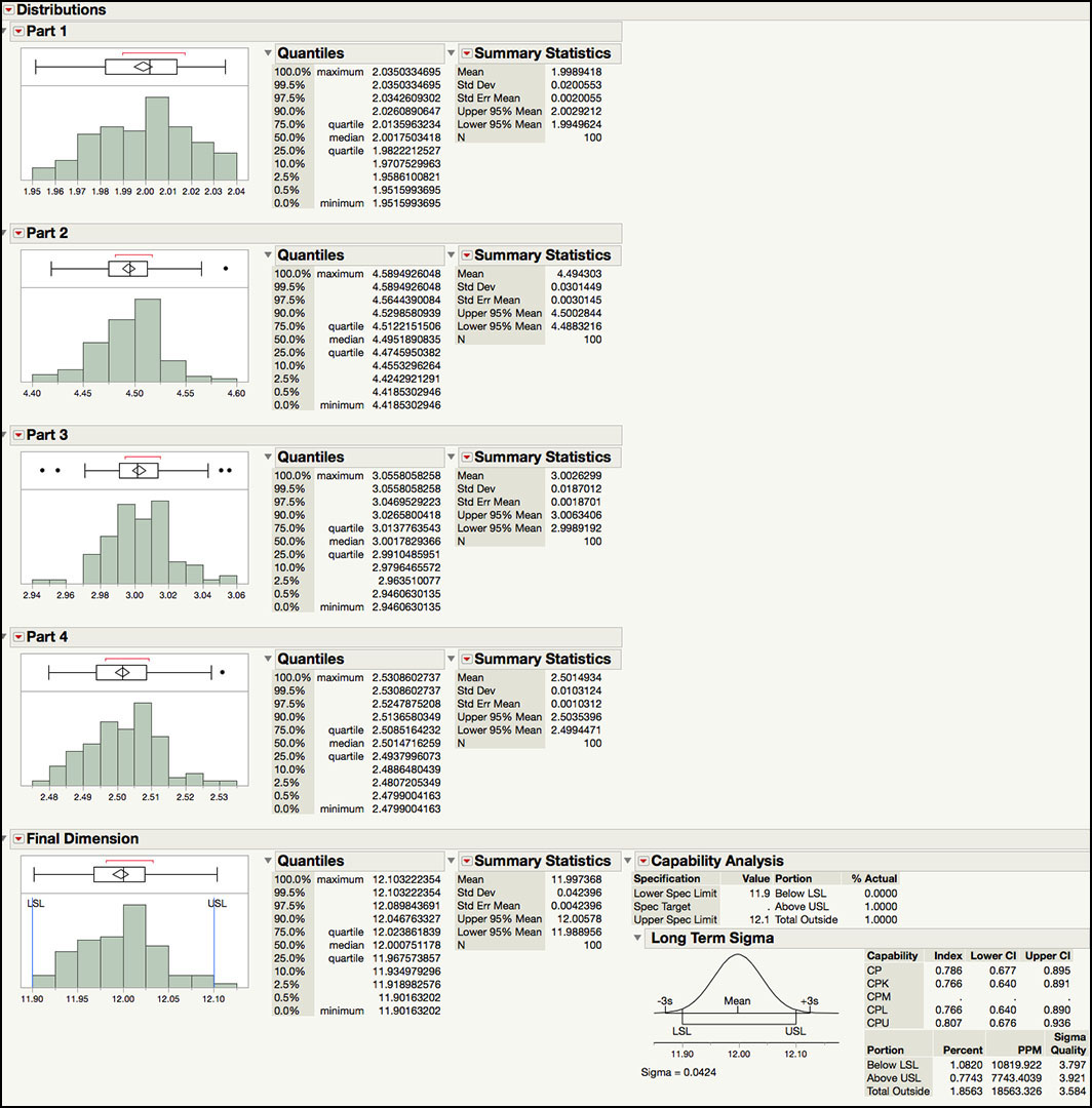
The output in Figure 5.39 includes summary statistics for Part 1 through Part 4, along with a capability analysis for the Final Dimension. This example illustrates the impact of tolerance stack-up problems when the performance of the individual components is not well controlled or specified in an optimal manner. As was discussed in ISQC Example 8.8, when four parts are assembled, the mean of the Final Dimension is the sum of the means of the four parts and the variance of the Final Dimension is the sum of the variances of the four parts. In Figure 5.39, we see that the means for Parts 1 through 4 are 1.9989, 4.4943, 3.0026 and 2.5015, respectively. The Final Dimension mean is 11.9974, as was expected. Similarly, the variance of Part 1 through Part 4 is 0.0004, 0.00009, 0.0003 and 0.0001, respectively. The Final Dimension variance is 0.0018, as is expected.
The Capability Analysis provides an estimate of the percent of assemblies that will be out of specification limits of 12 ±0.10, or (11.9, 12.1), which is 1.8563%. Alternatively, the assembled parts that will all be within the specification limits is 100 – 1.8653, or 98.14%. This number is slightly off to what is presented in ISQC Example 8.8, 98.173%, due to simulated data. The Cpk for this parameter is 0.766 and it has ‘3.8 sigma’ quality level. This process is far from a ‘6 sigma’ process. However, it can be improved by reducing the variation for the four parts, while keeping them on target; which is the topic of the next example.
ISQC Example 8.9 Designing a Six Sigma Process
In this example, we provide a data set to illustrate the concepts in ISQC Example 8.9. The specification limits for the length of the Final Dimension are 5.00 ±0.06 inches. Process capability specification limits for each part were set to its Target ±0.01732 inches. The following steps illustrate how to analyze this data set using the Distribution platform.
1. Open Chapter 5 – ISQC Example 8.9.jmp, which has variables called Assembly Number, Part1, Part2, Part3, and Final Dimension.
2. From the main menu, select Analyze ► Distribution.
3. When the launch window appears, highlight Part1, Part2, Part3, and Final Dimension and click Y, Columns. When finished, click OK.
4. From the red triangle next to Part 1, hold the control key (command on Mac) and deselect Display Options ► Quantiles. Next, while holding the control key (command on Mac), select Display Options ► Customize Summary Statistics. When the dialog box comes up, click Variance and then click OK. See Figure 5.40.
Figure 5.40 Output for ISQC Example 8.9

5. Under the Final Dimension output, from the red triangle next to Capability Analysis select Capability Animation. The Capability Animation window will appear. Shift the process mean by dragging the square on top of the blue normal distribution to the right, until it says ‘Mean Shift 2.5σ’. Note the LSL and USL can also be moved in the same manner.
Figure 5.41 Capability Animation for Final Dimension

The output in Figure 5.40 shows the summary statistics for Part 1, Part 2, Part 3, and the Final Dimension, along with their Capability Analysis. In ISQC Example 8.9, it was shown how to determine the maximum value for the variance of each part that is required to achieve a very high quality process for the final assembly. It was determined that if σ2final = 0.0102 is required for a high quality product then the variance for each of the three components (σ2part) can be no greater than 0.000033 (σ = 0.00574). The summary statistics show that the standard deviations for Part 1, Part 2, and Part 3 are 0.00548, 0.00574 and 0.00578, respectively. The standard deviation for the final assembly is 0.00927.
The Capability Analysis also shows that Cp is close to 1 for all three parts. For the Final Dimension, Cp is 2.157, which is at better than a ‘6 sigma’ level of quality. Capability Animation is a very nice tool in JMP that allows the mean and / or the specification limits to be reset in order to see the impact on the performance indices. The graph in Figure 5.41 shows the impact of shifting the mean of the Final Dimension from 5.00 to 5.025, which is a 2.5σ shift toward the USL. In practice, it is not unusual to see a drift in the mean over time. Even with this shift, the process is still operating at a Cpk = 1.6, which is a ‘6.3 sigma’ level of quality. This example illustrates the importance of tolerance stack up and the need to control the quality of all of the individual components to achieve a ‘6 sigma’ level of quality.
ISQC Example 8.12 Constructing a Tolerance Interval
In this example, we provide a data set to illustrate the concepts in ISQC Example 8.12.
The following steps illustrate how to analyze this data set using the Distribution platform.
1. Open Chapter 5 – ISQC Example 8.12.jmp, which has variables called Sample Number and Response.
2. From the main menu, select Analyze ► Distribution.
3. When the launch window appears, select Response and click on Y, Columns and click OK.
4. Click on the red triangle next to Response and select Tolerance Interval from the drop-down menu. In the Tolerance Intervals dialog box, enter 0.99 in the field next to Specify Proportion to cover. Click on radio button for Two-sided (Figure 5.42).
Figure 5.42 Dialog Box for Tolerance Intervals

5. Click OK when finished.
Figure 5.43 Tolerance Interval for Solid-Fuel Rocket Propellant

In Figure 5.43 we see that the mean and standard deviation for this data are 40.876 and 1.347, respectively. The tolerance interval is (35.212, 45.540), with 95% confidence (1-Alpha) and 99% coverage (Proportion). We expect 99% of future results to fall between 35.212 and 45.540. The “k” multiplier used in this calculation is 3.46. The value of k=2.972 used in ISQC Example 8.12 is the one corresponding to 99% confidence and 95% coverage. For 95% confidence and 99% coverage, the value from ISQC Appendix VII is 3.457, in close agreement with the k value in JMP.
|
|
Statistics Note 5.3: Howe (1969) gives an approximation for the two-sided tolerance interval multiplier k when the data can be approximated by a normal distribution. The k constant for a (1-α)% confidence and γ% coverage, for a sample of size n, can be approximated by Where z1-γ/2 is the 1-γ/2 quantile of the normal distribution, and χ21-α , (n-1) is the 1-α quantile of the Chi-Square distribution with (n-1) degrees-of-freedom. |
In industry, statistical tolerance intervals are often used to set process capability based specification limits. The sample size can influence the coverage used. For example, for smaller sample sizes (n ≤ 30), a coverage value of 99% is used and for larger sample sizes (n ≥ 75), a coverage value of 99.73% coverage, equivalent to 3 sigma, is more appropriate. For this example, setting the specifications to the 99% tolerance interval (36.21, 45.54) would result in an initial Cpk = k/3 = 3.46/3 = 1.153. If a larger initial Cpk is desired, then the coverage of the tolerance interval should be increased.
Statistical Insights
In this section, we elaborate upon some of the examples provided in ISQC Chapter 8. The examples highlighted in this section include several important concepts we have encountered over our many years of applying SPC successfully to a variety of industries. For most of these examples, additional output not provided in ISQC is included to illustrate JMP functionality or further elaborate on important points.
Process Capability Indices for Nonnormal Data
There is a discussion in ISQC Section 8.3.3 about normality and its impact on the interpretation of Cp and Cpk. More specifically, a large departure in normality will result in errors in the interpretation of the expected process fallout based on the normal distribution. It should be noted that published tables of the expected process fall out for different values of Cp or Cpk are most likely based on the normal distribution and therefore, assume that this is an appropriate distribution for the data at hand. In JMP, this information is found in the Capability Analysis section, which is labeled: Portion Below LSL, Above USL and Total Outside.
There are several suggestions provided in ISQC Section 8.3.3 for computing process capability indices for nonnormal data. These include computing PCIs in a transformed scale that achieve normality, using Luceños’s Cpc index (see ISQC equation 8.10) or using quantile-based formulas using a more appropriate distribution for the data (see ISQC equation 8.11). We will explore some of these options in this section using the Distribution platform in JMP. The data shown in ISQC Table 6.8 in Example 6.6 will be illustrated first. The data set includes Resistivity readings for 25 silicon wafers and the natural log of each result.
1. Open Chapter 5 – ISQC Table 6.8.jmp, which has variables called Sample, Resistivity and log(Resistivity).
2. From the main menu, select Analyze ► Distribution.
3. When the launch window appears, select Resistivity and log(Resistivity) in the left hand box and then click Y, Columns. Click OK when finished.
4. From the red triangle next to the Resistivity label, hold the control key (command on Mac) and deselect Display Options ► Quantiles and then deselect Outlier Box Plot.
5. From the red triangle next to Resistivity select Continuous Fit ► Normal (Figure 5.44a) and then select Continuous Fit ► LogNormal (Figure 5.44b). From the red triangle next to log(Resistivity) select Continuous Fit ► Normal (Figure 5.44c).
Figure 5.44a Process Capability Results for Resistivity Normal Distribution
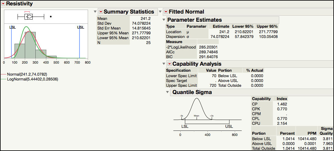
Figure 5.44b Process Capability Results for Resistivity Lognormal Distribution

Figure 5.44c Process Capability Results for log(Resistivity) Normal Distribution

In order to carry out a capability analysis for this data, we arbitrarily set LSL = 70 and USL = 720. The first part of the output shown in Figure 5.44a and Figure 5.44b show the data and capability analyses for the original Resistivity results, while Figure 5.44c shows the analysis for the natural log transformed results.
Both a normal (Figure 5.44a) and lognormal distribution (Figure 5.44b) was fitted to the Resistivity results. Since the specification values were set in the Column Properties, the capability analysis is automatically produced by JMP. The capability indices shown are calculated using the quantile-based approach described in ISQC equation 8.11. The normally derived Cp = 1.462 and Cpk = 0.770, while the lognormal Cp = 1.458 and Cpk = 1.213. The portion outside of the specification limits for the normal and lognormal distributions is 1.04% and 0.0048%, respectively. Finally, the Sigma Quality for each distribution is ‘3.811 sigma’ and ‘5.401 sigma’, for the normal and lognormal, respectively.
|
|
Statistics Note 5.4: To compute process capability indices for nonnormal data, one can use the quantiles from a scientifically justified probability distribution that approximates the data well. |
These two analyses for silicon wafer Resistivity result in two very different conclusions regarding the state of the process. The normal based analysis concludes that the process is significantly off-center and results in an unacceptable capability at the LSL, while the lognormal analysis suggests that capability is greater than 1 and is performing closer to a ‘6 sigma’ level of quality.
The analysis for the natural log transformed data in Figure 5.44c assumes that the transformation resulted in normally distributed data. The capability estimates are Cp = 1.335 and Cpk = 1.300. For this data, these results are similar to the capability indices obtained using the lognormal quantiles. However, this might not always be the case and there might be differences in the two estimates. We prefer, whenever possible, to select an appropriate distribution that approximates the data and makes sense, scientifically, and use the fitted quantiles to estimate the capability indices. The Distribution platform in JMP calculates capability indices for the continuous distributions (for example, normal, lognormal, gamma, weibull, and exponential) as well as the discrete distributions (Poisson, Gamma Poisson, Binomial, and Beta Binomial).
|
|
JMP Note 5.6: The Process Capability platform can be used to compute capability indices for nonnormal data. One can specify the distribution as well as the type of computation for capability indices, either quantile based, or z-score based. |
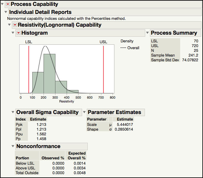
We can also use the Process Capability platform to perform a capability analysis for Resistivity using the lognormal distribution.
1. Open Chapter 5 – ISQC Table 6.8.jmp, which has variables called Sample, Resistivity and log(Resistivity).
2. Select Analyze ► Quality and Reliability ► Process Capability.
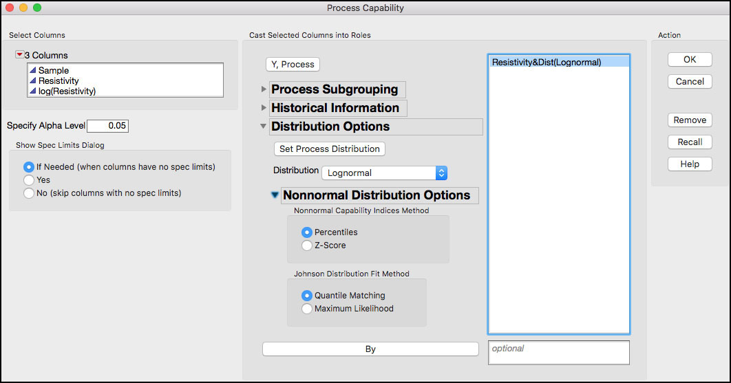
3. Select Resistivity as the Y, Process variable. From the Distributions Options select Lognormal under Distribution as shown in Figure 5.45. In the Distribution Options, select Resistivity and click the Set Process Distribution button. The dialog window now shows Resistivy&Dist(Lognormal) to indicate that the lognormal distribution is being applied to Resistivity (Figure 5.45). Leave the default value of Percentiles under Nonnormal Capability Indices Method. Click OK.
Figure 5.45 Process Capability Platform Dialog Window for Resistivity
4. To generate a report with the capability indices, click on the red triangle next to Process Capability and select Individual Detail Reports. The output is shown in Figure 5.46. These results are the same as the ones in Figure 5.44b, and similar to those in Figure 5.44c.
Figure 5.46 Process Capability Output for Resistivity with Lognormal Distribution
|
|
JMP Note 5.7: The distribution for the Process Capability platform can be pre-specified as a column property.
|
Process Capability Indices and Sample Size
Confidence intervals for Cp and Cpk are presented in ISQC Section 8.3.5. Since these are point estimates, similar to a sample mean or sample standard deviation, they contain sampling error. Therefore, these estimates should take into account the sampling error, as well as the sample size. Equations 8.20 and 8.21 in ISQC provide 1-a confidence intervals for Cp and Cpk, respectively. Both of these equations incorporate the effect of sample size, n, directly in the calculations, as well as through the selection of the chi-square quantiles in equation 8.20.
Figure 5.47 shows the width of the 95% confidence interval as a function of sample size, for a Cpk = 1.33, using ISQC equation 8.21. For a sample size of 20, the 95% confidence interval is [0.88, 1.78] (ISQC Example 8.5), with a width of ±0.45. As the sample size increases the width of the interval decreases. However, even for a sample size of 100 the 95% confidence interval for a Cpk = 1.33 is [1.13, 1.53], with a width of ±0.195. This means that with 95% confidence the true Cpk can be as low as 1.13, not as good of a situation, or as large as 1.53. We need a sample size of 400 to have an interval width of ±0.1, or a 95% interval of [1.23, 1.43].
Figure 5.47 95% Confidence Interval Width for Cpk = 1.33 versus Sample Size

EMP for Measurement System Analysis
Earlier in this chapter, we analyzed the data in ISQC Table 8.7 using the Gauge R&R MSA Method in the Measurement System Analysis platform. In this section, we would like to illustrate some of the functionality available in JMP using the EMP MSA Method.
1. Open Chapter 5 – ISQC Table 8.7.jmp, which has variables called Part Number, Operator, Test Number and Thermal Impedance.
2. Select Analyze ► Quality and Process ► Measurement Systems Analysis.
3. When the launch window appears, select Thermal Impedance and click Y, Response and then select Part Number and click Part, Sample ID and select Operator and click X, Grouping. Select EMP for MSA Method and Crossed for Model Type.
4. When finished, click OK.
Figure 5.48 Default Output for EMP MSA Method

5. Click on the red triangle next to Measurement System Analysis for Thermal Impedance (Figure 5.48). Select Bias Comparison, Test-Retest Comparison, EMP Results, and Effective Resolution. The output is shown in Figure 5.49a through Figure 5.49d.
|
|
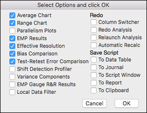
JMP Note 5.8: Holding the Alt (Mac Option key) launches a selection window where one can select multiple options at once. The selections for the EMP analysis in step 5 are shown below.
|
Many additional outputs are available for the EMP MSA Method, as is shown in the menu highlighted in Figure 5.48. We have selected a few to discuss in this section, which we find very useful. Note we discussed the graphical output shown in Figure 5.48 previously in ISQC Example 8.7. The first output is the Bias Comparison, shown in Figure 5.49a. This plot is used to determine if there is a bias between the Operators. It consolidates the information in the XBar chart in Figure 5.48. It uses Analysis of Means and charts the average of all of the results for each Operator. The limits are constructed using the test-retest error. The means for Operator 1 and Operator 2 plot outside of the decision limits, indicating that their mean difference is significantly larger than the test-retest error. Note in this analysis, Operator is treated as a fixed effect, where emphasis is placed on understanding and removing operator differences and therefore, improving the measurement process.
Figure 5.49a Bias Comparison for Thermal Impedance

|
|
Statistics Note 5.5: An analysis of means is a graphical decision tool for comparing a set of averages or variances with respect to their overall average. You can think of it as a control chart but with decision limits instead of control limits, or as an alternative to an analysis of variance (ANOVA). Prof. Ellis Ott introduced the analysis of means in 1967 as a logical extension of the Shewhart control chart. |
The plot in Figure 5.49b is used to determine if the test-retest error is similar among the operators. It consolidates the information found in the Range Chart in Figure 5.48. It also uses Analysis of Means to determine if the average Range for any of the operators is statistically different. Since all of the points are within the control limits, we can assume that the test-rest error for each operator is similar.
Figure 5.49b Test-Retest Error Comparison for Thermal Impedance

The EMP Results section is shown in Figure 5.49c. As was described above, Operator and Part*Operator are not included in the measurement error. The measurement error in this study is estimated using the repeat measurements, where the same operator measured the same part multiple times. In Figure 5.49c, an estimate of the test-retest error is 0.6302 and has 54.7 degrees of freedom. The probable error is 0.67σ test-retest = 0.67(0.6302) = 0.4251. This is used to describe the error associated with a single measurement; for example, the thermal impedance reading is 35.0 ±0.4251. The intraclass correlation (no bias) is the ratio of part-to-part variation over the total variation, using all of the data and the intraclass correlation (with bias) is the same ratio, but with operator bias removed The bias impact is the difference in the two intraclass correlation estimates. Finally, the EMP MSA method provides a measurement system classification, which is based on the intraclass correlation coefficient. The thermal impedance measurement system has a ‘First Class’ classification, which is the best performance. Definitions for the four classes are shown under the Monitor Classification Legend.
Figure 5.49c EMP Results for Thermal Impedance

The last piece of output shown is the Effective Resolution of the measurement system. This information is used to determine the recorded precision for a measurement. The current measurement increment shown in Figure 5.49d is 1 and can be verified in ISQC Table 8.7. The smallest and largest effective increments, 0.0935 and 0.9351, provide a bound for measurement precision. For example, there is no additional value in recording data below 0.0935. If we round this to 0.1, then the data should not be recorded past the first decimal place. The largest effective increment is 0.9351, which suggests that the recorded data precision should be increased.
Figure 5.49d Effective Resolution Results for Thermal Impedance

|
|
Statistics Note 5.6: There are many different ways to analyze data from a measurement system study. Some analyses view ‘operator’ effects as part of the noise of the measurement system, while others, treat it as an experimental factor that can be studied and improved upon. |

