Chapter 8: Other Univariate Statistical Process Monitoring and Control Techniques
JMP Platforms for Monitoring Autocorrelated Processes
ISQC Example 10.2 Residuals Control Chart
ISQC Figure 10.17 Moving Centerline Centerline Forecast Control Chart
Monitoring Future Autocorrelated Observations
Overview
This chapter illustrates several univariate statistical process monitoring and control techniques, which are covered in Chapter 10, Other Univariate Statistical Process-Monitoring and Control Techniques, of Introduction to Statistical Quality Control (ISQC). The two techniques covered in this chapter include SPC for autocorrelated process data and Cuscore charts for monitoring changes in time series parameters.
The techniques presented in this chapter are discussed for measurements using a continuous scale. The concepts will be illustrated using several platforms in JMP, including, Time Series and the Control Chart Builder, and examples based on data from the Semiconductor Industry.
Special Topics Review
This chapter illustrates monitoring techniques for autocorrelated data. These techniques are discussed in ISQC Chapter 10, Other Univariate Statistical Process-Monitoring and Control Techniques. As Montgomery points out, an underlying assumption for the use of control charts is that, when the process is in control, the data can be represented by a normal distribution with a constant mean μ and standard deviation σ. This is shown algebraically in ISQC equation (10.9), or equation (1) below.
(1)
where εt is normally and independently distributed, with mean 0 and standard deviation σ.
In practical terms, the model in equation (1) means that, when the process is in control, the plotted data on a Shewhart chart will be randomly distributed about the centerline; absent of unusual patterns or trends, and within the ±3 sigma control limits. When the process departs from a state of control, due to a mean shift, then the data will plot outside of the control limits or might violate runs tests, such as a run of points above the centerline.
The assumption of independent errors in equation (1), which implies that the data must be independent, should be investigated when using Shewhart control charts, such as, XBar and R charts or Individual and Moving Range charts (XmR). In general, when the data are not independent and positively autocorrelated, the within subgroup variance used in the construction of the control limits, which is estimated by the average moving range or average of the subgroup ranges, will be underestimated. This in turn results in control limits that are too tight, which in turn result in an excess of unnecessary violations to runs tests, such as Nelson 1 and Nelson 2.
|
|
Statistics Note 8.1: In industrial applications, positive autocorrelation is the most common situation. For positive autocorrelation, the variance is underestimated. |
As Montgomery points out, the independence assumption is often violated when the sampling frequency out paces the inertial elements of the process. The phenomenon is referred to as autocorrelation. For example, on equipment using engineering process controls algorithms, such as, make-up air handlers, sensors measure and store data every second. Observations next to each other in time are more similar than observations that are spaced farther apart. In Section 10.4.1 in ISQC Chapter 10, this concept is illustrated using a tank with an incoming and outgoing concentration of a chemical. Therefore, the statistical monitoring strategy must be adapted for processes that generate autocorrelated outputs.
Montgomery discusses several approaches to accommodate an autocorrelated data structure, including model and model-free techniques. In a model-based approach the correlation structure of the data is modeled with a Time Series model, and the residuals from the fitted model are monitored using the control charts described in previous chapters, such as a CUSUM chart. Montgomery provides a simple model (ISQC equation 10.11) for this data, shown in equation 2.
(2)
where ξ and ϕ (−1 < ϕ < 1) are unknown constants, and εt is normally and independently distributed with mean zero and standard deviation σ. This is a first-order autoregressive model where the observation at time t is predicted from the previous observation at time t-1.
A number of steps are needed to create residuals-based control charts. First, the specific form of the autocorrelation in a time series must be diagnosed and an initial model identified. The model is then fitted to the data and evaluated and adjusted as needed. In this book, ARIMA, or autoregressive integrated moving average, models will be used. The residuals, which are the actual value minus the predicted value from the ARIMA model, are approximately normally and independently distributed with mean 0 and constant variance. In other words, by using the residuals the autocorrelation is “removed” from the original time series data, and we can now chart the residuals with an XmR chart, for example, to retrospectively monitor the data.
Monitoring future data that is autocorrelated is accomplished by predicting future performance of the time series using the time series model with parameter estimates from the baseline data. In all cases the prediction equation will require data, or residuals, from previous time periods to predict the performance of the most recent data point. The residuals are calculated and stored in a data source and then run through the control charting application. The use of time series software is very helpful here.
As with any control charting technique, sometimes the control limits need to be updated to reflect the output from a desired process change. For time series-based control charts, this implies that the underlying autocorrelation structure has changed from the baseline process and the ARIMA model might need to be updated. A Cuscore control chart can be used to determine if it is time to re-estimate the time series model. A Cuscore chart is a CUmulative sum chart of SCORE statistics. Since the score statistics depend on the model being fit to the data, any changes in the model parameters can be detected with the Cuscore.
In this chapter we will show how to identify an appropriate time series model for a data stream, fit the specified model, obtain the residuals for the fitted model and monitor them using a XmR chart. We will also demonstrate how to use a Cuscore control chart to monitor the parameters from a time series model. Since the data for ISQC Chapter 10 was not available, these techniques will be illustrated using data from the Semiconductor industry.
JMP Platforms for Monitoring Autocorrelated Processes
The Time Series platform, within Specialized Modeling, is used to identify and fit a time series model, and the Control Chart Builder platform, under Quality and Process, is used to monitor the residuals. A general overview of these platforms was introduced in Chapter 2. Table 8.1 provides a summary of the features we find most useful in the Time Series platform.
Table 8.1 Overview of Features for JMP Time Series Platform
|
JMP Feature |
Time Series |
|
Series Diagnostic Tools |
Autocorrelation plot, Partial Autocorrelation plot, AR Coefficients Chart, Variogram, Lag plot, Ljung-Box statistics, White noise test |
|
Model Types |
ARIMA, Seasonal ARIMA, smoothing models |
|
Model Diagnostic Tools |
Model summary statistics, residuals plots (autocorrelation and partial autocorrelation), Forecast plots |
|
Saving Output |
JMP table with actual values, predictions, standard errors, residuals, and prediction confidence intervals |
|
Forecasting Capabilities |
Select forecasting period from within platform, save prediction formula to new JMP table, create and submit SAS job |
Examples from ISQC Chapter 10
As was noted previously, we were unable to obtain the data sets illustrated in ISQC Chapter 10. We will use a data set from the Semiconductor industry to illustrate the analysis shown in ISQC Section 10.4, but we will not be able to reproduce the exact ISQC Figures and Tables. Note, Cuscore charts are discussed in ISQC Section 10.7, but no examples are provided. The same JMP table will be used in all examples presented in this chapter.
Table 8.2 Summary of Examples from ISQC Chapter 10
|
ISQC Reference Number |
JMP |
JMP Platform |
Key Points |
|
Example 10.2 Residuals Control Chart |
Chapter 8 – |
Time Series & Control Chart Builder |
Diagnose and fit an ARIMA model and monitor Residuals. Add new data to model and monitor residuals. |
|
Figure 10.17 Moving Centerline Forecast Control Chart |
Chapter 8 – |
Time Series & |
Create a moving center- line forecast control chart |
|
Section 10.7 Cuscore Chart |
Chapter 8 – |
Formula Editor & Graph Builder |
Monitor time series parameters using a Cuscore chart |
ISQC Example 10.2 Residuals Control Chart
In this section, we will show how to monitor processes that have autocorrelated output by first fitting an ARIMA model using the Time Series platform, and then charting the residuals in the Control Chart Builder. As was described previously, we will be using a data set from the Semiconductor industry, in place of the data presented in ISQC Example 10.2.
The data used in this chapter is from J. Ramírez (1998), Monitoring Clean Room Air Using Cuscore Charts. In this paper, a parameter related to the pressure differential transmitter (PDT) of a make-up air handler, was analyzed using ARIMA models, residuals charts were used to monitor the process, and Cuscore charts were used to monitor the parameters of the fitted ARIMA model. All the analyses in the paper were done using SAS. We will reproduce the analyses in this paper using JMP. The JMP data table contains 1 pressure differential parameter with 1,000 baseline values, taken at a constant sampling interval of 5 minutes.
The following steps illustrate how to identify and fit an appropriate ARIMA model to the make-up air handler data. The JMP data table is called Chapter 8 – ISQC Example 10.2*.jmp to align with the example, but the * indicates the data is not the data shown in ISQC Chapter 10 Figure 10.12, since that data was not available. We begin with an XmR chart of the original data.
1. Open the JMP table Chapter 8 – ISQC Example 10.2*.jmp, which has two variables called Sample ID and PDT1221. In this table, Sample ID is the subgroup variable, and PDT1221 is the parameter.
2. Select Analyze ► Quality Process ► Control Chart Builder and drag PDT1221 to the Y zone. Then click Done.
Figure 8.1 Individuals Control Chart for PDT1221

The Individuals control chart of PDT1221 is shown in Figure 8.1. The control limits for this chart were calculated in the usual way (see Chapter 3). It is interesting to note the significant number of points that exceed the upper and lower control limits. The short-term variation in this process, which is captured by the moving ranges, significantly underestimates the longer-term variation, due to the drift inherent in the process, resulting in groups of observations above or below the overall average (centerline). The violations of additional runs tests, such as 8-point on one side of the centerline, would also be significant. A similar scenario, with only 100 observations, is shown in ISQC Figure 10.12.
|
|
Statistics Note 8.2: A basic assumption of Shewhart charts is that the data are independent. Autocorrelated data do not meet this assumption and will most likely result in many false signals, like the ones in Figure 8.1. |
This type of behavior is a tip off that the data might not meet the basic model assumptions for a Shewhart chart and it should be assessed for autocorrelation. This assessment is shown next.
1. Select Analyze ► Specialized Modeling ► Time Series.
2. A launch window will appear. From the window on the left-hand side, highlight PDT1221 and then click Y Time Series (Figure 8.2).
Figure 8.2 Launch Window for Time Series Platform
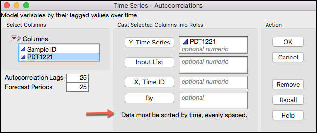
3. Click OK when finished. The default output is shown in Figure 8.3.
Figure 8.3 Default Time Series Output for PDT1221
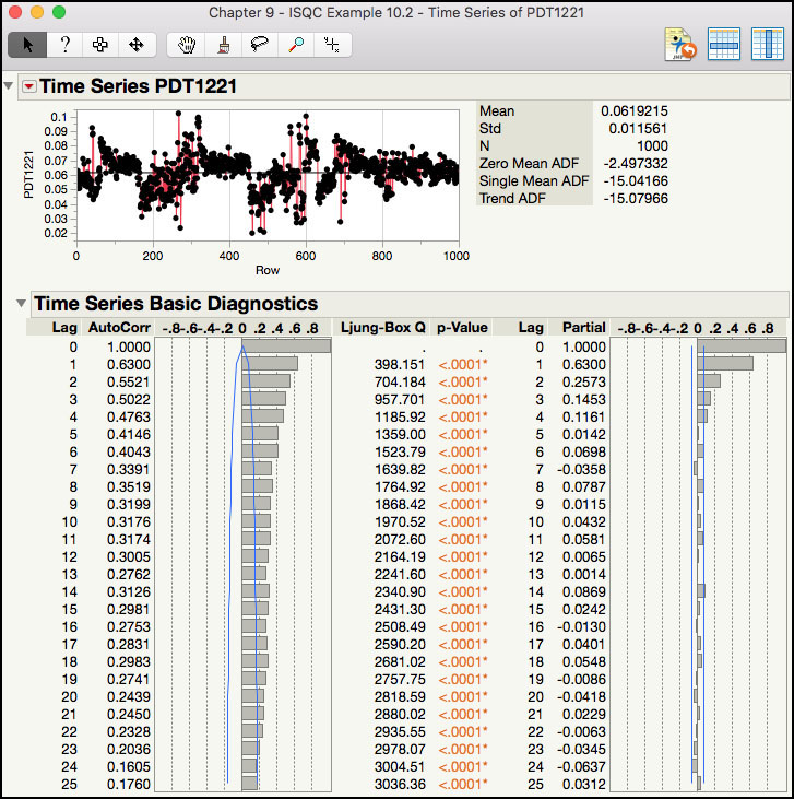
The default output shown in Figure 8.3 includes a Time Series plot of the data and underneath are the Time Series Basic Diagnostics plots. The plot of the raw data exhibits nonstationary behavior, where the data tends to trend upward for a period, followed by a downward trend. The Autocorrelation plot, which is on the lower left-hand side of this output, shows the sample correlation between points at time t and t-p, where p is the lag of the data, p = 0 through 25. For example, for lag = 1, the sample correlation coefficient is 0.6300 shows the correlation between subsequent time points in the time series that is, (x2, x1), (x3, x2), (x4, x3), …, (x1000, x999). The lag 1 Ljung-Box Q statistic of 398.151 and p-value <.0001, indicates that the correlation is statistically different from 0. Similarly, the correlation at lag 2 (0.5521) represents the correlation between every other point that is, (x3, x1), (x4, x2), (x5, x3), …, (x1000, x998).
|
|
JMP Note 8.1: JMP has many helpful tools to diagnose the time series. The Autocorrelation and Partial Autocorrelation plots are used in conjunction to identify an initial model. |
The Partial Autocorrelation plot, which is on the lower right-hand side of this output, shows the sample partial correlation between points at time t and t-p, where p is the lag of the data, p = 0 through 25. Note that the partial correlation at lag 1, 0.6300, is the same as the lag 1 correlation in the Autocorrelation plot, as expected. The partial correlation at lag 2 is 0.2573, which represents the correlation between every other point that is, (x3, x1), (x4, x2), (x5, x3), …, (x1000, x998), after accounting for the correlation between previous lags, (x2, x1), (x3, x2), (x4, x3), …, (x1000, x999). The partial correlations get weaker as the lags increase.
|
|
Statistics Note 8.3: For a given lag, time between observations, the autocorrelation function (ACF) is the correlation of the time series with itself. The partial autocorrelation function (PACF) is the partial autocorrelation of the time series with itself, not explained by autocorrelations at lower lags. |
The Autocorrelation and Partial Autocorrelation plots are used together to diagnose the time series and arrive at an initial model. The Autocorrelation plot in Figure 8.3 is described as having a slow decay in correlations as the lags increase, while the Partial Autocorrelation plot is said to cut off after lag 3. The combination of these to behaviors is indicative of a nonstationary process, or a process that is drifting around. In order to further diagnose this series, the drift needs to be removed by differencing the series.
4. Click on the red triangle next to the Time Series PDT1221 banner at the top of the window to bring up a list of options (Figure 8.4) A brief description for some of the options that we will illustrate in this chapter is shown below. To launch the online help, click on the ? at the top of the window and then click anywhere in the default output shown in Figure 8.3.
Figure 8.4 Time Series Options

a. Graph: contains various options to alter the appearance of the Time Series plot of the data.
b. Autocorrelation: a plot that describes the correlation between all pairs of points for a given separation in time. This plot is used in conjunction with the Partial Autocorrelation plot to identify a preliminary model.
c. Partial Autocorrelation: a plot that describes the partial correlation between all pairs of point in the time series for a given a given separation in time. This plot is used in conjunction with the Autocorrelation plot to identify a preliminary model.
d. Variogram: a plot that measures the variance of the differences of points k lags apart and compares it to that for points one lag apart. It is computed from the autocorrelations and is used to identify if the time series is stationary. For a nonstationary series, the plot starts at 1 and increases until it reaches an asymptote. For a stationary process the plot, after lag 1, is relatively flat.
e. AR Coefficients: a graph of the coefficients approximated by those obtained from fitting a higher order auto-regressive model.
f. Spectral Density: a graph of the spectral density as a function of period and frequency. The plot is helpful to identify possible cycles (daily, monthly, quarterly, and so on) within the data.
g. Difference: a window appears to specify the non-seasonal and seasonal differences applied to the data and then graphed using the default output. This plot is used to help specify an initial model.
h. Decomposition: isolates and removes linear trends and seasonal cycles from the time series. This is used for better model estimation.
i. Show Lag Plot: a plot that shows the data at time t on the Y axis and t±p on the X axis. This plot is used to examine the correlation structure of the time series. It can be used to assess how strong the autocorrelation is at a given lag. The more elongated the ellipse of data, the higher the autocorrelation.
j. ARIMA: shows a window that is used to specify the form of the ARIMA(p, d q) model to be fitted to the time series. The user enters the order for parameters, p (auto-regressive), d (difference) and q (moving average). The intercept can be excluded or included and the prediction level specified.
k. Seasonal ARIMA: shows a window that is used to specify the form of the seasonal ARIMA(p, d q)(P, D, Q)s model to be fitted to the time series. The user enters the order for parameters, p (auto-regressive), d (difference) and q (moving average) and P (seasonal autoregressive), D(seasonal difference) and Q (seasonal moving average). The intercept can be excluded or included and the prediction specified.
l. Smoothing Model: shows a menu of different smoothing models to select from. These include models with simple smoothing and exponential techniques. Models are also included to account for linear trends and seasonality.
5. From the red triangle next to the label Time Series PDT1221 (Figure 8.3), select Difference. A dialog box will appear and in the left-hand side of the window labeled Nonseasonal, toggle the Differencing Order to 1. Leave the Seasonal Differencing Order at 0 (Figure 8.5).
Figure 8.5 Differencing Dialog Box for PDT1221

6. Click Estimate when finished. The default output is shown in Figure 8.6.
Figure 8.6 First Differencing Output of PDT1221

The output of the differenced series is shown in Figure 8.6. The plot of the differenced data no longer exhibits drifting behavior and appears to be relatively flat, oscillating around 0. The Autocorrelation plot cuts off after lag 1, with highest order autocorrelations small and within the confidence band. The correlation at lag 1 is -0.3945, with Ljung-Box test indicating that is statistically different from 0. The Partial Autocorrelation plot dies off after lag 3. The behavior is these two plots suggests that a model with autoregressive (AR) order p=0, difference of order d=1, and a moving average (MA) of order q=1 may be appropriate. This model is the ARIMA(0,1,1) and can be written in a simplified way as IMA(1, 1), which stands for Integrated Moving Average model with order of differencing d = 1, and moving average order q = 1. Montgomery discusses the sample autocorrelation plot in ISQC Figure 10.13 for ISQC Example 10.2.
|
|
Statistics Note 8.4: A lot of industrial time series can be modeled using an IMA |
7. From the red triangle next to Time Series PDT1221, select ARIMA. A dialog box will appear. In the d, Differencing Order field enter the number 1, in the q, Moving Average Order field enter the number 1 and leave 0 in the p, Autoregressive Order field. Uncheck the Intercept box (see Figure 8.7).
Figure 8.7 ARIMA Dialog Box
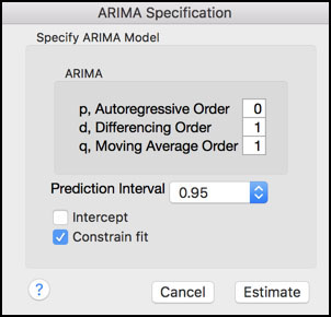
8. Click Estimate when finished. The default output is displayed in Figures 8.8 and 8.9.
Figure 8.8 Model Summary for IMA(1, 1)
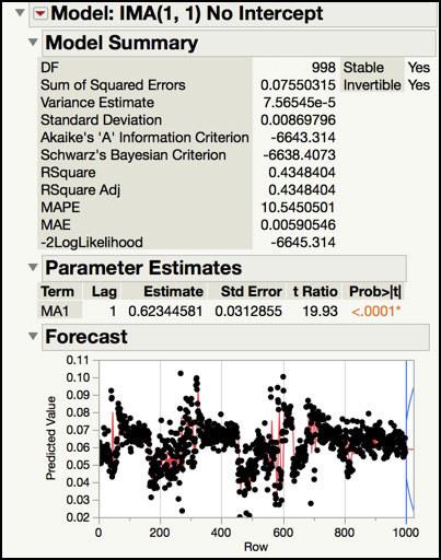
Figure 8.9 Residuals for IMA(1,1)
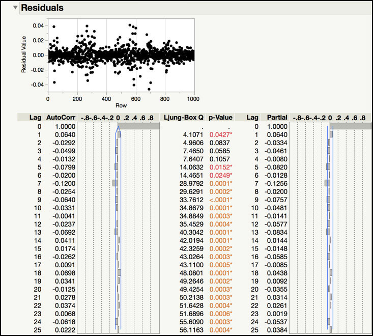
The Model Summary of the IMA(1, 1) fit is shown in Figure 8.8 and the Residuals of the fitted model are displayed in Figure 8.9. The Model Summary includes a number of statistics that quantify the quality of the fit of the model. For example, the Akaike’s Information Criterion (AIC) is -6643 and the Schwarz’s Bayesian Criterion is -6638, where smaller values indicate a better fit. The Standard Deviation (0.0087) and Variance (0.000076) are provided. The Mean Absolute Percentage Error (MAPE) is 10.55. This number is the sum of the ratio of the difference of the actual and predicted values to the actual value. The Mean Absolute Error (MAE) is 0.0059 and it is the average difference of the actual and predicted values. Finally, RSquare (0.4348) and Adjusted R-Square (0.4348) have the usual interpretation. Many of these statistics are more useful when comparing several models to each other, and we will review them in the Statistical Insights section.
The Parameter Estimates table provides the estimates, standard errors, t-ratios and p-values for the model parameters. The first order moving average parameter is 0.6234 and its standard error is 0.0313. The t Ratio for this parameter is 19.93 and its p-value is <.0001, indicating that it is statistically significant. Since the data were differenced, the intercept was omitted from the model
The Residuals output includes a plot of the model residuals and an Autocorrelation and Partial Autocorrelation plot of the residuals. These plots are used to determine if the autocorrelation has been removed from the original time series. Although, the trend plot of the residuals appears “flat”, it can be difficult to visually determine if any autocorrelation remains. However, the Autocorrelation and Partial Autocorrelation plots indicate that an insignificant amount of correlation is left, with the lag 1 correlation estimate of 0.0640. Therefore, this time series can be adequately modeled using an IMA(1, 1).
Now that we have the fitted IMA(1, 1) model, we can monitor the residuals to determine if this process is in control, after removing the autocorrelation. The following steps illustrate how to chart the residuals in the Control Chart Builder platform.
9. From the red triangle next to the banner Model: IMA(1, 1) No Intercept (Figure 8.8), select Save Columns. A JMP table is created that contains the actual data, predictions, prediction standard errors, residuals and the lower and upper confidence intervals (Figure 8.10)
Figure 8.10 JMP Table with IMA(1, 1) Residuals for PDT1221

10. Click the JMP table to make it active. From the main menu, select Analyze ► Quality and Process ► Control Chart Builder. Highlight the Residual PDT1221 variable in the Columns window in the left-hand side and drag it to the Y axis. When finished, click Done. The Chart is shown in Figure 8.11.
Figure 8.11 Individual and Moving Range Chart of IMA(1, 1) Residuals
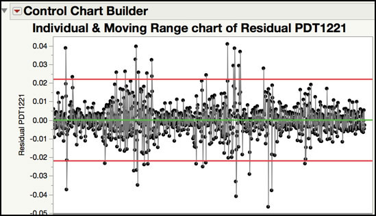
The Residuals control chart is shown in Figure 8.11. Since each time point represents a single value, sampled every 5 minutes, the subgroup size is n = 1. Therefore, an individual and moving range control chart is appropriate. The centerline of the Individuals chart is approximately 0 and the control limits are ±0.022. For such a large number of subgroups (N=999), it is expected that there will be a few points that exceed the control limits. However, there are 33 points that exceed the control limits in Figure 8.11, which seems excessive. This could be due to a couple of reasons. For one, we might have fit the wrong model to the time series and it needs to be re-specified. This can also indicate that the process is out-of-control and special cause variation should be investigated and removed. These options are investigated further in the Statistical Insights section of this chapter. Note Montgomery discusses the Residuals control chart in ISQC Figure 10.14 in ISQC Example 10.2.
ISQC Figure 10.17 Moving Centerline Centerline Forecast Control Chart
In the last section, we showed how to monitor an autocorrelated output by control charting the residuals from an IMA(1, 1) model. Since the residuals are not a direct plot of the data, additional analysis is required in order to investigate signals using the original data. While this approach is effective, it might be difficult for the practitioner to use. In ISQC Section 10.4, Montgomery discusses an approximate EWMA procedure for charting correlated data directly. This allows us to directly monitor the original data. An example of this approach is shown in ISQC Figure 10.17.
Another way to directly monitor autocorrelated output is to use the forecasts from the fitted ARIMA model and compare them to their (1−α)×100% prediction interval. We prefer this approach because it is more robust to a variety of ARIMA models and is easier to implement in JMP. We will use the same data set described in the last example, which is a parameter related to the pressure differential transmitter (PDT) of a make-up air handler (J. Ramírez (1998)).
The following steps illustrate how use the forecasts from an IMA(1, 1) model to directly monitor the make-up air handler data. Recall, the JMP data table contains 1,000 baseline values, taken at a constant sampling interval of 5 minutes.
1. Open Chapter 8 – ISQC Example 10.2*.jmp, which has two variables called Sample ID and PDT1221. In this table, Sample ID is the subgroup variable, and PDT1221 is the parameter.
2. Select Analyze ► Specialized Modeling ► Time Series.
3. A dialog window will appear. From the window on the left-hand side, highlight PDT1221 and then click Y Time Series. Click OK when finished.
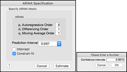
4. From the red triangle next to Time Series PDT1221, select ARIMA. A dialog box will appear. In the d, Differencing Order field enter the number 1, in the q, Moving Average Order field enter the number 1 and leave 0 in the p, Autoregressive Order field. Click on the toggle next to Prediction Interval and select Other. In the window that appears type 0.9973 and click OK. Uncheck the Intercept box. See Figure 8.12.
Figure 8.12 ARIMA Dialog Box for Prediction Interval
5. Click on the red triangle next to the banner Model: IMA(1, 1) No Intercept (see Figure 8.8), select Save Columns. A JMP table is created that contains the actual data, predictions, prediction standard errors, residuals and the lower and upper prediction intervals (see Figure 8.13). Note 25 additional rows are included in this table with forecasted results. These rows can be deleted before proceeding.
Figure 8.13 JMP Table with IMA(1, 1) Forecasts for PDT1221

6. Click on the JMP table to activate it and select Graph ► Graph Builder. From the Columns window on the left-hand side, drag Row to the X zone (x axis). Next drag Actual PDT1221 to the Y zone (y axis). Right-click in the graph window and select Smoother ► Remove.
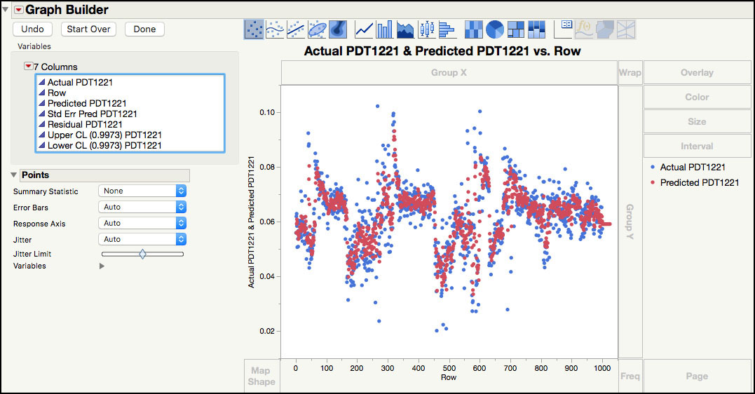
7. Next, highlight and drag Predicted PDT1221 to the Y zone (y axis).. In order to get an overlay plot, the variable needs to be dropped to the right of the Y axis. The two series will be plotted using two different colors, as is displayed in a legend on the right-hand side (Figure 8.14).
Figure 8.14 Actual and Predicted values for PDT122 Series
8. Right-click in the plot and select Add ► Line. This will add a line to both series. To remove the line for the actual points, right-click in the plot and select Line ► Y ► Actual PDT1221. To remove the points for the predicted values, select Points ► Y ► Predicted PDT1221. The plot is shown in Figure 8.15.
Figure 8.15 Actual values and Predicted Line for PDT122 Series
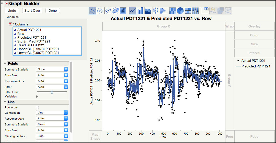
9. From the Columns window, drag Upper CL (0.99) PDT1221 to the Y zone (y axis). To remove the points from the upper prediction limits, right-click in the plot and select Y ► Points ► Upper CL (0.9973) PDT1221.
10. Form the Columns window, drag Lower CL (0.99) PDT1221 to the Y zone (y axis). To remove the points from the upper prediction limits, right-click in the plot and select Y ► Points ► Upper CL (0.9973) PDT1221. To remove the points from the lower prediction limits, right-click in the plot and select Y ► Points ► Lower CL (0.99) PDT1221.
11. To change point and line colors, right-click on the point (or line) legend in the right-hand side of the window and select the desired colors. Note marker types, sizes and line types can be changed in a similar manner. Click Done when finished. The plot is shown in Figure 8.16.
Figure 8.16 Forecast Control Chart for PDT1221

In order to create a control chart of the forecasts, the IMA(1, 1) model, discussed in the last example, must be fit to the baseline data. The parameter estimate shown in Figure 8.8 is used to develop a forecast equation, . In this equation, the next observation at time t+1 is predicted (or forecasted) from the sum of the current value at time t and a fraction of the current forecast error at time t. JMP calculates a (1−α)100% prediction interval for each forecasted value. The prediction interval is an interval associated with an individual value. In this example, we selected a 99.73% confidence level in order to get interval that is more in line with the width of ±3σ control limits.
|
|
Statistics Note 8.5: Under the normal distribution model, the probability that an observation falls between the usual ±3σ control limits is 0.9973. See ISQC Section 5.3.2. |
The chart in Figure 8.16 is a plot of the actual PDT1221 values, along with the forecasts and 99.73% prediction interval for each actual value. The forecasted results serve as the centerline of the control chart and the prediction interval bounds serve as the control limits. Unlike most control charts, the centerline and control limits are moving (or changing) with every subgroup.
|
|
Statistics Note 8.6: Under the normal distribution model, the probability that an observation at time t falls between the time series model prediction ±3σ is 0.9973. This is shown in ISQC Equation (10.17). |
Instead of using the 99.73% prediction intervals from the Time Series platform, we can generate limits as
(3)
These limits have a coverage probability of 0.9973 as shown in ISQC equation 10.17. The σ value is given by the Standard Deviation entry in the Model Summary for IMA(1, 1) shown in Figure 8.8. We leave it as an exercise for the reader to see that these limits are very close to the prediction limits produced by the Time Series platform.
For both type of limits, an out-of-control point is signaled by an actual value that plots outside of the prediction limits. For example, the PDT1221 value (0.0278) for observation n = 691 is below the lower prediction bound (0.0520). In fact, there are 20 values that are outside of the prediction interval in Figure 8.16. Twenty values are included in the 33 values that were outside of the control limits for the residuals control chart shown in Figure 8.11. This example is further discussed in the Statistical Insights section.
|
|
JMP Note 8.2: To identify the points that fall outside the forecast control chart one can create two columns with indicator formulas Actual – Upper < 0 and Lower – Actual < 0. Any row with a value 1 indicates an out-of-control point. We can the use the Select Where tool to select those rows. Markers and colors can be then added to make it easier to see in the chart. If desired, one can create just one column with formula: (Actual – Upper < 0) | (Lower – Actual < 0). A value of 1 will indicate an out-of-control point regardless which bound. |
Statistical Insights
In this section, we elaborate upon the modeling and interpretation of the parameter related to the pressure differential transmitter (PDT) of a make-up air handler. We further examine the signals obtained in the residuals and forecast charts presented earlier in this chapter to understand why there were so many signals. In the next section, we illustrate the powerful tools that JMP has in the Time Series platform to evaluate several models and select the best one. Finally, we show how to monitor future observations from an autocorrelated time series, using the ARIMA forecast model obtained from the baseline data, and we demonstrate how to use a Cuscore chart.
Evaluation of IMA(1,1) Chart
The Residuals control chart in Figure 8.11 and the Forecast control chart in Figure 8.16 both have 33 signals out of 999 subgroups. We would like to understand the cause for the excessive number of signals, which might be false alarms, or due to special cause variation or an ill-specified model. We can use the Stability Ratio, discussed in Chapter 6, to gain insight into the type of variation (common cause or special cause) present in the IMA(1,1) residuals.
1. Open Chapter 8 – IMA Forecasts.jmp, which has variables called Actual PDT1221, Predicted PDT1221, Residual PDT1221, Upper CL (0.9973) PDT1221 and Lower CL (0.9973) PDT1221.
2. From the main menu, select Analyze ► Quality and Process ► Control Chart Builder.
3. A launch window appears. Drag Residual PDT1221 to the Y zone and click Done. Figure 8.17 shows partial output form the Control Chart Builder.
Figure 8.17 Stability Ratio of IMA(1, 1) Residuals
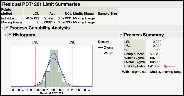
Recall from Chapter 6, the Stability Ratio is the ratio of the long-term variation and the short-term variation, estimated using the sample standard deviation and the average moving range, respectively. If the process is operating with common cause variation, the Stability Ratio will be close to 1; if special cause variation is present, then the Stability Ratio will be greater than 1. The Process Screening platform uses a default cut off of 1.5 to classify a parameter as unstable. However, since there is so much data, the Stability Ratio of 1.416 in Figure 8.17, based on the SR significance test for n = 999 observations, is indicative of an unstable process. Therefore, it is unlikely that the signals in Residuals and Forecast control charts are false alarms or false signals.
|
|
Statistics Note 8.7: To test for stability using the Stability Ratio, an approximate F test can be used. For an individual measurement and moving range chart the F-test numerator degrees-of-freedom are equal to (sample size – 1), and the denominator degrees-of-freedom are approximately 0.62×(sample size – 1). For the Stability Ratio of 1.416 in Figure 8.17, an approximate F-test of the Stability Ratio, based on 999 observations, gives a p-value= 1.12E-6. This indicates that the residuals are not stable. |
4. Click on Chapter 8 – IMA Forecasts.jmp to make it activate. In the JMP table, click in row 1 in the far left-hand column and scroll down until row 200 is visible and then hold the shift key and click in row 200. Rows 1 through 200 should be highlighted. To create a JMP table with the first 200 observations, select Tables ► Subset. Click OK.
5. Next select Graph ► Graph Builder.
6. From the Columns box, select Row and drag it to the X zone (x axis). Next, highlight Actual PDT1221 and drag it to the Y zone (y axis).
7. Right-click in the plot and select Smoother ► Remove. Alternatively, hold the control key and click in the graph to bring up the menu.
8. Select Residuals Signals from the Columns box and drag it to Color box on the far right-hand side of the window.
9. Right-click in the plot and select Add ► Line.
10. Right-click on each symbol and line in the Residuals Signal legend and select appropriate symbols and line colors. Click Done when finished. The graph is shown in Figure 8.18.
Figure 8.18 Trend Plot of the First 200 PDT1221 with Annotated Signals

11. Repeat Step 5 through Step 11 using observations 200 to 300. The graph is shown in Figure 8.19.
Figure 8.19 Trend Plot of Observations 200-300 PDT1221 with Annotated Signals
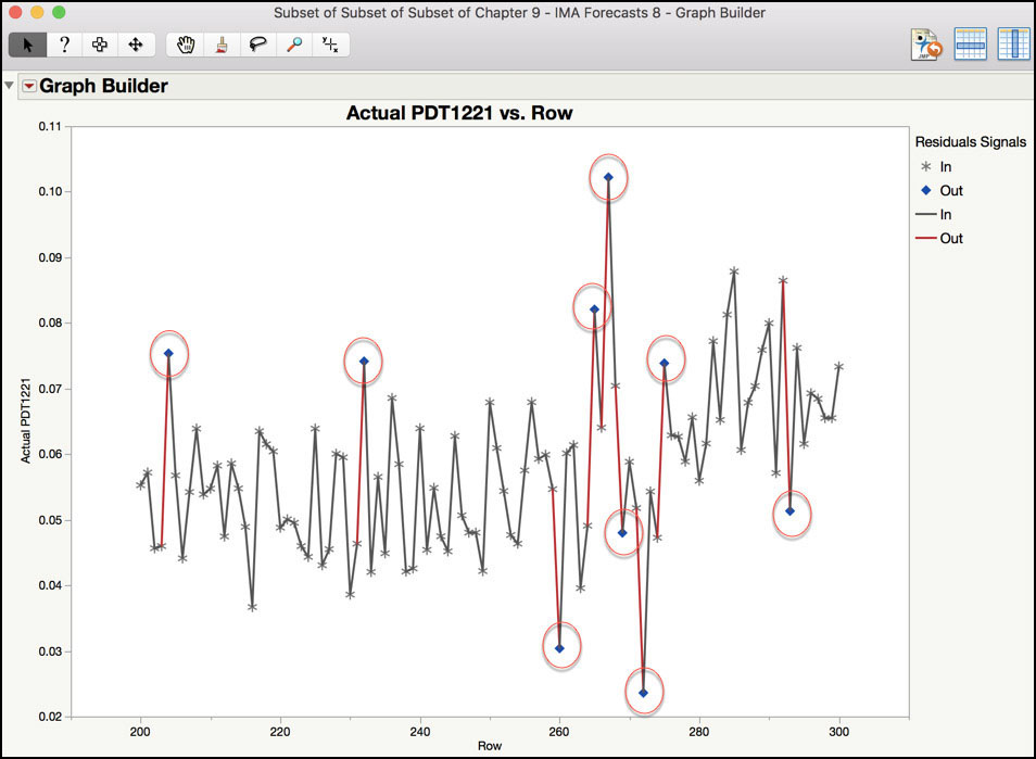
Subsets of the data were used in order to get a closer look at the patterns in the data. The graph in Figure 8.18 shows where the control limit excursions occurred in the first 200 observations (1,000 minutes or 16.7 hours). The first excursion shown in the graph occurred at observations 41 (205 minutes or 3.42 hours), after an increase of 0.037, from 0.056 to 0.092. The second excursion occurred at observation 44 (220 minutes or 3.67 hours), after a decrease of 0.045, from 0.088 to 0.43. Finally, the third excursion occurred at observation 63 (315 minutes or 5.25 hours), after an increase of 0.023, from 0.059 to 0.082. A similar assessment can be made using the data plotted in Figure 8.19.
The excursions in the Residual and Forecast control charts occur when there is a change in the consecutive readings of a certain magnitude. These situations can be due to a special cause in the clean room, where someone passes too closely to a sensor or a door opens. In these events, the sensor detects a change and the system needs time to catch up. There is also a chance that the model needs to be adjusted. These are explored further in the next example.
Time Series Model Comparisons
The diagnostic tools in the Time Series platform can be used to identify a preliminary model. For example, the following patterns in the ACF and PACF plots can be used to help specify the form and orders of an ARIMA model:
● Differencing: The ACF slowly declines, with many high correlations.
● AR(p): The PACF cuts off after lag p and the ACF decays in a sinusoidal manner.
● MA(q): The ACF cuts off after lag q and the PACF gradually decays toward zero in a sinusoidal manner.
● AR(p) & MA(q): The ACF and PACF do not have an abrupt cutoff, but both tail off
slowly.
Even with the use of the diagnostic tools, the model fitting process can be an art and it is often necessary to fit several models to select the most appropriate one for the series. In the PDT1221 make-up air handler data, an IMA(1, 1) was identified to model the autocorrelation. In this section, we explore several other models and compare their performance to the IMA(1, 1) to determine if the fit can be improved. We begin, by refitting the IMA(1.1) model to PDT1221 and then fit several more forms of the ARIMA model, with parameter orders of 2 or less.
1. Open Chapter 8 – ISQC Example 10.2*.jmp.
2. From the main menu select Analyze ► Specialized Modeling ► Time Series.
3. In the launch window, select PDT1221 and click Y, Time Series and click OK.
4. Next to the Time Series PDT1221 banner, click on the red triangle and select ARIMA.
5. To fit an IMA(1, 1), in the dialog box, leave 0 in the p, Autoregressive Order field, enter the number 1 in the d, Differencing Order field, and enter the number 1 in the q, Moving Average Order field and. Click on the toggle next to Prediction Interval and select 0.99 from the list. Uncheck the Intercept box. Click Estimate.
6. To fit an IMA(1, 2), in the dialog box, leave 0 in the p, Autoregressive Order field, enter the number 1 in the d, Differencing Order field, and enter the number 2 in the q, Moving Average Order field and. Click on the toggle next to Prediction Interval and select 0.99 from the list. Uncheck the Intercept box. Click Estimate.
7. To fit an AR(1, 1), in the dialog box, enter the number 1 in the p, Autoregressive Order field, enter the number 1 in the d, Differencing Order field, and leave 0 in the q, Moving Average Order field. Click on the toggle next to Prediction Interval and select 0.99 from the list. Uncheck the Intercept box. Click Estimate.
8. To fit an AR(2, 1), in the dialog box, enter the number 2 in the p, Autoregressive Order field, enter the number 1 in the d, Differencing Order field, and leave 0 in the q, Moving Average Order field. Click on the toggle next to Prediction Interval and select 0.99 from the list. Uncheck the Intercept box. Click Estimate.
9. To fit an ARIMA(1, 1, 1), in the dialog box, enter the number 1 in the p, Autoregressive Order field, enter the number 1 in the d, Differencing Order field, and enter the number 1 in the q, Moving Average Order field. Click on the toggle next to Prediction Interval and select 0.99 from the list. Uncheck the Intercept box. Click Estimate.
Figure 8.20 Model Comparisons for PDT1221

Performance statistics for all the models fitted to the series are summarized in this platform under the Model Comparison banner, as is shown in Figure 8.20. Seven performance statistics are included: Variance, AIC (Akaike’s Information Criterion), SBC (Schwarz’s Bayesian Criterion), Rsquare, -2LogLH (Log Likelihood Function), MAPE (Mean Absolute Percentage Error) and MAE (Mean Absolute Error). The performance metrics were briefly described in the previous example and further details can be found in JMP Help. With the exception of Rsquare, smaller values indicate a better fitting model. For Rsquare, larger values indicate a better fitting model. Therefore, to compare these models, the statistics can be appropriately sorted in the Time Series platform, or saved to a JMP table and plotted, and interpreted for each model. By default, the models are sorted by the AIC value.
10. Right-click in the results of the Model Comparison output and select Make into Data Table. A JMP table will be created with these results.
11. Activate the JMP table by clicking on it. From the main menu, select Graph Builder.
12. From the Columns window, drag Model to the X zone (x axis). Next, drag Variance to the Y zone (y axis). To create a second plot below the Variance, drag AIC to the Y zone and drop it to the lower y axis tick marks and outside of the graph. Note, the symbol color will change when the cursor is in the right place on the Y zone.
13. To create a third plot below AIC, drag MAPE to the Y zone and drop it to the lower y axis tick marks and outside of the graph. Note, the symbol color will change when the cursor is in the right place on the Y zone.
14. Right-click in each plot and select Add ► Line. Click Done when finished.
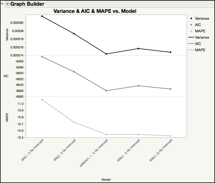
Figure 8.21 Plot of Variance, AIC and MAPE for 5 Models
15. From the red triangle next to the Graph Builder banner, select Save Script ► To Data Table....
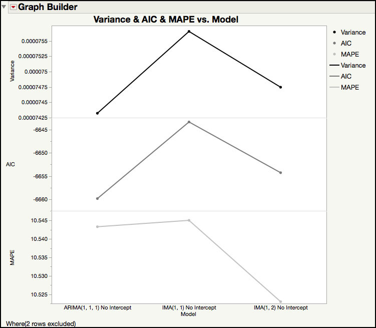
16. Highlight the last two rows in the JMP table for the AR models and, from the main menu select Rows ► Hide and Exclude. Run the script that was saved to the JMP table in Step 15. The graph is shown in Figure 8.22.
Figure 8.22 Plot of Variance, AIC and MAPE for 3 Models
The plot in Figure 8.21 shows the Variance, AIC and MAPE for each of the five fitted models. For these three statistics, smaller values indicate a better fit. Although it is not shown graphically, the RSquare (see Figure 8.20) show a similar result, with the AR models having the lower RSquare values. Therefore, the first two AR(p, 1) models can be eliminated from the model choices, since they have the worst performing statistics; while the IMA(q, 1) models and ARIMA(1, 1, 1) are a better fit to the PDT1221 series.
Figure 8.22 shows the Variance, MAPE and AIC for the remaining three models. The ARIMA(1, 1, 1) model has the best Variance, AIC, and the IMA(1, 2) has the best MAPE. Our original model, IMA(1, 1), shouldn’t be eliminated just yet, since it is the most parsimonious and has performance statistics with a similar magnitude as the other 2 models. The final decision will be made after observing the behavior of the residuals for each of the three models.
17. Go back to the Time Series output window.
18. Click on the red triangle next to the banner Model: IMA(2, 1) No Intercept, select Save Columns. A JMP table is created that contains the actual data, predictions, prediction standard errors, residuals and the lower and upper confidence intervals. Note 25 additional rows are included in this table with forecasted results. These rows can be deleted before proceeding.
19. Click on the red triangle next to the banner Model: ARIMA(1, 1, 1) No Intercept, select Save Columns. A JMP table is created that contains the actual data, predictions, prediction standard errors, residuals and the lower and upper confidence intervals. Note 25 additional rows are included in this table with forecasted results. These rows can be deleted before proceeding.
20. Open Chapter 8– All Forecasts.jmp. This table was created combining the forecast results from the IMA(1, 1), IMA(1, 2) and ARIMA(1, 1, 1). The columns include the actual results, forecasts, residuals and 99% prediction limits for each model. Columns have been added to identify points that are out-of-control using residuals and forecast charts. Finally, one column, All Signals, identifies rows where all charts produce a signal.
21. From the main menu, select Analyze ► Screening ► Process Screening. A launch window will appear. From the Columns window, select Residual PDT1221, these are the residuals for the IMA(1,1) model, and then click Process Variables. Next, select Residual IMA(1, 2) and click Process Variable. Finally, select Residual ARIMA and then click Process Variable. Click OK when done.
22. In the Process Screening table select all three rows and then, at the top of the output, click on the red triangle next to Process Screening and select Quick Graph for Selected Items.
Figure 8.23 Stability Ratios for Residuals

23. Click on Chapter 8 – All Forecasts.jmp to activate it. From the main menu, select Analyze ► Distribution. Highlight All Signals in the column window and click Y, Columns. Click OK when finished. The output is shown in the left side of Figure 8.24.
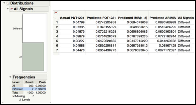
24. Click the Different bar to highlight the rows in the JMP table. Click on Chapter 8 – All Forecasts.jmp and from the main menu, select Tables ► Subset. In the launch window, click OK. The output is shown in the right side of Figure 8.24.
Figure 8.24 Signals with Different Outcomes
We used the Process Screening platform to calculate the Stability Ratios for the residuals from the three different models, IMA(1, 1), IMA(1, 2) and ARIMA(1, 1, 1), shown in Figure 8.23. We already discussed this ratio for the IMA(1, 1) model. The three stability ratios are 1.42, 1.35 and 1.32. Although the Stability Ratio for the ARIMA(1, 1, 1) is the closest to 1, they are all similar. Even though they are all technically less than the JMP cutoff of 1.5, their corresponding p-values (see Statistics Note 8.6 for how to calculate the p-value for the Stability Ratio) all indicate that there is special cause variation in the residuals.
The spark graphs of the residuals, shown in Figure 8.23, show a similar pattern among the residuals from the IMA(1, 1), IMA(1, 2) and ARIMA(1, 1, 1). They all have a few larger residual values in the first 50 observations, with the next period of larger residuals occurring between observations 200 to 300, and finally, between observations 600 to 700. Note that it is difficult to carry out a detailed comparison using all the data. In order to take a closer look, the data needs to be plotted and compared in groups of approximately 200 observations.
The JMP table includes variables that flag a signal in the residuals chart using an XmR chart and forecast chart using the prediction limits. If the observation is within the limits, the cell is set to “In”; if the observation exceeds the limits, then the cell is set to “Out”. For the IMA(1, 2) model, 31 observations had signals on both charts, while one observation had a signal on the residuals chart but not the forecast chart. For the ARIMA(1, 1, 1) model, 27 observations had signals on both charts, while 3 observations have a signal on the forecast chart but not the residuals chart. Note this information can be obtained using the Fit Y by X platform and placing Forecast Signals in the Y, Response and Residual Signals in the X, Factor.
The “All Signals” column in the JMP table has two values, “All” or “Different.” A result of “All” means that the six chart types (2 per model type) all signaled in the same way; all signaled as ‘in’ or all signaled as “out.” A result of “Different” means that the six chart types do not all signal in the same way for a particular observation. The output shown in Figure 8.24 provides the number of observations with each result in the “All Signals” column. There were 7 out of 999 observations, or 0.7%, that had different signal classifications among the 6 charts and 992 out of 999 observations, or 99.3% that had the same signal classification among the 6 charts.
Most of statistics used to evaluate the model performance, suggest that the ARIMA(1, 1, 1) model slightly edges out the performance of the IMA(1, 1) and IMA(1, 2) models. However, none of the statistics show a major improvement for the ARIMA(1, 1, 1) over the other two models. Most notably, 99.3% of the observations had the same signal identification for all three models. Since this model will be used to monitor future PDT1221 observations, and the model performance was similar, the most parsimonious model, the IMA(1, 1), is chosen as an appropriate model. It is also noted that, since all models perform similarly, the higher number of signals observed is most likely due to special cause variation, as we discussed previously.
Monitoring Future Autocorrelated Observations
Montgomery discusses Phase I and Phase II control chart applications in ISQC Chapter 5, Methods and Philosophy of Statistical Process Control. Retrospective monitoring is done in Phase I, where control limits are calculated and applied to the same data set and special cause variation is removed from the process. Once it is fairly stable, monitoring moves to Phase II, where control limits are locked down and applied to future process output. These phases can also be applied to monitoring autocorrelated data. In order to establish Phase II limits, we need a forecast model, obtained using the parameter estimates from an ARIMA model fit to the baseline data series, and control limits for the residuals, also calculated from the baseline data.
For the make-up air handler example, we selected the IMA(1, 1) model to represent the correlation in the PDT1221 results, that were sampled every 5 minutes. The forecast equation has the form, . In this equation, the next observation at time t+1 is predicted (or forecasted) from the sum of the current value at time t and a fraction of the current forecast error at time t. Undoubtedly, it is more challenging to automate these algorithms, since the forecasts require previous observations and residuals. This task is simplified with the use of a statistical software application, such as JMP or SAS. In this example, we will use JMP to carry out Phase II monitoring of PDT1221.
1. Open Chapter 8 – ISQC Example 10.2*.jmp.
2. Select Analyze ► Specialized Modeling ► Time Series.
3. In the launch window, select PDT1221 and click Y, Time Series and click OK.
4. Next to the Time Series PDT1221 banner, click on the red triangle and select ARIMA.
5. In the dialog box, leave 0 in the p, Autoregressive Order field, enter the number 1 in the d, Differencing Order field, and enter the number 1 in the q, Moving Average Order field and. Click on the toggle next to Prediction Interval and select 0.99 from the list. Uncheck the Intercept box. Click Estimate.
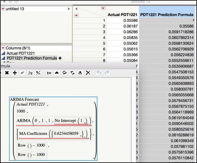
6. From the red triangle next to the Model: IMA(1, 1) No Intercept banner, select Save Prediction Formula. This will create a new JMP table. To see the prediction equation, click on the plus next to PDT1221 Prediction Formula+ in the Columns window. The formula is shown in Figure 8.25.
Figure 8.25 JMP Table with IMA(1, 1) Prediction Formula
7. Select Analyze ► Quality and Process ► Control Chart Builder. Drag and drop Residual PDT1221 from the Columns window on the left-hand side to the Y zone. From the red triangle select Save Limits ► In Column. Close the Control Chart Builder. The control limits for the original Residuals Chart will be added to the column properties. These can be viewed by clicking on the star next to Residual PDT1221 in the Columns window in the new JMP table, as is shown in Figure 8.26.
Figure 8.26 PDT1221 Residuals Control Limits for New Observations

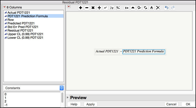
8. Highlight the Residual PDT1221 column in the JMP table and select Columns ► Formula…. In the Formula editor window, click Actual PDT1221 in the Columns window. Next click on the minus ‘−‘ symbol at the top of the window. Then click on PDT1221 Prediction Formula in the Columns window (Figure 8.27). Click OK when finished.
Figure 8.27 Residuals Formula for New Observations
9. To add new observations to the JMP table, from the main menu select Rows ► Add Rows.... In the dialog box enter 175 in the text entry box and click OK. Note we want to include 200 new observations. The JMP table already had 25 blank rows, to an additional 175 were added.
10. Type in or copy/paste the new observations into the Actual PDT1221 column in rows 1001 through 1200. Note these observations are included in Chapter 8 – New PDT1221 Values.jmp. Note if you are going to copy the row values too, then first move the Row column in the Columns window to the top of the list in the new table before copying the values from Chapter 8– New PDT1221 Values.jmp.
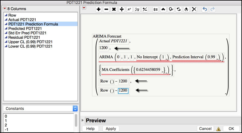
11. Click on the plus next to PDT1221 Prediction Formula+ in the Columns window to launch the Formula window. Replace three values set to 1,000 with the value 1,200 by clicking each field and entering the new number (Figure 8.28). Click OK when finished.
Figure 8.28 ARIMA Forecast Formula to Predict Forward
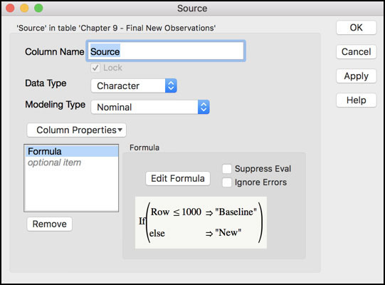
12. Add a new column to the JMP table and call it Source. Select Character for Data Type. Launch the Formula window and select Conditional ► If. Select Row in the Columns window to populate the expression. Then click Comparison ► a <= b and enter 1000 in the highlighted box. Click in the then clause box and type “Baseline”. Next click in the else clause and enter “New” (see Figure 8.29). Click OK when finished.
Figure 8.29 Plotting Symbol Variable for New Observations
13. From the main menu select Rows ► Color or Mark by Column… and then select Source from the Columns window. In the Markers drop-down menu, select Standard. Click OK when finished.
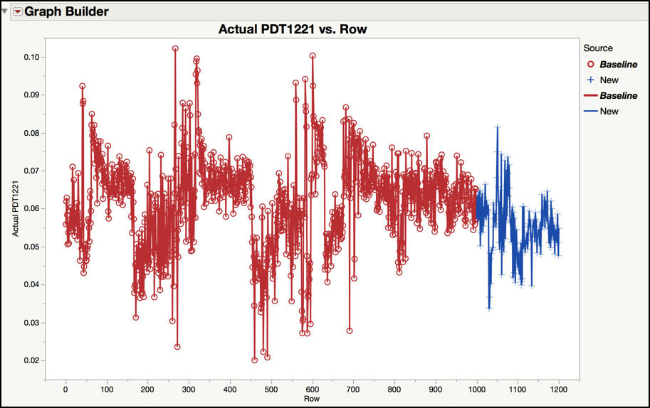
14. From the main menu, select Graph ► Graph Builder. Drag Actual PDT1221 to the Y zone and drag Row to the X zone. Drag Source to Color. Right-click in the plot and select Smoother ► Remove. Then right-click in the graph and select Add ► Line. The graph is shown in Figure 8.30.
Figure 8.30 New Observations for PDT1221
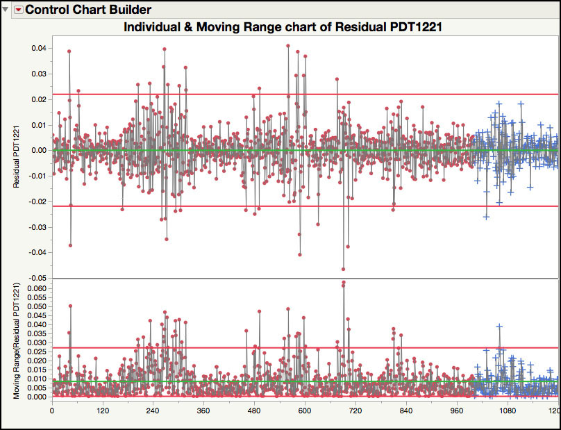
15. Click on the JMP table and select Analyze ► Quality and Process ► Control Chart Builder. Drag and drop the Residuals PDT1221 column to Y zone and click Done when finished. The control chart is shown in Figure 8.31.
Figure 8.31 Residuals Control Chart for New Observations
The previous steps illustrate an easier way to monitor future observations from an autocorrelated process using JMP. In Step 1 through Step 6, we refit the IMA(1, 1) model to the original 1,000 observations and created a new JMP table with the predicted values, standard error of prediction, residuals and 99% prediction limits. The prediction formula is also included in the table and the form of the equation is shown in Figure 8.25. In Step 7, an Individuals control chart is fit to the original residuals and the control limits are saved as a column property to the JMP table. Next, in Step 8 a formula is added to the Residuals column in the JMP table to calculate the new residuals using the difference between the actual and predicted values (see Figure 8.27).
Two hundred new observations are added to the JMP table in Step 9 and Step 10. For all 200 observations, the predictions are set to the same value. In Step 11, we update the prediction formula to provide unique predicted values for each of the new observations by changing the forecast range from n=1000 to n=1200, as is shown in Figure 8.28. Finally, in Step 12 through Step 15, a trend plot and Residuals control chart are created using a plotting symbol to more easily visualize the new observations.
The new observations are plotted using plus symbols in observations 1,001 to 1,200 in Figure 8.30. This time frame represents approximately 1,000 (=200 x 5) minutes, or 17 hours, of continuous operation of the make-up air handler. As compared with the previous 1,000 observations, or 83 hours, the new data appear to be less nonstationary. In fact, the behavior prior to observation 750 has more extreme behavior than appears in the series after observation 750.
The Residuals control chart in Figure 8.31 plots the old and new observations. For the new observations, one observation (n=1,030) exceeds the lower control limit, and one observation (n=1,061) exceeds the upper limit of the moving range chart. The point outside the upper control limit of the moving range chart indicates a large swing in observed values. For n=1,060 the PDT value is 0.07436, while for n=1,061 the value is 0.04253. This drop in differential pressure suggests that something has changed in the clean room or with the performance of the controller. As pointed out by J. Ramírez (1998), in those instances “the protocol for opening the doors of the fabrication areas was not followed. This resulted in sudden air flows in the fabrication area causing the observed changes in pressure.”
The approach to Phase II monitoring illustrated in this section is appropriate for post-hoc monitoring of data. However, it would be difficult to use this approach for “real-time” monitoring. In order to perform “real-time” monitoring using Time Series models, a software solution would need to be developed that automatically uploads the new data into an appropriate data source, predicts the observation from the previous data, calculates the residual and generates the control chart. This can be accomplished using JMP scripting, but it is beyond the scope of this book.
Cuscore Chart
Montgomery discusses Cuscore Charts in ISQC Section 10.7, where he provides the general form of the Cuscore statistic and shows how to detect changes to the mean of residuals from a given model. Although no specific examples are provided in ISQC, a number of references are specified with more details and applications, including several by J. Ramírez. In this section, we review one of the Cuscore examples provided in the reference we have been using throughout this chapter, Monitoring Clean Room Air Using Cuscore Charts. More specifically, we will show how to use a Cuscore chart to determine if the IMA(1, 1) model needs to be updated, for Phase II monitoring. Recall, the forecast equation for the PDT1221 data series, . We will show how to use the formula editor in JMP to create the necessary formulas for monitor the moving average estimate, θ = 0.62437, using the next 200 observations, 1001 to 1200, in the PDT1221 series.
|
|
Statistics Note 8.8: The Cuscore (Q) formulas for the IMA(1, 1) model are given in J. Ramírez (1998) and are shown below |
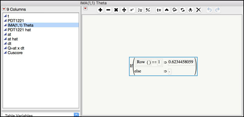
1. Open Chapter 8 – ISQC Example 10.7.jmp. The table has a column for the observation number t, and the PDT1221 observations. There are seven additional columns that are used to compute the Cuscore statistic, IMA(1, 1) Theta, PDT1221 hat, at, at hat, dt, at×dt, and Cuscore.
2. Click on the plus sign next to the IMA(1, 1) Theta variable in the Columns window in the left-hand side of the JMP table to display the formula (Figure 8.32).
Figure 8.32 Formula for IMA(1, 1) Theta
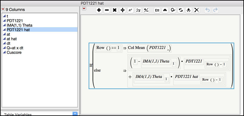
3. Click on the plus sign next to the PDT1221 hat variable in the Columns window in the left-hand side of the JMP table to display the formula (Figure 8.33).
Figure 8.33 Formula for PTD1221 hat
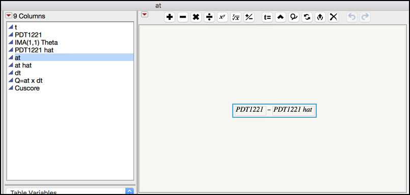
4. Click on the plus sign next to the at variable in the Columns window in the left-hand side of the JMP table to display the formula (Figure 8.34). The at is the residual, that is, the observed data PDT1221 minus the predicted value PDT1221 hat.
Figure 8.34 Formula for at (residual)
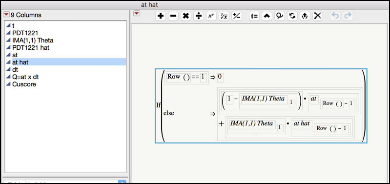
5. Click on the plus sign next to the at hat variable in the Columns window in the left-hand side of the JMP table to display the formula (Figure 8.35). at hat is the predicted residual.
Figure 8.35 Formula for at hat
6. Click on the plus sign next to the dt variable in the Columns window in the left-hand side of the JMP table to display the formula (Figure 8.36). dt is derivative of the residual.
Figure 8.36 Formula for dt

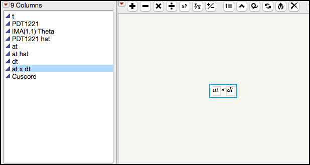
7. Click on the plus sign next to the at × dt variable in the Columns window in the left-hand side of the JMP table to display the formula (Figure 8.37).
Figure 8.37 Formula for at × dt
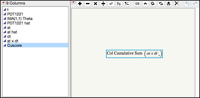
8. Click on the plus sign next to the Cuscore variable in the Columns window in the left-hand side of the JMP table to display the formula (Figure 8.38).
Figure 8.38 Formula for Cuscore
9. To create the Cuscore control chart we can use the Graph Builder but the table has a script to generate the graph. Click on the green arrow next to the JMP script in the upper left-hand window of the JMP table called PDT1221 & Cuscore vs. t. The chart is shown in Figure 8.39.
Figure 8.39 Cuscore Control Chart for Future Observations of PDT1221
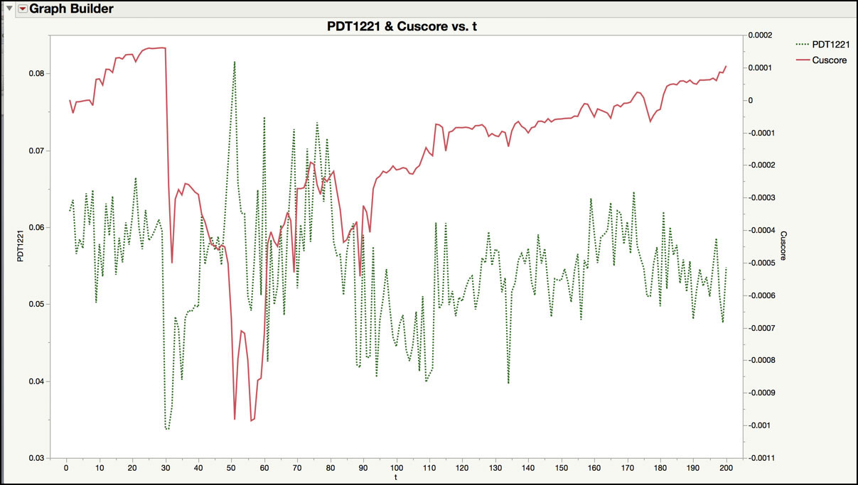
At the moment, a point-and-click platform is not available to create a Cuscore control chart in JMP. Therefore, a series of equations were manually created in a JMP table containing the next 200 observations for the PDT1221 series in order to generate the charting statistic. The estimate for the first order moving average parameter being monitored in the IMA(1, 1) forecast equation is entered in column IMA(1, 1) theta using the formula editor, as is shown in Figure 8.32. The next column, PDT1221 hat, contains the forecast equation for the IMA(1, 1). The formula shown in Figure 8.33 differs slightly from the one shown in the last example in Figure 8.28. Note the forecasts for both equations will converge quickly to the same value. The residuals are calculated in column at (see Figure 8.34). The next three columns (at hat, dt and at×dt) are used in the calculation of the Cuscore statistic, which is shown in equations 13, 14 and 15 of Ramírez (1998). Finally, the Cuscore statistic, in the last column is the cumulative sum of column at×dt.
The chart in Figure 8.39 plots the PDT1221 observations on the left-hand Y axis and the Cuscore on the right-hand Y axis. Abrupt changes in the Cuscore statistic signal a change in the IMA(1, 1) parameter. In this plot, the largest change occurs between observation 30 (n=1030) and observation and 31 (n=1031), where the Cuscore statistic drops from 0.00016 to -0.00027. This signal occurs in a similar region as where the Residuals control chart had a signal (n=1030), as is shown in Figure 8.31. The next largest jumps occur around observations 50 to (n=1050 to 1060), which agree with the large moving range value at observation 60 (n=1060). Note these drops can be selected in the JMP table by positioning your pointer over the appropriate point in the graph, clicking on it, and then finding the highlighted row in the JMP table. These drops can be located more easily by adding a column to the JMP table that contains the difference (Row ► Dif) of the Cuscore column and graphing it in time order.
|
|
JMP Note 8.3: Selecting the points in a graph in the Graph Builder will automatically select the rows in the JMP table associated with those points. |
The signals produced in the Cuscore control chart might be an indication that the moving average parameter has changed and the model needs to be updated. As shown in Ramírez (1998), a decision limit can be added to the Cuscore chart to signal when a change has occurred. We leave it as an exercise for the reader to fit an IMA(1, 1) model to the 200 new observations and compare the parameter estimate and forecast performance to the original 1,000 observations.