Chapter 5
Organizing Your Business Presence and Attracting Customers
In This Chapter
 Establishing your business presence(s)
 Organizing an easy-to-navigate business website
 Optimizing type and images to build a graphic identity
 Making your e-commerce site more usable with some digital Feng Shui
 Promoting trust with concise, well-designed web page content
 Inviting interaction through forms, e-mail, and more
No matter what you sell or where you sell it — on the web, in a brick-and-mortar store, or even on Facebook — you need to have a home base on the web, a presence. Not so long ago, a “home base” on the web automatically meant a website. A website is important, but you can sell online without one. That’s why I use the term presence instead of site.
It’s a subtle but significant difference. A presence can include a blog, ads on Craigslist, exposure for your app on iTunes, or storefronts on a variety of marketplaces.
Wherever you do business, the same basic principles work on the web just as well as they do in the brick-and-mortar world. Attracting customers is important, but real success comes from establishing relationships with customers who come to trust you and rely on you for providing excellent products and services.
This chapter focuses on creating an organized website as part of an overall presence to attract not only first-time, but also return customers. In this chapter, you explore ways to achieve these goals, including making your site easy to navigate, creating compelling content, optimizing your images so they appear quickly, and building interactivity into your site so customers want to return on a regular basis.
Feng Shui-ing Your Website
Feng Shui is the art of arranging objects in an environment to achieve (among other things) success in your career, wealth, and happiness. If that’s true, try practicing some Feng Shui with your online business environment — that is, your website.
Although you may be tempted to jump right into the creation of a cool website, take a moment to plan. Whether you’re setting off on a road trip across the nation or building a new addition on your house, you’ll progress more smoothly by first drawing a map of where you want to go. Dig down into your miscellaneous drawer until you find pencil and paper, and make a list of the elements you want to have on your site.
Look over the items on your list and break them into two or three main categories. These main categories will branch off your home page, which functions as the grand entrance for your online business site. You can then draw a map of your site similar to the one shown in Figure 5-1.
Note: The page heading Background Information is a placeholder for detailed information about some aspect of your online business. For my brother Mike’s audio restoration business, I suggested he include a page of technical information listing the equipment he uses and describing the steps he takes to process audio. You can write about your experience with and your love for what you buy and sell, or anything else that personalizes your site and builds trust.

Figure 5-1: A home page is the point from which your site branches into more specific levels of information.
The preceding example results in a very simple website. But there’s nothing wrong with starting out simple. When my brother was creating his first website, he was intimidated by getting started, and this simple model worked well. Many other businesses start with a three-layered organization for their websites. This arrangement divides the site into two sections, one about the company and one about the products or services for sale, as shown in Figure 5-2.

Figure 5-2: This arrangement divides the site into two sections.
Think of your home page as the lobby of a museum, where a friendly person at the information desk hands you a list of the special exhibits you can visit that day and shows you a map so you can figure out how you’re going to get from here to there. Remember to include the following items on your home page:
 The name of the store or business
 Your logo, if you have one
 Links to the main areas of your site or, if your site isn’t overly extensive, to every page
 Links to your presences online — your Facebook or Twitter page, or any storefronts you have
 Contact information, such as your e-mail address, phone/fax numbers, and (optionally) your business address so that people know where to find you in the Land Beyond Cyberspace
A mobile version of a website strips away most or all of the images and colors and simply presents the content. The presentation needs to be as straightforward as possible so that pages load quickly on a mobile device. Forget about animations or multiple columns. Isolate your most important links in a single one-column page that is easy to read on a smartphone. Figure 5-3 shows a possible arrangement.
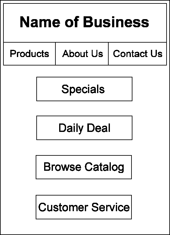
Figure 5-3: A mobile site’s home page needs to be simple and load quickly.
Some sites are "smart" enough to present a limited amount of content depending on whether a touch-enabled device such as an iPad is being used. For example, go to http://touch2.groupon.com to see a version of Groupon's mobile site that has fewer links than Groupon's desktop home page (www.groupon.com) and only one column. Then go to http://m.groupon.com to see an even simpler version with fewer images.
Devising a structure for your website is only one way to organize it — the outer or top-down organizational method, you might say. Organization also comes from the inside — from the content you create. The words, images, and interactive features that help your site get organized are discussed in the following sections.
Creating Content That Attracts Customers
What sells on the web? Look no farther than the search engine you probably use on a regular basis: Google. Google proves that information sells online. Making information easy to find and organizing much of the web’s content in one place has helped make this one of the most successful businesses of recent years. When it comes to a business website, you need to present the right content in the right way to make prospective clients and customers want to explore your site the first time and then come back for more. What, you ask, is the “right” content? The “right” content
 Helps people absorb information fast
 Makes it easy for visitors to find out who you are and what you have to offer
 Is friendly and informal in tone, concise in length, and clear in its organization
 Helps develop the all-important one-to-one-relationship with customers and clients by inviting dialogue and interaction, both with you and with others who share the same interests
Begin by identifying your target audience. Envision the customers you want to attract and make your site appear to speak directly to them, person to person. Ask around and try to determine what people want from your website. Speak informally and directly to them, by using you rather than we or us, and make sure your site has plenty of action points — links to click, forms to fill out, or product descriptions to view. And follow the general principles outlined in the sections that follow.
Following the KISS principle: Keep it simple, sir (or sister)
Studies of how information on a web page is absorbed indicate that people don’t really read the contents from top to bottom (or left to right, or frame to frame) in a linear way. In fact, most web surfers don’t read in the traditional sense at all. Instead, they browse so quickly you’d think they have an itchy mouse finger. They “flip through pages” by clicking link after link. More and more Internet users are swiping their index fingers on tablets, smartphones, and even cars with Internet-ready computer systems. Because your prospective customers don’t necessarily have tons of computing power or hours’ worth of time to explore your site, the best rule is to keep it simple.
People who are looking for things on the web are often in a state of hurried distraction. Think about a TV watcher browsing during a commercial or a parent stealing a few moments on the computer while the baby naps. Imagine this person surfing while standing on a platform waiting for a train. He isn’t in the mood to listen while you unfold your fondest hopes and dreams for success, starting with playing grocery-store cashier as a toddler. Attract him immediately by answering these questions:
 Who are you, anyway?
 All right, so what is your main message or mission?
 Well, then, what do you have here for me?
 Why should I choose your site to investigate rather than all the others that seem to be about the same?
When it comes to web pages, it pays to put the most important components first: who you are, what you do, how you stand out from any competing sites, and your contact information.
If you have a long list of items to sell, you probably can’t fit everything you have to offer right on the first page of your site. Even if you could, you wouldn’t want to: It’s better to prioritize the contents of your site so that the “breaking stories” or the best contents appear at the top, and the rest of what’s in your catalog is arranged in order of importance.
Striking the right tone with your text
Business writing on the web differs from the dry, linear report writing of the corporate world. So this is your chance to express the real you: Talk about your fashion sense or your collection of salt and pepper shakers. Your business also has a personality, and the more striking you make its description on your web page, the better. Use the tone of your text to define what makes your business unique and what distinguishes it from your competition.
Making your site easy to navigate
Imagine prospective customers arriving at your website with only a fraction of their attention engaged. Making the links easy to read and in obvious locations makes your site easier to navigate. Having a row of clickable buttons at the top of your home page, each pointing to an important area of your site, is always a good idea. Such navigational pointers give visitors an idea of what your site contains in a single glance and immediately encourage them to click a primary subsection of your site and explore further. By placing an interactive table of contents up front, you direct surfers right to the material they’re looking for.
The links to the most important areas of a site can go at or near the top of the page on either the left or right side. The Dummies.com home page, as shown in Figure 5-4, has a few links just above the top banner, but also sports links down both the left and right sides.

Figure 5-4: Putting at least five or six links near the top of your home page is a good idea.
On a tablet or other mobile device, you need to arrange the most important links without flashy graphics. Look at the mobile version of the same Dummies.com home page in Figure 5-5. You don't have to design a simplified mobile version of your home page from scratch (although you can do so at www.striking.ly). Just make sure the marketplace or hosting service you choose automatically creates a mobile version of your site for you, as described in Chapter 4.
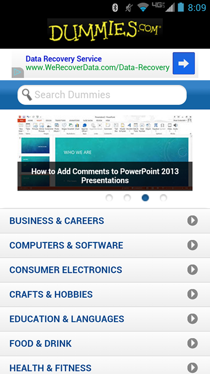
Figure 5-5: Simple navigation on a mobile site helps you reach visitors who are on the go.
Open the web page you want to edit and follow these steps to create links to local files on your website by using Dreamweaver, the powerful and popular website creation software by Adobe Systems, Inc. (www.adobe.com):
1. Select the text or image on your web page that you want to serve as the jumping-off point for the link.
2. Choose Insert⇒Link or press Ctrl+L.
The Link Properties dialog box appears, as shown in Figure 5-6.
3. In the box in the Link Location section, enter the name of the file you want to link to if you know the filename.

Figure 5-6: Enter the name of the file you want to link to.
If the page you want to link to is in the same directory as the page that contains the jumping-off point, enter only the name of the web page. If the page is in another directory, enter a path relative to the web page that contains the link. Or click the Choose File button, locate the file in the Open HTML File dialog box, and click the Open button.
4. Click OK.
You return to the Composer window. If you made a textual link, the selected text is underlined and in a different color. If you made an image link, a box appears around the image.
Presenting the reader with links up front doesn’t just help your search engine rankings, but also indicates that your site is content-rich and worthy of exploration.
Pointing the way with headings
Every web page needs to contain headings that direct the reader’s attention to the most important contents. This book provides a good example. The chapter title (I hope) piques your interest first. Then the section headings and subheadings direct you to more details on the topics you want to read about.
Most graphics designers label their heads with the letters of the alphabet: A, B, C, and so on. In a similar fashion, most web page–editing tools designate top-level headings with the style Heading 1. Beneath this, you place one or more Heading 2 headings. Beneath each of those, you may have Heading 3 and, beneath those, Heading 4. (Headings 5 and 6 are too small to be useful, in my opinion.) The arrangement may look like this (I’ve indented the following headings for clarity; you don’t have to indent them on your page):
Miss Cookie's Delectable Cooking School (Heading 1)
Kitchen Equipment You Can't Live Without (Heading 2)
The Story of a Calorie Counter Gone Wrong (Heading 2)
Programs of Culinary Study (Heading 2)
Registration (Heading 3)
Course Schedule (Heading 3)
New Course on Whipped Cream Just Added! (Heading 4)
Becoming an expert list maker
Lists are simple and effective ways to break up text and make your web content easier to digest. They’re easy to create and easy for your customer to view and absorb. Suppose that you import your own decorations and want to offer certain varieties at a discount during various seasons. Rather than bury the items you’re offering within an easily overlooked paragraph, why not divide your list into subgroups so that visitors find what they want without being distracted by holidays they don’t even celebrate?
Lists are easy to implement. If you're using Microsoft Expression Web (a trial version is available at www.microsoft.com/en-us/download/details.aspx?id=36179), open your web page and follow these steps:
1. Type a heading for your list and then select the entire heading.
For example, you might type and then select the words This Month’s Specials.
2. Choose a heading style from the Style drop-down list.
Your text is formatted as a heading.
3. Click anywhere in Expression Web’s Design View (the main editing window) to deselect the heading you just formatted.
4. Press Enter to move to a new line.
5. Type the first item of your list, press Enter, and then type the second item on the next line.
6. Repeat Step 5 until you enter all the items of your list.
7. Select all the items of your list (but not the heading).
8. Choose Format⇒Bullets and Numbering.
The List Properties dialog box appears.
9. Choose one of the four bullet styles and click OK.
A bullet appears next to each list item, and the items appear closer together onscreen so that they look more like a list. That’s all there is to it! Figure 5-7 shows the result.
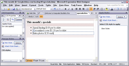
Figure 5-7: A bulleted list is an easy way to direct customers’ attention to special promotions or sale items.
Most web editors let you vary the appearance of the bullet. For example, you can make the bullet a hollow circle rather than a solid black dot, or you can choose a rectangle rather than a circle.
Leading your readers on with links
I mean for you to interpret the preceding heading literally, not figuratively. In other words, I’m not suggesting that you make promises you can’t deliver on. Rather, I mean that you should do anything you can to lead your visitors to your site and then get them to stay long enough to explore individual pages. You can accomplish this goal with a single hyperlinked word that leads to another page on your site:
More . . .
I see this word all the time on web pages that present a lot of content. At the bottom of a list of their products and services, businesses place that word in bold type: More . . . I’m always interested in finding out what more they could possibly have to offer me.
Magazines use the same approach. On their covers you find phrases that refer you to the kinds of stories you find inside. You can do the same kind of thing on your web pages. For example, which of the following links is more likely to get a response?
Next
Next: Paragon’s Success Stories
Whenever possible, tell your visitors what they can expect to encounter as a benefit when they click a link. Give them a tease — and then a big payoff for responding.
Enhancing your text with vwell-placed images
You can add two kinds of images to a web page: an inline image, which appears in the body of your page along with your text, or an external image, which is a separate file that visitors access by clicking a link. The link may take the form of highlighted text or a small version of the image — a thumbnail. You see lots of thumbnails when you do a search for images on Google Images (http://images.google.com).
<img src="URL">
This tag tells your browser to display an image (<img>) here. "URL" gives the location of the image file that serves as the source (src) for this image. Whenever possible, also include width and height attributes (as follows) because they help speed up graphics display for many browsers:
<img height=51 width=48 SRC="target.gif">
Most web page editors add the width and height attributes automatically when you insert an image. Typically, here's what happens:
1. Click the location in the web page where you want the image to appear.
2. Click an Image toolbar button or choose Insert⇒Image to display an image selection dialog box.
3. Enter the name of the image you want to add and click OK.
The image is added to your web page.
A well-placed image points the way to text that you want people to read immediately. Think about where your own eyes go when you first connect to a web page. Most likely, you first look at any images on the page; then you look at the headings; finally, you settle on text to read. If you can place an image next to a heading, you virtually ensure that viewers read the heading.
Making your site searchable
A search box is one of the best kinds of content you can put on your website’s opening page. A search box is a simple text-entry field that lets a visitor enter a word or phrase. Clicking a button labeled Go or Search sends the search term or terms to the site, where a script checks an index of the site’s contents for any files that contain those terms. The script then lists documents that contain the search terms in the visitor’s browser window.
Search boxes are not only found, but are expected to be found, on virtually all commercial websites. You usually see them at the top of the home page, near the links to the major sections of the site. Dummies.com, shown in Figure 5-8, includes a search box on the left side of the page.
Search boxes let visitors instantly scan the site’s entire contents for a word or phrase. They put visitors in control right away and get them to interact with your site. They’re popular for some very good reasons.

Figure 5-8: Many surfers prefer using a search box to clicking links.
But you can get around having to write CGI scripts to add search capabilities to your site. Choose one of these options:
 Let your web host do the work. Some hosting services do the indexing and creation of the search utility as part of their services. Nearly all shopping carts and e-commerce storefront hosting services do.
 Use a free site search service. The server that does the indexing of your web pages and holds the index doesn’t need to be the server that hosts your site. Some services make your site searchable for free. In exchange, you display advertisements or logos in the search results you return to your visitors.
 Pay for a search service. If you don't want to display ads on your search results pages, pay a monthly fee to have a company index your pages and let users conduct searches. FreeFind (
www.freefind.com) has some economy packages, a free version that forces you to view ads, and a professional version that costs $19 per month for a site of 3,000 pages or less and $39 per month for a site of 6,000 pages or less. SiteMiner (http://siteminer.mycomputer.com) charges $19.95 per month and lets you customize your search box and re-index your site whenever you add new content.
Nip and Tuck: Establishing a Visual Identity
The prospect of designing a website may be intimidating if you haven’t tried it before. But it really boils down to a simple principle: effective visual communication that conveys a particular message. The first step in creating graphics is not to open a painting program and start drawing, but to plan your page’s message. Next, determine the audience you want to reach with that message and think about how your graphics can best communicate what you want to say. Some ways to do this are
 Gather ideas from websites that use graphics well. Award-winning sites and sites created by designers who are using graphics in new or unusual ways can help you. To find some award winners, check out The Webby Awards (
www.webbyawards.com) and the WebAward Competition (www.webaward.org).
 Use graphics consistently from page to page. You can create an identity and convey a consistent message.
 Know your audience. Create graphics that meet visitors’ needs and expectations. If you’re selling fashions to teenagers, go for neon colors and out-there graphics. If you’re selling financial planning to senior citizens, choose a distinguished and sophisticated typeface.
Choosing wallpaper that won’t make you a wallflower
The technical term for the wallpaper behind the contents of a web page is its background. Most web browsers display the background of a page as light gray or white unless you specify something different. In this case, leaving well enough alone isn’t good enough. If you choose the wrong background color (one that makes your text hard to read and your images look like they’ve been smeared with mud), viewers are likely to get the impression that the page is poorly designed or the author of the page hasn’t put a great deal of thought into the project.
Most web page–creation programs offer a simple way to specify a color or an image file to serve as the background of a web page. For example, in the free editor Komodo Edit, you Ctrl-click the value next to the background-color command in the style sheet for the page you're working on (the section between the <style> and </style> tags). When the Color dialog box opens, click the color you want and then click OK. The hexadecimal code for your chosen color is added to the style sheet.
Color your website effective
You can use background and other colors to elicit a particular mood or emotion and convey your organization’s identity on the web. The right choice of color can create impressions ranging from elegant to funky.
The basic colors chosen by the United Parcel Service website (www.ups.com) convey to customers that it is a staid and reliable company, and the U.S. Postal Service (www.usps.com) sticks to the patriotic choice of red, white, and blue. In contrast, the designers of the nearly 20-year-old HotHotHot hot sauce site (www.hothothot.com) combine fiery colors to convey a site that sizzles.
When selecting colors for your web pages, consider the demographics of your target audience. Do some research on what emotions or impressions are conveyed by different colors and which colors best match the mission or identity of your business. Refer to resources, such as the online essay "How to Get a Professional Look With Color" by Webdesigner Depot (www.webdesignerdepot.com/2009/12/how-to-get-a-professional-look-with-color), which examines how color choices make web surfers react differently.
Tile images in the background
You can use an image rather than a solid color to serve as the background of a page. You specify an image in the style sheet code of your web page, and browsers automatically tile the image, reproducing it over and over to fill the current width and height of the browser window.
The fact is that few, if any, professional designers use background images any more. Background images worked only when they were subtle and didn't interfere with the page contents. Often, they were distracting. The emphasis these days is on easily accessible and readable content. Focus on that and make sure the background complements rather than interferes with your page's design. Choose an image with no obvious lines that create a distracting pattern when tiled. The effect you're trying to create should literally resemble wallpaper. Go to Google Images (http://images.google.com) and search for examples of background images that add something to a page's design.
Using web typefaces like a pro
If you create a web page and don’t specify that the text be displayed in a particular font, the browser that displays the page uses its default font — which is usually Times New Roman or Helvetica (although individual users can customize their browsers by picking a different default font).
If you want to specify a typeface, the simplest option is to pick a generic font that is built into virtually every computer’s operating system. This convention ensures that your web pages look more or less the same no matter what web browser or what type of computer displays them. A few choices available to you are Arial, Courier, Century Schoolbook, and Times New Roman.
However, you don’t have to limit yourself to the same-old/same-old. As a web page designer, you can exercise a degree of control over the appearance of your web page by specifying that the body type and headings be displayed in a particular nonstandard font. You have to own the font you want to use; you save it on your computer and identify the font and location in the cascading style sheets (CSS) for your website.
Where do you specify type fonts, colors, and sizes for the text? Again, special HTML tags or CSS commands tell web browsers what fonts to display, but you don’t need to mess with these tags yourself if you’re using a web page creation tool. The specific steps you take depend on what web design tool you’re using. In Dreamweaver, you can specify a group of preferred typefaces rather than a single font in the Properties inspector, as shown in Figure 5-9. If the viewer doesn’t have one font in the group, another font displays. Check the Help files with your own program to find out how to format text and what typeface options you have.
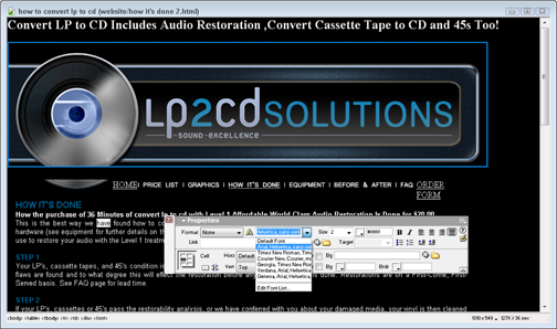
Figure 5-9: Most web page design tools let you specify a preferred font or fonts for your web page in a dialog box like this.
Using clip art is free and fun
Not everyone has the time or resources to scan photos or create original graphics. But that doesn’t mean you can’t add graphic interest to your web page. Many web page designers use clip-art bullets, diamonds, or other small images next to list items or major web page headings that they want to call special attention to. Clip art can also provide a background pattern for a web page or highlight sales headings, such as Free!, New!, or Special!.
When I first started in the print publications business, I bought catalogs of illustrations, literally clipped out the art, and pasted it down. It’s still called clip art, but now the process is different. In keeping with the spirit of exchange that has been a part of the Internet since its inception, some talented and generous artists have created icons, buttons, and other illustrations in electronic form and offered them free for downloading.
Here are some suggestions for tried-and-true sources of clip art on the web:
 Clipart.com (
www.clipart.com/en)
 Clip Art Universe (
http://clipartuniverse.com)
 The Yahoo! page full of links to clip art resources (
http://dir.yahoo.com/computers_and_internet/graphics/clip_art)
A picture is worth a thousand words
Some customers know exactly what they want from the get-go and don’t need any help from you. But most customers love to shop around or could use some encouragement to move from one item or catalog page to another. This is where images can play an important role.
Even if you use only some basic clip art, such as placing spheres or arrows next to sale items, your customer is likely to thank you by buying more. A much better approach, though, is to scan or take digital images of your sale items and provide compact, clear images of them on your site. Here’s a quick step-by-step guide to get you started:
1. Choose the right image to capture.
 The original quality of an image is just as important as how you scan or retouch it. Images that are murky or fuzzy in print are even worse when viewed on a computer screen.
2. Preview the image.
Digital cameras let you preview images so that you can decide whether to keep or delete individual pictures before downloading to your computer. If you’re working with a scanner, some scanning programs let you make a quick preview scan of an image so that you can get an idea of what it looks like before you do the actual scan. When you click the Preview button, the optical device in the scanner captures the image. A preview image appears onscreen, surrounded by a marquee box (a rectangle made up of dashes), as shown in Figure 5-10.
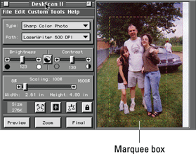
Figure 5-10: The marquee box lets you crop a preview image to make it smaller and reduce the file size.
3. Crop the image.
Cropping means that you resize the box around the image to select the portion of the image that you want to keep and leave out the parts of the image that aren’t essential. Cropping an image is a good idea because it highlights the most important contents and reduces the file size. Reducing the file size of an image should always be one of your most important goals — the smaller the image, the quicker it appears in someone’s browser window.
 Almost all scanning and graphics programs offer separate options for cropping an image and reducing the image size. By cropping the image, you eliminate parts of the image you don’t want, and this does reduce the image size. But it doesn’t reduce the size of the objects within the image. Resizing the overall image size is a separate step, which enables you to change the dimensions of the entire image without eliminating any contents.
4. Select an input mode.
Tell the scanner or graphics program how you want it to save the visual data — as color, line art (used for black-and-white drawings), or grayscale (used for black-and-white photos).
5. Set the resolution.
Digital images are made up of little bits (dots) of computerized information called pixels. The more pixels per inch, the higher the level of detail. When you scan an image, you can tell the scanner to make the dots smaller (creating a smoother image) or larger (resulting in a more jagged image). This adjustment is called setting the resolution of the image. (When you take a digital photo, the resolution of the image depends on your camera’s settings.)
 When you’re scanning for the web, your images appear primarily on computer screens. Because many computer monitors can display resolutions only up to 72 dpi, 72 dpi — a relatively rough resolution — is an adequate resolution for a web image. Using this coarse resolution has the advantage of keeping the image’s file size small. Remember, the smaller the file size, the more quickly an image appears when your customers load your page in their web browsers. (Alternatively, many designers scan at a fine resolution such as 300 dpi and reduce the file size in a graphics program.)
6. Adjust contrast and brightness.
Virtually all scanning programs and graphics editing programs provide brightness and contrast controls that you can adjust with your mouse to improve the image. If you're happy with the image as is, leave the brightness and contrast set where they are. (You can also leave the image as is and adjust brightness and contrast later in a separate graphics program, such as Paint Shop Pro X5, which you can try out by downloading it from the Corel website, www.corel.com/corel.) Or if you're working on the iPhone, check out the Clarity app (http://campl.us/feature/clarity), which dramatically improves so-so images.
7. Reduce the image size.
The old phrase “Good things come in small packages” is never more true than when you’re improving your digital image. If you’re scanning an image that is 8" x 10" and you’re sure that it needs to be about 4" x 5" when it appears on your web page, scan it at 50 percent of the original size. This step reduces the file size and makes the file easier to transport, whether it’s from your camera to your computer or your computer to your hosting service. Even more important, it appears more quickly in someone’s web browser.
8. Scan away!
Your scanner makes a beautiful whirring sound as it turns those colors into pixels. Because you’re scanning only at 72 dpi, the process shouldn’t take too long.
9. Save the file.
Now you can save your image to disk. Most programs let you do this by choosing File⇒Save. In the dialog box that appears, enter a name for your file and select a file format. (Because you’re working with images to be published on the web, remember to save either in GIF or JPEG format.)
For more details on scanning images, check out Scanners For Dummies, 2nd Edition, by Mark L. Chambers.
Creating a logo
An effective logo establishes your online business’s graphic identity in no uncertain terms. A logo can be as simple as a rendering of the company name that imparts an official typeface or color. Whatever text it includes, a logo is a small, self-contained graphic object that conveys the group’s identity and purpose. Figure 5-11 shows an example of a logo.
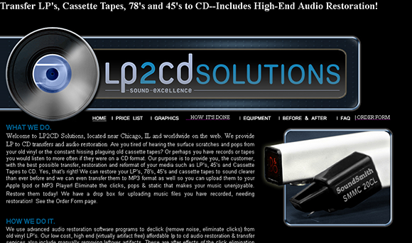
Figure 5-11: A good logo effectively combines color, type, and graphics to convey an organization’s identity or mission.
Inviting Comments from Customers
Quick, inexpensive, and personal: These are three of the most important advantages that the web has over traditional printed catalogs. The first two are obvious pluses. You don’t have to wait for your online catalog to get printed and distributed. On the web, your contents are published and available to your customers right away. Putting a catalog on the web eliminates (or, if publishing a catalog on the web allows you to reduce your print run, dramatically reduces) the cost of printing, which can result in big savings for you.
But the fact that online catalogs can be more personal than the printed variety is perhaps the biggest advantage of all. The personal touch comes from the web’s potential for interactivity. Getting your customers to click links makes them actively involved with your catalog.
Getting positive e-mail feedback
Playing hide-and-seek is fun when you’re amusing your baby niece, but it’s not a good way to build a solid base of customers. In fact, providing a way for your customers to interact with you so that they can reach you quickly may be the most important part of your website.
Add a simple mailto link like this:
Questions? Comments? Send e-mail to: info@mycompany.com
A mailto link gets its name from the HTML command that programmers use to create it. When visitors click the e-mail address, their e-mail program opens a new e-mail message window with your e-mail address already entered. That way, they have only to enter a subject line, type the message, and click Send to send you their thoughts.
Most web page–creation programs make it easy to create a mailto link. For example, if you use Dreamweaver, follow these steps:
1. Launch and open the web page to which you want to add your e-mail link.
2. Position your mouse arrow and click the spot on the page where you want the address to appear.
The convention is to put your e-mail address at or near the bottom of a web page. A vertical blinking cursor appears at the location where you want to insert the address.
3. Choose Insert⇒Email Link.
The Insert Email Link dialog box appears.
4. In the Text box, type the text that you want to appear on your web page.
You don’t have to type your e-mail address; you can also type Webmaster, Customer Service, or your own name.
5. In the E-Mail box, type your e-mail address.
6. Click OK.
The Insert Email Link dialog box closes, and you return to the Dreamweaver Document window, where your e-mail link appears in blue and is underlined to signify that it is a clickable link.
Other editors work similarly but don't give you a menu command called Email Link. In that case, you have to type the mailto link manually. In the WordPress editor, select the text you want to serve as the link and click the link toolbar icon. When the Insert/Edit Link dialog box opens, in the URL box, after http:// (which is pre-entered), you type mailto:name@emailaddress.
Web page forms that aren’t offputting
You don’t have to do much web surfing before you become intimately acquainted with how web page forms work, at least from the standpoint of someone who has to fill them out to sign up for web hosting or to download software.
When it comes to creating your own website, however, you become conscious of how useful forms are as a means of gathering essential marketing information about your customers. They give your visitors a place to sound off, ask questions, and generally get involved with your online business.
Be clear and use common sense when creating your order form. Here are some general guidelines on how to organize your form and what you need to include:
 Make it easy on the customer. Whenever possible, add pull-down menus with pre-entered options to your form fields (text boxes that visitors use to enter information). That way, users don’t have to wonder about things such as whether you want them to spell out a state or use the two-letter abbreviation.
 Validate the information. You can use a programming language — for example, JavaScript — to ensure that users enter information correctly, that all fields are completely filled out, and so on. You may have to hire someone to add the appropriate code to the order form, but the expense is worth it to save you from having to call customers to verify or correct information that they missed or submitted incorrectly.
 Provide a help number. Give people a number to call if they have questions or want to check on an order.
 Return an acknowledgment. Let customers know that you have received their order and will be shipping the merchandise immediately or contacting them if more information is needed.
As usual, good web page–authoring and –editing programs make it a snap to create the text boxes, check boxes, buttons, and other parts of a form that the user fills out. The other part of a form, the computer script that receives the data and processes it so that you can read and use the information, is not as simple. And programs like WordPress provide you with a host of add-on applications — plugins — that create both the text entry elements and the scripts for you.
Blogs that promote discussion
Most blogs give readers the chance to respond to individual comments the author has made. On my own blog, for instance, which was created with WordPress, I make comments, and readers can immediately respond. This is a standard feature to give readers the opportunity to comment on what you’ve written.
On blogs that attract a wide following, like Talking Points Memo (www.talkingpointsmemo.com), comments by multiple authors generate long discussions by a community of devoted readers. (Find out more about blogs in Chapter 1.)
The comments that appear at the end of an article or blog post have replaced what web designers used to call a guestbook — a place where visitors signed in so they could feel that they’re part of a thriving community. If you use WordPress to create and manage a blog or website, you can easily give visitors the ability to comment on an article. If you have created a blog, each post is automatically “commentable.” That’s one of the many nice things about WordPress. You just have to make sure commenting is turned on.
Log in to WordPress and click Settings under the heading Admin Options in the narrow column on the left side of the editing window. Then click Discussion, as shown in Figure 5-12, and select the Allow check box so people can post comments on new articles.
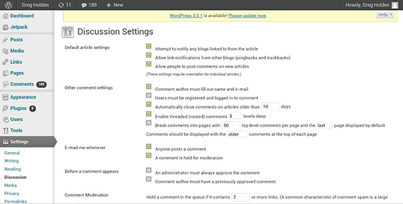
Figure 5-12: WordPress easily lets you manage comments for an entire site.
To enable comments on an individual page, follow these steps:
1. Click Pages in the Admin settings in the narrow column on the left side of the editing window.
The list of pages in your WordPress site appears.
2. Click the page you want, and if necessary, click Quick Edit.
The Quick Edit window for your page opens.
3. Scroll down to the Discussion section and select the Allow check box.
After you allow comments, be sure to log in to your site regularly to moderate them. You’ll probably have to delete spam comments left by bots (programs that perform automated functions such as “scraping” web pages for contents) that post them automatically and respond to legitimate comments that actual human beings have left.
Chit-chat that counts
After visitors start coming to your site, the next step is to retain those visitors. A good way to do this is by building a sense of community by posting a bulletin board–type discussion area.
A discussion area takes the form of back-and-forth messages on topics of mutual interest. Each person can read previously posted messages and either respond or start a new topic of discussion. The comments areas discussed in the preceding section are the most popular ways of promoting this sort of interaction. For a more elaborate example of a discussion area that's tied to an online business, visit the EcommerceBytes (www.ecommercebytes.com) discussion areas, one of which is shown in Figure 5-13. EcommerceBytes is a highly regarded site that provides information about the online auction industry. Its discussion boards give readers a place to bring up questions and issues in a forum that's independent from those provided by auction sites like eBay.
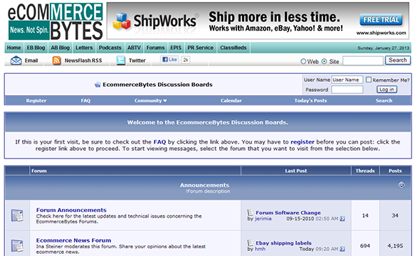
Figure 5-13: A discussion area stimulates interest and interaction among like-minded customers.
The talk doesn’t have to be about your particular niche in your business field. In fact, the discussion is livelier if your visitors can discuss concerns about your area of business in general, whether it’s flower arranging, boat sales, tax preparation, clock repair, computers, or whatever.
How do you start a discussion area? The basic first step is to install a special computer script on the computer that hosts your website. (Again, discussing this prospect with your web hosting service beforehand is essential.) When visitors come to your site, their web browsers access the script, enabling them to enter comments and read other messages.
Here are some specific ways to prepare a discussion area for your site:
 Copy a bulletin board or discussion-group script from either of these sites:
• eXtropia.com (www.extropia.com/applications.html)
• Matt's Script Archive (www.scriptarchive.com)
 Start your own forum on a service such as vBulletin (
www.vbulletin.com), which is used by the aforementioned EcommerceBytes.
Moving from Website to Web Presence
After you have established a visual identity through colors, images, and a logo, you can “brand” yourself by “popping up” in as many web venues as possible. Make no mistake about it: Tending to your image and building a name for yourself takes time and effort. It might take one, two, or more hours every day. And once you start blogging and building an audience, you need to keep at it every few days, if not every day. Otherwise, those fickle web visitors you worked so hard to cultivate will flit away to someone else’s website or blog or Facebook page.
How do you “pop up” in places where people will find you? You’ll find suggestions throughout this book. Here are a few ideas:
 Start up a blog and use it to comment on your area of interest. (See Chapters 1 and 13.)
 Twitter as much as possible; short “tweets” can advertise new products or sales you have running. (Again, see Chapter 13.)
 Get on Facebook and start cultivating a circle of friends. Use Facebook to point them to your website — and your blog, your tweets, and so on. (You guessed it — see Chapter 13.)
 Open a storefront on eBay or on a free site like eCRATER (
www.ecrater.com). (See Chapters 5 and 14 for more.)
The art of having a web presence is using all these sites to point to one another, so no matter where you are, shoppers are directed to your products or services, or at least prompted to find out more about you.
Extreme Web Pages: Advanced Layouts
People with some experience creating websites typically use tables for layout. They might be right up the alley of an adventurous type who wants to start an online business.
Setting the tables for your customers
Tables are to designers what statistics are to sports fans. They provide another means to present information in a graphically interesting way. Tables were originally intended to present “tabular” data in columns and rows, much like a spreadsheet. But by using advanced HTML techniques, you can make tables a much more integrated and subtle part of your web page.
Because you can easily create a basic table using web page editors, such as Dreamweaver, GoLive, and Expression Web, starting with one of these tools makes sense. Some adjustments with HTML are probably unavoidable, however, especially if you want to use tables to create blank columns on a web page (as I explain later in this section). Here is a quick rundown of the main HTML tags used for tables:

<table> </table> encloses the entire table. The border attribute sets the width of the line around the cells.

<tr> </tr> encloses a table row, a horizontal set of cells.

<td> </td> defines the contents of an individual cell. The height and width attributes control the size of each cell. For example, the following code tells a browser that the table cell is 120 pixels wide:
<td width=120> Contents of cell </td>
The clever designer can use tables in a hidden way to arrange an entire page, or a large portion of a page, by doing two things:
 Set the table border to 0. Doing so makes the table outline invisible, so the viewer sees only the contents of each cell, not the lines bordering the cell.
 Fill some table cells with blank space. They act as empty columns that add more white space to a page.
An example of the first approach, that of making the table borders invisible, appears in Figure 5-14: my friend Scott Wills’s website, where he advertises his graphic design services. The page appears to be divided into three columns, but the “columns” are cells in a table with borders that aren’t visible.
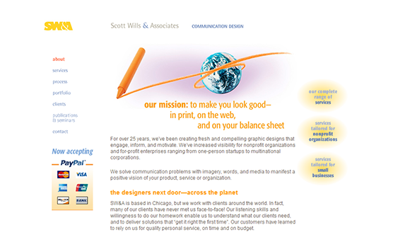
Figure 5-14: This page is divided into table cells, which give the designer a high level of control over the layout.
Breaking the grid with layers
Tables and another set of virtually obsolete layout tools called frames bring organization and interactivity to web pages, but they confine your content to rows and columns. If you feel confined by the old up-down, left-right routine, explore layers for arranging your web page content.
Layers, like table cells and frames, act as containers for text and images on a web page. Layers are unique because they can be moved around freely on the page — they can overlap one another and “bleed” right to the page margin.
With either Dreamweaver or Expression Web, you can draw a layer directly on the web page you’re creating. You add text or images to the layer, and then resize or relocate it on the page by clicking and dragging it freely. The result is an innovative page design that doesn’t conform to the usual grid.
Achieving consistency with Cascading Style Sheets
Cascading style sheets (CSS) are the tools of choice among designers who want to observe standards that have been established on the Internet and who want to make sure their web pages appear the same from browser to browser and from one computer to another. If you have a choice on how to lay out a page, and you want to precisely position items while creating layouts that are easily updatable, I urge you to look into CSS.
CSS is a subject for a book all by itself, so I’m not going to get into any great detail here. Suffice it to say that if you want to create full-featured, cutting-edge layouts, you need to use CSS. The major web design programs — Dreamweaver, GoLive, and Expression Web — all support CSS designs. Rather than learn CSS from scratch, choose one of these applications and let it do the work for you.
Standards like CSS and XML are important because they enable you to reach the widest set of viewers possible. A style sheet is a document that contains the formatting for a web page. By separating the formatting from the content, you quickly apply the same formatting to multiple web pages. You can also update the design of an entire website easily: Rather than change a heading from Arial to Verdana 20 separate times on 20 web pages, for example, you change it once, and all the pages that have the style sheet attached to them have their headings updated all at once.
 See
See  Building an online presence takes time
 Be sure to read the copyright fine print