Chapter 4. The Definition Phase (How to Frame Your Experiments)
NOW THAT YOU HAVE THE BASICS DOWN, it’s time to put them into action beginning in this chapter. Using the framework introduced in Chapter 3, we’ll begin to flesh out each step in the process of designing an A/B test, and explain how the early and close involvement of designers is necessary to your team’s success. We’ll be discussing the activities shown in Figure 4-1 that are outlined in a dotted line. Throughout, we’ll revisit some of the common themes we highlighted in the Preface and Chapter 1.
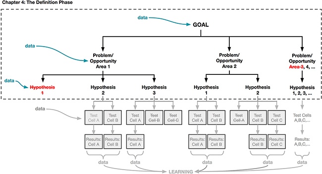
We’re going to spend the bulk of this chapter laying out how you can define your goals, problems, and hypotheses to maximize your learning when designing with data. Recall that a hypothesis is a statement that captures the impact you believe your design will have on your users. In this chapter, we’ll show you how to craft a strong hypothesis and how to “go broad” by generating as many hypotheses as possible. Then we’ll discuss how to narrow down to one or a few hypotheses to focus on. You should revisit our discussion from Chapter 2 about how to formulate a hypothesis before diving into this chapter, but the most important thing for you to understand is that a key part of using a data-aware framework is articulating the “why” behind your design and stating clearly your expectations regarding the ways in which your design will impact users’ behaviors and sentiments. Doing so is critical to using experimentation and data analysis successfully in your design practice, because it keeps learning central to every test you create and run.
As we start our discussion about hypotheses, keep in mind our introduction to experimentation in Chapter 2. Experimentation is a way for you to have a conversation with your users; in each experiment, the designs you put in front of your users provide an opportunity to collect feedback about their experience—the behavioral data you get back from your experimental test design(s) is your users’ response to your design options or “questions.” As you get involved in more experiments, the iterative and continual process of testing ideas and options will help you learn more about your users: who they are, their needs and wants, and what works for them and what doesn’t. Your basic goal in each experiment is to learn something about your users. You also gain the advantage of demonstrating through behavioral data that the work you are doing has business impact. Having clear strategic business and user experience goals defined will help guide and prioritize the experiments you pursue.
Getting Started: Defining Your Goal
“Without goals, and plans to reach them, you are like a ship that has set sail with no destination.”
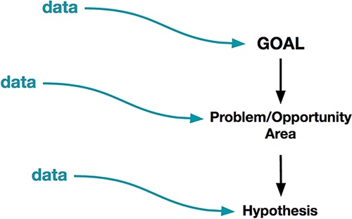
Taking time to reflect regularly on these questions will help you put your own passion and desire to learn at the center of your goals and experimentation process—and will also help you communicate your perspective more clearly to others. We’ll talk more about communicating your ideas and findings to others later in the book in Chapter 7. But for now, let’s continue to focus on defining your specific design-related goals in experimental terms. Defining your goals is the first step in the broader experimentation framework we introduced in Chapter 3 (Figure 4-2).
Beyond your own curiosity, we also encourage you to reflect on the following questions:
 Returning to our summer camp example, some goals are stated in terms of quantitative metrics. For instance: “I want to increase the number of campers who enroll at our camp.” Other goals are more abstract or qualitative, such as: “I want to make camp more fun.” Regardless of how you define your goals, you’ll need a way to measure whether or not you’re making progress toward them. Remember that all measurable things are rooted in human experiences, and most of the experiences you’ll aim to impact are measurable in some way.
Your goals should be measurable so that you can understand whether or not you’re approaching or achieving them. In Chapter 2, we told you that metrics are evaluative benchmarks that meaningfully track your business’s health. When defining your goals, you should also be thoughtful about choosing a metric of interest that tracks your progress toward those goals. We often hear designers worry that they’ll become slave to metrics, and lose their ability to be creative. We want to take a moment to remind you here that designing with data is a creative process. You and your team should rally around both your metrics and your goal so that you have something to strive for. How you chase that goal is up to you. Making those decisions depends on design intuition and creative problem solving.
Although your company may have many metrics, you should strive to have a single metric of interest or each of the tests you run. This metric of interest will be how you measure the impact of a particular test. Remember that your metric of interest should be a reflection of the user behavior you’re hoping to influence. To weigh in on this topic we spoke with Chris Maliwat. Chris has led product at a number of fast-growing internet companies, including Skillshare, Gilt Group, Vuze, and most recently, Warby Parker. In addition, Chris has product experience from large and established data-centric companies like Facebook, Netflix, and eBay. This means that he has broad experience across both smaller companies and established industry giants.
Chris shared an example of an experiment he ran at eBay that illustrates the importance of clearly defining your success metrics ahead of time, and then clearly relating those metrics to the user behavior you care most about. The test was about providing more information in the eBay bidding flow when there was a higher risk of the transaction being unsatisfactory for the buyer or seller. From past data, they knew that buyers were less likely to pay for their item in certain scenarios. Not all “fraudulent” transactions were malicious; for example, this could happen when a customer didn’t realize that they were buying from someone in a different country, which could result in longer shipping times or higher shipping rates.
In practice, it can be a challenge to identify metrics that align with your goal. Recall that in Chapter 2 we gave an example from Coursera, and how they use proxy metrics such as test completion to anticipate one of their key metrics, credential completion. This is a great example of a practical consideration in choosing metrics: this proxy metric is necessary because credentials can take a long time to complete, and the teams at Coursera couldn’t wait that long to collect data and learnings about their experiments.
Fundamentally, regardless of what metric of interest you and your team choose, a metric must always be measurable. Sometimes measuring the thing you care about can be challenging. We asked Jon Wiley of Google to tell us about how he approaches metrics that are more difficult to measure. His example of measuring “abandonment” shows how you may not be able to fully understand or capture everything you want to learn with A/B testing and it’s therefore important to find other ways to get at the underlying data you seek:
One consideration we haven’t yet introduced when choosing metrics is metric sensitivity. Sensitivity refers to how much of a change in experience it takes to cause a change in the metric. For instance, net promoter score (NPS) is a common metric that many companies track. NPS ranges from –100 to +100 and measures the willingness of a company’s customers to recommend the company’s products or services to others. NPS is used as a proxy for gauging the customer’s overall satisfaction with a company’s product or service and the customer’s loyalty to the brand, offering an alternative to customer satisfaction research. Proponents of NPS claim it is highly correlated with a company’s revenue growth. However, NPS is a relatively insensitive metric—it takes a significant change in experience and a long time to change what users think about a company, and small changes like moving the placement of a button or tweaking the copy on a sign-up flow will not change such a holistic metric. It’s important to select metrics that are capable of detecting and reflecting the change you’re making. Otherwise, you may observe no change in your metrics even though there was a meaningful change in your user experience. For example, a copy change might actually lead to more registrations on your website, which you wouldn’t know by tracking NPS.
This speaks to a broader point about why picking the right metric of interest for your experiment is important to avoid bias. You’ll want to be careful in structuring your test so that you don’t judge the success of your design on a metric that “can’t fail.” You want your experiment to be fair. For example, let’s say you decide to add a feature to your experience. During the course of assessing that feature’s success, is it fairer to look at the number of clicks that it gets, or to measure the impact of adding that feature to your overall user experience (like impacting retention)? In this example, a feature will necessarily get more clicks if it exists than if it doesn’t, so measuring “increased clicks” as your metric of interest will lead to an experiment that is not falsifiable. As you are defining your metric of interest, then, you should think about what you want to be different in your test group compared to your control group: Do you want these people to retain or subscribe at a higher rate? Engage with your product more frequently? It is these changes in user behavior that should be core to the metric of interest you choose to track.
In many cases, making meaningful changes in your company’s key metrics is a long-term game that is the result of many smaller changes. Even in those cases most companies are concerned with avoiding negative impacts to their key metrics. In practice, most A/B tests track several metrics: they make decisions about the “success” or “failure” of the test against the metric of interest, but may look to key metrics to make sure no negative change was made, and secondary metrics to gain a richer understanding of the impact of the test. Secondary metrics are less central to your business and experiment’s success, but may still reflect important pieces of your experience or how your product is being used. Secondary metrics reveal positive side effects from improvement to the metric of interest. For example, your metric of interest may be increasing time onsite as a result of better content personalization, with a secondary metric tracking number of social recommendations made. These are great for exploring specific pieces and features or fine-tuning designs that might matter experientially without impacting your company’s key metrics. Many feature teams define their own secondary metrics based on their goals; for instance, the iOS team at a social media company might measure how much content is created on iPhones. Although secondary metrics can be valuable and informative, one common pitfall we often see teams fall into is mistakenly targeting secondary metrics when they should be targeting key metrics or another metric of interest. In addition, secondary metrics are frequently targeted without teams thinking through how those metrics might impact the key metrics. If the improvement only affects a small subset of your user base or if you don’t think your changes will affect important metrics, then it may not be the right place to focus your energy. Based on your particular circumstances, we encourage you to pause and confer with your team about whether exploring changes to secondary metrics is worthwhile; that is, should you invest the resources and time if you don’t anticipate demonstrating a major impact on your company’s key metrics?
These questions will help you choose appropriate metrics, in the service of measuring your progress toward your goals. Remember that in Chapter 1 we told you that one of the major benefits of using data in your design process is that it reveals the impact of design. We believe that articulating and justifying your goals in terms of your metrics of interest and company key metrics is one of the best and most empowering ways to advocate for your users when it comes time to make design and product decisions. In fact, you can think of metrics as one of the unifying languages within your company: it’s one that will convey the value of your designs and your efforts to your key stakeholders and company investors most effectively. We believe that healthy and effective experimentation practices will add value to your company. Metrics therefore measure not only your success in that one experiment, but over time you’ll know whether your data and experimentation practices are effective at your business in general.
To help illustrate the importance of metrics when defining goals, we’ll share a few examples.
Getting the full picture
Katie Dill spoke to us about Airbnb’s key metrics and how they are working to establish metrics that are reflective of the business needs and also customer happiness and quality. Because Airbnb’s experience exists both online and offline, it can be harder to get a measure of the full experience. There is a transactional part of the experience where users are booking their stay online, but there is also an offline component where the “guest” and the “host” are actually interacting in real life as well:
I’m quite proud of the fact that our company has acknowledged that while our business metrics (we use “guest arrivals”) are the best classification for how successful we are, they can’t be the only thing we focus on. We are now looking at quality measurements of various types, too. We’re working hard to learn how they relate to each other, so we can use nights booked and quality metrics as complements to each other.
Measurement is critical in experience design, but first we need to understand what we want to learn and what we want to accomplish so we know we’re measuring the right thing. Measurement can shape your approach and cause you to focus on certain things over others. So before you settle on a metric you need to make sure it’s also the one that best depicts what success is. Design can play a key role in this conversation and help ensure we’re measuring what’s key to a person’s enjoyment and fulfillment with an experience. Over time, it’s not just the purchases made on your platform, but the quality your customers experienced that will determine your success as a business and a brand.
As Katie highlights, having design involved in the conversation about what is going to be measured can be instrumental in making sure that you feel confident about what you are prioritizing in your experience and in judging whether or not it’s performing.
Your metrics may change over time
To weigh in on how metrics can evolve as the business evolves, we spoke to Eric Colson. Eric is the Chief Algorithms Officer at Stitch Fix, where his team helps to redefine retail shopping using a unique personalized experience for their customers by leveraging data, personalization, and human curation. Stitch Fix sends their customers a personalized selection of clothes and accessories with every order, which they call your “Fix.” As the business went from an “on demand” service to one which also offered an automatic cadence—something more akin to a subscription service model—their metrics needed to change to reflect the shift in their customers’ behavior. His story also points out how a small change to the design manifested as a big insight that eventually affected their business fairly dramatically:
Our business model was on demand; clients would schedule each shipment individually and whenever they wanted one. Early in 2012, we wanted to provide a way for clients to have a more effortless experience. So, we added the option to receive shipments automatically on a set cadence. Clients could opt in to this by checking an option box on the bottom of their account page. It was a subtle—we didn’t think many would opt in; perhaps just those who loved the service so much that they didn’t want to have to remember to request a shipment every month. But, to our surprise, tons of clients started ticking the box. We had underestimated the convenience automatic shipments would provide. We later added different cadence options—every other month, quarterly, every two months, and so on. There’s four cadences now and many of our customers opt in to this.
As an illustration of how key metrics are used to define a goal for your testing and experimentation, let’s consider Netflix. Because it is a subscription-based business, one of Netflix’s key metrics is retention, defined as the percentage of their customers who return month over month. Conceptually, you can imagine that someone who watches a lot of Netflix should derive a lot of value from the service and therefore be more likely to renew their subscription. In fact, the Netflix team found a very strong correlation between viewing hours and retention. So, for instance, if a user watched only one hour of Netflix per month, then they were not as likely to renew their monthly subscription as if they watched 15 hours of Netflix per month. As a result, the Netflix team used viewing hours (or content consumption) as their strongest proxy metric for retention, and many tests at Netflix had the goal of increasing the number of hours users streamed. Recalling our earlier discussion about metric sensitivity, you likely also see the parallel between Coursera’s test completion metric and Netflix’s viewing hours metric. Viewing hours is more sensitive and therefore easier to measure quickly.
We have a “List Your Space” flow where hosts can sign up and create a listing of their home. Two teams wanted to redesign this part of the product. One team wanted to improve efficiency and the conversion of hosts signing up. Whereas another team wanted to improve the readiness and preparedness of the hosts that went through the flow. These teams’ goals were potentially at odds. One team would benefit from a more concise flow resulting in more sign-ups, while the other would benefit from a more in-depth flow resulting in fewer sign-ups. To ensure both goals would be addressed, and team collisions avoided, the teams banded together. A composite team was created with product managers and designers from both teams. They used both goals as their guiding light—readiness and conversion—and in the end tracked both metrics. They needed to make sure that one metric didn’t increase at the detriment of the other. It was a tough project but everyone is happy with the result that helps many hosts sign-up well prepared to host.
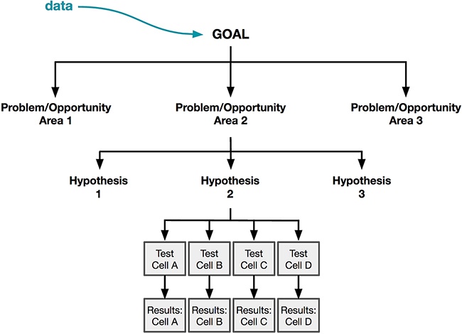
As we started to show you in Chapter 3, data can be immensely useful even in the early stages of the definition phase. We really want to emphasize that data isn’t only used at the end of an A/B test to see which test cell was most successful, but that it’s used throughout the entire process of planning and executing your experiment. Data can be used to help inform and shape your goal and to provide you with insights into how you might go about achieving your goal via experimentation. In Figure 4-3, we show that data already plays a role even at the stage of defining your goal, even if only informally—we draw on prior assumptions and experiences to define goals.
As you consider and define your goal, think to yourself: what data do you have available to you right now? What evidence do you have about how people are currently using your product? Take stock of everything that you know about your experience currently and how users are reacting to it. Where do they get stuck? Where are their frustrations? How do your insights align with your company and business goals? If this is your first time really engaging with data, you will want to do a few things.
First, be as broad as possible about your definition of “data.” As we showed in Chapter 2, data can come in many forms and be from many sources. Don’t let your biases restrict the scope of the data that you consider in this phase. Being open-minded early in your process might allow you to stumble upon insights that you wouldn’t have seen otherwise. Your user research, analysis, or marketing teams probably have many insights about your users that can help early in this process. Even if such teams aren’t established at your company, though, there are other sources available that you might not have considered before—for example, if you have a customer support team, hearing what people are complaining about and praising is a great source of information and data.
Once you’ve gathered your data, remember that data has different levels of quality. So although we want you to be open-minded in collecting your data, you should be very disciplined and critical about deciding what data to leverage in making decisions. Here are some questions to ask yourself:
Who or what does the data represent? Is it just from a specific segment of your user base or does it come from a sample of your users that resembles and represents the entire user base? Recall that certain kinds of data (like tweets) indicate only the happiest or the angriest of customers and experiences.
Is it accurate? How has it been vetted for quality? Has the data been interpreted at any point, opening the possibility of bias?
On what dimensions does the data fall? What are the strengths and limitations of that type of data?
Was it collected recently enough to still apply to your company and business landscape today?
As we’ve said throughout this book, you can’t think about data in isolation. Think also about how this data reflects what your users are doing and what it tells you about their behavior. What are they trying to achieve? Think hard about how human emotions, actions, and behaviors are represented in your data. By doing so, your existing data can inform the types of goals you’ll pursue in your data and design process, and the types of things you hope to learn.
To summarize, here are some questions to get you started thinking about how to leverage existing data to refine your goals prior to designing and testing:
What kind of data do you currently have access to that might give you insight into where you can make the most impact?
How can other forms of data provide insight into where there is an opportunity to improve performance?
What are some of your most engaged users doing? How can you encourage other users to do the same? What delights those users? Will the same things delight users you would like to attract to your service?
Why do they do what they do and how does that behavior make them more likely to continue using your product or service?
What do users who are most likely to convert do? What actions do they take?
What are your users’ biggest pain points? Do pain points vary across cohorts and segments of your users?
What types of complaints do you hear in your customer service department, or through past user research?
Understanding this type of data can open your mind to possible problem areas and opportunities that will later help you to formulate different hypotheses and solutions that you might not have identified otherwise. If you don’t have a lot of data available to you to help shape and inform your goal, you can also make a list of the kind of data you would like to have access to. You might find that you can invest in some user research or surveys within your company or through external agencies like UserTesting.com or UserZoom.com in order to gather some preliminary insights around your goal. Investing early and often in data will help you check your intuitions at every step of the process. The earlier you catch errors in your intuitions about your users or problems with your execution, the easier and less costly they’ll be to change.
So, you’ve started thinking about a goal and how you’re going to measure your success at moving toward that goal. Once you’ve articulated your goal, you’ll have to think about how you will approach achieving it (Figure 4-4). Hopefully you had some data that helped you to refine your goal, and you feel excited about pursuing that goal. Right now, you don’t need to know exactly how you’re going to achieve that goal. However, in many cases looking at past data helps you refine your existing goal and spur some ideas about a few approaches you could take to achieving that goal (what we are labeling here as “problem/opportunity areas”)

Identifying a few problem/opportunity areas where your designs could make an impact is the first step in beginning to craft your hypothesis. For example, let’s go back to the example goal of “increasing the number of campers.” What might lead you to get more campers? You could break this out into two possible approaches: retain more old campers, or bring on more new campers. You could start by surveying campers who attended camp and didn’t return the next summer—what did they do instead? Are they attending different summer camps, and if so, why? Are they taking summer classes instead, or traveling abroad? This might provide some insight into why they’re leaving: is it because they didn’t understand the value of camp? Because camp was too expensive? Or because their parents didn’t think camp was educational enough? There are many possible reasons you might see a low return rate in campers. You could also try to understand why prospective campers don’t attend—is it because they don’t know about your camp? Because it’s too far away from home? Experimentation and data can help you identify many reasons, but using your intuition as a designer you might think of others that are worth exploring further.
Why is that interesting? In data research, John represents the classic “outlier,” a person who stands out from the other members of the group. From a traditional data perspective, people may by default look at measures of central tendency or how the majority of people behaved. However, as designers we seek these outliers. From a business perspective, outliers may provide a new design opportunity that we might not pay attention to otherwise.
As we close out this section, we want to remind you one more time to think about the space of design activities you might be embarking on. This is a good time to review for yourself the nature of the work you’re taking on with each problem/opportunity area along the two dimensions we introduced in Chapter 2. You need to ask yourself whether your problem is of a global or local scope. Are you aiming to evaluate your ideas or explore more possibilities? In the next section, we’ll begin to speak about generating hypotheses that align with the problem/opportunity areas you’re thinking about. In Figure 4-5, we show that taking time to scope your problem carefully at this point will help you decide what data and hypotheses are most appropriate for the design activity you’re working on, and being thoughtful at this point in the process will save you significant time later on.
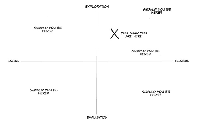
When we talked about metrics, we expressed the idea that metrics help you measure not only your success toward your goal, but also whether your efforts were “worth it.” Resource limitations and prioritization are realities at the vast majority of companies, and make it impossible to chase every idea. When you’re thinking about global problems and opportunities, you may be looking to fundamentally change your approach. Deviating significantly from your existing experience requires more resources and effort than making small iterations. When you design in “unknown territories” (as you often do when working on a global scope), you can’t be sure in advance whether these territories will be fruitful or not or whether there’s a much better solution to be found. In these cases, you should look hard for existing data or signals that indicate that these efforts might pay off in larger metrics increases. You can think of global problems and opportunities as being more high risk and high reward than local when working on a local scope, because with local problems your proposed changes will be more similar to the existing solution. As you’re scoping your problem or opportunity area, then, always consider how external sources of data can give you confidence (or counterevidence!) in support of your efforts. If you don’t have signals to suggest that a global scope is worthwhile, consider whether you should be thinking about a local problem of opportunity instead.
You should also take into consideration how far along you are in the process of committing to a solution. In Chapter 2, we mentioned that exploratory problems can give you the freedom to stay open-minded without fear of being stuck launching work that isn’t your best, whereas evaluatory work should be more vetted and closer to a solution you’d be proud to ship soon after the test. Once you’ve decided which type of design challenge you’re solving, consider how whether you’re exploring or evaluating might impact the way you consider your metrics. In an evaluatory test, your goals will be clearly defined: you want to make sure that you haven’t negatively impacted your metrics of interest, and that the positive impact of the design is sufficient to justify your efforts. With this kind of mentality, you will have a clear expectation about what should happen to your metrics. In exploratory work, however, you still have a clear and measurable goal in mind, but exactly how your designs will lead to that impact might not yet be clear. You therefore will approach your metrics with the mindset of observing what happens (perhaps in several secondary metrics as well as your key metrics) rather than seeing if an expected change happened. These types of problems can help inspire further experiments to gain greater confidence in the phenomenon you observed.
By this point, we hope that you have a clear sense of your goals, and some ways to approach defining the different problem and opportunity areas you could consider in service of meeting those goals. Now, we’ll launch into a deeper discussion about how you as a designer should be involved in crafting well-formed hypotheses.
Building Hypotheses for the Problem at Hand
In Chapter 2, we introduced the idea of a hypothesis as a testable prediction of what you think will happen to your users if you make a change to your experience. You now know that defining clear hypotheses is important to ensure that your designs express a clear intention that you can learn from. You can think of your hypothesis as a north star that helps you stay focused, guiding you toward valuable insights that will be actionable and meaningful to you as a designer, and to achieving your business goals. Having a clear hypothesis is also an essential way to keep learning at the center of your experimentation practice.
What we haven’t covered yet is how to actually generate a solid hypothesis. In this section, we’ll walk you through the key components of building a hypothesis. We’ll also provide some secondary questions that will help you when crafting your hypothesis. You’ll notice that we deliberately used language to reflect what designers are most familiar with: user behaviors and experiences. This should help to set the foundation for the way you will design your hypothesis statement and test cells, the material we cover in Chapter 5.
One way to construct a strong hypothesis is:
For [user group(s)], if [change] then [effect] because [rationale], which will impact [measure].
We introduced a simpler version of this hypothesis framework in Chapter 2. Now, let’s talk a little bit more about each of the components in turn.
In a hypothesis, the user group component indicates who you hope your change will affect. In Chapter 2, we told you about the diversity of your user base and how certain grouping strategies can help you start to understand and represent this diversity. Based on previous data, you may be focusing on your entire population of users or only a subset. Here are a few questions to get you started thinking about the user group(s) you’re aiming to affect with this hypothesis:
What do you know about them as a demographic? Their habits?
How are you targeting these users in relation to your business?
What relationship do they have with your company?
Are these existing users? New users? Power users?
You’ll need to do something different to impact the user group(s) you’ve defined. Recall from Chapter 2 that the change component is a broad statement of the types of changes you’ll be making to your control (current) experience to encourage the user behavior you’re aiming to impact. This doesn’t have to be a perfect expression of exactly how you’ll design or implement the change; rather, it should represent the change abstractly while still leaving room for you to design several possible treatments of the hypothesis. We’ll discuss how to design different treatments of the same hypothesis in Chapter 5. As you’re thinking about the change your design will bring about, consider the following questions:
Are you introducing something completely new to the experience, or removing something?
Are you changing something about the existing experience?
Your goal in making a change to your experience is to impact your user’s behavior in some meaningful way. When you define the effect, you’re explicitly articulating the desired behavior you hope to bring about in your user group(s). This effect part of your hypothesis will probably be directly related to the problem or opportunity area you already defined, since your hypothesis represents an idea you have for targeting that particular area. The effect essentially calls out the specific behavior that will help you address that. As you revisit your problem or opportunity area, think about the following:
What was the problem you identified? What user behaviors can minimize or address this problem?
What was the opportunity area you identified? How can you incentivize behaviors that make this opportunity a reality? What are your power users doing?
In Chapter 3 and earlier in this chapter, we discussed how data can help you identify effective problem areas and ways to address them. The rationale part of a hypothesis is a statement of the evidence you have to support your hypothesis, or the common sense reasoning why you think your proposed change would drive the desired behaviors. In other words, why do you think that the change you make will have the desired outcome? By including your rationale in your hypothesis, you’re giving the reasons you believe your efforts will be justified. This is one way for you and your team to make sure you’re prioritizing hypotheses that will give you the most effective learning and the best shot of a successful test. Get started by asking yourself the following questions:
Does your rationale speak to your customers’ motivations or does it leverage a tactic or mechanism to make that change?
What kind of data have you seen to support this hypothesis and how consistent is that data?
Finally, the measure is the metric or metrics that you will ultimately try to impact. These describe how you will measure your success. You need to have your success metrics defined upfront, so that after you launch your tests you have an objective way to track their performance, therefore maximizing your learning. One more important note is that tracking your business success metrics is important, and the best business metrics will consider customer experience; however, you should also be thoughtful about whether you should track a qualitative measure of user sentiment as well. This is one way to triangulate your findings and ensure that your data reflects a holistic image of how your design changes affect your users. We already provided an in-depth discussion of choosing appropriate metrics (refer back to “Defining Your Metric of Interest” as well as Chapter 2), but here are a few more questions to put it into the context of hypothesis generation:
Which metrics are you going to look at to understand if the impact you are making is the right one or big enough? How are these metrics related to the goal you’ve already defined, and your business’s goals?
Will you measure or factor in user sentiment, and if so, how? Will you use surveys, focus groups, and interviews?
As you continue to develop hypotheses and run more experiments, you might find that a number of these building blocks tend to be the same from hypothesis to hypothesis. For example, if you are consistently working with the same user group(s) every time, you might find it getting redundant to state the specific user group(s) in every hypothesis statement. It might occasionally make sense to create hypothesis statements that don’t include every single one of these items, but we believe it’s important to periodically revisit all five of these areas in the course of your work to make sure that you remain aligned with the other folks you might be working with and the larger company goals. Our opinion is that the minimal good hypothesis will include the change you’re trying to make and the metric you will track to observe its effect. This is in service of holding yourself and your team accountable to your goal and knowing very concretely whether you have achieved it, which is at the core of making data-informed decisions.
Example: A Summer Camp Hypothesis
There is no strict way to formulate a hypothesis. The structure we described earlier was merely illustrative. As long as you capture the most important and relevant building blocks for your situation, your hypothesis will be clear and well formed. Here is another example of a format that might work for a hypothesis that is similar to the template that many tech companies use:
Asking some of the following questions might help you as you look for ideas:
Who are your users? Do they match the users you would like to have in the future? How are they similar or different from each other? (Think back to our discussion in Chapter 2 of new versus existing users.)
What are some of the current gaps in your product, experience, or service that you can fill?
What are competitors or other companies in the space doing that is successful but different from your experience?
Now that we’ve introduced some concrete thoughts on how to go about building a hypothesis, we want to walk you through a concrete example of how this played out at Netflix.
Example: Netflix—transitioning from DVD Rentals to Streaming
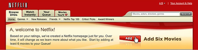
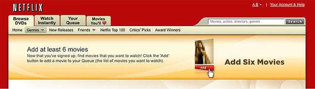
As an example of creating a hypothesis, consider this example from Netflix when they were transitioning from a company that was known for its DVD rental business to one that would lead the market in video streaming. The Netflix website was divided up into several major areas—the first two tabs in the navigation were “DVD” and “Watch Instantly” (Figure 4-6). At that time, the “DVD” tab had been the first and default tab for many years. A lot of work had been done to optimize that experience for first-time use. There was a lot of testing around what behaviors were important to encourage right after the user had signed up (e.g., “Add 6 DVDs to your queue”) and on welcome messaging (Figure 4-7 and Figure 4-8). Because the “Watch Instantly” tab was not the default tab, it hadn’t received the same degree of optimization.

Given that the company wanted to understand the extent to which the tab placement could both affect people’s impression of the company and the number of movies people streamed, a hypothesis was put forward to change the first tab from being “Browse DVDs” to “Watch Instantly” (shown in Figure 4-9). At that time the company’s core metrics were focused on both DVD consumption and streaming consumption—that is, how many DVDs were added to a user’s queue as well as how much they streamed. The belief was that because the DVD business was so well established at the time, moving it to the second tab would not negatively impact the core metrics for the company. This hypothesis could be formulated as:
By making the “Watch Instantly” tab the first tab on the website, more users will stream from Netflix without negatively impacting the number of DVDs they add to their queue, resulting in more consumption of Netflix (DVDs and streaming) because the streaming option is more prominent.

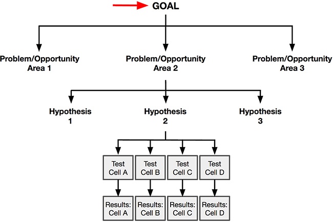
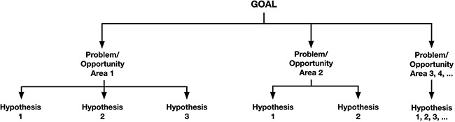
Up until now, we’ve shown how you can use data to identify your goals and understand the nature of your problem/opportunity area. We’ve also talked about how to structure and craft a hypothesis statement. So although the process we have covered so far looks something like Figure 4-10, where a problem/opportunity area lends itself to a single hypothesis, in actuality it’s more like Figure 4-11, where there may be multiple hypotheses that address the same problem or opportunity area. In this section, we’ll talk about how to go broad in your generation of hypotheses.
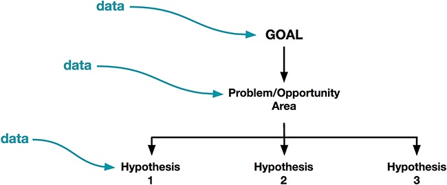
As part of ensuring that you are constantly learning from your designs, we believe that generating a large variety of different hypotheses prior to designing forces you and your team to be more creative. This will force you to think about very different ways to solve your problem, and therefore help you to generate a greater diversity of solutions. In fact, you could have also identified a number of problem/opportunity areas that might each generate more hypotheses, so Figure 4-12 could be a more accurate representation of the way we’d want you to work with data.
Notably, though we’ve reiterated the importance of allowing data to feed into your hypothesis generation, it is important to remember that this is in service of being data first but not data only. Design intuition is a powerful tool for generating hypotheses in unexplored territory; this is especially the case where there may not be strong evidence for which hypotheses are the most critical to test. At the hypothesis generation phase, you need not weed out these hypotheses. They are worth noting and considering alongside other data-backed hypotheses later on, and you can always decide not to pursue them due to potential risk later on. Remember that hypothesis generation is meant to be lightweight and nonbinding, so you shouldn’t restrict yourself or your creativity too early on in the process.
As you may have already seen in your experience as a designer, there are often many behaviors that can drive the same eventual result. For instance, think back to the summer camp example from before. Remember that your goal is to increase enrollment for the camp’s upcoming summer session. You’ve identified several problem/opportunity areas toward that goal, but now you’re going to focus on one specific opportunity area: increasing the number of new campers. We built one hypothesis earlier—that providing buses to camp would increase registrations from urban campers—but we can build more by thinking more broadly.
Thinking about the user component of your hypothesis can be more challenging, but has the potential to make huge impacts to your metrics. Recalling our conversation about different cohorts and segments in Chapter 2, there are a few ways you could approach hypotheses regarding different users or user groups:
Broaden your user base by targeting new users (e.g., by opening new markets, expanding advertising efforts to new populations, etc.)
Provide a better experience to an existing set of users (e.g., to improve retention of those cohorts or segments)
Speaking to the first point, we want to take a moment to pause here to remind you that though it’s important to consider your current users, you should be equally thoughtful about who your future users may be. The users you currently attract and target may be very different from the users that you would like to have in the future. The success of your business depends heavily on you continuing to attract and retain new users in the future. For instance, early adopters of new technologies are often more tech-savvy than the average person, and are more tolerant of poor experiences because they’re highly motivated to use your product. As you try to grow your user base, you might find that a broader or different set of users will have different behaviors, needs, or abilities than your initial user group. Another example might be a company that initially launches in the United States but then decides to expand internationally. While it might turn out that the experience you are designing has broad appeal right from the start, it’s rare that an experience won’t need to take into account different needs from an evolving and growing user base. One rule of thumb is that if your business is fairly mature and you’ve saturated a market then you should focus on your existing users, but if you’re at the early stages of growth as a company, then you should focus on new/future users.
Remember the three Coursera segments that we introduced in Chapter 2? Recall that Coursera thinks about lifelong learners, seasoned professionals, and unseasoned professionals as three segments with very different needs who are currently using their product offering. John Ciancutti also shared an example from Coursera about how there is potentially a fourth segment that the company might not be thinking about just yet, but that could be very promising for the business in the future. According to him:
Most of the world hasn’t spent the last 200 years building universities. Developing markets would need 10,000 more universities just to get to the baseline of first-world post-secondary education. They would need a million more instructors than they have today. But in fact, they’re losing instructors and colleges there because there’s a global competition for that talent. Structurally, they’re not going to do it the way the United States did it. They don’t have those 200 years; they want to do it now.
If you’re at Coursera, today there’s not a business model that’s going to meet the developing markets segment. You have to make choices. The easiest way to make money in 2016 is to go after those affluent lifelong learners who want to give you money. There’s a lot of temptation to do that, but if you’re going after the biggest possible future demographic, you go after the people who want the credentials. 93% of humans never get a post secondary education of any kind, but middle-class jobs today require it. So there’s a gap. The question is, are we going to roll the dice and go with the big thing?
As John shared, considering a new segment of users is potentially a great way to open new doors for a business. However, the types of people who would use Coursera in an emerging market are very different than the lifelong learner segment. You can imagine that if Coursera decided to explore these emerging market learners, they’d need to be thoughtful about using data to understand how those folks react to their product offering.
Just now, we spoke about how you could vary the change, desired behavior, and user profile(s) to generate more hypotheses. One rule of thumb to remember is that the scope of the problem you are trying to solve could impact how many of these hypothesis dimensions you vary away from your control experience. For instance, for a local problem, you might be making a different change, but otherwise focus on the same users, desired behavior, or metrics. However, for a more global problem, your hypothesis might deviate away from your control in more than one way: maybe your hypothesis has to do with changing or expanding the users or user groups in which you are interested, or targeting a new behavior, or measuring additional or different variables, as opposed to just making different product changes.
As we discussed in Chapter 2, local problems are generally ones where you have decided to focus on one area of your customer experience. You are already familiar with the territory, and are looking to optimize the existing experience by making only one or two small changes to your existing experience. You can think of local problems as those where the different hypotheses represent smaller changes to the user experience, giving you more trustworthy data about exactly how the small changes impact your users and your metric of interest. In global changes, remember that you’re trying to come up with the best possible solution by being open-minded to radical changes that might dramatically alter your user’s experience, the user groups you are serving, or your business model.
Earlier, we told you that for local problems, your hypothesis might only reflect a different change relative to the control experience, keeping the users, measures, and desired behaviors the same. However, though we’ve often heard concern from designers about these “local optimizations,” in practice such changes can have huge measurable impact on the health of an experience and business. In other words, small changes to the experience don’t necessarily imply small impact. And, local experiments are often the only way to be very confident of the impact about specific components of the experience, since they let you “tease apart” the causal impact of each individual change.
By contrast, your hypotheses for a global problem should be much more diverse. Even though your intuition might tell you that thinking narrowly enough for a local problem is more challenging, we would contend that thinking as broad as you should for a global problem is actually much harder. We encourage you to challenge yourself and think deeply about how you could leverage each component of the hypothesis. How can targeting different users or user groups help you address your selected problem or opportunity area? What different behaviors can you encourage in those different users or user groups and with what incentives? What might you change about your experience to drive the behavior you’d like to see? As you can see, you might have an exponential number of different hypotheses you can generate by targeting each of the building blocks of your hypothesis in turn.
When Netflix first launched on the PlayStation, the experience was fairly basic (Figure 4-13). Users had to click through one title at a time, making it challenging to evaluate many possible movies to watch, and the experience generally didn’t scale well to a growing catalog of streaming content.

When A/B testing capabilities came to the PS3, the Netflix team was eager to get to work on optimizing their experience. This was the first time that the team had the opportunity to experiment with a TV interface, and they acknowledged that they had yet to develop a well-honed instinct about what works and what doesn’t work in that environment. They didn’t feel confident that the current design was the right one and knew there was a strong chance that the “right” design was significantly different from what was in market. Therefore, it was important to try some different ideas.
- Hypothesis 1
- Hypothesis 2
In the second hypothesis, the team strove to focus on simplicity as the core basis of the hypothesis. Rather than focusing on providing users with depth of access to the catalog, they thought about how to make things easier. One aspect of this hypothesis was that the website was an understood paradigm for Netflix users and replicating that interface on the TV would result in more streaming due to the familiarity and ease of navigating through the experience.
- Hypothesis 3
- Hypothesis 4
The team believed that by launching these different experiences to their users, they would get directional guidance about what the potential impact was for what each of the four hypotheses represented. This example illustrates how even when tackling a large global problem, A/B testing and experimentation can be used to explore the impact of a few concrete hypotheses against a specific metric (consumption time). We’ve intentionally not shown you the designs that were created for each of these hypotheses because we wanted to make a point of abstracting the work of making a hypothesis from the work of designing it. We know and understand that for most designers a natural way of working is to design and craft a hypothesis or set of hypotheses at the same time. This is, of course, completely fine. However, we have found it helpful to at least consider each of these as a separate step so that you are conscientiously making sure that you are not jumping too quickly to a specific solution that you get attached to before exploring all the other possibilities that you might be able to explore.
We’ll take a deeper look at this example and the different designs that were made to represent each hypothesis in Chapter 5 and Chapter 6. For now, we hope you can see how each of these concepts tried to serve the same goal (increasing the amount of time people spend watching Netflix) even though the approaches were different. To really learn the most from this A/B test, the team also explored secondary metrics in order to understand the strengths and weaknesses of each version. When there are many different ways to reach your goal, your job will be to find out which approach will help you achieve that goal in the best possible way.
Involve Your Team and Your Data Friends
We hope that this chapter has empowered you to start generating many hypotheses to address your design goals and problems. We want to take a quick moment here to remind you about other members of your team and organization who can bring their own superpowers to the process of building hypotheses. This is valuable not only to build team consensus on hypotheses that will shape the team’s work going forward, but also because different members of your team have unique expertise that can inform your hypotheses.
If you work with product managers, they will often have unique insight into the business or strategic goals. These strategic goals should inform the metrics that have the highest priority in your hypothesis, and have the potential to shape what behaviors you consider encouraging in your users. Similarly, these strategic goals may put limitations on what you can and can’t change based on the strategic priorities of your company.
Anyone on your team who focuses on working with data, such as user researchers or data analysts from across the organization, have specialized knowledge about your users. One point we want to emphasize is that past learning should inform future hypotheses. By partnering closely with all kinds of data specialists, you can apply that past knowledge to your hypothesis generation, inspiring you to think of alternative hypotheses that you otherwise would not have considered.
Finally, your engineering partners can help you understand the potential engineering impact of different hypotheses. Although you don’t need to nail down exactly what the implementation will be while generating hypotheses, your engineering friends will be able to clue you into roughly how much work different ideas take to pursue. Sometimes these are obvious (of course, redoing a whole home page is harder than changing the size or color of a button), but they may be less obvious as well.
For instance, in his talk “Data Driven Products Now!” Dan McKinley shares a couple of examples from his time at Etsy of how simple estimation (what he calls “applied common sense”) could help project the potential value of different hypotheses before building anything.[13] He shares two examples of reasonable-sounding product ideas that turned out to have very different potential impacts: building a landing page for local furniture, or emailing people that give up in the middle of purchases.
By looking at some metrics they already tracked, McKinley found out that the furniture landing page would have nominal impact for the business, and the experiment would need to run for more than six years to reach sufficient power—hardly feasible at all, and not worthwhile! Comparatively, emails to people who gave up in the midst of a purchase had much bigger potential impact to the business: due to the promising estimations, the team rolled out the feature and it wound up contributing to 1.5% of Etsy’s total sales in a year (a huge success for such a seemingly small feature!).
The point we’re trying to emphasize here is that making some ballpark estimations early on is a great way to vet potential hypotheses to understand their impact. You might only be thinking of orders of magnitude ($10K potential revenue versus $100K potential revenue versus $1M potential revenue?), but this is often enough to give you a sense of whether to further explore a hypothesis or not.
Using What You Already Know
At the end of our hypothesis generation section, we closed with a note reminding you to involve other members of your team and your “data friends.” To be clear, your team is not only helpful in generating hypotheses, but they can be invaluable in selecting them as well. Your “data friends,” in particular, may have many types of data and past insights available at their disposal: past A/B tests, user research, surveys, and market research, among others. This expert knowledge can start to provide a lens through which you can start pruning some hypotheses and prioritizing others. Selecting the best hypotheses is another instance where past data should inform future data.
Start by sitting down with your data friends to discuss the hypotheses you’ve already generated. You might want to ask some of the following questions to begin your conversation:
Have we conducted research about any similar hypotheses before?
Similar users or user groups? Similar changes? Similar desired behaviors? Similar rationales?
How have these types of hypotheses been performed in the past?
What types of changes have successfully impacted this metric in the past?
Remember to be open-minded about the types of data that inform your hypotheses; sometimes you might have weak signals from previous tests that were not relevant at the time, but apply well to your current hypotheses. Insights need not map one-to-one in order to be useful or worth considering.
That said, you should always be cognizant about confirmation bias, or the tendency to look for evidence that confirms your existing thoughts or beliefs. Even if your company does a good job of documenting past research in reports or other formats, we strongly encourage you to take the time to collaborate with your data friends, since they can put the findings in context and help you avoid confirmation bias. Plus, your data friends can help you look for evidence that disproves or contradicts your hypothesis, which is an important part of a balanced approach to using data to explore hypotheses. Being balanced with the data you explore early on requires skill but will pay off later.
So how should you actually go about leveraging past data in service of slimming down hypotheses? Strong contradicting evidence and data might suggest that you should prune that hypothesis: perhaps it’s not worth exploring further because you’ve already been down that path and found it fruitless. Further investment might be a waste of time. However, as we mentioned earlier in the chapter, you might also be curious about how to prioritize different hypotheses. The questions we introduced before can help you prioritize based on expected payoff: if you already have some evidence that supports your hypothesis, you might have more confidence that your test will be successful (that your results will show a positive change in your metrics of interest).
Your company hopefully already has past insights available that can guide your hypothesis selection process. However, in certain cases, you might also want to invest in evaluating your hypotheses using other research methods, which may be lightweight or (what have been called) “quick and dirty” methods or through “pilot studies.” Pilot studies are small-scale preliminary studies that you carry out prior to a full-scale study. Pilot studies allow you to iterate on your study design through evaluation of feasibility, time, cost, and sample size, likely effect size or statistical variability, and, most importantly, potentially have adverse effects on your users. Putting effort upfront into these kinds of explorations means you can assess whether your expected payoff executing, launching, and analyzing a large-scale A/B test is worth it. Oftentimes, collecting feedback from smaller groups of users and assessing sentiment toward or usability of your proposed hypothesized design(s) is well worth it. This is especially true if you find yourself in situations where you’re about to embark on a very large and costly global test, and you want stronger signals before making that commitment. Another method you can use to start evaluating your hypothesis is a survey. Surveys allow you to collect small to medium amounts of data from users about their attitudes and emotions (but not, importantly, their behaviors). In this method, you can collect self-reported data, which can be both quantitative or qualitative.
Additionally, generating low-fidelity mocks or prototypes (e.g., wireframes, sketches, or noncode prototypes such as those built in InVision) to collect a pulse check on your hypothesis is a great way to get insights from other sources prior to your A/B test. You need not focus yet on optimizing or perfecting design ideas. These mocks don’t need to be the same design you ultimately launch in an A/B test, but they should help convey the hypothesis you’re planning to convey so that you can get quick feedback about those ideas before you invest in an A/B test.
We’ve talked a lot about how you can make informed decisions about which hypotheses to pursue, by leveraging your broader team and their knowledge of existing data, and collecting further data to help evaluate your hypothesis. Our discussion of hypothesis selection has focused on selecting hypotheses that maximize the potential for learning and that give you the greatest chance of having your efforts pay off. However, the practical considerations of launching your test will also dictate which hypotheses you can pursue through to a completed A/B test. This is because you need to make sure that the data that you’ll get out of the test is hygienic and actionable. In other words, you need to make sure that you can reasonably collect the data that you need from the appropriate and representative group of users, in a reasonable length of time, and in a way that you can reasonably detect a meaningful effect if there is one. Here, we’ll walk you through a few key considerations when thinking about whether you can realistically test a particular hypothesis.
Recall that in Chapter 2 we introduced the concept of statistical power. Power is the ability of your test to measure an effect, if it exists in the world. If your A/B test has insufficient power, you won’t know whether your result is because no difference between your test cell and your control exists in the world, or because you just didn’t have a strong enough lens to see it.
We want our experiment to robustly test our hypothesis so we need to have sufficient power to detect a difference in the control and treatment when a difference actually exists. A power analysis will determine the minimum detectable effect (MDE); this is the minimum change you’d need to see (this can be positive or negative) in the metric to have a chance to observe a change with statistical significance. So, for instance, a power analysis might reveal that the minimum detectable effect would require that you observe at least a 10% increase in the number of campers next year to conclude that the difference is statistically significant.
Why does the minimum detectable effect matter in the hypothesis selection phase? Let’s continue on with the example of a 10% minimum detectable effect in the change in how many campers you have. You’ll need to ask yourself for each hypothesis whether you really believe that the change you’re proposing can make that big of an impact. This is where design intuition becomes critically important, because you’ll have to make a judgment call about this. In some cases, you’ll conclude that your hypothesis doesn’t “think big enough,” giving you the license to consider more ambitious changes to your existing experience.
Similarly, if you plan to segment your results you’ll have to keep that in mind too. Let’s say your experiment is focused on testing the user experience on all the devices for which you have designs but you particularly care about users who primarily use your mobile device experience(s)—let’s call those users the “mobile” user group. When you analyze the results for all devices combined, you’ll have a larger sample size and more power. But you’ll also need to make sure that you have a large enough mobile-only sample to draw conclusions about the mobile device user experience specifically. Again, this involves taking on more cost and rolling out an experiment to a bigger constituency of your users. Plus this constitutes more risk to your experience, since you’re exposing more of your users to an as-yet-unproven, experimental design. In this kind of situation, you should very carefully vet hypotheses that target your mobile users specifically.
The second consideration for balancing learning and speed is how long you will need to keep your test user group living with the test experience. It will often take time for your users’ behavior to change, and depending on the behavior that you are hoping to impact, you may need more or less time depending on the details of the test you are running. Recall that some metrics may take longer to measure than others. It is in this situation that having good proxy metrics will help to minimize the time you need to keep a test running. A clear example of this is offering something like a 30-day money-back guarantee to your users. You would need to leave this test up for at least 30 days to see how many of the people who bought your product or service actually end up returning it within the 30-day period. Although you may have increased the number of purchases (and can measure those results right away), you won’t know whether the purchases you added will actually contribute to the bottom line until after the 30-day period is over.
In this section, we showed you how our abstract conversation about statistical power in Chapter 2 becomes more concrete as you generate and select hypotheses. We encourage you to be proactive about considering the minimum detectable effect and whether you have sufficient power to evaluate your hypotheses early in designing your A/B test. All too often we see teams invest heavily into A/B tests, only to reach the heartbreaking conclusion at the end that they weren’t able to see an effect if it existed. Remember, even if you have to abandon an exciting hypothesis now due to practical considerations, there’s always the hope that you could evaluate it in the future when your user base grows or you have more time to explore.
Keep Your Old Hypotheses in Your Back Pocket
We’ve given you some considerations on how to select hypotheses in this chapter, by prioritizing hypotheses that give you a greater chance of success over those that don’t and pruning hypotheses that don’t currently make sense to test due to practical considerations about your launch and past research and insights. However, we want to take a second to remind you not to give up on the hypotheses that you really believe in, even if you can’t test them immediately.
Experimentation is a mindset and an iterative process, which means that it is constantly building on itself and improving. As your experience evolves, experimentation will allow the data and insights that guide your future design directions to be crisper and more relevant, bringing to the foreground hypotheses that you might have had to table at first due to lack of evidence or even counterevidence. Who knows what the future of your experience and product will be? By hanging onto hypotheses that you didn’t pursue before, you’ll make your next iteration of generating hypotheses easier and faster, and you’ll always be ready to learn when the next opportunity arises.
It’s a surprisingly common mistake for teams to move too quickly past this first stage of clearly articulating what it is that they are trying to accomplish. Often people fall prey to this because of eagerness; we all want to roll up our sleeves and build, whether that means designing or implementing engineering solutions. Having a clearly defined hypothesis that the entire team is aligned around can help you to avoid the frustration of finding out late in your test process that you are focused on the “wrong” things. Having several strong hypothesis statements that you can revisit again and again throughout your experimentation journey will give you a north star that you can check yourself against along the way. Understanding what it is that you want to learn from your statement and how you’d measure the outcome of your work in the beginning will help to ensure that the results you get at the end of the process will be both actionable and useful. By rallying around well-crafted hypotheses you’ll foster a mindset of designing to learn rather than designing to ship, letting you be successful in every test even when the test itself fails.