CHAPTER 9
The High‐Yield Bond Market: Risks and Returns for Investors and Analysts
“High‐yield junk bonds, they are finished.” This was not an uncommon refrain heard from various pundits on Wall Street and in Washington in the wake of the corporate default surge in 1990 and 1991 and after the bankruptcy of the market's leading underwriter of these non‐investment‐grade bonds (Drexel Burnham Lambert) and the criminal indictment of the market's leading architect, Michael Milken. We argued then (Altman 1992, 1993), and in every other subsequent instance of a major domestic or international credit crisis, that high‐yield bonds are a legitimate and effective way for firms that have an uncertain credit future to raise money. One should expect periodic times of relatively high defaults commensurate with the risk premiums that issues need to offer investors to lend money. These investors, primarily from institutions like mutual funds and pension funds, seek higher fixed income returns than are available from safer, corporate investment‐grade and government bonds.
Figure 9.1 displays the rating hierarchy of credit and default risk from the leading bond and bank loan rating agencies – Fitch Ratings, Moody's Investors Service, and Standard & Poor's. Note the now familiar distinction between the relatively safe investment grade bonds (AAA to BBB–, or Aaa to Baa3) and the more speculative, non‐investment‐grade, or high‐yield, securities (below BBB– or Baa3).
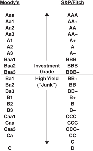
FIGURE 9.1 Major Agencies' Bond Rating Categories
In 2018, almost one‐quarter of the total North American dollar‐denominated corporate bond market was comprised of lower‐graded bonds (Figure 9.2). And the market for high‐yield bonds had grown dramatically to a total amount outstanding at 2017 (Q2) of over $1.6 trillion! (See Figure 9.3.) Note the consistent growth of the size of the market from 1996, when it totaled under $300 billion, to the impressive total in 2017.
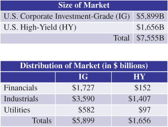
FIGURE 9.2 Size of the North American Corporate Bond Market, June 30, 2017
Sources: S&P Global Ratings and NYU Salomon Center.
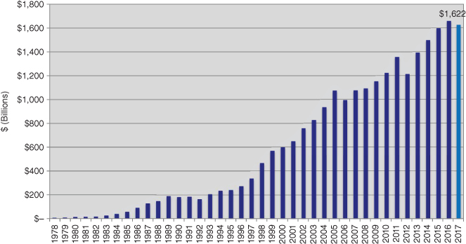
FIGURE 9.3 The Size of the North American High‐Yield Bond Market, 1978–2017 (Mid‐year, $ Billions)
Source: NYU Salomon Center estimates using Credit Suisse, S&P, and Citi data.
The growth and sustainability of the U.S. high‐yield bond market is reflected in the record amount of new issuance since the great financial crisis of 2008–2009, as shown in Figure 9.4, and the also impressive growth in the European market, as shown in Figure 9.5. Indeed, according to Bank of America, Merrill, statistics, the market has averaged significant annual new issuance exceeding, on average, $230 billion per year from 2010 to 2017. European high‐yield bonds also began its own impressive new issuance run in 2010 and its total amount outstanding, according to Credit Suisse, in 2017 (Q1), totaled €477 billion ($563 billion). Europe's growth reflects the substitution of capital market bonds for the more traditional commercial bank financing, as banks were reluctant to lend to subinvestment grade companies due to higher capital requirements under Basel II, and the quest for yield by investors in Europe, and other parts of the world.
| Ratings | ||||||||
| Annual | Total | BB | B | CCC | (CCC % H.Y.) | NR | ||
| 2005 | 81,541.8 | 18,615.0 | 45,941.2 | 15,750.9 | (19.3%) | 1,234.7 | ||
| 2006 | 131,915.9 | 37,761.2 | 67,377.3 | 25,319.2 | (19.2%) | 1,458.2 | ||
| 2007 | 132,689.1 | 23,713.2 | 55,830.8 | 49,627.6 | (37.4%) | 3,517.5 | ||
| 2008 | 50,747.2 | 12,165.0 | 25,093.1 | 11,034.4 | (21.7%) | 2,454.6 | ||
| 2009 | 127,419.3 | 54,273.5 | 62,277.4 | 10,248.4 | (8.0%) | 620.0 | ||
| 2010 | 229,307.4 | 74,189.9 | 116,854.7 | 35,046.8 | (15.3%) | 3,216.1 | ||
| 2011 | 184,571.0 | 54,533.8 | 105,640.4 | 21,375.0 | (11.6%) | 3,021.8 | ||
| 2012 | 280,450.3 | 71,852.1 | 153,611.1 | 48,690.2 | (17.4%) | 6,297.0 | ||
| 2013 (1Q) | 73,492.3 | 31,953.1 | 29,534.2 | 11,480.0 | (15.6%) | 525.0 | ||
| (2Q) | 62,135.0 | 24,380.0 | 23,665.0 | 13,790.0 | (22.2%) | 300.0 | ||
| (3Q) | 73,770.8 | 22,964.2 | 32,610.0 | 18,196.6 | (24.7%) | 0.0 | ||
| (4Q) | 60,936.8 | 24,050.0 | 22,686.8 | 14,175.0 | (23.3%) | 25.0 | ||
| 2013 Totals | 270,334.8 | 103,347.3 | 108,495.9 | 57,641.6 | (21.3%) | 850.0 | ||
| 2014 (1Q) | 51,634.7 | 17,585.0 | 25,792.2 | 7,842.5 | (15.2%) | 415.0 | ||
| (2Q) | 74,629.6 | 23,893.7 | 30,852.3 | 19,363.6 | (25.9%) | 520.0 | ||
| (3Q) | 59,777.3 | 25,537.3 | 22,550.0 | 10,875.0 | (18.2%) | 815.0 | ||
| (4Q) | 52,721.1 | 21,975.0 | 28,906.1 | 1,840.0 | (3.5%) | 0.0 | ||
| 2014 Totals | 238,762.7 | 88,991.0 | 108,100.6 | 39,921.1 | (16.7%) | 1,750.0 | ||
| 2015 (1Q) | 76,059.5 | 23,184.2 | 44,785.3 | 8,090.0 | (10.6%) | 0.0 | ||
| (2Q) | 73,428.4 | 21,219.0 | 40,037.3 | 12,052.1 | (16.4%) | 120.0 | ||
| (3Q) | 31,740.0 | 14,770.0 | 12,675.0 | 4,295.0 | (13.5%) | 0.0 | ||
| (4Q) | 34,584.1 | 20,500.9 | 13,100.0 | 660.0 | (1.9%) | 323.2 | ||
| 2015 Totals | 215,812.0 | 79,674.2 | 110,597.5 | 25,097.1 | (11.6%) | 443.2 | ||
| 2016 (1Q) | 34,665.0 | 19,325.0 | 11,070.0 | 4,270.0 | (12.3%) | 0.0 | ||
| (2Q) | 63,490.4 | 31,427.4 | 26,043.0 | 6.020.0 | (9.5%) | 0.0 | ||
| (3Q) | 56,403.6 | 21,614.6 | 28,788.9 | 5,650.0 | (10.0%) | 0.0 | ||
| (4Q) | 40,509.1 | 13,610.7 | 20,763.4 | 4,960.0 | (12.2%) | 1,175.0 | ||
| 2016 Totals | 194,718.0 | 85,977.7 | 86,665.3 | 20,900.0 | (10.7%) | 1,175.0 | ||
| 2017 (1Q) | 72,673.9 | 33,327.5 | 29,802.4 | 9,544.0 | (13.1%) | 0.0 | ||
| (2Q) | 50,342.4 | 18,531.3 | 23,366.0 | 7,895.1 | (15.7%) | 550.0 | ||
| (3Q) | 57,157.3 | 19,639.7 | 27,699.3 | 9,818.3 | (17.2%) | 0.0 | ||
| (4Q) | 61,415.0 | 23,877.5 | 27,050.0 | 9,587.5 | (15.6%) | 0.0 | ||
| 2017 Totals | 241,588.7 | 95,376.0 | 107,917.8 | 36,844.9 | (15.3%) | 550.0 | ||
FIGURE 9.4 New Issuance: U.S. High‐Yield Bond Market ($ millions), 2005–2017
Source: Based on data from Bank of America, ML.
| Ratings | Currency | |||||||||||||||||
| Annual | Total | BB | B | CCC | (CCC % HY) | NR | USD | EUR | GBP | |||||||||
| 2005 | 19,935.6 | 1,563.3 | 11,901.0 | 5,936.6 | (29.8%) | 534.8 | 2,861.0 | 15,080.3 | 1,668.3 | |||||||||
| 2006 | 27,714.6 | 5,696.2 | 16,292.1 | 5,020.5 | (18.1%) | 705.9 | 7,657.8 | 19,935.7 | 121.1 | |||||||||
| 2007 | 18,796.7 | 5,935.3 | 11,378.5 | 562.0 | (3.0%) | 920.9 | 4,785.5 | 12,120.9 | 1,890.3 | |||||||||
| 2008 | 1,250.0 | 1,250.0 | 25,093.1 | 1,250.0 | ||||||||||||||
| 2009 | 41,510.3 | 18,489.4 | 16,697.4 | 4,771.3 | (11.5%) | 1,552.2 | 12,315.0 | 28,696.9 | 498.3 | |||||||||
| 2010 | 57,636.5 | 22,751.3 | 29,050.5 | 2,170.7 | (3.8%) | 3,663.9 | 12,775.0 | 43,147.7 | 1,403.3 | |||||||||
| 2011 | 60,435.8 | 24,728.9 | 29,919.7 | 4,108.7 | (6.8%) | 1,678.6 | 16,720.0 | 33,758.0 | 8,842.4 | |||||||||
| 2012 | 65,516.1 | 27,001.7 | 29,013.0 | 7,186.7 | (11.0%) | 2,314.6 | 28,198.0 | 32,270.4 | 2,929.3 | |||||||||
| 2013 (1Q) | 27,954.5 | 6,783.8 | 15,008.4 | 5,160.6 | 1,001.7 | 10,050.0 | 12,380.7 | 4,837.4 | ||||||||||
| (2Q) | 30,335.3 | 6,860.2 | 19,295.1 | 3,724.1 | 455.9 | 9,913.0 | 14,149.9 | 6,074.0 | ||||||||||
| (3Q) | 16,558.4 | 3,375.3 | 9,609.6 | 2,721.8 | 851.7 | 5,310.0 | 8,644.0 | 2,604.4 | ||||||||||
| (4Q) | 16,655.9 | 2,588.0 | 10,657.6 | 2,366.4 | 1,043.9 | 5,210.0 | 9,086.5 | 2,359.4 | ||||||||||
| 2013 Totals | 91,504.1 | 19,607.3 | 54,435.2 | 13,972.9 | (15.3%) | 3,353.2 | 30,483.0 | 44,125.6 | 15,875.3 | |||||||||
| 2014 (1Q) | 27,169.2 | 12,565.7 | 11,685.2 | 1,230.0 | (4.5%) | 1,688.3 | 7,315.0 | 16,352.8 | 3,501.4 | |||||||||
| (2Q) | 65,671.4 | 13,730.1 | 45,808.3 | 4,111.1 | (6.2%) | 2,021.9 | 23,150.0 | 36,009.0 | 6,096.7 | |||||||||
| (3Q) | 15,980.5 | 3,586.3 | 10,593.2 | 1,241.3 | (7.8%) | 559.7 | 2,750.0 | 8,216.2 | 4,744.6 | |||||||||
| (4Q) | 10,646.9 | 3,893.7 | 4,288.8 | 654.5 | (6.1%) | 1,810.0 | 6,305.0 | 4,341.9 | ||||||||||
| 2014 Totals | 119,468.0 | 33,775.8 | 72,375.4 | 7,236.9 | (5.1%) | 6,080.0 | 39,520.0 | 64,919.9 | 14,342.7 | |||||||||
| 2015 (1Q) | 30,535.5 | 15,387.8 | 10,054.6 | 938.7 | (3.1%) | 4,154.3 | 10,225.0 | 17,149.0 | 2,622.0 | |||||||||
| (2Q) | 26,458.3 | 11,282.6 | 12,253.2 | 2,334.6 | (8.8%) | 587.8 | 12,465.0 | 11,744.4 | 1,782.2 | |||||||||
| (3Q) | 12,605.5 | 2,068.1 | 10,125.9 | 411.5 | (3.2%) | 5,850.0 | 5,170.1 | 1,585.4 | ||||||||||
| (4Q) | 5,645.5 | 3,032.2 | 2,350.9 | 262.4 | (4.6%) | 2,050.0 | 3,169.1 | 426.4 | ||||||||||
| 2015 Totals | 75,244.9 | 31,770.8 | 34,784.6 | 3,947.3 | (5.2%) | 4,742.1 | 30,590.0 | 37,232.6 | 6,416.0 | |||||||||
| 2016 (1Q) | 2,771.6 | 334.7 | 2,280.6 | 156.2 | (5.6%) | 1,675.0 | 1,096.6 | |||||||||||
| (2Q) | 22,337.5 | 6,553.8 | 13,629.8 | 2,153.8 | (9.6%) | 14,590.0 | 7,115.4 | 569.8 | ||||||||||
| (3Q) | 23,206.6 | 12,240.5 | 8,745.2 | 2,220.8 | (9.6%) | 10,565.0 | 10,590.8 | 2,050.8 | ||||||||||
| (4Q) | 9,131.6 | 600.0 | 7,316.5 | 1,215.1 | (13.3%) | 2,595.0 | 6,268.6 | 268.0 | ||||||||||
| 2016 Totals | 57,447.2 | 19,729.1 | 31,972.2 | 5,745.9 | (10.0%) | 29,425.0 | 25,071.3 | 2,888.6 | ||||||||||
| 2017 (1Q) | 18,283.5 | 6,094.4 | 7,805.9 | 4,133.3 | (22.6%) | 250.0 | 7,665.0 | 7,074.9 | 3,543.7 | |||||||||
| (2Q) | 17,632.6 | 9,117.5 | 6,702.3 | 1,812.7 | (10.3%) | 4,920.0 | 8,513.8 | 3,854.3 | ||||||||||
| (3Q) | 17,903.1 | 5,868.7 | 9,002.3 | 2,278.4 | (12.7%) | 753.7 | 4,200.0 | 11,879.6 | 1,823.5 | |||||||||
| (4Q) | 31,845.9 | 9,888.6 | 19,448.9 | 2,508.4 | (7.9%) | 6,355.0 | 23,913.6 | 1,381.9 | ||||||||||
| 2017 Totals | 85,665.1 | 30,969.2 | 42,959.5 | 10,372.8 | (12.5%) | 1,003.7 | 23,140.0 | 51,381.9 | 10,603.3 | |||||||||
FIGURE 9.5 New Issuance: European High‐Yield Bond Market (Face Values in US $ millions), 2005–2017
Source: Based on data from Bank of America, ML.
High‐yield bond estimates from Asia and South America (not shown in our figures) are in the range of $150 billion in each region as of 2017. So, all together, the global high‐yield bond market was about $2.5 trillion in 2017, indicating it as a legitimate diversified asset class.
High‐Yield Bond Market Developments in Russia and Mini‐Bonds in Italy We are now aware of some recent efforts to promote high‐yield bond issuance and trading in Russia and expand the role of a new local rating agency, the Analytical Credit Rating Agency (ACRA). It has been estimated that in recent years there have been about 70 original‐issue HY bonds issued in Russia, aggregating about $5 billion. The size distribution in rubles of these bonds are all the way from less than $20 million to about $200 million. Most of these bonds have been issued to private individuals seeking higher yields, with only a small amount of issuance to financial institutions. In October 2018, two conferences were held for the first time on Modeling Bond Ratings and one on the high‐yield bond market, sponsored by ACRA and at least one investment bank, SOLID, respectively.
This parallels efforts in Italy to issue and promote SME bond issuance, known as mini‐bonds. Since 2013, more than €10 billion of these bonds, mostly less that €25 million in size have been issued. These bonds, yielding from 5 to 7%, have mostly been bought by institutions, such as foundations, and individuals, and some structured into CBOs. One of our authors, Altman, has developed a credit risk model, called the Italian SME Z‐Score model (Altman, Sabato, and Esentato 2016), to assist investors and issuers in both original issuance and secondary market trading on Borsa Italiana.
Size and Growth of High‐Yield Bond Market The yields on various debt securities are determined by the market's assessment of three major risks in purchasing and holding a given issue: (1) its sensitivity to changes in interest rates, (2) its liquidity or lack thereof, and (3) its probability of default. Such yields are set by the market to provide investors with promised yields that increase with the level of these three risks. It is the third category of risk – the probability of default – that defines the high‐yield bond market and periodically has provided substantial amounts of “raw‐material” securities that make up the distressed and defaulted debt market – a focus of this book.
High‐yield bonds are comprised of, basically, two types of issuing companies. About 20–25% of the market in recent years is made up of so‐called fallen angels – securities that at one time (usually at issuance) were investment grade, but, like most of us, get uglier as they aged, and migrated down to non‐investment‐grade or so‐called junk level status. When the modern‐age high‐yield market started in the late 1970s, just about 100% of the very small market was comprised of these fallen angels. As an example, in the early‐to‐mid 2000s, one of the icons of American industry, General Motors (GM), was being scrutinized by at least one of the major rating agencies as a possible fallen angel candidate. And, in May 2005, GM was downgraded to noninvestment grade by S&P, soon to be followed by Fitch and then by Moody's. Ford Motor Company was also downgraded to high‐yield status by S&P at the same time.
The other source of high‐yield bonds is original‐issue securities that receive a non‐investment‐grade rating at birth. Today, all major investment banks have teams of bankers, analysts, and sales/trading personnel dedicated to this dynamic and growing speculative grade market. Since many investment‐banking divisions are part of larger commercial bank organizations, there is usually a close relationship between the low‐grade bonds of an issuer and its corporate loan analogue, the so‐called leveraged loan market (see Chapter 3 herein). The latter are loans either issued by non‐investment‐grade companies or that require a risk premium, or yield spread, over the London Interbank Offered Rate (LIBOR) of at least 150 basis points.
The continuing growth of both the U.S. corporate high‐yield bond and the leveraged loan markets was punctuated by the record amount of new issuance in both markets of late. As we will show clearly, the most important risk area, that of default rates, has seen a relatively large number of years when the annual rate of default has approached and even exceeded 10%. Indeed, since 1978, there has been five years with a default rate of about 10%, or more (Figure 9.6). Yet, the most recent high‐default period of 10.7% in 2009 has been shrugged off by many in the market as ancient history with an impressive rebound. More and more analysts and regulators, including one of the authors, have sounded serious alarms of late, like he did about one decade earlier; see Altman (2007).
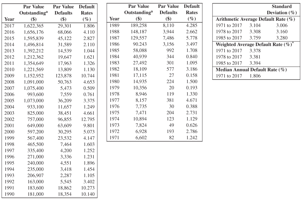
a Excluding Defaulted Issues from Par Value Outstanding (US $ millions).
FIGURE 9.6 Historical High‐Yield Bond Default Rates, Straight Bonds Only, 1971–2017
Source: E.I. Altman and B. Huehne (2018a), Solomon Center.
What Is a Default?
We, and the credit rating agencies, define “default” in the bond or loan markets as an issue or issuer experiencing one of the following three events:
- A bankruptcy petition is filed and accepted, either a Chapter 7 (liquidation) or Chapter 11 (reorganization). In this case, all liabilities of the bankrupt entity are in default.
- A missed interest payment or principal repayment, whereby the payment‐default is not “cured” within the grace period (usually 30 days), or not within a “forbearance” period agreed upon by the debtor and specific creditors whose debt is affected.
- A distressed exchange (DE), through which the debtor presents a tender‐offer to creditor group or groups, whereby some swap is accepted. The swap, or exchange, usually involves one or more of the following: (a) cash for debt, (b) new debt for old debt, or (c) equity for debt. Note that at least one of the rating agencies, S&P, records the tender‐offer as a default, regardless if it is accepted by the creditors. See Altman and Karlin (2009) for a discussion and analysis of DEs.
Defaults and Returns (1971–2017)
As noted, the key risk variable for investors in high‐yield, and high‐risk, corporate bonds is default and default loss expectations and results. This paramount issue has always been a major determinant of the success, or not, for investors, issuers, traders, and commentators about the return/risk tradeoff and popularity of “junk” bonds. This was especially important in the embryonic stage of the modern high‐yield bond market in the early 1980s, when the market was being introduced to newly issued, non‐investment‐grade debt securities. Altman and Nammacher (1985, 1987) and Altman (1987) were the first academics to explore the default rate calculation in a rigorous fashion, although Drexel and other investment banks had been commenting and reporting their own default results, primarily only on original issue junk, for several years. We felt then, as we do now, that the appropriate market size of high‐yield bonds to measure default rates was the entire population of non‐investment‐grade bonds, both fallen angels and original‐issue speculative grade. Currently, everyone has adopted our approach.
Back in the mid‐1980s, believe it or not, the average annual high‐yield bond default rate was a miniscule 1.4% per year (see Altman and Nammacher 1985), which market “players” actually argued was too high! Over the years, default rates, measured in terms of dollar amounts, fluctuated according to the business cycle, industry trends, and corporate leveraged strategies, such as leveraged buyouts. Indeed, as shown in Figure 9.6, the average annual default rate for the period 1971–2017 was about 3.4% per year, weighted each year by the amount outstanding. The standard error was 3.01%, so a two‐standard deviation year implies a rate of about 10% on the high side and near zero on the low side (of course, default rates cannot go below zero). Default rate measures using the number of issuers in the market as the base, as reported by S&P and Moody's, has averaged a bit higher, at close to 4.0% per year (e.g., S&P Global Ratings, 2017). While we understand the argument for using number of issuers as the base in default rate calculations, we remain convinced that most market participants identify more with rates based on dollar amounts, which weight larger defaults more heavily than smaller ones. Indeed, most of the rating agencies now include dollar‐denominated rates, as well as issuer‐denominated default rates.
For the relationship between default rates and economic recessions, we can observe in Figure 9.7 that corporate default rates tend to peak at the end of a recession, or, in most cases, soon after the recession ends (shaded areas represent recession periods). What is also clear, however, is that in many recession‐stressed periods, default rates actually begin to rise two to three years before the recession starts! This was especially the case in two of the three most recent recessions; the exception being the most recent recession period in 2008–2009 when increasing defaults in the mortgage‐backed debt market preceded the recession, while corporate defaults were essentially coincident with economic declines. Note in Figure 9.7, that the most recent benign credit cycle, where default rates are below the historic average, was into its eighth year, a record number of years for this low‐stressed benign period. We will comment on the definition and measurement issues of benign and stressed credit cycles shortly.
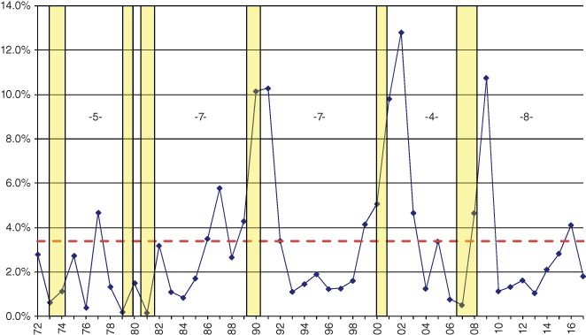
FIGURE 9.7 Historical Default Rates and Recession Periods in the United States,* High‐Yield Bond Market, 1972–2017
*All rates annual.
Periods of Recession: 11/73–3/75, 1/80–7/80, 7/81–11/82, 7/90–3/91, 4/01–12/01, 12/07–6/09
Sources: E. Altman (NYU Salomon Center) and National Bureau of Economic Research.
Another particularly important variable to consider when analyzing corporate defaults is the relationship between nonfinancial corporate debts as a percentage of GDP versus default rates. Figure 9.8 shows that in the past three recessionary‐stressed cycles, when default rates spiked to double‐digits, U.S. nonfinancial corporate debt to GDP peaked within one year or less, of the peak in high‐yield bond default rates. An ominous signal existed in 2017 when it appeared that the Debt/GDP ratio was peaking. But, the market for risky debt was in no mood to be concerned and the low‐interest rate and low‐spread environment continued through most of the summer of 2017. As global political tensions escalated and certain industries (e.g. retail) showed distinct signs of stress, spreads and volatility did increase toward summer's end, but still did not signal a major change in investor sentiment.
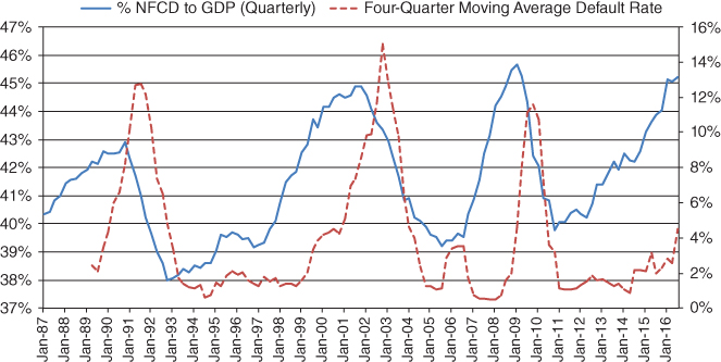
FIGURE 9.8 U.S. Nonfinancial Corporate Debt to GDP: Comparison to Four‐Quarter Moving Average Default Rate
Sources: FRED, Federal Reserve Bank of St. Louis, and Altman/Kuehne High‐Yield Default Rate data.
Default rates on leveraged loans also remained in a benign state into 2017 (and in 2018), mirroring the trends we observed for high‐yield bonds. Similar to bonds, defaults escalated temporarily in 2015–2016 due to energy defaults and the distressed ratio had a momentary spike upward in late 2015 as this sector “produced” many potential defaults. As data from S&P Global's LCD group showed, as oil prices turned upward in mid‐2016 and into 2017, pressures in the energy industry eased and Recovery Rates (see below) on new and existing defaulted issues increased significantly to over 60% in 2017, from as low as 30% one year earlier (see Figure 9.9).
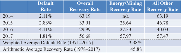
FIGURE 9.9 Default and Recovery Rates for High‐Yield Bond Defaults, 2014–2017
Recovery Rates
The subject of recovery rates on high‐yield bond and leveraged loan defaults will be addressed in Chapter 16 of this volume in more detail, but the topic deserves some specific mention at this point, as we move from defaults to loss given defaults (LGD). We define the recovery rates on defaulted securities as the price, in the market, just after default.
The simple relationship between estimating PDs and LGDs is through the recovery rate measurement and its correlation, or not, with PD. Altman, Brady, Resti, and Sironi (2005) presented a straightforward, but powerful, study that showed that over time, the coincident relationship between default rates and recovery rates (price at default) was negative and highly significant (see Figure 9.10). Indeed, when default rates in the high‐yield bond market were high in such years as 1990/1991, 2001/2002, and 2009, recovery rates were quite low, between 25% and 35%, compared to the historical average of about 45%. Likewise, when default rates were low (see top‐left quadrant of Figure 9.10), recovery rates were far above average. So, with just one explanatory variable (default rate), we can explain as much as between 58% and 62% (depending upon the regression model) of the level and variance of our key dependent variable: recovery rates (see Altman, Brady, Resti, and Sironi, 2005, for explanation and various regressions).
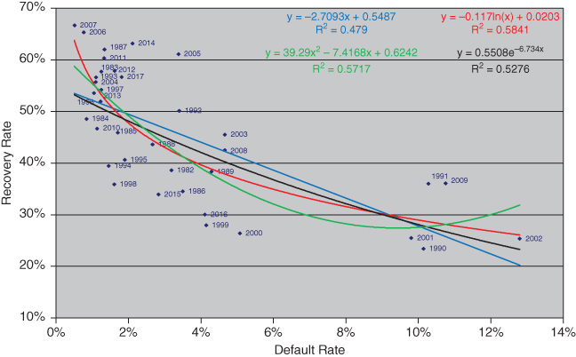
FIGURE 9.10 Recovery Rate/Default Rate Association: Dollar‐Weighted Average Recovery Rates to Dollar Weighted Average Default Rates, 1982–2017
Source: Altman, Brady, Resti, and Sironi (2005).
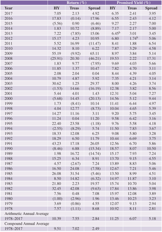
Over time, high‐yield bond investors have lost about 2.4% per year from default losses, considering default rates, recoveries, and lost‐coupon receipts (see Altman and Kuehne 2017). Compared to average promised yield spreads of 5.21% from 1978 to 2016 (Figure 9.11), the expected return spread was about 2.8% (5.2% – 2.4%). This simple, but important expected relationship was remarkably close to actual return spread results of an average 2.4–2.8% (lower left‐hand part of Figure 9.11) per year! See Altman and Bencivenga, (1995) for an in‐depth discussion of the powerful association between promised yield spreads, expected losses from defaults, lost coupon payments from defaults, and expected return spreads.
a End‐of‐year yields.
b Lowest yield in time series.
FIGURE 9.11 Annual Returns, Yield, and Spreads on 10‐Year Treasury (Treas) and High‐Yield (HY) Bonds,a 1978–2017
Source: Citi's High‐Yield Composite Index.
What Is a Benign Credit Cycle?
We are often asked what differentiates a benign credit cycle from one that is stressed. There really is no formal definition, but we have found it helpful to focus on four variables that help to describe a credit cycle, namely:
- Default rates on risky debt.
- Recovery rates on defaulted debt.
- Yields and spreads on risk debt compared to “riskless” benchmark rates.
- Liquidity of the market.
These four determinants, and related factors, are shown in Figure 9.12.
|
FIGURE 9.12 What Is a Benign Credit Cycle?
- It is instructive to view again Figures 9.6 and 9.7 and focus on the historical default rate and the duration of lower‐than‐average default rates; one clear definition of a benign credit cycle. We can observe that the duration of the periods of lower‐than‐average default rates between stressed periods (double‐digit rates), had lasted between 4 and 7 years, with an average duration of 5.5 years, during the history of the modern high‐yield bond market. Indeed, in the most recent lower‐than‐average default cycle, we are already (at the end of 2018) in the ninth year of below‐average high‐yield bond default rates since the “lofty” rate of 10.7% in 2009. The duration of default rates that are below the historical average annual rates of 3.5% is one of the most important barometers of a benign cycle. Investors are extremely sensitive to “current” defaults when analyzing required yields and spreads for investing in risky debt and the duration of below, or above, average rates, is viewed carefully by market participants.
- Related to default rates is the other “half” of the default loss calculation, recovery rates. As we saw earlier, during periods of extremely high or low default rates, we have observed the opposite for recoveries. So, a second determinant of a benign cycle is certainly recoveries and default losses. The latter is much above average in stressed periods.
- One of the most closely watched statistics in the high‐yield bond market is the yield and spreads over Treasuries currently being required, that is., accepted by the market. The more benign are market conditions, the lower the required yield and spreads, either the yield‐to‐maturity or option‐adjusted spread, that investors are comfortable with. From Figure 9.11, we see that the historical average yield‐to‐maturity spread was 5.18% as of December 31, 2017. Spreads at year‐end have been as low as 2.81% in 1978, and dropped to 2.6% in June 2007 (Figure 9.13). On the upper‐side, aside from the unprecedented level as of year‐end 2008 of 17.3% (spreads actually exceeded 20% in mid‐December 2008), when the nominal yield spiked to well over 20%, the highest yield spread was 10.5% in 1990, when default rates also exceeded 10% for the first of two years in succession (Figure 9.6). Of course, Treasury yields impact the level of required yields and spreads. The spread as of year‐end 2017 of just 3.9% partially reflects the low 10‐year T‐Bond rate of 2.4%, but also reflects the benign status of the HY bond market at that time. So, a 3.9% spread as of December 31, 2017 is not as low as a similar spread of 4.0% in 2005, when 10‐year Treasuries were higher than 2.3%, at 4.4%.
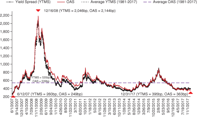
FIGURE 9.13 YTM and Option‐Adjusted Spreads between High‐Yield Markets and U.S. Treasury Notes, June 1, 2007–December 31, 2017
Sources: Citigroup Yieldbook Index Data and Bank of America Merrill Lynch.
- The liquidity of a market, be it fixed‐income or equity, is perhaps the most challenging variable to define precisely. At the same time, the perceived liquidity is always a major factor in a credit cycle and sometimes, for instance during highly stressed periods, is the dominant variable in defining a credit cycle's phase. While some traditional measures as bid‐ask spreads, size of issues, and market volume are related to liquidity, we tend to look more closely at the volume of newly issued debt, and the proportion of this debt issued at the lowest credit rating category (i.e., CCC/Caa). If very risky firms with this lowest category of credit worthiness are able to easily access debt markets for refinancing or growth, this is definitely a sign that markets are not concerned much about credit risk and liquidity is high. Figure 9.14 shows the percentage of all high‐yield bond new issuance that was CCC in both the United States and European markets. Note that the percentage reached an incredibly high 37.4% in 2007, just before the credit crisis hit and at the end of that cycle's benign state. Since 2009, CCC percentages ranged in the United States from as low as 8.0% in 2009 to over 21% in 2013, with more recent periods of 10.0–16%. It does appear that liquidity remains high with new HY issuance in 2017 of about $242 billion. So, CCC issuers seemingly had relatively easy access to the market at attractive rates and the overall high‐yield market's ability to attract investors and new issuers was continuing its easy‐money environment.
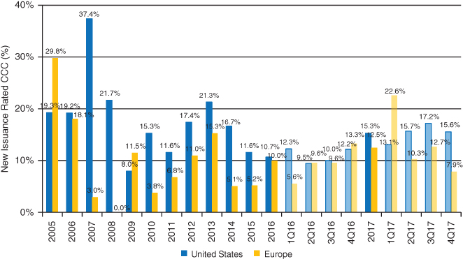
FIGURE 9.14 U.S. and European High‐Yield Bond Market: CCC‐Rated New Issuance (%), 2005–2017
Source: Based on data from S&P Global.
The last bullet of Figure 9.12 notes that when a market has enjoyed a benign credit cycle for many years and new issuance, combined with investor enthusiasm, seems perhaps excessive, a careful analysis must ask the question of a possible bubble growing and what might precipitate its bursting. Our conclusion in 2017 is that the high‐yield bond market had several of the bubble characteristics of the frothy and excessive market in 2007, but also a few important mitigating factors which helped to provide confidence to investors that the benign cycle would continue, at least for the short‐term future. There was no question that the four determinants, described above, were all pointing to a continuance of the benign cycle.
Where we were concerned was in several risk factors that could change the market's sentiment fairly quickly and precipitate a more risky environment. These included:
- The unprecedented duration already of the benign cycle (Figure 9.7)
- Level of nonfinancial corporate debt/GDP (Figure 9.8)
- Comparative health of high‐yield issuing firms in 2016 compared to 2007 (see Chapter 10 herein on Z‐Scores for these periods)
- High‐yield and CCC new issuance (Figures 9.4, 9.5, 9.14)
- LBO statistics and trends (discussed further on)
LBO Risk Factors
Throughout the history of the high‐yield bond market, one pervasive supply factor has been the use of these leveraged‐financed instruments, including leveraged‐loans, to finance takeovers of companies by private‐equity (PE) firms, either in a friendly or hostile transaction. When the demand for company buyouts is particularly strong, either for reasons of low valuation of potential buyout candidates, low interest rates, and easy access to credit, or enormous stockpiles of cash acquired by PE funds, or several or all of the above, the competition will drive up the purchase cost and result in larger transactions at higher levels of debt than when demand is not as excessive. Figure 9.15 shows the Purchase Price Multiple paid by private‐equity firms in their LBO transactions from 1998 to 2017, for public‐to‐private or “other” (secondary buyouts) transactions. The public‐to‐private multiples have ranged from as low as 5.2 times in 2001 to 11.2 times recently in 2016. This latter average multiple was the highest recording that we have ever seen. This level was even higher than the frantic and catastrophic buyouts binge in the late 1980s that eventually led to a huge increase in defaults in 1990–1992, which was, in our opinion, one of the main catalysts of the economic recession in 1991 and record level of high‐yield bond and leveraged loan default rates.
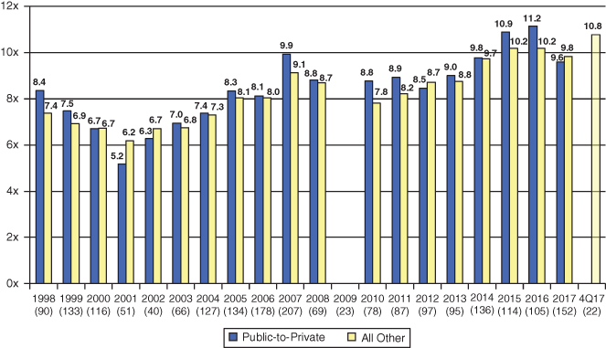
FIGURE 9.15 Purchase Price Multiples, Excluding Fees for LBO Transactions, 1998–2017
Source: Based on data from S&P Global.
Skeptics of this concern about very recent record levels of purchase price multiples will cite the low current interest rate environment and the greater proportion of equity invested in current deals by PE firms compared to the average 80–90% debt to total capital transactions in 1987–1989. And, these skeptic factors are correct. LBO deals are more conservatively financed in recent years than back in the late 1980s and debt levels have averaged only 60–70% of late. Still, when debt is measured relative to EBITDA (Figure 9.16), we do see that the median levels of late are just below the dangerous level of six times. And, a median level of, say, 5.8 times indicates that half of the LBO transactions had debt/EBITDA ratios above 5.8 times – an ominous signal, even at low interest rates. One final point involves the significant amount of floating rate‐leveraged loans in these transactions. So, if interest rates rise considerably in the future, LBO firms will face much higher hurdles to survive the high level of debt.

FIGURE 9.16 Average Total Debt Leverage Ratio for LBOs: Europe and United States with EBITDA of €/$50M or More, 2003–2017
Source: Based on data from S&P Global.
It should be noted that our concern with LBO purchase price multiples and Debt levels is mitigated by the PE firm industry's impressive track record with respect to avoiding defaults, either through superior portfolio management of their stockpile of firms and/or their network of alternative financing sources to provide liquidity should a crisis manifest. Indeed, our research has shown (not published) that, controlling for credit risk levels, PE‐financed LBOs default significantly less frequently than do comparable risk firms, which are not part of a PE firm portfolio. Also, an element of late is the increased availability of financing from “shadow‐banking” funds, which were not evident nearly as much in prior LBO cycles. This access‐to‐capital is more prominent for PE‐owned firms than stand‐alone entities.
Correlations between HY Bonds and Stock Returns
One final ingredient in our discussion of risk and returns in the HY bond market involves its critical relationship to another risky security market – equity prices. Classical financial‐economic theory of the 1960s discussed the “pecking‐order” theory of various types of capital financing for companies, firms' asymmetric information with respect to choices of capital, and their ability to maintain a target capital structure, debt/equity ratio, but also to take advantage of periodic opportunities (tradeoff theory) either to increase debt levels or to cut down on leverage when levels become excessive. This alternative financing theory works very well when firms have the ability to relatively seamlessly substitute equity for debt when it desires to, at costs which are not prohibitive. And, such was the case when it was easy to switch and the cost of equity was not highly correlated with the cost of debt. Figure 9.17 shows that the correlation between high‐yield bonds and the S&P 500 Stock Index was reasonably low at 59% for the entire sample period 1987–2017 and even lower during the stressed cycles of 1990–1991 and 2001–2002 (48% and 54%, respectively). So, when the risky debt market “tanked” in those two cycles, equities fell also, but not nearly as much as what occurred in the 2008–2009 financial crisis (73% correlation) and, indeed, for the subsequent most recent period 2010–2017, when the correlation was 72%. Hence, it appeared that high‐yield issuing or fallen‐angel companies did have the opportunity to switch to equity in benign credit cycle markets, as it was in mid‐2017, if they were concerned with the debt buildup since 2010. But, if they wait until the bond market shows unmistakable signs of stress to switch to equity, it may be too late to do so at reasonable costs, or at all! The temptation to continue to take advantage of low interest rates during a benign cycle may dominate the more conservative strategy to increase equity when the stock market is also at historic high record levels.
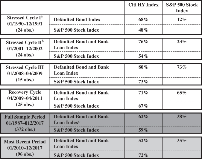
a Correlation between Defaulted Bond Index and S&P 500 was –16% during recovery period.
b Correlation between Defaulted Bond and Bank Loan Index and S&P 500 was 43% during recovery period.
c Based on only the Defaulted Bond Index from 01/1987 to 12/1995.
FIGURE 9.17 Total Monthly Return Correlations on Various Asset Class Indexes during Stressed and Recovery Credit Cycles
Source: E. Altman and B. Kuehne (2017), NYU Salomon Center.
Forecasting Default Rates and Recoveries
Forecasting market default and recovery rates is a tricky exercise at best, that can be based on a “bottom‐up” approach on individual issues and issuers or a macro, “top‐down” approach – or both. For practical and track‐record reasons, we have chosen the top‐down approach using several techniques (models) that include (1) aggregate amounts of new issuance over the past decade stratified by the major ratings categories (mortality statistics). We also analyze the information content of market‐based measures, based on (2) yield spreads and (3) distress ratios, to forecast the near‐term default incidence of the market. Distress ratios are based on the percentage of high‐yield bonds selling at least at 10% above the benchmark government bond rate (see Chapters 14 and 15 on distressed debt). In the past, these three techniques have been averaged to arrive at our single default rate estimate, although the range of possible outcomes can be observed as well. We now believe that our two market‐based measures overweight the final default rate forecast, so we also present our forecast based on equal weights between the mortality rate method and average of the two market‐based estimates. Our default rate estimates are then used as inputs to form the basis for estimates of aggregate recovery rates on corporate high‐yield bond defaults. For more details on our default rate forecasting methodologies and their estimates over time, see our annual High‐Yield bond reports, for example, Altman and Kuehne (2017).
Comparing Cumulative Default Rates across Sources
One can observe in Figure 9.18 a marked difference in one‐year default rates for many of the bond rating classes, if you compare our mortality results in Figures 9.19 and 9.20 (Altman 1989, Altman and Kuehne, 2017) with those cumulative default rates of the major rating agencies (Moody's and S&P). The different methodologies for computing marginal and cumulative rates can explain these seemingly confusing results. The differences can be explained by several factors:
| 1 | 2 | 3 | 4 | 5 | 6 | 7 | 8 | 9 | 10 | |
| AAA/Aaa | ||||||||||
| Altman | 0.00% | 0.00% | 0.00% | 0.00% | 0.01% | 0.03% | 0.04% | 0.04% | 0.04% | 0.04% |
| Moody's | 0.00% | 0.00% | 0.00% | 0.03% | 0.13% | 0.22% | 0.31% | 0.41% | 0.51% | 0.62% |
| S&P | 0.00% | 0.04% | 0.17% | 0.29% | 0.42% | 0.54% | 0.59% | 0.67% | 0.76% | 0.85% |
| AA/Aa | ||||||||||
| Altman | 0.00% | 0.00% | 0.20% | 0.26% | 0.28% | 0.29% | 0.30% | 0.31% | 0.33% | 0.34% |
| Moody's | 0.01% | 0.02% | 0.08% | 0.21% | 0.35% | 0.47% | 0.57% | 0.66% | 0.74% | 0.82% |
| S&P | 0.03% | 0.08% | 0.18% | 0.31% | 0.45% | 0.60% | 0.74% | 0.86% | 0.96% | 1.07% |
| A/A | ||||||||||
| Altman | 0.01% | 0.04% | 0.15% | 0.27% | 0.36% | 0.41% | 0.43% | 0.67% | 0.74% | 0.78% |
| Moody's | 0.03% | 0.13% | 0.30% | 0.46% | 0.64% | 0.86% | 1.09% | 1.34% | 1.60% | 1.85% |
| S&P | 0.07% | 0.20% | 0.36% | 0.54% | 0.73% | 0.95% | 1.19% | 1.41% | 1.65% | 1.89% |
| BBB/Baa | ||||||||||
| Altman | 0.32% | 2.65% | 3.86% | 4.80% | 5.27% | 5.48% | 5.71% | 5.86% | 6.02% | 6.33% |
| Moody's | 0.15% | 0.43% | 0.78% | 1.23% | 1.68% | 2.14% | 2.59% | 3.06% | 3.59% | 4.18% |
| S&P | 0.22% | 0.58% | 0.99% | 1.50% | 2.05% | 2.60% | 3.09% | 3.58% | 4.07% | 4.55% |
| BB/Ba | ||||||||||
| Altman | 0.92% | 2.94% | 6.68% | 8.50% | 10.71% | 12.11% | 13.37% | 14.32% | 15.53% | 18.16% |
| Moody's | 1.07% | 2.93% | 5.08% | 7.27% | 9.25% | 11.13% | 12.80% | 14.46% | 16.16% | 17.94% |
| S&P | 0.80% | 2.52% | 4.57% | 6.57% | 8.38% | 10.14% | 11.62% | 12.98% | 14.17% | 15.25% |
| B/B | ||||||||||
| Altman | 2.86% | 10.31% | 17.29% | 23.70% | 28.08% | 31.29% | 33.76% | 35.12% | 36.24% | 36.72% |
| Moody's | 3.90% | 9.07% | 14.31% | 18.97% | 23.25% | 27.16% | 30.70% | 33.81% | 36.64% | 39.10% |
| S&P | 3.92% | 9.00% | 13.43% | 16.88% | 19.57% | 21.76% | 23.56% | 24.98% | 26.24% | 27.42% |
| CCC/Caa | ||||||||||
| Altman | 8.11% | 19.50% | 33.79% | 44.55% | 47.27% | 53.40% | 55.91% | 58.01% | 58.28% | 60.05% |
| Moody's | 10.37% | 18.29% | 24.97% | 30.52% | 35.25% | 38.77% | 41.96% | 45.31% | 48.89% | 51.59% |
| S&P | 28.85% | 39.23% | 44.94% | 48.55% | 51.31% | 52.53% | 53.95% | 55.00% | 55.96% | 56.66% |
Sources:
- Altman, Market value weights, by number of years from original Standard & Poor's issuance ratings, 1971–2016; see Altman (1989) and Altman and Kuehne (2017)
- Moody's Average Cumulative Default Rates, all issues (1970–2016), Moody's Investors Services, 2017
- S&P 2016 Annual Global Corporate Default Study and Rating Transitions: Average Cumulative Default Rates for Corporates (1981–2016)
FIGURE 9.18 Cumulative Default Rate (Mortality Rate) Comparison (in Percent for Up to 10 Years)
- Dollar‐weighted (Altman) versus issuer‐weighted (rating agencies) data.
- Original issuance ratings (Altman) versus grouping by rating regardless of age (rating agencies).
- Mortality approach (Altman) versus default rates based on original cohort size (rating agencies).
- Sample periods.

| MMR | = | marginal mortality rate |
One can measure the cumulative mortality rate (CMR) over a specific time period (1, 2,…, t years) by subtracting the product of the surviving populations of each of the previous years from one (1.0), that is,
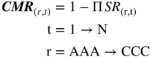
here
| CMR (r,t) | = | cumulative mortality rate of (r) in (t), |
| SR (r,t) | = | survival rate in (r,t), 1 – MMR (r,t) |
FIGURE 9.19 Marginal and Cumulative Mortality Rate Actuarial Approach
| Years After Issuance | |||||||||||
| 1 | 2 | 3 | 4 | 5 | 6 | 7 | 8 | 9 | 10 | ||
| AAA | Marginal | 0.00% | 0.00% | 0.00% | 0.00% | 0.01% | 0.02% | 0.01% | 0.00% | 0.00% | 0.00% |
| Cumulative | 0.00% | 0.00% | 0.00% | 0.00% | 0.01% | 0.03% | 0.04% | 0.04% | 0.04% | 0.04% | |
| AA | Marginal | 0.00% | 0.00% | 0.19% | 0.05% | 0.02% | 0.01% | 0.01% | 0.01% | 0.01% | 0.01% |
| Cumulative | 0.00% | 0.00% | 0.19% | 0.24% | 0.26% | 0.27% | 0.28% | 0.29% | 0.30% | 0.31% | |
| A | Marginal | 0.01% | 0.03% | 0.10% | 0.11% | 0.08% | 0.04% | 0.02% | 0.23% | 0.06% | 0.03% |
| Cumulative | 0.01% | 0.04% | 0.14% | 0.25% | 0.33% | 0.37% | 0.39% | 0.62% | 0.68% | 0.71% | |
| BBB | Marginal | 0.31% | 2.34% | 1.23% | 0.97% | 0.48% | 0.21% | 0.24% | 0.15% | 0.16% | 0.32% |
| Cumulative | 0.31% | 2.64% | 3.84% | 4.77% | 5.23% | 5.43% | 5.66% | 5.80% | 5.95% | 6.25% | |
| BB | Marginal | 0.91% | 2.03% | 3.83% | 1.96% | 2.40% | 1.54% | 1.43% | 1.08% | 1.40% | 3.09% |
| Cumulative | 0.91% | 2.92% | 6.64% | 8.47% | 10.67% | 12.04% | 13.30% | 14.24% | 15.44% | 18.05% | |
| B | Marginal | 2.85% | 7.65% | 7.72% | 7.74% | 5.72% | 4.45% | 3.60% | 2.04% | 1.71% | 0.73% |
| Cumulative | 2.85% | 10.28% | 17.21% | 23.62% | 27.99% | 31.19% | 33.67% | 35.02% | 36.13% | 36.60% | |
| CCC | Marginal | 8.09% | 12.40% | 17.71% | 16.22% | 4.88% | 11.60% | 5.39% | 4.73% | 0.62% | 4.23% |
| Cumulative | 8.09% | 19.49% | 33.75% | 44.49% | 47.20% | 53.33% | 55.84% | 57.93% | 58.19% | 59.96% | |
* Rated by S&P at issuance.
Based on 3,359 issues.
FIGURE 9.20 Mortality Rates by Original Rating, All Rated Corporate Bonds,* 1971–2017
Source: Standard & Poor's (New York) and author's compilation.
In our opinion, by far the most important reason is the mortality rate vs. cumulative default rates, whereby we use the rating of an issue, and its size, when the bond was first issued (second and third bullets above). The rating agencies all use a basket of bonds with the same rating at a point in time, regardless of how long they have been outstanding and what the original rating was. So we observe substantially lower default rates in the first few years in the mortality rate results than we do in the rating agency data. For example, the mortality rate for single‐B rated issues in the first year is 2.86%, whereas the one‐year default rate for Moody's (5.0%) is substantially higher. Note that the differences between mortality and cumulative rates persist until the fourth or fifth year, when the aging effect is diminished and all methods give fairly similar results (Figure 9.18).
These differences in results are immensely important for the bank or investor, who needs to estimate the one‐year expected default rate for Basel II purposes (banks) or for expected defaults and loss reserves (all users). We believe that the age distribution of the portfolio under analysis should dictate the method used and the data referenced. Certainly, when making a new loan or investing in a newly issued bond, the mortality rate approach would be logical to use for estimating cash flows, net of defaults, and other purposes. For more mature portfolios, there is perhaps more logic in the rating agencies' cumulative‐default approach.
Conclusion
In conclusion, the high‐yield bond market, both in the United States and in several other geographical areas of the world, is now a mature, universally accepted means of financing lower‐rated companies for a great variety of purposes, and its securities are a legitimate asset class for investors. We will in Chapter 14 and Chapter 15 of this volume explore a “derivative” asset class to high‐yield bonds and leveraged loans, specifically distressed and defaulted securities of companies that may, or actually do, default but whose securities continue to trade as the firm attempts to restructure, either out‐of‐court or while in a Chapter 11 reorganization. Keep in mind that while high‐yield bonds are a legitimate risk‐return asset class, especially for institutional investors, they are also the potential inventory for distressed investors.