
Business up front, party at the back
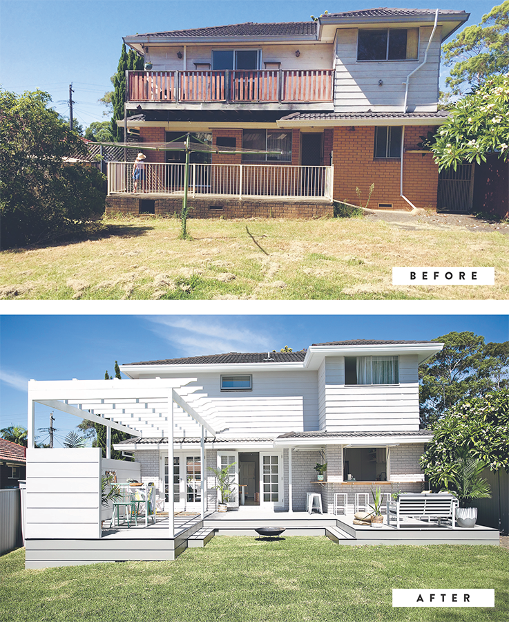
With most of our flip properties, the big opportunity lies at the back of the house rather than the front – this house was no exception. It had all the trappings of a typical suburban home and a decent size footprint, but it had pokey little rooms, a tiny kitchen, no indoor/outdoor flow, an external laundry where you’d want the kitchen to be, no real alfresco area for entertaining and last, but not least, a rickety old Hills Hoist baring its soul in the heart of the backyard.
For us, the solution was simple. First up, we absorbed the external laundry into the footprint of a new kitchen to connect it directly to the outside with two new gas-strut windows and a wrap-around breakfast bar. #nobrainer! Next, we built a new deck off the existing concrete porch and ran it the full length of the house. With some fresh paint, privacy screening and an open pergola to create the feeling of an outdoor room, Bob’s your uncle, it’s a whole new world out there!
In case you’re wondering why we removed the upstairs balcony, let us explain. It was broken and required rebuilding. #costly Plus, the view wasn’t exactly spectacular (it looked straight into the neighbour’s house). We also couldn’t build an ensuite while it remained, so what might seem like an odd decision was actually an easy one for us on the day. And here’s a tip: there are so many tough decisions when renovating that when an easy one comes along, you take it!

Privacy please
We love open plan, but internal doors like these give you the option for privacy from time to time.
#SERENITYNOW
LOVELY LAMINATE
We used laminate flooring throughout this house. It simulates the look and feel of timber, but there’s actually no timber used at all. It’s made from compressed wood composite, cork, melamine and other materials. It looks like timber because of the photographic layer used on its surface, which is protected underneath a clear ‘wear’ layer. Laminate planks are basically a picture of wood, but not real wood. It’s a great affordable alternative to the real thing.
TAPAS, ANYONE? #YESWAYJOSÉ
Even in our smaller homes, we like to create moments of indulgence and luxury. In this modest four-bedroom house, we created what Lana calls ‘the tapas lounge’ (seriously, that got printed in the real estate brochure!). It’s a place for adults to host pre-dinner drinks, maybe some tapas, or even enjoy a quiet nightcap before bed. Whatever your flavour, this room has you covered.
Magic floors
Want a bigger house but can’t afford an extension? Choose light-coloured flooring instead of dark – it makes the house look larger.
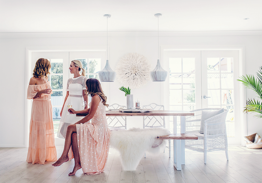
Hanging pendant lights over your table?Don’t fall into the trap of hanging them too high. Remember, you and your guests or family will be seated, so the pendants can hang lower than you might think. These ones are just 500 mm above the table, and they are the perfect height.
MIX, DON’T MATCH
When buying a dining table, don’t feel compelled to buy a set of matching chairs. Sure, it can look nice and we’ve done it before, but we also like to mix things up sometimes. In this dining room, we used three different types of chairs and it’s those chairs that make the room so interesting. P.S. We upcycled those two bamboo chairs at the back with a can of spray paint and new upholstery. And how good do they look?
PENDANTS DON’T NEED TO BE PRICEY
In fact, you can pick up some gorgeous pendants at your local hardware store for less than $100. Most shops will allow you to return the pendants for a full refund, so it’s worth taking home a few options and holding them up. #trybeforeyoubuy
RESTYLE THAT LOUNGE
Whether you’re planning to do a small reno or a large one, we bet our budget that you’ll want to style your lounge room differently. The kitchen may be the heart of the home, but the lounge room comes a close second. It’s where the whole family comes together, so creating a comfortable and stylish lounge room that flows is a must. The good news is that this doesn’t have to be a daunting or expensive task (see here for some of our top tips).
CREATING BALANCE ISN’T NECESSARILY ABOUT SYMMETRY
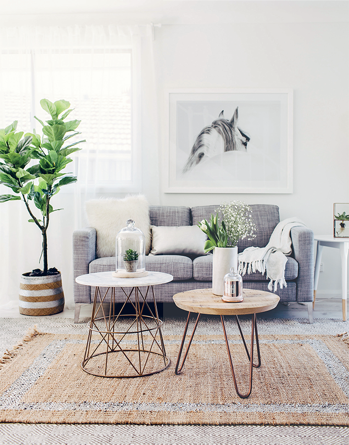
Symmetry, i.e. when elements in a room perfectly mirror each other (think matching bedside tables or identical armchairs on either side of a couch), is a pretty traditional way of creating balance in a room. Of course it works really well, but we often prefer asymmetrical styling, which mixes things up a bit more. For us, balance is about distributing the visual weight in a room, and though this can be done with symmetry, that sort of arrangement can sometimes feel a little too formal. Asymmetrical balance brings a sense of casual living to a room, which is why we love using it. In this lounge, we popped an occasional table on one side of the couch and a large plant on the other, and chose coffee tables in different sizes. Even the art is a little off-centre. Contrast and variety add visual interest to a room. Try a few options when it comes to styling and play with asymmetryto see if it suits the look you’re going for.

Bonnie
“One of the things I find hardest when trying to explain how I work is articulating what goes on in my head and heart when designing a room. I believe in trusting your gut and trying things out. I never know for sure how a room is going to look until I’m in the space, working up a sweat and moving things around. So grab some friends to help you out and just go for it.”
ADD INTEREST WITH PLANTS
But before you get potting, make sure you do your research on which plants are best suited to your home, as things like room temperature and sunlight play a huge role in what lives and what ends up in the bin. Some plants will burn when placed next to a window with too much direct sunlight, while others will thrive. We love using tall plants like fiddle-leaf figs or strelitzias in the corner of a room, or by a front door to add height and interest, but then we opt for small succulents and trailing plants for bathrooms, kitchens and shelves.
A CLUSTER OF COFFEE TABLES
We aren’t huge fans of big heavy coffee tables in a lounge room – they tend to dominate the space a bit too much. Multiple tables nested together are a better option because they provide flexibility when you are entertaining and are so easy to move around.
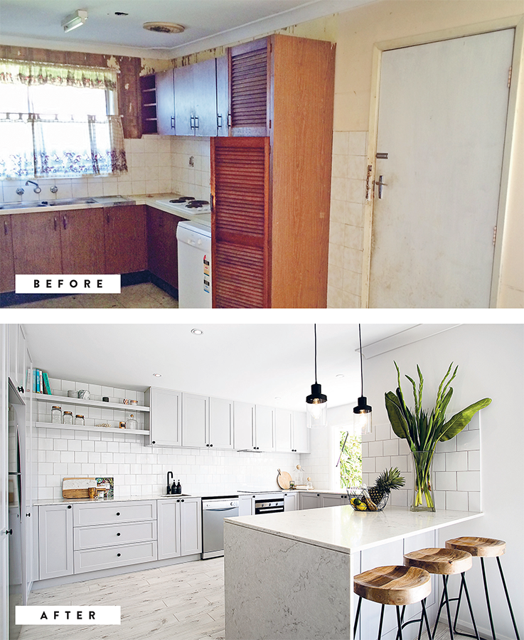
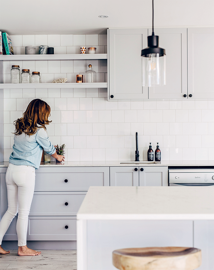
OPEN UP YOUR KITCHEN AND EVICT THE ORIGINAL LAUNDRY!
To state the obvious, your kitchen should not be in a room of its own, if possible. That was the preference decades ago, but not today. Open-plan living is all the rage and for good reason. Kitchens should open out to a dining and lounge room wherever possible. In many older homes, the laundry (often an external one) was built right in the spot where you’d probably like to put your new kitchen – close to the backyard! This was done to provide quick and easy access to the washing line. In this house, we addressed this challenge by removing a wall and absorbing the old external laundry into our new kitchen footprint. This created an awesome entertainer’s kitchen that connects directly to the backyard. ALWAYS relocate the laundry if it’s where you’d prefer the kitchen to be. Remember, your kitchen is priority #1.
GREY IS THE ‘NEW NEUTRAL’
It’s now widely accepted as a mainstream colour for exteriors and kitchens alike, and we think grey is a beautiful alternative to white. If you don’t want white (perhaps you think it’s too boring), but still want to play it safe, we recommend pale grey – we love Silkwort by Dulux. Just like white, grey offers the perfect neutral canvas for bringing in splashes of colour and warmth through your choice of accessories. If you’re not confident about going all the way with a colour, you can limit it to under-bench cabinetry and the island and use white for all of the overhead cabinets. #twotonebaby
CREATING A NEW CLASSIC
If cabinetry is going to be the statement feature in your kitchen, the splashback needs to take a back seat, and vice versa. Makes sense, right? This custom-made kitchen is the same silky grey colour as the feature stairwell (see here). Since cabinetry was the star, we went for stone benchtops in muted tones with soft grey veins and classic white square tiles in a brick pattern with light grout for the splashback. Matt black tapware, pendant lights and handles ensure this kitchen feels modern despite the more traditional splashback and shaker doors – hence a new classic!
3 KITCHEN LAYOUT TIPS
01
Ideally, your kitchen should connect to the outdoor entertaining area. That area can be located at the front, back or side of your house, but the best kitchen position will be close to it, so try to put it there on your plans. If you don’t have an outdoor entertaining area, think about where you could create one.
02
Most kitchens have at least one wall of floor-to-ceiling cabinetry, with no space for windows. Think carefully about which side of the room to put this wall and, if you can, choose the side that gets the LEAST amount of natural light. That way you’ll be letting in the maximum amount of natural light when you build your kitchen.
03
Put the fridge in a convenient place (at one end of the room, perhaps) so people can grab drinks from it without having to walk right through the middle of the kitchen.

From sad and neglected to useful and fab
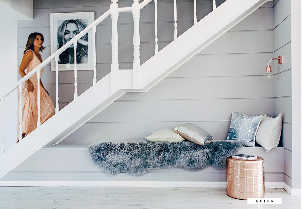
WE LOVE FINDING DEAD SPACE!
It provides a real opportunity to add value by creating something out of nothing. By ‘dead space’ we mean space you’re not using – you know, that area you probably avert your eyes from due to the pang of embarrassment. These areas can often be transformed with relatively minimal effort and cost. Sometimes dead space can be really tiny, like this area we transformed under the stairs. We added a reading nook by building a bench seat with a reading lamp and we used ship-lap wall cladding to add texture and dimension. Light grey paint and a fresh white balustrade created a quiet, peaceful feeling that was softened further by using cushions and a faux fur throw. This became one of our favourite spots in the house. Take a look around your home. Are there any nooks, inside or outside, that you could bring to life?
ONE-COLOUR MOOD
Tiles are the best way to create a feature in your bathroom. Not only are there so many tiles to choose from, but they can often be laid in different ways with a choice of grout colours to create any number of looks. The standout feature of this bathroom was always going to be these gorgeous sea-foam subways. It’s the only colour used in this bathroom and it packs an awesome punch against the large-format marble wall tiles and darker herringbone floor.
GROUT IS OFTEN AN AFTERTHOUGHT
This is because many people don’t realise they have a choice beyond the standard grout. What a missed opportunity! Spending just a little time choosing your grout colour can have a very dramatic effect on the look of your bathroom. If you want your tiles to ‘pop’ as individual pieces, choose a contrasting grout colour; if you want the tiles to blend together and look like one big piece, choose a colour that matches the tiles. We used white grout in this bathroom to make the brick pattern in these subway tiles more visible.
TALK ‘FALL’ WITH YOUR TILER
Your tiler will ensure the floor slopes towards the drains and meets the required building standards – this is called the ‘fall’. This slope is imperceptible to the eye but is necessary to send any water that finds its way onto the floor towards the drain, rather than leave it to pool on your floor. What’s this got to do with tiles? Glad you asked; you see, the size and shape of your tiles will impact how easy (or hard) it is for the tiler to create the right fall without having to cut into your tiles and create loads of unsightly diagonal joins. Our advice is to get a sample of your preferred tile, show it to your tiler and discuss how they plan to create the right fall with this type of tile. Ask specifically if they will need to make any cuts and how they can avoid creating any ugly cuts. You’ll be glad you did. Sometimes, part of the solution will be to add a long strip drain, but this won’t be cheap.
CAN YOU ACCEPT A SMALL STEP UP?
When renovating a bathroom, your builder will usually ask if you want to lower the existing bathroom floor so the end result is flush with the adjoining room’s floor height. The alternative is accepting a small step up when you enter the bathroom. In a perfect world all floors would be flush, but if money is tight, a little step is a small price to pay to avoid the costs of lowering the floor for the sake of a flush finish. Just be careful not to stub your toe in the middle of the night. #ouch
HANG YOUR VANITY
A wall-hung vanity is suspended in the air, affixed to the wall with sturdy bolts. It can be installed by your plumber, builder or cabinet-maker. Wall-hung vanities are great for giving the illusion of a bigger bathroom because your floor space is visible underneath the vanity.
Planning vanity
If a wall-hung vanity is your preferred style, take note that it cannot be a last-minute decision. You need to plan for it in advance and communicate your intentions to your builder so they can put in the studwork behind the wall that the vanity will be attached to. Also, let your plumber know so they can rough in the pipes behind the wall to make them invisible.

Walk-in-robe behind this floating wall
A BIG BED ISN’T ALWAYS BETTER
Who doesn’t love a king-size bed? They’re luxurious, and if you’ve got heaps of space we definitely recommend one. If you’re styling an average-sized bedroom, be realistic and consider how the room will function when all of the furniture is in place. The number of people that are willing to shove a huge bed into a tiny room always amazes us – it looks awful and kills the flow of the room completely. If space is tight, use a single bed. If you’re working with a smaller master suite, opt for a queen rather than king bed … and consider that a double bed would make the room feel even bigger.
GENEROUS DRESSING SPACE IS A MUST IN A MASTER
We like to move beyond the standard walk-in-robe (WIR) or built-in concept and create more of a luxurious dressing space. Usually this involves a floating wall, like the one here.
BEDSIDE TABLES
We often mix and match bedside tables to add a bit of variety to a bedroom. When choosing a bedside table, consider how it’s going to be used. Does it need to be big enough to fit a lamp, a cup of tea and a book, or will a tiny round table do the trick? These tables are classic clutter-collectors, so if the person using the table has a tendency to leave magazines, piles of mail, cold cups of tea and other non-stylish items piled next to their bed, opt for a small, simple table that offers minimal ‘storage’ opportunities.
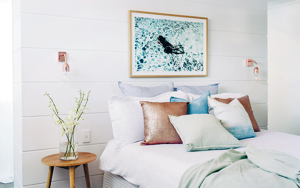
DITCH THE BEDSIDE LAMPS
Sounds a bit harsh, we know (sorry!), but we’re yet to find a bedroom that isn’t improved by replacing bedside lamps with beautiful wall sconces or pendant lights. Both of these options are elevated, so they don’t clutter up bedside tables. They also look beautiful and provide warm, intimate lighting.

Solo styles
In small bedrooms, we suggest you only have one bedside table.
BEFORE BUYING ART
 Ask yourself if you need more than one piece of art on that wall to achieve your desired look. Would a series of two or perhaps a cluster of small frames be better than one large piece? If you’re not too confident, stick with a single piece of art as making a gallery wall can be a bit trickier.
Before you push the green button on your artwork purchase, use masking tape to map out its exact size and the intended location on the wall. This is particularly helpful when trying to work out how to cluster a bunch of smaller prints.
FLIP TIP
If you’re selling your house, it’s important to get the size and location of the beds right because you want potential buyers to see B-I-G bedrooms. Downsize the bed wherever you can. (But this doesn’t mean putting single beds in every room. Eek! #backpackerslodge)
MAXIMISING THE OUTSIDE SPACES
Without a doubt, one of the biggest (and best) transformations at this house took place at the back. We ripped down the second-floor balcony and focused our efforts on making the ground floor deck a dream space. We created different zones, putting two seating areas in, adding privacy screening to create that outdoor room feeling and a pergola for interest.
FAKE IT OUTSIDE
We’ve already mentioned that we are big advocates of faux plants indoors, but did you know you can fake it outside too? This faux palm was super easy to manage while this house was on the market … it never needed watering. #flippingperfect
PERGOLA TO THE RESCUE
When we’re faced with an unloved outdoor area, we have a special saying here at Three Birds: ‘If in doubt, add a pergola!’ Pergolas don’t need to cover the full alfresco area – they look fab when used in only part of the space as a design feature and can also signal a change in alfresco zones. Technically, pergolas are supposed to have an open framework, but you can add a polycarbonate roof for rain cover (like Bon did at her house here) or perhaps pop a couple of bamboo mats over the top to provide filtered shade (like Lana did in her pool area here).
Pre-pergola planning
Contrary to what some people think, pergolas may need council approval depending on their size, depth of footings, connection to the house, roof type, etc. Make sure you include a pergola in your original house plans.

THERE’S SO MUCH TO LOVE ABOUT PERGOLAS …
They add dimension and depth to your home, particularly if the rear of your house has quite a flat vertical plane.
They’re pretty.
They are quick and easy to build (and paint). A builder, landscaper or carpenter can do this for you.
They’re affordable.
They suit many styles of home as pergolas can be made from different materials and designed with modern or traditional rafter shapes.
They are also perfect for training plants. #starjasmine #ivy #bougainvillea