1 million tons CO2e Mount Etna in a quiet year
42 million tons CO2e Mount Pinatubo, Philippines, 1991
If you have been a victim of the rumor, persistent in some circles, that volcanic emissions dwarf those of human activity, now is the time to be liberated. All the world’s volcanoes together produce a total of about 300 million tons CO2 per year.1 This is well under 1 percent of the annual emissions from humankind’s activities.
Nonetheless, as the figures above show, each active volcano does have a massive footprint, with a major eruption causing tens of millions of tons CO2e. But these numbers are misleading because, alongside their warming effect, volcanic emissions also cause a cooling effect. The ash and sulfur dioxide that they throw up into the stratosphere reflect sunlight away from the Earth. Overall, the Mount Pinatubo eruption of 1991 is thought to have resulted in a net planetary cooling of 0.5°C the following year.
Over time the cooling effect fades faster than the greenhouse effect of the carbon, so the question of whether the warming effect or the cooling effect is greater is not clear-cut.
Iceland 2010
When Eyjafjallajökull erupted, it was estimated to have belched out 150,000 tons CO2e per day. This climate change impact was offset by its effect on aviation. One relatively transparent back-of-the-envelope calculations concluded that the savings in aviation emissions from grounded flights was around 200,000 tons per day greater than emissions from the volcano itself.2 I’d like to add two more factors into the equation: the first is the possibility of long-term changes in habits. A few days after initial eruption some colleagues of mine were involved in an international conference, and they had a choice between canceling altogether or holding the event virtually. They felt it was too short notice to set up the IT and so canceled. However, my hope is that others in analogous situations may have been nudged into breaking old habits and new low-carbon alternatives. The second effect is the possibility that flying through even low-level dust permanently damages jet engine efficiency. If this is the case, Eyjafjallajökull could haunt the aviation industry for many years.
Overall, was the Iceland incident good or bad for the climate? We don’t know. My hunch that it did us a favor by helping society to associate flying with hassle rather than glamour.
2.8 million tons CO2e the 2010 South Africa World Cup
> That’s 6,000 space shuttle fights, three quiet years for Mount Etna, or three and a half cheeseburgers for every man, woman, and child in North America.
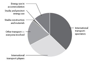
The headline footprint figure here comes from a study of the 2010 South Africa World Cup and includes players and their entourages traveling around, the construction of the sites, energy used at the stadiums, accommodation, and fans traveling (Figure 11.1).3
An estimated 1.2 million spectators saw matches live, so that’s a massive carbon cost of 2.3 tons per viewing. Luckily for the carbon credentials of the World Cup, each of the 64 matches was viewed on the television by a guesstimated 93 million people worldwide. At 2 hours per match, including intervals, extra times, penalty nail biters, and the bit where they swap shirts at the end, that adds up to a massive 12 billion fan-hours of top-quality entertainment.

FIGURE 11.1: A carbon footprint of the World Cup.
If these numbers are correct, the World Cup comes in at 230 g CO2e per fan-hour of entertainment, though of course the viewers’ footprints are boosted by their own televisions. The worst scenario is that you watched alone on a 42-inch plasma screen (page 33), in which case your TV made up about half of the footprint of your viewing experience. Even if you watched 24 hours a day, 7 days a week for a whole year (that’s a whole year alone without sleep in front of the plasma TV in permanent World Cup ecstasy), you’d clock up only a 4-ton footprint.4
By comparison, a U.K. Premiership match, at 820 tons, comes out at a tiny 45 g per viewer-hour (excluding all the televisions—see An hour’s TV), with over nine-tenths of the entertainment being exported around the world.
Even better is a kick-around in your local park or street. This is virtually emissions free, making it one of the best carbon bargains in this book.
130 million tons CO2e 2010
250 to 340 million tons CO2e prediction for 20205
> The footprint of the world’s data centers is currently the same as one-seventh of the U.K.’s footprint, or a quarter of a percent of the global total.
Data centers are buildings packed top to bottom with computers. These computers store web pages, databases, applications, and downloads and generally make the Information Age possible. As you’d expect, they use lots of electricity (both for powering the machines they contain and for keeping them cool with air-conditioning), and as people consume ever more digital content, their already considerable carbon footprint is rising fast.
According to IT advisory company Gartner, the world’s data centers currently account for one-quarter of the energy consumed around the world by the information and communication technology sector. That’s around two-thirds as much as all the computers and monitors in the world. On current growth trends, however, the power draw of data centers is set to at least double over the coming decade. The precise growth rate will depend on efficiency improvements and changes to the amount of data being stored and processed.
If data centers alone account for 0.25 percent of the world’s total footprint and that figure is set to rise to 0.5 percent and beyond, then digital data as a whole is looking set to climb to well over 1 percent of total emissions. Meanwhile 1 percent is about the proportion of the U.K.’s footprint accounted for by printing and paper-based publishing. The direct comparison is a bit more complex, but the point is that digital information may not be lower-carbon than the paper-based world of 20 years ago. Part of the problem is the so-called rebound effect—the idea that when something (in this case the storing and interrogation of data) becomes cheaper and more carbon efficient to do, we end up simply doing more of it so that there is no net reduction in cost or impact. Sometimes it is even the reverse.6 Not only is global data growing incredibly fast, but so is our expectation that we can interrogate it at a moment’s notice. Where we might have expected to line up at busy times in a bookshop to enquire about just the contents of its shelves, Amazon now has to meet our expectation, through its data center capacity, that even in peak times we can search the world’s published materials in an instant.
Of course, if we go for digital information without ditching the paper, downloading stuff simply to print it out, we end up with the worst of all carbon worlds.
165 million tons CO2e the Australian forest fires of 2009
231 million tones CO2e the Californian forest fires of summer 2008
> Australian fires were equivalent to the total yearly footprint of more than 5 million Australians or 50 million Chinese people.
If you were to start one of these deliberately, that one strike of a match would make your footprint thousands of times greater than most people build up over their lifetimes.
My estimate for the Australian fires is based on 450,000 hectares (1,750 square miles) of forest containing 100 tons of carbon per hectare.7 To put the number in perspective, the most recent estimate of Australia’s annual footprint was 529 million tons CO2e, so the fires added nearly one-third.8
For the Californian fires, mostly started by lightning, I’ve based my sums on 630,000 hectares and the same forest density.
Emissions from forest fires vary from year to year. In 1997–98 they are thought to have been around 2.1 billion tons.9 Although some vegetation regrows, they are almost certainly a nasty example of a climate change positive feedback loop.
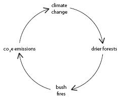
In theory, regrowth will absorb the CO2 from the air in time, thus making the fire carbon neutral in the long term. However, it is looking increasingly likely that permanent changes in terrain take place following a fire. Furthermore, forest fires are also a major source of black carbon (see Black carbon).
Around 1.5 million tons CO2e per year Malawi
4 million tons CO2e per year Iceland
610 million tons CO2e per year Australia
810 million tons CO2e per year France
862 million tons CO2e per year the U.K.
890 million tons CO2e per year Canada
980 million tons CO2e per year Brazil
1,350 million tons CO2e per year Germany
1,400 million tons CO2e per year India
1,940 million tons CO2e per year Russian Federation
4,300 million tons CO2e per year China
8,250 million tons CO2e per year the U.S.
The estimates here are of the footprints of national consumption in 2005. They include the footprint of goods imported from overseas but exclude goods produced in each country for export.
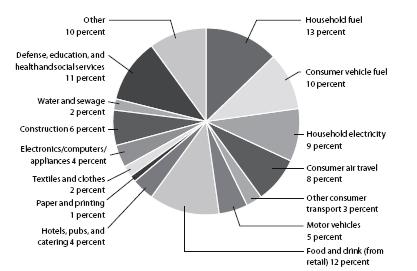
FIGURE 11.2: A breakdown of the U.K.’s carbon footprint, including imports but excluding exports.
Let’s start off by looking at the footprint of the U.K. As we saw earlier (see A person), each person in the country is responsible for around 15 tons CO2 per year. Because the U.K. imports more goods than it exports, the total figure for the country—862 million tons—is higher than the 700 million or so tons that usually gets reported for U.K. emissions.10
Taking the U.K. as an example of a fairly typical European country, let’s see how all those emissions break down (Figure 11.2).
Domestic energy, which often dominates the media coverage of carbon footprints, makes up 22 percent of the total, consisting of household fuel at 13 percent and electricity at 9 percent. For most people the fuel is gas, for which 84 percent of the emissions happen in the home itself and the rest are caused during gas extraction and distribution.
Cars come in at 15 percent of the total when you add together the 10 percent caused by their fuel (extraction, distribution, and use) and the 5 percent caused by their manufacture and maintenance. As a rule of thumb, the exhaust-pipe emissions are about half the total footprint of driving (see Driving 1 mile). Note that this slice of the pie doesn’t include commercial vehicles, so the whole of road transport is a good deal more.
Food and drink, often underestimated, come in at 12 percent just for those groceries bought at stores. If we include all the food and drink served by hotels, pubs, cafés, schools, hospitals, and so on, we’d get to about 17 percent. If we also added in the emissions from cooking at home, traveling to the stores, and the emissions from food waste sent to landfill, the total footprint of the stuff that goes into people’s mouths comes to about 20 percent of the U.K.’s footprint. It’s roughly the same percentage for the world as a whole. All these numbers are without considering the impact of food demand on deforestation, which would take the U.K. total to around 30 percent.11
Air travel for private purposes is a staggering 8 percent12 of the total. If you include business travel and air freight as well, flying comes in at around 12 percent of the U.K.’s footprint—much higher than the figure usually quoted. British people probably fly a bit more than other Europeans because they live on an island and because there is a lot of sea to the west, but this is still a remarkable statistic—especially when you consider that air travel is the fastest-growing major emissions source in the country.
In the pie chart, construction, at 6 percent of the total, includes domestic repairs, new houses, and all new commercial construction work. And the production of electrical goods—that is, household computers and appliances—comes in at 4 percent, almost half as much as the electricity they consume in use.
Public administration, defense, education, health care, and social services cause a significant 11 percent of emissions. A common misconception is that there is nothing we can do about this as individuals. To cut your share of these emissions, how about preventing crime; encouraging schools, universities, and businesses to manage their carbon; staying as healthy as possible; and voting with climate change in mind?
Other factors. This is my catch-all category. It contains a jumble of things, including some that might never occur to you as incurring a footprint at all. In here are bikes, brooms, Lego bricks, lipstick, legal fees, phone calls, footballs, tables, toiletries, travel insurance, jewelry, and too many other things to list individually.
So that’s the U.K. How about the rest of the world? Figure 11.3 picks out a few key countries and gives their official carbon emissions (that is, the quantity of greenhouse gases released within their borders) and my estimate of their true consumption footprints (that is, with exports subtracted, and imports and international travel and transport added in). Note that the numbers shown are from the year 2005. Things change fast, and China is now widely thought to lead the U.S. in terms of emissions, probably having drawn level in about 2006, even though the footprint of Chinese consumption is still just over half that of the U.S.
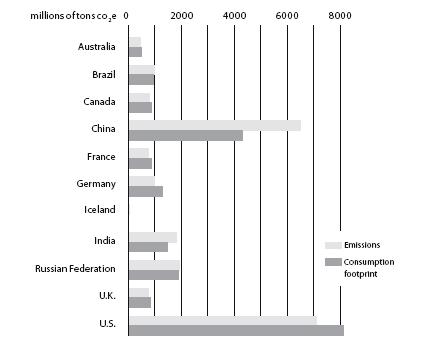
FIGURE 11.3: National emissions and consumption footprints in 2005.
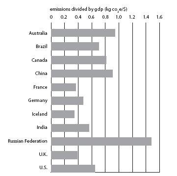
FIGURE 11.4: Emissions per dollar of GDP for a selection of nations.13
Even when you factor in imports and exports, however, it isn’t necessarily hugely meaningful to think of the total emissions of a country. China may have overtaken the U.S. as the biggest emitter, for example, but it has far more people. Hence emissions per person is usually a more meaningful way to compare one nation with another—as discussed on page 193.
Yet another way of looking at a country’s footprint is in terms of emissions per unit of GDP (gross domestic product); see Figure 11.4. This is a measure of “carbon efficiency” or “carbon intensity”—a nation’s footprint relative to its economic activity. Countries with inefficient factories, and which get their electricity from dirty coal-fired power stations, rate worse on this scale. Hot countries can sometimes achieve a better rating because they don’t have to spend so much on keeping warm (provided that people aren’t rich enough to afford air-conditioning).
Through this GDP lens, Russia comes out worst, because of its coal-fired power stations, inefficient factories, and cold climate, with coal-dependent China and Australia following behind. Western Europe has relatively efficient factories and cleaner electricity, so countries in this region come out well— especially nuclear-powered France and renewable-powered Iceland. The U.S. comes in somewhere in the middle of the carbon-efficiency stakes.
Although we may talk about becoming more carbon efficient, it is clear that we are a very long way from being able to grow our economy without increasing our consumption footprint. Tim Jackson’s recently published Prosperity without Growth14 is both the most rigorous and the most accessible articulation of this uncomfortable reality that I have seen.
Ultimately, there’s no avoiding the fact that a country’s emissions are strongly linked to its wealth. It’s hard to be rich and have a low carbon footprint (see Spending $1). Malawi is just one example of a country whose poverty ensures a low footprint. Its 14 million people have a footprint of around 100 kg each per year.
I’ve looked at typical footprints by country, but this doesn’t always give the full picture. Sometimes the most significant differences occur within countries. In China, for example, hundreds of millions of people live very low-carbon lives, whereas the emerging middle class, with Western lifestyles in a less energy-efficient economy, probably have carbon footprints to dwarf those of the Australians.
690 million tons CO2e a “limited” nuclear exchange of fifty 15-kiloton15 warheads
250 to 600 million tons CO2e Iraq, 2003–09
> The Iraq war up until the start of 2010 probably racked up a carbon footprint roughly equivalent to the whole of the U.K. economy for between 3 and 8 months and rising.
The direct human costs of wars are so great that it might seem flippant to think about their climate change costs. But war unfortunately plays a big role in global society, so this book wouldn’t be what it says on the cover without giving it a mention. Moreover, it’s worth bearing in mind that even just the emissions of a war could ultimately have serious human impacts somewhere in the world.
In what was perhaps the only academic estimate of the carbon footprint of an atomic war, it was concluded that even a “small nuclear exchange” of just fifty 15-kiloton warheads would cause 690 million tons of CO2 emissions through the burning of cities.16 The same report also estimated that the exchange would also release 313 million tons of soot into the atmosphere, which would have a cooling effect and would therefore counter the warming for the first few years after the explosions.
But a war doesn’t need to be nuclear to have a huge carbon footprint. The financial cost of the U.S. military operation in Iraq for 2003–09 has been estimated at $1.3 trillion, with a further $600 billion anticipated for the lifetime health care costs of injured troops.17 We can use the input–output model to give a very crude estimate of the footprint of the U.S. operation, of 160 to 500 million tons CO2e for the military activities and perhaps a further 80 million tons for the health care of troops.18 This excludes the actual emissions from combat itself. Add on a few percent to both numbers to include the coalition forces. Also add perhaps another 1 percent for the footprint of the much more poorly resourced insurgency. Overall we might be looking at 250 to 600 million tons—roughly equivalent to between 20 percent and 60 percent of all U.S. citizens flying from L.A. to Barcelona and back. The war-and-carbon discussion starts to get distinctly uncomfortable (and methodologically just about impossible) at the point where we start factoring in the indirect emissions impact caused by the death toll and indeed the broader economic impacts of the war. In the nuclear example, the report in question estimates 17 million deaths—equivalent to around one-quarter of the U.K. population. Looked at in the starkest and simplest possible terms, if each of these people had a typical U.K. footprint, then the carbon savings of their ceasing to exist might make up for the direct emissions from the war in just a few years. In other words, mass annihilation turns out to be an effective way of curbing emissions—though of course it also defeats the object.
7 to 15 billion tons CO2e per year
> That is 15 to 30 percent on top of the figure I normally quote for global human-made emissions.
How can this have slipped off the radar for so long?* As Dennis Clare of the World Watch Institute put it, “Black carbon, a component of soot, is a potent climate-forcing aerosol and may be the world’s second-leading cause of global warming after CO2.”19
My low figure for black carbon’s global warming impact— 7 billion tons of carbon equivalent—came from the Intergovernmental Panel on Climate Change 2007 report. The higher figure of 15 billion tons came from more recent studies.20
Black carbon warms the world in two ways. In the atmosphere it contributes to the greenhouse effect. Down on the ground, it turns snow and ice murky and in so doing makes it absorb more of the Sun’s heat. It is thought to be a major contributor to the global reduction in ice cover, especially in the Northern Hemisphere.
Black carbon is caused by incomplete combustion; 42 percent comes from outdoor fires of one kind or another, and one-quarter comes from the burning of wood, coal, dung, peat, and any other organic stuff in homes. A further quarter comes from transport (mainly diesel), and about 10 percent comes from coal-fired power stations.
The good news about black carbon is that it lasts only a few days in the atmosphere. In other words, if we can reduce the amount we create, the benefit will be instant. Hence some experts think that reducing black carbon pollution should be a number one priority in tackling global warming. Easy wins can be made by using particulate filters on diesel engines and swapping inefficient open fires for super-efficient stoves.
50 billion tons CO2e per year
In 2007, the IPCC estimated global greenhouse gas emissions at 49 gigatons (that is, 49 billion tons) CO2e a year and rising. That doesn’t include a multiplier to take account of the extra warming effect of emissions from planes, which takes the total to 50 gigatons CO2e. Figure 11.5 shows the emissions broken down to constituent greenhouse gases, looked at in terms of the impact over a 100-year period.
Around half the methane comes from agriculture (especially livestock at 5 percent of global emissions, but also rice cultivation at 1.5 percent and other farming). The rest of the methane comes mainly from the extraction and processing of coal, gas, and oil; from landfill (2 percent of the global total); from the treatment of used water; and from other wastes.
Nitrous oxide results mainly from the spreading of nitrogen fertilizer and manure, although there are also contributions from fuel combustion, industrial processes, and waste treatment. The F gases, at 1.1 percent, result mainly from refrigeration and air-conditioning (there are some good technologies coming through to deal with this: see Refrigeration). Aviation comes to 3 percent of the total once you factor in the effect of altitude (in the pie chart the 1.4 percent sliver is just the additional bit to take account of high-altitude effects).
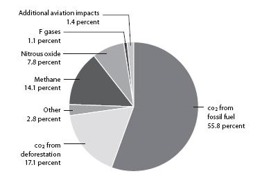
FIGURE 11.5: The breakdown of our 50 million tons CO2e greenhouse gas.21
Although there is a convention to look at the impact of different gases over a 100-year time span (that is, up until 2110), this is in fact somewhat arbitrary. Many people believe that climate change will bite much sooner than that, so there may be a case for considering the impact over shorter timescales as well. This changes the relative impact of the different gases: those that are powerful but short-lived become more important relative to the weak but long-lasting CO2. If you were to look at a 50-year timescale, for example, the non-CO2 emissions caused by agriculture, refrigeration, and air-conditioning would immediately become roughly twice as serious.
To understand where in the world all these emissions come from, it’s time for some squidgy maps. The first, Figure 11.6, shows the size of countries in proportion to their emissions. Note that these are just the emissions that physically rise out of each country rather than the consumption footprint, so the emissions from a factory in China that makes washing machines for people elsewhere in the world is shown as belonging to China, rather than to the people who buy them. The U.S., China and Europe dominate the map. More recently, China has overtaken the U.S. as the biggest national emitter.
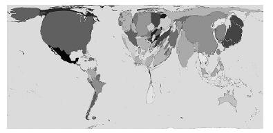
FIGURE 11.6: The world according to greenhouse gas emissions (as of 2000).22
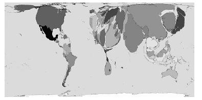
FIGURE 11.7: The increase in global greenhouse gas emissions (1980–2000).23
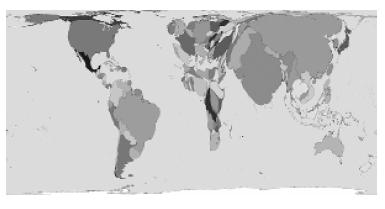
FIGURE 11.8: Global emissions of methane and nitrous oxide in 2000, in CO2e.24
Figure 11.7, which focuses on emissions growth, shows how things have been changing. In this view, China, India, and the U.S. dominate, while most of Africa has been strangled to nothing. A few European countries have vanished, too, showing that their emissions were static or declining.
Figure 11.8 shows just methane and nitrous oxide, and in doing so it emphasizes agricultural emissions. In this view China, India, and South America dominate. North America, although hardly looking lean, is at its smallest. This is by far the most imposing view of Africa out of the three, although it still looks emaciated. A bit more fertilizer application in Africa could actually be helpful.
Burning the world’s fossil fuel reserves
2.5 trillion tons CO2e
> That’s 50 years of current global emissions.
The exact figure depends on just how big you think our reserves are. The numbers in Table 11.1 are based on “proven” reserves, as of 2006, but nobody really knows for sure how much is down there. Because fossil fuels account for only a little over half of total global emissions, even this conservative estimate of our reserves means that we have enough fuel left to allow us to keep on belching out carbon at our current rate until roughly the end of the century.
In other words, regardless of the precise amount of fossil fuel left in the ground, it’s clear that there’s more than enough to push us into climate meltdown if we were to burn it all—and judging by our current mindset it does look as though we are on course to do just that. For this not to happen, we will need to achieve a situation in which although there is fuel in the ground waiting to be extracted and burned, the countries and businesses that own the rights to it are simply content to leave it there for all time.
For me this is an uncomfortable perspective because it is hard to imagine Russia, China, the U.S., Saudi Arabia, Exxon, Shell, BP or anyone else simply being happy to leave their valuable assets down there in the ground. One solution, albeit a long way off, might be to devalue those assets by making renewable energy even more abundant.

Oil spills
At the time of writing, the BP Horizon Deepwater oil spill is estimated to have topped out at 300,000 to 600,000 tons of oil, assuming BP’s claims to have stopped the flow prove to be well founded.25 If (and it’s a big if) the eventual fate of all the oil is to degrade into carbon dioxide, the result would be roughly one to two million tons CO2e. That is a lot, but in this case, the climate change implications look small compared with the wider environmental impact of the disaster.
For comparison with other big spills in the history of oil, Saddam Hussein’s deliberate 1991 gulf war spill is estimated at 270,000 to 820,000 tons, and the 1910–11 Lakeview Gusher in California is estimated at 1,230,000 tons.
| Fuel | Billions of tons oil equivalent | Billions of tons CO2e from burning | ||
| Coal | 463 | 1,470 | ||
| Oil | 165 | 530 | ||
| Gas | 163 | 520 | ||
| total | 791 | 2,520 | ||
TABLE 11.1: Proven fossil fuel reserves.26
* I inserted this entry late in the day. The implications of black carbon are not systematically integrated throughout the book. I could apologize, but then it’s just an example of how we are all having to learn on the go.