CHAPTER THREE
ADDING COLOR TO FORM
The combination of precise color and specific light and shadow variations is crucial to drawing realistic three-dimensional form. We will use nature to learn how to match color, mix variations, and study how light and shadow affect these colors. Then we’ll use a color wheel to explore how colors relate to one another, so that by the end of this chapter you’ll have mixed a full spectrum of colors as well as their shadows and highlights on a three-dimensional subject. These practical exercises will become your color charts to help you mix colors on just about any form you’ll find in nature!
Color Theory: Exploring the Color Wheel
I’ve always loved looking at color wheels. I liken this to the joy I feel whenever I see a rainbow—nature’s way of showing us an arch of colors. A color wheel shows us a complete spectrum of color hues and how each color relates to all the other colors on the wheel. Though we all perceive color slightly differently, a color wheel helps create a universal language that we can all use to understand color and how to mix its subtleties.
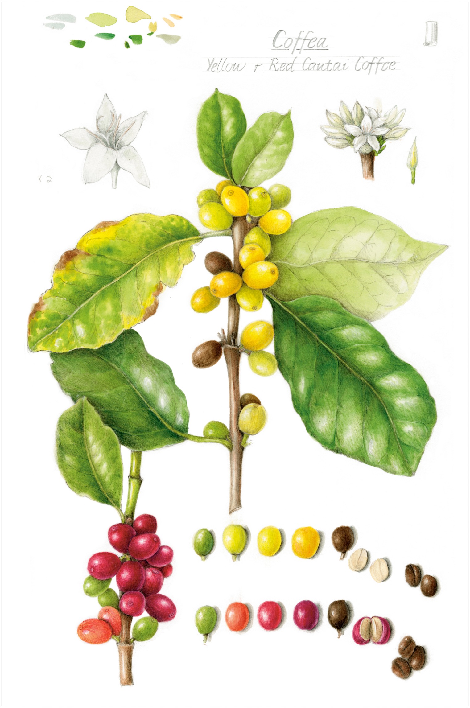
I created the center of my color wheel with a sunflower drawing to illustrate how to use all the pencils that I include in my essential colors. I have organized the top flower petals to show the twelve colors in the color wheel, and additionally, I included petals underneath that are more in shadow, thus are darker and duller in color. For these, I used colors that aren’t as bright, referred to as earth tones, that appear often in nature. I’ve used darker colors for shading in shadow areas and lighter and brighter colors in the highlighted areas of the petals.
For the outside of my color wheel, I was inspired by a real cherry tomato plant, called Toronjina, that was growing in our garden. It is almost the perfect subject for a color lesson. The fruit starts out green, becomes more yellow-green, then yellow, then yellow-orange, then bright orange, all on one stem—a lovely color gradient to practice. Next to my red cherry tomatoes, which change from green to bright red in increments through the growing season, we have almost a complete range of hues. If only there were tomato varieties in blues and violets, my tomato color wheel would be complete! The drawing of a few blueberries on a bush developing from green to magenta to violet to blue gives us a complete color wheel of round forms.

In describing these various fruits, I use the language of color to explain hue and saturation variations. I’ll use a color wheel to illustrate how to mix nature’s colors in a realistic way, as well as to create highlights and shadows for each color. This lesson will explain and explore the local color of a form and then create appropriate shadows and highlights for each color.
Let’s begin with some basic vocabulary for describing color. Visualizing a color using these definitions can make it easier to mix the color you’re trying to achieve.
HUE: the name of a color, also known as local color (for example red, yellow, or blue)
VALUE: how dark or light the color is, as it relates to a nine-step value scale
SATURATION: how bright or dull the color is
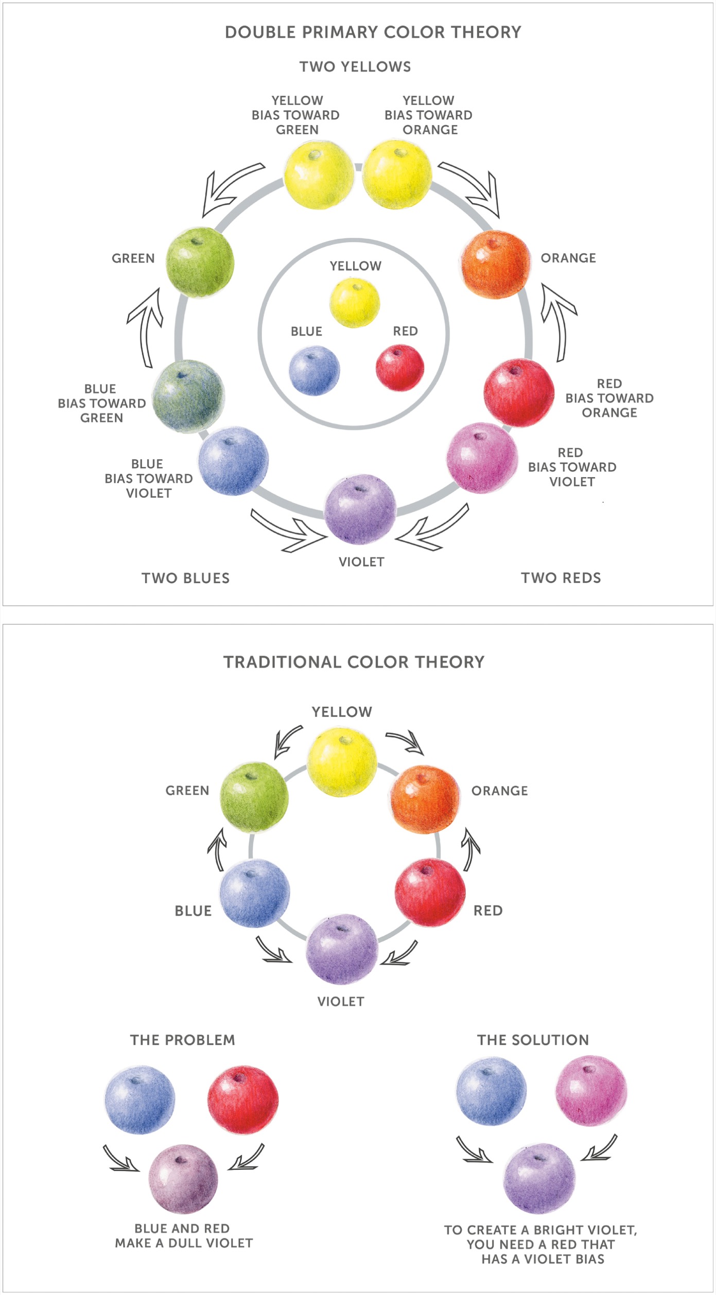
My tomato color wheel has twelve distinctly colored tomatoes arranged in a typical color-wheel configuration. I also use double primary color theory, or color bias theory, to create another color wheel, meaning I use two primary colors for each primary color—so I have six primary colors total rather than three. Most of us learned some color theory basics back in elementary school. We were always taught that there are three primary colors—red, yellow, and blue—and that we can mix them together to create all other colors. Mixing two primary colors equally creates a secondary color. These are called orange, violet, and green. The problem with this concept is that pigments used in paints and pencils are never a pure primary color. They will always be biased toward one secondary color or the other. A red can be biased toward orange or toward violet. Having two hues for each primary color allows for precise color mixing so that you can create the color you want, whether it’s a bright hue or a dull hue. To create a bright hue, always mix two colors that are biased toward the same secondary color. For a duller color, you can use colors biased toward different secondary colors in different directions.
The final piece of this puzzle is to understand that two primary colors biased in the same direction do not have any of the third primary color when mixed together. When the third primary color is added to a mix, it dulls the color, which is very helpful when mixing colors. Because most of the time we will already be using secondary colors, we won’t have to mix them. Keep this biased color theory in mind when you’re mixing colors and a color doesn’t appear as bright or dull as you want it.

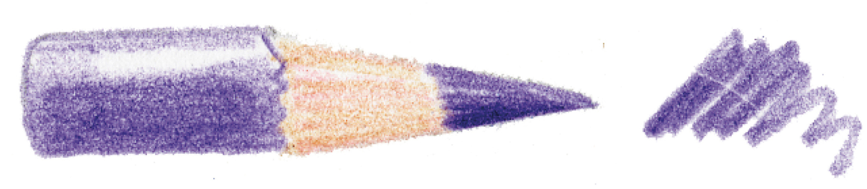
Primary colors in our set are:
 RED BIASED TOWARD ORANGE (Pale Geranium Lake #121)
 RED BIASED TOWARD VIOLET (Middle Purple Pink #125)
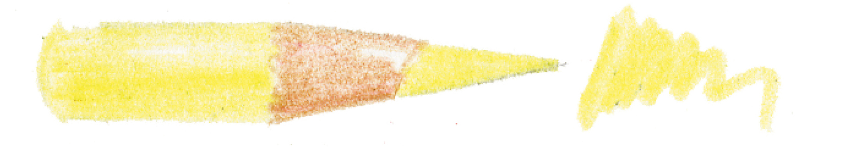 YELLOW BIASED TOWARD ORANGE (Cadmium Yellow #107)
 YELLOW BIASED TOWARD GREEN (Cadmium Yellow Lemon #205)
 BLUE BIASED TOWARD GREEN (Cobalt Turquoise #153)
 BLUE BIASED TOWARD VIOLET (Ultramarine #120)
Secondary colors are a 50/50 blend of two primary colors. In our set, we have:
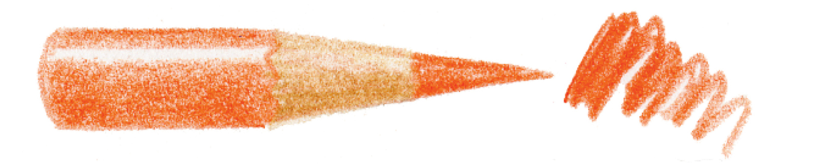 ORANGE (Dark Cadmium Orange #115)
 GREEN (Permanent Green Olive #167)
 VIOLET (Purple Violet #136)
The other six colors on the wheel are tertiary colors. They are blends of two primaries in a ratio of approximately 3:1. They are called yellow-orange, red-orange, red-violet, blue-violet, blue-green, and yellow-green. This is a visual mixing process and not an exact science. Mix until it looks like the right variation. This is similar to the layering process in creating value steps.
Complementary colors are pairs of colors that fall opposite each other on the color wheel. Any two complementary colors “complete” each other, meaning that together they contain all three primary colors. When you mix two complementary colors together, the result is often a neutral “brownish” color. When you understand how complements mix to create neutrals, you can adjust your drawing to match colors that you find in nature. In the example of a black cherry tomato on the this page, the pigments in the colors red and green actually mix on the tomato to create a brownish color. Similarly, if you are drawing a green leaf that is beginning to turn brown in autumn, you could add red to the green to neutralize that color and describe the brown you are seeing.
Dark Sepia is such an important shadow color because it’s a blend of all three primary colors. Try mixing it with a combination of three primary colors (see the bottom illustration on this page).
Usually color wheels show the brightest hues possible, because in color mixing, you can alter a color to make it duller when needed, but it cannot be brightened easily. Starting with the brightest possible hues allows you to dull them when needed. Bright greens are rare in nature, especially on leaves, so I prefer to have my greens less bright on the color wheel, as my color wheel is for practical use. This way, I avoid creating greens that are not realistic in nature.
These series of color wheels can be used as a guide to help you choose and mix colors when you are trying to match the colors in a subject. The next series of lessons in this chapter will walk you through the process of mixing all these color variations.

Color Matching and Blending with Colored Pencils and Watercolor Pencils
Soon, color matching and combining colored pencils will become second nature. But before attempting to draw a colorful subject, try this helpful practice session of color matching.
The techniques you learn while drawing red objects, such as a shiny red tomato, are applicable to many subjects. Red subjects are challenging because, in addition to matching the main local color of red, you will want your shadow tones and highlight tones to appear realistic as well. The shadow colors need to be dark but still appear red in shadow. Monochromatic tones (only one shade of red from light to dark) are not realistic—convince the viewer that your red tomato is three-dimensional by showing them a range of red hues. This lesson helps create reds that are darker and duller in shadow and brighter and more vibrant in the midtone and lighter areas. Strive for a range of nine values from light to dark.
A cherry tomato is a great first subject because it is easy to find, not too big, and comes in multiples, plus you can eat it when you’re finished. Repeat this lesson as many times as you like with subjects of different colors. Once you feel comfortable with this technique and blending colors, it will become easier to pick your colors and do quick, small blend bars to start a drawing with the correct colors. The colors listed here are those that I used, but you should use the colors that match your subject.
SUBJECT
Red tomato
ADDITIONAL MATERIALS
• Watercolor brush #2
• Pale Geranium Lake watercolor pencil #121
• Dark Cadmium Orange watercolor pencil #115
• Red Violet colored pencil #194
• Pale Geranium Lake colored pencil #121
• Dark Cadmium Orange colored pencil #115
• Madder colored pencil #142
• Ivory colored pencil #103
• Dark Sepia colored pencil #175
• Cadmium Yellow colored pencil #107 (optional)
• Other colored pencils to match your tomato’s local color
WATERCOLOR PENCILS
#121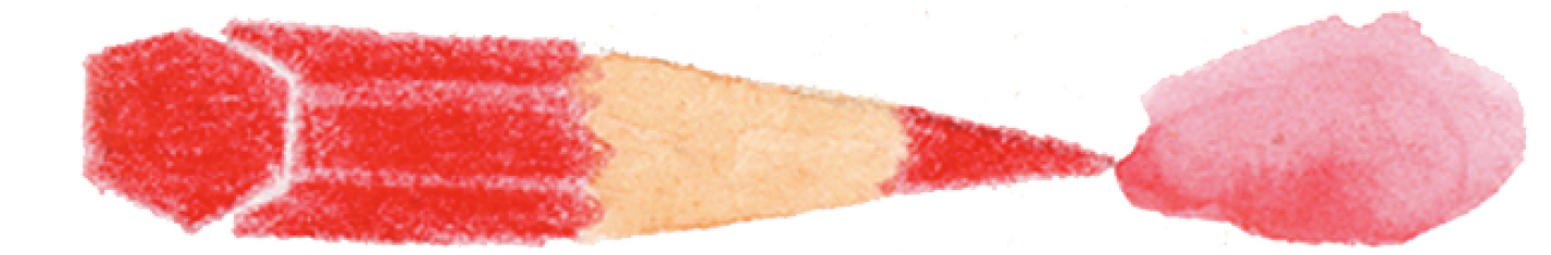
#115
COLORED PENCILS
#194
#121
#115
#142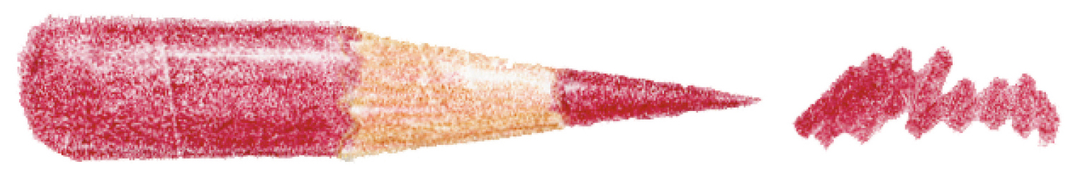
#103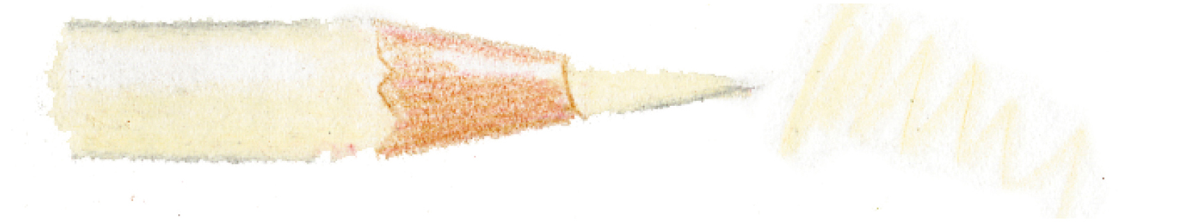
#175
#107

Place the tomato right next to your pencils to choose colors that you think might combine to create the tomato color. The watercolor pencils should be what you consider the local color of your tomato or what seems to be in the lighter areas of the local color. Using a #2 brush, blend Pale Geranium Lake and Dark Cadmium Orange to create a watercolor wash.
Once you’ve chosen your colored pencils, draw small swatches of each color. Blend your colors together to build an exact color match for your tomato. Then apply a layer of watercolor pencil. Let it dry, then layer colored pencils on top. (A)

Create two tone bars (see beginning on this page). Make one straight, approximately 2½ inches wide by ½ inch high, and the other slightly curved, approximately the same size, to simulate three-dimensional form.
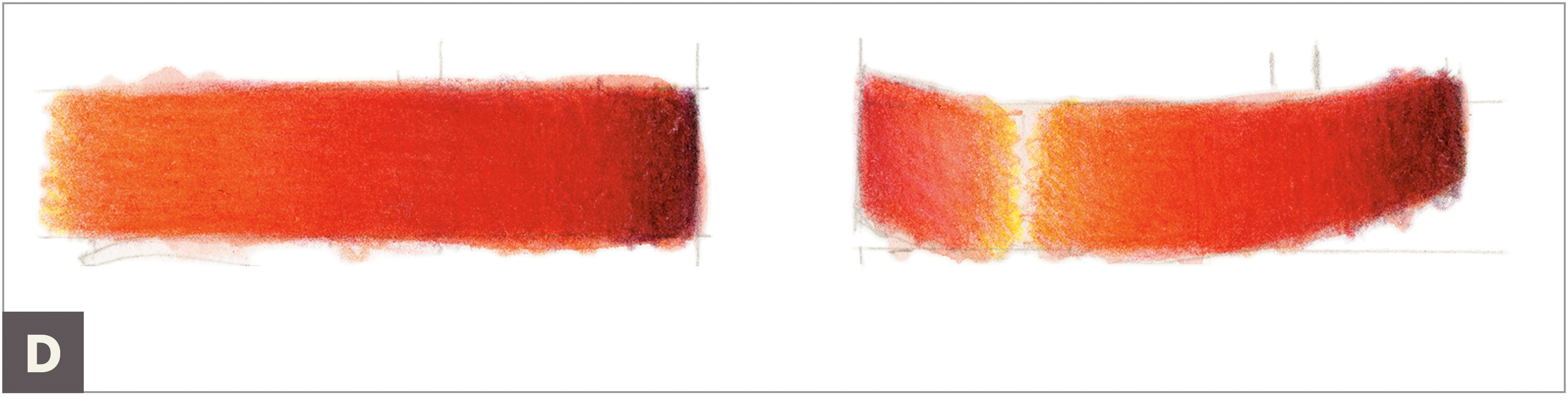
Once the paper is completely dry, add a layer of toning from dark to light using a very sharp Red Violet colored pencil. Draw about four layers of Red Violet, switching the directions of your strokes to create a smooth transition of values. Rather than press hard, build slow layers of tonal variation. Take your time with this and enjoy the process. (C)

Next, starting on both sides of the highlight area and working out to the darker values, begin adding three to four layers of Pale Geranium Lake colored pencil.
Burnish the whole subject with a layer of Ivory colored pencil to blend the colors together. Press hard, and try to blend and remove the texture of the paper by blending all the colors together.
Reapply one or two layers of all colors on top of the Ivory layer, retaining your color variations. This creates vibrant color while maintaining a smooth transition without any abrupt changes in color and value. To assure that you have dark tones in value 9 at the end of the right side, add a bit of Dark Sepia colored pencil at the darkest side. Consider adding a touch of Cadmium Yellow colored pencil near the highlight. This is optional depending on your tomato. Mine had a bit of yellowish color in it. Place your tomato next to your tone bars and see how well you’ve mixed and matched the colors. (E)


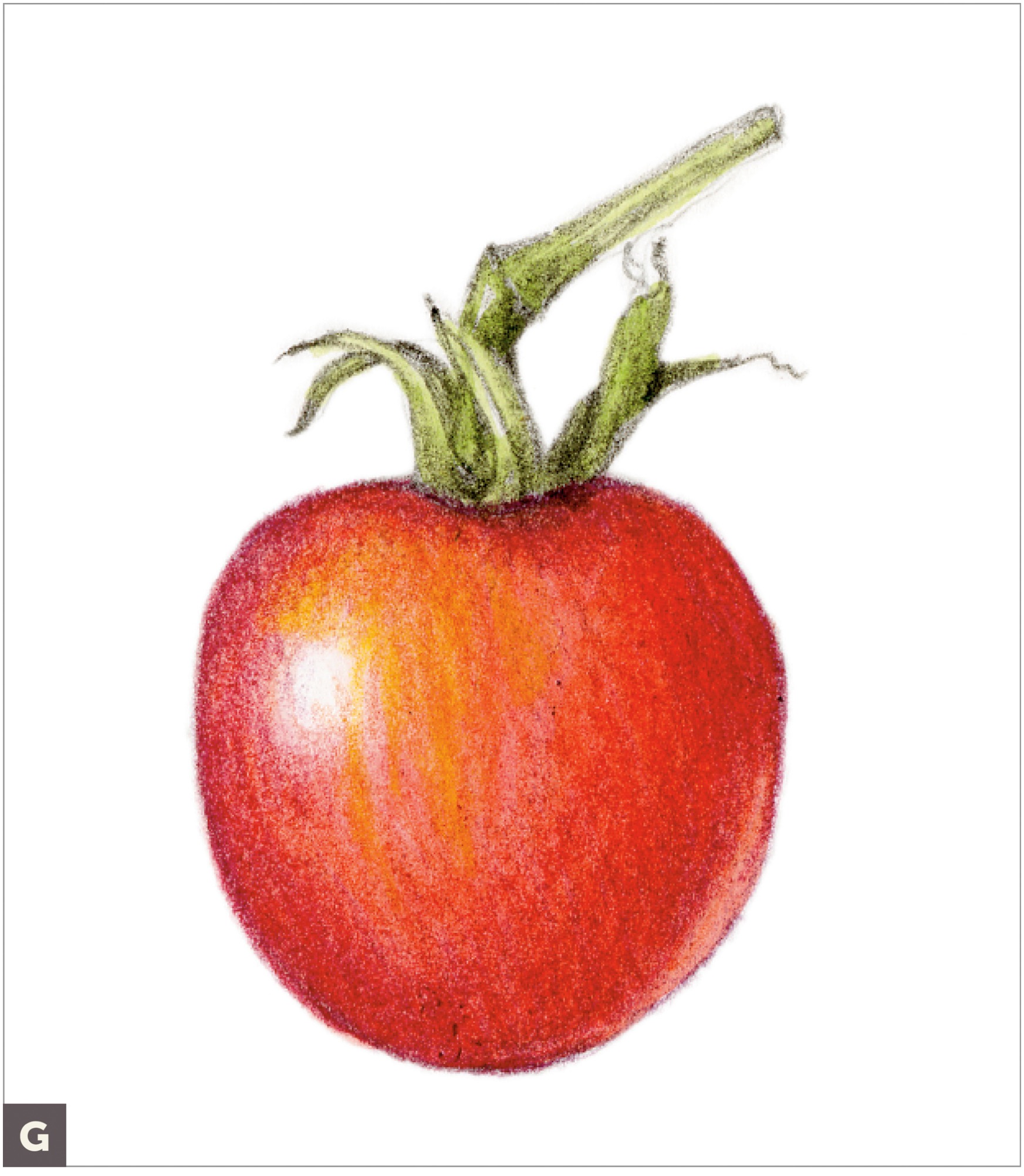
Drawing a Red Tomato in Colored Pencil and Watercolor
Now that you’ve practiced blending and layering your colors, you’re ready to apply these techniques to a red tomato. You can use a tomato with or without a stem for this lesson. The goal is to make your tomato look very three dimensional. To achieve this, create a complete range of reddish colors from dark to light. Set up a light source on your tomato so that you can visualize the correct shading. Repeat this lesson again and again with different round subjects, such as small fruits and vegetables and nuts. I’ve listed the colors I used here, but if you used other colors in the previous lesson and they worked, use those.
SUBJECT
Red cherry tomato
ADDITIONAL MATERIALS
• Tracing paper
• Red Violet colored pencil #194
• Dark Sepia colored pencil #175
• Watercolor brush #2
• Dark Cadmium Orange watercolor pencil #115
• Pale Geranium Lake watercolor pencil #121
• Permanent Green Olive watercolor pencil #167
• Pale Geranium Lake colored pencil #121
• Dark Cadmium Orange colored pencil #115
• Madder colored pencil #142
• Ivory colored pencil #103
• Cadmium Yellow colored pencil #107
• Other colored pencils to match your tomato’s local color
COLORED PENCILS
#194
#175
#121
#115
#142
#103
#107
WATERCOLOR PENCILS
#115
#121
#167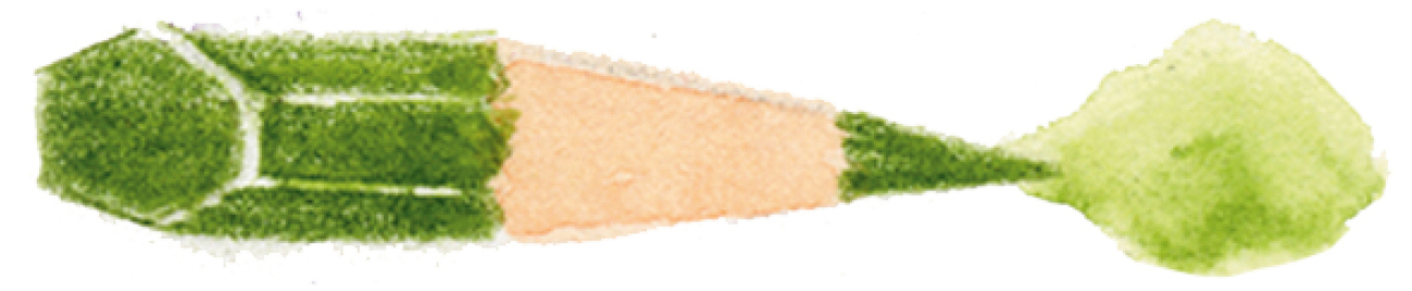
Measure the height and width of your tomato with a ruler and draw a light, life-size outline of it using an H graphite pencil. It’s okay to place your tomato right on your paper to lightly indicate its size and outline, but be sure to always redraw precisely. (A)
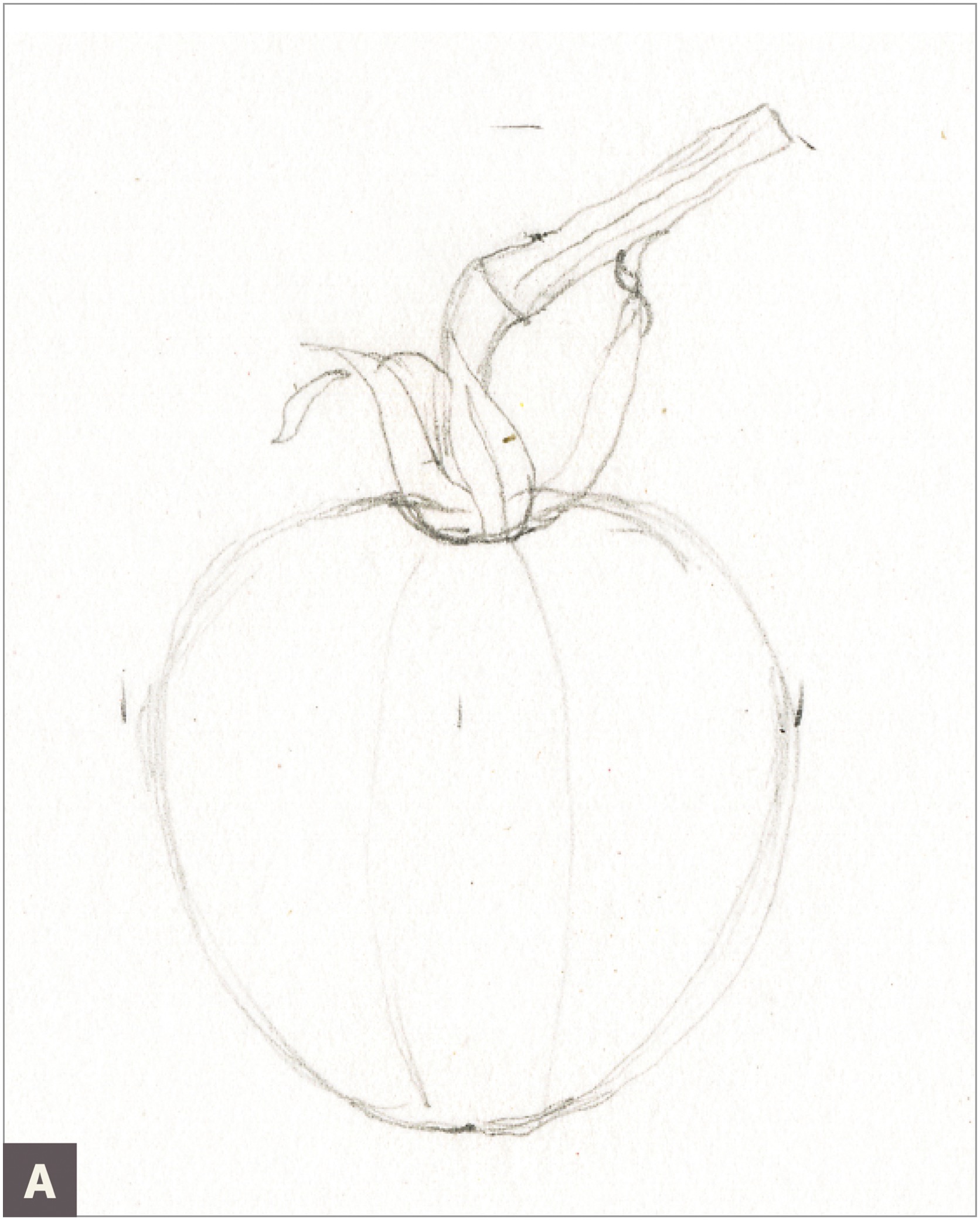
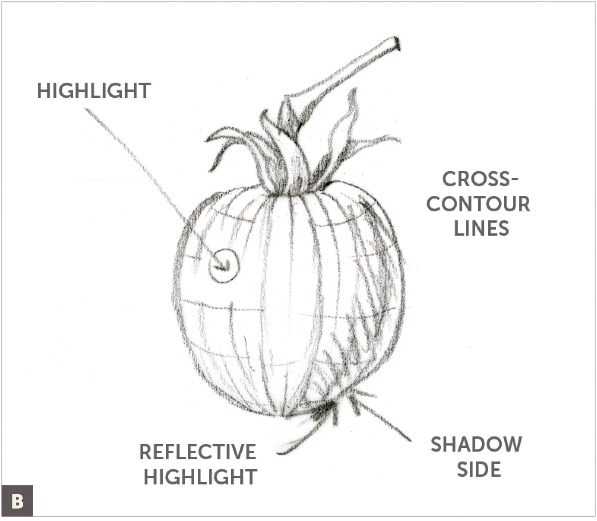
Place a piece of tracing paper over the drawing and draw a cross-contour map to show the three-dimensional surface of the tomato. Indicate the highlight, reflective highlight, and shadow side. (B)
Begin the first layer of grisaille toning with Red Violet colored pencil. In previous lessons, I’ve used Dark Sepia colored pencil for the grisaille layer, but because this is a red tomato, I prefer my grisaille layers to start with a red-tinted neutral shadow color to keep the colors bright. Leave the highlight blank, and make sure to create a seamless blend of dark to light values. Don’t press hard at this stage. Consider applying tone with tiny circular strokes for smooth texture application. Remember to always use very sharp pencils to create seamless blends of color and value. (C)

If your tomato has a stem, apply a grisaille layer with Dark Sepia colored pencil on that area, and indicate any small shadows you see. (See this page for more about creating these overlapping shadows.)
With a #2 brush, paint a layer of watercolor to create a red-orange color base, leaving the highlight empty. (I used a mixture of Dark Cadmium Orange and Pale Geranium Lake for my watercolor layer.) Always try to match a light to midtone area of the local color for your watercolor layer. When you approach the highlight, dip your brush in plain water, blot on a paper towel, and smooth the transition of the highlight so it is not a hard edge.
Apply a watercolor layer using Permanent Green Olive on the stem and any sepals (the small green leaves around the stem). Let this watercolor dry completely. (D)

Next, start layering Pale Geranium Lake colored pencil, Dark Cadmium Orange colored pencil, and Madder colored pencil (applied lightly) on top, and continue to develop a good shadow side, good midtones, and a blank highlight. Strive for a complete range of seamless values from dark to light. (E)

Continue to layer these three colors, and start to press a bit harder in the shadow side of the tomato. (F)

Lightly apply a layer of Red Violet colored pencil in the shadow area, leaving a reflective highlight on the edge of the tomato if desired. (G)
Add a layer of Ivory and Cadmium Yellow colored pencils in the light-value areas. Do not apply yellow in the shadow areas. Burnish and blend the colors together to remove the texture of the paper and smooth transitions. Apply Ivory colored pencil close to the highlight, leaving tiny areas of the paper without any pencil, but breaking up the area a bit with Ivory to create a shimmery highlight.
Reapply all colors to brighten and retain good shadows and contrast. (H)


DRAWING A CROSS SECTION OF FRUIT
For a challenge, cut your tomato in half and add a cross section to your composition. Follow all the steps again for the rendering techniques, and refer to this page on measuring in perspective using ellipses. Notice how subtle the cast shadow is on the cut-open fruit. I drew my cast shadow with a light layer of Warm Grey IV watercolor, and I depicted the outer edge of the shadow gradually fading into the background. (A) When the watercolor was dry, I layered Verithin pencil Cool Grey 70% and Verithin Black right where the shadow touched the leaf edge. I finished with just the slightest bit of Dark Sepia colored pencil in the darkest area of the shadow. (B)


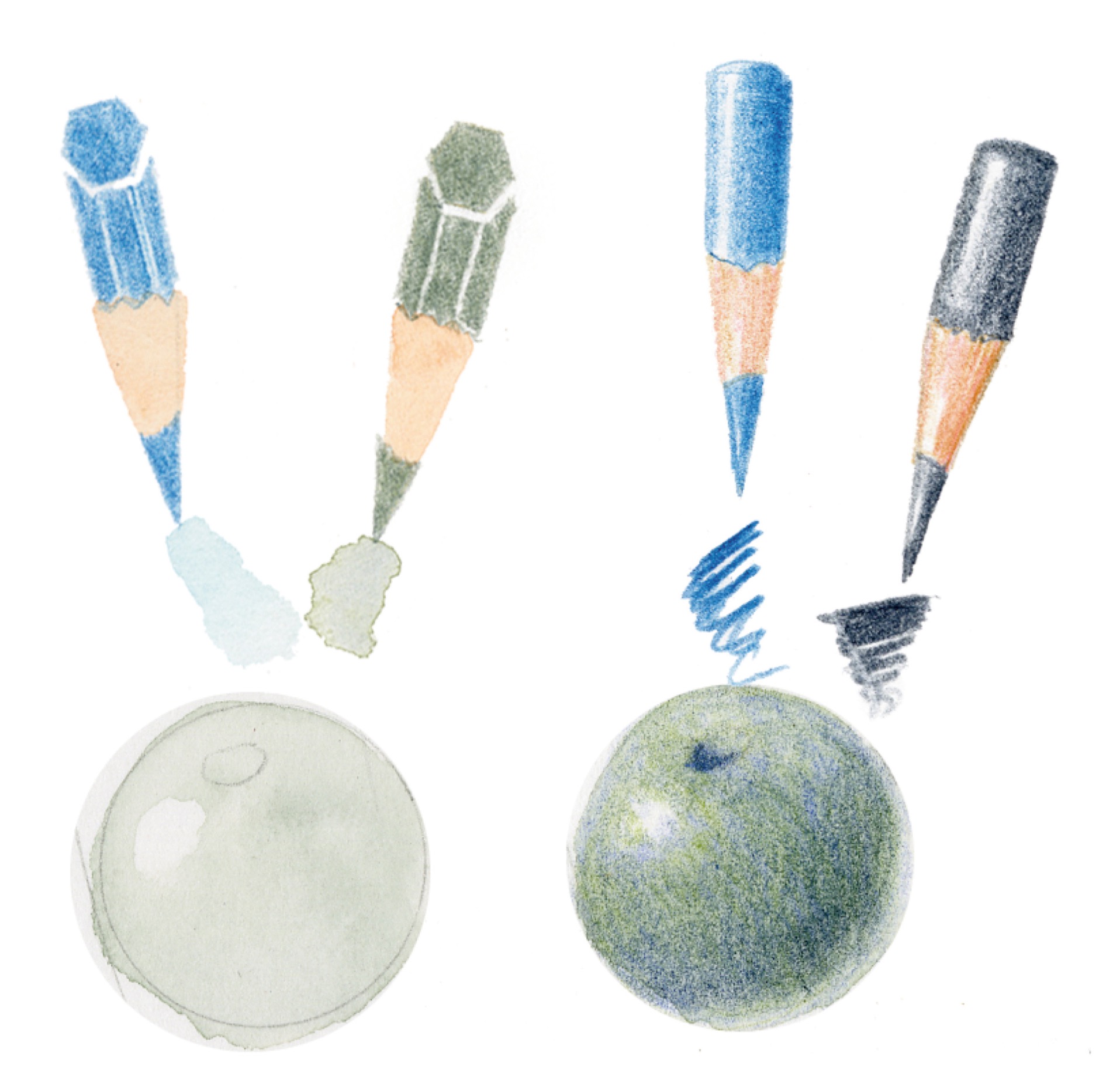
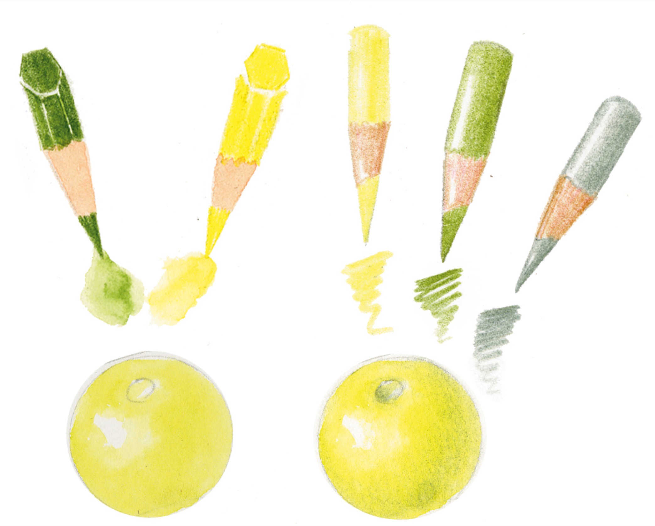
Mixing Bright Colors and Shadows
This lesson combines the techniques you’ve learned for rendering a three-dimensional form with the basics of color theory. You’ll practice combining all the colors on a color wheel with appropriate lights and shadows, and this can be a guide to help you find appropriate colors for any subject in the future. I have not included Dark Sepia in the suggested colors for each sphere because I want you to experience color first. Sometimes too much Dark Sepia creates overly dull colors, so use it cautiously. You can add a touch of it on your shadow sides if you need a slightly darker shadow, especially on colors that have a darker value in their local color, such as blues and greens.
Note: This is a long lesson, and there is a lot of information to absorb. I recommend doing it over several sessions. If you complete your watercolor layers for all of the spheres first, they’ll be nice and dry by the time you’re ready to add your colored-pencil layers. In this lesson, the step-by-step procedure for creating each round form (steps 1–4, following) is the same, but you will substitute the appropriate colors from one form to the next. This is the same technique used in Drawing a Red Tomato on this page. Take your time, and pay attention to the way colors blend with each other and how quickly you can make color variations as needed.

ADDITIONAL MATERIALS
• Watercolor brush #2
• All colored pencils and watercolor pencils
With graphite pencil, lightly draw a small tomato or sphere. You can have a stem indentation if you like.
Wet the tomato with water, being careful to stay within your outline. While the sphere is still wet, mix a watercolor wash on your palette and paint a layer to create a round form. Leave a highlight of blank paper in the appropriate place. Let the watercolor dry completely.
Once dry, add several layers of colored pencil to the round form. Choose appropriate shadow colors, and add shadows to create a three-dimensional form.
Saturate your form with colored pencils of the local color, more shadow colors if needed, and a touch of Dark Sepia lightly blended into the shadow, especially when working with the darker colors (such as blues and greens).
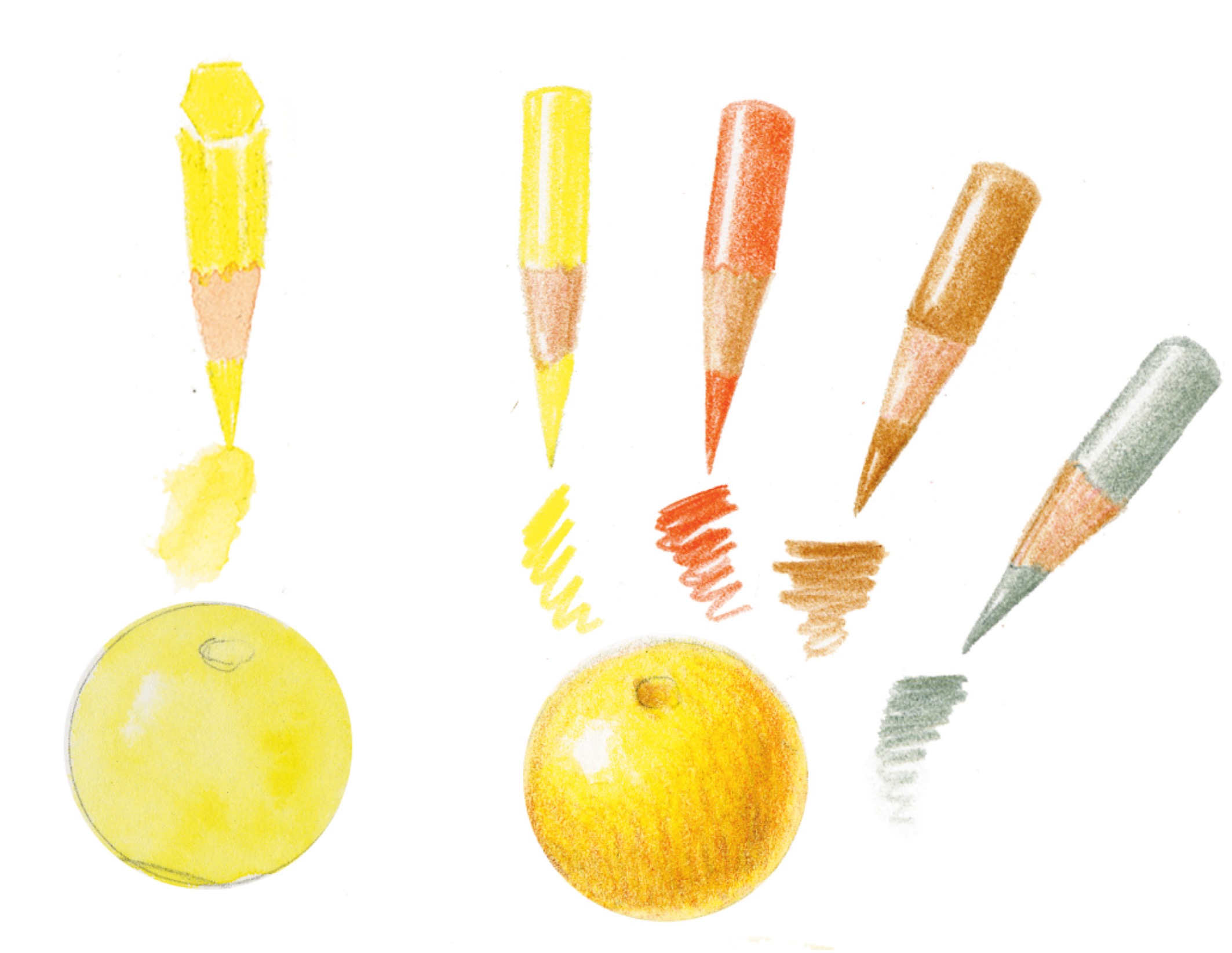
YELLOW, BIAS TOWARD ORANGE 
WATERCOLOR PENCIL: Cadmium Yellow #107
COLORED PENCIL SHADOW COLOR: Earth Green #172
LOCAL COLORED PENCIL: Cadmium Yellow #107
Use a light shadow color because yellow is a very light hue. Earth Green is a dull green and works well for this purpose; it’s composed of yellow, blue, and a bit of red. You can try mixing this color to understand its components.

YELLOW-ORANGE 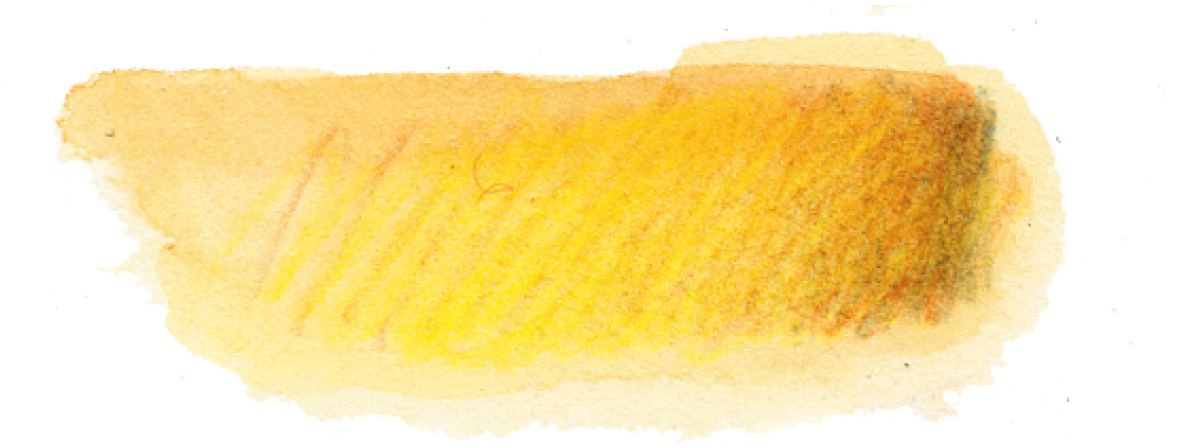
WATERCOLOR PENCILS: Cadmium Yellow #107 and Dark Cadmium Orange #115 (3:1)
COLORED PENCIL SHADOW COLORS: Burnt Ochre #187 and Earth Green #172
LOCAL COLORED PENCILS: Dark Cadmium Orange #115 and Cadmium Yellow #107
Orange has a darker color value than yellow; avoid getting an overpowering orange by adding less orange and more yellow.
ORANGE 
WATERCOLOR PENCIL: Dark Cadmium Orange #115
COLORED PENCIL SHADOW COLOR: Red Violet #194
LOCAL COLORED PENCIL: Dark Cadmium Orange #115
For additional practice, mix Cadmium Yellow #107 and Pale Geranium Lake #121 (1:1) to create an orange color to use as a base coat.

RED, BIAS TOWARD ORANGE 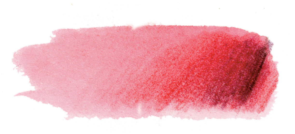
WATERCOLOR PENCIL: Pale Geranium Lake #121
COLORED PENCIL SHADOW COLOR: Red Violet #194
LOCAL COLORED PENCIL: Pale Geranium Lake #121
Observe a real red tomato to decide on the shadow color. I chose a deep, dull wine color (Red Violet) for my shadow. It has red in it with some yellow and a touch of blue. Try mixing a color that matches Red Violet if you want to understand the components of this color.

RED, BIAS TOWARD VIOLET 
WATERCOLOR PENCIL: Middle Purple Pink #125
COLORED PENCIL SHADOW COLOR: Red Violet #194
LOCAL COLORED PENCIL: Middle Purple Pink #125

RED-VIOLET 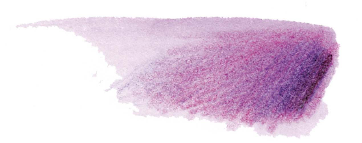
WATERCOLOR PENCILS: Middle Purple Pink #125 and Purple Violet #136 (1:1)
COLORED PENCIL SHADOW COLOR: Dark Indigo #157
LOCAL COLORED PENCILS: Middle Purple Pink #125 and Purple Violet #136 (1:1)

VIOLET 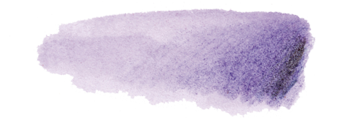
WATERCOLOR PENCIL: Purple Violet #136
COLORED PENCIL SHADOW COLOR: Dark Indigo #157
LOCAL COLORED PENCIL: Purple Violet #136
Violet is a secondary color created by mixing red and blue; however, for this exercise you can use a Purple Violet watercolor pencil. For additional practice, mix Middle Purple Pink #125 and Ultramarine #120 watercolor pencils (1:1), which are both bias toward violet, to create a bright violet color.

BLUE, BIAS TOWARD VIOLET 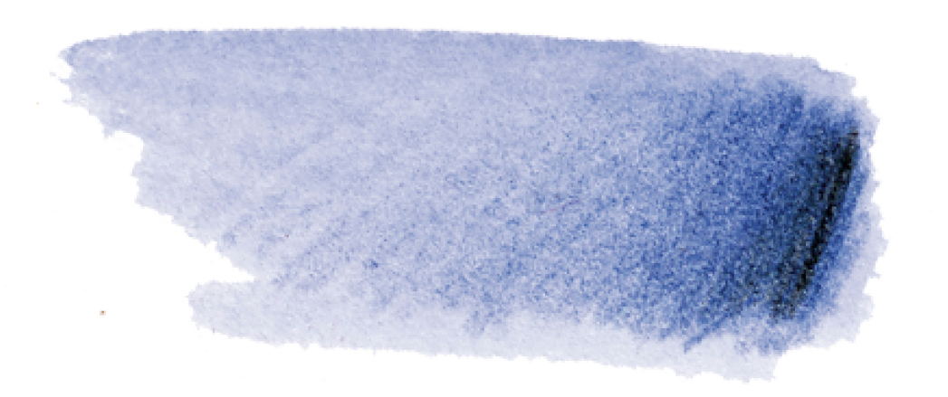
WATERCOLOR PENCIL: Ultramarine #120
COLORED PENCIL SHADOW COLOR: Dark Indigo #157
LOCAL COLORED PENCIL: Ultramarine #120

BLUE, BIAS TOWARD GREEN 
WATERCOLOR PENCILS: Ultramarine #120 and Earth Green #172 (1:1)
COLORED PENCIL SHADOW COLOR: Dark Indigo #157
LOCAL COLORED PENCIL: Cobalt Turquoise #153
BLUE-GREEN 
WATERCOLOR PENCIL: Permanent Green Olive #167
COLORED PENCIL SHADOW COLOR: Chrome Oxide Green #278
LOCAL COLORED PENCIL: Permanent Green Olive #167

GREEN 
WATERCOLOR PENCIL: Permanent Green Olive #167
COLORED PENCIL SHADOW COLOR: Chrome Oxide Green #278
LOCAL COLORED PENCIL: Earth Green Yellowish #168

YELLOW, BIAS TOWARD GREEN 
WATERCOLOR PENCILS: Permanent Green Olive #167 and Cadmium Yellow #107 (1:3)
COLORED PENCIL SHADOW COLOR: Earth Green #172
LOCAL COLORED PENCILS: Cadmium Yellow Lemon #205 and Earth Green Yellowish #168
Mixing Earth-Tone Colors and Shadows
In my sunflower color wheel, I have listed all my favorite colored pencils and shown when I use them in each of these petals. Use the following formula to help choose appropriate colors for your subjects:
LOCAL COLOR + SHADOW COLORS + HIGHLIGHT AND BURNISHING COLORS = SUBJECT COLOR

To mix an earth tone with either colored pencils or watercolor pencils, it’s important to understand how to dull a color. Because we include important earth tones in our colored-pencil palette, you won’t need to mix them; however, for a watercolor wash underneath an earth tone, you will need to do some mixing. In this lesson, you’ll mix a wash that matches Venetian Red. There are an infinite number of ways to create this color, but let’s first mix it with Pale Geranium Lake, Cadmium Yellow, and Ultramarine, three primary colors. The first step in understanding how to mix a color is to use words to describe it. The first questions to ask are, What is the hue? Is it closest to red? If so, most likely there will be more red in the blend you mix. If it’s bright, it will most likely have only two primary colors present. If it is bias toward brown and dull, there will be some combination of all three primary colors present. Mixing complementary colors together is another way to create earth tones.
SUBJECT
Petal from a daisy or sunflower in any color
ADDITIONAL MATERIALS
• Watercolor brush #2
• Pale Geranium Lake colored pencil #121
• Cadmium Yellow colored pencil #107
• Ultramarine watercolor pencil #120
• Venetian Red colored pencil #190
• Red Violet colored pencil #194
• Dark Sepia colored pencil #175
• Ivory colored pencil #103
WATERCOLOR PENCILS
#121
#107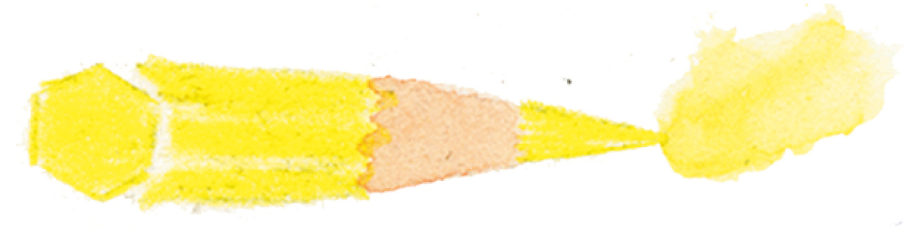
#120
COLORED PENCILS
#190
#194
#175
#103
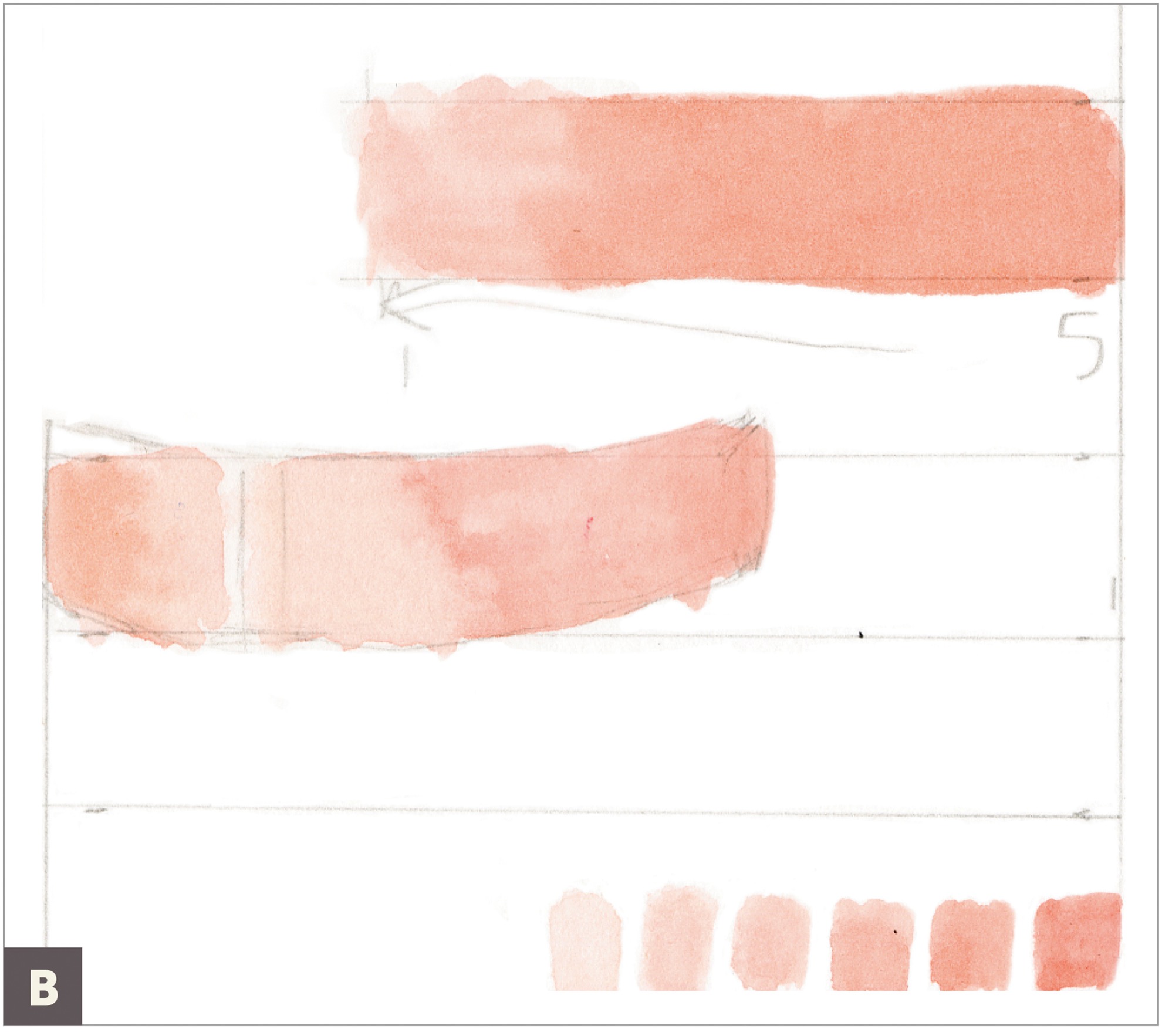
With a #2 brush, mix up a blend on your watercolor palette that’s a small amount of Pale Geranium Lake with an even smaller amount of Cadmium Yellow in a 3:1 ratio. Make a swatch of this color on your paper. Next, add in a tiny amount of Ultramarine watercolor pencil, and make a swatch next to the first swatch. Notice the difference in the color. You have now added a tiny bit of the third primary, creating a duller color. (A)

Look at it next to a Venetian Red colored pencil and see if it is a lighter version of this color. If you need to adjust your color by adding more of a particular primary, go for it. Use your visual taste buds to feel if your color needs warmth (yellow), dulling (blue), or more red, for example. (B)

Draw your petal with a graphite pencil, and paint it with your Venetian red watercolor mix. Let it dry. (C)
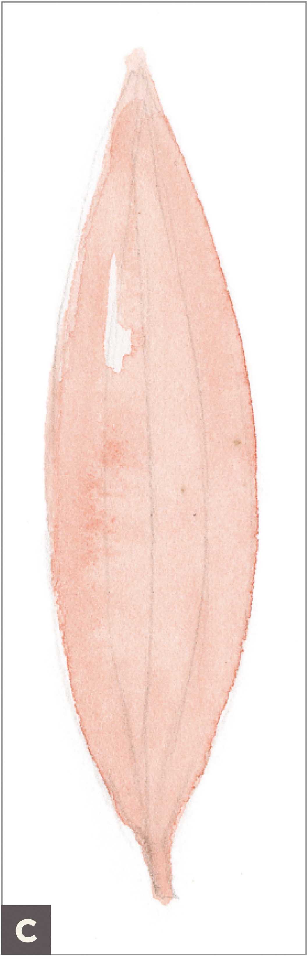
With a Venetian Red colored pencil, use your grisaille toning on top of the petal. For shadows, add in Red Violet and a touch of Dark Sepia, and burnish with Ivory colored pencils. (D)

Reapply all colors on top for a smooth blending of colors. (E)