Figure 543: The Dynamic Sample Application
Visually representing collections of items is an important aspect of
many mobile apps. The classic Android implementation of this was the
AdapterView family of widgets: ListView, GridView, Spinner, and
so on. However, they had their limitations, particularly with respect to
advanced capabilities like animating changes in the list contents.
In 2014, Google released RecyclerView, via the Android Support package.
Developers can add the recyclerview-v7 to their projects and use
RecyclerView as a replacement for most of the AdapterView family.
RecyclerView was written from the ground up to be a more flexible
container, with lots of hooks and delegation to allow behaviors to be
plugged in.
This had two major impacts:
RecyclerView is indeed much more powerful than its AdapterView
counterpartsRecyclerView, out of the box, is nearly useless, and wiring together
enough stuff to even replicate basic ListView/GridView functionality
takes quite a bit of codeIn this chapter, we will review RecyclerView from the ground up, starting
with basic operation. Many of the ListView samples from elsewhere in the
book will be replicated here, to see how to pull off the same things with
RecyclerView. And, we will explore some of the additional capabilities
that make RecyclerView perhaps worth the effort on high-end Android
applications.
Understanding this chapter requires that you have read the core chapters,
particularly the one on AdapterView and adapters.
One section involves the use of custom XML drawables.
Another section demonstrates using content pulled from
the MediaStore ContentProvider.
This chapter also covers things like action modes
and other advanced ListView techniques.
AdapterView, and particularly its ListView and GridView
subclasses, serve important roles in Android application development.
And, for basic scenarios, they work reasonably well.
However, there are issues.
Perhaps the biggest tactical issue is that updating an AdapterView tends to be an
all-or-nothing affair. If there is a change to the model data — new
rows added, existing rows removed, or data changes that might affect
the AdapterView presentation — the only well-supported solution is
to call notifyDataSetChanged() and have the AdapterView rebuild
itself. This is slow and can have impacts on things like choice states.
And, if you wanted to get really elaborate about your changes, and
use animated effects to show where rows got added or removed, that was
halfway to impossible.
Strategically, AdapterView, AbsListView (the immediate parent of
ListView and GridView), and ListView are large piles of code
that resemble pasta to
many outsiders. There are so many responsibilities piled into these
classes that maintainability was a challenge for Google and extensibility
was a dream more than a reality.
RecyclerView is designed to correct those sorts of flaws.
RecyclerView, on its own, does very little other than help manage
view recycling (e.g., row recycling of a vertical list). It delegates
almost everything else to other classes, such as:
This is on top of the adapters and view holders that were the hallmarks
of conventional AdapterView usage.
Because things like layout managers are handled via abstract classes and replaceable concrete implementations, third-party developers can contribute options for developers to use, just as Google does. Later in this chapter, we will explore some of these contributions.
On the flip side, though, RecyclerView does much less “out of the box”
than does ListView or GridView. Not everything that is missing is
supplied anywhere in the recyclerview-v7 library, requiring that you
either roll a bunch of code yourself or rely upon those third-party
libraries to get anything much done.
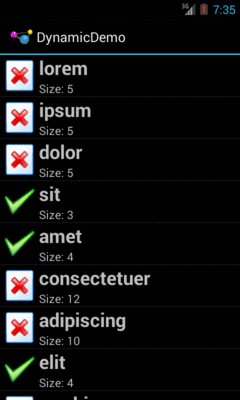
Back in the original chapter on AdapterView and adapters,
we had the Selection/Dynamic sample app. This app would display a list
of 25 Latin words, each with the word’s length and an accompanying icon
(different for short and long words):
Figure 543: The Dynamic Sample Application
Here, we will review the
RecyclerView/SimpleList
sample project, which is a first pass at porting the Selection/Dynamic
demo over to use RecyclerView.
Any project that wishes to use RecyclerView needs to have access
to the recyclerview-v7 library from the Android Support package.
Android Studio users can simply have a reference to it in the
top-level dependencies closure:
apply plugin: 'com.android.application'

dependencies {
    compile 'com.android.support:recyclerview-v7:22.2.0'
}

android {
    compileSdkVersion 22
    buildToolsVersion "22.0.1"
}
However, if you are using recyclerview-v7, you want to use version 23 or higher
of that library. There are
changes to ART –
the Android runtime used on Android 5.0+ — that apparently will
break the older versions of recyclerview-v7 when running on Android
6.0+ devices.
With ListView, we could use ListActivity, to isolate some of the
ListView-management code. There is no RecyclerViewActivity in the
recyclerview-v7 library… but we can create one:
package com.commonsware.android.recyclerview.simplelist;

import android.app.Activity;
import android.support.v7.widget.RecyclerView;

public class RecyclerViewActivity extends Activity {
  private RecyclerView rv=null;

  public void setAdapter(RecyclerView.Adapter adapter) {
    getRecyclerView().setAdapter(adapter);
  }

  public RecyclerView.Adapter getAdapter() {
    return(getRecyclerView().getAdapter());
  }

  public void setLayoutManager(RecyclerView.LayoutManager mgr) {
    getRecyclerView().setLayoutManager(mgr);
  }

  public RecyclerView getRecyclerView() {
    if (rv==null) {
      rv=new RecyclerView(this);
      rv.setHasFixedSize(true);
      setContentView(rv);
    }

    return(rv);
  }
}
The important part is the getRecyclerView() method. Here, if we have
not already initialized the RecyclerView, we create an instance of it and
set it as the activity’s content view via setContentView(). Along the
way, we call setHasFixedSize(true) on the RecyclerView, to tell it
that its size should not be changing based upon the contents of the
adapter. This knowledge can help RecyclerView operate more efficiently.
The RecyclerViewActivity also has getAdapter() and setAdapter() analogues
for their ListActivity counterparts. We will explore the differences
in the adapter classes later in this section.
We also have a setLayoutManager() convenience method, that just calls
setLayoutManager() on the underlying RecyclerView — we will see what
a layout manager is in the context of RecyclerView
in the next section.
There are other features of ListActivity that are not mirrored here
in RecyclerViewActivity, just to keep RecyclerViewActivity short.
Notably, ListActivity supports either inflating a custom layout that
contains the ListView or creating its own. RecyclerViewActivity
does not support this, though it could with some minor extensions.
The “real” activity of the project is MainActivity, which consists
of a single method: onCreate()
  @Override
  public void onCreate(Bundle icicle) {
    super.onCreate(icicle);

    setLayoutManager(new LinearLayoutManager(this));
    setAdapter(new IconicAdapter());
  }
After chaining to the superclass, the first thing we do is call
setLayoutManager(), which will associate a RecyclerView.LayoutManager with
our RecyclerView. Specifically, we are using a LinearLayoutManager.
ListView has the notion of a vertically-scrolling list of
rows “baked into” its implementation. Similarly, GridView has the notion of
a two-dimensional vertically-scrolling grid “baked into” its implementation.
RecyclerView, on the other hand, knows absolutely nothing about how
to lay out its children. That work is delegated to a RecyclerView.LayoutManager, so that
different approaches can be plugged in as needed.
There are three concrete subclasses of the abstract RecyclerView.LayoutManager base
class that ship with recyclerview-v7:
LinearLayoutManager, which implements a vertically-scrolling list,
akin to ListView
GridLayoutManager, which implements a two-dimensional vertically-scrolling
list, akin to GridView
StaggeredGridLayoutManager, which implements a “staggered grid”, which
has columns of cells like a GridView, but where the cells do not have to
all have the same sizeIn addition, it is eminently possible to create your own RecyclerView.LayoutManager,
or use ones from third-party libraries.
In this example, though, we stick with a simple LinearLayoutManager, as
we are attempting to replicate the functionality of a ListView.
Our onCreate() method also calls setAdapter(), to associate an
RecyclerView.Adapter with our RecyclerView (specifically, a revised
version of our IconicAdapter from the original Selection/Dynamic
sample app). As with the AdapterView family,
RecyclerView uses an adapter to help convert our model data into
visual representations. However, the implementation of a RecyclerView.Adapter
is substantially different from a classic ListAdapter for use with
ListView or GridView.
Reminiscent of ArrayAdapter, a RecyclerView.Adapter uses generics,
and we declare what sort of stuff we are adapting. However, ArrayAdapter
uses the generic to describe the model data. RecyclerView.Adapter instead
uses the generic to identify a ViewHolder that will be responsible
for doing the work to actually tie model data to row widgets:
  class IconicAdapter extends RecyclerView.Adapter<RowHolder> {
    @Override
    public RowHolder onCreateViewHolder(ViewGroup parent, int viewType) {
      return(new RowHolder(getLayoutInflater()
                            .inflate(R.layout.row, parent, false)));
    }

    @Override
    public void onBindViewHolder(RowHolder holder, int position) {
      holder.bindModel(items[position]);
    }

    @Override
    public int getItemCount() {
      return(items.length);
    }
  }
In our case, IconicAdapter is using a RowHolder class that we will
examine in the next section.
A RecyclerView.Adapter has three abstract methods that need to be implemented.
One is getItemCount(), which fills the same role as does getCount()
with a ListAdapter, indicating how many items there will be in the
RecyclerView. In the case of IconicAdapter, this is based on the
length of the items static array of String objects, same as it was
with IconicAdapter in the Selection/Dynamic sample app:
  private static final String[] items={"lorem", "ipsum", "dolor",
          "sit", "amet",
          "consectetuer", "adipiscing", "elit", "morbi", "vel",
          "ligula", "vitae", "arcu", "aliquet", "mollis",
          "etiam", "vel", "erat", "placerat", "ante",
          "porttitor", "sodales", "pellentesque", "augue", "purus"};
The other two methods are onCreateViewHolder() and onBindViewHolder().
These are a bit reminiscent of the newView() and bindView() methods
that are used by a CursorAdapter. However, rather than working directly
with views, onCreateViewHolder() and onBindViewHolder() work with
ViewHolder objects, as a formalization of the view holder pattern
seen originally in the chapter on selection widgets.
onCreateViewHolder(), as the name suggests, needs to create, configure,
and return a ViewHolder for a particular row of our list. It is passed
two parameters:
ViewGroup that will hold the views managed by the holder, mostly
for use with layout inflation, andint that is the particular view type we are using, for cases where
we have multiple view types
The IconicAdapter implementation inflates our row view (R.layout.row)
and passes it to the RowHolder constructor, returning the resulting
RowHolder.
onBindViewHolder() is responsible for updating a ViewHolder based
upon the model data for a certain position. IconicAdapter
handles this by passing the model into a private bindModel() method
implemented on RowHolder.
There are many other methods you could override on RecyclerView.Adapter,
and we will see a few of those later in this chapter. But, for a simple
list, these three will suffice.
The RecyclerView.ViewHolder is responsible for binding data as needed
from our model into the widgets for a row in our list:
  static class RowHolder extends RecyclerView.ViewHolder {
    TextView label=null;
    TextView size=null;
    ImageView icon=null;
    String template=null;

    RowHolder(View row) {
      super(row);

      label=(TextView)row.findViewById(R.id.label);
      size=(TextView)row.findViewById(R.id.size);
      icon=(ImageView)row.findViewById(R.id.icon);

      template=size.getContext().getString(R.string.size_template);
    }

    void bindModel(String item) {
      label.setText(item);
      size.setText(String.format(template, item.length()));

      if (item.length()>4) {
        icon.setImageResource(R.drawable.delete);
      }
      else {
        icon.setImageResource(R.drawable.ok);
      }
    }
  }
However, other than needing to use the base class of RecyclerView.ViewHolder,
there is no other particular protocol that is mandated between the
adapter and the view holder. You can invent your own API. Here, we use
the RowHolder constructor to pass in the row View, where the constructor
retrieves the individual widgets and sets up our string resource template.
Then, a private bindModel() method takes our model object (a String)
and binds it to the row’s widgets, applying our business rules along
the way.
As the project name suggests, this gives us a simple list:
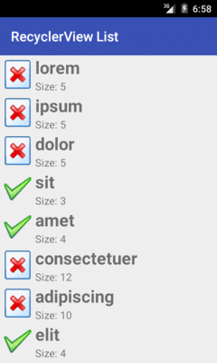
Figure 544: SimpleList RecyclerView Demo
As with ListView, RecyclerView (along with the RecyclerView.LayoutManager)
handles the vertical scrolling through our available rows.
However, we are lacking two things that we had in the Selection/Dynamic
edition of this sample that used a ListView.
First, there are no dividers between the rows. That may not be a huge issue for this particular row layout, but other layouts may need more assistance in visually separating one row from the next. We will explore ways of accomplishing this in the next section.
Second, we are missing click events. The user can tap on rows as much as
she wants. Not only will the user not get any visual feedback from those
taps, but we have no setOnItemClickListener() to find out about
those taps. We will explore how to fill in this gap
later in the chapter.
RecyclerView also lacks a variety of other things that we could get
from a ListView, that we happen to not be using in this sample, such
as:
We will explore some of those and how to address them in this chapter.
There are two main approaches for visually separating items in a
RecyclerView:
CardView
RecyclerView.ItemDecoration to apply a common divider
between itemsBoth of these techniques will be covered in this chapter.
Cards are a popular visual metaphor in mobile development. Dividing content collections (or aspects of a larger piece of content) into cards makes it clearer how you can reorganize that content to fit various screen sizes and orientations. In some cases, you might have a single column of cards, while in other cases, you have cards arranged more laterally.
In 2014, Google released cardview-v7, another library in the Android
Support package, that offers a CardView. CardView is a simple subclass
of FrameLayout, designed to provide a card UI, consisting of a rounded
rectangle and a drop shadow. In particular, CardView will use
Android 5.0’s default drop shadows based on widget elevation, while offering
emulated drop shadows on earlier Android releases. This way, you can get
a reasonably consistent look going back to API Level 7.
To use this, you will have to add the cardview-v7 library to your
app project. Android Studio users can just add a dependency on
the cardview-v7 artifact in the Android Support repository, as seen in the
RecyclerView/CardViewList
sample project:
dependencies {
    compile 'com.android.support:recyclerview-v7:22.2.0'
    compile 'com.android.support:cardview-v7:22.2.0'
}
Then, you can wrap your row layout in a CardView (or, more accurately,
in an android.support.v7.widget.CardView):
<?xml version="1.0" encoding="utf-8"?>
<android.support.v7.widget.CardView
  xmlns:android="http://schemas.android.com/apk/res/android"
  xmlns:cardview="http://schemas.android.com/apk/res-auto"
  android:layout_width="match_parent"
  android:layout_height="wrap_content"
  android:layout_margin="4dp"
  cardview:cardCornerRadius="4dp">

  <LinearLayout
    android:layout_width="match_parent"
    android:layout_height="wrap_content"
    android:orientation="horizontal">

    <ImageView
      android:id="@+id/icon"
      android:layout_width="wrap_content"
      android:layout_height="wrap_content"
      android:layout_gravity="center_vertical"
      android:padding="2dip"
      android:src="@drawable/ok"
      android:contentDescription="@string/icon"/>

    <LinearLayout
      android:layout_width="match_parent"
      android:layout_height="wrap_content"
      android:orientation="vertical">

      <TextView
        android:id="@+id/label"
        android:layout_width="wrap_content"
        android:layout_height="wrap_content"
        android:textSize="25sp"
        android:textStyle="bold"/>

      <TextView
        android:id="@+id/size"
        android:layout_width="wrap_content"
        android:layout_height="wrap_content"
        android:textSize="15sp"/>
    </LinearLayout>

  </LinearLayout>
</android.support.v7.widget.CardView>
With no other code changes from the original RecyclerView/SimpleList sample,
we get this:
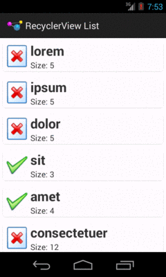
Figure 545: CardViewList RecyclerView Demo
Note that drop shadows from CardView may not show up on Android 5.0+
emulators, particularly if you have Host GPU mode disabled in the
emulator AVD. The CardView itself will work fine, just without the
drop shadow effect.
A CardView may not be an appropriate visual approach for your list.
Perhaps you want a regular divider, like we had with ListView.
While that is possible, it is not especially straightforward.
RecyclerView considers things like dividers to be “item decorations”.
There is a RecyclerView.ItemDecoration abstract class that you can
extend to handle item decoration, and you can attach such a decoration
to a RecyclerView via addItemDecoration(). As the name suggests,
you can have more than one decorator if needed.
However, Google did not bother to provide any concrete implementation of such a decoration.
A few enterprising developers experimented with this, leading to
solutions like
this one, published as a GitHub gist.
The
RecyclerView/ManualDividerList
sample project demonstrates the use of such a decoration.
First, we will need a drawable resource for the divider itself:
<?xml version="1.0" encoding="utf-8"?>
<shape xmlns:android="http://schemas.android.com/apk/res/android"
       android:shape="rectangle">

  <size
    android:width="1dp"
    android:height="1dp" />

  <solid android:color="@color/divider" />

</shape>
This is a ShapeDrawable, as is covered in the chapter on drawables.
The big thing is the solid fill, here pointing to a color resource for the
color to use for that fill:
<?xml version="1.0" encoding="utf-8"?>
<resources>
  <color name="divider">#ffaaaaaa</color>
</resources>
The ShapeDrawable is given a size of 1dp square. In reality, it will be
resized on the fly by the decorator to fill the width of the RecyclerView.
Note that there is nothing especially magic about using this particular drawable.
You could have a gradient fill to have the divider taper off towards the ends
and be solid in the middle. Or, you could use a nine-patch PNG file,
a VectorDrawable on Android 5.0+, or anything else that will resize
well.
Next, we need a RecyclerView.ItemDecoration implementation, such as
the sample project’s HorizontalDividerItemDecoration:
package com.commonsware.android.recyclerview.manualdivider;

import android.graphics.Canvas;
import android.graphics.drawable.Drawable;
import android.support.v7.widget.RecyclerView;
import android.view.View;

// inspired by https://gist.github.com/polbins/e37206fbc444207c0e92

public class HorizontalDividerItemDecoration extends RecyclerView.ItemDecoration {
  private Drawable divider;

  public HorizontalDividerItemDecoration(Drawable divider) {
    this.divider=divider.mutate();
  }

  @Override
  public void onDrawOver(Canvas c, RecyclerView parent, RecyclerView.State state) {
    int left=parent.getPaddingLeft();
    int right=parent.getWidth()-parent.getPaddingRight();

    int childCount=parent.getChildCount();

    for (int i=0; i<childCount-1; i++) {
      View child=parent.getChildAt(i);
      RecyclerView.LayoutParams params=
          (RecyclerView.LayoutParams)child.getLayoutParams();

      int top=child.getBottom()+params.bottomMargin;
      int bottom=top+divider.getIntrinsicHeight();

      divider.setBounds(left, top, right, bottom);
      divider.draw(c);
    }
  }
}
This class takes the Drawable that is the divider as input, so it
can be used for different dividers as needed.
HorizontalDividerItemDecoration calls mutate() on the Drawable
to get a Drawable that can be changed independently of any original
instance of the Drawable. This is important when using Drawable
resources, as the Drawable instances get reused for other references to
the same resource, so changing the core Drawable itself (e.g., via
a setBounds() call) is unsafe.
The main logic of HorizontalDividerItemDecoration resides in the
onDrawOver() method. This will be called to let us draw over top
of the items in the RecyclerView. Here we:
RecyclerView, but subtracting the padding, so
that we only draw inside of that paddingRecyclerView, find the vertical
location for that divider, resize the divider to fit the desired space,
and then draw the divider on the supplied Canvas, skipping the last
child so we do not draw a divider at the bottom of the listUsing that bit of magic, then, is merely a matter of attaching our
HorizontalDividerItemDecoration to our RecyclerView, done here
in onCreate() of MainActivity:
  @Override
  public void onCreate(Bundle icicle) {
    super.onCreate(icicle);

    setLayoutManager(new LinearLayoutManager(this));

    Drawable divider=getResources().getDrawable(R.drawable.item_divider);

    getRecyclerView().addItemDecoration(new HorizontalDividerItemDecoration(divider));
    setAdapter(new IconicAdapter());
  }
The rest of the sample project is a clone of the original SimpleList
sample project from the beginning of this chapter.
The result is that we have a divider drawn between the children:
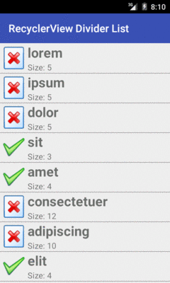
Figure 546: ManualDividerList RecyclerView Demo
If the idea of having to do all of this yourself irritates you, there are third-party libraries that offer item decorations that you can use “out of the box”. We will examine one such library later in this chapter.
However, having nice dividers does not address the larger problem: responding to input.
The RecyclerView vision, overall, is that RecyclerView itself has
nothing much to do with input, other than scrolling. Anything having
to do with users clicking things and triggering some sort of response
is the responsibility of the views inside the RecyclerView, such
as the rows in a list-style RecyclerView.
This has its benefits. Clickable widgets, like a RatingBar, in a
ListView row had long been in conflict with click events on rows
themselves. Getting rows that can be clicked, with row contents that
can also be clicked, gets a bit tricky at times. With RecyclerView,
you are in more explicit control over how this sort of thing gets
handled… because you are the one setting up all of the on-click
handling logic.
Of course, that does not help the users much. Users do not care what bit of code is responsible for input. Users simply want to provide the input. If you present them with a vertically-scrolling list-style UI, they will attempt to click on rows in the list and will expect some sort of outcome.
The RecyclerView approach, though, means that you are largely on your
own for handling that input. This requires yet more code that, in an
ideal world, would be offered as an “out of the box” option by
RecyclerView.
At its core, responding to clicks is a matter of setting an OnClickListener
on the appropriate Views.
So, for example, the
RecyclerView/CardClickList
sample project is a clone of the
CardViewList sample, where we call setOnClickListener() on the
row View in the RecyclerView.ViewHolder, now renamed RowController:
package com.commonsware.android.recyclerview.cardclicklist;

import android.support.v7.widget.RecyclerView;
import android.view.View;
import android.widget.ImageView;
import android.widget.TextView;
import android.widget.Toast;

class RowController extends RecyclerView.ViewHolder
    implements View.OnClickListener {
  TextView label=null;
  TextView size=null;
  ImageView icon=null;
  String template=null;

  RowController(View row) {
    super(row);

    label=(TextView)row.findViewById(R.id.label);
    size=(TextView)row.findViewById(R.id.size);
    icon=(ImageView)row.findViewById(R.id.icon);

    template=size.getContext().getString(R.string.size_template);

    row.setOnClickListener(this);
  }

  @Override
  public void onClick(View v) {
    Toast.makeText(v.getContext(),
        String.format("Clicked on position %d", getAdapterPosition()),
        Toast.LENGTH_SHORT).show();
  }

  void bindModel(String item) {
    label.setText(item);
    size.setText(String.format(template, item.length()));

    if (item.length()>4) {
      icon.setImageResource(R.drawable.delete);
    }
    else {
      icon.setImageResource(R.drawable.ok);
    }
  }
}
In this sample, all the onClick() method does is show a Toast. However,
you could:
RowController
constructor) to delegate the event to a higher-order controller, orIn this case, since none of the widgets in the row are interactive and might
consume click events themselves, the user can tap anywhere on the row,
and the Toast will appear. If you have more complex scenarios — such as
a checklist where you have a CheckBox in the rows — you can decide for yourself
how to handle click events on different parts of the row. We will see checklists
in action later in this chapter.
However, if you run the CardClickList sample, you will notice one major
remaining flaw: there is no visual feedback to the user about the click
event. Yes, the Toast appears, but users are used to seeing some sort of
transient state change in the row itself on a click, such as a flash of
color. Once again, we have the ability to control this as we see fit… by
having the responsibility to make it happen at all.
There are a few approaches to this problem, such as the ones outlined in this section.
An approach that Mark Allison suggested in
his Styling Android blog
mimics the drawSelectorOnTop approach available to ListView.
Using something like a FrameLayout, you layer a translucent selector
atop the rows, where the selector implements the click feedback.
The
RecyclerView/CardRippleList
sample project is a clone of CardClickList that takes
Mr. Allison’s approach. The revised row.xml takes advantage of the
fact that CardView is a subclass of FrameLayout, so it layers
a plain View atop the LinearLayout that is the core content of the
row:
<?xml version="1.0" encoding="utf-8"?>
<android.support.v7.widget.CardView
  xmlns:android="http://schemas.android.com/apk/res/android"
  xmlns:cardview="http://schemas.android.com/apk/res-auto"
  android:layout_width="match_parent"
  android:layout_height="wrap_content"
  android:layout_margin="4dp"
  cardview:cardCornerRadius="4dp">

  <LinearLayout
    android:layout_width="match_parent"
    android:layout_height="wrap_content"
    android:orientation="horizontal">

    <ImageView
      android:id="@+id/icon"
      android:layout_width="wrap_content"
      android:layout_height="wrap_content"
      android:layout_gravity="center_vertical"
      android:padding="2dip"
      android:src="@drawable/ok"
      android:contentDescription="@string/icon"/>

    <LinearLayout
      android:layout_width="match_parent"
      android:layout_height="wrap_content"
      android:orientation="vertical">

      <TextView
        android:id="@+id/label"
        android:layout_width="wrap_content"
        android:layout_height="wrap_content"
        android:textSize="25sp"
        android:textStyle="bold"/>

      <TextView
        android:id="@+id/size"
        android:layout_width="wrap_content"
        android:layout_height="wrap_content"
        android:textSize="15sp"/>
    </LinearLayout>

  </LinearLayout>

  <View
    android:layout_width="match_parent"
    android:layout_height="match_parent"
    android:background="?android:attr/selectableItemBackground" />

</android.support.v7.widget.CardView>
The background of that View is the selectableItemBackground from
the current theme. On apps using Theme, this will give you an orange
flash. On apps using Theme.Holo, this will give you a blue flash. On
apps using Theme.Material, this will give you a ripple animation.
And, of course, you can supply your own override value for
selectableItemBackground to use your own StateListDrawable instead.
The downsize of this approach is that the View is higher on the Z
axis than is the rest of the row content. In this case, since the
rest of the row content is non-interactive, this is not a problem.
However, if we elect to put interactive widgets in the rows — such as
CheckBox widgets to implement a checklist — now our View will
prevent the user from interacting with those widgets.
Another approach would be to apply the selectableItemBackground
to our existing row content, rather than to some separate selector
widget that overlays the row content. This is the approach taken
in the
RecyclerView/CardRippleList2
sample project. Here, the selectableItemBackground is applied to the
LinearLayout inside of the CardView:
<?xml version="1.0" encoding="utf-8"?>
<android.support.v7.widget.CardView
  xmlns:android="http://schemas.android.com/apk/res/android"
  xmlns:cardview="http://schemas.android.com/apk/res-auto"
  android:layout_width="match_parent"
  android:layout_height="wrap_content"
  android:layout_margin="4dp"
  cardview:cardCornerRadius="4dp">

  <LinearLayout
    android:layout_width="match_parent"
    android:layout_height="wrap_content"
    android:orientation="horizontal"
    android:background="?android:attr/selectableItemBackground">

    <ImageView
      android:id="@+id/icon"
      android:layout_width="wrap_content"
      android:layout_height="wrap_content"
      android:layout_gravity="center_vertical"
      android:padding="2dip"
      android:src="@drawable/ok"
      android:contentDescription="@string/icon"/>

    <LinearLayout
      android:layout_width="match_parent"
      android:layout_height="wrap_content"
      android:orientation="vertical">

      <TextView
        android:id="@+id/label"
        android:layout_width="wrap_content"
        android:layout_height="wrap_content"
        android:textSize="25sp"
        android:textStyle="bold"/>

      <TextView
        android:id="@+id/size"
        android:layout_width="wrap_content"
        android:layout_height="wrap_content"
        android:textSize="15sp"/>
    </LinearLayout>

  </LinearLayout>

</android.support.v7.widget.CardView>
For non-interactive widgets, like our TextViews and ImageView,
touch events will get propagated to the LinearLayout, which will
trigger the changes in the state of the StateListDrawable that
is the LinearLayout background. Yet, if we change the rows to have
interactive widgets, those widgets will still be able to process their
own touch events, as we will see
later in this chapter.
However, particularly for this sample app, the visual effect is largely
the same as with CardRippleList: the user will get click feedback
based upon the selectableItemBackground in use given the activity’s
theme.
There is one problem with both click event implementations, though: the ripples on Android 5.0+ start in the center of each row.
According to the Material Design rules, the ripples should start where the touch event occurs, so they seem to flow outward from the finger.
To do this, you need to use the setHotspot() method, added to
Drawable in API Level 21.
setHotspot() provides to the drawable a “hot spot”, and
RippleDrawable apparently uses this as the emanation point for the
ripple effect. setHotspot() takes a pair of float values, presumably
with an eye towards using setHotspot() inside of an OnTouchListener,
as the MotionEvent reports X/Y positions of the touch event with
float values.
The
RecyclerView/CardRippleList3
sample project is a clone of CardRipple2 that adds this feature.
The row layout is the same as before. However, in RowController,
when setting up the row, we register an OnTouchListener, to find out
the low-level MotionEvent of when the user touches our row:
  RowController(View row) {
    super(row);

    label=(TextView)row.findViewById(R.id.label);
    size=(TextView)row.findViewById(R.id.size);
    icon=(ImageView)row.findViewById(R.id.icon);

    template=size.getContext().getString(R.string.size_template);

    row.setOnClickListener(this);

    if (Build.VERSION.SDK_INT >= Build.VERSION_CODES.LOLLIPOP) {
      row.setOnTouchListener(new View.OnTouchListener() {
        @TargetApi(Build.VERSION_CODES.LOLLIPOP)
        @Override
        public boolean onTouch(View v, MotionEvent event) {
          v
            .findViewById(R.id.row_content)
            .getBackground()
            .setHotspot(event.getX(), event.getY());

          return(false);
        }
      });
    }
  }
We only bother registering this listener on API Level 21+, as
there is no setHotspot() method on prior versions of Android and
therefore no need for the listener. However, if we are on an Android
5.0+ device, we intercept the touch event, pass it along
to setHotspot() on the background Drawable, and return false to
ensure that regular touch event processing proceeds.
The effect is subtle and may be difficult for you to discern. But, if you look at the touch events in slow motion (e.g., screen record a session, then examine the resulting video frame-by-frame), you will see that the ripple effect appears to emanate from the touch point, rather than from the row’s center as before. And, since this logic is only used on API Level 21+, older devices are unaffected.
So far, our model data has been a simple static array. Often times, though,
we need to be working with model data culled from a database or
ContentProvider. It may be that, for other reasons, we want to convert
the Cursor we get back from queries into an array of ordinary Java
objects. However, there is nothing stopping us from using a Cursor
more directly as the model for a RecyclerView.
The RecyclerView.Adapter is responsible for teaching the
RecyclerView.ViewHolder the model data to bind against.
The RecyclerView.Adapter base class is oblivious to how that model
data is organized: array, ArrayList, Cursor, JSONArray, etc. And
the actual bind-the-data logic for the ReyclerView.ViewHolder is our
responsibility — again, the base class is oblivious to where the
data is coming from. Hence, we can create our own protocol for passing
the model data for the needed position from the RecyclerView.Adapter
to the RecyclerView.ViewHolder. If we want to use a Cursor as the
vehicle for doing this, we are welcome to do so.
This is illustrated in the
RecyclerView/VideoList
sample project, which is a clone of the VideoList project introduced
in the chapter on the MediaStore ContentProvider.
In the original sample, the list was a ListView; in this sample, the
list is a RecyclerView.
The core “plumbing” of the app is akin to the previous RecyclerView
samples, such as using RecyclerViewActivity for handling getting
the RecyclerView on the screen. However, our row layout is now
based on the original VideoList row:
<LinearLayout xmlns:android="http://schemas.android.com/apk/res/android"
  android:layout_width="match_parent"
  android:layout_height="wrap_content"
  android:orientation="horizontal"
  android:padding="8dp"
  android:background="?android:attr/selectableItemBackground">

  <ImageView
    android:id="@+id/thumbnail"
    android:layout_width="64dp"
    android:layout_height="64dp"
    android:contentDescription="@string/thumbnail"/>

  <TextView
    android:id="@android:id/text1"
    android:layout_width="match_parent"
    android:layout_height="wrap_content"
    android:layout_marginLeft="8dp"
    android:layout_gravity="center_vertical"
    android:textSize="24sp"/>

</LinearLayout>
However, as we will now be accessing media, we need the READ_EXTERNAL_STORAGE
permission, so we request that in the manifest:
<?xml version="1.0"?>
<manifest xmlns:android="http://schemas.android.com/apk/res/android"
          package="com.commonsware.android.recyclerview.videolist"
          android:versionCode="1"
          android:versionName="1.0">

  <supports-screens
    android:anyDensity="true"
    android:largeScreens="true"
    android:normalScreens="true"
    android:smallScreens="true"/>

  <uses-permission android:name="android.permission.READ_EXTERNAL_STORAGE" />

  <application
    android:icon="@drawable/ic_launcher"
    android:theme="@style/Theme.Apptheme">
    <activity
      android:name=".MainActivity"
      android:label="@string/app_name">
      <intent-filter>
        <action android:name="android.intent.action.MAIN"/>

        <category android:name="android.intent.category.LAUNCHER"/>
      </intent-filter>
    </activity>
  </application>

</manifest>
And our app/build.gradle file gives us a targetSdkVersion of 23,
requiring us to deal with runtime permissions on Android 6.0+:
apply plugin: 'com.android.application'

dependencies {
    compile 'com.android.support:recyclerview-v7:23.4.0'
    compile 'com.squareup.picasso:picasso:2.5.2'
}

android {
    compileSdkVersion 23
    buildToolsVersion "23.0.2"

    defaultConfig {
        minSdkVersion 15
        targetSdkVersion 23
    }
}
onCreate() sets up the empty RecyclerView with a LinearLayoutManager
and a VideoAdapter (that we will examine shortly). However, we also
confirm whether we have READ_EXTERNAL_STORAGE already — if yes, we
call loadVideos() to get the videos. If we do not have permission, and we
are not in the middle of requesting permission, we ask for permission using
requestPermissions():
  private static final String STATE_IN_PERMISSION="inPermission";
  private static final int REQUEST_PERMS=137;
  private boolean isInPermission=false;

  @Override
  public void onCreate(Bundle icicle) {
    super.onCreate(icicle);

    setLayoutManager(new LinearLayoutManager(this));
    setAdapter(new VideoAdapter());

    if (icicle!=null) {
      isInPermission=
        icicle.getBoolean(STATE_IN_PERMISSION, false);
    }

    if (hasFilesPermission()) {
      loadVideos();
    }
    else if (!isInPermission) {
      isInPermission=true;

      ActivityCompat.requestPermissions(this,
        new String[] {Manifest.permission.READ_EXTERNAL_STORAGE},
        REQUEST_PERMS);
    }
  }
hasFilesPermission() just uses checkSelfPermission() to see whether
we can read external storage:
  private boolean hasFilesPermission() {
    return(ContextCompat.checkSelfPermission(this,
      Manifest.permission.READ_EXTERNAL_STORAGE)==
      PackageManager.PERMISSION_GRANTED);
  }
We then call loadVideos() once we have permission, plus keep track of
whether or not we are in the process of requesting permissions (so we do
not raise the permission dialog again if we undergo a configuration
change while the permission dialog is already on-screen):
  @Override
  protected void onSaveInstanceState(Bundle outState) {
    super.onSaveInstanceState(outState);

    outState.putBoolean(STATE_IN_PERMISSION, isInPermission);
  }

  @Override
  public void onRequestPermissionsResult(int requestCode,
                                         String[] permissions,
                                         int[] grantResults) {
    isInPermission=false;

    if (requestCode==REQUEST_PERMS) {
      if (hasFilesPermission()) {
        loadVideos();
      }
      else {
        finish(); // denied permission, so we're done
      }
    }
  }
loadVideos() just calls initLoader() to request that we load
the videos from the MediaStore:
  private void loadVideos() {
    getLoaderManager().initLoader(0, null, this);
  }
The CursorLoader logic, for getting details about videos from the
MediaStore, is pretty much the same as before, other than providing
the Cursor to the VideoAdapter when it is ready:
  @Override
  public Loader<Cursor> onCreateLoader(int arg0, Bundle arg1) {
    return(new CursorLoader(this,
                            MediaStore.Video.Media.EXTERNAL_CONTENT_URI,
                            null, null, null,
                            MediaStore.Video.Media.TITLE));
  }

  @Override
  public void onLoadFinished(Loader<Cursor> loader, Cursor c) {
    ((VideoAdapter)getAdapter()).setVideos(c);
  }

  @Override
  public void onLoaderReset(Loader<Cursor> loader) {
    ((VideoAdapter)getAdapter()).setVideos(null);
  }
VideoAdapter is another subclass of RecyclerView.Adapter, this time
with smarts for dealing with a Cursor as the source of model data:
  class VideoAdapter extends RecyclerView.Adapter<RowController> {
    Cursor videos=null;

    @Override
    public RowController onCreateViewHolder(ViewGroup parent, int viewType) {
      return(new RowController(getLayoutInflater()
                                 .inflate(R.layout.row, parent, false)));
    }

    void setVideos(Cursor videos) {
      this.videos=videos;
      notifyDataSetChanged();
    }

    @Override
    public void onBindViewHolder(RowController holder, int position) {
      videos.moveToPosition(position);
      holder.bindModel(videos);
    }

    @Override
    public int getItemCount() {
      if (videos==null) {
        return(0);
      }

      return(videos.getCount());
    }
  }
Specifically:
getItemCount() returns the count of videos from the Cursor, or 0
if the Cursor is null (mimicking the behavior of CursorAdapter, which
also treats a null Cursor as merely being one that has no rows)onCreateViewHolder() creates the RowController
onBindViewHolder() moves the Cursor to the desired position, then
passes the Cursor over to the RowController
Also note that we have a setVideos() method that is used to associate our
Cursor of video information with the adapter. This also triggers a call
to notifyDataSetChanged(), to ensure that the RecyclerView knows that
our model has changed and it should re-render its contents.
The RowController constructor retrieves the necessary widgets
from the row and setting up an OnClickListener:
  RowController(View row) {
    super(row);

    title=(TextView)row.findViewById(android.R.id.text1);
    thumbnail=(ImageView)row.findViewById(R.id.thumbnail);

    row.setOnClickListener(this);
  }
The bindModel() method invoked by onBindViewHolder() on VideoAdapter
uses the same basic logic from the original VideoList sample to populate
the row widgets, plus holds onto the Uri and MIME type of the video in
data members for the current row:
  void bindModel(Cursor row) {
    title.setText(row.getString(
      row.getColumnIndex(MediaStore.Video.Media.TITLE)));

    videoUri=
        ContentUris.withAppendedId(
          MediaStore.Video.Media.EXTERNAL_CONTENT_URI,
          row.getInt(row.getColumnIndex(MediaStore.Video.Media._ID)));

    Picasso.with(thumbnail.getContext())
      .load(videoUri.toString())
      .fit().centerCrop()
      .placeholder(R.drawable.ic_media_video_poster)
      .into(thumbnail);

    int uriColumn=row.getColumnIndex(MediaStore.Video.Media.DATA);
    int mimeTypeColumn=
        row.getColumnIndex(MediaStore.Video.Media.MIME_TYPE);

    videoMimeType=row.getString(mimeTypeColumn);
  }
The onClick() method uses those saved Uri and MIME type values for
starting up the activity to play the selected video:
  @Override
  public void onClick(View v) {
    Intent i=new Intent(Intent.ACTION_VIEW);

    i.setDataAndType(videoUri, videoMimeType);
    title.getContext().startActivity(i);
  }
Other than the lack of dividers, the UI is very similar to the
original VideoList.
This sample app is used as the basis for many other samples in this book, such as the drag-and-drop examples.
So far, we have focused on one visual representation of our collection
of model data: a vertically-scrolling list. In the AdapterView
family, a given AdapterView subclass has a specific visual
representation (ListView for a vertically-scrolling list,
GridView for a two-dimensional grid, etc.). With RecyclerView,
the choice of layout manager determines most of the visual representation,
and so switching from a list to a grid can be as simple as a single-line
change to our code.
The key, though, is the word can in the previous sentence. Depending
upon what you want to do, a grid-styled RecyclerView can be more
complicated, simply because you now have two dimensions’ worth of power
and configuration to play with.
Making a RecyclerView use a grid is a matter of swapping out
LinearLayoutManager for GridLayoutManager. In the
RecyclerView/Grid
sample project, you will see a clone of the CardRippleList3 sample app,
where we are now using GridLayoutManager in onCreate()
of MainActivity:
  @Override
  public void onCreate(Bundle icicle) {
    super.onCreate(icicle);

    setLayoutManager(new GridLayoutManager(this, 2));
    setAdapter(new IconicAdapter());
  }
GridLayoutManager takes a number of “spans”, as well as a Context,
as constructor parameters. In the simple case, as is with this app,
“spans” will equate to “columns”: each item returned by the
RecyclerView.Adapter will go into a single-row, single-span cell.
In our case, we requested two spans, and so our result resides in two columns:
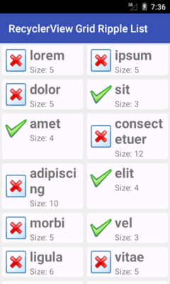
Figure 547: Grid RecyclerView Demo
In this case, this is a “true” grid, with rows and columns of cells.
Hence, the height of a row is determined by the tallest cell in that
row. The “amet” cell in the left column of the third row is taller
than required because of the word-wrap of the “consectetuer” cell
in the right column of the same row, for example.
Later in this chapter, we will examine
yet another option, StaggeredGridLayoutManager, where cells do not
necessarily line up neatly in rows.
If we rotate the screen for the above sample, you will see that the cells fit a bit better, since they are really repurposed list-style rows:
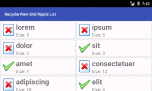
Figure 548: Grid RecyclerView Demo, Landscape
However, some apps may have smaller per-cell content. Plus, we have tablets to consider, and perhaps even televisions. It may be that you want to determine how many spans to use based on screen size and orientation.
One approach for doing that would be to use integer resources. You
could have a res/values/ints.xml file with <integer> elements,
giving the integer a name (name attribute) and value (text of the
<integer> node). You could also have res/values-w600dp/ints.xml or
other variations of the resource, where you provide different
values to use for different screen sizes. Then, at runtime,
call getResources().getInteger() to retrieve the correct value of
the resource to use for the current device, and use that
in your GridLayoutManager constructor. Now, you are in control
over how many columns there are, by controlling how many spans
are supplied to the constructor.
Another approach,
suggested by Chiu-Ki Chan,
is to create a subclass of RecyclerView, on which you provide a custom
attribute for a desired approximate column width. Then, in your
subclass’ onMeasure() method, you can calculate the number of spans
to use to give you the desired column width.
Of course, another way to take advantage of screen space is to grow
the cells. By default, they will grow evenly, as each cell takes up
one span, and the spans are evenly sizes. However, you can change
that behavior, by attaching a GridLayoutManager.SpanSizeLookup to
the GridLayoutManager. The GridLayoutManager.SpanSizeLookup
is responsible for indicating, for a given item’s position, how
many spans it should take up in the grid. We will examine how this works
later in this chapter.
So far, all of the items in the RecyclerView have had the same basic
structure, just with varying content in the widgets in those items.
But, it is entirely possible that we will want to have some items
be more substantively different, based on different layouts.
ListView and kin handle this via getViewTypeCount() and
getItemViewType() in the ListAdapter. RecyclerView and
RecyclerView.Adapter offer a similar mechanism, including their own
variant of the getItemViewType() method. In this section, we will
examine how this works, both with lists and grids.
There are many cases where we want to have a list with some sort of section headers. The look of the headers usually is substantially different than the look of the rest of the rows, and therefore the best way to handle this is to teach the adapter about multiple row types.
This can be seen in the
RecyclerView/HeaderList
sample project. This is a clone of a similar project for ListView,
where we want to put the 25 Latin words into 5 groups of 5 words each,
with each group getting its own header.
Hence, our model data is now a two-dimensional String array:
  private static final String[][] items= {
      { "lorem", "ipsum", "dolor", "sit", "amet" },
      { "consectetuer", "adipiscing", "elit", "morbi", "vel" },
      { "ligula", "vitae", "arcu", "aliquet", "mollis" },
      { "etiam", "vel", "erat", "placerat", "ante" },
      { "porttitor", "sodales", "pellentesque", "augue", "purus" } };
Our getItemCount() method now needs to take into account the headers,
as well as the regular rows. There is one header row per batch of items,
and so getItemCount() sums up the sizes of the batches with the extra
header rows:
    @Override
    public int getItemCount() {
      int count=0;

      for (String[] batch : items) {
        count+=1 + batch.length;
      }

      return(count);
    }
In order to teach RecyclerView about our different rows, we need
to implement getItemViewType(). Unlike its counterpart on ListAdapter,
getItemViewType() can return any int value, so long as it is unique
for the row type. In fact, the recommendation is to use dedicated ID
resources to ensure that uniqueness.
To that end, we define two ID resources, in a res/values/ids.xml file:
<?xml version="1.0" encoding="utf-8"?>
<resources>
  <item type="id" name="header"/>
  <item type="id" name="detail"/>
</resources>
Then, getItemViewType() can return R.id.header or R.id.detail to
identify the two row types, and specifically which row type corresponds
to the supplied position:
    @Override
    public int getItemViewType(int position) {
      if (getItem(position) instanceof Integer) {
        return(R.id.header);
      }

      return(R.id.detail);
    }

    private Object getItem(int position) {
      int offset=position;
      int batchIndex=0;

      for (String[] batch : items) {
        if (offset == 0) {
          return(Integer.valueOf(batchIndex));
        }

        offset--;

        if (offset < batch.length) {
          return(batch[offset]);
        }

        offset-=batch.length;
        batchIndex++;
      }

      throw new IllegalArgumentException("Invalid position: "
          + String.valueOf(position));
    }
This leverages a copy of the getItem() method from the original ListView
version of this sample, which returns an Integer for a header item (identifying
which header it is) and a String for detail item (identifying what
Latin word to use). Note that getItem() is not part of the
RecyclerView.Adapter protocol, but you are certainly welcome to
have one if you want it.
In onCreateViewHolder(), we can now start paying attention to
the second parameter, which we have been studiously ignoring until now.
That value, viewType, will be a value that we returned from
getItemViewType(), and it indicates what sort of RecyclerView.ViewHolder
we should return. In our case, there are only two possibilities, and so
we just inflate the appropriate layout and use a dedicated controller
class (HeaderController for headers, RowController for detail):
    @Override
    public RecyclerView.ViewHolder onCreateViewHolder(ViewGroup parent, int viewType) {
      if (viewType==R.id.detail) {
        return(new RowController(getLayoutInflater()
                     .inflate(R.layout.row, parent, false)));
      }

      return(new HeaderController(getLayoutInflater()
                    .inflate(R.layout.header, parent, false)));
    }
Similarly, our binding logic in onBindViewHolder() needs to route
the right sort of model information to the proper controller:
    @Override
    public void onBindViewHolder(RecyclerView.ViewHolder holder, int position) {
      if (holder instanceof RowController) {
        ((RowController)holder).bindModel((String)getItem(position));
      }
      else {
        ((HeaderController)holder).bindModel((Integer)getItem(position));
      }
    }
RowController is the same sort of setup as we have had in past
examples. HeaderController is too, though it is far simpler, as
we have only one widget needing to be updated (a TextView named
label) and we do not care about click events:
package com.commonsware.android.recyclerview.headerlist;

import android.support.v7.widget.RecyclerView;
import android.view.View;
import android.widget.TextView;

class HeaderController extends RecyclerView.ViewHolder {
  TextView label=null;
  String template=null;

  HeaderController(View row) {
    super(row);

    label=(TextView)row.findViewById(R.id.label);

    template=label.getContext().getString(R.string.header_template);
  }

  void bindModel(Integer headerIndex) {
    label.setText(String.format(template, headerIndex.intValue()+1));
  }
}
The results are header rows with one look-and-feel, and detail rows with a different look-and-feel:
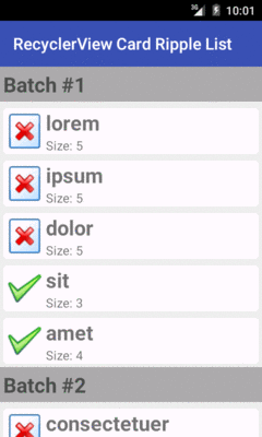
Figure 549: HeaderList RecyclerView Demo
In the discussion of RecyclerView grids, we saw that one way to
take advantage of larger screens is to have more cells, in part
by having more spans across the screen.
Another way to take advantage of screen space is to grow
the cells. By default, they will grow evenly, as each cell takes up
one span, and the spans are evenly sizes. However, you can change
that behavior, by attaching a GridLayoutManager.SpanSizeLookup to
the GridLayoutManager. The GridLayoutManager.SpanSizeLookup
is responsible for indicating, for a given item’s position, how
many spans it should take up in the grid.
One way of employing a GridLayoutManager.SpanSizeLookup is to
make a table. If you want a table, but the user should only be able
to select rows, that would be a matter of using a LinearLayoutManager
and setting up the rows with “cells” that are of consistent size per
row. For example, each row could be a horizontal LinearLayout, where
the “column” widths are determined using android:layout_weight. But
sometimes you want a table where individual cells can be clicked upon
(or selected via a five-way navigation option, like a trackball).
In this case, GridLayoutManager.SpanSizeLookup will let you indicate,
for a “column” of your output, how many spans the cell should take up.
By using a consistent number of spans for each column, you can get the
same sort of weighted column width that you might get with
LinearLayout-based rows in a LinearLayoutManager-powered
RecyclerView.
And that will make a lot more sense (hopefully) when you see an example.
The
RecyclerView/VideoTable
sample project is a clone of the VideoList sample project from earlier
in the chapter, with a few changes:
GridLayoutManager, yet still organize our
output into logical rows, by having three cells per row (title,
thumbnail, and video duration)GridLayoutManager.SpanSizeLookup to control the
widths of each column in our gridImageView in one, TextView
in others), we will use different controllers for those cells, each
optimized for handling that cell’s sort of contentThe two columns that will hold text (title and video duration) will use the following layout:
<LinearLayout xmlns:android="http://schemas.android.com/apk/res/android"
  android:layout_width="match_parent"
  android:layout_height="wrap_content"
  android:orientation="horizontal"
  android:padding="8dp"
  android:background="?android:attr/selectableItemBackground">

  <TextView
    android:id="@android:id/text1"
    android:layout_width="match_parent"
    android:layout_height="wrap_content"
    android:layout_marginLeft="8dp"
    android:layout_gravity="center_vertical"
    android:textSize="24sp"/>
</LinearLayout>
The LinearLayout root element may seem superfluous, but we are using it
for the selectableItemBackground, to provide a response when the
cell is clicked upon.
Similarly, we have a layout dedicated to the thumbnail:
<LinearLayout xmlns:android="http://schemas.android.com/apk/res/android"
  android:layout_width="match_parent"
  android:layout_height="wrap_content"
  android:orientation="horizontal"
  android:padding="8dp"
  android:background="?android:attr/selectableItemBackground">

  <ImageView
    android:id="@+id/thumbnail"
    android:layout_width="96dp"
    android:layout_height="72dp"
    android:contentDescription="@string/thumbnail"/>

</LinearLayout>
onCreate() of MainActivity is largely the same as before. This time,
though, we are creating an instance of a ColumnWeightSpanSizeLookup
class and using it for two things:
getTotalSpans() to tell the GridLayoutManager how
many spans to useGridLayoutManager.SpanSizeLookup, attaching it to the
GridLayoutManager via setSpanSizeLookup():
    ColumnWeightSpanSizeLookup spanSizer=new ColumnWeightSpanSizeLookup(COLUMN_WEIGHTS);
    GridLayoutManager mgr=new GridLayoutManager(this, spanSizer.getTotalSpans());

    mgr.setSpanSizeLookup(spanSizer);
    setLayoutManager(mgr);
    setAdapter(new VideoAdapter());
The latter point means that ColumnWeightSpanSizeLookup is a subclass
of the abstract GridLayoutManager.SpanSizeLookup base class. The one
method that you need to override in a GridLayoutManager.SpanSizeLookup
subclass is getSpanSize(). Given an item’s position, getSpanSize()
returns the number of spans that the item’s cell should… um… span.
(we overload the word “span” a lot in Android…)
ColumnWeightSpanSizeLookup handles this via a set of column weights,
which it gets as an int array in the constructor. onCreate()
referenced a COLUMN_WEIGHTS static data member for the weights:
private static final int[] COLUMN_WEIGHTS={1, 4, 1};
This int array tells us both how many columns there are and how wide
each column should be, in terms of spans.
Converting the position to a column index is a matter of applying
the modulo (%) operator, so the implementation of getSpanSize() on
ColumnWeightSpanSizeLookup just returns the columnWeights value
for the desired column:
package com.commonsware.android.recyclerview.videotable;

import android.support.v7.widget.GridLayoutManager;

class ColumnWeightSpanSizeLookup extends GridLayoutManager.SpanSizeLookup {
  private final int[] columnWeights;

  ColumnWeightSpanSizeLookup(int[] columnWeights) {
    this.columnWeights=columnWeights;
  }

  @Override
  public int getSpanSize(int position) {
    return(columnWeights[position % columnWeights.length]);
  }

  int getTotalSpans() {
    int sum=0;

    for (int weight : columnWeights) {
      sum+=weight;
    }

    return(sum);
  }
}
getTotalSpans() is a convenience method, to sum all of the column weights.
That is how many spans the GridLayoutManager will use overall, with each
column getting its specific number of spans based upon the int array.
Note that while we hard-coded the int array values in this case, there
is nothing stopping us from using <integer-array> resources to pull these
values out of the Java code, and perhaps even vary them by screen size
or other configuration variations.
All of that will set up our grid with the correct number of spans and
the right number of spans to use per column of the output. The combination
will give us the row structure, as each row’s worth of columns uses all
of the spans for that row, forcing GridLayoutManager to put subsequent
items on the next row.
The rest of the project is focused on having different widgets for those
different cells, using getItemViewType() and so on.
The VideoAdapter implementation of getItemViewType() simply returns
the position modulo 3, to return a unique value (in this case, 0, 1,
or 2):
    @Override
    public int getItemViewType(int position) {
      return(position % 3);
    }
getItemCount() takes into account that there are three cells per
video, and so the number of items being managed by this adapter is
triple the number of videos:
    @Override
    public int getItemCount() {
      if (videos==null) {
        return(0);
      }

      return(videos.getCount()*3);
    }
The onCreateViewHolder() and onBindViewHolder() methods take into
account those three item types, using a VideoThumbnailController
or a VideoTextController depending on the item type. Both of those
classes will inherit from a BaseVideoController, which defines a
bindModel() method that onBindViewHolder() can use:
    @Override
    public BaseVideoController onCreateViewHolder(ViewGroup parent, int viewType) {
      BaseVideoController result=null;

      switch(viewType) {
        case 0:
          result=new VideoThumbnailController(getLayoutInflater()
                                                 .inflate(R.layout.thumbnail,
                                                          parent, false));
          break;

        case 1:
          int cursorColumn=videos.getColumnIndex(MediaStore.Video.VideoColumns.DISPLAY_NAME);

          result=new VideoTextController(getLayoutInflater()
                                            .inflate(R.layout.label,
                                                parent, false),
                                          android.R.id.text1,
                                          cursorColumn);
          break;

        case 2:
          cursorColumn=videos.getColumnIndex(MediaStore.Video.VideoColumns.DURATION);

          result=new VideoTextController(getLayoutInflater()
                                            .inflate(R.layout.label,
                                                parent, false),
                                          android.R.id.text1,
                                          cursorColumn);
          break;
      }

      return(result);
    }

    @Override
    public void onBindViewHolder(BaseVideoController holder, int position) {
      videos.moveToPosition(position/3);
      holder.bindModel(videos);
    }
BaseVideoController handles click events on the cell, along with
collecting the Uri and MIME type of the video to use on click events:
package com.commonsware.android.recyclerview.videotable;

import android.content.ContentUris;
import android.content.Intent;
import android.database.Cursor;
import android.net.Uri;
import android.provider.MediaStore;
import android.support.v7.widget.RecyclerView;
import android.view.View;

abstract class BaseVideoController extends RecyclerView.ViewHolder
    implements View.OnClickListener {
  private Uri videoUri=null;
  private String videoMimeType=null;

  BaseVideoController(View cell) {
    super(cell);

    cell.setOnClickListener(this);
  }

  @Override
  public void onClick(View v) {
    Intent i=new Intent(Intent.ACTION_VIEW);

    i.setDataAndType(videoUri, videoMimeType);
    itemView.getContext().startActivity(i);
  }

  void bindModel(Cursor row) {
    int mimeTypeColumn=
        row.getColumnIndex(MediaStore.Video.Media.MIME_TYPE);

    videoUri=ContentUris.withAppendedId(
      MediaStore.Video.Media.EXTERNAL_CONTENT_URI,
      row.getInt(row.getColumnIndex(MediaStore.Video.Media._ID)));
    videoMimeType=row.getString(mimeTypeColumn);
  }
}
VideoTextController extends BaseVideoController and handles binding
some column from the MediaStore Cursor to a TextView with some
ID:
package com.commonsware.android.recyclerview.videotable;

import android.database.Cursor;
import android.view.View;
import android.widget.TextView;

class VideoTextController extends BaseVideoController {
  private TextView label=null;
  private int cursorColumn;

  VideoTextController(View cell, int labelId, int cursorColumn) {
    super(cell);
    this.cursorColumn=cursorColumn;

    label=(TextView)cell.findViewById(labelId);
  }

  @Override
  void bindModel(Cursor row) {
    super.bindModel(row);

    label.setText(row.getString(cursorColumn));
  }
}
VideoThumbnailController handles using Picasso to get the video thumbnail
asynchronously and binding it to an ImageView in the inflated cell View:
package com.commonsware.android.recyclerview.videotable;

import android.content.ContentUris;
import android.database.Cursor;
import android.net.Uri;
import android.provider.MediaStore;
import android.view.View;
import android.widget.ImageView;
import com.squareup.picasso.Picasso;

class VideoThumbnailController extends BaseVideoController {
  private ImageView thumbnail=null;

  VideoThumbnailController(View cell) {
    super(cell);

    thumbnail=(ImageView)cell.findViewById(R.id.thumbnail);
  }

  @Override
  void bindModel(Cursor row) {
    super.bindModel(row);

    Uri video=
        ContentUris.withAppendedId(
          MediaStore.Video.Media.EXTERNAL_CONTENT_URI,
          row.getInt(row.getColumnIndex(MediaStore.Video.Media._ID)));

    Picasso.with(thumbnail.getContext())
      .load(video.toString())
      .fit().centerCrop()
      .placeholder(R.drawable.ic_media_video_poster)
      .into(thumbnail);
  }
}
The result is the same information as was in the original VideoList
demo, but organized into a table, where each cell is clickable:

Figure 550: VideoTable RecyclerView Demo
The duration is returned by MediaStore in milliseconds, which is not a
great choice to present directly to the user. An improved version of this
app might use a dedicated RecyclerView.ViewHolder that would convert
the millisecond count into a duration measured in hours, minutes, and
seconds (e.g., shown as HH:MM:SS to the user).
Also note that the cell sizes are purely driven by their weights, which will not necessarily handle all content in all configurations very well. The chosen weights barely work on a 10" tablet in portrait, for example:

Figure 551: VideoTable RecyclerView Demo, Portrait
So far, all of the items we have used have been display-only. At most,
they might respond to click events, along the lines of clicking a ListView
row or GridView cell.
But, what about choice modes?
ListView and GridView — by way of their common AbsListView ancestor –
have the concept of choice modes, where the user can “check” and “uncheck”
items, and the list or grid will keep track of those states.
Well, as with lots of other things involving RecyclerView, RecyclerView
does not offer choice modes… though you can implement that yourself.
The
RecyclerView/ChoiceList
sample project turns our list-style RecyclerView into a checklist,
with CheckBox widgets in each row, where the RecyclerView.Adapter
will keep track of the CheckBox checked states for us.
First, we need to add a CheckBox to the row:
<?xml version="1.0" encoding="utf-8"?>
<android.support.v7.widget.CardView
  xmlns:android="http://schemas.android.com/apk/res/android"
  xmlns:cardview="http://schemas.android.com/apk/res-auto"
  android:layout_width="match_parent"
  android:layout_height="wrap_content"
  android:layout_margin="4dp"
  cardview:cardCornerRadius="4dp">

  <LinearLayout
    android:id="@+id/row_content"
    android:layout_width="match_parent"
    android:layout_height="wrap_content"
    android:orientation="horizontal"
    android:background="?android:attr/selectableItemBackground">

    <ImageView
      android:id="@+id/icon"
      android:layout_width="wrap_content"
      android:layout_height="wrap_content"
      android:layout_gravity="center_vertical"
      android:padding="2dip"
      android:src="@drawable/ok"
      android:contentDescription="@string/icon"/>

    <LinearLayout
      android:layout_width="0dip"
      android:layout_height="wrap_content"
      android:layout_weight="1"
      android:orientation="vertical">

      <TextView
        android:id="@+id/label"
        android:layout_width="wrap_content"
        android:layout_height="wrap_content"
        android:textSize="25sp"
        android:textStyle="bold"/>

      <TextView
        android:id="@+id/size"
        android:layout_width="wrap_content"
        android:layout_height="wrap_content"
        android:textSize="15sp"/>
    </LinearLayout>

    <CheckBox
      android:layout_width="wrap_content"
      android:layout_height="wrap_content"
      android:id="@+id/cb"
      android:layout_gravity="center_vertical"/>

  </LinearLayout>
</android.support.v7.widget.CardView>
Our IconicAdapter is only slightly different than before:
ChoiceCapableAdapter that we will examine
shortly, andMultiChoiceMode instance to ChoiceCapableAdapter
as part of chaining to the ChoiceCapableAdapter constructor
  class IconicAdapter extends ChoiceCapableAdapter<RowController> {
    IconicAdapter() {
      super(new MultiChoiceMode());
    }

    @Override
    public RowController onCreateViewHolder(ViewGroup parent, int viewType) {
      return(new RowController(this, getLayoutInflater()
                                      .inflate(R.layout.row, parent, false)));
    }

    @Override
    public void onBindViewHolder(RowController holder, int position) {
      holder.bindModel(items[position]);
    }

    @Override
    public int getItemCount() {
      return(items.length);
    }
  }
ChoiceCapableAdapter is simply a RecyclerView.Adapter that knows
how to handle choice modes, as implemented via the ChoiceMode
interface:
package com.commonsware.android.recyclerview.choicelist;

import android.os.Bundle;

public interface ChoiceMode {
  void setChecked(int position, boolean isChecked);
  boolean isChecked(int position);
  void onSaveInstanceState(Bundle state);
  void onRestoreInstanceState(Bundle state);
}
A ChoiceMode is effectively a strategy class, responsible for tracking
the checked states, not only for the current ChoiceCapableAdapter
instance, but for future ones created as part of a configuration change.
It requires four methods:
setChecked() and isChecked() are getters and setters for whether
or not a given position is checkedonSaveInstanceState() and onRestoreInstanceState() manage storing
and restoring those check states from the saved instance state Bundle
of an activity or fragmentThis project uses a MultiChoiceMode implementation of ChoiceMode:
package com.commonsware.android.recyclerview.choicelist;

import android.os.Bundle;

public class MultiChoiceMode implements ChoiceMode {
  private static final String STATE_CHECK_STATES="checkStates";
  private ParcelableSparseBooleanArray checkStates=new ParcelableSparseBooleanArray();

  @Override
  public void setChecked(int position, boolean isChecked) {
    checkStates.put(position, isChecked);
  }

  @Override
  public boolean isChecked(int position) {
    return(checkStates.get(position, false));
  }

  @Override
  public void onSaveInstanceState(Bundle state) {
    state.putParcelable(STATE_CHECK_STATES, checkStates);
  }

  @Override
  public void onRestoreInstanceState(Bundle state) {
    checkStates=state.getParcelable(STATE_CHECK_STATES);
  }
}
MultiChoiceMode, in turn, is mostly handled by a ParcelableSparseBooleanArray.
SparseBooleanArray is a class, supplied in the Android SDK, that is a
space-efficient mapping of int values to boolean values, as opposed to
using a HashMap and having to convert those primitives to Integer
and Boolean objects. However, for inexplicable reasons, SparseBooleanArray
was not implemented to be Parcelable, and therefore it cannot be stored
in a Bundle. ParcelableSparseBooleanArray is a subclass of SparseBooleanArray
that handles the Parcelable aspects:
package com.commonsware.android.recyclerview.choicelist;

import android.os.Parcel;
import android.os.Parcelable;
import android.util.SparseBooleanArray;

public class ParcelableSparseBooleanArray extends SparseBooleanArray
    implements Parcelable {
  public static Parcelable.Creator<ParcelableSparseBooleanArray> CREATOR
    =new Parcelable.Creator<ParcelableSparseBooleanArray>() {
    @Override
    public ParcelableSparseBooleanArray createFromParcel(Parcel source) {
      return(new ParcelableSparseBooleanArray(source));
    }

    @Override
    public ParcelableSparseBooleanArray[] newArray(int size) {
      return(new ParcelableSparseBooleanArray[size]);
    }
  };

  public ParcelableSparseBooleanArray() {
    super();
  }

  private ParcelableSparseBooleanArray(Parcel source) {
    int size=source.readInt();

    for (int i=0; i < size; i++) {
      put(source.readInt(), (Boolean)source.readValue(null));
    }
  }

  @Override
  public int describeContents() {
    return(0);
  }

  @Override
  public void writeToParcel(Parcel dest, int flags) {
    dest.writeInt(size());

    for (int i=0;i<size();i++) {
      dest.writeInt(keyAt(i));
      dest.writeValue(valueAt(i));
    }
  }
}
The net effect is that MultiChoiceMode, by means of ParcelableSparseBooleanArray,
can track the checked/unchecked states of particular item position values.
ChoiceCapableAdapter, then, is a RecyclerView.ViewHolder that surfaces
a ChoiceMode implementation:
package com.commonsware.android.recyclerview.choicelist;

import android.os.Bundle;
import android.support.v7.widget.RecyclerView;

abstract public class
    ChoiceCapableAdapter<T extends RecyclerView.ViewHolder>
    extends RecyclerView.Adapter<T> {
  private final ChoiceMode choiceMode;

  public ChoiceCapableAdapter(ChoiceMode choiceMode) {
    super();
    this.choiceMode=choiceMode;
  }

  void onChecked(int position, boolean isChecked) {
    choiceMode.setChecked(position, isChecked);
  }

  boolean isChecked(int position) {
    return(choiceMode.isChecked(position));
  }

  void onSaveInstanceState(Bundle state) {
    choiceMode.onSaveInstanceState(state);
  }

  void onRestoreInstanceState(Bundle state) {
    choiceMode.onRestoreInstanceState(state);
  }
}
The methods exposed by ChoiceCapableAdapter can then be used by outside
parties. Specifically, MainActivity delegates onSaveInstanceState()
and onRestoreInstanceState() to ChoiceCapableAdapter, so checked states
can span configuration changes and the like. Plus, RowController can
hook up on OnCheckedChangedListener and to update ChoiceCapableAdapter
based on the state of checkbox changes:
package com.commonsware.android.recyclerview.choicelist;

import android.annotation.TargetApi;
import android.os.Build;
import android.support.v7.widget.RecyclerView;
import android.view.MotionEvent;
import android.view.View;
import android.widget.CheckBox;
import android.widget.CompoundButton;
import android.widget.ImageView;
import android.widget.TextView;
import android.widget.Toast;

class RowController extends RecyclerView.ViewHolder
    implements View.OnClickListener, CompoundButton.OnCheckedChangeListener {
  private ChoiceCapableAdapter adapter;
  private TextView label=null;
  private TextView size=null;
  private ImageView icon=null;
  private String template=null;
  private CheckBox cb=null;

  RowController(ChoiceCapableAdapter adapter, View row) {
    super(row);

    this.adapter=adapter;
    label=(TextView)row.findViewById(R.id.label);
    size=(TextView)row.findViewById(R.id.size);
    icon=(ImageView)row.findViewById(R.id.icon);
    cb=(CheckBox)row.findViewById(R.id.cb);

    template=size.getContext().getString(R.string.size_template);

    row.setOnClickListener(this);

    if (Build.VERSION.SDK_INT >= Build.VERSION_CODES.LOLLIPOP) {
      row.setOnTouchListener(new View.OnTouchListener() {
        @TargetApi(Build.VERSION_CODES.LOLLIPOP)
        @Override
        public boolean onTouch(View v, MotionEvent event) {
          v
              .findViewById(R.id.row_content)
              .getBackground()
              .setHotspot(event.getX(), event.getY());

          return(false);
        }
      });
    }

    cb.setOnCheckedChangeListener(this);
  }

  @Override
  public void onClick(View v) {
    Toast.makeText(v.getContext(),
        String.format("Clicked on position %d", getAdapterPosition()),
        Toast.LENGTH_SHORT).show();
  }

  @Override
  public void onCheckedChanged(CompoundButton buttonView, boolean isChecked) {
    adapter.onChecked(getAdapterPosition(), isChecked);
  }

  void bindModel(String item) {
    label.setText(item);
    size.setText(String.format(template, item.length()));

    if (item.length()>4) {
      icon.setImageResource(R.drawable.delete);
    }
    else {
      icon.setImageResource(R.drawable.ok);
    }

    cb.setChecked(adapter.isChecked(getAdapterPosition()));
  }
}
Here, bindModel() updates the CheckBox based upon the ChoiceCapableAdapter
isChecked() value for the RecyclerView.ViewHolder position (obtained via
getPosition()). And, onCheckedChanged() updates the ChoiceCapableAdapter
to keep track of whether this position is checked or unchecked, to handle
row recycling, configuration changes, etc.
The result is much as you would expect: a version of our same sort
of UI as before, except that if the user clicks the CheckBox, instead
of the rest of the row, the CheckBox toggles its checked state, and that
state survives row recycling, configuration changes, and so on:
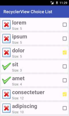
Figure 552: ChoiceList RecyclerView Demo
Note that since this sample is using Theme.Material on Android 5.0+
devices, and since the screenshot is from an Android 5.0 emulator,
the CheckBox styling is based on the accent color, here shown as bright
yellow.
Also note that ChoiceCapableAdapter, MultiChoiceMode, and kin
are oblivious to how the user is informed about what is checked
and unchecked. RowController in the previous sample happens to use a
CheckBox. RowController could use some other widget, like a Switch.
Another approach is to use the activated state. Once again, this is the
sort of thing that is automatically handled for us by ListView and its
choice modes, but with some minor tweaks, we can get our RowController
to use this approach. This is shown in the
RecyclerView/ActivatedList
sample project.
First, we need to give our row a background that has a StateListDrawable
that supports the activated state. The simplest approach — and the one
traditionally used with ListView — is to set up an activated style
with the stock theme-supplied background drawable, then apply that style
to the row.
So, this sample app defines activated in res/values/styles.xml:
<?xml version="1.0" encoding="utf-8"?>
<resources>

  <style name="Theme.Apptheme" parent="@android:style/Theme.Holo.Light.DarkActionBar">
  </style>

  <style name="activated" parent="Theme.Apptheme">
    <item name="android:background">?android:attr/activatedBackgroundIndicator</item>
  </style>

</resources>
Note that activated inherits from Theme.Apptheme. This means that
we will get the Theme.Holo-flavored background normally, but on
API Level 21+, we will get the Theme.Material-flavored background, courtesy
of a res/values-v21/styles.xml override of Theme.Apptheme:
<?xml version="1.0" encoding="utf-8"?>
<resources>
  <style name="Theme.Apptheme" parent="android:Theme.Material.Light.DarkActionBar">
    <item name="android:colorPrimary">@color/primary</item>
    <item name="android:colorPrimaryDark">@color/primary_dark</item>
    <item name="android:colorAccent">@color/accent</item>
  </style>
</resources>
Our row layout now dumps the CardView (whose own background may conflict
with the activated one) and applies the activated style to the root
LinearLayout:
<?xml version="1.0" encoding="utf-8"?>
<LinearLayout
  xmlns:android="http://schemas.android.com/apk/res/android"
  android:layout_width="match_parent"
  android:layout_height="wrap_content"
  android:orientation="horizontal"
  style="@style/activated">

  <ImageView
    android:id="@+id/icon"
    android:layout_width="wrap_content"
    android:layout_height="wrap_content"
    android:layout_gravity="center_vertical"
    android:padding="2dip"
    android:src="@drawable/ok"
    android:contentDescription="@string/icon"/>

  <LinearLayout
    android:layout_width="0dip"
    android:layout_height="wrap_content"
    android:layout_weight="1"
    android:orientation="vertical">

    <TextView
      android:id="@+id/label"
      android:layout_width="wrap_content"
      android:layout_height="wrap_content"
      android:textSize="25sp"
      android:textStyle="bold"/>

    <TextView
      android:id="@+id/size"
      android:layout_width="wrap_content"
      android:layout_height="wrap_content"
      android:textSize="15sp"/>
  </LinearLayout>

</LinearLayout>
The row also no longer has the CheckBox, as it is no longer needed.
RowController now uses the OnClickListener interface to respond to
clicks and use that to toggle the activated state for that row:
  @Override
  public void onClick(View v) {
    boolean isCheckedNow=adapter.isChecked(getAdapterPosition());

    adapter.onChecked(getAdapterPosition(), !isCheckedNow);
    row.setActivated(!isCheckedNow);
  }
setActivated(), applied to a View, indicates that it is (or is not)
activated, affecting anything in that View that depends upon that
state, such as the background.
Similarly, bindModel() uses setActivated() to update the activated
state when binding our data:
  void bindModel(String item) {
    label.setText(item);
    size.setText(String.format(template, item.length()));

    if (item.length()>4) {
      icon.setImageResource(R.drawable.delete);
    }
    else {
      icon.setImageResource(R.drawable.ok);
    }

    row.setActivated(adapter.isChecked(getAdapterPosition()));
Everything else is the same as the original CheckBox version of the
sample. But now, the “checked” state is indicated by the activated
highlight:
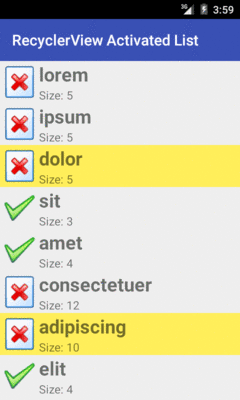
Figure 553: ActivatedList RecyclerView Demo
And, since this demo is running on Android 5.0, the activated highlight color is the accent color, which in this case is set to be yellow.
Both of the preceding examples illustrate multiple-choice behavior. Sometimes, though, single-choice behavior is the better option. For example, in a master-detail structure, in dual-pane mode (e.g., tablets, where the master and the detail are both visible), you probably normally want single-choice mode.
That is certainly possible, though, once again, RecyclerView does not
offer it. It also adds a wrinkle: how do we arrange to uncheck a previously-checked
item, when the user checks another item? Like RadioButton widgets
in a RadioGroup, we need to ensure that only one item at a time
is checked, and that will require us to update the UI of the formerly-checked-but-now-unchecked
item.
With some tweaks, the last sample project, where we used the activated
state for a multiple-choice list, can be revised to limit the user to a
single choice. Those tweaks are illustrated in the
RecyclerView/SingleActivatedList
sample project.
The ChoiceMode interface now has two new methods:
isSingleChoice() will return true for a single-choice ChoiceMode
strategy, false otherwisegetCheckedPosition() will return the position of whatever
the currently-checked item is
package com.commonsware.android.recyclerview.singleactivatedlist;

import android.os.Bundle;

public interface ChoiceMode {
  boolean isSingleChoice();
  int getCheckedPosition();
  void setChecked(int position, boolean isChecked);
  boolean isChecked(int position);
  void onSaveInstanceState(Bundle state);
  void onRestoreInstanceState(Bundle state);
}
SingleChoiceMode is now our implementation of ChoiceMode:
package com.commonsware.android.recyclerview.singleactivatedlist;

import android.os.Bundle;

public class SingleChoiceMode implements ChoiceMode {
  private static final String STATE_CHECKED="checkedPosition";
  private int checkedPosition=-1;

  @Override
  public boolean isSingleChoice() {
    return(true);
  }

  @Override
  public int getCheckedPosition() {
    return(checkedPosition);
  }

  @Override
  public void setChecked(int position, boolean isChecked) {
    if (isChecked) {
      checkedPosition=position;
    }
    else if (isChecked(position)) {
      checkedPosition=-1;
    }
  }

  @Override
  public boolean isChecked(int position) {
    return(checkedPosition==position);
  }

  @Override
  public void onSaveInstanceState(Bundle state) {
    state.putInt(STATE_CHECKED, checkedPosition);
  }

  @Override
  public void onRestoreInstanceState(Bundle state) {
    checkedPosition=state.getInt(STATE_CHECKED, -1);
  }
}
SingleChoiceMode tracks the currently-checked position, using -1
to indicate no position is checked. Of note, if a position was
checked, then setChecked() unchecks it, SingleChoiceMode goes back
to -1 and indicates that there is no currently-checked position.
ChoiceCapableAdapter also has a couple of modifications. First, it now
accepts the RecyclerView itself as a constructor parameter, holding onto
it in an rv data member. And, onChecked() needs to be modified to take
care of removing the activated state from whatever item had been previously
checked when some new item is checked:
package com.commonsware.android.recyclerview.singleactivatedlist;

import android.os.Bundle;
import android.support.v7.widget.RecyclerView;

abstract public class
    ChoiceCapableAdapter<T extends RecyclerView.ViewHolder>
    extends RecyclerView.Adapter<T> {
  private final ChoiceMode choiceMode;
  private final RecyclerView rv;

  public ChoiceCapableAdapter(RecyclerView rv,
                              ChoiceMode choiceMode) {
    super();
    this.rv=rv;
    this.choiceMode=choiceMode;
  }

  void onChecked(int position, boolean isChecked) {
    if (choiceMode.isSingleChoice()) {
      int checked=choiceMode.getCheckedPosition();

      if (checked>=0) {
        RowController row=
            (RowController)rv.findViewHolderForAdapterPosition(checked);

        if (row!=null) {
          row.setChecked(false);
        }
      }
    }

    choiceMode.setChecked(position, isChecked);
  }

  boolean isChecked(int position) {
    return(choiceMode.isChecked(position));
  }

  void onSaveInstanceState(Bundle state) {
    choiceMode.onSaveInstanceState(state);
  }

  void onRestoreInstanceState(Bundle state) {
    choiceMode.onRestoreInstanceState(state);
  }

  @Override
  public void onViewAttachedToWindow(T holder) {
    super.onViewAttachedToWindow(holder);

    if (holder.getAdapterPosition()!=choiceMode.getCheckedPosition()) {
      ((RowController)holder).setChecked(false);
    }
  }
}
To do that, onChecked() asks the ChoiceMode if it is single choice. If
yes, it gets the last checked position. If that position is plausible (0 or
higher), it gets the RecyclerView.ViewHolder for that position via
findViewHolderForAdapterPosition(), called on the RecyclerView. If this returns
something other than null, then it must be a RowController, and so
onChecked() calls setChecked(false) on that row to remove the activated
state.
findViewHolderForAdapterPosition() and findViewHolderForLayoutPosition()
replace the now-deprecated findViewHolderForPosition() method. All three
methods do the same basic thing: given a position, return the ViewHolder
for that position, if any. findViewHolderForPosition() and
findViewHolderForLayoutPosition() have the same implementation, at least
at the present time. The primary thing that findViewHolderForAdapterPosition()
does differently is it always returns null if the data has been changed
(e.g., notifyDataSetChanged() was called on the adapter) but those changes
have not yet been laid out. In this sample app, that difference is academic,
but findViewHolderForAdapterPosition() probably is a safer choice
for most use cases.
However, these find...() methods have a wrinkle: they only return a
ViewHolder if the row is visible. If the ViewHolder is cached, but
not visible, find...() will still not return it. This causes a problem
where we need to de-select a row that is not visible (and so find...()
does not work) but will not be re-bound using onBindViewHolder()
(as the ViewHolder is already set up). This requires us to implement
onViewAttachedToWindow() — called whenever a ViewHolder contents
are actually attached as children to the RelativeLayout — and update
the checked state there, as a fallback.
(and many thanks to Mahmoud Abou-Eita for reporting that problem)
setChecked() did not exist in the previous sample, as the activated state
was handled purely internally to RowController. So, now RowController
has a setChecked() method to toggle the activated state:
  void setChecked(boolean isChecked) {
    row.setActivated(isChecked);
  }
MainActivity now must supply the RecyclerView to the IconicAdapter
in onCreate():
  @Override
  public void onCreate(Bundle icicle) {
    super.onCreate(icicle);

    setLayoutManager(new LinearLayoutManager(this));
    adapter=new IconicAdapter(getRecyclerView());
    setAdapter(adapter);
  }
…so that IconicAdapter() can supply it to the ChoiceCapableAdapter
superclass constructor:
    IconicAdapter(RecyclerView rv) {
      super(rv, new SingleChoiceMode());
    }
Visually, the results are identical to the previous example, except that
at most only one item can be checked at a time. The key is the phrase
“at most” — this implementation allows the user to tap on a checked item
to uncheck it. This may be fine, as your app may simply hide the detail in
this scenario, still allowing the user to interact with action bar items
(e.g., a “create new model” item). If you wanted to prevent that, have
SingleChoiceMode not set checkedPosition to -1 when the user
taps on a previously-checked item, to leave the currently-checked position
intact.
If you try using the RecyclerView/SingleActivatedList app — or any
of the sample apps presented so far — on a device that has a physical
keyboard or five-way navigation option (e.g., D-pad), you will find that
RecyclerView has no built-in keyboard navigation. This is in contrast
with standard AdapterView classes like ListView, where key events
are handled automatically. Once again, if you want the behavior, you
have to add it yourself.
The exact details of what you want to do when the user tries navigating with a keyboard will vary, based on lots of things:
RecyclerView items? If so,
how will navigation between those widgets blend with navigation
through the RecyclerView overall?Enter key or a center D-pad button),
with the two-way or four-way navigation showing up as something separate
from the user’s choice?The
RecyclerView/SingleActivatedListKB
sample project is a clone of the SingleActivatedList sample, except that
we now support keyboard events. Specifically, the user can use the up
and down arrow keys to change the selected row in the list. This is perhaps
the simplest scenario:
And, the best part is that we only need to change ChoiceCapableAdapter — the rest
of the app can remain unchanged.
First, we override another method on RecyclerView.Adapter:
onAttachedToRecyclerView(). As the name suggests, this method is called
when our adapter is assigned to a RecyclerView instance. Here, if we are
in single-choice mode, we register an OnKeyListener on the RecyclerView
itself, to find out when it receives key events:
  // inspired by http://stackoverflow.com/a/28838834/115145

  @Override
  public void onAttachedToRecyclerView(RecyclerView rv) {
    super.onAttachedToRecyclerView(rv);

    if (choiceMode.isSingleChoice()) {
      rv.setOnKeyListener(new View.OnKeyListener() {
        @Override
        public boolean onKey(View v, int keyCode, KeyEvent event) {
          if (event.getAction()==KeyEvent.ACTION_DOWN) {
            switch (keyCode) {
              case KeyEvent.KEYCODE_DPAD_DOWN:
                return(chooseNext());
              case KeyEvent.KEYCODE_DPAD_UP:
                return(choosePrevious());
            }
          }

          return(false);
        }
      });
    }
  }
When the user presses down either the up or down arrow key (or equivalents
on a D-pad), we call out to private choosePrevious() and chooseNext()
methods, which will return true if we moved the selection
in that direction, false otherwise. If the key event is not one of those,
we return false to indicate that we are not consuming the key event.
The choosePrevious() and chooseNext() methods are responsible for
determining what our next selection should be, assuming that the selection
can change in the designated direction:
  private boolean chooseNext() {
    long now=System.currentTimeMillis();
    boolean result=false;

    if (lastDownKeyTime==-1 || now-lastDownKeyTime>KEY_TIME_DELTA) {
      lastDownKeyTime=now;
      lastUpKeyTime=-1L;

      int checked=choiceMode.getCheckedPosition();

      if (checked<0) {
        onChecked(0, true, true);
        result=true;
      }
      else if (checked<getItemCount()-1) {
        onChecked(checked+1, true, true);
        result=true;
      }
    }

    return(result);
  }

  private boolean choosePrevious() {
    long now=System.currentTimeMillis();
    boolean result=false;

    if (lastUpKeyTime==-1 || now-lastUpKeyTime>KEY_TIME_DELTA) {
      lastUpKeyTime=now;
      lastDownKeyTime=-1L;

      int checked=choiceMode.getCheckedPosition();

      if (checked>0) {
        onChecked(checked-1, true, true);
        result=true;
      }
      else if (checked<0) {
        onChecked(0, true, true);
        result=true;
      }
    }

    return(result);
  }
In both cases, we find out what the current selection is. If it is a negative number, we do not have a selection yet, so we select the first row. Otherwise, if we can still move in the desired direction, add or subtract one from the current selection.
However, in this crude implementation, we need to slow down how frequently we change the selection. Simply changing which row is highlighted is fast, but if the list has to scroll to uncover that row, doing too many of those too quickly results in a “smearing” effect. The simplest way to avoid that smearing is to limit how many consecutive identical key events we process (e.g., user holds down an arrow key).
The approach taken in this code is to track the last time we were called
to process an arrow key event for each direction, in lastUpKeyTime
and lastDownKeyTime fields. We use -1 to indicate that we have not
just processed another one of that type. If, when we get a key event,
either the related time value is -1 or is within KEY_TIME_DELTA of
now, we go ahead and update the checked position (if needed), plus update
the times. KEY_TIME_DELTA is defined as 250, limiting us to four
updates per second.
We change the current selection, where needed, via a call to a new
three-parameter onChecked() method:
  void onChecked(int position, boolean isChecked) {
    onChecked(position, isChecked, false);
  }

  void onChecked(int position, boolean isChecked, boolean updateUI) {
    if (choiceMode.isSingleChoice()) {
      int checked=choiceMode.getCheckedPosition();

      if (checked>=0) {
        RowController row=
            (RowController)rv.findViewHolderForAdapterPosition(checked);

        if (row!=null) {
          row.setChecked(false);
        }
      }
    }

    choiceMode.setChecked(position, isChecked);

    if (updateUI) {
      notifyItemChanged(position);
      rv.scrollToPosition(position);
    }
  }
The third parameter indicates if we need to update the UI or not. For touchscreen events, activating rows and such is enough to ensure that the UI is properly updated. With key events, we need to:
notifyItemChanged()), andscrollToPosition())Another thing that ListView gave us was support for action modes.
In particular, the “multiple-choice modal” setting would automatically
start and finish an action mode for us.
And, once again, RecyclerView has no hooks for action modes, though
you can do it yourself if desired. We have to manually start and destroy
the action mode, in addition to responding to the user’s interaction
with the action mode (tapping on items, or dismissing the action mode
manually).
Where things get interesting is in the connection between checked items and the action mode. There are two UX rules:
You might think that those two rules are the same, and to some extent they are. They are phrased this way to emphasize the state changes that are involved:
Handling these transitions takes a bit of work, demonstrated in the
RecyclerView/ActionModeList
sample project. This is a clone of the ChoiceList sample from earlier,
augmented with an action mode when 1+ items are checked. The action mode
logic is largely cloned from one of the book’s action mode samples, where
we want to allow the user to capitalize or remove the checked items.
Once again, we have some tweaks to ChoiceMode, adding two methods:
getCheckedCount(), to return the number of checked items, which
we will use for the subtitle of the action modeclearChecks(), to uncheck all checked items
package com.commonsware.android.recyclerview.actionmodelist;

import android.os.Bundle;

public interface ChoiceMode {
  void setChecked(int position, boolean isChecked);
  boolean isChecked(int position);
  void onSaveInstanceState(Bundle state);
  void onRestoreInstanceState(Bundle state);
  int getCheckedCount();
  void clearChecks();
}
MultiChoiceMode implements those, plus adds a subtle change to setChecked().
Previous editions of MultiChoiceMode would simply put the checked state
boolean into the ParceableSparseBooleanArray, with false as a default
value for any position not in the array. Now, we specifically remove items
that are unchecked, so the only items in the ParcelableSparseBooleanArray are
those that are checked. This makes getCheckedCount() and clearChecks()
very simple to implement:
package com.commonsware.android.recyclerview.actionmodelist;

import android.os.Bundle;

public class MultiChoiceMode implements ChoiceMode {
  private static final String STATE_CHECK_STATES="checkStates";
  private ParcelableSparseBooleanArray checkStates=new ParcelableSparseBooleanArray();

  @Override
  public void setChecked(int position, boolean isChecked) {
    if (isChecked) {
      checkStates.put(position, isChecked);
    }
    else {
      checkStates.delete(position);
    }
  }

  @Override
  public boolean isChecked(int position) {
    return(checkStates.get(position, false));
  }

  @Override
  public void onSaveInstanceState(Bundle state) {
    state.putParcelable(STATE_CHECK_STATES, checkStates);
  }

  @Override
  public void onRestoreInstanceState(Bundle state) {
    checkStates=state.getParcelable(STATE_CHECK_STATES);
  }

  @Override
  public int getCheckedCount() {
    return(checkStates.size());
  }

  @Override
  public void clearChecks() {
    checkStates.clear();
  }
}
ChoiceCapableAdapter exposes the two new ChoiceMode capabilities to
its subclasses:
package com.commonsware.android.recyclerview.actionmodelist;

import android.os.Bundle;
import android.support.v7.widget.RecyclerView;

abstract public class
    ChoiceCapableAdapter<T extends RecyclerView.ViewHolder>
    extends RecyclerView.Adapter<T> {
  private final ChoiceMode choiceMode;

  public ChoiceCapableAdapter(ChoiceMode choiceMode) {
    super();
    this.choiceMode=choiceMode;
  }

  void onChecked(int position, boolean isChecked) {
    choiceMode.setChecked(position, isChecked);
  }

  boolean isChecked(int position) {
    return(choiceMode.isChecked(position));
  }

  void onSaveInstanceState(Bundle state) {
    choiceMode.onSaveInstanceState(state);
  }

  void onRestoreInstanceState(Bundle state) {
    choiceMode.onRestoreInstanceState(state);
  }

  int getCheckedCount() {
    return(choiceMode.getCheckedCount());
  }

  void clearChecks() {
    choiceMode.clearChecks();
  }
}
IconicAdapter now not only extends ChoiceCapableAdapter, but it implements
the ActionMode.Callback interface, and therefore will be responsible for
managing the action mode:
  class IconicAdapter extends ChoiceCapableAdapter<RowController>
      implements ActionMode.Callback {
IconicAdapter now overrides onChecked(), normally just handled by
ChoiceCapableAdapter. In addition to chaining to the superclass for
standard behavior, IconicAdapter manages the action mode:
isChecked is true),
and if we do not already have an action mode going (tracked by an
activeMode data member), start the action mode using startActionMode()
finish() that action mode, as the user has unchecked the last checked
item and the action mode is no longer needed
    @Override
    void onChecked(int position, boolean isChecked) {
      super.onChecked(position, isChecked);

      if (isChecked) {
        if (activeMode==null) {
          activeMode=startActionMode(this);
        }
        else {
          updateSubtitle(activeMode);
        }
      }
      else if (getCheckedCount()==0 && activeMode!=null) {
        activeMode.finish();
      }
    }
Because IconicAdapter implements ActionMode.Callback, it needs
to implement the methods required by that interface. This
includes:
onCreateActionMode(), to set up the action modeonPrepareActionMode(), just because it is required by the interfaceonActionItemClicked(), where we should do some real work, but for the
moment just have a TODO commentonDestroyActionMode(), where we make sure that all checked items
are unchecked (clearChecks()) and tell the RecyclerView.Adapter that
the data set changed, to force a repaint of all the visible rows, so they
will now reflect the fact that they are no longer checked
    @Override
    public boolean onCreateActionMode(ActionMode mode, Menu menu) {
      MenuInflater inflater=getMenuInflater();

      inflater.inflate(R.menu.context, menu);
      mode.setTitle(R.string.context_title);
      activeMode=mode;
      updateSubtitle(activeMode);

      return(true);
    }

    @Override
    public boolean onPrepareActionMode(ActionMode mode, Menu menu) {
      return(false);
    }

    @Override
    public boolean onActionItemClicked(ActionMode mode, MenuItem item) {
      // TODO: do something based on the action

      updateSubtitle(activeMode);

      return(true);
    }

    @Override
    public void onDestroyActionMode(ActionMode mode) {
      if (activeMode != null) {
        activeMode=null;
        clearChecks();
        notifyDataSetChanged();
      }
    }
The updateSubtitle() method, referred to by some of the previous methods,
just updates the subtitle of the action mode to reflect the current
count of checked items:
    private void updateSubtitle(ActionMode mode) {
      mode.setSubtitle("(" + getCheckedCount() + ")");
    }
The resulting app looks a lot like the original ChoiceList sample,
until we check one or more items, at which point the action mode appears:
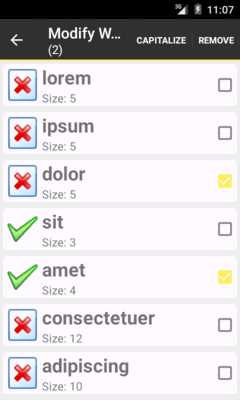
Figure 554: ActionModeList RecyclerView Demo
The obvious problem with the preceding sample is that we are not actually
doing anything in response to user clicks on action mode items. We really
should be capitalizing and/or removing words. However, this involves modifying
the model data and how that model data is being visually displayed by
the RecyclerView.
The less-obvious problem is that we are calling notifyDataSetChanged()
when the action mode is dismissed, to force a full repaint of the RecyclerView
contents. While this works, it is overkill, as probably only a subset of
the visible items are checked. Ideally, we would only update the specific
positions that were checked and now, with the action mode finished, are
unchecked. We could find the affected RowController instances, using
findViewHolderByPosition() on RecyclerView, as we did in the single-choice
list sample. But, really, updating the checked state is just another
manifestation of the same problem that capitalizing or removing words
causes: we need to ensure that the RecyclerView depicts the current
model state, ideally with minimum work.
So, let’s see how this is accomplished, by looking at the
RecyclerView/ActionModeList2
sample project. As the name suggests, this is a clone of the
ActionModeList shown in the preceding section. This time, we will
fully implement onActionItemClicked() and allow our model data to be
mutable.
With AdapterView and Adapter classes based on BaseAdapter,
the only way we had to tell the AdapterView about model data changes
was notifyDataSetChanged(). This would trigger a rebuild of the entire
AdapterView, which is slow and expensive.
While RecyclerView.Adapter has its own notifyDataSetChanged(), that is
really for total reloads of the model data, such as having gotten a fresh
Cursor from a database and not knowing exactly what the changes are.
If you are driving the changes yourself from the UI — and particularly
if your model data is something like an ArrayList of model objects –
you can use methods on RecyclerView.Adapter that are more fine-grained
than is notifyDataSetChanged().
If an item was updated in place — such as a word now being capitalized –
you can use notifyItemChanged() on RecyclerView.Adapter to point
out the specific position that changed. Alternatives include:
notifyItemMoved(), to indicate that an item is still in the model
data but now is in a new positionnotifyItemRangeChanged(), to indicate a range of positions that
were modified, instead of having to repeatedly call notifyItemChanged()
ActionModeList2 uses notifyItemChanged() when the user capitalizes
words, to get those items repainted, if needed. It may not
be needed immediately, if one or more of those items are not presently
visible within the RecyclerView.
However, so far, our model data has been a static String array, and now
we need a mutable model. So, we take the same approach as the ListView
action mode samples use, converting our model to be an ArrayList
that happens to be populated by a static String array.
The items data member of MainActivity
is now an ArrayList of String, with the static String
array being converted into ORIGINAL_ITEMS:
  private static final String[] ORIGINAL_ITEMS={"lorem", "ipsum", "dolor",
          "sit", "amet",
          "consectetuer", "adipiscing", "elit", "morbi", "vel",
          "ligula", "vitae", "arcu", "aliquet", "mollis",
          "etiam", "vel", "erat", "placerat", "ante",
          "porttitor", "sodales", "pellentesque", "augue", "purus"};
  private ArrayList<String> items;
Places that used to refer to items now use a private getItems() method,
which lazy-instantiates the list if needed:
  private ArrayList<String> getItems() {
    if (items==null) {
      items=new ArrayList<String>();

      for (String s : ORIGINAL_ITEMS) {
        items.add(s);
      }
    }

    return(items);
  }
We also need to ensure that we hold onto the items across configuration changes,
since those items could be changed by the user. So, our onSaveInstanceState()
and onRestoreInstanceState() methods on MainActivity now handle that
chore, in addition to their original behavior of having the ChoiceCapableAdapter
persist checked states:
  @Override
  public void onSaveInstanceState(Bundle state) {
    adapter.onSaveInstanceState(state);
    state.putStringArrayList(STATE_ITEMS, items);
  }

  @Override
  public void onRestoreInstanceState(Bundle state) {
    adapter.onRestoreInstanceState(state);
    items=state.getStringArrayList(STATE_ITEMS);
  }
(here, STATE_ITEMS is a static data member, serving as the constant key
for the Bundle entry)
In order to be able to capitalize or remove the checked words from the list,
we need to know which ones are checked. Rather than expose that data
directly, ChoiceMode now has a visitChecks() method, where we can supply
a Visitor to be invoked for every checked position:
package com.commonsware.android.recyclerview.actionmodelist2;

import android.os.Bundle;

public interface ChoiceMode {
  void setChecked(int position, boolean isChecked);
  boolean isChecked(int position);
  void onSaveInstanceState(Bundle state);
  void onRestoreInstanceState(Bundle state);
  int getCheckedCount();
  void clearChecks();
  void visitChecks(Visitor v);

  public interface Visitor {
    void onCheckedPosition(int position);
  }
}
MultiChoiceMode implements visitChecks() by iterating over a copy
of the checkStates ParcelableSparseBooleanArray. That way, if the
visitor modifies checkStates (e.g., unchecks a position), our loop
is unaffected.
  @Override
  public void visitChecks(Visitor v) {
    SparseBooleanArray copy=checkStates.clone();

    for (int i=0;i<copy.size();i++) {
      v.onCheckedPosition(copy.keyAt(i));
    }
  }
visitChecks() is also exposed by ChoiceCapableAdapter, as are all the
other methods on ChoiceMode.
Now, IconicAdapter can capitalize the words, by using visitChecks():
        case R.id.cap:
          visitChecks(new ChoiceMode.Visitor() {
            @Override
            public void onCheckedPosition(int position) {
              String word=getItems().get(position);

              word=word.toUpperCase(Locale.ENGLISH);
              getItems().set(position, word);
              notifyItemChanged(position);
            }
          });
          break;
Here, for each checked item, we capitalize the word, replace the original
word with its capitalized equivalent, and call notifyItemChanged() to
let the RecyclerView know that this position had its model data changed
and therefore should be repainted, if needed.
We also use visitChecks() now in onDestroyActionMode(), to avoid
the notifyDataSetChanged() call:
    @Override
    public void onDestroyActionMode(ActionMode mode) {
      if (activeMode != null) {
        activeMode=null;
        visitChecks(new ChoiceMode.Visitor() {
          @Override
          public void onCheckedPosition(int position) {
            onChecked(position, false);
            notifyItemChanged(position);
          }
        });
      }
    }
Each item that was checked is unchecked, and we use notifyItemChanged()
to ensure that the item is repainted if needed.
Now, checking some items and choosing “CAPITALIZE” from the action mode will capitalize those words:
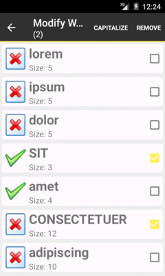
Figure 555: ActionModeList2 RecyclerView Demo, with Capitalized Words
There are also methods on RecyclerView.Adapter to specifically call out
when you are adding or removing items from the adapter. Not only does this
cause the RecyclerView to update itself, but it will animate the changes,
if the relevant position(s) are visible.
Specifically, you can call:
notifyItemInserted(), to indicate that a new item was inserted at
a specified position, with everything else moving one position later in the
rosternotifyItemRangeInserted(), to insert several items in a blocknotifyItemRemoved(), to indicate a position that had an item removed from
the roster, with later items moving up to take over earlier positionsnotifyItemRangeRemoved(), to remove several items in a blockThe ActionModeList2 sample uses notifyItemRemoved() as part
of its handling of the remove action mode item:
        case R.id.remove:
          final ArrayList<Integer> positions=new ArrayList<Integer>();

          visitChecks(new ChoiceMode.Visitor() {
            @Override
            public void onCheckedPosition(int position) {
              positions.add(position);
            }
          });

          Collections.sort(positions, Collections.reverseOrder());

          for (int position : positions) {
            getItems().remove(position);
            notifyItemRemoved(position);
          }

          clearChecks();
          activeMode.finish();
          break;
Because items slide up to take over vacated positions, when removing items, it is important to remove the lowest items first and work your way up the roster. That is why this code:
ArrayList
and calling notifyItemRemoved() to inform the adapter that the old
item at this position is now goneChoiceMode (as all checked items
are now removed) and finishes the action mode (as there are no more
checked items)The result is that when the user removes items, they rapidly fade out,
then later items in the list slide up to occupy the now-vacated space.
If you would prefer to use other animations, you can do so, by creating
your own subclass of RecyclerView.ItemAnimator and attaching it to
the RecyclerView with setItemAnimator().
Version 22+ of recyclerview-v7 offers SortedList. On the surface,
the class appears to be a regular List that offers sorting. However,
it also has a callback interface designed to be tied into RecyclerView,
so that changes made to the SortedList can be reflected in the
RecyclerView itself, complete with animations, optional batched processing,
and so on.
This is illustrated in the
RecyclerView/SortedList
sample project. Along the way, we will also see how to use RecyclerView
in a fragment and how to populate RecyclerView from the background thread.
This project requires version 22 or higher of recyclerview-v7, as the
original v21 release of recyclerview-v7 did not have SortedList. So,
the Gradle build file requests something appropriate:
    compile 'com.android.support:recyclerview-v7:22.2.0'
    compile 'com.android.support:cardview-v7:22.2.0'
Note that it pulls in the same version of cardview-v7. In general, it
is best to try to keep Android Support package libraries in sync, at least
in terms of major versions. Similarly, it is best to have the
compileSdkVersion match the major library version, as the library may
be conditionally using APIs made available in that version of Android.
Hence, the project also has compileSdkVersion (and buildTools) set
to pull from v22:
    compileSdkVersion 22
    buildToolsVersion "22.0.1"
Prior samples in this chapter used a RecyclerViewActivity for basic
RecyclerView setup. However, in this sample, we want to use a
retained fragment for managing the AsyncTask, which suggests putting
the RecyclerView in a fragment, rather than having it be managed
directly by the activity.
So, this project has a reworking of RecyclerViewActivity into
RecyclerViewFragment:
package com.commonsware.android.recyclerview.sorted;

import android.app.Fragment;
import android.os.Bundle;
import android.support.v7.widget.RecyclerView;
import android.view.LayoutInflater;
import android.view.View;
import android.view.ViewGroup;

public class RecyclerViewFragment extends Fragment {
  @Override
  public View onCreateView(LayoutInflater inflater, ViewGroup container,
                           Bundle savedInstanceState) {
    RecyclerView rv=new RecyclerView(getActivity());

    rv.setHasFixedSize(true);

    return(rv);
  }

  public void setAdapter(RecyclerView.Adapter adapter) {
    getRecyclerView().setAdapter(adapter);
  }

  public RecyclerView.Adapter getAdapter() {
    return(getRecyclerView().getAdapter());
  }

  public void setLayoutManager(RecyclerView.LayoutManager mgr) {
    getRecyclerView().setLayoutManager(mgr);
  }

  public RecyclerView getRecyclerView() {
    return((RecyclerView)getView());
  }
}
Basically, what had been in onCreate() mostly moves into onCreateView(),
where we set up the RecyclerView. The rest of the core API is unchanged.
The project has SortedFragment, which extends RecyclerViewFragment
and handles loading of the data — we will examine more of it later in
this chapter.
The revised MainActivity then just loads up SortedFragment via
a FragmentTransaction:
package com.commonsware.android.recyclerview.sorted;

import android.app.Activity;
import android.os.Bundle;

public class MainActivity extends Activity {
  @Override
  public void onCreate(Bundle savedInstanceState) {
    super.onCreate(savedInstanceState);

    if (getFragmentManager().findFragmentById(android.R.id.content) == null) {
      getFragmentManager().beginTransaction()
                          .add(android.R.id.content,
                               new SortedFragment()).commit();
    }
  }
}
Most of SortedFragment is reminiscent of the original AsyncTask
demo from the chapter on threads, mashed up with
one of the CardView/RecyclerView samples from earlier in this chapter.
However, the SortedList gets weaved throughout.
The model in the original AsyncTask demo was a simple ArrayList.
Now it is a SortedList, initialized in onCreate() of the SortedFragment:
  @Override
  public void onCreate(Bundle savedInstanceState) {
    super.onCreate(savedInstanceState);

    setRetainInstance(true);

    model=new SortedList<String>(String.class, sortCallback);

    task=new AddStringTask();
    task.execute();
  }
The SortedList constructor takes two parameters:
String.class)SortedList.Callback object that will be invoked when the model
changes based on List APIs (e.g., add(), insert(), remove())There is an optional third parameter for the capacity, unused in this sample.
We will take a peek at the SortedList.Callback implementation, named
sortCallback, shortly.
The IconicAdapter from earlier RecyclerView samples worked directly
off of the static array of String values. Now, we want it to work off
of the model SortedList. Hence, onBindViewHolder() and getItemCount()
need to be modified to refer to appropriate methods on the model:
  class IconicAdapter extends RecyclerView.Adapter<RowController> {
    @Override
    public RowController onCreateViewHolder(ViewGroup parent, int viewType) {
      return(new RowController(getActivity().getLayoutInflater()
                                .inflate(R.layout.row, parent, false)));
    }

    @Override
    public void onBindViewHolder(RowController holder, int position) {
      holder.bindModel(model.get(position));
    }

    @Override
    public int getItemCount() {
      return(model.size());
    }
  }
Also note that when we create the adapter in onViewCreated(), that we
hold onto it in an adapter data member of the fragment:
  @Override
  public void onViewCreated(View view, Bundle savedInstanceState) {
    super.onViewCreated(view, savedInstanceState);

    setLayoutManager(new LinearLayoutManager(getActivity()));
    adapter=new IconicAdapter();
    setAdapter(adapter);
  }
The job of the SortedList.Callback is to serve as the bridge between
the SortedList and the RecyclerView.Adapter.
SortedList, as the name
suggests, sorts its contents. That means that any change to the SortedList
contents can have different impacts on the RecyclerView. For example,
while an add() to an ArrayList would just add a new row to the end
of the RecyclerView, an add() on SortedList might need to insert
a row in the middle of the RecyclerView, to maintain the sorted order.
Hence, your SortedList.Callback is responsible for two things:
RecyclerView.Adapter, so the appropriate moves can be made there,
complete with animationsWith that in mind, here is the sortedCB implementation of
SortedList.Callback:
  private SortedList.Callback<String> sortCallback=new SortedList.Callback<String>() {
    @Override
    public int compare(String o1, String o2) {
      return o1.compareTo(o2);
    }

    @Override
    public boolean areContentsTheSame(String oldItem, String newItem) {
      return(areItemsTheSame(oldItem, newItem));
    }

    @Override
    public boolean areItemsTheSame(String oldItem, String newItem) {
      return(compare(oldItem, newItem)==0);
    }

    @Override
    public void onInserted(int position, int count) {
      adapter.notifyItemRangeInserted(position, count);
    }

    @Override
    public void onRemoved(int position, int count) {
      adapter.notifyItemRangeRemoved(position, count);
    }

    @Override
    public void onMoved(int fromPosition, int toPosition) {
      adapter.notifyItemMoved(fromPosition, toPosition);
    }

    @Override
    public void onChanged(int position, int count) {
      adapter.notifyItemRangeChanged(position, count);
    }
  };
The first method is your standard sort of compare() comparison
method, as you might implement on a Comparator. It should return zero
if the two model objects are the same from a sorting standpoint,
a negative number if the first parameter sorts before the second
parameter, or a positive number if the first parameter sorts after
the second parameter.
Then there are two similarly-named methods that serve as more-or-less
replacements for the equals() that you might have on a Comparator:
areContentsTheSame() and areItemsTheSame().
areItemsTheSame() should
return true if the two passed-in values represent the same actual
logical item. In the case of SortedFragment, that is simply whether
or not the strings are equal. But, with a more complex data model, you
might be comparing primary keys or some other form of immutable identifier.
areContentsTheSame() should return true if the visual representation
of the items look the same, as this will be used to optimize the changes
made to the RecyclerView.
For example, suppose a shopping cart fragment
wanted to use SortedList. Further suppose that if you added three boxes
of laundry detergent to the cart, rather than having one row in the
list with “Quantity: 3”, you were representing them as three rows in the
RecyclerView. In this case:
compare() returns a value to indicate the sorting rules of
those shopping cart items, perhaps based on the title of the itemareItemsTheSame() might return false for any combination of these
three items, as they are logically distinct rows within the RecyclerView
areContentsTheSame() might return true for any combination of these
three items, as while they are three separate line items, each is visually
identical in terms of what the RecyclerView rows look likeIn many cases, areContentsTheSame() can simply invoke areItemsTheSame(),
under the premise that different items probably have different visual
representations. That is what is done in this sample, where areItemsTheSame()
in turn uses compare() to see whether or not the items are the same.
Finally, there are four on...() methods that are simply forwarded
along to their RecyclerView.Adapter counterparts, so changes to the
SortedList make the corresponding changes to the RecyclerView
contents.
Note that there is a SortedListAdapterCallback that takes a
RecyclerView.Adapter as a constructor parameter and handles the
on...() methods for you. However, since we want to retain the
SortedList across configuration changes, and since SortedList
does not allow us to change the SortedList.Callback object, we cannot
readily switch the SortedList to the new fragment and new adapter
after a configuration change.
The AddStringTask is the same as with the original AsyncTask sample,
except that now it adds the words to the SortedList, which (via its
Callback) will update the RecyclerView:
  private class AddStringTask extends AsyncTask<Void, String, Void> {
    @Override
    protected Void doInBackground(Void... unused) {
      for (String item : items) {
        if (isCancelled())
          break;

        publishProgress(item);
        SystemClock.sleep(400);
      }

      return(null);
    }

    @Override
    protected void onProgressUpdate(String... item) {
      if (!isCancelled()) {
        model.add(item[0]);
      }
    }

    @Override
    protected void onPostExecute(Void unused) {
      Toast.makeText(getActivity(), R.string.done, Toast.LENGTH_SHORT)
          .show();

      task=null;
    }
  }
If you run this sample, you will see the words be added to the list,
every 400ms. However, in the original ListView-based sample, new rows
were appended to the end, and so you would not see new rows appear after
the ListView space was filled. In this sample, the Latin words are sorted
by SortedList, and you will see them animate into position at the appropriate
spots as they are added. In the end, you get the same look as in earlier
CardView-based RecyclerView implementations, except that the words
are sorted:
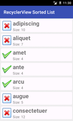
Figure 556: SortedList RecyclerView Demo
To quote the infamous American infomercial line: “But wait! There’s more!”
In addition to LinearLayoutManager and GridLayoutManager, there
is StaggeredGridLayoutManager. With a vertically-scrolling
GridLayoutManager, rows are
all a consistent height, but the cell widths might vary. With a
vertically-scrolling StaggeredGridLayoutManager, the columns are all
the same width, but the cell heights might vary.
All three of the standard layout managers support horizontal operation
as well, through a boolean on a constructor. In these cases, the
content will scroll horizontally, rather than vertically. This eliminates
the need for third-party horizontal ListView implementations and the like.
And, of course, you can implement your own RecyclerView.LayoutManager,
eschewing any of the built-in ones.
SortedList is interesting, but it is inflexible. For example,
you cannot readily change the sort order, without completely replacing
the SortedList.
Moreover, it assumes that the changes that you want to make are simply
to keep a list in sorted order. There are plenty of other possible
changes to your data set that might occur, such as from the results of
some Web service call to synchronize your local data with that on a server.
You would have to somehow perform your own “diff” on the data shown
in your RecyclerView and the new roster of data, to determine what
changed, what did not change, and how those changes affect things like
item positions within the list or grid.
Fortunately, the 25.0.0+ version of recyclerview-v7 gives you another
tool: DiffUtil. This handles everything cited in the last sentence
of the previous paragraph. You hand it two collections (old and new),
plus an object that can help determine what the changes are (one reminiscent
of a SortedList.Callback). It gives you a results object that, in turn,
can update the RecyclerView to affect those changes.
The
Java8/VideoLambda
sample project is yet another rendition of the “list of videos” sample
app from earlier in this chapter. However, it shows the list in sorted
order, but using DiffUtil rather than SortedList. This allows us to
offer the user the ability to change the sort order (ascending or descending).
The original version of this sample used a Cursor directly, wrapping
it in a RecyclerView.Adapter. That is fine, but we cannot readily
sort a Cursor. It is simpler to convert the Cursor into a list
of model objects, so we can sort the list.
To that end, the VideoLambda sample app has a Video class, with
a constructor that can populate itself from a Cursor positioned
on a valid row:
package com.commonsware.android.recyclerview.videolist;

import android.content.ContentUris;
import android.database.Cursor;
import android.net.Uri;
import android.provider.MediaStore;

class Video implements Comparable<Video> {
  final String title;
  final Uri videoUri;
  final String mimeType;

  Video(Cursor row) {
    this.title=
      row.getString(row.getColumnIndex(MediaStore.Video.Media.TITLE));
    this.videoUri=ContentUris.withAppendedId(
      MediaStore.Video.Media.EXTERNAL_CONTENT_URI,
      row.getInt(row.getColumnIndex(MediaStore.Video.Media._ID)));
    this.mimeType=
      row.getString(row.getColumnIndex(MediaStore.Video.Media.MIME_TYPE));
  }

  @Override
  public boolean equals(Object obj) {
    if (!(obj instanceof Video)) {
      return(false);
    }

    return(videoUri.equals(((Video)obj).videoUri));
  }

  @Override
  public int hashCode() {
    return(videoUri.hashCode());
  }

  @Override
  public int compareTo(Video video) {
    return(title.compareTo(video.title));
  }
}
Note that Video has an implementation of equals() considering
two Video objects to be equal if they point to the same Uri. That will
be important when we use DiffUtil, as DiffUtil (and our helper code)
need to know when two Video objects logically represent the same video.
Video also implements Comparable and therefore has a compareTo()
method, implemented by comparing the titles of the videos. This will be
used as part of our sorting logic.
The VideoAdapter has a setVideos() method, taking a Cursor that we
loaded from the MediaStore, as before. However, now VideoAdapter
does not hold that Cursor in a field. Rather, it holds an ArrayList
of Video objects as the videos field, with setVideos() handling
the conversion of data from the Cursor into the Video objects:
    void setVideos(Cursor c) {
      if (c==null) {
        videos=null;
        notifyDataSetChanged();
      }
      else {
        ArrayList<Video> temp=new ArrayList<>();

        while (c.moveToNext()) {
          temp.add(new Video(c));
        }

        if (videos==null) {
          videos=new ArrayList<>();
        }

        sortAndApply(temp);
      }
    }

    @Override
We will see the sortAndApply() method, and understand what the temp
local variable is all about, a bit later in this section. For now, take
it on faith that:
Cursor is null (e.g., onLoaderReset() was called), we
null out the videos field and call notifyDataSetChanged(), to
let the RecyclerView know that our entire roster of videos changedCursor is not null, we convert it into an ArrayList
of Video objects, then use sortAndApply() to update the
RecyclerView
The other time we need to sort the videos is if the user chooses to switch from ascending to descending sort (or back again).
The app has a menu resource with a checkable menu <item>, named
sort, that the user will be able to use to toggle the sort order:
<?xml version="1.0" encoding="utf-8"?>
<menu xmlns:android="http://schemas.android.com/apk/res/android">
  <item
    android:id="@+id/sort"
    android:checkable="true"
    android:checked="true"
    android:enabled="false"
    android:showAsAction="never"
    android:title="@string/sort_ascending" />
</menu>
Note that it is disabled initially. When the app starts up, we do not
yet have our videos, since they need to be loaded from the MediaStore.
Hence, we keep the item disabled until the videos are ready.
In the activity’s onCreateOptionsMenu() method, we inflate the resource,
get the sort MenuItem, hold onto it in a field (also named sort),
and enable it if the VideoAdapter happens to already have some videos:
  @Override
  public boolean onCreateOptionsMenu(Menu menu) {
    getMenuInflater().inflate(R.menu.actions, menu);
    sort=menu.findItem(R.id.sort);
    sort.setEnabled(adapter.getItemCount()>0);

    return(super.onCreateOptionsMenu(menu));
  }
Then, in onOptionsItemSelected(), if the user taps on this action bar
item, we toggle its checked state, then tell the VideoAdapter to
sort() based upon that state:
  @Override
  public boolean onOptionsItemSelected(MenuItem item) {
    if (item.getItemId()==R.id.sort) {
      item.setChecked(!item.isChecked());
      adapter.sort(item.isChecked());

      return(true);
    }

    return(super.onOptionsItemSelected(item));
  }
sort(), in turn, keeps track of the current sort order, then calls
the same sortAndApply() that we did in setVideos():
        sortAscending=checked;
        sortAndApply(new ArrayList<>(videos));
      }
    }
  }
}
The job of sortAndApply() is to do what the name suggests: sort the
videos and apply the sorted list to the RecyclerView. In principle,
there are two possible scenarios:
MediaStore, triggering the Loader
framework to hand us a fresh Cursor
Fortunately, we can handle both the same way:
        Collections.sort(newVideos,
          (one, two) -> one.compareTo(two));
      }
      else {
        Collections.sort(newVideos,
          (one, two) -> two.compareTo(one));
      }

      DiffUtil.Callback cb=new SimpleCallback<>(videos, newVideos);
      DiffUtil.DiffResult result=DiffUtil.calculateDiff(cb, true);

      videos=newVideos;
      result.dispatchUpdatesTo(this);
    }

    private void sort(boolean checked) {
The new list of videos is the newVideos parameter to sortAndApply().
Based on the sortAscending value, we use Collections.sort() to
sort the newVideos list… using a Java 8 lambda expression.
Lambda expressions are covered elsewhere in the book.
However, we could just sort using an anonymous inner class implementation
of Comparator, such as this for sorting in ascending order:
Collections.sort(temp, new Comparator<Video>() {
  @Override
  public int compare(Video one, Video two) {
    return(one.compareTo(two));
  }
});
Given the newly-sorted list, we create an instance of a DiffUtil.Callback
object, called SimpleCallback. We will see its implementation shortly.
Its role is to help DiffUtil calculate the nature of the changes to
list of videos, comparing what is in the RecyclerView now (videos)
with what we want the RecyclerView to show (newVideos).
That DiffUtil.Callback object is passed to the calculateDiff() method
on DiffUtil. The second parameter — true — indicates whether or
not objects in the list may have moved. Sometimes, we know that the updates
do not move objects around in the list, but merely insert new ones
or remove existing ones. In such cases, calculateDiff() can optimize
its tracking algorithm to run more efficiently. In our case, we most
definitely are changing the positions of existing objects, and therefore
we need to pass true.
In principle, calculateDiff() should be called on a background thread.
For long lists and complicated comparisons, calculateDiff() could take
long enough that you might exhibit some jank by taking up
too much time on the main application thread. In this case, the comparisons
are cheap, and hopefully you do not have too many videos on your test
device.
The result of calculateDiff() is a DiffUtil.DiffResult object.
After updating our video field to be the sorted newVideos collection,
we call dispatchUpdatesTo() on the DiffResult, to have it apply the
changes to the VideoAdapter. We need to update videos first because
dispatchUpdatesTo() may trigger fresh onBindViewHolder() calls, and
we need to make sure that we are using the newly-sorted list for those.
SimpleCallback, as the name suggests, is a naive implementation of
DiffUtil.Callback:
package com.commonsware.android.recyclerview.videolist;

import android.support.v7.util.DiffUtil;
import java.util.ArrayList;

class SimpleCallback<T extends Comparable> extends DiffUtil.Callback {
  private final ArrayList<T> oldItems;
  private final ArrayList<T> newItems;

  public SimpleCallback(ArrayList<T> oldItems,
                        ArrayList<T> newItems) {
    this.oldItems=oldItems;
    this.newItems=newItems;
  }

  @Override
  public int getOldListSize() {
    return(oldItems.size());
  }

  @Override
  public int getNewListSize() {
    return(newItems.size());
  }

  @Override
  public boolean areItemsTheSame(int oldItemPosition,
                                 int newItemPosition) {
    return(oldItems.get(oldItemPosition)
      .equals(newItems.get(newItemPosition)));
  }

  @Override
  public boolean areContentsTheSame(int oldItemPosition,
                                    int newItemPosition) {
    return(oldItems.get(oldItemPosition)
      .compareTo(newItems.get(newItemPosition))==0);
  }
}
Any DiffUtil.Callback needs to implement four key abstract methods:
getOldListSize() and getNewListSize(), which return pretty much
what their names would indicateareItemsTheSame(), where you need to indicate if a particular
item from the old list (identified by position) represents the same
logical entity as does a particular item from the new list (also identified
by position)areContentsTheSame(), where you need to indicate if objects from
the old and new list (identified by positions) are similar enough
that the user would not notice a visual differenceThose latter two methods basically fill the same roles as do
methods of the same names on a SortedList.Callback.
In the case of SimpleCallback, areItemsTheSame() uses
equals(). Since Video implements equals() to compare
the video Uri values, areItemsTheSame() will return true
if the two Video objects point to the same video.
areContentsTheSame()
leverages compareTo(), which compares the titles of the videos.
If compareTo() return 0, the titles are the same, and so
areContentsTheSame() returns true to indicate that the visual
representation of the videos is the same. This might not actually
be the case, as we are showing the video thumbnails in the rows,
and so it is possible that we have two videos that have the same
title but different thumbnails. In that case, DiffUtil might
not cause RecyclerView to redraw one or the other row.
An alternative approach would be to have areContentsTheSame()
simply return the value of areItemsTheSame(). This covers the
thumbnails issue, at the expense of possibly doing some unnecessary
shuffling of RecyclerView items, for cases where we have two
videos with identical titles and thumbnails. It will be up to you,
in your own app, to determine the best implementation of
areContentsTheSame() based on your UI.
By this point in time, you may be wailing in anguish and rending your
garments over how much is involved in getting RecyclerView going.
(pro tip: do not rend your garments in public, to avoid running afoul of indecency laws)
There is little doubt that RecyclerView is the epitome of “some
assembly required”. However, other developers have come to the forefront
with libraries that can help fill in these gaps without you having
to roll all the code yourself.
Note that the author has not tried many of these libraries, and listing them here neither is an endorsement of these libraries nor a knock on any libraries not listed here.
The DynamicRecyclerView library offers:
OnItemTouchListener
implementationOnItemTouchListener implementationOnItemTouchListener
implementationThe Advanced RecyclerView library
offers its own drag-and-drop and swipe-to-dismiss implementations. Rather
than using OnItemTouchListener implementations, you implement certain interfaces
on your RecyclerView.Adapter and RecyclerView.ViewHolder classes to support
drag-and-drop and/or swipe-to-dismiss, plus work with “manager” classes to tie
the support together.
It also supports an expandable item, where clicking on the item expands
or collapses a set of views vertically beneath the item, offering an approach
for using RecyclerView to replace ExpandableListView. And, it has a few
item decorators, including a basic divider implementation.
The SuperRecyclerView library has its own swipe-to-dismiss implementation. It also supports the “swipe layout” pattern, where a horizontal swipe gesture slides out the main view and uncovers a set of contextual operations on the item.
It also offers:
RecyclerView)RecyclerView, until replaced
by a new header that scrolls to the topHowever, this library requires that you inherit from a custom
RecyclerView subclass.
The FlexibleDivider library does just one thing: provides dividers. However, it offers deep support for dividers, where you can easily control all sorts of aspects, from color and width to margins and path effects (e.g., dashed lines versus solid lines).
The
RecyclerView/FlexDividerList
sample project is a clone of the ManualDividerList sample from earlier
in the chapter, where the dividers are now provided by the FlexibleDivider
library, which is loaded via the build.gradle file:
dependencies {
    compile 'com.android.support:recyclerview-v7:22.2.0'
    compile 'com.yqritc:recyclerview-flexibledivider:1.0.1'
}
Then, we use the library’s HorizontalDividerItemDecoration to set up
our dividers:
  @Override
  public void onCreate(Bundle icicle) {
    super.onCreate(icicle);

    setLayoutManager(new LinearLayoutManager(this));

    RecyclerView.ItemDecoration decor=
        new HorizontalDividerItemDecoration.Builder(this)
          .color(getResources().getColor(R.color.primary))
          .build();

    getRecyclerView().addItemDecoration(decor);
    setAdapter(new IconicAdapter());
  }
The results are a solid blue divider:
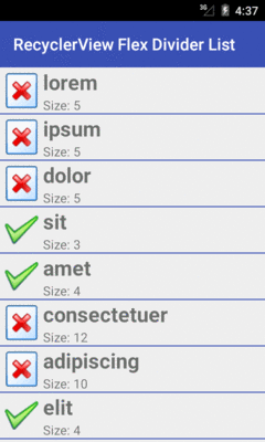
Figure 557: FlexDividerList RecyclerView Demo
Of course, through the library, you can change a lot more about the divider than just its color, through its builder-style API.
A common pattern in vertically-scrolling lists is to have the rows expand and contract when clicked. This allows you to have more information inline in the list, without always taking up all of the vertical space that the information might require.
This might not sound very hard: just toggle the visibility of some widgets, perhaps using an animation.
However, what we really want is that when a row is expanded, that the entirety of the expanded row is visible, assuming that there is sufficient screen space for it. Otherwise, if the user happens to expand some row at the bottom of the list, the user might not realize that more information is available off the bottom of the screen.
Making this work requires knowing where the row is in the list, how much
space will be required when it is expanded, whether the expanded row will
fit given the RecyclerView size, and how to scroll the RecyclerView
to make the row fit if needed.
That sounds complicated.
And so, we turn to a library: the ExpandableLayout provided
by com.github.SilenceDut:ExpandableLayout.
This library is demonstrated in the
RecyclerView/ExpandableRow
sample project. However, this sample project makes extensive use of
the data binding framework, so you may wish to read
that chapter before continuing with this section.
This app is another “list the recent questions on Stack Overflow” apps
that have been profiled elsewhere in the book, starting with
the chapter on Internet access. In this case, we are
using a RecyclerView for the list, with the data binding framework
populating the rows.
A Stack Overflow question has
lots of possible pieces of data,
far more than we would want to display in a RecyclerView row.
Even showing a subset of this information would make for a really long
list, as each row would be fairly large. So, instead, we will use
ExpandableLayout to show the title, owner’s avatar, and question
score all the time and show the tags, view count, and answer count
after the user taps on a row. Since we are “stealing” the click event
to expand and collapse the row, we cannot use it for anything else,
so we also want a “View” button in the expanded area, to allow the user
to view the Stack Overflow question on the Stack Overflow Web site.
Our build.gradle file pulls in libraries for accessing the Stack Exchange
API (Retrofit and Picasso), libraries for displaying the results
(recyclerview-v7 and cardview-v7), plus ExpandableLayout:
apply plugin: 'com.android.application'

repositories {
    maven { url "https://jitpack.io" }
}

dependencies {
    compile 'com.squareup.picasso:picasso:2.5.2'
    compile 'com.squareup.retrofit:retrofit:1.9.0'
    compile 'com.android.support:recyclerview-v7:24.1.1'
    compile 'com.android.support:cardview-v7:24.1.1'
    compile 'com.github.SilenceDut:ExpandableLayout:1.2.0'
}

android {
    compileSdkVersion 24
    buildToolsVersion "24.0.1"

    defaultConfig {
        minSdkVersion 15
        targetSdkVersion 24
        versionCode 1
        versionName "1.0"
        applicationId "com.commonsware.android.databind.expandable"
    }

    dataBinding {
        enabled = true
    }
}
An ExpandableLayout contains two children. The first child will
be shown all the time, while the second child represents the additional
content to be shown when the ExpandableLayout is expanded. So, our
res/layout/row.xml resource contains an ExpandableLayout,
wrapping around the desired UI. The ExpandableLayout itself is wrapped
in a CardView for formatting, and the whole thing is inside a
<layout> for the data binding framework:
<?xml version="1.0" encoding="utf-8"?>
<layout xmlns:android="http://schemas.android.com/apk/res/android"
  xmlns:app="http://schemas.android.com/apk/res-auto">

  <data>

    <import type="android.text.Html" />

    <import type="android.text.TextUtils" />

    <variable
      name="question"
      type="com.commonsware.android.databind.basic.Question" />

    <variable
      name="controller"
      type="com.commonsware.android.databind.basic.QuestionController" />
  </data>

  <android.support.v7.widget.CardView
    xmlns:cardview="http://schemas.android.com/apk/res-auto"
    android:layout_width="match_parent"
    android:layout_height="wrap_content"
    android:layout_margin="4dp"
    cardview:cardCornerRadius="4dp">

    <com.silencedut.expandablelayout.ExpandableLayout
      android:id="@+id/row_content"
      android:layout_width="match_parent"
      android:layout_height="wrap_content"
      android:background="?android:attr/selectableItemBackground"
      android:onTouch="@{controller::onTouch}"
      app:expWithParentScroll="true">

      <LinearLayout
        android:layout_width="match_parent"
        android:layout_height="wrap_content"
        android:orientation="horizontal">

        <ImageView
          android:id="@+id/icon"
          android:layout_width="@dimen/icon"
          android:layout_height="@dimen/icon"
          android:layout_gravity="center_vertical"
          android:contentDescription="@string/icon"
          android:padding="8dip"
          app:error="@{@drawable/owner_error}"
          app:imageUrl="@{question.owner.profileImage}"
          app:placeholder="@{@drawable/owner_placeholder}" />

        <TextView
          android:id="@+id/title"
          android:layout_width="0dp"
          android:layout_height="wrap_content"
          android:layout_gravity="left|center_vertical"
          android:layout_weight="1"
          android:text="@{Html.fromHtml(question.title)}"
          android:textSize="20sp" />

        <TextView
          android:id="@+id/score"
          android:layout_width="wrap_content"
          android:layout_height="wrap_content"
          android:layout_gravity="center_vertical"
          android:layout_marginLeft="8dp"
          android:layout_marginRight="8dp"
          android:text="@{Integer.toString(question.score)}"
          android:textSize="40sp"
          android:textStyle="bold" />

      </LinearLayout>

      <LinearLayout
        android:layout_width="match_parent"
        android:layout_height="wrap_content"
        android:orientation="horizontal"
        android:padding="8dp">

        <LinearLayout
          android:layout_width="0dp"
          android:layout_height="wrap_content"
          android:layout_weight="1"
          android:orientation="vertical">

          <TextView
            android:layout_width="wrap_content"
            android:layout_height="wrap_content"
            android:ellipsize="end"
            android:maxLines="1"
            android:text='@{@string/tags+" "+TextUtils.join(", ", question.tags)}' />

          <TextView
            android:layout_width="wrap_content"
            android:layout_height="wrap_content"
            android:text='@{@string/views+" "+question.viewCount}' />

          <TextView
            android:layout_width="wrap_content"
            android:layout_height="wrap_content"
            android:text='@{@string/answers+" "+question.answerCount}' />

        </LinearLayout>

        <Button
          android:layout_width="wrap_content"
          android:layout_height="wrap_content"
          android:onClick="@{()->controller.showQuestion(context, question)}"
          android:text="@string/btn_view" />
      </LinearLayout>
    </com.silencedut.expandablelayout.ExpandableLayout>
  </android.support.v7.widget.CardView>
</layout>
We do not need to do anything to teach ExpandableLayout to expand
and collapse based upon click events, as that is built into the class.
However, we do opt into one optional feature, via app:expWithParentScroll="true".
This indicates that we want to scroll the parent (here, referring to
the RecyclerView) to allow the expanded ExpandableLayout to be fully
visible where possible.
When the activity is launched, the rows are collapsed:
Figure 558: Expandable RecyclerView Rows, Collapsed
Tapping on one expands it to show the rest of the content, including
scrolling the RecyclerView so it is visible: