Figure 575: ScaleDrawable, Level of 10000
Many times, our artwork can simply be some PNG or JPEG files, perhaps with different variations in different resource directories by density.
Sometimes, though, we need something more.
In addition to supporting standard PNG and JPEG files, Android has a number of custom drawable resource formats — mostly written in XML — that handle specific scenarios.
For example, you may wish to customize “the background”
of a Button, but a Button really has several different background images
for different circumstances (normal, pressed, focused, disabled, etc.).
Android has a certain type of drawable resource that aggregates other
drawable resources, indicating which of those other resources should be used
in different circumstances (e.g., for a normal button use X, for a disabled
button use Y).
In this chapter, we will explore these non-traditional types of “drawables” and how you can use them within your apps.
Understanding this chapter requires that you have read the core chapters, particularly the ones on basic resources, basic widgets, and vector drawables.
Having read the chapters on animators and legacy animations would be useful.
All of the drawables described in this chapter, unless otherwise noted,
are density-independent. Hence, they do not normally go in a density-dependent
directories like res/drawable-hdpi/. However, that still leaves
three possible candidates: res/drawable-nodpi/, res/drawable-anydpi/,
and the unadorned res/drawable/.
A drawable in res/drawable-nodpi/ is valid for any screen density.
However, if there is another drawable with the same base name
in a density-specific directory, and the device running your app happens
to have that screen density, the density-specific resource will be used.
As a result, -nodpi becomes a fallback, to be used in cases where
you do not have something specific for a density.
For example, suppose that we have res/drawable-nodpi/foo.xml and
res/drawable-xxhdpi/foo.png. An -xxhdpi device would use the PNG;
all other devices would use the XML.
A drawable in res/drawable-anydpi/ also is valid for any screen density.
However, in this case, the -anydpi variant trumps any density-specific
variant.
For example, suppose that we have res/drawable-anydpi/foo.xml and
res/drawable-xxhdpi/foo.png. All devices would use the XML, even
-xxhdpi devices.
For this reason, often you will see -anydpi used in conjunction with
other qualifiers. A popular one will be -v21, to restrict the
resources to be used on API Level 21+ devices.
res/drawable/ is a synonym for res/drawable-mdpi/, for backwards
compatibility with really old Android apps, written before we had
density-specific resources. Hence, res/drawable/ is not really an
appropriate choice for density-independent drawables.
Alas, Android Studio may put some drawables here, for uncertain reasons.
So long as there are no other resources with the same basename, the choice made by Android Studio’s developers is unlikely to cause any harm.
The simplest XML drawable format, by far, is for ColorDrawable. Not
surprisingly, this defines a Drawable that is a solid color.
So, you can have a res/drawable/thing.xml file, containing something
like this:
<color xmlns:android="http://schemas.android.com/apk/res/android"
    android:color="#80FF00FF"/>
From there, you can use @drawable/thing or R.drawable.thing in the same
places that you would use any other drawable resource.
Note that a ColorDrawable is different than a color resource. A color
resource (e.g., res/values/colors.xml) specifies a color. A ColorDrawable
resource defines a Drawable of a color. A ColorDrawable resource is
welcome to reference a color defined by a color resource, though:
<color xmlns:android="http://schemas.android.com/apk/res/android"
    android:color="@color/primary_dark"/>
The original way of doing animation on the Web was via the animated GIF. An individual GIF file could contain many frames, and the browser would switch between those frames to display a basic animated effect. This was used by Web designers for things both good (animated progress “spinners”) and bad (“hit the monkey” ad banners).
Android, on the whole, does not support animated GIF files, certainly not
as regular images for use with widgets like ImageView.
However, there are times where having this sort of frame-by-frame animation
would be useful. For example, in another chapter,
we will look at
ProgressBar, which is Android’s primary way of demonstrating progress of background
work. You may wish to customize the “spinning wheel” image that Android
uses by default, to match your app’s color scheme, or to spin your company
logo, or whatever. On the Web, particularly on older browsers, you might use
an animated GIF for that. On Android, you still could, though it would
require a third-party library or
some fairly heavyweight solutions (e.g., WebView, Movie).
Another possibility is to use an AnimationDrawable.
AnimationDrawable has the net effect of an animated GIF:
However, rather than encoding all of this in an animated GIF, you instead encode this information in an XML file, stored as a drawable resource.
XML-encoded drawable resources are typically stored in a drawable
directory that does not contain density information, such as res/drawable/.
That is because the XML-encoded drawable resources are density-invariant:
they behave the same regardless of density. Those, like the AnimationDrawable,
that refer to other images might well refer to other images that are stored
in density-dependent resource directories, but the XML-encoded drawable
itself is independent of density.
An AnimationDrawable is defined as in XML with a root <animation-list>
element, containing a series of <item> elements for each frame:
<animation-list xmlns:android="http://schemas.android.com/apk/res/android"
    android:oneshot="true">
    <item android:drawable="@drawable/frame1" android:duration="250" />
    <item android:drawable="@drawable/frame2" android:duration="250" />
    <item android:drawable="@drawable/frame3" android:duration="250" />
    <item android:drawable="@drawable/frame4" android:duration="250" />
</animation-list>
The root <animation-list> element can have an android:oneshot attribute,
indicating whether the animation should repeat after displaying the last
frame (false) or stop (true).
The <item> elements have android:drawable attributes pointing to the
individual images for the individual frames. Usually these frames are PNG
or JPEG files, but you refer to them as drawable resources, using @drawable
syntax, so Android can find the right image based upon the density (or
other characteristics) of the current device. The <item> elements also
need an android:duration attribute, specifying the time in milliseconds
that this frame should be on the screen. While the above example has all
durations the same, that is not required.
For example, the Android OS uses AnimationDrawable resources in a few
places. One is for the download icon used in a Notification for use
with DownloadManager and similar situations. That drawable resource –
stat_sys_download.xml — looks like this:
<?xml version="1.0" encoding="utf-8"?>
<!--
/* //device/apps/common/res/drawable/status_icon_background.xml
**
** Copyright 2008, The Android Open Source Project
**
** Licensed under the Apache License, Version 2.0 (the "License");
** you may not use this file except in compliance with the License.
** You may obtain a copy of the License at
**
**     http://www.apache.org/licenses/LICENSE-2.0
**
** Unless required by applicable law or agreed to in writing, software
** distributed under the License is distributed on an "AS IS" BASIS,
** WITHOUT WARRANTIES OR CONDITIONS OF ANY KIND, either express or implied.
** See the License for the specific language governing permissions and
** limitations under the License.
*/
-->
<animation-list
        xmlns:android="http://schemas.android.com/apk/res/android"
        android:oneshot="false">
    <item android:drawable="@drawable/stat_sys_download_anim0" android:duration="200" />
    <item android:drawable="@drawable/stat_sys_download_anim1" android:duration="200" />
    <item android:drawable="@drawable/stat_sys_download_anim2" android:duration="200" />
    <item android:drawable="@drawable/stat_sys_download_anim3" android:duration="200" />
    <item android:drawable="@drawable/stat_sys_download_anim4" android:duration="200" />
    <item android:drawable="@drawable/stat_sys_download_anim5" android:duration="200" />
</animation-list>
Here, we have a repeating animation (android:oneshot="false"), consisting of
six frames, each on the screen for 200 milliseconds.
By specifying an AnimationDrawable in your Notification for its icon,
you too can have this sort of animated effect. Of course, the animation is
“fire and forget”: other than by removing or replacing the Notification, you
cannot affect the animation in any other way.
It may be that you have an animated GIF that you would like to use as the
basis for your AnimationDrawable. If you have passing familiarity with
Ruby, the author of this book has published
a Ruby script, named gif2animdraw,
that automates the conversion.
To use gif2animdraw, in addition to the script itself and a Ruby interpreter,
you will need the RMagick, slop, and builder gems. Note that RMagick, in
turn, will require ImageMagick libraries and therefore
is a bit more complicated to install than is your ordinary gem.
On Linux environments,
you can also chmod the script to run it directly; otherwise, you would
run it via the ruby command.
The script takes four command-line switches:
-i should point to the GIF file to be converted-o should point to the root output directory, which typically would be a
project’s res/ directory-d should have, as a value, one of the Android density bucket names (e.g., hdpi);
this will be used as the density for the frames of the GIF--oneshot to indicate that this should be a one-shot animation,
not a repeating oneThe results will be:
drawable/ directory underneath your supplied root, containing a file with the
same name as the GIF file, but with a .xml extension, representing the AnimationDrawable
itselfdrawable-XXXX/ directory, where XXXX is your stated density, containing each
frame of the animated GIF, as a PNG file, with a sequentially numbered filename based
on the GIF’s filenameAnother XML-defined drawable resource, the StateListDrawable, is
key if you want to have different images when widgets are in
different states.
As outlined in the introduction to this chapter, what makes a Button
visually be a Button is its
background. To handle different looks for the Button background for
different states (normal, pressed, disabled, etc.), the standard
Button background is a StateListDrawable, one that looks
something like this:
<?xml version="1.0" encoding="utf-8"?>
<!-- Copyright (C) 2008 The Android Open Source Project

     Licensed under the Apache License, Version 2.0 (the "License");
     you may not use this file except in compliance with the License.
     You may obtain a copy of the License at

          http://www.apache.org/licenses/LICENSE-2.0

     Unless required by applicable law or agreed to in writing, software
     distributed under the License is distributed on an "AS IS" BASIS,
     WITHOUT WARRANTIES OR CONDITIONS OF ANY KIND, either express or implied.
     See the License for the specific language governing permissions and
     limitations under the License.
-->

<selector xmlns:android="http://schemas.android.com/apk/res/android">
    <item android:state_window_focused="false" android:state_enabled="true"
        android:drawable="@drawable/btn_default_normal" />
    <item android:state_window_focused="false" android:state_enabled="false"
        android:drawable="@drawable/btn_default_normal_disable" />
    <item android:state_pressed="true"
        android:drawable="@drawable/btn_default_pressed" />
    <item android:state_focused="true" android:state_enabled="true"
        android:drawable="@drawable/btn_default_selected" />
    <item android:state_enabled="true"
        android:drawable="@drawable/btn_default_normal" />
    <item android:state_focused="true"
        android:drawable="@drawable/btn_default_normal_disable_focused" />
    <item
         android:drawable="@drawable/btn_default_normal_disable" />
</selector>
The XML has a <selector> root element, indicating this is a
StateListDrawable. The <item> elements inside the root describe
what Drawable resource should be used if the StateListDrawable is
being used in some state. For example, if the “window” (think
activity or dialog) does not have the focus
(android:state_window_focused="false") and the Button is enabled
(android:state_enabled="true"), then we use the
@drawable/btn_default_normal Drawable resource. That resource, as
it turns out, is a nine-patch PNG file, described
later in this chapter.
Android applies each rule in turn, top-down, to find the Drawable
to use for a given state of the StateListDrawable. The last rule
has no android:state_* attributes, meaning it is the overall
default image to use if none of the other rules match.
So, if you want to change the background of a Button, you need to:
res/drawable/btn_default.xml inside any of the platforms/ directories,
into your projectButton state nine-patch images into your projectStateListDrawable XML you copiedStateListDrawable as the background for your
Button
The backgrounds of most widgets that have backgrounds by default will
use a StateListDrawable. Searching a platform version’s res/drawable/
directory for XML files containing <selector> elements comes up with
a rather long list.
A ColorStateList is analogous to a StateListDrawable, in that it
defines states and identifies what should be used for a given state. Whereas
StateListDrawable ties states to drawables, ColorStateList ties
states to colors. This allows you to, say, change the color of some
text based upon whether that text is drawn in a widget that is being
pressed, or has the focus, or is disabled. If you tailor the background
of a text-based widget using a StateListDrawable, you may well wind
up tailoring the foreground text using a ColorStateList.
While this chapter mentions ColorStateList, technically a ColorStateList
is not a Drawable. You do not use it in methods that take drawables
or in widget XML attributes that take drawables. Rather, there are other
methods and other attributes that take a ColorStateList, such as
android:textColor.
Similarly, while you can define a ColorStateList in XML, you do not
do so in a res/drawable/ resource directory, but rather a
res/color/ resource directory. Beyond that, though, a ColorStateList
XML resource looks a lot like a StateListDrawable XML resource, such
as this definition of @android:color/primary_text_dark from Android 4.4:
<?xml version="1.0" encoding="utf-8"?>
<!-- Copyright (C) 2008 The Android Open Source Project

     Licensed under the Apache License, Version 2.0 (the "License");
     you may not use this file except in compliance with the License.
     You may obtain a copy of the License at

          http://www.apache.org/licenses/LICENSE-2.0

     Unless required by applicable law or agreed to in writing, software
     distributed under the License is distributed on an "AS IS" BASIS,
     WITHOUT WARRANTIES OR CONDITIONS OF ANY KIND, either express or implied.
     See the License for the specific language governing permissions and
     limitations under the License.
-->

<selector xmlns:android="http://schemas.android.com/apk/res/android">
    <item android:state_enabled="false" android:color="@android:color/bright_foreground_dark_disabled"/>
    <item android:state_window_focused="false" android:color="@android:color/bright_foreground_dark"/>
    <item android:state_pressed="true" android:color="@android:color/bright_foreground_dark_inverse"/>
    <item android:state_selected="true" android:color="@android:color/bright_foreground_dark_inverse"/>
    <item android:state_activated="true" android:color="@android:color/bright_foreground_dark_inverse"/>
    <item android:color="@android:color/bright_foreground_dark"/> <!-- not selected -->
</selector>
Based upon the state, the ColorStateList pulls in a separate resource
to define the actual color. Those colors, in turn, are defined via <color>
elements in res/values/colors.xml as color resources, or are pulled
in from system-defined colors (@android:color/... syntax):
    <color name="background_dark">#ff000000</color>
    <color name="background_light">#ffffffff</color>
    <color name="bright_foreground_dark">@android:color/background_light</color>
    <color name="bright_foreground_light">@android:color/background_dark</color>
    <color name="bright_foreground_dark_disabled">#80ffffff</color>
    <color name="bright_foreground_light_disabled">#80000000</color>
    <color name="bright_foreground_dark_inverse">@android:color/bright_foreground_light</color>
    <color name="bright_foreground_light_inverse">@android:color/bright_foreground_dark</color>
A LayerDrawable basically stacks a bunch of other drawables on top of each
other. Later drawables are drawn on top of earlier drawables, much as later
children of a RelativeLayout are drawn on top of earlier children.
Typically, you will create a LayerDrawable via a <layer-list>
XML drawable resource.
For example, a ToggleButton widget has a LayerDrawable as its
background:
?xml version="1.0" encoding="utf-8"?>
<!-- Copyright (C) 2008 The Android Open Source Project

     Licensed under the Apache License, Version 2.0 (the "License");
     you may not use this file except in compliance with the License.
     You may obtain a copy of the License at

          http://www.apache.org/licenses/LICENSE-2.0

     Unless required by applicable law or agreed to in writing, software
     distributed under the License is distributed on an "AS IS" BASIS,
     WITHOUT WARRANTIES OR CONDITIONS OF ANY KIND, either express or implied.
     See the License for the specific language governing permissions and
     limitations under the License.
-->

<layer-list xmlns:android="http://schemas.android.com/apk/res/android">
    <item android:id="@+android:id/background" android:drawable="@android:drawable/btn_default_small" />
    <item android:id="@+android:id/toggle" android:drawable="@android:drawable/btn_toggle" />
</layer-list>
This LayerDrawable draws two images on top of each other. One is a standard small button
background (@android:drawable/btn_default_small). The other is the actual face of the
toggle itself — a StateListDrawable that uses different images for checked and unchecked
states.
In the <layer-list>, you can have several <item> elements. Each <item> element usually will
need an android:drawable attribute, pointing to the drawable that should be drawn. Optionally,
you can assign ID values to the items via android:id attributes, much like you would do
for widgets in a layout XML resource. Later on, you can call findDrawableByLayerId() on
the LayerDrawable to retrieve an individual Drawable representing the layer, given its
android:id value.
There are also android:left, android:right, android:top, and android:bottom attributes,
which you can use to provide dimension values to offset an image within the layered set.
For example, you could use android:left to inset one of the layers by a certain number
of pixels (or dp or whatever).
By default, the layers in the LayerDrawable are scaled to fit the size of whatever View
is holding them (e.g., the size of the ToggleButton using the LayerDrawable as a background).
To prevent this, you can skip the android:drawable attribute, and instead nest a <bitmap>
element inside the <item>, where you can provide an android:gravity attribute to control
how the image should be handled relative to its containing View. We will get more into
nested <bitmap> elements later in this chapter.
A TransitionDrawable is a LayerDrawable with one added feature: for a two-layer drawable,
it can smoothly transition from showing one layer to another on top.
For example, you may have noticed that when you tap-and-hold on a row in a ListView that
the selector highlight has an animated effect, slowly shifting colors from the color used
for a simple click to one signifying that you have long-clicked the row. Android accomplishes
this via a TransitionDrawable, set up as a <transition> XML drawable resource:
<?xml version="1.0" encoding="utf-8"?>
<!-- Copyright (C) 2008 The Android Open Source Project

     Licensed under the Apache License, Version 2.0 (the "License");
     you may not use this file except in compliance with the License.
     You may obtain a copy of the License at

          http://www.apache.org/licenses/LICENSE-2.0

     Unless required by applicable law or agreed to in writing, software
     distributed under the License is distributed on an "AS IS" BASIS,
     WITHOUT WARRANTIES OR CONDITIONS OF ANY KIND, either express or implied.
     See the License for the specific language governing permissions and
     limitations under the License.
-->

<transition xmlns:android="http://schemas.android.com/apk/res/android">
    <item android:drawable="@android:drawable/list_selector_background_pressed"  />
    <item android:drawable="@android:drawable/list_selector_background_longpress"  />
</transition>
The TransitionDrawable object has a startTransition() method that you can use,
that will have Android smoothly switch from the first drawable to the second. You
specify the duration of the transition as a number of milliseconds passed to
startTransition(). There are also options to reverse the transition, set up
more of a cross-fade effect, and the like.
A LevelListDrawable is similar in some respects to a StateListDrawable, insofar
as one specific item from the “list drawable” will be displayed based upon certain
conditions. In the case of StateListDrawable, the conditions are based upon the
state of the widget using the drawable (e.g., checked, pressed, disabled). In the
case of LevelListDrawable, it is merely an integer level.
For example, the status or system bar of your average Android device has an icon
indicating the battery charge level. That is actually implemented as a LevelListDrawable,
via an XML resource containing a root <level-list> element:
<?xml version="1.0" encoding="utf-8"?>
<!--
/* //device/apps/common/res/drawable/stat_sys_battery.xml
**
** Copyright 2007, The Android Open Source Project
**
** Licensed under the Apache License, Version 2.0 (the "License");
** you may not use this file except in compliance with the License.
** You may obtain a copy of the License at
**
**     http://www.apache.org/licenses/LICENSE-2.0
**
** Unless required by applicable law or agreed to in writing, software
** distributed under the License is distributed on an "AS IS" BASIS,
** WITHOUT WARRANTIES OR CONDITIONS OF ANY KIND, either express or implied.
** See the License for the specific language governing permissions and
** limitations under the License.
*/
-->

<level-list xmlns:android="http://schemas.android.com/apk/res/android">
    <item android:maxLevel="4" android:drawable="@android:drawable/stat_sys_battery_0" />
    <item android:maxLevel="15" android:drawable="@android:drawable/stat_sys_battery_15" />
    <item android:maxLevel="35" android:drawable="@android:drawable/stat_sys_battery_28" />
    <item android:maxLevel="49" android:drawable="@android:drawable/stat_sys_battery_43" />
    <item android:maxLevel="60" android:drawable="@android:drawable/stat_sys_battery_57" />
    <item android:maxLevel="75" android:drawable="@android:drawable/stat_sys_battery_71" />
    <item android:maxLevel="90" android:drawable="@android:drawable/stat_sys_battery_85" />
    <item android:maxLevel="100" android:drawable="@android:drawable/stat_sys_battery_100" />
</level-list>
This LevelListDrawable has eight items, whose android:drawable attributes point to
specific other drawable resources (in this case, standard PNG files with different
implementations for different densities). Each <item> has an android:maxLevel value.
When someone calls setLevel() on the Drawable or setImageLevel() on the ImageView,
Android will choose the item with the lowest maxLevel that meets or exceeds the requested
level, and show that. In the case of the battery icon, when the battery level changes,
the status bar picks up that change and calls setImageLevel() with the battery charge
percentage (expressed as an integer from 0-100) — that, in turn, triggers the right
PNG file to be displayed.
Another use of LevelListDrawable is with a RemoteViews, such as for an
app widget.
The setImageLevel() method is “remotable”, despite not being directly part of the
RemoteViews API. Hence, given that you use a LevelListDrawable in your app widget’s
layout, you should be able to use setInt() with a method name of "setImageLevel" to
have the app widget update to display the proper image.
A ScaleDrawable does pretty much what its name suggests: it scales another
drawable. A ClipDrawable does pretty much what its name suggests: it clips
another drawable.
How they do this, and how you control it, requires a bit more explanation.
Like LevelListDrawable, ScaleDrawable and ClipDrawable leverage the setLevel()
method on Drawable (or the setImageLevel() method on ImageView). Whereas
LevelListDrawable uses this to choose an individual image out of a set of possible
images, ScaleDrawable and ClipDrawable use the level to control how much an
image should be scaled or clipped. For this, they support a range of levels from
0 to 10000.
For a level of 0, ScaleDrawable will not draw anything. For a level from 1 to
10000, ScaleDrawable will scale an image from a configurable minimum size
to the bounds of the View to which the drawable is applied.
The amount of scaling is determined by android:scaleHeight and
android:scaleWidth attributes:
<?xml version="1.0" encoding="utf-8"?>
<scale xmlns:android="http://schemas.android.com/apk/res/android"
  android:drawable="@android:drawable/btn_default"
  android:scaleGravity="left|top"
  android:scaleHeight="50%"
  android:scaleWidth="50%"/>
The above ScaleDrawable (denoted by the <scale> root element) says that
we should scale both height and width of the underlying drawable to 50% of the
available space for the drawable, when the level is at its maximum (10000).
Note that you do not have to scale along both dimensions. If, for
example, you kept android:scaleWidth but deleted android:scaleHeight,
setImageLevel() would control the scaled width of the underlying
image (provided via android:drawable) but not the height.
The android:scaleGravity attribute indicates where the scaled image
should reside within the available space (the 10000 level, determined by
the bounds of the View to which the drawable is applied). The value
shown above, center, keeps the image centered within the available
space, and shrinks or expands it around the center. A value of left|top
would keep the image in the upper-left corner of the space, having the
visual effect of moving the lower-right corner based upon the supplied
level.
Scaling proportionally reduces the height and/or width of an image. Clipping, on the other hand, chops off part of the height or width of the image.
<clip xmlns:android="http://schemas.android.com/apk/res/android"
  android:clipOrientation="horizontal"
  android:drawable="@drawable/btn_default_normal"
  android:gravity="left"/>
In this sample ClipDrawable (indicated by the <clip> root element),
we are going to allow the level to chop off part of the image indicated
by the android:drawable attribute. Our android:clipOrientation, set
to horizontal, means we are going to chop off part of the width
(vertical would have us chop off part of the height). The amount
that is going to be chopped off is the level you supply (e.g., setImageLevel())
divided by 10000. Hence, a level of 5000 will chop off 0.5 (a.k.a., 50%)
of the image.
Where in the image the clipping occurs is determined by the android:gravity
attribute. An android:clipOrientation of horizontal and an android:gravity
of left, as in the sample drawable above, means that the left side of the image
is retained, and the image will be clipped on the right. Specifying right instead
of left would reverse that, clipping the image from the right, while center
would clip equally from both sides. There are other gravity values as well,
such as top and bottom values to be used with a vertical orientation.
To see these effects, take a look at the
Drawable/ScaleClip
sample project. This is derived from an earlier example showing how to use ViewPager
with PagerTabStrip. In that example, we had 10 tabs, each being a large EditText
widget. In this example, we have 2 tabs, “Scale” and “Clip”, both using the same
layout:
<RelativeLayout xmlns:android="http://schemas.android.com/apk/res/android"
  android:layout_width="match_parent"
  android:layout_height="match_parent">

  <ImageView
    android:id="@+id/image"
    android:layout_width="150dp"
    android:layout_height="150dp"
    android:layout_centerHorizontal="true"
    android:layout_marginTop="20dp"
    android:scaleType="fitXY"/>

  <SeekBar
    android:id="@+id/level"
    android:layout_width="match_parent"
    android:layout_height="wrap_content"
    android:layout_alignParentBottom="true"
    android:layout_marginBottom="20dp"
    android:layout_marginLeft="20dp"
    android:layout_marginRight="20dp"
    android:max="10000"
    android:progress="10000"/>

</RelativeLayout>
This is simply a 150dp square ImageView towards the top of the screen and a
SeekBar towards the bottom of the screen. The SeekBar will be used to control
the level applied to a ScaleDrawable and ClipDrawable, which is why we have
android:max set to 10000. We also have our “progress” (original SeekBar
value) set to 10000, so the bar’s thumb will be fully slid over to the right
at the outset.
The fragments that we will use for the tabs both inherit from a common abstract
FragmentBase class:
package com.commonsware.android.scaleclip;

import android.app.Fragment;
import android.os.Bundle;
import android.view.LayoutInflater;
import android.view.View;
import android.view.ViewGroup;
import android.widget.ImageView;
import android.widget.SeekBar;

abstract public class FragmentBase extends Fragment implements
    SeekBar.OnSeekBarChangeListener {
  abstract void setImageBackground(ImageView image);

  private ImageView image=null;

  @Override
  public View onCreateView(LayoutInflater inflater,
                           ViewGroup container,
                           Bundle savedInstanceState) {
    setRetainInstance(true);

    View result=inflater.inflate(R.layout.scaleclip, container, false);
    SeekBar bar=((SeekBar)result.findViewById(R.id.level));

    bar.setOnSeekBarChangeListener(this);
    image=(ImageView)result.findViewById(R.id.image);
    setImageBackground(image);
    image.setImageLevel(bar.getProgress());

    return(result);
  }

  @Override
  public void onProgressChanged(SeekBar seekBar, int progress,
                                boolean fromUser) {
    image.setImageLevel(progress);
  }

  @Override
  public void onStartTrackingTouch(SeekBar seekBar) {
    // no-op
  }

  @Override
  public void onStopTrackingTouch(SeekBar seekBar) {
    // no-op
  }
}
In onCreateView(), we inflate the above layout file, hook up the fragment itself to be
the listener for SeekBar change events, call the subclass’ setImageBackground() method
to populate the ImageView with an image, and set the ImageView’s level to be
the initial value of the SeekBar. When the SeekBar value changes, our onProgressChanged()
method will adjust the level.
The concrete subclasses — ScaleFragment and ClipFragment — simply populate the
ImageView with the ScaleDrawable and ClipDrawable resources shown earlier in
this section:
package com.commonsware.android.scaleclip;

import android.widget.ImageView;

public class ScaleFragment extends FragmentBase {
  @Override
  void setImageBackground(ImageView image) {
    image.setImageResource(R.drawable.scale);
  }
}
package com.commonsware.android.scaleclip;

import android.widget.ImageView;

public class ClipFragment extends FragmentBase {
  @Override
  void setImageBackground(ImageView image) {
    image.setImageResource(R.drawable.clip);
  }
}
Those two drawables based their scaling and clipping on res/drawable-xdpi/btn_default_normal.9.png. This
is a slightly-modified copy of the default button background, and is a nine-patch PNG file. We
will discuss nine-patch PNG files later in this chapter — suffice it to say
for now that it is a PNG file with rules about how it should be stretched.
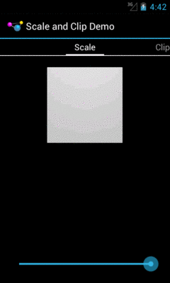
Our scale tab starts off showing the full image:
Figure 575: ScaleDrawable, Level of 10000
As we start sliding the SeekBar thumb to the left, the image shrinks progressively:
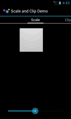
Figure 576: ScaleDrawable, Level of Approximately 5000
It eventually tends towards the 50% level specified in our android:scaleHeight and
android:scaleWidth values:
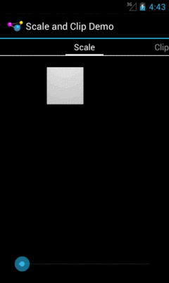
Figure 577: ScaleDrawable, Level of Approximately 100
Sliding it all the way to the left, though, causes the image to vanish.
The ClipDrawable starts off looking much like the ScaleDrawable:
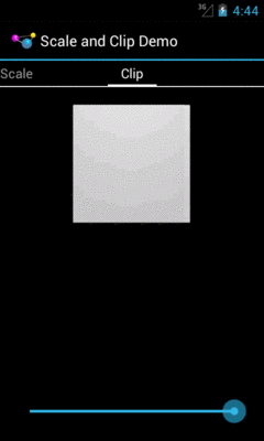
Figure 578: ClipDrawable, Level of 10000
As we slide the SeekBar to the left, the right side of the image gets clipped:
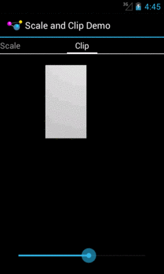
Figure 579: ClipDrawable, Level of Approximately 5000
An InsetDrawable allows you to apply insets on any side (or all sides) of some
other drawable resource. The use case cited in
the documentation
is “This is used when a View needs a background that is smaller than the View’s actual bounds”.
However, at the present time, nothing in the Android open source code uses this particular
type of resource, or even the Java class.
In principle, though, you could have an XML drawable resource that looked like this:
<?xml version="1.0" encoding="utf-8"?>
<inset xmlns:android="http://schemas.android.com/apk/res/android"
    android:drawable="@drawable/something_or_another"
    android:insetLeft="20dp"
    android:insetTop="10dp" />
When used as the background for some View, for example, Android would pull in the
something_or_another resource and effectively add 20dp of left margin and 10dp
of top margin on the background when calculating its size and drawing it on the screen.
ShapeDrawable is the original approach to implementing limited vector
art on Android.
It gives you what amounts to a very tiny subset of SVG, for creating simple vector
art shapes.
The root element of a ShapeDrawable resource is <shape>, which may have
child elements, along with attributes, to configure what gets rendered on the screen
when the drawable is applied.
This section will review the elements and attributes available to you, with sample
drawables (and screenshots) culled from
the
Drawable/Shape
sample project.
This is a “sampler” project, designed to depict a number of ShapeDrawables. To accomplish
this, we will use action bar tabs. Our activity
(MainActivity) has a pair of static int arrays, one pointing at string resources to
use for tab captions, the other pointing at corresponding drawable resources:
package com.commonsware.android.shape;

import android.app.ActionBar;
import android.app.ActionBar.Tab;
import android.app.ActionBar.TabListener;
import android.app.Activity;
import android.app.FragmentTransaction;
import android.os.Bundle;
import android.widget.ImageView;

public class MainActivity extends Activity implements TabListener {
  private static final int TABS[]= { R.string.solid, R.string.gradient,
      R.string.border, R.string.rounded, R.string.ring,
      R.string.layered };
  private static final int DRAWABLES[]= { R.drawable.rectangle,
      R.drawable.gradient, R.drawable.border, R.drawable.rounded,
      R.drawable.ring, R.drawable.layered };
  private ImageView image=null;

  @Override
  public void onCreate(Bundle savedInstanceState) {
    super.onCreate(savedInstanceState);
    setContentView(R.layout.activity_main);

    image=(ImageView)findViewById(R.id.image);

    ActionBar bar=getActionBar();
    bar.setNavigationMode(ActionBar.NAVIGATION_MODE_TABS);

    for (int i=0; i < TABS.length; i++) {
      bar.addTab(bar.newTab().setText(getString(TABS[i]))
                    .setTabListener(this));
    }
  }

  @Override
  public void onTabSelected(Tab tab, FragmentTransaction ft) {
    image.setImageResource(DRAWABLES[tab.getPosition()]);
  }

  @Override
  public void onTabUnselected(Tab tab, FragmentTransaction ft) {
    // no-op
  }

  @Override
  public void onTabReselected(Tab tab, FragmentTransaction ft) {
    // no-op
  }
}
In onCreate(), we toggle the ActionBar into tab-navigation mode, then iterate over the
arrays and add one tab per element.
Our layout is an ImageView, named image, centered on the screen,
taking up 80% of the horizontal space,
plus has 20dp of top and bottom margin:
<LinearLayout xmlns:android="http://schemas.android.com/apk/res/android"
  xmlns:tools="http://schemas.android.com/tools"
  android:id="@+id/LinearLayout1"
  android:layout_width="match_parent"
  android:layout_height="match_parent"
  android:orientation="horizontal"
  android:gravity="center"
  android:weightSum="10">

    <ImageView
      android:id="@+id/image"
      android:src="@drawable/rectangle"
      android:layout_width="0dp"
      android:layout_height="match_parent"
      android:layout_marginTop="20dp"
      android:layout_marginBottom="20dp"
      android:layout_gravity="center"
      android:layout_weight="8"/>

</LinearLayout>
In our activity’s onTabSelected() — implemented because the activity is the TabListener
for our tabs — we get the position of our tab and fill in the appropriate drawable into the
ImageView.
Given that, let’s take a look at how to construct a ShapeDrawable, along with some
sample drawables.
Your root element, not surprisingly, is <shape>.
The primary thing that you will define on the <shape> element is the redundantly-named
android:shape attribute, to define what sort of shape you want:
line (a shape with no interior)oval (also for ellipses)rectangle (including rounded rectangles)ring (for partially-filled circles)There are some other attributes available on <shape> for a ring, which we will examine
later in this chapter.
Your shape will usually require some sort of fill, to say what color goes in the shape. There are two types of fills: solid and gradient.
For a solid fill, add a <solid> child element to the <shape>, with an android:color
attribute indicating what color to use. As with most places in Android, this can either
be a literal color or a reference to a color resource.
So, for example, we can specify a solid red rectangle as:
<?xml version="1.0" encoding="utf-8"?>
<shape xmlns:android="http://schemas.android.com/apk/res/android"
  android:shape="rectangle">
  <solid android:color="#FFAA0000"/>
</shape>
This gives us the following visual result:
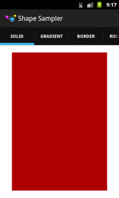
Figure 580: ShapeDrawable, Solid Red Rectangle
Your alternative fill is a gradient. The nice thing about gradients with ShapeDrawable
is that they are generated at runtime from the specifications in the ShapeDrawable,
and therefore will be smooth. Gradients that appear in PNG files and the like, if stretched,
will tend to have a banding effect.
Gradient fills are defined via a <gradient> child element of the <shape> element.
The simplest way to set up a gradient is to use three attributes:
android:startColor and android:endColor, to specify the starting and ending colors
of the gradient, respectively, andandroid:angle, to specify what direction the gradient “flows” inThe angle must be a multiple of 45 degrees. 0 degrees is left-to-right, 90 degrees is bottom-to-top, 180 degrees is right-to-left, and 270 degrees is top-to-bottom.
So, for example, we could change our rectangle to have a gradient fill, from red to blue, with red at the top, via:
<?xml version="1.0" encoding="utf-8"?>
<shape xmlns:android="http://schemas.android.com/apk/res/android"
  android:shape="rectangle">

  <gradient
    android:angle="270"
    android:endColor="#FF0000FF"
    android:startColor="#FFFF0000"/>

</shape>
That gives us:
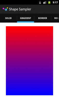
Figure 581: ShapeDrawable, Gradient Fill Rectangle
We will examine some other gradient options in the section on rings, later in this chapter.
If you want a separate color for a border around your shape, you can use
the <stroke> element, as a child of the <shape> element, to configure one.
There are four attributes that you can declare. The two that you will probably
always use are android:color (to indicate the color of the border) and
android:width (to indicate the thickness of the border). By default, using
just those two will give you a solid line around the edge of your shape.
If you would prefer a dashed border, you can add in android:dashWidth
(to indicate how long each dash segment should be) and android:dashGap
(to indicate how long the gaps between dash segments should be).
So, for example, we can add a dashed border to our gradient rectangle via
a suitable <stroke> element:
<?xml version="1.0" encoding="utf-8"?>
<shape xmlns:android="http://schemas.android.com/apk/res/android"
  android:shape="rectangle">

  <gradient
    android:angle="270"
    android:endColor="#FF0000FF"
    android:startColor="#FFFF0000"/>

  <stroke
    android:width="2dp"
    android:dashGap="4dp"
    android:dashWidth="20dp"
    android:color="#FF000000"/>

</shape>
This gives us:
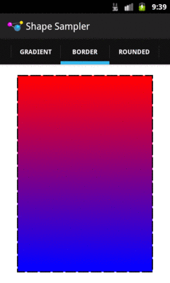
Figure 582: ShapeDrawable, Gradient Fill Rectangle with Dashed Border
If we are implementing a rectangle shape, but we really want it to be
a rounded rectangle, we can add a <corners> element as a child of the
<shape> element. You can specify the radius to apply to the corners,
either for all corners (e.g., android:radius), or for individual
corners (e.g., android:topLeftRadius). Here, “radius” basically means
the size of the circle that should implement the corner, where a radius
of 0dp would indicate the default square corner.
So, if we wanted to add rounded corners to our gradient-filled, dash-outlined rectangle, we could use this:
<?xml version="1.0" encoding="utf-8"?>
<shape xmlns:android="http://schemas.android.com/apk/res/android"
  android:shape="rectangle">

  <gradient
    android:angle="270"
    android:endColor="#FF0000FF"
    android:startColor="#FFFF0000"/>

  <stroke
    android:dashGap="4dp"
    android:dashWidth="20dp"
    android:width="2dp"
    android:color="#FF000000"/>

  <corners android:radius="8dp"/>

</shape>
This gives us the following:
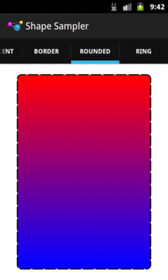
Figure 583: ShapeDrawable, Gradient Fill Rounded Rectangle with Dashed Border
There are also <padding> and <size> elements that you can add, that specify
padding to put on the various sizes and the overall size of the drawable. More often
than not, you would actually handle this on the ImageView or other widget that is
using your drawable, but if you would prefer to define those things in the drawable
itself, you are welcome to do so.
Rings are a bit more complicated, in large part because they are not completely filled. With a ring, the “fill” is filling what goes in the ring itself, not the “hole” in the center of the ring. This means that we need to teach Android more about how that “hole” is supposed to be set up.
To do that, we need to provide two pieces of information:
The ring will then be drawn based upon that inner radius and thickness.
You might wonder, “well, where does the size of the actual drawable come into
play?” After all, if we specify an inner radius of 20dp and a thickness of
10dp, that would give us an outer radius of 30dp, for a total width of
60dp… regardless of how big the actual drawable is.
And that is completely correct.
However, for both the inner radius and the thickness, you have two choices of how to specify their values:
<size> or the
widget that is using the drawable)This gives us four total attributes to choose from, to be placed on
the <shape> element for ring drawables:
android:innerRadiusandroid:innerRadiusRatioandroid:thicknessandroid:thicknessRatioTherefore, if you want the ring’s size to be based on the size of the
drawable, you would use innerRadiusRatio, thicknessRatio, or both.
The other thing about rings is that they are round. Hence, a default
linear gradient fill — going from one side of the drawable to another –
may not be what you really want. You can control the type of gradient
fill to use via the android:type attribute on the <gradient> element.
There are three possible values:
linear (the default behavior)radial, where the gradient starts from the center (or another
point that you define) and changes color from that center to the edgessweep, where the gradient revolves clockwise in a circle, starting from
whatever android:angle you specify (or 0, meaning “east”, as the
default)So, for example, take a look at the following ShapeDrawable:
<?xml version="1.0" encoding="utf-8"?>
<shape xmlns:android="http://schemas.android.com/apk/res/android"
  android:innerRadiusRatio="3"
  android:shape="ring"
  android:thickness="15dp"
  android:useLevel="false">

  <gradient
    android:centerColor="#4c737373"
    android:endColor="#ff9933CC"
    android:startColor="#4c737373"
    android:type="sweep"/>

</shape>
Here, we:
ring
15dp
We also have android:useLevel="false" in the <shape> element.
For unknown reasons, this is required for rings but not for other
types of shapes.
This gives us:
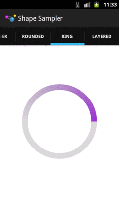
Figure 584: ShapeDrawable, Ring with Gradient Fill
Having an XML drawable format named BitmapDrawable may seem like a
contradiction in terms. However, BitmapDrawable is not an XML representation
of a bitmap, but rather an XML representation of operations to perform on
an actual bitmap.
The big thing that BitmapDrawable offers is android:tileMode, which
turns a single bitmap into a repeating bitmap. The bitmap is tiled, horizontally
and vertically, using a tiling mode that you specify.
This is demonstrated in the
Drawable/TileMode
sample project.
Our activity’s layout is just a LinearLayout, set to fill the screen:
<LinearLayout xmlns:android="http://schemas.android.com/apk/res/android"
  xmlns:tools="http://schemas.android.com/tools"
  android:id="@+id/widget"
  android:layout_width="match_parent"
  android:layout_height="match_parent"
  android:orientation="horizontal">

</LinearLayout>
Our activity populates action bar tabs, where it applies a particular background
image to the LinearLayout (known as R.id.widget) based on the selected
tab:
package com.commonsware.android.tilemode;

import android.app.ActionBar;
import android.app.ActionBar.Tab;
import android.app.ActionBar.TabListener;
import android.app.Activity;
import android.app.FragmentTransaction;
import android.os.Bundle;
import android.view.View;

public class MainActivity extends Activity implements TabListener {
  private static final int TABS[]= { R.string._default, R.string.clamp,
      R.string.repeat, R.string.mirror };
  private static final int DRAWABLES[]= { R.drawable._default,
      R.drawable.clamp, R.drawable.repeat, R.drawable.mirror };
  private View widget=null;

  @Override
  public void onCreate(Bundle savedInstanceState) {
    super.onCreate(savedInstanceState);
    setContentView(R.layout.activity_main);

    widget=findViewById(R.id.widget);

    ActionBar bar=getActionBar();
    bar.setNavigationMode(ActionBar.NAVIGATION_MODE_TABS);

    for (int i=0; i < TABS.length; i++) {
      bar.addTab(bar.newTab().setText(getString(TABS[i]))
                    .setTabListener(this));
    }
  }

  @Override
  public void onTabSelected(Tab tab, FragmentTransaction ft) {
    widget.setBackgroundResource(DRAWABLES[tab.getPosition()]);
  }

  @Override
  public void onTabUnselected(Tab tab, FragmentTransaction ft) {
    // no-op
  }

  @Override
  public void onTabReselected(Tab tab, FragmentTransaction ft) {
    // no-op
  }
}
The res/drawable/_default.xml resource, used on the first tab, is an unadorned
BitmapDrawable resource, where our <bitmap> element simply has an
android:src attribute pointing to a bitmap to be used for this BitmapDrawable:
<bitmap xmlns:android="http://schemas.android.com/apk/res/android"
  android:src="@drawable/hatch"/>
Since we have not specified a tile mode, the image is stretched to fill the
size of our LinearLayout when serving as its background:
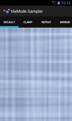
Figure 585: BitmapDrawable, Without android:tileMode
The res/drawable/clamp.xml resource, used on the second tab, adds
android:tileMode="clamp":
<bitmap xmlns:android="http://schemas.android.com/apk/res/android"
  android:src="@drawable/hatch"
  android:tileMode="clamp"/>
This causes the right-most column of pixels and the bottom-most column of pixels to be repeated to fill the available space:
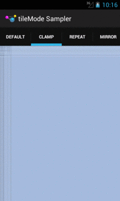
Figure 586: BitmapDrawable, Clamped
Zooming in on the upper-left portion of our LinearLayout demonstrates this:
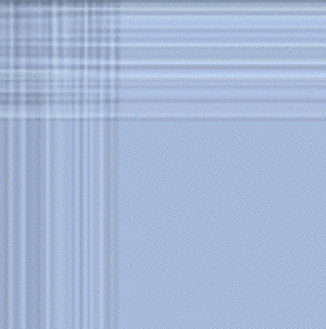
Figure 587: Portion of BitmapDrawable, Clamped
The res/drawable/repeat.xml resource, used on the third tab, employs
android:tileMode="repeat":
<bitmap xmlns:android="http://schemas.android.com/apk/res/android"
  android:src="@drawable/hatch"
  android:tileMode="repeat"/>
Here, the image is simply repeated in toto to fill the available space, rather than only its lower-right edges:
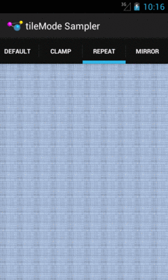
Figure 588: BitmapDrawable, Repeated
Zooming in on an arbitrary chunk
of the LinearLayout shows this effect:
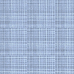
Figure 589: Portion of BitmapDrawable, Repeated
The res/drawable/mirror.xml resource, used on the fourth tab, uses
android:tileMode="mirror":
<bitmap xmlns:android="http://schemas.android.com/apk/res/android"
  android:src="@drawable/hatch"
  android:tileMode="mirror"/>
Here, the image is repeated, but alternately mirrored along the repeating axis. So, it is flipped horizontally for each repeat along the horizontal axis, and it is flipped vertically for each repeat along the vertical axis:
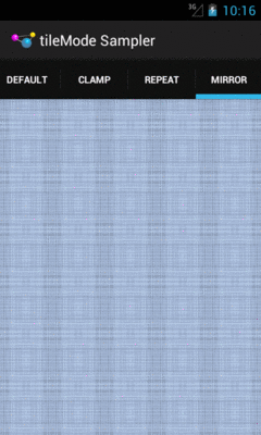
Figure 590: BitmapDrawable, Mirrored
Zooming in on an arbitrary chunk
of the LinearLayout shows this effect:
Figure 591: Portion of BitmapDrawable, Mirrored
Let’s say that we wanted to have a pair of ShapeDrawable images, one
superimposed on another. Since a single ShapeDrawable defines only one
shape, we would need something else to assist with stacking the images.
One possibility would be to use a LayerDrawable, creating three total
resources:
ShapeDrawable, in its own resource fileShapeDrawable, in its own resource fileLayerDrawable, holding references to the two ShapeDrawable resourcesAnd this will certainly work. But you have an alternative: put all of it into a single drawable resource.
An android:drawable attribute in an <item> element can be replaced by
child elements representing another drawable structure. Hence, rather
than having a LayerDrawable with two <item> elements pointing to other
drawable resources, we could have those same <item> elements contain
the other drawable XML structures, and thereby cut our number of files from
3 to 1.
For example, we could have something like this:
<?xml version="1.0" encoding="utf-8"?>
<layer-list xmlns:android="http://schemas.android.com/apk/res/android">

  <item>
    <shape android:shape="rectangle">
      <gradient
        android:angle="270"
        android:endColor="#FF0000FF"
        android:startColor="#FFFF0000"/>

      <stroke
        android:dashGap="4dp"
        android:dashWidth="20dp"
        android:width="2dp"
        android:color="#FF000000"/>

      <corners android:radius="8dp"/>
    </shape>
  </item>
  <item>
    <shape
      android:innerRadiusRatio="3"
      android:shape="ring"
      android:thickness="15dp"
      android:useLevel="false">
      <gradient
        android:endColor="#FFFFFFFF"
        android:startColor="#ff000000"
        android:type="sweep"/>
    </shape>
  </item>

</layer-list>
This is a LayerDrawable, layering two ShapeDrawable structures. The
first ShapeDrawable is our dash-bordered, gradient-filled, rounded rectangle
from before. The second ShapeDrawable is a ring with a simple gradient
sweep fill, from black to white.
This gives us:
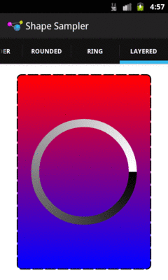
Figure 592: Composite Drawable
Hence, any of the drawable XML structures other than ShapeDrawable can, in their <item>
elements, hold any drawable XML structure, instead of pointing to another separate
resource.
Android uses this trick as well. For example, the stock ProgressBar image is based
off of a LayerDrawable wrapped around three ShapeDrawable structures:
<?xml version="1.0" encoding="utf-8"?>
<!-- Copyright (C) 2008 The Android Open Source Project

     Licensed under the Apache License, Version 2.0 (the "License");
     you may not use this file except in compliance with the License.
     You may obtain a copy of the License at

          http://www.apache.org/licenses/LICENSE-2.0

     Unless required by applicable law or agreed to in writing, software
     distributed under the License is distributed on an "AS IS" BASIS,
     WITHOUT WARRANTIES OR CONDITIONS OF ANY KIND, either express or implied.
     See the License for the specific language governing permissions and
     limitations under the License.
-->

<layer-list xmlns:android="http://schemas.android.com/apk/res/android">

    <item android:id="@android:id/background">
        <shape>
            <corners android:radius="5dip" />
            <gradient
                    android:startColor="#ff9d9e9d"
                    android:centerColor="#ff5a5d5a"
                    android:centerY="0.75"
                    android:endColor="#ff747674"
                    android:angle="270"
            />
        </shape>
    </item>

    <item android:id="@android:id/secondaryProgress">
        <clip>
            <shape>
                <corners android:radius="5dip" />
                <gradient
                        android:startColor="#80ffd300"
                        android:centerColor="#80ffb600"
                        android:centerY="0.75"
                        android:endColor="#a0ffcb00"
                        android:angle="270"
                />
            </shape>
        </clip>
    </item>

    <item android:id="@android:id/progress">
        <clip>
            <shape>
                <corners android:radius="5dip" />
                <gradient
                        android:startColor="#ffffd300"
                        android:centerColor="#ffffb600"
                        android:centerY="0.75"
                        android:endColor="#ffffcb00"
                        android:angle="270"
                />
            </shape>
        </clip>
    </item>

</layer-list>
We will get into how this works with a ProgressBar in a separate chapter.
Most of the types of non-traditional drawable resources you can create in Android are described in XML… but not all.
As you read through the Android documentation, you no doubt ran into references to “nine-patch” or “9-patch” and wondered what Android had to do with quilting. Rest assured, you will not need to take up needlework to be an effective Android developer.
If, however, you are looking to create backgrounds for resizable
widgets, like a Button, you may wish to work with
nine-patch images.
As the Android documentation states, a nine-patch is “a PNG image in
which you define stretchable sections that Android will resize to fit
the object at display time to accommodate variable sized sections,
such as text strings”. By using a specially-created PNG file, Android
can avoid trying to use vector-based formats (e.g., ShapeDrawable) and their
associated overhead when trying to create a background at runtime.
Yet, at the same time, Android can still resize the background to
handle whatever you want to put inside of it, such as the text of a
Button.
In this section, we will cover some of the basics of nine-patch graphics, including how to customize and apply them to your own Android layouts.
Note that nine-patch PNG files, while they provide stretching rules,
are still somewhat dependent upon density. You may wish to have
different versions of your nine-patch PNG files for different densities,
and therefore these images should be put in density-specific resource
directories (e.g., res/drawable-hdpi/).
Nine-patch graphics are PNG files whose names end in .9.png. This
means they can be edited using normal graphics tools, but Android
knows to apply nine-patch rules to their use.
What makes a nine-patch graphic different than an ordinary PNG is a one-pixel-wide border surrounding the image. When drawn, Android will remove that border, showing only the stretched rendition of what lies inside the border. The border is used as a control channel, providing instructions to Android for how to deal with stretching the image to fit its contents.
Along the right and bottom sides, you can draw one-pixel-wide black lines to indicate the “padding box”. Android will stretch the image such that the contents of the widget will fit inside that padding box.
For example, suppose we are using a nine-patch as the background of a
Button. When you set the text to appear in the button (e.g.,
“Hello, world!”), Android will compute the size of that text, in
terms of width and height in pixels. Then, it will stretch the
nine-patch image such that the text will reside inside the padding
box. What lies outside the padding box forms the border of the
button, typically a rounded rectangle of some form.
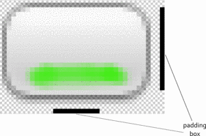
Figure 593: The padding box, as shown by a set of control lines to the right and bottom of the stretchable image
To tell Android where on the image to actually do the stretching, draw one-pixel-wide black lines on the top and left sides of the image. Android will scale the graphic only in those areas — areas outside the stretch zones are not stretched.
Perhaps the most common pattern is the center-stretch, where the middle portions of the image on both axes are considered stretchable, but the edges are not:
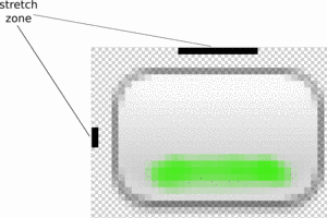
Figure 594: The stretch zones, as shown by a set of control lines to the left and top of the stretchable image
Here, the stretch zones will be stretched just enough for the contents to fit in the padding box. The edges of the graphic are left unstretched.
Some additional rules to bear in mind:
To experiment with nine-patch images, you may wish to use the
draw9patch program, found in the tools/ directory of your SDK
installation:
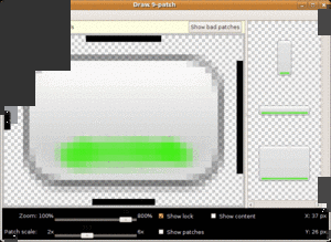
Figure 595: The draw9patch tool
Android Studio, at the present time, does not have a built-in version of
draw9patch, so IDE users will need to run the standalone
copy from their SDK installation.
While a regular graphics editor would allow you to draw any color on
any pixel, draw9patch limits you to drawing or erasing pixels
in the control area. If you attempt to draw inside the main image
area itself, you will be blocked.
On the right, you will see samples of the image in various stretched sizes, so you can see the impact as you change the stretchable zones and padding box.
While this is convenient for working with the nine-patch nature of
the image, you will still need some other graphics editor to create
or modify the body of the image itself. For example, the image shown
above, from the Drawable/NinePatch project, is a modified version
of a nine-patch graphic from the SDK’s ApiDemos, where the GIMP was
used to add the neon green stripe across the bottom portion of the
image.
Nine-patch images are most commonly used as backgrounds, as
illustrated by the following layout from the
Drawable/NinePatch
sample project:
<?xml version="1.0" encoding="utf-8"?>
<LinearLayout xmlns:android="http://schemas.android.com/apk/res/android"
  android:orientation="vertical"
  android:layout_width="match_parent"
  android:layout_height="match_parent"
  >
  <TableLayout
    android:layout_width="match_parent"
    android:layout_height="wrap_content"
    android:stretchColumns="1"
  >
    <TableRow
      android:layout_width="match_parent"
      android:layout_height="wrap_content"
    >
      <TextView
        android:layout_width="wrap_content"
        android:layout_height="wrap_content"
        android:layout_gravity="center_vertical"
        android:text="Horizontal:"
      />
      <SeekBar android:id="@+id/horizontal"
        android:layout_width="match_parent"
        android:layout_height="wrap_content"
      />
    </TableRow>
    <TableRow
      android:layout_width="match_parent"
      android:layout_height="wrap_content"
    >
      <TextView
        android:layout_width="wrap_content"
        android:layout_height="wrap_content"
        android:layout_gravity="center_vertical"
        android:text="Vertical:"
      />
      <SeekBar android:id="@+id/vertical"
        android:layout_width="match_parent"
        android:layout_height="wrap_content"
      />
    </TableRow>
  </TableLayout>
  <LinearLayout
    android:orientation="vertical"
    android:layout_width="match_parent"
    android:layout_height="match_parent"
    >
    <Button android:id="@+id/resize"
      android:layout_width="96px"
      android:layout_height="96px"
      android:text="Hi!"
      android:textSize="10sp"
      android:background="@drawable/button"
    />
  </LinearLayout>
</LinearLayout>
Here, we have two SeekBar widgets, labeled for the horizontal and
vertical axes, plus a Button set up with our nine-patch graphic as
its background (android:background = "@drawable/button").
The NinePatchDemo activity then uses the two SeekBar widgets to
let the user control how large the button should be drawn on-screen,
starting from an initial size of 64px square:
package com.commonsware.android.ninepatch;

import android.app.Activity;
import android.os.Bundle;
import android.view.View;
import android.view.ViewGroup;
import android.widget.LinearLayout;
import android.widget.SeekBar;

public class NinePatchDemo extends Activity {
  SeekBar horizontal=null;
  SeekBar vertical=null;
  View thingToResize=null;

  @Override
  public void onCreate(Bundle savedInstanceState) {
    super.onCreate(savedInstanceState);
    setContentView(R.layout.main);

    thingToResize=findViewById(R.id.resize);

    horizontal=(SeekBar)findViewById(R.id.horizontal);
    vertical=(SeekBar)findViewById(R.id.vertical);

    horizontal.setMax(144); // 240 less 96 starting size
    vertical.setMax(144);  // keep it square @ max

    horizontal.setOnSeekBarChangeListener(h);
    vertical.setOnSeekBarChangeListener(v);
  }

  SeekBar.OnSeekBarChangeListener h=new SeekBar.OnSeekBarChangeListener() {
    public void onProgressChanged(SeekBar seekBar,
                                  int progress,
                                  boolean fromTouch) {
      ViewGroup.LayoutParams old=thingToResize.getLayoutParams();
      ViewGroup.LayoutParams current=new LinearLayout.LayoutParams(64+progress,
                                                                   old.height);

      thingToResize.setLayoutParams(current);
    }

    public void onStartTrackingTouch(SeekBar seekBar) {
      // unused
    }

    public void onStopTrackingTouch(SeekBar seekBar) {
      // unused
    }
  };

  SeekBar.OnSeekBarChangeListener v=new SeekBar.OnSeekBarChangeListener() {
    public void onProgressChanged(SeekBar seekBar,
                                  int progress,
                                  boolean fromTouch) {
      ViewGroup.LayoutParams old=thingToResize.getLayoutParams();
      ViewGroup.LayoutParams current=new LinearLayout.LayoutParams(old.width,
                                                                   64+progress);

      thingToResize.setLayoutParams(current);
    }

    public void onStartTrackingTouch(SeekBar seekBar) {
      // unused
    }

    public void onStopTrackingTouch(SeekBar seekBar) {
      // unused
    }
  };
}
The result is an application that can be used much like the right
pane of draw9patch, to see how the nine-patch graphic looks on
an actual device or emulator in various sizes:
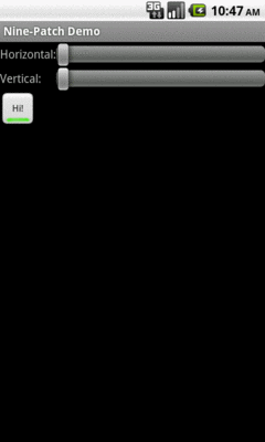
Figure 596: The NinePatch sample project, in its initial state
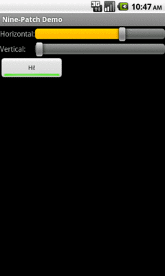
Figure 597: The NinePatch sample project, after making it bigger horizontally
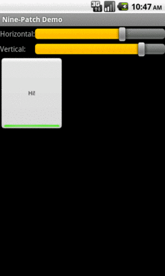
Figure 598: The NinePatch sample application, after making it bigger in both dimensions