Chapter 3
Customizing a pivot table
In this chapter, you will:
Although pivot tables provide an extremely fast way to summarize data, sometimes the pivot table defaults are not exactly what you need. In such cases, you can use many powerful settings to tweak pivot tables. These tweaks range from making cosmetic changes to changing the underlying calculation used in the pivot table.
Many of the changes in this chapter can be customized for all future pivot tables using the new pivot table default settings. If you find yourself always making the same changes to a pivot table, consider making that change in the pivot table defaults.
In Excel 2019, you find controls to customize a pivot table in myriad places: the Analyze tab, Design tab, Field Settings dialog box, Data Field Settings dialog box, PivotTable Options dialog box, and context menus.
Rather than cover each set of controls sequentially, this chapter covers the following functional areas in making pivot table customization:
Minor cosmetic changes—Change blanks to zeros, adjust the number format, and rename a field. The fact that you must correct these defaults in every pivot table that you create is annoying.
Layout changes—Compare three possible layouts, show/hide subtotals and totals, and repeat row labels.
Major cosmetic changes—Use pivot table styles to format a pivot table quickly.
Summary calculations—Change from Sum to Count, Min, Max, and more.
Advanced calculations—Use settings to show data as a running total, percent of total, rank, percent of parent item, and more.
Other options—Review some of the obscure options found throughout the Excel interface.
Making common cosmetic changes
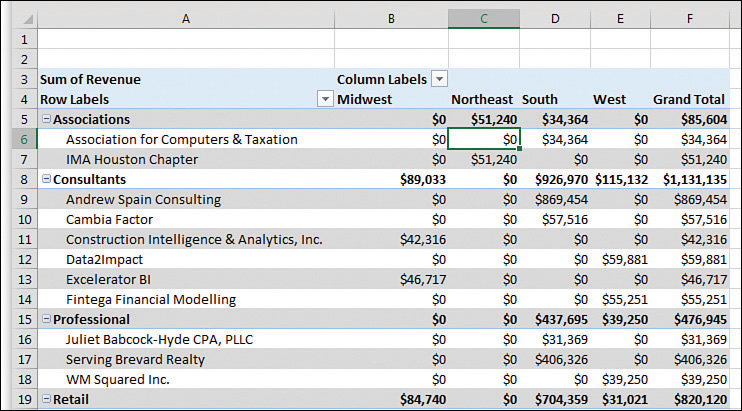
You need to make a few changes to almost every pivot table to make it easier to understand and interpret. Figure 3-1 shows a typical pivot table. To create this pivot table, open the Chapter 3 data file. Select Insert, Pivot Table, OK. Select the Sector, Customer, and Revenue fields check boxes, and drag the Region field to the Columns area.
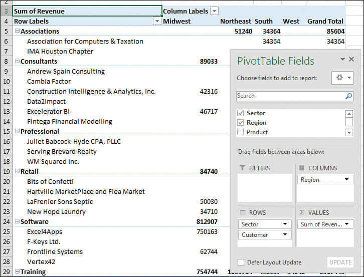
This default pivot table contains several annoying items that you might want to change quickly:
The default table style uses no gridlines, which makes it difficult to follow the rows and columns across and down.
Numbers in the Values area are in a general number format. There are no commas, currency symbols, and so on.
For sparse data sets, many blanks appear in the Values area. The blank cell in B5 indicates that there were no Associations sales in the Midwest. Most people prefer to see zeros instead of blanks.
Excel renames fields in the Values area with the unimaginative name Sum Of Revenue. You can change this name.
You can correct each of these annoyances with just a few mouse clicks. The following sections address each issue.
 Tip
Tip
Excel MVP Debra Dalgleish sells a Pivot Power Premium add-in that fixes most of the issues listed here. Debra’s add-in offers a few more features than the new PivotTable Defaults. This add-in is great if you will be creating pivot tables frequently. For more information, visit http://mrx.cl/pivpow16.
Applying a table style to restore gridlines
The default pivot table layout contains no gridlines and is rather plain. Fortunately, you can apply a table style. Any table style that you choose is better than the default.
Follow these steps to apply a table style:
Make sure that the active cell is in the pivot table.
From the ribbon, select the Design tab. Three arrows appear at the right side of the PivotTable Style gallery.
Click the bottom arrow to open the complete gallery, which is shown in Figure 3-2.
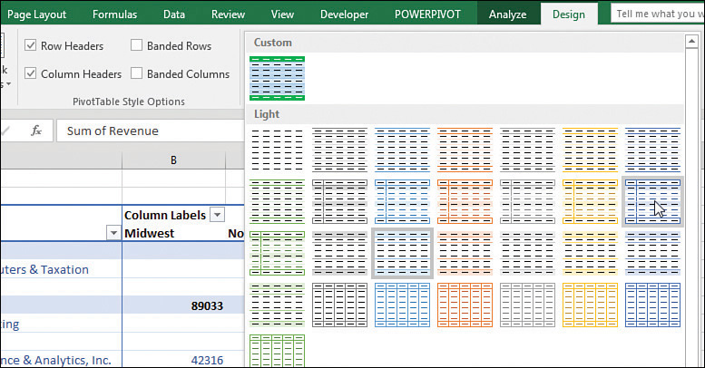
Choose any style other than the first style from the drop-down menu. Styles toward the bottom of the gallery tend to have more formatting.
Select the check box for Banded Rows to the left of the PivotTable Styles gallery. This draws gridlines in light styles and adds row stripes in dark styles.
It does not matter which style you choose from the gallery; any of the 84 other styles are better than the default style.
 Note
Note
For more details about customizing styles, see “Customizing a pivot table’s appearance with styles and themes,” later in this chapter.
Changing the number format to add thousands separators
If you have gone to the trouble of formatting your underlying data, you might expect that the pivot table will capture some of this formatting. Unfortunately, it does not. Even if your underlying data fields were formatted with a certain numeric format, the default pivot table presents values formatted with a general format. As a sign of some progress, when you create pivot tables from Power Pivot, you can specify the number format for a field before creating the pivot table. This functionality has not come to regular pivot tables yet.
Note
For more about Power Pivot, read Chapter 10, “Unlocking features with the Data Model and Power Pivot.”
For example, in the figures in this chapter, the numbers are in the thousands or tens of thousands. At this level of sales, you would normally have a thousands separator and probably no decimal places. Although the original data had a numeric format applied, the pivot table routinely formats your numbers in an ugly general style.
What is the fastest way to change the number format? It depends if you have a single value field or multiple value fields.
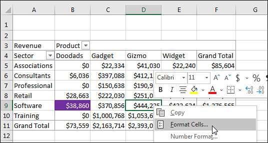
In Figure 3-3, the pivot table Values area contains Revenue. There are many columns in the pivot table because Product is in the Columns area. In this case, right-click any number and choose Number Format.
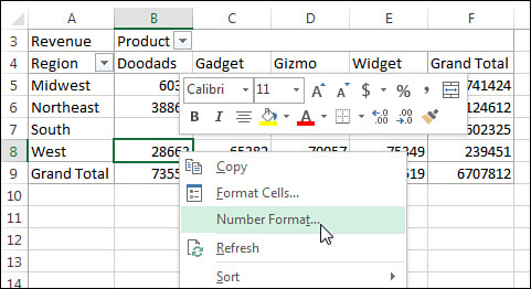
In contrast to Figure 3-3, the pivot table in Figure 3-4 contains three fields in the Values area: Revenue, Cost, and Profit. Rather than applying the Number Format to each individual column, you can format the entire pivot table by following these steps:

Select from the first numeric cell to the last numeric cell, including the Grand Total row or column if it is present.
Press Ctrl+1 to display the Format Cells dialog box.
Choose the Number tab across the top of the dialog box.
Select a number format.
Click OK.
Until a coding change in Excel 2010, the preceding steps would not change the number format in cases where the pivot table became taller. However, provided you include the Grand Total in your selection, these steps will change the number format for all the fields in the Values area.
Replacing blanks with zeros
One of the elements of good spreadsheet design is that you should never leave blank cells in a numeric section of a worksheet.
A blank tells you that there were no sales for a particular combination of labels. In the default view, an actual zero is used to indicate that there was activity, but the total sales were zero. This value might mean that a customer bought something and then returned it, resulting in net sales of zero. Although there are limited applications in which you need to differentiate between having no sales and having net zero sales, this seems rare. In 99% of the cases, you should fill in the blank cells with zeros.
Follow these steps to change this setting for the current pivot table:
Right-click any cell in the pivot table and choose PivotTable Options.
On the Layout & Format tab in the Format section, type 0 next to the field labeled For Empty Cells Show (see Figure 3-5).
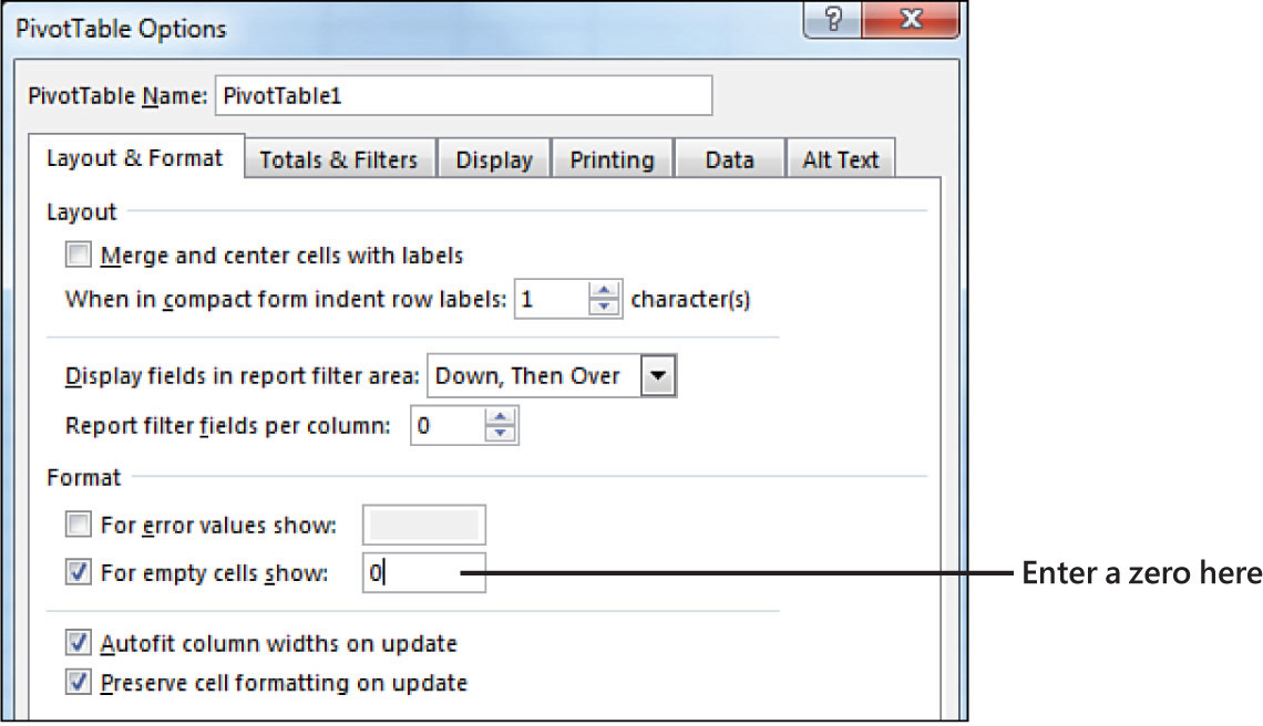
Click OK to accept the change.
The result is that the pivot table is filled with zeros instead of blanks, as shown in Figure 3-6.
Changing a field name
Every field in a final pivot table has a name. Fields in the row, column, and filter areas inherit their names from the heading in the source data. Fields in the data section are given names such as Sum Of Revenue. In some instances, you might prefer to print a different name in the pivot table. You might prefer Total Revenue instead of the default name. In these situations, the capability to change your field names comes in quite handy.
Tip
Although many of the names are inherited from headings in the original data set, when your data is from an external data source, you might not have control over field names. In these cases, you might want to change the names of the fields as well.
To change a field name in the Values area, follow these steps:
Select a cell in the pivot table that contains the appropriate type of value. You might have a pivot table with both Sum Of Quantity and Sum Of Revenue in the Values area. Choose a cell that contains a Sum Of Revenue value.
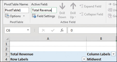
Go to the Analyze tab in the ribbon. A Pivot Field Name text box appears below the heading Active Field. The box currently contains Sum Of Revenue.
Type a new name in the box, as shown in Figure 3-7. Click a cell in your pivot table to complete the entry and have the heading in A3 change. The name of the field title in the Values area also changes to reflect the new name.
Note
One common frustration occurs when you would like to rename Sum Of Revenue to Revenue. The problem is that this name is not allowed because it is not unique; you already have a Revenue field in the source data. To work around this limitation, you can name the field and add a space to the end of the name. Excel considers “Revenue” (with a space) to be different from “Revenue” (with no space). Because this change is only cosmetic, the readers of your spreadsheet do not notice the space after the name.
Tip
When you can see the value field name such as “Sum of Revenue” in the Excel worksheet, you can directly type a new value to rename the field. For example, in Figure 3.7, you could type Sales in cell A3 to rename the field.
Making report layout changes
Excel 2019 offers three report layout styles. The Excel team continues to offer the Compact layout as the default report layout. If you prefer a different layout, change it using the default settings for pivot tables.
If you consider three report layouts, and the ability to show subtotals at the top or bottom, plus choices for blank rows and Repeat All Item Labels, you have 16 different layout possibilities available.
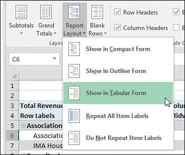
Layout changes are controlled in the Layout group of the Design tab, as shown in Figure 3-8. This group offers four icons:
Subtotals—Moves subtotals to the top or bottom of each group or turns them off.
Grand Totals—Turns the grand totals on or off for rows and columns.
Report Layout—Uses the Compact, Outline, or Tabular forms. Offers an option to repeat item labels.
Blank Rows—Inserts or removes blank lines after each group.
Note
You mathematicians in the audience might think that 3 layouts × 2 repeat options × 2 subtotal location options × 2 blank row options would be 24 layouts. However, choosing Repeat All Item Labels does not work with the Compact layout, thus eliminating 4 of the combinations. In addition, Subtotals At The Top Of Each Group does not work with the Tabular layout, eliminating another 4 combinations.
Using the Compact layout
By default, all new pivot tables use the Compact layout that you saw in Figure 3-6. In this layout, multiple fields in the row area are stacked in column A. Note in the figure that the Consultants sector and the Andrew Spain Consulting customer are both in column A.
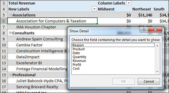
The Compact form is suited for using the Expand and Collapse icons. If you select one of the Sector value cells such as Associations in A5 and then click the Collapse Field icon on the Analyze tab, Excel hides all the customer details and shows only the sectors, as shown in Figure 3-9.
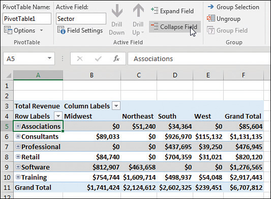
After a field is collapsed, you can show detail for individual items by using the plus icons in column A, or you can click Expand Field on the Analyze tab to see the detail again.
Tip
If you select a cell in the innermost row field and click Expand Field on the Options tab, Excel displays the Show Detail dialog box, as shown in Figure 3-10, to enable you to add a new innermost row field.
Using the Outline layout
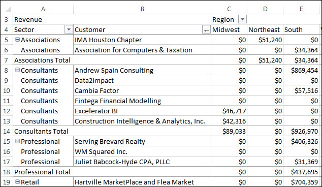
When you select Design, Layout, Report Layout, Show In Outline Form, Excel puts each row field in a separate column. The pivot table shown in Figure 3-11 is one column wider, with revenue values starting in C instead of B. This is a small price to pay for allowing each field to occupy its own column. Soon, you will find out how to convert a pivot table to values so you can further sort or filter. When you do this, you will want each field in its own column.

The Excel team added the Repeat All Item Labels option to the Report Layout tab starting in Excel 2010. This alleviated a lot of busy work because it takes just two clicks to fill in all the blank cells along the outer row fields. Choosing to repeat the item labels causes values to appear in cells A6:A7, A9:A14, as shown in Figure 3-11.
Figure 3-11 shows the same pivot table from before, now in Outline form and with labels repeated.
 Caution
This layout is suitable if you plan to copy the values from the pivot table to a new location for further analysis. Although the Compact layout offers a clever approach by squeezing multiple fields into one column, it is not ideal for reusing the data later.
By default, both the Compact and Outline layouts put the subtotals at the top of each group. You can use the Subtotals drop-down menu on the Design tab to move the totals to the bottom of each group, as shown in Figure 3-12. In Outline view, this causes a not-really-useful heading row to appear at the top of each group. Cell A5 contains “Associations” without any additional data in the columns to the right. Consequently, the pivot table occupies 44 rows instead of 37 rows because each of the 7 sector categories has an extra header.

Using the traditional Tabular layout
Figure 3-13 shows the Tabular layout. This layout is similar to the one that has been used in pivot tables since their invention through Excel 2003. In this layout, the subtotals can never appear at the top of the group. The new Repeat All Item Labels works with this layout, as shown in Figure 3-13.
The Tabular layout is the best layout if you expect to use the resulting summary data in a subsequent analysis. If you wanted to reuse the table in Figure 3-13, you would do additional “flattening” of the pivot table by choosing Subtotals, Do Not Show Subtotals and Grand Totals, Off For Rows And Columns.
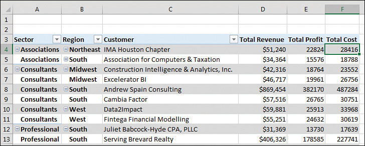
Case study: Converting a pivot table to values
Say that you want to convert the pivot table shown in Figure 3-13 to be a regular data set that you can sort, filter, chart, or export to another system. You don’t need the Sectors totals in rows 7, 14, 18, and so on. You don’t need the Grand Total at the bottom. And, depending on your future needs, you might want to move the Region field from the Columns area to the Rows area. This would allow you to add Cost and Profit as new columns in the final report.
Finally, you want to convert from a live pivot table to static values. To make these changes, follow these steps:
Select any cell in the pivot table.
From the Design tab, select Grand Totals, Off For Rows And Columns.
Select Design, Subtotals, Do Not Show Subtotals.
Drag the Region tile from the Columns area in the PivotTable Fields list. Drop this field between Sector and Customer in the Rows area.
Check Profit and Cost in the top of the PivotTable Fields list. Because both fields are numeric, they move to the Values area and appear in the pivot table as new columns. Rename both fields using the Current Field box on the Analyze tab. The report is now a contiguous solid block of data, as shown in Figure 3-14.
Select one cell in the pivot table. Press Ctrl+* to select all the data in the pivot table.
Press Ctrl+C to copy the data from the pivot table.
Select a blank section of a worksheet.
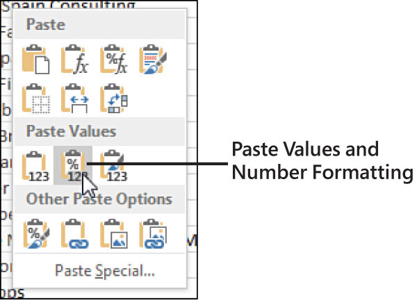
Right-click and choose Paste Values to open the flyout menu. Select Paste Values And Number Formatting, as shown in Figure 3-15. Excel pastes a static copy of the report to the worksheet.
If you no longer need the original pivot table, select the entire pivot table and press the Delete key to clear the cells from the pivot table and free up the area of memory that was holding the pivot table cache.
The result is a solid block of summary data. These 27 rows are a summary of the 500+ rows in the original data set, but they also are suitable for exporting to other systems.
Controlling blank lines, grand totals, and other settings
Additional settings on the Design tab enable you to toggle various elements.
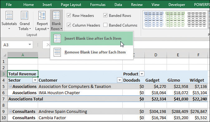
The Blank Rows drop-down menu offers the choice Insert Blank Row After Each Item. This setting applies only to pivot tables with two or more row fields. Blank rows are not added after each item in the inner row field. You see a blank row after each group of items in the outer row fields. As shown in Figure 3-16, the blank row after each sector makes the report easier to read. However, if you remove Sector from the report, you have only Customer in the row fields, and no blank rows appear (see Figure 3-17).

Note
For those of you following along with the sample files, you may have noticed quite a leap from the pivot table in Figure 3-14 to the one in Figure 3-16, but it is still the same pivot table. Here is how to make the changes:
Clear the Sector, Customer, Profit, and Cost check boxes in the PivotTable Fields list.
Drag the Product field to the Columns area.
Recheck the Sector field to move it to the second Row field.
Make sure the active cell is in column A.
On the Design tab of the ribbon, open Subtotals and choose Show All Subtotals At Bottom Of Group.
As shown in Figure 3-16, open the Blank Rows drop-down menu and choose Insert Blank Line After Each Item.
To get to the pivot table shown in Figure 3-17, clear the Sector field check box.
Grand totals can appear at the bottom of each column and/or at the end of each row, or they can be turned off altogether. Settings for grand totals appear in the Grand Totals drop-down menu of the Layout group on the Design tab. The wording in this drop-down menu is a bit confusing, so Figure 3-18 shows what each option provides. The default is to show grand totals for rows and columns.

If you want a grand total column but no grand total at the bottom, choose On For Rows Only, as shown at the top of Figure 3-18. To me, this seems backward. To keep the grand total column, you have to choose to turn on grand totals for rows only. I guess the rationale is that each cell in F5:F8 is a grand total of the row to the left of the cell. Hence, you are showing the grand totals for all the rows but not for the columns. Perhaps someday Microsoft will ship a version of Excel in English-Midwest where this setting would be called “Keep the Grand Total Column.” But for now, it remains confusing.
In a similar fashion, to show a grand total row but no grand total column, you open the Grand Totals menu and choose On For Columns Only. Again, in some twisted version of the English language, cell B18 is totaling the cells in the column above it.
The final choice, Off For Rows And Columns, is simple enough. Excel shows neither a grand total column nor a grand total row.
Tip
You can abandon these confusing menu choices by using the right-click menu. If you right-click on any cell that has the words “Grand Total,” you can choose Remove Grand Total.
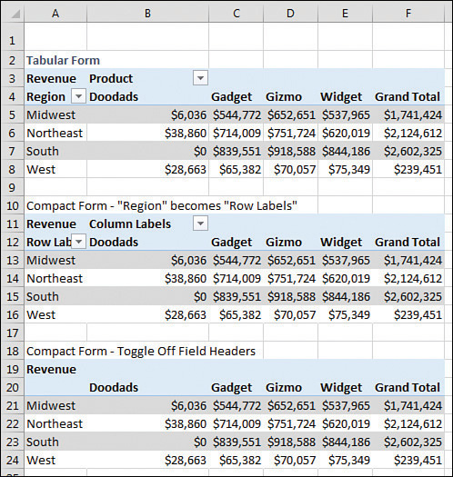
Back in Excel 2003, pivot tables were shown in Tabular layout and logical headings such as Region and Product would appear in the pivot table, as shown in the top pivot table in Figure 3-19. When the Excel team switched to Compact form, they replaced those headings with Row Labels and Column Labels. These add nothing to the report. To toggle off those headings, look on the far-right side of the Analyze tab for an icon called Field Headers and click it to remove Row Labels and Column Labels from your pivot tables in Compact form.
Caution
When you arrange several pivot tables vertically, as in Figure 3-19, you’ll notice that changes in one pivot table change the column widths for the entire column, often causing #### to appear in the other pivot tables. By default, Excel changes the column width to AutoFit the pivot table but ignores anything else in the column. To turn off this default behavior, right-click each pivot table and choose PivotTable Options. In the first tab of the Options dialog box, the second-to-last check box is AutoFit Column Widths On Update. Clear this check box.
Customizing a pivot table’s appearance with styles and themes
You can quickly apply color and formatting to a pivot table report by using the 85 built-in styles in the PivotTable Styles gallery on the Design tab. These 85 styles are further modified by the four check boxes to the left of the gallery. Throw in the 48 themes on the Page Layout tab, and you have 65,280 easy ways to format a pivot table. If none of those provide what you need, you can define a new style.
Start with the four check boxes in the PivotTable Style Options group of the Design tab of the ribbon. You can choose to apply special formatting to the row headers, column headers, banded rows, or banded columns. My favorite choice here is banded rows because it makes it easier for the reader’s eye to follow a row across a wide report. You should choose from these settings first because the choices here will modify the thumbnails shown in the Styles gallery.
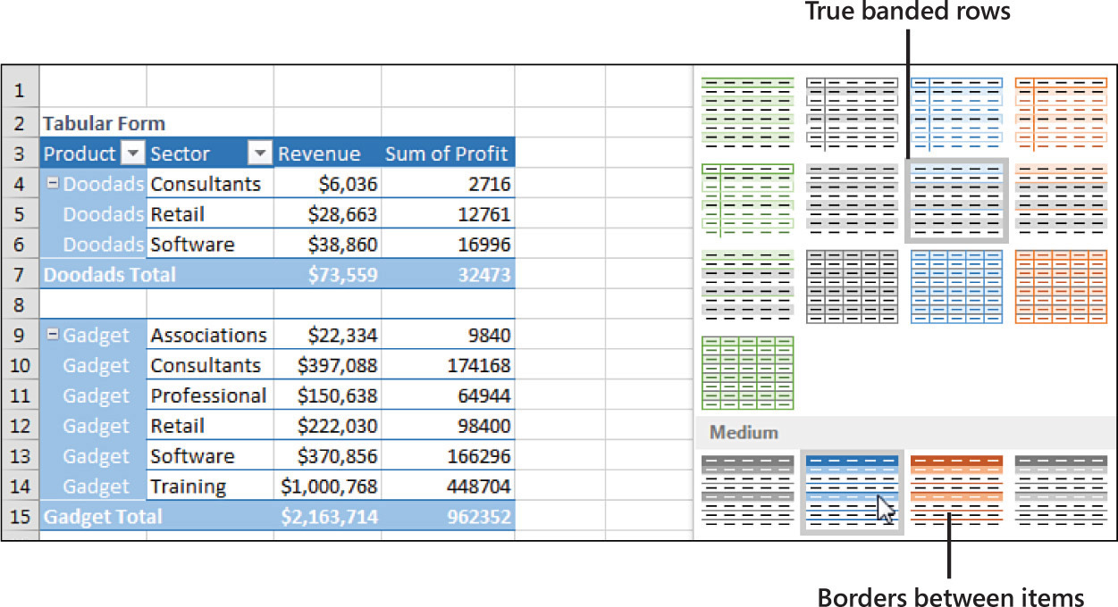
As mentioned earlier, the PivotTable Styles gallery on the Design tab offers 85 built-in styles. Grouped into 28 styles each of Light, Medium, and Dark, the gallery offers variations on the accent colors used in the current theme. In Figure 3-20, you can see which styles in the gallery truly support banded rows and which just offer a bottom border between rows.
Tip
Note that you can modify the thumbnails for the 85 styles shown in the gallery by using the four check boxes in the PivotTable Style Options group.
The Live Preview feature in Excel 2019 works in the Styles gallery. As you hover your mouse cursor over style thumbnails, the worksheet shows a preview of the style.
Customizing a style
You can create your own pivot table styles, and the new styles are added to the gallery for the current workbook only. To use the custom style in another workbook, copy and temporarily paste the formatted pivot table to the other workbook. After the pivot table has been pasted, apply the custom style to an existing pivot table in your workbook and then delete the temporary pivot table.
Say that you want to create a pivot table style in which the banded colors are three rows high. Follow these steps to create the new style:
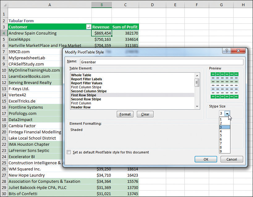
Find an existing style in the PivotTable Styles gallery that supports banded rows. Right-click the style in the gallery and select Duplicate. Excel displays the Modify PivotTable Quick Style dialog box.
Choose a new name for the style. Excel initially appends a 2 to the existing style name, which means you have a name such as PivotStyleDark3 2. Type a better name, such as Greenbar.
In the Table Element list, click First Row Stripe. A new section called Stripe Size appears in the dialog box.
Select 3 from the Stripe Size drop-down, as shown in Figure 3-21.
To change the stripe color, click the Format button. The Format Cells dialog box appears. Click the Fill tab and then choose a fill color. If you want to be truly authentic, choose More Colors, Custom and use Red=200, Green=225, and Blue=204 to simulate 1980s-era greenbar paper. Click OK to accept the color and return to the Modify PivotTable Quick Style dialog box.
In the Table Element List, click Second Row Stripe. Select 3 from the Stripe Size drop-down. Modify the format to use a lighter color, such as white.
If you plan on creating more pivot tables in this workbook, choose the Set As Default PivotTable Style For This Document check box in the lower left.
Optionally, edit the colors for Header Row and Grand Total Row.
Click OK to finish building the style. Strangely, Excel doesn’t automatically apply this new style to the pivot table. After you put in a few minutes of work to tweak the style, the pivot table does not change.
Your new style should be the first thumbnail visible in the Styles gallery. Click that style to apply it to the pivot table.
Tip
If you have not added more than seven custom styles, the thumbnail should be visible in the closed gallery, so you can choose it without reopening the gallery.
Modifying styles with document themes
The formatting options for pivot tables in Excel 2019 are impressive. The 84 styles combined with 16 combinations of the Style options make for hundreds of possible format combinations.
In case you become tired of these combinations, you can visit the Themes drop-down menu on the Page Layout tab, where many built-in themes are available. Each theme has a new combination of accent colors, fonts, and shape effects.
To change a document theme, open the Themes drop-down menu on the Page Layout tab. Choose a new theme, and the colors used in the pivot table change to match the theme.
Caution
Changing the theme affects the entire workbook. It changes the colors and fonts and affects all charts, shapes, tables, and pivot tables on all worksheets of the active workbook. If you have several other pivot tables in the workbook, changing the theme will apply new colors to all the pivot tables.
Tip
Some of the themes use unusual fonts. You can apply the colors from a theme without changing the fonts in your document by using the Colors drop-down menu next to the Themes menu, as shown in Figure 3-22.

Changing summary calculations
When you create a pivot table report, by default Excel summarizes the data by either counting or summing the items. Instead of Sum or Count, you might want to choose functions such as Min, Max, and Count Numeric. In all, 11 options are available.
The Excel team fixed the Count Of Revenue bug
In early 2018, Microsoft fixed a bug that caused many pivot tables to provide a count of revenue instead of a sum. If a data column contains all numbers, Excel will default to Sum as the calculation. If a column contains text, the pivot table will default to Count. But up until 2018, a bug appeared if you had a mix of numbers and empty cells. An empty cell would cause your pivot table to Count instead of Sum.
One Excel customer wrote a letter to the Excel team describing this bug: “Why are you treating empty cells as text? Treat them like any other formula would treat them and consider them to be zero. A mix of numbers and zeroes should not cause a Count of that field.”
Without a single vote on Excel.UserVoice.com, someone on the Excel team patched the bug. If you have a mix of numbers and blank cells, you will no longer get a Count Of Revenue. This is a nice improvement.
Changing the calculation in a value field
The Value Field Settings dialog box offers 11 options on the Summarize Values As tab and 15 main options on the Show Values As tab. The options on the first tab are the basic Sum, Average, Count, Max, and Min options that are ubiquitous throughout Excel; the 15 options under Show Values As are interesting ones such as % of Total, Running Total, and Ranks.
There are several ways to open the Value Field Settings dialog box:
If you have multiple fields in the Values area, double-click the heading for any value field.
Choose any number in the Values area and click the Field Settings button in the Analyze tab of the ribbon.
In the PivotTable Fields list, open the drop-down menu for any item in the Values area. The last item will be Value Field Settings.
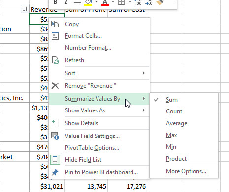
If you right-click any number in the Values area, you have a choice for Value Field Settings, plus two additional flyout menus offering six of the eleven choices for Summarize Values By and most of the choices for Show Values As (see Figure 3-23).
The following examples show how to use the various calculation options. To contrast the settings, you can build a pivot table where you drag the Revenue field to the Values area nine separate times. Each one shows up as a new column in the pivot table. Over the next several examples, you will see the settings required for the calculations in each column.
To change the calculation for a field, select one Value cell for the field and click the Field Settings button on the Analyze tab of the ribbon. The Value Field Settings dialog box is similar to the Field Settings dialog box, but it has two tabs. The first tab, Summarize Values By, contains Sum, Count, Average, Max, Min, Product, Count Numbers, StdDev, StdDevP, Var, and VarP. You can choose 1 of these 11 calculation options to change the data in the column. In Figure 3-24, columns B through D show various settings from the Summarize Values By tab.

Column B is the default Sum calculation. It shows the total of all records for a given market. Column C shows the average order for each item by market. Column D shows a count of the records. You can change the heading to say # Of Orders or # Of Records or whatever is appropriate. Note that the count is the actual count of records, not the count of distinct items.
Note
Counting distinct items has been difficult in pivot tables but is now easier using PowerPivot. See Chapter 10 for more details.
Far more interesting options appear on the Show Values As tab of the Value Field Settings dialog box, as shown in Figure 3-25. Fifteen options appear in the drop-down. Depending on the option you choose, you might need to specify either a base field or a base field and a base item. Columns E through J in Figures 3-24 and 3-25 show some of the calculations possible using Show Values As.
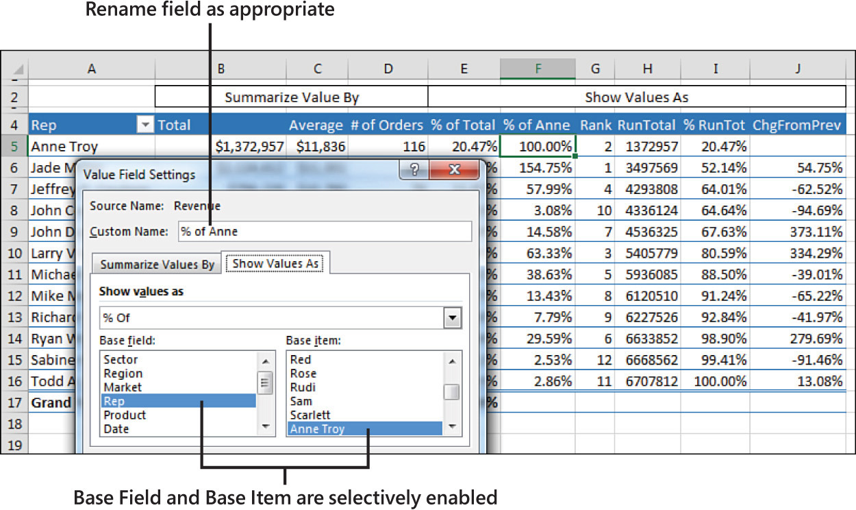
Table 3-1 summarizes the Show Values As options.
TABLE 3-1 Calculations in Show Value As
Show Value As |
Additional Required Information |
Description |
No Calculation |
None |
|
% of Grand Total |
None |
Shows percentages so all the detail cells in the pivot table total 100%. |
% of Column Total |
None |
Shows percentages that total up and down the pivot table to 100%. |
% of Row Total |
None |
Shows percentages that total across the pivot table to 100%. |
% of Parent Row Total |
None |
With multiple row fields, shows a percentage of the parent item’s total row. |
% of Parent Column Total |
None |
With multiple column fields, shows a percentage of the parent column’s total. |
Index |
None |
Calculates the relative importance of items. For an example, see Figure 3.31. |
% of Parent Total |
Base Field only |
With multiple row and/or column fields, calculates a cell’s percentage of the parent item’s total. |
Running Total In |
Base Field only |
Calculates a running total. |
% Running Total In |
Base Field only |
Calculates a running total as a percentage of the total. |
Rank Smallest to Largest |
Base Field only |
Provides a numeric rank, with 1 as the smallest item. |
Rank Largest to Smallest |
Base Field only |
Provides a numeric rank, with 1 as the largest item. |
% of |
Base Field and Base Item |
Expresses the values for one item as a percentage of another item. |
Difference From |
Base Field and Base Item |
Shows the difference of one item compared to another item or to the previous item. |
% Difference From |
Base Field and Base Item |
Shows the percentage difference of one item compared to another item or to the previous item. |
The capability to create custom calculations is another example of the unique flexibility of pivot table reports. With the Show Data As setting, you can change the calculation for a particular data field to be based on other cells in the Values area.
The following sections illustrate a number of Show Values As options.
Showing percentage of total
In Figure 3-24, column E shows % Of Total. Jade Miller, with $2.1 million in revenue, represents 31.67% of the $6.7 million total revenue. Column E uses % Of Column Total on the Show Values As tab. Two other similar options are % Of Row Total and % Of Grand Total. Choose one of these based on whether your text fields are going down the report, across the report, or both down and across.
Using % Of to compare one line to another line
The % Of option enables you to compare one item to another item. For example, in the current data set, Anne was the top sales rep in the previous year. Column F shows everyone’s sales as a percentage of Anne’s. Cell F7 in Figure 3-26 shows that Jeff’s sales were almost 58% of Anne’s sales.

To set up this calculation, choose Show Values As, % Of. For Base Field, choose Rep because this is the only field in the Rows area. For Base Item, choose Anne Troy. The result is shown in Figure 3-26.
Showing rank
Two ranking options are available. Column G in Figure 3-27 shows Rank Largest To Smallest. Jade Miller is ranked #1, and Sabine Hanschitz is #12. A similar option is Rank Smallest To Largest, which would be good for the pro golf tour.
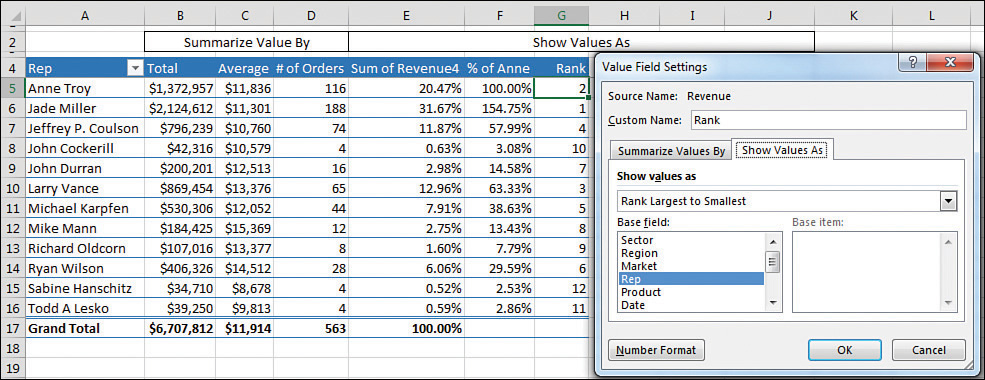
To set up a rank, choose Value Field Settings, Show Values As, Rank Largest To Smallest. You are required to choose Base Field. In this example, because Rep is the only row field, it is the selection under Base Field.
These rank options show that pivot tables have a strange way of dealing with ties. I say strange because they do not match any of the methods already established by the Excel functions =RANK(), =RANK.AVG(), and =RANK.EQ(). For example, if the top two markets have a tie, they are both assigned a rank of 1, and the third market is assigned a rank of 2.
Tracking running total and percentage of running total
Running total calculations are common in reports where you have months running down the column or when you want to show that the top N customers make up N% of the revenue.
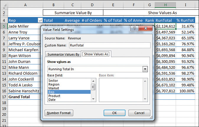
In Figure 3-28, cell I8 shows that the top four sales reps account for 76.97% of the total sales.
Note
To produce this figure, you have to use the Sort feature, which is discussed in depth in Chapter 4, “Grouping, sorting, and filtering pivot data.” To create a similar analysis with the sample file, go to the drop-down menu in A4 and choose More Sort Options, Descending, By Total. Also note that the % Change From calculation shown in the next example is not compatible with sorting.
To specify Running Total In (as shown in Column H) or % Running Total In (Column I), select Field Settings, Show Values As, Running Total In. You have to specify a Base Field, which in this case is the Row Field: Rep.
Displaying a change from a previous field
Figure 3-29 shows the % Difference From setting. This calculation requires a Base Field and Base Item. You could show how each market compares to Anne Troy by specifying Anne Troy as the Base Item. This would be similar to Figure 3-26, except each market would be shown as a percentage of Anne Troy.
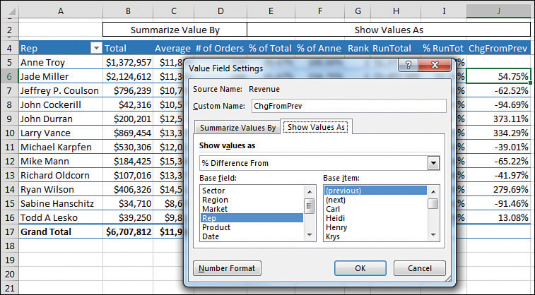
With date fields, it would make sense to use % Difference From and choose (previous) as the base item. Note that the first cell will not have a calculation because there is no previous data in the pivot table.
Tracking the percentage of a parent item
The legacy % Of Total settings always divides the current item by the grand total. In Figure 3-30, cell E4 says that Chicago is 2.75% of the total data set. A common question at the MrExcel.com message board is how to calculate Chicago’s revenue as a percentage of the Midwest region total. This was possible but difficult in older versions of Excel. Starting in Excel 2010, though, Excel added the % Of Parent Row, % Of Parent Column, and % Of Parent Total options.
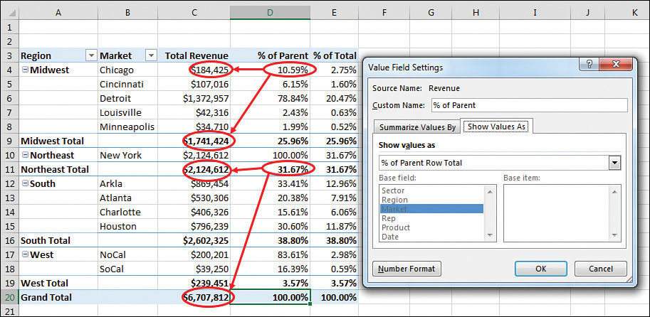
To set up this calculation in Excel 2019, use Field Settings, Show Values As, % Of Parent Row Total. Cell D4 in Figure 3-30 shows that Chicago’s $184,425 is 10.59% of the Midwest total of $1,741,424.
Although it makes sense, the calculation on the subtotal rows might seem confusing. D4:D8 shows the percentage of each market as compared to the Midwest total. The values in D9, D11, D16, and D19 compare the region total to the grand total. For example, the 31.67% in D11 says that the Northeast region’s $2.1 million is a little less than a third of the $6.7 million grand total.
Tracking relative importance with the Index option
The final option, Index, creates a somewhat obscure calculation. Microsoft claims that this calculation describes the relative importance of a cell within a column. In Figure 3-31, Georgia peaches have an index of 2.55, and California peaches have an index of 0.50. This shows that if the peach crop is wiped out next year, it will be more devastating to Georgia fruit production than to California fruit production.

Here is the exact calculation: First, divide Georgia peaches by the Georgia total. This is 180/210, or 0.857. Next, divide total peach production (285) by total fruit production (847). This shows that peaches have an importance ratio of 0.336. Now, divide the first ratio by the second ratio: 0.857/0.336.
In Ohio, apples have an index of 4.91, so an apple blight would be bad for the Ohio fruit industry.
I have to admit that, even after writing about this calculation for 10 years, there are parts that I don’t quite comprehend. What if a state like Hawaii relied on productions of lychees, but lychees were nearly immaterial to U.S. fruit production? If lychees were half of Hawaii’s fruit production but 0.001 of U.S. fruit production, the Index calculation would skyrocket to 500.
Adding and removing subtotals
Subtotals are an essential feature of pivot table reporting. Sometimes you might want to suppress the display of subtotals, and other times you might want to show more than one subtotal per field.
Suppressing subtotals with many row fields
When you have many row fields in a report, subtotals can obscure your view. For example, in Figure 3-32, there is no need to show subtotals for each market because there is only one sales rep for each market.
If you used the Subtotals drop-down menu on the Design tab, you would turn off all subtotals, including the Region subtotals and the Market subtotals. The Region subtotals are still providing good information, so you want to use the Subtotals setting in the Field Settings dialog box. Choose one cell in the Market column. On the Analyze tab, choose Field Settings. Change the Subtotals setting from Automatic to None (see Figure 3-33).
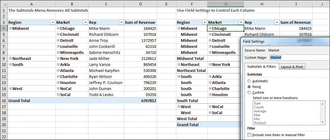
To remove subtotals for the Market field, click the Market field in the bottom section of the PivotTable Fields list. Select Field Settings. In the Field Settings dialog box, select None under Subtotals, as shown in Figure 3-33. Alternatively, right-click a cell that contains a Market and remove the check mark from Subtotal Market.
Adding multiple subtotals for one field
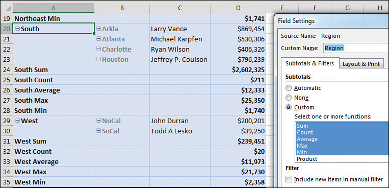
You can add customized subtotals to a row or column label field. Select the Region field in the bottom of the PivotTable Fields list, and select Field Settings.
In the Field Settings dialog box for the Region field, select Custom and then select the types of subtotals you would like to see. The dialog box in Figure 3-34 shows five custom subtotals selected for the Region field. It is rare to see pivot tables use this setting. It is not perfect. Note that the count of 211 records in cell D25 automatically gets a currency format like the rest of the column, even though this is not a dollar figure. Also, the average of $12,333 for South is an average of the detail records, not an average of the individual market totals.
Tip
If you need to calculate the average of the four regions, you can do it with the DAX formula language and Power Pivot. See Chapter 10.
Formatting one cell is new in Office 365
In the summer of 2018, a new trick appeared for Office 365 customers. You can format a cell in a pivot table, and the formatting will follow that position.
For example, in Figure 3-35, a white font on dark fill has been applied to Revenue for Doodads sales to the Software sector.
If you rearrange the pivot table, the dark formatting will follow the cell in the pivot table. While cell B9 was formatted in Figure 3.35, the formatting has moved to D5 in Figure 3.36.
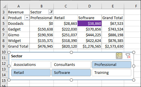
Note that the formatting will persist if you remove the cell due to a filter. If you unselect Software from the Slicer and then reselect Software, the formatting will return.
However, if you remove Sector, Product, or Revenue from the pivot table, the individual cell formatting will be lost.
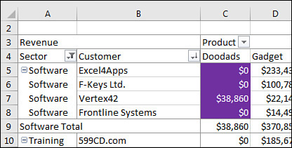
In Figure 3.37, a Customer field has been added as the inner-row field. The dark formatting applied to Doodads sales of Software is now expanded to C5:C8 to encompass all four customers in this group. Note that in cell C9, the subtotal for Doodads sold to the Software sector is not formatted.
Next steps
Note that the following pivot table customizations are covered in subsequent chapters:
Sorting a pivot table is covered in Chapter 4, “Grouping, sorting, and filtering pivot data.”
Filtering records in a pivot table is covered in Chapter 4.
Grouping daily dates up to months or years is covered in Chapter 4.
Adding new calculated fields is covered in Chapter 5, “Performing calculations in pivot tables.”
Using data visualizations and conditional formatting in a pivot table is covered in Chapter 4.