
134 Artist and Model, 1973–74
In the early 1970s Hockney slowly became aware that for the first time in more than a decade he was in danger of becoming set in his ways, trapped by naturalism as well as by his commercial success and popularity. His growing impatience with the self-imposed limitations of picturing the world in one way only was compounded by a sense that he had lost the freedom of movement that he had known when he was younger. As early as 1973 in The Weather Series [124, 125] he began to move away from naturalism, yet his efforts to disembarrass himself of the style, in spite of the firm intentions voiced in the autobiography taped in the summer of 1975, were to preoccupy him at least as late as 1977.
‘I was, I think, going on the wrong path, but it took me a long time to completely realize it and a longer time to get out of it. In a sense it took a few years to get out of it again, it’s amazing, partly because of timidity, I think.’ Hockney suggests that like other artists in mid-career he was afraid to make a drastic change that might appear to negate his own earlier production. ‘I think your past work sometimes becomes a burden, I think it is for a lot of artists around today. In a way they’re burdened with what they see as commitment, but might not be truly commitment anyway, and it might be severely limiting what really expressive qualities they wish to deal with. I think that happens when you’re older and I think it causes a kind of crisis. All artists can go through that and if you come out of it the other side, you come out richer, the art comes out richer and wider and better.’
The first sign of Hockney’s urge to work again directly from the imagination occurs in a group of drawings and prints made in 1973 under the inspiration of Picasso, who had died on 8 April of that year. Hockney was one of a group of artists commissioned by a Berlin publisher, the Propyläen Verlag, to produce a print for a portfolio, Homage to Picasso, to be published in the following year. Hockney left California to work on this etching in Paris with Aldo Crommelynck, the master printer who had worked closely with Picasso for twenty years. The contact was decisive: Crommelynck not only showed Hockney sugar lift and colour etching techniques which he had perfected for Picasso, but also spoke with great affection of the Spanish master, telling Hockney how well the two of them would have got on with each other. Hockney’s regret at never having met him seems to have renewed his long-standing admiration for his work, which had exerted such a powerful influence on him as early as 1960, and intensified his desire to meet the challenge of Picasso’s art through a close examination of favoured themes. Hockney recalls also that it was only with Picasso’s death that one could begin to see the consistency of his life’s work, making sense of the apparent stylistic breaks as the result of a unified attitude towards style and content. In Hockney’s view, only now will Picasso’s real influence begin to emerge, for it will be based on an appreciation of his expansive approach rather than on the mere imitation of the superficial characteristics of one of the many styles he devised. The problem of so much contemporary art lies not in its relative degree of academic, reactionary or avant-garde qualities but in its self-imposed narrowness, which to Hockney seems like a meanness of spirit. The authority and weight of Picasso’s work, on the other hand, is the result of the sheer breadth and generosity of his vision, allied to a steadfast insistence on connecting his pictures to his own life, surroundings and interests.
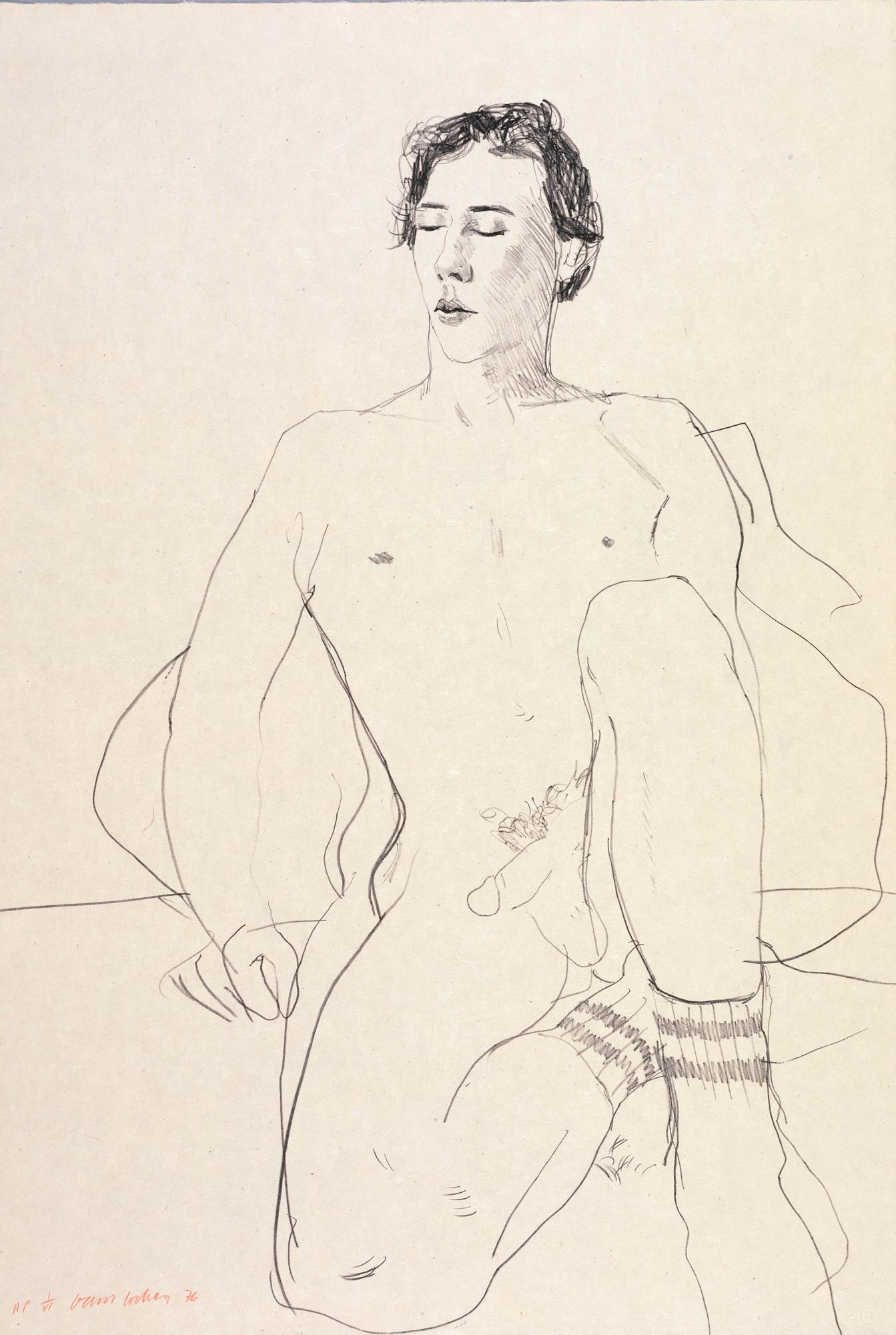
134 Artist and Model, 1973–74
Hockney eventually produced two etchings which transform one of Picasso’s favoured themes, that of the artist and his model, into a personal act of homage. The first of these, The Student: Homage to Picasso, 1973, was the print produced for the Berlin portfolio. Hockney depicts himself in this etching in the humble role of student, carrying under his arm a portfolio of his work for the scrutiny of his hero Picasso, who is represented as a youthful sculptured head on a columnar pedestal. The image carries deliberate echoes of Picasso’s series of etchings L’Atelier du sculpteur, executed in 1933 as part of the Vollard suite, in which the artist presents himself in the act of contemplating his own creation, reflecting on the sources of his inspiration and awed into silence by the impossibility of fully achieving his own ambitions. Hockney evidently looked closely at this series of prints by Picasso and made at least one ink drawing as a reasonably accurate copy of the figures in one of them. His imagination may have been further stimulated by an article, ‘The Artist and his Model’, by Michel Leiris, published in 1973 in the volume of essays edited by Roland Penrose and John Golding, Picasso 1881/1973, which discusses the transformations of the subject in Picasso’s work over a period of four decades.
The Student: Homage to Picasso, interesting though it may be in terms of theme, is treated, however, in a rather uninspired illustrative manner. Far more successful is a second etching, Artist and Model [134], which was begun in 1973, nearly abandoned, but reworked and published in the following year by Petersburg Press. Hockney here has devised an affectionate and far wittier response to the theme, again incorporating, for the first time in his work since the 1961 etching Myself and My Heroes [24], an explicit self-portrait. Hockney and Picasso are shown gazing intently at each other, just as the artist and his model often do in images by Picasso, of which Leiris writes: ‘Confrontations, meetings, mutual discoveries are the basic themes of many compositions involving two or more characters between whom nothing is happening, except that they are looking at each other.’ In depicting himself naked, however, Hockney humbly places himself in the role of model rather than artist, reversing the iconographical custom so as to declare once again his admiration and debt to an artist whose greatness he would not pretend to rival.
In his work of the early 1960s Hockney had found it useful to play with both form and style as a means of doing away with arbitrary restrictions. The freedom of movement which he now wished to reclaim, as he readily avowed in the interview published in the catalogue of his 1974 Paris retrospective, took its inspiration directly from Picasso. Just as the elder master often contrasted different styles within the same picture, drawing attention to the elusive task of devising a visual form for the reality he perceives, so Hockney in Artist and Model contrasts various ways of drawing and three different techniques: hard-ground, soft-ground and sugar aquatint.
In the same year that he began this print, Hockney made several drawings based closely on Picasso’s most stylized sculptures, particularly on those with self-portrait connotations. Three of the Cubistic forms in Heads [135] derive from the cut-out and folded metal sculptures which Picasso began making in 1953. These sculptures made actual the interpenetration of planes characteristic of Picasso’s Late Cubist paintings, adapting the methods of two-dimensional representation to a three-dimensional object opened out into space. If Picasso had found a way of making the implicit pictorial volume explicit by fabricating the images out of sheets of metal, Hockney here reverses the process by drawing the sculptures back on to paper, transforming the volumes into a surface design of insistent flatness. There is a gently ironic humour at work here, but also a poignant sense of the struggle facing the artist. In 1971 Hockney had produced two paintings, Gonzalez and Shadow and Cubistic Sculpture & Shadow [136], both based on photographs he had taken at the Musée d’Art Moderne in Paris, which demonstrate how circumstances can contrive to undermine the illusions so carefully sought by the artist. There is something slightly pathetic as well as funny about the fact that Cubistic sculptures, theoretically the most vivid expression yet devised of volume and mass in space, cast shadows just as flat pictorially as those produced by any other object, thus apparently denying their whole purpose. This reminder that reality can never be fully seized in pictorial form must have been slightly painful to Hockney at a time when he was doubting more and more the efficacy of naturalism as a neutral container for depicting the world. If any form of depiction is but a convention requiring the viewer’s ‘suspension of disbelief’, there can be no justification in placing a special premium on naturalism.
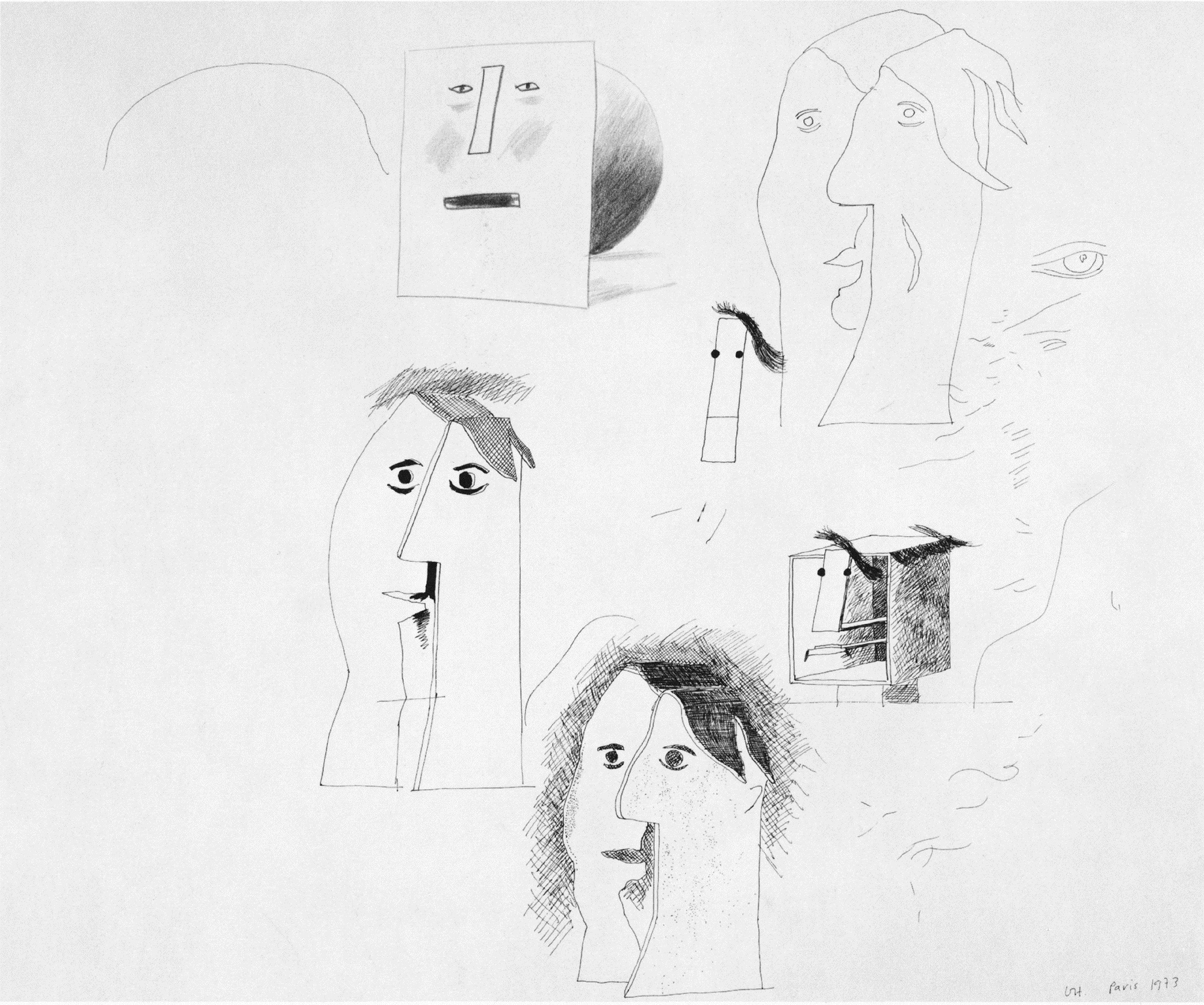
135 Heads, 1973
136 Cubistic Sculpture & Shadow, 1971
137 Showing Maurice the Sugar Lift, 1974
As if to test how far a highly conventionalized treatment can still transmit the artist’s perceptions and sense of humanity, Hockney shifted his attention to the extremes of geometric stylization in Picasso’s work in a playful return to the theme of Cézanne’s cube, cylinder and sphere which had preoccupied him in 1965. The box-like shape in the lower right of Heads, which appears three times in a companion drawing of the same year, refers to Picasso sculptures such as Head, 1958, fashioned in wood and then cast in bronze. In these a sophisticated, knowing ‘primitivism’ prevails, an urge to discover the ability of the viewer as well as of the artist to transform the barest of pictorial signals into a convincing evocation of human presence. Still taking his cue from Picasso sculptures as well as from the sketchiest of Picasso’s post-war paintings, Hockney took this one step further by creating a head solely from geometric elements: the head as a sphere surmounted by a rectangular face on which are drawn the simplest possible indications of eyes, nose and mouth. A group of four such heads constructed from standard geometric forms fills the entire sheet of Simplified Faces, 1973, a crayon drawing which was used as the model for two coloured etchings in the following year.
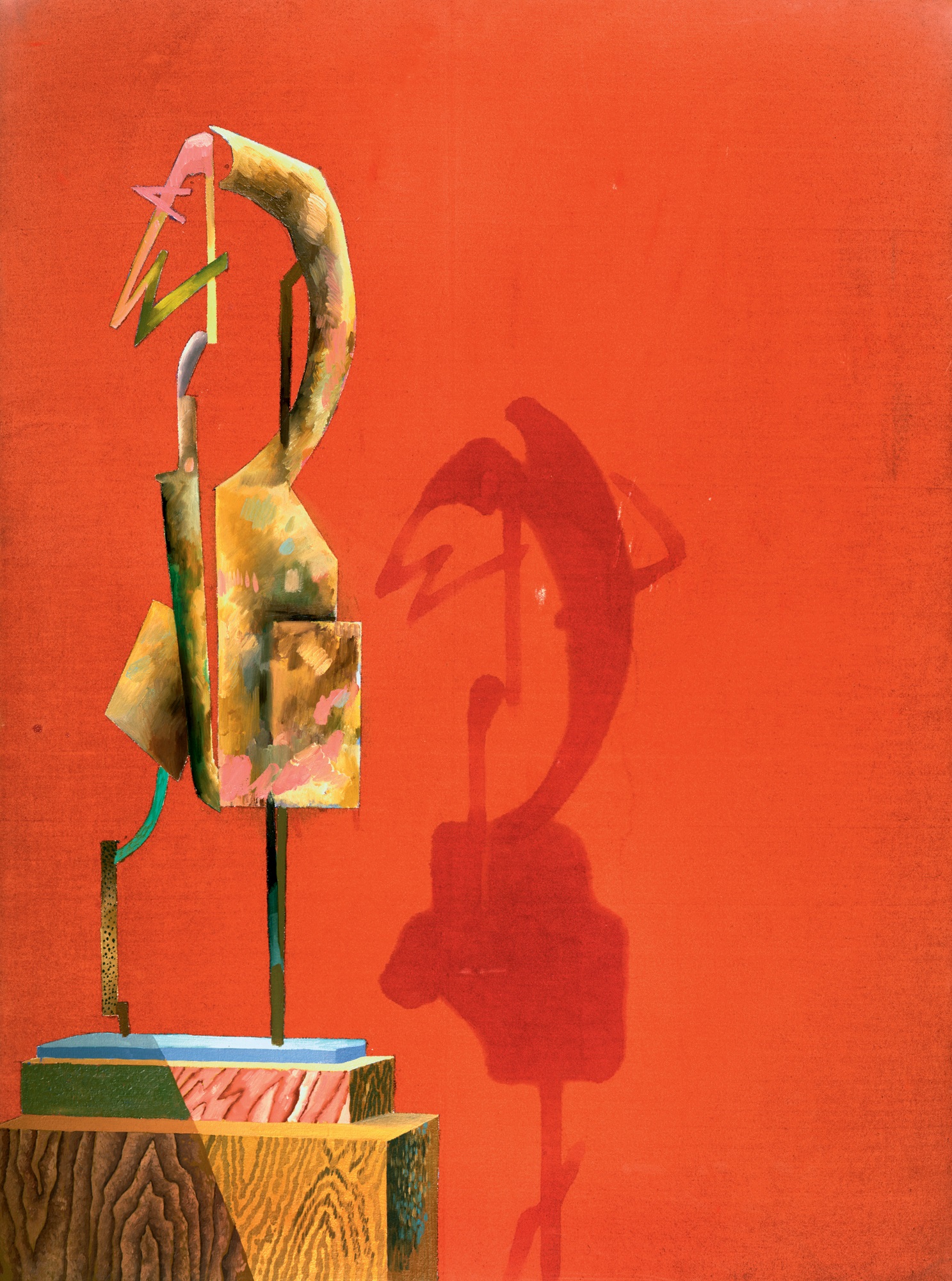
During 1973–74 Hockney was still immersed in the stilted naturalism of the double portraits of Gregory Masurovsky and Shirley Goldfarb and George Lawson & Wayne Sleep [132] and in the delicate if rather academic drawings of Celia. Showing Maurice the Sugar Lift, 1974 [137], although originally intended only as a demonstration piece for Hockney’s printer, Maurice Payne, in retrospect can be seen as a signpost for Hockney’s subsequent return to the bewildering variety which characterized his work in the early 1960s. The etching technique used here was that devised by Crommelynck for Picasso, but the selection of contrasting idioms is Hockney’s own, recalling his Rake’s Progress etchings of 1961–63 [1, 25]. The geometric figure in the upper-right of the print reappears in the Invented Man Revealing Still Life, a small canvas of early 1975 [138]. This is the first painting in more than a decade in which Hockney avoids naturalism completely, and it is not, therefore, surprising that he voices his new-found freedom in a language that has much in common with his work of the first half of the 1960s. Particularly prominent is the device of the curtain, seized this time from Fra Angelico’s The Dream of the Deacon Justinian (Museo di San Marco, Florence) [139], as an indication of a shallow theatrical space and as a means of disclosing the scene as a painted event witnessed by the spectator. The brushwork once again is more varied, there are jarring contrasts of idiom from the flattened geometry of the figure to the illusionism of the vase of flowers, and the combination of conflicting perspectives and areas of bare canvas breaks any possible spatial illusions, once more proclaiming a discontinuity of space rather than a continuous single view. Even the figure, though derived from Hockney’s recent study of Picasso’s work, is endowed with a schematization and anonymity that recall equivalent qualities of the childlike and semi-Egyptian figures of Hockney’s paintings of the early 1960s. Like the trickles of colour that flow from the upper edge of the canvas, the figure is presented as a pure invention, a fabrication in paint, rather than as a substitute for reality.
The blatant artifice and theatricality of Invented Man Revealing Still Life, in spite of its sources in Hockney’s own earlier work and in his recent drawings and prints, owe much to the fact that it was worked on at the same time that he was producing his first designs for an opera. He had worked for the stage only once before, in 1966 when he designed the Royal Court production of Ubu Roi [65, 66], and when producer John Cox approached him in the summer of 1974 to design a new production of Stravinsky’s opera The Rake’s Progress for Glyndebourne [140, 141], he was tempted simply to turn down the offer out of fear that he did not know enough about the technical problems involved. He agreed, however, to return to England from Paris to discuss the project with Cox, who convinced him that he would be able to adapt his procedures to the requirements of the theatre. The opera was to be staged the following summer, and Hockney was given until Christmas 1974 to produce the designs. Hockney could not resist the challenge, particularly since he enjoyed the music so much, and consented to take on the project. In October he left for Hollywood to work on the designs, partly to be able to concentrate without the social pressures of London or Paris but also because Stravinsky had composed the music there between 1947 and 1951. By Christmas, Hockney had completed 70 per cent of the work and knew how he was going to approach the rest.
138 Invented Man Revealing Still Life, 1975

139 Fra Angelico The Dream of the Deacon Justinian, 15th century
There were a number of factors which prompted Hockney to accept the commission. He had been a lover of opera since about the age of twelve, when he was taken by his father to see a production of La Bohème at the Bradford Alhambra, and since his arrival in London in 1959 he had been an avid opera-goer. The Rake’s Progress was bound to interest him, of course, for the story alone, since it was based on the same group of pictures by Hogarth [26] that had inspired Hockney’s own series of that title in 1961 [1, 25]; it was, indeed, because of this link that John Cox thought of contacting Hockney in the first place, although Hockney immediately made it clear that he wished to keep the action in the eighteenth century rather than updating it as he had in his set of prints. Hockney had met the co-authors of the libretto, W.H. Auden and Chester Kallman, on several occasions, although he had not had occasion to speak to either of them about the opera. The music itself, written in what Stravinsky called the ‘Italian-Mozartian’ style, appealed to Hockney, and he realized that this essential element would provide additional inspiration that he would not find in designing a straight play. Following Wagner, whose views have greatly shaped his own, Hockney considers opera to be ‘heightened reality’. He points out that if poetry can say more than prose, then music combined with poetry can achieve still greater profundity.
140 Churchyard at Night from The Rake’s Progress: (Act III Scene 2), 1974–75
Hockney’s painting, in any case, was causing him problems, and he sensed that the challenge of a new medium could inject a new enthusiasm into his work. ‘When you’re working suddenly in another field, you are much less afraid of failure. You kind of half expect it, so therefore you take more risks, which makes it more exciting.’ Had he been asked to do work for the theatre earlier, while he was still engrossed in naturalism, he thinks that he would have turned the offer down, since he cannot conceive of working in a naturalistic vein in this context. Coming when it did, Glyndebourne’s offer seemed a possible way to help him out of the clutches of naturalism through a return to the theatrical devices which had exerted such a fascination on him in the early 1960s. His experience with Ubu Roi had already taught him that he need not worry about reintroducing theatrical devices to the stage, because that is what they are intended for. It is merely a question of using them in context rather than out of context.
141 Bedlam from The Rake’s Progress: (Act III Scene 3), 1974–75
Hockney had seen only one production of The Rake’s Progress, at Sadler’s Wells in 1962, before setting to work on his own, but that single experience had proved so visually uninteresting to him that he had to be reminded by a friend that he had actually seen it. He carried out all possible research into previous productions and did a considerable amount of reading about the opera and its libretto, but he quickly decided that he would base his designs largely on Hogarth’s series of engravings, published in 1735, both for the imagery and technique of drawing. It seemed to Hockney incomprehensible that productions of this opera sometimes ignore reference to Hogarth altogether, or choose to set the action in the nineteenth or twentieth century, in view of the fact that both composer and librettists had based their conception directly on this eighteenth-century source.
In a note written for the first American production of the opera in 1953, Stravinsky recalled that ‘Six years ago, in Chicago, at an exhibition of English paintings, I was struck by the various Hogarth scenes as by a succession of operatic scenes.’ He had long wanted to write an English-language opera and realized that he had now found a suitable subject. Aldous Huxley, a friend and neighbour of Stravinsky’s in Hollywood, suggested W. H. Auden as librettist, and by November 1947 the composer and writer had agreed on the subject, ‘a three-act moral fable, to be based on the Rake’s Progress series’, and devised a list of characters and a rough idea of the plot. The Auden/Kallman libretto takes great liberties with the Hogarth, following only two of the scenes found in the original series, the brothel and Bedlam scenes, inventing two entirely new central characters, Nick Shadow and Baba the Turk, and changing many of the other details of the story for the sake of the dramatic flow of the opera.
If the opera as it stands bears a somewhat oblique relationship to the Hogarth series which inspired it, the relationship nevertheless remains close enough to allow Hockney to translate a considerable number of elements from one context to the other. Hockney’s conception is a graphic one, based not on the paintings which Stravinsky had seen but on Hogarth’s engraved copies of them. Hockney’s designs, which were made in the form of scaled-down models of the stage so as to retain full control over every detail painted by the scene painters, were drawn entirely in pen lines which mimic the crispness of the marks of the engravings. Cross-hatching, a technique particularly associated with the eighteenth century and which Hockney had already used to striking effect in the Grimm illustrations in 1969 [100–02], invades every scene. Such linear patterns are used not only for the walls of the rooms but even across the clothing, the make-up, the wigs, the furniture and other objects, some of which take on the air of stylized sculptures reminiscent of the work of American Pop artist Roy Lichtenstein. The use of a technique from engraving, translated into another medium on such an extended scale, is a means of leading the audience to keep in mind Hogarth’s prints as a kind of parallel structure to the action. Hockney softens the severity of the graphic effect, however, by drawing the scenes in red, blue and green; black and white is used prominently only for the two nocturnal scenes (the garden during Act I Scene 3 and the churchyard in Act III Scene 2) [140], for the external walls of Rakewell’s town house (Act II Scene 2) and for the second and third appearance of Tom’s morning-room (in Act II Scene 3, revealing the changes wrought by his marriage to Baba, and to create a suitable antiquarian atmosphere for the auction scene in Act III Scene 1).
Hockney’s designs insist on the eighteenth-century reference, but there is no mistaking the fact that they are drawn in a twentieth-century spirit, not only through the humorous translation of techniques of engraving on to the stage but also by means of a schematized rendering of the imagery. In this Hockney sought to create a visual parallel to the music, which was a mid-twentieth-century interpretation of an eighteenth-century style, modelled largely on features found in Mozart’s late Italian operas such as Così fan tutte. The libretto, too, is written as a twentieth-century idea of eighteenth-century language. Hockney was concerned above all that his designs should be of a piece with the opera rather than worrying whether the result would bear the stamp of his style; he evidently recognized that in simplifying the imagery for theatrical impact, elements of his characteristic drawing style and humour would show through.
‘Having read the libretto and listened to the music, I thought you couldn’t put it in the twentieth century. The story would seem a bit too ridiculous. Even in the nineteenth century it would seem a bit too ridiculous. Instead of being at first a kind of innocent taken in, you’d have just thought him a fool straight away, and therefore less interesting. I told John Cox this before I began. I said, “I think you have to take note of the eighteenth-century setting of the story,” which he agreed with me then. I gave him the reasons. But I said, “Somehow we have to look at the eighteenth century and give it a twentieth-century look,” which of course is easier than one thinks anyway. You can stylize it.’
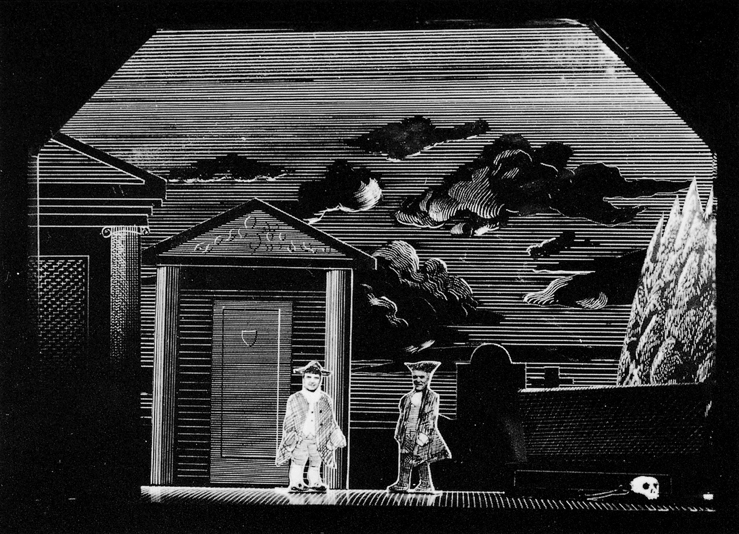
The opera is divided into three acts, each with three scenes, though at Glyndebourne it is staged in two parts, with the interval after Act II Scene 2. Hockney produced nine models plus a design for a drop-curtain for the epilogue. He did not follow all the stage directions to the letter, sometimes changing minor details or placing the required elements in a different order, but he has remained faithful throughout to the domestic scale of both the music (‘musica da camera’ as Stravinsky labelled it) and the action. As a painter Hockney wanted to revive the traditional, but now uncommon, practice of using painted scenery rather than manipulating actual objects or obtaining effects through complicated lighting. He considered it appropriate in this case, however, to conceive of the sets as separate rooms or enclosed exterior spaces rather than simply as backdrops. This allowed him greater freedom in the lighting of the sets, although he recognized that in relying on painted imagery he had to achieve his effects principally through the choice of colour and image. The garden of Trulove’s cottage, seen first in the afternoon (Act I Scene 1) and then at night (Act I Scene 3), is based on a single design but reveals the changes in light through the use of different backdrops: a brightly lit landscape for the first, followed by a pitch-black sky etched with the white outlines of clouds. A similar black sky is used for the ‘starless night’ of the churchyard scene [140]. The designer’s constant ingenuity is required to surmount the necessary limitations of painted scenery:
‘The trouble with painted scenery is all the effects have to be created in the painting. You light it mainly one way, dim or light. But if you put two cubes on an empty stage, there are so many ways you can light it; using the shadows, you can create a lot of effects. If you put two pictures of cubes on the stage, your lighting is a lot more limited; you can have light and dark, but you can’t help the space or flatten it, it’s always going to be the same. Whereas with the 3-dimensional cubes you can have them flat or you can make it suggest a bigger space, there’s a lot of things you can do with it. I wouldn’t do that. That’s why there are operas that at one time I thought I might not do that I might do, that you could deal with in different ways.’
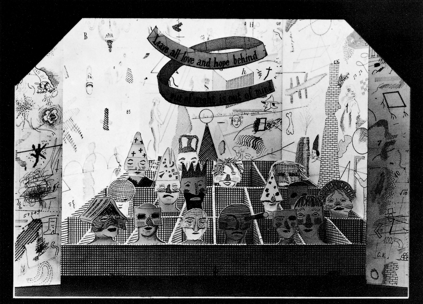
Hockney thinks of his sets as large pictures, but as three-dimensional rather than as two-dimensional pictures. The rooms in The Rake’s Progress are viewed from an angle rather than straight on. This ensures that each member of the audience, depending on his position, will get a different perspective on the wealth of detail afforded by certain scenes. Hockney remains faithful to the simple instructions provided in the libretto, but elaborates the designs with a complexity of imaginative detail in excess of anything he had produced in his paintings in recent years. For the Bedlam scene, the last in the opera, Hockney suggests the disordered states of mind of the inmates by providing them with grotesque masks reminiscent of the commedia dell’arte and by covering the walls with a multitude of nervous scribbles, doodles and graffiti [141]. (On one wall are written the initials ‘W. H.’ in an elegant script, an homage both to Auden and to Hogarth.) The inmates are housed in a grid of wooden stalls, a symbol both of their physical imprisonment and of their psychological isolation from each other.
The Rake’s Progress was the most demanding project which Hockney had undertaken since the Grimm illustrations five years earlier. Every visual detail had to be carefully considered. For the costumes, for instance, Hockney made a few drawings and provided references to figures in Hogarth engravings which he wanted to be used as a guide. The fabrics from which the clothes were made were printed up in cross-hatched patterns in different colours under Hockney’s supervision. In this way, the figures partook of the same characteristics as their surroundings. The triumph over naturalism was now complete, for even when dealing with real people he had now found a way of avoiding the prosaic description which had been plaguing him in his paintings.
Soon after Glyndebourne had approached Hockney, Roland Petit of the Ballet de Marseille asked him to produce a simple backdrop for a new ballet, Septentrion, which was staged in 1975 shortly before the première of The Rake’s Progress. Hockney was asked for a scene in the south of France with a swimming pool; he produced two preliminary sketches and a finished crayon drawing which was then painted to scale by scene painters in Paris [142]. Although the pool is borrowed from Portrait of an Artist (Pool with Two Figures), 1972 [112], and the house is reminiscent of the façade in another 1972 painting, Two Deckchairs, Calvi, this backdrop is not simply a retrospective image. Deliberately French in tone, it looks forward to the Mediterranean backdrop designed in 1980 for the Poulenc opera Les Mamelles de Tirésias [168].
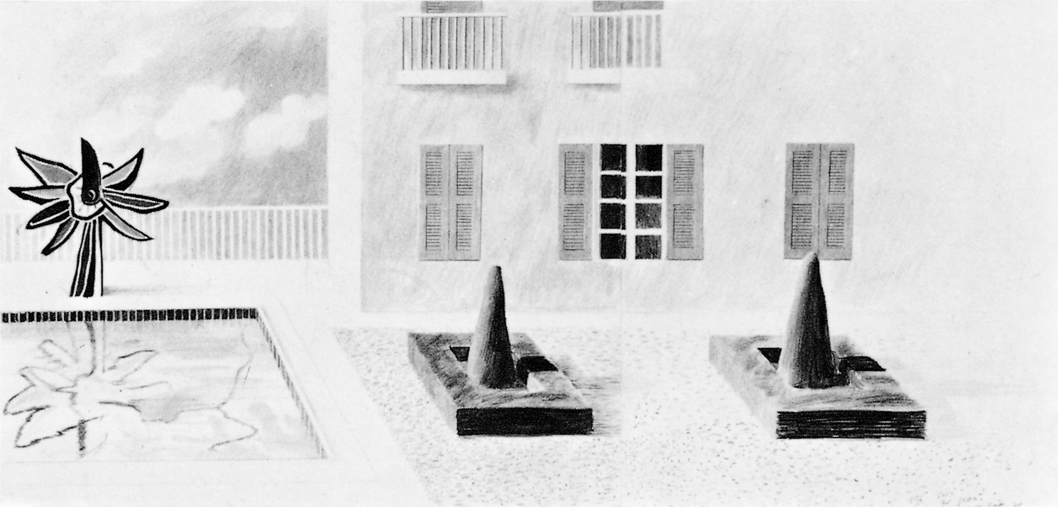
142 Design for Roland Petit’s ballet Septentrion, 1975

143 Kerby (After Hogarth) Useful Knowledge, 1975
As Hockney had hoped, the theatre proved to be the liberating influence that he needed. A renewed sense of purpose becomes evident in all his work following the staging of the opera in the summer of 1975. He was excited to see the results of the collaborative effort, and his confidence was further boosted on the opening night when John Cox asked him if he would next design Mozart’s opera The Magic Flute, to be staged three years later [154–56]. Even though he did not actually begin working on the latter until mid-1977, the theatre has thus been a constant and dominant presence in Hockney’s work since 1974, providing a clear focal point for his energies and an alternative to naturalism.
Hockney’s research for The Rake’s Progress led him to examine editions of Hogarth’s complete engraved work. In the process he discovered an amusing design by Hogarth, engraved by Luke Sullivan, which was used as the frontispiece to Dr. Brook Taylor’s Method of Perspective made easy (1754) by Hogarth’s friend Joshua Kirby. The print was intended as a satirical illustration of the disastrous effects resulting from neglect of the rules of perspective, but Hockney enjoyed the playful element of Hogarth’s engraving and decided to transcribe it on to canvas, adapting the technique that he was using at the same time for the stage sets. Kerby [143] tests the hypothesis that a painting observes its own laws and not those of the natural world. In an interview in Art Monthly published in November 1977, Hockney remarked that with this painting he finally ‘abandoned the idea of superficial consistency’, realizing that underneath the differences ‘there is consistency in the search, in the attempt to find it’. Kerby’s concept outstrips its presence as a painting, since Hockney was escaping one form of illustration only to engage in another, but it is of the utmost significance as a clarification of his ideas concerning the role of painting.
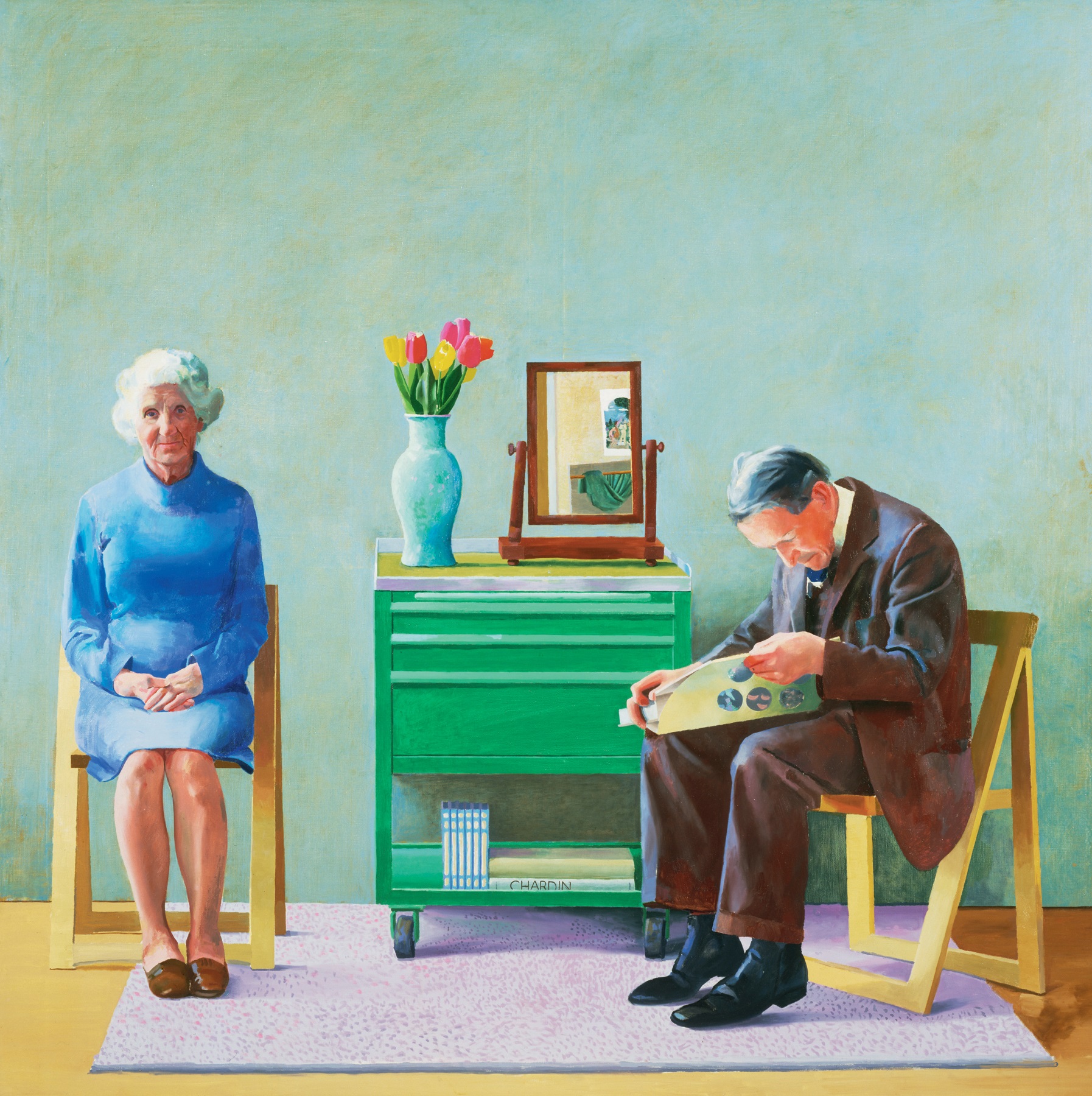
While working on Kerby in the spring of 1975, Hockney began work on My Parents and Myself [144], a subject which he conceived when his mother was in hospital in the early 1970s to undergo an operation. ‘My father could go to the hospital every day for a few hours, but he wasn’t used to sitting and talking to her for a few hours every day at home. He’d be doing something, my mother would be doing something else. It was then I noticed that people communicate in other ways, it’s not always just talking, especially people who know each other well. They’d been married forty-five years, and if you’ve been living with somebody forty-five years, you know a lot about the face, the little actions, what they mean, you know how to interpret them. I think it was then I decided there was a subject there I somehow wanted to try and deal with.’ As in Hockney’s previous double portraits, the figures are still treated volumetrically, which he evidently considered necessary as a means of endowing them with a convincing presence. This picture marks a departure, however, in the minimal note that is taken of the setting, which is not so much a room as a neutral background for the figures. The function of the bare canvas here is to concentrate attention on the people portrayed, just as the new square format, six foot by six foot, makes the figures appear compressed and more monumental. It is a picture very much about Hockney’s relationship with his parents and about their dealings with each other. His self-portrait appears in the small mirror, and a red triangle behind the figures, the bottom line of which indicates the heads of the three people, functions both as a formal device uniting them and as a visual metaphor of their mutual dependence. Hockney recognized, however, that this triangle was a superficial response to a profound emotional relationship, and it was partly for this reason that he later decided to paint a second version of the subject.

144 My Parents and Myself, 1975 (destroyed)
The figures in My Parents and Myself [144] were painted from life, but the composition was first established in line drawings in ink (one of them drawn very rapidly as a means of working out the format) and in a rather crude crayon drawing. The painting should have been a fairly routine matter once he had decided what to do, but he decided to paint the picture slowly, perhaps because he was still out of practice with oils, and reworked it to such an extent that it began to lose its freshness. It was eventually abandoned. In 1977 he began work on a second version, again measuring six foot by six foot, but this time painted quickly [145]. This pleased him more even though he could not find a way ‘to put myself successfully in the picture’. The composition and the most significant details remain the same, such as the set of paperbacks of Marcel Proust’s Remembrance of Things Past, which he had recently re-read and which he evidently considered an apposite reference in a picture concerned with personal memory and with the process of ageing. A comparison of the two versions, however, makes it clear that the awkwardness of the earlier picture was due to various factors: the difficulties in handling the paint, the stiffness of the poses, and the uncomfortable contrast of volumetric figures set within a flat background. In the new picture Hockney makes something of a return to naturalism, devising a coherent internal space in which the floor meets the painted surface of a wall rather than bare canvas, and allowing the sitters to adopt a more characteristic posture. Hockney’s father, impatient with the business of sitting still for long sessions, has picked up a copy of Aaron Scharf’s Art and Photography and has shifted his attention to the book. This results in a far more revealing study of the behaviour of the two people, the father drifting into himself while the mother patiently gives her son her undivided attention.
145 My Parents, 1977
The two portraits of his parents may appear to be a reactionary move back into naturalism, all the more curious after the liberating moves he had made in his work in 1974–75, but Hockney never lost faith in the validity of depiction. One must recall, moreover, that it was a project formulated essentially in the early 1970s but which he felt the need to complete for personal reasons out of respect for his parents, who were approaching their eighties. In the first picture he seemed intent on getting away from his old habits, but was unable to find a radically new way of treating an old subject. By the time he came to start work on the second version, he felt secure enough in his capacity for invention to return to a more naturalistic conception when the occasion seemed to demand it. He had again availed himself of the camera, taking more than five dozen colour photographs to establish the composition and as studies for the individual figures [146]. It was in these photographs that he discovered a more appropriate attitude in which to depict his father, although the figures were still painted from life, and it was the camera also which supplied the evidence for the greater colouristic brilliance of the picture. The camera, however, is no longer to be obeyed in a servile manner. Next to the Proust paperbacks, Hockney has inserted a book on the eighteenth-century painter Chardin as a clue to the frame of reference in which he would like the picture to be seen. Like the paintings for which Chardin is best known, this is an intimate and contemplative domestic interior and one in which a sensuousness of response is invoked through the technique of superimposing transparent glazes of colour to describe the fall of light on the surface of the wall.
146 Mother, c. 1976–77
The difficulties Hockney experienced with the portraits of his parents attest to a far more serious problem, the fact that from about 1974 to 1978 he was suffering from the longest and most severe painting ‘block’ he had yet encountered. Apart from working on designs for the two operas staged in 1975 and 1978, he occupied much of his time with photography and with academic drawing exercises which reiterate earlier concerns sometimes to great effect, but without arriving at new solutions of any great significance.

147 Joe McDonald, 1976
There is a confusion in Hockney’s work at this time which suggests that he was not sure what he should do. He still wished to move away from naturalism, but through his increasingly close association with fellow painter R. B. Kitaj he was now having to consider also the possibility of abandoning Modernism. He had admired Kitaj since their student days together at the Royal College, had renewed the friendship in 1968 when Kitaj was teaching at the University of California at Berkeley, and since moving to Paris in 1973 had made him one of his best-loved and most intimate friends. Together Hockney and Kitaj began in 1976 to make a unified public stand in favour of the traditional virtues of drawing from the human figure, in direct opposition to what they considered the peripheral concerns of the more extreme forms of Late Modernism. A double interview between Kitaj and Hockney published in the January/February 1977 issue of The new review provides the clearest expression of their views. Given their fighting tone, it is not surprising that the case they were putting forward was grossly misinterpreted both by their reputed supporters and by their detractors. The latter labelled them reactionary, while the former used them as symbolic leaders of a ‘return to the figurative’, and both parties tended to regard them as agents for the destruction of Modernism. It was not Modernism they were attacking, however, but Modernist academicism. They felt much recent art to be hopelessly compromised by its downgrading of the humanist concerns so strongly evident in the early stages of Modernism in the work of great artists such as Picasso and Matisse.
For a short time Hockney seems to have suffered from a loss of nerve as a result of thinking constantly about the issues raised by these discussions, as if through fear that what he produced was going to be used in evidence against him. Rather than make a big statement, he retreated to the relative security and privacy of drawing and printmaking. He spent some time in Los Angeles in 1976 producing a series of large-scale lithographic Portraits of Friends such as Joe McDonald [147]. Taking up where he had left off in 1973 with the similar-sized lithographs of Celia, he produced what are in effect a series of academic demonstration pieces, evenly worked, painstakingly drawn and ultimately rather dull. In retrospect he thinks the small book produced by Gemini G.E.L. to accompany the publication of the prints is more successful than the full lithographs, since each page reproduces a detail of the head, ‘the most interesting part’. Granted that these prints lack the wit of most of Hockney’s work in the medium, Hockney nevertheless felt that it was necessary for him to produce such prints and academic drawings simply as another bout of self-training.
‘I’ve always liked the idea of doing academic drawings at times, and I will still do it, I’m sure, in the future. It’s something that’s reasonably necessary to do if you want to draw at all, I think. If you want to make depictions of anything, it’s just something as old-fashioned as training your eye to look and observe again. They’re done really as exercises, you’re not that interested in what it’s going to look like when you’ve done. It’s the doing of it that’s the exercise. Every period I’ve done it, I’ve always thought then immediately afterwards all the drawings are better, whatever you draw. The line drawings are better: the line can tell you more of what’s there after doing this.… Before he did all those lovely line drawings, Matisse would make really detailed charcoal drawings and tear them up. He wouldn’t leave them about, he thought of them as working drawings. I understand what he was doing: discovering what’s there. And then when you come to use line, if you know what you’re looking at, it’s much easier to make the line meaningful, to find a linear solution to what you want to depict.’

148 Henry with Cigar, 1976
149 Gregory with Gym Socks, 1976
The evidence of Hockney’s claims is provided by the prints he produced immediately after the hard linear portraits of 1976. Lithographs such as Henry with Cigar [148] and Gregory with Gym Socks [149] are among the freest and most daring excursions Hockney has yet made in the medium. The picture of Gregory is notable for the nervous energy of the contours which describe the volume of the body without recourse to shading except on one side of the face. The fact that one arm and one side of the body have been redrawn serves only to increase the sense of urgency, revealing the broad sweep of the artist’s arm in making the mark. The small lithograph of Henry Geldzahler, drawn with a diluted form of lithographic ink known as tusche, achieves an extreme of simplicity which recalls the Oriental brush drawings which Hockney had recently admired in an exhibition at the British Museum. What astonished him most of all was the beauty and economy of means by which a few marks described the gesture of the artist’s hand while at the same time producing an immediately recognizable depiction of something seen. It is an almost alchemical process of transformation which could be described as a visual equivalent to poetry.
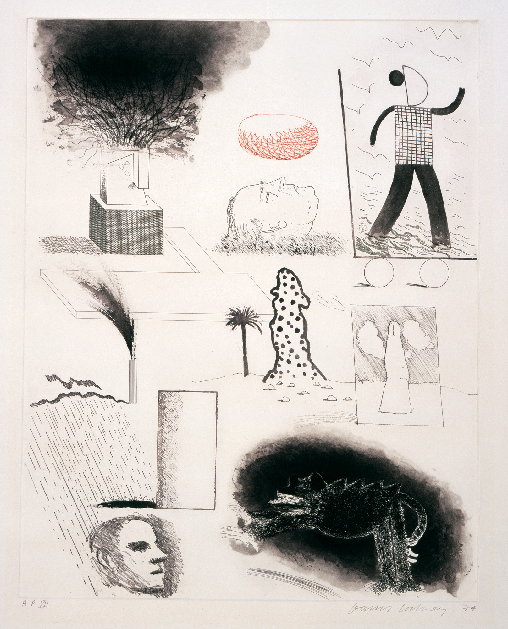
While staying on Fire Island, just outside New York City, during the summer of 1976, Hockney read for the first time the long poem by Wallace Stevens titled ‘The Man with the Blue Guitar’. This was at the instigation of Henry Geldzahler, who has consistently influenced Hockney’s literary interests over the years. Hockney was immediately stimulated by the poem, which concerns the role of the imagination in interpreting reality and which uses as its primary reference the Blue Period Picasso painting of 1903 called The Old Guitarist. With nothing more than paper, coloured inks and crayons with which to work, Hockney immediately began a set of drawings inspired by the poem, producing ten in all. For the moment the drawings were an end in themselves, a means of bringing together his admiration for Picasso with his new-found freedom of technique, united by reference to the poem. He investigated the possibility of transferring this imagery on to a few small canvases, but these paintings were abandoned. In the autumn he decided instead to produce a set of coloured etchings in which, appropriately, he could make his first concerted group of prints using the method devised by Aldo Crommelynck for Picasso. Producing as many as three or four etchings from a single drawing and researching into Picasso’s œuvre for additional images, he completed a set of twenty etchings which was published as a portfolio and also as a book in an edition of 20,000. Printed in the spring of 1977, this was Hockney’s most important series of prints since the Grimm illustrations of 1969.
150 Tick it, Tock it, Turn it True from The Blue Guitar, 1976–77
The full title of The Blue Guitar [150] gives a forewarning of the double and triple takes which lie in wait: Etchings by David Hockney who was inspired by Wallace Stevens who was inspired by Pablo Picasso. These are pictures based on words based on pictures, pictures of pictures, and pictures about techniques. What holds them together is the constant reference to Picasso’s example. The method of colour etching itself was chosen not simply as the most appropriate for translating the linear coloured drawings on to a plate for printing; there was also a poignancy about using a technique which had been invented for Picasso but which the master had not had a chance to use before his death. The imagery is derived largely from Picasso’s work, with references to particular paintings and prints, to different modes of drawing and stylistic phases associated with him, to standard themes such as the artist and his model, and to recurring geometrical forms and motifs such as the guitar, symbol of the artist’s most important instrument, his imagination.
Hockney made The Blue Guitar at a time when he and Kitaj were most actively involved in discussions concerning the central importance of the human figure in the history of art; Kitaj remarked in several interviews that it was no accident that the two great artists of the twentieth century, Picasso and Matisse, received a training based on drawing of the human figure. Hockney’s etchings suggest a variety of ways of reinventing the human form, from the most basic geometrical armature to outline drawings of great elegance and delicacy. Naturalism is not rejected altogether; rather it is one possibility among many. The clear implication is that art resides in the search for equivalents, rather than in a particular style, and that the imagination is the vital tool for transforming the prosaic into the poetic.
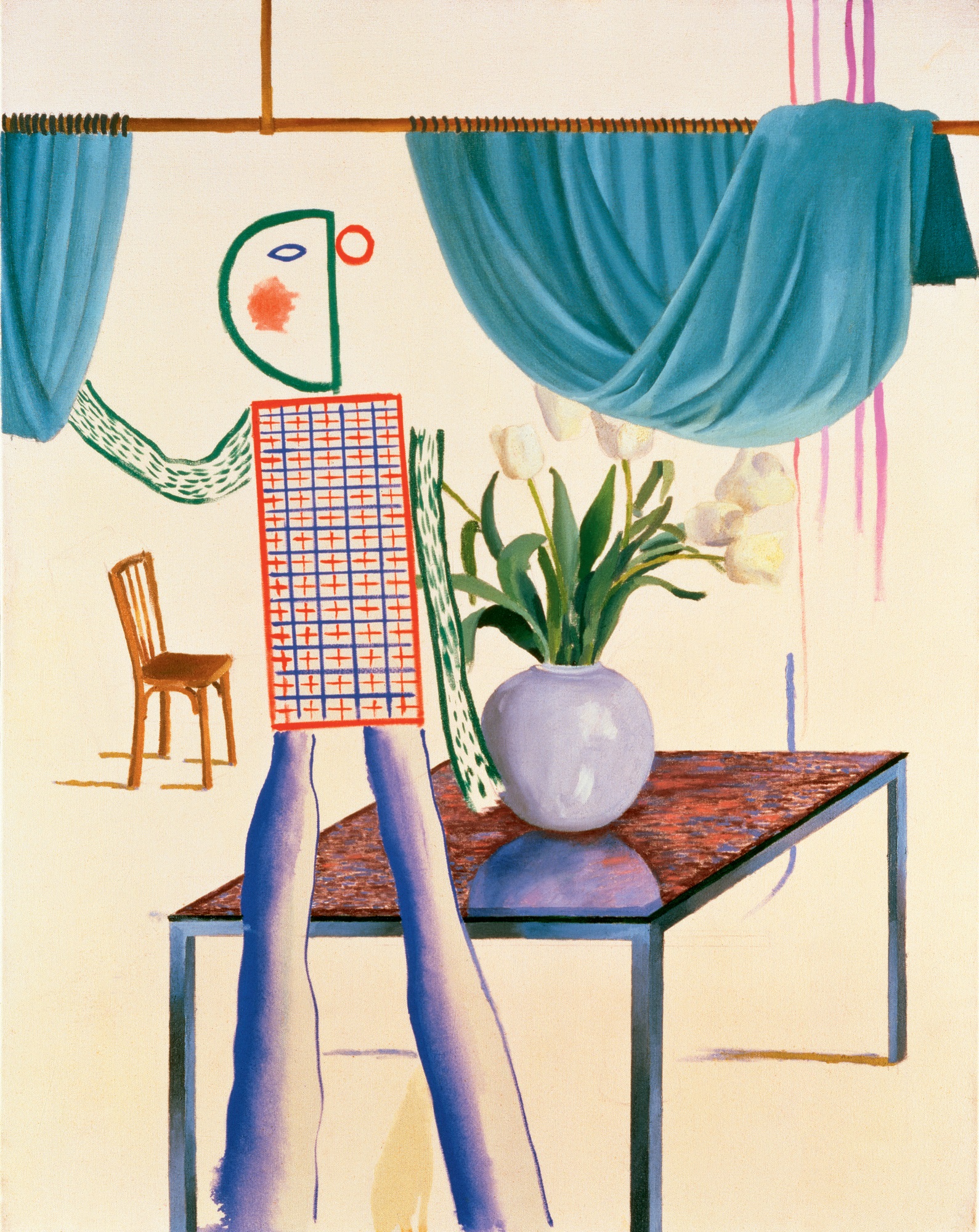
Intelligent as it is in its treatment of a poetic theme, The Blue Guitar series can only be judged a qualified success; the imagery tends to be disparate, and the colour schemes of red, blue and green, used so effectively for The Rake’s Progress sets, do not always balance. Hockney’s exhilaration by the themes proposed in the poem, however, did not wane, and early in 1977 he began work on two canvases in which he examines the theme of painting as the subject of painting. The first of these, Self-Portrait with Blue Guitar [133], was begun spontaneously with no real plan, simply taking imagery from his recent work. The title and subject of the picture can be interpreted in two ways. Taken literally, it is a representation of the artist at work on the Blue Guitar drawings. Suspended in the air as a materialization of his thoughts are images used in the etchings: the two-coloured path in perspective from the print titled It Picks its Way next to the 1937 female head by Picasso depicted in What is this Picasso?, the last print of the series. Coloured inks, a table and chair in conflicting perspectives, curtains and other devices lie in wait for him like the brushmarks and false geometries in the Portrait Surrounded by Artistic Devices of 1965 [54].
Construed metaphorically in the terms established in the series of etchings, however, this is a self-portrait of the artist as one who creates through his imagination. The similarity of the props and setting to those of Invented Man Revealing Still Life [138], painted in 1975 before he had come across the Wallace Stevens poem, is a conscious one that celebrates the central role of the imagination already indicated in Hockney’s work before the morale-boosting discovery of ‘The Man with the Blue Guitar’. The juxtaposition of the Blue Guitar imagery with Hockney’s first-ever self-portrait on canvas proclaims a personal involvement with these themes which belies the sense of ironical detachment in the prints. The echoes of other past works by Hockney such as the 1974 Louvre paintings [128] (in the modified pointillist technique used for the table) and the 1971 González paintings [136] (in the spiky shadow cast by the chair and in the Cubist-inspired illusionistic painting of wood grain) suggest that Hockney recognized at once that in The Blue Guitar he had drawn together many of the threads from his previous work. Inspired as he was by the example of Picasso, the apparent discontinuities and contradictions evident in his own development no longer seemed to pose such a threat to his integrity. He was free once more to do what he wished, confident in the knowledge that the consistency of his attitude would emerge no matter what style he chose to work in. In contrast to the rather innocent freedom of movement declared in his early work, however, his attitude has by this time become highly self-conscious.
151 Model with Unfinished Self-Portrait, 1977
The second of the two paintings, Model with Unfinished Self-Portrait [151], was planned with greater deliberation. The title warns us that what appears at first glance to be a continuous interior space in fact consists of a portrait from life placed in front of another canvas, the Self-Portrait with Blue Guitar [133], a finished reproduction in paint of a work in an incomplete state. The lower half is painted in a naturalistic style that contrasts with the blatant artifice of the upper register, drawing attention to the fact that reference is being made to two orders of reality and that the two figures do not occupy the same space. The double takes and sense of play are carried still further in a series of colour photographs which Hockney took of the model and props in the studio in front of these paintings, suggesting that the resounding of visual echoes is potentially limitless. As always in Hockney’s work, however, these witty games have a serious purpose, that of reminding the viewer that he must question all the information with which he is presented.
Model with Unfinished Self-Portrait carries one step further the first painting’s implication that aesthetic concerns continue for Hockney to be closely bound to personal matters. The sleeping figure is Gregory Evans, Hockney’s companion and model who appears in many of his drawings and prints of this period (including The Blue Guitar print Etching is the Subject), and whose close relationship with him provides an immediate instance of the artist and model theme which occurs repeatedly in The Blue Guitar. To complicate matters, Peter Schlesinger was used as a substitute model in Gregory’s absence and was photographed by Hockney in this role. Hockney’s insistence on personal emotional motivation was a direct rebuff to what he considered the refusal of much Modernist art to deal with sentiment. As he said to Kitaj in the conversation published in the January/February 1977 issue of The new review: ‘And remember this: it is always figures that look at pictures. It’s nothing else. There’s always a little mirror there. On every canvas there’s a little bit of mirror somewhere. You don’t get “Red and Blue Number Three” looking at “Blue and Brown Number Four”.’
Looking at Pictures on a Screen [152], one of the last two canvases he painted in London before leaving for New York in the summer of 1977, takes account more directly than ever before of our role as spectators. Henry Geldzahler engages in the same activity as we, that of looking at pictures. Celebrating art as a shared human experience, Hockney brings to our attention reproductions of favourite pictures from the National Gallery as an act of homage to four masters of the human figure, Vermeer, Piero della Francesca, Van Gogh and Degas. Hockney declares his own alliance with the tradition represented by these artists by taking as the focal point of his own picture a figure which is endowed with an impressive monumentality in spite of the fact that it is under life-size.
Hockney’s interest in Van Gogh led him early in 1978 to experiment with new techniques of line drawing. Using a reddish-brown ink and reed pens of the same type as those which Van Gogh had taken up in Arles in emulation of the Japanese, Hockney began to produce drawings marked by a spontaneity and boldness of execution which strongly betray the influence of Van Gogh’s essays in the same medium. Given that this looseness of technique and delight in surface pattern are new in Hockney’s drawings and owe much to his adoption of instruments closely associated with one artist, there inevitably is an element of pastiche in these first excursions, a sense that he is imitating a style rather than using it to his own ends. When the subject itself makes a strong impression on him, however, Hockney rises to the occasion and uses the medium to transmit an emotional content all the more poignant for its apparent awkwardness. This is the case, for instance, with Mother, Bradford, 18th Feb., 1978 [153], which was drawn on the day before his father’s funeral and which captures the vulnerability and sadness of a person contemplating the future without the company of a lifelong partner. It was drawn quickly because she had already put on her hat and coat to go out, and Hockney was aware that she was not feeling well. Although it might seem callous to ask her to pose at such a moment, the reverse is the case, for in drawing his mother Hockney was communicating his own sense of loss at a time when words would have been superfluous. ‘When my father died, it was the first person who was very close, very close, who had died. Death was not something I had dealt with.’ The adoption of a technique from Van Gogh, an artist particularly adept at translating emotions into pictorial form, is thus not a question here of making a knowing artistic reference but of manipulating a technique for an essentially private purpose.

152 Looking at Pictures on a Screen, 1977

153 Mother, Bradford, 18th Feb., 1978
The direct acknowledgment of the spectator’s presence alluded to in Looking at Pictures on a Screen [152], though attributable to Hockney’s views on the role of the human figure in painting, may also be due to the fact that he was about to begin his next project for the stage, a context in which the audience must be borne constantly in mind. He had accepted John Cox’s commission to design a new production of Mozart’s The Magic Flute, to be staged at Glyndebourne in May 1978, and in the summer of 1977 he left for the comparative anonymity of New York City to begin work on his models.
The Magic Flute is one of the most frequently staged of all operas, popular with public and with designers alike not only because of the beauty and clarity of the music but also because of the immense scope for pictorial invention provided by Emanuel Schikaneder’s libretto. Hockney is not the only painter to have responded to the challenge; in 1967 Marc Chagall designed a famous production for New York’s Metropolitan Opera which is still being used. The demands on the designer, however, are enormous. Hockney produced designs for thirteen separate sets, more than twice his annual production of paintings at that time, and had to find a way of changing scenes in the space of a few seconds so as not to interrupt the flow of the music [154–56]. He had found in designing The Rake’s Progress three years earlier that moving objects on and off stage took too long, and decided that on this occasion he would have to use painted drops as the most efficient method of dealing with the problem. He knew early on, therefore, that his designs would take the form of enormous pictures rather than fully three-dimensional settings as he had used for the Stravinsky. Only two of the final scenes, however, employ ordinary illusionism on a single flat surface, since in most cases a sensation of space is created by the placing of two or even three drops parallel to each other, establishing a continuous perspective which must be filled in by the spectator’s imagination. Hockney eventually used all the drops available to him on the relatively small Glyndebourne stage, thirty-six in all, and was disappointed that there were not additional drops with which to put into action the aerial car he had devised for the three boys who appear at intervals with messages for the protagonists.
154 A Rocky Landscape from The Magic Flute (Act I, Scene 1), 1977
Hockney had seen about ten different productions of The Magic Flute, ‘none of them totally memorable, nor that clear’, and did a lot of research on previous designs and on the meaning of the opera itself before starting work. He was aware from his own experience as a spectator that the designer could ruin the production by making it visually dull or by taking too long to effect the transformation scenes. The pictures, he thought, should be crisp and clear like the music, and he explained in an interview published in the Glyndebourne programme that he decided for that reason to keep the designs ‘in focus, no haze, not too many shadows, reduce chiaroscuro’. He played different recordings of the opera constantly while working, an enormous advantage to designers in recent years, particularly to those who, like Hockney, cannot read music. Other designers of this opera have married their sets to the music by setting them in the eighteenth century, a solution which Hockney firmly resisted as lazy and as a misrepresentation of the action, which is set in ancient Egypt. He wished to follow the original libretto as closely as possible, obeying the instructions for the imagery required but devising an equivalent to the mood of the music through colour and formal design.
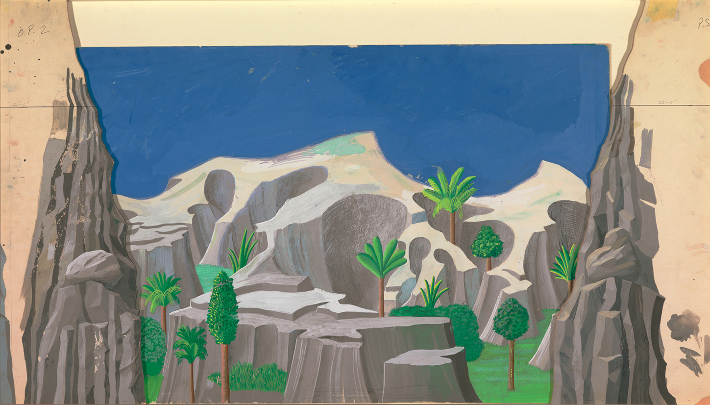
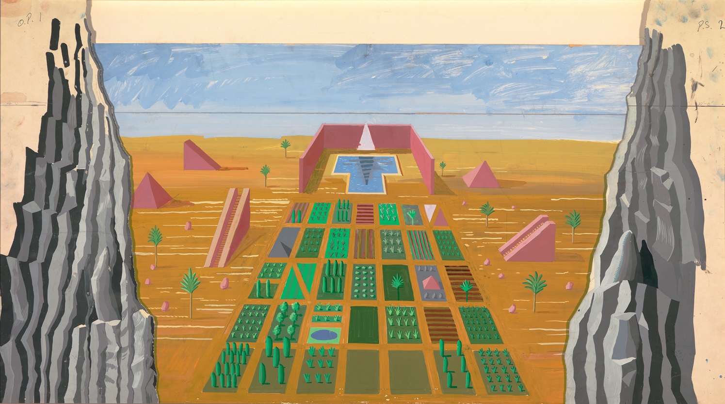
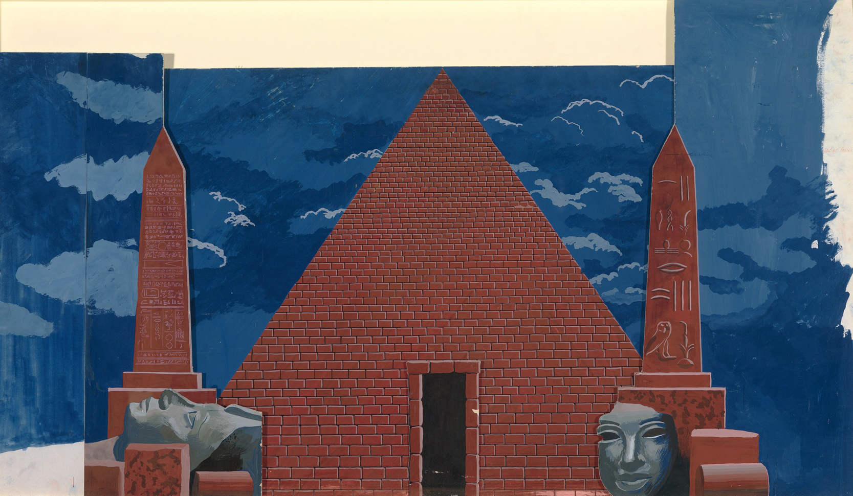
Hockney’s sets are unmistakably situated in ancient Egypt, filled as they are with images of pyramids, palm trees, deserts, obelisks, monumental stone heads and massive interior spaces [155]. He had recourse both to his own early Egyptian drawings and paintings, such as Great Pyramid at Giza with Broken Head from Thebes, 1963, as well as to the photographs and drawings he made on a return visit to that country at the beginning of 1978. Unlike the work he did for The Rake’s Progress, however, this time he could not rely on one source alone for all his material. He was aware that the libretto of the opera itself drew on a bewilderingly diverse range of sources such as Masonic symbolism (both Mozart and Schikaneder were Masons); a treatise by Abbé Terrasson called Sethos (1731), now known to be a fabrication, concerning the mysteries of Isis and Osiris; a collection of pseudo-Oriental fairy tales titled Dschninnistan, which was published in 1786 and which provided plots for a number of other Singspiele written in Vienna at the time; and elements from the commedia dell’arte and from Viennese popular theatre. Hockney likewise took ideas for his designs from a number of unrelated sources, reinterpreting written as well as visual material in a stylized pictorial form to ensure a sense of unity. A satisfactory flow was also aided by Hockney’s decision to make all the models in the order in which they would appear dramatically. The models were painted on a scale of 1 to 12 in gouache, so that the proportions and colour relationships could be envisaged accurately from the beginning. The scale Hockney used is said to be twice that normally favoured by professional designers, suggesting that he was anxious both to think on the expanded scale required and to maintain complete control over every detail to be painted.
155 Sarastro’s Kingdom from The Magic Flute (Act 1 Scene 3), 1977
Italian paintings of the Quattrocento, which have the kind of linear clarity and evenness of light which Hockney required, supplied ideas for the opening scene of Act I [154], which is described in Schikaneder’s libretto as ‘A rocky scene dotted with a few trees. In the centre stands a temple, to which steep paths lead from either side.’ Not wishing to overcrowd the scene, Hockney has disregarded the temple, which is not absolutely necessary for the sense of the action, putting in its place a hollow mountain which will shortly burst open for the spectacular entry of the Queen of the Night. The mountainous landscape is based on Benozzo Gozzoli’s fresco painting of The Journey of the Magi, painted 1456–60 in the Chapel of the Medici in the Palazzo Riccardi, Florence. Hockney has not copied Gozzoli’s complexly detailed painting in a slavish manner, keeping the stylized treatment of the rocky terrain and foliage but greatly simplifying the scene for impact. In order to preserve the homogeneity of the scene, Hockney has chosen to clothe the protagonist, Tamino, in garments drawn from other Italian paintings of the same period rather than in the exotic Japanese costume stated in the libretto. By the same token, the serpent which pursues Tamino is presented in the guise of the monstrous beast from Uccello’s Saint George and the Dragon (National Gallery, London), completing the tableau.
The violent contrasts of mood characteristic of The Magic Flute demanded, in Hockney’s view, equally dramatic visual shifts and clearly differentiated scenes so as to complement the music and to make the action easy to follow. ‘In The Magic Flute you have contrasts between comic, bawdy entertainment like a pantomime and then rather solemn almost church-like music when of course you wouldn’t want a comic setting behind it. That’s the difficult part of doing it, you have to be able to combine these two things which you don’t usually come across in a play. So I used the mood of the music for the scenes; depending on what was going on, you’d then decide to make something jolly or something solemn.’
The wide range of reference of Hockney’s designs thus has a specific function in devising a series of starkly differentiated visual solutions, each of which is appropriate to the events taking place and to the emotional dimension of the music at that moment. The crescendo and clap of thunder which announce the awesome appearance of the Queen of the Night, a personification of the forces of darkness, necessitates an equally breathtaking visual transformation. The stage lights are extinguished and Hockney’s mountain parts in the centre, following the instructions in the libretto, revealing the Queen of the Night in front of a black sky studded with a swirling pattern of stars, lit in such a way as to make invisible the gauze backdrop on which the mountain landscape is painted. Hockney’s design of this scene bears sufficient resemblance to that devised by Karl Friedrich Schinkel for the 1816 Berlin production to suggest in this case a direct inspiration. In the few instances where Hockney’s sets recall other designs for the opera, reference invariably is to very early productions, which like his own were conceived as painted drops and which follow Schikaneder’s instructions more closely than has generally been the case in the past century. The distribution of the three temples that appear in Act I Scene 3, for instance, is based on Schikaneder’s own staging of the opera (first performed in 1791) as known through coloured sketches by Josef and Peter Schaffer published in 1794 in the Allgemein-Europäisches Journal. Impressively, Hockney has outdone even Schikaneder by including all the elements outlined in the stage instructions: ‘The scene changes to a sacred grove. Right at the back is a beautiful temple with the inscription: “Temple of Wisdom”. Two other temples are joined to this temple by colonnades: the one on the right is inscribed “Temple of Reason”; the one on the left, “Temple of Nature”.’ While the original production indicated the grove simply by surrounding the temple fronts with foliage, Hockney has introduced a vast grove complete with sacred pool on a separate backdrop behind the three cut-out façades.
The awesomeness of the setting in this closing scene of the first act is suggested through the high horizon and plunging perspective, one of many such pictorial illusions by means of which Hockney greatly extends the impression of scale. The monumental interiors in Act II, for instance, employ the perspective trick of two vanishing-points to make the stage look larger than it really is, with the foreground elements as if seen from above and those in the background as if viewed from below. Such solutions were worked out intuitively through trial and error, although Hockney has also made use of his own observations of architecture. The huge flight of steps used as the dominant element of one of the great halls, for instance, was suggested by the main staircase of the Metropolitan Museum in New York, where Hockney had spent much time researching Egyptian art.
The opening scene of Act II, which represents the domain of the High Priest Sarastro, is largely of Hockney’s own invention, although the palm trees have been transplanted from the Uffizi Baptism of Christ by Andrea del Verrocchio and Leonardo da Vinci, as an illustration of the landscape envisaged in the libretto. In spite of the considerable research which he undertook on Masonic symbolism, Hockney decided to represent the progress from the darkness of superstition to the blazing light of enlightened wisdom not through a symbolic use of colour but by a literal rendering of the stage instructions. Scenes 2 through 7 of the second act are all set at night [156], as in Schikaneder’s libretto, and it is only at the end of the opera, after Tamino and Pamina have undergone their trials that ‘man’s dark world is filled with light’. The sun makes its reappearance as a rigidly geometrical pattern that paraphrases certain paintings by Frank Stella; on Hockney’s own admission, it is perhaps the least successful of his backdrops for the opera.
Hockney’s work on The Magic Flute confirmed him in the belief that inspiration can be found anywhere. He did much research, for instance, for the brief trial by water scene, reading books about water and even purchasing a book on waterfalls. The blue-green waterfall which he eventually devised for the backdrop, however, was borrowed from a colour advertisement for menthol cigarettes which he discovered in a magazine. The advantage of using such a cliché is that its very familiarity saves valuable time in identifying a scene which lasts only a matter of seconds. The moonlit garden of Act II Scene 3, on the other hand, takes its cue from two of Hockney’s earlier designs for The Rake’s Progress, those used for the garden of Trulove’s country cottage and for the churchyard at night [140].
156 Outside the Temple from The Magic Flute (Act II, Scene 7), 1977
The vast range of sources compiled by Hockney was reassembled in a form so traditional as to be almost archaic in terms of modern theatre practice. It is not simply that the designs take the form of painted backdrops, but also that depth is suggested by means of coulisses, or wings, one of the oldest devices known to the stage. Some critics expressed fears that Hockney’s sets, as impressive as they might be as paintings, could turn out to be distracting when placed in their dramatic context. These worries proved unfounded, for the clarity of Hockney’s designs, and the splendid scene changes of the second act in particular, focus the viewer’s attention on the action and themes of the opera to an unusually successful degree. The achievement is recognized by the fact that this production is now commonly known as ‘Hockney’s Flute’, a rare instance in which a version has come to be associated with the designer rather than with the producer or the conductor.
Hockney’s own reservations about his designs for The Magic Flute centre on the costumes, which he found more difficult to do than for The Rake’s Progress. Papageno’s bird costume, based on engravings which depict Schikaneder himself in the original role, was a simple enough matter. Hockney wanted the other costumes, however, to fit in with the colours of the sets he had already designed, but by this time he had sent the models to Glyndebourne and thus had difficulty in matching them as he planned. Since he did not know enough about ‘building’ clothes to produce accurate measured drawings, he simply brought with him coloured sketches as a guide for the wardrobe department. The clothes were made in the month prior to the première, with the designs altered in the process of making them until a satisfactory solution was achieved.
Hockney’s absorption in The Magic Flute dominated his attention for nearly a year, and he produced no paintings at all during this period. He explains that it was not only that his time was taken up but also that he was suffering from a painting ‘block’, one which he blames in part on his distaste for his newly modernized studio at Powis Terrace, where he felt enclosed and cut off from the life outside. He decided to sell the studio, along with the rest of the house where he had lived for sixteen years, and return to Los Angeles, for him always a more receptive environment for painting.
In view of the enormous amount of work which he had produced for the opera, however, one should take with a grain of salt Hockney’s complaints about his unproductiveness. He recognizes that the theatre once again had acted as ‘a liberating influence’, and it is evident from the work he made immediately afterwards that his enthusiasm had been renewed not only by the optimistic message of The Magic Flute itself but also by the warm reception accorded to his designs and by the new boldness of colour and form which he had achieved. It was the first occasion on which he had worked extensively in gouache, a medium which he has continued to use because of the intensity and range of its colours and because of its fluid texture, which has helped him considerably in loosening his technique. Responding to the qualities of the medium as on past occasions, he began to explore the possibilities of placing one colour over another to achieve effects unprecedented in his earlier pictures, finding a way to create images ‘more spontaneously, relying more on the paint than on outline’.
The boldness and expansiveness of scale characteristic of the Magic Flute designs dictated a major shift in Hockney’s subsequent work. The change in his sensibility is apparent in the first pictures he made on his departure from England in the summer of 1978. Hockney had intended to stop off in New York for a few days en route to California, but decided to extend his stay after visiting Ken Tyler’s graphic workshop at Bedford Village, a short drive outside New York City. Tyler was determined to interest Hockney in a technique he was using with other artists, one which combined painting with printmaking, and showed him works in this medium by Ellsworth Kelly and Kenneth Noland. Hockney responded immediately to the beauty and tactile qualities of these pressed colour paper pulp pictures and decided to try the medium for himself. Liquid colour pulp is poured into metal moulds directly on to a surface of wet paper; more coloured pulp and liquid dyes can then be applied freehand, and the whole pressed between felts in a high-pressure hydraulic press. Once it has dried, the coloured image is part of the actual fabric of the paper.
After making a few trials himself, including a series of Sunflowers which indicate that Van Gogh was still very much on his mind, Hockney decided to use this ‘watery’ medium for a more appropriate subject, and started making photographs and drawings of Tyler’s swimming pool. In the interview recorded only three years earlier for his autobiography, Hockney had stated that ‘doing variations on a theme doesn’t interest me; I think it’s too easy.… The idea of doing a whole exhibition of swimming pools, for instance, wouldn’t appeal to me at all, even though you could do them very differently.’ Now he found himself doing precisely that, completing in a six-week period a series of twenty-nine Paper Pools, all dating from August to October 1978 [157, 158]. His enthusiasm for the medium, and the challenge it provided both to his technical abilities and to his powers of perception, made him forget his former qualms about working in series.

157 Midnight Pool (Paper Pool 10), 1978
It was the technique itself, with its brilliance of colour and its sensuously tactile quality, which attracted Hockney. Never before had he demonstrated such a direct physical involvement with the materials, actually kneading the surface, for instance to fuse the pinks of the underwater swimmer’s flesh, in order to achieve particular effects. The very nature of the medium allowed Hockney to integrate the activities of drawing and painting in a way that had hitherto proved difficult for him, since in these works the flat areas of colour and the (necessarily crude) figurative images alike are produced by the same method. The separation of line and colour evident in his former work can no longer be perceived in these works in, rather than on, paper, since line is defined by the boundaries of coloured forms and colour is the basic constructive substance rather than merely an additional source of decorative pleasure.
158 Le Plongeur (Paper Pool 18), 1978
The Paper Pools take the swimming pool motif as a convenient reference point for the exploration of his long-standing interest in water, light and pattern, but these pictures are by no means mere spin-offs of the California pool paintings of the mid-1960s. These new works are based on direct observation, and the fact that the swimming pools this time are in New York State rather than on the Pacific coast determines fundamental changes in colour and in imagery: the vegetation is different (no palm trees, but greener grass) and the colours are cooler, evidence of a more muted type of light. The echoes of Monet’s Giverny paintings are appropriate in view of Hockney’s adoption of the Impressionist practice of producing a number of views of the same scene under different weather conditions or at different times of day, something he had already tried with the alternative painting of some of The Weather Series lithographs in 1973 [124, 125]. This time the changes of colour and surface occur within a scene which remains literally the same, since a single set of moulds is used to produce a series of variations. The static man-made object thus becomes a container for the artist’s perceptions, a contemporary reformulation of a late nineteenth-century concept. Hockney tests to the full the acuteness of his observations, studying the effects of transparency, reflection and refraction of light under constantly changing circumstances. Among these Pools are his first direct studies of nocturnal effects. These may have been prompted not only, as he says, by the mysterious appearance of the pool at night, but also by his recent experience of designing seven night scenes for The Magic Flute [156].
Challenged by the medium itself, Hockney devised new methods for representing the interaction of light and water, taking full advantage of the fact that images are created with coloured matter in a fluid state. Like Matisse’s late paper cut-outs, to which the Paper Pools have been compared, these pictures are at once fully representational and virtually abstract in the simplicity and daring of their formal designs. Hockney’s sense of pattern is given free rein in the interplay of the rectilinear structure of the over-all image with the format of separate sheets of paper of identical size. One sheet on its own might read as an abstract image, one that recalls work in the same medium by artists such as Kelly, Noland and Frank Stella, but the relationship of the various parts provides a figurative context which modifies the interpretation of the marks. This division of the image was a practical necessity, since there was a limit to the sheet size which could be accommodated by the hydraulic press, but Hockney has used it to his own advantage as an opportunity to continue making sly reference to abstraction.
A comparison of the swimming pool pictures of the mid-1960s [51, 73, 86] with the Paper Pools reveals the extent to which Hockney has persisted in devising new responses to constant preoccupations. The spectator of the earlier pool paintings seemed to be placed outside the experience of the painting; the highly schematized arrangement across the surface, the abstracted symbols for light and transparency, and the mediation of the photographic process all conspired to distance the viewer from the subject [71, 74]. The Paper Pools have an equal emphasis on the surface, actually fusing the image with the material, yet as spectators we now seem actually to be immersed in the space created by the boundaries of the image. We are placed directly at the pool’s edge and encouraged to examine the changing patterns on and through the water. There is a subtle subjectivity of intention here which establishes an emotional response beyond the expected involvement with perception and with the material processes of painting or drawing. The bold surface geometries and rich colour range, along with the clear evidence of direct study from nature, create an air of silent contemplation, a remarkable shift of mood from the extroversion of the earlier pool pictures.
Hockney’s recent experience in the theatre and sense of environmental enclosure of the Paper Pools paved the way for the twenty-foot-wide figure painting, Santa Monica Blvd. [159], which he began on his arrival in Los Angeles in the autumn of 1978. He worked on this canvas, his first multi-figure composition, for two years before finally abandoning it. He was satisfied with only two fragments: a male hitch-hiker and a female shopper, spied walking casually down the street rather than formally posed, as had been Hockney’s earlier custom. The architectural background which was the dominant element in the painting seemed hopelessly stilted, but in the figures at least there was evidence of a new conception of the human form based not just on physiognomy but on the patterns of ordinary behaviour and social interaction.

159 Santa Monica Blvd. (detail of work in progress), 1978–80
If Santa Monica Blvd. was the last gasp of Hockney’s old method of piecing together a composition from photographs, it did signal a startling change in his use of colour. The picture was executed in a new kind of acrylic paint which he found in California and which excited him at once for the vividness of its hues; it is finely ground and dense in pigment. Hockney’s delight in the medium, as on previous occasions, was immediately incorporated into his work. Also significant was the huge scale of this canvas, which in one sense was a contemporary version of the Grandes Machines painted for the Salon in the nineteenth century but which was also a response to the vast enclosures of American Abstract art since the Second World War.
Within two weeks of his arrival in California, Hockney had begun work on a canvas that was eventually to be known as Canyon Painting [160]. Initially this was not conceived as a painting at all but only as a technical experiment, a means of testing the new acrylic paints he was using and of exploring combinations of colour. ‘French marks’ such as one would find in Dufy’s work are dangled suggestively over flames of colour reminiscent of Kandinsky’s pre-First World War Improvisations. In the centre is a grid of red and blue strokes which calls to mind Mondrian’s so-called ‘Plus and Minus’ paintings of about 1914, seminal works of abstraction still rooted in an appreciation of landscape. ‘Until I finished it,’ Hockney recalled in December 1980, ‘I didn’t treat it seriously. Then I made it into a picture. Then it took nearly a year before I did the next thing from it, partly because I was working on other things. Meanwhile I kept going back to the Santa Monica Blvd. painting, working in a way that I’d already broken, actually, and not realizing it.’
Hockney’s policy since his arrival in California in 1978 has been to keep his paintings in the studio for as long as possible so that he can learn from them, since his income from prints and drawings alone is now such that he does not need to worry about selling the canvases. In this case, prolonged study changed his interpretation of his own picture. What he had originally conceived simply as a testing ground now appeared to him as a kind of landscape, with the central void as an equivalent to the canyons running near his home in the Hollywood Hills. The Mondrian reference now took on another meaning. Excited by the discovery through intuitive means of an image literally ‘close to home’, he immediately set to work on an explicitly representational landscape of Nichols Canyon, a road down which he drove every day from his home to his studio.
Nichols Canyon [161] takes its cue from Hockney’s stylized landscapes of the mid-1960s such as Iowa, 1964 [53], or Rocky Mountains and Tired Indians of the following year. The boldness of design now creates a continuous surface pattern, however, and the saturated colour has a lushness unprecedented in his work. Hockney has at last found a way of dealing directly with experience without resorting to the imitation of appearances as captured by the camera. The extraordinary range of orange, yellow, blue, red, green and violet in this painting is not an arbitrary one nor simply a response to the challenge of incorporating the entire spectrum on one canvas; the conjunction of colours, rather, is an accurate if grossly exaggerated reflection of the spectacular sunsets which can be viewed over the Hollywood Hills. In form, too, Hockney has conceived an equivalent to actual experience, for the serpentine line which rushes through the picture conveys the disorienting effect of driving down a constantly curving road. The landscape is schematized, as if glimpsed briefly and recalled in memory; its only specific features, such as the red-roofed house in the centre, are the landmarks which identify each bend in the road.
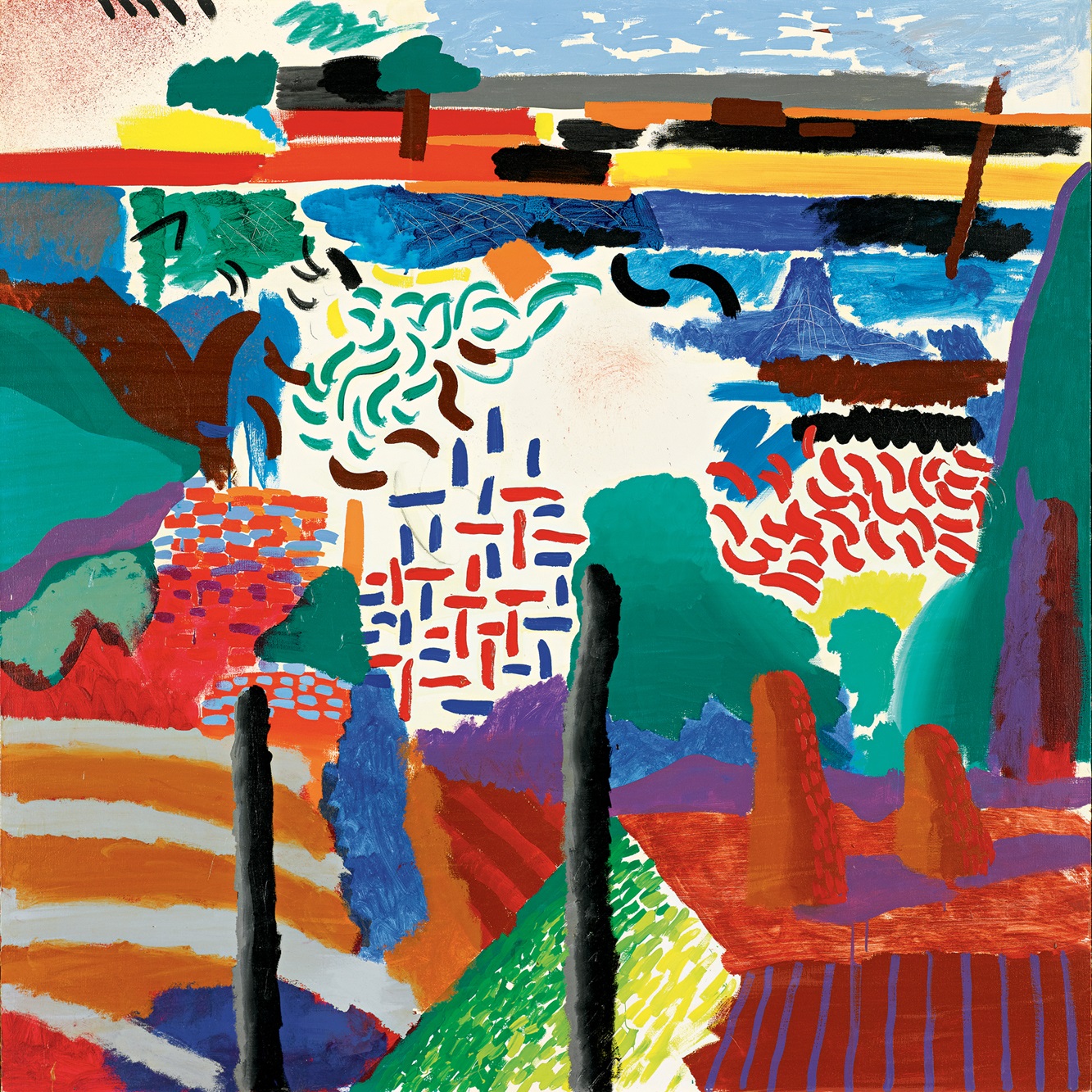
160 Canyon Painting, 1978
Hockney’s return to California was marked by feverish activity. Plainly exhilarated by his own discoveries and anxious to loosen his technique, during 1979 and the early months of 1980 he began no less than twelve medium-sized canvases as well as an equal number of small paintings measuring no more than about two feet in height or width. All are painted in acrylic and most have been worked on sporadically and then put aside in order to concentrate on other projects, such as the designs commissioned for a triple bill of opera and ballet premièred at the Metropolitan Opera in February 1981. At the same time, Hockney was effecting changes in his way of drawing, conscious of his need to develop greater spontaneity first in this medium in order to translate his discoveries into paintings.
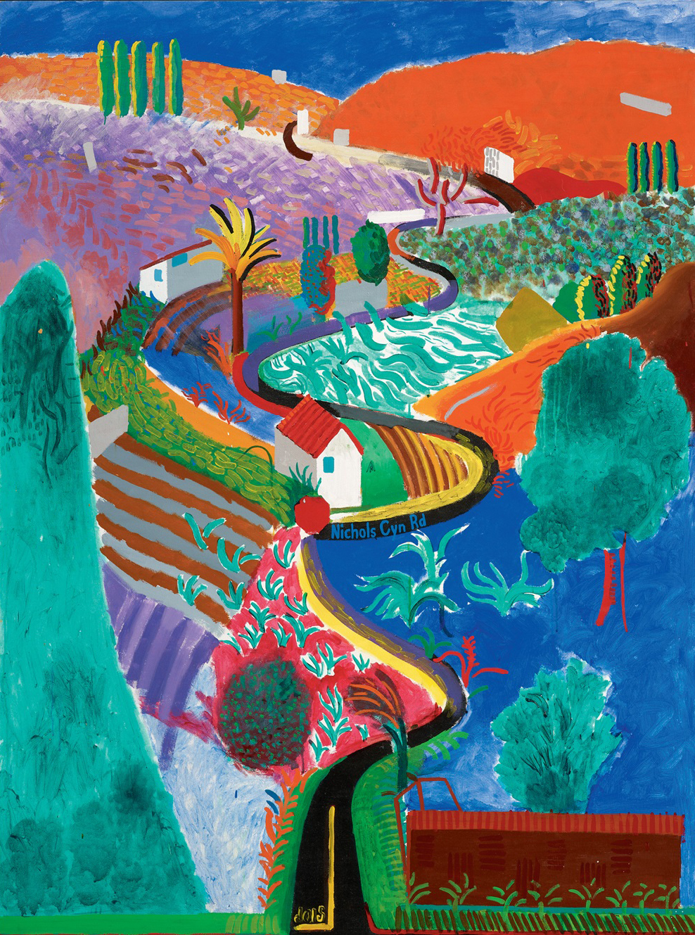
161 Nichols Canyon, 1980

162 Celia Amused, 1979
In the summer of 1979 Hockney produced a series of ten lithographs known collectively as Celia and Ann, large in scale and demonstrating a boldness of contour strongly reminiscent of Matisse’s lithographs, in which the single female figure is the most characteristic subject [162]. Like Matisse’s prints, described and illustrated in Susan Lambert’s 1972 catalogue for the Victoria and Albert Museum, Hockney’s lithographs of his friends Celia Birtwell and Ann Upton were done in the presence of the model but with the imagination as an equally important element. Also as in Matisse’s prints, a sense of languid self-absorption is linked to the subject of women engaged in daily activities, dreaming or sunk in thought. On occasion Hockney’s awareness of the historical lineage of these images in late nineteenth-century Intimism becomes obtrusive, as in Ann Putting on Lipstick, a tall vertical print with reminiscences of Bonnard and Toulouse-Lautrec. One senses the presence also of the calligraphic marks of Albert Marquet, whose work Hockney had grown to admire while living in Paris, and particularly of Raoul Dufy, the freshness and exuberance of whose work Hockney only now was beginning to appreciate. The vitality of early twentieth-century French painting, which Hockney was studying for inspiration for his Metropolitan Opera designs, was making a great impression on him. In preparation for the project he made a series of watercolours which consist of nothing but ‘French marks’ derived largely from the paintings of Dufy. The lightness of touch and animated strokes of Hockney’s recent work owe much to this source.
Although Hockney was still, in his own words, ‘groping around’ for a new pictorial structure for his paintings, he recognized at once that colour was fulfilling a more important constructive role than ever before. Freed of the restrictions of naturalism, he had begun to apply colours in a much more forceful manner, using them at full saturation, with very little white mixed in, and combining them in surprising ways. ‘A lot of the early paintings have quite strong colour. I suppose it was the naturalism that muted it. As you move away from naturalism, you do get more involved with colour. I did an awful lot of paintings where I wasn’t that interested in colour, they’re about other things, but I think that lately, in the last two years certainly, the colour has been a lot stronger. In the Paper Pools there’s more colour, and the Ravel opera I’m working on is about colour.’
In Santa Monica Blvd. [159] colours that were new to Hockney’s palette were daringly juxtaposed, a shrill lemon-yellow abutting the red of the brick wall, which in turn was contrasted with flat areas of orange and blue-green. Hockney remarks that ‘California has an effect on colour, you do see brighter colours than you do in England’, and the new pitch of hue in his work would certainly be unthinkable without the experience of this strong light. The boldness of colour in new paintings such as Nichols Canyon [161], however, far exceeds in expressive potential the bright but essentially local colour of Hockney’s earlier California paintings. Van Gogh’s influence, apparent already in the 1977 oils My Parents [145] and Looking at Pictures on a Screen [152], with its talismanic reproduction of Van Gogh’s Sunflowers, now was fully realized. Hockney was drawing also from Matisse’s work, sometimes to the extent of specific references, as in the translation of La danse, 1910 [170], into the nocturnal garden of his Ravel opera designs. By examining the work of both artists, Hockney began to explore ways in which colour could be used to create moods, and he also became more acutely sensitive to the properties of colour in particular environments, which he realized could be made an expressive feature through exaggeration. Intuition was playing an ever more important role. ‘The more you use less naturalistic colour, less local colour, the more you discover it in the painting itself as you’re doing it.’

163 Divine, 1979
Van Gogh and Matisse are constant presences in Hockney’s work of the early 1980s, which is characterized by an appreciation of colour at full strength, an activation of the entire surface of the canvas by means of patterns and bold brushmarks, and a fusion of drawing with painting achieved through the conjunction of flat areas of colour. Hockney was searching for a way to paint more spontaneously, more freely, in order to endow his paintings with the kind of freshness and immediacy of impact that he had often found easier to achieve in his work on paper. In an interview with Charles Ingham in February 1979, Hockney spoke of his wish to paint more quickly. ‘I now realize sometimes I’ve been labouring over things, therefore not being expressive enough. The drawings rarely get laboured because they’re done with some speed. And I think they’re fresher, aren’t they, than the paintings? Although it’s harder to paint. Now, what I always longed to do was to be able to paint like I can draw, most artists would tell you that, they would all like to paint like they can draw. But in California I’m beginning to find the way.’
The portrait of drag artist Divine [163], star of outrageously vulgar American underground films such as Pink Flamingos and Female Trouble, was perhaps the most successful of Hockney’s new figure paintings, the one in which he most convincingly translated the spontaneity of his drawing style into paint. A great measure of its success, Hockney later realized, was due to the fact that the head was repainted after the sitter’s departure, using small photographs only to prompt his recall and otherwise relying completely on memory. As in Nichols Canyon [161], this freedom from the motif allowed him to invent the image in an apparently unpremeditated and effortless fashion. The massive presence of the figure is contained within an aggressively patterned setting, so that the entire image is locked into a surface design of brilliant colour. It bears particular comparison to Matisse single-figure paintings of the 1920s, such as Figure décorative sur fond ornamental, 1927, and Nu assis au tambourin, 1926. Hockney here uses pattern and colour for just the purpose that Lawrence Gowing detects in the paintings of Matisse: ‘The all-over pattern makes an enveloping symbolic reality which is “conclusively present” just as the colour is.’
An opposite approach, but one also based on fluency of drawing and vividness of colour, is demonstrated in Kas Reading “Professor Seagull” [164], the first of a small group of paintings executed on large sheets of acid-free cardboard intended for the packing of works of art. It was Kasmin himself who suggested to Hockney that he try painting on board as a way of translating the directness of response he was achieving in his drawings; Hockney agreed that he was sometimes intimidated by the canvas, whereas when he worked on paper he felt much freer, secure in the knowledge that he could always throw the results away if they failed to satisfy him. The image, painted from life, is drawn in first with bold charcoal lines, and then over-painted with colours straight from the tube. The charcoal lines are used as a guide, but colour now is not simply an afterthought filling the contours, as had been the case in Hockney’s work from 1963 through to the middle of the following decade. The surfaces of colour, freely brushed and assertive in hue, proclaim their presence as independent forms vital to the impact of the composition as a whole. So concentrated is the image and so forceful is the presence of the figure compressed within the four borders that Hockney decided to leave the painting in what he had first regarded to be an unfinished state; the original intention was to paint the legs as well, but Kasmin had to return to England from California before this had been done. As it is, everything in the image is geared to immediacy of impact and to a concentrated attention on the figure. There are echoes of Kitaj’s impressive single-figure panels such as Moresque, 1975–76 [165], both in the composition and in the device of the table viewed at an angle as a spatial lead-in to the figure, but Hockney has peeled away the layers of reference and sophistication in order to transmit at full intensity his impression of the man seated before him. For all its roughness, this figure has a physical impact which exceeds the more fussy concern with surface appearance and likeness of the naturalistic portraits of the previous years.
164 Kas Reading “Professor Seagull”, 1979–80
165 R. B. Kitaj Moresque, 1975–76
Hockney’s two-figure compositions of this period seek a similar physical force, but attention is necessarily dissipated to some degree by the human situation depicted. In paintings such as The Conversation [166], a portrait of Henry Geldzahler and his friend Raymond Foye, Hockney has deliberately concentrated attention on the figures by placing them within the neutral setting of the studio. Gone for the moment are the explicitly domestic environments of the double portraits of the late 1960s and early 1970s, which used architectural devices and details of particular locations to inform the viewer of different aspects of the relationships portrayed. Now it is through pose and gesture alone that the nature of the relationship is communicated, as in the 1975 and 1977 portraits of Hockney’s parents [144, 145].
The screen behind Henry and Raymond is a single surface of bright yellow paint, unavoidably evocative of Van Gogh, applied unevenly over a black ground so as to vary its luminosity and strength of hue. It is a technique of superimposing colour which Hockney has evolved through his experiments with gouache in his stage designs. Colour is used in broad areas for decorative impact, but it also serves to create volume in the figures, a development which surprised even Hockney. ‘It’s reasonably loose, but it’s rather tight in its volumes; you feel them, and that’s because of colour actually. I’m discovering that, what you can actually do with it. That’s a new discovery, for me, I mean, not for anybody else, but for me that’s a new discovery which is quite exciting.’
During the latter half of 1979 and through much of 1980, Hockney’s attention turned once again to the stage, this time to design a triple bill for the Metropolitan Opera which consists of Erik Satie’s short ballet Parade and two operas lasting less than an hour each: Les Mamelles de Tirésias by Francis Poulenc [168] and L’Enfant et les sortilèges by Maurice Ravel [167]. Director John Dexter encouraged Hockney to consider the three pieces as a unity linked in period and theme. The First World War and its aftermath in France supply the background against which the action is set; the coils of barbed wire punctuated with Tri-colours which are the sole objects on the stage at the beginning of the performance remain a half-seen presence behind the sets which follow, disappearing only during the Ravel opera with which the evening closes. The world of the circus and street fairs, explicitly introduced in Parade, also underlies Poulenc’s opera and can be extended into the children’s fantasy world of the Ravel; as a result, Pulcinella and other figures from the commedia dell’arte appear in all three parts, with the entire chorus in the Ravel opera clothed in such costumes. For these costumes Hockney has made reference in particular to a group of Pulchinello drawings by Domenico Tiepolo which were exhibited at the Stanford University Museum of Art at the end of 1979.

166 The Conversation, 1980
In a letter to Hockney (8 February 1980), John Dexter expressed his hope that the evening would present a gentle reminder ‘of how wildly and weirdly the arts survived in a time of world chaos’. Parade, a short ballet which takes as its premise the beckoning of the audience from the street into the theatre, is used as a prologue to the evening’s entertainment and as an indication of Dexter’s ‘personal philosophy of possible alternatives in musical theatre’. As Dexter explained, ‘Perhaps I am trying to lure a new audience into a different tent to discover whether there are not still ways of making evenings of theatrical excitement in an opera house which are restricted neither by the disappearing breed of star international singers or by the weight and expensiveness of the décor.’
Hockney’s designs make constant reference to the heroic days of Modernism in France in the second and third decades of the twentieth century, in recognition of the themes set by Dexter and of the historical connections with the music. Parade is one of the most famous theatrical collaborations of that century, largely because of the extremely influential designs by Picasso which dominated its first production in 1917, but also because of the involvement of other figures: Satie wrote the music, Jean Cocteau devised the story, Massine was choreographer and Diaghilev producer, and the poet Guillaume Apollinaire, who died in the last week of the war, wrote the programme note. Poulenc’s music for Les Mamelles de Tirésias was written in 1944 and first performed in 1947, but it is based on a play written by Apollinaire for the most part in 1903 and staged in 1917 as a ‘Surrealist drama in two acts and a prologue’. (It was this caption and in the programme note for Parade that Apollinaire first used the term ‘surrealism’, appropriate to the farcically illogical events of his play.) L’Enfant et les sortilèges, based on a poem written by Colette during the First World War, ‘Ballet pour ma fille’, was composed by Ravel between 1920 and 1925, when it was first staged. Set in ‘the present’, no direct allusion is made to the war. The story of the child who is isolated through his misbehaviour but redeemed by his compassion can, however, be interpreted symbolically as a triumph of love over violence, a theme with evident anti-war implications.
167 Ravel’s Garden with Night Glow from L’enfant et les sortilèges, 1980
Hockney’s designs for The Rake’s Progress and The Magic Flute were made largely in the form of scale models, with few preliminary drawings. For the triple bill, however, which underwent numerous modifications before reaching its final form, ideas were formulated in a large number of sketches in gouache during late 1979 and the first half of 1980. Other aspects of these set designs, in particular the costumes and the movement of the figures in and around the backdrops, were explored in more than half of the sixteen small canvases which Hockney painted during his stay in London from early June to mid-August 1980.
The concept of Parade was changed several times. It was first conceived as an entr’acte to be staged between the Poulenc and Ravel operas, but it was later decided that it would be more logical to stage it first as an invitation into the world of the theatre, which is presented as a reflection of life on the street. The final design, established in one of Hockney’s last London paintings from that summer, shows the stage strewn with fragments of the designs that the audience will see later in the evening, conveying the impression that the scenery has been improvised quickly from the material at hand.
Les Mamelles de Tirésias (The Breasts of Tirésias), an opéra bouffe in two acts and a prologue, was the most straightforward of the three pieces to design. It opens with a prologue in which the theatre manager, standing in front of the curtain, explains that the entertainment to follow will be light and amusing but that it has a serious message, that of repopulating the nation after the ravages of war. The only indication of the farcical action to follow, the frantic illogicality of which has been compared to Jarry’s Ubu Roi, comes in the form of Hockney’s stylized backdrop representing a curtain, a variation of that used in two 1963 paintings, Still Life with Figure and Curtain and Seated Woman Drinking Tea, Being Served by Standing Companion. The curtain is then lifted to reveal the single set as a ‘stage within the stage’. Poulenc’s note for the staging of the opera removes the action from the country of Zanzibar used by Apollinaire and places it instead in an imaginary town on the French Riviera, somewhere between Monte Carlo and Nice, about 1910. In Poulenc’s view, exoticism did not accord with the patriotic overtones of the theme, and he insisted that on no account should the designs emphasize this aspect. The change of scene to the Riviera was predicated largely on the fact that Apollinaire grew up in that part of the country.

168 Les Mamelles de Tirésias, 1980
Hockney’s set for Poulenc’s opera, which because of its short length is performed without an interval, is an exact rendering of all the elements detailed in the libretto’s instructions. It represents the main square of the Mediterranean town. On one side is a café with an awning, on the other a building in the style typical of the south of France, with a window open on the first floor and a ‘Bar-Tabac’ on the ground floor. In the centre is a view through to the port [168]. Hockney has gone for inspiration primarily to Dufy’s harbour scenes of the 1930s, appropriately witty and buoyant in tone and sufficiently familiar as an identifiable artistic reference to provide a visual parallel to the elements of stylistic parody which characterize Poulenc’s music.
Hockney lavished his greatest attention, however, on Ravel’s opera not only because of his love of the music but also because of the challenges presented to the designer by its forty minutes of complicated transformation scenes. In the first part alone, set in the child’s room, chairs dance, a Wedgwood teapot and a Chinese cup perform a foxtrot, flames jump from the hearth to menace the child, the shepherds torn off the wallpaper sing and dance before making their departure, and the princess from the child’s favourite book, torn by him in anger, emerges from the severed page to come to life. Hockney’s ingenious solution to this constant metamorphosis was to make a stylized representation of each of these objects on the faces of oversized building blocks, which were turned in different directions and reassembled by stage hands dressed as Pulcinellas. Through this simple device of a child’s toy we as spectators are placed in the role of children, filled with wonder at the imaginative power through which fantasies can be turned into actuality.
A plunging perspective worked out intuitively in a series of at least six designs transforms the enormous stage of the Metropolitan Opera into an intimate room seen from a child’s point of view. More remarkable than this spatial sensation, however, is Hockney’s daring use of colour, a startling scheme of green, red and blue, through which he creates a parallel to the mood of the music. The music begins slowly and quietly, simply setting the mood, which Hockney interprets as that of ‘the child in the room looking at everything, in the way a child is excited by everything, a corner of the room, the shadows’. It was thus decided to have no action accompanying those opening bars. ‘You’re just looking. The music is evoking the room, that’s all.’
The equivalence of music and colour is even more impressively achieved in the second part of the opera, when the walls of the room suddenly disappear and the child finds himself in the garden at night, lit only by the moon and by the lingering pink of sunset. Hockney’s garden diorama is dominated by a large central tree [167], an image inspired by a black and white photograph of Joe McDonald and Peter Schlesinger on the Banks of the Nile taken at the beginning of 1978. Once more, however, it is the environment of rich colour that creates the fullest impact. The scene is itself a transformation, for the brilliant red trunks and vast expanse of blue foliage, balanced by a vivid green ground, are based directly on the colour scheme and formal economy of Matisse’s great canvas of 1910, La danse [170]. The reference here is made not for the sake of cleverness or even as an act of homage, but out of an urge to find the most compelling visual form in which to clothe the mood of the music. Matisse’s painting, which not only proposed a correlation between music and colour but also sought, in the artist’s words, to ‘inspire the most direct emotion possible by the simplest means’, is here re-enacted in a new context. The graceful flowing curves of the dancers’ arms suggesting continuous movement, are translated into the swaying branches of the trees, which become animated when wounded by the child’s knife. Matisse’s painting is well served by this remarkable revitalization of colour on a huge scale. Once again the inspiration of opera has led Hockney to transcend his sources and to create some of his most memorable inventions.
In a great burst of energy unprecedented in his work for more than a decade, Hockney produced a series of sixteen canvases on themes of music and dance during his two-month stay in London during the summer of 1980 [169, 171]. In these paintings, many of them based on his designs for the Metropolitan Opera triple bill, he brought together his recent experience with the stage with his ever-growing enthusiasm for the work of Picasso, which he studied at some length earlier that summer in the mammoth retrospective held at the Museum of Modern Art in New York. More than ever it was Picasso’s attitude to his art, rather than the superficial appearance of particular works or styles created by him, that Hockney wished to emulate: the ability to take inspiration from anywhere at any time, to discard methods when they cease to provide an adequate container for his ideas, to work quickly and spontaneously, trusting to impulse, to return to earlier subjects in the light of new experience, to channel his energies so as to produce a wealth of imaginative ideas rather than to squander all his effort on constantly reworking a single picture, and above all to unify his art and his life.
‘The Picasso exhibition made me realize’, recalled Hockney in December 1980, ‘that sometimes just getting it down quickly, what you get down is often more your thinking than when you coldly plan it. Henry used to say to me, “The real bit of puritanism you have left is that you think if you’ve spent three months on a painting it’s forced to be good, and if you’ve spent two days on a painting, it’s nothing.” He said, “Often when you just spent two days on it something came out that doesn’t come out in the others.” I realized there was a lot of truth in that. All the paintings I’ve spent a real long time on, like the portrait of George Lawson and Wayne Sleep, I’ve eventually abandoned. Sometimes I play down spontaneity, whereas you never do it in drawings. In painting, somehow or other, blocks occur, you don’t treat the canvas like the paper; you should.’ Hockney agrees that a great deal of the vitality of his work in the early 1960s, when he rarely spent longer than two or three weeks on a picture, arose from its sense of urgency, and it is this which he wishes to recapture now. ‘If you deal with subjects quickly, you actually get more in, because you put more into it.’
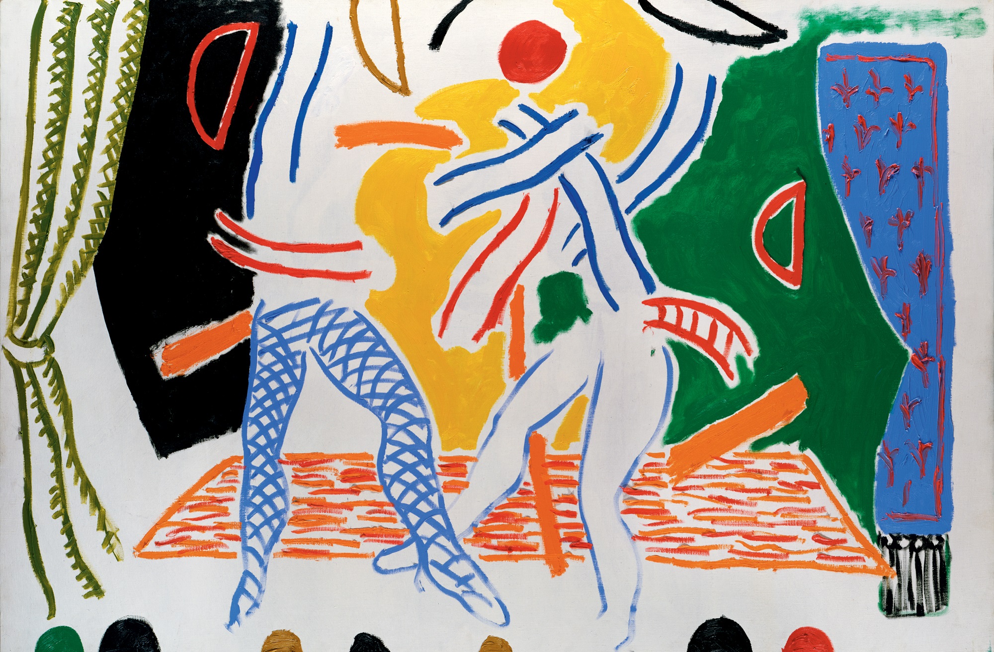
169 Two Dancers, 1980
170 Henri Matisse La danse, 1910
Hockney has not set himself up in competition with Picasso; rather, Picasso’s example has made him conscious of how important it is to continue relating his own experience in his own voice. The success of many contemporary artists in constantly refining a single idea has come to seem to him a rather hollow one, since it eliminates such a wide range of experience. Hockney recognizes that in following Picasso’s approach he is likely to produce some failures as well as some work which might seem trivial, but what his art could gain in terms of its humanity is immeasurable. He has come to the conclusion that the artist should fear nothing, that he should not worry even about imitating other artists or about producing work which seems old-fashioned, for if he deals honestly with his own experience the work by definition will be of his own time.

171 Harlequin, 1980
The paintings Hockney made in London during the summer of 1980 and those that have followed in subsequent years are exuberantly varied, yet there is no doubt that they are all by his hand. There is a playful sense of experiment and a willingness to engage in games of style and technique that recall the liberating eclecticism of his work of the early 1960s, creating an air of constant surprise and discovery. The new paintings seem logical successors to his Royal College work, a fact that pleases him greatly and that has led him to the view that it is the naturalistic pictures of the late 1960s and early 1970s that in time will come to seem the aberration in his development.
None of Hockney’s London canvases took more than a few days to paint. In general they are very freely drawn in bold colours and simple forms. The first of the paintings, a highly schematized image of two dancers [169], was rapidly improvised from a drawing made three years earlier for a drop-curtain used in Wayne Sleep’s one-man show at London’s Adelphi Theatre in November 1977. The portrayal of movement through line and colour alone is carried even further on another small canvas, Waltz, which proposes a nearly abstract equivalent for the music of Ravel’s 1919 ballet La Valse. Hockney has flirted with abstraction before, but never quite in this way. Instead of making an ironical gesture towards abstraction, as in the 1971 Rubber Ring Floating in a Swimming Pool [110] or the earlier Portrait Surrounded by Artistic Devices [54], he now feels sufficiently confident about his ability to translate his experience into paint that he is able to simplify an image to the point of near-illegibility. He has come to see that abstract art has more to offer him than its decorative appeal, that it can provide the means to concentrate on essences, but he feels more strongly than ever that an art which severs its links with perceived experience is bound to be vacuous. ‘The trouble with some abstract art’, explained Hockney in December 1980, ‘is that it doesn’t come from anywhere. That is the point Kitaj keeps trying to make, that there is a difference, actually, between an art that depicts and an art that does not.… Very few people are interested in the activity of moving one’s arm around making marks, but people are interested in making something of experience, because everybody does that. The only difference is that the artist makes something of it.’
Hockney returned to Los Angeles in the autumn of 1980 in a buoyant mood, anxious to apply the spontaneity of the new London pictures to a more ambitious project. Santa Monica Blvd. [159], which was still pinned on to the wall of his studio, now seemed to him beyond saving. Hockney instructed one of his assistants, Jerry Sohn, to destroy the painting and to keep only the two fragments that satisfied him; only after more than a decade had passed did he discover that Sohn had taken it upon himself to roll the canvas up instead. Pleasantly surprised by the rediscovery of the work, which seemed to him much better than he had remembered, he agreed that it be shown at last in the context of an exhibition, ‘Hockney in California’, that toured Japan in 1994. His intention had been to make the eye move across the painting as if one was walking down the street, employing to this end a very wide format and a composition which deliberately dispersed attention among a number of separate images. He stopped work on the painting, however, when he decided that the result was static because it was too tightly drawn and the images were too fragmented, too separate, to create a continuous flow. Nichols Canyon [161], which was painted much more freely and with recourse to memory, seemed to him a far more satisfactory solution because of the way it conveyed sensation rather than literal appearance. With this in mind, Hockney tacked up another eight by twenty-foot canvas over the Santa Monica Blvd. and in the space of three weeks in November produced another Los Angeles landscape, this time Mulholland Drive: The Road to the Studio [172], a diagrammatic view of an undulating route through the Hollywood Hills also painted from memory.
Hockney worked daily on Mulholland Drive, completing it in time for it to be shown at the Royal Academy’s survey exhibition, ‘Painting: A New Spirit’, the following January. The road which he chose as his subject is the main thoroughfare down which he was driving daily on the way to his studio from his home in the Hollywood Hills. The winding route is depicted prominently at the top of the hill. Beyond this can be seen, to the left and right, the suburbs of Studio City and Burbank in the San Fernando Valley, copied on to the canvas from road maps. Like his forays into landscape in the mid-1960s, and more recently in Nichols Canyon, this view of the Hollywood Hills is presented in a strongly diagrammatic fashion. It was painted quickly and entirely from memory, concentrating on the sensation of curving movement and on salient details spotted while driving: the roofs of houses, various hills, different kinds of vegetation, and to the left some tennis courts and a swimming pool. By means of a robust serpentine line, orchestrated accents of colour and scattered points of interest, the viewer’s eye is made to wander in a jagged path across the surface of the painting, emulating the movement of an automobile through a landscape.
172 Mulholland Drive: The Road to the Studio, 1980
‘You drive around the painting, or your eye does,’ explained Hockney a few weeks after completing his picture, ‘and the speed it goes at is about the speed of the car going along the road. That’s the way you experience it.’ The enormous width of the canvas is appropriate to the subject, allowing a panoramic view of the extended landscape and filling the viewer’s field of vision with sensations of colour and texture. Hockney has used a wide range of marks, a lexicon of his new pictorial vocabulary: broadly brushed images, decoratively patterned areas, outlines incised into the paint, and surfaces filled with bustling brushmarks of intense hue. It was painted in acrylic because the enormous scale made oil impractical, as Hockney knew that the painting would have to be ready quickly to be rolled for shipment. He has made much use of thin glazes of colour applied one over the other on a white ground, a method that creates unusual and rich hues and guarantees maximum intensity and luminosity. Elsewhere the contrasts are often of an elementary kind – red against blue or green, blue against orange – but varied from section to section and kept at a constant pitch. The result is a tumultuous blaze of colour.
While Hockney had no intention at that time of reinventing himself as a landscape painter, it was clear that he no longer believed in a hierarchy of subject-matter. The whole world around him, not just the human figure, could legitimately capture his attention. Having opened up his options in this way, anything was now possible.
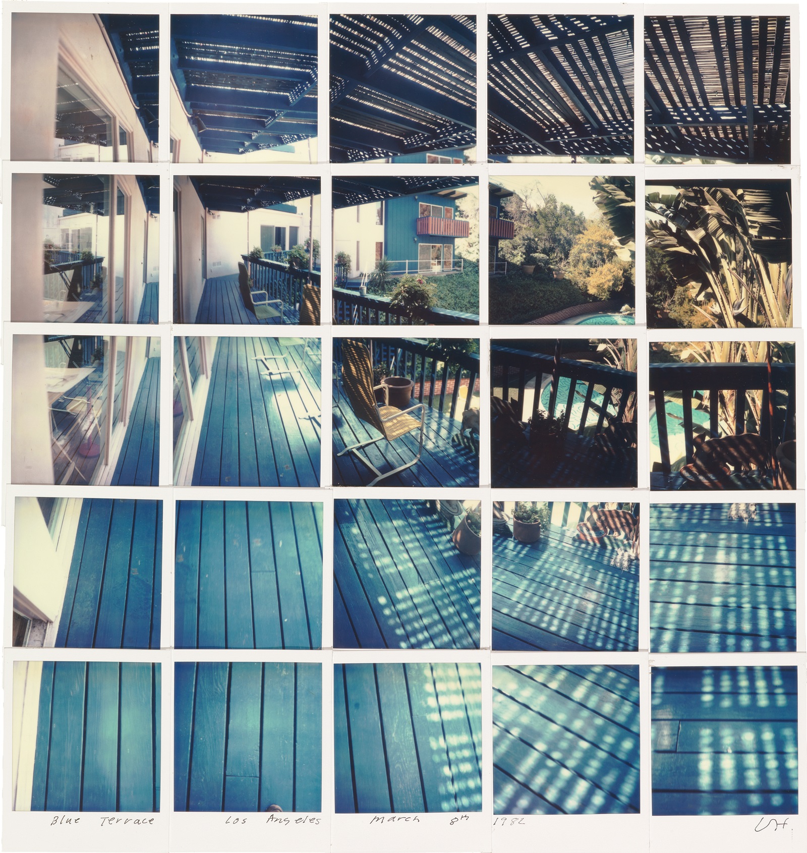
173 Blue Terrace, Los Angeles, March 8th 1982, 1982