CHAPTER 9
ADVANCED STORYTELLING CHARTS
This penultimate chapter explores advanced strategies for visual data storytelling beyond the basic charts and graphs provided in Tableau’s core functionality. You will learn how to create advanced charts that require additional formatting and calculations, including timelines, Likert scale charts, lollipop charts, and more.
As discussed in Chapter 5, many fantastic data visualization options are available to create from the menu of charts presented in the Show Me card in Tableau. These require little manual formatting beyond tidying up visualizations and cover most of the common chart types used in traditional data visualization and basic visual storytelling.
This chapter goes beyond these basic options and takes a look at how to create several advanced charts step by step in Tableau. These advanced charts require the use of more calculated fields and formatting to build; however, they offer deeper, more dynamic views into data and can be beneficial in supporting more complex visual data stories. These charts include:
![]() Timelines
Timelines
![]() Bar-in-bar charts
Bar-in-bar charts
![]() Likert scale visualizations
Likert scale visualizations
![]() Lollipop charts
Lollipop charts
![]() Word clouds
Word clouds
Timelines
A timeline chart can be a useful way to depict when events occur over time, whether to analyze patterns in notable events, or to show dates of interest. Although a timeline isn’t a graph that can be built out of the box in Tableau, creating one in a few simple steps is easy, and it is a useful visual that can support storytelling when discussing important events over time.
I keep a timeline graphic on my website to visually display upcoming conferences, speaking events, and client on-site visits to website visitors (in addition to a more detailed list), as shown in Figure 9.1.

Figure 9.1 A snapshot of a finished visual timeline.
To create this visualization requires, at minimum, a very simple dataset (see Figure 9.2). In this case I have connected to a small, simple Excel dataset that lists the date of the event, the type of event, its title, and its location.
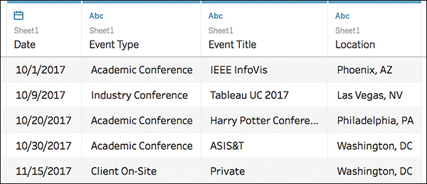
Figure 9.2 A simple timeline requires minimal data: the date of the event and the event itself. You can use additional detail to enhance the visualization.
Before beginning, in your Sheet make sure that your date is recognized by Tableau as a continuous date. If it is not, you can change it by right-clicking the field on the Dimensions pane, and selecting Convert to Continuous on the list of options (see Figure 9.3).
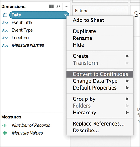
Figure 9.3 Adjust your date to continuous if it is not already. This allows you to view an event over a span of time, rather than in isolation.
The key to creating a timeline in Tableau is to create a calculated field that will form the horizontal axis of the timeline and allow all of your dates to line up on a straight line. Think of this field as an anchor to hold your events to time.
note
Calculated Fields can be created easily in Tableau to extend your analysis by creating a new field (or column) that is not already contained in your data source. To create a new calculated field, in a Tableau worksheet select Analysis > Create Calculated Field. A dialog box will open, called the Calculation Editor, which prompts you to give the calculated field a name and provide a formula. Formulas can be created using a combination of functions, fields, and operators. Once created, the new Calculated Field will appear as a new Measure in the Data Pane, and be designated with an equal (=) sign that precedes the field name.
1. Create the Anchor calculated field by following these steps: MIN(0).
2. Drag the newly created Anchor calculated field to the Rows shelf to provide a starting point for your timeline. At this point your visualization is simply a horizontal axis line with a zero line (see Figure 9.4)
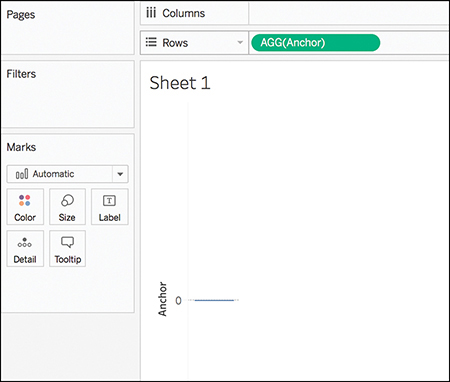
Figure 9.4 The Anchor placeholder gives a straight axis to begin plotting your events.
3. Drag your Date field to the Columns shelf. Right-click the Date pill and select Exact Date. This prompts Tableau to recognize each of the exact dates listed in your dataset of events and lays the foundation of the timeline by displaying a flat, solid, colored line (see Figure 9.5). Because there is no additional data, this is correct.
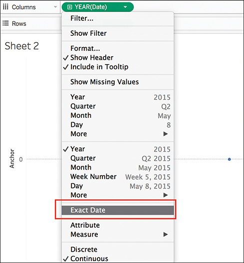
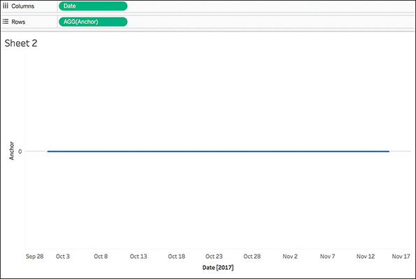
Figure 9.5 Adding the Date field to the Columns shelf provides the foundation of a timeline.
With the baseline set, you can now add dated events and begin formatting the timeline to look more traditional. To do this:
1. Drag the Date dimension from the Data pane again, this time dropping it on the Details Marks card. Initially, the timeline continues to appear flat. This is because Tableau automatically looks at the largest segment of the date, in this case, Year. You need to prompt Tableau to look at a more granular view of the date.
2. Click the + icon to expand the date to its lowest level, in this case, Day. Your timeline should now display each of the events in your dataset as individual dots (see Figure 9.6).
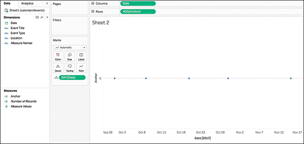
Figure 9.6 With event dates added to the baseline, the timeline begins to take form.
A bit of additional formatting can enable this timeline to tell a more detailed story about the events displayed. In Figure 9.7, I have used Event Category to color-code the events, as well as adjusted the shape and size of each event point and added a tooltip to provide more information. You can also adjust or delete zero lines, axis rules, and axis ticks as desired.
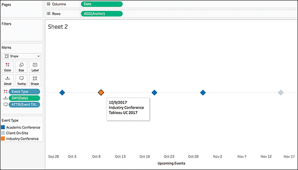
Figure 9.7 A little bit of additional formatting can add more detail and visual impact to your timeline.
A few additional things you can do to spice up a timeline and make it more visually appealing include:
![]() Add a timeframe. With a large number of events to display, adding a relative date filter to show only the events within a certain amount of time might be helpful. To do this, drag the Date dimension to the Filters shelf and choose Relative Dates. You can set the logic to be any subset of dates that you want to dynamically display. In this example, I have limited the range to a mere 30 days (see Figure 9.8).
Add a timeframe. With a large number of events to display, adding a relative date filter to show only the events within a certain amount of time might be helpful. To do this, drag the Date dimension to the Filters shelf and choose Relative Dates. You can set the logic to be any subset of dates that you want to dynamically display. In this example, I have limited the range to a mere 30 days (see Figure 9.8).
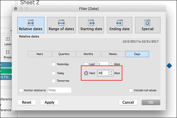
Figure 9.8 Filter the dates in a view to limit the number of events displayed.
![]() Add a Reference Line for “Today.” A reference line for the current date can give audiences a visual checkpoint on the timeline. To create a reference line, follow these steps:
Add a Reference Line for “Today.” A reference line for the current date can give audiences a visual checkpoint on the timeline. To create a reference line, follow these steps:
1. Create a new calculated field, Today: TODAY()
2. Place this newly created calculated field on the Details Marks card. This allows the field to be used as a reference line. Adjust the field from a discrete date by right-clicking the date pill and selecting Exact Date (see Figure 9.9).
3. To add the reference line onto the timeline, select Reference Line from the Analytics pane. Choose the Today calculated field as the Line Value for the line. Additionally, use the Line Label option Custom to type how you want the line to be labeled on the canvas. Further formatting can also be completed in this box to define how you want the line to visually appear (see Figure 9.10).
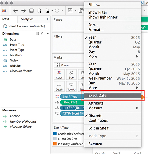
Figure 9.9 Adjusting the field for today’s date to be Exact Date is critical to achieve a reference line that displays the current date.
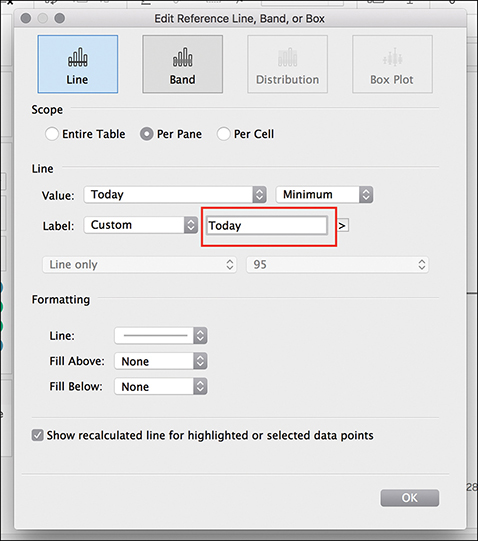
Figure 9.10 Use the Today calculated field to add a reference line to the timeline.
With a few formatting tweaks, you can finalize a visually appealing timeline that makes a great asset to a dashboard or data story.
Bar-in-Bar Charts
Chapter 5, “Choosing the Right Visual,” covered several forms of a basic bar chart, including side-by-side and stacked bar charts. Both of these options are available out of the box in Tableau. Another option in the bar chart landscape is a bar-in-bar chart. These can be useful when comparing a measure against a goal or comparing two measures (or discrete dimensions) against one another, with both items starting at the zero line for a precise analysis (see Figure 9.11).
Building a bar-in-bar chart in Tableau is not terribly difficult, but it does require taking a few additional manual steps to help get your bars in the shape you want.

Figure 9.11 This bar-in-bar chart compares the percentage of survey respondents in a two-district cyberbullying survey.
The first step in building a bar-in-bar chart is to create a slightly odd-looking stacked bar chart by dragging one measure and one dimension to the Rows and Columns shelves. Drag your second dimension to the Color Marks card, and then drag this same dimension to the Size Marks card (see Figure 9.12). Now you should see a stacked bar chart with dimensions differentiated by color and by size.
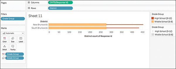
Figure 9.12 A bar-in-bar chart begins with a slightly odd-looking stacked bar chart.
At this point, the two dimensions are stacked together along the x axis of the measure, rather than laid atop each other with both starting at the zero point. This stacking is an automatic function of Tableau that you need to turn off to manually build your bar-in-bar chart. To disable this feature, navigate to the Analysis menu and choose Stack Marks > Off (see Figure 9.13).
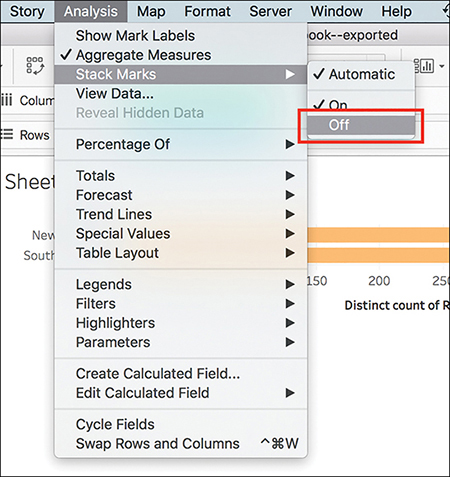
Figure 9.13 Turn off the automatic mark-stacking feature on the Analysis menu to overlay components of stacked bars.
After this step, you should have completed a raw version of your bar-in-bar chart. At this point, you can adjust which dimension is in the foreground and background by dragging and dropping to sort the measures on the Color Marks card filter, if desired. You may also edit the width of the bars by clicking the drop-down menu on the Size Marks card, selecting Edit Sizes, and then adjusting the Mark Size Range slider as desired (see Figure 9.14). Complete your visualization by editing and removing axis headers, titles, and so on (see Chapter 6).
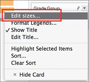
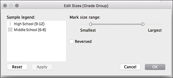
Figure 9.14 Adjust the width of the bars by editing the size range on the Size Marks card menu.
tip
To make a chart larger on the canvas, hold down Ctrl+Shift and press B several times.
Continue to format as desired to clean up and curate the bar-in-bar chart.
Likert Visualizations
Likert scales are the most widely used approach to scaling responses to gauge sentiment and tendencies, and are a staple of surveys and other types of data collection methodologies. Several ways exist to ask Likert scale questions, as well as several ways to visualize their data. This section provides a look at the two most common Likert scales and the best ways to visualize them: a 100% stacked bar chart and a divergent bar chart.
Before discussing how to build Likert visualizations, let’s take a look at what Likert scale data looks like. Figure 9.15 shows an example of a five-point Likert scale using an example from the Harry Potter dataset. Common 5-point Likert scales range values from one extreme to another (for example, Highly Satisfied to Highly Dissatisfied) with a neutral option residing midrange.
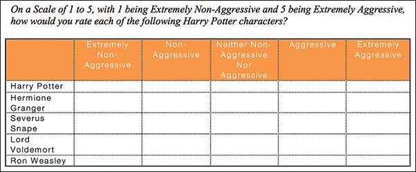
Figure 9.15 A 5-point Likert scale.
Whereas 5-point Likert scales are commonly used to measure sentiment, 4-point Likert scales are more typically used to measure tendencies. Figure 9.16 shows an example of a 4-point Likert scale using an example from the Cyberbullying dataset.

Figure 9.16 A four-point Likert scale.
note
When preparing Likert data for analysis, the recommendation is to have both a text and numerical value associated. Chapter 7 discussed the value of having both of these pieces of metadata.
100% Stacked Bar Chart
A stacked bar chart is a simple, straightforward way to visualize Likert questions that does not involve the creation of any calculated fields and little manual work (see Figure 9.17).

Figure 9.17 A 100% stacked bar chart can be an easy way of visualizing Likert data, although it falls short of the richness that other methods can add to the data’s story.
To create this visualization, drag your first dimension to the Rows shelf (this example uses survey data so the field is Wording) and a measure to the Columns shelf. A simple horizontal bar chart with solid color bars of equal length, representing the total count of responses for each dimension, appears.
Next, drag your second dimension that represents the Answer value (or the value representing survey responses) to the Color Marks card (see Figure 9.18).
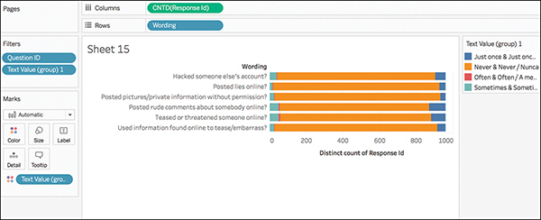
Figure 9.18 A rough stacked bar chart begins to visualize Likert data; however, it requires more curation to be a useful visualization.
A number of things need to be done to improve this basic 100% stacked bar chart to properly visualize the Likert data:
![]() Color: The automatic color scheme in Tableau does little to help us see behaviors that are adjacent (for example, sometimes/often and just once/never). Using the Color Marks card, adjust these to a more suitable color palette.
Color: The automatic color scheme in Tableau does little to help us see behaviors that are adjacent (for example, sometimes/often and just once/never). Using the Color Marks card, adjust these to a more suitable color palette.
![]() Sort: Tendencies are sorted in alphabetical order rather than by how often they occur. Manually sort these to reflect the correct order.
Sort: Tendencies are sorted in alphabetical order rather than by how often they occur. Manually sort these to reflect the correct order.
![]() Totals: A count of data is an okay option, but a better option (particularly in survey data) may be Percent of Total. Add in the correct table calculation to reflect this.
Totals: A count of data is an okay option, but a better option (particularly in survey data) may be Percent of Total. Add in the correct table calculation to reflect this.
![]() Curate: Remove unnecessary headers to clean up your canvas.
Curate: Remove unnecessary headers to clean up your canvas.
note
You can apply several types of calculations to transform the values for a measure in Tableau, including custom calculations, table calculations, level of detail (LOD) expressions, and more. For more information on these various types of calculations and how to use them, visit https://onlinehelp.tableau.com/current/pro/desktop/en-us/advanced_overview.html.
With a bit of tweaking, this 100% stacked bar chart can be a decent approach to display Likert responses (see Figure 9.19). You could also add labels onto each category to see percentage of responses per tendency.
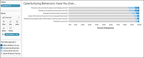
Figure 9.19 With better colors, and sorted, this 100% stacked bar chart does a better job of visualizing the Likert data.
Divergent Stacked Bar Chart
Although the 100% stacked bar chart will work to represent Likert data, a better approach is a divergent bar chart, which is not actually a bar chart but a modified version of a Gantt chart. Rather than stacking tendencies or sentiment ratings on a scale of 0 to 100, this approach shows the spread of negative and positive sentiment values (such as Strongly Disagree to Strongly Agree) aligned to each other around the neutral midpoint (see Figure 9.20).
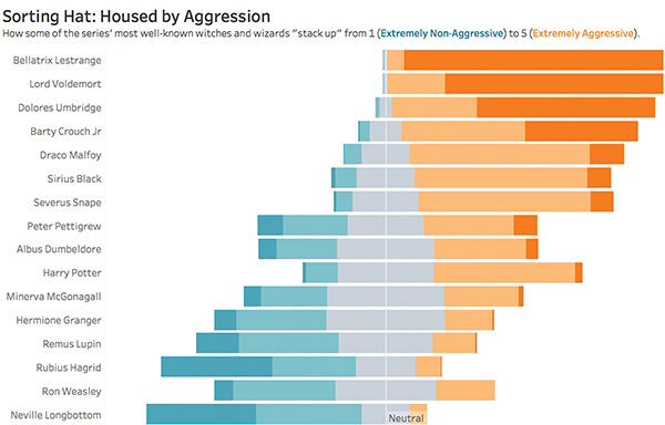
Figure 9.20 Completed divergent stacked bar chart representing five-scale Likert data.
This approach requires the creation of several calculated fields. As such, to begin building this visualization by you must first create a table, or crosstab, in Tableau. This enables you to see the output of each of the calculations you build and troubleshoot any calculation errors before moving into visualizing them.
note
For this challenging chart, you will use the Harry Potter dataset used in previous chapters. Download the dataset to follow along.
In this table, first drag the QuestionID and Text Value dimensions to the Row shelf. (In this example, the QuestionID has been renamed to match the character name for readability.) Because we included both the text and the numeric coding for each Answer field, we can avoid writing any calculations at this point (the Numeric Value for each response will become useful in the next steps). However, notice that when you add this dimension the Text Values are not in the sequence they should be. Click the drop-down menu on the Text Value dimension on the Rows shelf, select Sort, and manually adjust these so that they display in the correct ranking order (minimum to maximum, or 1 to 5). Then, drop the Number of Records Measure (SUM) onto the Text Marks card. Your table should appear similar to Figure 9.21.
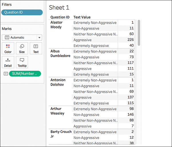
Figure 9.21 After this step, you can see for each question asked (in this case, each character ranked) how many respondents chose each option on the Likert scale.
The next step is to create a series of calculated fields and add them onto the table.
Calculated Field #1: Negative Sentiment
The first calculated field will calculate how many negative sentiment responses were received for each question (or item ranked) and should appear as negative values and below (or to the left of) the dividing line of 0 in the divergent stacked bar chart. To do this we need to count the number of responses received for the two lowest selections on the scale (in this case 1—extremely non-aggressive and 2—non-aggressive) as well as half of the neutral selection (in this case, 3—neither non-aggressive nor aggressive). Because neutral responses in a survey are neither positive nor negative, we want to split them in half to distribute them across the bars in the chart as to not unfairly weight one side of the data.
Create this calculated field, named Negative Sentiment:
IF [Numeric Value] < 3 THEN 1 ELSEIF [Numeric Value] = 3 THEN 0.5 ELSE 0 END
Add this calculation onto the canvas. Your screen should appear as in Figure 9.22; the Number of Responses in the two negative sentiment ranks should match the count in the Negative Sentiment column. The neutral response count in Negative Sentiment should be half the count of Number of Responses, and the two positive sentiment ranks should appear with a count of 0 in the Negative Sentiment column.
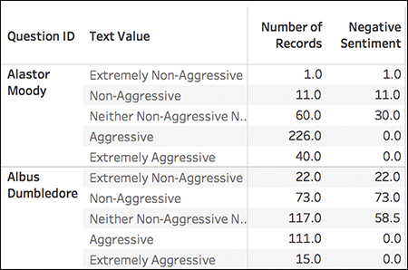
Figure 9.22 This calculated field counts the number of negative sentiment responses that will appear on the negative side of the dividing 0.
Calculated Field #2: Total Negative Sentiment
The next step is to create a calculated field to calculate the percent of negative values per question.
Create this calculated field, named Total Negative Sentiment:
TOTAL(SUM([Negative Sentiment]))
This calculated field is a default table calculation; however, we need to manually change the field being used to compute the calculation. From within the calculated field editor box, click the blue text Default Table Calculation. Then, select Text Value from the list (see Figure 9.23).

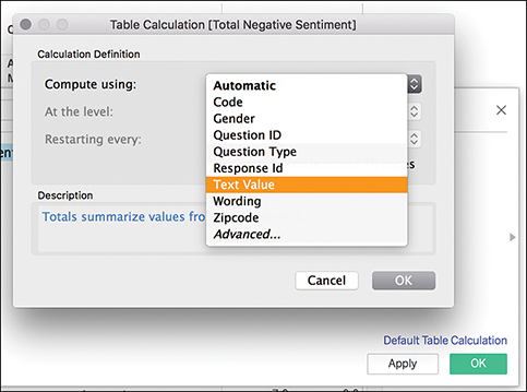
Figure 9.23 This calculated field calculates the percent of negative values per question.
After you add this calculated field to your crosstab, it should appear similar to Figure 9.24. Notice that the Total Negative Sentiment value is the same for each QuestionID. This function simply sums the values in the Negative Sentiment column for each item scored. For example, Alastor Moody has a Negative Sentiment Count of 1 + 11 + 30 = 42. This total sentiment appears in the Total Negative Sentiment column.
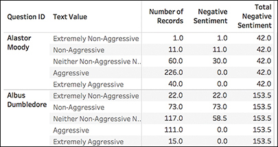
Figure 9.24 The Total Negative Sentiment function sums the individual count of negative responses per question scored.
Calculated Field #3: Total Sentiment Scores
Now that we have the percent of the total for the negative values, we need the percent of the total for the entire bar and add up the responses for each item scored.
Create this calculated field, named Total Sentiment Scores:
TOTAL(SUM([Number of Records]))
You will need to change the default table calculation to Text Values.
Added to the crosstab, this calculated field will sum the number of responses per question. If your dataset is nice and clean and all questions were answered, the value in this column should be the same all the way down. For datasets where not every question was answered, such as this one, you will see variations in the count of responses in this column (see Figure 9.25).
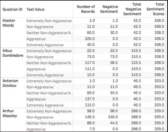
Figure 9.25 This calculated field counts the total number of scores for each question in order to calculate the length of the entire bar.
Calculated Field #4: Gantt Start
The next step is to create a calculated field that will determine the percentage offset, or how far into the negative to begin building the bar chart. Remember, what we are creating is a modified Gantt chart, so this calculated field is really intended to be the first data point in the Gantt chart.
Create this calculated field, named Gantt Start:
−[Total Negative Sentiment]/[Total Sentiment Scores]
Because this number will be expressed as a percent, we need to adjust the number format. Do this by right-clicking on the Measure and choosing Default Properties > Number Format (see Figure 9.26). Select percentage from the menu and enter the number of decimal points.

Figure 9.26 Change the default number format directly from the Data pane.
You can spot-check the Gantt Start calculated field after it’s added into the crosstab by comparing it against the number of positive and negative responses. The higher the count of negative responses, the larger the Gantt Start percentage will be (see Figure 9.27).
Calculated Field #5: Percent of Gantt Sizing
The next step is to build a calculated field to determine the size (how wide) each section of the Gantt chart should be.
Create this calculated field, named Percent of Gantt Sizing:
SUM([Number of Records])/[Total Sentiment Scores]
Again, this is a percentage, so you must adjust the default number format for this calculated field, too.

Figure 9.27 The Gantt Start calculated field tells each bar in the Gantt chart where on the axis to begin.
Calculated Field #6: Gantt Percent Line
The last calculated field to build will tell Tableau where to draw each line after the original Gantt Start data point and separate the sentiment value categories.
Create this calculated field, named Gantt Percent Line:
PREVIOUS_VALUE([Gantt Start]) + ZN(LOOKUP([Percent of Total Sizing],−1))
You need to change the default table calculation to Text Values, and adjust the default number format to be a percentage.
The Gantt Percent Line is the trickiest of all the calculated fields needed to create the divergent stacked bar chart. Essentially, in plain English, the calculated field begins with the table calculation Previous Value and tells Tableau to look to the previous row of the calculation we’ve just made. However, there is no previous row for the first line in the table, so instead we are directing Tableau to Gantt Start instead (−12.4%). We then tell Tableau to add the previous row, this time on Percent of Total Sizing, and minus one. However, again, because there is no previous value, we’ve directed Tableau to zero nulls (ZN), and so the first value in this column is −12.04%. In the next row, we can see this formula begin to work more smoothly (see Figure 9.28).
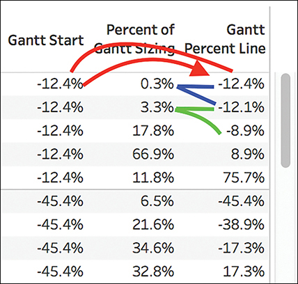
Figure 9.28 The Gantt Percent Line calculated field creates a new calculation using the values generated from previously created calculated fields.
After all five of these new calculated fields have been created and added into the view, the crosstab for the divergent stacked bar chart is complete (see Figure 9.29). We are now ready to begin building the visualization in a new sheet.
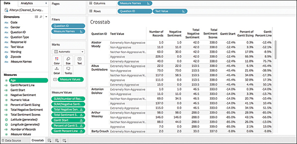
Figure 9.29 Although it’s a long process, this crosstab creates the foundation for our eventual Likert visualization.
In a new sheet, drag the Question dimension to the Rows shelf and the Gantt Percent Line measure to the Columns shelf. Tableau will break immediately, flagging the measure in red and giving the error message that a critical field used to create this calculation is missing from the view (see Figure 9.30).
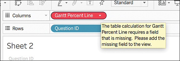
Figure 9.30 The first step in creating this Likert visualization throws an error—but that’s okay!
The missing field is Text Value, which is the field we calculated everything over in the crosstab. Bring this dimension into the view and drop it on the Color Marks card (you might need to filter and then add depending on how many options there are for this dimension).
Immediately we see a divergent stacked bar chart begin to appear! However, as we’re actually creating a Gantt chart, we still have quite a bit of work to do:
1. Change the mark from Automatic to Gantt chart (see Figure 9.31). This adjusts the view from bars to lines that separate each section of the Gantt chart.
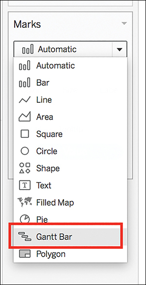
Figure 9.31 Changing the mark from the automatic bar to Gantt begins the Gantt chart transformation.
2. You need to manually re-sort your text value options, the same way discussed when making the crosstab table, but this time by clicking the sort option on the Color Marks card and manually adjusting so that text values display in the correct ranking order (minimum to maximum, or 1 to 5).
3. Drag and drop the Percent of Gantt Sizing calculated field on the Size Marks card. Now, the visualization is beginning to take shape.
4. Now to address color: Tableau has used the automatic color palette, which is intended to make things look very different; however, for this example, make the colors look more like a standard blue-orange diverging palette by changing the colors to a colorblind palette, and manually selecting better color choices (see Figure 9.32).
Because this scale is from Extremely Non-Aggressive to Extremely Aggressive, I used color choices that reflect the severity of character aggression. You could use other color scales depending on the context of the story and the takeaway intended.

Figure 9.32 With a few quick clicks, leveraging the calculated fields already made, and making smart color choices, the divergent chart is beginning to take shape.
5. Now, to fix the axis: Because we know that the axis can range from a –1 to 1, adjust it by right-clicking on the x axis, selecting Edit Axis, and then changing the fixed range from –1 to 1 (see Figure 9.33). This shifts the bars slightly so that everything is centered on the zero midpoint.
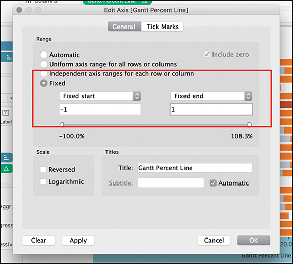
Figure 9.33 Shifting the axis allows everything to line up nicely at zero.
A few more clicks to simplify and remove headers and clean up the visualization delivers a stunning divergent bar chart that displays the Likert scale sentiment data nicely. (The final result will look like 9.20, shown earlier in the chapter.)
Lollipop Charts
The lollipop chart, while not native to Tableau, is a hybrid chart that combines a traditional bar chart and a Cleveland dot plot. It is simply a dual axis chart that superimposes a circle on top of a very thin bar chart (see Figure 9.34). However, it’s a fun way to spice up a bar chart to give it more visual appeal without reducing its analytical integrity.
note
Lollipop charts are a helpful way to visualize many bars of the same length while avoiding the Moire effect discussed in Chapter 6.
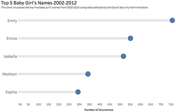
Figure 9.34 Completed lollipop chart.
A lollipop chart is great for comparing multiple measures because it helps the reader to align categories to points without drowning the graphic in ink. It typically contains categorical variables on the y axis measured against a second (continuous) variable on the x axis, although these can be plotted on the y axis. With either orientation, the emphasis is on the circle, as it is a visual cue to draw the audience’s attention to the specific value in each category. The line (or bar) itself is meant to be a minimalistic approach to tie each category to its relative point without drawing too much attention to the line itself.
To begin:
1. Build a basic bar chart in Tableau (see Figure 9.35). In this example, I am using the Top Baby Names dataset provided by Tableau. This dataset contains the most popular male and female names in each state for each year from 1910–2012 via the Social Security Administration.
2. Duplicate your dimension on the same shelf you are currently using to display dimensions (in this example, the Columns shelf). This creates a side-by-side view of two identical bar charts (see Figure 9.36).
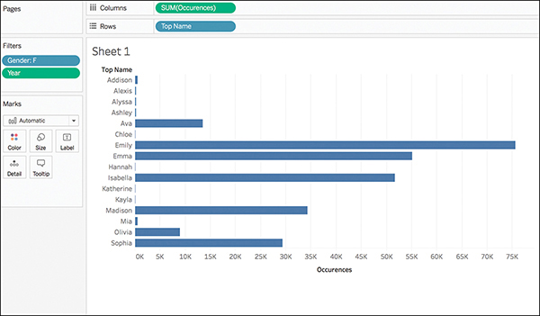
Figure 9.35 To tell a story about the top baby girl names over a decade, I have filtered the dataset to include only girl’s names from 2002 to 2012.
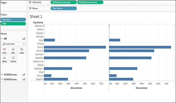
Figure 9.36 A little messy at first, duplicating your dimension creates a side-by-side view of two identical bar charts.
3. Using the duplicated measure, adjust to a dual axis by right-clicking the second measure (or second axis) and selecting Dual Axis (see Figure 9.37). Because the mark Type is set to Automatic, Tableau will likely convert both visualizations to circle charts.
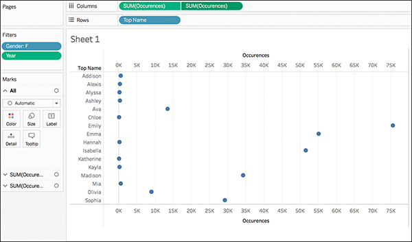
Figure 9.37 Converting to a dual axis adjusts the marks, but you can now change the Marks formatting for each dimension.
4. Using the Marks card, change the first occurrence of your dimension to a bar. Use the Size slider to slim down the line and the Color Marks to adjust the color of the bar as appropriate. I typically use a lighter gray (see Figure 9.38).
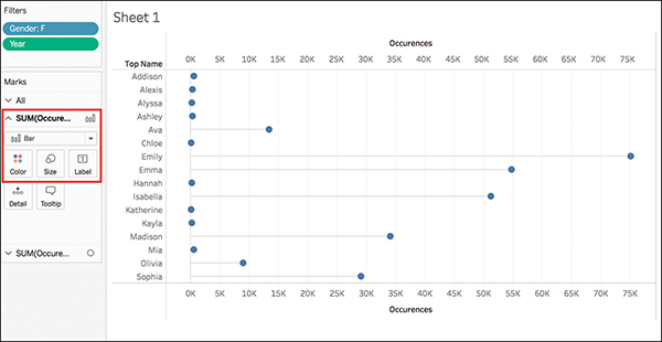
Figure 9.38 With your first marks adjustment the lollipop charts begins to take shape.
5. To adjust the second dimension occurrence, using the Size Marks card, enlarge the circles as appropriate (see Figure 9.39).
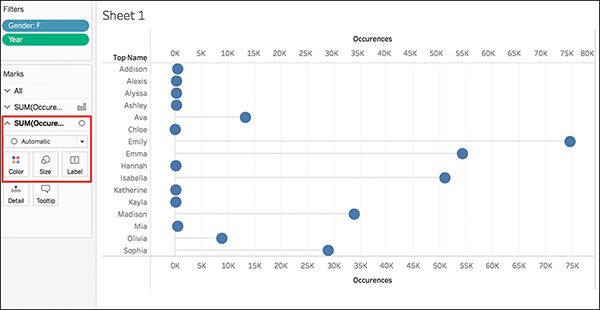
Figure 9.39 The bars and circles of the lollipop chart can be changed individually in size and color to curate your chart.
With the basis of the lollipop chart built, it’s time to clean up the visualization.
6. Make sure your axes line up correctly. Right-click the second measure axis (the one on top) and choose Synchronize Axis to make the axes equal. Right-click the axis again and uncheck Show Header.
7. Tidy up the visual by sorting bars and excluding any data that might not be pertinent to your story. I have sorted in Descending order and excluded everything but the Top 5 names. (You will likely need to readjust the Marks Sizing after this step.)
8. Continue removing headers and axis titles as well as adjusting titles as appropriate until you are happy with the visualization.
Labeled Lollipops
You might elect to remove the bottom axis header and use the circles to encode their value.
To do this, drag the measure to the canvas for a third time, this time dropping it on the Label card on the second occurrence. Adjust the Label alignment to be centered and Automatic, and make sure the checkbox to allow marks to overlap other labels is selected (see Figure 9.40).
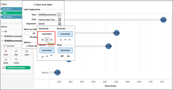
Figure 9.40 Carefully formatting mark labels can embed additional data in your lollipop chart, and eliminate the need for axis headers.
Right-click on the dimension on the Labels shelf to format the number and text color, and then remove axis headers and tweak as necessary (see Figure 9.41).
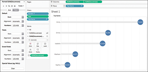
Figure 9.41 With proper size, color, and label adjustments, a lollipop chart can be a richer visual alternative to a classic bar chart.
Other options to embellish your lollipop charts include color-coding the circles based on a measure or changing circles to custom shapes.
Word Clouds
A word cloud is an image composed of words in which the size of each word indicates its frequency or importance (see Figure 9.42). While not particularly analytically astute and not recommended for analytical purposes, these types of visualizations can be a powerful way to display textual data and can be an attention-grabbing technique for the purpose of data storytelling and visual impact. In fact, word clouds can make great bookends to presentations to incite interest or leave a lasting impression on an audience.
The good news is that word clouds are quick and simple to create in Tableau.

Figure 9.42 A word count of article keywords created in Tableau.
Creating a word cloud in Tableau essentially requires using your Text dimension in a variety of marks. First, on a blank canvas, drag the desired dimension to the Text Marks card, and then drag the same dimension to the Size Marks card. At this point your canvas should look similar to Figure 9.43, displaying a simple list of your words in increasingly larger size. Depending on the number of words in your list, this size differential may be more immediately noticeable, or may be subtler as in Figure 9.43, which contains a rather long list of keywords.
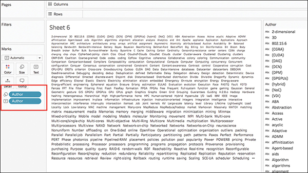
Figure 9.43 After two quick clicks on the canvas, the structure of a word cloud begins to form.
At this point you are ready to transform this view into something that better resembles your expectation of a word cloud. To do this, right-click on the dimension on the Size card and select Measure > Count (see Figure 9.44).
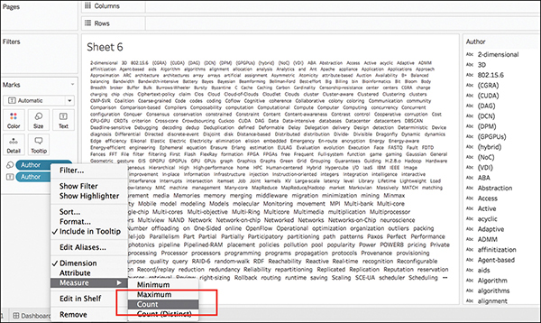
Figure 9.44 Adjust the dimension to a measure to resize the words based on their count.
This step converts your initial word cloud structure to something that looks like a tree map of a single color. Change the Mark type from Automatic to Text and your word cloud will re-form (see Figure 9.45).
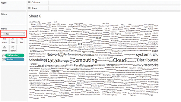
Figure 9.45 Changing the Mark type from Automatic to Text reshapes the tree map into something more akin to a word cloud.
You might need to do some additional work to clean up your word cloud, including removing extraneous words, performing deduplication, or streamlining the words included.
To add color to the word cloud, drag the same dimension to the Color Marks card. Now, your word cloud is complete (see Figure 9.46).
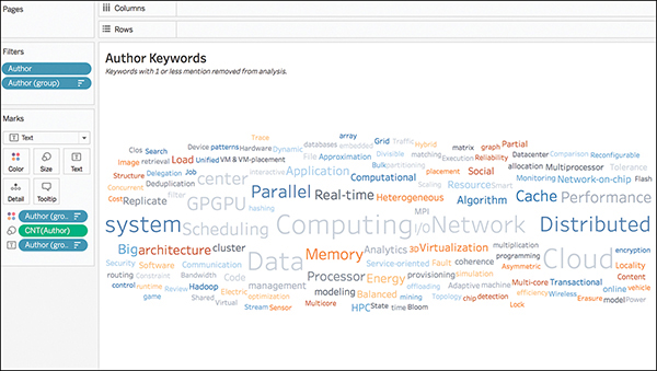
Figure 9.46 To finish your word cloud, add color.
Summary
This chapter provided a look at how to create a few advanced chart types that are not available on the Show Me card in Tableau. These charts require a little more hands-on manipulation but can be excellent candidates to add some variety into dashboards or visual presentations. Many more advanced charts exist, too, that can be learned and built in Tableau. Some fun ones to try on your own might be waffle charts or hexbin map charts, or you can explore the use of spark lines. There are always more charts to learn—explore and have fun!