Figure 71: Android Studio Graphical Layout Editor
Every GUI toolkit has some basic widgets: fields, labels, buttons, etc. Android’s toolkit is no different in scope, and the basic widgets will provide a good introduction as to how widgets work in Android activities. We will examine a number of these in this chapter.
There are a few core features of widgets that we need to discuss at the outset, before we dive into details on specific types of widgets.
As mentioned in a previous chapter, widgets have attributes that describe how they should behave. In an XML layout file, these are literally XML attributes on the widget’s element in the file. Usually, there are corresponding getter and setter methods for manipulating this attribute at runtime from your Java code.
If you visit the JavaDocs for a widget, such as
the JavaDocs for TextView,
you will see an “XML Attributes” table near the top. This lists all of the
attributes defined uniquely on this class, and the “Inherited XML Attributes”
table that follows lists all those that the widget inherits from superclasses,
such as View. Of course, the JavaDocs also list the fields, constants,
constructors, and public/protected methods that you can use on the widget
itself.
This book does not attempt to explain each and every attribute on each and every widget. We will, however, cover the most popular widgets and the most commonly-used attributes on those widgets.
Many widgets and containers only need to appear in the XML layout file and do
not need to be referenced in your Java code. For example, a static label
(TextView) frequently only needs to be in the layout file to indicate where
it should appear.
Anything you do want to use in your Java source, though, needs an
android:id.
The convention is to use @+id/... as the id value (where the ...
represents your locally-unique name for the widget) for the first
occurrence of a given id value in your layout file. The second and subsequent
occurrences in the same layout file should drop the + sign.
Android provides a few special android:id values, of the form
@android:id/... — we will see some of these in various chapters of this
book.
To access our identified widgets, use findViewById(), passing it the numeric
identifier of the widget in question. That numeric identifier was generated by
Android in the R class as R.id.something (where something is the specific
widget you are seeking).
This concept will become important as we try to attach listeners to our widgets
(e.g., finding out when a checkbox is checked) or when we try referencing
widgets from other widgets in a layout XML file (e.g., with RelativeLayout).
All of this will be covered later in this chapter.
Most sample code that you will see for Android will show the results of the
findViewById() call being cast to some other class:
TextView tv=(TextView)findViewById(R.id.name);
That is because for most of Android’s existence, findViewById() returned a View,
so we would need to down-cast that to a more appropriate class.
However, if you are using Android Studio 3.0+, with an app with a compileSdkVersion
of 26 or higher, you will notice that you no longer
need those casts. Any existing ones will show up in gray, with a tooltip indicating
that the cast is unnecessary.
What happened is that Android 8.0 changed findViewById() to return T, using Java
generics to automatically cast it to the data type you request in the assignment.
Casts are a compile-time thing in Java — they do not appear in compiled code and
have no effects at runtime. As a result, code that skips the casts works perfectly
fine on older devices as well.
Most of the time, we need to tell Android how big we want our widgets to be.
Occasionally, this will be handled for us — we will see an example of that
with TableLayout in an upcoming chapter. But generally we need to provide
this information ourselves.
To do that, you need to supply android:layout_width and
android:layout_height attributes on your widgets in the XML layout file. These
attributes’ values have three flavors:
125dip to indicate the
widget should take up exactly a certain size (here, 125 density-independent
pixels)wrap_content, which means the widget should take up as
much room as its contents require (e.g., a TextView label widget’s content
is the text to be displayed)match_parent, which means the widget should fill up all
remaining available space in its enclosing containerThe latter two flavors are the most common, as they are independent of screen size, allowing Android to adjust your view to fit the available space.
Note that you will also see fill_parent. This is an older synonym for
match_parent. match_parent is the recommended value going forward, but
fill_parent will certainly work.
This chapter focuses on individual widgets. Size becomes much more important when we start combining multiple widgets on the screen at once, and so we will be spending more time on sizing scenarios in later chapters.
The layout_ prefix on these attributes means that these attributes represent
requests by the widget to its enclosing container. Whether those requests
will be truly honored will depend a bit on what other widgets there are in the
container and what their requests are.
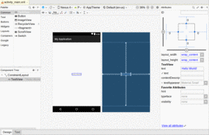
If you open a layout resource in Android Studio, by default you will see the graphical layout editor:
Figure 71: Android Studio Graphical Layout Editor
This offers a drag-and-drop means of defining the contents of that layout resource.
Android IDEs have had drag-and-drop GUI building capability for several years, dating back to when Eclipse was the official IDE. However, Android Studio 2.2 made some significant changes in the way the drag-and-drop GUI builder looks and works, and later updates have changed it further. This book covers the current look-and-feel, but older blog posts, Stack Overflow answers, and similar resources may refer to aspects of previous GUI builders.
With all that in mind, let’s look at the different pieces of the graphical layout editor.
The upper-left side of the graphical layout editor is the Palette tool:
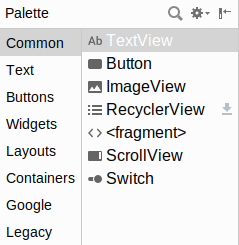
Figure 72: Palette Tool
This lists all sorts of widgets and containers that you can drag and drop.
They are divided into categories (“Widgets”, “Text”, “Layouts”, etc.)
with many options in each. A few are not strictly widgets or containers
but rather other sorts of XML elements that you can have in a layout
resource (e.g., <fragment>, <requestFocus>). Some — such as the RecyclerView
shown in the above screenshot — are from libraries and will have a “download”
icon adjacent to them to help illustrate that.
As we cover how to use the graphical layout editor, we will see how to create and configure several of these widgets, containers, and other items.
The main central area of the graphical layout editor consists of two perspectives on your layout resource contents. The one on the left is a preview of what your UI should resemble, if this layout were used for the UI of an activity:
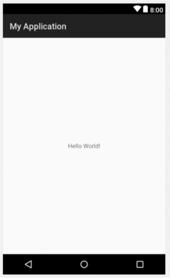
Figure 73: UI Preview
This pours your layout resource contents into a preview frame that has aspects of a regular Android device, such as the navigation bar at the bottom and the status bar at the top.
If you drag items out of the Palette and drop them into the preview area, they will be added to your layout resource.
To the right of the preview area is the blueprint view. This also visually depicts your layout resource. However, rather than showing you a preview of what your UI might look like, it visually represents what widget and container classes you are using. And, for some types of containers, it will show some of the sizing and positioning rules that you are using for children of that container:
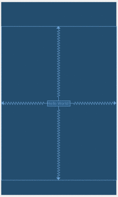
Figure 74: Blueprint
For a trivial layout resource, the blueprint view does not show you much. It will become more useful with more complex layout resources. In particular, it is very useful when you have designated some widgets or containers as being invisible, as they will show up in the blueprint but not in the preview:
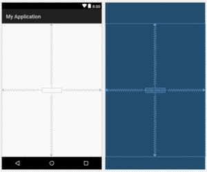
Figure 75: Layout Resource with Invisible TextView
Above the preview and blueprint is a bi-level toolbar that allows you to configure various aspects of the preview and blueprint appearance and behavior.
From left to right, the upper left portion of the toolbar contains:

Figure 76: Preview Toolbar, Top Level
A couple of those — particularly the theme selector — pertain to topics that we will explore later in the book.
On the upper right side of the toolbar are:
Figure 77: Preview Toolbar, Bottom Level, Right Side
The left side of the bottom level of the preview toolbar will change, based upon the selected widget or container, offering options for you to be able to make simple changes to whatever is selected. We will see examples of this over the next few chapters
Towards the bottom-left corner is the component tree:
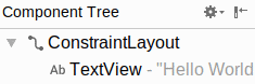
Figure 78: Component Tree
This gives you a full tree of all of the widgets and containers inside of this layout resource. It corresponds to the tree of XML elements in the layout resource itself.
Clicking on any item in the component tree highlights it in both the preview and blueprint views, plus it switches to that widget or container for the attributes pane.
When a widget or container is selected — whether via the component tree, clicking on it in the preview, or clicking on it in the blueprint – the Attributes pane on the right will allow you to manipulate how that widget or container looks and behaves.
By default, it will bring up a condensed roster of the most important attributes:
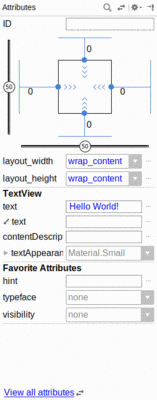
Figure 79: Attributes Pane, Showing Condensed Roster
Clicking the “View all attributes” link, or the opposing-arrows toolbar button, switches to a list of all attributes:
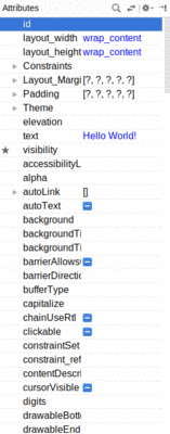
Figure 80: Attributes Pane, Showing Full Roster
You can also click the magnifying glass icon in the toolbar of this pane to search for available attributes by name:
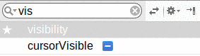
Figure 81: Attributes Pane, Showing Search Results
We will see what many of these attributes are and how to work with them over the course of the next few chapters.
For the attributes in the full roster, you can click the star icon on the left to mark them as “favorites”, as seen with the “visibility” attribute in the above screenshot. Those favorite attributes show up in the condensed roster, in the section labeled “Favorite Attributes”.
Towards the bottom of the graphical layout tool, you will see that it contains two sub-tabs. One, “Design”, encompasses everything described above. The other, “Text”, allows you to edit the raw XML that is the actual content of the layout resource:
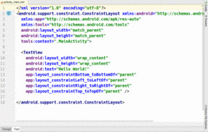
Figure 82: Text Sub-Tab in Layout Editor
By default, the entire area is devoted to the text editor. However, when the Text sub-tab is active, a “Preview” tool will appear docked on the right side of the Android Studio window. Clicking that will display the preview from the Design sub-tab:
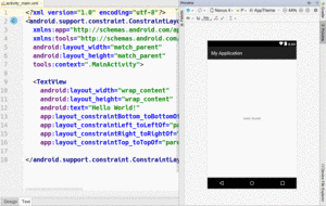
Figure 83: Text Sub-Tab with Preview
Clicking on items in the preview will highlight the corresponding XML element in the text editor.
This book profiles hundreds of sample apps, demonstrating everything from how to display text on the screen to how to scan NFC tags or work with the clipboard.
These sample apps are housed in a Git repository on GitHub. They are all open source, and the vast majority are licensed under the Apache Software License 2.0, in case you copy any of the code.
The Git repo uses tags that match the book version numbers (e.g., the v8.8 tag
is for Version 8.8 of the book). Hence, to get the source code that matches
your book version, you can:
git clone https://github.com/commonsguy/cw-omnibus.git)
and then checkout a particular tag; orFor those projects that you wish to examine in Android Studio, you can use
File > New > Import Project to import the project. However, you have to do this
on a project-by-project basis, importing each project directory as needed.
Roughly speaking, any directory that has settings.gradle in it is a project
directory, particularly with respect to this book’s samples.
Starting with the next section, the book will be displaying code from these sample projects. Links will point you to a particular sample project or to a specific file in that project, such as a layout resource or Java source file. Those links go to the GitHub repository, but you can use that information to help you identify where the corresponding file is on your development machine, if you elected to download the code.
The simplest widget is the label, referred to in Android as a TextView. Like
in most GUI toolkits, labels are bits of text not editable directly by users.
Typically, they are used to identify adjacent widgets (e.g., a “Name:” label
before a field where one fills in a name).
In Java, you can create a label by creating a TextView instance. More
commonly, though, you will create labels in XML layout files by adding a
TextView element to the layout, with an android:text attribute to set the
value of the label itself. If you need to swap labels based on certain
criteria, such as internationalization, you may wish to use a string resource
reference in android:text instead (e.g., @string/label).
For example, in
our last tutorial,
we still are using the automatically-generated
res/layout/main.xml file, containing, among other things, a TextView:
<?xml version="1.0" encoding="utf-8"?>
<RelativeLayout android:id="@+id/main"
  xmlns:android="http://schemas.android.com/apk/res/android"
  xmlns:tools="http://schemas.android.com/tools"
  android:layout_width="match_parent"
  android:layout_height="match_parent"
  android:paddingBottom="@dimen/activity_vertical_margin"
  android:paddingLeft="@dimen/activity_horizontal_margin"
  android:paddingRight="@dimen/activity_horizontal_margin"
  android:paddingTop="@dimen/activity_vertical_margin"
  tools:context="com.commonsware.empublite.EmPubLiteActivity">

  <TextView
    android:layout_width="wrap_content"
    android:layout_height="wrap_content"
    android:text="Hello World!" />

</RelativeLayout>
The TextView widget is available in the “Widgets” category of the Palette
in the Android Studio graphical layout editor:
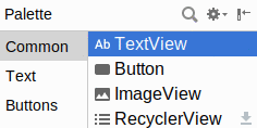
Figure 84: Palette, “Plain TextView” in Widgets Category
You can drag that TextView from the palette into a layout file in the main
editing area to add the widget to the layout. Or, drag it over the top of some container
you see in the Component Tree pane of the editor to add it as a child of that specific
container.
Clicking on the new TextView
will set up the
Attributes pane with the various attributes of the widget, ready for you to change as
needed.
The “Text” attribute will allow you to choose or define a string resource to serve as the text to be displayed:
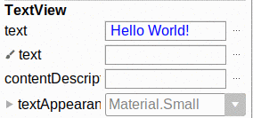
Figure 85: Attributes Pane, Showing TextView “text” Attribute
The “text” with a paintbrush icon allows you to provide a separate piece of text that will show up in the preview, but not be used by your app at runtime.
You can either type a literal string right in the Attributes pane row, or you can click the “…” button to the right of the field to pick a string resource:
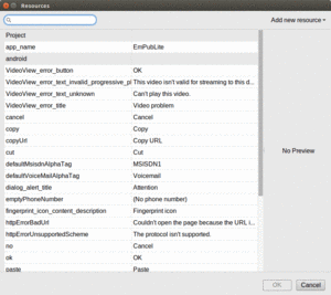
Figure 86: String Resources Dialog
You can highlight one of those resources and click “OK” to use it. Or, towards the upper-right of that dialog, there is an “Add new resource” drop-down. When viewing string resources, that drop-down will contain a single command: “New string Value…”. Choosing it will allow you to define a new string resource via another dialog:
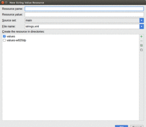
Figure 87: New String Resource Dialog
You can give your new string resource a name, the actual text of the string itself,
the filename in which the string resource should reside (strings.xml by default),
and which values/ directory the string should go into (values by default). You
will also choose the “source set” — for now, that will just be main. Once
you accept the dialog, your new string resource will be applied to your TextView.
The “ID” attribute will allow you to change the android:id value
of the widget:
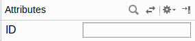
Figure 88: Attributes Pane, Showing ID Field
The value you fill in here is what goes after the @+id/ portion (e.g., textView2).
This works for all widgets, not just TextView.
TextView has numerous other attributes of relevance for labels, such as:
android:typeface to set the typeface to use for the label (e.g.,
monospace)android:textStyle to indicate that the typeface should be made bold
(bold), italic (italic), or bold and italic (bold_italic)android:textColor to set the color of the label’s text, in RGB hex format
(e.g., #FF0000 for red) or ARGB hex format (e.g., #88FF0000 for a translucent
red)These attributes, like most others, can be modified through the Attributes pane.
For example, in the
Basic/Label
sample project, you will find the following layout file:
<?xml version="1.0" encoding="utf-8"?>
<TextView xmlns:android="http://schemas.android.com/apk/res/android"
  android:layout_width="match_parent"
  android:layout_height="wrap_content"
  android:text="@string/profound"
  />
Just that layout alone, with the stub Java source provided to your app, along with appropriate string resources, gives you:
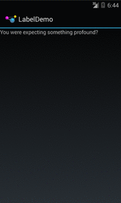
Figure 89: The LabelDemo Sample Application
Android has a Button widget, which is your classic push-button “click me
and something cool will happen” widget. As it turns out,
Button is a subclass of TextView, so everything discussed in the preceding
section in terms of formatting the face of the button still holds.
For example, in the
Basic/Button
sample project, you will find the following layout file:
<?xml version="1.0" encoding="utf-8"?>
<LinearLayout xmlns:android="http://schemas.android.com/apk/res/android"
  android:layout_width="match_parent"
  android:layout_height="match_parent"
  android:orientation="vertical">

  <Button
    android:id="@+id/button1"
    android:layout_width="wrap_content"
    android:layout_height="wrap_content"
    android:text="@string/button"/>

</LinearLayout>
Just that layout alone, with the stub Java source provided to your app, along with appropriate string resources, gives you:

Figure 90: Button Widget
As with the TextView widget, the Button widget is available in the “Buttons” portion of the Palette
in the Android Studio graphical layout editor:
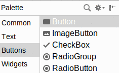
Figure 91: Widgets Palette, Button Shown Highlighted
You can drag that Button from the palette into a layout file in the main
editing area to add the widget to the layout. The Attributes pane will then let you
adjust the various attributes of this Button. Since Button inherits from TextView,
most of the options are the same (e.g., “Text”).
Buttons are command widgets — when the user presses a button, they expect something to happen.
To define what happens when you click a Button, you can:
Activity that holds the button that takes a
single View parameter, has a void return value, and is public
Button element, include the android:onClick
attribute with the name of the method you defined in the previous stepFor example, we might have a method on our Activity that looks like:
public void someMethod(View theButton) {
  // do something useful here
}
Then, we could use this XML declaration for the Button itself, including
android:onClick:
<Button
  android:onClick="someMethod"
  ...
/>
This is enough for Android to “wire together” the Button with the click
handler. When the user clicks the button, someMethod() will be called.
Another approach is to skip android:onClick, instead calling setOnClickListener()
on the Button object in Java code. When a Button is used directly by an activity,
this is not typically used — android:onClick is a bit cleaner. However, when we
start to talk about fragments, you will see that android:onClick
does not work that well with fragments, and so we will use setOnClickListener() at
that point.
Android has two widgets to help you embed images in your activities:
ImageView and ImageButton. As the names suggest, they are image-based
analogues to TextView and Button, respectively.
Each widget takes an android:src attribute (in an XML layout) to specify what
picture to use. These usually reference a drawable resource (e.g., @drawable/icon).
ImageButton, a subclass of ImageView, mixes in the standard Button
behaviors, for responding to clicks and whatnot.
For example, take a peek at the main.xml layout from the
Basic/ImageView
sample project:
<?xml version="1.0" encoding="utf-8"?>
<ImageView xmlns:android="http://schemas.android.com/apk/res/android"
  android:id="@+id/icon"
  android:layout_width="match_parent"
  android:layout_height="match_parent"
  android:adjustViewBounds="true"
  android:src="@drawable/molecule"/>
The result, just using the code-generated activity, is simply the image:
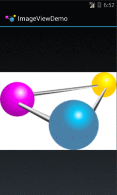
Figure 92: The ImageViewDemo sample application
The ImageView widget can be found in the “Widgets” portion of the
Palette in the Android Studio graphical layout editor:

Figure 93: Widgets Palette, ImageView Shown Highlighted
ImageButton appears alongside ImageView in that tool palette.
When you drag one of these into the preview or blueprint, you are immediately greeted by a dialog to choose a drawable resource or color to use for the image:
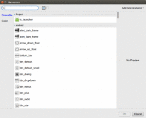
Figure 94: Image Resource Dialog
Unfortunately, you have no choice but to choose one of these, as due to a bug, if you click Cancel to exit the dialog, it also abandons the entire drag-and-drop operation.
You can drag these into a layout file, then use the Attributes pane to set
their attributes. Like all widgets, you will have an “id” option to set
the android:id value for the widget. Two others of importance, though,
are more unique to ImageView and ImageButton:
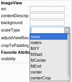
Figure 95: Scale Types in Android Studio Attributes Pane
We will examine those scale types more in the next section.
It is possible, perhaps even probable, that our ImageView size will not exactly
match the size of the images that we are trying to display. ImageView supports
a variety of “scale types” that indicate how Android should try to deal with the
discrepancy between the size/aspect ratio of the image and the size/aspect ratio of
the ImageView itself.
These values can be seen in the JavaDocs in
the ImageView.ScaleType class.
The default (fitCenter) simply scales up the image to best fit the available space.
Of note, a choice of “center” will center the image in the available space but will not scale up the image:
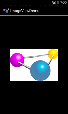
Figure 96: The ImageViewDemo Sample, Set to center
A choice of centerCrop will scale the image so that its shortest dimension
fills the available space and crops the rest:
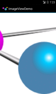
Figure 97: The ImageViewDemo Sample, Set to centerCrop
A choice of fitXY will scale the image to fill the space, ignoring the aspect
ratio:
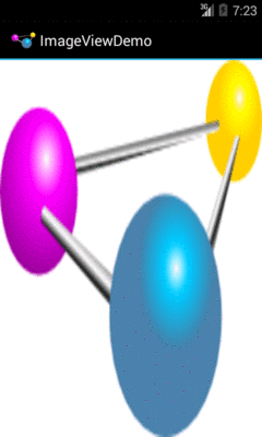
Figure 98: The ImageViewDemo Sample, Set to fitXY
Along with buttons and labels, fields are the third “anchor” of most GUI
toolkits. In Android, they are implemented via the EditText widget, which is
a subclass of the TextView used for labels.
Along with the standard TextView attributes (e.g., android:textStyle),
EditText has others that will be useful for you in constructing fields,
notably android:inputType, to describe what sort of input your EditText
expects (numbers? email addresses? phone numbers?). A thorough explanation of
android:inputType and its interaction with input method editors (a.k.a.,
“soft keyboards”) will be discussed in an upcoming chapter.
For example, from the
Basic/Field
sample project, here is an XML layout file showing
an EditText:
<?xml version="1.0" encoding="utf-8"?>
<EditText xmlns:android="http://schemas.android.com/apk/res/android"
  android:id="@+id/field"
  android:layout_width="match_parent"
  android:layout_height="match_parent"
  android:inputType="textMultiLine"
  android:text="@string/license"
  />
Note that we have android:inputType="textMultiLine", so users will be able to enter in
several lines of text. We also have defined the initial text to be the value
of a license string resource.
The result, once built and installed into the emulator, is:
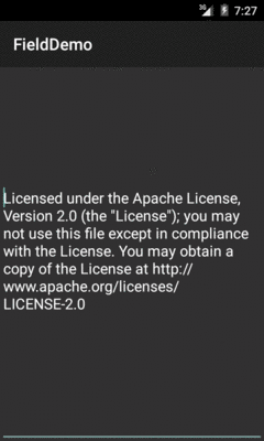
Figure 99: FieldDemo, in Theme.Material
The Android Studio Graphical Layout’s Palette has a whole section dedicated primarily to EditText
widgets, named “Text”:
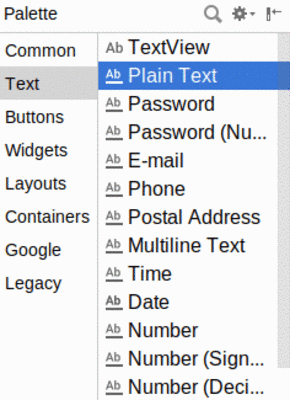
Figure 100: Widgets Palette, “Plain Text” Shown Highlighted
The first entry is a TextView. The second entry (“Plain Text”) is a
general-purpose EditText. The rest come pre-configured
for various scenarios, such as a password.
You can drag any of these into your layout, then use the Attributes pane to
configure relevant attributes. The “Id” and “Text” attributes
are the same as found on TextView, as are many other attributes, inherited from TextView.
The “Hint” item in the Attributes pane allows you to set a “hint” for
this EditText. The “hint” text will be shown in light gray in the EditText
widget when the user has not entered anything yet. Once the user starts typing
into the EditText, the “hint” vanishes. This might allow you to save on
screen space, replacing a separate label TextView.
The “Input Type” item in the Attributes pane allows you to describe what sort
of input you are expecting to receive in this EditText, lining up with many
of the types of fields you can drag from the Palette into the layout:
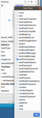
Figure 101: Android Studio’s Text Fields InputType List
The inputType attribute will be covered in greater detail in
an upcoming chapter.
All widgets, including the ones shown above, extend View. The View base
class gives
all widgets an array of useful attributes and methods beyond those already
described.
Widgets have a minimum size, one that may be influenced by what is inside of
them. So, for example, a Button will expand to accommodate the size of its
caption. You can control this size using padding. Adding padding will increase
the space between the contents (e.g., the caption of a Button) and the edges
of the widget.
Padding can be set once in XML for all four sides (android:padding) or on a
per-side basis (android:paddingLeft, etc.). Padding can also be set in Java
via the setPadding() method. On Android 8.0+, there is also android:paddingHorizontal
and android:paddingVertical, to set the padding on both sides of a single
axis.
The value of any of these is a dimension — a combination of a unit of
measure and a count. So, 10dip is 10 density-independent
pixels, 2mm is 2 millimeters, etc.
By default, widgets are tightly packed, one next to the other. You can control this via the use of margins, a concept that is reminiscent of the padding described previously.
The difference between padding and margins comes in terms of the background.
For widgets with a transparent background — like the default look of a
TextView — padding and margins have similar visual effect, increasing
the space between the widget and adjacent widgets. However, for widgets with a
non-transparent background — like a Button — padding is considered
inside the background while margins are outside. In other words, adding padding
will increase the space between the contents (e.g., the caption of a Button)
and the edges, while adding margin increases the empty space between the edges
and adjacent widgets.
Margins can be set in XML, either on a per-side basis (e.g.,
android:layout_marginTop) or on all sides via android:layout_margin. Once
again, the value of any of these is a dimension — a combination of a unit
of measure and a count, such as 5dp for 5 density-independent pixels. On
Android 8.0+, there is also android:layout_marginHorizontal and
android:layout_marginVertical, to set the margin on both sides of a single axis.
There are two types of color attributes in Android widgets. Some, like
android:background, take a single color (or a drawable to serve as the
background). Others, like android:textColor on TextView (and subclasses)
can take a ColorStateList, including via the Java setter (in this case,
setTextColor()).
A ColorStateList allows you to specify different colors for different
conditions. For example, when you get to selection widgets in an upcoming
chapter, you will see how a TextView has a different text color when it is
the selected item in a list compared to when it is in the list but not
selected. This is handled via the default ColorStateList associated with
TextView.
If you wish to change the color of a TextView widget in Java code, you have
two main choices:
ColorStateList.valueOf(), which returns a ColorStateList in which all
states are considered to have the same color, which you supply as the parameter
to the valueOf() method. This is the Java equivalent of the
android:textColor approach, to make the TextView always be a specific color
regardless of circumstances.ColorStateList with different values for different states, either
via the constructor or via an XML drawable resource. This will be covered
much later in the book.Some additional attributes on View most likely to be used include:
android:visibility, which controls whether the widget is initially visibleandroid:nextFocusDown, android:nextFocusLeft, android:nextFocusRight,
and android:nextFocusUp, which control the focus order if the user uses the
D-pad, trackball, or similar pointing deviceandroid:contentDescription, which is roughly equivalent to the alt
attribute on an HTML <img> tag, and is used by accessibility tools to help
people who cannot see the screen navigate the application — this is very
important for widgets like ImageView
We will see more about the focus attributes and android:contentDescription in
the chapter on focus management and accessibility, later in this book.
You can toggle whether or not a widget is enabled via setEnabled() and see if
it is enabled via isEnabled(). One common use pattern for this is to disable
some widgets based on a CheckBox or RadioButton checked state. We will explore
CheckBox, RadioButton, and similar sorts of widgets
a bit later in the book.
You can give a widget focus via requestFocus() and see if it is focused via
isFocused(). You might use this in concert with disabling widgets as
mentioned above, to ensure the proper widget has the focus once your disabling
operation is complete.
To help navigate the tree of widgets and containers that make up an activity’s overall view, you can use:
getParent() to find the parent widget or containerfindViewById() to find a child widget with a certain IDgetRootView() to get the root of the tree (e.g., what you provided to the
activity via setContentView())You can learn more about Android’s input method framework — what you might think of as soft keyboards — in a later chapter.
Another chapter in the trails covers the use of fonts,
to tailor your TextView
widgets (and those that inherit from them, like Button).
Yet another chapter in the trails covers rich text formatting,
both for presenting
formatted text in a TextView (e.g., inline boldface) and for collecting
formatted text from the user via a customized EditText.