> Text and Text Box Transparency
Although photo books consist mainly of photos, text often adds spice and gives a book a high-quality look and feel. The interplay between images and text results in a more balanced (and more interesting) book than one that contains only visual information. Text can also play an important informational or anecdotal role.

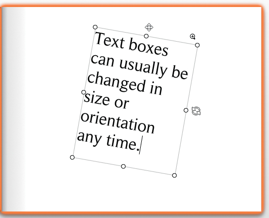
Figure 10.1: Photo book software uses text boxes to arrange text. Like image boxes, they can be moved, stretched, and adjusted at any time.
Photo book software uses text boxes (sometimes also called “captions”) to arrange text on a page in the same way it uses image boxes for photos. After the desired text has been typed in or imported, the size of a text box can be adjusted to fit the text within it.
Most providers let you type directly into a text box.
TIPS & TRICKS Some providers (SmileBooks, Picaboo, and AdoramaPix, for example) have a built-in spell checker. If your provider doesn’t have this functionality, you can write and spell check your text using a word processing program like Word. You can then use the Ctrl/Cmd+C command to copy your text and Ctrl/Cmd+V to paste it into your layout. If you have applied any formatting to your text, this will be lost during the cut & paste process, and you will have to reformat it later using your provider’s tools. 
Some programs adjust the size of a text box automatically if it isn’t large enough to accommodate the text you paste into it, while others issue a pop-up warning. It’s best to adjust the size of your text box immediately, but if you don’t, you will receive another warning later during your quality control check.
Figure 10.2: Using columns makes reading large amounts of text easier, especially on large-format pages
Long text looks best in columns, especially if you are using a large page format. Reading columns is less tiring for the eyes because they don’t have to move as much or constantly search for the start of the next line. At normal distances, the human eye is capable of reading lines of between 45 and 65 characters in one go. Check out your favorite magazine or newspaper and measure the width of its columns. Standard sizes are generally around 2 inches.
Unfortunately, most provider software doesn’t support automatically generated text columns and requires you to create separate text boxes manually for each column. This usually means that text doesn’t flow from one column to the next.
If your book contains large amounts of text, it is preferable to use dedicated layout software (see also “Creating a Layout Using Photoshop” in chapter 2)—otherwise you’ll have to spend a great deal of time and effort apportioning your text precisely to the space available in each text box. If you decide to take this route, be sure to make all the necessary corrections before you insert the text into your layout. If you consider carefully in advance exactly how you want your formatted text to look, you’ll save yourself a lot of work later on.
TIPS & TRICKS READY-MADE TEXT
Many people like to add text to their photo books but aren’t particularly keen on writing. Some websites—such as quoteland.com, quotations page.com, and aphorisms-galore.com—offer proverbs and sayings for free.
General quotes and sayings can be appropriate for wedding books, while a travel book will benefit more from text that relates directly to the places the book portrays. Wikipedia is a good place to start looking for useful information, although Wiki content can be rather dry and unexciting. You can find literary quotes relating to your destination in libraries and perhaps online at Google Books. However, you will have to type in text from these sources by hand, as direct cut & paste is not supported.
Another great source of free text is Project Gutenberg (www.gutenberg.org). This platform hosts all manner of texts that are no longer subject to copyright (i.e., the author has been dead for more than 70 years) in a variety of languages that include English, German, Chinese, and even Esperanto. The major advantage of this site is that all texts are fully searchable and can be inserted directly into your layout using cut & paste. This is especially practical for travel books, as it helps you to find text excerpts in books that you wouldn’t otherwise associate with your destination. You are much more likely to find what you are looking for if you use specific search terms like “Sistine Chapel” rather than general terms like “Rome.”
Figure 10.3: You can find quotes in a wide range of categories at quoteland. com
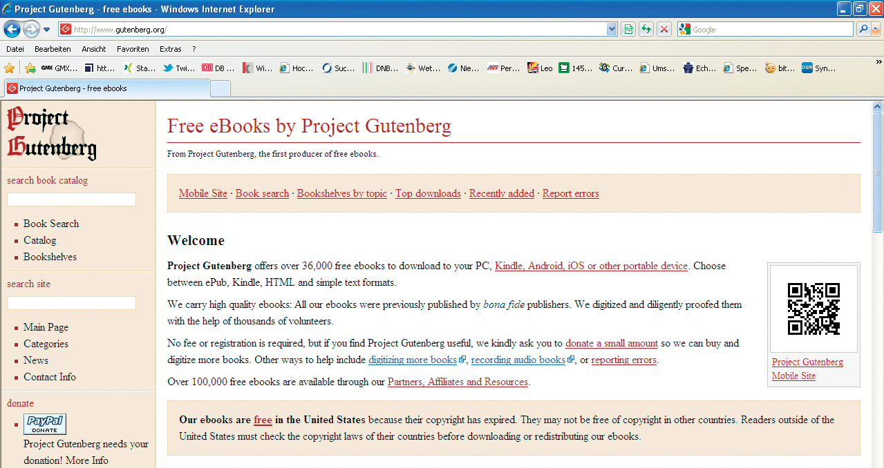
Figure 10.4: Project Gutenberg hosts large numbers of public domain texts that can be searched and copied at will
The downside of Project Gutenberg is that its texts are, by definition, not contemporary, while the major advantage is that you can use the results you find however you like—even commercially. Excerpts from travel guides and other contemporary literary sources are usually protected by copyright and are not available for public use. 
Most photo book software includes a range of formatting tools similar to those found in most word processing programs. You can choose your font and your style settings (such as bold, italic, or underline), and you can also usually select color and justification settings (left, right, or center). Some providers (SmileBooks, Blurb, and MyPublisher) support indents, and MyPublisher also offers numbered and bulleted lists. However, that’s more or less it—there are no other fine-tuning or tweaking options available. Line, paragraph, and character spacing are usually fixed, although Blurb does offer single, one-and-a-half, and double line spacing options. Mixbook offers one of the most comprehensive text design toolsets on the market.
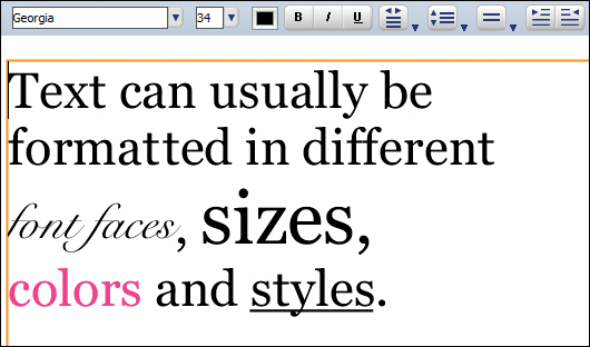
Figure 10.5: Most providers offer standard text formatting tools like the ones built into most word processing programs
TIPS & TRICKS The design of some fonts simply isn’t suited for use as italics or bold, which is why not all fonts are offered in all common variations. Professional typographers use specially designed bold and italic versions of a font to achieve these effects. The automatic bold and italic commands built into most word processing programs generally produce artificial-looking results. 
WORKAROUND You can artificially adjust paragraph spacing by inserting a blank line of text between paragraphs. Simply try out different font sizes until you find one that gives you the right size blank space. You may find that you have to type at least one character on the blank line to get the software to accept it. 
WORKAROUND A numbered or bulleted list is a desirable feature that is difficult to duplicate manually if your provider doesn’t offer it as an automatic feature. If your provider supports the use of third-party fonts, you can use symbols like the ones in the Wingdings font as substitutes for bullet points. 
If the text tools your provider offers don’t fulfill your specific needs, you can always create a text box in Photoshop (or any other image processing program) and insert it into your layout as an image. This approach can cause a loss of text quality due to the compression automatically applied to JPEG image files. However, I printed a test book to check the impact of this effect and found that it was negligible for font sizes of 10 point and larger. Nevertheless, make sure you create your text in a size that will print adequately at 300 dpi rather than scaling it with your provider’s software.
Figure 10.6: Mixbook offers a range of advanced text tools, including shadow effects and transparency. Don’t be put off by the fact that there is a slight delay before these effects appear in the layout preview.

Figure 10.7: This illustration shows an overview of InDesign’s character (top) and paragraph (bottom) formatting tools
PRO-GRADE SOFTWARE Pro software, such as InDesign, offers a much broader range of text editing tools than any online or downloadable photo book software. Custom attributes can be applied easily to single characters or entire paragraphs. These include character spacing, which is extremely useful when you are designing titles and headings. InDesign also has tools for creating custom indents and paragraph spacing. [Fig. 10.7–10.9] 
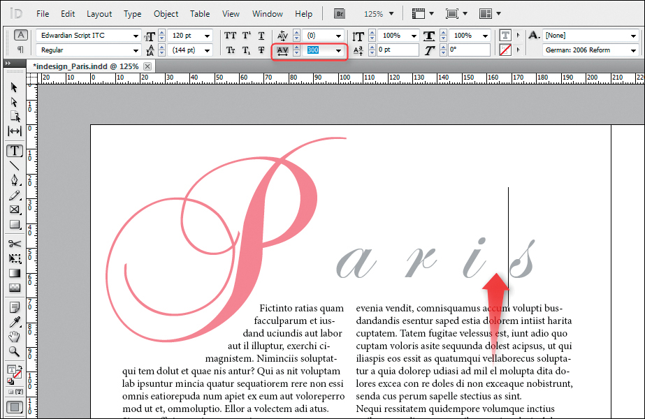
Figure 10.8: InDesign includes tools for altering the spacing between individual characters ...
Figure 10.9: ... and for creating custom indents
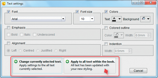
Figure 10.10: SmileBooks includes an option for applying text settings to your entire book
The text adjustments we have looked at so far relate to individual characters or paragraphs. Many designers like to create a global look that is repeated throughout a book, but most provider software only supports settings for individual text boxes. There are some exceptions, and we will come to those shortly. Some programs use the settings made in the previous text box when you create a new one, which helps to duplicate text formatting adjustments.
TIPS & TRICKS Plan your project carefully if you want to avoid spending a lot of time and effort making adjustments to text formats later on. If your software doesn’t support the application of global settings (see below), you should decide precisely in advance how you want your text to look. The best approach is to draft several different versions of your title page(s) and text elements and try them out before deciding which to use. You can also simulate global settings by creating a sample text box that includes the settings you want, and then copying it as a complete element to all the places where you want to insert text. 
MyPublisher is a prominent exception to the non-flexibility rule when it comes to global text editing options. The program’s Text settings dialog includes a button for applying a particular font and font color to all the text in a book. SmileBooks gives you the option of applying your settings to the current window only or the whole book. [Fig. 10.10]
Blurb takes the prize for flexibility, allowing you to define styles for body text, headings, headers/footers, and captions that you can then apply when you want. However, the software doesn’t let you define completely customized styles the way you can in a dedicated text program like Word. [Fig. 10.11]
Figure 10.11: Blurb lets you define the basic attributes for various categories of text
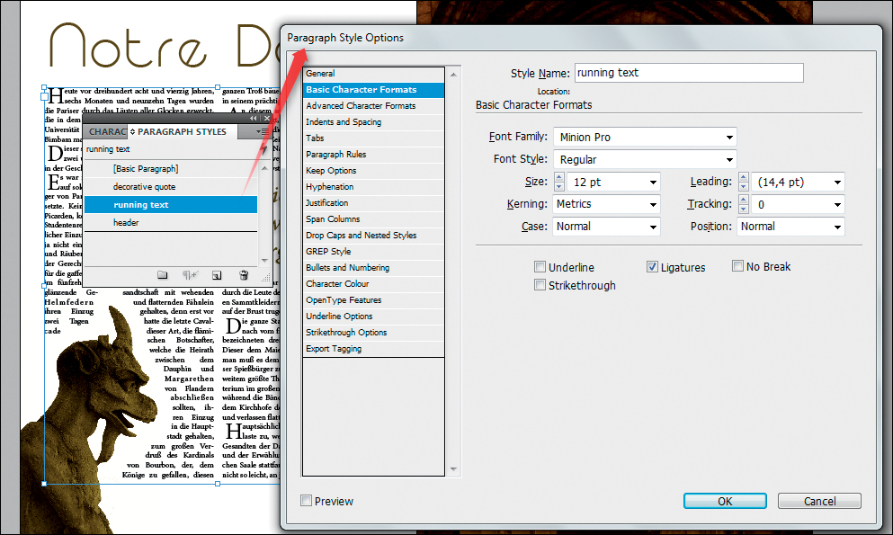
Figure 10.12: InDesign lets you define your own custom text styles
If you are working with large amounts of text that you need to link between text boxes, or if you need to perform a lot of typographical fine-tuning, the best solution is to use a pro layout program (see also “Creating a Layout Using Dedicated Layout Software” in chapter 2).
PRO-GRADE SOFTWARE Pro layout software lets you define your own custom paragraph and character styles. Paragraph styles contain detailed text settings that, once defined, can be applied to any amount of text with a single click. This is a great aid to layout fine-tuning, especially if you need to make major changes at a late stage in the process. [Fig. 10.12] 
Even if they are limited, the text editing tools offered by most providers let you apply useful basic settings to the text in your book. The following guidelines will help you create a balanced overall look:
 Don’t use more than two different fonts in the course of a book. Pro book designers vary the style of a font (italic, bold, etc.) in preference to using a different font altogether (see below).
 Use 9- to 12-point fonts for body text, 8- to 10-point for captions, and 18- to 20-point for headings. Even if these sizes appear small and difficult to read on a computer monitor, they are usually perfectly adequate in print. If you use fonts that are too large, you run the risk of your book looking like an advertising flyer or a children’s book.
 Choose a column width that is easy to read—use magazines and newspapers as a guide.
 Use dark gray text in preference to black, and light gray in preference to white. This reduces potentially stark contrasts on a page.
EXPERT ADVICE FROM DIETMAR BÜHRER: CHOOSING THE RIGHT FONTS

I often come across books that include too many different fonts—for example, switching between Times New Roman and Arial or Bodoni in a single text box. Text and page numbers that are too large can also distract the reader. Page numbers should always remain in the same position on each page and not jump from top to bottom or side to side between pages. 
TIPS & TRICKS Most providers don’t support the application of global text styles and instead require you to manually apply text attributes to each individual text box. Try out a range of text styles on a small amount of text before you decide which to apply to the whole book. 
Choosing the right font for a project is an art in itself. It’s no surprise that the typesetting profession existed for centuries before desktop publishing all but wiped it out.
The font options offered by most providers fall into one of three categories. AdoramaPix, Kodak, and Shutterfly provide their own fonts and limit you to using those fonts alone. Others, such as Picaboo, allow you to install additional fonts from a predefined range, while the most flexible, such as Blurb, allow you to use all the fonts currently installed on your computer. Some providers offer predefined fonts and also let you use your own fonts.
The advantage of predefined fonts is that you don’t waste time looking for better alternatives, and you can be sure that all the available font sizes have sufficient print resolution. The disadvantage is that you are limited to choices made by someone else, and you cannot use custom fonts (such as your own company’s custom fonts, for example).
Providers that support the fonts installed on your computer make designing a layout a much more flexible process—but they don’t guarantee that the font size you choose will have sufficient print resolution, especially for free fonts downloaded from the Internet.
WARNING! If you are using a special font in your layout, make sure it is installed on every computer you use. 
It’s essential that the font style you choose suits the book you are creating. A curlicue font is just as incompatible for a technical book as a hard, blocky font is for a wedding book. [Fig. 10.13]
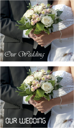
Figure 10.13: A font style that doesn’t suit the project can be irritating for the reader
Typographers divide fonts into two basic families—“serif” and “sans serif” fonts—and the difference between them is fundamental. Serifs are “hooks” located at the ends of the strokes that make up a character and are designed to make reading easier. Times New Roman is the best-known serif font for PCs, and Times is the most common font for the Mac. The most popular sans serif fonts for PCs are Arial and Verdana, while Helvetica still rules in the Mac world.
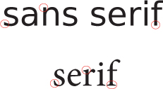
Figure 10.14: In contrast to the “cleaner” look of sans serif fonts, serif fonts have “hooks” at the ends of the strokes that form the characters
While serif fonts are considered easier to read in print, they often have a more traditional (some would say old-fashioned) look. Sans serif fonts are easier to read on a monitor and have a cleaner, more modern look. You should choose one of these two types of fonts for a photo book, especially if you want to keep long text as readable as possible.

Figure 10.15: Combining normal and bold type is a typographical trend that has gained popularity in recent years
When used carefully, a mix of serif and sans serif fonts can look nice. Mixing bold and “normal” type is a practice that is popular. [Fig. 10.15]
Figure 10.16: Decorative fonts are great for use in headings and titles
Fancy, decorative fonts are often used for headings. There are many different decorative fonts available, but you must choose carefully to find one that fits your theme. Decorative fonts can be difficult to read, especially when printed at a small size. Avoid using decorative fonts for body text. [Fig. 10.16]
TIPS & TRICKS ONLINE FONT SOURCES If your provider supports third-party fonts, the Internet has an inexhaustible supply of fonts for you to try. Some websites offer free fonts, while others make it simple to purchase high-end fonts. If you are using a free font, make sure it includes any special characters or accents that you need.
Free Font Portals:
http://www.1001freefonts.com
http://www.fontsquirrel.com
http://www.dafont.com
Commercial Font Portals:
http://www.fontshop.com
Offers a huge range of fonts and font families that can cost as much as several hundred dollars. Occasionally, individual members of a font family are available for free.
Offers collections of fonts, often for less than $100
Offers a wide range of high-end fonts, often for less than $100 for a single style. Check out Font Magazine online for free articles about typography and fonts
Offers a range of fonts from various sources at prices from $50–100 
The color you select for a font serves to make it readable and visually congruent with the rest of the layout. For a font to be readable, it must have sufficient contrast with the background (the page itself or a photo). Gray type on a black background is difficult to read, as is white type on a blue sky. [Fig. 10.17]
A font color that matches the color of a detail in the accompanying photo results in a balanced look. Programs like Photoshop usually have an eyedropper tool for selecting specific colors, but photo book software rarely provides this option. Blurb and others allow you to manually enter numerical RGB (red, green, and blue) color values, which you can ascertain using the color picker in your favorite image processing program. Try to avoid using a different font color for every photo in your book by choosing a color (or a few colors) that works for most of the photos in the book. For example, if you’re creating book of wedding photos, you could use a font color that matches a flower from the bride’s bouquet. Because colored fonts can sometimes be difficult to read, you may want to use a special font color only for headings or other accents like page numbers. [Fig. 10.18, 10.19]
Figure 10.17: For a font to be readable, it must have sufficient contrast with the background
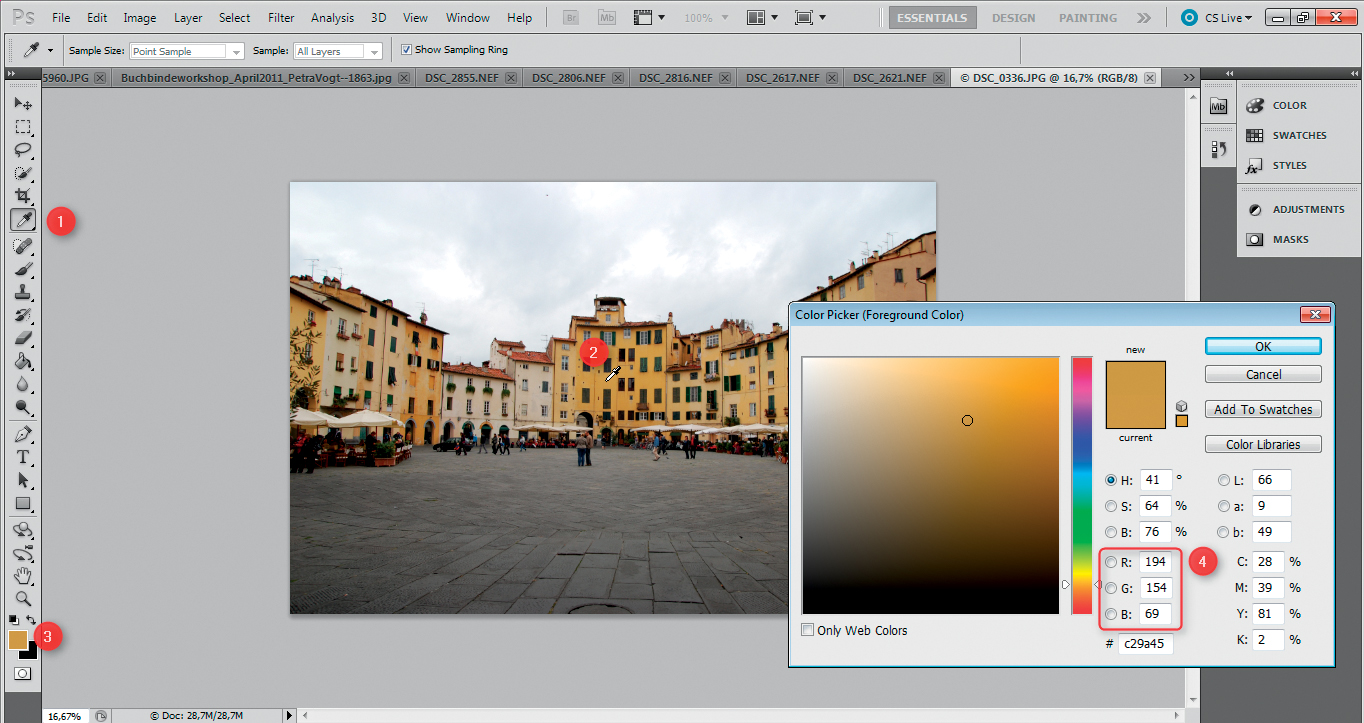
Figure 10.18: Photoshop has an eyedropper tool for selecting specific colors
Figure 10.19: Some providers, such as Blurb (illustrated here) and SmileBooks, let you select a specific color from a photo to use as your font color
Transparent and semi-transparent text and text boxes are contemporary effects often used in magazines and advertising. Strictly speaking, an effect that allows the background to “show through” is a reduction in opacity rather than a “real” transparency. Mixbook and Picaboo are among the few providers that currently offer this type of effect.

Figure 10.20: Transparent text and text backgrounds are special effects that are only offered by a few providers, such as Mixbook and Picaboo
Mixbook gives access to transparency effects with four predefined styles and a stepless Opacity slider found in the Transparency Styles tab in the Styles menu. [Fig. 10.21]
If your software doesn’t offer transparency effects for text, it’s best to use a dedicated layout program rather than working directly in Photoshop (see also “Creating a Layout Using Photoshop” in chapter 2). It’s all too easy to produce text without sufficient print resolution when working with type in Photoshop.
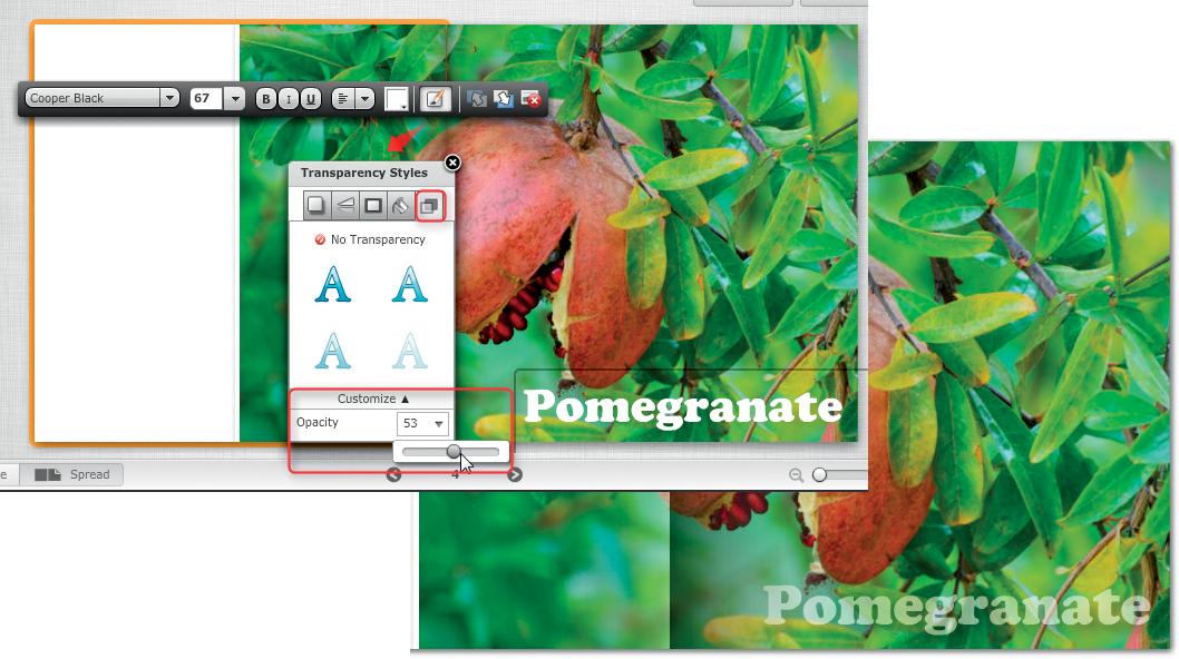
Figure 10.21: Mixbook Transparency Styles options
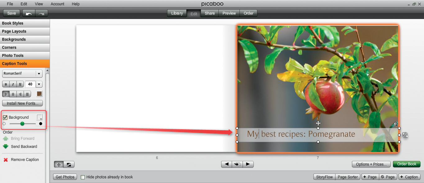
Figure 10.22: Semi-transparent text backgrounds can be produced using the Background slider in Picaboo’s Caption Tools tab
The background of a text box can be made semi-transparent by reducing its opacity. Pica-boo has a practical Background slider in the Caption Tools tab for doing just that. You can select various colors for your semi-transparent background—although white is often the best option for use with photos, as it makes the text easily readable and avoids jarring contrasts. [Fig. 10.22]
WORKAROUND If your software doesn’t include transparency effects (and most don’t), you can use a dedicated layout program to create the appropriate combination of photo and text—or, ideally, the entire page. If you only want to apply transparency to the background of a text box, proceed as follows using an image processing program. We have used GIMP to demonstrate the process, but the general principle is the same whichever program you use.
Use the File > New command to create a new image and select the Transparency option for the Fill with command. This option is one of GIMP’s Advanced Options, but is part of the standard dialog in Photoshop. [Fig. 10.23]
Now, create a layer filled with your desired background color. (White is often the best option.) At this point, Photoshop automatically fills the new layer, saving you a step in the process. You can now adjust the opacity of the new layer. The value you choose is, of course, a matter of personal taste, but experience has shown that values of around 50 % are a good starting point. [Fig. 10.24]
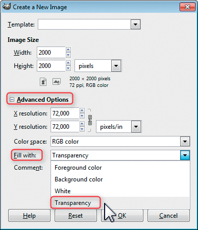
Figure 10.23: When you create a new layout file, make sure that the background is transparent. In GIMP, this setting is located in the Advanced Options section of the Create a New Image dialog.
Give your file an appropriate name and save it in PNG format, ignoring the additional export options that GIMP offers. If you are using Photoshop, simply confirm the default Interlace option. The resulting image file can then be used like a conventional background image in a text box, although you will probably have to juggle the proportions a little until they fit.
If you use this type of background regularly, it can speed up your workflow if you produce and save versions with 20 %, 30 %, 40 %, and 50 % opacity in white (and black, too, if necessary) before you start work on a layout. 
Figure 10.24: You can now fill the new layer with your desired background color (white is usually the best option for use with photos) and reduce its opacity using the slider in the Layers panel
Picture text is a special effect that involves inserting a photo into the outlines of oversized letters. While it’s not a standard effect from most providers, it can be simulated with the help of an image processing program if your provider software supports transparent PNG files (as do Blurb and SmileBooks, for example). The process is more difficult to complete at Blurb because its software doesn’t support completely overlapping image boxes or accurately depict transparency in the preview window.
The first step is to select the photo you want to insert. Because only small portions of the photo will actually be visible when the process is finished, subjects with even textures, such as an animal’s coat or a landscape, are the most effective. You can use multiple photos, too, as long as the basic lighting and color are the same—inconsistent transitions won’t show because of the way the letters divide the surface of the images.
You can now insert your chosen image(s) into your layout while you prepare the overlay mask. To do this, you can use any free or commercial program that supports transparent PNG files (Photoshop, GIMP, Paint.NET, etc.).
Create a new 300 dpi image file that is at least the size you want your picture text to appear in the finished book, and select a background color. Black is great for this kind of effect, but you can, of course, use any color you like. If you use a colored background, make sure it matches a color in the photo(s). See section 9.3, “Using Your Own Backgrounds,” for more information on color picking.
The real art in creating this type of effect is choosing the right font. Most conventional fonts are relatively slim, even at extremely large point sizes, and only allow small portions of the image below to show through. We used the DF Space font for our example, but other fonts, such as the freely downloadable Gill Sans Ultra Bold, are well suited to this use. You will need to select an extremely large font size—we used 800 point for a 12″ × 12″ book. Make sure that the color you choose for the font contrasts with the page background.
Figure 10.25: Picture text is a special effect that requires plain text with an obvious meaning and a very large type size in order to be effective
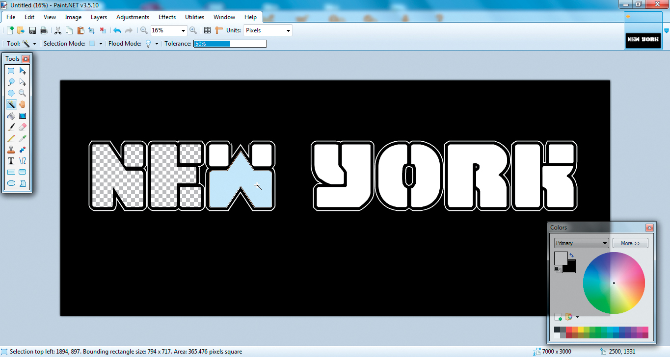
Figure 10.26: Creating the text “stencil” using the Magic Wand tool
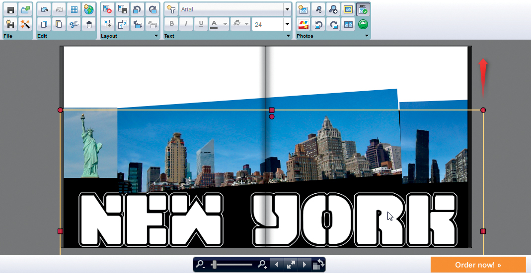
Figure 10.27: Superimposing the text “stencil” on the background image using the provider’s software
Once you decide on your font, you’ll have to knock out the central parts of the letters where the photo will show through. The easiest way to do this is to select the body of each letter using the Magic Wand tool and press the Del key. Save the resulting mask as a transparent PNG file (see section 7.4, “Isolating Image Details”).
Close your image processing program and switch back to your photo book software. Create a new image box for the PNG file on top of the one that contains your background image, either the same size or slightly smaller. You will have to juggle everything a little until it fits, especially if you are using multiple background images.
It can help to move the text “stencil” behind the background image for a moment while you align the two layers. SmileBooks makes use of the extremely practical Alt+plus and Alt+minus keyboard shortcuts to move the currently selected object backward or forward.
PRO-GRADE SOFTWARE Once again, InDesign offers sophisticated tools for creating this type of effect and allows you to embed photos directly in text characters using the Type on a path command in the Type menu. You can then insert images directly into the text using the Place command. 
Ornamental initial letters are usually used at the beginning of a page or an important paragraph. Ornamental (or “illuminated”) initials enjoyed their heyday during the Middle Ages, but they still make an attractive addition to a contemporary book layout, especially in the context of art books or wedding books.
You can create your own initials by using either a single letter of an appropriate font at a very large size or by inserting a photo of an ornamental initial created by someone else.
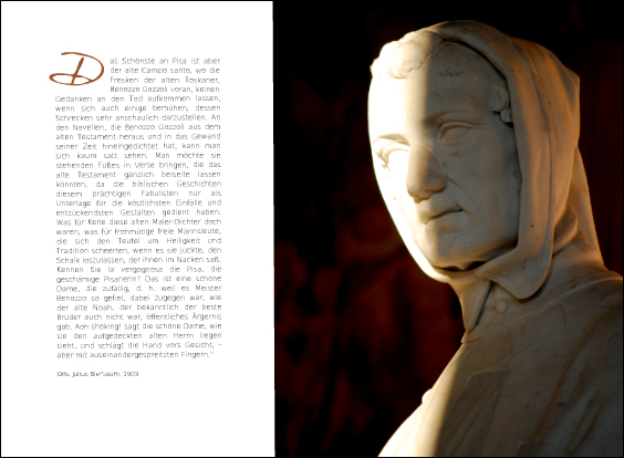
Figure 10.28: Ornamental lettering enjoyed its heyday in the Middle Ages, but it still makes an attractive, eye-catching detail in a contemporary layout
The most important aspect of placing an initial is to ensure that the rest of the text in the paragraph “flows” around it. Most provider software doesn’t support this type of complex function, so you will have to provide some manual help to apply this effect.
The solution is to use multiple (usually three) text boxes. You will need one box for the initial itself, which you can then set to the size and color of your choice. The second text box (next to the initial) needs to be the same height as your initial and narrower than the rest of the text column; it will be used for one to three lines of text that start to the right of the initial. The third box will be as wide as a standard column and contain the rest of the text on the page. [Fig. 10.29]
Figure 10.29: Most photo book software requires you to use multiple text boxes to successfully place an ornamental initial at the start of a paragraph
TIPS & TRICKS If your provider supports the use of third-party fonts, you can use a custom font to create your own ornamental initials. Alternatively, you can simply search for “initials” at any of the font portals listed earlier in this chapter. 
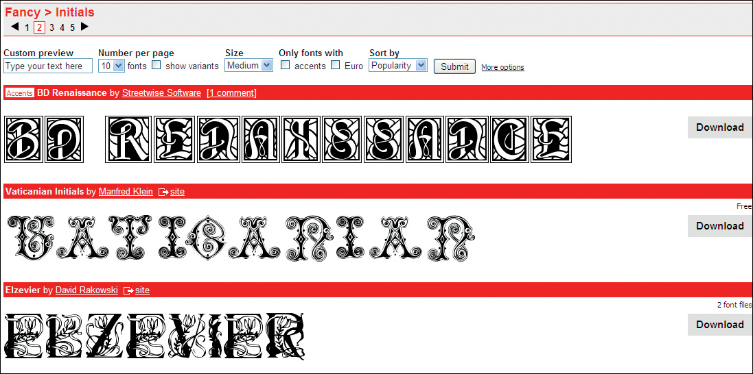
Figure 10.30: Font portals like dafonts.com often have dedicated categories for “fancy” or ornamental fonts
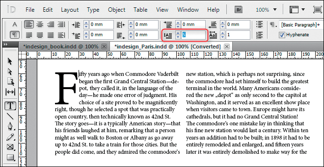
Figure 10.31: InDesign makes it simple to place an ornamental initial at the beginning of a paragraph
PRO-GRADE SOFTWARE InDesign includes comprehensive indent functionality and also allows you to set the height of an initial to a specific number of lines. 