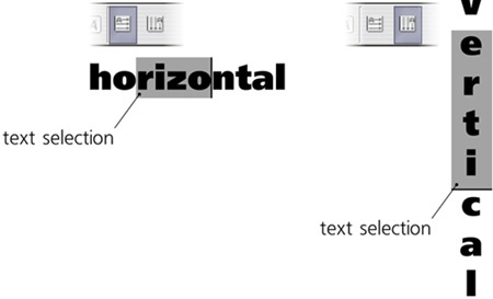
The two buttons on the Text tool’s controls bar allow you to set the direction of the text flow—either horizontal (default) or vertical. This feature is primarily intended for writing in languages that prefer vertical direction (such as Japanese), but it can be used for text objects in any language, if necessary:
Each text object has a certain alignment: left (default), right, or center, which you can choose with the buttons on the Text tool’s controls bar. For example, when editing left-aligned text, pressing  moves the cursor horizontally to the beginning of the next line, and the text you type grows to the right of this alignment edge, moving the cursor with it. In contrast, in a right-aligned text, moves the cursor under the end of the previous line, and the text you type shifts to the left while the cursor remains in place.
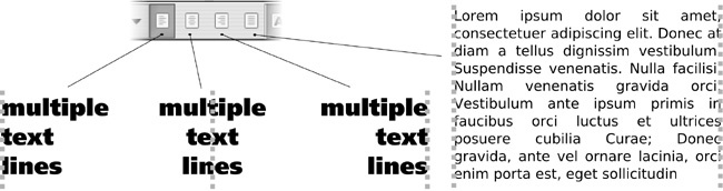
For flowed text, there’s an additional alignment option: justify, which expands spaces in each line to make both edges of the text column line up.
What sets Inkscape apart from most other text-capable software is the freedom of moving each individual character and adjusting the spacing between letters. Unfortunately, most of this functionality is somewhat “hidden,” as it is only available via keyboard shortcuts.
Position your cursor before a character, and press  . The rest of the line to the right of the cursor will move slightly to the right (by 1 screen pixel at the current zoom; pressing arrow keys with
  moves 10 times the distance of an , compare 6.5.1 Moving). What you have done is adjust the kerning interval between the two characters; it is easy to kern any pair of characters closer together or further apart to achieve the best overall balance and visual rythm in a line of text. Spaces can also be kerned to move words closer together or farther apart as needed.
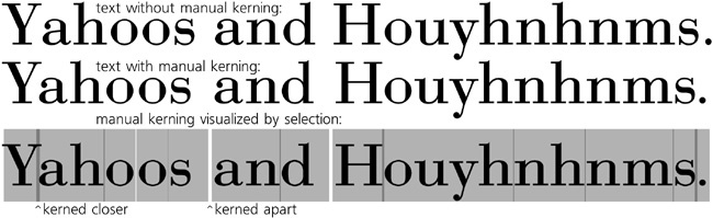
To visualize the kerning you have added, simply select the text (e.g., via  ). Whenever two letters were manually kerned closer together, their selection rectangles will overlap, and you will see a darker band; contrastingly, a kernedout pair of characters will have a gap in the selection overlay between them (Figure 15-11). The width of the darker bands and gaps correspond exactly to the amount of kerning you have added at that point.
By zooming in closer, you can make finer kerning adjustments. Don’t get carried away, however; always zoom out to see how your interval looks in the context of the entire text line.
Horizontal kerning is especially useful for text on a path. As you can see in Figure 15-7, letters tend to be too close together in concave bends and too far apart on convex arcs. With manual kerning, it is easy to counteract this effect and make the characters spread evenly along the curve.
Note
Many fonts contain built-in kerning instructions; for example, a font may specify that whenever Y and a are next to each other, they are kerned together by 0.03 of the font size. Inkscape honors these automatic font kerning instructions. However, if you try to manually adjust kerning in such a pair of characters, you will disable the automatic kern. This is why the first  to kern Y and a closer together may result in these two letters jumping, unexpectedly, further apart. Don’t worry; just keep pressing to achieve the kerning interval you need.
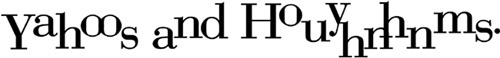
You can also kern characters vertically by pressing  and
and  . A combination of horizontal and vertical kerning gives you an absolute freedom in positioning individual letters in a text string:
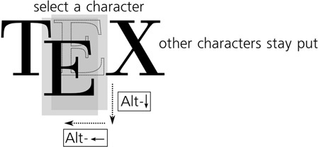
If you select one or more characters by mouse drag or pressing  -arrows, applying kerning shortcuts will effectively move the selected fragment relative to the rest of the text by inserting two opposite kerns before and after it:
Finally, you can rotate any character in a text object by pressing  or
or  when the cursor is before that character:

This rotation is around the character’s baseline origin—its leftmost point on the baseline (the line on which lie the bottoms of most letters without extenders, such as i or m). (By the way, the baseline origin of the first character of each text object is shown on the canvas as a little square when you select that text with the Selector tool.)
Note
For historical reasons, horizontal and vertical kerning as well as rotation are not available in flowed text, but only in regular text and text on a path.
SVG
In SVG, kerning information is stored in the dx (horizontal), dy (vertical), and rot (rotation) attributes of the text element. Each attribute contains a list of space-separated numbers, each number corresponding to the character at the same position. For example, dx="0 0 -2" means that the third character in this text is moved by 2 px to the left.
What if you want to kern all characters in your text closer together or farther apart, not just some particular pair? This kind of adjustment is called letter spacing (in other software, it is sometimes called tracking); select all or part of the text and press  to space the characters apart or
  to move them closer together (these are the same shortcuts that scale an object in the Selector tool).
The ideal amount of letter spacing depends on the final viewing size of your text. Usually, a smaller font size requires more airy spacing, while larger text should be tighter:

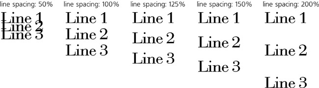
Similarly, you can adjust the spacing between lines in a regular or flowed text object by pressing  and
and  . This adjustment affects the entire text object, disregarding any text that is selected. A numeric Line spacing control, measurable as a percentage of the natural line height for this font size, is also available in the Text and Font dialog (
 ).
).
Consistent with other shortcuts, both letter spacing and line spacing shortcuts can be accompanied by for 10 times the effect.