Chapter 2. Upgrading to HTML5
HTML takes a few hours to learn and years of experience and discussion to master. Yes, most software engineers, designers, and even large numbers of high school students claim to know HTML, but they likely know only a few elements, and likely use those few elements incorrectly.
In this chapter, we’re going to cover many of the sectioning elements of HTML5. By the time you’re done reading this chapter, you should have a very good understanding of the semantics of HTML5. I can’t teach you everything about HTML in three chapters. Truthfully, I am still learning HTML—and not just because HTML5 is still an unfinished spec. With the specifications being incomplete, there will likely still be several changes. But don’t worry about that either. Likely, what has been implemented in browsers will stay the same with just some nuanced differences.
I hope that in addition to learning about the various elements, their attributes, their semantic meaning, and their purpose, you take from this an awareness that you know less about HTML than you thought: the more you learn about HTML, the more you realize how much more there is to learn.
We’re going to cover elements, briefly. While a chapter could be written about each element, we do have a lot of ground to cover in a few not-so-short chapters. We’ll cover enough for you to know how to use each element, and for you to at least know what you don’t know.
The first thing to know is that there is no space in the term HTML5: it is HTML5, not HTML 5.
You see? You’ve learned something! You’re already ahead of the game. Let’s dive in.
HTML5 Syntax
HTML5 is very similar to HTML 4 and XHTML. Most of the elements supported
in both are still supported in HTML5. Only deprecated tags and attributes
have been removed. For the most part, if your document validated as HTML 4
Strict or XHTML, your document will be valid HTML5.[12] The syntaxes of HTML and XHTML are slightly different, but
both are supported. Simply change your HTML 4.01 or XHTML doctype to
<!DOCTYPE html> and it will
validate as HTML5 (more on doctype later).
HTML5 improves upon HTML 4 and XHTML, encompassing the elements of previous versions, removing deprecated elements, adding some new elements, and redefining or fine-tuning yet other elements.
The authors of the HTML5 specifications looked into what developers were already doing on the Web: what document sections all sites tended toward, what classes and IDs they gave those components, what scripts most site authors reiterated, and which library features had proliferated to ubiquity.
HTML5 attempts to handle what individual developers have been doing on their own: creating a standard, detailing how browsers are supposed to handle these standards, and how browsers should handle developer markup when their code is, um, less than standard. The HTML5 specifications detail precisely how browsers are supposed to handle, or interpret, every instance of correct and incorrect code. Through this attention to minutiae, one of the goals of HTML5 is to inform browsers how to handle every possible scenario, so browsers construct identical DOMs from the same markup, and so that developers don’t continue to waste bandwidth dealing with browser differences.
Personally, I would like to see stricter standards. My view is that instead of browsers leniently interpreting bad code, developers should code correctly. You’re reading this, so I assume you’re in the “good code” camp. Good! That’s what you’re going to learn.
Elements
A web page is made up of a series of elements. Some elements are
empty, other elements contain text, while others contain other elements
(or both elements and text). Most elements can contain child elements or text nodes. Those that can’t contain
children, such as images and meta elements, are
called empty elements.
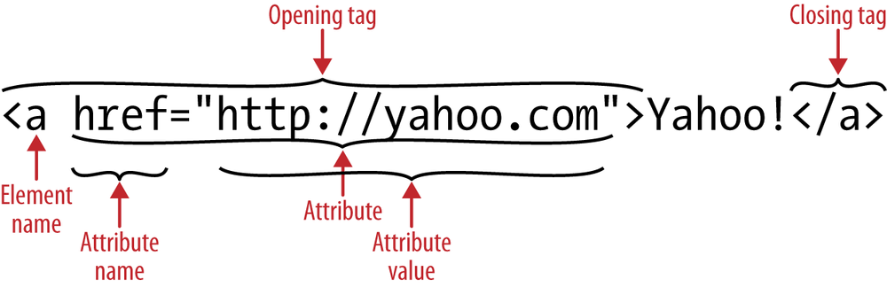
As shown in Figure 2-1, an element is a
construct consisting of an opening tag, some optional (and occasionally
required) attributes, usually some content, a closing tag, and, if
you’re coding XHTML style, an optional forward slash to self-close the
tag for empty elements such as <img> or <input>.
In prior versions of HTML, inline elements could only contain other inline elements and text. Depending on the element, block-level elements could contain other block-level elements, inline elements, and/or text. Their descendant elements, like the ancestor elements, are also made up of elements, attributes, and text.
Note
With CSS, you can alter the appearance of any phrase element to display as a block, and force a block or sectioning element to appear inline. (Note that I am using inline still. In HTML5, inline refers to presentation, not to element type.)
In HTML5, we’ve said good riddance to the notion of inline versus block elements—naming conventions based on presentation. In HTML5, elements are defined as sectioning, heading, phrase, embedded, flow, metadata, and interactive elements. Semantically, however, some of the ideas remain the same. For example, sectioning elements should not be located inside of phrase elements.
Note
When choosing an element, choose the most appropriate element based on semantics, not based on default browser rendering. While you really can use any element for any stylistic purpose, you shouldn’t. Each element has semantic meaning.
Attributes
All elements can have attributes. Some elements have required
attributes. An example of an attribute is the href attribute of the <a> element, as shown in Figure 2-1. Attributes are
typically name/value pairs, with the value optional for Boolean attributes.[13] Attributes provide additional information to the rendering
engine about the element, and are found in the opening element tag and
not in the closing tag.
There are several attributes that are global to almost all HTML elements—including the core, or global, attributes and the internationalization attributes (covered in the next section)—and others that are more element-specific, which will be described in Chapter 3 when we cover the elements that they are modifying.
Global and Internationalization Attributes
HTML5 has added several internationalization and core attributes that can
be applied to almost any element. The id, class,
title, style, lang, and dir attributes continue to be supported on all
elements. HTML5 adds accesskey,
hidden, and tabindex, along with five proposed interactive
attributes, contenteditable, contextmenu, spellcheck, draggable, and dropzone, to the list of core attributes. The
attributes are discussed next.
In addition to the global attributes, all elements can also have
microdata attributes, WIA-ARIA roles and aria- attributes, and custom data attributes, which are your own attributes
that are written as data-*, where
* is your own creation. The data-
prefix was added to HTML5 to allow developers to create attributes that
won’t conflict with future versions of HTML. data-* attributes are described in the section
. Microdata and ARIA accessibility
attributes are described in Chapter 6.
id
The id attribute is a
unique identifier. No two elements should have the same
id in a single document, and each
element can only have up to a single id. In HTML5,
id values must be at least one
character long and contain no spaces. This differs from previous
versions when the value of the id
had to begin with a letter in the range A–Z or a–z and could be
followed by letters (A–Za–z), digits (0–9), hyphens (-), underscores
(_), colons (:), and periods (.).
Note
I recommend limiting your IDs to letters and digits only, but whichever naming convention you choose to use, the important thing is to be consistent.
The id attribute is generally
optional. However, it is required for internal page anchoring and
inside form elements when implementing explicit labels. Explicit
labels are associated with form elements via the label’s for attribute and the form element’s
id attribute. Note that the
id attribute is not necessary on
form elements nested within an implicit label. Labels and the
id attribute are discussed in Chapter 4.
The id attribute is also
helpful, though perhaps used a little too heavily, as an anchor for
targeting with JavaScript. The id
attribute, if included, can be used in CSS to target elements.
However, due to the high value, or specificity, of the id in the CSS cascade, even though id selectors perform a tinge better,
id values should be sparsely used
in CSS selectors. We’ll discuss all of that in Chapter 6. Suffice it to say that by the time you
finish this book, you’ll understand that you can target any element on
a page with CSS3 selectors without the use of id selectors.
class
A class is a name of a classification, or list of names of
classifications, to which the element belongs. The class attribute specifies the element to be
a member of one or more classes. Unlike the id attribute, any number of elements can
share the same class or classes. An element may have multiple,
space-separated classes.
In terms of the CSS cascade, the order of class names within the
class attribute doesn’t matter. The
order in the stylesheet, however, does matter (this too will be
discussed in Chapter 6):
<a href="http://google.com" class="external popup search">link text</a>
title
The title attribute
provides a human-readable description for any element to
which it is applied. The title
attribute is often implemented as a “tooltip” on some visual browsers,
but other browsers, especially mobile browsers, don’t display the
title attribute. While screen
readers can be set to support the title attribute, most screen readers do not
read the title attribute value as a
default setting, so the title
attribute cannot be relied upon for improving accessibility.
Note
There are some elements for which the title attribute is required, such as
<abbr>, for which the value
of the title attribute expands
the shortened term. Otherwise, the title attribute is generally
optional.
While the title attribute is
useful as an attribute for links, images, frames, and multimedia
elements, it can come in handy as a method of providing small bits of
hidden information that can be displayed based on user interaction.
For example, it is possible to extract the content of the title attribute with CSS and create
generated content for “tooltip” pop-ups by including the title value as generated content on a ::before or
::after pseudoelement.
While values of the title
attribute can be used for nifty tricks for progressive enhancement,
due to the inaccessible nature of such a trick, it should not be
relied upon for providing important information. And, because the user
can access it, only use title if
the content of the title is useful
and appropriate. If you are adding content to the title attribute to enable your analytics or
add codes for use by your JavaScript, don’t! Crafty abuses of the
rel and title attributes are no longer necessary
(and never were appropriate) with the addition of the custom data
attributes, described in the section .
style
The style attribute
allows you to specify style rules inline for a single
occurrence of an element. This attribute can come in handy for quick
prototyping. Other than prototyping, there should never be a need to
use this attribute, as web standards dictate to separate content from
presentation!
An additional note: when using an inspector to look at code in
tools such as Web Inspector for Safari or Chrome, Firebug for Firefox,
Dragonfly for Opera, or F12 in IE, styles that are added with
JavaScript, or through the debugger interface, will appear inline as
the value of the style attribute.
This is dynamically generated. The browser may do it. You
shouldn’t!
lang
The lang attribute is
one of the two global internationalization attributes
(dir being the other). The primary
language of a web page is set using the lang attribute on the <html>
element, by using the Content-Language HTTP header, or the
http-equiv="language" attribute.
Used for internationalization or defining nondefault language sections of content, the
lang attribute specifies the
language of an element’s attribute values and its content, including
all contained elements that do not specify their own lang attribute.
The lang attribute enables
search engines to index content by its language, and allows screen
readers to use international pronunciation rules.
The lang attribute enables
styling of text depending on language. The <q> element is supposed to render the appropriate quotation mark for
the language defined in the lang
attribute, but this is not well supported.
dir
Often used in conjunction with the lang
attribute, the dir attribute can be
used to change the direction of text when writing Arabic, Hebrew, or
other right-to-left languages. The default value of the dir attribute is ltr (left to right). If your web page is
primarily in one of those right-to-left languages, set the primary
direction using the dir attribute
on the <html>
element.
Within the body of the page, if you have content that is in a
direction other than the default of the page, you can change the
direction of the text with the dir
attribute. While not explicitly required, I recommend including the
title and lang
attributes whenever you include the dir attribute on an element. Generally, the
dir attribute is used for changing
parts of your text to right-to-left languages. Including the lang attribute is necessary to inform search
engines, screen readers, and other assistive technologies that the
language has changed. The title
attribute provides a way for you to include a translation of the
content in the main language of your website. These attributes provide
ways of making your web content accessible not only to those with
disabilities, but also to your main “visually impaired” user:
Google!
Note that dir is slightly
different in HTML5, which has introduced a third value: auto. Possible values of the dir attribute include rtl, ltr,
and auto.
HTML 4 Attributes Made Core in HTML5
The preceding attributes were global, or core, attributes in previous versions of (X)HTML, and continue to be. There are also two accessibility attributes supported on interactive elements that are now global attributes in HTML5. These are covered in the following sections.
tabindex
The tabindex attribute
was included in prior specifications on interactive
elements such as links and form elements, allowing the developer to
set the sequence by which these element types receive focus. HTML5 has
expanded the role of tabindex to
include any HTML element.
Many people use mice to navigate through a website, clicking on
links and form elements to engage the interactive elements. Others
navigate through the page using a keyboard; clicking the Tab key and
moving the focus from one interactive element to the next. On nontouch
phones, users will navigate through focusable elements in four
directions with the navigational or directional pad (D-pad, for
short). On smartphones, most users generally touch the links they want
to follow or the form elements they want to enter. Once they’ve
finished entering data into a form element, many dynamic keyboards
provide for a Next button to forward to the next form element. By
default, only links and form fields receive focus through this method.
The sequence of the current element to the element receiving focus via
the right button on the navigation pad, the Next button, or the Tab
key is the order of the form elements in the source code, unless the
native sequence has been usurped by the tabindex attribute.
In HTML5, the global nature of the tabindex attribute adds
focusability to all elements—not just form elements and
links. The attribute takes as its value an integer. As the user tabs,
the elements with the tabindex
attribute will receive focus in sequential order based on the value of
the tabindex attribute’s numeric
value—for tabindexes that have a
positive value.
Don’t use tabindex with
positive values unless you are able to provide tabindex values to every interactive element
on the page plus have good reason to rearrange
the order, plus be certain that you will be able
to maintain the correct order through the life of the application.
Instead, mark up the page in the correct order. The default tab order
is the same as the source order. Rearranging the tab order of a page
can be very confusing to the user, and can lead to very bad user
experiences. It’s best to lay out the page in an order that makes
sense, and never use the tabindex
attribute. Using the default tab (and therefore source) generally
creates the best user experience.
So, if you’re not supposed to change the order of the page, why
has tabindex become a global
variable? The tabindex attribute
has become global to enable programmatic focus on all elements,
including noninteractive elements, generally via JavaScript and/or
keyboard focus.
Since we don’t want to actually change the tab or keyboard focus
order from the source order of the page, the only values of tabindex should be 0 or −1. The value of
tabindex="-1" (any negative value
works, but −1 is the convention) can be used for programmatic focus
and tabindex="0" for accessibility
reasons only, if you want to provide keyboard access to an element
other than a link or form element without changing the order of the
page.
Note
You may be wondering what tabindex has to do with the mobile realm,
where you don’t generally tab to navigate. Note that when you fill
out a form element, the displayed keyboard on some devices includes
a Next button at the top. Also, just like you want to enable focus
via JavaScript on the desktop, you may want to do so on the phone.
And, just like on the desktop, not all users have a pointing device.
Many visually impaired people use smartphones, especially the iPhone
in the United States. In that way, tabindex helps with accessibilty.
accesskey
The accesskey is similar
to the tabindex,
except instead of navigating the page by tabbing through to the
element with the next higher tabindex value in sequential order, the
focus moves directly to the element for which the activated access key
has been set. Think of it as a keyboard shortcut.
The accesskey attribute’s
value creates keyboard shortcuts. For example, <input accesskey="s" name="search"
type="text"/> creates a search input box with an accesskey of s. When the user presses on the letter “s,”
the focus moves to the search input.
The value of the accesskey
attribute is one or more characters separated by a space. Generally,
it’s just one character, but the specifications allow for more than
one keyboard shortcut for an element. The syntax for the value of
accesskey is similar to the
class attribute in that the value
of this attribute is an ordered set of space-separated tokens.
However, here the order matters; tokens beyond the first are
considered fallbacks for user agents that can’t support the initial
values.
While tabindex and accesskey were originally highly regarded as
possible solutions for accessibility concerns, they aren’t the
accessibility solution that everyone had hoped for. As mentioned
previously, tabindex can create a
bad user experience by altering the expected sequence of the focus of
the page. Similarly, accesskey can
interfere with default behaviors and shortcuts set in the client’s
browser.
As of yet, I have found no use for the accesskey on smartphones, but because we’re
learning HTML5, I’ve included it here. The accesskey used to be helpful before the
advent of smartphones, when navigating websites on tiny old mobile
device browsers was a chore.
New to HTML5: Global Accessibility and Interactive Attributes
HTML5 includes several new attributes, including some new global attributes, which are included in this section. We’ll cover some of the new element-specific attributes and values when we discuss the elements to which they relate in the next two chapters.
hidden
When included, the hidden
attribute indicates that the element is not yet, or is no longer,
relevant. Supporting browsers do not display elements with the
hidden attribute, including
display:none; in the user-agent
stylesheet. It is best not to use this attribute simply to
hide elements from the user since it has semantic
meaning: it indicates that the content encompassed in this
hidden attribute is either outdated or otherwise
not relevant.
contenteditable
The contenteditable attribute
indicates whether an element is editable or not. When
included, user changes to your content are not saved, but they do
change the DOM, so you can capture the changes and send them back to
the server to be saved. The contenteditable attribute is supported in all
of the desktop browsers and all mobile devices except Opera Mini, with
support starting in Android 3.0 and iOS 5.
When an element has the contenteditable attribute set, the dynamic
keyboards on touch devices should pop open to enable editing.
contextmenu
The contextmenu enables the
linkage of the element with a <menu> that provides more context to
that element or <command>. It
takes as its value the value of the id of the <menu> you want associated with it.
This attribute has yet to be supported in any browser other than
experimentally in Chrome, so the <menu> and <command> elements are not part of
this book.
draggable
The draggable attribute
indicates whether an element is draggable or not. You
may have noticed that you can drag images in most desktop browsers,
but you can’t drop them. This is the default draggable behavior in
action. For the draggable attribute
to be useful, it should be used in conjunction with JavaScript event
handlers such as dragstart,
drag, dragenter, dragleave, dragover, drop, and dragend. Mobile browsers, other than IE10,
don’t support drag-and-drop, so the API is not covered in this
book.
dropzone
It’s one thing to drag an element, but what do you do after dragging it? HTML5
provides us with a dropzone
attribute that specifies what types of content can be dropped on an
element. You can move, copy, or create a link to the originally
dragged content using the move,
copy, and link attribute values, respectively. Since
drag-and-drop is not well supported on mobile browsers, we won’t be
discussing it further in this book.
spellcheck
The spellcheck attribute
indicates whether an element is to have its spelling and
grammar checked or not. By default, most smartphones and tablets
autocorrect text areas as you type, but not always well—there are
several sites making fun of some of the “corrections.” While they don’t support
the spellcheck attribute, they do
support autocorrect.
Interestingly, although the default behavior of iOS is to
autocorrect text, if the autocorrect
attribute is added to an input of type text, it actually does not
spell check; it will autocorrect only if the attribute is not
included.
ARIA accessibility attributes
HTML5 supports the Accessible Rich Internet Applications (ARIA)
accessibility module attributes of role and aria-*. ARIA is a separate module, and not
part of the HTML5 specifications. With live regions, roles, and ARIA
states and properties, WAI-ARIA can help improve the accessibility of
dynamically updating content and hijacked elements.
When interacting with rich Internet applications, the user
visiting with a screen reader may be having one part of the page read
aloud while another part of the page is dynamically updated. ARIA live
regions can help indicate to the user that a part of the page—a part
that doesn’t currently have focus—has updated. With the
arialive values of assertive, polite, or the default off, ARIA provides a way for the site author
to interrupt the screen reader to inform the user that part of the
page has been updated. Associated attributes include aria-atomic, aria-busy and aria-relevant.
The ARIA role attribute
enables the creation of a semantic structure on repurposed
elements—for example, elements repurposed into a grid, listbox, menu, menubar, tablist, toolbar, tree, or treegrid can be identified as such—making
seemingly nonsemantic markup accessible, usable, and interoperable
with assistive technologies. While full support of the new HTML5
elements (see Chapter 3) by
screen readers may make some of the ARIA structure roles irrelevant,
adding the role values of article, application, banner, complementary, contentinfo, document, form, heading, main, navigation, and search to your pages now can help with
screen readers that are supportive of ARIA, but not yet HTML5.
Two notes about roles: (1) once set, a role
should not be dynamically changed, since this will confuse the
assistive technology, and (2) roles take precedence over element
default semantic meaning.
In addition to the role
attribute and its many values, ARIA also provides for state and
property attributes. There are state attributes aria-disabled, aria-busy, aria-expanded, aria-hidden, and property attributes such as
aria-describedby, aria-haspopup, and aria-labelledby, which provide additional
information on dynamic widgets and repurposed elements. It is best
practice to use the most semantic existing element for the job, but
when you must absolutely use a specific element for a nonintended purpose (such as a tree
menu), ARIA should be used.
Custom data attributes with data-*
In HTML5, you can create your own attributes. While you could create your own attributes before, your markup would not validate. HTML5 introduces the custom data attributes, where, as an author, you can define the name of the attribute.
Developers have been including invalid attributes and/or abusing
the title and rel attributes to provide data for
interactivity. Instead of misusing HTML 4 attributes like rel and title, simply create an attribute with the
data- prefix, and your code will
validate.
For example, in our CubeeDoo game, we want to maintain the
position and value of every card so that when we compare them, we can
see if the first flipped card matches the second flipped card, and
also to maintain state, in conjunction with localStorage, when we
pause the game and leave the screen. We could keep track of every card
as an array in our JavaScript. Instead, we created the data-position and data-value attributes in our markup,
dynamically updating the data-value
for each new board setup:
<div id="board" class="level1">
    <div data-value="0" data-position="1">
        <div class="face"></div>
        <div class="back"></div>
    </div>
    <div data-value="0" data-position="2">
        <div class="face"></div>
        <div class="back"></div>
    </div>
    <div data-value="0" data-position="3">
        <div class="face"></div>
        <div class="back"></div>
    </div>
    <div data-value="0" data-position="4">
        <div class="face"></div>
        <div class="back"></div>
    </div>
    ...
    <div data-value="0" data-position="24">
        <div class="face"></div>
        <div class="back"></div>
    </div>
</div>
When the user selects two cards, the data-value values are compared. If they
match, we have a match. The data-position attribute enables us to track
the location of each card, changing the data-value of the two cards to 0 when
matched. We also use the value of the data-value attribute to style the front of
the cards using attribute selectors, covered in Chapter 7.
Prior to having the data-*
attributes, we may have structured our cards with <div class="..." rel="15" title="4">
or similar. While that title might
have validated, it was unhelpful and would even allow people to easily
cheat (you can still cheat with an element inspector in this game, but
showing a tooltip would have made the game a bit too easy) when
hovered on the desktop. The data-
prefix has been reserved for this purpose to avoid clashes with future
versions of HTML. Custom data attributes are intended to store custom
data private to the page or application. The only requirement on these
attributes is that they are not used for user-agent extensions like
-moz- or -webkit-.
Dataset API
The custom data attributes come with the dataset
API. With the dataset API, you
can capture the attribute/value pairs even if the custom data
attribute name is dynamically generated (i.e., you don’t know what
the attribute name is after the dash):
1             // get all the cards values and positions
2             // use dataset to get value for all the cards.
3             currCards = document.querySelectorAll('#board > div');
4             for (i = 0; i < qbdoo.cards; i++) {
5                cardinfo.push(currCards[i].dataset);
6             }
7             currentState.cardPositions = JSON.stringify(cardinfo);
While we know what attributes we’ve set, we are using the
dataset API instead of getAttribute() to teach the API when we
extract the values to pause the game. The snippet from the qbdoo.pauseGame method uses a query
selector to capture all the cards (line 3), then iterates through
the cards using the dataset API
to capture the key/value pairs of any dataset attributes present as
a DOMStringMap as an array value.
The last line (line 7) converts the key/value pairs we’ve captured
into a JSON string. Instead, we could have also iterated through the
deck :
1              for (i = 0; i < qbdoo.cards; i++) {
2                   for (key in currCards[i].dataset) {
3                     deck[key] = currCards[i].dataset[key];
4                 }
5                cardinfo[i] = deck;
6           }
itemid, itemprop, itemref, itemscope, and itemtype
There are five other global attributes related to microdata
that have been removed from the main part of the HTML5 specification
and are now part of the microdata
specifications, including itemid, itemprop, itemref, itemscope, and itemtype. I’ve included them here so you have all the global attributes
listed together. These attributes are explained in Microdata API.
HTML Element/Attribute Syntax
We’ve talked about elements and attributes, but we haven’t discussed how to include them. Syntax is important, so let’s dive in.
To include an element in your web page, you include an opening and closing tag. Opening tags start with a left angle bracket (or less-than sign, <), followed by the element name, followed by the right angle bracket (or greater-than sign, >).
Correct:
<a>
<p>
<div>
Incorrect:
<m> <!-- there is no 'm' element' -->
< div><!-- there can be no space before the element name -->
If there are any attributes, they are included in the opening tag, after the element name, separated by a space.
All attributes are name/value pairs. Unlike XHTML, HTML5 Boolean attribute
values don’t need to be explicitly declared. The browser defaults to
true when a Boolean attribute is present but the value
is omitted.
Even though HTML5 does not require it, for ease of legibility and best practices, the attribute should be in all lowercase and the value should be in quotes. Depending on the type of attribute, the value may be case-sensitive.[14]
An attribute can only appear once for each element’s opening tag. While you likely know that, and don’t include an attribute multiple times in elements on purpose, it is a common cause of validation errors, so take this as a friendly reminder.
Correct:
<a href="http://www.standardista.com">
<p class="racket-tailed drongo">
<div id="content">
Valid, but not best practices:
<a href=http://www.yahoo.com>
<!-- best to quote all attribute values -->
Not valid:
<p class="racket-tailed" class="drongo">
 <!-- no duplicated attributes allowed. -->
<p class=Racket-Tailed Drongo>
 <!-- while HTML5 does not require quotes around all attributes, it is
best practice. And, if there is a space in the attribute value, the
quotes are required to unambiguously delineate the start and end of
the attribute's value! -->
To end, or close, the element, you include a left angle bracket and a forward slash, followed by the element name (that matches the element in the opening tag) and a right angle bracket. If the element is an empty element (see the section Self-Closing Elements), you can end the element by adding the optional forward slash immediately before the right angle bracket in the opening tag:
<a href="http://standardista.com/mobile/ch2">Files for this chapter</a>
<p class="racket-tailed drongo">Exotic Asian Bird</p>
<div id="content">. . .</div>
In between the opening and closing tags you put the content of the element, which may include other elements and/or text nodes. Nest your elements correctly! If you include an element as a child of another element, the nested child element must be both opened and closed before the closing tag of the parent element:
<div id="content">
 <p class="files">
  Examples in the <a href="http://standardista.com/mobile">
  online chapter resources</a>
 </p>
</div>
In this example, the <div>
element contains everything from the first < to the last >, including the descendant paragraph and
anchor element. Notice that the <a> is both opened and closed within the
opening and closing <p> tags,
and, in turn, the <p> element is
both opened and closed within the <div>.
Self-Closing Elements
All elements have closing tags, except self-closing elements, also known as empty or void elements, which, in XHTML syntax, we self close with a trailing backslash.
Empty elements cannot contain nested elements or text. Being self-closing, they don’t include an end or closing tag. You can include a slash before the right angle bracket of the opening tag if you wish. While HTML5 does not require elements to be closed, XHTML syntax does require it via the trailing slash. Self-closing, or empty elements, include:
Best Practices
There are several coding rules required for XHTML that were optional or even unsupported in HTML. While HTML5 supports both coding formats, here are some nonrequired best practices:
- Use lowercase for markup
In XHTML, the element tags must all be lowercase as must all the attribute names. While HTML5 supports camelCase and everything else, please use all lowercase markup. Nothing in the W3C states that attribute values need to be lowercase, but some, like
id, are case-sensitive, so stick to lowercase.- Quote all attributes
In XHTML, all attribute values must be encased in single or double quotes. In HTML5, only attribute values with spaces or special characters are required to be in quotes. Make me happy: quote all attributes.
- Close all elements
In XHTML, every opening tag must have a closing tag. Empty elements such as
<img/>and<br/>must be self-closing. In HTML5, some tags can be left unclosed. While omitting the closing element reduces the number of characters on a page, it can make your markup harder to read and therefore harder to maintain. Some speakers/blog posts recommend omitting end tags to reduce the number of characters to make smaller files for mobile. The few bytes saved are not worth the risk. Reducing the number of DOM elements will have more of an impact than reducing the number of characters in this way. Make me happy: close all elements.In terms of trailing slashes to close elements, you can include them or you can omit them. Whichever you choose, however, be consistent.
- Nest all elements
All tags must be properly nested: if you start tag
<a>and then start, or nest, a<strong>, you must close the</strong>tag before you close the</a>tag. Nest your tags correctly: your markup will render as expected, it will be easier to troubleshoot, and your markup will be valid (plus, you’ll make me happy).- Provide values for all non-Boolean attributes
In XHTML, all attributes must be coded as attribute/value pairs, even Boolean values. The default selected option in XHTML should be written
selected="selected". In HTML5, the same can simply be coded asselected. In HTML5, providing values for Boolean attributes is not necessary, since including the attribute property makes a Boolean value true even if the value of the attribute is false in most browsers. Whether you choose to include or not include Boolean values, be consistent with your decision. If you include Boolean values, always include them. If you omit them, always omit them.Don’t include an empty string,
="", for a Boolean (or even non-Boolean) attribute; rather, always include the value.Warning
Note that if you include a Boolean value, it will be true even if you set the value to the empty string. If you want it to be false, you will have to use
removeAttribute(attributeName)and notsetAttribute(attributeName, '')since the empty string will result in the Boolean attribute being true.Note that the empty string can have unintended consequences, especially when it comes to the
formattribute as will see in Chapter 3.- Use the most semantically correct element for the job
In XHTML, elements need to be coded in a semantic manner. Tables and forms cannot be included in paragraphs. Form elements, being phrase elements, need to be contained within a semantic block-level element, such as a paragraph or table cell. Yes, you can use
spans anddivs to contain everything on your page, but if a header is a header, use an<h1-6>tag.
The Required Components
Elements are the building blocks that make up the Web. Without the content of a site, CSS and JavaScript would have nothing to enhance. But, in reality, for a web page to be valid XHTML it only requires five components:
The document type declaration, or DTD
The HTML root element:
<html></html>The head of the document, a direct child of
html:<head></head>The document title, found in the
head:<title></title>The body of the document, a direct child of
html:<body></body>
In other words, the minimum required for a valid HTML5 document using XHTML syntax is:
<!DOCTYPE html>
<html>
  <head>
   <meta charset="utf-8"/>
   <title>Blank Document</title>
  </head>
  <body>
  </body>
</html>
I’ve included the charset
<meta> element, which is not required if you have the correct HTTP
headings set on your server. If you don’t have control over your server,
consider it required as well.
In truth, HTML5 doesn’t even require that many elements for a
document to be valid. Browsers implicitly include <html>, <head>, and <body> if omitted. The shortest possible
HTML5 document is actually:
<!DOCTYPE html>
<title>blank document</title>
Notice in Figure 2-2 that the browser includes the missing tags. When
you omit <html>, <head>, <body>, or closing tags, the browser
will render the document correctly, adding the nodes as rendered into
the DOM and adding closing tags.
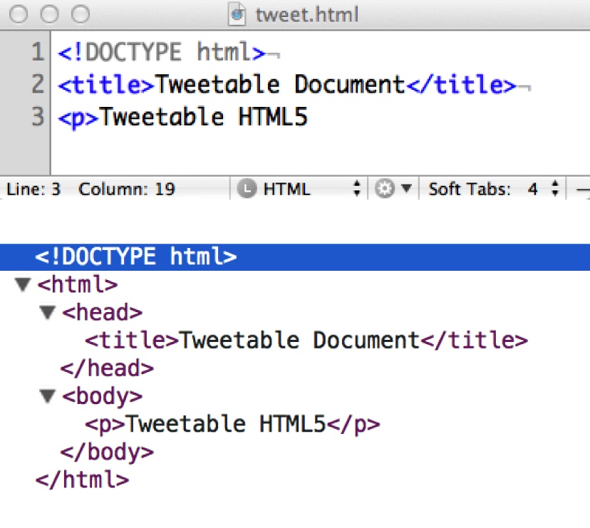
Yes, you can fit an entire HTML5 document inside a 140-character tweet. Just because you can omit what were once three of the only five required elements on a page doesn’t mean you should. For ease of legibility and maintenance, especially by others, pick a coding style and stick with it: preferably code in XHTML-style syntax, and include the five elements.
Let’s look at the five “required” components in greater detail.
The Document Type Declaration
The Document Type Declaration, doctype or DTD, informs the browser what markup syntax you are using so that the browser knows what to expect and how to handle it. This is always the first line that should be sent to the browser, with the exception of the XML prologue, if parsing as XML. The previous example uses HTML5’s DTD, which is the shortest, and the point of this book, but there are others as shown in Table 2-1.
| Page type | Document Type Declaration (DTD) |
HTML 4.01 Transitional |
|
HTML 4.01 Strict |
|
XHTML 1.0 Transitional |
|
XHTML 1.0 Strict |
|
XHTML 1.1 |
|
HTML5 |
|
[a] Like the rest of HTML5, the doctype is not case-sensitive. | |
While you may have been using an XHTML DTD for 10 years, chances are you still copy and paste it into your documents, because you have yet to memorize it. Me too! After typing the HTML5 doctype once, I’ve never had to look it up again.
All modern mobile browsers support all of the HTML and XHTML DTDs, including the new, shorter HTML5 doctype declaration.
If you’re concerned about how your old code will fare with the
new HTML5 doctype, don’t worry.[15] If your web page validated as HTML 4 or XHTML Strict,
your markup is valid HTML5. HTML5-supporting browsers should provide
for backward compatibility of all previous HTML and XHTML versions,
including deprecated elements. However, just because the formerly
deprecated elements are supported by the browser doesn’t mean you
should use them! While <center> and <font> may render as intended, it
doesn’t pass as valid or as good code![16] To ensure consistent, clean, and extensible code, I
recommend using XHTML syntax including quoting all attribute values
and closing all elements. HTML5 allows for lazy coding practices, but
don’t be a lazy coder!
The <html> element
The <html> element is
the root element of an HTML document. While it is optional
in HTML5, it’s required when using XHTML syntax. HTML 4 transitional
does not require the <html>
element, and neither does HTML5, but we want to write good, clean,
standards-compliant code: so, for all intents and purposes, it is
required and is written as shown in Table 2-2.
The <html> element has
two children nested in it: <head> and <body>. It’s good practice (but not
required) to include the lang
attribute in the HTML element.
HTML5 provides for a new attribute on the <html> element. The manifest attribute, when included,
takes as its value the URL of the manifest file.
Application cache, the manifest file, and offline applications are
discussed in Chapter 6.
Some HTML5 script tools like modernizr add classes to the
opening <html> element. This
is completely legal. With the application cache, modernizr script for
feature detection, and a language declaration, my opening <html> tag often looks like
this:
<html lang="en" manifest="cache.appcache" class="no-js">
We covered the lang attribute
earlier. We’ll cover the manifest
attribute in offline and storage in Chapter 6. The no-js class should be included if you are using modernizr[17] to test for native implementation of the various web
technologies discussed in this book.
The <head> element
The <head> of the
document contains important information that, other than the
<title>
element, is not displayed directly in the browser window.[18] While the contents of the <head> are generally not displayed,
most browsers display the title, which is the only required element
for a valid HTML5 document, in the tab or other browser chrome. The
other contents of the <head>
element inform the browser how to render the page and “speaks” to
search engine spiders about the content of the page. In terms of
changes between HTML 4 and HTML5, the never used profile
attribute of the <head>
element is not included in the proposed HTML5 specifications.
<head> is the parent
element for the required <title>, and the optional <style>, <script>, <link>, <meta>, and <base> elements.
The <title> element
The <title> element is
required and must include the closing </title> tag. Your page can validate
without <head>, <body>, or even <html> tags, but will not validate
without the required <title>,
and won’t parse if the closing tag is missing. Your <body> can be empty, and you can
display no content to the user. Even the <title> can contain no text, but it’s
still required!
The contents of the <title> tag should define the overall
content of your document. While the <title> may seem unimportant to the
layout of your web page, the <title> is the most important
element of your document when it comes to search engines.
Note how the contents of the <title> tag appear in the browser
chrome, as seen in Figure 2-3. While this may
be a nonfactor as compared to the <title>’s importance in search engine
optimization (SEO) on the desktop, when you’re looking at the tiny screen
of a cell phone, it can get ugly fast, so choose your title wisely.
The <body> element
We’ve added a <title>,
but we still have a blank web page. All the content that you
want to display on your website needs to be in the body of the page,
encompassed in a single <body> element. The <body> is the second and last of the
two child elements of the root <html> element.
There are several presentational attributes for the body element
that were deprecated in XHTML. HTML5 goes along with that ingenious
XHTML tradition: HTML5 has none of the presentational attributes that
were in HTML 4, like align,
bgcolor, and background and link
coloring, since their functions are better handled by CSS. The only
attributes you will likely be adding to the <body> element are id and class, and lang and dir if necessary.
When viewing the source of a web page, you’ll often encounter
event handlers in the opening <body> tag, such as onload="doSomething();". In general, you should only be adding global attributes,
such as class or id, to the opening <body> tag. Event handlers should be in your external
JavaScript file, and styling should be in your external CSS
file.
Our first, bare-bones HTML5 document could be coded like the following, with the only noticeable differences being the character set (described later) and the document type declaration:
<!DOCTYPE html>
<html>
<meta charset="UTF-8"/>
 <head>
  <title>My First HTML5 Web Page</title>
 </head>
<body>
</body>
</html>
And with those six components (DTD, <html> root, <head>,
<meta> character set, <title> element,
and the <body> element),
we’ve created a web page—a blank web page, but a web page nonetheless.
And, with relevant contents in the <title> element, our blank web page is
more findable by search engines than many sites on the Web.
As I mentioned earlier, you don’t even need that many elements:
<!DOCTYPE html>
<meta charset="utf-8">
<title> My First HTML5 Web Page </title>
<p> Hello World
While this is a valid HTML5 document, it’s not good practice. By being more explicit in your code, developers that maintain your code later, including yourself, will be better able to grok your code’s original intentions.
Elements Found in the <head>
The <head> may be
the least sexy part of the web page markup, as it’s not
visible to the user by default. But just because it’s not sexy doesn’t
mean you’re allowed to neglect it. The head of the web document is where
you, as a developer, tell the browser how to render your page, and where
you can give hints to the printer, the search engine, and parser on how
the content should be handled.
In the <head>, you will
always find the <title>, but
you may also come across <meta>, <base>, <link>, <script>, <style>, <command>, and <noscript> tags.
Here is what a really busy head section could look like:
<head>
<meta charset="UTF-8"/>
<title>Mobile HTML5</title>
<meta name="author" content="Estelle Weyl"/>
<meta name="publisher" content="O'Reilly"/>
<meta name="copyright" content="Copyright 2013"/>
<meta http-equiv="date" content="Mon, 18 Nov 2013 16:15:30 GMT"/>
<meta http-equiv="date-modified"
    content="11/18/2013" scheme="MM/DD/YYYY"/>
<meta name="keywords" content="html5 css3 svg
    border-radius canvas audio iphone android ipad"/>
<meta name="description" content="Moving from desktop to mobile:
    Learning CSS3 and HTML5."/>
<meta name="pagetopic" content="Internet"/>
<meta name="page-type" content="Instruction"/>
<meta name="audience" content="all"/>
<meta name="robots" content="index,follow"/>
<meta name="generator" content="Sublime"/>
<meta name="apple-mobile-web-app-capable" content="yes"/>
<meta name="apple-mobile-web-app-status-bar-style" content="black">
<base href="http://www.standardista.com/"/>
<script src="/js/application.js"></script>
<link rel="apple-touch-icon" href="touch-icon-iphone.png"/>
<link rel="apple-touch-icon" sizes="72x72"
    href="touch-icon-ipad.png"/>
<link rel="apple-touch-icon" sizes="114x114"
    href="touch-icon-iphone4.png"/>
<link href="/css/prettification.css" media="all" rel="stylesheet"/>
<link href="/css/tinylittledevice.css" media="only screen and
    (max-device-width: 480px)" rel="stylesheet"/>
<link href="/css/print.css" media="print" rel="stylesheet"/>
<style>
     p {color: #333333;}
</style>
</head>
That is a verbose header, and yours should never look like this, but you should understand it. So, what does it all mean? Let’s take a look...
<meta>: Adding Metadata
The <meta> element
allows web developers to include various types of metadata
on their pages by specifying a property and a value. There are four
attributes specific to <meta>:
charset, http-equiv, content, and name.
<meta charset=“UTF-8”>
The first <meta>
element we’ll cover is the one you’re likely to use in every
HTML5 document you create:
<meta charset="utf-8"/>
You’ve likely been adding:
<meta http-equiv="Content-Type" content="text/html; charset=utf-8"/>
to your documents for years, telling the browser to treat the page as HTML and to use the UTF-8 character set in case your server’s HTTP headers are not configured to set the charset.
While the <title>
element was supposed to be the first element after the opening
<head> tag, we made an
exception for the character set declaration, as we wanted to be sure
the rendering agent knew which charset to render before characters got
rendered. While new to HTML5, this is supported in all major browsers,
since browsers have been supporting the erroneously unquoted meta:
<meta http-equiv=Content-Type content=text/html; charset=utf-8>
Note that in this incorrectly written <meta> tag, due to the lack of quotes
and the space in the value of the content attribute, the browser sees
charset as a separate attribute.
This former “error,” supported by all browsers because the error was
so prevalent, is now an implemented part of the HTML5 proposed
specifications.
You can (and should) serve all your files as UTF-8 from the
server. If you’re running Apache, add AddDefaultCharset UTF-8 to your .htaccess
file.
With the exception of charset, the type of <meta> tag is defined by the value of
either the name or the http-equiv attribute value. Other than
charset, each <meta> tag must contain either the
name or
http-equiv attribute
and the content attribute.
Generally, unless you’re trying to generate an HTTP response
message header, a <meta> tag
has the name attribute and a
content attribute, yet the values
of both are basically freeform: you create the value for the name and
the value for the content. We’ll cover the ubiquitous <meta> types first, and then delve
into the more mobile-specific ones.
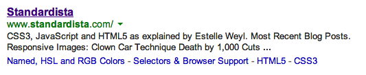
Description meta tag
There are some standard values, including the most important nonmobile-specific one:
description. The content of the "description" <meta> tag is what many
search engines return when your web page is included in search
results. So, make sure your description content value is a well-formed, descriptive
sentence about the contents of the page, including your keywords for
the page (see Figure 2-4):
<meta name="description"
  content="CSS3, JavaScript and HTML5 as explained by Estelle Weyl">
Keyword meta tag
Of all the <meta> tags,
the "keyword" is the most famous. However, since the abuse of the "keyword" meta tag by spammers last
millennium, search engines don’t place high value on its content. You
can feel free to include keyword metadata, but don’t rely on it for
your search engine efforts:
<meta name="keyword" content="CSS3, HTML5, JavaScript">
<meta http-equiv=“. . .”>
While the <meta>
element with name attribute is fairly freeform, the http-equiv attribute is not. The http-equiv attribute, used instead of
name, can replace the server
creation of an HTTP response message header. The values of the
http-equiv attribute mimic the HTTP
response headers. I created a list of the http-equiv <meta> tag values at
http://www.standardista.com/html5/http-equiv-the-meta-attribute-explained/.
If you have access to the .htaccess file
on your server, use that file to set up your headers. Relying on the
<meta> tag to set your
headers should be your last, not first, resort:
<meta http-equiv="cache-control" content="no-cache" />
Mobile Meta Tags
There are several <meta>
tags that are specifically geared to mobile devices. Among them are
<meta> tags that tell the
browser to take up the entire viewport and disable scaling, and to
change the status bar color, which we will cover in the following
section.
Viewport meta tag
On the desktop, unless you’ve expanded your browser window size beyond the bounds of your monitor, the viewport size is the size of the browser window. On most mobile devices, the scale of the page can be controlled, but the viewport size remains the same, determined by the size of the device’s screen.[19]
The "viewport" <meta>
tag allows us to dictate the logical dimensions and scaling of the
browser viewport window on mobile. In CubeeDoo, our web application,
we’ve used the following meta tag:
<meta name="viewport"
 content="user-scalable=no, width=device-width, initial-scale=1.0"/>
This viewport <meta>
tag is supported on all smartphones and mobile devices, including iOS,
Android, webOS, Windows Phone, and Opera Mobile. By setting the
viewport width equal to device-width, we’re telling the browser to
set the document width to the device width. Duh!
The viewport <meta> tag
supports a comma-delimited list of directives allowing us to dictate
the width, scale, and height of the browser viewport. You can tell the
browser to not allow scaling, or to scale up to a maximum or down to a
minimum value.
width=<num>|device-widthGenerally, you’ll want to use the key term
device-widthto set the viewport width to the width of the device, though numeric values are also valid. The default value differs by browser, but is generally around 980. The minimum value is 200, the maximum 10,000.height=<num>|device-heightSet to
device-height, or a value like 480 for an iPhone 4 or older, defines the viewport height. This value is generally omitted in favor of using only width. For reference, the minimum value is 223.user-scalable=no|yesDetermines whether or not the user can zoom in and out to change the scale of the viewport. Set to
yesto allow scaling andnoto disallow scaling. The default isyes. Setting tonoalso prevents scrolling on data entry. User scaling, if allowed, can be limited by theminimum-scaleandmaximum-scaleproperties of the viewport<meta>.initial-scale=<float>Sets the initial scaling or zoom factor (or multiplier) used for viewing a web page. The default value of 1.0 displays the web page unscaled.
maximum-scale=<float>Sets the user’s maximum limit for scaling or zooming unless
user-scalableis set tono. The maximum value is 10, but can be a float value of 0.25 or larger.minimum-scale=<float>Sets the user’s minimum limit for scaling or zooming a web page. The minimum value is 0.25.
The default width rendered by most mobile browsers is 980 px. By
setting the width to device-width, the user doesn’t
need to zoom in on page load because you served them 980 px width on a
320 px device. We could have set the viewport width to 320 for 320 px
instead of device-width, but then
it would only work correctly on mobile devices of exactly 320 px
width. We are setting the width of the window to the width of the
device, which is optimal: it scales the page proportionally to the
device without the author having to know the width of the device the
user may be using.
However, this isn’t necessarily optimal for all websites, but
rather just for mobile sites and mobile web applications. Then, when
user-scalable is enabled, the user
can zoom in to make the page more legible for those who can’t read
small print.
With CubeeDoo, we are creating a mobile game. When playing, the user will be touching the screen. We do not want our users to accidentally scale the page up or down while trying to flip a tile, so we told the browser to make the game the full width of the screen and to not allow scaling. Had we been creating a website instead of an app, we would have allowed user scaling without limits for better usability, which we do in our language picker:
<meta name="viewport" content="user-scalable=yes,
     width=device-width, initial-scale=1.0"/>
The function of the viewport <meta> tag really is presentation, and
was never part of any specifications; rather, it’s a feature initiated
by Apple. The specification to convert the functionality from HTML
markup to CSS with @viewport is
well under way, and is partially supported in IE10.
Mobile Vendor-Specific Values
There are also some mobile vendor-specific values: for example, Google and Apple have created their own meta name/value pairs for integrating with some of their services/APIs. There are three such tags that we have used in our project, which we cover in the following sections.
apple-mobile-web-app-capable
This <meta> tag reads
“apple” but is also supported on Android; it sets whether a web
application runs in fullscreen mode. When run in fullscreen mode, none
of the browser chrome shows. The browser takes up the whole screen,
with just the phone’s status bar showing. This <meta> tag only affects the web
application if the site has been bookmarked. We’ve included this
<meta> tag in our web app so
that if the user chooses to bookmark our application, we can take up
as much real estate as possible:
<meta name="apple-mobile-web-app-capable" content="yes"/>
If content is set to yes, the
web application runs in fullscreen mode; otherwise, it does
not.
You can use JavaScript to determine whether a web page is
displayed in fullscreen mode by using the Boolean
window.navigator.standalone
read-only property.
apple-mobile-web-app-status-bar-style
As noted previously, even when you enable full-screen mode with apple-mobile-web-app-capable, the status bar
still shows. It is the one element on the mobile device that
developers cannot remove, even with native web applications. Few
people know, however, that you do have some control over the status
bar’s appearance, even if that control is minimal: we can impact its
color and transparency with the apple-mobile-web-app-status-bar-style
<meta> tag:
<meta name="apple-mobile-web-app-status-bar-style" content="black"/>
If your web app is mostly black, making the status bar match may
enhance your design and make your web app look more like a native
application. The iOS values for this are default, black, and black-translucent. Unfortunately (or
fortunately, considering some people’s lack of taste), these are
currently your only options.
format-detection
The format-detection mobile
<meta> tag enables or
disables automatic detection of possible phone numbers
in a web page:
<meta name="format-detection" content="telephone=no"/>
By default, some devices automatically detect strings formatted
like phone numbers, creating links where none existed that allow for
direct calling, or at least the launch of the phone application with
the phone number pre-entered. Specifying telephone="no" disables this feature.
We have no phone number in our application, or anything that resembles
a phone number, so we are not employing this <meta> tag in our application.
The <base> of Your Web Page
Almost never used, <base>
can be really helpful when it comes to local testing. The
<base> element gives a base URL
for de-referencing relative URLs. For example, suppose you have a
relative image in your code such as <img
src="image/drongo.gif" alt="Meandering Racket-Tailed
Drongo"/>. By including the <base
src="http://RacketTailedDrongo.com"/>, the browser will go
to the image directory on the
RacketTailedDrongo.com server to find
drongo.gif.[20]
The base URL may be overridden by an HTTP header, but it’s
generally helpful for local testing. Try saving a file from the Web onto
your hard drive. Add a base pointer to the
originating server in the <head> of the file. When you open the
page locally, the page will likely render correctly on your desktop,
even though the file is local and you never downloaded images or changed
the path of a file in the body of your page. The syntax is:
<base href="http://www.mydomain.com"/>
<link>s Aren’t Just for Stylesheets
The <link> element gets
no credit. It’s a powerful, often included but rarely
considered element. The <link>
element provides the ability to define relationships among your HTML
document and other documents and resources. <link> can be used to control print
rendering, to link stylesheets and scripts, to define favicons, or to
provide alternative forms of the current document.
We have four link tags in our web application:
<link rel="icon" href="/appleicon.png"/><link rel="apple-touch-icon" href="/appleicon.png"/> <link rel="apple-touch-startup-image" href="startup.png"/> <link rel="stylesheet" href="styles.css"/>
-
Add
rel="shortcut icon"for IE, which requires the “shortcut” term when favicon is not named favico.ico or not stored at site root.
The <link> element can
include several attributes: href,
rel, type, sizes, hreflang, media, and title. The rev and charset attributes have both been removed from
<link> in HTML5. Here’s the
syntax:
<link href="url to resource" rel="type of relationship" title="title"/>
The rel attribute specifies the
named relationship from the current document to the resource specified
by the href attribute. Both the
rel and href attributes are
required.
Of our four <link> tags,
the first three are for imagery and the fourth you are likely most
familiar with: linking to stylesheets.
Add <link>s for your stylesheets
This powerful little <link> element can be used to send different stylesheets to a phone,
tablet, and desktop. It can be used to serve up different stylesheets
depending on the tilt of any type of mobile phone or the width of the
user’s browser.
While we’ve only included one stylesheet in our web application, we could have included several, each targeting differing or overlapping media, browser sizes, DPIs, or even browser orientations:
<link href="/css/styles.css" media="all" rel="stylesheet"/>
<link href="/css/tinylittledevice.css"
  media="only screen and (max-device-width: 480px)" rel="stylesheet"/>
<link href="/css/print.css" media="print" rel="stylesheet"/>
These examples should look familiar, with perhaps two
exceptions. Note that the type="text/css" attribute/value pair is
missing. There is currently no other type of stylesheet language (nor
do I see any forthcoming), so HTML5 assumes that the type is text/css, and explicitly stating it is not
necessary. Also, media="only screen and
(max-device-width: 480px)" may be new to you. We’ll quickly
cover that attribute, along with the other attributes of the <link> tag, in the following sections,
and go into deeper detail on media queries in Chapter 7.
Attributes of the <link> tag
Like almost all elements, the <link> tag accepts all of the global attributes. Shown in Table 2-3 are the other attributes
of the <link> element.
The media attribute
The media attribute describes
for which media the contents of the link will be included. If not
declared, the default is all,
indicating that the source described by the href attribute will always be
present.
Values used to be fairly limited, with values such as screen for desktops and print for printers, etc. Values for media
included: screen, tty, tv,
projection, handheld, print, braille, aural, and all. Now you can include @media queries. The media attribute value has been greatly
expanded with CSS3. We can now serve up different stylesheets based on
more esoteric values of the media property. For
example, mobile device flipping and desktop browser resizing will
change the screen aspect ratio from portrait to landscape and back
again, so you can serve different CSS files when in portrait versus
when in landscape mode:
<link rel="stylesheet" media="all and (orientation:portrait)" href="prtrt.css"/>
<link rel="stylesheet" media="all and (orientation:landscape)" href="lndscp.css"/>
The @media queries that are
new in CSS3 are acceptable values for the media attribute. Newly accepted key terms in
the attribute values include:
(min/max)-width: Viewport width(min/max)-height: Viewport height(min/max)-device-width: Screen width(min/max)-device-height: Screen heightorientation: Portrait(h>w) | landscape(w>h)(min/max)-aspect-ratio: Width/height(min/max)-device-aspect-ratio: Device-width/height
Several <link>
attributes that were in HTML 4 have since been removed from the HTML5
spec, including the coords,
shape, urn, target, charset, methods, and rev attributes. Also, the title attribute has special semantics on
this element.
The rel attribute
The rel attribute specifies the named relationship from the current
document to the resource specified by the href attribute. The rel attribute is stated as being optional,
but if you don’t include it, your browser will not correctly link the
resource to your document. A stylesheet link without rel="stylesheet" will not correctly render
any styles: your browser will just download the file and think “Well,
that was a waste of bandwidth.” (Yes, browsers can think, and they
make fun of us all the time.) Table 2-4
lists some values of the rel
attribute along with the value’s definition.
rel attribute
| Definition of
|
| The most commonly used
value of the When including |
| The link references the next document in a guided tour or next document in an ordered series. The spec was originally meant to aid in the preloading of the subsequent file, improving user experience. |
| The link references the previous document in a guided tour or previous document in an ordered series. |
| Index for the document. |
| The link references a document offering help, (e.g., describing the wider context and offering further links to relevant documents). This is aimed at reorienting users who have lost their way. |
| Links to a document containing a table of contents for the document or site. |
| Specifies an alternate
version of the document. When used in conjunction with the
|
| References a copyright statement for the document or site. |
| A document with definitions of terms used in the current document. |
| The favicon for the page or website. |
| Defines which icon is displayed on the user’s screen when a web application is bookmarked and added to the screen. |
| A startup image that is displayed while the web application launches. This is especially useful when your web application is offline. If not included, some browsers will display a screenshot of the web application the last time it was accessed. |
Android and iOS both support the apple-touch-icon and apple-touch-startup-image. Windows Phone has
tiles instead of icons. To include tile information, include:
<meta name="msapplication-TileColor" content="#<color>"/>
<meta name="msapplication-TileImage" content="<image reference>"/>
<style>
The <style> element
provides a method for you to add styles to a document. Unlike
styles imported via the <link> element, the styles included in
the <style> tag in the head
of the page are applied to the current page only, and are therefore
not natively accessible in the cache for other documents to use.
Unlike styles added using the style
attribute on an element, which only impact the element on which the
attribute is placed until the scoped attribute is supported, styles
included within <style> are
applicable to the matched selectors in the entire document.
The <style> element
used to require the type attribute
(generally, type="text/css"). It
can be omitted in HTML5, in which case its presence with the value of
"text/css" is implied. Like the
<link> tag, the <style> accepts the media attribute.
New in HTML5, but not yet supported in any browser, is
the scoped attribute.
Adding the scoped attribute to the
<style> element tells the
rendering agent to apply that CSS only within the scope, or section,
in which that style is found. This will be useful when creating
widgets appearing on sites over which you may have no control,
ensuring that the CSS for your widget doesn’t accidentally overwrite
the hosting website’s CSS.
<style> and mobile performance: standards anti-pattern
For the past 12 years, it has always been recommended to use <link> to include site-wide styles
instead of <style>.
Including CSS via <style>
may reduce the number of HTTP requests, but it does not allow for
caching. This is obviously not optimal.
Due to latency issues of extra HTTP requests, a mobile anti-pattern has emerged.
To reduce latency, the site CSS is included inline in the main
response inside one or more style tags. With JavaScript, the content
of the style blocks are extracted
and saved in localStorage, and the key values are added to the
cookie string. Additional HTTP requests include the cookie with the
names of the styles (and other resources) that are stored in
localStorage. Server side, the server reads the cookie, checks which
resources (if any) are still needed, then sends along only the files
that are not yet in localStorage embedded in the one response. This
results in a large download on first request, and much smaller
downloads on subsequent requests, with the original site load and
all subsequent site reloads being a single HTTP request and
response.
While this is an anti-pattern, reducing the number of HTTP requests can greatly improve performance. The improvement in performance can well outweigh the costs of sending a fairly large file (with content that was required anyway) and the cost of accessing data stored in localStorage.
Adding a <script> to your web page
The <script> tag allows
you to include blocks of JavaScript or link to an external
JavaScript (or other script type) file. The type attribute was required in XHTML and was
almost always type="text/javascript". In HTML5, the
type is assumed to be text/javascript. As long as your script is
JavaScript, the type attribute
should be omitted. Also, the language attribute has been made
obsolete.
When src is included, it may
seem like the element is empty, since there is no text between the
opening and closing tags. Include a full closing tag anyhow, and do
not put any JavaScript between those tags.
JavaScript performance tips
Although we are discussing elements within the <head> of the document, the <script> element can be found inside
the <body> or <head> of the document, and
sometimes (usually, really) the end of the body is the best suited
location for the <script>
element.
Why? JavaScript is generally parsed immediately when
downloaded, halting the download of the document in its tracks until
the JavaScript has finished being downloaded, parsed, and executed.
This can greatly slow down the perceived download time of the page.
For this reason, it is recommended to include scripts toward the end
of the document, instead of in the <head>.
Consider your visitors to be non-JavaScript users during the time it takes to download, parse, and execute all the components of your web page. Wouldn’t you prefer them to be looking at some content rather than a blank screen? This is why JavaScript performance and source order matters.
There are two attributes that can alter the order of execution
of the JavaScript: the defer and
async attributes. Both are
Boolean, with async being a new
addition in HTML5. async
indicates that the script should execute asynchronously, when it
becomes available. defer
indicates that the script should execute after the document has
finished parsing. If neither attribute is present, the JavaScript is
parsed when encountered. Both are only valid for external scripts
and invalid for inline scripts.
As stated earlier, JavaScript is parsed immediately when
encountered (unless async and/or
defer are included and supported
by the browser). Browsers stop downloading additional elements from
the server until the JavaScript is fully downloaded, parsed, and
executed. By including the JavaScript at the end of the document
instead of the head, the perceived download
time is much shorter. When the script is in the <head>, the page “hangs” while it
loads and executes the JavaScript. With the <script> in the footer, while it
actually takes the exact same amount of time to download and execute
the script, the perceived download time is much faster as there is
no visible halting in the download.
There is a new solution to the issue of the hanging UI due to slow JavaScript in HTML5. Web workers, described in Chapter 6, enable multiple threads of JavaScript to execute concurrently. Dynamically generating the script tag is another trick to improving performance.
When a user has JavaScript turned off, <noscript>
You can include a <noscript>
element with content that is made visible only if the user has
JavaScript disabled. Generally, it’s best to progressively enhance
static functionality of a page, making the <noscript> obsolete. However, there
are some project managers that insist on sites completely reliant on
JavaScript. In these cases, you can use <noscript> in the body of the document
to include directions to your user to turn JavaScript back on.
JavaScript is by default enabled in all mobile browsers and other
modern browsers, including mobile WebKit, Blink, Opera Mobile,
Windows, and Firefox.
A <body> of elements
The <body> is always
the second and last child of the <html> element, the first child being
the <head>. Everything
displayed to the user within the main window of the browser is found
within the <body> element.
While the <head> contains all
the metadata for the page, the
<body> contains all the
visible (and occasionally some nonvisible) content.
The next chapter discusses the elements that are actually
displayed to the client: the <body> element and all of its
children. As mentioned earlier in the discussion of required elements,
the <body> has no
element-specific attributes, but has many event handlers, including:
onafterprintonbeforeprintonbeforeunloadonbluronerroronfocusonhashchangeonloadonmessageonofflineononlineonpopstateonredoonresizeonstorageonundoonunload
It is best to include these event handlers within your external
JavaScript and not within the <body> element. I’ve included them
here so that you know what is available, but I highly recommend and
completely encourage you to keep content separate from presentation
separate from behavior.
[12] See http://www.w3.org/TR/html5-diff/ for changed elements and attributes, as well as obsolete elements and attributes.
[13] Boolean attributes are attributes that are either true if set
or false if not. XHTML examples include readonly="readonly", checked="checked", and disabled="disabled", which in HTML5 can
(and should) be written as readonly, checked, or disabled, respectively.
[14] Values defined in the specifications are generally not case-sensitive, but strings that you define, such as IDs and class names, are case-sensitive.
[15] The HTML5 DTD throws older IE desktop browsers into quirks mode.
[16] Obsolete features are listed at http://bit.ly/16t5Z6L.
[17] modernizr is a JavaScript library that feature detects HTML5 and CSS3 browser support in your users’ browsers.
[18] It is possible to display the contents of the <head> to the user with
CSS.
[19] On most smaller devices, the browser is automatically fullscreen and not user changeable. On some devices, like the Slate tablet, the browser is resizable.
[20] If you’re wondering why I keep referencing the Racket-tailed Drongo, it’s the bird on the cover of this book.