Chapter 7. Upgrading to CSS3
CSS3 has been in the works for over a decade. WebKit/Blink, Opera, and Firefox have been supporting some features for a long time now. With IE10 and IE11, we’re almost there! It’s time we took advantage of some awesome new (and sometimes not so new) features. Especially when it comes to CSS selector support, mobile browsers are there.
When you don’t have to worry about older versions of Internet Explorer (IE8 and earlier), you can use any CSS3 selector. All of them are supported in all modern browsers, and all of them are supported on all smartphone and tablet browsers.
The CSS2 specifications were adopted in 1998. CSS3 has been in development since then. The CSS3 specifications are still in development, and will likely never be finalized.
“Huh?” you ask. CSS 2.1 and earlier specifications were monolithic specifications. CSS3 is an umbrella term for all specifications after CSS 2.1. Instead of a monolithic specification, there are now modules for each CSS component, and new modules and new features keep getting added. Some of these specifications, like colors and selectors, are level 3, with work having commenced on level 4. Other specifications are at level 1. All of these modules, whatever the level, are under the umbrella called “CSS3.” Each module goes through the spec writing and finalization process at its own pace.
WebKit/Blink, Opera, and Mozilla have not waited for module specifications to be finalized. With Internet Explorer 9, Microsoft finally joined the game. Most of the recommended features have been part of the draft specifications for years. In most areas, the recommended specifications are stable enough that most browser developers have begun implementing these CSS3 features.
While web developers may still have to ensure graceful degradation of our websites on the desktop for the various IEs, the ubiquity of CSS3 and HTML5 support in the mobile market and on non-Windows operating systems (think PlayStation, Wii, etc.) means we’re not just playing with these technologies, we can implement them. We are reaching millions, even billions, of people through HTML5 and CSS3 supportive browsers, which are the default browsers of most mobile phones, tablets, and almost all other non-Windows desktop OS-based devices.
In this chapter, we’ll cover CSS selectors, and how to use selectors to target DOM nodes in JavaScript (without jQuery).
We’ll first give a brief overview of the CSS3 syntax, which is the same as the syntax of previous CSS recommendations. Then we’ll take an in-depth look at CSS3 selectors, selectors that enable semantic targeting of elements in HTML documents, including targeting any element in your document without touching the HTML or adding a class or ID, before diving into query selectors.
CSS: A Definition and Syntax
Before diving into CSS3, you need to know the basics of creating a CSS rule set. We will cover the syntax briefly for those who may be new to CSS, and then dive into some very advanced element targeting with CSS selectors.
First off, we need to know what CSS means.
Cascading Style Sheets, or CSS, make up the presentational layer of the Web. With CSS, you can define the look and feel of your site in one location, and that one file can impact the look and feel of your entire site. If there is a design change, with CSS, you can make a change to the one presentational file, and that change will be immediately apparent site wide. When your boss or other client says, “You know what, I changed my mind ... let’s make the links purple instead of green,” with a correctly coded site using an external CSS file, that change can take one minute. It doesn’t matter if your site has one page of HTML or one million. Change one line in your CSS file, and you can successfully update the appearance of all your web pages.
In earlier versions of HTML there were a series of presentational
elements, such as <font> and
<center>, which were used to
enable webmasters to design sites. For proper web standards, however, the
content layer, or HTML, should be separate from the presentational layer
(the CSS) and from the behavioral layer (the JavaScript). Had you used
<font color="green">, the request
to change to purple would be a challenge. You would have to update every
occurrence of color="green" in every
web page.
Using elements for presentation is so 1996! In fact, many of these
presentational elements that were commonly used in 1996 have been
deprecated or made obsolete in favor of using CSS for presentation.
Don’t use <center>,
<b>, <i>,[41] <font>, <tt>, or other presentational elements for
presentational effect, even if not obsolete. Instead, use CSS. Here’s
how...
CSS Syntax
Before implementing rules with selectors, properties, and values, we need to learn the syntax. Stylesheets are made up of rules, which are selectors followed by a block statement with properties and values. Most CSS rules look similar to this:
selector {
  property1: value1;
  property2: value2;
}
The selector tells the browser what element(s) to match. The property is the feature of the element that you want to affect, and the value is a value that you want to set for that property of that element.
Properties support specific value types and/or value keywords, which we discuss in Chapter 8.
CSS selectors enable you to target elements in your markup with the styles you define in the style declaration block. The style declaration block consists of the properties and values between the curly braces. All the properties and values for a rule are encased in curly braces, creating a declaration block:
p {
  color: blue;
  margin-bottom: 12px;
}
The statement reads: “paragraphs should have blue text and have a margin of 12 pixels below it.”
Note that in this example, values and properties are separated by a colon and each declaration ends with a semicolon.
The semicolon on the last declaration in a block is officially optional, but don’t omit it! You may save a few characters by not including the optional final semicolon, but since a single missing required semicolon, parentheses, or curly brace can make the rest of your stylesheet fail, I highly recommend always including the final optional semicolon. The bandwidth cost of including it is chump change compared to the time you may have to spend troubleshooting failing CSS caused by a missing character.
CSS styles impact the element that is targeted by the selector. Elements can be targeted generally, by their element name, or with exacting precision by defining elements based on their relationships to other elements, their position in the document flow, their attributes, attribute values, current state, or through unique IDs. We’ll cover all the selectors in the next section.
A style like this one can be put into one of three locations: inline, in embedded styles, or in an external stylesheet.
Styles can be declared as an inline style as
part of the opening <p> tag
using the style attribute:
<p style="color:blue; margin-bottom: 12px;">
Styles can be embedded within the head of the document:
<style>
  p {
    color: blue;
    margin-bottom: 12px;
  }
</style>
Note
Note that we write <style> and not <style type="text/css"> in the
examples given here. In HTML5, type="text/css" is implied and therefore
omittable.
Styles can, and should, be included
in an external stylesheet, linked to
using the <link>
element:
<link rel="stylesheet" src="styles.css"/>
Best practices recommend using external stylesheets. By using an
external stylesheet, you can link all of your web pages to a single
stylesheet, ensuring that all your pages have the same look and feel,
and reducing site maintenance as design changes can be made to the whole
site by editing a single file. Use <link> rather than @import to download your stylesheets in
parallel for faster load time.
By using an external stylesheet, the styles for the site only have to be downloaded once: on the users’ initial visit to any page within your site. The CSS file is generally cached by the client browser. Therefore, the bytes of the CSS are only downloaded once. Also, keeping your style information in a separate document separates your content from your presentation. Separating content from presentation from behavior is a key tenet in web standards.
While best practices dictate using external stylesheets, due to
issues of mobile network latency, the anti-pattern of including embedded styles and storing the
style in local storage have the benefit of reducing HTTP requests. This
topic was discussed in Chapter 2 when we
covered the <style> element.
Whether you link to your styles or you embed them as part of the
anti-pattern, do ensure that you reduce the number of lookups and HTTP
requests.
Using External Stylesheets: <link> Revisited
To include an external stylesheet, we employ the <link> element. We discussed the
<link> tag in Chapter 2, so I won’t reiterate all the attributes
and values. Instead, let’s look at the attributes and values that are
relevant to CSS. The points that do require emphasis include the
attributes found in the external stylesheet link:
<link type="text/css" rel="stylesheet" src="styles.css" media="all"/>
In XHTML, the type
attribute defining the MIME type as type="text/css" was required. This supposedly
informed the browser that the linked file is text (not an application or
binary), with CSS markup. As noted previously, this attribute is not
required in HTML5, unless you are using something other than CSS, which
you won’t likely be doing. Ever. When the relation, or rel, is set to
"stylesheet", the type is assumed to be test/css unless otherwise indicated, and the
default of media is "all":
<link rel="stylesheet" src="styles.css"/>
Don’t forget to include the rel
attribute written as the rel="stylesheet" attribute/value pair. Without
this attribute, the browser won’t know the purpose of your file and will
not render it as CSS. If your CSS fails to render, check to make sure
you included this attribute. This is the cause of many headaches: hard
to spot but easy to resolve. The rel
attribute value tells the browser what relation the linked file has to
the file.
When present and set to "stylesheet", the type is
implied, and the browser knows to parse the content of the file as
text/css.
The src (or source) attribute should have a URL as its value, pointing to the
external stylesheet containing your CSS.
The <link> element is an
empty element. If you are using an XHTML-styled markup, you can
self-close it with a slash before the closing bracket.
The media attribute
The media attribute, if not
included, defaults to media="all", which means all media. The main
values that have been part of CSS for years are:
allRendered for all devices, including all types listed here.
brailleRendered only for Braille tactile-feedback devices.
embossedPaged Braille printers.
handheldIntended for handheld devices, usually with small screen and limited bandwidth. Note that although smartphones and the iPad are handheld devices, they have full-featured browsers and respond to
screenandall, and not tohandheld.printRendered by printers, PDFs, and the “print preview” mode of most browsers.
projectionIntended for projectors and other projected presentations.
screenColor computer screens, including laptop, desktop, and smartphone browsers, including devices like phones, tablets, and phablets.
speechIntended for speech synthesizers. Note: CSS 2 had a similar media type called
auralfor this purpose.ttyIntended for media using a fixed-pitch character grid (such as teletypes, terminals, or portable devices with limited display capabilities).
tvIntended for television-type devices, when there is sound but no ability to scroll.
As noted earlier, smartphones have full browsers, and therefore
implement linked stylesheets that have the attribute media="screen", media="all", and no media declarations, as
the default is all.
You can use a single stylesheet without the media declaration,
and target different types using @media:
@media screen {
 p {
  color: blue;
 }
}

@media print {
 p {
  color: red;
 }
}
Media Queries
In CSS3, the media attribute is
not limited to the values in the preceding list. Media
queries allow us to target CSS to a device or browser based on the
height, width, resolution, and orientation of the browser window or
device, or, in the case of SVG, to the parent container. If you want to
use the same HTML page but different stylesheets for smartphones,
tablets, and desktop web browsers, you can use the media attribute to indicate which CSS file
should be rendered in different-sized screens:
<link media="only screen and (max-device-width: 480px)"
  href="mobile.css" rel="stylesheet"/>
While there are many device properties with which we can target devices and browsers to style, the most common properties are shown in Table 7-1.
Property | Minimum property | Maximum property | Description |
|
|
| |
|
|
| |
|
|
| |
|
|
| |
| |||
|
|
| |
|
|
|
You can target a device specifically; for example, you can target an iPhone in portrait mode specifically with:
<link media="only screen and (width: 320px) and (orientation: portrait)"
  href="iphone.css" rel="stylesheet"/>
However, this is a bad idea. Mobile devices come in all shapes and sizes...well, at least all sizes. Instead of defining a separate stylesheet for every possible device of every pixel width and height, create media queries with ranges of sizes, creating breakpoints where a change in layout might make sense. For example, it may make sense to put your extended navigation bar on top for a tablet user, but better to put the content above the extended navigation on a very small device so the user doesn’t have to scroll to get the important content.
Media queries can be used to provide different CSS property values based on device and viewport size and orientation. For example, media queries can (and often should) be used to serve different media to different screen sizes. There is no reason to serve a 1,400 px wide image to a 320 px wide phone:[42]
@media screen and (min-width: 440px) {
    #content { background-image: url(/images/small/bg.jpg);
}
@media screen and (min-width: 1000px) {
    #content { background-image: url(/images/large/bg.jpg);
}
Note that in these @media
blocks we used two widths that are not necessarily standard device
widths. When choosing breakpoints in your designs and markup, don’t pick
breakpoints based on popular device sizes. Rather, pick breakpoints that
make sense in terms of your user interface design. The quickest method
for choosing breakpoints is to test them in browsers. Slowly grow or
shrink your screen on your desktop. When the design starts to look bad,
that is a good place for a breakpoint.
We’ll discuss @media and
responsive features further in Chapter 11.
In addition to targeting based on size and orientation, you can also target based on a browser’s support of animation, transitions, and 3D transforms with:
@media screen and (transform-3d) {
 .transforms {}
}
Here the property in the parentheses may need to be vendor prefixed in browsers that still require prefixing from the aforementioned three properties.
Browsers will eventually support @supports:
@supports (display: table-cell) and (display: list-item) {
 .query .supports { display: block; }
}
Where the supports query, similar to the media query, can target CSS to different devices based on browser CSS feature support. However, at the time of this writing, this feature has some desktop browser support, but no mobile browser support.
window.matchMedia
CSSOM, the CSS Object Model, provides us with extensions to the
window interface. window.matchMedia, when supported,[43] returns a new MediaQueryList (mql) object representing the
parsed results of the specified media query string that has a matches property:
var mql = window.matchMedia(mediaquery);
if (mql.matches) {
    //if it matches the media query
}
Where mediaquery is a media
query.
For example, you can test to see if the viewport is less than 500 px wide:
var mqobj = window.matchMedia('(orientation: portrait)');
if (mqobj.matches) {
    document.querySelector('body').classList.add('portrait');
}

if (window.matchMedia("(max-width: 500px)").matches) {
 // the view port is no more than 500 pixels wide
} else {
 // the view port is more than 500 pixels wide
}
We are also provided with a way to listen to media change events. We can test to see if the orientation is currently in portrait or landscape mode, and listen for changes:
var mqobj = window.matchMedia('(orientation: portrait)');
mqobj.addEventListener('orientationchange', bodyOrientationClass);

function bodyOrientationClass() {
 if (mqobj.matches) {  // orientation is portrait
    document.querySelector('body').classList.remove('landscape');
    document.querySelector('body').classList.add('portrait');
 } else {
    document.querySelector('body').classList.remove('portrait');
    document.querySelector('body').classList.add('landscape');
 }
}
We first create a media query list object and include an
addEventListener listener method of
the media query list object, which calls a function to respond to the
event. I’ve included a function that checks to see if it matches the
media query, and handles it.
We can remove the listener with:
myobj.removeEventListener('orientationchange', bodyOrientationClass);CSS Best Practices
In order to maintain quality and improve download speed for your site, here are five tips (or rules!) to put in your tool belt that will enable you to write better CSS.
1. Minimize HTTP requests
To improve download speed, minimize the number of separate stylesheets to minimize the number of HTTP requests. The overhead of an HTTP request can be extreme. Reducing the number of requests can dramatically reduce a page’s download time.
HTTP requests are often the largest time consumer in terms of download time, especially over mobile networks. As such, it is generally better to include one longer stylesheet that includes all the styles for your site rather than several smaller stylesheets, each styling a component of your site.
While it may be beneficial to modularize your styles within your stylesheet, with styles for each “module” of your website grouped together, in production, serve all of your CSS in one longer file. Instead of having style.css, home.css, about.css, footer.css, sidebar.css, etc., include a single all.css.
Downloading and caching one larger CSS file will generally create a better user experience than having the client download page-specific stylesheets, even if those page-specific stylesheets are smaller. The cost of making an extra HTTP request is oftentimes greater than the cost of having a few lines of unused CSS. Additionally, by using a single CSS file, all of your styles for the entire site are cached when the first page’s content is downloaded: no waiting for additional CSS files to download as the user navigates through your website.
That being said, note that mobile memory is more limited than desktop device memory, so don’t go crazy with super large file sizes. While I recommend server-side preprocessors, like Sass, to help make writing CSS easier and faster, if you don’t know what you’re doing, your CSS files can become much larger than necessary. If you know what you are doing, these tools can help you modularize and minify your CSS, greatly reducing the bytes needed. Use these tools wisely.
2. Use external stylesheets
Use an external stylesheet, linked to within the <head> of your files. The benefits of
including this single external stylesheet include:
You change your styles for the whole site in one location.
Users download and cache the stylesheet once on their first visit (and don’t have to download it again when they visit a second, third, and fourth page).
Users only have to download your stylesheet once, saving HTTP requests on secondary page visits.
You’re preserving the separation of content from presentation.
While rule number 1 (minimize HTTP requests) may lead one to believe that it is better to embed the CSS and save an HTTP request, the price paid of adding a single HTTP request is generally well worth the benefits of having an external stylesheet (though there is an anti-pattern exception, as noted in Chapter 2). The browser can cache the external stylesheet references by all your pages, so it only has to be downloaded once. Embedded styles, on the other hand, are downloaded with every page.
While the download time cost associated from a single HTTP request is generally less than the cost associated with downloading the bytes of in-page CSS when the second, third, and fourth pages of your site are downloaded, HTTP requests over 3G networks can have a lot of latency. For websites accessed over a tethered network, the extra HTTP request for an external stylesheet is worth it. This isn’t always the case with mobile.
As noted in Chapter 2, some mobile sites use an anti-pattern. They embed the CSS, and even the JavaScript, into the first server response. Then they use JavaScript to extract the embedded scripts and put them into local storage using the localStorage API. By providing each script with a unique ID, the script can be stored, retrieved, and referenced with that unique key. The script identifier is also added to a cookie. On following page loads, as with all HTTP requests, cookies are sent along with the HTTP request, informing the server which scripts the user already has, allowing the server to decide which scripts, if any, to send on subsequent requests. This anti-pattern can lead to a very large download on first page load, with much smaller subsequent requests. While localStorage has some drawbacks, such as the time it takes for the device to access the localStorage data, it can be a viable tool in minimizing HTTP requests, which helps with latency issues in mobile. We discussed localStorage in Chapter 6.
3. Normalize browsers with a CSS reset or normalizer
Browsers come with their own stylesheet called a user agent (UA)
stylesheet. This native stylesheet sets up default styles, such as
italics for <em>, bolding,
and font size increases for <h1-h6>, indenting and bullets on
<li>s. Unfortunately, not all
browsers and not all browser versions come with the same UA
stylesheets. For example, margins on paragraphs and the body change
from browser to browser. It is recommended to start with a
reset[44] or normalizer CSS file to make all browsers behave
similarly: to remove or normalize many of the default styles in favor
of a uniform styling for all browsers.
To normalize, begin your stylesheet with a low specificity setting of baseline styles to remove cross-browser differences in UA stylesheets. By setting defaults, you avoid browser inconsistencies of both current and future browsers.
Even if you are developing your website purely for a single
browser—for example, a single version of WebKit (which, of course, I
recommend against doing)—I still recommend using a CSS
reset/normalizer.[45] I include margin: 0; padding:
0; and background-repeat:
no-repeat; in my reset on most elements. By including these
three lines of markup in my reset, I save hundreds of lines of code by
not having to repeat any of them.
Warning
If you use * in your reset, do so with caution, as you likely don’t want to remove default styling on some elements, like form fields. In addition, it increases memory usage and rendering time.[46]
4. Use the weakest specificity for ease of overwriting
Another recommendation is to use elements and classes in your selectors, rather than IDs. Decreased specificity reduces the number of selectors needed to override a rule. The weaker your specificity, especially when creating your reset and original template, the easier it will be to override a value for one-off styles. Begin by styling the basic HTML tag selectors.
Avoid IDs, as IDs have the greatest value in the cascade. Although ID’d selectors may perform slightly better when it comes to rendering time, the time savings is small. Using IDs limits the target of your CSS to a single subset area, and overriding ID’d styles requires even stronger ID’d specificity. So, although there is a miniscule performance hit, use the least amount of specificity needed in a selector to create more general rules and to better enable overwriting a property value.
Then you can create specific styles for the sections to override the defaults.
For example:
<p id="myP" class="blue">This is
<strong class="warning">important</strong></p>Could be targeted with:
body p#myP.blue strong.warning {
color: red;
}Or simply:
.warning {
color:red;
}We often come across CSS with selectors as specific as the former, but the latter does the trick.
You’re not only saving bytes of code with the latter, but it’s easier to code, read, maintain, and, mostly, override. Imagine if your designer adds a caveat: “If that paragraph is in the sidebar, I want the red to be more chartreuse.” There are two issues here: one, I have no clue what “chartreuse” is. At least I can Google it. The main issue is that to change the color, you have to be even more specific! So:
body aside.sidebar p#myP.blue strong.warning {
color: #7FFF00;
}Or, if you were less specific to begin with:
aside .warning {
color: #7FFF00;
}If you’re using Sass or another compiler, you may find yourself with selectors that are 10 rules deep. As a general rule, I limit my selectors to three deep, which feels like a good balance between performance, specificity, and ease of maintenance.
For more information on CSS Specificity, see Specificity Trumps Cascade: Understanding CSS Specificity and Appendix A.
5. Don’t use inline styles or the !important modifier
That’s it. No explanation required. Inline styles and the !important key term are bad practices. Don’t
use them (other than for prototyping).
If you need an explanation: the !important keyword overrides the cascade for
the property in which the !important declaration is included. A
property value for a selector with low specificity that includes the
!important modifier in a
declaration, that value has greater specificity than any other value
for that same property and cannot be overwritten. For example:
p {color: green !important;}
p#myP {color: blue;}
<p style="color: red" id="myP">In this case, the paragraph text will be green no matter what,
because the !important modifier was
used.
The !important modifier was
added to CSS to enable users to override web author styles. For all
intents and purposes, assume that the !important key term is the domain of your
power users, not you as a developer.
The only time I use !important is for debugging. I add !important temporarily to see if my selector
is hitting my element at all. When the addition of !important doesn’t alter my element as
intended, I realize I have a typo in my selector, or I thought my
<span> was a link <a>, or some similar error.
Note
No matter how specific you are, even with the addition of
!important, you cannot overwrite
an !important in a property
declaration in the UA stylesheet. There aren’t many in most UA
stylesheets, but those property values that include them cannot be
overwritten by your own styles.
The tips listed here are best practices and simplify the efforts of writing CSS. There are several other best practices for creating maintainable stylesheets, such as grouping selectors by section, commenting for future readability, and indenting for current readability, but we won’t delve into the best practices for human readability,[47] as there are “different strokes for different folks.”
The best advice I have is to pick your best practices and stick with them. For example, I don’t care if you use spaces or tabs for indentation, but whatever you choose, stick with it: consistency rules!
CSS Selectors
If you’re familiar with CSS, skip to the section More CSS3 Selectors. If not, we’ll cover the basics. And, even if you are a pro, don’t skip “More CSS3 Selectors.” You may be surprised at how powerful CSS selectors have become.
Selectors are CSS patterns used to determine which style rule blocks apply to which elements in the document tree. Selectors range from simple element types to rich contextual patterns targeting DOM nodes based on attributes, source order, or family tree relations. If all conditions in the pattern are true for a certain element or pseudoelement, rules are applied to that element.
Note
All mobile browsers support the CSS 2.1 and CSS3 selectors discussed in this chapter, as do all desktop browsers, with the exception of IE8 and earlier.
Basic Selectors
If you have any experience with CSS, you likely know how to target elements using element, class, and ID selectors, or a combination of them. These are the most often used type, class, and ID selectors: the basic CSS selectors that were provided to us in the original versions of CSS.
You’ll discover that with CSS3, you can target with incredible precision almost any node in your document, generally without even having to add a class or ID. But first we need to ensure full understanding of the building blocks of CSS.
Type selector
The type selector or element selector will target all elements of a particular type:
a {
color: blue;
}
p {
color: pink;
}
strong {
color: green;
}The preceding CSS dictates that your links will be blue, your paragraphs will be pink, and your strongly emphasized text will be green.
<p>This is a paragraph with an <a href="..."><strong>emphasized</strong> link</a> </p>
In this example, due to nesting, the word “emphasized” will be green, the “link” will be blue and the rest of the paragraph will be pink, unless any of those elements inherit CSS that is more specific and alters the colors.
We can declare multiple elements in a selector group by separating them with a comma, creating a list of type selectors:
p, li {
text-transform: uppercase;
}We declare descendant elements by separating them with a space:
p strong {
color: pink;
}
li a {
color: black;
}If I were to include this CSS, the text in this paragraph, along
with the text in any other paragraph and list item, would be uppercase
and the word “emphasized” would be pink, since the strong element is a descendant of the
<p> element. However, the
word “link” would still be blue, not black, since the <a> is in a
<p> and does not have an <li> as an ancestor.
Warning
Old versions of Internet Explorer do not support the type selector on elements it doesn’t know, including all of the new elements in HTML5. All mobile browsers that you are likely trying to target will render elements they don’t recognize, and understand all CSS3 selectors.
Class selector
The class selector will target all elements with that particular case-sensitive class:
.copyright {
font-size: smaller;
}
.urgent {
font-weight: bold;
color: red;
}
<p class="copyright">This is a paragraph with an
<a href="..."><strong class="urgent">emphasized</strong> link</a>
</p>With the added classes, the entire paragraph will be in a smaller font, and the word “emphasized” will be both bold and red, instead of green. The reason it is red instead of green is because a class selector has more strength or specificity in terms of the cascade.
You can have more than one class on an element in your HTML:
simply separate the class names with a space in the value of the
class attribute. Note that
the order of the classes in the class attribute on any element is not
important: the order of the classes in the stylesheet is what
determines precedence. The following are equal:
<p class="class1 class2">some text</p> <p class="class2 class1">some text</p>
In terms of the cascade, a single class selector has more weight than any number of type selectors.
We could have written:
p.copyright {
font-size: xx-small;
}Then, since there is no space between the p and the class, only paragraphs with a
class of copyright will be xx-small. <li
class="copyright"> would be smaller, but not xx-small, since it is targeted by the
general selector of .copyright, but
not by the more specific p.copyright.
As noted in the best practices section, it is recommended to use
the least amount of specificity to target an element. In this case, it
is recommended to use .copyright
instead of p.copyright. The shorter
selector is less specific, potentially targeting more elements: all
elements with the .copyright class.
Unless you are trying to override just the paragraphs that have this
class, use the selector with the least specificity.
Warning
Class names are case-sensitive: copyright does not equal Copyright or copyRight.
ID selector
The ID selector targets the single element in your document with that particular ID. Remember that IDs are case-sensitive and must be unique in a document:
#divitis {
color: orange;
font-size: larger;
}
<p class="copyright" id="divitis">This is a paragraph with an
<a href=""><strong class="urgent">emphasized</strong> link</a>
</p>In this example, the paragraph will be orange and larger, not
smaller, since ID selectors have more specificity than class
selectors, and therefore overwrite the .copyright and p.copyright selectors.
#divitis a{} is more specific
than .copyright a{} which is more
specific than p a {}, which is more
specific than a {}. See Table 7-2 for a
visualization of the specificity values of type, class, and ID
selectors, and Specificity Trumps Cascade: Understanding CSS Specificity.
In terms of the cascade, a single ID selector has more weight or specificity than any number of class selectors or type selectors, so use them sparingly, if at all. They’re difficult to out-specify. To out-specify an ID selector, you need to write an even more detailed rule that uses the same or greater number of ID selectors.
Warning
Class and ID selectors are case-sensitive. Type selectors are not.
More CSS3 Selectors
Even if you’re familiar with CSS, the following will be useful: there are many tidbits you may not know or may not have considered.
The selector matches the element or item that the CSS will be
applied to. In the era of CSS 2 and desktop support, we’ve been thinking
“element”: we’ve limited ourselves to type, class,
and id selectors, with a smattering of
link-related pseudoclasses, and possibly, though not necessarily wisely,
the universal * selector.
In targeting elements in our stylesheets, let’s stop thinking about element type, and instead focus on the document model. With CSS3 we can more easily target styles based on an element’s position within a document, an element’s relation to other elements, and even an element’s attributes and UI state.
CSS3 greatly expands our horizons and our ability to microtarget
with new attribute selectors, structural selectors, pseudoclasses, and
combinators. Actually, the combinators (described in the next
section)—along with some attribute selectors—were in CSS 2, but only
starting with IE8 did Internet Explorer fully support the CSS 2.1
selectors. Opera, Chrome, Safari, Firefox, and Internet Explorer (starting
with IE9) support all of the CSS 2.1 and CSS3 selectors, with one caveat:
for security reasons, some other browsers have stopped fully supporting
the :link and :visited pseudoclasses of the <a> element.
Note
All mobile (and desktop) browsers, including Opera, Chrome, Safari, Firefox, and Internet Explorer, starting with IE9, support all of the CSS 2.1 and CSS3 selectors.
General Selectors
The general selectors, including the universal selector, type selector, class selector, and ID selectors, have been around since the last millennium.
Universal selector: *
Added in CSS 2, the universal selector matches every element on the page.
The syntax is an asterisk (*):
* {
color: blue;
}
footer * {
color: white;
}A standalone universal selector affects every element, from the
root down to the last child. Instead of using it as a global selector,
narrow the scope with a combinator: target all elements of a known
ancestor, such as all elements contained in your <footer>, but avoid targeting your
entire document. Other unintended consequences can be removing default
styling from form fields.
Type selector: E
The element selector, or type selector, matches all the elements of that type. In your stylesheets, include the tag name only, with no special symbols, to represent that element in the selector:
section, aside, p {
color: red
}Using the Selectors
An element can have more than one class but can only have one ID. If an
id is included in an element, that ID
must be unique for the page:
<p class="firstclass secondclass" id="myparagraph">
This paragraph element can be targeted a multitude of ways, in order of specificity as shown in Table 7-2.
Selector | Explanation | Specificity |
| All paragraphs. | 0-0-1 |
| All elements with that class. | 0-1-0 |
| ||
| All paragraphs that have that class. | 0-1-1 |
| ||
| Any element that has both classes. | 0-2-0 |
| All paragraphs that have both classes. | 0-2-1 |
| The unique element that has that ID. | 1-0-0 |
| The element with that ID, if it’s a paragraph. Otherwise, matches nothing. | 1-0-1 |
| The paragraph with that ID if it has that class. Otherwise, does not match the element with that ID. | 1-1-1 |
p#myparagraph.secondclass | ||
| The paragraph with that
ID if it has both those classes. Otherwise, does not match the
| 1-2-1 |
Be as minimally specific as you need to be! If you can target the element with just a type selector, only use the type selector. If you need to use a class, use just a single class if you can. Less specific selectors target more elements, leading to a more unified site, and are easier to override by using the CSS cascade and/or with minimally increased specificity.
While all the selectors in Table 7-2 are valid, the
last few selectors should rarely, if ever, be used. Because of the high
specificity, I avoid using ID selectors, including the
id attribute on elements generally only in labels,
for targeting with JavaScript, and anchoring. If you start off being as
minimally specific as possible, you’ll never need the last five or six
selectors in Table 7-2.
Relational Selectors: Rules Based on Code Order
We’ve covered classes based on a single element’s type, class, and ID. CSS also enables targeting selectors based on an element’s relationship to other elements.
In the preceding selectors, we were generally using one element, with class and ID to discuss and learn the cascade. In the real world, there isn’t just one element in a page. All elements are either a parent or child of another element (except the root element and text nodes—but they are parents and children, respectively). Most are both. Most elements will have parents, children, and siblings in the markup. In fact, most are the ancestors, descendants, and siblings of a plethora of elements.
CSS provides several relational selectors to help us target elements based on these relationships. For our examples, we’ll use the following code:
<div id="myParent">
<p class="copyright" id="divitis">This is a paragraph with a <a href="...">
<strong class="urgent">strongly emphasized</strong> link</a></p>
<p class="second classitis">This is another paragraph with an
<a href="..."><em>emphasized</em> link</a></p>
</div>Once you’re done reading this chapter, you’ll realize that you can remove all the classes and IDs in this code snippet and still style each element individually.
Descendant combinator: E F
The descendant combinator, symbolically written as E
F, with one or more spaces, is when the selector for element
F is a child or other descendant of
element E. In our prior
example:
p strong {}Targets the
<strong>element that is a descendant of a paragraph, even if it is not a direct child.#myParent a{}Targets both links
<a>since, while not direct children, they are descendants of the element withid="myParent"..copyright .urgent {}Targets the elements with a class of
urgentthat is a descendant of an element with a class ofcopyright.li strong {}Doesn’t target our text, since
<strong>is not a descendant of a list item in our example code.
Child combinator: E > F
The child combinator, symbolically
written E > F, is
a selector in which the selector for element F is the direct child of element E. This is different than the more general
descendant combinator E F,
described earlier, which allows for F being a child, grandchild, or great-,
great-, great-grandchild. The child combinator, with the greater than
symbol (>), requires that the
child F be a
direct child of element E:
div > p {}Matches both paragraphs, as both paragraphs are direct children of the parent
<div>.p > strong {}Does not match anything in our example, since
<strong>is a direct child of<a>, not<p>.
While all mobile browsers support the child selector, and have
for a very long time, few people have been employing it because of the
lack of support in really old desktop browsers. All modern mobile
browsers support all CSS3 selectors, so stop worrying and start using!
Note that while the > symbol is
very handy in being more specific in what you want to target, E F has the same specificity in terms of
weight as E > F.
In CubeeDoo, we make use of the child combinator. When we go up in levels,
our cards shrink in size. To tell the <div>s, which are direct children of
the #board and no other nodes, to
change height based on the class of the board, we can target them
directly without touching the HTML to add classes:
#board > div {
position: relative;
width:23%;
height:23%;
margin: 1%;
float: left;
transform-style: preserve-3d;
transition: 0.25s;
box-shadow: 1px 1px 1px rgba(0,0,0,0.25);
cursor: pointer; /* for desktop */
}
#board.level2 > div {
height: 19%;
}
#board.level3 > div {
height: 15%;
}These property values will affect the card containers, but not the front or back of the cards. We want to define CSS properties for the card container, but don’t want those properties to be applied to the front and back of the card: we want each card to be 23% as wide as the board, which is the viewport. We don’t want the front of the card to only be 23% as wide as a single card though.
We’ve declared them all as <div>s. How can we target a <div> without affecting its descendant
<div>s? By using the child
> combinator to specify a
specific relationship. #board >
div matches only the <div> nodes that are direct children
of #board. The CSS property/values
will not be added to the grandchildren, though some properties, like
color, can be inherited.
All the cards will have a height of 23% because there are four
rows of cards on level 1. However, when the #board has a class of level2 or level3, we overwrite the heights of the
cards to be 19% and 15%, respectively, as the game then has four and
five rows, respectively. If we hadn’t included the child combinator,
the front and back of the cards would have been targeted with the
height declaration as well. Those nested <div>s would be 23%, 19%, or 15% of
the height of their parent <div> or card, or really, really
tiny.
We’ve also used the child selector to target the <footer> that is the direct child of
the <article>, enabling us to
style the main footer and descendants of that footer without also
targeting section footers:
article > footer,
article > footer ul {
text-align: center;
margin: auto;
width: 100%;
}
article > footer li {
float: none;
display: inline-block;
}
article > footer p {
clear: both;
}Adjacent sibling combinator: E + F
The adjacent sibling combinator targets
the second element in the selector if both the elements
separated by the + sign
share the same parent and the targeted element
(F) occurs
immediately after the first element of the
selector (E) in the mark up:
p:first-of-type + p {}Targets the second paragraph, and the second paragraph only, as both paragraphs are direct children of the
<div>, but only if the second paragraph comes immediately after the first with no elements in between.
General sibling combinator: E ~ F
The general sibling combinator is similar
to the adjacent sibling combinator in that it targets
the second element in the selector if both the elements separated by
the ~ (tilde) share the same
parent. However, unlike the adjacent sibling selector, the targeted
element F does not need to occur immediately after
the E in the markup. Instead, it
has to be any sibling F element
that occurs after the first element E. Unlike the adjacent sibling selector, the
general sibling selector can match more than one node.
Table 7-3 recaps the relational selectors and provides some examples.
Attribute Selectors
In Chapter 2, we learned about adding attributes to elements. The nifty thing with CSS is that you can use CSS selectors to target elements based on those attributes, and even the values of those attributes. CSS 2 provided a few very useful attribute selectors. CSS3 adds several more, enabling substring matching of the attribute value.
The CSS 2 attribute selectors include targeting elements that have a specific attribute with any value, attributes that have a specific exact value, attributes whose values contain a specific, space-separated word, and language attributes.
Note the repeated use of the word “specific” in the preceding paragraph. With CSS you can be very precise in targeting specific elements based on their attributes.
To introduce the CSS 2.1 attribute selectors, we will match the following two lines of HTML with the four attribute selector types detailed in Table 7-4:
<ul>
<li><a href="http://x.com/selectors.pdf" hreflang="en-us" rel="nofollow"
title="CSS selectors and browser support">Specifishity</a></li>
<li>
<input type="checkbox" name="spec" id="spec" value="web workers rock"/>
<label for="spec">Are web workers in the specifications?</label>
</li>
</ul>Selector | Example | Description |
|
| Has the attribute, with any value. |
|
| Has the attribute with
the exact value |
|
| Value is exactly |
|
| Matches any space-separated full word in the attribute value. |
[a] The case sensitivity depends on the language and the case sensitivity of the attribute value. The quotes are required if the attribute value within the element would have required the quotes. | ||
Since CSS 2.1, we’ve been able to match selectors based on the mere presence of an attribute, the presence of an attribute with an exact value, the presence of an attribute whose value contains an exact space-separated word, and the presence of an attribute whose value is an exact value, or begins with an exact value followed by a hyphen.
Note that the quotes in the attribute value in these examples are optional. Had there been a space in the value of the attribute selector, quotes would have been required. I prefer to use them since consistency is good, and sometimes they are required: so be consistent and quote your attributes. Also note that the attribute value within the attribute selector is case-sensitive if the attribute value in the HTML was case-sensitive.
The language subcode attribute selector is not well known and a rarely used CSS feature. It is useful for adding visual cues such as language-specific flags as background images or italicizing content in a foreign language.
For an attribute selector such as a[hreflang|=fr], we can target matching links
with a small French flag indicating that the link leads to a page
written in French. Figure 7-1 shows a simple
example of providing cues based on an attribute:
<style>
a[hreflang] {
padding-right: 18px;
background-position: 100% 0;
background-repeat:
        no-repeat;
}
a[hreflang|="en"] {
background-image: url(img/usa.png);
}
a[hreflang|="es"] {
background-image: url(img/esp.png);
}
a[hreflang|=fr] {
background-image: url(img/fra.png);
}
</style>
<ul>
<li><a href="/us/index.html" hreflang="en-us">English</a></li>
<li><a href="/fr/index.html" hreflang="fr-fr">Français</a></li>
<li><a href="/fr/index.html" hreflang="es-es">Español</a></li>
</ul>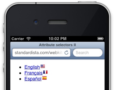
In the body of the page, only links to French language files will
have an hreflang attribute with a
value of fr. By using the attribute
selector to target the language, you don’t have to know where the
element is, what parent the element has, etc. By using attribute
selectors, no matter who or how the website gets updated, proper
elements can get styled correctly. With attribute selectors, you can
target elements via their attributes; no need to muddy up your HTML with
extra classes in such scenarios.
CSS3 added even more powerful attribute selectors, including attribute values that begin with a specific substring, end with the specific substring, and ones that contain a substring anywhere within the attribute value.
Understanding these selectors is quicker with examples. So, rather than describing each of the attribute selectors, we will continue matching the lines of HTML shown rendered in Figure 7-1 with the various attribute selector types. Table 7-5 is a grid of the attribute selectors new to CSS3:
<ul>
<li><a href="http://x.com/selectors.pdf" hreflang="en-us" rel="nofollow"
title="CSS selectors and browser support">Specificity</a></li>
<li>
<input type="checkbox" name="spec" id="spec" value="web workers rock"/>
<label for="spec">Are web workers in the specifications?</label>
</li>
</ul>Selector | Example | Description |
|
| The |
|
| The |
|
| The |
The attribute selectors enable you to target elements with CSS
based on their attributes and attribute values. There are some useful
examples in the preceding list. For example, a[href^=http] targets any fully qualified
URL,[48] and a[href$=".pdf"]
indicates that the link is likely pointing to a file of PDF
format.
In your stylesheet, you may want to indicate nonrelative links with an icon that indicates the link points to a different domain, or that the link points to a file in PDF format rather than to a web page, or you can even append text to the link to indicate the link type. For example, users may want to be warned before tapping on links that will download files or open new windows. You can indicate file type, as shown in Figure 7-2, using attribute selectors with string matching:
<ul>
<li><a href="file.zip">Link 1</a></li>
<li><a href="file.pdf">Link 2</a></li>
<li><a href="file.html">Link 3</a></li>
<li><a href="file.html" target="_blank">Link 3</a></li>
</ul>
<style>
a[target="_blank"]::after {content: " (opens in new window)";}
a[href$=".zip"]::after {content: " (.zip file)";}
a[href$=".pdf"]::after {content: " (.pdf file)";}
</style>
Quoting the attribute value is optional in some cases, but is
required when nonalphanumeric characters such as spaces and colons are
included. The attribute name is not case-sensitive, but the attribute
value is case-sensitive if it is not an HTML value. For example,
[type=CHECKBOX] and [type=checkbox] will both target your
checkboxes no matter how you marked them up, but a[href^=http] and a[href^=HTTP] will only target lowercase and
uppercase protocols respectively.[49]
You can even style different types of links differently based on the width of the viewport using media queries. For example, if the device is wide enough, you can include a background image before a link and the document type after the link, omitting this enhancement if the viewport is really narrow:
@media screen and (min-width: 480px) {
a[href^="mailto:"] {
padding-left: 30px;
background: url(emailicon.png) no-repeat left center;
}
}
@media print, screen and (min-width: 640px) {
a[href^="mailto:"]::after {
content: "(" attr(data-address) ")";
opacity: 0.7;
}
}The preceding snippet adds an email icon link as a background
image on a link if the browser width is 480 px wide or larger, and adds
the email address as listed in the data-address attribute if the browser is 640
px or wider, or printed.
CSS 2.1 provided for generating content with CSS. In the previous examples, we generated a bit of text informing the user of the type of file that a link will download or that it is an email link, determining the link type based on the value of the link URL. While generating content is a helpful feature, generally you do not want to include text at all, but especially text that is necessary for understanding the context of the page. You should only generate text as progressive enhancement. Do not use generated content for actual content.
There are two features from CSS 2.1 in this example. We are using
attribute selectors along with the ::after pseudoelement, and generating content
with the CSS 2.1 content property. Attribute
selectors can be used for not just for targeting elements, but can also
be used to enhance the usability of the page by adding generated content
using CSS 2.1 generated content (described in Pseudoclasses).
In terms of specificity, all attribute selectors, no matter how specific that attribute selector is, have the same weight as a class selector.
CubeeDoo
The whole CubeeDoo game relies on the data-value attribute. We target the look of
the face of the card based on the value of the data-value attribute. The color theme of the
game is completely defined by changing the board’s class to colors.[50] The background color of the <div class="back"> changes, depending
on the value of the data-value
attribute of the parent:
.colors div[data-value="0"] .back {background-color:transparent;}
.colors div[data-value="1"] .back {background-color:#F00;}
.colors div[data-value="2"] .back {background-color:#090;}
.colors div[data-value="3"] .back {background-color:#FF0;}
.colors div[data-value="4"] .back {background-color:#F60;}
.colors div[data-value="5"] .back {background-color:#00F;}
.colors div[data-value="6"] .back {background-color:#909;}
.colors div[data-value="7"] .back {background-color:#F0F;}
.colors div[data-value="8"] .back {background-color:#633;}
.colors div[data-value="9"] .back {background-color:#000;}
.colors div[data-value="10"] .back {background-color:#fff;}
.colors div[data-value="11"] .back {background-color:#666;}
.colors div[data-value="12"] .back {background-color:#ccc;}Pseudoclasses
A pseudoclass is similar to a class, but instead of being developer defined by
putting the class attribute in the
opening tag of the HTML element, pseudoclasses are classes based on the
position in the DOM or on the current state of the user interface. A
pseudoclass has the same weight as a regular class in terms of
specificity and the cascade as delineated in Appendix A and described in Specificity Trumps Cascade: Understanding CSS Specificity.
There are two link pseudoclasses: :link
and :visited. :link matches unvisited links and :visited matches visited links. Although these
two pseudoclasses can be used to improve usability, these pseudoclasses
create a security risk. Safari reduced support for them with their
release of Safari 5, and other browser vendors have since followed suit.
Unlike all the other pseudoclasses, the styling for these two are very
limited. These are the only two class types for which styling is
limited.
With the global attribute tabindex, the
:hover, :active, and :focus user-action pseudoclasses are
not limited to links and forms anymore. Both links and form elements
have always been able to have focus and/or be active. Therefore,
:focus and :active have been relevant to all interactive
elements. With tabindex, any element
can be interactive. :focus and
:active are therefore applicable to
elements with a tabindex attribute
(see Chapter 2).
Note
Include :focus with :hover declarations for better usability and
accessibility.
As you know, when you have a mouse, any element can be hovered. CSS reflects this.
The :hover pseudoclass can be
added to any element. However, on a touch device, you’re not hovering.
You’re touching. Mobile devices treat touching as hovering, with some
mobile browsers and operating systems adding a few features. Features or
properties you may want to style include:
-webkit-tap-highlight-colorAllows you to set the
background-colorof the underlay when a user touches a link or otherwise clickable element. By default, the tap highlight color is semitransparent. You may want to style this, but don’t disable it. Having the browser indicate to the user that an element is being tapped is good user experience. Hiding the fact that it is being touched is bad user experience.-webkit/moz/ms-user-selectAvailable on desktop and mobile browsers with a prefix, when set to
noneyou can prevent the user from selecting text, or at least appearing like they can select text (it doesn’t actually prevent selecting content). This is an experimental feature, not currently in the specifications, though I expect to see it added back in. It must be vendor prefixed, and is supported everywhere except Opera before Blink, even though it is nonstandard.-webkit-touch-calloutWhen set to
none, it prevents the call-out toolbar (to select, copy, or paste) from appearing when the user holds down a link.
In addition to the new feature of having support for the user-action pseudoclasses, CSS3 provides us with two other user-interface pseudoclasses and a slew of user-interaction pseudoclasses.
You can target elements that are :enabled and
:disabled. The :checked pseudoclass can target inputs of
type="checkbox" and type="radio" that are checked.
Table 7-6 lists the user interface pseudoclasses, and what those selectors match.
Pseudoclass | What it matches |
| Unvisited links. Supported since CSS 1, this pseudoclass isn’t fully supported in newer browsers for security reasons. |
| Visited links. Supported since CSS 1, this pseudoclass isn’t fully supported in newer browsers for security reasons. |
| Any hovered element, not just links. |
| A currently user-activated element. |
| Elements that have focus based on touch, keyboard, or mouse events or other input. |
| User interface element that is enabled. |
| Disabled user interface element. |
| Radio button and/or checkbox that is selected. |
|
The :active pseudoclass is not
evenly activated on all devices when an element receives focus. A fix
for this is to add an .active class
wherever the :active pseudoclass is
set in your CSS and add and remove the .active class with touchstart and touchend event listeners.
When it comes to mouseless touch devices, you don’t actually hover
over an object. You can hover with event handling, using touchstart and touchend, and eventually pointerenter and pointerleave. Most touch devices handle touchstart to touchend[51] as :hover, but are more
finicky with :active. You can add a
script in as well to make sure all touch-supporting browsers support
.hover like :hover and .active like :active on any element with a tabindex attribute:
var myLinks = document.querySelectorAll('[tabindex]');
for (var i = 0; i < myLinks.length; i++) {
myLinks[i].addEventListener('touchstart',
function() {
this.classList.add('hover');
this.classList.add('active');
}, false);
myLinks[i].addEventListener('touchend',
function() {
this.classList.remove('hover');
this.classList.remove('active');
}, false);
}This adds the hover class to any element that is being hovered or activated with a finger instead of a mouse. In your CSS, where you would call the hover pseudoclass, add the hover class:
.hover, :hover {
/* css for hover state */
}
.active, :active[52] {
/* css for hover state */
}You don’t have to actually add the .hover class selector in your CSS. Most
touch-enabled device browsers will correctly handle the :hover declaration if you identify an element
and have a touchStart event:
<script>
var everything = document.querySelectorAll('a, label, span, input, [tabindex]');
for (var i = 0; i < everything.length; i++) {
everything[i].addEventListener('touchstart',
function() {
// empty
}, false);
}
</script>
<style>
a:hover,
label:hover,
span:hover,
input:hover {
/* css for hover state */
}
</style>Putting everything we’ve learned together, you already have some sweet tools in your tool belt. We can style a label based on whether its checkbox is checked!
<li>
<input type="checkbox" name="spec" id="spec" value="web workers rock"/>
<label for="spec">Are web workers in the specifications?</label>
</li>
input[type=checkbox]:checked + label {color: red;}This line should be easily understood now. It reads: “The label
that comes immediately after a checked checkbox should be red.” Our
selector is using the attribute selector, :checked pseudoclass, and adjacent sibling
combinator.
State Pseudoclasses
Not yet fully supported in browsers are the UI state pseudoclasses. These CSS3 UI
module specifications introduced several pseudoclasses (delineated in
Table 7-7) to define
additional user interface states that are becoming more relevant, and
better supported, with HTML5. While the :required, :valid, and :invalid pseudoclasses have been around since
before 2004, they have only become relevant recently with native browser
form validation and the required
attribute added to HTML5 in web forms (see Chapter 4).
Pseudoclass | What it matches |
| Applies to the one or more UI elements that are the default among a set of similar elements. |
| Applies to elements that are valid based on the type or pattern expected, data validity semantics defined. |
| Applies to elements that do not match the data validity semantics defined by type or pattern |
| Applies to elements that have range limitations, and the value is within those limitations |
| Applies to elements that have range limitations, and the value is outside of those limitations |
| Applies to form elements
that have the |
| Applies to all form elements that do not have the |
| |
| Applies to elements whose contents are user alterable, such
as text input fields or are |
Note
The UI or state pseudoclasses are defined in the Basic User Interface Module, not the CSS3 selector module. They will be included as part of CSS Selectors Level 4.
Structural Pseudoclasses
CSS3 adds many selectors that enable developers to target elements based on the
structure of the HTML files and DOM. Table 7-8 lists all the
structural pseudoclasses, with a brief description of what they all
mean. Don’t worry if some are confusing. The math of the nth structural pseudoclasses will be explained
in the following section.
The :root element is fairly
self evident. It’s the root element of the document, which is always the
<html> element in an HTML5
document. The nth pseudoclasses, on the other hand, require some
explaining.
The Math of the nth Types
The :nth-of-type(), :nth-child(), and other structural
pseudoclasses enable matching of elements based on their position
relative to their ancestors and siblings. These selectors take an
argument that enables the pinpointing of elements you want to target for
styling. The argument can be a keyword, number, or a number
expression.
Even and odd
The two keywords include odd
and even, which cause the selector to target every other element of that
type, starting with the first element for odd or the second element for even.
For example, a common use of the nth pseudoclasses with the
odd and even key terms is to stripe, or
zebra, a table. Data tables, especially wide
and/or tall ones, can be hard to read. Simply telling every even row
to have a different background color can make it easier to
read:
table {
background-color: #ffffff;
}
tr:nth-of-type(even) {
background-color: #dedede;
}With this pseudoclass, the striping of the table is dynamically
set by the CSS. There is no need to add classes to the <tr> directly like we used to do. And,
when sorting, you don’t have to worry about changing the colors of any
rows. Automatically, every even row will be gray, even if you sort or
remove rows.
This works for striping table rows as all <tr>s are siblings, children of
<tbody>. Structural selectors
count elements that have the same parent. It’s not “all the table rows
in my document.” Rather, it counts all the sibling <tr>s, and starts counting from one
again when it reaches a second table, nested or not.
Single elements
If you only want one element targeted, based on its position, include an integer as the parameter. Continuing with the previous example, we can write:
tr:nth-of-type(8) {
background-color: #ff0000;
}This CSS code will make the eighth row red. To take effect, this
selector must come after the tr:nth-of-type(even) in the stylesheet as
both selectors have the same specificity (0-1-1), so the one that is
last in the cascade, or markup order, takes precedence.
Note that the browser counts which nth-child and nth-of-type selectors to match from the
parent element. If a table is nested in a table cell of another table,
the eighth row of both the outer table and nested table will be
matched.
:nth-of-type versus :nth-child
The difference between :nth-of-type and :nth-child is a subtle one, and, as in the
case of our example, they will often target the same node. However,
there is a difference:
p:nth-child(3) {color: red;}
p:nth-of-type(3) {color: blue;}p:nth-child(3) will check the third child
of every element to see if that element is a paragraph. In the
following example, <p>3</p> is the third child but
the second paragraph, and thus would be red. p:nth-of-type(3) will count only the child
paragraphs of an element, selecting the third paragraph it finds, or
<p>4</p> in this case,
will be blue:
<article>
<p>1</p>
<div>2</div>
<p>3</p>
<p>4</p>
</article>In a table, :nth-of-type(8)
is the same as :nth-child(8) since
only <tr>s can be children of
a <tbody>. Had we written
p:nth-of-type(8) and p:nth-child(8), we may not have targeted the
same paragraph with both those statements. The :nth-of-type(8) counts the paragraphs in a
parent element and selects the eighth paragraph nested within the same
parent, if there are at least 8. The :nth-child(8) will go through the children
(not descendants, but only direct children) of an element until it
reaches the eighth child of that element. If the eighth child happens
to be a paragraph, then we have a match. If not, the browser moves on
to the next element to count its children.
Number expressions
Lastly, more confusingly, and definitely more powerful, is the fact that these selectors support number expressions.
Number expressions are written as (xn+y), where x is the frequency and y is the offset. For example, instead of
using the key terms even and
odd, we could have used (2n) for even, and (2n-1) for odd.
To explain, (2n) means every
other element, starting with 2*0, then 2*1, then 2*2, so 2, 4, 6, 8,
10, etc. (2n-1) means every other
element, starting with one less than the second element, or odd, so 1,
3, 5, 7, 9, etc. Other examples include (4n-2), which would target every fourth
elements, starting with the second, so 2, 6, 10, 14, etc.
The + or - y only needs to be included if there is an
offset. If you want to target every fifth element starting with the
fifth element, simply write (5n).
Note that if you do include an offset, it has to come last (after the
n if present), or the selector will
fail.
If you include a large offset, like 2n+9, the first targeted element will be the
ninth. The iterations start with n =
0, and increment by 1. With :nth-of-type(2n+9), the 9th, 11th, 13th
elements will be targeted. With :nth-last-of-type(2n+9), the browser will
find the last element, count backward by 9, and target the 9th, 11th,
13th, etc., elements from the end. In other words, the last eight
elements will not be matched, and the even or odd elements before that
will be matched depending on whether there is an even or odd number of
children of the parent.
In CubeeDoo, to illustrate the :nth-of-type() selector, we’ve made the
matched cards disappear sequentially. In our CSS, we tell the second
matched card to start fading away after 250 ms, targeting the second
matched card with:
#board > div.matched:nth-of-type(2) {
-webkit-animation-delay: 250ms;
}Similarly, we use structural selectors in our iPhone native-look example to ensure there is no bottom border on the last language in our language list. We target the last list item to remove its bottom border:
article ul li:last-of-type {
    border-bottom: none;
}
With this structural pseudoclass, we don’t need to know which
language is last, nor do we need to add a class to the last element.
Instead, we use the current document structure to target an element
based on that structure. We used :last-of-type, but since only <li>s can be direct children of
<ul>s, we could have also
targeted this element using :last-child, :nth-last-of-type(1), or :nth-last-child(1).
Note that using :first-of-type is more performant than using
:last-of-type. We could have, and
probably should have, included border-top on our language list items, and
then written:
article ul li:first-of-type {
    border-top: none;
}
Exercise
OK, I know you’re not 12 anymore (and if you are, kudos for getting an early start on HTML5 and CSS3), but since these expressions can be confusing, let’s do some mid-chapter exercises. The exercises should help you to see how useful these expressions can be.
Warning
When including pseudoclass, you are adding specificity.
Warning
Do not include any whitespace before the opening parenthesis,
or between the multiplier and the n. Also, the offset needs to come
last.
More Pseudoclasses
There are a few more pseudoclasses that we haven’t covered, shown in Table 7-9.
Pseudoclass | Name | What it matches |
| target pseudoclass | Element being the target of a currently active intra-page anchor. |
| language pseudoclass | Element in language denoted by the 2-letter abbreviation (L). |
| negation pseudoclass | Element E that does not match the selector(s) in the parenthesis. Elements that match E except those that also match s. |
:target
The :target pseudoclass is
applied or becomes active when the element is the current target of
the document. For example, if you have a div with an ID, and your user clicks on an
anchor link making that div active,
any styles set in the :target style
block will be applied until focus of the target moves
elsewhere.
For example, #main:target
will be applied to <div
id="main"> when the URL reads thispage.html#main. You can style elements
based on whether they are the current target of the page. There is an
example of showing and hiding tabbed content using only CSS in the
online chapter
resources.
:lang(en)
The E:lang() or language
pseudoclass matches element E if E is
in the language passed as a parameter in the :lang() parenthetical. The element E does not have to have the lang attribute directly applied to it, but
rather just has to be a descendant of an element with the matching
language applied.
For example, your HTML document is declared to be in US English
with the <html lang="en-us">
language declaration. Any selector E with E:lang(en) will be a match, but E:lang(fr) will not match, unless a
subsection of your page is declared to be in French. For example, if
you have a <blockquote
lang="fr-fr"> within that document, p:lang(fr) will match any paragraph that is
within the block quote, but the p:lang(en) that matched the rest of the
paragraphs in your document will not match those within the block
quote.
:not(s), or the negation pseudoclass
The negation pseudoclass, :not(s), represents an element that is not represented by the argument s. A selector with an E:not(s) will match all elements E that do not also match the argument that
is in the parenthetical. E:not(F)
basically reads “match all elements E that aren’t also F.”
The argument between the parentheses is a simple selector. By simple selector, I don’t mean easy selector. Rather, I mean a selector with no ancestral/descendant relationship:
input[type=checkbox]:not(:checked)
In the preceding example, the selector matches all inputs of
type checkbox that are not
currently checked. :checked may not
seem simple if CSS3 selectors are new to you. But, it is considered
simple as there is no DOM tree relationship specified.
Selectors with the :not
pseudoclass match whatever is to the left of the colon, and then
exclude from that matched group those that also match what is on the
right side of the colon.
p:not(.copyright)Matches all paragraphs except those with the copyright class.
:not(a)Matches everything that is not a link.
p a:not(:visited)Matches all nonvisited links that are found in a paragraph.
li:not(:last-of-type)Matches all list items except the last in a list.
input:not([type=radio]):not([type=checkbox])Matches all inputs except those of input type
radioorcheckbox.h1:not(header > h1):not(#main h1)Does nothing, as
header > h1and#main h1are not simple selectors, so the selector fails and is ignored.
Note that you can use multiple pseudoclasses together, as seen
in the input :not example given
earlier:
ul > li:nth-of-type(n+2):nth-last-of-type(n+2)
The preceding code will target all of the list items except the first and last list items in an unordered list, as would the two simpler versions:
ul > li:not(:first-of-type):not(:last-of-type)
ul > li:not(:first-child):not(:last-child)
In terms of specificity, the :not has no weight, but the argument passed
in the parentheses adds specificity:
li:not(#someID) /* 1-0-1 the ID selector adds 1-0-0 to the specificity */
li:not([title]) /* 0-1-1 the attribute selector adds 0-1-0 to the specificity */
Real world example
In the following code, we have a checkbox for
other and a text area that we only want to show if
other is checked:
<li>
    <input type="checkbox" value="other" id="other">
    <label for="other"> other: </label>
    <input type="text">
</li>
We can combine some of our selectors to hide/show this input based on user interaction:
input[type="checkbox"]:not(:checked) ~ input {
    display: none;
}
This code finds checkboxes that are not checked, then finds any
sibling inputs within the same parent and hides them. If they checkbox
is checked, the display: none
property value will not apply to the text input box.
Pseudoelements
Pseudoelements can target text that is part of the document but not targetable in the document
tree. For example, all text nodes have a first letter. However, unless
you encompass it with a <span>,
that first letter is not a separate, targetable part of the DOM.
Pseudoelements, as the name suggests, create
pseudoelements. With the ::first-letter
pseudoelement, you can access the first letter of an element as if that
first letter were a separate DOM element (which it isn’t) and style it.
Pseudoelements allow developers to target otherwise inaccessible
information without adding first-letter or first-line logic to the
markup.
:first-letter refers to the
first letter of an element’s text node. The correct syntax is double-colon notation, ::first-letter, but we generally use
single-colon notation because of IE’s lack of support for the double
colon.
Similarly, :first-line and
::first-line refer to the first line of text in an element. While the
double-colon notation is more accurate, the single-colon notation is
better supported across browsers.
Possibly new to you is the ::selection pseudoelement. With the ::selection pseudoelement, you can target highlighted text. ::selection was removed from the current CSS3
selectors specification because it was holding up the finalization
process, but it is supported in all browsers (and has been supported in
Firefox for a long time, but still with the -moz- prefix).
If you are creating a game, you may want to disable mobile selection of images and text. As already mentioned, there are a few properties we can include to control or prevent selection behavior:
.willNotBeSelectable {
 -webkit-tap-highlight-color: #bada55;
 -webkit-user-select: none;
 -webkit-touch-callout: none;
 -ms-touch-action: none;
}
We can control the background color of touched elements with
tap-highlight-color. We can prevent
the device from asking the user if they want to copy and/or paste
content with user-select: none;. This
property is useful for games: if our user holds down a card for too long
in CubeeDoo, we do not want the user to be distracted by a pop-up asking
if they want to save a contentless card. The touch-callout property is similar, but
prevents the dialog from popping up with images. The touch-action property when set to none prevents operating system pop-ups when
panning in Windows.
::before and ::after
The ::before and ::after pseudoelements are slightly different. Instead of targeting text that
is in the document, these two pseudoelements provide a way to refer to
content that does not exist in the markup or DOM. The ::before and ::after pseudoelements provide the ability
to generate content. For example, you can add an exclamation point to
the end of every element with the class of warning:
.warning::after {content: '!';}Not only can you add content, but you can style the content. One
of the most common uses for generated content has been the .clearfix solution, using the :after pseudoelement to clear floats.
Earlier in the chapter, you saw other valid uses, including the flag
icon based on language (Figure 7-1) and text
generation based on file types and link types (Figure 7-2).
When creating generated content, you must
use the content property, even if
it’s an empty string, or there will be nothing to display. The
generated content appears inside the element,
before the content/text nodes of that parent element or after the last
child or text node. While the generated content will appear on screen
as if it were actual content, it is not added to the DOM.
All browsers support the :before and :after pseudoelements, including IE since
IE8.
CubeeDoo
As an example, in CubeeDoo, we use generated content to add content for
our numbers and shapes themes:
.numbers div[data-value="1"] .back:after{ content:'1';}
.numbers div[data-value="2"] .back:after{ content:'2';}
.numbers div[data-value="3"] .back:after{ content:'3';}
.numbers div[data-value="4"] .back:after{ content:'4';}
.numbers div[data-value="5"] .back:after{ content:'5';}
.numbers div[data-value="6"] .back:after{ content:'6';}
.numbers div[data-value="7"] .back:after{ content:'7';}
.numbers div[data-value="8"] .back:after{ content:'8';}
.numbers div[data-value="9"] .back:after{ content:'9';}
.numbers div[data-value="10"] .back:after{ content:'10';}
.numbers div[data-value="11"] .back:after{ content:'11';}
.numbers div[data-value="12"] .back:after{ content:'12';}


.shapes div[data-value="1"] .back:after{ content:'★';}
.shapes div[data-value="2"] .back:after{ content:'⚫';}
.shapes div[data-value="3"] .back:after{ content:'⬣';}
.shapes div[data-value="4"] .back:after{ content:'◼';}
.shapes div[data-value="5"] .back:after{ content:'⬆';}
.shapes div[data-value="6"] .back:after{ content:'►';}
.shapes div[data-value="7"] .back:after{ content:'♦';}
.shapes div[data-value="8"] .back:after{ content:'♥';}
.shapes div[data-value="9"] .back:after{ content:'♣';
.shapes div[data-value="10"] .back:after{ content:'♠';}
.shapes div[data-value="11"] .back:after{ content:'☻'}
.shapes div[data-value="12"] .back:after{ content:'⬇';}
By simply changing the class of the game board, we are able to
change the theme. For the color scheme, we changed the background
colors based on the data-value
attribute. In our SVG image sprite example, we simply changed the
background-position based on the
data-value attribute and the
position of the target image in the sprite. To change the theme to
numbers and shapes, we used generated content to actually generate
numbers and icon shapes.
Generated content by default appears inline. However, it is fully styleable other than animation, but the ability to animate generated content should be coming soon, and is already present in Firefox.
We’ve explored an example of using media queries to determine the width of the window and serve different generated content progressive enhancements to links based on whether they will fit on the screen. Progressively enhancing links is just one of the many uses of generated content.
Generated content can be used as an image replacement method, displaying attributes as values in print (or on screen), to create an ordered list out of any element with counters, or style the numbers of ordered lists, display language-appropriate quotation marks, create styled tool tips and thought bubbles, etc. For a tutorial on generated content, check out the online chapter resources for a link.
Understanding double-colon notation
A pseudoelement starts with two colons (::) followed
by the name of the pseudoelement. The double colon replaced the
single-colon for pseudoelements in CSS3 to make an explicit
distinction between pseudoclasses and pseudoelements. For backward
compatibility, the single-colon syntax is acceptable for pre-CSS3
selectors. Therefore, ::after is a
pseudoelement and :after is also a
pseudoelement, but with pseudoclass notation; whereas :hover is always a pseudoclass, not a
pseudoelement, and only allows for a single colon.
These two colons, ::
(double-colon notation), were introduced by the W3 in order to
“establish a discrimination between pseudoclasses and pseudoelements.
For compatibility with existing stylesheets, user agents must also
accept the previous one-colon notation for pseudoelements introduced
in CSS levels 1 and 2 (namely, :first-line,
:first-letter,
:before, and :after).”
Other Selectors: Shadow DOM
You thought we were done? So did we! There are other pseudoclasses and pseudoelements that browser vendors are creating but are not yet part of the specifications. For example, to style form-validation error messages in WebKit, you are provided with four pseudoelements:
::-webkit-validation-bubble {}
::-webkit-validation-bubble-arrow-clipper {}
::-webkit-validation-bubble-arrow {}
::-webkit-validation-bubble-message {}
You are not limited to these four validation bubble selectors. There are a plethora of pseudoelements in all browsers, with WebKit currently allowing us to easily target these native UI features with our own styles. For example, there are pseudoelements to enable styling for progress bars:[53]
::-webkit-progress-bar {}
::-webkit-progress-value {}
To discover what pseudoelements can be targeted and what the correct syntax is for those pseudonodes, the Chrome web inspector allows you to inspect the shadow DOM.
You’ll note in Figure 7-3 that there is an
arrow next to the range input type. Inputs are empty
elements and therefore do not have nested children. Clicking on that
arrow, however, exposes the shadow DOM, or user agent components that, in
this case, make up the range’s slider. By clicking on the pseudo webkit-slider-runnable-track, we can observe the
user agent styles for the track. You can style this element by using
::-webkit-slider-runnable-track as the
pseudoelement selector. By clicking on the nested div, we see that the child can be targeted with
-webkit-slider-thumb, and has its own
styles. You can learn about all of the different styleable shadow DOM
components via the web inspector:
input[type="range"]::-webkit-slider-runnable-track {
    -webkit-flex: 1 1 0px;
    min-width: 0px;
    -webkit-align-self: center;
    box-sizing: border-box;
    display: block;
    -webkit-user-modify: read-only;
}
input[type="range"]::-webkit-slider-thumb,
input[type="range"]::-webkit-media-slider-thumb {
    -webkit-appearance: sliderthumb-horizontal;
    box-sizing: border-box;
    display: block;
    -webkit-user-modify: read-only;
}
With the introduction of web components, Blink-based browsers may be reducing access to the styling of some of shadow DOM pseudoelements in favor of web components.
Specificity Trumps Cascade: Understanding CSS Specificity
CSS declarations may appear to conflict with each another. You may declare the same element, in different selector blocks, to be both larger and smaller, both pink and orange. The way the CSS specifications are written, however, you can always determine which property values will be applied, and there will never be a discrepancy between browsers: you can always determine which rule will take precedence based on the order and specificity or weight of the selector declarations.
The CSS cascade is a set of rules that define which rule takes precedence in seemingly conflicting declarations. More specific rules override more general rules. If equal in specificity, later rules override earlier rules. If weighted equally, closer (or later in the cascade) rules override farther (earlier in the cascade) rules. All the rules to be applied are applied from most general to most specific, with each successively more specific or closer rule overriding previous conflicting declarations for a property.
The selector you select, type,
class, id, or one of the pseudoclasses, attribute
selectors, etc., determine the weight or specificity of a rule. Only
when two conflicting declarations have the same weight are they then
compared in terms of order precedence.
The general selector (*), and
the child, adjacent, and general sibling combinators (the >, +,
and ~) add no weight to the
specificity. The element and pseudoelement selectors all have the same,
lowest level weight.
Classes, attribute selectors, pseudoclasses, including structural selectors and UI selectors, all have the same weight, with a single class, attribute, or pseudoclasses selector having more weight than any quantity of element selectors.
The :not negation pseudoclass
has no value in itself, but the specificity of the parameter is added to
the weight of the selector. When an element has two or more classes as
the value of the class attribute, the
source order of those classes in the HTML does not matter. It is the
specificity of the selectors and source order of the declarations of
those individual classes in the CSS that counts.
A single ID selector has greater weight than a selector with any number of classes.
Two things alter the general equation: inline styles are more
specific than embedded or linked styles, and properties with the key
term !important after the value are
even more specific than inline styles. However, since best practices
(see #5 in the section CSS Best Practices) dictate
that we should never use inline styles or !important declarations in production (on live
sites), we really only need to focus on and understand the
cascade.
If this was at all confusing, http://specifishity.com delineates class, element, and ID weight in terms of the cascade, with selector combinations targeting a paragraph in order of specificity, lowest to highest, using fish, sharks, and plankton. Appendix A provides a list of the selectors and their weight in terms of specificity.
In Conclusion
That’s it! We’ve only touched upon what there is to learn about the CSS cascade, specificity, selectors, and syntax, but hopefully enough to get everything done that you may need to do. Appendix A includes a little cheat sheet to remind you of all the CSS3 selectors that all mobile devices fully support.
[41] As noted in Chapter 3,
<i> and <b> have received new semantic meaning
in HTML5. Use these elements sparingly, when semantically
appropriate.
[42] If you need to figure out the width and height of your viewport with JavaScript, you can do so, but you will force a layout:
width = window.innerWidth;
height = window.innerHeight;
[43] window.matchMedia is
supported in all mobile browsers except IE, starting with iOS 5
and Android 3.
[44] Yahoo! provides an excellent CSS reset file at http://developer.yahoo.com/yui/reset/. Add background-repeat: no-repeat; to it, and
you’re golden.
[45] Normalize.css is a small CSS file providing for cross-browser consistency of default styling (rather than resetting) of HTML elements. Created by Jonathan Neal and Nicolas Gallagher, it targets only the styles that need normalizing.
[46] The documentation of the source code of HTML5BoilerPlate on GitHub provides lots of useful tips.
[47] Chapter 9 of Advanced CSS by Moscovitz and Lewis, published by Friends of Ed, dedicates an entire chapter to optimizing CSS for performance.
[48] a[href^=http] matches any
fully qualified URL, whether it’s HTTP or HTTPS, and other links
with a path that start with HTTP. It would be more specific to write
a[href^="http://"],
          a[href^="https://"]
. You can combine attribute selectors,
such as a[href^=http][href$=pdf],
which would match external links to PDF files and other links that
start with HTTP and end with PDF, but writing a[href^="http://"][href^="https://"] would
match nothing, as no link can start with both
http: and https:.
[49] CSS selectors Level 4 will enable case-insensitive matching. See Appendix A.
[50] We also have numbers and
shapes. Numbers will be
discussed later in this chapter. Shapes was covered in Chapter 5 when we
covered SVG.
[51] The touchstart and touchend events are nonstandard and
proprietary. Apple patented touch events, but specifications are
open standards. The touch W3C standard is pointer events. While all
touch devices currently support these nonstandard touch events,
browsers will soon support pointer events, and, with the exception
of Apple, may begin deprecating touchstart and touchend. See Chapter 13.
[52] You don’t actually want to use this selector as the global * selector is implied. Be more specific.
[53] Mozilla pseudoelements and pseudoclasses can be found at http://mzl.la/1cdK4mx.