Chapter 8. Expanding Options with CSS3 Values
As we develop mobile applications on our modern browser on smartphones, we don’t have to worry about older browsers’ lack of support for CSS3 selectors, properties, and values. The iPhone, iPod, iPad, modern Android phones, Galaxy tablet, Microsoft Surface, and all other WebKit, Firefox, Opera, and Windows 8 devices have one of the most modern, standards compliant browsers. With smartphone browsers (excluding some older Windows 7 phones, but that is changing rapidly), we can now move forward and code with the most cutting-edge CSS3 and HTML5. There’s no longer a reason to hold back.
In this chapter, we start on our journey to becoming cutting-edge CSS3 developers. In the last chapter, we learned about CSS3 selectors: cutting-edge ways of targeting elements with CSS. In this chapter, we start with cutting-edge CSS3 values. In Chapter 9, we will learn how to use some cutting-edge CSS3 properties.
There are new values, including new value types, in the CSS3 specifications. In this chapter, we will cover both the old and new values of colors, lengths, and angles. We’ll learn what values are useable in all browsers, what values are new in CSS3 but already supported in most browsers, and some keyword values that are unique to specific browsers.
CSS Color Values
Prior to CSS3, we had three types of color formats: there was the hexadecimal format
(and the shorthand hex format), rgb()
format, and named colors. CSS3 adds support for HSL, HSLA, RGBA, and a few
other color types described in the following sections.
RGB, RGBA, and the hexadecimal color formats take red, green, and blue values. Similar to Photoshop’s HSB (hue, saturation, brightness) color format, HSL and HSLA both take hue, saturation and light as values. RGBA and HSLA both provide for declaring alpha transparency on the selected color.
Let me translate by example: Table 8-1 shows the formats, including the new formats in CSS3.
Color syntax | Example code | Definition |
|
| |
|
| |
|
| |
|
| |
|
| |
|
| |
|
| |
|
| |
|
| |
|
| |
[a] CMYK colors, not supported in any browser, are defined by the paged media module, not the color module like the rest of the colors listed. | ||
Hexadecimal Values
You can declare the hexadecimal value of your red, green, and blue with hexadecimal values ranging from 0 to 255 in the format of 00 to FF, case-insensitive. Put the three values together, in red, green, blue order, preceded by a hash (#), and that’s the color.
For example, #FFFFFF stands for
a complete saturation of red, green, and blue, creating white. The
opposite is the complete absence of color, so no red, green, or blue,
written as #000000, creating black. A
mix and match of hexadecimal values from 00 to FF,
case insensitive, for the red, green, and blue values, combined together
in the order of red, green, and blue, can create millions of colors.
Saturated red, with no green or blue will show as bright red, and is
written as #FF0000. Less red
saturation will be less bright, but still red, and can be written as
#CC0000.
Did I mention case insensitivity? It doesn’t matter if you use
#FFCC00 or #ffcc00; the value syntax for colors, as for
all key term property values, are case-insensitive.
Note
The color input type, described in Chapter 3, submits color values in
the lowercase hexadecimal format, with a default value of #000000 in supporting browsers.
The RGB hexadecimal notation also has a shorthand, of #RGB, where the R, G, and B are a single
character, A–Fa–f0–9, case-insensitive, that are put together and
preceded by a hash mark. Identical to the long format, the browser
expands the RGB value, such as #369
expands to #336699. #FF9900 can be shortened to #F90, but #F312AB cannot be written in
shorthand.[54]
I find shorthand harder to read, so I don’t use them, but there is nothing actually wrong with their use in terms of web standards. Also, whereas I tend to code in all lowercase, I find hexadecimal colors easier to read when using capital letters. It’s personal preference. But whatever syntax you choose to use, stick with it.
Note that when using the <input
type="color"> input type, where supported, the default
value returned is #000000, and the
values are submitted in lowercase.
All browsers support all of the hexadecimal values, both shorthand and longhand.
If you’ve been developing sites since the ’90s, you may recall the discussion of web-safe colors. With the vast improvement of color support on all devices, not just LCD screens, web-safe colors have become a nonissue, even for handheld devices. It is safe to use any color combination. While some color combinations may not be pretty or legible, they will render.
rgb() Syntax
Instead of using the hexadecimal values for colors, as described in the previous section, you can use base-10 values or percentages for your mix of red, green, and blue.
Instead of preceding your color with a hashtag, the syntax is the
key term or functional notation rgb
followed by your comma-separated values in parentheses. Whitespace is
optional, but I find adding whitespace makes the color easier to
read:
#FFFFFF = #FFF = rgb(255, 255, 255) = rgb(100%, 100%, 100%).
All browsers support all of the RGB color combinations in general.
Some browsers allow the mixing of rgb() numbers with percentages, but the
specifications clearly state that this is not expected behavior, and not
all browsers support it, so avoid mixing value types.
Right:
rgb(255, 255, 255)
rgb(100%, 100%, 100%)
Wrong:
rgb(255, 100%, 255);
Adding Transparency with RGBA
New in CSS3 is RGBA. RGBA is similar to RGB, but with an added A for alpha transparency.
The rgb() specifications were
extended to include rgba() in CSS3 to
include alpha, to allow specification of the opacity of a color. The
first three values are still red, green, blue. The fourth value is the
opacity level. The value 1 means fully opaque, 0 is fully transparent,
0.5 is 50% opaque. Include any float between and including 0 and
1.
Extending our white example, opacity of 1 means fully opaque, so the following are all equal:
rgb(255, 255, 255)
rgb(100%, 100%, 100%)
rgba(255, 255, 255, 1)
rgba(100%, 100%, 100%, 1)
These are all equal to white, since 1 means fully opaque. But
don’t get confused: rgba(0, 0, 0, 0)
is transparent, not black, because the level of opacity is none.
Note
Note that the keyterm transparent is transparent black, or
rgba(0, 0, 0, 0), not rgba(255, 255, 255, 0), which may make a
huge difference if you are transitioning colors.
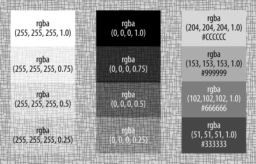
Figure 8-1
demonstrates that rgba(0, 0, 0, 1) is
fully opaque black. As you reduce the alpha transparency value, the
closer you get to zero, the more transparent it is. You’ll notice in
Figure 8-1 that the
background shows more clearly through the more transparent background
color declarations.
Note
RGBA is extremely useful for creating drop shadows on elements. Drop shadows on text or boxes go from the declared color to full transparent over a few pixels. Start with a partially transparent color instead of a solid color; shadows are see-through.
Instead of:
text-shadow: 5px 4px 6px #666666;
Use:
text-shadow: 5px 4px 6px rgba(0, 0, 0, 0.4);
Unlike RGB, there is no hexadecimal notation for RGBA. There has been some discussion of including an eight-character hexadecimal value for RGBA, but that has so far not been added into a draft specification, nor has an eight-character notation been added to any mobile browser.
Hue, Saturation, and Lightness: HSL()
HSL is a new color type added in CSS3. HSL stands for hue, saturation, and lightness. The HSL format simplifies color palette creation, as you can pick a hue as the base and then manipulate the lightness/darkness and saturation of the hue selected.
Monitors display colors in hues of red, green, and blue, which is different from the human eye. HSL mimics the human eye. We see colors in terms of hues with different saturations and lightness. HSL is generally more intuitive for designers to understand.
The syntax hsl() appears
similar to rgb(), but instead of
including the values for red, green, and blue, the color value accepts
values in degrees from 0 to 359 for hue, and percentages for saturation
and lightness, with 50% as the norm for lightness.
Values for hues include: 0 = red, 60 = yellow, 120 = green, 180 = cyan, 240 = blue, 300 = magenta, and everything in between. Since this book is in black and white (and shades of gray), we can’t really show you. But there is a link to my HSL color picker in the online chapter resources.
Lightness is the amount of light, or brightness: 100% is white
(very, very light), 50% is the actual hue, and 0% is black, with a
complete lack of light. Saturation of 100% will be the hue, saturation
of 0 will give you a shade of gray from white to #808080 to black depending on the lightness,
and 100% gives you the color fully saturated.
Similar to rgb() with rgba(), hsl() also has an alpha transparent version,
hsla(). The syntax is the functional
notation of hsla(), with hue in
degrees, saturation in percentage, lightness in percentage, and an alpha
value from 0–1, encompassed in the parentheses in that order.
For example: hsla(300, 100%, 50%,
0.5) is magenta, fully saturated with average lightness at 50%
opacity.
With HSL, or HSLA, the values are the hue, saturation, lightness, and alpha transparency. To create white and black, the hue can be any value, not necessarily 0, with full lightness (100%) for white or complete lack thereof (0%) for black.
CMYK
Have you ever changed the ink in a color printer? Notice what colors you changed? Most likely you added cartridges of cyan (which is a color similar to turquoise), magenta (which is a hot pink), yellow, and black. CMYK stands for cyan, magenta, yellow, and black, which is the system that printers use: print designers (and your color printer) use CMYK, not RGB.
Computer monitors display in RGB. Humans who are not color blind generally see colors as HSL. Printers, on the other hand, determine colors based on CMYK. CMYK is not supported in any browser, and may never be since it is designed for print. Yes, CMYK is kind of irrelevant for mobile development, but I’m including it here to be thorough. CMYK is in the CSS3 paged media module, not the color module.
Named Colors
We haven’t yet described the color keywords like aqua,
fuchsia, and lime, for four main
reasons:
They are limited in the number of values you can choose from, and therefore less specific than the millions of values provided by RGB and HSL.
They are prone to typos and therefore unintended consequences (e.g., IE only supports gray colors with an “a,” such as
lightgrayrather thanlightgrey).Not all keyword values are supported in quite the same way on all browsers or displays due to implementation details.
And I think they should be avoided for these three reasons.
Even the keyterm transparent,
which is a much faster way of writing rgba(0,
0, 0, 0) has issues. As I mentioned earlier, transparent is a transparent black, which may
produce ugly grays when transitioning to a color.[55] If you want to transition from 'transparent' to the #FF0000 shade of red, use rgba(255, 0, 0, 0), which is a transparent
red, instead. There is a list of named colors along with the
hexadecimal, RGB, and HSL values in the online chapter
resources.
CurrentColor
One more keyword was added in CSS3: currentColor. The currentColor takes on the value of the
'color:' property, or the color of
the text, of the element on which it is applied.
Supported in all mobile browsers, currentColor can be really useful with text
shadows for creating bolder text on fonts like Helvetica Neue
Light:
.bolderText {text-shadow: 0 0 1px currentColor;}With high-DPI devices, some font families are really too thin to
read. You can add a slight shadow directly behind the text in the color
of the text to make it slightly more legible. This is possible even
without knowing the text color, by declaring currentColor as the shadow color.
Browser Color Values
Similar to the currentColor and
transparent keywords that are in the
W3C CSS3 draft specifications, there are a plethora of system colors
defined in CSS 2.1.[56] These named colors differ between browsers and operating
systems. While rarely used, I’ve included them here because they can be
useful when creating a native-looking web application:
activeBorderactiveCaptionappWorkspaceDefault background color of application workspace or interface.
backgroundbuttonFacebuttonHighlightbuttonShadowbuttonTextcaptionTextgrayTexthighlighthighlightTextinactiveBorderinactiveCaptioninactiveCaptionTextinfoBackgroundinfoTextmatchmenumenuTextscrollbarthreeDDarkShadowthreeDFacethreeDHighlightthreeDLightShadowthreeDShadowwindowFramewindowText
There are some colors that are browser specific, including:
-webkit-activelink: Hyperlink that is being clicked-webkit-focus-ring-color: Color surrounding a UI element that has focus-webkit-link: Visited hyperlink color-webkit-text: Text color window; default window-moz-buttonDefault-moz-buttonHoverFace-moz-buttonHoverText-moz-cellHighlightText-moz-comboBox-moz-ComboboxText-moz-Dialog-moz-DialogText-moz-dragtargetzone-moz-EvenTreeRow-moz-Field-moz-FieldText-moz-html-CellHighlight-moz-html-CellHighlightText-moz-mac-accentdarkestshadow-moz-mac-accentdarkshadow-moz-mac-accentface-moz-mac-accentlightesthighlight-moz-mac-accentlightshadow-moz-mac-accentregularhighlight-moz-mac-accentregularshadow-moz-mac-chrome-active-moz-mac-chrome-inactive-moz-mac-focusring-moz-mac-menuselect-moz-mac-menushadow-moz-mac-menutextselect-moz-MenuHover-moz-MenuHoverText-moz-MenuBarText-moz-MenuBarHoverText-moz-nativehyperlinktext-moz-OddTreeRow-moz-win-communicationstext-moz-win-mediatext
Firefox also has prefixed colors.
Using browser colors, you could write something like this:
#myElement {
  color: -webkit-focus-ring-color;
  background-color: -webkit-link;
  text-shadow: 3px 3px 3px -webkit-text;
  -webkit-box-shadow: 4px 4px 4px -webkit-activelink;
}
There are code examples of all these key terms in the online chapter resources. Open the page in browsers with different browser engines to see subtle differences. Note that I camelCased the list for ease of reading: the values are, in fact, case-insensitive.
Remember, browsers ignore lines of CSS they don’t understand. You can declare a color, then immediately follow that declaration with the same property and the color key term listed above. If the browser doesn’t understand the color value, it will ignore that line of CSS and implement the previously declared color.
Which color syntax should I use?
There are many ways to write colors in CSS. Dark red can be
written as #800000, maroon,
rgba(128, 0, 0), rgba(128, 0, 0, 1.0), hsl(0, 100%, 13%), or hsla(0, 100%, 13%, 1.0).
If you are working with a large team or still supporting old desktop browsers, use six-character hexadecimal syntax, as it is likely the best understood by nondesigners. Or, use a CSS preprocessor like Sass, and create variables for your team members to use. Variables will be coming to CSS, but we are not there yet.
If you are using transparencies and gradients, pick hsla() or rgba() syntax. Otherwise, you really can use
whatever syntax you are most comfortable with.
Mobile browsers and all other modern browsers support all of these syntaxes. We each have our own preferences. It doesn’t matter what your preference is, but pick a preference and stick with it.
CSS Units of Measurement
Many property values are keywords unique to a property. The key terms that are unique (or semiunique) to a property will be described with their property’s description when covered in the next chapters. Other values, like the colors just described, can be values for many different properties.
We’ve learned almost everything there is to know about color values, but colors aren’t the only value type that is common for many properties. We also have lengths, times, frequencies, and angles.
CSS Length Values
In terms of lengths, there are both relative and absolute lengths. Table 8-2 is a quick summary of all of the length value types.
Unit | Meaning |
| |
| |
| |
| |
| Relative to the viewport width: the viewport with is 100 vw. |
| Relative to the viewport height: the viewport height is 100 vh. |
| |
| |
| Relative the screen resolution not the viewport size; generally 1 point, or 1/72 of an inch. |
| |
| |
| |
| |
| |
| Relative to the parent element, it’s normally defined
|
[a] All values are well supported with the exception of vmax and ch, which are not supported in Android and Opera, and vmax is not supported in Safari. | |
The most common value types in CSS include pixels and percents.
The new length units, like rem,
vh, vw, vmin,
and vmax are very powerful,
especially when developing for a multitude of devices of unknown
sizes.
One of my favorite new features is the rem unit. CSS3 introduced the rem unit, which stands for “root em.” While
the em unit is relative to the font
size of the parent of that element, potentially causing compounding, the
rem is relative to the font size of
the root element: in our case <html>. By defining a single font size
on the root element, you can define all rem units to be a percentage of or relative to
that font size. rem is supported in
all mobile browsers, since IE9, iOS 4, and Opera 12 (it’s always been
supported on Android).
Note
Note that zero-length values, or null value, for any of these can be simply written as 0. All other value types require the unit for zero, such as 0deg for zero-degrees.
Pixels can be considered both a relative and absolute. Pixels are a relative measurement because the measurement is based on the resolution of the monitor or screen, rather than the viewport size. However, pixels are also an absolute size because lengths given in pixels are immutable: they can only be increased via zoom features.
Images, such as JPEG photos and GIFs have an absolute width and height, defined in pixels. Increasing or decreasing the size of these image types with CSS or via the width and height attributes of the image tag distort the image.
Several properties that expect length values may also accept
keyword values such as auto and
inherit:
p {
  height: auto;
  font-size: inherit;
}
dpi, dpc, dppx
The original iPhone viewport was 480 × 320 pixels. iDevices with high DPIs, like the iPhone 4 and iPod touch 4G, that are physically the same size of 320 × 480, have a screen size of 960 × 640. The iPad viewport is much larger at 1024 × 768 pixels, and changes to 768 × 1024 px with orientation change. The third generation iPad has higher DPI and a 2048 × 1536 resolution. Safari for Desktop, Chrome for Desktop, Nokia tablets, OpenMoko, Android phones, and other WebKit browsers all come in different sizes. And even if you can measure the size of a device, a pixel is not really a pixel anymore when it comes to devices with differing DPIs. For example, the iPhone 4 may have a high DPI, so the resolution looks better, but images sent to the device as foreground or background images are still defined in the pixels you would expect as if the DPI were the same as the lower resolution devices. Table 8-3 shows the various resolution units and their meaning.
With the emergence of devices with different resolutions, CSS3 provides us with resolution units to include in our media queries. We can target different images to different device resolutions based on dpi, dpc, or dppx.
CubeeDoo
When it comes to our application, we have used px for images and background images,
rem for fonts, and vh and vm
for the widths of input fields. We managed to create the entire
application without importing a single nonscalable image. Had we used
images, we would have used ddpx in
our media queries to serve higher resolution images to higher
resolution devices:
@media
only screen and (-webkit-min-device-pixel-ratio: 2),
only screen and (   min--moz-device-pixel-ratio: 2),
only screen and (   -o-min-device-pixel-ratio: 2/1),
only screen and (        min-device-pixel-ratio: 2),
only screen and (           min-resolution: 192dpi),
only screen and (            min-resolution: 2dppx) {

 /* styling for high resolution devices */

}
Angles, Times, and Frequencies
With some new CSS3 features, such as transforms and animations, length units do not suffice. We also need to learn and understand angles, times, and frequencies. These measurements have been around and used in aural stylesheets, but now with browser support for transitions, transforms, and animations, angles and times have become relevant to the screen as well. The units of angles, times, and frequencies are shown in Table 8-4, and described in greater detail in the sections that follow.
Unit | Meaning |
| degrees |
| grads |
| radians |
| turns |
| milliseconds |
| seconds |
| hertz |
| kilohertz |
The default unit for all of the length, angle, time, and frequency values is zero, and all the values are interpreted as floats. When including any of these units of measurement, make sure to include the unit shorthand listed in Table 8-4. Unlike length units, omitting the unit for angles, times, and frequencies is not valid CSS and the declaration will be ignored.
Originally, all of these units, frequencies, and times, other than
the new turn unit, were introduced as
aural values. The units used for aural stylesheets are angles, specified
in rad (radians), deg (degrees), or grad (gradians). Frequencies are specified in
Hz (hertz) or kHz (kilohertz). Times are specified in
ms (milliseconds) or s (seconds).
Warning
When including any of these units of measurement, make sure to include the unit shorthand. Unlike length units, omitting the unit for angles, times, and frequencies will throw an error and the declaration will be ignored.
CSS Angle Measurements
Angle measurement types include degrees, gradians, radians, and turns. We’ll introduce them here, but only use degrees in our examples since they make more sense to nonmath nerds like myself!
Degrees
Degrees range from 0 deg to 360 deg, with those two being equal. Positive degrees go clockwise, negative degrees go counterclockwise. For example, −90 deg is one quarter of the way around counterclockwise, turning it on its left side. 90 deg will turn it clockwise 90 degrees.
The CSS for the figure (in part) reads (see Figure 8-2):
.image1, image5 {
     -webkit-transform: rotate(-5deg);
     -ms-transform: rotate(-5deg); /* for IE9 */
     transform: rotate(-5deg);
      }
.image2, image4 {
     -webkit-transform: rotate(7deg);
     -ms-transform: rotate(7deg);
     transform: rotate(7deg);
      }
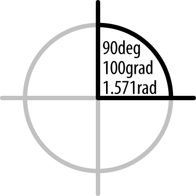
Grads
A grad, or gradian, is
equivalent to 1⁄400 of a full circle. Similar to
degrees, a positive grad value will
go clockwise, a negative value goes counterclockwise. 100grad will be at a 90% angle (see Figure 8-3).
Times
Time units are much easier to explain than rads! There are two units of
measurement: seconds (ms) and
milliseconds (s). There are 1,000
milliseconds in a second. The format of a time value is a number
followed by s for seconds or ms for milliseconds. As with all nonlength
units, always include the s or
ms, even if your value is 0s. The two following lines are
equivalent:
animation-duration: 0.5s;
animation-duration: 500ms;
Frequencies
Frequency values are used with aural (or spoken) cascading
stylesheets. There are two value units: Hz or hertz, and kHz or kilohertz. 1,000Hz = 1kHz (case-insensitive). Frequencies
can be used to change the pitch of a voice reading text. A low frequency
is a bass sound, a high frequency is a treble.
With the following CSS snippet, a low-pitched voice, such as a
deep-toned male voice, will speak the words for the paragraph with
class="low", and the audio will
change to a high-pitched tone when a quote with class squeal is encountered. The two following lines
are not equivalent:
p.low { pitch: 105Hz; }
q.squeal {pitch: 135Hz;}
CubeeDoo
In our game, we use CSS degrees to flip the cards, and timing is in both CSS and JavaScript. The game’s timer is in seconds in JavaScript. The smooth transforms of the cards from front to back and back to front again are done by transforming the cards 180 deg over 200 ms. We’ll cover how to do that—animations and transforms—in the next chapter.
Avoiding TRouBLe: Shorthand Properties and Value Declarations
We’ve covered most of the values that are not property specific. There is just one more CSS quirk that we need to cover before diving into actual CSS3 properties, and that is the idea of shorthand, and the shorthand TRouBLe order.
CSS provides us with some shorthand properties. There are two types of shorthand properties: those that enable developers to define top, right, bottom, and left values of a property in a single property, and those that enable developers to define several commonly associated properties from a CSS module into a single call.
For example, instead of writing:
.sameValues {
  padding-top: 3px;
  padding-right: 3px;
  padding-bottom: 3px;
  padding-left: 3px;
}
.twoValues {
  padding-top: 3px;
  padding-right: 6px;
  padding-bottom: 3px;
  padding-left: 6px;
 }
.threeValues {
  padding-top: 3px;
  padding-right: 6px;
  padding-bottom: 12px;
  padding-left: 6px;
 }
.fourValues {
  padding-top: 3px;
  padding-right: 6px;
  padding-bottom: 9px;
  padding-left: 12px;
 }
You can write:
.sameValues {
  padding: 3px;
}
.twoValues {
  padding: 3px 6px;
 }
.threeValues {
  padding: 3px 6px 12px;
 }
.fourValues {
  padding: 3px 6px 9px 12px;
 }
Note that in writing this shorthand, the order of the values is very important. Sometimes, especially with CSS3 properties (as we’ll see in Chapter 9), order will be important when defining associated properties in shorthand format. Other times, the order of the values in shorthand notation, which define several associated properties, is not important. In this instance, the shorthand declarations that define the four sides of a box have a very specific, and somewhat confusing, order. Hence the pneumonic that is a double entendre: TRouBLe, for top, right, bottom, left.
If only one value is present, the value will be assigned to all four sides. If two properties are present, the first value is for the top/bottom, and second value is for left/right. If three values are present, the first value is top, the second value refers to both left and right, and the third value is bottom. Otherwise, the order is top, right, bottom, left, or TRouBLe as a pneumonic for remembering the sequence.
For those who learn better by example, Table 8-5 details what is represented when one, two, three, and four values are given for a shortcut.
Examples | Values | Order |
3px | All four sides have the same value | TRBL |
2px 4px | Top/bottom: 2px Left/right: 4px | TB RL |
3px 1px 5px | Top: 3px Left/right: 1px Bottom: 5px | T RL B |
1px 2px 3px 4px | Top: 1px Right: 2px Bottom: 3px Left: 4px | T R B L |
Note that there is an exception to this rule: for the CSS background-position
property, the order is LR TB, not TB LR, when two values are
provided.
The shorthand for defining several commonly associated properties is generally, with a few exceptions, not concerned with the order of the values. Most shorthands can save a lot of typing. For example
.myClass {
  border: 1px solid #ff0000;
}
Could also be written as:
.myClass {
  border-width: 1px;
  border-style: solid;
  border-color: #ff0000;
}
Which itself is shorthand for:
.myClass {
  border-top-width: 1px;
  border-top-style: solid;
  border-top-color: #ff0000;
  border-right-width: 1px;
  border-right-style: solid;
  border-right-color: #ff0000;
  border-bottom-width: 1px;
  border-bottom-style: solid;
  border-bottom-color: #ff0000;
  border-left-width: 1px;
  border-left-style: solid;
  border-left-color: #ff0000;
}
Without the shorthand, describing the border of a box would take 12
lines. With the shorthand border
property, we are able to border a box in one line, using fewer characters
in the one line than in most individual longhand property/value
declarations.
I will make special note of shorthand property order when the order makes a difference. I mention it here so that you too take note and don’t think I was just trying to help with your insomnia.
In Conclusion
In this brief chapter, we’ve covered more than 60 property values—actually, more than a million if you count all the possible color values we can create. We learned about the different color value types of CSS, the new color additions in CSS3, and different angle and length units. We also covered the value order for box model property values: a confusing yet vitally important topic. Now we can safely jump in to learning about the properties with which these, and other value types, can be associated. The fun is about to start!
[54] 8-digit hex values, with the last 2 digits defining the
alphatransparency (with FF being fully opaque and
00 meaning fully transparent), are part of CSS
Colors Level 4.
[55] transparent will produce
ugly grays when transitioning to colors other than white. Some
browsers have begun supporting transparent as transparent black or
transparent white, but when transitioning to any hue, you may still
see the grays in most browsers.