As discussed in Chapter 1, in the early days of the Web, HTML's limitations forced designers to develop clever ways to make their websites look good. The most common tool was the <table> tag, which was originally intended to create a spreadsheet-like display of information composed of rows and columns of data. Designers used HTML tables to build a kind of scaffolding for organizing a page's contents (see Figure 11-2). But because the <table> tag wasn't meant for layout, designers often had to manipulate the tag in unusual ways—like placing a table inside the cell of another table—just to get the effect they wanted. This method was a lot of work, added a bunch of extra HTML code, and made it very difficult to modify the design later. But before CSS, that's all web designers had.
If you're a longtime <table> tag jockey, you need to develop a new mindset when you begin to use CSS for layout. First, forget about rows and columns—that notion is important only when working with tables. In table-based layout, you took your HTML and put it into individual table cells. Each cell acted like a box on the page holding a headline, an image, text, or a combination.
CSS has a rough equivalent of a table cell—the <div> tag. As with table cells, a <div> tag is a container for content that you want to position in one area of the page. In addition, as you'll see, CSS designs often nest a div inside another div, much like you'd nest tables within tables to get certain effects—but the CSS method uses a lot less HTML code.
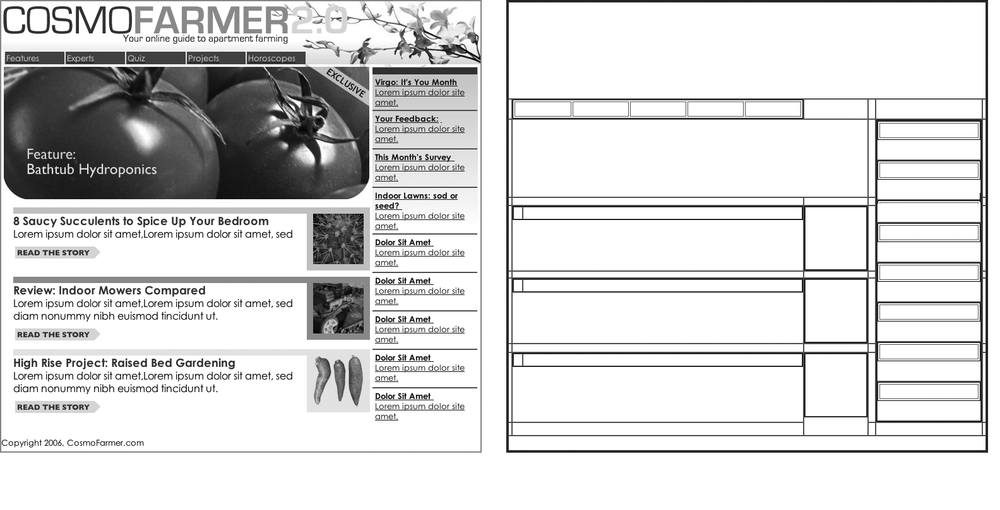
Figure 11-2. Building a complex page design (left) using the <table> tag involves tricks like nesting tables within tables, merging adjacent cells, and propping open cells with invisible spacer images. It's like building a rigid scaffolding (right), and changing the design of a page requires tearing down the scaffolding and building a new one.
Web page layout involves putting chunks of content into different regions of the page. With CSS, the element most commonly used for organizing content is the <div> tag. As you read on HTML to Forget, the <div> tag is an HTML element that has no inherent formatting properties (besides the fact that browsers treat the tag as a block with a line break before and after it). Instead, it's used to mark a logical grouping of elements or a division on the page.
You'll typically wrap a <div> tag around a chunk of HTML that belongs together. The elements comprising the logo and navigation bar in Figure 11-3 occupy the top of the page, so it makes sense to wrap a <div> tag around them. At the very least, you would include <div> tags for all the major regions of your page, such as the banner, main content area, sidebar, footer, and so on. But it's also possible to wrap a <div> tag around one or more additional divs. One common technique is to wrap the HTML inside the <body> tag in a <div>. Then you can set some basic page properties by applying CSS to that wrapper <div>. You can set an overall width for the page's content, set left and right margins, center all of the page's content in the middle of the screen, and add a background color or image to the main column of content.
Once you've got your <div> tags in place, add either a class or ID to each one, which becomes your handle for styling each <div> separately. For parts of the page that appear only once and form the basic building blocks of the page, designers usually use an ID. The <div> tag for a page's banner area might look like this: < div id="banner">. You can use an ID only once per page, so when you have an element that appears multiple times, use a class instead. If you have several divs that position photos and their captions, for example, then wrap those tags in a div and add a class like this: <div class="photo">. (For more on knowing when to use a div, read the box below.)
Once you have the divs in place and have accurately identified them with IDs or class names, you can then create CSS styles to position those <divs> on the page using either floats (Chapter 12) or absolute positioning (Chapter 13).
At this point in the evolution of CSS, layout comes in two flavors—floats and absolute positioning. The vast majority of web pages use the CSS float property for layout. You've already encountered this seemingly simple property in Chapter 8, where the float property was introduced as a way of positioning an image within a column of text by either floating the image to the left or right side. The same concept applies to divs: By setting the width on a div and floating it to the left or right, you can create a column (the text following the div ends up wrapping around the floated div as if it were another column). By using the float property with multiple divs, you're able to achieve multi-column layouts. Taking this technique further, you can quickly create complex, multicolumn layouts by placing floated divs within floated divs.
Absolute positioning lets you place an element anywhere on the page with pixel-level accuracy. You can place an element 100 pixels from the top edge of the browser window and 15 pixels in from the left edge, for example. Page layout programs like InDesign and Quark Xpress work this way. Unfortunately, the fluid nature of web pages and some of the weird characteristics of absolute positioning make it difficult to achieve total layout control with this technique. As you'll read in Chapter 13, it is possible to lay out a page using absolute positioning, but, in general, this technique is better suited to smaller tasks like positioning a logo in a particular location of the page.
Don't worry if this sounds rather abstract right now, you'll see all of these techniques in action in the next two chapters.
Note
There are a couple of other ways to do CSS layout as well, but they're limited to Internet Explorer 8, Firefox, Safari, and other current browsers. In other words, these other techniques won't work for the vast majority of web surfers on IE 6 and 7. However, we do introduce these up-and-coming techniques on Child Selectors in Chapter 16.