We are going to start off this KST explanation by discussing an indicator suitable for price swings associated with primary trends or those that revolve around the so-called 4-year business cycle, subsequently turning to its application for intermediate- and short-term trends.
Chapter 13 explained that rate of change (ROC) measures the speed of an advance or decline over a specific time span, and is calculated by dividing the price in the current period by the price N periods ago. The longer the time span under consideration, the greater the significance of the trend being measured. Movements in a 10-day ROC are far less meaningful than those calculated over a 12- or 24-month time span and so forth.
The use of an ROC indicator helps to explain some of the cyclical movements in markets, often giving advance warning of a reversal in the prevailing trend, but a specific time frame used in an ROC calculation reflects only one cycle. If that particular cycle is not operating, is dominated by another one, or is influenced by a combination of cycles, it will be of little value.
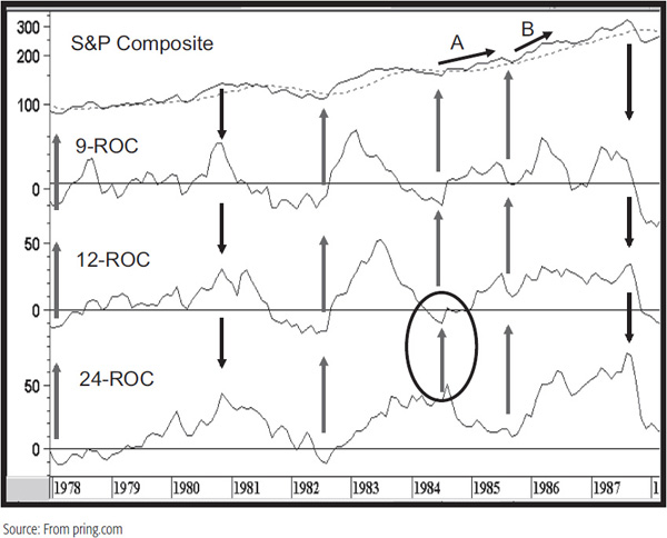
This point is illustrated in Chart 15.1, which shows three ROC indicators of different time spans: 9 months, 12 months, and 24 months.
CHART 15.1 S&P Composite, 1978–1988 Three Rates of Change
The 9-month ROC tends to reflect all of the intermediate moves, and the 24-month series sets the scene for the major swings. The arrows flag the important turning points in this period. They show that, for the most part, all three ROCs are moving in the same direction once the new trend gets under way. A major exception occurred at the 1984 bottom. Here we see the price rise, but immediately after, the 24-month ROC declines while the others continue on up. During the period covered by arrow A, the speed of the advance is curtailed because of the conflict between the three cycles. Later on, though, all three ROCs get back in gear on the upside, and the rally approximated by arrow B is much steeper. In effect, major turning points tend to occur when several cycles are in agreement, and speedy advances and declines develop when more cycles are operating in the same direction. Even this is a fairly limited view because there are far more than three cycles operating at any one point in time.
Clearly, one ROC time span taken on its own does not give us a complete picture. This was one of the factors considered in the design phase of the KST. Another requirement was an indicator that fairly closely reflected the major price swings over the time period under consideration, primary trends for monthly charts, short-term trends for daily charts, and so forth.
Chart 15.2 shows the S&P during the 1980–2012 period.
CHART 15.2 S&P Composite, 1980–2012 and a Smoothed 24-Month ROC
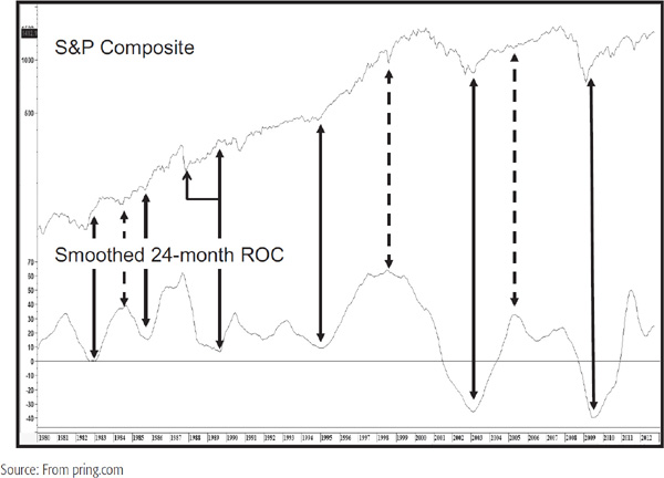
The oscillator is a 24-month ROC smoothed with a 9-month MA. This series certainly reflects all of the primary trend swings during this period. However, if we use the indicator’s changes in direction as signals, close examination shows that there is a lot to be desired. For example, the 1984 low is signaled with a peak in the oscillator. Similarly, the 1989 bottom in the momentum series develops almost at the rally peak. Also, the 1998 low was signaled with a peak in the oscillator, and the 2005 momentum peak was clearly premature. What is needed, then, is an indicator that reflects the major trend, yet is sensitive enough to reverse fairly closely to the turning points in the price. We are never going to achieve perfection in this task, but a good way of moving toward these goals is to construct an indicator that includes several ROCs of differing time spans. The function of longer time frames is to reflect the primary swings, while the inclusion of the shorter ones helps to speed up the turning points. The formula for the KST is as follows:
TABLE 15.1 Formula for Time Frames Used in the Long-Term KST
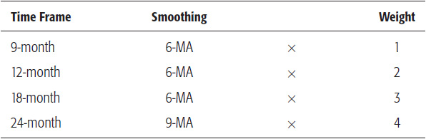
Since the most important thing is for the indicator to reflect the primary swings, the formula is weighted so that the longer, more dominant time spans have a larger influence.
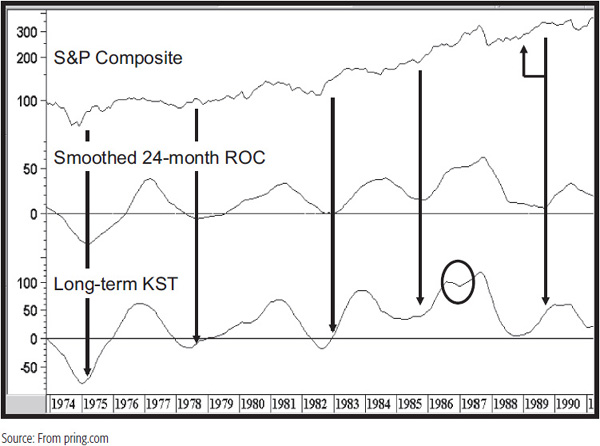
Chart 15.3 compares the performance of the smoothed 24-month ROC to the long-term KST between 1974 and 1990. It is fairly self-evident that the KST reflects all of the major swings being experienced by the smoothed 24-month ROC. However, the KST turning points develop sooner than those of the ROC. The vertical arrows slice through the ROC as it bottoms out. In every instance, the KST turns ahead of the arrow, the lead time varying with each particular cycle. Note how in 1988 the KST turns well after the 1987 bottom, but just at the time when the market begins to take off on the upside. The ROC reverses direction much later. There is one period when the KST underperformed, and that is contained within the 1986–1987 ellipse where the KST gave a false signal of weakness, unlike the ROC, which continued on up.
CHART 15.3 S&P Composite, 1974–1991 The KST Compared to a 24-Month Smoothed ROC
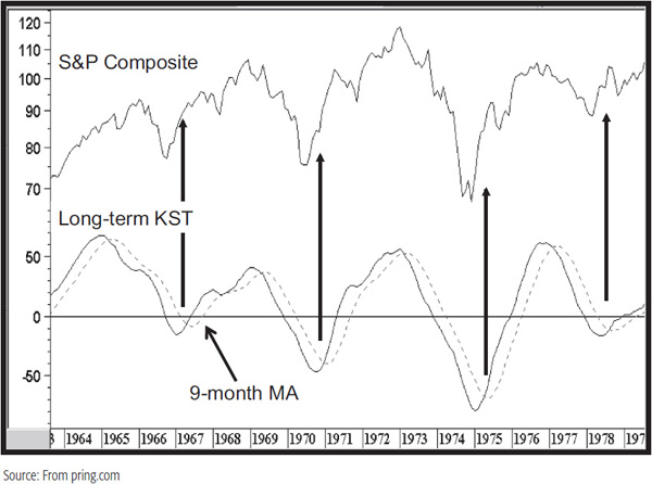
The dominant time frame in the KST’s construction is a 24-month period, which is half of the so-called 4-year business cycle. This means that it will work best when the security in question is experiencing a primary uptrend and downtrend based on the business cycle. For example, Chart 15.4 shows the KST during the 1960s and 1970s, where the S&P was in a clearly defined business cycle–type trading range. Periods of accumulation and distribution occur between the time when the KST and its moving average (MA) change direction. There are really three levels of signaling. The first occurs when the indicator itself changes direction, the second when it crosses its 9-month MA, and the third when the MA itself reverses direction. In most cases, the MA crossover offers the best combination of timely signals with a minimum of whipsaws. Changes in the direction of the 9-month MA offer the most reliable signals, but these usually develop well after the turning point. The timeliest and most reliable signals thereby develop in those situations where the MA reverses close to a turning point. If it does not, this event should merely be interpreted as a confirmation of a move that is already in progress.
CHART 15.4 S&P Composite, 1963–1979 Long-Term KST in a Volatile Cyclical Environment
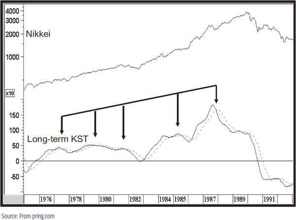
For the most part, the KST has been reasonably reliable, but like any other technical approach, it is by no means perfect. For instance, the same calculation is shown in Chart 15.5, but this time, for the Nikkei. During periods of a secular or linear uptrend (as occurred for Japanese equities in the 1970s and 1980s), this type of approach is counterproductive since many false bear signals are triggered. However, in the vast majority of situations, prices do not experience such linear trends, but are sensitive to the business cycle. It is for this reason that I call this indicator the KST. The letters stand for “know sure thing” (KST). Most of the time, the indicator is reliable, but you “know” that it’s not a “sure thing.”
CHART 15.5 Nikkei, 1975–1992 KST Operating in a Linear Trend Environment
The principles of interpreting the long-term KST are the same as any other oscillator, though its “default” technique is to observe positive and negative MA crossovers. Occasionally, it’s possible to construct trendlines and even observe price patterns, as well as conduct overbought/oversold analysis.
The KST concept was originally derived for long-term trends, but the idea of four smoothed and summed ROCs can just as easily be applied to short-term, intermediate, and even intraday price swings. Formulas for various time frames are presented in Table 15.2. These are by no means the last word and are suggested merely as good starting points for further analysis. Readers may experiment with different formulas for any of the time frames and may well come up with superior results. When experimenting, strive for consistency, never perfection, for there is no such thing in technical analysis.
TABLE 15.2 Suggested KST Formulas*
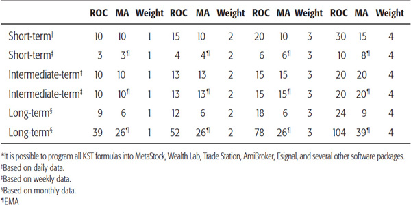
Chart 15.6 shows an intermediate KST for the U.S. Dollar Index. The dark highlights indicate when the KST is above its 10-week exponential moving average (EMA), and the lighter plots when it is below. Two round-trip signals have been flagged with the arrows to demonstrate this. The principle of countercyclical trends being weak and the danger of trading them can also be appreciated from this chart. The three small arrows in the 2007–2008 period indicate bullish signals that ran counter to the main trend, which was negative. All three were short-lived and lost money.
Chart 15.6 U.S. Dollar Index, 2006–2012 and an Intermediate KST
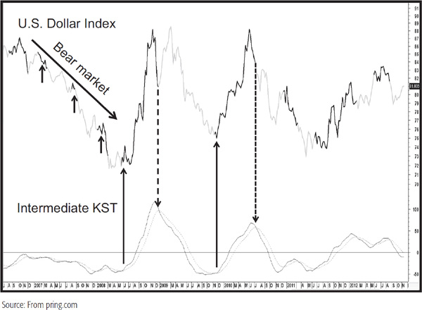
Chart 15.7 features the London copper price. One of the things I like about the indicator, especially in its short-term and intermediate varieties, is its flexibility of interpretation. Nearly all of the interpretive techniques discussed in Chapter 13 can be applied. In Chart 15.7, for example, we see an overbought crossover at the tail end of 1994. It did not amount to anything because it was not possible to come up with any trend-reversal signals in the price. Later on, though, in early 1995, we see a negative divergence, and at the end of the year an overbought crossover, a 65-week EMA crossover, and a head-and-shoulders top in the price—classic stuff. There were a couple of false buy signals on the way down, but the rally peaks in the KST lent themselves to the construction of a nice down trendline. The violation of the line, the oversold crossover, and the completion of the base in the price combined together to offer a nice buy signal in late 1996. The next time the KST crossed its oversold level in 1998, there was no good place to observe a trend-reversal signal in the price. That was not true in early 1999, where a positive divergence, EMA crossover by the KST, and a trendline break in the price offered a good timely entry point. Note that after the price broke above the down trendline it subsequently found support at the extended line.
Chart 15.7 Cash Copper, 1993–2001 Intermediate KST Interpretation
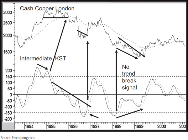
Chart 15.8 features the Global X FTSE Columbia ETF with a daily KST. It demonstrates the fact that this series has the occasional ability to trace out price patterns, as it does in late 2010. Note also the bear market that began late in that year and the inability of the KST to rally much above the equilibrium level.
CHART 15.8 Global X Columbia ETF, 2009–2012 and a Daily Short-Term KST
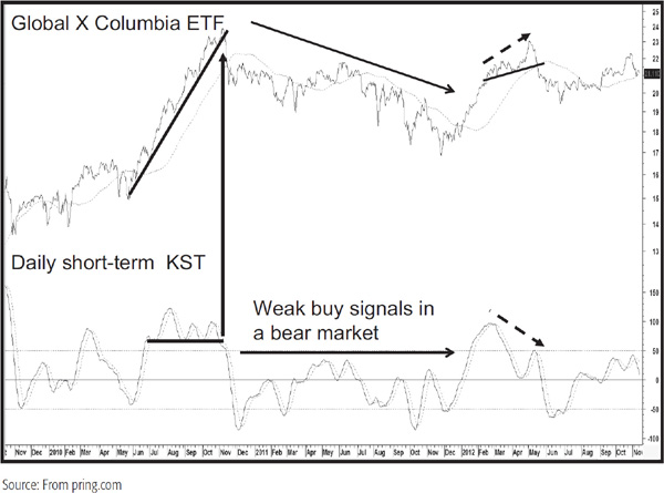
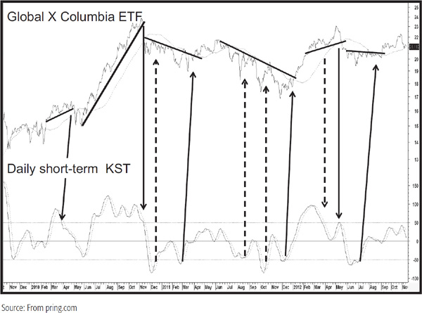
Note also the ability of the KST to signal divergences, such as the negative discrepancy in early 2012. Chart 15.9 shows the same information as its predecessor, but this time the solid arrows flag positive and negative overbought/oversold crossovers that were confirmed by the price. The failed (dashed) arrows show the value of waiting for such signals to be confirmed by the price.
CHART 15.9 Global X Columbia ETF, 2009–2012 Daily Short-Term KST Interpretation
Identifying the direction of the main trend is easier said than done. However, if you pay attention to the price relative to its 65-week or 12-month MA and the level and direction of the long-term KST, or Special K (explained later in this chapter), you will at least have an objective measure of the primary trend environment.
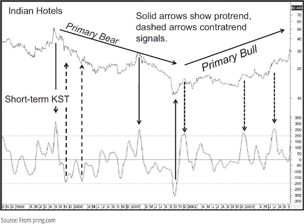
Chart 15.10, featuring Indian Hotels, again brings out the concept of constructing overbought and oversold lines and seeing what happens when the KST reverses from such levels. In this exercise, I am not concentrating on confirmations, but in qualifying the distinction between the generation of pro- and contratrend signals. The solid arrows indicate pro-trend signals, and the dashed ones indicate contratrend signals.
CHART 15.10 Indian Hotels, 1998–2003 and a Weekly Short-Term KST
Three Main Trends Earlier chapters explained that there are several trends operating in the market at any particular time. They range from intraday, hourly trends right through to very long-term or secular trends that evolve over a 19- or 30-year period. For investment purposes, the most widely recognized trends are short-term, intermediate-term, and long-term. Short-term trends are usually monitored with daily prices, intermediate-term with weekly prices, and long-term with monthly prices. A hypothetical bell-shaped curve incorporating all three trends is shown in Figure 1.1.
From an investment point of view, it is important to understand the direction of the main, or primary, trend. This makes it possible to gain some perspective on the current position of the overall cycle. The construction of a long-term KST is a useful starting point from which to identify major market cycle junctures. The introduction of short-term and intermediate series then allows us to replicate the market cycle model.
The best investments are made when the primary trend is in a rising mode and the intermediate and short-term market movements are bottoming out. During a primary bear market, the best selling opportunities occur when intermediate and short-term trends are peaking and the long-term series is declining.
In a sense, any investments made during the early and middle stages of a bull market are bailed out by the fact that the primary trend is rising, whereas investors have to be much more agile during a bear market in order to capitalize on the rising intermediate-term swings.
Combining the Three Trends Ideally, it would be very helpful to track the KST for monthly, weekly, and daily data on the same chart, but plotting constraints do not easily permit this. It is possible, though, to simulate these three trends by using different time spans based on weekly data, shown for the S&P European 350 ETF in Chart 15.11.
CHART 15.11 S&P Europe ETF 350, 2006–2011 and Three KSTs
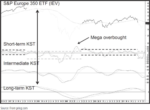
Note that the formula for the short-term KST differs from its daily counterpart in that the time spans (see Table 15.2) are longer and the formula, like all three included on the chart, uses EMAs rather than the simple moving average. This arrangement facilitates identification of both the direction and the maturity of the primary trend (shown at the bottom), as well as the interrelationship between the short-term and the intermediate trends. The dark plot shows when the long-term KST is above its 26-week EMA and the lighter plot when it is below. Sometimes, KST primary trend signals coincide with the price itself crossing its 65-week EMA, as was the case in December 2007 and August 2009. The chart also shows the approximate trading bands for the short-term KST in bull and bear markets as defined by the long-term KST EMA crossover approach. Note how it rarely moves to the oversold zone during the bullish environments and rarely to the overbought zone when the main trend is down.
The best buying opportunities seem to occur either when the long-term index is in the terminal phase of a decline, or when it is in an uptrend but has not yet reached an overextended position.
Quite often, the long-term series stabilizes but does not reverse direction, thereby leaving the observer in doubt as to its true intention. Vital clues can often be gleaned from the action of the short-term and intermediate series in conjunction with the price action itself. For example, it is unusual for the intermediate series to remain above or below equilibrium for an extended period—say, more than 9 months to a year. Consequently, when it falls below zero after a lengthy period of being above it, this argues for a bearish resolution to a flat long-term series and vice versa. A sell signal of this nature was triggered in early 2008 after the intermediate KST had been above zero for over 4 years, although you can’t see all of that from this chart. Note also the mega overbought reading in the short-term series that developed in 2009. It was actually the highest reading since the inception of this ETF in the year 2000. The KST can be plotted for free at www.pring.com in this market cycle format for any Yahoo! symbol, whether U.S. or international.
The KST can also be adapted to relative strength lines and is especially useful for long-term (primary trend) analysis when applied to industry groups or individual stocks. This is because sector rotation develops around the business cycle as different groups are coming in and out of fashion. As a result, linear uptrends and downtrends are far less likely to develop than with absolute price data. For a fuller discussion on these matters and KST applications, see Chapters 19 and 22.
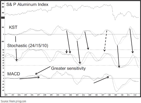
The KST is not the only answer to our smoothed momentum problems, since it is also possible to substitute the moving-average convergence divergence (MACD) using the default parameters, or the stochastic using a 24/15/10 combination, in the likely event that your charting software does not carry the KST or the ability to replicate it. Those same parameters for the stochastic appear to work for all three time frames. Chart 15.12 compares the three indicators using monthly data. Note that in most cases, the KST coincides with or leads turning points in the stochastic. The dashed arrow indicates when the stochastic led. Alternatively, the more sensitive MACD often gives false impressions of trend reversals that either turn out to be false or are reversed before a crossover of the signal line takes place. For these reasons, I prefer the KST for all trends, not just long-term ones. It may well be possible to come up with superior parameters for both indicators, and the reader is certainly encouraged to make an attempt to do so.
CHART 15.12 S&P Aluminum Index, 1992–2012 Comparing Long-Term Momentum Indicators
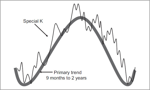
An alternative method of charting the KST comes when all three of them are combined into one indicator, which I call the “Special K.” This gives us true summed cyclicality where the short-, intermediate-, and long-term trends are combined into one super one. The calculation is made by adding the daily KST formula to that of the intermediate and long-term series based on daily data. Thus, say the 12-month time span used in the long-term KST calculation is replaced by 265 days as an approximation for the trading days in a calendar year. Table 15.3 contains the formula, and Figure 15.1 features the concept in a visual format. It is really a practical adaptation of the dashed line (short-term trend) in Figure 15.1. It also contrasts the slow, deliberate path of the long-term KST with the more jagged trajectory of the Special K. In an ideal world, the Special K ought to peak and trough more or less simultaneously with the price at bull and bear market turning points. In most situations, that actually happens. When it does, the trick is being able to identify these turning points as quickly as possible. The usual caveat with premature momentum turning points developing in linear uptrends or downtrends still applies.
Table 15.3 Special K Formula
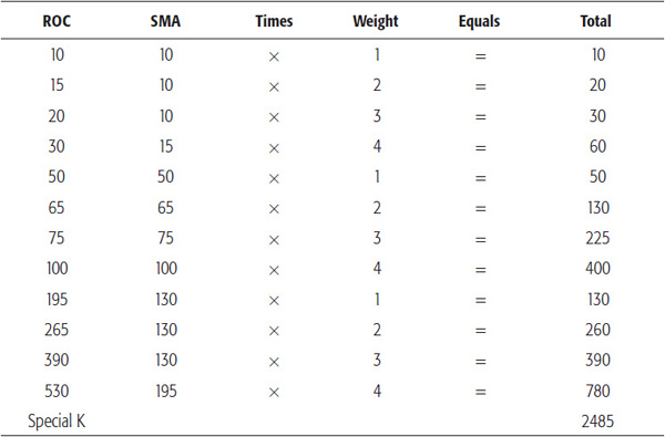
FIGURE 15.1 The Special K versus the Long-Term Trend
The prime function of the Special K, then, is to identify primary trend turning points. Since this indicator also includes short-term data in its calculation, a subsidiary benefit lies in identifying smaller trends and putting that in context with the direction and maturity of the primary trend.
The following are some of the Special K characteristics:
1. The Special K is a curve that reflects the dominant long-term KST, but is not as smooth, since it also contains data that reflect short-term and intermediate price movements.
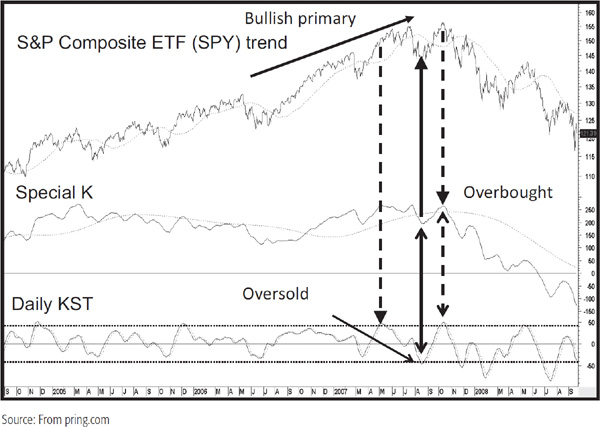
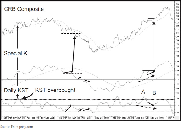
2. Primary trend peaks and troughs in the price itself often coincide simultaneously with those of the Special K. Where linear uptrends or downtrends are present, the Special K (SPK) leads such turning points and sets up a divergence. The arrows on Chart 15.13 show some of these turning points for the S&P Composite. Note that in 1998 the SPK peaked prematurely due to the presence of a secular uptrend in U.S. equities. There are even more examples in Chart 15.14 of the CRB Composite. Of the 12 peaks and troughs between 1983 and 2012, only one did not develop simultaneously with the SPK.
3. This indicator lends itself to trendline construction. Usually, when lines greater than 9 months in duration are penetrated, there is a high probability that the primary trend has reversed. This is demonstrated in Chart 15.15 for the S&P Composite, where we see several SPK trendline penetrations confirmed by a similar action by the price. Occasionally, the trend is so steep that it is impossible to construct a meaningful trendline. In such cases, joint moving-average crossovers between the price and SPK that develop within a short time of each other usually serve as timely signals. A joint MA crossover takes place at A along with some trendline violations, but the rally off the 2009 bottom would have been signaled with the MA cross approach. The MA for the price has a 200-day span, and the one for the SPK has a 100-day span smoothed by an additional 100-day MA.
CHART 15.13 S&P Composite versus the Special K, 1995–2011
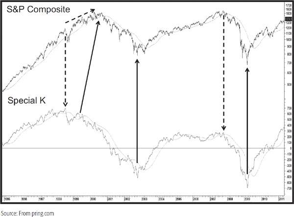
CHART 15.14 CRB Composite versus the Special K, 1983–2012
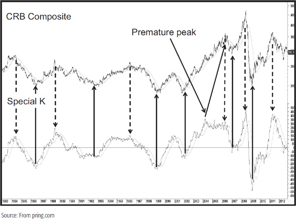
CHART 15.15 S&P Composite versus the Special K, 1995–2011
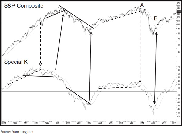
Chart 15.16 also shows some joint MA breaks at points A, B, and C, as well as numerous trendline combinations. Note that occasionally the SPK will trace out a small trading range, and when this has been completed, reversal signals are triggered. The 2007 and 2010 lows offer two examples of this phenomenon.
CHART 15.16 CRB Composite versus the Special K, 1999–2012 Trendline Interpretation
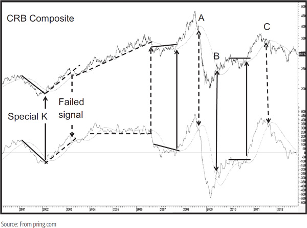
CHART 15.17 BSE FMG Index, 2001–2009 Special K Interpretation
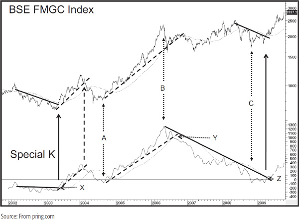
4. Peak-and-trough reversals often show up at primary trend turning points. We see three instances in Chart 15.17 for the Bombay Stock Exchange FMGC Index at points X, Y, and Z. Not all turning points are signaled in this way, just as it’s not always possible to construct a meaningful trendline. However, if we see a trend break and an obvious peak/trough reversal, the odds of a primary trend reversal are greatly enhanced.
If you compare movements in the daily KST in Chart 15.18 with those of the Special K, you will see that they are very close indeed, which means that we really do get the summed cyclicality of that dashed short-term trend curve in our original market cycle diagram (Figure 1.1).
CHART 15.18 Composite, 2004–2008 the Special K versus the Daily Short-Term KST
That means we can use its gyrations to help identify short-term reversals in the Special K. For example, if the KST is overbought and reversing, as in October 2007, it is more likely to result in an imminent reversal in the trajectory of the Special K and, therefore, the price. The oversold reading that preceded it in August 2007 also worked quite well. However, during May 2007 we get another KST overbought reversal. The Special K also reverses, but there is no immediate decline. The reason? It’s because this sell signal was a contratrend one, as the prevailing primary trend was bullish.
Chart 15.19, featuring the CRB Composite, also displays the daily KST in the bottom window.
CHART 15.19 CRB Composite, 2000–2003 Using the KST Special K Relationship for Interpretation
We see an overbought KST with a reversing Special K in May 2000, and this is followed by a 3-month correction. However, there is more to it than that. Most of the time when the KST reverses direction, the Special K does as well. However, when the KST reverses to the upside, for example, and there is very little or no Special K response, the chances are that bearish intermediate and long-term forces are dominating, thereby putting substantial downward pressure on the Special K. Under such circumstances, the Special K is most likely going to move lower once the daily KST rally is over, thereby confirming that the main trend remains bearish. Several examples of this phenomenon are seen in the chart, the most glaring of which developed in the August/September 2001 period when the KST experienced a gentle rally but the Special K continued in its decline with no sign of strength whatsoever. This weakness was not apparent by observing the action of the daily KST, but by comparing it to the weak action of the Special K, it was possible to appreciate the downside pressure being applied by the intermediate and long-term cycles. Another small discrepancy developed in July 2001, where the Special K was hardly able to rally at all. The April/May 2001 period also shows a strong KST rally but a very weak Special K advance.
Bullish divergences develop when the KST declines but the dominant longer-term cycles used in the Special K calculation propel it upward. A good example developed in November 2002 and January 2003, as indicated by the two solid arrows. The idea of rising peaks and troughs for the Special K is especially important, because it indicates strength in the dominant intermediate and primary trend cycles. For example, look at the two dashed arrows. The one for the KST shows a lower low in November 2002 and that for the Special K shows a higher trough, if you can call it that, at B.
Finally, there is another way in which the near-term movements can help in deciding whether a specific short-term KST buy or sell signal is going to work or not. Note the horizontal dashed line marking the short-term low in the Special K in May 2001. When the indicator violates this level, it signals that a new low in the price itself is likely. In the case of the May 2001 example, the Special K took out its low just about 2 weeks before the CRB itself did.
The reverse situation developed in November 2002, where the Special K moved to a new high. In this case, there was no lead by the momentum indicator, as the price broke out more or less simultaneously with it.
One of the most important things for short-term traders to grasp is the fact that
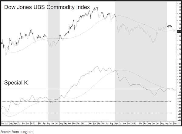
One starting point that helps us arrive at an objective way of determining the direction of the primary trend is to use the SPK. Obviously, we can easily tell with the benefit of hindsight where the actual SPK peaks and troughs formed, but in real time, we do not have this luxury. One solution is to determine its position vis-à-vis its 100-day MA smoothed with a 100-day MA. Positive readings would indicate a primary bull market and vice versa.
Chart 15.20 shows such a system for the Dow Jones UBS Commodity Index. The shaded areas represent bear markets as defined by the SPK/MA relationships. No signals are generated during this type of environment. The dark highlights indicate when the SPK crosses above its 10-day MA and when the primary bull/bear model is bullish. This approach is far from perfect because there are points when the model is bullish but the price has already reversed and so forth. Rather than blindly using this approach as a mechanical system, I think it better to use pro-trend signals as an alert and to then use other indicators as a filter in a weight-of-the-evidence approach.
CHART 15.20 Dow Jones UBS Commodity Index, 2009–2012 Generating Pro-Trend Short-Term Buys and Sell Signals
Self-generated charts and templates for these SPK systems are included in an add-in package for MetaStock, which is available at www.pring.com
Like all momentum indicators, the SPK does come with drawbacks. The most noticeable derives from the fact that the indicator’s construction assumes that the price series in question is revolving around the typical business cycle. Consequently, it reverses prematurely during linear trends and will lag when the cycle is unusually brief. That is, of course, a drawback with any long-term momentum indicator.
However, in the few years I have been working with it, I have grown more and more impressed with its ability to identify numerous primary trend turning points where other indicators have failed.
The objective of the directional movement system, designed by Welles Wilder, is to determine whether a market is likely to experience a trending or trading range environment. The distinction is important because a trending market will be better signaled by the adoption of trend-following indicators, such as moving averages, whereas a trading range environment is more suitable for oscillators. In practice, I am not impressed with the ability of the directional movement system to accomplish this objective, other than to identify a change in trend. On the other hand, there are, I find, several other ways in which this indicator can be usefully applied.
The calculation of the directional movement system is quite involved, and time does not permit a full discussion here. For that readers are referred to Wilder’s New Concepts in Technical Trading Systems (Trend Research, 1978), to my own Definitive Guide to Momentum Indicators book and CD-ROM tutorial (Marketplace Books, 2009), or to my online audio-visual technical analysis course at Pring.com.
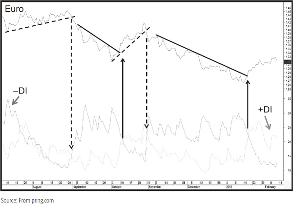
To simplify matters, the directional movement indicator is plotted by calculating the maximum range that the price has moved, either during the period under consideration (day, week, 10-minute bar, etc.) or from the previous period’s close to the extreme point reached during the period. In effect, the system tries to measure directional movement. Since there are two directions in which prices can move, there are two directional movement indicators. They are called +DI and –DI. The resultant series is unduly volatile, so each is calculated as an average over a specific time period and then plotted. Normally, these series are overlaid in the same chart panel, as shown in Chart 15.21 for the euro using the standard, or default, time span of 14 periods.
CHART 15.21 Euro, 2011–2012 Featuring a +DI and –DI
There is one other important indicator incorporated in this system, and that is the average directional movement (ADX). The ADX is simply an average of the + and –DIs over a specific period. In effect, it subtracts the days of negative directional movement from the positive ones. However, when the –DI is greater than the +DI, the negative sign is ignored. This means that the ADX only tells us whether the security in question is experiencing directional movement or not. Again, the normal default time span is 14 days.
The ADX is calculated in such a way that the plot is always contained within the scale of 0 to 100. High readings indicate that the security is in a trending mode, i.e., it has a lot of directional movement, and low readings indicate a lack of directional movement and are more indicative of trading range markets.
In Chart 15.21, buy alerts are signaled when the +DI crosses above the –DI (solid arrows) and vice versa (dashed arrows). In this example, there are several occasions when it is possible to confirm such crossovers with a trendline violation in the price. Moving-average crossovers or price patterns could just as easily be substituted. These DI crossovers are fairly accurate and not subject to whipsaws.
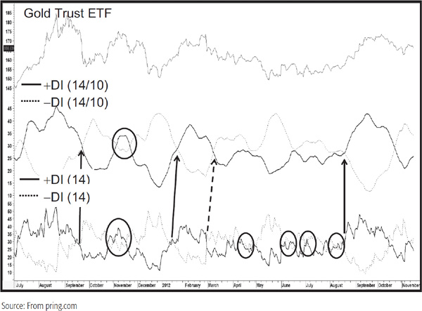
Unfortunately, things do not always work out as well, which you can see from the whipsaw signals in the five ellipses in the bottom window of Chart 15.22. That’s one reason why it is important to make sure that these crossovers are confirmed by the price. Another way around this is to smooth the two DIs as I have done in the middle panel of Chart 15.22 using a 10-day MA. This certainly eliminates a lot of the whipsaws, as you can see from the ellipses, but there is a trade-off in that the signals are occasionally delayed because this approach is less sensitive. In this instance, I have placed arrows at some of the key points where the smoothed series cross each other. Again, it’s important to remember that these are momentum signals and should be confirmed by the price. In addition, this approach, like most others, should be used where you decide to fight the battle. That means that if the price has already moved a long way by the time the signal has been triggered, it is probably best to ignore it for new positions.
CHART 15.22 Gold Trust ETF, 2011–2012 Comparing “Raw” with Smoothed DIs
A high ADX reading does not tell us that that the market is overbought and about to go down. Instead, it measures the intensity of the move from a directional point of view. Consequently, when it reaches a high reading and starts to reverse, a warning is given that the prevailing trend has probably run its course. From here on in we should expect it to change. This is different from a reversal in trend, since a change in trend could also be from up to sideways or down to sideways. In Chart 15.23, a 14-day ADX has been plotted against the Gold Trust ETF, the GLD. Note how reversals from high readings signal turning points at both tops and bottoms. Since the upward and downward trajectories are fairly deliberate, negative 10-day MA crossovers at high ADX readings act as good confirmation that a peak has been seen. The indicator in the bottom panel is simply the differential between a 10-day MA of a 14-day +DI and a –DI, as shown in the center panel of Chart 15.22. By comparing the position of the ADX to the differential, it is fairly obvious whether a high-end reversal is coming from an overbought or oversold level. When the ADX reverses in such a manner, it’s then a good idea to obtain some kind of price confirmation. Of the three instances in this chart, only the first in September 2011 was confirmed.
CHART 15.23 Gold Trust ETF, 2011–2012 the ADX versus a DI Differential Indicator
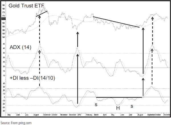
Low readings in the ADX indicate a lack of directional movement. These these can be helpful as well when it is fairly clear that a new rising trend of directional movement from such a benign level is under way. In this respect, the differential indicator traced out a reverse head and shoulders in the late summer of 2012 just as the ADX was crossing above its MA from a subdued level. The low ADX reading told you there was no directional movement and to be prepared for some. In addition, the breakout from the base in the differential and trendline violation in the price said it would be an upward one.
1. The KST can be constructed for any time frame, from intraday to primary.
2. It is calculated from the smoothed ROC of four time spans, each of which is weighted according to the length of its time span.
3. Long-term, short-term, and intermediate KSTs can be combined into one chart to reflect the market cycle model.
4. The KST lends itself to numerous momentum interpretive techniques.
5. The KST can successfully be applied to relative strength analysis.
6. The Special K is a summation of the short-term, intermediate, and long-term KSTs and can be useful for identifying short-term and long-term trend reversals.
7. In most situations, the Special K peaks and troughs very closely to primary-trend turning points.
8. Trend reversals in the Special K are signaled by trendline violations, moving-average crossovers, and peak/trough progression reversals.
9. The +DI and –DI measure positive and negative short-term direction. They can be smoothed to eliminate whipsaws and can be differentiated to result in a timely oscillator.
10. When the raw or smoothed DIs cross, they trigger buy and sell momentum signals.
11. The ADX measures the directional movement of a trend.
12. A rising ADX indicates an increase in directional movement and vice versa.
13. When the ADX reverses direction from a high reading, the prevailing trend is likely to change.