
The methods of trend determination considered so far have been concerned with analysis of the movement of the price itself through trendlines, price patterns, and moving-average (MA) analysis. These techniques are extremely useful, but they identify a change in trend only after it has taken place. The use of momentum indicators can warn of latent strengths or weaknesses in the indicator or price being monitored, often well ahead of the final turning point.
This chapter will examine the general principles of momentum interpretation that apply in some degree or another to all such oscillator type indicators. Rate of change will be used as a case study. The subsequent two chapters will discuss other specific momentum indicators.
The concept of upside momentum is illustrated in the following example. When a ball is thrown into the air, it begins its trajectory at a very fast pace; i.e., it possesses strong momentum. The speed at which the ball rises gradually diminishes, until it finally comes to a temporary standstill. The force of gravity then causes it to reverse course. This slowing-down process, known as a loss of upward momentum, is a phenomenon that is also experienced in financial markets. The flight of a ball can be equated to a market price. The price’s rate of advance begins to slow down noticeably before the ultimate peak in prices is reached.
On the other hand, if a ball is thrown inside a room and hits the ceiling while its momentum is still rising, the ball and the momentum will reverse at the same time. Unfortunately, momentum indicators in the marketplace are not dissimilar. This is because there are occasions on which momentum and price peak simultaneously, either because a ceiling of selling resistance is met or because buying power is temporarily exhausted. Under such conditions, the level of momentum is often as helpful as its direction in assessing the quality of a price trend.
The idea of downward momentum may be better understood by comparing it to a car that is pushed over the top of a hill. The car begins to roll downhill and, as the gradient of the hill steepens, to accelerate; at the bottom, it reaches maximum velocity. Although its speed then begins to decrease, the car continues to travel, but finally it comes to a halt. Market prices act in a similar fashion: The rate of decline (or loss of momentum) often slows ahead of the final low. This is not always the case, however, since momentum and price sometimes (as at peaks) turn together as prices meet a major level of support (resistance). Nevertheless, momentum leads price often enough to warn of a potential trend reversal in the indicator or market average that is being monitored.
Momentum is a generic term. Just as “fruit” describes apples, oranges, grapes, etc., so “momentum” embraces many different indicators. Examples include rate of change (ROC), the relative strength indicator (RSI), moving-average convergence divergence (MACD), breadth oscillators, and diffusion indexes.
There are essentially two broad ways of looking at momentum. The first uses price data for an individual series, such as a currency, commodity, stock, or market average, and manipulates it in a statistical form that is plotted as an oscillator. We will call this price momentum (although volume can be manipulated in the same way). The second is also plotted as an oscillator, but is based on statistical manipulation of a number of market components, such as the percentage of New York Stock Exchange (NYSE) stocks above a 30-week MA. This measure is referred to as breadth momentum and is discussed in Chapter 27. Price momentum can be constructed for any price series, but breadth momentum can be calculated only for a series that can be broken down into various components.
This chapter outlines the eight basic principles. (For further study please refer to The Definitive Guide to Market Momentum, Martin J. Pring, 2009, Traders Press or the momentum module at the online technical analysis course at Pring.com.) We will be using ROC as an example, but you should remember that it is only one type of price momentum indicator. Chapters 14, 15, 26, and 27 will discuss other individual indicators for price and breadth momentum, respectively.
It should be noted that the type of trend reversal signaled by a momentum indicator depends upon the time span over which it has been calculated. It is accepted practice to use daily data for identifying short-term trends, weekly data for intermediate trends, and monthly data for primary trends.
It is very important to note that the use of momentum indicators assumes that markets or stocks are experiencing a normal cyclic rhythm, which is expressed in price action by rallies and reactions. However, in some instances, countercyclical reactions are almost nonexistent. Price movement is then reflected as a linear uptrend or downtrend. This is an unusual phenomenon, and when it develops, momentum indicators fail to work.
The simplest way of measuring momentum is to calculate the rate at which a security price changes over a given period of time. This is known as a rate of change (ROC) indicator. If it is desired, for example, to construct an ROC using a 10-week time span, the current price is divided by the price 10 weeks ago. If the latest price is 100 and that one 10 weeks ago was 105, the ROC or momentum indicator will read 95.2, that is, 100 divided by 105. The subsequent reading in the indicator will be calculated by dividing next week’s price by the price 9 weeks ago (see Table 13.1); the result is a series that oscillates around a central reference point.
TABLE 13.1 10-Week ROC Calculation

This horizontal equilibrium line represents the level at which the price is unchanged from its reading 10 weeks ago (Figure 13.1). If an ROC calculation were made for a price that remained unchanged, its momentum index would be represented by a straight line.
FIGURE 13.1 ROC Using Percentage Scaling
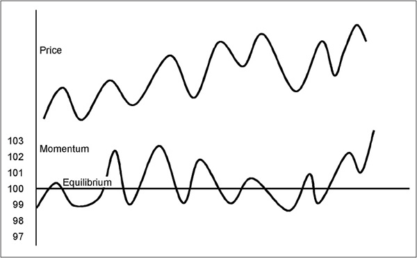
When an ROC indicator is above the reference line, the market price that it is measuring is higher than its level 10 weeks ago. If the ROC indicator is also rising, the difference between the current reading of the price and its level 10 weeks ago is growing. If an ROC indicator is above the central line but is declining, the price is still above its level 10 weeks ago, but the difference between the two readings is shrinking. When the ROC indicator is below its central line and falling, the price is below its level 10 weeks ago, and the difference between the two is growing. If the indicator is below its central line but rising, the price is still lower than its level 10 weeks ago, but its rate of decline is slowing.
In short, a rising ROC indicator implies expanding velocity, and a falling one implies a loss of momentum. Rising momentum should be interpreted as a bullish factor, and declining momentum as a bearish one.
There are two methods of scaling an ROC chart. Since the choice does not affect the trend or level of the index, the method used is not important, but a brief explanation is in order because the two alternatives can be confusing. The first method is the one described earlier and shown in Figure 13.1, where 100 becomes the central reference point. In the example, 100 (this week’s observation) divided by 99 (the observation 10 weeks ago) is plotted as 101, 100 divided by 98 as 102, 100 divided by 102 as 98, and so on.
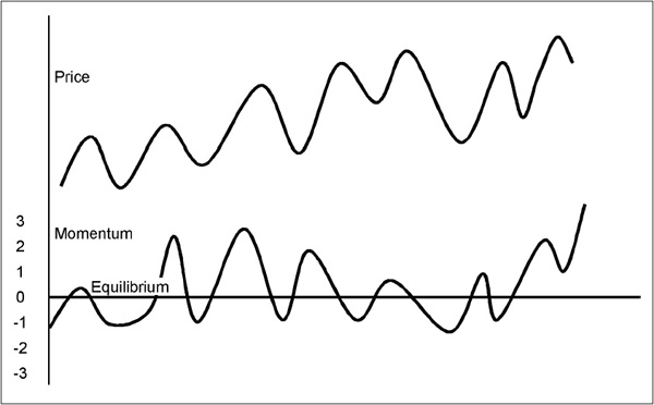
The alternative is to take the difference between the indicator and the 100 level and plot the result as a positive or negative number, using a reference line of 0. In this case, 101 is plotted as +1, 102 as +2, 98 as -2, and so on (see Figure 13.2).
FIGURE 13.2 ROC Using Plus and Minus Scaling
Choosing the correct time span is important. For longer-term trends, a 12-month or 52-week momentum is generally the most reliable, although a 24- or 18-month period can also prove useful. For intermediate trends, a 9-month, 26-week (6-month), or 13-week (3-month) momentum works well. Price movements of even shorter duration are often reflected by a 10-, 20-, 25-, or 30-day span. Reliable short/intermediate movements are often reflected with a 45-day (9-week) span.
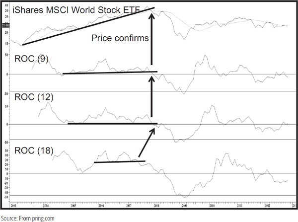
In this way, trendlines, price patterns, or divergences, which may not be apparent in one period, are more apparent in another. The discovery of signs of a trend reversal in several indicators constructed from different time spans adds further fuel to the weight of the evidence. An example of this is featured in Chart 13.1 for the iShares MSCI World Stock ETF (symbol ACWI) just prior to the 2007–2009 bear market. Note that the trendline for the price was violated more or less simultaneously with the 12-month MA for a stronger signal than just the trendline on its own.
CHART 13.1 iShares MSCI World Stock ETF 2002–20012 Multiple Momentum Trend Breaks
The following description of the principles and use of momentum indicators applies to all forms of oscillators, whether constructed from an individual price series or from an index that measures internal market momentum, such as those described in Chapter 27.
These principles can be roughly divided into two broad categories.
1. Those that deal with overbought conditions, oversold conditions, divergences, and the like. I will call these momentum characteristics. If you study momentum indicators or oscillators, you’ll find that they have certain characteristics that are associated with subsurface strengths or weaknesses in the underlying price trend. It’s rather like looking under the hood of an engine. Quite a lot of the time you can identify mechanical trouble before it becomes self-evident. Momentum and sentiment are closely allied, and the relationship between them is discussed in Chapter 29.
2. The identification of trend reversals in the momentum indicator itself. I will call these momentum trend reversal techniques. In this case, we are making the assumption that when a trend in momentum is reversed, prices will sooner or later follow.
Trend-determining techniques, such as trendline violations, moving-average crossovers, etc., when applied to momentum, are just as valid as when utilized with price. The difference, and it is an important one, is that a trend reversal in momentum is just that—a reversal in momentum. Momentum typically reverses along with price, often with a small lead, but just because oscillators change direction, doesn’t always mean that prices will too. Normally, a reversal in the momentum trend acts as confirming evidence of a price trend reversal signal. In effect, this momentum signal performs the act of supplementary “witness” in our weight-of-the-evidence approach. I will have more to say on this one a little later, but for now, take special note of the fact that actual buy and sell signals can only come from a reversal in trend of the actual price, not the momentum series.
1. Overbought and Oversold Levels Perhaps the most widely used method of momentum interpretation is the evaluation of overbought and oversold levels. This concept can be compared to a person taking an unruly dog for a walk on a leash. The leash is continually being pulled from one side of the person to the other as the dog struggles to get free. Despite all its activity, however, the dog can move no farther away than the length of the leash.
The same principle holds true for momentum indicators in the marketplace, except that the market’s “leash” should be thought of as made of rubber, so that it is possible for particularly strong or weak price trends to extend beyond the normal limits, known as overbought and oversold-levels. These areas are drawn on a chart at some distance above and below the equilibrium level, as in Figure 13.3. The actual boundaries will depend on the volatility of the price being monitored and the time period over which the momentum indicator has been constructed, For example, an ROC indicator has a tendency to move to wider extremes over a longer period than over a shorter one. It is highly unlikely that a price will move 10 percent over a 10-day period; yet, over the course of a primary bull market extending over a 12-month period, a 25 percent increase would not be uncommon. Some indicators, such as the RSI and stochastic, have been specially constructed to move within definite predetermined boundaries.
FIGURE 13.3 Overbought and Oversold Zones
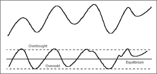
When a price reaches an overbought or oversold extreme, the probabilities favor but, by no means guarantee, a reversal. An overbought reading is a time to be thinking about selling, and an oversold one warns that the current technical position may warrant a purchase. In many cases, when a price reaches an overbought extreme, the news is good, participants are optimistic, and human nature tells us to buy. Unfortunately, the opposite is more likely to be the case. On the other hand, an oversold reading is usually associated with a negative news background. The last thing we want to do is raise our shaking hand, pick up the phone, and call our friendly broker or nervously click online, but that is often a reasonable time to do it, provided the overall technical position is favorable.
In view of the variability of indicators such as ROC, there is no hard-and-fast rule about where the overbought and oversold lines should be drawn. This can be determined only by studying the history and characteristics of the security being monitored. They should be drawn such that they will act as pivotal points, which, when touched or slightly exceeded, are followed by a reversal in the oscillator. When a particularly sharp price movement takes place, these boundaries will become totally ineffective. Unfortunately, this is a fact of life, but by and large, it is usually possible to construct overbought and oversold benchmarks that are price-sensitive. Again, the market “leash” is made of rubber and can remain in overbought or oversold territory for long periods. Consequently, it is essential to get confirmation from a reversal in the trend of the price itself before taking any drastic action.
2. Oscillator Characteristics in Primary Bull and Bear Markets I mentioned earlier that the character of an oscillator alters according to the price environment. In a bull market, oscillators tend to move into an overbought condition very quickly and stay there for a long time. In a bear market, they can and do remain in an oversold condition for a long time. In effect, an oscillator is not unlike a migrating bird in the Northern Hemisphere. I’ve divided the price action in Figure 13.4 into a bear market, followed by a bull, and finally another bear market. As we enter the bear phase, the true range of the oscillator shifts to the south, in a similar way to a bird in the Northern Hemisphere migrates south to escape the cold northerly winter. Then, when the bull market starts, the oscillator’s trading pattern migrates north again. As a new bear market begins, just like the bird the oscillator finally shifts south again.
FIGURE 13.4 Changes in Momentum Characteristics in Bull and Bear Markets
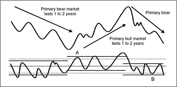
This is useful information in itself, for if it’s possible to draw parallel horizontal lines like these against an oscillator, it provides a valuable clue as to whether the prevailing primary trend is bullish or bearish.
The second point is that if you have an idea of the direction of the primary trend, you can anticipate what price action might follow from a specific overbought or oversold reading. In a bull market, the price is extremely sensitive to an oversold condition. That means that when you are lucky enough to see one, look around for some confirming signals that the price is about to rally. An example might be the violation of a down trendline, etc. The reason for this sensitivity lies in the fact that the oversold reading very likely reflects an extreme in short-term sentiment. Market participants are focusing on the latest bad news and using that as an excuse to sell. Since this is a bull market, they would be better served by remembering the positive long-term fundamentals that will soon emerge and using this weakness as an opportunity to buy.
The same thing happens in reverse during a bear market. Traders are focused on bad news, which sends the price down. Then, some unexpectedly good news hits the wires and the price rallies. However, when it is fully digested, most people realize that things really haven’t changed at all and the price declines again. Thus, the overbought reading more often than not will correspond with the top of a bear market rally.
Looking at it from another perspective, during a bull market, the price will be far less sensitive to an overbought condition. Often, it will be followed by a small decline or even a trading range, as at point A in Figure 13.4. The rule, then, is don’t count on a short-term overbought condition to trigger a big decline because the odds do not favor it.
Finally, people often point to an oversold condition and use that as their rationale for a rally. Your favorite financial columnist might say “Analysts point out that the market is deeply oversold and a snapback rally is expected.” Once again, it very much depends on the environment. In a bull market, that’s true, but the columnist is more likely to say that “despite a short-term oversold condition, analysts are expecting lower prices because. . .” and then the columnist will go on to list a load of bearish factors justifying his or her position. Remember the media tend to reflect the crowd, which is usually wrong at turning points and do not make accurate forecasts, especially when quoting “experts.” In a bear market, though, a market or stock is far less sensitive to an oversold reading, often failing to signal a rally, or possibly being followed by a trading range, as at point B in Figure 13.4.
The maturity of the trend, whether primary or intermediate, often has an effect on the limits that an oscillator might reach. For example, when a bull market has just begun, there is a far greater tendency for it to move quickly into overbought territory and to remain at very high readings for a considerable period of time. In such cases, the overbought readings tend to give premature warnings of declines. During the early phases of the bull cycle, when the market possesses strong momentum, reactions to the oversold level are much more responsive to price reversals, and such readings, therefore, offer more reliable signals. It is only when a bull trend is maturing, or during bear phases, that overbought levels can be relied upon to signal that a rally is shortly to be aborted. The very fact that an indicator is unable to remain at, or even to achieve, an overbought reading for long is itself a signal that the advance is losing momentum. The opposite is true for a bear trend.
3. Overbought/Oversold Re-crossovers In most cases, excellent buy and sell alerts are generated when the momentum indicator exceeds its extended overbought or oversold boundary and then re-crosses back through the boundary on its way to zero. Figure 13.5 demonstrates this possibility. This approach filters out a lot of premature buy and sell signals generated as the indicator just reaches its overextended boundary, but one should still wait for a trend reversal in the price itself before taking action.
FIGURE 13.5 Overbought and Oversold Re-crossovers

4. Mega Overboughts and Oversolds As discussed in Chapter 29, there is a close connection between market sentiment indicators and the characteristics of oscillators. Since market sentiment differs widely during a bull and bear market, it follows that such variations are occasionally reflected in changing characteristics of momentum indicators. I have termed one of these phenomena “mega overboughts and oversolds.” A mega overbought is the initial thrust in a bull market following the final low. It’s a reading in the momentum indicator that takes it well beyond the normal overbought condition witnessed in either a preceding bull or bear market. It should, for example, represent a multiyear high for the oscillator concerned—perhaps even a record overbought reading. Such conditions are usually a sign of a very young and vibrant bull market. The very fact that an oscillator is able to even rise to such a level can be used, along with other trend-reversal evidence, to signal that a new bull market has begun. It represents a sign that the balance between buyers and sellers has unequivocally shifted in favor of buyers. It’s something like a person using all his strength to crash through a locked door. It takes a tremendous amount of energy to achieve, but once the door is finally shoved open, there is nothing to hold that person back any longer. In the same way, a mega overbought removes the price from its bear market constraints, leaving it free to experience a new bull market. An example is shown in Figure 13.6.
FIGURE 13.6 Mega Overbought
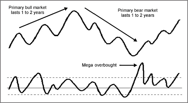
This is about the only instance when opening a long position from an overbought condition can be justified. Even so, it can only be rationalized by someone with a longer-term time horizon. This is due to the fact that whenever an oscillator experiences a mega overbought, higher prices almost always follow after a short-term setback or consolidation has taken place. A highly leveraged trader may not be able to withstand the financial pressure from the contratrend move, whereas the long-term investor can. In most instances, you will probably find that the correction following the mega overbought is a sideways rather than a downward one, but there are just enough exceptions to cause the over-leveraged trader a lot of sleepless nights. Since a mega overbought is associated with the first rally in a bull market, it’s a good idea to check and see if volume is also expanding rapidly. If it takes the form of record volume for that particular security, the signal is far louder because record volume coming after a major decline is typically a reliable signal of a new bull market. Expanding volume is a more or less necessary condition since it is consistent with the idea that buyers now have the upper hand and that the psychology has totally reversed.
Having said that, there are occasions when a mega overbought is followed not by a reversal, but by a change in trend. In other words, the previous bear market emerges into a multiyear trading range rather than a full-fledged bull market. The point here is that that the low that precedes the mega overbought is not normally decisively violated for many years.
The same concept also appears in reverse for oversold extremes. Consequently, when a price decline following a bull market high pushes a momentum indicator to a new extreme low, well beyond anything witnessed either during the previous bull market or for many years prior to that, the implication is that sellers now have the upper hand. The fact that it is possible for the momentum indicator to fall so sharply and so deeply is in itself a sign that the character of the market has changed. When you see this type of action, you should, at the very least, question the bull market scenario. Look for telltale signs that a new bear market may be underway. What are the volume configurations on the subsequent rally? Does volume now trend lower as the price rises compared to previous rallies that were associated with trends of rising volume? And so forth. The same possibilities of a change, as opposed to a reversal in trend, also apply in the sense that a mega oversold is typically the first decline in a bear market, but occasionally, it can also signal a change in trend from a primary bull market to a multiyear trading range. An example of a mega oversold is shown in Figure 13.7. Both mega conditions are usually best observed in short-term oscillators with a time span ranging from 10 to as many as 30 days. On weekly charts, it’s also possible to go out as much as 13 weeks, though obviously such signals are less timely than those derived from shorter-term time spans. They never develop from indicators whose construction constrains their fluctuations between 0 and 100, such as the RSI and stochastic.
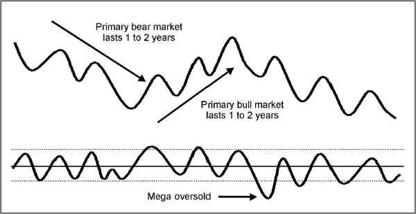
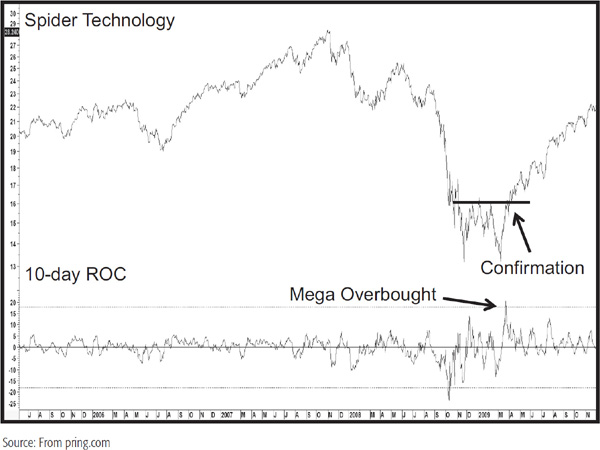
Chart 13.2 features the Spider Technology ETF (symbol XLK) at the 2009 primary bear market low. See how the high reading in the 10-day ROC exceeds anything seen prior for a classic mega overbought signal. This is quite remarkable when you remember that the first sign of a primary trend reversal is given within 10 days of the bear market low. This is not sufficient evidence to call a turn, but certainly enough to alert the observant analyst to be looking around for confirming evidence, such as a break above the horizontal trendline flagging the completion of a double bottom.
CHART 13.2 Spider Technology ETF 2005–2009 Mega Overbought
5. Extreme Swings The extreme swing is another phenomenon that signals a dramatic shift in psychology. It reflects the idea that some primary trend reversals are signaled by a swing from unbelievable exuberance as the bull market reaches its peak, to one of complete despondency and depression as the first bear market setback gets underway. The opposite is true of a transition from a primary bear to a primary bull market. In order for an extreme swing to develop, it is necessary to experience a prolonged uptrend or downtrend. The extreme swing then appears in a momentum indicator by an especially strong move in the direction of the then-prevailing trend, as shown in Figure 13.8. This is then followed by an extreme reading in the opposite direction. In Figure 13.8 we see a blow-off to the bull move as the oscillator reaches a highly overbought reading. This is subsequently followed by a price decline that pushes it to the other extreme. Such action indicates a dramatic shift in sentiment as market participants change from a mood of euphoria to one of despondency as the market eventually reacts in the opposite direction to that originally expected.
FIGURE 13.8 Bearish Extreme Swing
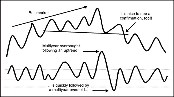
In order to qualify for an extreme swing, the first swing must represent the strongest move in several years, certainly the strongest since the initial thrust from the previous bear market bottom. It is really a climax move for the bull market. The second swing to the downside should really be a mega oversold, though in some cases, an extreme oversold will suffice.
This phenomenon undoubtedly occurs because the first swing encourages participants who have been right about the prevailing trend and discourages those who have been wrong. In the case of a bull market, the final rally also squeezes out all of the remaining shorts, so when the trend reverses, there is virtually no buying activity from speculators covering short positions. The preceding sharp advance also encouraged buyers who could see that there was only one way prices could go, and that was up. As a result, decisions on the buy side are made carelessly and without thought for the fact that prices may move the other way. When they do, such individuals are flushed out of the market with no quarter given. Since there are few short sellers able to pick up the pieces, the price drops ferociously.
Extreme swings also develop between a bear and bull primary trend, as featured in Figure 13.9. In this case, though, the mood swing is from total despondency and depression as the bear market squeezes out the last of the bulls to one of disbelief as the market reverses to the upside. At market bottoms, it is the shorts who gain confidence from the sharp and persistent downtrend. Even the strongest bulls are forced to capitulate, and eventually there is no one left to sell. Then, during the rally phase, the shorts are forced to cover and new buying comes in because of the perceived improvement in the fundamentals. Since there is virtually no one left to sell, prices shoot up and a mega or extreme overbought is registered.
FIGURE 13.9 Bullish Extreme Swing
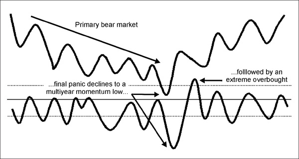
Needless to say, extreme swings are quite unusual, but when you can spot them, it really pays to follow their lead since a new trend invariably results.
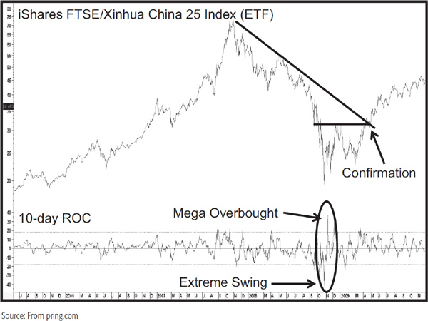
Chart 13.3 shows an example of a bullish extreme swing for the China iShare (symbol FXI), at the 2007–2009 primary bear market low. Note that in this case the bullish part of the pattern was also a mega overbought condition. It barely qualified, though, because although it was a multiyear overbought following a bear market, that decline was only a few months longer than our minimum requirement of 9 months for one of these phenomena.
CHART 13.3 iShares FTSE China 25 ETF 2005–2009 Extreme Swing
6. Divergences The ball example used at the beginning of the chapter showed that maximum velocity was obtained fairly close to the point at which the ball leaves the hand. Similarly, prices in financial markets usually reach their maximum level of momentum ahead of the final peak in prices. In Figure 13.10, this is shown at point A.
FIGURE 13.10 Momentum and Divergences
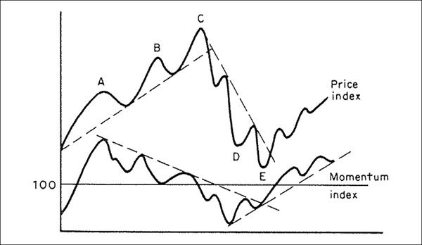
If the price makes a new high, which is confirmed by the momentum index, no indication of technical weakness arises. On the other hand, if momentum fails to confirm (point B), a negative divergence is set up between the two series, and a warning of a weakening technical structure is given. Such discrepancies normally indicate that the price will undergo a corrective process. It can take the form of either a sideways or a horizontal trading range, or (more likely) a downward one. However, the price will sometimes continue upward to a third top and be accompanied by even greater weakness in the momentum index (point C). Occasionally, the third peak in the momentum index may be higher than the second but lower than the first. Either circumstance requires some degree of caution, since this characteristic is a distinct warning of a sharp reversal in price or a long corrective period.
Figure 13.10 also shows a positive divergence. In this instance, the price makes its low at point E, but this was preceded by the oscillator, which bottomed at D.
Whenever any divergence between momentum and price occurs, it is essential to wait for a confirmation from the price itself that its trend has also been reversed. This confirmation can be achieved by: (1) the violation of a simple trendline, as shown in Figures 13.10 and 11: (2) the crossover of a moving average (MA); or (3) the completion of a price pattern. This form of insurance is well worth taking, since it is not unknown for an index to continually lose and regain momentum without suffering a break in trend during a long cyclical advance. Examples of this phenomenon occurred during the 1962–1966 bull market in U.S. stocks, and in Japanese stocks between 1982 and 1990.
A good example can be seen in Chart 13.4, which shows the Nikkei Index violating an important 3½-year secondary trendline after the 13-week ROC indicator had negatively diverged several times with the index. As a result, the final rally was accompanied by very little in the way of upside momentum. It would have been a mistake to sell on any of the prior divergences, but a very timely sell signal was generated by waiting for a confirmation in the form of a trend break in the index itself through a negative 65-week EMA crossover.
CHART 13.4 Nikkei 1995–1990 Negative Divergences

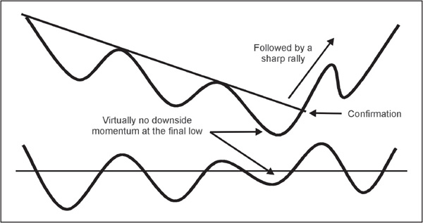
At point C in Figure 13.11, the price moves to a significant new high, but the momentum indicator is barely able to remain above the equilibrium line. Such a situation demands the utmost caution when accompanied by a trend break, for it is usually a sign of extreme technical weakness and is often, though certainly not always, followed by a very sharp decline. The opposite type of situation (Figure 13.12) in a bear market should be viewed as a very positive characteristic, especially if the upward trend break in price is accompanied by high volume. The more explosive the volume, the more reliable the signal is likely to be.
FIGURE 13.11 Extreme Bearish Divergence
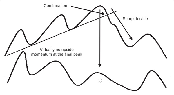
FIGURE 13.12 Extreme Bullish Divergence
In a sense, it is possible to equate momentum divergences and price trend breaks with dark clouds and rain. If you look up at the sky and observe dark clouds, common sense tells you that it will probably rain, but you do not know for sure until you can hold out your hand and actually feel rain falling. In other words, the clouds (like the divergences) warn of the deteriorating weather (technical condition), but the change is signaled only by the first raindrop (reversal in the price). It is possible to take the analogy a step further by concluding that the darker the clouds (the greater the number of divergences), the heavier the rainstorm (the sharper the price decline) will be.
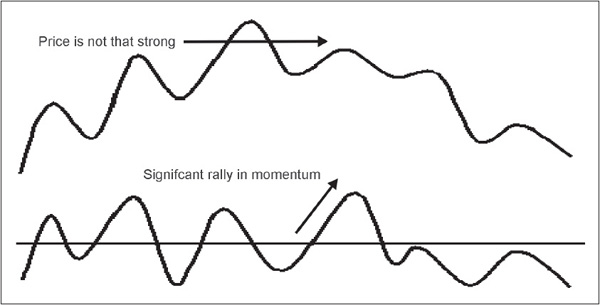
7. Price Discrepancy Divergence A further indication of subtle strength or weakness is given when the momentum series moves strongly in one direction, but the accompanying move in the price index is a much smaller one. Such a development suggests that the price index is tired of moving in the direction of the prevailing trend, for despite a strong push of energy from the momentum index, prices are unable to respond. This unusual, but powerful, phenomenon is illustrated for both tops and bottoms in Figures 13.13 and 13.14. The mid-1990 rally in the 13-week ROC for the Nikkei in Chart 13.4 represents good example. Note also how the price was turned back a couple of times by the 65-week EMA.
FIGURE 13.13 Bullish Price Discrepancy Divergence
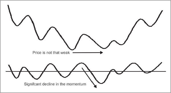
FIGURE 13.14 Bearish Price Discrepancy Divergence
8. Complex Divergences It is widely recognized that price movements are simultaneously influenced by several cyclic phenomena. Because a single momentum indicator can monitor only one of these cycles, it is always a good idea to compare several different momentum indicators based on differing time spans.
One approach is to plot two momentum indicators of differing time spans on the same chart, as shown in Figure 13.15. Since this method tries to monitor two separate cycles, it is wise to choose two widely different time spans. For example, not much could be gained from the comparison of a 12- and a 13-week ROC since they would move very closely together. On the other hand, a combination of 13- and 26-week spans would clearly reflect different cycles.
FIGURE 13.15 Complex Divergence
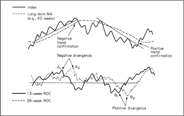
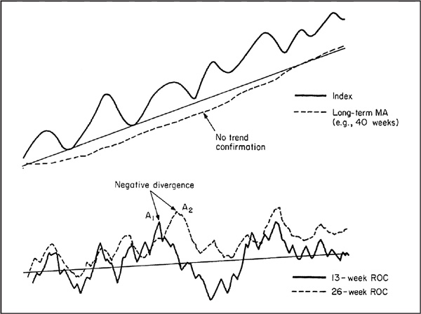
Most of the time, the two indicators are moving in gear, so this study does not give us much information. On the other hand, when the longer-term indicator reaches a new peak and the shorter one is at or close to the equilibrium line, they are clearly in disagreement or out of gear (point A2, Figure 13.15). This normally, but not necessarily, indicates that a reversal in trend will take place, and it is usually an important one. Even so, it is very important to make sure that any such divergence is confirmed by a reversal in the price trend itself. In Figure 13.15, a trend break does occur, but in Figure 13.16, no reversal took place and the price continued on upward.
FIGURE 13.16 Complex Divergence with Nonconfirmation
Complex divergences also occur in a positive combination, as indicated later on at point B1 in Figure 13.15, but again, it is mandatory to wait for that trend-reversal signal in the price itself.
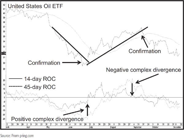
An example in Chart 13.5 features the United States Oil ETF. Note that it offers a good example of a positive and negative complex divergence, together with a confirmation. Generally speaking, the wider the divergent time spans within reason, the more likely you will be to spot these interesting characteristics.
CHART 13.5 U.S. Oil ETF Complex Divergences
1. Trendline Violations Occasionally, it is possible to construct a trendline on the momentum indicator by connecting a series of peaks or troughs. An example for an uptrend reversal is shown in Figure 13.17. When the line is violated, a trend reversal signal for the oscillator is generated.
FIGURE 13.17 Bearish Momentum Trend Break
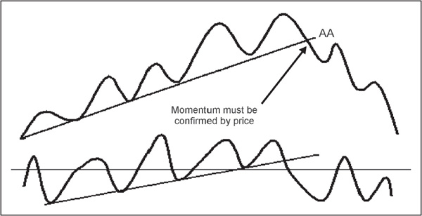
The construction and significance of the break should be based on the principles outlined in Chapter 6. This type of momentum weakness must be regarded as an alert, and action should be taken only when confirmed by a break in the price trend itself (indicated at point AA in Figure 13.17). In effect, the momentum trend break is reinforcing the price trend break, and it offers an additional piece of evidence that the trend has reversed.
An example signaling a new uptrend is featured in Figure 13.18. It is possible for the momentum trend break to precede that of the price by some time, yet it does not generally lose its potency because of this.
FIGURE 13.18 Bullish Momentum Trend Break
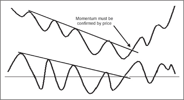
It should also be noted that momentum trendline breaks can be confirmed by any legitimate trend-reversal technique in the price, be it a moving average crossover, price pattern, peak-trough progression reversal, etc.
2. Momentum Price Patterns Momentum indicators are also capable of tracing out price patterns. Because of the shorter lead times normally associated with reversals of falling momentum, a breakout from an accumulation pattern, when accompanied by a reversal in the downward trend of the price itself, is usually a highly reliable indication that a worthwhile move has just begun. An example is shown in Figure 13.19.
FIGURE 13.19 Momentum Price Pattern Completion

It is important to use a little common sense in interpreting momentum price patterns. Figure 13.20, for example, shows a breakout from a reverse head-and-shoulders (H&S) pattern that takes place from an overbought condition. This is not to say that such signals will never be valid, but it stands to reason that a breakout from an extreme level is very unlikely to result in a sustainable price move. Remember, technical analysis deals with probabilities, and the odds of a favorable outcome in this case are low. If you want a tip-off, this type of failure typically develops in a contratrend way as a false upward breakout in a primary bear market or false downside move in a primary bull market.
FIGURE 13.20 Overbought Momentum Pattern Completion
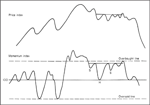
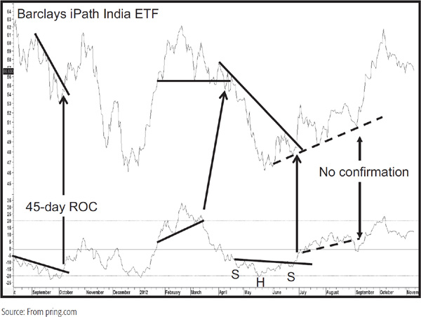
Chart 13.6 is rich in examples of momentum trendline breaks and price pattern completions. The September 2012 break of the dashed up trendline is a classic example of why it is important to wait for some price confirmation, as the failure of the price to do this was followed by a really good rally.
CHART 13.6 Barclays iPath India ETF Momentum and Price Patterns
3. Equilibrium Crossovers Some technicians have devised indicators that offer buy and sell signals when the momentum indicator crosses above and below its equilibrium or zero line. Many markets do not lend themselves to this approach, so its implementation depends very much on a trial-and-error basis through experimentation. In any event, it is always a good idea to use this method in conjunction with a reversal in the price itself. Chart 13.7 shows how zero crossovers used in conjunction with 12-month ROC crossovers have consistently given reliable buy signals for the Economist All Items Commodity Index. The two sets of ellipses point up a couple of whipsaw signals.
CHART 13.7 Economist Commodity Index 1969–2000 Equilibrium Crossovers

4. Momentum and Moving Averages By now, it is apparent that all the trend-determining techniques used for price are also applicable to momentum. Interpretation of momentum indicators, as described earlier, depends to a considerable extent on judgment. One method of reducing this subjectivity is to smooth the ROC index by using an MA. Warnings of a probable trend reversal in the price being monitored are offered by momentum moving average crossovers, as indicated in Figure 13.21.
FIGURE 13.21 MA Crossovers
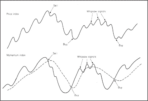
One of the problems associated with this approach is that the momentum indicator is often much more jagged than the price index that it is trying to measure, causing the generation of an unacceptable number of whipsaw signals. It is possible to filter out some of these whipsaws by using a combination of two MAs, as shown in Figure 13.22. Buy and sell alerts are given when the shorter-term MA crosses above or below its longer-term counterpart.
FIGURE 13.22 MA Crossovers Smoothed
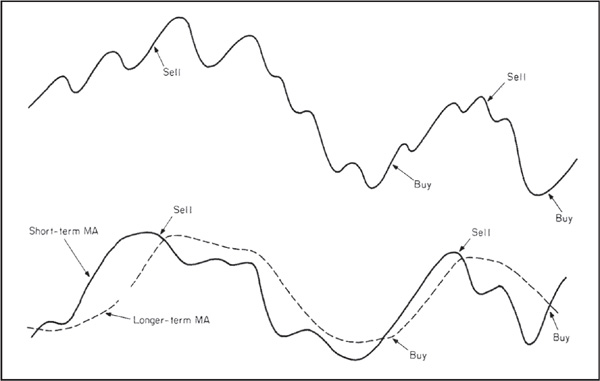
This interpretation of momentum is explained in greater detail in the next chapter, since momentum forms the basis of the trend deviation and MACD indicators.
Another way of incorporating MAs into momentum studies is to smooth the momentum indicator by a long-term MA. The meaning of “long-term” in this case will depend on the type of trend being monitored. For example, a 20- to 30-day time span would be suitable for a short-term price movement, but a 6-, 9-, 12-month or even longer smoothing is more appropriate for a primary trend. Warnings of a probable trend reversal in the price would be offered by a reversal in the smoothed momentum index itself, as shown in Figure 13.23, example a, or by a penetration of the MA through a designated overbought or oversold level, as in example b. The level of the dashed overbought and oversold barrier would be determined on a trial-and-error basis, with reference to a historical study of the relationship between the price and the momentum curve.
FIGURE 13.23 (a) Directional Changes of Smoothed Momentum MAs. (b) Overbought/Oversold Re-crossovers of Smoothed Momentum MAs

If the momentum series is found to be unduly volatile, it is always possible to smooth out fluctuations by calculating an even longer-term MA, or by smoothing the MA itself with an additional calculation.
Another possibility is to construct an oscillator by combining the MAs of three or four ROCs and weighting them according to their time span. This possibility is discussed at length in Chapter 15.
Chart 13.8 shows the effectiveness of combining two ROC indicators and smoothing them. In this case, the smoothing is a 10-month weighted average of 11- and 14-month rates of change of the S&P Composite monthly closing prices.
CHART 13.8 S&P Composite 1980–2012 Coppock Indicator
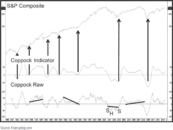
This was an approach devised by E. S. C. Coppock. Since this indicator has been found useful for market bottoms rather than tops, the momentum curve is significant only when it falls below the zero reference line and then rises. The arrows show that bull market signals between 1982 and 2012 were particularly timely. I have traced this indicator back to 1900 and found that only 3 signals out of 29, in 1913, 1941, and 2002, were premature. Clearly an excellent track record. Even these signals could have been filtered by requiring a positive 12-month MA crossover. Please note that this indicator can be just as easily applied to other markets or relationships.
The lower panel shows how it is possible to also incorporate trendline violations and price pattern completions using the raw data, i.e., the sum of the two ROCs.
A further variation on construction of a smoothed momentum index is to take the ROC of an MA of a price index itself. This method reverses the process described earlier, for instead of constructing an ROC and then smoothing the resulting momentum index, the price index itself is first smoothed with an MA and an ROC is taken of that smoothing.
1. Momentum is a generic term embracing many different types of oscillators.
2. Momentum measures the rate at which prices rise or fall. It gives useful indications of latent strengths or weakness in a price trend. This is because prices usually rise at their fastest pace well ahead of their peak and normally decline at their greatest speed before their ultimate low.
3. Since markets generally spend more time in a rising than a falling phase, the lead characteristic of momentum indicators is normally greater during rallies than during reactions.
4. Oscillators reflect market sentiment and have different characters in primary bull and bear markets.
5. There are two basic methods of interpreting momentum: momentum characteristics and momentum trend reversals.
6. Momentum signals should always be used in conjunction with a trend-reversal signal by the actual price.