
Breadth indicators measure the degree to which the vast majority of is-sues are participating in a market move and, therefore, monitor the ex-tent of a market trend. Generally speaking, the fewer the number of issues that are moving in the direction of the major averages, the greater the probability of an imminent reversal in trend. Breadth indicators were originally developed to monitor trends in the stock market, but in recent years, they have been expanded to embrace any market that can conveniently be subdivided into components. Even though most of the comments in this chapter refer to U.S. equities, it should be remembered that breadth can just as validly be extended to other markets around the world. For example, experiments with Indian, Brazilian, and several Middle Eastern markets have shown they are susceptible to such analysis, and I see no reason why other countries would not also lend themselves to this approach.
Breadth analysis can be applied to any sector or market that can be broken down into a basket of securities that are reflective of an overall index. An example might include a selection of commodities being compared to a commodity index or a series of currencies to an overall currency index such as the Dollar Index and so forth. The main thing to bear in mind is that the principles of interpretation remain constant.
The concept of breadth can probably be best explained using a military analogy. In Figure 27.1, lines AA and BB indicate military lines of defense drawn up during a battle. It might be possible for a few units to cross over from AA to BB, but the chances are that the BB line will hold unless an all-out effort is made. In example a, the two units represented by the arrows are quickly repulsed. In example b, on the other hand, the assault is successful since many units are taking part, and army B is forced to retreat to a new line of defense at B1.
FIGURE 27.1 Trench Warfare

A narrowly advancing stock market can be compared to example a, where it looks initially as though the move through the line of defense (in stock market terms, a resistance level) is going to be successful, but because the move is accompanied by such little support, the overall price trend is soon reversed. In the military analogy, even if the two units had successfully assaulted the BB defense, it would not be long before army B would have overpowered them, for the farther they advanced without broad support, the more vulnerable they would have become to a counteroffensive by army B.
The same is true of the stock market, for the longer a price trend is maintained without a follow-up by the broad market, the more vulnerable is the advance.
At market bottoms, breadth is not such a useful concept for determining reversals because the majority of stocks usually coincide with or lag behind the major indexes. On the few occasions when breadth reverses its downtrend before the averages, it is actually a more reliable indicator than at tops. I’ll begin this discussion with a rationale as to why the broad market normally leads the averages at market tops. The word “normally” is used because, in the vast majority of cases, the broad list of stocks does peak out ahead of a market average such as the Dow Jones Industrial Average (DJIA) or the S&P Composite. This rule is not invariable, however, and it should not be assumed that the technical structure is necessarily sound just because market breadth is strong. In most cases it will be, but if other indicators are pointing up weakness, this can override a positive breadth picture.
The most widely used indicator of market breadth is an advance/decline (A/D) line. It is constructed by taking a cumulative total of the difference (plurality) between the number of New York Stock Exchange (NYSE) issues that are advancing over those that are declining in a particular period (usually a day or a week). Similar indexes may be constructed for the American Exchange (AMEX) or NASDAQ issues. Because the number of issues listed on the NYSE has expanded since breadth records were first kept, an A/D line constructed from a simple plurality of advancing over declining issues gives a greater weighting to more recent years. For the purpose of long-term comparisons, it is better to take a ratio of advances versus declines, or a ratio of advances and declines divided by the number of unchanged issues, rather than limiting the calculation to a simple plurality.
The late Hamilton Bolton devised one of the most useful measurements of breadth. It is calculated from a cumulative running total of the following formula:

where A = the number of stocks advancing
D = the number declining
U = the number unchanged
Since it is not mathematically possible to calculate a square root of a negative answer (i.e., when the number of declining stocks is greater than the number of those advancing), the D and A are reversed in such cases, so that the formula becomes the square root of D/U – A/U. The resulting answer is then subtracted from the cumulative total, as opposed to the answer in the earlier formula, which is added. Table 27.1 illustrates this calculation using weekly data.
TABLE 27.1 Weekly A/D Line Calculation (Bolton Formula)

Inclusion of the number of unchanged issues is useful because the more dynamic the move in either direction, the greater the tendency for the number of unchanged stocks to diminish. Consequently, by giving some weight to the number of unchanged stocks in the formula, it is possible to assess a slowdown in momentum of the A/D line at an earlier date, since an expanding number of unchanged issues will have the tendency to re-strain extreme movements.
The A/D line normally rises and falls in sympathy with the major market averages, but it usually peaks well ahead of them. There appear to be three basic reasons why this is so:
1. The market as a whole discounts the business cycle and normally reaches its bull market peak 6 to 9 months before the economy tops out. Since the peak in business activity is itself preceded by a deterioration of certain leading sectors such as financial, consumer spending, and construction, it is logical to expect that the stocks representing these sectors will also peak out ahead of the general market.
2. Many of the stocks listed on the NYSE, such as preferreds and utilities, are sensitive to changes in interest rates. Since interest rates usually begin to rise before the market peaks, it is natural for the interest-sensitive issues to move down in sympathy with rising rates.
3. Poorer-quality stocks offer the largest upside potential, but they are also representative of smaller, underfinanced, and badly managed companies that are more vulnerable to reduced earnings (and even bankruptcy) during a recession. Blue-chips normally have good credit ratings, reasonable yields, and sound underlying assets; thus, they are typically the last stocks to be sold by investors during a bull market.
The DJIA and other market averages are almost wholly composed of larger companies, which are normally in better financial shape. These popular averages, therefore, continue to advance well after the broad market has peaked out.
Here are some key points for interpreting A/D data:
1. Some A/D lines appear to have a permanent downward bias. It is, therefore, important as a first step to observe the relationship between an A/D line and an index over a very long period to see whether this bias exists. Examples include breadth data for the AMEX market, the U.S. over-the-counter (OTC) market, and the Japanese market.
2. Divergences between a market average and an A/D line at market tops are almost always cleared up by a decline in the average. However, it is mandatory to await some kind of trend-reversal signal in the average as confirmation before concluding that it will also decline.
3. It is normal for the A/D line to coincide or lag at market bottoms. Such action is of no forecasting value. When the A/D line refuses to confirm a new low in the index, the signal is unusual and very positive, but only when confirmed by a reversal in the average itself.
4. Breadth data may diverge negatively from the averages, but an important rally is often signaled when a down trendline violation is signaled along with a breakout in the market average itself.
5. In most cases, daily A/D lines have more of a downward bias than lines constructed from weekly data.
6. A/D lines may be used with moving-average (MA) crossovers, trendline breaks, and price pattern analysis. For longer periods, the 200-day MA appears to work reasonably well.
7. When the A/D line is in a positive trend, e.g., above its 200-day MA, it indicates that the environment for equities in general is a positive one, regardless of what the major averages such as the DJIA or S&P Composite may be doing. A positive A/D line is, therefore, a better bellwether for the market as a whole than a narrowly based blue-chip index. The opposite is true when the A/D line is in a declining trend.
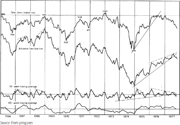
For this reason, divergences between the A/D line and the major market averages at primary peaks are more significant than those that occur at intermediate tops. For example, Chart 27.1 shows that the weekly A/D line peaked in March 1971, almost 2 years ahead of the DJIA, a very long period by historical standards. The ensuing bear market was the most severe since the Depres-sion. On the other hand, the absence of a divergence does not necessarily mean that a steep bear market cannot take place, as the experience of the December 1968 top indicates. This is also shown in Chart 27.1.
CHART 27.1 The DJIA and the Weekly NYSE A/D Line, 1966–1977
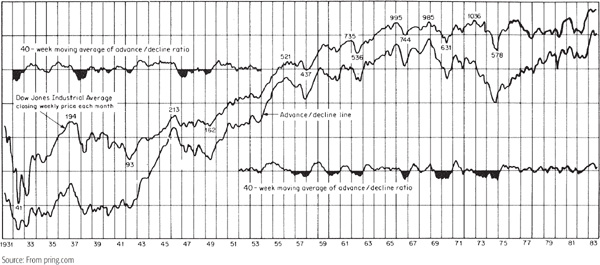
Positive divergences develop at market bottoms where the A/D line refuses to confirm a new low in the Dow. The most significant one occurred in the 1939–1942 period. The DJIA (shown in Chart 27.2) made a series of lower peaks and troughs between 1939 and 1941, while the A/D line refused to confirm. Finally in the middle of 1941, the A/D line made a post-1932 recovery high unaccompanied by the DJIA. The immediate result of this discrepancy was a sharp sell-off into the spring of 1942 by both indicators, but even then the A/D line held well above its 1938 bottom, unlike the DJIA. The final low in April 1942 was followed by the best (in terms of breadth) bull market on record. This positive action by the broad market is unusual. Typically at market bottoms the A/D line either coincides with or lags behind the low in the DJIA and has no forecasting significance until a reversal in its downtrend is signaled by a breakout from a price pattern, a trendline, or MA crossover.
CHART 27.2 The DJIA and the Long-Term A/D Line, 1931–1983
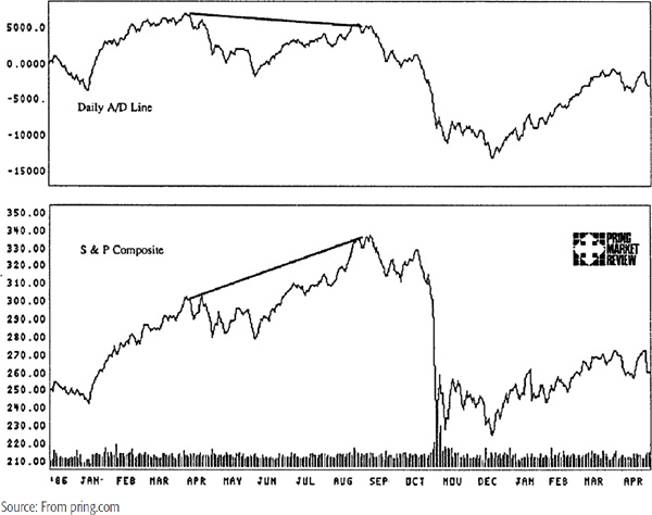
Because daily A/D lines have a tendency toward a downward bias, some care should be used in comparing recent highs with those achieved 2 to 3 years ago. Daily A/D lines come into their own when they fail to confirm new highs in the market average that have occurred within an 18-month period. An example is shown in Chart 27.3a, where the A/D line peaks in April 1987 but the S&P Composite does not top out until late August. The S&P did not fall right away, but eventually followed the leadership of the A/D line. Quite often, a number of divergences will be set up. Initially, these might be well publicized, but since the widely expected decline fails to materialize, many technicians give up, stating that the divergence “won’t work this time.” Invariably it does work, though much later than most would anticipate. This was very much the case at the market peak in January 1973, which was followed by a 2-year divergence.
CHART 27.3a The S&P Composite versus the Daily NYSE A/D Line, 1986–1988
Because bottoms in the daily line usually coincide with or lag behind bottoms in the average, they are not very useful at this point for the purpose of identifying a trend reversal.
A more practical approach is to construct a trendline for both the A/D line and the market average. Violation of both lines usually signals that an important rally is under way. Some examples are shown in Chart 27.3b.
CHART 27.3b The S&P Composite versus the Daily NYSE A/D Line, 1991–1995
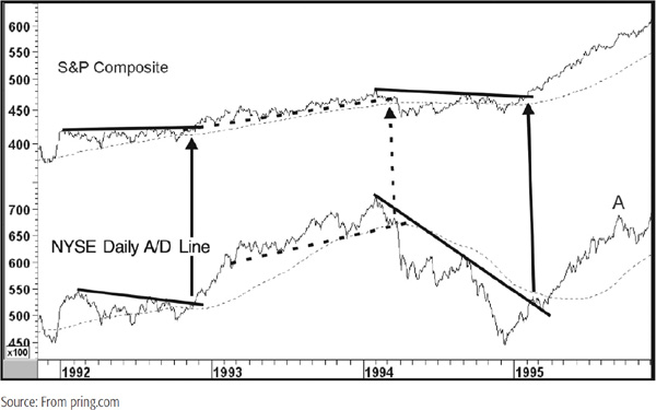
Two resistance lines are violated at the end of 1992. Later on, the two dashed up trendlines are violated for a joint sell signal. Note that in this case the lines are penetrated at approximately the same time that both series cross below their respective 200-day MAs. This joint evidence adds to our weight-of-the-evidence approach and increases the odds of a valid breakout. Finally, both series violate down trendlines at the beginning of 1995.
When considering potential divergences or nonconfirmations, it is always important to give these relationships some room. For example, at point A it may have appeared at the time that the A/D line was going to experience a major negative divergence since it had yet to beat its early 1994 high. It would have been easy to jump to a bearish conclusion. However, this would not have been supported by the facts since the A/D line was well above its 200-day MA at this point. Moreover, there was no sign of a trend break in the S&P Composite that would confirm the negative divergence even had it existed. As it turned out, both series went on to make significant new highs, thereby pointing out the importance of giving the prevailing trend and this relationship the benefit of the doubt.
Charts 27.4 and 27.5 also compare the S&P Composite to the daily A/D line. The first shows a negative divergence that opened up at the 2007 bull market peak. I have highlighted the 2009 low, though this was not an actual divergence, as both simultaneously registered new lows, though that for the breadth indicator was clearly less intense. This slight discrepancy did represent a small warning that things might turn to the upside, but really required the kind of confirmation given at point B, where two down trend-lines were penetrated on the upside. The action at A was a positive divergence as the A/D line experienced rising bottoms but not the price. This was again confirmed with two nice trendline violations, and a solid rally followed. Chart 27.5 shows a later period. First we see a confirmed negative discrepancy at the July 2011 intermediate top. This time, it’s different because the S&P registered its high ahead of the line. It really does not matter which way this disagreement falls, though usually it comes from A/D line weakness. The key is that when both series confirm with a trendline break or reliable MA crossover, a discrepancy is a discrepancy and prices fall. Points A and B offer two examples of a rare situation whereby the A/D line bottoms ahead of the S&P. In the case of A, we see some actionable confirmation. However, in B’s case, the drop was so steep that it was not possible to construct timely trendlines that could have served as actionable technical events.
CHART 27.4 The S&P Composite versus the Daily NYSE A/D Line, 2007–2009
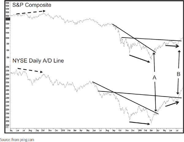
CHART 27.5 The S&P Composite versus the Daily NYSE A/D Line, 2010–2012

For historical comparative purposes, the rate-of-change (ROC) method of determining momentum is useful in measuring price indexes because it reflects moves of similar proportion in an identical way. This method, however, is not suitable for gauging the vitality of the indicators constructed from cumulative data that monitor internal market structure, such as those that measure volume or breadth. This is because the construction of such indexes is often started from a purely arbitrary number. Under certain circumstances, this might require an ROC to be calculated between a negative and a positive number, which would obviously give a completely false impression of the prevailing trend of momentum. The following sections provide a brief summary of some oscillators constructed from breadth data using a more suitable method of calculation.
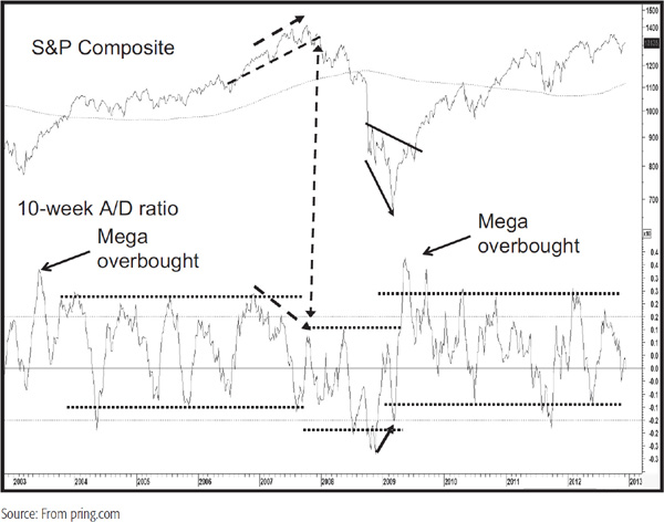
Chart 27.6 shows the DJIA and a 10-week oscillator calculated from a 10-week MA of the square root of the A/U – D/U formula discussed earlier. A comparison of the A/D line to the DJIA illustrates the principle of divergence, as evidenced by declining peaks of momentum and rising peaks in the Dow at the 2007 peak. This was later confirmed by a break below the dashed up trendline. A positive divergence was also confirmed in the spring of 2009. Note that it was possible to establish different ranges for the oscillator depending on the primary trend environment. These are shown by the dashed parallel lines. Also, note the extremely high reading in the oscillator as it came off the 2009 low. This was a mega overbought and represented an early bird warning of a reversal to a bull market. You can also see an extreme but lower reading in the spring of 2003. That was also a mega overbought, but this time signaling the start of the 2003–2007 bull market.
CHART 27.6 The S&P Composite versus the 10-Week A/D Ratio, 2002–2013
These indicators are calculated by taking a 10- or 30-day MA of the A/D or the A – D ratio. An alternative calculation can be made by dividing the total of advancing issues by the total of declining issues over a specific time span. Their interpretation is exactly the same as with other momentum indicators, bearing in mind their relatively short time span. An example of a 10-day breadth momentum series is shown in Chart 27.7.
CHART 27.7 The NYSE Daily A/D Line, 1999–2001, and Two Breadth Oscillators
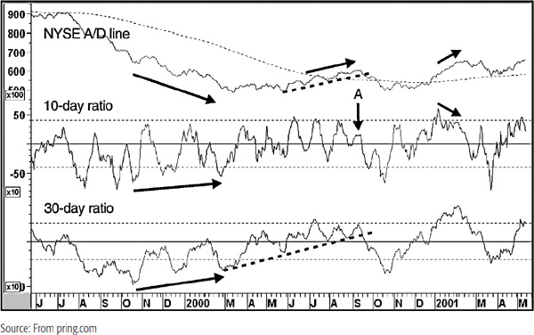
Note that this time we are comparing the oscillators to the A/D line itself rather than the S&P or DJIA. Both series experience a set of positive divergences between 1999 and March 2000. Then we see some negative divergences as the A/D line peaks out later that year. Note how the 10-day series is barely able to rally above the equilibrium point, indicating extreme weakness at the time of the actual rally high in September. Finally, both the 30-day oscillator and the line itself both violate up trendlines for a classic weight-of-the-evidence sell signal. One final negative divergence develops in January 2001.
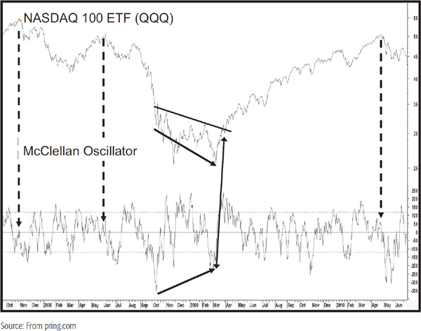
The McClellan Oscillator is a short-term breadth momentum indicator that measures the difference between a 19- and a 39-day exponential moving average (EMA) of advancing minus declining issues. In this respect, it is based on the same principle as the moving-average convergence divergence (MACD) indicator discussed in Chapter 14. The generally accepted rules are that buy signals are triggered when the McClellan Oscillator falls to the oversold area of –70 to –100 and sell signals are triggered when it rises to the +70 to +100 area. Since the calculation is based on a subtraction method and the number of NYSE issues has grown over the years, these bands are probably too narrow to be of practical use. My own experience suggests that its interpretation should be based on the same principles as those described in Chapter 13 using divergences, trendline analysis, and so forth. An example is shown in Chart 27.8 using breadth data from the NASDAQ exchange. Note the positive divergence that developed at the 2009 low. The dashed vertical arrows flag three important peaks—all were associated with a very low reading in the oscillator. At the 2000 peak, the indicator was actually in slightly negative territory, clearly an extreme reading for an extreme chart point.
CHART 27.8 NASDAQ 100 ETF, 2007–2010, and the McClellan Oscillator
Finally, the oscillator has been described here using two specific time frames for the EMAs for the calculation since these are the generally accepted default values. However, there is nothing to stop the innovative technician from experimenting with different combinations of EMAs.
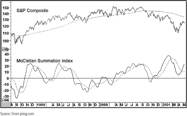
The McClellan Summation Index is a derivation of the McClellan Oscillator and is calculated as a cumulative total of the daily readings of the oscillator itself. The result is plotted as a slow-moving curve that changes direction whenever the raw oscillator (described earlier) crosses above or below its zero line. The slope of the summation curve is determined by the difference between the actual reading and the zero line. In other words, an overbought reading will cause the summation index to rise sharply, and vice versa. Many technicians use these changes in direction as buy and sell signals, but this can result in a lot of whipsaws. My own preference is to use an MA crossover. This is often less timely, but it filters out a significant number of false signals. A suggested time frame for this exercise is a 35-day simple moving average. An example is featured in Chart 27.9. Even here we see numerous whipsaw signals indicating that this approach is far from perfect.
CHART 27.9 S&P Composite, 1998–2001, and the McClellan Summation Index
The popular press and many online data providers publish daily and weekly figures for stocks reaching new highs and lows. These statistics relate to the number of issues making new highs or lows over a 52-week period. There are various methods of measuring the high-low figures, but since the raw data are very jagged, displaying them in an MA format is usually better. Some technicians prefer to plot an MA of the two series individually, others an MA of the net difference between highs and lows.
When the major averages trace out a series of higher peaks following a long advance but the net number of new highs forms a series of declining peaks, this is a warning of potential trouble. This type of relationship indicates that the technical picture is gradually weakening because successive peaks in the market average are accompanied by fewer and fewer stocks making breakouts (new highs) from price patterns. The net number of new highs also takes into consideration stocks making new lows. In a bear market, a new low in the S&P Composite or other market average that is not accompanied by a declining number of net new highs is a positive sign.
In this case, a declining number of stocks reaching new lows implies fewer downside breakouts, i.e., a shrinkage in the number of stocks resisting the downtrend in the major averages. In Chart 27.10, for instance, the S&P falls to approximately the same level in December 1994 as it did earlier in the year, yet the number of new lows was far less. This indicated an improving technical position that was eventually confirmed when the index rallied above the solid trendline.
CHART 27.10 The S&P Composite, 1993–1996, and 52-Week New NYSE Lows

The bottom panel in Chart 27.11 shows a 10-day MA of the daily high/low differential. Note the negative divergence between this series and the average between 1989 and 1990, and also the fact that it was possible to construct a couple of (dashed) trendlines for the ratio and the S&P that were violated in early 1991. The implied trend of expanding net new highs was signaling that once the index itself responded with a breakout, prices were likely to move higher.
The Cumulative Net New High series in the second panel is constructed by cumulating the daily difference between the new highs and lows in a similar fashion to the daily A/D line. For example, if there are 100 new highs and 20 new lows, the difference, i.e., 80, would be added into the total and vice versa.1 I have found that using 100-day MA crossovers offers reasonably good signals of when the environment is positive or negative for the overall market. Signals of this nature generated between 1988 and 1993 are indicted by the solid perpendicular arrows in Chart 27.11.
CHART 27.11 S&P Composite, 1988–1993, and Two Net New High Indicators
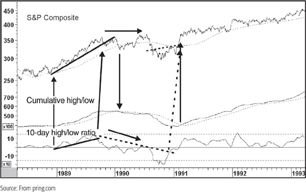
Chart 27.12 shows more recent price action where the arrows point up the 100-day MA crossovers of the cumulative line.
CHART 27.12 S&P Composite, 2006–2012, and Two New High Indicators
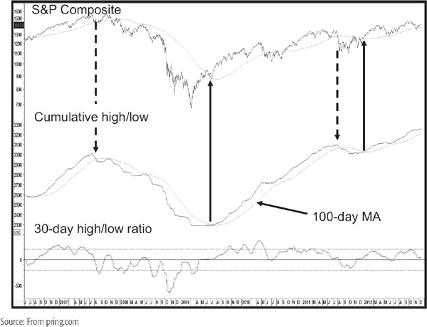
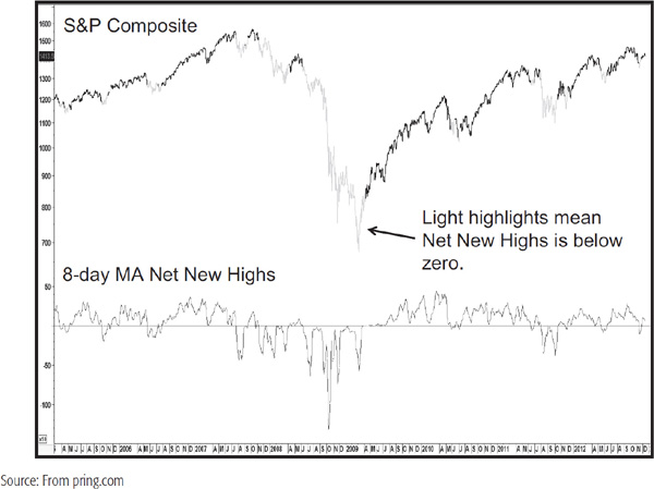
Note that in early 2009 and late 2011 this developed more or less simultaneously with the 200-day MA crossovers of the S&P Composite. An alternative method of calculating high-low data is shown at the bottom of Chart 27.13, where an 8-day MA of net weekly new highs has been plotted against the S&P Composite. The light highlights indicate when this indicator falls below zero. Its main claim to fame is protection against a primary bear market, which it did very well in the 2007–2009 period. However, the drawback is that it often falls into negative territory at the end of a protracted short-term decline.
CHART 27.13 S&P Composite, 2005–2012, and an 8 Day New High Indicator
In this discussion we have limited ourselves to 52-week periods for the new high-low calculations. However, there is no reason why such calculations cannot be made for any time period or any basket of securities. For example, Chart 27.14 shows a cumulative line derived from the net new highs of a basket of commodities calculated over a 165-day time span.
CHART 27.14 Dow Jones UBS Commodity ETN, 2005–2012, and a Commodity New High Indicator
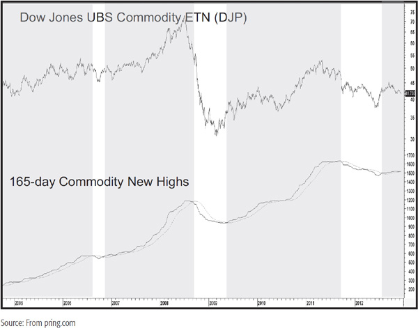
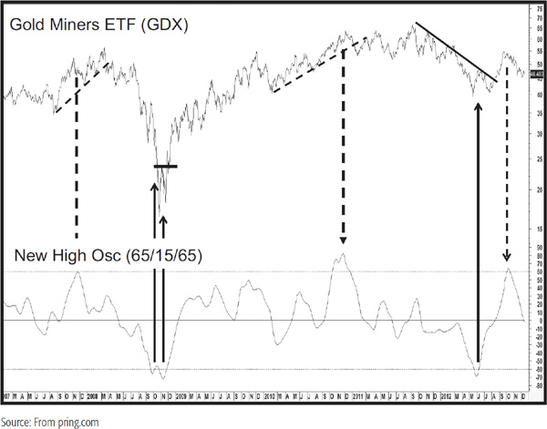
The shaded areas represent when this series crosses above its (dashed) 100-day MA. It’s by no means a perfect indicator, but does offer a view as to whether commodities are in a primary bull or bear market. Finally, Chart 27.15 shows a price oscillator calculated from a cumulative line of a basket of gold stocks. The legend explains the calculation. First, the line is calculated using a 65-day time span—in other words, the number of gold stocks registering net new highs over a 65-day period. The 15 and 65 indicate that the oscillator is calculated by dividing a 15-day MA of the cumulative line by a 65-day MA. As you can see, overbought/oversold reversals offer timely buy and sell alerts. We have used gold shares in this example, but there is no reason why this analysis cannot be extended to other sectors or markets.
CHART 27.15 Gold Miners ETF, 2007–2012, and a New High Oscillator
A diffusion indicator is a form of oscillator constructed from a basket of items that measures the number or percentage of that universe that are in a positive trend. An example might be the percentage of the 30 stocks comprising the DJIA that are above their 30-day MAs. When all members are in a bullish mode, the picture is as positive as it can get. The implication is that the aggregate measure, the DJIA in our example, is vulnerable and, therefore, likely to peak out. The reverse set of conditions, in which none of the series is in a positive trend, produces the opposite effect; i.e., the aggregate index may be reaching its low point and could, there-fore, be a “buy.” This simple interpretation of diffusion indexes is a good starting point, but in practice, a diffusion measure is a form of momentum indicator, and is subject to the same benefits, drawbacks, and principles of interpretation outlined in Chapter 13.
In technical analysis, a market or stock that forms a series of rising peaks and troughs, or is above a trendline, may be classified as being in a positive trend. However, the only way trends can be monitored through this interpretation is on the basis of individual judgment, which would make the construction of a diffusion index covering many series over many years a very laborious process. For this reason, and because of the need for greater objectivity, a statistical measure that can easily be calculated on a computer is normally used.
The most common measurements calculate the percentage of a series that are above a specific MA or that have a rising MA. Another popular alternative is to take the percentage of a universe of series that have a positive ROC, i.e., a reading above 0 or 100. The choice of the time span for the MA or ROC is very important. The shorter the span, the more volatile the resulting oscillator.
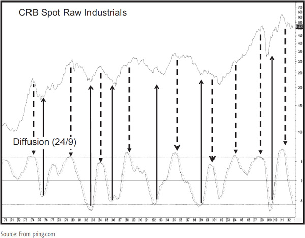
In practice, it seems that the MAs and ROCs commonly used in other areas of technical analysis offer superior results. These are 30-day and 50-day for short-term trends; 13-, 30-, and 40-week for intermediate-term trends; and 9-, 12-, 18-, and 24-month for longer-term trends. The same exercise could also be accomplished with intraday data. One characteristic of using any raw series is that the resulting data usually needs to be smoothed. For example, the diffusion series shown in Chart 27.16 is calculated from the percentage of a basket of commodities and commodity indexes that are above a 24-month MA. This data, in turn, have been smoothed, and thus the solid line actually represents a 9-month MA of the percentage of groups above their respective 24-month MAs. The dashed line is a 9-month MA of the solid (24/9) series. The arrows show that timely primary-trend buy and sell signals are triggered as the diffusion indicator reverses direction and crosses its 9-month (dashed) MA.
CHART 27.16 CRB Spot Raw Industrials, 1969–2012, and a Diffusion Indicator
A natural tendency is to use as many items as possible to calculate a diffusion indicator, but this involves maintaining a very large database. My own experience shows that the same objective can be obtained from a relatively small universe of securities. The main thing to bear in mind is that the basket of items used in the calculation reflects the diverse nature of the index’s components.
When a diffusion indicator moves to an extreme, it reflects an overbought or oversold condition. However, such readings do not in themselves constitute actual buy or sell signals. The false sell signal for the diffusion series in Chart 27.16 in 2004 is an excellent reason to await a trend confirmation signal. Obviously, the odds favor a profitable investment made at the time of a zero reading, and vice versa. However, it is usually much safer to wait for a reversal in the trend of the diffusion index, or better still, for the confirmation of a trend break in the aggregate index being monitored.
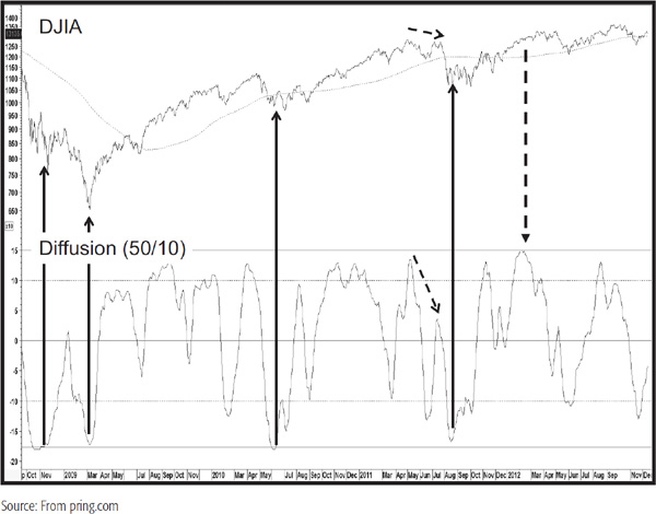
Chart 27.17 features a diffusion indicator constructed from a basket of Dow stocks. The basis of the calculation is the percentage that are above their 50-day MA. Since that would return a fairly jagged series, the data have been smoothed with a 10-day MA. There are two extreme levels, flagged by the dashed and solid horizontal overbought/oversold levels. The arrows show that reliable buy and sell signals are often triggered when the indicator reverses direction from a position beyond the extremes marked by the solid horizontal lines. The July 2007 high was instructive for although it was slightly below the April/May high, the oscillator was distinctly weaker. That sort of combination, whether the index reached a new high or not, is typically a strong sign of a very weak market.
CHART 27.17 DJIA, 2008–2012, and a Diffusion Indicator
Every cycle effectively goes through four momentum stages before completion. This is shown conceptually in Figure 27.2. The first occurs after downside momentum has reached its maximum. At this point, the series turns up but is still below its equilibrium level. The second is signaled when it crosses above its zero reference line. The third phase starts when it peaks out from above zero. Finally, phase 4 is triggered when the indicator crosses below the equilibrium point.
FIGURE 27.2 Seasonal Momentum Defined
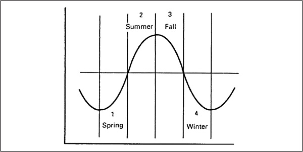
For simplicity’s sake, the respective stages have been labeled as spring, summer, fall, and winter.2 From both an agricultural and an investment point of view, the best results occur when planting (investing) is done in the spring and harvesting in late summer or fall.
In effect, spring represents accumulation, summer the markup phase, fall distribution, and winter the markdown phase. In situations in which a market can be subdivided into components, it is possible to take this approach one step further by calculating a diffusion index based on the position of the seasonal momentum of its various components, e.g., industry groups for a stock market average, commodity prices for a commodity index, etc. This seasonal momentum approach has two merits. First, it helps to identify the prevailing stage in the cycle, i.e., whether the stock market is in an accumulation, markup, distribution, or mark-down phase. Second, it also helps identify major buying and selling opportunities.
The choice of time span is critical for all momentum indicators, including those used in the seasonal momentum studies. For example, a series based on a smoothed 13-week ROC will have far less significance in terms of long-term investment strategy than a series based on a 48-month time span. This approach can be used for daily, weekly, and monthly data. I am sure you could expand this concept to include intraday data because the principle is the same. I have never done so, but encourage active traders to give it a try. As with most things technical, it seems that daily and weekly calculations, even when greatly smoothed, do not give as reliable a picture as calculations based on monthly data. That does not mean that shorter-term frames never work and that monthly ones always do. It’s just that longer-term frames are less determined by random events and therefore have a tendency to operate more reliably. While our explanation of seasonal momentum is focused more on U.S. equities, this approach can also be expanded to commodities, bonds, and international markets. The indicators represented in the charts included in this chapter have been constructed by finding the number of a basket of 10 S&P Industry Groups in their respective winter, spring, summer, or fall positions and then smoothing that data with a 6-month MA.
Chart 27.18 shows all four seasonal momentum curves between 1980 and 2012. A high reading in the spring series, for example, indicates that the momentum of a significant proportion of the groups is in phase 1, i.e., below zero and rising, and therefore in a position to begin a major advance.
CHART 27.18 S&P Composite, 1980–2012, and Seasonal Momentum
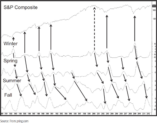
It is important to note that in most cycles there is a chronological sequence as the majority of groups move into spring from winter, subsequently landing in summer and finally fall. This is shown by the arrows. Bear market lows typically occur around the time winter momentum peaks. As with all momentum series, confirmation should come from the price, which in this case, is the S&P Composite.
The peaking out of spring momentum is sometimes associated with the first intermediate-term peak in the bull market, but it is not a primary-trend bearish sign. It simply means that the majority of groups are moving from the spring (accumulation) to the summer (markup) phase. It is when summer peaks that we get the first sign that the trend may be topping, but because it takes longer to build than to tear down, this sign of trouble is nowhere near as reliable as the winter peaking action at major lows.
When summer peaks, though, it does indicate that the environment has become much more selective as the smoothed momentum for more and more groups moves to the fall (distribution) phase.
Major buying points occur when winter momentum reaches its peak and starts to turn down. Generally speaking, the higher the peak, the greater the potential for upside activity. This is because a movement out of winter momentum must flow into spring. A high and falling level in winter momentum, therefore, indicates that a significant number of groups have the potential to move into the spring position, i.e., to move to the point from which they have the greatest potential to rise. This is shown more clearly in Chart 27.18, but with a far greater history in Chart 27.19.
CHART 27.19 S&P Composite, 1923–2012, and Monthly Winter Momentum

CHART 27.20 S&P Composite, 2010–2012, and Daily Winter Momentum

In this case, the universe from which the indicator is calculated is limited to 14 industry groups since that represents all of the available data. Nevertheless, reversals from above the horizontal line show consistent and reliable primary-trend buy signals. Note also that during secular bear markets, as flagged by the shaded areas, the number of groups moving into the winter position is usually far greater than in secular bull markets. Finally, you will notice that the winter position maxed out at around the same time the S&P was peaking. That was due to the fact since 1998 the market had been correcting internally as the index rallied due to the tech boom. By the time tech peaked, most groups were actually in a position to rally, which they did. The S&P sold off though, because its highly weighted tech component declined. This was a unique situation, but it does point out that while diffusion and indexes usually move in tandem, diffusion tells whether the advance or decline will be broadly based or not.
Chart 27.20 shows another “winter” exercise, but this time using the daily Know Sure Thing (KST) formula to identify short-term buying opportunities. There is no reason why it would not be possible to use the MACD or a smooth stochastic as a basis for constructing these indicators. In the case of the latter, the 50 level would correspond to the equilibrium zone for the KST.
A useful exercise is to take the total of groups in a positive trend (spring + summer) as shown in Chart 27.21.
CHART 27.21 S&P Composite, 1980–2012, and Spring and Summer Monthly Momentum
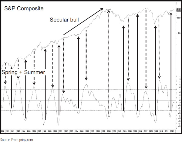
Bull and bear markets are then signaled by reversals in this indicator. It’s not perfect, of course, but when it peaks, it is warning us to be more selective in what we buy, even though the S&P may still work its way higher, as it did in the secular bull period of the late 1990s. Generally speaking, the lower the level of summer velocity when a reversal occurs, the greater the potential for a market rise.
Market tops are far more elusive than bottoms, but often occur at some point between the peak in summer and fall momentum. Even a topping out in the fall momentum is not always sufficient to trigger a fullfledged bear market. It is only when a large and expanding number of groups fall below their zero reference lines, i.e., move into winter, that a bear market picks up downside momentum.
1. Market breadth measures the degree to which a market index is supported by a wide range of its components.
2. It is useful from two aspects. First, it indicates whether the environment for most items in a universe (normally equities) is good or bad. Second, market breadth indicators signal major turning points through the establishment of both negative and positive divergences.
3. Indicators constructed from breadth data include A/D lines, breadth oscillators, diffusion indicators, and net new highs.
4. Breadth divergences are a fine concept, but should be confirmed by a trend reversal in the market averages themselves.
5. New highs and lows can be used to indicate the underlying strength or weakness of the prevailing trend. This data can also flag divergences or serve as a measurement of trends by cumulating the plurality of the highs and lows.
6. Seasonal momentum helps to point out major buying opportunities and explain the maturity of a primary bull and bear market.
lArms-Equivolume Corp., 1650 University Boulevard N.E., Albuquerque, NM 87102.
2This approach was first brought to my attention by the late Ian S. Notley, Notley Group, Yelton Fiscal, Inc., Unit 211-Executive Pavilion, 90 Grove Street, Ridgefield, CT 06877.