
It is recommended that you study all of the momentum indicators described in this and the next chapter, subsequently selecting the two or three with which you feel intuitively comfortable with. Following too many indicators will likely lead to confusion. If you wish to find a more indepth explanation of these and many other momentum indicators, please refer to my Definitive Guide to Momentum Indicators (Marketplace Books, 2009) or the momentum module in my online audio/visual course at Pring.com.
The relative strength indicator (RSI) was developed by Wells Wilder.l It is a momentum indicator, or oscillator, that measures the relative internal strength of a stock or market against itself, instead of comparing one asset with another, or a stock with a market. The formula for the RSI is as follows:

where RS = the average of x days’ up closes divided by the average of x days’ down closes. The indicator’s design aims to overcome two problems involved in construction of a momentum indicator: (1) erratic movements and (2) the need for a constant trading band for comparison purposes. Erratic movements are caused by sharp alterations in the values, which are dropped off in the calculation. For example, in a 20-day rate-of-change (ROC) indicator, a sharp decline or advance 20 days in the past can cause sudden shifts in the momentum line even if the current price is little changed. The RSI attempts to smooth out such distortions.
The RSI formula not only provides this smoothing characteristic, but also results in an indicator that fluctuates in a constant range between 0 and l00. The default time span recommended by Wilder is 14 days, which he justified on the basis that it was half of the 28-day lunar cycle. Unfortunately, the lunar cycle includes weekends and, therefore, has more than 14 trading days. Nonetheless, this default time span works quite well in reality, and that’s what really counts.
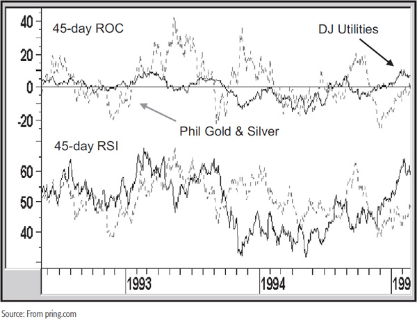
The nature of the RSI calculation allows the accurate comparison of different securities on the same chart. In Chart 14.1 there are two series: the Dow Jones Utilities and the Philadelphia Gold and Silver Share Index. The upper panel plots a 45-day ROC, and the lower one a 45-day RSI. With the ROC, it is not possible to easily compare the two because the Utilities are far less volatile. On the other hand, you can see that the divergence in volatility is far less in the lower panel featuring the RSI.
CHART 14.1 Roc versus RSI characteristics
Because of this, it is much easier to establish universal standards for the overbought and oversold benchmarks. Using the 14-day default, they are traditionally set at 30 for oversold and 70 for overbought. In an article entitled “How RSI Behaves,”2 Peter W. Aan argued that the average value of an RSI top and bottom occurred close to the 72 and 32 levels, respectively. This research would indicate that the 70 and 30 levels recommended by Wilder should be moved further apart to better reflect the average overbought and oversold value.
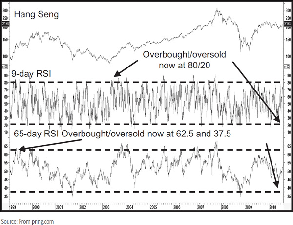
It is important to note that the magnitude of the oscillations of the RSI is inverse to that of most other momentum series. For example, the ROC indicator is subject to wider fluctuations as the time span becomes longer. It works in an opposite way for the RSI. For the RSI, equilibrium is the halfway point, which in this case is the 50 level. It is, therefore, traditional to place the overbought oversold lines equidistant from this point. We should remember that longer time spans in the RSI calculation result in shallower swings and vice versa. Consequently, the 70/30 combination is inappropriate when the time span differs appreciably in either direction from the standard 14-day period. Chart 14.2, for example, features a 9-day RSI for the Hang Seng Index in Hong Kong, where an 80/20 combination gives a much better feel for the overbought/oversold extreme than the 70/30 default value. This is due to the fact that shorter time spans result in wider RSI oscillations. The lower panel features a 65-day RSI where the narrower swings result in a more appropriate 62.5/37.5 combination. In this instance, neither of the default 70/30 values is reached at any time.
CHART 14.2 Hang Seng, RSI 1999–2010 overbought/oversold Time Span comparisons
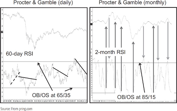
The terms “long” and “short” with regard to time spans refer to the type of data under consideration in a relative sense. For example, a 60-day RSI would represent a long span for daily data, but for monthly numbers, a 60-day, i.e., 2-month, span would be very short. Some consideration should therefore be given to this factor when choosing a specific RSI time span. Chart 14.3 plots two RSIs for identical time periods (60 days or 2 months). However, the overbought/oversold lines are drawn at different levels because one calculation is based on daily and the other on monthly data.
CHART 14.3 Procter & Gamble 40-day versus 2-month RSI
Because RSIs based on shorter-term time spans are more volatile, they are more suitable for pointing out overbought and oversold conditions. On the other hand, longer-term spans are more stable in their trajectories and therefore lend themselves better for the purpose of constructing trendlines and price patterns.
The RSI can be plotted for any time span. In his book The New Commodity Trading Systems and Methods (Wiley, 1987). Perry Kaufman questions the exclusivity of the 14-day time span (the default) selection. He points out that maximum divergence occurs when the moving average is exactly half the time span of the dominant cycle. In other words, if you make the assumption that the primary trend of the stock market revolves around the 4-year business cycle, a moving average of 24 months will give you the greatest divergence between the high and low points of the cycle. In the case of the 28-day cycle, 14 days is the correct choice, but it is important to understand that there are many other cycles. Working on this assumption, for example, would mean that a 14-hour RSI would be inappropriate if the dominant cycle was something other than 28 hours. The same would be true for weekly and monthly data.
In practice, a 14-day time span works quite well, but only for shorter periods. I also use 9-, 25-, 30-, and 45-day spans. For weekly data, the calendar quarters operate effectively, so 13-, 26-, 39-, and 52-week spans are adopted. As for monthly charts, the same spans for the ROC are recommended, i.e., 9, 12, 18, and 24 months. For longer-term charts, covering perhaps two years of weekly data, a time span of about 8 weeks offers enough information to identify intermediate-term turning points. A 26-week RSI results in a momentum series that oscillates in a narrower range, but, nevertheless, usually lends itself to trendline construction. Very long-term charts, going back 10 to 20 years, seem to respond well to a 12-month time span. Crossovers of the 30 percent oversold and 70 percent overbought barriers give a very good idea of major long-term buying and selling points. When the RSI pushes through these extremes and then crosses back toward the 50 level, it often warns of a reversal in the primary trend. Remember, these suggested spans tend to work consistently well, but never perfectly well. If you are looking for perfection, technical analysis is probably not your best analytical choice!
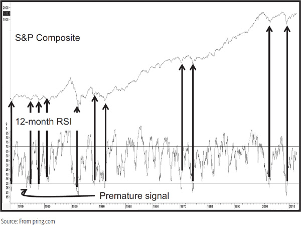
To isolate major buy candidates, it is important to remember that the best opportunities lie where long-term momentum, such as a 12-month RSI, is oversold. In this respect, Chart 14.4 shows that an oversold reversal for the S&P using a 12-month RSI has triggered some very prescient signals in the last 100 years. As with all indicators, this one is not perfect, as you can see from the premature buy signal in the early part of the twentieth century. More care is needed in identifying tops, as equities have a natural tendency to take longer to build than to tear down. Consequently, overbought reversals have a habit of being premature, especially when the secular trend is a positive one.
CHART 14.4 S&P composite, 1898–2012 12-Month RSI
Returning to buying opportunities, if you can also identify an intermediate-and a short-term oversold condition, all three trends—primary, intermediate-term, and short-term—are then in a classic position to give a high-probability buy signal.
Some of the principal methods used to interpret the RSI are as follows.
Extreme Readings and Failure Swings Any time an RSI moves above its overbought or below its oversold zone, it indicates the security in question is ripe for a turn. The significance depends upon the time. For example, the 45-hour RSI shown in Chart 14.7 is nowhere near as significant as an RSI constructed with a 12-month time span, as in Chart 14.4. An overbought or oversold reading merely indicates that, in terms of probabilities, a counter-reaction is overdone or overdue. It presents an opportunity to consider liquidation or acquisition, but not an actual buy or sell signal.
More often than not, the RSI traces out a divergence, as in Figure 14.1. In this case, the second crossover of the extreme level at points A and B usually offers good buy and sell alerts. These divergences are often called failure swings.
FIGURE 14.1 RSI Failure Swing

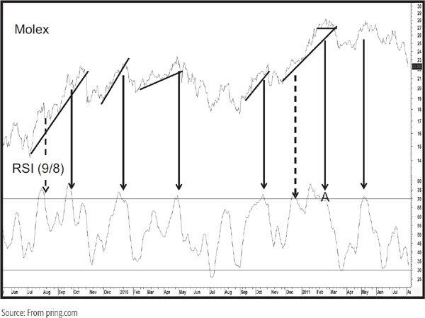
We see a bearish failure swing at the end of 2011 at point A in Chart 14.5 featuring a smoothed version of a 9-day RSI.
CHART 14.5 Molex, 2009–2011 Smoothed RSI
Trendline Violations and Pattern Completions The RSI can also be used in conjunction with trendline violations. Generally speaking, the longer the time span for any particular period, i.e., daily, weekly, or monthly, the better the opportunity for trendline construction. Important buy and sell signals are generated when trendlines for both price and the RSI are violated within a relatively short period. Chart 14.6 features a 14-day RSI for Caterpillar. The RSI starts off after a decline by forming a reverse head-and-shoulders pattern, which is more or less simultaneously confirmed by the price. After a good rally materializes, the RSI violates this up trendline. Note how the extended line becomes resistance for the final rally. We can also construct a trendline for the price. Finally, the RSI completes a broadening formation with a flat bottom, and a nasty downside break ensues. The next rally peak also experiences a small RSI top, which is confirmed with a trendline violation by the price.
CHART 14.6 caterpillar, 2009–2010 RSI and Price Patterns
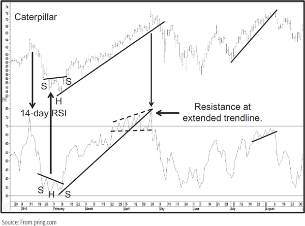
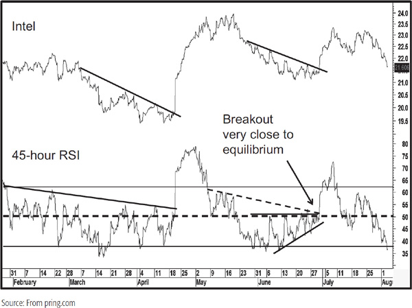
An example of the RSI’s ability to form price patterns is shown in Charts 14.6 and 14.7.
Chart 14.7 shows an hourly chart for Intel. It has a 45-hour RSI in the lower panel, which roughly corresponds to a week of trading. I have drawn the overbought/oversold lines at 62 and 38. See what a nice combination of trendline breaks we get in April 2011. We see another setup in late June, where a trendline break on the RSI is confirmed by one on the price. It’s even possible to observe a right-angled triangle. If you study the equilibrium line at 50, it’s apparent that the strong late June breakout develops slightly above this critical point of balance.
CHART 14.7 Intel and a 45-Hour RSI Featuring Price Patterns
Smoothing the RSI It is a perfectly legitimate technique to smooth the RSI. One of my favorite approaches is to smooth a 9-day RSI with an 8-day moving average (MA). Because the fluctuations are not as great as the raw data, the overbought/oversold lines are drawn at 70 and 30, not my usual default of 80/20 for a 9-day span.
Chart 14.5, featuring Molex, contains a 9-day RSI smoothed with an 8-day MA. The downward-pointing arrows flag all of the overbought reversals. The solid ones show confirmed reversals with varying degrees of success. The dashed arrows indicate overbought reversals where it was not possible to construct a meaningful trendline. Needless to say, they were all failures.
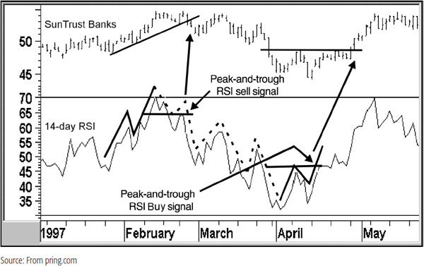
RSI and Peak-and-Trough Progression The RSI often traces out a series of rising or falling peaks and troughs, which, when reversed, offer important buy or sell alerts. Chart 14.8 shows that the 14-day RSI for Suntrust Banks experienced two peak and trough reversals, each of which was confirmed by a price trend break. These are flagged by the arrows.
CHART 14.8 Sun Trust Banks, 1997 RSI and Peak-and-Trough Analysis
The Chande Momentum Oscillator (CMO), named after its inventor Dr. Tushar Chande, is a variation on the RSI, yet is uniquely different. It has three characteristics:
1. The calculations are based on data that have not been smoothed. This means that extreme short-term movements are not hidden, so the indicator reaches overbought/oversold extremes more often, but not enough to result in too many signals.
2. The scale is confined within the –100 to +100 range. This means that the zero level becomes the equilibrium point. With the RSI, the 50 level is the equilibrium point, and is not always readily identifiable. With zero as the pivotal point, it is easier to see those periods when momentum is positive and those when it is negative. The zero equilibrium, therefore, makes comparisons between different securities that much easier as well.
3. The formula uses both up and down days in the calculation.
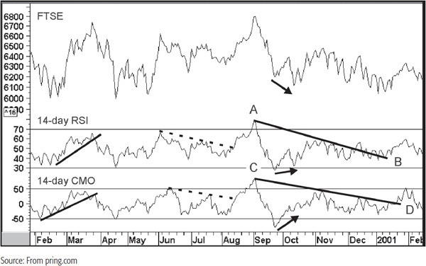
Interpretation Chart 14.9 compares a 14-day RSI with a 14-day CMO. The first thing to notice is that the CMO reaches an overbought/oversold extreme more times than the RSI—in February and June of 2000 and January of 2001, for instance. Sometimes it is possible to construct timelier and better trendlines for the CMO, though occasionally it works the other way. The March 2000 break, for instance, came off a better trendline for the CMO than the RSI; so, too, did the breaks from trendline AB and CD. The two trendlines in the summer of 2000 were slightly better for the RSI. Note also that both series experienced positive divergences at the October 2000 low, but that for the CMO was a much stronger signal, since the September bottom was well above that of mid-October. It doesn’t always work in favor of the CMO, but I prefer it because of the more numerous overbought/oversold readings and the plus and minus scaling, which makes it easier to spot positive and negative readings.
CHART 14.9 FTSE, 2000–2001 comparing the RSI with the CMO
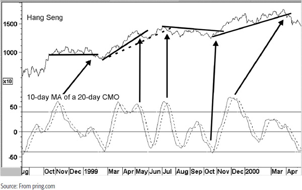
One approach that I have found helpful is to plot a 20-day CMO and smooth it with a 10-day MA, such as that plotted in Chart 14.10. I then take a smoothing of this indicator—in this case, a 10-day simple moving average. That’s the dashed line that hugs close to the CMO, using the crossovers to generate buy and sell alerts. However, since there are a lot of moving-average crossovers, it’s important to try to filter out those that are not likely to work out. That’s done by taking crossovers that develop at an extreme level more seriously, since they tend to be more accurate. Then make sure that this is confirmed by a trend break in the price. Some examples are shown in the chart.
CHART 14.10 Heng Seng, 1998–2000 Smoothed CMO
The relative momentum index, or RMI, is another variation on the RSI. When calculating the RMI, the standard RSI formula is modified to allow for a momentum factor. The actual formula by Roger Altman was published in the February 1993 Stocks and Commodities magazine article.
This modification has two effects. First, it smooths the indicator, and second, it accentuates the degree of the fluctuation. The result is a less jagged oscillator that experiences more overbought/oversold readings. The RMI requires two parameters: the time frame and the momentum factor.
If the RMI has a momentum factor of 1, the indicator is identical to the RSI. It is only when the momentum factor is greater than 1 that the two series diverge. Chart 14.11 shows two variations on the RMI. The middle panel features a 14-day span with an 8-day momentum factor, and the lower one a 45-day span with a 10-day momentum factor. Since it is an RSI-based indicator, longer-term spans involve less volatility. Note that the fluctuations in the 45-day series are much less pronounced than the 14-day RMI.
CHART 14.11 ATT 1996–2001 Two RMI Variations
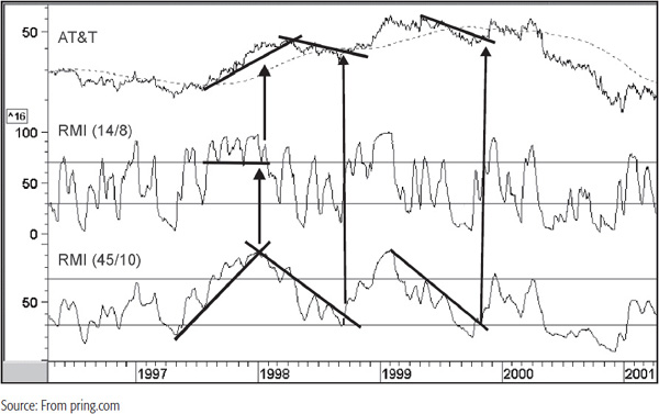
Generally speaking, the longer-term span offers slower and more deliberate movements that lend themselves more easily to trendline construction. Several examples are shown in Chart 14.11, but I particularly like the late 1998 signal since it is confirmed by a simultaneous breakout above the trendline and the 200-day MA. Whenever a price crosses above a trendline and reliable moving average simultaneously, it emphasizes the strength of the signal since they reinforce each other as dynamic resistance areas.
Most of the time, the RSI and its two variations, like all oscillators, are not telling us very much. It can be really useful when it triggers divergences, complete price patterns, or violate trendlines. When such characteristics are also confirmed by a trend-reversal signal in the price itself, it is usually a wise policy to pay attention because the RSI has a good record of reliability.
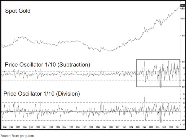
A trend-deviation indicator is obtained by dividing or subtracting a security’s price by a measure of trend, which is usually a form of MA. It is also possible to base a trend deviation using linear regression techniques. However, we will concentrate on the moving-average technique here. This approach is also called a “price oscillator” in some charting packages. Of the two approaches, subtraction or division, division is preferred since it is more reflective of proportionate moves. For a discussion on this topic, you are referred to Chapters 6 and 8, which compare the logarithmic and arithmetic scales. Chart 14.12 plots the two approaches using a 1/10 price oscillator. The “1” and “10” in the price oscillator legend refer to the fact that a 1-day MA (i.e., the close) is divided by a 10-day MA. Note how the volatility becomes exaggerated as the point movements in the gold price become greater in the last few years. The division calculation returns far more rational swings in the indicator. For short-term charts, where prices do not experience large percentage movements between the low and the high, this is not an important distinction. However, when prices are being compared over many years and there is a substantial net loss or gain over that period, it is wiser to adopt the division approach.
CHART 14.12 Spot Gold, 1985–2011 comparing Price oscillator comparing Subtraction and Division calculations
Since the average represents the trend being monitored, the momentum indicator shows how fast the price is advancing or declining in relation to that trend. An oscillator based on a trend-deviation calculation is, in fact, a horizontal representation of the envelope analysis discussed in Chapter 12, but it also shows subtle changes of underlying technical strengths and weaknesses. The top panel of Chart 14.13 shows the price of Brookline Bancorp and its 50-day MA. Two bands at +10 and –10 percent of the 50-day MA have been plotted above and below it. The bottom panel represents the same data but expressed in momentum (price oscillator) format. Therefore, the MA appears as the equilibrium line at zero and the two bands as overbought and oversold levels at +10 and –10 percent. In this way a negative zero crossover is the same as a negative 50-day crossover and so forth.
CHART 14.13 Brookline Bancorp, 2010–2011 Price oscillator Interpretation
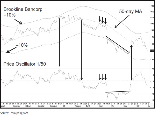
The interpretation of a trend-deviation indicator is based on the same principles described in Chapter 13. This method can be used to identify divergences and overbought and oversold zones, but it appears to come into its own when used in conjunction with trendline construction and MA crossovers.
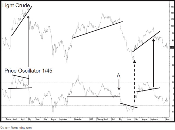
Chart 14.14 shows the crude oil price together with a trend deviation calculated from a close divided by a 45-day MA. This is a fairly jagged indicator and lends itself to overbought/oversold, trendline, and price pattern analysis. We see a good example of a descending triangle break along with a price confirmation in May 2011. Later on, there is barely any upside momentum at point A, and the price and oscillator both subsequently violate trendlines. Most of the time it’s not possible to forecast the character of a price move following a technical event. In this case, though, the very weak positive momentum at A indicated the vulnerability of the situation. Later on, in June 2012, we see an unconfirmed reverse head and shoulders in the oscillator. I say “unconfirmed” because it was not really possible to construct a meaningful down trendline on the price. Finally, a price pattern completion for the oscillator and a trendline violation for the price leave the chart with a confirmed short-term downtrend.
CHART 14.14 Light crude, 2011–2012 Price oscillator Interpretation
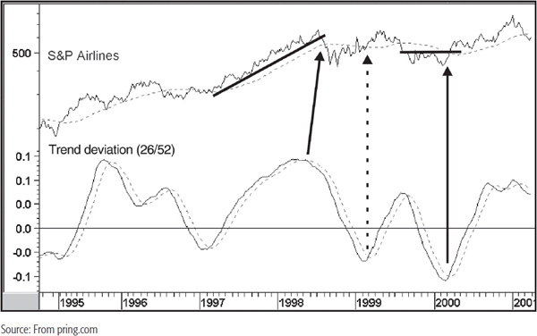
An alternative approach with trend deviation indicators is to smooth out unwanted volatility with the aid of two MAs, as shown in Chart 14.15. The actual trend-deviation series is calculated by taking a 26-week MA of the closing price divided by a 52-week MA. The second series is simply a 10-week MA of the first. Buy and sell alerts are then triggered as the smoothed trend-deviation indicator crosses above or below its 10-week MA. Then look for a confirmation from the price itself. Two examples are shown in Chart 14.15, one for a top and the other for a bottom. This is very much a guerilla approach because the buy alert indicated by the dashed arrow was signaled almost at the top of the rally. This example demonstrates the importance of picking and choosing between signals, only selecting those that develop close to a turning point. If this filtering approach is not taken, then there is considerable risk that action will be taken close to the end of the trend.
CHART 14.15 S&P Airlines, 1995–2001, and a Smoothed Trend-Deviation Indicator
A useful method that greatly reduces such whipsaw activity but still offers timely signals is to lag the 52-week MA by 10 weeks when the trend-deviation calculation is being made. This means that each weekly close is divided by the 52-week MA as it appeared 10 weeks before. This new calculation has been plotted in the center panel of Chart 14.16.
CHART 14.16 S&P Airlines, 1995–2001, and Two Smoothed Trend-Deviation Indicators
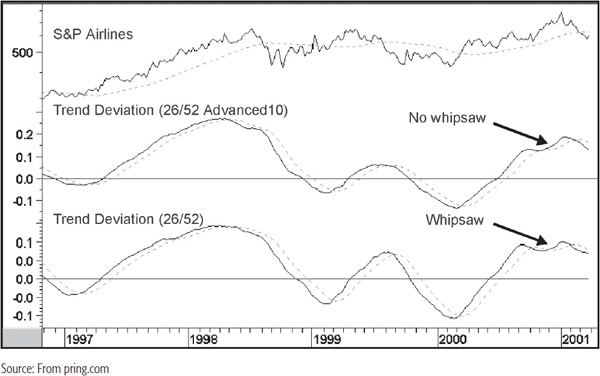
In this example, the whipsaw in late 2000 was filtered out since the trend-deviation indicator fails to cross decisively below its MA. I am not suggesting this is the only legitimate combination for weekly charts, but it is one that appears to operate quite well. There is always a trade-off when you try to make signals less sensitive, and in this case, we find that there is occasionally a small delay compared to the nonlagged 52-week MA. The most obvious one on this chart developed at the beginning of 1997, where the lagged series in the center panel crossed its MA at a slightly higher price. In most instances though, this is a small price to pay if a costly whipsaw can be avoided.
The moving-average convergence divergence (MACD) trading method is form of trend-deviation indicator using two exponential moving averages, the shorter being subtracted from the longer. The two MAs are usually calculated on an exponential basis in which more recent periods are more heavily weighted than in the case of a simple MA. It is normal for the MACD to then be smoothed by a third exponential moving average (EMA), which is plotted separately on the chart. This average is known as the “signal line,” the crossovers of which generate buy and sell signals. It obtains its name from the fact that the two EMAs are continually converging and then diverging from each other. The MACD has gained great popularity over the years, but in effect, it is really just another variation on a trend-deviation indicator that employs two EMAs as its method of deviation. A visual of its construction is therefore very similar to Chart 14.13.
MACDs can be used in an infinite number of time periods. Gerald Appel of Signalert,3 who has done a considerable amount of research on the subject, recommends that buy signals on a daily chart be constructed from a combination of 8, 17, and 9 exponential MAs, but he feels that sell signals are more reliable when triggered on the basis of a 12, 25, and 9 combination. On the other hand, the popular MetaStock program plots the default values as 12 and 26 with the signal line at 9.
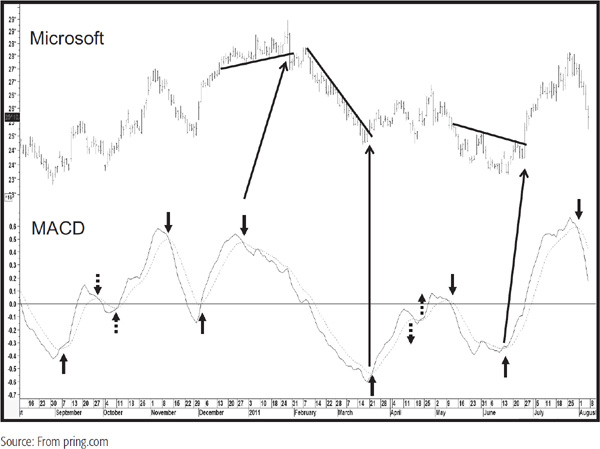
Chart 14.17 shows Microsoft in 2011 and 2012. The dotted arrows indicate whipsaw signals, and the long arrows indicate those signals that were confirmed with a trendline break of some kind.
CHART 14.17 Microsoft, 2010–2011 MACD Interpretation
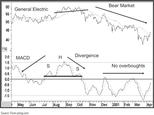
General Electric is shown with an MACD indicator in Chart 14.18. Another technique is to construct overbought/oversold lines, trendlines, and price patterns and to look for divergences. In Chart 14.18, for instance, both series complete head-and-shoulders patterns at the end of the year 2000. The MACD also experiences a negative divergence. Note how the divergence, flagged by the right shoulder, is barely able to rally above zero. The result is an above-average decline. Note also that the indicator remained below the equilibrium point and touched its oversold level several times during the balance of the period covered by the chart. This type of action reflects bear market activity.
CHART 14.18 General Electric and an MACD Indicator
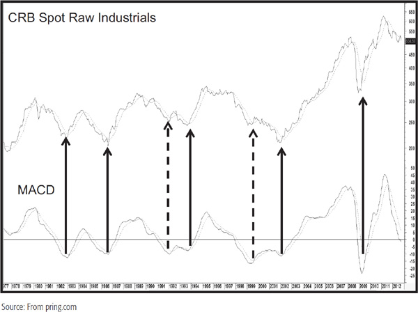
The MACD often works well with monthly data. In this respect, we look at the CRB Spot Raw Industrial Commodity Index in Chart 14.19, where the solid arrows indicate good primary-trend momentum buy signals. The two dashed ones indicate smaller rallies, which fall into the failure category.
CHART 14.19 CRB Spot Raw Industrials, 1977–2012 Long-Term MACD Buy Signals
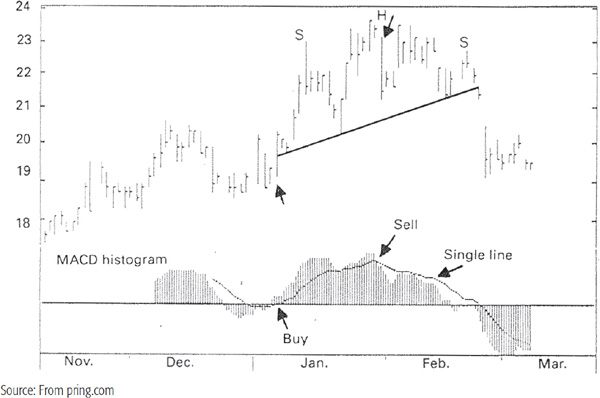
The MACD is often plotted in a histogram format and the signal line against it, as in Chart 14.20 featuring Homestake Mining. The chart shows a classic head-and-shoulders pattern. Note that the MACD histogram gradually became weaker as the pattern progressed. This was only a short-term sell signal, but the price eventually fell below the signal level.
CHART 14.20 Homestake Mining and an MACD in Histogram Format
The stochastic indicator has also gained a great deal of popularity among futures traders, with the result that the standard formula uses very short-term time spans. The theory behind the indicator, which was invented by George Lane,4 is that prices tend to close near the upper end of a trading range during an uptrend. As the trend matures, the tendency for prices to close away from the high of the session becomes pronounced. In a downward-moving market, the reverse conditions hold true.
The stochastic indicator, therefore, attempts to measure the points in a rising trend at which the closing prices tend to cluster around the lows for the period in question, and vice versa, since these are the conditions that signal trend reversals. It is plotted as two lines: the %K line and the %D line. The %D line is the one that provides the major signals and is, therefore, more important.
The formula for calculation of %K is:
%K = 100[(C – L5close)/(H5 - L5)]
where C is the most recent close, L5 is the lowest low for the last five trading periods, and H5 is the highest high for the same five trading periods. Remember that the calculation of stochastic indicators differs from that of most other momentum indicators in that it requires high, low, and closing data for the calculation.
The stochastic formula is similar to the RSI in that the plots can never exceed 0 or 100, but in this case, it measures the closing price in relation to the total price range for a selected number of periods. A very high reading in excess of 80 would put the closing price for the period near the top of the range, while a low reading under 20 would put it near the bottom of the range.
The second line, %D, is a smoothed version of the %K line. The normal value is three periods. The %D formula is as follows:
%D = 100 × (H3/L3)
where H3 is the three-period sum of (C – L5) and L3 is the three-period sum of (H5 – L5).
The momentum indicator that results from these calculations is two lines that fluctuate between 0 and 100. The %K line is usually plotted as a solid line, while the slower %D line is usually plotted as a dashed line.
The popularity of the stochastic indicator can no doubt be explained by the smooth manner in which it moves from an overbought to an oversold condition, lulling a trader into feeling that price trends are much more orderly than would appear from an observation of an RSI or an ROC indicator.
Longer-term time frames, used on monthly and weekly charts, appear to work much better than the shorter-term stochastics used on daily futures charts. Colby and Meyers, in The Encyclopedia of Technical Market Indicators (McGraw-Hill, 2002),5 noted that the stochastic indicator tested very poorly relative to MA crossovers and other momentum indicators.
Overbought and oversold bands for the stochastic are usually plotted in the 75 to 85 percent area on the upside and in the 15 to 25 percent area on the downside, depending on the time span in question. An overbought indication is given when the %D line crosses the extreme band, but an actual sell alert is not indicated until the %K line crosses below it. When the two lines cross, they behave very similarly to a dual MA system. If you wait for the penetration, you can avoid getting trapped into shorting a strongly bullish move or buying an extremely negative one.
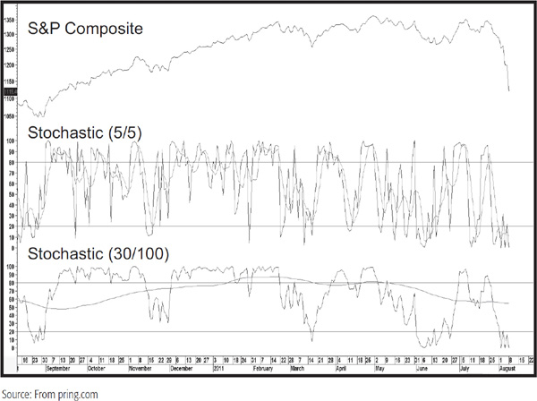
The behavior of the indicator will depend very much on the selected time frames. Since the %K and %D can be thought of as moving averages, it follows that the longer the time span, the smoother the resultant indicator. The upper panel of Chart 14.21 shows a very volatile 5/5 combination, whereas the lower window contains a 30/100 combination. Note that the %K is much less volatile than that in the upper window. The same is true for the 100 parameter used in the %D. However, it is so flat that it is essentially useless from the point of view of reflecting the cyclic rhythms. In reality, one would never use such a combination.
CHART 14.21 S&P composite, 2010–2011 comparing Two Stochastic Time Spans
It is also possible (and desirable) to extend the calculation in order to invoke a slowed version of the stochastic. In this instance, the %K line is replaced with the %D line, and another MA is calculated for the %D. Many technicians argue that this modified stochastic version gives more accurate signals. It certainly results in a more deliberate action. A comparison between a regular and a slowed stochastic is featured in Chart 14.22. The 5/5 in the upper window legend refers to a 5 period for the %K and D, respectively. The 5 in the middle of the lower window legend refers to the slowing factor.
CHART 14.22 S&P Composite, 2010–2011 Comparing a Stochastic with a Slowed Stochastic
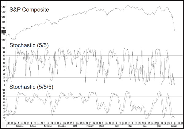
Chart 14.22 compares a regular stochastic to a slowed one.
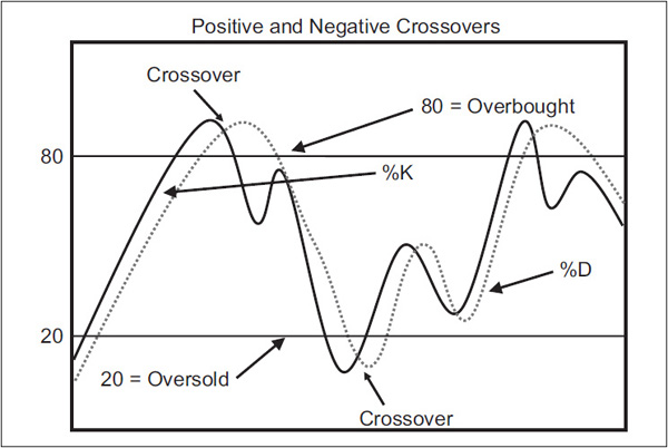
Crossovers Normally, the faster %K line changes direction sooner than the %D line. This means that the crossover will occur before the %D line has reversed direction, as in Figure 14.2.
FIGURE 14.2 Stochastic crossovers
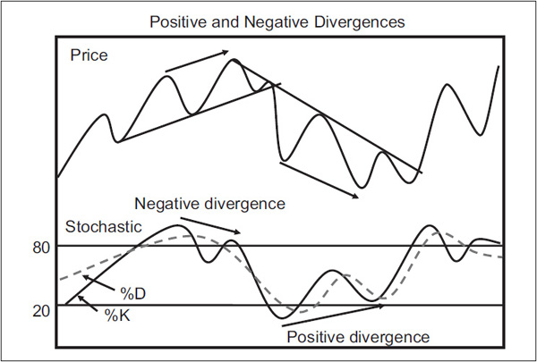
Divergences Figure 14.3 shows examples of where the %K fails to confirm a new high or low in the price, thereby setting up a divergence, which when confirmed, signals a change in trend.
FIGURE 14.3 Stochastic Positive and Negative Divergences
Divergence Failure An important indication of a possible change in trend arises when the %K line crosses the %D line, moves back to test its extreme level, and fails to cross the %D line, as in Figure 14.4. Once again, it is always important to see some price confirmation, and that is given with the break above the down trendline in the right side of the diagram.
FIGURE 14.4 Stochastic Divergence Failure

Chart 14.23 shows some examples of divergence failures: two confirmed bearish ones and one unconfirmed bullish one
CHART 14.23 Microsoft and Divergence Failures

Reverse Divergence Occasionally during an uptrend, the %D line will make a lower low, which is associated with a higher low in the price, as shown in Figure 14.5.
FIGURE 14.5 Stochastic Negative Reverse Divergence
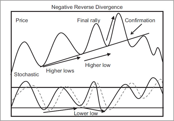
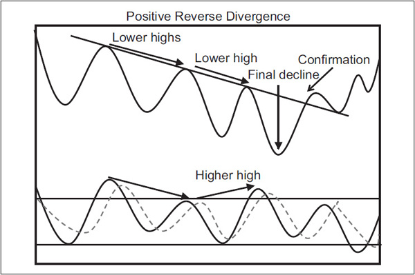
This is a bearish omen, and conventional wisdom suggests looking for a selling opportunity on the next rally. This condition is sometimes referred to as a bear setup. A positive reverse divergence is featured in Figure 14.6.
FIGURE 14.6 Stochastic Positive Reverse Divergence
Extremes Occasionally the %K value reaches the extreme of 100 or 0. This indicates that a very powerful move is under way, since the price is consistently closing near its high or low. If a successful test of this extreme occurs following a pullback, it is usually an excellent entry point.
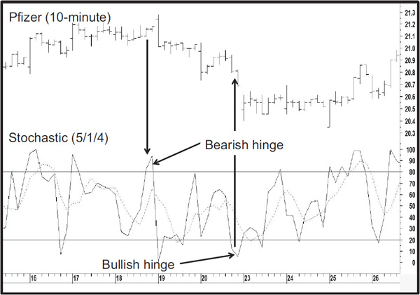
Hinge When either the %K line or the %D line experiences a slowdown in velocity, indicated by a flattening line, the indication is usually that a reversal will take place in the next period. Examples are shown in Figure 14.7 and Chart 14.24 in the form of a 10-minute chart for Pfizer.
FIGURE 14.7 Stochastic Hinges
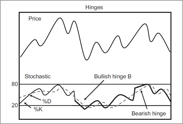
CHART 14.24 Pfizer and Two Hinges
It is often a useful idea to tweak the parameters to obtain a slower-moving indicator where %K and %D crossovers can be used to good effect. Chart 14.25, featuring the S&P Composite, shows a 20/20/20 and a 20/10/10 combination. Both show divergences, but the smoother series experiences just one whipsaw, whereas the 20/10/10 variety experiences three. The trade-off is that the more volatile series triggers crossovers on a timelier basis.
CHART 14.25 S&P composite, 2010–2011 Negative Divergences

Finally, we move up to the monthly charts where the 24/15/10 combination in Chart 14.26 really comes into its own. This combination, in most cases, will reflect primary trend swings in a fairly good way. For example, there is a positive stochastic crossover at the end of the 2000–2002 bear market confirmed with a nice trendline violation. There was another buy signal confirmed in 2006. Finally, a sell signal in late 2007 was essentially confirmed simultaneously with a trendline penetration.
CHART 14.26 Echostar, 1998–2011 Stochastic with Long-Term crossover Signals

1. The RSI is bounded by 0 and 100. Overbought and oversold lines should be wider as the time span gets shorter.
2. The RSI lends itself more easily to comparing the momentum of different securities than does the ROC.
3. The RSI can be used in conjunction with overbought and oversold lines, divergences, price patterns, trendlines, and smoothings.
4. Trend-deviation indicators are calculated by dividing the close or a short-term MA by a longer-term one.
5. Trend-deviation indicators can be used with trendlines, price patterns, and MAs. They also lend themselves to overbought/oversold and divergence analysis.
6. The MACD is a form of trend-deviation indicator.
7. The stochastic indicator assumes that prices close near the low at the end of a rally and near their highs at the end of a downtrend.
8. The stochastic indicator is confined between 0 and 100 and consists of two lines, the %K and the %D.
9. Stochastic indicators lend themselves to crossovers, divergences, hinges, extremes, and reverse divergences and are usually plotted in their slowed version.