In the introduction, technical analysis was defined as the art of identifying trend changes at an early stage and to maintain an investment or trading posture until the weight of the evidence indicates that the trend has reversed. In order to identify a trend reversal, we must first know what that trend is. This chapter explains and categorizes the principal trends, and concludes with a discussion of one of the basic building blocks of technical analysis: peak-and-trough progression. This technique is arguably the simplest of trend-determining techniques, but in my book, certainly one of the most effective.
We have already established the link between psychology and prices. It is also a fact that human nature (psychology) is more or less constant. This means that the principles of technical analysis can be applied to any time frame, from one-minute bars to weekly and monthly charts. The interpretation is identical. The only difference is that the battle between buyers and sellers is much larger on the monthly charts than on the intraday ones. This means that such trend-reversal signals are far more significant. As we proceed, it will be evident that this book contains a huge variety of examples featuring many different time frames. For the purpose of interpretation, the time frame really doesn’t matter; it’s the character of the pattern that does. For example, if you are a long-term trader and see a particular example featured on a 10-minute bar chart, the principles of interpretation are the same when applied to a weekly chart. A long-term investor would never initiate an investment based on a 10-minute chart, but can and should take action when that same type of technical evidence appears on a weekly or monthly one, and vice versa.
A trend is a period in which a price moves in an irregular but persistent direction. It may also be described as a time measurement of the direction in price levels covering different time spans. There are many different classifications of trends in technical analysis. It is useful to examine the more common ones, since such an understanding will give us perspective on the significance of specific technical events. The three most widely followed trends are primary, intermediate, and short-term. Whenever we talk of any specific category of trend lasting for such and such a time period, please remember that the description offered is a rough guide encompassing most, but not all, of the possible durations for that particular type. Some specific trends will last longer, and others for less time.
The primary trend generally lasts between 9 months and 2 years, and is a reflection of investors’ attitudes toward unfolding fundamentals in the business cycle. The business cycle extends statistically from trough to trough for approximately 3.6 years, so it follows that rising and falling primary trends (bull and bear markets) last for 1 to 2 years. Since building up takes longer than tearing down, bull markets generally last longer than bear markets. The direction of the secular or very long-term trend will also affect the magnitude and duration of a primary trend. Those that move in the direction of the secular trend will generally experience greater magnitude and duration than those that move in the opposite direction. The characteristics of secular trends are discussed later in this chapter and more fully in Chapter 23.
The primary trend cycle is operative for bonds, equities, and commodities. Primary trends also apply to currencies, but since they reflect investors’ attitudes toward the interrelationship of two different economies, analysis of currency relationships does not fit neatly into the business cycle approach discussed in Chapter 2.
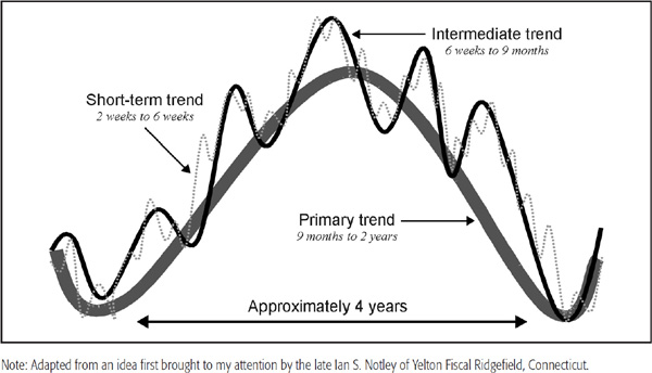
The primary trend is illustrated in Figure 1.1 by the thickest line. In an idealized situation, the primary uptrend (bull market) is the same size as the primary downtrend (bear market), but in reality, of course, their magnitudes are different. Because it is very important to position both (short-term) trades and (long-term) investments in the direction of the main trend, a significant part of this book is concerned with identifying reversals in the primary trend.
FIGURE 1.1 The Market Cycle Model
Anyone who has looked at prices on a chart will notice that they do not move in a straight line. A primary upswing is interrupted by several reactions along the way. These countercyclical trends within the confines of a primary bull market are known as intermediate price movements. They last anywhere from 6 weeks to as long as 9 months, sometimes even longer, but rarely shorter. Countercyclical intermediate trends are typically very deceptive, often being founded on very believable but false assumptions. For example, an intermediate rally during a bear market in equities may very well be founded on a couple of unexpectedly positive economic numbers, which make it appear that the economy will avoid that much-feared recession. When subsequent numbers are reported and found to be wanting, the bear market resumes. Intermediate-term trends of the stock market are examined in greater detail in Chapter 4 and are shown as a thin solid line in Figure 1.1.
It is important to have an idea of the direction and maturity of the primary trend, but an analysis of intermediate trends is also helpful for improving success rates in trading, as well as for determining when the primary movement may have run its course.
Short-term trends typically last 3 to 6 weeks, sometimes shorter and sometimes longer. They interrupt the course of the intermediate cycle, just as the intermediate-term trend interrupts primary price movements. Short-term trends are shown in The Market Cycle Model (Figure 1.1) as a dashed line. They are usually influenced by random news events and are far more difficult to identify than their intermediate or primary counterparts.
By now, it is apparent that the price level of any market is influenced simultaneously by several different trends, and it is important to understand which type is being monitored. For example, if a reversal in a short-term trend has just taken place, a much smaller price movement may be expected than if the primary trend had reversed.
Long-term investors are principally concerned with the direction of the primary trend, and, thus, it is important for them to have some perspective on the maturity of the prevailing bull or bear market. However, long-term investors must also be aware of intermediate and, to a lesser extent, short-term trends. This is because an important step in the analysis is an examination and understanding of the relationship between short- and intermediate-term trends and how they affect the primary trend. Also, if it is concluded that the long-term trend has just reversed to the upside, it may pay to wait before committing capital because the short-term trend could be overextended on the upside. Ignoring the position of the short-term trend could therefore prove costly at the margin.
Short-term traders are principally concerned with smaller movements in price, but they also need to know the direction of the intermediate and primary trends. This is because of the following principle.
In other words, rising short-term trends within the confines of a bull market are likely to be much greater in magnitude than short-term downtrends, and vice versa. Losses usually develop because the trader is in a countercyclical position against the main trend. In effect, all market participants need to have some kind of working knowledge of all three trends, although the emphasis will depend on whether their orientation comes from an investment or a short-term trading perspective.
The post-1990 development of real-time trading enabled market participants to identify hourly and even tick-by-tick price movements. The principles of technical analysis apply equally to these very short-term movements, and are just as valid. There are two main differences. First, reversals in the intraday charts only have a very short-term implication and are not significant for longer-term price reversals. Second, extremely short-term price movements are much more influenced by psychology and instant reaction to news events than are longer-term ones. Decisions, therefore, have a tendency to be emotional, knee-jerk reactions. Intraday price action is also more susceptible to manipulation. As a consequence, price data used in very short-term charts are much more erratic and generally less reliable than those that appear in the longer-term charts.
The primary trend consists of several intermediate cycles, but the secular, or very long-term, trend is constructed from a number of primary trends. This “super cycle,” or long wave, extends over a substantially greater period, usually lasting well over 10 years, and often as long as 25 years, though most average between 15 and 20 years. It is discussed at great length in Chapter 23. A diagram of the interrelationship between a secular and a primary trend is shown in Figure 1.2.
FIGURE 1.2 The Relationship Between Secular and Primary Trends
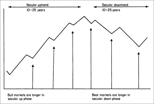
It is certainly very helpful to understand the direction of the secular trend. Just as the primary trend influences the magnitude of the intermediate-term rally relative to the countercyclical reaction, so, too, does the secular trend influence the magnitude and duration of a primary-trend rally or reaction. For example, in a rising secular trend, primary bull markets will be of greater magnitude than primary bear markets. In a secular downtrend, bear markets will be more powerful, and will take longer to unfold, than bull markets. It is certainly true to say that long-term surprises will develop in the direction of the secular trend.
Bonds and commodities are also subject to secular trends, and these feed back into each other as well as into equities. I will have much more to say on this subject later.
Earlier, we established that technical analysis is the art of identifying a (price) trend reversal based on the weight of the evidence. As in a court of law, a trend is presumed innocent until proven guilty! The “evidence” is the objective element in technical analysis. It consists of a series of scientifically derived indicators or techniques that work well most of the time in the trend-identification process. The “art” consists of combining these indicators into an overall picture and recognizing when that picture resembles a market peak or trough.
Widespread use of computers has led to the development of some very sophisticated trend-identification techniques. Some of them work reasonably well, but most do not. The continual search for the “Holy Grail,” or perfect indicator, will undoubtedly continue, but it is unlikely that such a technique will ever be developed. Even if it were, news of its discovery would soon be disseminated and the indicator would gradually be discounted. It is as well to remember that prices are determined by swings in crowd psychology. People can and do change their minds, and so do markets!
In the quest for sophisticated mathematical techniques, some of the simplest and most basic techniques of technical analysis are often overlooked. Arguably the simplest technique of all, and one that has been underused, is peak-and-trough progression (see Chart 1.1). This principle reflects Charles Dow’s original observation that a rising market moves in a series of waves, with each rally and reaction being higher than its predecessor. When the series of rising peaks and troughs is interrupted, a trend reversal is signaled. To explain this approach, Dow used an analogy with the ripple effect of waves on a seashore. He pointed out that just as it was possible for someone on the beach to identify the turning of the tide by a reversal of receding wave action at low tide, so, too, could the same objective be achieved in the market by observing the price action.
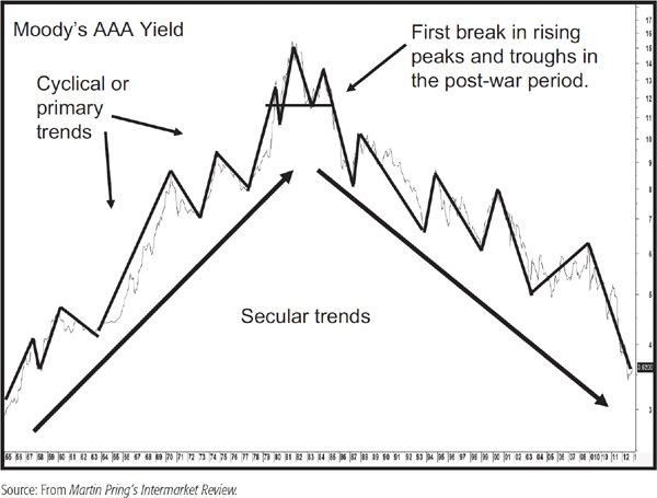
CHART 1.1 Moody’s AAA bond yields and peak-and-trough analysis. In Chart 1.1, the solid line above the yield corresponds to primary bull and bear markets. The series of rising peaks and troughs extended from the end of World War II until September 1981. This was a long period even by secular standards. Confirmation of the post-1981 downtrend was given in 1985, as the series of rising peaks and troughs was reversed. The signal simply indicated a change in trend, but gave no indication as to its magnitude.
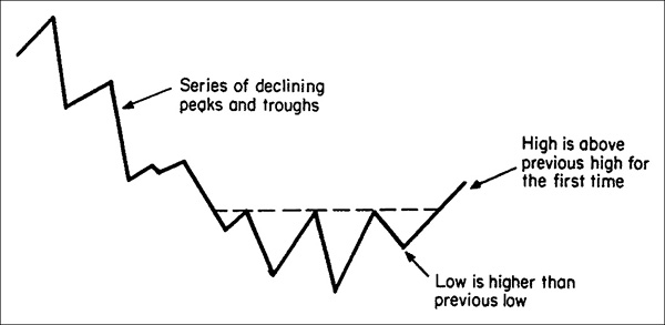
In Figure 1.3, the price has been advancing in a series of waves, with each peak and trough reaching higher than its predecessor. Then, for the first time, a rally fails to move to a new high, and the subsequent reaction pushes it below the previous trough. This occurs at point X, and gives a signal that the trend has reversed.
FIGURE 1.3 Reversal of Rising Peaks and Troughs

Figure 1.4 shows a similar situation, but this time, the trend reversal is from a downtrend to an uptrend.
FIGURE 1.4 Reversal of Falling Peaks and Troughs
The idea of the interruption of a series of peaks and troughs is the basic building block for both Dow theory (Chapter 3) and price pattern analysis (Chapter 8).
For example, if it takes 2 to 3 weeks to complete each wave in a series of rallies and reactions, the trend reversal will be an intermediate one, since intermediate price movements consist of a series of short-term (2- to 6-week) fluctuations. Similarly, the interruption of a series of falling intermediate peaks and troughs by a rising one signals a reversal from a primary bear to a primary bull market.
Occasionally, peak-and-trough progression becomes more complicated than the examples shown in Figures 1.3 and 1.4. In Figure 1.5, example a, the market has been advancing in a series of rising peaks and troughs, but following the highest peak, the price declines at point X to a level that is below the previous low. At this juncture, the series of rising troughs has been broken, but not the series of rising peaks. In other words, at point X, only half a signal has been generated. The complete signal of a reversal of both rising peaks and troughs arises at point Y, when the price slips below the level previously reached at point X.
FIGURE 1.5 Half-Signal Reversals
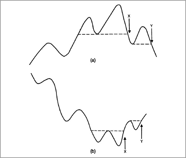
At point X, there is quite a dilemma because the trend should still be classified as positive, and, yet, the very fact that the series of rising troughs has been interrupted indicates underlying technical weakness. On the one hand, we are presented with half a bearish signal, while on the other hand, waiting for point Y would mean giving up a substantial amount of the profits earned during the bull market.
The dilemma is probably best dealt with by referring back to the second half of the definition of technical analysis given at the beginning of this chapter “and riding that trend until the weight of the evidence proves that it has been reversed.”
In this case, if the “weight of the evidence” from other technical indicators, such as, moving averages (MAs), volume, momentum, and breadth (discussed in later chapters), overwhelmingly indicates a trend reversal, it is probably safe to anticipate a change in trend, even though peak-and-trough progression has not completely confirmed the situation. It is still a wise policy, though, to view this signal with some degree of skepticism until the reversal is confirmed by an interruption in both series of rising peaks as well as troughs.
Figure 1.5, example b, shows this type of situation for a reversal from a bear to bull trend. The same principles of interpretation apply at point X as in Figure 1.5, example a. Occasionally, determining what constitutes a rally or reaction becomes a subjective process. One way around this problem is to choose an objective measure, such as categorizing rallies greater than, say, 5 percent. This can be a tedious process, but some software programs (such as MetaStock with its zig-zag tool) enable the user to establish such benchmarks almost instantly in graphic format.
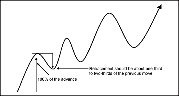
Most of the time, the various rallies and reactions are self-evident, so it is easy to determine that these turning points are legitimate peaks and troughs. Technical lore has it that a reaction to the prevailing trend should retrace between one-third and two-thirds of the previous move. Thus, in Figure 1.6, the first rally from the trough low to the subsequent peak is 100 percent. The ensuing reaction appears to be just over half, or a 50 percent retracement of the previous move. Occasionally, the retracement can reach 100 percent. Technical analysis is far from precise, but if a retracement move is a good deal less than the minimum one-third, then the peak or trough in question is held to be suspect.
FIGURE 1.6 Identifying Peaks and Troughs (Magnitude)
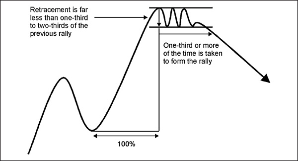
Sometimes though, it takes the form of a line or trading range. The depth of the trading range can fall short of the minimum “approximate one-third retracement” requirement and, in such instances, the correction qualifies more on the basis of time than on magnitude. A rule of thumb might be for the correction to last between one-third and two-thirds of the time taken to achieve the previous advance or decline. In Figure 1.7, the time distance between the low and the high for the move represents 100 percent. The consolidation prior to the breakout should constitute roughly two-thirds, or 66 percent, of the time taken to achieve the advance, ample time to consolidate gains and move on to a new high.
FIGURE 1.7 Identifying Peaks and Troughs (Time)
These are only rough guidelines, and in the final analysis, it is a judgment call based on experience; common sense; a bit of intuition; and perhaps most important of all, a review of other factors such as volume, support and resistance principles, etc. The words common sense have been italicized because the charts should always be interpreted with a bit of poetic license. For example, the rule states that a one-third retracement is required for a legitimate turning point, but it turns out to be 32 percent. If other factors suggest the move qualifies as a valid retracement, always take the common sense interpretation over the strict rules-based one. That is why we should regard technical analysis as both a science and an art.
We have mainly been studying these concepts in a rising trend. However, the principles work exactly the same in a declining trend, in that rallies should retrace one-third to two-thirds of the previous decline.
It is also important to categorize what kind of trend is being monitored. Obviously, a reversal derived from a series of rallies and reactions, each lasting, say, 2 to 3 weeks, would be an intermediate reversal. This is because the swings would be short-term in nature. On the other hand, peak-and-trough reversals that develop in intraday charts are likely to have significance over a much shorter period. How short would depend on whether the swings were a reflection of hourly or, say, 5-minute bars.
1. A number of different trends simultaneously influence the price level of any market.
2. The three most important trends are primary, intermediate, and short-term.
3. The principles of technical analysis apply to intraday trends, but since they are more random in nature, the analysis is generally less reliable than that for longer-term trends.
4. Very long-term, or secular, trends influence the magnitude of primary bull and bear markets.
5. Peak-and-trough progression is the most basic trend-identification technique, and is a basic building block of technical analysis.
6. As a general rule, in order to qualify as a new legitimate peak or trough, the price should retrace between one-third and two-thirds of the previous move.
7. Lines or consolidations also qualify as peaks and troughs where they form between one-third and two-thirds of the time taken to produce the previous advance or decline.