In previous editions, our central theme focused on technical principles, with a primary objective of analyzing the U.S. stock market. In the early 1980s, when the United States was far more dominant in the global financial scene, that approach had some merit. In the second decade of the twenty-first century and beyond, the attention of technicians has become far more diverse, having broadened to international stock markets, bonds, commodities, and currencies. While our coverage will be broadened in this edition, it is not possible to cover all of the market averages and indexes that have been developed for these various entities in one small chapter.
Another important financial market development in the twenty-first century has been the rapid expansion and burgeoning popularity of exchange-traded funds (ETFs) and, to a lesser extent, exchange-traded notes (ETNs). Previously, the purchase of an index involved the acquisition of its individual components, but with ETFs, it was now possible to buy the index just like a stock. That’s because the ETF is a basket of stocks whose management objective is to replicate a stated index. To give you an idea of their growth, I stated in my book The Investor’s Guide to Active Asset Allocation (McGraw-Hill, 2006) that there were then 160 listed ETFs. In mid-2013, that number was closer to 1,500 and still growing. One personally important introduction was the Pring Turner Business Cycle ETF, in December 2012 (symbol DBIZ). The fund adopts an active approach based on the business cycle and technical strategies outlined in this book.
In this chapter we are going to examine some of the principal U.S. indexes and expand the discussion to cover some of the ETFs that reflect major global equity, bond, and commodity indexes.
There is no ideal index that represents the movement of “the market.” It’s true that the majority of stocks move together in the same direction most of the time, but there is rarely a period when specific stocks or several industry groups are not moving contrary to the general direction of the trend. The general level of stock prices is basically measured in two principal ways. The first, known as an unweighted index, takes a mean average of the prices of a wide base of stocks; the second also takes an average of the prices of a number of stocks, but in this case, they are weighted by the capitalization of each company (i.e., the number of shares outstanding multiplied by their price). The first method monitors the movement of the vast majority of listed stocks, but since the second gives a greater weight to larger companies, movements in a market average constructed in this way more fairly represent changes in the value of investor portfolios. For this reason, weighted averages are usually used as the best proxy for “the market.” These averages are compiled from stocks representing public participation, market leadership, and industry importance.
Several price indexes have been developed that measure various segments of the market. Their interrelationship offers useful clues about the market’s overall technical condition. Chapter 3 discussed in detail the relationship between the Dow Jones Industrial Average (DJIA) and the Dow Jones Transportation Average, but there are many other useful indexes, such as the Dow Jones Utility Average, unweighted indexes, and a few bellwether stocks groups. They are examined in this chapter in the context of their contribution to the U.S. market’s overall technical structure.
The DJIA is the most widely followed stock market index in the world. It is a price-weighted average and is constructed by totaling the prices of 30 stocks and dividing the total by a divisor. The divisor, which is published regularly in The Wall Street Journal and Barron’s, is changed from time to time because of stock splits, stock dividends, and changes in the composition of the average. In recent decades, its makeup has expanded from its industrial base to include consumer goods financials and other sectors. However, strictly speaking, it is not a “composite” index, since it does not include such industries as transportation or utilities. Yet, the capitalization of the DJIA is still equivalent to a substantial percentage of the outstanding capitalization on the New York Stock Exchange (NYSE), and it has normally proved to be a reliable indicator of general market movements. The original reason for including a relatively small number of stocks in an average was convenience. Years ago, the averages had to be laboriously calculated by hand. With the advent of the computer, the inclusion of a more comprehensive sample became much easier.
One of the drawbacks of the method used in the construction of the DJIA is that if a stock increases in price and is not split, its influence on the average will become substantially greater, especially if many of the other Dow stocks are growing and splitting at the same time. In spite of this and other drawbacks, however, the Dow has, over the years, acted fairly consistently with many of the more widely capitalized market averages. The ETF that represents the DJIA is the SPDR Dow Jones Industrial Average ETF (symbol DIA).
The Standard & Poor’s (S&P) Composite, which comprises 500 stocks representing well over 90 percent of the NYSE market value, is another widely followed bellwether average. Its ETF is the SPDR S&P 500 (symbol SPY). The index is calculated by multiplying the price of each share by the number outstanding, totaling the value of each company, and reducing the answer to an index number.
Over the years, the S&P 500 has become the benchmark against which professional money managers are judged. It is also the most widely traded equity futures contract.
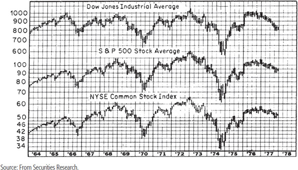
Most of the time, the DJIA and S&P 500 move in the same direction, but there are times when a new high or low is achieved in one index but not the other. Generally speaking, the greater the divergence, the greater the next move in the opposite direction is likely to be. Chart 21.1 shows that in late 1968 the S&P 500 reached a new all-time high, unlike the DJIA, which was not able to surpass its 1966 peak. This development helped to signal a bear market that wiped nearly 40 percent off the value of both averages. On the other hand, the 1973–1974 bear market was completed with a double bottom. In the case of the DJIA, the second bottom in December 1974 was lower than the October one, yet the S&P 500 failed to confirm the new low in the DJIA. In the space of the next two years, the DJIA rose by some 80 percent. This is also shown in Chart 21.1.
CHART 21.1 Key Market Averages, 1964–1978

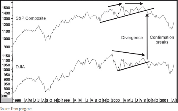
Chart 21.2 compares the DJIA to the S&P Composite for the turn of the century. For most of the 1990s, both series were in gear. However, the DJIA made its peak in January 2000, and the S&P topped out in March and September of that year. This indicated that both averages were out of gear with each other. The confirmation of a bear trend came later in the year when both averages violated important up trendlines. Do not get the impression that the lack of a divergence means a healthy market, because there was no discrepancy at the next bull market peak in 2007, and this was followed by one of the worst bear markets in history.
CHART 21.2 The DJIA versus the S&P Composite, 1998–2001 and Divergences
The NASDAQ Composite is a capitalization-weighted index consisting of all the stocks listed on the NASDAQ. Since it contains most of the technology heavyweights, it is very much a technology-driven index. However, when it comes to ETFs, the NASDAQ 100 (symbol QQQ) is the preferred vehicle. This index/ETF is constructed from the 100 NASDAQ issues with the largest capitalization.
The NYSE compiles an all-encompassing index called the NYSE Composite. In a sense, it represents the ideal average, since its value is based on the capitalization of all shares on the exchange. Its movements are very similar to those of the DJIA and the S&P 500. Nevertheless, divergences between the trends of these three averages offer additional confirmation of changes in the overall technical structure.
The most comprehensive indicator of all is the Wilshire 5000 Equity Index, which represents the value-weighted total, in billions of dollars, of all actively traded common stocks in the United States. Conceptually, this is the indicator that should be used for monitoring trends of the overall market, but because of the lethargy of the investment community and the obvious vested interest of the sponsors of the other popular averages, it has not received the widespread recognition that it justly deserves.
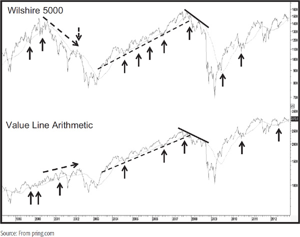
Value Line has published the Value Line Arithmetic, an equally weighted price index that reflects the broad market. Since its construction emphasizes smaller stocks, it occasionally differs in its trajectory with, say, the Wilshire 5000 in a significant way. Chart 21.3 compares the two. Note how there was a huge discrepancy between them just after the 2000 stock market peak. That was undoubtedly due to the unwinding of the tech bubble since tech stocks had fought their way to huge weightings in the cap-weighted indexes. Generally speaking, any form of discrepancy whichever index leads is a sign of weakness in the prevailing trend that, when confirmed by price, usually results in a worthwhile reversal. You can see a small divergence at the 2007 peak, which was confirmed by two trendline breaks.
CHART 21.3 Wilshire 5,000 versus the Value Line Arithmetic 1998–2012 and Divergences
When experimenting with a moving average (MA) from the point of view of trend determination, it is first necessary to assess the type of cycle to be considered. The 4-year stock market cycle has corresponded to the U.S. business cycle for many decades. Since the stock market is greatly influenced by business cycle developments, this 4-year (or, to place it more exactly, 41-month) cycle is of great significance in trend determination. Consequently, the choice of an MA to detect such swings is limited to anything less than the full period, i.e., 41 months, since an MA covering this whole time span would smooth out the complete cycle and theoretically become a straight line. In practice, the MA does fluctuate, since the cycle is rarely limited exactly to its average 41 months and varies in magnitude of price change. Through computer research1 it has been found that a 12-month MA for the S&P Composite was the most reliable between 1910 and the early 1990s. Between then and 2012, there were only four whipsaw signals.
In his book The Stock Market Indicators (Investors Press, 1968), William Gordon calculated that a 40-week crossover gave 29 buy and sell signals for the DJIA between 1897 and 1967. The average gain for all bull signals (i.e., between the buy and sell signals) was 27 percent, and the average change from sell signals was 4 percent. For investors using the buy signals to purchase stocks, nine resulted in losses, although none greater than 7 percent, while gains were significantly higher. This approach has worked reasonably well since 1967, though it is important to note that 40-week MA crossovers of the S&P Composite resulted in many whipsaws in the late 1970s. As so often happens after a number of whipsaws, the 1982 buy signal was superb. It captured most of the initial advance of the 1982–1987 bull market, while the second, in late 1984, would have kept investors in the market until the Friday before the 1987 crash.
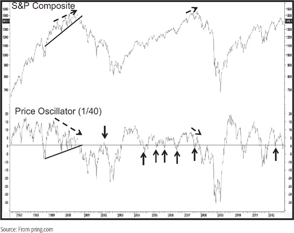
The arrows in Chart 21.4 show whipsaw 40-week MA crossovers for the S&P Composite between 1996 and 2012. They may look plentiful on the chart, but developed, on average, about once every 18 months or so. There were also quite a lot of occasions when the average acted as a support or resistance area by turning back advances and declines. When combined with the valid crossover signals, it can be argued that the 40-week MA acts as a fairly reliable benchmark, but as always, keep the following principle in mind.
CHART 21.4 S&P Composite, 1996–2012 versus a 1/40 Price Oscillator
For intermediate swings, crossovers of 13- and 10-week (50-day) averages have proved to be useful benchmarks, but naturally, an MA covering such a brief time span can result in many misleading whipsaws and is, therefore, less reliable than the 40-week average. For even shorter swings, a 30-day (6-week) MA works well, although some technicians prefer a 25-day average.
There are many ways in which the techniques described in previous chapters can be adapted to the major averages. In Charts 21.5 and 21.6, for instance, the S&P Composite is featured with a 9-month rate of change (ROC).
CHART 21.5 S&P Composite, 1900–1950 versus a 9-Month ROC
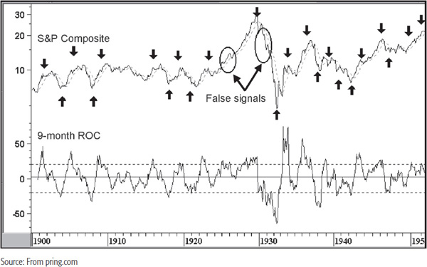
CHART 21.6 S&P Composite, 1950–2001 versus a 9-Month ROC
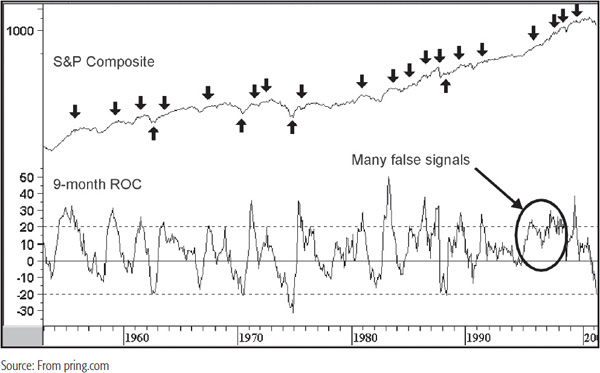
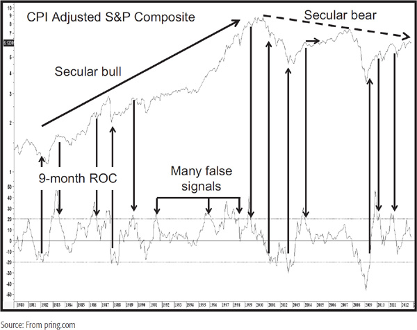
It seems that an excellent signal of an intermediate to primary trend bottom develops when the ROC either recrosses above its oversold line at –20 percent or touches the –20 percent level and then reverses. Alternatively, a recrossing of the +20 percent level appears to be a reasonably reliable intermediate peak or bear market signal. Obviously, this is not a perfect indicator, but for the most part, it works with a high degree of statistical reliability. Some of the most glaring errors are flagged by the ellipses. The first, in 1929–1930, which was obviously premature, and the second in the late 1990s, where several signals of weakness completely failed. Chart 21.7 shows the same exercise for more recent times, but in this instance, the S&P has been adjusted by the Consumer Price Index (CPI). Note that in a secular bull market there is a slight tendency for the sell signals to fail, whereas the opposite is true in the secular bear between 2000 and 2012.
CHART 21.7 CPI Adjusted S&P Composite, 1979–2012 versus a 9-Month ROC
Another technique is to construct an up trendline joining the bear market low with the first intermediate bottom. This is then combined with a 12-month ROC where a similar trendline is constructed or a price pattern, if available, flagged. That is the idea behind most of the trendlines drawn in Charts 21.8 and 21.9. Sometimes it is not possible to construct such lines and we are left with the alternative of a secondary trendline. When both are violated, this is usually a good sign that the bull move is over. Most of the time, the signals come fairly close to the bull market peak.
CHART 21.8 S&P Composite, 1966–1983 and Trendlines
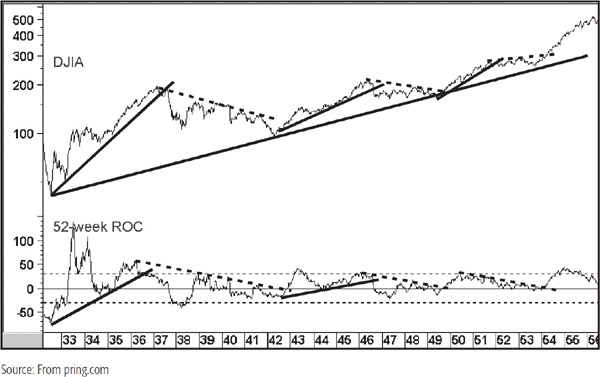
CHART 21.9 S&P Composite, 1989–2012 and Trendlines
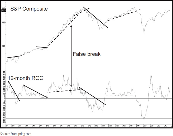
Chart 21.10 shows the trendline break technique with a 65-week ROC of the Dow Industrials. With a time span of this length, signals tend to be few in number. Sometimes the ROC offers a useful trendline break, such as at A and B, but the price trend is so sharp that it is not possible to construct a meaningful trendline. That, unfortunately, is a fact of life and is better ignored than forced, i.e., drawing a sharp trendline just to make the data fit.
CHART 21.10 DJIA, 2000–1012 and Trendlines

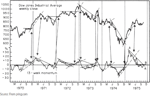
A simpler technique for identifying intermediate trends is to use reversals in the trend of a 13-week ROC of a market average, such as the S&P Composite, in conjunction with a reversal in the trend in the level of the average itself. The technique used in Chart 21.11 involves the drawing of trendlines for both the weekly closing price of the DJIA and its 13-week momentum. When a break in one index is confirmed by the other, a reversal in the prevailing trend usually takes place. Such signals are illustrated in the chart by the arrows. This type of analysis should be supported where appropriate with price pattern analysis for the S&P, and with other techniques utilizing the momentum principles described in Chapter 13. This method does not always give a signal, but whenever there are clearly definable violations of trendlines that have been touched three or more times, the conclusions drawn are usually extremely reliable.
CHART 21.11 DJIA, 1970–1975 and a 13-Week ROC
In Chart 21.12 the letters A–E indicate where overbought/oversold crossovers are not confirmed by the price. In the cases of B and D, these were preliminary signals, where a subsequent oversold decline was eventually confirmed. A, C, and E were never confirmed.
CHART 21.12 DJIA, 2001–2011 and a 13-Week ROC

In the last part of the nineteenth century and the early part of the twentieth century, rail was the dominant form of transportation and, therefore, an average composed solely of rails represented a good proxy for transportation stocks. In 1970, the Rail Average was expanded to embrace other transportation segments, and the index was renamed the Dow Jones Transportation Average.
The Transportation Average is basically affected by two factors: volume of business and changes in interest rates. First, when a business recovery gets under way, inventories are low and raw materials are needed to initiate production. Transportation volume picks up, and investors, anticipating such a trend, bid up the price of transportation shares. At business cycle peaks, companies typically overbuild their stocks; the result is that when sales start to fall, their requirements for raw materials are reduced. Transportation volume then falls sharply, and the stocks react accordingly. Second, transport companies tend to be more heavily financed with debt than industrials. Because of the leverage of this heavy debt structure, their earnings are also more sensitive to changes in interest rates and business conditions than those of most industrial companies. As a result, the Transportation Average quite often leads the Industrial Average at important juncture points. Indeed, recently conducted research data since the mid-1950s confirmed that the Transportation sector outperformed the market during the early primary bull phase and underperformed during the latter stages of the cycle. (Note: See my book The Investor’s Guide to Active Asset Allocation.)
The significance of the Dow theory rule requiring confirmation of both the Industrials and Transportations should now be more obvious, since a move by the producer stocks (the Industrials) really has to be associated with an increased volume of transportation, which should be reflected by a similar move in the Transportation stocks. In a similar vein, increased business for the Transportation stocks is likely to be of temporary significance if the industrial companies fail to follow through with a rise in sales and production levels. The longer-term cycles of the Transportation Average and the Industrial Average are more or less the same as a result of their close association with business conditions. The techniques and choice of time spans for MAs, ROCs, etc., are, therefore, similar to those described earlier for the Industrials.
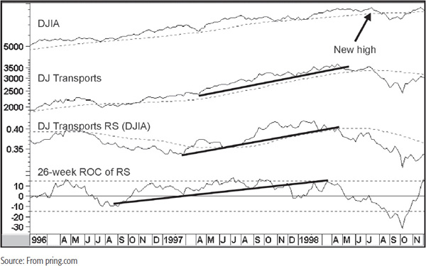
One principle that is not normally used for the Industrials but that can be applied to the Transportations is that of relative strength (RS). This technique is particularly useful during periods of nonconfirmation between the two averages, when RS can offer a useful clue as to how the discrepancy will be resolved. One such example occurred in the summer of 1998 when the DJIA made a marginal new high. Chart 21.13 shows that the Transports remained above their 40-week MA but the average had already violated a secondary uptrend, thereby indicating potential weakness. As it turned out, when the Industrials reached their new high, the Transports rallied back to the extended trendline that they had previously violated. However, the real tip-off that the Transports were unlikely to confirm the Industrials came from the fact that the RS line had crossed below its MA and secondary up trendline in April 1998. The 26-week ROC of relative strength also violated an up trendline. Thus, at the time when the Industrials were making a new high in July, the Transport RS line was declining and well below its MA. Finally, the ROC was unable to rally above zero, which represented an additional sign of vulnerability.
CHART 21.13 DJ Transports, 1996–1998 and Three Indicators
The Dow Jones Utility Average comprises 15 utility stocks drawn from electric utilities, gas pipelines, telephone companies, etc. This average has historically proved to be one of the most reliable barometers of the Industrials. This is because utility stocks are extremely sensitive to changes in interest rates and interest rates generally lead the overall stock market. Interest rate changes are important to utility stocks for two reasons. First, utility companies require substantial amounts of capital because they are usually highly financed with debt relative to equity. As interest rates rise, the cost of renewing existing debt and raising additional money puts pressure on profits. When interest rates fall, these conditions are reversed and profits rise. Second, utility companies generally pay out their earnings in the form of dividends so that these equities are normally bought just as much for their yield as for their potential capital gain. When interest rates rise, bonds, which are also bought for their yield, fall in price and thus become relatively more attractive than utilities. As a result, investors are tempted to sell utility stocks and buy bonds. When interest rates fall, the money returns once again to utility stocks, which then rise in price.
Generally speaking, when the Utility Average flattens out after an advance or moves down while the Industrials continue to advance, it is usually a sign of an imminent change in trend for the Industrials. Thus, the Utilities led the Industrials at the 1937, 1946, 1953, 1966, 1968, 1973, and 1987 bull market peaks. Conversely, at the 1942, 1949, 1953, 1962, 1966, 1974, and 1982 bottoms, the Utilities made their bear market lows ahead of the Industrials. At most major juncture points, the Utilities coincided with the Industrials, and occasionally, as at the 1970 bottom and the 1976 top, the Utilities lagged. Chart 21.14 shows that for the most part since the 1970s they have led, but lagged at the 2000 peaks and very slightly at the 2007 top.
CHART 21.14 DJIA versus DJ Utilities 1980–2013
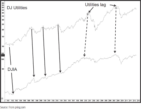
The relationship between the Utilities and the Industrials is often overlooked because they usually give their loudest message when other market activity is at its most exciting. It is normal behavior at market tops for the Utility Average to quietly decline while investors, analysts, and the media are excited about huge price advances yet to be seen. Chart 21.14 shows a classic example in 1987. In August, the Industrials were at an all-time high, but the Utility Average was already in a well-established bear market. At market bottoms, fear, depression, and sometimes panic reign while the Utility Average is very quietly in the process of turning up.
An unweighted index is calculated by adding the prices of a universe of stocks and dividing the total by that number. The resulting average is then weighted by price rather than capitalization. The most widely followed is the Value Line Arithmetic.
Unweighted indexes are useful because they closely represent the price of the “average” stock often found in individual portfolios, as opposed to the blue chips, to which institutional investment is more oriented. Unweighted indexes are also helpful in gaining an understanding of the market’s technical structure since they have a tendency to lead the market (i.e., the DJIA) at market tops. When a persistent divergence of this nature between the DJIA and the Value Line develops, it almost always results in the Dow being dragged down as well. Once a divergence starts, a cautious approach should be maintained until both the DJIA and the Value Line break out from price patterns or declining trendlines, etc.
A show of good RS by the unweighted indexes at a time of sustained weakness in the major averages often indicates that a significant rally will follow when the decline is over. This occurred in 1978, when the Value Line Composite Index made its low in late 1977, several months ahead of the DJIA.
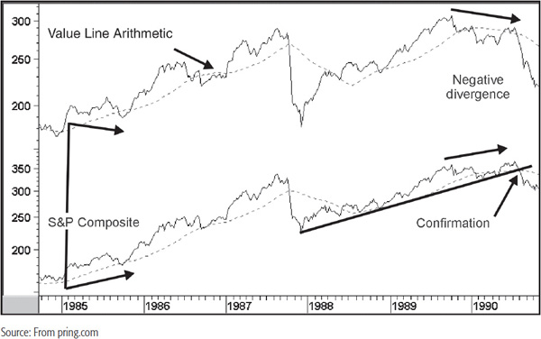
Chart 21.15 shows the Value Line Arithmetic against the S&P Composite between 1984 and 1990. In late 1985, the Value Line made a lower low than it did at the beginning of the year, but the S&P made a higher low. This out-of-gear situation was a negative sign but was never confirmed by the S&P violating its 40-week EMA. We see a similar type of situation in 1986, but again, this potentially negative discrepancy was not confirmed by a negative S&P MA crossover. The situation in 1990 was different because the S&P not only penetrated its MA but violated a major up trendline as well. This reaffirms an important principle—that of confirmation. There are countless situations where we can compare two indicators or averages and observe disagreements. However, just as divergences in oscillators should be confirmed by price, so these disagreements, whether they are positive or negative in nature, must be confirmed before we can come to a conclusion that the trend has reversed.
CHART 21.15 Value Line Arithmetic versus S&P Composite, 1984–1990
The technology boom of the 1990s brought the NASDAQ Composite into a kind of prominence that it had never experienced before. This capitalization-weighted index is dominated by large technology companies and has become a proxy for the technology sector. The NASDAQ has no consistent leading characteristics like the Utilities, probably because several technology sectors, such as semiconductors, have lagging tendencies. However, it can be used with relative strength analysis. Chart 21.16 features the NASDAQ together with its RS line against the S&P Composite. Note how a joint trendline break in 1991 signaled a major rally. Later on, another down trendline break in the RS line was confirmed. This time, it was a solid break above a resistance trendline, the violation of which resulted in an acceleration in the speed of the bull market.
CHART 21.16 NASDAQ Composite, 1983–2000 versus NASDAQ RS
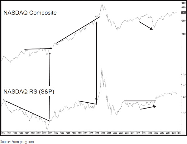
Also worthy of note is the fact that the RS line diverged positively with the NASDAQ Composite Index at the 2009 low. This was quite different from the previous bear market where the NASDAQ Composite outperformed on the downside. While there was a nice breakout above a trendline on the RS line, there was no such possibility for the price itself, which literally reversed on a dime.
The Frank Russell Organization, among other things, publishes three important indexes: The Russell 3000, 2000 and 1000. The Russell 1000 is a composite capitalization-based series containing the 1,000 largest stocks in the country. The Russell 2000 represents the next 2,000 issues based on capitalization. Finally, the Russell 3000 is a composite index of the other two. It represents in excess of 95 percent of the investable U.S. equity market. These indexes are plotted in Chart 21.17. Normally, they move in gear with each other. It is when they disagree that the discrepancies can sometimes be very revealing. In October 1999, all three succeeded in violating important down trendlines, and the joint break indicated a rally lay ahead. On the other hand, the Russell 2000, which is often used as a proxy for the low-cap sector, experienced a sharp rally going into February 2000. All three indexes then retreated, but the Russell 2000 was unable to rally to a new high, unlike the other two. Thus, we have what had previously been the leader no longer leading. Such leadership failures are often a sign that the prevailing trend is running out of steam and throws up a definite red flag.
CHART 21.17 Three Russell Indexes 1999–2000
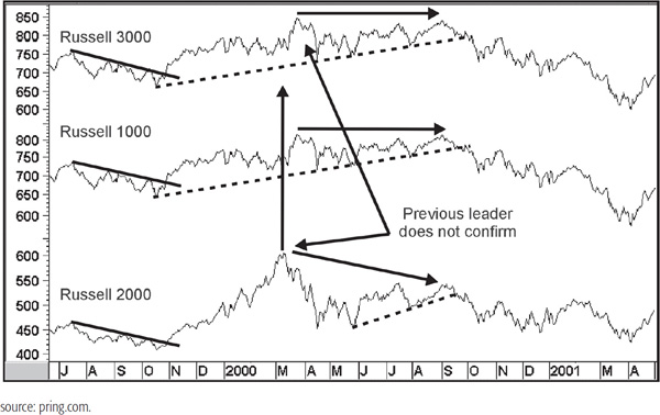
In this case, the April rally proved to be the top of the bull market. Finally, we see that the Russell 1000 rallied back to its spring high in September 2000 but the Russell 2000 was unable to confirm. When all three violate their (dashed) up trendlines a little later, the divergences were confirmed and a major decline followed.
The relationship between the Russell 2000 (low cap) and Russell 1000 (blue chip/high cap) can also be helpful because it can provide a clue as to which category investors should favor. Chart 21.18 shows that the relationship can be quite cyclical in nature. This can be seen from the long-term Know Sure Thing (KST). Sometimes it is possible to augment KST MA crossovers with trendline breaks in the ratio itself.
CHART 21.18 Russell 2000/1000 Ratio, 1987–2012 and Long-Term Momentum
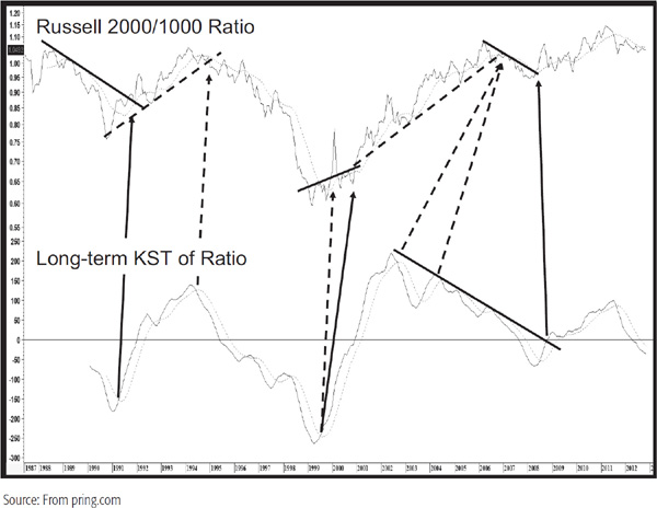
This was the case in 1991 and 1995, but the drop was too steep in the late 1990s to construct a line. The next breakout, flagged by the dashed arrow, developed with the sharp rise in 2000, which turned out to be a whipsaw. The reason was the dramatic first-quarter run up in the technology sector, which temporarily dominated the Russell 2000. Later on, if one was prepared to ignore this false move, it was possible to observe a subsequent breakout from the extended base at the end of 2000.
The KST peaked in 2002, fully three years before the 2005 top, which was confirmed with the violation of a dashed up trendline. Even that followed a second lower KST peak. A small decline followed, and the next upleg in the secular bull market of this relationship was signaled by the price violating the solid down trendline in 2008. The KST followed with a lag, which is unusual, and the ratio continued to rally into early 2011.
MSCI, Dow Jones, and FTSE are the leading index providers for international equity indexes, but since the vast majority of widely traded international ETFs fall under the Morgan Stanley Capital International (MSCI) banner, we will focus on two of their offerings. The MSCI World Stock Index has been available since the mid-1960s and includes over 6,000 stocks from developed countries. A related index, the MSCI All Country World Index, incorporates both developed and emerging countries. It is the tracking index for an ETF (symbol ACWI), and is used here as a proxy for global equities.
There are also many regional and individual country indexes that are too numerous to mention. However, the MSCI Europe Australasia Far East Index does deserve mention, since for all intents and purposes, it represents 22 developed countries, excluding its biggest component, the United States. Canada is also excluded. In effect, it reflects the rest of the non-U.S. world. This ETF carries the symbol EFA and is useful when calculated as a ratio between the SPY and itself. A rising ratio trend then indicates that the United States is outperforming the rest of the world and vice versa.
The most comprehensive U.S. bond ETF is the Barclay’s Aggregate Bond (symbol AGG). AGG holds bonds across the spectrum: Treasury notes, Treasury bonds, corporate bonds, utilities, U.S. agencies, and more. About 40 percent of its holdings at the end of 2012 were invested in bonds with a maturity greater than 5 years. It serves as a proxy for the overall U.S. credit market. A good proxy for long-term U.S. government bonds is the Barclay’s 20+ year Treasury bond ETF (symbol TLT).
Internationally, the Barclay’s Capital Global Treasury Ex-U.S. Capped Index is a useful benchmark for the world, with the exception of the United States. It includes government bonds issued by investment-grade countries outside the United States, in local currencies, that have a remaining maturity of 1 year or more. Since the tracking index for this fund includes a large group of countries, it could be adversely affected by questionable sovereign debt. The symbol for this ETF is BWX.
The commodity index that you will find used a lot in this book is the CRB Spot Raw Industrials published at CRBtrader.com. This series is constructed from 18 raw industrial commodities, none of which except cotton are traded on the major exchanges. This series is very useful for intermarket and interasset analysis since it is not driven by weather, but by economic developments. Therefore, it better reflects true inflationary conditions as they arise in the commodity markets thereby affecting bond yields and equity prices.
There are two principal commodity funds based on tracking indexes. The first is the DB Commodity Fund, which tracks the DB Commodity Index. At the end of 2012, this index comprised just over 50 percent energy with 22 percent in grains and the balance in metals. The weightings are determined by the liquidity of the various contracts rather than by their economic importance. The second is the Dow Jones UBS Commodity ETN, the DJP, which tracks the Dow Jones UBS Commodity Index. The rough commodity sector ratings in December 2012 were energy 30 percent, agriculture 32 percent, industrial and precious metals 32 percent, and a small 6 percent in livestock. Of the two funds, the DBC is the more liquid.
1. There is no perfect index or average that consistently and truly represents “the market.”
2. There are two principal methods of calculating market averages: those that use capitalization and those that incorporate an unweighted formula.
3. The technical indicators described elsewhere in this book can be applied to market averages.
4. Most of the time, market indexes move in gear with each other. It is when discrepancies develop and are confirmed that reversals in trend are signaled.
1Robert W. Colby and Thomas A. Meyers, The Encyclopedia of Technical Market Indicators, Homewood, IL: Dow Jones-Irwin, 1988.
2Investors Press, Palisades, NJ, 1968. The actual rule used for buy signals was as follows: “If the 200-day (40-week) average line flattens out following a previous decline, or is advancing and the price of the stock penetrates that average line on the upside, this comprises a major buying signal.”