Time is represented on the horizontal axis of most technical charts. It is normally used in conjunction with price, volume, and breadth, the other three dimensions of psychology involved in determining trends in the stock market. These latter three, though, are measured on the vertical axis. Time can also be assessed independently through the analysis of cycles.
Discussions of the importance of time have, so far, been limited to the idea that the significance of a reversal in trend depends upon the length of time needed for a distribution or accumulation to complete. The longer the period, the greater the magnitude and duration of the next move are likely to be. Removing the speculative excesses of a trend requires a commensurately large corrective movement, just as the discipline of a long period of accumulation provides a sound base from which a substantial and lengthy advance can take place. The very long (8-year) bull market between 1921 and 1929 was interrupted by corrective reactions, but the substantial increase in stock prices during this period resulted in a considerable amount of excess confidence and speculative excesses, which were only erased by a sharp and lengthy decline.
Similarly, the 1966 stock market peak was preceded by 24 years of basically rising prices followed by a long period of consolidation involving widely swinging stock prices. When adjusted for inflation, stock prices peaked in 1965, subsequently experiencing an extremely severe secular bear market, which was comparable to the 1929–1932 debacle.
Another example comes from the big bull market in gold, which started in 1968 at $32 and ran up to $850 in January 1980. While the price decline was not as severe as the 1929 crash, the next 20 years were spent in a frustrating sideways trading range at prices well under half their peak value. Once that cathartic process had been completed, prices were free to more than double from their 1980 peak.
Investors become accustomed to rising prices in a bull market, with each reaction being viewed as temporary. When the trend finally has reversed and the first bear market rally takes place, the majority are still convinced that this, too, is a temporary reaction and that the bull trend is being renewed. The initial response is always disbelief, as reflected in the attitude “It’s bound to come back” or “It’s a good company; I am in it for the long-term.” As prices work their way lower in a bear market, the adjustment takes a less optimistic form because the majority of investors forsake their expectations of a rising market and look for them to move sideways for a time. The psychological pendulum finally swings completely to the other (bearish) side, as investors watch prices slip even further and become overly pessimistic. At this point, sufficient time and downside price action have elapsed to complete the adjustment process, and the market in question is then in a position to embark on a new bull cycle.
Time has been viewed here in an emotional context, since it is required for investors to adjust from their unrealized expectations. Both traders and investors should realize that time is deeply bound up with the business cycle. This is due to the fact that a strong and lengthy recovery, like those between 1921–1929 and 1990–2000 breed confidence among investors and businesspeople. As a result they tend to become inefficient, careless, and overextended due to this long period of prosperity. The subsequent contraction in business conditions needed to wipe out these distortions is thus more severe. Equity prices suffer the double influence of: (l) losing their intrinsic value due to the decline in business conditions and (2) being revalued downward from the unrealistically high levels that prevailed during the period of prosperity. The reverse set of circumstances applies following a long market decline.
Measuring time as an independent variable is a complicated process, since prices move in periodic fluctuations known as cycles. Cycles can operate for periods ranging from a few days to many decades. At any given moment, a number of cycles are operating simultaneously, and since they are exerting different forces at different times, the interaction of their changing relationships often has the effect of distorting the timing of a particular cycle.
The most dominant of the longer ones is the so-called 4-year cycle, in which there is a nominal or average length between troughs of 41 months. Since several other cycles are operating at the same time but with different influences, the length of the 4-year variety can vary either way by 6 months or so.
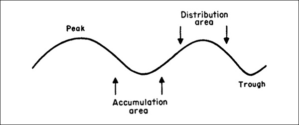
Cycles are shown on a chart in the form of a sine wave, as in Figure 24.1. These curves are usually based on a rate of change (ROC) or trend-deviation calculation, which is then smoothed to iron out misleading fluctuations. Since it occurs only rarely that two cycles are of identical length, an average, or nominal, period is calculated. This theoretical time span is used as a basis for forecasting.
FIGURE 24.1 Typical Cycle

In Figure 24.2, this idealized cycle is represented by the dashed line and the actual cycle by the solid one. The arrows indicate the peaks and troughs of the idealized cycle: In actual fact, price trends rarely reverse exactly at theoretical points, especially at peaks, where there is often a long lead time. Nevertheless, the theoretical points provide a useful guide. Three other important principles are concerned with cycle analysis in addition to those of proportionality and nominality. The first is the principle of commonality, which states that cyclicality of similar duration exists in the price action of all stocks, indexes, and markets. This means that a 4-year cycle exists not only for the U.S. stock, bond, and commodity markets, but also for each individual stock and for international markets as well.
FIGURE 24.2 Typical versus Idealized Cycle

For example, if two food stocks are experiencing breakouts, the trend for food stocks is likely to be less significant than if, say, 10 stocks are experiencing similar breakouts. The old adage “strength in numbers” certainly come to mind on this point.
In other words, all stocks, indexes, and markets go through a similar cycle, but the timing of both their peaks and their troughs differs, and so does the size of their price fluctuations. For example, the interest-sensitive and cyclical (basic industry) stocks go through the similar cycle, but because interest-sensitive stocks, such as utilities, lead the market, cyclicals, such as steel groups, generally lag behind them. This is shown in Figure 24.3. Similarly, the interest-sensitive issues may rise by 80 percent from the trough to the peak of their cycle, while the cyclicals might advance by only 20 percent, and vice versa.
FIGURE 24.3 Leading versus Lagging Sectors

Chart 24.1 also illustrates this principle, and shows the interaction of financial series during a typical business cycle. The rising part usually consists of three stages, which correspond to the three phases described in Dow theory. It is normal for prices to reach a new high as each stage unfolds, but sometimes this does not happen. This is known as a magnitude failure, and is a distinct sign of weakness. A magnitude failure occurs because of very poor underlying fundamentals. In effect, the cycle misses a beat. Magnitude failures are a characteristic of a contratrend price movement such as a short-term rally in a primary bear market, a primary trend advance that develops under the context of a secular bear, and so forth.
CHART 24.1 Typical Cycles with Financial Series in Percentage of Their Averages. A Mechanistic Approach to Business Cycle Conditions
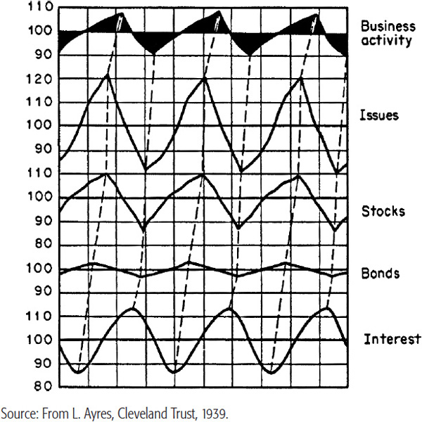
The opposite can also occur; exceptionally strong fundamentals (or the perception of them) can give rise to a fourth stage, in which prices undergo an additional upward leg. For equity markets, this final upward surge is often associated with an extended period of declining interest rates. Such strong underlying conditions normally develop when the 4-year cycle occurs in conjunction with the peak of longer-term cycles, such as that associated with secular trends.
In cases in which the cyclic turning points of a number of components of a particular market converge, the magnitude of the next move will be much greater. For example, the turning points of individual stock markets around the world can occur at different times. However, in the summer of 1982, most of their cyclical lows coincided. The resulting rally in virtually all markets was explosive.
The third principle is summation.
It is really the combination of a number of cycles into one and is the concept behind the Know Sure Thing (KST) market cycle model discussed in Chapter 15. If the result were plotted as one idealized cycle, it would be represented by a curve similar to the Special K indicator, also discussed in the same chapter.
There are four influences affecting a time series trend at any one time: secular, cyclical, seasonal, and random. The cyclical trend is the starting point for the purpose of analyzing primary bull and bear markets. Specifically, this is the 4-year, or Kitchin, cycle. The secular influence is a very long-term one that embraces several 4-year cycles. From the point of view of a stock, bond, or commodity market, the most dominant secular cycle” is ranges from 30 to 50 years between troughs. Two other important cycles in excess of 4 years are the 9.2-year and 18 -year cycles.
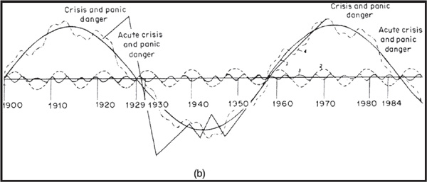
Figure 24.4, adapted from Business Cycles by Joseph Schumpeter (McGraw-Hill, 1939), combines the effect of three observable business cycles into one curve. In effect, it shows the summation principle using three longer-term cycles: the 50- to 54-year (Kondratieff), the 9.2-year, and the 41-month (Kitchin) cycles. The model is not intended to be an exact prediction of business conditions and stock prices, but rather to indicate the interaction of the shorter cycles with the longer ones. Even so, it is worth noting that the long-term curve crossed below the zero line in 1987. Projecting the down wave from that point forward to its expected positive equilibrium crossover 20 to 25 years later certainly brings us into the ballpark for the secular low in commodity prices, which actually took place in 2001. A more detailed description of the long wave was presented in Chapter 23. For now, we will concentrate on a few cycles of relatively shorter duration.
FIGURE 24.4a Schumpeter’s Model of Nineteenth-Century Business Cycles. (From Joseph Schumpeter, Business Cycles,McGraw-Hill, New York, 1939.)
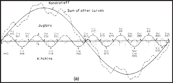
FIGURE 24.4b Twentieth-Century Business Cycle and Crisis Points (Calculated Path).
Normally, the amplitude of a cycle is a function of its duration; i.e., the longer the cycle, the bigger the swing.
The 18-year or, more accurately, the 18 -year cycle, has occurred fairly reliably in stock market prices since the beginning of the nineteenth century, but its recent performance is questionable. Even so, this cycle gains credibility because it operates in other areas, such as real estate activity, loans and discounts, and financial panics.
The smoothed line in Chart 24.2 is a 3-year centered moving average (MA) of common-stock prices from 1835 to 2012. This average helps to smooth the trend and isolate the long-term picture more clearly. The beginning of the 18-year cycle at major market bottoms is self-evident when the vertical lines are referenced.
CHART 24.2 S&P Composite, 1835–2012 the 18 Year Cycle
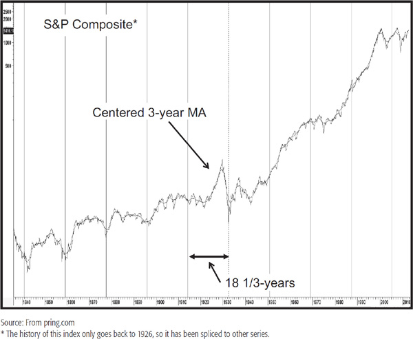
While the average cycle lasts 18 years, actual cyclical lows can vary 2 to 3 years either way. The increase in government interference in the economy resulting from the Keynesian revolution has had the effect of biasing the cycle to the upside to the extent that there is a question of whether it is still operating. For example, the conceptual low in the 1987–1988 period did not coincide with a bottom associated with a business cycle. Note that the early 1950s and 1987–1988 lows developed during the course of a secular bull market as defined in the previous chapter. In such cases, we would not expect to find much in the way of downside cyclicality, but those juncture points, like regular cyclic lows, still qualified as a long-term buying opportunity.
On balance, since 1840, the 18-year cycle has operated fairly consistently. However, the erratic nature of the last two cycles leads us to question whether this 18-year periodicity is still continuing to operate, and is another reason why cycles, just like any other technique, need to be augmented with other indicators.
A slight variation on the 18-year cycle is its 17.5 counterpart. This is featured in Chart 24.3, where you can see that it has embraced many significant bottoms as well as tops. Secular turning points, such as 1929, 1949, 1966, 1982, and 2000, all developed close to expected bottoms or inversions. Unfortunately, this cycle does not distinguish between tops and bottoms—there again, momentum indicators are required for this process.
CHART 24.3 S&P Composite, 1840–2012 the 17.5-Year Cycle
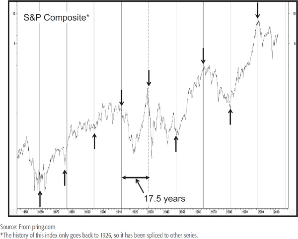
Chart 24.4 shows the 9.2-year cycle in stock prices from 1830 to 1946. The dashed lines represent the ideal cycle, which reversed exactly on schedule, and the solid line shows the actual annual average as a percentage of its 9-year MA trend.
CHART 24.4 The 9.2-Year Cycle in Stock Prices 1830–1946
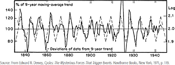
The cycle occurred 14 times during the 1930–1946 period, and according to the Bartels test of probability, it could not occur by chance more than once in 5,000 times. Further evidence of the significance of this cycle is given by observation of the 9.2-year periodicity in other phenomena as unrelated as pig iron prices and the thickness of tree rings.
One problem with using the technique illustrated in the chart is that the annual average is expressed as a percentage of a centered 9-year MA. This means that the trend is not known until 4 years after the fact, so there is always a 4-year lag in learning whether the 9.2-year cycle is still operating. Nevertheless, if the theoretical crest in 1965 is used as a base and the 9.2 years are subtracted back to 1919, the peaks of the 9.2-year cycle correspond fairly closely to major stock market tops.
The vertical lines in Chart 24.5 show the 9-year cycle theoretical lows using the 1932 bottom as a centering device. The small black arrows show how the actual low diverged from the theoretical low or became an inverted high. Those against the 55-month ROC (half the time span of the cycle) point up when the cycle turning point corresponded with an important ROC reversal or the start of a more accelerated trend.
CHART 24.5 S&P Composite, 1900–2012 the 9.2-Year Cycle

The cycle worked well until the 1990s—after that, the lows represented good buying points but developed halfway up the rallies. The fact that this cycle completely missed the lows of 2002 and 2009 suggest it may not still be operating.
This pattern was first noted by Edgar Lawrence Smith in his book Tides and the Affairs of Men (Macmillan, 1932).1 Smith researched equity prices back to 1880 and came to the conclusion that a 10-year pattern, or cycle, of stock price movements had more or less reproduced itself over that 58-year period. He professed no knowledge as to why the 10-year pattern seemed to recur, although he was later able to correlate the decennial stock patterns with rainfall and temperature differentials. Even though the cycle is a relatively reliable one, there has been to date no rational explanation as to why it works.
Smith used the final digit of each year’s date to identify the year in his calculations. The years 1881, 1891, 1901, etc., are the first years; 1882, 1892, etc., are the second; and so forth. Inspired by the research of Dr. Elsworth Huntington and Stanley Jevons,2 who both emphasized the 9- to 10-year periods of recurrence in natural phenomena, Smith experimented by cutting a stock market chart into 10-year segments and placing them above each other for comparison, as shown in Chart 24.6. He concluded from this data that a typical decade consists of three cycles, each lasting approximately 40 months.
CHART 24.6 The Decennial Pattern of Industrial Stock Prices
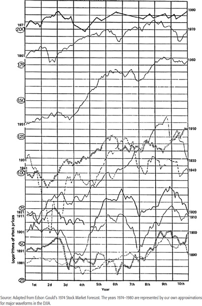
The late Edson Gould, who came into prominence in the mid-1970s because of his uncannily accurate stock forecasts, used the decennial cycle as a cornerstone for his research. In his 1974 stock market forecast Gould wrote, “In the 35 years that have passed since Mr. Smith’s book was published—35 years of wars, inflation, and vast changes in our economic monetary set-up and background—the action of the stock market has, much of the time, fitted unusually well with the 10-year pattern.”3 Smith’s discovery has stood the test of time.
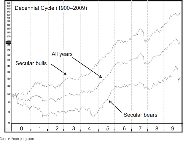
The stock series in Chart 24.7 represents a simple average of the decennial pattern from 1900 to 2009, giving equal weight to the proportional movements of each period. It starts off with years ending in zero and ends with those terminating with nine. You can see that the trajectories are very similar during secular bull and bear markets even though they represent different years. The chart also brings out the fact that secular bull years are easier to make money in than secular bears, a fairly obvious observation but nonetheless a very important one.
CHART 24.7 Decennial Cycle 1900–2009 Distinguishing between Secular Bull and Bear Markets
The pattern is plotted together with a 12-month ROC in Chart 24.8. The swings in the ROC show four down phases and an equal number of advances, as flagged by the solid lines.
CHART 24.8 Decennial Cycle 1900–2009 and a Momentum Indicator
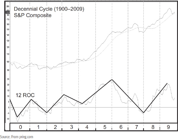
The decennial pattern can be of greater value if it is used to identify where the strong and weak points usually occur and then to see whether other technical phenomena are consistent. For example, in the middle of year 9, the 12-month ROC indicator for the average cycle is highly overbought, which is consistent with a decline or consolidation, starting at the end of that year and following through to the year ending in zero. In 1949, the 12-month ROC was highly oversold and was inconsistent with its normal position in the decennial pattern. Instead of declining into 1950, the market actually rose. This experience is a good example of why the decennial approach should be used with other technical indicators and not in isolation.
The strongest period in the cycle is centered on years ending in a five and extends until the early part of the seventh year. There is a distinct upward bias beginning at the tail end of the seventh or the middle of the eighth year, which runs through to the third quarter of the ninth. Indeed, Table 24.1 shows that 9 years rallied 10 times from a total of 13, only being eclipsed by the super 5 years, which have a 12-1 rally advantage. That exception developed in 2005, but would not be an exception had we used the S&P Composite in our calculation. The weakest years are those ending in a seven or a zero.
TABLE 24.1 The 10-Year Stock Market Cycle
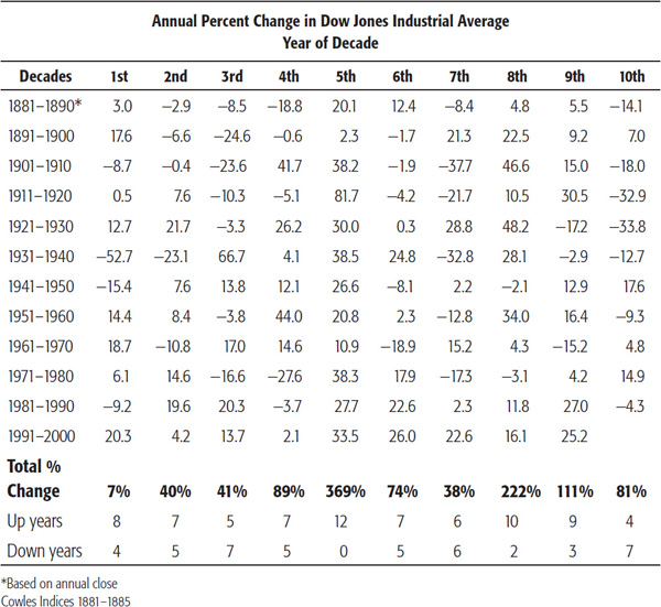
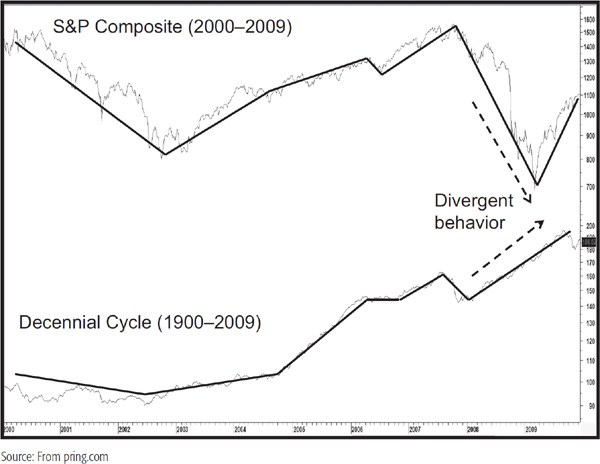
Chart 24.9 compares the average cycle with the S&P Composite in the opening decade of the current century. By and large, the trajectories were quite similar until the 2008 financial crisis began to unfold and the market sold off sharply instead of rising. This discrepancy once again offers a timely warning that however promising a historical pattern or relationship may be, it is mandatory to form a weight-of-the-evidence conclusion because in the world of financial forecasting nothing is predetermined except the recurring cycle of fear and greed! Moreover when using these types of cyclical patterns and the cycles themselves for analysis greater emphasis should be placed on direction rather than magnitude.
CHART 24.9 S&P Composite versus the Decennial Pattern 2000–2009
The so-called 4-year cycle is a 40.68-month (41-month) cycle. It has been observed to operate in stock prices since 1871. Around 1923, Professor Joseph Kitchin was also able to show a cycle of 41 months in bank clearings, wholesale prices, and interest rates in the United States and United Kingdom. This cycle has since carried his name.
The Kitchin cycle as applied to stock prices is illustrated in Charts 24.10a and b. Between 1871 and 1946 it has occurred 22 times with almost uncanny consistency. Then in 1946, as Edward Dewey describes it, “Almost as if some giant hand had reached down and pushed it, the cycle stumbled, and by the time it had regained its equilibrium, it was marching completely out of step from the ideal cadence it had maintained for so many years.”4
CHART 24.10a The 41-Month Rhythm in Stock Prices, 1868–1945
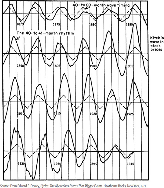
CHART 24.10b The 41-Month Rhythm in Stock Prices Reversed, 1946–1968

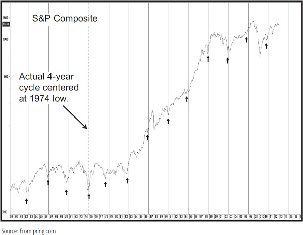
The 4-year cycle can also be observed by looking for a major buying opportunity every 4 years, and in this way is arguably the most reliable of the cycles described here. Charts 24.11 and 24.12 show that this usually develops after a decline, such as in 1962, 1966, 1970, 1974, 1978, 1982, 1990, 1994, 1998, and 2002. Sometimes, as in 1986 and 2006, the market is very strong and the buying opportunity develops after a sideways consolidation. The 4-year cycle year of 2010 also developed a buying opportunity, but this time it came after an intermediate decline in the middle of the year. The charts center the cycle in 1921 and 1974, respectively, so that the vertical lines represent the idealized lows. The important thing to notice is that the actual buying opportunity lows develop close to either side of these points. Many of them closely intersect the vertical lines as well. The most notable failure developed in 1930 about halfway down the greatest bear market in history. Once again, this anomaly indicates the fact that a particular indicator or cycle that has operated successfully in the past is no guarantee that it will continue to do so in the future.
CHART 24.11 S&P Composite, 1910&1958, 4-Year Cycle
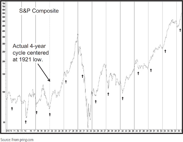
CHART 24.12 S&P Composite, 1959–2018, 4-Year Cycle
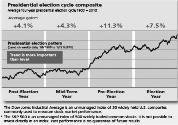
The presidential cycle is closely allied to its 4-year counterpart but is more of a pattern than an actual cycle with two lows separated by a cyclic high. The presidential cycle can be split into 4 separate years like the presidential term. In the first year, presidents like to do some economic housecleaning to prepare for better times as the subsequent election approaches. Wars also tend to develop in the first half of the term. The most recent example was the Iraq invasion, which began in late 2003, although strictly speaking, that took place very early in the second half of the term. The Afghanistan surge by President Obama was advertised in December 2009 less than 1 year into his presidency. The point here is that the first year of the cycle involves economic pain and stress and is a drag on equity prices. In Stock Market Cycles (Wiley, 2002), Jeffrey Hirsch lays out the fact that between 1833 and 2011 the market gained 724 percent in the last 2 years of the presidential cycle compared to 273.1 percent for the first two. By way of contrast to the austerity of the first 2 years, the preelection and election years are characterized by pump priming. The percentage return for each of the 4 years in the cycle is shown in Chart 24.13. Returning to the first year we find that a number of bear markets begin at such times. Examples include 1929, 1937, 1957, 1969, 1973, 1981, and 2001, although in the case of the latter the actual high was registered in 2000.
Chart 24.13 also shows that the third year of the cycle is by far the best. Indeed, there has not been a down year in the third year of a presidential election year since the outbreak of World War II in 1939, when the Dow Jones Industrial Average (DJIA) lost 3 percent.
CHART 24.13 Presidential Cycle, 1833–2011, Annual Returns
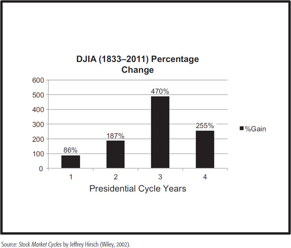
Chart 24.14 lays out the average performance for each year of the cycle. Here it is evident that the period that starts at the end of the mid-term year and ends toward the final quarter of the preelection year is statistically the strongest. When combined with the strongest year in the decennial cycle (1915, 1935, 1955, 1975, and 1995), an explosive rally typically develops every 20 years. The manuscript for this book is being prepared in early 2013, so it will be interesting to observe how the next fifth decennial third presidential combination due in 2015 will behave.
CHART 24.14 Composite Presidential Cycle, 1900–2010
There is a distinct seasonal pattern of stock prices that tends to repeat year after year. Equities seem to have a spring rise, a late-second-quarter decline, a summer rally, and a fall decline. Apart from seasonal changes in the weather that affect economic activity and investor psychology, there are also some seasonal patterns in financial activities. For example, July and January are heavy months for dividend disbursement, retail trade around the year’s end (Christmas) period is the strongest of the year, and so on.
Stocks purchased in October have a high probability of appreciating if held for a 3- or 6-month period, as that month ends the worst-performing 6 months of the year. It has also posted more bear market lows than any other month. Not surprisingly, the November–January period offers the best-performing consecutive months of the year (S&P average gain of 4.3 percent since 1950). Failure to do well in this part of the year is often a sign of trouble. The late Edson Gould observed that “if the market does not rally, as it should during bullish seasonal periods, it is a sign that other forces are stronger and that when the seasonal period ends those forces will really have their say.”
Close to the center of this 3-month bullish seasonal is the period surrounding Christmas marked by the last five trading days of the old year and embracing the first two of the new year. This is the so-called Santa Claus rally, which according to Jeffrey Hirsch in Stock Market Cycles, has averaged 1.5 percent since 1953. Yale Hirsch, Jeffrey’s father, coined the expression “If Santa Claus should fail to call, bears may come to Broad and Wall.” Examples include 1968, 1981, 2000, and 2008, all of which were followed by bear markets. This, of course is a great example of Edson Gould’s failed seasonal principle outlined above.
Chart 24.15 represents the seasonal tendency of the stock market to rise in any given month. The probabilities were calculated over the twentieth century by Tim Hayes at Ned Davis Research (see Table 24.2). All movements are relative, since a month with a strong tendency will be accentuated in a bull market, and vice versa. It is also important to note that the direction of the trend is more important than the level.
CHART 24.15 The Seasonal Pattern in the Stock Market
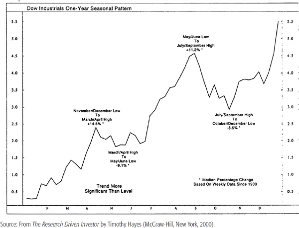
TABLE 24.2 DJIA Monthly Performance Since 1900

The January Barometer was originally devised by Yale Hirsch in 1972. Simply stated, the indicator adheres to the maxim that “as goes the S&P in January, so does the whole year” (Jeffrey Hirsch, Stock Market Cycles, p. 143). According to Hirsch, the barometer has an 88.7 percent accuracy.
One final comment on seasonality derives from the fact that the May to October period has the worst track record. “Sell in May and go away” has some statistical merit on its side. For instance, Jeffrey Hirsch calculates that a hypothetical $10,000 investment in the DJIA compounded to $674,074 for the November–April period, compared to a $1,024 loss over a 62-year period. That does not mean that every May–October period lost money, nor that every November–April one made money, but it does indicate a strongly positive bias toward the November–April period.
My friend Sam Stovall at S&P Capital IQ takes it one step further. He points out that two good performing sectors in the negative May–November period are the defensive consumer staples and health care. Alternatively, the higher beta materials and industrials outperform in the bullish November–May period.
The year-end effect of superior returns also seems to apply to the month’s end. Data covering the 89-year period ending in 1986 show that returns from the last trading day of a month (day 1 in Figure 24.5) to the end of the third trading day of the new month are consistently good. The rationale for this effect may well come from higher month-end cash flows, such as salaries, dividends, etc.
FIGURE 24.5 Turn of the Month (Average Daily Returns)
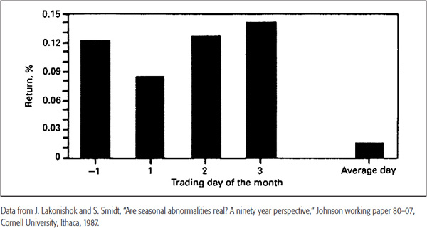
Indeed, these four trading days average 0.118 percent, versus 0.015 percent for all trading days. Turn-of-the-month returns can be said to account for all the positive capital gain returns generated by the market. In an article entitled “Calendar Anomalies,”5 Bruce Jacobs and Kenneth Levy point out that this effect was less prevalent in the 1980s, which goes to show that it is not a wise policy to follow one indicator exclusively. In the 2001 edition of the Stock Traders Almanac, a must-read for the seasonally oriented trader, Yale Hirsch points out that this seasonal indicator shifted between 1981 and 2000 to the last 4 and first 5 trading days of the new month. The most bullish day of all appears to be the first day of the month, according to the Almanac’s 2013 edition, as the editors point out that in the previous 15 years the DJIA gained more points on that day than all the others combined.
However, it does make sense to integrate this reliable long-term seasonal effect with short-term oscillators. Clearly, the potential for the market to advance at this time will be much greater if it is oversold going into the last (presumably) bullish day of the month.
The term “blue Monday” is very much justified. The influence of weak Mondays originated during the 1929–1932 crash. During the Depression, the market advanced, on average, every day of the week except Mondays. It could be said that the entire market decline took place over weekends during the periods from Saturdays to closings on Mondays.
Figure 24.6 shows the average return for each day from 1928 to 1982. Monday is the only down day. Remembering that this takes into account “black Thursday” in 1929 but does not include the 500-point drop that occurred on “black Monday” in 1987, it just goes to emphasize the point.
FIGURE 24.6 The Day-of-the-Week Effect (Average Daily Returns)
There does not appear to be any acceptable rationale for this effect, which also occurs in non-U.S. equity markets, debt instruments, and even orange juice.
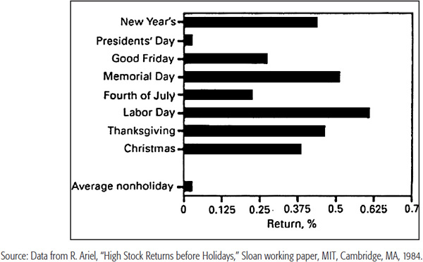
The day preceding holidays is statistically a bullish period. This is indicated in Figure 24.7, which covers the period between 1963 and 1982. With the exception of Presidents’ Day, all these (average) pre-holiday trading sessions handsomely beat the average day.
FIGURE 24.7 The Holiday Effect (Average Pre-Holiday Returns)
Recent studies6 have indicated that there is a definite time-of-day effect, as shown in Figure 24.8. There is little difference in the activity from day to day, except for Monday mornings. All days, however, show an upward bias going into the last half-hour. The study showed that this rallying effect was emphasized even to the closing bell, with the average return of the last trade equal to 0.05 percent, or 0.6 cents per share. The nearer the return took place to the closing bell, the higher it was. Trades after 3:55 P.M. averaged 0.12 percent returns, or 1.75 cents per share. That upbeat note is a good place to close this chapter.
FIGURE 24.8 Time-of-the-Day Effect
1 From Smith, Tides and the Affairs of Men, p. 55ff.
2 The cycle was also noted by Professor William Stanley Jevons, an English economist, in the second half of the nineteenth century.
3 From Smith, Tides and the Affairs of Men.
5 MTA Journal, winter 1989–1990.
6 Harris, “How to Profit from Intradaily Stock Returns,” Journal of Portfolio Management, winter 1986.