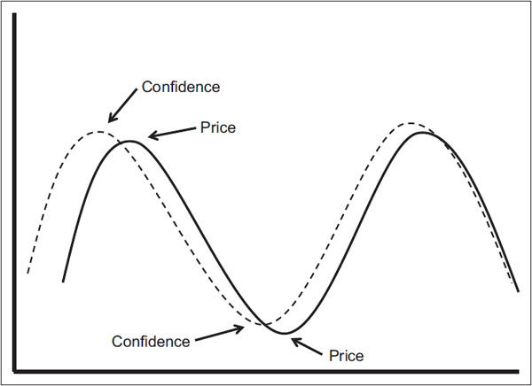
A negative divergence between an A/D line and a market average is a broad measure of a subtle loss of confidence by market participants. It is also possible, though, to gain an insight into confidence levels by observing relationships that compare what we might call speculative to defensive areas, as these, too, often serve in a more direct way as an indication of growing confidence or lack thereof. When these relationships are reflecting a trend of growing optimism, it is a positive sign and is an indication of higher prices. When they are deteriorating, an omen of weakness and lower prices is signaled.
Figure 28.1 reflects the basic principles that can be applied to essentially all of the relationships described in this chapter in that the confidence ratios typically peak and trough ahead of prices. This does not happen in all instances of market turning points, nor is the lead/lag relationship constant. We should also add that not every divergence, whether negative or positive, is necessarily followed by a change in trend of the price series being monitored.
FIGURE 28.1 Confidence versus Price

The relationships in this chapter are focused on the U.S. market, but there is no reason why the curious reader cannot expand these principles to other equity markets, or indeed to the bond and commodity arenas.
The consumer staple sector embraces companies that produce, for want of a better term, necessities—things that consumers buy in bad times as well as good ones. Examples include manufacturers of food, household products, beverages, etc. In effect, they produce goods that people are unable or unwilling to cut out of their budgets, regardless of their financial situation. Consumer staple stocks are considered noncyclical, meaning that they are always in demand, no matter how poorly the economy is performing, because people tend to demand such products at a relatively constant level, regardless of price.
When investors are cautious, they tend to flock to these equities for four reasons:
1. Their lack of cyclicality makes for more accurate earnings forecasts than, say, highly cyclical and volatile mining stocks.
2. They tend to pay better dividends.
3. They generally have a consistent record of earnings and dividend growth.
4. Most of these companies have a solid balance sheet.
Because of these characteristics, consumer staples tend to do better during bear markets. Their relative action during bull markets has a tendency to be weaker as investors turn to more exciting sectors.
This knowledge can be put to profitable use with the aid of several indicators. For example, just monitoring the relative action of staples to the S&P offers some useful buy and sell signals. Chart 28.1 compares the S&P exchange-traded fund (ETF), the SPY, with the Spider Consumer Staple (symbol XLP) relative action.
CHART 28.1 S&P ETF, 1998–2012, and Consumer Staples RS Showing Divergences
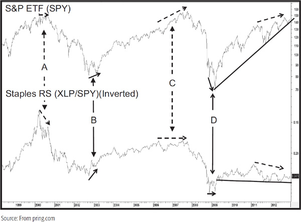
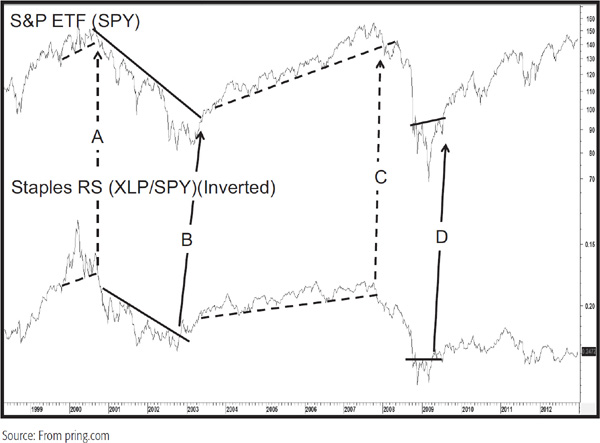
In view of the fact that the relative strength (RS) line moves in the opposite direction to the S&P, it has been plotted inversely in the chart. This relationship often gives us advance warning of a change in trend as the inversely plotted RS line fails to confirm new highs and lows in the S&P. These divergences represent a subtle way in which confidence changes ahead of the overall market. Chart 28.2 codifies this in the sense that the divergences at A, B, C, and D were all confirmed with joint trendline breaks. Note that each instance was followed by a worthwhile move. The only exception was the potential divergence in the 2011–2012 period, but that had not been confirmed as the manuscript for this book was being submitted in mid-2013.
CHART 28.2 S&P ETF, 1998–2012, and Consumer Staples RS Showing Trendline Violations
Another technique using the XLP/SPY relationship is to compare the momentum of the XLP relative action to that of the SPY. I use the daily Know Sure Thing (KST) formula presented in Chapter 15, but there is no reason why two moving-average convergence divergence (MACD) or stochastic indicators could not be overlaid to achieve similar results. An example using KSTs is shown in Chart 28.3, where the dotted line represents the XLP relative momentum and the solid one the KST for the SPY.
CHART 28.3 S&P ETF, 2006–2012, Comparing Two Momentum Indicators
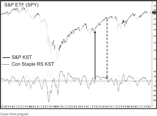
The light highlights indicate when the relative XLP momentum is above that for the SPY and when the SPY itself is responding by being below its 50-day MA advanced by 10 days. For a description on the technique of advancing moving averages, please refer to Chapter 11. During the bullish 2009–2012 period, this technique was not particularly helpful in that the declines were fairly truncated and therefore the sell signals developed fairly close to the final intermediate lows. On the other hand, for the most part, the bullish periods indicated by the dark highlights caught most of the upside action. Alternatively, the light shadings that occurred in the 2007–2009 bear market tell us that the model would have offered great protection against downside action, except for a relatively small decline at the start of 2009. The bottom line is that this approach works best when the signals are triggered in the direction of the prevailing primary trend.
An alternative method of presenting the same information is to subtract the S&P momentum from that of the relative XLP (Chart 28.4). In that way positive KST crossovers are represented on the chart by a move above the zero equilibrium line. Since this arrangement tells us when the relationship is overstretched, warnings of trend reversals, ahead of the actual zero crossovers, can be generated when the ratio reverses direction. Some examples have been flagged with the arrows.
CHART 28.4 S&P ETF Daily, 2008–2012, and a Differential of Two Momentum Indicators
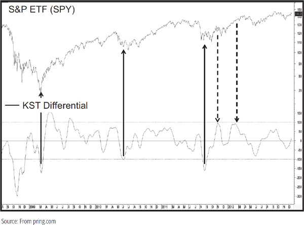
However, you can also see that other extreme reading reversals fail completely in their trend signaling abilities. This will typically happen at the start of a new bull market, where momentum is particularly strong and countercyclical signals benign. The two “sell” signals in May and August 2009 are prime examples.
Finally, it’s possible to extend the time frame to an intermediate one, as shown in Charts 28.5 and 28.6.
CHART 28.5 S&P ETF Weekly, 1977–1994, and a Differential of Two Momentum Indicators
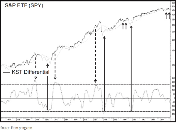
CHART 28.6 S&P ETF Weekly, 1995–2012, and a Differential of Two Momentum Indicators
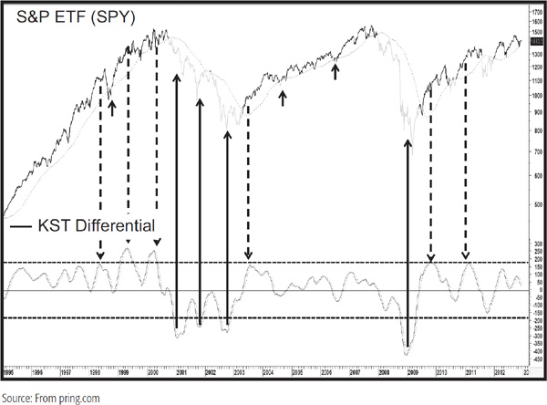
In these instances, the S&P Food Index, which is a member of the consumer staple sector, has been substituted for the consumer staples themselves because more history is available. The differential indicator in the lower panel is constructed by subtracting the intermediate KST of the S&P Composite from that constructed from the relative action of the food group. As you can see, reversals in the indicator from an extreme level, i.e., at or beyond +170 and –170, usually provide reliable signals of intermediate-trend reversals unless they develop at the start of a new primary trend. The light highlights reflect bearish trends when two conditions are in force. First, the relative food KST is above that for the S&P and the S&P itself is below its 40-week moving average (MA), which itself has been advanced by seven periods. Again, the main criticism would come from bearish signals that are triggered in bull markets, where limited declines mean that the signals are triggered very near to the final low of the move, the 1987 decline being a principal example. Some additional instances have been flagged in the chart by the small solid arrows. The results using this system between 1976 and August 2012 returned annualized gains of 9.65 percent when this technique was in a positive mode and –0.60 percent when negative.
Another confidence relationship can be obtained by comparing the high-yield IBOXX Corporate High Yield Bond Fund (symbol HYG) to the Barclays 20-Year Trust, a government-bond ETF (symbol TLT). A rise in the ratio means that the prices of low-quality bonds are outperforming the relatively safe government sector. Such action indicates growing confidence by bond investors. Charts 28.7 and 28.8 compare the ratio to the ups and downs in the S&P Composite.
CHART 28.7 S&P ETF, 2007–2010, and a High Yield/Government Bond Ratio
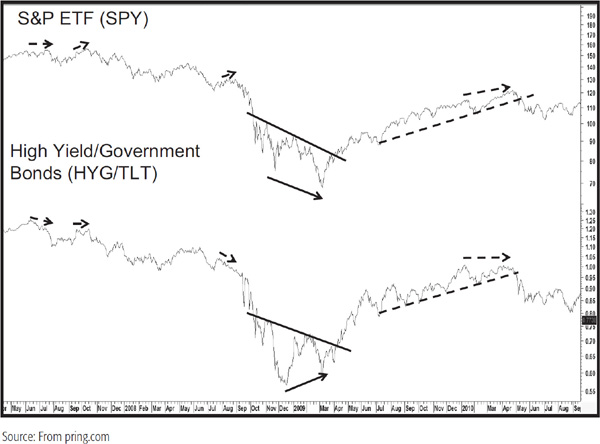
CHART 28.8 S&P ETF, 2010–2012, and a High Yield/Government Bond Ratio
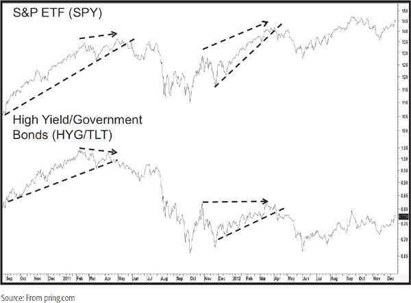
Most of the time, both series are moving in the same direction. It is when they are not that a subtle warning of a change in trend is given. Usually, these prove to be negative indications, but the positive divergence in 2009 shows that it is not a one-way street. Once again, it is always useful to obtain some confirmation from the price as flagged by the various trendline combinations. Since the HYG has only been around since 2007, this relationship does not have a long-term track record. However, a similar relationship that has been around since the early twentieth century is the ratio between Moody’s BAA corporate bonds and the constant 20-year maturity of U.S. government bond.
Chart 28.9 shows the actual ratio, with the arrows flagging extreme point reversals.
CHART 28.9 S&P Composite, 1923–2012, and a Government/Corporate BAA Ratio
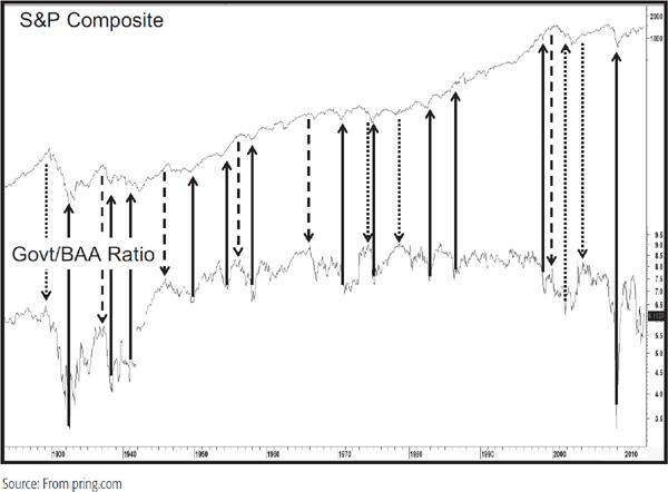
Solid arrows indicate bullish signals, dashed ones bearish indications, and dotted ones failed signals. The chart clearly indicates that there is a definite relationship between bond market sentiment and equity prices. The trick is knowing where the extreme points of the ratio are. But how do we know they won’t become more extreme? A useful answer is to take the 12-month rate of change (ROC) of the ratio and set up some overbought and oversold zones at +15 and –15. Reversals that take place from a position beyond these levels then serve as our mechanism of primary-trend equity reversals. This is shown in Chart 28.10, where the extreme movements of the 1920s and the post-2007 period have been excluded so that the normal range can be appreciated. Once again, the two dotted lines indicate failed signals.
CHART 28.10 S&P Composite, 1940–2007, and Government/Corporate BAA Momentum
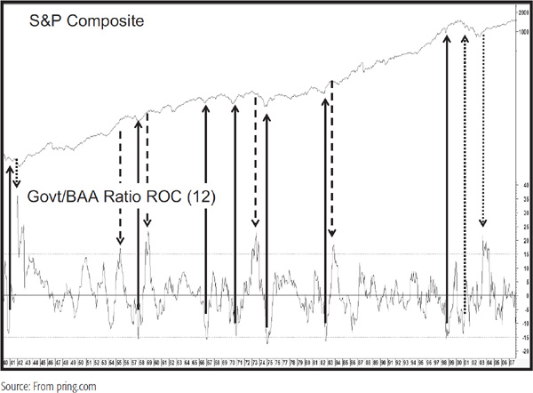
Chart 28.11 shows the post-2007 period that involved the 2008 financial crisis. These swings were enormous and certainly reflected the dramatic swings in investor confidence during these troubled times.
CHART 28.11 S&P Composite, 1997–2007, and Government/Corporate BAA Momentum
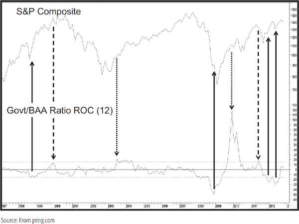
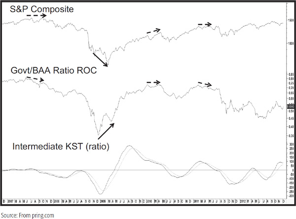
Finally, Chart 28.12 shows the ratio on a weekly basis, where divergences show up every few months or so. Also, changes in direction of the intermediate KST have provided useful signals of smaller trend reversals. I should add that prior to 2007, this relationship did not work as well as it has since, so it is possible that the 6 years of price behavior shown in this chart could turn out to be an aberration. Historical data for these and other bond series can be downloaded from the Federal Reserve website under “H.15 Selected Interest Rates Download.”
CHART 28.12 S&P Composite, 2006–2012, and Two Indicators
The market as a whole discounts the economy, but brokerage stocks, which obtain their profits from market conditions, have a tendency to lead the market in both directions. For example, during bull markets, volume and therefore brokerage commissions tend to increase because traders and investors find it easier to take profits than losses. When these folks are making money, they also tend to make faster, more careless decisions. That also inflates trading. By the same token, more companies go public during the course of a bull market because they obtain a higher price for their stock. Underwriting fees can represent a large share of brokerage income. Finally, interest rates have a tendency to lead the stock market. That means that brokerage carrying costs decline at the start of an equity bull market and begin to rise prior to its ending. The bottom line is that a rising market means greater profits for brokerage companies and investment banks, and a falling market less so.
Each sector discounts or anticipates developments in its sector of the economy, so the leading role often played by the price of brokerages is no exception to this rule. There are two principal ways in which it is possible to follow these stocks. The first is the Amex Brokerage Index (symbol XBD) and the second is the Dow Jones Broker Dealer, or more practically through the ETF that uses it as a tracking index, the IAI.
There are several ways in which the broker/market relationship can be analyzed. The first arises from positive and negative divergences. Chart 28.13 compares the S&P to the XBD.
CHART 28.13 S&P Composite, 1981–2012, and the Amex Brokers Index
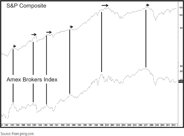
The arrows show that brokers typically top out ahead of the overall market at primary-trend peaks. The leads are not constant, of course, but change from cycle to cycle. The width of the arrows roughly flag the lead times, and there does not appear to be a connection between the size of the divergence and that of the ensuing decline. For example, the divergence that took place in the 1989–1990 period was relatively large but the decline was fairly truncated. This compares to the devastating 2007–2009 decline that followed the very small 2007 negative divergence. Positive divergences, where the brokers fail to confirm new equity market lows, exist but are far more infrequent than negative ones. Chart 28.14 compares brokerage action to the market again, but this time, it reflects their relative action.
CHART 28.14 S&P Composite, 1978–2012, and the Amex Brokers Index Relative Action
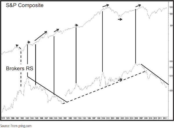
The first thing to notice is the failure of brokers to identify the 1981 peak since the top in the RS line developed as the bear market was in its final stages. Other than that, the RS action, judging by the width of the arrows, provides a longer-term warning of tops than the absolute price data in the previous chart.
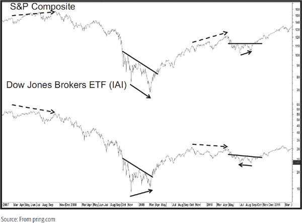
Chart 28.15 compares the Dow Jones Broker Dealer ETF, the IAI, to the S&P. Here you can see the negative 2007 divergence and the 2008–2009 positive one. Also featured in the chart is the July/August 2010 divergence, as flagged by the backward-pointing arrow on the IAI. This was an example of where the ETF lagged the market, thereby creating a disagreement. In such cases, price trumps everything, which means that when such disagreements develop, they are cancelled in the event that both series reverse their prevailing trend. In this case, it was a downtrend which was canceled by two upside trendline breaks.
CHART 28.15 S&P Composite, 2007–2011, and the Dow Jones Broker ETF
The brokerage/market relationship is far from perfect, but it often gives a hint as to whether investors and traders are optimistic or pessimistic about the stock market’s future performance.
Another useful relationship is to compare the prices of inflation-protected bonds (Barclays TIPS ETF) to the Barclays 20-Year Trust, or the TIP to the TLT. If the ratio is rising, it means that investors are favoring bonds protected by inflation over those that are not. If that is the case, it should mean that bond investors are anticipating inflation. Were they expecting deflation, the ratio would decline in view of the fact that the noninflation-protected instruments were outperforming their inflation-protected counterparts. In this respect, Chart 28.16 compares the ratio to the performance of the CRB Spot Raw Industrial commodity index. Prior to 2006, there was not much in the way of a relationship as commodities rallied and the ratio fell. However, at the start of that year both series violated trendlines and signaled higher commodity prices. Later in 2006 they started to move in similar directions, though the magnitude of each one was different as the more volatile commodity measure grabbed the majority of the price moves in both directions.
CHART 28.16 CRB Spot Raw Industrials, 2005–2012, and the TIP/TLT Ratio
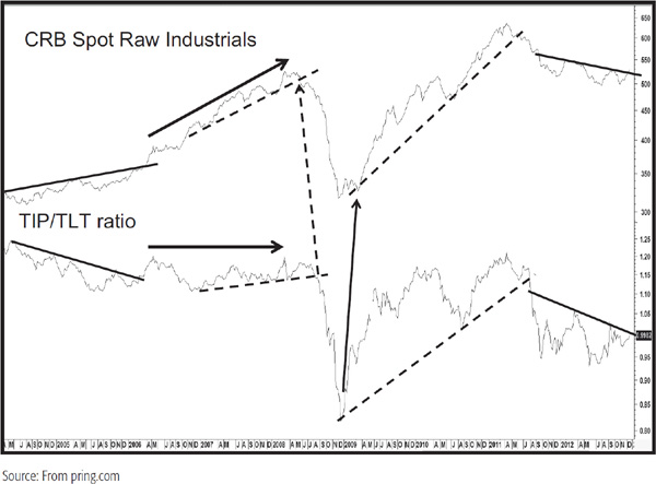
The joint trendline breaks indicate signals for both trends reversing, and the two arrows indicate the confirmed negative divergence that developed in 2008. The more recent convergence of the price action can be better appreciated from Chart 28.17, which compares the intermediate KST for the two series.
CHART 28.17 Commodity Momentum versus the TIP/TLT Momentum, 2005–2012

It would be convenient to be able to conclude that one series is a consistent leader, but that is not the case, as the solid arrows show ratio leadership and the dashed ones when the commodity KST turned first. Turning points with no arrows indicate a coincidental relationship. Starting in 2001 there are many periods where it is not possible to distinguish between the two series because their trajectories are so similar. When you consider that the ratio contains such completely different data from the commodity index, the recent similarities between the two series serve as a sharp reminder that commodity and bond market participants are clearly on the same page.
Since the history of this relationship has only been available for a few years, it would be incorrect to place a great deal of weight on these conclusions. However, the fact that the connection between the ratio and commodity prices appears to be growing suggests that this form of analysis should be closely monitored as it appears to be quite promising.
1. Confidence ratios, such as the relative action of defensive stocks or quality bond market spreads, typically turn ahead of market averages such as the S&P Composite.
2. They can be used to trigger buy and sell signals through trendline analysis or momentum relationships.
3. Brokers have a tendency to lead the stock market at tops, less so at bottoms. Useful buy and sell signals can be derived from joint trendline violations.
4. In recent years there has been a strong relationship between the trend of commodity prices and the ratio between inflation-protected and regular bonds.