A useful systematic approach for stock selection is what is known as the top-down approach. In this case, the “top” represents an analysis of whether equities in general are experiencing a primary bull or bear market. Since most equities rise during a bull trend and decline during a bear trend, the first step establishes whether the overall environment is likely to be positive or negative.
The next involves an appraisal of the various sectors and below them, industry groups, since equities in the same industry generally move together, as do industry groups in their sector. Once an attractive industry group has been isolated, the final stage involves the selection of individual stocks. This approach is discussed later, but first, some general observations.
All investors and traders would like their selections to appreciate rapidly in price, but stocks that may satisfy this wish tend to be accompanied by a substantially greater amount of risk than most of us are willing to accept. Stocks that move up sharply in price usually have a high beta (i.e., they are very sensitive to market movements), a very small float (i.e., are illiquid and very price sensitive to a small increase in volume), or a very strong earnings momentum, resulting in constant upward revisions in the price/earnings multiple. Others may be experiencing a turnaround situation in which the price has fallen to unrealistically low levels so that the slightest good news has an explosive effect on the price.
These are all fundamental factors and really fall outside the scope of this book. However, it is important to understand that investors can be very fashion conscious when it comes to stock ownership. After prices have been bid up to unrealistically high levels and the media are covering positive developments in cover stories, major articles, etc., the chances are that the bullish arguments are understood by virtually all market participants. At this point, effectively everyone who wants to buy has already done so and the stock is said to be overowned. This happened to the pollution control group (waste management) in the late 1960s, the so-called glamour growth stocks in 1973, the oils in 1980, and technology in the spring of 2000. When the news is so bad that it appears that profits will never recover, or that the company might file for bankruptcy, the opposite condition sets in and the stock is said to be underowned. Real estate investment trusts in 1974, tire stocks in 1980, and financials in 2009 are examples of underownership. Not all companies move to such extremes, but it is important to recognize that this psychological pendulum nevertheless exists.
A position of overownership usually develops over several major advances after a secular rise. Similarly, a position of underownership, in which a stock becomes totally out of fashion, usually takes many years to evolve.
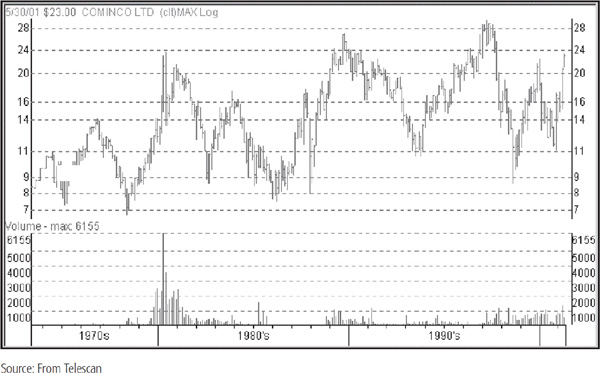
It makes sense to start off with a very long-term or secular point of view, gradually working down to the short-term aspects. Ideally, the selection process should begin by determining whether the stock in question is in a secular advance or decline in order to gain some idea of where it might be in its ownership cycle. Chart 32.1 shows Cominco, a Canadian mining company, that went through many cycles between the 1970s and the turn of the century. Stocks in resource and basic industries such as Cominco are called cyclical stocks since they offer great profit opportunities over one or two business cycles but are rarely profitable using the buy-hold approach.
CHART 32.1 Cominco, 1970–2001

Because of the long-term growth characteristics of the global economy, most stocks exhibit characteristics of a long-term secular advance interrupted by mild cyclical corrections or multiyear trading ranges.
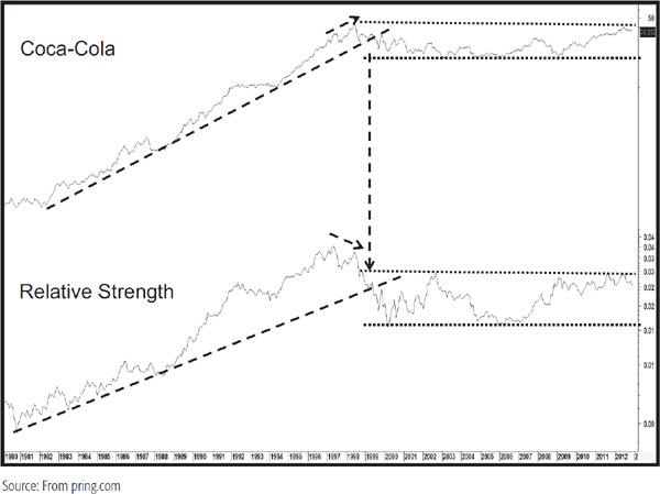
An example is shown in Chart 32.2, featuring Coca-Cola. A couple of secular trends are evident. The termination of the first was signaled by a joint trendline break in the price and the relative strength (RS) line in 1999. Note this was preceded with a negative divergence where the price touched a new high but the RS line did not. The second was a sideways trading range for the ensuing 13 years. The direction of the ultimate breakout may well be signaled by the RS line.
CHART 32.2 Coca-Cola, 1980–2012, and Relative Strength
All the RS lines in this chapter are relative to the S&P Composite unless otherwise stated. I have incorporated them into most of the charts in this chapter for two reasons. First, RS trends and divergences can be very helpful in understanding the strength or weakness in the underlying technical structure. Second, when a stock is purchased, it is far better for it to be in a trend that is outperforming than underperforming the market. Chart 32.3 offers a classic example of this.
CHART 32.3 Reliant Energy, 1980–2001, and Relative Strength
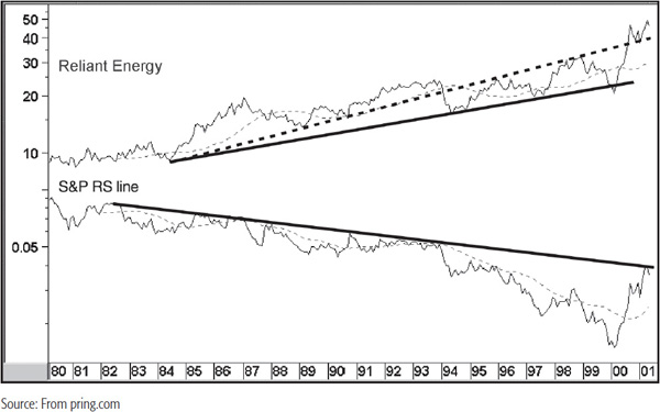
During the 20-year period covered by the chart, Reliant Energy was in a secular uptrend. This looked good on the surface, but a quick glance at the RS line indicates that it was in a secular downtrend in terms of relative performance. Note that it was possible to construct two trendlines for the price. The dashed one is an extremely good example of why it is a smart idea to extend a trendline once it has been violated. Note how the extended line became formidable resistance several times in the mid-to-late 1990s. Even when the price broke above the line at the turn of the century, the retracement move found support there.
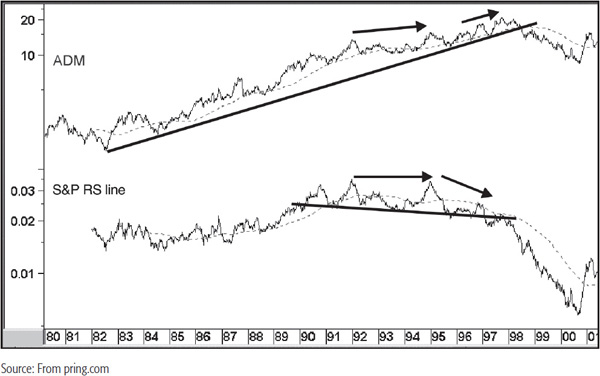
Finally ADM experienced a secular break to the downside in 1998 (Chart 32.4). Its RS line also completed a downward head-and-shoulders top. Note that in ADM’s case, advance warning of potential weakness was given first by the failure of the RS line to confirm the new high in the price in 1995 (at the tip of the horizontal arrow) and then to diverge negatively with the late-1997 high.
CHART 32.4 ADM, 1980–2001, and Relative Strength
These examples point up the differing life cycles and characteristics of individual stocks. Investors who are able to identify secular trend reversals in price and relative action are in a position to profit from extremes in the ownership cycle. Consequently, a very long-term chart can provide a useful starting point for stock selection.
In Chapter 8, the relationship between the size of the formation and the ensuing price move in both terms of magnitude and duration was established. The bigger the base, the further they can race! Or the greater the top, the more they’ll drop!
By definition, there are few points in a stock’s lifetime where this condition is prevalent, but when it can be spotted, it is well worth while taking action based on this information. Sometimes, as in the 1940s and the 1982–1983 period, for example, there are an unusually large number of such issues breaking out of large bases. The more this is so, the stronger the foundation for the next bull market. The 1940s were followed by the very strong 1950s and early 1960s, and the 1982 low was followed by the 18-year secular bull, with its final top in early 2000.
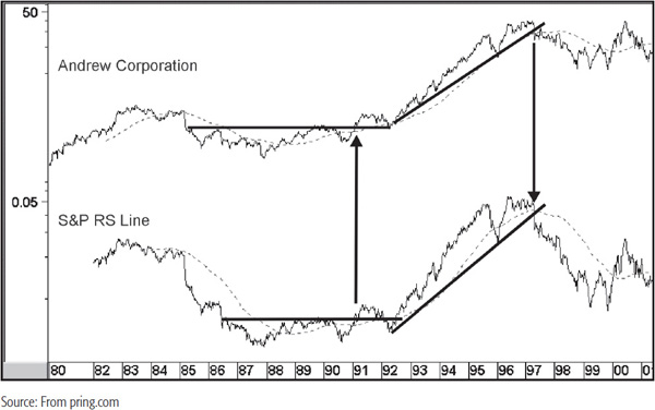
Chart 32.5 shows an example for Andrew Corp. breaking out from a 6-year base in 1991. A good rally, more than meeting the objective of the pattern, followed. Later on, the joint penetration of 6-year up trendlines indicated that the strong advance was unlikely to continue. In the case of the price, this was followed by a consolidation, and for the RS line, an actual trend reversal.
CHART 32.5 Andrew Corp, 1980–2001, and Relative Strength
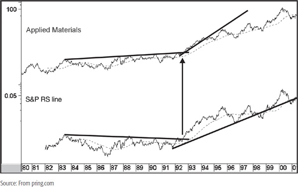
Applied Materials experienced a breakout from a 10-year base (Chart 32.6) in late 1992. The uptrend in the price continued until at least the spring of 2001, but the RS up trendline was temporarily violated in 1998 and 2000.
CHART 32.6 Applied Materials, 1980–2001, and Relative Strength
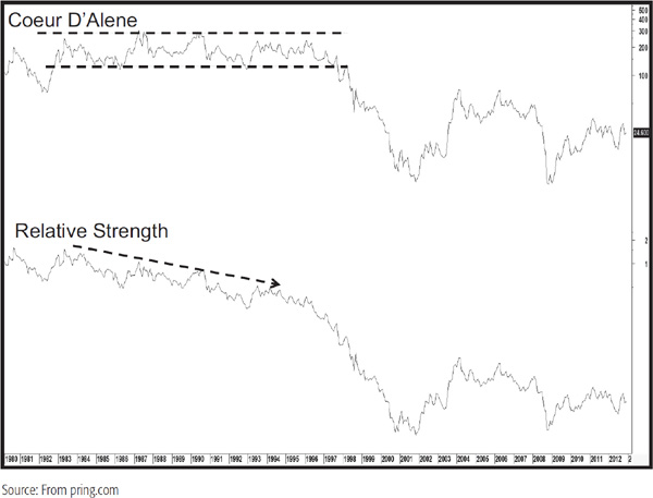
Large tops are, of course, the opposite of large bases, and we see one such animal in Chart 32.7 featuring Coeur D’Alene Mines. Interestingly, a clue of impending weakness was given by the persistent decline in the RS line. That’s not always the case, because it has been known for RS trends to reverse to the upside during the formation of a trading range. However, in this case, there was no indication whatsoever that the fortunes of the RS line was about to change for the better until well after the downside price break.
CHART 32.7 Coeur D’Alene, 1980–2012, and Relative Strength
Compare that example to Chemed in Chart 32.8. Once again we see a multiyear trading range in the form of a consolidation reverse head-and-shoulders pattern. Throughout the formation of the range, the RS line was in a clear-cut downtrend, leaving the impression that the pattern would break to the downside. Then, as the right shoulder was forming, the RS line violated a 4-year (dotted) down trendline and started to rally at a more accelerated rate than the price. At the time of the breakout, the RS line was well below its late-1982 high, but had already violated a 20-year (solid) down trendline, thereby supporting the breakout by the price which developed in late 2003.
CHART 32.8 Chemed Ordinary, 1980–2012, and Relative Strength

A bull market has been defined as an environment when most stocks are moving up most of the time for an extended period. In this case, the extended period should be expected to last between 9 months and possibly as long as 2 to 3 years. A bear market is exactly the opposite, except the average bear market typically unfolds over a shorter period. When exposure to equities is being contemplated, it is clearly better for both investors and short-term traders with a 2- to 3-week horizon to be buying when the primary trend is positive. It is true that some stocks experience primary bull trends when the overall market is in a primary bear trend, but the law of probability indicates that it is much more difficult to make money when swimming against an overall negative environment. We must also bear in mind, of course, that because of the group rotation process, different stock groups are experiencing different phases of their bull and bear cycles simultaneously. Thus, while the S&P, for instance, may have just embarked on the first downleg of a new bear market, lagging groups, such as mines, may still be experiencing the final leg of their bull market. The selection process at this stage of the cycle is much more difficult, but there are still some opportunities offering substantial upside magnitude at this juncture. A lot will depend on whether commodities are in a secular bull or bear market. If it’s a bull trend, the inflationary part of that specific business cycle associated with the trend will generally experience greater magnitude and duration.
The performance of specific issues can differ widely, not only over the course of the total market bull move, but during its various stages as well. This concept was described in Chapter 22, which described the sector rotation process.
The first step is to decide whether the market is in a primary bull or bear trend using the principles outlined earlier. If it is fairly evident that a bull market began some time ago and there are few signs of a top or evidence of a bear market, intermediate lows are a good place to begin the analysis. I’ll have more to say on that one later, but for now, let’s assume that there is ample evidence that a new bull market is just beginning. Signs would include the observation that A/D line had been falling for a year or more. We would also probably see a confirmed new trend of declining interest rates and an oversold condition in the long-term momentum indicators, lots of media coverage on weakness in the stock market and the economy, layoffs at major brokerage firms, and so on.
If all of these conditions were present, it would be an odds-on probability that the market was either at or very close to a bear market low based on the principles outlined earlier in this chapter.
The next step would be an examination of the technical position of the various industry groups, especially the early-cycle leaders, to make sure that they are technically sound on both an absolute and relative basis. Finally, an examination of the stocks within the groups found to be the most sound should be undertaken.
In this respect, the obvious starting point would be an analysis of the relative positions of the various industry groups in terms of the sector rotation process described in Chapter 22. Some sectors do not fit conveniently into the chronological sequence that makes up a complete cycle, and not all that do respond in the way expected in every cycle. However, an analysis of the energy and financial sectors or the banks/aluminum ratio would be a good point to determine whether the environment was an inflationary or deflationary one. The next step would be to analyze the groups that were akin to the sector that looked more promising. We will do that later, but for now, let us assume that we have been lucky enough to identify a bear market low.
The 1990 bottom met these requirements. The S&P Composite actually fell for a relatively short period of time, yet the New York Stock Exchange (NYSE) daily A/D line had been falling for over a year by the time the market bottomed in late 1990. One of the good-looking groups falling into the early leader category at the end of 1990 was the brokerage industry. What made them especially appealing as a contrary play was the Businessweek cover story cited in Chapter 30 questioning the future of the industry.
Technically, Chart 32.9 shows that the index completed a base in early 1991.
CHART 32.9 S&P Brokerage Index, 1982–1993, and Three Indicators
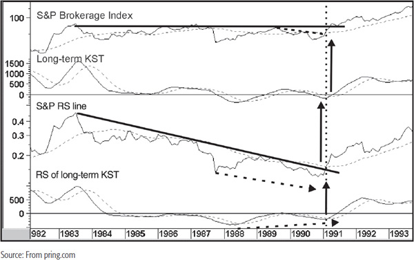
The RS line was ahead of the game because it experienced an 8-year down trendline break a couple of months earlier right at the turn of the year. The index itself had simultaneously violated a smaller down trendline and crossed above its 24-month moving average (MA) as the RS line was breaking out. The RS line also crossed above its 24-month MA. Both long-term monthly Know Sure Things (KSTs) triggered bullish signals as well. Note how the RS line made a slightly lower low in 1990 than in 1987 but the RS KST did not. This positive divergence added icing to the bullish case, indicating the probability of an emerging bull market to be pretty high. The dotted vertical line on this chart indicates the approximate point where the initial trend breaks took place. They are replicated on Charts 32.10 through 32.15, which feature individual stocks.
CHART 32.10 Merrill Lynch, 1983–1993, and Three Indicators
CHART 32.11 Merrill Lynch, 1986–1991, Relative to the Brokerage Index
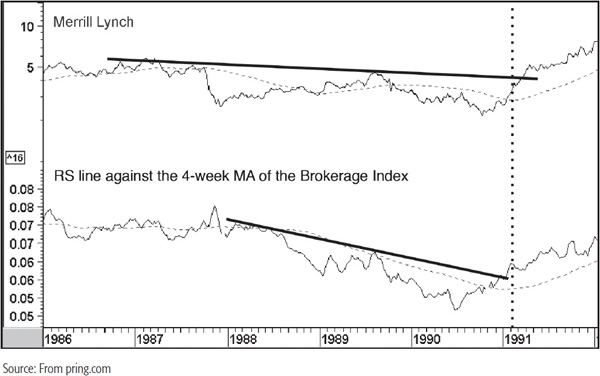
CHART 32.12 Legg Mason, 1986–1993, and Three Indicators
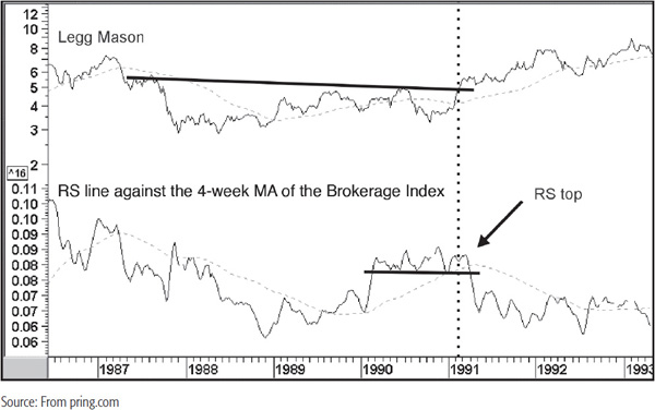
CHART 32.13 Legg Mason, 1986–1991, Relative to the Brokerage Index
CHART 32.14 Raymond James, 1985–1993, and Three Indicators
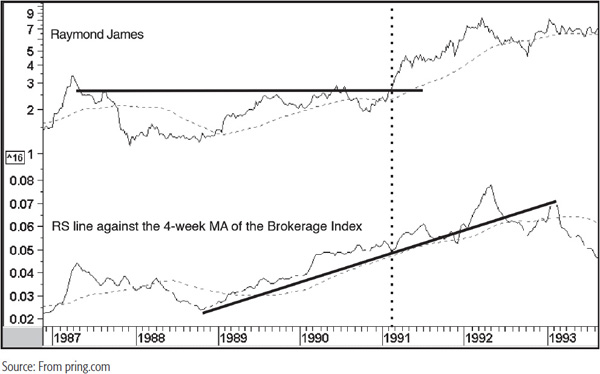
CHART 32.15 Raymond James, 1986–1993, Relative to the Brokerage Index
Merrill Lynch (symbol MER), formerly the largest broker and now no longer with us as a separate trading entity, is featured in Charts 32.10 and 32.11.
It violated a 2-year down trendline for the absolute price and an 8-year down trendline for the RS line against the S&P. Since both KSTs were turning bullish and the absolute one was actually completing a reverse head-and-shoulders pattern, MER would have qualified as a buy. Later on, the 8-year down trendline for the absolute price was penetrated on the upside, and that completed the bullish picture. Chart 32.11 shows the price together with an RS line against the Brokerage Index itself. A rising line means that the stock is outperforming the index and vice versa. It is fairly evident at the opening of 1991 that this stock has broken its downtrend and was, therefore, likely to outperform both the S&P and the Brokerage Index.
Legg Mason, featured in Chart 32.12, was also in a bullish position since both the absolute and relative prices had broken out from bases and their respective KSTs had gone bullish. Indeed, the relative KST was actually diverging positively from the RS line.
This sideways action was actually potentially more bullish than that of MER, which was reversing from a downtrend. However, Chart 32.13 shows us that RS line against the Brokerage Index was actually tracing out a top. Unfortunately, that was not known at the time of the breakout (i.e., at the dotted vertical line). There was little doubt by the early spring of 1991 that a switch to another broker would have made sense since the RS line completed the top and dropped below its 65-week estimated moving average (EMA).
Finally, Raymond James, featured in Chart 32.14, came away from the 1989–1990 bear market virtually unscathed. At the time of the broker breakout, both the absolute and relative lines were completing large bases.
Unfortunately, this was not a low-risk situation like Merrill because the long-term KST for the absolute price was reversing from a moderately overbought condition, which, on the one hand, made it less attractive. On the other hand, it often pays to go with the leader because strong stocks have a habit of getting stronger. This is because there are usually some good fundamentals that enabled them to be strong stocks in the first place. The arbiter in this case would have been the RS line against the Brokerage Index in Chart 32.15. Just after the breakout, it started to accelerate away from its 65-week EMA and up trendline and outperformed the Brokerage Index for the next year.
Throughout the stock cycle, groups are continually changing leadership. One way of detecting this is to create a ratio of a leading and lagging group. Chart 32.16 shows such a series—aluminums against property casualty insurers.
CHART 32.16 S&P Aluminum/Property Casualty Ratio, 1984–2012, and Two Indicators
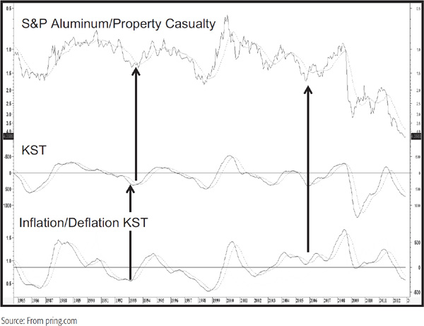
When the line is rising, it is bullish for aluminum producers relative to insurance stocks, and vice versa. We are looking for changes in the direction of the ratio, which offer a proxy for a change in leadership from early-cycle, liquidity-driven issues to late-cycle, earnings-driven sectors. It is fairly evident from looking at the chart that this is a pretty jagged relationship subject to numerous whipsaws. One way around this is to construct a smoothed long-term momentum indicator, such as a KST—the moving-average convergence divergence (MACD) or stochastic (24/15/10) can also be substituted. Note that the indicator in the bottom panel is similar in its trajectory since it is the long-term monthly KST for the inflation/deflation ratio discussed in Chapter 22. It’s a preferred measure and acts as a check, but for a “down and dirty” substitute, the more narrowly based aluminum/insurance ratio works fine. KST MA crossovers of the ratio are then used as a proxy for when a change in leadership might be taking place.
In most situations, the ratio bottoms out during the course of the cycle rather than at a bear market low. An exception developed during early 2009 because of the relative collapse of financials in the 2008–2009 crisis. For this exercise, we are interested in the point in the cycle when the ratios bottom, since that gives us a clue that the inflationary part of the cycle is underway. The arrows on the chart flag two such reversals in 1993 and the very end of 2005. The upside reversals indicated a switch to lagging or earnings-driven stocks. In these instances, both rallies lasted a couple of years. At the time it was not possible to note breakouts in resource-based stocks in 1993, as this was the early stage of the tech boom, but in Chart 32.17 the lagging technology sector appears to offer some potential.
CHART 32.17 S&P Computer Hardware, 1986–2012, and Three Indicators
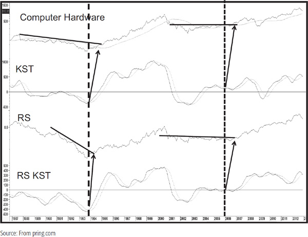
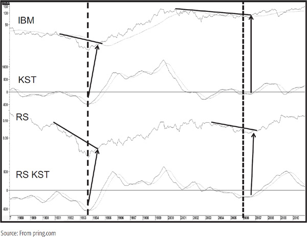
In both cases a certain amount of stalking was necessary as the absolute and relative down trendlines were not violated for several months after the aluminum/insurance ratio signal was given. Eventually, the lines were violated and in the case of the 1993 signal, a worthwhile rally followed. There are lots of computer hardware stocks, but one well-known seasoned issue is IBM, featured in Chart 32.18. See how both KSTs bottomed and the absolute and relative trendlines violated on the upside in 1993 and 2005.
CHART 32.18 IBM, 1987–2010, and Three Indicators
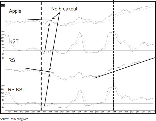
Apple (Chart 32.19) is another industry giant, but while its KSTs bottomed in a sympathetic way to computer hardware action, neither the price itself nor its RS experienced an upside breakout.
CHART 32.19 Apple, 1987–2012, and Three Indicators
Short-term traders will need to adopt one more stage to the analysis, and that is to make sure that prior to a purchase, the stock in question is in a technically strong short-term position as well as being in a constructive mode from a long-term point of view.
Chart 32.20 shows McKesson with a short-term and long-term KST, both based on daily data.
CHART 32.20 McKesson, 1999–2001, and Two Indicators
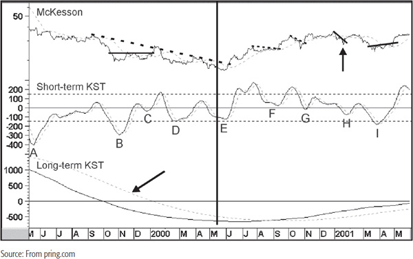
In this case, the long-term KST uses the same time frames as the monthly formula, but multiplied by 21 to correspond to the approximate average trading day in a month. The vertical thick black line indicates the low point separating the bear market on the left from the primary bull trend on the right. The letters mark the short-term KST buy signals that developed close to or below zero. Other smoothed short-term oscillators, such as a stochastic, smoothed relative strength indicator (RSI); MACD; etc., could, of course, be substituted for the KST. Note that none of the signals labeled A to D had any form of upside magnitude, with the exception of C. Even here, the nice trendline break in the price was followed by a whipsaw breakout, simply because this was a bear market environment. This again emphasizes the point that the best signals go with the trend. This is not the same thing as saying that all short-term bear market buy signals result in whipsaws and all pro-trend moves will be successful. For example, the buy signal at H took place during the bull move but was essentially a false signal. Again, we could filter this one out because it was not possible to construct a meaningful trendline as it was at F, H, and I.
E, of course, was the most successful, but at the time, the long-term KST had not crossed above its MA. However, one of the principles of interpretation allows us to anticipate a reversal if the KST has flattened and if a trendline break in the price or short-term KSTs is sufficient to anticipate a reversal. In this case, an 8-month down trendline in the price had been violated, and the short-term KST had gone bullish and diverged positively with the price twice. Consequently, there would have been enough evidence to draw the conclusion that the odds favored a long-term KST buy signal being triggered.
Sometimes, when a computer scanning exercise returns a long-term smoothed momentum buy signal, the short-term situation is overbought. Chart 32.21 offers an example for IBM at arrow A. In such situations, it doesn’t matter too much for a long-term investor, but for a short-term trader, entering when the price is overbought can prove disastrous. Chart 32.21 shows that the first opportunity to buy once the long-term KST had crossed its MA came under the cloud of a short-term overbought situation.
CHART 32.21 IBM, 1993–1994, and Two Indicators
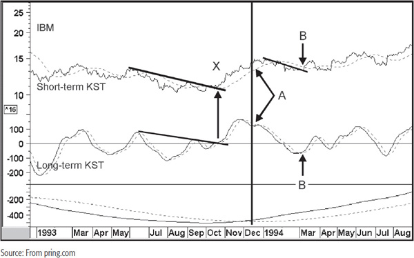
The next one came at B when the price broke above a small trendline and the short-term KST triggered a buy signal. Even this was not the greatest of signals, but at least the entry price was lower than that when the long-term series went bullish. The best signal of all developed at X when the price violated a down trendline and the short-term KST went bullish. Note also that the KST was barely below zero at the time, which was a tip-off for the sharp rally that followed. Since the long-term KST had reversed to the upside at this point, it would have been reasonable to use all this positive evidence to conclude that the probabilities strongly favored a long-term MA crossover.
I am not going to say that anticipating a long-term buy signal will work every time, but it is certainly true that on many occasions the first rally coming off a bear market low often turns out to be very worthwhile.
1. Most stocks go through ownership cycles, which normally take a long period to complete. It is important to identify whether a stock is in a secular uptrend or downtrend in order to better understand its position within its ownership cycle.
2. Substantial profit potential is available to the long-term investor who can identify stocks that are breaking out from extended bases when they are accompanied by expanding volume and an improving long-term trend in RS.
3. A bull market generally carries most stocks with it, but the performance of individual issues can vary enormously, both over the course of the primary upmove and within it.
4. Once a favorable market environment has been established, the process of selecting stocks should begin with the selection of industry groups with a positive long-term technical position.
5. Following the isolation of attractive sectors and subsequently groups, it is important to look for stocks that are also showing positive technicals.