People who don’t count won’t count.
ANATOLE FRANCE
The success of the deductive approach employed by mathematics and the physical sciences depends upon the acquisition of correct and significant basic principles. In mathematics proper these principles are the axioms of number and geometry. In the physical sciences they are, for example, the laws of motion and gravitation. Though the social scientists sought such principles, they did not succeed in finding them.
The social scientists’ inability to find fundamental principles is undoubtedly due to the immense complexity of the phenomena that they wish to study. Human nature is a more complicated structure than a mass sliding down an inclined plane or a bob vibrating on a spring. A phenomenon such as national prosperity is even more complicated; not only are millions of human wills and rapacities involved, but so are natural resources, relationships with other nations, the disruptions of war, and a dozen other major factors. The difficulties which harass the social scientists are also encountered by the biologists. Although the physical sciences have provided some insight into the functioning of the eye, the ear, the heart, and into muscular action, and although chemistry is making rapid advances in the study of complex molecular structures, the operation of the human body and the brain remains, on the whole, a great mystery.
If one attempts to simplify these problems by making assumptions about some of the factors involved or by neglecting what appear to be minor factors, just as Galileo, for example, neglected air resistance, one is likely to make the problem so artificial that its solution no longer has any bearing on real situations.
Very fortunately the social and biological sciences have acquired a totally new mathematical method of obtaining information about their respective phenomena—the method of statistics. By resorting to numerical data and by applying techniques which distill the essential content of those data, these sciences have made striking progress in the past one hundred years. However, the use of statistical methods has also given rise to the problem of determining the reliability of the results, and this aspect of statistics is treated by means of the mathematical theory of probability. In the present chapter we shall survey some of the concepts of statistics and in the next one we shall study the concept and applications of probability.
The realization that statistics could serve as a method of attack on major social problems came first to a prosperous seventeenth-century English haberdasher, John Graunt (1620–74). Purely out of curiosity Graunt studied the death records in English cities and noticed that the percentages of deaths due to accidents, suicides, and various diseases were about the same in the localities studied and scarcely varied from year to year. Thus occurrences which superficially seemed to be a matter of chance possessed surprising regularity. Graunt also was the first to discover the excess of male over female births. On this statistic he based an argument: since men are subject to occupational hazards and war service, the number of men available for marriage approximately equals the number of women, and so monogamy has natural sanction. He also noticed the high mortality rate of children and the higher death rate in urban as compared to rural areas. In 1662 Graunt published his Natural and Political Observations. . . upon the Bills of Mortality, a book which might be said to have launched the trend toward scientific method in the social sciences and which certainly founded the science of statistics.
Graunt’s work was followed and supported by his friend Sir William Petty (1623–85), professor of anatomy at Oxford, professor of music at Gresham College, and later an army physician. Petty wrote on medicine, mathematics, politics, and economics. His Political Arithmetic, written in 1676 and published in 1690, did not contain any more striking facts than Graunt’s work, but is of particular significance because it calls specific attention to the method of statistics. The social sciences, he insisted, must become quantitative. He says,
The method I use is not yet very usual; for, instead of using only comparative and superlative words, and intellectual arguments, I have taken the course . . . to express myself in terms of number, weight, and measure; to use only arguments of sense, and to consider only such causes as have visible foundations in nature.
To the infant science of statistics he gave the name of “Political Arithmetic,” defining it as “the art of reasoning by figures upon things relating to the government.” In fact, he regarded all of political economy as just a branch of statistics.
The work of Graunt and Petty was followed by studies of population and income and by extensive studies of mortality rates among which those made by the astronomer Edmond Halley are famous. Life insurance companies formed at the end of the seventeenth century and in the eighteenth century explored further data on mortality. However, though the subject of statistics did come to be known in the eighteenth century as data for statesmen, no mathematical methods for extracting significant implications from the data were developed.
Undoubtedly it was the aggravated social ills brought on by the Industrial Revolution in Europe which prompted a number of men to wade farther into important statistics, such as birth and death records, national and individual incomes, mortality, unemployment, and incidence of diseases, and to seek solutions for major problems through statistical methods. The man who revived Graunt’s and Petty’s basic thought that statistical methods might produce significant laws for the social sciences was a Belgian, L. A. J. Quetelet (1796–1874). Inspired by the successes of the physical sciences and conscious of the failure of the deductive approach to the social sciences, Quetelet undertook to construct and apply statistical methods suitable for social and sociological investigations. Quetelet was professor of astronomy and geodesy at the École Militaire and in 1820 became director of the Royal Belgian Observatory, which he founded. In 1835 he published his Essay on Social Physics. In 1848 he presented to the Royal Belgian Academy a memoir, On Moral Statistics, which contained conclusions on the science of government. Ironically, the publication of this memoir coincided with the outbreak of the revolution of 1848 in Paris. Prince Albert of Belgium remarked that the law governing the causes which led to revolutions had unfortunately come a little late.
In the latter half of the nineteenth century a number of well-known scientists, attracted by the already evident power of statistical methods, entered the field. We must content ourselves with mentioning Francis Galton (1822–1911) and Karl Pearson (1857–1936). It so happened that statistical techniques were already proving to be highly important in astronomy and in the theory of gases, and so the physical and social scientists accelerated the creation and application of statistical methods.
Before we examine the mathematics of extracting information from data, we should be clear as to how the method of statistics differs from the deductive approach. To put the matter crudely, the statistical approach to a problem is first of all a confession of ignorance. When crucial experiments, observation, or intuition fails to give us fundamental principles which can be used as premises for a significant chain of reasoning, we turn to data and seek to cull whatever information we can from what has happened. If we lack the knowledge which permits us to deduce what a new medical treatment should achieve, we apply the treatment, note results, and then attempt to draw some conclusions. Even if we come to the conclusion that the treatment is remarkably successful and should be widely applied, we still do not know what physical or chemical factors are operative. Perhaps the most important difference between the deductive approach and statistical methods is that the latter tell us what happens to large groups and do not provide definite predictions about any one given case, whereas the former predicts precisely what must happen in individual instances.
The task of the science of statistics is to summarize, digest, and extract information from large quantities of data. Our illustrations and discussions of various statistical techniques will be based on somewhat artificial and limited classes of data. Real problems usually involve large collections of data whose handling then becomes so encumbered by arithmetic that one loses sight of the essential mathematical idea.
About the simplest mathematical device for the distillation of knowledge from data is the average. A housewife who buys a 5-pound bag of potatoes once a week at prices which vary throughout a year can add the sums spent and divide by 52. She then has an average, known as the arithmetic mean, which represents fairly well what potatoes cost during that year.
Such an average can be meaningful in some situations and quite misleading in others. Suppose that we wish to study the wages of workers in an industry, that we have selected 1000 people as our representative sample, and that we have listed the wages of each worker. Suppose further that the mean wage turns out to be $1200. This figure gives some information about the earnings of the people, but not too much. For example, 990 people of the 1000 could be earning $1100 each; 10 people could be earning $11,000 each; and the mean of these earnings would be $1200. Hence our mean figure tells us nothing about the inequalities in the distribution of these wages.
Another type of average commonly used is called the mode. In a study of wages, for example, it is that wage which is earned by most people. Suppose that the distribution of wages is such that 25 people happen to receive the wage of $1150, whereas any other salary, larger or smaller, is received by fewer than 25 people. In this case, the mode is $1150. What does this figure tell us about the wage distribution if we do not know what the remaining 975 people earn? Are these others receiving wages near $100,000 a year or near $100 a year? Obviously, the mode may not be the average to represent such a situation.
A third type of average is called the median. Let us examine its meaning with the help of the following table:
Salary |
Number of People |
1,000 |
1 |
1,100 |
3 |
1,200 |
4 |
1,300 |
2 |
10,000 |
2 |
20,000 |
2 |
50,000 |
1 |
The table lists a total of 15 salaries. The median salary is the salary of the middle man, so to speak, or the eighth person; that is, there are as many who earn less than this middle person as there are who earn more. Since the eighth person occurs among the four who earn $1200, the median salary is $1200. To obtain the median of a set of data, one must arrange the data (salaries in the above example) in order of increasing magnitude and then find the datum which occurs in the middle. Of course, one must take into account how many times each datum occurs. Determining the median is a clumsy procedure. But more objectionable is the median’s failure to provide any information about the level of the salaries above and below the median.
Although not one of the three averages we have discussed, or others we could discuss, is particularly informative, the mean is nevertheless the best one, for it, at least, takes into account the actual salaries earned by all the people involved. As we shall see later, the mean also proves to be the most useful concept in other statistical techniques.
1. State the meanings of mean, mode, and median.
2. Calculate the mean and mode for the salaries listed in the above table.
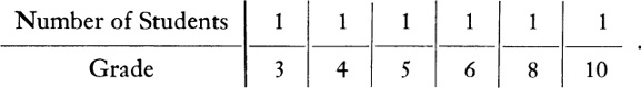
3. A class of 20 students was graded as follows:
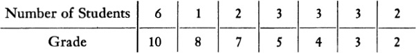
What are the mean, median, and mode of these data? Which average best represents the data?
4. The following weekly wages were paid to the employees of a company:
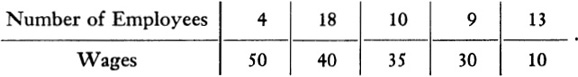
Answer the same question as in Exercise 3.
5. Criticize the assertion, “Obviously there must be as many people with above-average intelligence as there are with below-average intelligence.”
6. Is it safe for an adult to step into a pool whose mean depth is 4 ft?
We have already pointed out that no one of the averages provides detailed information about a set of data. Insofar as the mode and median are concerned, we can certainly change the salaries above and below either of these averages as much as we want to without affecting them. The mean has similar short-comings. For example, the numbers 3, 5, and 7, each taken once, have a mean of 5, but so do the numbers 0, 5, and 10. Thus one may again change the data, though not at will, and still obtain the same mean.
To obtain further information about a set of data, statisticians seek to measure how closely the data are grouped about the mean; i.e., they seek to determine the dispersion of the data about the mean. Thus the data 0, 5, 10 are more widely dispersed about the mean of 5 than are the data 3, 5, 7. Various measures of dispersion might be introduced, but the one which has proved to be the most useful and also the best from the point of view of mathematical manipulation is the standard deviation.
Let us note first what is meant by a deviation. Suppose that the grades of six students in a class are:
We calculate first the mean grade; that is, we multiply each grade by the number of students earning that grade and divide by the number of students. In the present example, the mean grade is 6. The deviation of any grade from the mean is merely the difference between that grade and the mean. Thus the deviations for the above set of grades are
3, 2, 1, 0, 2, 4.
To obtain the standard deviation, one squares each deviation, calculates the mean of these squares, and then takes the square root. The squares of the deviations are
9, 4, 1, 0, 4, 16.
To compute the mean of these squares, we must add them taking each with the frequency with which it occurs, and divide by the total number of data. Thus
![]()
The standard deviation, denoted by σ (sigma), is the square root of this mean. Then
![]()
The standard deviation of 2.4 is merely a convenient and yet somewhat arbitrary measure of how close the various grades are to the mean. Had the grades of the six students been
the mean would again be 6, but the standard deviation would turn out as follows. The deviations are
4, 0, 4.
The squares of these deviations are
16, 0, 16.
The mean of these squares is
![]()
and the standard deviation is
![]()
In other words, the fact that more grades in this latter distribution are farther from the mean of 6 is reflected in the change of the standard deviation from 2.4 to 3.3.
1. The grades of eight students on a quiz were 1, 2, 4, 5, 8, 9, 9, 10. Calculate the standard deviation of this distribution of grades.
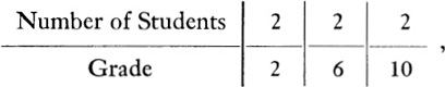
2. Calculate the standard deviation of the grades listed in Exercise 3 of Section 22–3. You may take the mean to be 6.
3. Calculate the standard deviation of the wages listed in Exercise 4 of Section 22–3.
4. Suppose that the mean height of men in a certain city is 5 ft 7 in. and the standard deviation is 2 in., while in another city the mean is the same but the standard deviation is 3 in. What fact is revealed by the difference in standard deviation?
5. Suppose that a student made a grade of 75 in an examination for which the mean grade was 65 and the standard deviation of the grades was 5, and another student made the same grade in an examination for which the mean was also 65, but the standard deviation was 15. Which student did better?
6. What is the significance of the standard deviation?
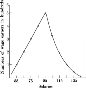
A better knowledge about some collections of data than the mean and standard deviation afford can be obtained by means of a graph. Consider, for example, the wages paid in an industry. In this case, the graph might show the wages paid as the abscissas and the numbers of people earning those wages as the ordinates. Although there may be thousands of different salaries, it is not necessary to plot that many points. One might group the salaries in $10-intervals, and enter into one interval all those earning from $50 to $60, in the next interval those earning from $60 to $70, and so on. One might then regard all those grouped in the first interval as earning $55, those in the second as earning $65, and so forth. Thus one point on the graph will have an abscissa of 55 and and an ordinate equal to the number of people whose salary is somewhere between $50 and $60 or, to be precise, from $50 to $59.99. When a smooth curve is drawn through the points plotted, its shape clearly exhibits the gradual variation in the number of people earning salaries from $50 to the maximum salary paid (Fig. 22–1).
Fig. 22–1.
Frequency distribution of numbers of employees earning different salaries.
Fig. 22–2.
The normal frequency curve.
Of course, the process of lumping together all those with earnings from $50 to $60 and using a representative figure of $55 has introduced some element of error into the data and graph. If this error should matter for the purposes of the study, it might be necessary to use a smaller interval of, say $5 or $2, instead of $10. The smooth curve may also be misleading. The graph in Fig. 22–1, for example, seems to show that to every possible salary in the range from $50 to the maximum there correspond some wage earners. Actually the graph represents only the number of people earning salaries of $55, $65, $75, and so on. However, the shape of the graph is reasonably accurate with respect to the relative frequencies. For example, the smooth curve shows more people earning $60 than, say $55; that is, it shows a distribution which very likely reflects the actual situation, especially if the number of wage earners is large.
The value of the graph is apparent. The mean and standard deviation of the salaries involved would not reveal the rather sharp drop in number from medium- to high-salaried employees and the small number of people earning very high salaries. Graphs, then, do provide a useful picture. A person who reads the newspapers and magazines can hardly fail to observe how commonly they are employed. Not all of these graphs are smooth curves. Bar graphs and pie charts are also frequently used.
The variables whose relationship is represented by a graph may be time and stock prices, production and consumption of coal, or hundreds of other similarly related data. The relationship which plays a central role in statistical work is called a frequency distribution. Thus the graph plotting wages versus the number of people earning the various wages illustrates a frequency distribution. The heights of people and the numbers of people possessing these various heights, for example, or intelligence quotients and the numbers of people possessing the various quotients, or grades on an examination and the numbers of students earning those grades are all frequency distributions.
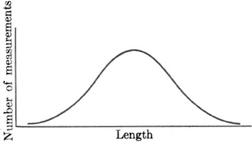
Among frequency distributions one type is of particular importance. Consider the rather simple problem of measuring a length. A scientist interested in the exact length of a piece of wire, say, measures it not once but, if need be, fifty times. Partly because no measurement is exact and partly because environmental conditions such as temperature affect the length, these fifty measurements will differ from each other, sometimes perceptibly and sometimes imperceptibly. A graph plotting the results of all fifty measurements against the number of times that each measurement occurs will look like the curve in Fig. 22–2. In fact, the more measurements that are made, the more nearly will their frequency distribution follow this curve.
The graph in Fig. 22–2 has been well known to physical scientists since about 1800 because it is obtained from almost all measurements of physical quantities. The measurements cluster about one central value, just as the shots of a rifleman at a target will, if he is a marksman, cluster about the bull’s-eye. The similarity of the two situations, the measurement of a length and shots at a target, suggests that the exact length should be the central value. The other lengths apparently represent random or accidental variations from the true length just as the shots near, but not on, the bull’s-eye represent accidental errors in marksmanship. Because the shape of the graph in Fig. 22–2 occurs repeatedly in connection with errors of measurement, it has come to be known as the error curve or the normal frequency curve. Its very existence affirms the seemingly paradoxical but nonetheless true conclusion that accidental errors in measurements do not follow any chance pattern, but always follow the error curve. Humans may not even err at will.
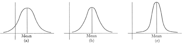
The normal frequency curve is not just one curve but a class of curves possessing common mathematical properties, just as the parabola is not a single curve but a class of curves which can be defined geometrically as the loci of points which are equidistant from a fixed point and a fixed line, and which are algebraically represented by the equation y = (1/2a)x2 (for the proper choice of coordinate axes). The precise definition of the class of normal frequency curves will not be stated because the formula contains a function we have not studied. But we can characterize this class of curves well enough for our purposes. Figure 22–3 shows three different normal frequency curves. Their shapes resemble bells, and the curve is therefore often described as bell-shaped. Each curve is symmetric about a vertical line. The abscissa of the base point of this vertical line is the mean of the data which are plotted as abscissas, for example, lengths. The means of the three curves will generally be different values. In fact one may be a mean length; another, a mean height; and so on. It is almost apparent from the symmetry of these curves that the mode and median coincide with the mean of each distribution, and the different widths indicate that each has its own standard deviation. The left-hand curve (22–3a) evidently has the largest standard deviation of the three because the data are more widely dispersed.
Fig. 22–3.
Three different normal frequency curves.
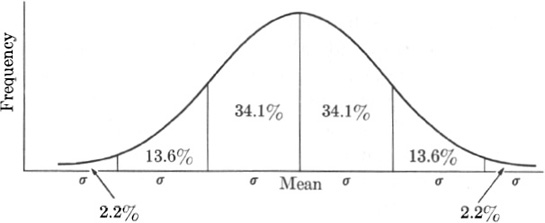
Despite these differences, all normal frequency curves are characterized by their mean and standard deviation. Regardless of the value of the mean and of the standard deviation, 68.2% of the data lie within σ on either side of the mean (Fig. 22–4); 95.4% of the cases lie within 2σ of the mean; and 99.8% of the cases lie within 3σ of the mean.* Thus if the curve of Fig. 22–4 represented the heights of 100,000 men, if the mean were 67 inches, and if σ were 2, then 68,200 men would have heights falling within the range 65 to 69 inches; 95,400 men would have heights between 63 and 71 inches; and so forth. If the standard deviation were 1 instead of 2, the curve would have a sharper hump around the middle because the dispersion would be smaller. But it would still be true that 68.2% of the population would lie within σ of the mean; i.e., 68,200 men would have heights between 66 and 68 inches. Thus knowing that some frequency distribution is normal and knowing the mean and standard deviation of this distribution, we can draw a great number of conclusions about the data.
Fig. 22–4.
The normal frequency curve.
About 1833 Quetelet decided to study the distribution of human traits and abilities in the light of the normal frequency curve. He took many of his data, incidentally, from the thousands of anatomical measurements made by the Renaissance artists, Alberti, Leonardo, Ghiberti, Dürer, Michelangelo, and others. He found what hundreds of successors have since confirmed. All mental and physical characteristics of human beings follow the normal frequency distribution. Height, the size of any one limb, head size, body weight, brain weight, intelligence (as measured by intelligence tests), the sensitivity of the eye to the various frequencies of the visible portion of the electromagnetic spectrum, all these properties are normally distributed within one genus, which may be race or nationality. The same is true of animals and plants. The sizes and weights of grapefruits of any one variety, the lengths of the ears of corn of any one species, the weights of dogs of any one breed, and so forth, are normally distributed.
Quetelet was struck by the fact that human traits and abilities follow the same distribution curve as do errors of measurement. He concluded that all human beings, like loaves of bread, are made in one mold and differ only because of accidental variations arising in the process of creation. Nature aims at the ideal man, but misses the mark and thus creates deviations on both sides of the ideal. The differences are fortuitous, and, for this reason, the law of error applies to these distributions of physical characteristics and mental abilities. On the other hand, if there were no general type to which men conform, measuring their characteristics, height, for example, would not reveal any particular significance in the graph or any definite numerical relationships in the data.
The typical man, according to Quetelet, emerges as the result of a great number of measurements. The mean of each of the characteristics, that is, the value having the largest ordinate, belongs to this typical, or “mean,” man, who is, incidentally, the center of gravity around whom society revolves. The more measurements Quetelet made, the more he noted that individual variations are effaced and that the central characteristics of mankind tend to be sharply defined. These central characteristics, he then declared, proceed from underlying forces or causes which fashion mankind. More than that, his results led him to believe that he had found decisive evidence for the existence of eternal laws of human society and of design and determinism in social phenomena.
Let us content ourselves, for the moment, with the observation that the applicability of the error curve to social and biological problems has led to knowledge in these fields and to laws. Indeed, the conviction that the distribution of any physical or mental ability must follow the normal curve is today so firmly entrenched that any measurements on a large number of people which do not lead to this result are suspect. If, for example, a new test given to a representative group does not lead to a normal distribution of grades, it is not the conclusion about the distribution of intelligence which is challenged; the test is declared invalid. Similarly, if measurements of velocity, force, or distance failed to follow a normal distribution, the scientist would blame his measuring instruments.
Another use of the normal frequency distribution occurs in manufacture. For example, manufactured wire is continually tested for quality. Suppose that 100 samples are taken each day from the day’s production and tested for tensile strength. A graph can be drawn showing strength against the number of samples having that strength. Such graphs usually are normal distributions. Now if the distribution resembled the curve in Fig. 22–3(a), it would imply a wide variety in strength of samples and hence nonuniform production. On the other hand, a distribution such as the curve in Fig. 22–3(c) shows uniform production. The two distributions differ in dispersion, and therefore in their standard deviations. If uniformity is important—and often it is more important than superior quality because a defective piece of wire in an electric circuit may do a lot of damage—then a graph such as the left-hand one indicates the need for some change in the manufacturing process.
One must not presume, however, that all, or practically all, distributions follow the normal frequency curve. The distributions of incomes of families or individuals and the number of families owning 0, 1, 2, 3 or 4 cars are not normal. The failure of incomes to follow a normal curve raises an interesting point because physical and mental abilities are normally distributed and these qualities should determine income.
1. What is a frequency distribution?
2. Describe the normal frequency curve.
3. Given a normal frequency distribution, what percentage of the data lie within a range of 2σ on both sides of the mean?
4. Suppose that the heights of 1000 college freshmen are measured and found to follow a normal frequency distribution, with a mean of 66 in. and a standard deviation of 2 in. What percentage of the students has heights between 66 and 70 in.? between 60 and 72 in.?
5. The United States Army gives a well-designed intelligence test to all prospective soldiers and then rejects all those whose scores fall, say below one σ to the left of the mean. Draw a graph showing the frequency distribution of intelligence of the men accepted for service.
6. Where would the mean income of the distribution of incomes shown in Fig. 22–1 lie in relation to the modal income?
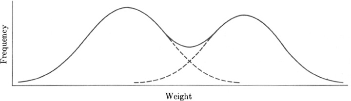
7. Suppose you measured the weights of 1000 grapefruits and made a frequency distribution of the various weights. If the resulting curve followed the solid line shown in Fig. 22–5, what would you conclude about the homogeneity of the species of grapefruit?
Fig. 22–5
We have seen that a great deal of information can be extracted from data by the application of averages, standard deviation, and graphs. When graphical methods are employed, we are particularly fortunate if the graph happens to be a normal frequency distribution. However, the major techniques of mathematics used to derive new information from given facts are designed to apply to formulas. If the data that we happen to be studying present a functional relationship, for example, the variation of population with time in some region, then it is extremely desirable to obtain a formula for this function.
Now the compression of data into formulas is usually possible, and the process is fraught with meaning which we shall examine later. For the present, we shall limit ourselves to illustrating the procedure and, for this purpose, we shall consider first a somewhat specialized and slightly oversimplified problem. By measuring the velocity of a falling body at various instants of time Galileo obtained the following data:
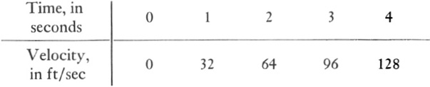
Fig. 22–6.
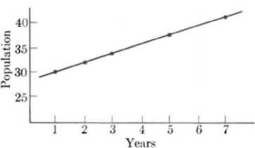
The graph of population versus years for a particular town.
By inspecting this table Galileo could see that the formula relating velocity and time is
Let us treat next the problem of obtaining a formula for data when the result is not obvious by inspection. Most towns, cities, and even the country at large are concerned with studying population changes to predict the needs for housing, water, sewers, schools, and so on. Suppose a town has the following record of growth:
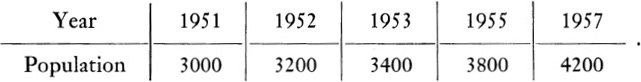
Can one find a formula to fit these data?
To simplify the graphing and calculation, let us count years from 1950 and population in hundreds. Thus 1951 will be regarded as the year 1 and the population for that year as 30. The graph of the data is shown in Fig. 22–6. A straightedge placed along the plotted points shows that they lie on a straight line. We know from our work on coordinate geometry (see Exercise 13, Section 12–3) that the formula or equation of a linear graph is of the form
Let y represent the population of the town and x the year. Since the straight line is the curve which fits our data, let us project the straight line backward to the point where it crosses the Y-axis. At this point, we see from the graph that the value of y is 28 and, of course, x = 0. Since formula (2) is to fit the graph, then for x = 0, y must be 28. If we substitute these values in (2), we have
28 = m · 0 + b,
and we see that b = 28. So far, then, our formula is
The quantity m is unknown. However, the graph tells us that when x = 5, y = 38. Let us therefore substitute these values in (3). We obtain
38 = m · 5 + 28
or
5m = 10
or
m = 2.
Hence the final equation relating y and x is
and we have found a formula which fits the data of the above table.
With this formula we can now predict the population of the town, say for the year 1970. For 1970, x = 20. Then, substituting 20 for x in (4), we obtain
y = 2 · 20 + 28 = 68.
The formula predicts that the population in 1970 will be 68, that is, 6800 people. Of course, we are assuming that the factors which led to the increase in population from 1951 to 1957 will not only continue to operate, but will operate on the same level. Here we encounter one of the serious limitations in the use of statistics for social and economic phenomena. Since we do not know the fundamental forces which control such phenomena (although we may have some qualitative information), we cannot be at all certain that the population will continue to increase after 1957 in the same way as it did before. In fact, we can be fairly sure that it will not. Local, national, or global events slow down or accelerate the growth of a population. For example, during a financial depression young people cannot afford to marry and have children. By contrast, the study of physical phenomena reveals that the forces operating in nature are invariable.
As a matter of fact, there is a fundamental difference between the formulas obtained from data of the physical sciences and formulas derived from data of biology, psychology, the social sciences, and pedagogy. One may say that, in general, a formula developed from data of the first class continues to hold as added data are gathered. Three hundred years ago Kepler deduced his laws from observational data, and they are still correct. On the other hand, for problems of the second class, it does not happen very often that formulas continue to hold without corrections as additional data are gathered. We must constantly refit the formula to the enlarged collection of data. This inconstancy need not be interpreted to imply that lawlessness prevails in the social and biological sciences, for we have already encountered instances of what appear to be well-established laws in these areas.
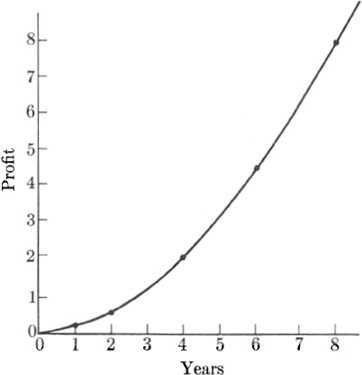
The above example shows data which led to a linear function. But suppose that the graph were not a straight line or sufficiently close to one to be approximated by a straight line. An example will show that we can nonetheless fit a formula to nonlinear graphs. Suppose that, beginning with the year 1951, the profits of a business concern were as follows:
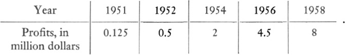
To find a formula fitting these data, we first plot the data. Let us record years after 1950 as abscissas and profits as ordinates. Figure 22–7 shows the graph.
The points plotted are connected by a smooth curve whose appearance suggests a parabola. We know from our work on coordinate geometry that parabolas placed with respect to the axes as shown in the figure have equations of the form [see Chapter 12, formula (9)]
Let x in (5) stand for time and let y denote the profits. To fit formula (5) to our data, we must first determine the value of a. We choose the coordinates of any one point on the curve. Thus in 1954 the profits were 2. The corresponding point on the curve has coordinates x = 4, y = 2. Substituting these values in (5), we obtain
![]()
Then a = 4, and formula (5) becomes
Fig. 22–7.
The graph of profits versus years for a given firm.
Of course, in classifying the curve as a parabola, we judged by appearance. Hence we should check whether (6) fits other data on the graph. Thus, for example, the coordinates of the point corresponding to 1956 are x = 6 and y = 4.5. If we substitute these values in (6), we see that the left side does indeed equal the right side, and so we have verified that the parabola does fit the data.
If, for example, the profits for the year 1956 had been 4.6 instead of 4.5, then the result of substituting 6 for x in (6) would not have yielded the exact figure. However, one might still accept formula (6) as a good approximation to the data. If the substitution into (6) of one or more x-values of points on the graph had not yielded good approximations to the corresponding y-values, then our judgment about the parabolic nature of the graph would have been wrong, and we would have had to fit a different type of formula to the data. There are techniques which aid in deciding what formulas to try, but these are valuable only for the specialist.
These few examples, obviously chosen for their simplicity, show how formulas can be fitted to data. At the same time we see that the procedure presupposes a knowledge of coordinate geometry, that is, the relationship between equation and curve.
1. The following data are given for two variables, x and y:
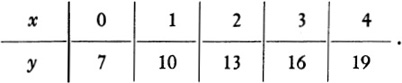
Find by inspection a formula of the form y = mx + b relating x and y.
2. When a spring is stretched, it exerts a force which opposes the stretching force. To determine the relationship between F, the force exerted by the spring, and d, the amount of stretch or displacement, the following data are available:
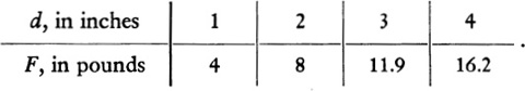
Graph these data and find a formula which relates F and d. The result is Hooke’s law (Chapter 18) for the particular spring.
3. Suppose that experimentation has yielded the following data on the distance fallen by a body in various time intervals:
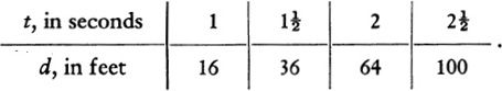
Though you undoubtedly know the answer, graph the data, and fit a formula relating d and t to the graph.
4. People are constantly concerned with the rise of prices. These are measured by an index number which represents an average cost of vital commodities and services. Suppose that the index numbers for a number of years are as follows:
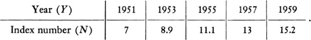
Find a formula relating the index number N and the year Y. Check the formula obtained by trying it out on those data of the table that are not used to determine the constants.
5. The profits of a concern for the years following 1950 are:
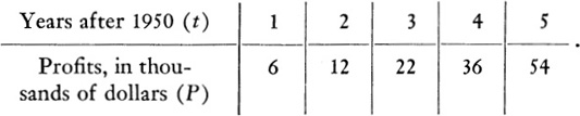
Fit a formula of the form P = at2 + b to the data.
6. The volume of a given quantity of water will vary with temperature because, as we have had occasion to learn in the past, water expands or contracts with temperature. Hence suppose you had gathered the following data on the volume in cu. in. of a fixed quantity of water at various temperatures (in degrees centigrade):
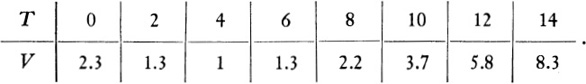
Determine the formula relating T and V. [Suggestion: Try the formula V = a + bT + cT2, which, of course, represents a parabola. Then since you know V for T = 0, you can immediately find a. Next use two sets of data to determine b and c by solving two equations in two unknowns.]
7. What are the advantages of fitting a formula to data?
8. How would a knowledge of coordinate geometry be helpful to a scientist who is attempting to fit a formula to data?
The process of fitting a formula to data is useful in that it summarizes data and may permit further mathematical work with the formula. However, it is not always possible to fit a formula to data. The very notion of a functional relation demands that there be a unique value of y for each value of x in the range studied. Many types of data do not meet this condition. Suppose, for example, one wished to study the relationship between height and weight of men. To any one height there correspond many weights, or if one starts with weight, to any one weight there correspond many heights. Hence one cannot ask for a formula which relates weight and height. Nevertheless there is some correspondence between these two variables, and one might wish to determine the extent and nature of this relationship.
Sir Francis Galton, a cousin of Charles Darwin and founder of the science of eugenics, faced the above problem in his study of human characteristics. Galton was a doctor who used statistics to study heredity. In particular, in his famous Natural Inheritance, Galton undertook to investigate the relationship between the heights of fathers and the heights of their sons. It is immediately apparent that to any given height of a father there correspond many heights of sons. Galton introduced a notion now known as correlation. This mathematical concept permits one to measure the closeness of the relationship between two sets of data which may not be functionally related.
Galton found a close relationship between the heights of fathers and their sons. Tall parents have tall children. He also discovered, incidentally, that the mean height of all the sons of tall fathers was closer to the mean of the entire population than was the mean of all the fathers. Thus, while the trait of tallness or shortness is on the average inheritable, succeeding generations regress toward a norm. He also found that the same conclusions apply to intelligence. Talent is, on the average, inherited, but the children are more mediocre than the parents. (Hence parents know better what is good for their children than do the children themselves!). After finding that the same law also holds for other human characteristics, Galton concluded, first, that human physiology is stable and, secondly, that all living organisms tend towards types. Leaving aside Galton’s broad inferences, we find in his work examples of biological laws obtained solely by the use of statistics and the simplest of mathematics. Moreover, it was possible to establish these conclusions without any knowledge of the mechanism of heredity.
The precise mathematical measure of correlation which is widely used today was formulated by Karl Pearson. His formula yields a number which lies between − 1 and 1. A correlation of 1 indicates that the given variables are directly related; when one variable increases or decreases, so does the other; when one of the variables assumes a high numerical value, so does the other. A correlation of − 1 means that the behavior of one variable is directly opposite to that of the other; as the values of the first variable increase, those of the second decrease, and conversely. A correlation of zero means that the behavior of one variable has nothing to do with the behavior of the other; they proceed independently of each other. A correlation of three-fourths, say, indicates that the behavior of one variable is similar to, but not identical with, that of the other.
A knowledge of correlations can be extremely valuable. If stock prices correlate highly with industrial production, one can use a knowledge of the former to study and predict the behavior of the latter. This approach has a definite advantage since stock prices are much more easily compiled than data on industrial production. If general intelligence correlates highly with ability in mathematics, then a person with good intelligence can expect to do well in mathematics. If the total earnings of a nation’s wage earners correlate highly with prosperity as measured by the total profits of business concerns, then industry in its own interest ought to consider the prudence of diverting a larger share of its earnings to its employees. If the correlation between the frequencies of occurrence of two diseases is high, the successful analysis of one may be expected to lead to an equally favorable result for the other. Knowledge of the correlation between success in high school and success in college or between success in college and financial success in later life can be extremely valuable in predicting the future of groups of individuals.
Suppose that a study of 1000 students reveals a very high correlation between general intelligence and ability in mathematics. A particular student is known to be very intelligent. What would you expect his ability in mathematics to be?
Since statistics are now widely employed in our society to bolster arguments on both sides of controversial issues, it might be advisable on this account as well as for a general understanding of the nature of statistically established conclusions to become aware of the pitfalls in applying statistical methods and in interpreting the mathematical results. One of the first difficulties in applying statistics is to decide the meaning of the concepts involved. Suppose that one wished to make a statistical study of unemployment, say over a period of years. Who are the unemployed? Should the term include those people who do not have to work, but would like to? Or people who are employed two days a week and are looking for full-time employment? Or the well-trained engineer who cannot find a job corresponding to his qualifications and has to drive a cab? Or the man unfit for employment? Should a study of passenger cars include taxis, station wagons, and passenger cars used by salesman for business purposes?
After one has decided what objects or groups of people are to be included in a given term, the question of whether the data are reliable arises. For example, any study of crime rates must take into account that police departments occasionally change their practices of recording and classifying crimes. A study of the incidence of mental diseases among men and women must take into account that women are less frequently hospitalized than men.
The clear delineation of the problem to be investigated is also often a difficult matter. Suppose that one wishes to compare deaths due to automobiles in the United States and Great Britain. The number of deaths is certainly larger in the United States but so are the population and the number of automobiles. Should one compute the number of deaths per inhabitant, per automobile, or per mile of automobile travel?
The largest single problem which arises in the process of using statistics is the problem of sampling. To study the incidence of tuberculosis in the United States, for example, one does not examine every person; rather a group of people believed to be typical of the whole population is selected for study. This group is called a random sample. Similarly, all physiological and mental characteristics of human beings are studied by sampling. The level of retail food prices is gauged by selecting a few important food items which are considered to be representative of all foods. The study of wages in an industry is conducted by selecting a random sample of workers. The doctor studies a person’s blood by sampling a small quantity which he believes to be typical because the blood is continually circulating throughout the body. A sociologist interested in the life of families with a given income will study a selected, typical group rather than the entire class. The Gallup poll studying the country’s attitude towards public questions and the astronomer studying the number and sizes of stars in a region of the sky use sampling.
Since the conclusions of a statistical study are based on the sample, it is evident that the sample should be chosen with care. If one is studying the output of a machine by sampling its products, it is essential that the products be picked at various times during the day rather than all at one time. In the morning, before there is any chance of overheating, the machine may do better work than in the afternoon
Given a truly random sample, the next question concerns the extent to which the information derived from the sample can be trusted to be indicative of the entire population. This problem involves probabilities, and we shall discuss this subject in the next chapter.
The evaluation of statistical results presents problems of its own. Let us suppose that the meanings of terms are satisfactorily established and that representative samples have been chosen, or that the entire population has been covered so that the questions raised by sampling do not enter. Statistics do show that graduates of Harvard make more money later in life than graduates of any other university. What shall we conclude? Does Harvard’s education ensure greater success for the average student there as opposed to the average student at some other university? Hardly. Many of the students at Harvard come from well-established families who take their sons into the family business or profession.
Statistics show that in 1954 among fatal accidents due to automobiles 25,930 occurred in clear weather, 370 in fog, 3640 in rain, and 860 in snow. Do these statistics show that it is safest to drive in fog? Obviously not. Fogs occur more often at night when fewer cars are on the road. When fogs occur, many people refrain from driving, and others drive more cautiously. Finally, fogs are rare.
To see more clearly the danger of drawing hasty conclusions from statistics, one might resort to some extreme and even ridiculous examples. It has been noted that among people who sit in the front rows of burlesque houses bald heads predominate. May one conclude that close observation of burlesque shows produces baldness?
These difficulties in the compilation and evaluation of statistics are real enough. They have led to false inferences and to derogatory remarks such as that there are romances, grand romances, and statistics, or to the definition of statisticians as men who draw precise lines from indefinite hypotheses to foregone conclusions. One must indeed be careful in the uses of statistics. Especially where sampling is involved, statistics do not prove anything; they tend to show. They give us guides to action. Almost always statistical results do not tell us anything certain about an individual, but they indicate what is very likely to hold among a class of individuals as, for example, the distribution of intelligence.
However, the difficulties are easily overshadowed by the effectiveness of the statistical approach in studies of population changes, stock market operations, unemployment, wage scales, cost of living, birth and death rates, extent of drunkenness and crime, distribution of physical characteristics and intelligence, and incidence of diseases. Statistics are the basis of life insurance, social security systems, medical treatments, governmental policies, educational studies, and the numbers racket. Modern business enterprises are using statistical methods to locate the best markets, test the effectiveness of advertising, gauge the interest in a new product, and so forth. Pure speculation, haphazard guesses, and the captiousness of individual judgments are being supplanted by statistical studies. Indeed statistical methods have been decisive in turning undeveloped and backward fields into sciences, and they have become a way of approaching problems and thinking in all fields.
1. Compare the methodology of the deductive approach to a field of investigation with the statistical approach.
2. Why have economists not succeeded in finding a deductive approach to the economic system of a country?
3. Assuming a reasonable definition of an unemployed person, suppose that statistics show rising unemployment in the United States for a period of five years. Do these statistics imply that the economic condition of the country has been getting worse during those years?
4. Statistics show that every year more people die of cancer than in preceding years. Is cancer caused by factors which are becoming more common in our civilization?
5. Statistics show that cancer occurs much more frequently among men who smoke heavily than among men who smoke little or not at all. Is smoking a cause of cancer?
6. It has been shown statistically that older fathers produce more intelligent children. Do these statistics imply that men should have children later rather than earlier?
7. The average age at death of people with false teeth is higher than that of people possessing natural teeth. Do false teeth enable you to live longer?
1. The work of Sir William Petty.
2. The work of John Graunt.
3. The work of Sir Francis Galton.
4. The concept of correlation.
5. The deductive approach to the social sciences.
ALDER, HENRY L. and EDWARD B. ROESSLER: Introduction to Probability and Statistics, Chaps. 1 to 4, W. H. Freeman & Co., San Francisco, 1960.
FREUND, JOHN E.: Modern Elementary Statistics, 2nd ed., Chaps. 1 through 6, Prentice-Hall, Inc., Englewood Cliffs, 1960.
HUFF, DARRELL: How to Lie with Statistics, W. W. Norton & Co., New York, 1954.
KLINE, MORRIS: Mathematics in Western Culture, Chap. 22, Oxford University Press, New York, 1953.
KLINE, MORRIS: Mathematics: A Cultural Approach, Chap. 28, Addison-Wesley Publishing Co., Reading, Mass., 1962.
NEWMAN, JAMES R.: The World of Mathematics, Vol. III, pp. 1416-1531 (selections on statistics), Simon and Schuster, Inc., New York, 1956.
REICHMANN, W. J.: Use and Abuse of Statistics, Chaps. 1 through 13, Oxford University Press, New York, 1962.
WOLF, ABRAHAM: A History of Science, Technology and Philosophy in the Sixteenth and Seventeenth Centuries, 2nd ed., Chap. 25, George Allen and Unwin Ltd., London, 1950. Also in paperback.
* The normal frequency curve, as a mathematical curve, extends indefinitely far to the right and to the left of the Y-axis although its so-called tails come closer and closer to the X-axis. However, these tails play almost no role since only 0.1% of the measured events can occur beyond 3σ to the right or to the left of the mean.