Chapter 6
Visual communication and literacy
Abstract
This chapter takes a scholarly perspective to review the origins and evolution of visual communication, and its influence on the values of modern visual storytelling. We will explore the genesis of visual communication, the way it has taken shape and evolved over years of human history, how communication has morphed into analysis, and how this ultimately influences the constructs of visual literacy and visual data literacy before beginning to bridge into visual, data storytelling.
Keywords
visual communication
visual literacy
data visualization
memorability
learning
storytelling
“If students aren’t taught the language of sound and images, shouldn’t they be considered as illiterate as if they left college without being able to read or write?”
—George Lucas
In the first few chapters of Part I, we set the tone of the book by focusing on today’s emergent discovery imperative and exploring the unique needs and characteristics of the data-driven organization in an era of disruption and invention. We reviewed the adoption of business-driven discovery to complement traditional business intelligence; the emergence and enterprise adoption of visual discovery from the data to the dashboard; and the maturation of self-service, self-sufficiency, and user enablement for data discovery as IT shifts to ET, or enablement technology. And, last but certainly not least, we engaged in a practical albeit philosophical conversation on how next-generation information leaders must navigate the complexities of today’s big data democracy and prepare for ever-increasing interconnectedness and ethical challenges of the Internet of Things.
As we move into Part II we will begin to dig deeper into the premise of visual discovery and the elements—communication, storytelling, design, and application—that make it so compelling. To frame our next series of conversations, I would like to begin with a brief history on the genesis and evolution of visual communication and data literacy. With these as foundation, we can better apply a larger, more integrated perspective to the role of data visualization and data discovery today, as well as how we use visual-based approaches to interact with information in the big data ecosystem that offers more variety, volume, and velocity of data than ever before.
Keep in mind that this discussion is not meant to be all encompassing. Each of these areas easily deserves (and already commands) its own body of dissertation. Instead, this perspective is intended to provide a mere potsherd of distilled information on the history of visual communication by which to broker a larger context of understanding for the impact of data visualization and data science. The discussions in this chapter will, too, be by far the most academic in the book, as we will be discussing communication, cognition, and literacy from a scholarly perspective and visiting a small sample library of available academic literature. In the subsequent chapters of Part II, we will expand these constructs to explore storytelling psychology and how various narrative frameworks can be applied to tell meaningful, actionable, and inspiring data stories.
In the preface to his seminal research on the history of visual communication and graphic design, American graphic designer, professor, and historian Philip B. Meggs begins his discussion with one word: zeitgeist. A German word with no direct English translation, zeitgeist roughly translates to mean the spirit of the times, or the intellectual or dominant school of thought that influences the cultural trends characteristic of a given era. “Since prehistoric times,” writes Meggs in The History of Graphic Design, “people have searched for ways to give visual form to ideas and concepts, to store knowledge in graphic form, and to bring order and clarity to information” (Meggs, 2011, preface). If we consider the evolution of visual communication from a historical relevance perspective—from prehistoric cave drawings, to the Sumerians who invented writing, to Egyptian artisans and medieval illuminators, and throughout the aesthetic movements that have propelled us to today’s contemporary design artists—we can better inform and position ourselves (as Meggs rightly claims) to continue a legacy of beautiful form and effective communication.
Visual communication is, at its simplest, the act of engaging in direct or indirect communication through a visual aid. It is the conveyance of ideas and information in forms that can be looked upon, and thus relies on vision—whether the image itself is communicated through typography, drawings, designs, illustrations, animations, and so on. The study of visual communication also explores the idea that a visual message and accompanying text has a greater power to inform, educate, or persuade (Smith et al., 2004). Visual communication, when focusing on information transfer and the distillation of complex (often mathematical) concepts, can be further articulated as a function of visual data literacy—a critical component of the multiple intelligences theories that we will explore later in this chapter. And, both visual communication and data literacy impact how we analyze imagery and how visualization is used within the larger storytelling paradigm—the subject of the chapter to come.
Paying homage to “iconic” artist Ivan Chermayeff, who has created hundreds of memorable commercial logos and icons, let us begin our brief journey in cultural anthropology where “the design of history meets the history of design.”
6.1. The history of visual communication
From the earliest cave drawings and cuneiform languages to the first alphabets and typologies, visual communication has been among the most primary ways that humans have communicated over thousands of years (see Box 6.1). By tracing the history of visual communication back through its roots from simple, elementary symbolic pictures to convey basic information, to how it has evolved through written languages, illustrated manuscripts, photography, modern graphic design movements, and advanced data visualization, we can clearly see the influence of visual communication throughout the ages.
A precursory exploration into the genesis of visual communication will show that it has taken an interesting and somewhat parallel journey alongside that of the history of writing. As the primary means of visually conveying ideas and information, visual communication had its beginnings in manmade markings found in Africa that date to over 200,000 years old (Meggs, 2011). In our archeological discoveries, explorers have discovered rock and cave painting dating from the early Paleolithic to Neolithic periods (35,000 BCE to 40,000 BCE). While the examples are many, one particularly remarkable finding is the Chauvet-Pont-d’Arc Cave in southern France, discovered in 1994, which is home to the earliest known and best preserved figurative cave paintings. These paintings feature renderings of several animal species with spectacular anatomical precision and are lauded as being of exceptional aesthetic quality (UNESCO, 2015). The next time you visit your local natural science museum, pause to look at the many markings on pottery or other objects and reflect on their potential not as mere decorative embellishment, but as the earliest forms of visual communication. What stories about their lives were our earliest ancestors trying to tell us?
When they eventually came, our first written languages were inherently visual—from ancient Eastern ideogrammatic writing systems, where a single image represented a word or a morpheme (a meaningful unit of words) to the first pure alphabets (properly known as “abjads” and which only represented consonants) of ancient Egypt that mapped single symbols to single phonemes. These visual languages later inspired the Phoenician and Greek alphabets, and eventually the Aramaic alphabet, which is credited for being the ancestor of nearly all of the modern alphabets of Asia. One of the later (and perhaps best-known if controversial) picture-based writing systems is Early Indus script, a corpus of symbols developed by the Indus Valley Civilization dated to have emerged somewhere between the 35th and 20th centuries BCE (Whitehouse, 1999).
Without oversimplifying the continued (and largely subjective) scholarly disagreement on the factors that distinguish “proto-writing” (systems of writing which used ideographic and/or early mnemonic symbols to convey information yet were probably devoid of direct linguistic content) from “true writing” in visual communication history, we can note succinctly that conventional writing systems follow a series of developmental stages that provide a maturity framework that illustrates how the arrival of picture writing (whether mnemonic or ideographic) moves forward to transitional systems and ultimately to phonetic systems wherein graphemes are represented by sounds or spoken symbols, and finally, elements like alphabets are introduced. (Curiously, these defined stages of alphabet maturity are not too unlike the developmental stages of children learning to write, who similarly transition from scribbling, to the emergence of letters and symbols to represent ideas, to the inclusion of sound clouds, and then eventually words as they move from drawings to represent ideas to sentences by which to tell them.)
The invention of the alphabet took place in an era of experimentation in writing, and brought with it an easier opportunity for literacy (Millard, 1986). Thus, on the continuum of the history of writing and its convergence with the history of visual communication, the advent of the alphabet was the catalyst that propelled us into the realm of written communication. Eventually, this led to the conception of what we consider today as written storytelling and literature. Of course, while writing and storytelling are interconnected but not synonymous concepts, their histories are nonetheless paramount in the history of visual communication. Medieval Europe brought about the first visual storybooks in the form of illuminated manuscripts—beautifully and ornately illustrated books that often took several (short) scribe lifetimes to complete (the earliest surviving of these manuscripts are from CE 400 to 600). From these manuscripts, next came technology that enabled movable type and Gutenberg’s mechanized printing press that began to spread across Europe in the early 16th century (Febvre and Martin, 1976). Alongside the printing press appeared the art of calligraphy, the illustrations of Da Vinci, and those known as the Masters of Type, including Claude Garamond and John Baskerville (we will explore typography as an element of design in future chapters) that carried storytelling through the 18th century.
The Industrial Revolution of the late 18th and early 19th centuries spread major technological, socioeconomic, and cultural change throughout the world unlike anything witnessed since perhaps the Neolithic revolution (which propelled human advancements in agriculture). Production machines for manufacturing enabled mass production of text-complementary illustrations through lithography, which, within a few years of its invention, allowed for the creation of multicolor printed images, as well as free running type, a process called Chromolithography. This era was also marked by another major innovation in visual communication: photography. From the first photo image produced in 1826 by French inventor Joseph Nicéphore Niépce to the Daguerreotype of 1839, to the invention of film in 1886 to replace the photographic plate, photography became an unprecedented and innovative mechanism of visual communication. Eventual mass-market availability of photography was made possible with the introduction of the Kodak Brownie in 1901, effectively making visual communication a self-service endeavor with the most advanced technology of the time. With the ability to pair the written word with self-service visualization (and, of course, the benefits of postal mail) came perhaps the first method of “modern” visual communication and storytelling: the postcard (see Box 6.3).
Box 6.3 The dear data project
When New York-based Giorgia Lupi and London-based Stefanie Posavec met at the 2014 Eyeo Festival in Minneapolis and bonded over a mutual passion for hand-drawn data visualization, they had no idea that they would be soon embarking on a year-long, analog data drawing project together. Their project, Dear Data, is (per the website) “an art project that challenges the increasingly widespread assumption that big data is the ultimate key to unlocking, decoding, and describing people’s public and private lives.” And, it is a working example of how visual communication is technology-influenced without being technology-dependent.
Each week for the length of the project, Lupi and Posavec have collected and measured a type of data about their lives; hand-drawn a custom data visualization generated from manual data collection and analysis on a postcard-sized piece of paper; and dropped it in the post on its way to the other side of the world. The visualization is drawn on the front of the postcard, and an instructional “how to” legend for guiding understanding and interpretation is rendered on the back. Once received, the images are uploaded weekly on dear-data.com, as Lupi and Posavec share their beautifully illustrated—and deeply personal—journeys through their everyday lives as quantified in personally curated analog data visualizations (Figure 6.2).

Figure 6.1 Timeline of Visual Communication
Created by visual artist Matt Brighton, this visualization represents the journey of visual communication from its earliest known roots to today’s approach to graphic design.
Created by visual artist Matt Brighton, this visualization represents the journey of visual communication from its earliest known roots to today’s approach to graphic design.

Figure 6.2 Dear Data Week 7: Musial Complaints.
This data visualization, told through musical scales, shows the type and frequency (or tune!) of Lupi’s complaints over the course of one week.
This data visualization, told through musical scales, shows the type and frequency (or tune!) of Lupi’s complaints over the course of one week.
A design project at heart, Dear Data is a compelling way that two women are working together to humanize data. But, it is also a foray into continuing visual, nonanalog communication with data visualization. Each postcard is an exploration of small, incomplete, and imperfect data. More important, Dear Data is a way to visually communicate and share personal experiences through data in a way that makes it possible to physically experience data from the interaction they share in collecting, designing, and using the postcards.
The Arts and Crafts movement—a major English and American aesthetic reaction that occurred in the transitional years between the 19th and 20th centuries—closed the gap between the eclectic historicism of the Victorian era and the machine-made production milieu of the Industrial Revolution. This movement brought visual communication back to the forefront of storytelling. One of the principal founders of Arts and Crafts was William Morris, an English artist, writer, social activist, and ecosocialist pioneer. Morris later founded the Kelmscott Press in London to produce examples of printing and book design that led the press to become the most famous of the private presses due to its integration of type and decoration (or, visual illustration). From there, we dove into periods of visual-based art, with movements in eclecticism, art nouveau, and the invention of posters paving the way for new graphic design styles, such as constructivism, futurism, Dadaism, Bauhaus, and De Stijl. Moving ahead, these initial steps forward in graphic design and visual storytelling have led to the age of the computer and digital (or, inkless) graphic design—which has dramatically changed the game in how we interact with visual communication in the age of modern visual communication, and what is now being referred to within the industry-at-large as data storytelling.
As inconsequential and meandering as it may seem, this bit of history can be distilled into one simple takeaway (see Figure 6.1): from prehistoric cave paintings to today’s modern data visualizations, we have stayed true to our roots of using visual communication as a primary means of interacting with and communicating about information (see Box 6.4).
6.1.1. Noteworthy figures in visual communication
Before we move on and shift our discussion to the role of human cognition in visual literacy, and further, visual storytelling as a form of data communication, it would be a disservice to overlook the contributions of two notable figures in the relatively recent study of visual communication. These influential figures are author and philosopher Aldous Huxley (1894–1963) and psychologist Max Wertheimer (1880–1943), respectively.
Perhaps most well-known for his dystopian novel Brave New World, Aldous Huxley is a highly regarded explorer of visual communication and sight-related theories. In The Art of Seeing, his critique of orthodox approaches to corrective vision and the resulting dehumanizing aspects of the scientific process (Huxley became nearly-blind as a teenager as the result of an illness and used the Bates Method to improve his vision to the point where he was capable of reading without the use of glasses), Huxley posits that there is more to seeing than simply sensing imagery—that there is more to visual communication therefore than making an image for the eyes to perceive, but that it must also accommodate the mind of the person being communicated to (Huxley, 1943). We will see the wisdom of Huxley’s assessment later in discussions of visual design (Box 6.5).
Along with Kurt Koffka and Wolfgang Köhler, Max Wertheimer is a founder (and said to be the father of) Gestalt psychology. In a nutshell, Gestalt (the German word for form or shape) theory is the study of whole processes and their interactions which we experience (Humphrey, 1924), and springs from experimental work that has—in over nine decades since its inception—proved fruitful in presenting hypotheses. The study of Gestalt psychology emphasizes simplicity in shape, color, and proximity, and looks for continuation, closure, and figure-ground principles. Today, studiers of visual communication can expect to learn about Gestalt psychology alongside color and perception theories, design principles, semiotics, etc. Again, like Huxley, the Gestalt principles will prove to be a pivotal piece of the conversation when we later discuss how visual design hinges not on embellishment, but on removing and simplifying until nothing stands between the visual’s message and its audience.
6.2. Visual memorability and retention
Moving forward, let us apply the previous brief anthropological summary of the genesis and progress of visual communication as a communication mechanism, art form, and psychological perspective to the role of human cognition in visual memorability and retention. In an effort to disentangle the myriad compounding factors that affect visual cognition, we will save discussions that explore human cognition in the context of visual design—including perceptual pop out, pattern recognition, numerosity, etc., for a later chapter and stick simply to the basic cognitive elements of visual memorability, recall, and retention in this chapter.
As you may suspect by our long history of visual communication, humans are extremely good at remembering thousands of pictures and a vast amount of visual detail. In fact, the number of remembered images and context has been measured to be somewhere in the ballpark of 10,000 images with a recognition rate of approximately 83% (Standing, 1973).
In recent years, attributes-based visual recognition has received a lot of attention in computer science literature. And, this attention has not been in vain. With numerous in-depth studies providing clear data and learning opportunities, we now definitively know that visualization that blends information with influential features (such as color, density, and content themes, like recognizable icons or imagery) significantly and reliably increases learning, memorability, and recall (Borkin et al., 2013). Further, seeing and interacting with an image in combination with traditional written and verbal instruction has, too, been consistently associated with higher levels of retention and understanding of salient ideas. While research into the human cognitive capacity to remember visual stimuli has been ongoing, in the past few years researchers have worked to systematically study the intrinsic memorability of images and the interface between human cognition and computer vision. This body of study is ultimately intended to help understand the predictive ability of visual memorability and how visuals can be designed to take best advantage of our visual recognition system.
Today there is ongoing debate in the visualization community regarding the role that visualization types play in data understanding and memorability. And, like all great scientific debates, those who seek to understand the role of visual attributes in memorability are not unique in that there are convincing pieces of research on both sides of the topic. The conventional view, supported by visualization purists, argue that visualizations should be devoid of chart junk and curated with as few design elements as possible to create a clean visualization and increase memorability and information saliency. While this view is supported by many psychology lab studies, there is, naturally, still a body of research that argues the opposite—that chart junk can possibly improve retention and force a user to expend more cognitive effort to be able to understand and learn from the visual, thereby increasing both their understanding and recall of the data in a deeper way. That said, let us call attention to two specific studies that provide really interesting—and very opposite—takeaways into visual memorability to provide a deeper understanding of the recurring themes and their points of contention.
First, a recent collaborative research project by computer scientists from Harvard and cognitive scientists from MIT—whose findings were later presented at the IEEE Conference on Computer Vision and Pattern Recognition—explored cognitive memorability of visualizations in hopes of finding empirical evidence to support the theory that while our memories are unique, we have the same algorithm embedded in our heads to convert visual communication to memory and thereby learn—and retain that learning. In other words, regardless of the memory being stored within our brains the same algorithm—a standard baseline that does not vary much from person to person—commits these to memory. To test their theory, these researchers used a publically available memorability dataset, and augmented the object and scene annotations with interpretable spacial, content, and aesthetic image proprieties (colors, shapes, etc.) (Isola et al., 2011). While the finding that images containing people are more memorable than images of settings (places and/or locations) is not particularly surprising, their other finding—that unusualness and aesthetic beauty are not associated with high memorability and are, instead, negatively correlated with memorability—is. This would seem to challenge the popular assumption that beautiful images—more aesthetically pleasing ones—are more valuable in memory currency. Another interesting find of the Harvard/MIT study is that visualizations are instantly and overwhelmingly more memorable if it includes a human-recognizable element—such as a photograph, person, cartoon, or logo—items that, in essence, provide our memory with a visual cue to build a story around, linking back to our most primitive of visual communication methods: symbolism, or the practice of representing things by symbols. This is a compelling case for the use of icons in visualizations like infographics that rely on symbols to communicate mass amounts of complex data in simple and meaningful ways.
In a later study on what makes a visualization memorable, another group of researchers built a broad, static visualization taxonomy to cover the large variety of data visualizations in use today, and then collected nearly 6,000 visual representations of data from various publications. The scraped visualizations were then categorized by a wide range of attributes. The researchers were able to expose the images to participants via Amazon Mechanical Turk and test the influence of features like color, density, and content themes on participants’ memorability. The results of the study again validated previous findings that faces and human-centric scenes are more memorable than others—specifically, people and human-like objects contributed most positively to the memorability of images. This again confirms that certain design principles make visualizations inherently more memorable than others, irrespective of a viewer’s individual context and biases (Borkin et al., 2013). However, an interesting find of this particular study was that, contrary to the popular mantra of “less is more” in data visualization, these researchers found that visualization with low data-to-ink ratios and high visual densities (or, in the common vernacular: more chart junk) were actually more memorable than minimalist data visualizations (Borkin et al., 2013). Unique visualizations that left a lasting impression were more memorable than traditional, common graphs—like bar charts or line graphs—which likewise is a direct contradiction to the previous study, which found that uniqueness of visuals was actually associated with lower levels of memorability. This is part of the experience of looking at a visual, which we will explore more later.
While the intrinsic—and predictive quality—of visual memorability continues to be an ongoing area of inquiry, there are a few key takeaways that are of paramount importance:
• We have a high memory capacity—we can remember thousands of images for a long time with a high degree of recall
• Memorability is an intrinsic feature of visual information, and likewise, is reproducible across a diverse spectrum of visual taxonomies
• Memorability is a tool that can be used as a metric for quantifying information and presenting it in visually meaningful ways
• Certain design principles make visualizations consistently more memorable than others, irrespective of a viewer’s individual context and biases
• Visuals that blend information with influential features (like color, density, and content themes of recognizable icons or imagery) are significantly more memorable
Of course, as many researchers and data visualization pundits (myself included) have pointed out, it is crucial to remember that a memorable visualization is not necessarily a good visualization. Data visualization does not equal data analysis, and poorly designed data visualizations that misinterpret or misrepresent data may very well be memorable—but for all the wrong reasons (and even potentially make visualizations dangerous). Going forward, we will discuss how to avoid this paradox and leverage design considerations and visualization best practices, as well as learn from a few examples of memorable, beautiful data visualization gone wrong.
6.2.1. Imagery analysis
There is an old age that says, “the more you know, the more you see.”
In his book Visual Communication: Images with Messages, Paul Lester—a professor of Communications at California State University—writes, “An image…is forgotten if it isn’t analyzed…Meaningless pictures entertain a viewer only for a brief moment and do not have the capacity to educate. But an analyzed image can affect a viewer for a lifetime” (Lester, 2010). If we reflect independently on Lester’s wisdom, we can each bring to mind certain images—photographs, paintings, or other works of art—that have greatly impacted us in a personal way. For example, who cannot immediately conjure up a mental image of da Vinci’s Mona Lisa or that iconic photographic rendition of the RMS Titanic as it plunged into the North Atlantic? What about the photo of American soldiers raising a flag in Iwo Jima during World War II, the famous portrait of a scowling Winston Churchill, or Marilyn Monroe’s skirt-blowing pose over a New York City subway grate? Likewise, from a data visualization perspective, those who have seen Florence Nightingale’s area chart—the Coxcomb Plot—that analyzed the causes of morality of soldiers in Crimean war, or Gapminder’s Wealth and Health of Nations global trend animated visualization are not likely soon to forget either the visual or the information it presented. Analyzing imagery is ego-driven (at least, according to author and literary critic, David Lodge). How we approach this analysis moves through our initial assessment, to an emotional one, and then to a subjective personal reaction before making the transition to a rational, objective response. Through this process we learn and reveal, first and foremost, something about ourselves (or the person making the analysis) before the actual image itself.
There are many perspectives to analyzing imagery. Lester himself emphasizes six perspectives—personal, historical, technical, ethical, cultural, and critical—while others, like David Lodge—list up to 14 different analytical perspectives. However, rather than discuss perspectives by which to analyze a visual image, I would like to suggest four simple steps to guide image analysis. We will walk through these next.
First, make an observation. Focus on the image to draw out what immediately catches your eye as significant. Then, transform those observations into connections by drawing in additional elements in the visual that could affect or influence your first observation in a new way. Then, make an educated guess that is grounded in observation and critical thinking as to what the image is trying to communicate. Finally, arrive at an interpretive conclusion that leverages observations, connections, and inferences to form a hypothesis on the message the image is conveying. Critical thinking is a very satisfying intellectual endeavor. As a thinking exercise, apply these steps to any of the visual examples listed above and see what results you come up with.
To walk you through the exercise, consider Figure 6.3. At first glimpse, we see a young girl from the back looking into a circular window through a wall with peeling paint. She is wearing a white dress with a shawl draped over her shoulders and arms, and a hat resting on her back. These are high-level take aways from what you may immediately notice when you look at the picture. There is very little analysis; it is pure observation. Following the fours steps outlined above, next draw in additional elements that influence that first observation—notice, perhaps, that the girl is standing awkwardly in a somewhat tentative pose with her bare right foot overlapping her left. Or, notice that her right hand disappears into the void of the window as she investigates whatever she is looking at. Now, make an educated guess about what you are seeing in the photograph. Like many of Alvarez’s photos, this one invites several interpretations. One is that the girl is a symbol of the innocence of childhood, looking at a world of unknowns in her future. Another is that the peeling paint and the girl’s bare feet speak to a “hardness” of the world outside, and that the window is an escape. Arriving at the final step, it is time for you to arrive at a conclusion that leverages these observations, connections, and inferences, as well as your personal opinions and experiences. If you are familiar with Alvarez’s work or with Mexican reliefs and carvings, your analysis of the photograph may yield one conclusion, and if you are looking at this photo for the first time, you may see something different. (As a side note, in this visual we see many repetitions of shape, patterns, contrast, and balance—themes we will explore in more detail in chapter: The Importance of Visual Design).
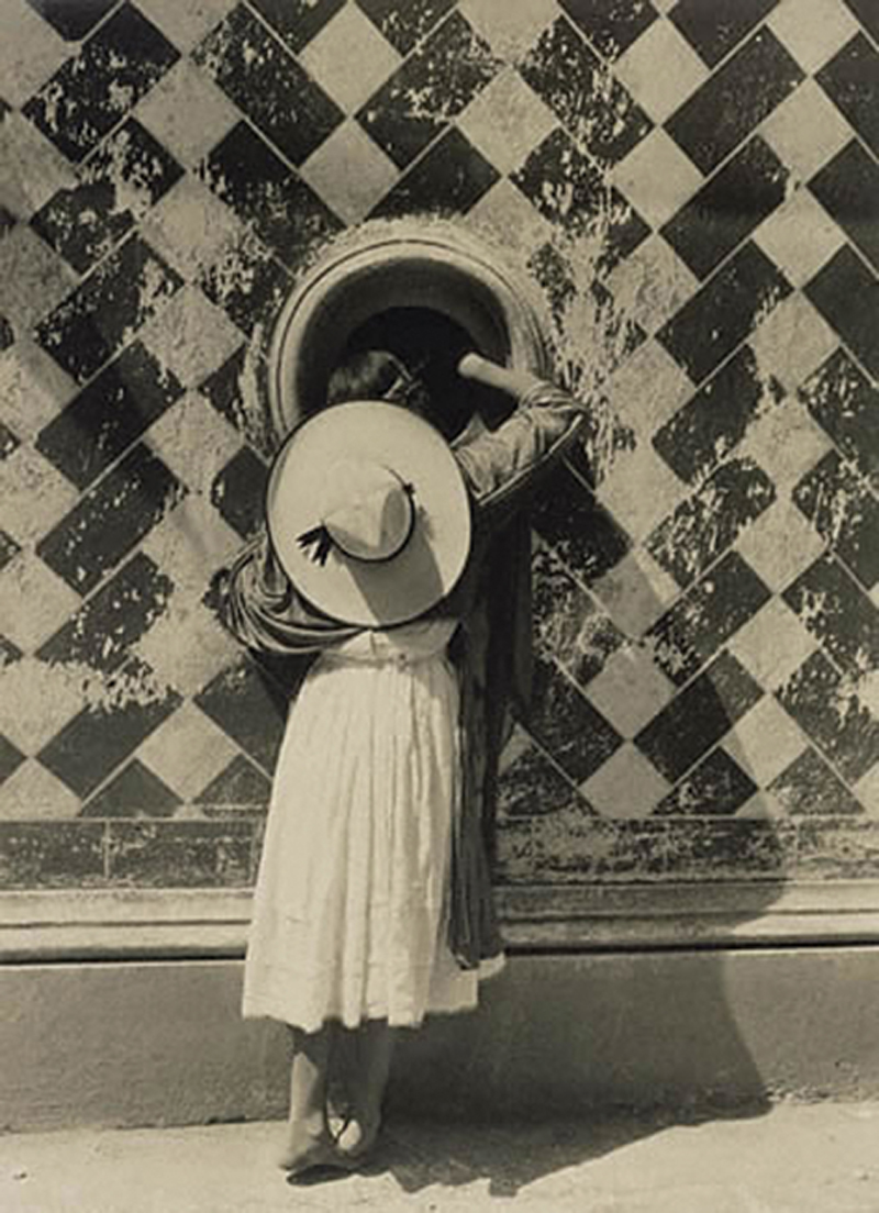
Figure 6.3 The Daughter of the Dancers by Manuel Alvarez Bravo, 1933
Upcoming sections on visual data literacy will add more substance on the bones of this framework, but for now it is important to understand the process of image analysis and the experience of looking at a visual.
6.3. Extending visual literacy to visual data literacy
Before we make the transition from visual communication and cognitive hardwiring to visual literacy, it is useful to note that the insistence on visual literacy is not new. In fact, it is an argument that is both old and perennial (George, 2002). Consider this quote from a turn of the 20th century text on English composition: “In some respects…words cannot compare in effectiveness with pictures. The mere outlines in a Greek vase painting will give you a more immediate appreciation of the grace and beauty of the human form than the pages of descriptive writing. A silhouette in black paper will enable you to recognize a stranger more quickly than the most elaborate description in the world (Gardiner et al., 1902).”
As early as the beginning of the twentieth century, right about the same time as the world’s first self-service cardboard camera—again, the Kodak Brownie—made photography accessible to everyone who could afford the modest price tag (which, by the way, at a price of between one and two dollars is roughly equivalent in today’s value of a few bucks short of $800 dollars), the construct of visual literacy was hot on the list of multiple literacies that complemented the traditional three R’s—reading, writing, and arithmetic—of traditional education. The Dick and Jane elementary reader alerted teachers to the need to pair visual cues with written instruction, and fifty years later the New London Group, finally identified the ability to both read and use visual information as primary among multiliteracies, stating: “literacy pedagogy must account for the burgeoning variety of text forms associated with information… This includes understanding and competent control of reprepresentational forms” (New London Group, 1996).
Even with a vast amount of scholarly literature and academic examination, there still remains much confusion over visual communication, visual rhetoric, and the role of “visual” as a pedagogical construct—what it is, and where and whether or not it belongs in composition. This is particularly relevant as an evolving understanding of the cognitive style construct continues to emerge with today’s advances in multimedia and visual technologies (Stokes, 2002; Mayer & Massa, 2003), making literacy increasingly visual. Earlier in this chapter, visual communication was proposed as a form of communication: the act of engaging in direct or indirect communication through a visual aid that provides the means by which to convey an idea and/or information in forms that rely on seeing (including typography, drawings, designs, illustrations, animations, etc.). Likewise, visual rhetoric is a theoretical framework that describes how such visual images are used to communicate. Both visual communication and visual rhetoric fall under the umbrella term of visual literacy, or the ability to read, interpret, and understand information presented in nonword form (Wileman, 1993) (Figure 6.4). Using visualization approaches, coupled with a focus on increasing information understanding and analysis, leverages our visual cognitive hardwiring and extends visual literacy to cultivate visual data literacy, and furthers the construction of critical and higher-level thinking, encourages data-driven decision-making, and provides the deeper degree of data fluency requisite for data analysis and communication.
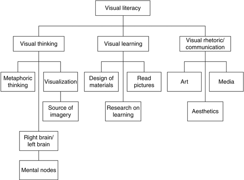
Figure 6.4 Visual Literacy Model
This model is modified from Sandra Moriarty’s diagram in her essay A Conceptual Map of Visual Communication and expanded to include the role of data visualization and rearticulated within the context of visual data literacy.
This model is modified from Sandra Moriarty’s diagram in her essay A Conceptual Map of Visual Communication and expanded to include the role of data visualization and rearticulated within the context of visual data literacy.
6.3.1. Visual learning key to data literacy
As we have discussed in the previous sections, visual learning is part and parcel to intrinsic human cognitive hardwiring as a communication, learning, and memorability mechanism. Further, established learning theories outline how learners acquire different types of information and through which processes (including classic conditioning, behavior theory, functionalism, sign learning, mathematical learning, information processes models, and/or neuron-linguistic programming and cognitive sciences) (Penrose, 2006). As a core construct, many of these support the role of visualization as a key component of learning and retention—visual literacy. The ability to visually learn from and consume information is a core construct of the deeply engrained visualizer–verbalizer hypothesis (wherein learning is a combination of verbal and visual elements) (Stokes, 2002).
Today, visual learning may be tipping the scales of this hypothesis, in terms of both cognitive ability (human capabilities) and cognitive style (how people process and represent information by preference). One possible explanation for this shift could be attributed to the globalization of classroom education increasingly directed to both English speaking and nonEnglish speaking audiences that reduces dependency on verbal instruction and places more emphasis on visual methods of interactive learning to span language and cultural barriers. Another reason for the use of visualization is to compensate for a documented drop in vocabulary, especially across younger generations into the workforce today. It is estimated that the vocabulary of a 14-year old dropped from 25,000 words in 1950 to only 10,000 words in 1999—a reduction in verbal lexis of 60% (Penrose, 2006).
With increasing technological competencies (eg, more advanced statistical and/or visualization tools used in educational settings), the ability to place emphasis on visually-oriented approaches in learning has evolved from an information presentation mindset to the integration of interdisciplinary approaches, designed to cultivate data literacy and critical thinking to support the needs of an increasingly data-dependent and analytical culture. Incorporating more visual elements into learning helps to foster interdependency between the two modes of thought, balancing verbal and visual learning (Stokes, 2002). This approach to learning complements previous research, which has proposed multiple literacies are necessary to meet the challenges of society, including print, visual, aural, media, computer, and ecoliteracy (Kellner, 1998; Stokes, 2002).
6.3.2. Incorporating data into visual learning
In later chapters, we will explore the need for and role of formal data analysis education in data visualization, in addition to statistics and analytical modeling and the convergent relationship of visual analysis and data discovery. Here, within the context of cultivating visual data literacy, the intent is to simply understand that as the need to gather, examine, and explore data becomes increasingly more fundamental across all verticals of industry, it brings alongside it a growing need to introduce and establish data literacy skills to build capabilities for understanding data (Brinkley, 2014). This does not merely support current knowledge workers and business analysts working with data, but is extremely pertinent to next-generation workers entering the workforce and students learning to apply analytical concepts to information. Building on the framework of visual literacy, we can achieve various learning objectives for data literacy by directly leveraging data visualization tools that include elements of design, statistics visualization, and communication. Each of these provides benefit to expanding visual data literacy, including enabling current and emerging visual analysts to think creatively and map conceptual and physical space; helping to examine changes and hypothesize reasons for change; and providing the ability to create persuasive visual representations to support arguments or recommendations (Hitchcock et al., 2014).
To achieve data literacy through visualization, visual learning should be extended to project data in a way that reduces complexity while capturing important information in a meaningful and memorable way. Many case studies in the literature provide the design, prototypic implementation, and evaluation of a framework for contextualized visualization as a learning support mechanism for ongoing, informal (or not focused on a particularly educational objective or provided through formal academic processes), and visually supported learning. However, there are many less academic and more practicable examples of using data visualization mechanisms to foster data literacy, irrespective of subject appeal and within a broader educational context. To meet this need, two major approaches to visual data literacy have been proposed as extensions of traditional visual literacy models. They are, respectively, decode and encode.
6.3.3. Decode
The first is to leverage visualization to read and decode, thus assisting learners with various analytical techniques that includes teaching mathematics and statistics. While students have traditionally been taught to draw graphics to visualize mathematical information, the growth of user-friendly computing technologies has spurred a trend to teach statistical concepts using interactive data visualization tools (Forbes et al., 2014). Further, pictorial vision is a prerequisite for the understanding of the concepts of statistical inference (Moore as cited in Forbes et al., 2014). Putting this theory into practice, an enrichment program for high school students interested in a career in science of mathematics was designed by researchers from North Carolina General Assembly in partnership with JMP Software, an interactive software tool for desktop statistical discovery and division of business analytics software leader SAS. As an experiment, this program was intended to expose students to data in a unique and exciting way by allowing them to engage with information and describe, visualize, and critique data sets from health care, education, and business. With a very limited focus on material covered in traditional mathematics curriculum, students were invited to explore data critically and visually to structure information for summary analysis (Brinkley, 2014). At the end of the program, students had developed a proven capacity to visually work with and understand data, as well as understand the role of data in decision-making.
6.3.4. Encode
The second proposed method to visual data literacy is to encode visuals with data as a communication mechanism. One particularly popular type of visualization applicable under this concept is the infographic, which visually communicates complex quantitative and/or qualitative information through the combination of data displays, lists, graphics, and other data elements (including words) (Toth, 2013). Infographics, which we will explore in detail in a later chapter, have been integrated into collegiate level business courses to highlight literacy concerns and teach students what information is valuable and how to use it effectively. In one study, students were directed to design a meaningful infographic as part of the learning process. Results showed an increase in student engagement and a deeper understanding for the visual data design process, while the production approach of the infographic supported traditional pedagogical elements, such as writing proposals, performing research, and meeting citation and documentation requirements (Toth, 2013).
6.3.5. Special considerations for visual data literacy educators
Visual data literacy is a core competency in the days to come, both for knowledge workers and for educators. To recap, in chapter: From Self-Service to Self-Sufficiency, we discussed the changing academic landscape to facilitate the emergence of new data science roles, how universities and companies alike are addressing a noticeable STEM worker shortage, and the continuing challenges being faced in talent acquisition and retention. In chapter: Navigating Ethics in the Big Data Democracy, we explored how educators are preparing future IT leaders with the ethical competencies they will need to navigate an increasing data-dependent culture. Within the discussion on cultivating visual data literacy, as academics align with the needs and demands of industry for emerging workers, there is an increased expectation to deliver graduates with enhanced knowledge and technical skills that leverage advanced visualization techniques for critical business competencies and data-driven decision-making (Hitchcock et al., 2014). This is driven by a progressively data-reliant and analytical business culture, wherein workers are expected to use data visualization techniques to graphically see business data to clearly interpret meanings, patterns, and trends, and make decisions that affect the business, internal and external stakeholders, and society-at-large. Thus, while the majority of this text is geared toward business and technical audiences, there are special considerations to be paid to those educators interested in integrating visual data literacy as an exemplary educational practice. Many of these considerations will also apply to the methods organizations can employ to provide guided data visualization, which we will explore in the appropriate context later.
Like any use of data visualization, the use of visualization to promote data literacy should be carefully planned. Applying the use of visualizations depends largely on the content, and thus must be used in the appropriate context. While many forms of graphics exist, visualizations that incorporate illustrations and text (the verbalizer–visualizer hypothesis) depict patterns of concepts and ideas that service as frameworks to promote learning, whereas those that steer learners toward exciting presentation can interfere (Stokes, 2002). This includes using visualization in photographs for realism, drawings, diagrams, or maps, as well as deciding when to use visualizations for the effective visual support of data and information (Penrose, 2006). Additionally, visualization must be used within the proper larger educational context, as visualization alone does not maximize achievement (Stokes, 2002).
When using data visualizations to support visual data literacy, highlight connections between visualization, design, and elements of science, and engage students in group critiques to explore and develop a position of personal insight and experience with data visualizations (Dykes et al., 2010). As an intellectual endeavor, providing guided visualization examples has also been acknowledged as a catalyst for creative thought and problemsolving, and offers an innovative pedagogical format for teaching ethics and decision-making alongside complementary frameworks like Six Sigma, which involves the continuous and systematic use of data (Honey-Roses et al., 2013).
6.4. From communication to conversation
As humans, we are hard-wired to communicate, to learn, and to remember visually. From this, we develop the capacity for visual dialog, or as conceived by Nathan Knobler (1972), the exchange that must occur between the artist, his work, and its consumer. Building upon the basis of visual memorability and literacy, cognitive psychologists describe how the human mind, in its attempt to understand and remember, assembles bits and pieces of experiences and information into a story. To aid in this story-building process, we automatically conjure images—visual cues—associated with the story. Stories, then, are not only how we learn, but also a key ingredient to how we remember—visually.
Award-winning writer and director, Robert McKee, said that ultimately the most powerful way to motivate people to action is by “uniting an idea with an emotion.” The best way to do that, McKee says, is by telling a compelling story—where you can not only weave in a lot of information, but you can also arouse the listener’s emotion and energy. He argues that a good story “fulfill[s] a profound human need to grasp the patterns of living—not merely as an intellectual exercise, but within a very personal, emotional experience.” The value of a good story, then, is an experience that inspires more stories. It turns a onesided narrative into a living conversation.
Don’t buy in to the value of a good, visual data story as a vehicle primed for learning and memorability? Good—let me tell you a story to change your mind! At the 2014 Tableau User Conference, astrophysicist and science communicator Neil deGrasse Tyson reminded an audience five thousand strong of data visualization lovers that our human brains are built for learning from graphics rather than pure scientific data. In his keynote, Tyson gave a tour of scientific topics—from the continued disgruntlement abut Pluto’s declassification as a planet to the spectacular rendition of Tyson’s own starry vest in a recent Superman comic book. He debunked the Super Moon idea, showed us the power of correlations in data, and showed the audience a simulation of galaxies colliding and how data and computer modeling was used to deflect Apophis. By the end of his speech, Tyson moved the room to standing ovation—which is not such an easy feat when talking about data.
This, of course, was not the first time that Tyson has used storytelling to help communicate scientific information to the masses. For example, in his National Geographic miniseries Cosmos: A Spacetime Odyssey (a follow-up to Carl Sagan’s 1980s television series of a similar name), Tyson distilled the 14-billion year history of the universe into a digestible 12-month calendar and used it as a visual guide—or, as he was quoted as saying “vehicle of storytelling”—for each of the series’ 13 episodes.
How effective were these vehicles of visual data storytelling? Well, Cosmos won the 4th Critics’ Choice Television Award for “Best Reality Series” and Tyson himself won the award for “Best Reality Host.” The show received a multitude of other nominations and awards, including several Emmys and a 2014 Peabody Award for education. But—more important than awards—what makes Tyson such a celebrated storyteller? It is because he accesses mental models for scientific education, and layers these—along with a fair amount of levity and clever puns—to make the data accessible to a nontechnical audience. He engages the audience in learning that is visual, memorable, and fun. This is the heart of McKee’s quote: uniting an idea with emotion.
Stories engage us: they create bonds through a compelling narrative that help us to learn, connect, retain, and relate information across communities over time. A good story is memorable by design, and, if history proves anything, we tend to share good stories over and over again. Stories spread, and they nurture the interest in future storytelling. However, storytelling alone does not provide the value that we need and using visualization to communicate supports stories in an increasingly more complex world (see Box 6.6). Thus, in the next chapter, we will discuss how narrative visualization differs from other forms of storytelling and the key elements of story structure for telling meaningful data stories with data visualization.
Box 6.6 Storytelling through art
What do you get when you pair the love of books with widely used, general-purpose programming language Python? For entrepreneur Danny Fein, the answer is Litographs, an innovative Massachusetts-based startup that designs projects to lift the text of a literary classic off of the page and transform it into a stunning piece of visual art (Figure 6.5).
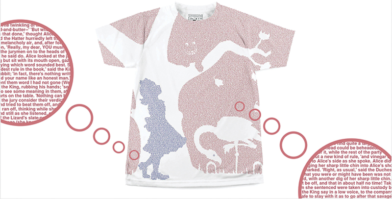
Figure 6.5 Litograph’s Alice T-Shirt
The average litographs t-shirt contains approximately 40,000 words—the length of a short novel.
The average litographs t-shirt contains approximately 40,000 words—the length of a short novel.
Fein left UPenn with a degree in evolutionary psychology and went to work in applied science at a DC-based software company, where he became interested in data visualization. While teaching himself Python through self-written and abstract, slightly-modified script, Fein knew—that he wanted to create something creative while promoting literacy, both at home and abroad. With his creative director, the pair drew up a couple of silhouette concepts and wrote a Python script to translate a raw image into a text data image—and Litographs was born. Today, the company has found its niche in telling stories in a new way, and doing its part to promote global literacy: as of this writing, Litographs offers over 140 titles, and for each poster, t-shirt, and tote bag sold, a new, high-quality book is donated to a community in need.
Through its work, Litographs is helping to keep the beauty of classic literature alive and well to continue to tell traditional stories in an increasingly digital era. “As books become more electronic,” says Fein, “Litographs gives us a new opportunity to find innovative ways to bring people back to the beauty of a classic text.”
In its first major departure from their bread-and-butter business of representing complete texts in a single image, Litographs launched The World’s Longest Tattoo Chain™ as an interactive, community-based project intended to tell Lewis Carroll’s enchanting tales via temporary tattoos. Powered by Kickstarter, and inspired by projects like Shelley Jackson’s SKIN Project (who published a 2,000 word novella across participants’ bodies in single words) and other literary tattoo movements, The World’s Longest Tattoo Chain is an ode to the connection between a reader and a book told in 5,258 unique—and randomly-selected for the recipient—phrases.
“This project provides a new way to visually collaborate with thousands of people in a way that transcends the temporary nature of tattoos and creates a powerful, forever concept,” says Fein. “It’s a visual way for people to come together through literature and art—to stamp themselves as a book lover and participate.” And, it is a project wherein each person is a part of something larger than themselves—telling a global narrative through their personal interpretation of a seemingly out-of-context, mysteriously chosen few words.
In what feels like a natural tie back to the idea of creating artwork from book text, the outcome of The World’s Longest Tattoo Chain project will be a permanent collection commemorating Carroll’s work through the bodies and photos of each participant. Meanwhile, Litographs is already working on the next tattoo chain, hoping to continue finding books that resonate in a new format to produce interesting results and continuing telling stories through beautiful photos.