QuarkXPress has the most advanced text-formatting engine in the industry. But that’s not to say that using it is difficult — in fact, the opposite is true. If you know how to format text in Microsoft Word, you already know how to use those same features in QuarkXPress. But QuarkXPress goes far beyond those features, with an insane number of formatting options to please even the most persnickety typographic expert.
This chapter guides you through all the typographic features, and you learn quite a lot about the art of type in the process.
Learning the Basics of Typography
People have been creating and arranging symbols for thousands of years. In the early days of print, text and symbol wrangling was handled by exacting craftsmen called typesetters, who lovingly set blocks of type onto printing presses (hence the phrase setting type). With the advent of desktop publishing, however, everyone started setting type. The result is both good and bad: It’s great that you can whip up your own yard sale signs, invitations, and posters; but, as you might suspect, the quality of typography has suffered because most people lack professional training.
Some of the most frequent typographic offenses include:
Overusing decorative fonts and using too many fonts per design. Just because you have a ton of wacky fonts doesn’t mean you should use them — especially not all in one document.
Setting whole sentences in capital letters. All-capped text takes people longer to read because we partially rely on the shapes of words and the shapes are lost in ALL CAPS. Even worse, it tends to imply that you’re YELLING. That said, with the right formatting, small portions of all-capped text can look classy.
Underlining text that isn’t a hyperlink. Thanks to the Internet, when people see an underlined word, they assume that it’s a hyperlink. Find another way to make your text stand out, such as bolding or italicizing it.
Centering large bodies of text. It’s best to reserve centered text for formal occasions. To read a long block of centered text, the reader’s eye must jump to a different location when reading each line.
Misusing straight and smart (curly) quotation marks and apostrophes. Use the straight ones to indicate units of measurement (feet and inches) and curly ones for everything else. You can switch between them using QuarkXPress Preferences: Choose QuarkXPress ⇒ Preferences ⇒ Input Settings (Mac) or Edit ⇒ Preferences ⇒ Input Settings (Windows) and select or deselect the Smart Quotes check box.
Misusing hyphens, en dashes, and em dashes:
Hyphens are for combining two words (like “eye-opener”) and for line breaks (when a word gets split across two lines of text).
En dashes are slightly longer than hyphens and are a good substitute for the word to” as in “Chapters 1–4” or “8:00 a.m.–5:00 p.m.” On a Mac, you can create an en dash by typing Option-Hyphen; in Windows, press and hold Ctrl and then press the minus sign on your numeric keypad.
Em dashes are the longest of the bunch and imply an abrupt change — like this! — or a halt in thought or speech. Use them instead of a comma or period when the former is too weak and the latter too strong. To create an em dash on a Mac, press Shift-Option-Hyphen; in Windows, press and hold Ctrl+Alt and then press the minus sign on your numeric keypad.
The names en dash and em dash are derived from the days of lead typesetting when an en dash was the width of the letter N and an em dash was the width of the letter M.
Improperly spaced ellipses (…). An ellipsis indicates an omission, interruption, or hesitation in thought, as in, “But … but … you promised!” Instead of typing three periods (which can get broken across lines), let your computer create the dots for you. On a Mac, it’s Option-; (on Windows, press Alt and type 0133 on the numeric keypad).
There are more typographic offenses, to be sure — such as putting two spaces after each period instead of one. Nonetheless, the preceding guidelines will serve you well throughout the rest of this chapter, if not your entire career.
Measuring something as small as type requires a small unit of measurement. Long ago, English printers — being fond of systems that measure in dozens — invented the system of points and picas. There are 12 points in a pica and six picas in an inch, and therefore 72 points in an inch. The size of a font is determined by the distance between the top of its tallest character (the ascender) to the bottom of the lowest character (the descender) — for example, the top of a lowercase h and the bottom of a lowercase g. That’s why two fonts at the same point size can appear to be different sizes.
Common font formats
Fonts come in various formats that determine how and what kind of information gets stored in each font file. You need to think about only three formats: PostScript, TrueType, and OpenType. If you’ve already created some text in QuarkXPress, you can discover its format by choosing Edit ⇒ Font Menu to take a peek at the Font menu, shown in Figure 9-1. A red A means that it’s a PostScript font (because Adobe invented PostScript); a green TT stands for TrueType; and an O indicates OpenType. Because an OpenType font can be generated from either PostScript or TrueType outlines, the O displays in red for PostScript and green for TrueType.
FIGURE 9-1: The Font menu displays a symbol to the left of each font name to denote its format.
These days, font format isn’t a big deal — any printer with equipment less than 15 years old can print any format you throw at it. But in case you need to know, here’s how the formats differ:
PostScript: Each PostScript font consists of two files: one that contains the shapes that get displayed onscreen (called the screen or bitmap file because monitors display bits or dots) along with font family and letter spacing info, and another that contains outline drawings of each glyph for the printer (commonly referred to as the printer file). If either of the two files becomes separated or lost, the font is unusable. Also, these font files are platform specific: Windows can’t use a PostScript font created for Macs, and vice versa.
If you’re creating a document that will become an e-book, and you want to embed the fonts in the e-book, don’t use a PostScript font — some readers (such as the Kindle) don’t support embedded fonts in the PostScript format. Instead, use a TrueType or OpenType font. To be totally safe, use an OpenType font that was generated from TrueType outlines. These fonts have a green O to the left of their name in QuarkXPress’s font menu, as shown in Figure 9-1.
TrueType: Developed jointly by Apple and Microsoft, TrueType is the most common font format. Both the screen and outline information are stored in a single file, so they can’t be separated or lost. TrueType fonts for Windows can be used on Macs, but not vice versa.
OpenType: This format, created by Microsoft and Adobe, is the new standard. Like TrueType, OpenType fonts store the screen and outline information together in one file. They can store more than 65,000 different glyphs in one font file. This makes them ideal for decorative and pictorial languages like Asian and Middle-Eastern ones, and for other fancy typographic goodness like swashes and stylistic alternates. As an added bonus, you can use the same OpenType font on both Mac and Windows machines.
Font categories
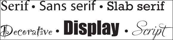
Font designers crank out new fonts daily, with probably more than a hundred thousand available for use. Luckily, you can rely on a few basic principles for choosing a font that’s appropriate to your message — one that will reinforce it rather than distract from it. Figure 9-2 shows examples of the following font categories:
Serif: These fonts have little lines (serifs) that resemble tiny feet extending from their letters’ main strokes. The main strokes vary in thickness, and the serifs help lead the eye from one character to the next. Serifs are great for large bodies of printed text — such as books, newspapers, and magazines — where legibility is paramount. However, they’re not great for large bodies of online text (the next bullet point explains why). Examples include Times New Roman, Garamond, and Minion.
Sans serif: Fonts lacking the aforementioned feet are called sans serif (sans means without). They’re perfect for headlines, subheads, and, surprisingly enough, online body copy. Because their strokes are uniform — they don’t vary in thickness — they display well at small sizes, so they’re ideal for web use. Examples include Arial, Helvetica, and Futura.
Slab serif: These fonts have uniform main strokes and thick serifs. Use them when you want to attract attention, or when you’re printing body copy under less-than-optimal conditions (cheap paper, cheap printer, or fax machine). Examples include Bookman, Courier, and Rockwell.
Decorative, Display: This group includes all kinds of distinctive, eye-catching fonts, from the big and bold, to the swirly, to letters made out of flowers. Though eye-catchingly unusual, they’re harder to read because of the extra ornamentation or stroke thickness. Use them sparingly and on small blocks of text (perhaps a single word). Examples include Impact, Party, and Stencil.
Scripts: Casual scripts are designed to look as though they were drawn (quickly) by hand. Formal scripts have carefully crafted strokes that actually join the letters together, like cursive handwriting. Use casual scripts for small blocks of text (because they can be hard to read), and reserve formal scripts for fancy announcements (weddings, graduations, and so on). Examples include Brush Script, Freestyle, and Edwardian.
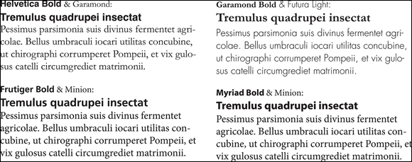
Using fonts together, especially those designed by different designers, is fraught with peril. However, Figure 9-3 shows a few combinations of common fonts that work well when you need a clean, strong headline font and a harmonious font for body copy. Note that the headlines are bolder and a bit bigger than the body copy, and from a different category — for example, a sans-serif headline with a serif body copy, or vice versa.
FIGURE 9-3: Examples of successful font combinations.
Discovering and Replacing Fonts Used in Your Document
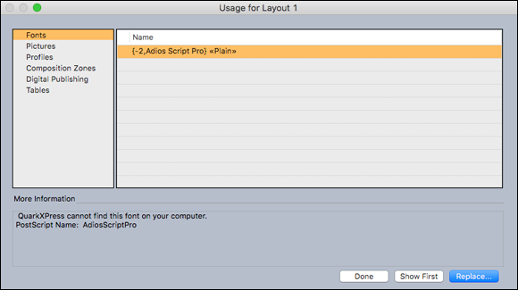
Sometimes it’s handy to know which fonts are used in a QuarkXPress layout — possibly to troubleshoot a printing problem, to identify missing fonts, or even to replace one font with another throughout the layout. In QuarkXPress, all the fonts used in a layout are listed in the Usage dialog box, shown in Figure 9-4. To open it, choose Utilities ⇒ Usage. To see a list of fonts used in the layout, click Fonts in the left panel.
FIGURE 9-4: The Fonts section of the Usage dialog box.
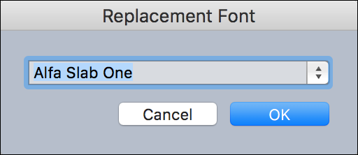
If a font is missing, the More Information box at the bottom of the Usage dialog box will say so, as shown in Figure 9-4. To replace a missing font, select it in the list, click Replace (in the lower-right corner), and choose an active font.
If you’re not sure where a font is used in the layout, or if you just want to be sure you’re replacing what you intend to be replacing, the Usage dialog box can help. To see where the font is first used in the layout, click Show First (which then becomes Show Next). To see the next place that it’s used, click Show Next.
Working with font mapping rules
When you open a project, QuarkXPress checks to make sure that all the fonts used in it are active on your system. If they’re not, a Missing Fonts alert gives you the opportunity to replace missing fonts with active fonts. You can save those replacements as font mapping rules, which QuarkXPress can apply automatically each time you open a project. (If you don’t replace a missing font when you open a project, text that’s supposed to be using that font is displayed in a standard system font — usually Lucida Grande or Lucida Sans Unicode — and highlighted in pink.)
To create a font mapping rule, follow these steps:
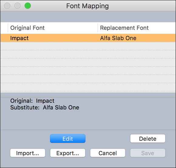
To change, delete, or share font mapping rules, choose Utilities ⇒ Font Mapping to open the Font Mapping dialog box shown in Figure 9-8. There, you can click Edit to change the replacement font, Delete to remove the rule, Export to export your rules as a file that can be imported for use by other QuarkXPress users, or Import to import an exported set of rules.
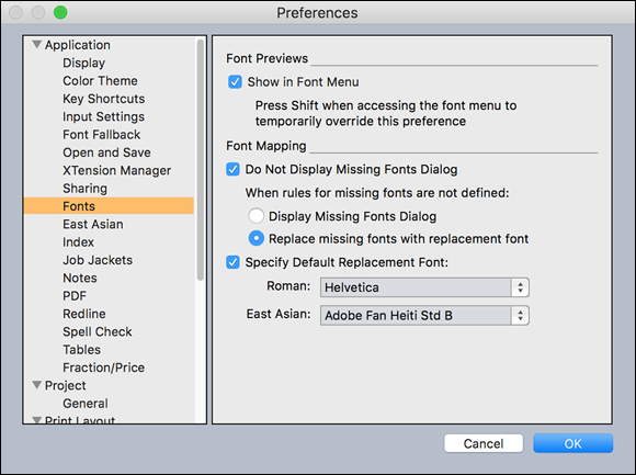
To specify a default replacement font and to control whether the Missing Fonts alert displays when you open a project with missing fonts, open QuarkXPress Preferences, and in the Application section, go to the Fonts pane and turn the relevant check boxes on and off, as shown in Figure 9-9.
If you have a bunch of projects whose fonts you want to change, try this: Use your font management utility to deactivate the fonts that you want to replace, open one of the projects that uses them, and create a font mapping rule for each font. Then open all the projects whose fonts you want to change, and QuarkXPress replaces the missing ones according to your font mapping rules. Save the projects. You can then reactivate the original font for use in other projects.
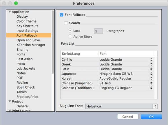
When Font Fallback is enabled, if QuarkXPress encounters a character that is not available in the current font, it searches through your active fonts to find a font that does include that character. For example, if Helvetica is the current font, and you import or paste text containing a Kanji character, QuarkXPress might apply the Hiragino font to that character. If the application cannot find an active font that contains the character, the character displays as a box or symbol.
Font Fallback is enabled by default, but if you need to disable it, open QuarkXPress Preferences, go to the Application section, click Font Fallback in the left pane to open the Font Fallback pane, and deselect the Font Fallback check box shown in Figure 9-10.
Font Fallback uses the first font it finds that has the character you need. If you prefer a different font for that character, choose Edit ⇒ Find/Change to use the Find/Change feature described in Chapter 11, which lets you change the font everywhere in your layout.
Choosing to Use the Measurements Palette
Seemingly, people prefer to format text and other items on the page in three ways:
By typing keyboard shortcuts
By clicking icons in a palette
By choosing menu items
None is better than the others, but some are more efficient. Generally, using a keyboard shortcut is the fastest because you don’t move your hands from the keyboard. However, keyboard shortcuts require memorization and repetition to become proficient.
Using a palette often gives you the most options, because a palette can contain any control imaginable. However, the purpose of each tiny icon often isn’t obvious until you’ve used it a few times.
And while menu items are easiest for beginners to figure out because they’re text-based, they’re also limited by the way menus work — for example, you can’t type a value into a menu item.
In this chapter, you focus on using the Character/Character Attributes tab of the Measurements palette to format text because it contains every control you need. Figure 9-11 shows the Character tab.
FIGURE 9-11: The Character tab of the Measurements palette.
Selecting a typeface
Choosing typefaces for your project is a lot like choosing an outfit to wear to an event. Even though it’s the same “you” (words) under those clothes, people react to you differently based on what you wear (typefaces). Your local bookstore has plenty of good books on choosing and combining typefaces for a variety of purposes. For some truly entertaining enlightenment, hop on over and peruse their collection.
In the long-ago time of trained typesetters (before computers), typeface had a very specific meaning, as did font. Those meanings have been blurred because digital fonts behave quite differently from individual letters carved out of wood or metal. Today, you might think of a typeface as a family that may include several styles and weights of fonts. For example, the typeface Helvetica includes many fonts, such as light, medium, bold, black, oblique, condensed and extended. (Type aficionados may argue with you about this simple way of thinking, but it works for this book’s purposes.)
Applying a typeface
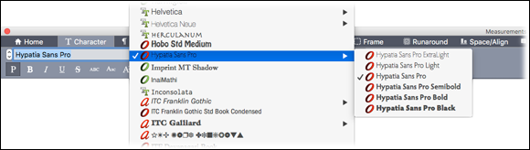
To apply a font to selected text, choose its name from the Font drop-down menu in the Home/Classic or Character/Character Attributes tab of the Measurements palette, as shown in Figure 9-12. QuarkXPress tries its best to present its font menu to you as a list of typefaces whose individual fonts or font styles are available in a flyout menu to the side of the typeface name. Some fonts don’t behave this way, so you may see some as separate fonts stacked on top of each other in the menu.
FIGURE 9-12: The Font drop-down menu of the Measurements palette.
The fastest way to choose a font to press Command-Option-Shift-M (Mac) or Ctrl+Alt+Shift+Mt (Windows) to jump directly to the font field in the Measurements palette. Then enter the first few characters of the font name. When the font you want is selected, press Return (Mac) or Enter (Windows).
To scroll up or down the list of fonts and see your text formatted in each of them, click the up or down arrow at left of the Font drop-down menu or use the following keyboard shortcuts:
Up: Press Option-F9 (Mac) or Alt+F9 (Windows) on your keyboard.
Down: Press Shift-Option-F9 (Mac) or Shift+Alt+F9 (Windows) on your keyboard.
On a Mac, each font in the list is displayed in its own typeface. To enable that feature in Windows, choose Edit ⇒ Preferences, click the Fonts section, and select Show in Font Menu under Font Previews.
Some font names are unreadable when displayed in their own typeface — dingbat and symbol fonts, for example. To temporarily show all font names in the system font, press the Shift key as you click the font menu.
The icons next to the font names indicate the font’s file format: An A denotes a PostScript font; an O denotes an OpenType font; and a TT denotes a TrueType font. Knowing a font’s format can be useful when creating e-books in EPUB format, because they only allow you to embed TrueType and OpenType fonts.
Choosing a font size
Your choice of font size depends to a great degree on the kind of document you’re creating (an invitation is quite different from a newsletter), and the medium on which it will be read (print or digital). Adding to the fun, different fonts appear to be different sizes even when set at the same font size. Trial and error can be fun — just be sure to print your design to judge the fonts, rather than relying on your computer display (which is notoriously deceiving).
To set the font size for selected text, you can take any of these actions:
Click the up or down arrow at the left of the font size field. This increases and decreases the font size to preset standard sizes (7, 8, 9, 10, 12, 14, 18, 24, 36, 48, 60, and 72).
Click the up or down arrow at right of the Font Size field and choose one of the preset sizes.
Select the current font size in the font size field and type in any value between 2 and 16,128 points.
Use the following keyboard shortcuts (Mac users substitute Command for Ctrl and Option for Alt):
Increase 1 pt: Ctrl+Alt+Shift+>
Decrease 1 pt: Ctrl+Alt+Shift+<
Increase in preset range: Ctrl+Shift+>
Decrease in preset range: Ctrl+Shift+<
Applying and removing a type style
To apply a style such as Bold, Italic, Underline, Strikethrough, All Caps, Small Caps, Superscript, or Subscript, click the buttons below the Font field. To apply other styles, including Word Underline, Double Strikethrough, Outline, Shadow, or Superior, click the Text Styles button (f) and choose the style from the drop-down menu that appears. I don’t know why some of these styles appear in both places but others appear in only one — it’s just one of those things.
When you apply the Bold, Italic, or Bold Italic styles to a font, behind the scenes QuarkXPress looks to see whether that font has a true Bold, Italic, or Bold Italic style built into it. If it does, QuarkXPress uses that style. If it doesn’t, QuarkXPress asks your computer’s operating system to generate a fake style, which can result in strange-looking type. Because using fake font styles is a bad idea, QuarkXPress alerts you when this happens by displaying a warning icon on the Bold or Italic buttons.
To remove all styles you applied to selected text and return it to the base font style, choose Remove All Styles from the Text Styles (f) drop-down menu.
Breaking ligatures apart
The ligature button (fi) lets you break apart and recombine ligatures. (A ligature is a single character that combines and replaces two or three other characters, such as fi, fl, ff, or ffi. These special characters are created by the font designer to avoid having parts of characters collide with each other, such as the dot on the i bumping into the top of the f, or the top of an l or f overlapping the top of an adjacent f.) To replace these combinations of letters with the ligature characters included in a font, select the text and then click the ligature button (fi). To break a ligature apart into its separate letters, select it and click the ligature button again.
Applying OpenType styles
Some advanced OpenType fonts (they usually have Pro in the name, such as Warnock Pro, Myriad Pro, or Adios Pro) have intelligence built into them that lets them use different versions of characters when they fall next to other specific characters, or in specific locations in a word or sentence. Take swashes for example (a swash is the swooshy bit that extends from the end of some characters in a script font): An advanced OpenType font may include several different versions of the same character that have different swashes attached to them and it can choose the correct swash depending on whether the character falls at the beginning or end of a word, as shown in Figure 9-13.
FIGURE 9-13: The Adios Script Pro font, with no OpenType styles applied (left), Contextual Alternates applied, (center) and Swash applied (right).
Other advanced OpenType options convert fractions that you type into true fractions, and replace stylized small caps with true small caps (not squished versions of capital letters).
The OpenType button (O) lets you apply any combination of features available in the selected OpenType font. Features that are not available in the selected font have brackets around them, as shown in Figure 9-14.
FIGURE 9-14: The OpenType drop-down menu with Stylistic Sets exposed.
Some font designers create combinations of advanced OpenType features to spare you the trial and error of finding which features work well together — and they call these combinations Stylistic Sets. To try them, select some text and apply one Stylistic Set at a time. As with other advanced OpenType features, QuarkXPress places brackets around all Stylistic Sets that aren’t available in the currently selected font, so choose one that isn’t in brackets.
Controlling text spacing
As I mention earlier in this chapter, fonts are not like clip art — they’re small programs that are used by an application to set type. Among the intelligence a font designer builds into every font is the optimum amount of space that should appear between all the letters in the font (tracking), the width of spaces between words (word space tracking), and the optimum space between specific pairs of letters (kerning).
QuarkXPress lets you adjust the spacing between characters to suit your own aesthetic sense:
Kerning: Kerning refers to the space between a pair of letters. To adjust kerning, place the text insertion point between two letters; then, in the Kern Amount field, type a new value or use the up or down arrows at its right to increase or decrease the amount.
Tracking: Tracking refers to the space between all the letters in a selection of text. To adjust tracking, select some text, then in the Track Amount field, either type in a new value or use the up/down arrows at its right to increase or decrease the amount.
Word space tracking: This refers to the space between all the words in a selection of text. To apply word space tracking, use these keyboard shortcuts:
Tracking value
Mac OS X Command
Windows Command
Increase space by .05 em
Command-Control-Shift-]
Control+Shift+@
Increase space by .005 em
Command-Control-Option-Shift-]
Control+Alt+Shift+@
Decrease space by .05 em
Command-Control-Shift-[
Control+Shift+!
Decrease space by .005 em
Command-Control-Option-Shift-[
Control+Alt+Shift+!
Baseline shift: The distance you manually apply to raise a letter above its normal position. To shift the baseline of selected text, type a new value into the Baseline field or use the up or down arrows at its right to increase or decrease the amount.
Assigning color, shade, and opacity
To apply a color to selected text, click the Text Color icon and choose among the colors available in the layout. You can also choose New and create a new color. (For more on creating and managing colors, see Chapter 15.)
To adjust the intensity (shade) of the color, you can type a new value in the Shade field to the right of the Text Color icon or click the up or down arrow to the right of the Shade field and use the slider that appears to choose a new value.
To adjust the opacity of the color, type a new value in the Opacity field to the right of the Opacity icon or click the up or down arrow to the right of the Opacity field and use the slider that appears to choose a new value. (Opacity is a measure of how much an item blocks your ability to see items behind it: 100 percent opacity blocks all light from showing through.)
Applying Special Effects
Besides choosing and adjusting the attributes built into fonts, QuarkXPress also lets you stretch the height and width of the characters, convert ugly fractions to less-ugly fractions, format prices, and add drop shadows.
Stretching text
QuarkXPress lets you stretch the characters in selected text both horizontally and vertically for a special effect. The result can be very strange, so use with caution. Here’s how to stretch text:
Horizontally: To scale text horizontally, select the Scale Text Horizontally radio button and then type a new value in the Scale field to its right or click the up or down arrow to the right of the Scale field to increase or decrease the value by 10 percent increments.
Vertically: To scale text vertically, select the Scale Text Vertically radio button and use the same technique as described in the preceding bullet.
Scaling text horizontally can be useful for fitting text into a slightly smaller space, but scaling it more than 5 percent in either direction will be visible (and annoying) to most people. If possible, use a slightly smaller font size or choose a condensed version of the font.
Converting fractions and prices
The vast majority of fonts contain the numbers 0–9 and possibly a built-up fraction or three. But of course you can type these numbers to create an almost infinite array of fractions and prices. The problem is, when you create fractions and prices this way, they look horsey and interrupt the flow of text. QuarkXPress attempts to help you by providing features that resize and reposition these numbers to look more like true fractions and prices, as shown in Figure 9-15.
FIGURE 9-15: Fractions and prices, as typed (top line) and converted in QuarkXPress (bottom line).
Here’s how to perform conversions for fractions and prices:
Fractions: To convert a typed fraction to something that looks more like a true fraction, select all the characters in the fraction and choose Style ⇒ Type Style ⇒ Make Fraction. This makes the first number smaller and moves it up, replaces the slash with a virgule (a more vertical slash that doesn’t extend below the baseline of the text), and reduces the size of the number after the slash.
If your text is formatted with an advanced OpenType font that includes fractions, it will look far better than the effect you can achieve using the Make Fraction command in QuarkXPress. Before converting a selected fraction, check to see whether the Fractions option is available in the OpenType drop-down menu in the Measurements palette. If you don’t see brackets around the Fractions option, the font has true fractions in it and you can choose select the Fractions option in the OpenType drop-down menu to convert your fraction to a true fraction.
Prices: To convert a price to what you often see in grocery stores or newspaper ads, select all the characters in the price and choose Style ⇒ Type Style ⇒ Make Price. This removes the period or comma between, for example, dollars and cents, reduces the size of the cents, raises it up, and underlines it.
Controlling the conversion: The default way that QuarkXPress converts fractions and prices is fine for how most people prefer fractions and prices to look. However, you can control how the characters in fractions and prices are formatted when you subsequently use this feature. To do so, choose QuarkXPress ⇒ Preferences (Mac) or Edit ⇒ Preferences (Windows); then, in the Application section, click Fraction/Price, as shown in Figure 9-16.
The Offset value determines how much higher or lower the character will be than normal. The Scale values determine its size. The Kern value determines how close the number will be to the slash (virgule). Keep the Fraction Slash check box selected to replace the standard slash (which descends below the baseline) to a virgule (which is slightly less tilted and stops at the baseline). Selecting the Underline Cents check box adds an underline beneath the cents amount, and selecting the Delete Radix check box removes the period or comma.
Converting fractions and prices is a one-way street: QuarkXPress changes the size and position of characters just as if you had done it manually. If you don’t like what you see after converting a fraction or price, immediately choose Edit ⇒ Undo Style Change. Otherwise, you’ll need to retype the fraction or price and restyle it to your liking.
Using drop shadows for text
First, forget ever applying the Shadow style in the Measurements palette to your text. It’s unbearably ugly, and you have no control over its appearance. Instead, use the Drop Shadow feature in QuarkXPress, as described in Chapter 13 — and use it only on large text, because although you may be able to make a drop shadow on small text look okay on your display, it will look terrible when printed.
Inserting Special Characters
Some text characters aren’t available by typing the keys on your keyboard. Examples of characters that aren’t on your keyboard are automatic page numbers, alternate characters in advanced OpenType fonts, and invisible characters that control text wrapping. Read on to find out how to insert these characters into your text.
Inserting hyphens, invisible characters, and automatic page numbers
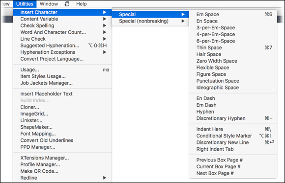
Some common typesetting characters aren’t on your keyboard, such as the en and em dashes and other varying-width characters. Also, QuarkXPress has its own invisible characters that help you control how text breaks and flows. All these oddball characters are considered special characters. To insert a special character, you choose them from the Special Characters menu. To get there, choose Utilities ⇒ Insert Character ⇒ Special. Figure 9-17 shows the Special Characters menu.
The top section of this menu includes space characters of various widths. They’re useful when aligning text or numbers in columns, or for specialized typesetting projects. (In all my years of using QuarkXPress, I’ve never used them — but then, I don’t typeset financial reports.) For a complete rundown on what each one does, please see Quark’s QuarkXPress 2016 User Guide.
The next section of the menu contains the following characters:
En Dash: This character is approximately the width of an uppercase N in the current font. Use it between a range of numbers, dates, and other types of ranges.
Em Dash: This character is approximately the width of an uppercase M in the current font. Use it when you’re tempted to use two hyphens.
Hyphen: This is a regular hyphen.
Discretionary Hyphen: This character inserts an invisible command character that tells QuarkXPress to hyphenate the word at that location if it falls at the end of a line. If the paragraph rewraps so that the word is no longer at the end of a line, QuarkXPress automatically removes the hyphen.
The third section of the Special Characters menu includes these characters:
Indent Here: Indents all lines below the first line in a paragraph to that location. Use this character as an easy way to create a hanging indent.
Conditional Style Marker: Inserts an invisible marker that tells a conditional style to change to the next format. See the section on conditional styles in Chapter 10 for more about using this character.
Discretionary New Line: Inserts an invisible command character that tells QuarkXPress to start a new line at that location if this character falls at the end of a line, and to do so without inserting a hyphen.
Right Indent Tab: Inserts a special kind of tab that causes the text after it to align with the right edge of the text box. If you resize the text box, the text will still align with its right edge.
The last section of the Special Characters menu contains automatic page number commands that insert and automatically update the page numbers of boxes in a chain of linked text boxes:
Previous Box Page #: Inserts the page number of the box immediately before the current box in the chain of text boxes
Current Box Page #: Inserts the page number of the current text box
Next Box Page #: Inserts the page number of the box immediately after the current box in the chain of text boxes
Using the Glyphs palette for other special characters
The Glyphs palette is a portal to the magic world of special characters. When you need to find a specific dingbat or symbol character, or a specific alternative character for an advanced OpenType font, choose Window ⇒ Glyphs to open the Glyphs palette, shown in Figure 9-18.
FIGURE 9-18: The Glyphs palette (left) and the Glyphs palette with its selection menu displayed (right).
A glyph is the correct term for a single character, letter, or squiggle in a font. As its name implies, it means simply “shape with meaning,” so it can refer to any item in the tens of thousands of characters that can be included in an OpenType font.
Here is how to use the Glyphs palette:
Display all the characters (glyphs) of a font: Choose that font in the palette’s font menu and its glyphs display in the grid in the center of the palette. If you select a character on the page, the palette’s font menu displays that font for you.
View the Bold, Italic, or Bold Italic variations of a font: Click the B and I buttons. To change back to the plain variation, click the P icon.
Change the size of the glyphs and the grid: Click the magnifying glass icons.
Change the size of the glyphs within the grid: Use the Adjust Font Size slider.
Filter the glyphs being shown: Choose items on the drop-down menu under the font name to do the following:
If the active font is an advanced OpenType font (that type of font usually has “Pro” in its name) and you select a character on the page, you can then choose Alternates for selection to see alternatives for that character.
To see only the glyphs used in European languages, choose European characters.
If the active font is an advanced OpenType font, categories of its special characters are listed in the second section of the menu. Choose one to display only those glyphs.
To see only the symbols in a font, choose Symbols from the bottom section of the menu.
Find a specific character: Type it into the Find field. To find a glyph that you can’t type on your keyboard and whose Unicode value you know, type the Unicode value into the Find field and choose Unicode Value from the drop-down menu next to it.
Insert a glyph at the insertion point in the active text box: Double-click the glyph you want in the Glyphs palette.
Save a favorite glyph for future use: Drag the glyph you want to save into the Favorite Glyphs area at the bottom of the palette. You can then double-click it there to insert it into your text.
Setting Typographic Preferences
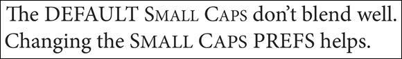
The Small Caps, Superscript, Subscript, and Superior characters built into advanced OpenType fonts are designed by the font designer to harmonize with the other characters in the font. But if you rely on QuarkXPress to format less advanced fonts with these styles, you may notice that they look a bit clunky — especially the Small Caps style. If so, you can change the Character settings in QuarkXPress Preferences so that these characters are scaled to better match the other text.
The Superior and Superscript styles are identical unless you change one or both of them in QuarkXPress Preferences. You can use this to your advantage if you need a small, raised style for a number and also need a slightly less small or more raised style. To create these style options, change the horizontal and/or vertical scale of one of them, and optionally change the Offset percentage of the Superscript style to move that character up or down.
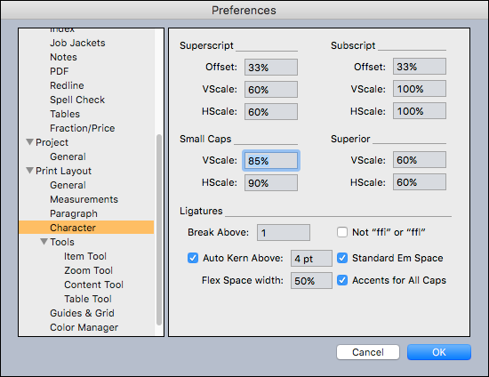
To scale these characters, open QuarkXPress Preferences, and in the Print Layout section in the left panel, click the Character category to display the Character Preferences dialog box shown in Figure 9-19.
FIGURE 9-19: The Character Preferences dialog box.
For better Small Caps, change the Vscale value to 85% and the Hscale value to 90% wide. This makes the Small Caps characters look slightly thicker, which more closely matches the weight of the tall caps. Figure 9-20 shows an example of the Small Caps style using the default settings (top) and adjusted to 85% vertical and 90% horizontal scaling (bottom).
If you change Preferences settings when a project is open, the changes apply to only that project. If you change them with no project open, the changes apply to all new projects that you create after that.
Controlling Text Greeking
In the bad old days of low-powered computers, displaying a page of formatted text took a lot of horsepower. So, QuarkXPress employed a feature called greeking that displays your text as gray bars when you zoom out far enough. These days, greeking is turned off by default, but you can enable it by opening QuarkXPress Preferences, choosing Print Layout ⇒ General, and selecting the Greek Text Below check box.
Sometimes when showing your client a layout, the client focuses on the text rather than the overall arrangement of items on the page. To keep the focus on the layout, you can use the Greeking feature to obscure the text in your layout. To do this, select the Greek Text Below check box, as explained in the preceding section, and type a large number into the Greek Text Below field — try 100 pt to start. Then when you view your layout at Actual Size, all text smaller than 100 pt will appear as gray bars; but if you zoom in far enough, the text will begin to show itself. If you don’t want your client looking at the pictures, select the Greek Pictures check box at the right of the Greek Text Below check box as well.
Working with Language Features
QuarkXPress is a multilingual publishing program. You can type or import text in any of dozens of European and East Asian languages, and QuarkXPress can correctly spell check and hyphenate for each one. The trick is to assign a language to the text so that the program knows which dictionary to use.
Choosing a language for spelling and hyphenation
QuarkXPress can correctly hyphenate and check the spelling of dozens of languages. Unless you tell it otherwise, it assumes that the language of your text is the same as the language of your operating system.
You can assign a language to selected text by using the Language drop-down menu in the Character/Character Attributes pane of the Measurements palette. You can also assign a language to both character and paragraph style sheets.
Enabling East Asian languages
QuarkXPress has the most powerful text engine for Chinese, Japanese, and Korean (CJK) in the industry, but by default, this text engine is turned off. To use these languages, open QuarkXPress Preferences, scroll down to the Application section in the left panel, locate the East Asian area, and select the East Asian Functionality check box. When you relaunch QuarkXPress, all the CJK features are then available.
 Learning typographic basics
 The names en dash and em dash are derived from the days of lead typesetting when an en dash was the width of the letter N and an em dash was the width of the letter M.
 Measuring something as small as type requires a small unit of measurement. Long ago, English printers — being fond of systems that measure in dozens — invented the system of points and picas. There are 12 points in a pica and six picas in an inch, and therefore 72 points in an inch. The size of a font is determined by the distance between the top of its tallest character (the ascender) to the bottom of the lowest character (the descender) — for example, the top of a lowercase h and the bottom of a lowercase g. That’s why two fonts at the same point size can appear to be different sizes.
 If you’re creating a document that will become an e-book, and you want to embed the fonts in the e-book, don’t use a PostScript font — some readers (such as the Kindle) don’t support embedded fonts in the PostScript format. Instead, use a TrueType or OpenType font. To be totally safe, use an OpenType font that was generated from TrueType outlines. These fonts have a green O to the left of their name in QuarkXPress’s font menu, as shown in