Chapter 3. Defying Logic
The Black and White on Converting to Black-and-White in Camera, Black-and-White Conversion in RAW Processors, and to Grayscale in Photoshop
Belief is the death of intelligence.
—Robert Anton Wilson
The Camera & the RAW File
The more things change, the more they remain the same.
—Jean-Baptiste Alphonse Karr
Back in the day, which manufacturer of the camera you used did not matter as much as it does today. Camera manufacturers did not make film; they made lenses and camera bodies. They did not concern themselves with what film you used or the chemistry of emulsions and film bases. Their only concern was that the film be manufactured in such a way to fit in the camera. Film was interchangeable. You chose color slide, color negative, black-and-white, infrared, high speed, fine grain, and other film types based on what you needed in the moment. In other words, a camera was just a camera.
Today, things are different. Cameras are built around CMOS or CCD sensors. In a sense, the sensor is the film emulsion, and the file that is produced is the digital negative. You now make buying decisions about a camera not only for the mechanical features you desire, you also purchase a camera based on how the camera records the image. The boon of digital photography is that you have complete and total access to all of the information. The bane of digital photography is that you now have complete and total access to all of the information in the file.
A color file is also a black-and-white file; however, a black–and-white file is not really black-and-white but chromatic grayscale. If you want to shoot infrared (IR), you need to have a camera physically modified and dedicated to shoot just IR. If you need to shoot high ISO, you need to choose a camera—not a film you could put into a camera—to accomplish this. If you want super high resolution, that is yet another camera you will need. Why? Because the sensor is the film, and the camera is the transport device for the sensor.
What has remained the same is this overarching goal: always try to get it right in the camera. What has changed is what that now means. In this chapter, I would like you to think about getting it right in the camera, RAW files, and RAW processors. For some, getting it right in the camera is the start and end of the process; if it is right in the camera, this is the truth that you have captured with the camera, and it is your final product. If you expect more from your captures and shoot RAW files, you have to use some sort of RAW processor. RAW processors are designed to help you get the most of your digital captures (RAW files), and ensure that when you get it close in the camera, you can then make it right. Both the camera and RAW processors are capable of creating chromatic grayscale images—with their own peccadilloes. In the next lessons you will see the possibilities of using in-camera conversions and RAW processor conversions to a chromatic grayscale image.
In Camera Conversion
If you believe as I do that Photoshop is not a verb, but a noun, and that your goal should be to get as much right as possible in the camera, then logically, you should set the camera to capture in black-and-white and be done with it. This is great in theory, but less so in practice. When you set the camera to black-and-white mode, the camera creates a file that has equal values of R, G, and B. That means that there is no difference in grayscale value among the three channels (as you saw in the previous lesson) and that all three channels will be light and dark in exactly the same places. As a tonal reproduction curve goes, all you have recorded is merely luminace. (See sidebar: Terms of Engagement in Chapter 1 for a discussion of a tonal reproduction curve.) This means that your file will have all the file size of a full color capture and and none of the interplay among all the colors that is the key ingredient to creating the best possible image. In other words, you have a file that is the same size as the one with which you begain, but with two-thirds of the data missing. In addition, the file is 8-bit and not 16–bit, so the bit depth that is needed to help in the minimization of artifacts during the image editing process leading to conversion from a color image to a chromatic grayscale image is also lost (Figures 3.1, 3.2, 3.3, and 3.4).

Figure 3.1. RAW digital image
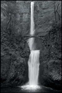
Figure 3.2. After in-camera conversion
Figure 3.3. Converted using the Film and Filter technique
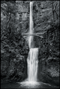
Figure 3.4. Converted using Silver Efex Pro 2 in Photoshop
There is a file that has all of the conversion techniques discussed in this lesson and the previous one. The CH01-03_COMPARE.psb file located in the Chapter 3 section of the download page for this book.
Look at a 16-bit image (in which I have done an Auto Levels adjustment) and its histogram before and after converting from 16-bit to 8-bit. Look also at an 8-bit image (and its histogram) in which I have done the same auto levels adjustment. Note that there is more detail, smoother transitions, and significantly less noise (the 16-bit file). The white gaps in the histogram represent missing information or clipped data (Figures 3.5, 3.6, 3.7, 3.8, 3.9, 3.10, 3.11, 3.12, and 3.13).

Figure 3.5. Before Auto Levels adjustment
Figure 3.6. 16-bit image after Auto Levels adjustment
Figure 3.7. 8-bit image after Auto Levels adjustment
Figure 3.8. Close-up of the 16-bit image after Auto Levels adjustment

Figure 3.9. Close-up of the 16-bit image converted to 8-bit
Figure 3.10. Close-up of 8-bit image after Auto levels adjustment
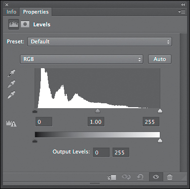
Figure 3.11. The histogram of the 16-bit file before Auto Levels adjustment
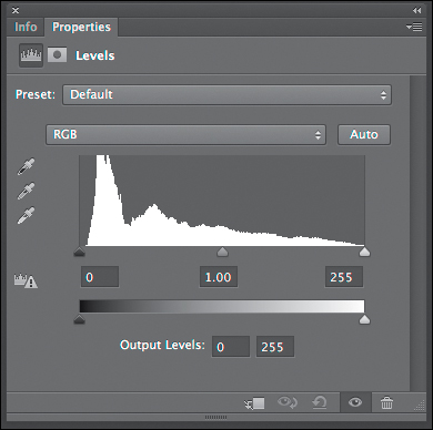
Figure 3.12. The histogram of the file after Auto Levels and converted to 8-bit
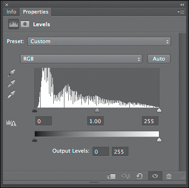
Figure 3.13. The histogram of the 8-bit file after Auto Levels adjustment
As I discussed at great length in Welcome to Oz 2.0, artifact creation is cumulative and may be multiplicative. The goal of any fine-art workflow is to develop one that minimizes the cumulative and tries to negate the multiplicative aspects of artifact production. Working in 16-bit and in the ProPhoto color space is a significant step toward achieving this goal.
What I have done is for illustrative purposes only. I do not suggest that you ever do this to an image. Also, this image’s color is unacceptable after doing an Auto Levels adjustment.
When you compare these images, you will see that there is considerably more image structure to be had from doing the conversion using software rather than doing it in the camera.
Living in the World of 2%: 16-bit vs. 8-bit
Basically, computers know only two things: 1 or 0; on or off. There is no gray; their world is black and white. All images are recorded as a bunch of 1’s and 0’s. This means that for a one bit image, each pixel will be either pure black or pure white. In the binary world of digital images, the number of tonal values that a pixel can have is equal to 2 raised to the power of the number of bits. For a 1-bit image, the number of levels of gray equals 21. To create a continuous tone image, you need to have more than just one bit, so that you can have more choices than 21 = 2. Modern digital cameras record in either 8-bit, 12-bit, or 14-bits with the 12-bit and 14-bit capture being rendered to 16-bits when processed in RAW conversion software. This means that an image that is captured in 8-bit is a file that has 2 to the 8th power (28)or 256 levels or “shades” of gray per channel. A 14-bit capture that becomes a 16-bit file during the RAW conversion process, has a 2 to the 16th power (216) or 65,536 levels or “shades” of gray per channel. An 8-bit, RGB color image will have 256 levels for each color channel or 16,777,216 possible colors, and a 16 bit RGB color image will have 65536 levels for each color channel or 281,474,976,710,656 possible colors.
What this means to your image is that 16-bit files, using a ProPhoto RGB color space, show fewer artifacts because they have the potential for more data. Even though the grayscale aspect of the image can easily be reproduced in the sRGB color space and in 8-bit, the underlying color image is capable of reproducing significantly more color than can be contained in that space. This is why it is best to work in the ProPhoto color space with its larger number of possible colors. In the ProPhoto RGB color space, you have more information and a greater color range, and that translates into smoother transitions, and less pixilation and banding (Figures 3.14 and 3.15).
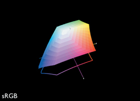
Figure 3.14. sRGB color space
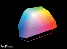
Figure 3.15. ProPhoto RGB color space
In RAW Processor Conversions
The cleanest state the data of your image file will ever be in is in the RAW file that the camera creates at the moment of capture. As soon as you open that file in whatever RAW processor you choose (Lightroom 4, Capture NX2, Aperture 3, etc.) and do anything to it, you are clipping data. And, the instant that you start clipping data from the file is the moment that you start introducing artifacts. All artifacting is cumulative and may be multiplicative, which means that a small amount of artifacting introduced at the beginning of an image’s workflow, has the potential of being amplified into something profoundly visible at the end of the workflow.
Therefore, as you work on an image, you want to clip as little of the original source data as possible. If this is true, then one might think that doing one’s black-and-white conversions at the RAW file level must be the way to go. Right?
Not quite. It is certainly a way to create a black-and-white image; certainly better than letting the camera do it and certainly acceptable in many cases, but it will never produce optimal results. When it comes to black-and-white, there is considerably more to be squeezed from a file than what can be done with it in the RAW processor.
Also, the conversion from color to chromatic grayscale (black-and-white) is the last thing you want to do to an image before you prepare it for printing. This is because the better defined your image structure, the better your final image will be. Therefore, it is best to retouch a face in a full color image rather than in a black-and-white one. This is true of landscapes and still life images as well.
Lightroom and Adobe Camera Raw (ACR) have extremely similar functions for black-and-white conversion; the function buttons are just in different places, and Lightroom has a cleaner, more elegant user interface (UI). Photoshop CS6 has a black-and-white conversion via the Black & White adjustment layer. (I will discuss this later in this book.)
Lighroom 4, Capture NX2, and Aperture 3 all allow the use of third party plug-ins, but in Light-room and Aperture, the files must first be converted to a TIFF format. (Only in Capture NX2 can you work directly on RAW data, but there are some plug-ins that Capture NX2 does not allow.) ACR does not allow third party plug-ins, because it is already a plug-in for Photoshop and can be made into a Smart Filter. So when it comes to black-and-white conversion, I suggest that you use Photoshop where you will get the most bang for your buck.
Even though there are several more RAW processors available, I will address only ACR and Lighroom 4, because they are the RAW processors with which most people are familiar, and they are available on both Mac and Windows operating systems.
Capture NX2 and Aperture 3 information can be found as PDFs on the download site for this book. Aperture 3 is covered as a PDF because it is specific to the Mac operating system. Capture NX2 is covered as a PDF because it only supports Nikon RAW files, and while I’m a Nikon shooter, I wanted the information in this book to be as universal as possible.
To Begin the Beguine
A goal without a method is cruel.
—W. Edwards Deming
Regardless of which of the conversion techniques you use to convert an image from full color to chromatic grayscale, you must first analyze what you want to do with it. In Photoshop, one of the ways to do this is by creating image maps, a series of layers on which you can draw and write so that you can map out your thoughts. These image map layers stay within the file so that your notes are always connected to the image. When you use RAW processors, you must do it with a pad a paper so that your notations are not preserved with the file.
The primary subject of the Multnomah Falls image is the waterfall itself (Figure 3.16). Next in importance is the bridge, then the foreground rock face and foliage, and then the background. The great painter, Josef Albers, posited two things. First, that “shape is the enemy of color,” and second, “that patterns are interesting, but patterns interrupted are more interesting.” In this part of the lesson, you will explore the use of shape and interruption of pattern to control how the viewer’s eye moves through an image, and in so doing, you will see the limitations of trying to work on your images exclusively with RAW processors.
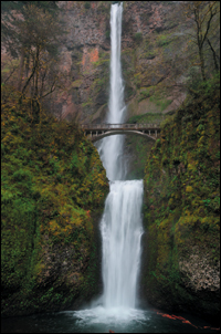
Figure 3.16. The RAW image
The Multnomah Falls image has a series of vertical patterns with one horizontal pattern. Dark—Light—Dark is the main pattern that you can see. The dark of the trees and rock faces to the right and left of the image are interrupted by the light waterfall in the center. You can see this pattern emerge by: 1) applying a Curves adjustment layer to the image, 2) setting the adjustment layer to the Luminosity blend mode, 3) clicking on the white point anchor (the anchor point located at the upper right of the Curves dialog box), 4) moving it directly to the center of the vertical axis of the Curves dialog box, 5) clicking on the black anchor point (the anchor point located at the lower left of the Curves dialog box), and 6) moving it directly center to vertical axis of the Curves adjustment layer dialog box (Figures 3.17 and 3.18). It is the interruption of the pattern made by the bridge that makes the image more interesting. Without the bridge, it is just another pretty waterfall.
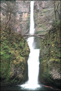
Figure 3.17. After moving the white anchor point

Figure 3.18. After moving the black anchor point
As for every image that you create, your goal should be to control how the viewer’s eye tracks through it. The mechanics of how the eye “sees” the image is what will guide the decisions that you will make when editing this image; not some arbitrary rules of composition. The problem inherent in following rules that are supposed to be applicable to every image is that images you might create, you do not, because you believe that you should not.
The first thing to understand about the way the eye “sees” is that it does not want to look at any one thing. It wants to wonder or “retreat,” as Josef Albers puts it. The eye works by going first to patterns that it recognizes. It moves from areas of light to dark, high contrast to low contrast, high sharpness to low sharpness, in focus to blur (which is different than high to low sharpness), high saturation of color to low saturation of color, and warm colors appear to move forward in an image, while cool colors appear to recede. Knowing this, you can guide your viewer’s eye to travel within your image along a path of your choosing. (See Welcome to Oz 2.0, Chapter 1.)
For this image of Multnomah Falls, I wanted the viewer’s eye to start its journey at the brightest part of the waterfall, then move up the composition to the upper waterfall, and then see the bridge in relationship to the falls. The viewer then becomes aware of the foliage, and then, the back wall.
If you look at this image in terms of CJ Elfont’s Isolate theory, there are light, intermediate (which can be a series of isolates with different brightnesses), and dark isolates. Any one or group of these can be the primary, secondary, or supporting isolates. (The primary isolate is usually light or dark.) The various supporting isolates work in concert to emphasize the primary isolate, and possibly the secondary isolate, and enhance the visual experience for the viewer. (This theory was discussed in Chapter 4 of Welcome to Oz 2.0, page 228.)
Since the primary isolate, in this case the waterfall (a light isolate), is bisected by the bridge, the bridge is elevated to the status of secondary supporting isolate because it is the second element of the composition of which the viewer’s eye becomes aware. Then, the rest of the composition is made up of supporting isolates that vary from intermediate to dark. In this way, the eye first sees the waterfall, and then travels directly to the bridge to complete those parts of the composition that have the most impact. Then, as the viewer becomes more involved with the composition, he/she begins to appreciate the nuances created by the supporting isolates; the flora and the rock wall. The viewer’s eye is kept within the composition because the isolate flow continually draws the eye into the image. Thus, all parts of the composition are essential to one another and allow it to communicate what the photographer felt at the moment of capture.
You should never forget that the tonal range brightness values, in concert with one another, create the ideal composition, such that the viewer sees the primary isolate first, the secondary next, and then the supporting isolates.
Now that you have an idea of what you want to accomplish, look at what needs to be done to get there.
Basic Processing Set-up for Adobe Camera Raw (ACR)
ACR
When opening your RAW files in Photoshop using ACR, click on the settings information at the bottom of the ACR interface. This will bring up the Workflow Options dialog box (Figure 3.19). In the Workflow Options dialog box, select the ProPhoto RGB color space, 16 Bit/Channel, and set the resolution to 360 pixels/inch. The Size option can be set either to the native resolution of your camera or the maximum resolution possible, although setting the resolution to the maximum size introduces the possibility of artifacts from interpolation.
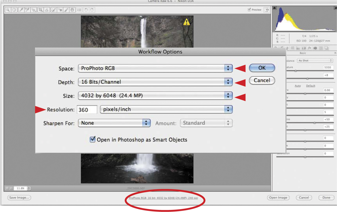
Figure 3.19. The Workflow Options dialog box for ACR
Also, I always choose to send my photographs to Photoshop as Smart Objects so that I can go back and tweak the RAW processing at any time without having to start my editing process over again.
I set the Sharpen For option to None because I prefer to apply any sharpening selectively while I am editing in Photoshop.
Basic Processing Set-up for Lightroom 4
Lightroom 4
Lightroom 4 processes RAW files in the Develop module and makes its edits through metadata, rarely changing any actual pixels in the image. Lightroom 4 does not cook any of the edits into a image until the image is exported out of Lightroom, the image is printed, or if the image is sent to an external editor. Below are the recommended settings for sending a file to an external editor, but each external editor can have its own file settings.
Go to the Preferences for Lightroom. On a Mac, this can be found under Lightroom > Preferences, and on a PC, this can be found under Edit > Preferences. Choose the External Editing tab at the top of the window.
If you are going to be editing in Photoshop from Lightroom, I recommend setting the File Format option to PSD, however, TIFFs support metadata changes more readily than PSD files. PSDs also must be saved in Photoshop with the Maximize Compatibility option turned on for Lightroom to be able to read the file after it has been edited and saved.
Set the Color Space option to ProPhoto RGB, set the Bit Depth to 16 bits/component, and set the Resolution to 360 (Figure 3.20).
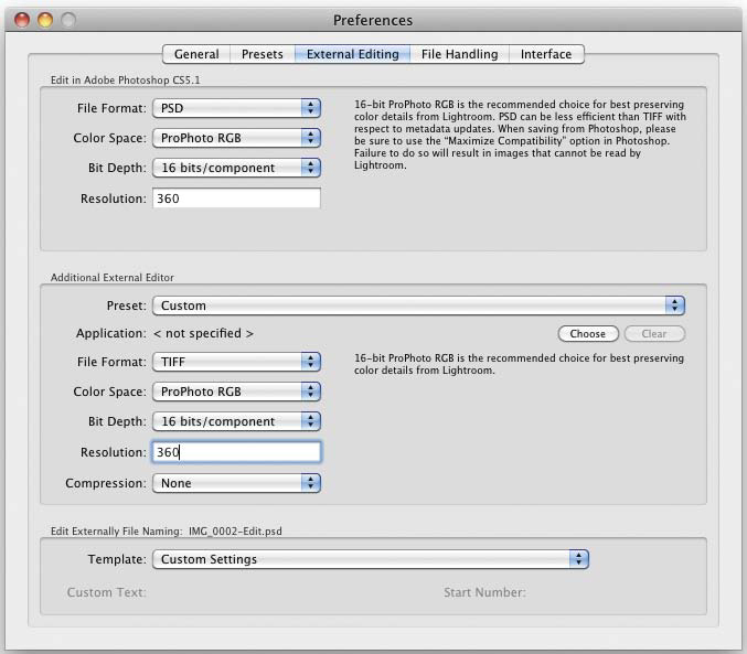
Figure 3.20. Editing options for Lightroom 4
If you are using an external editor other than Photoshop, you can set up a preset for it in the section just below, the bottom half of the dialog box, and I recommend setting the File Format option to PSD rather than TIFF, and setting the other options to match the editing settings in Photoshop.
The first issue is the lack of definition between the background and foreground of the foliage-covered rock faces. This occurred because the image was shot on an overcast, somewhat rainy day that was exactly what was needed (maybe not the rain) to maintain the detail of the water while shooting at a long enough exposure to cause the water to streak. Now is your chance to apply the most important lesson that you have learned about desaturation: when desaturated, different colors of the same luminance will produce the same gray.
In this lesson, you are going to look at two different RAW processors: Lighroom 4 and ACR. ACR is essentially everything that Lighroom 4 is, but with a different user interface. Regardless of whether you use only Lighroom 4 or ACR, you will be best served if you learn to use both RAW processor workflows. If you choose not to do both, I highly recommend that you read both approaches so that you can see the thought processes behind the aesthetic choices made to create an acceptable image and to help reinforce your ability to “see” a black-and-white image while it is still a color one.
In Lighroom 4 and Adobe Camera Raw (ACR)
Lighroom 4’s develop module and ACR are essentially the same piece of software; much like owning two cars, one from the early 1990s and one from the 21st century, with the same engines and chassis, but with two completely different bodies and dashboards.
Of the RAW processors that I will discuss in this book, the UI of Lighroom 4 is certainly the most elegant. ACR’s UI is not as visually friendly. So why own both? Because, although Lightroom 4 is far better organized, and its tools are better and more efficiently placed, it cannot directly work on a file as a Smart Object in combination with layers and pixel editing tools. The major advantage of having both Lightroom 4 and Photoshop CS6 is that you can open up a Lightroom 4 edited file into Photoshop CS6 as a Smart Object, and still edit the RAW data using ACR. This means that you can use Lighroom 4 to do what you want to do to an image from using the catalog functionality of the Library module (Adobe Bridge, which comes with Photoshop, is a browser, with a less intuitive workflow and more limited functions) with global to somewhat limited granular post-processing in the Develop module. If you need to perform further image editing that Lighroom 4 cannot (layers, advanced masking, third party plug-ins as Smart Objects, using multiple images for ExDR—Extending Dynamic Range, which was discussed in Chapters 3 and 4 of Welcome to Oz 2.0—of focus, exposure, time etc.) you can open the Lightroom edited file into Photoshop as a Smart Object, so that you can further adjust and work on the RAW file data.
The approaches in this chapter start at the point at which you have imported the images into either Lighroom 4 or ACR. Keep in mind that no matter which application you use, make the image look its best in color, and then do the conversion.
For this section, the editing will be done in Lighroom 4, but the functionality for Lighroom 4 and ACR are very similar, and will occasionally be shown side by side.
1. After importing the file DSC0886LR.nef into Lighroom 4, switch from the Library to the Develop module (Figure 3.21). (In Adobe Bridge, select the RAW file that you wish to open and double-click on it. This will launch ACR in Adobe Photoshop (Figure 3.22).
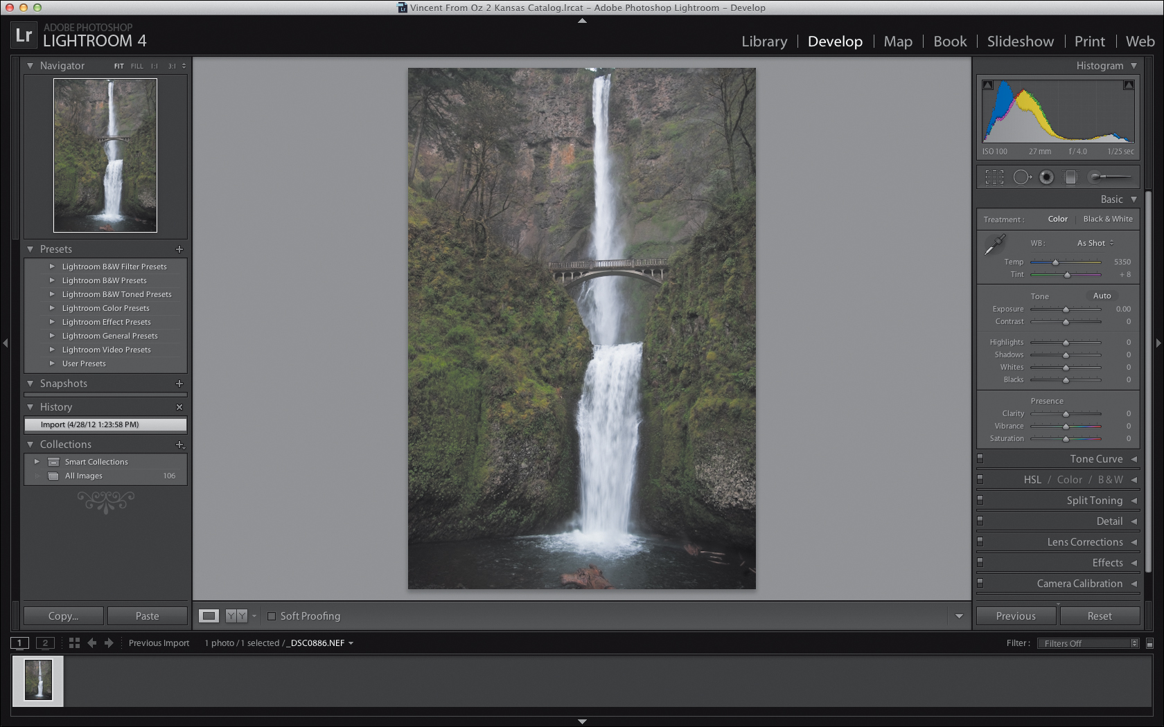
Figure 3.21. Lightroom 4 Develop module
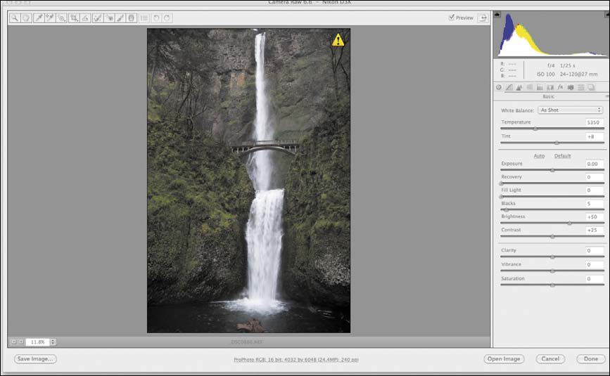
Figure 3.22. The Adobe Camera RAW (ACR) interface
Notice that the image has little contrast, and that there is little separation between the background hillside rock wall and the foreground rock wall.
2. Do whatever global, image specific adjustments that you feel are necessary. For this image, I used the White Balance “As Shot,” Tint +8, Exposure +0.05, Contrast +17, Highlights -60, Whites 0, Shadows 0, Blacks 12, Clarity +6, Vibrance 0, and Saturation 0 (Figures 3.23, 3.24, and 3.25).
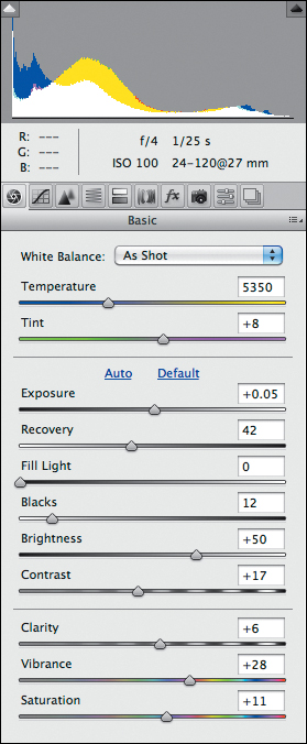
Figure 3.23. The settings in ACR

Figure 3.24. The image preview in ACR
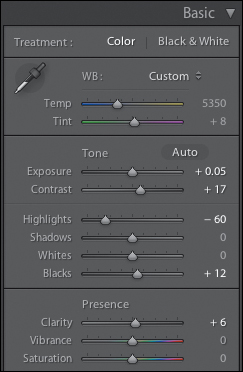
Figure 3.25. The basic develop settings in Lightroom 4
If I were going to use a third party plug-in, it is at this point in the workflow that I would make that decision.
3. Move down the Develop dialog box to the Black and White Mixer, and click on the Target adjustment tool (Figure 3.26). Click on the foreground rock wall (Figure 3.27) and move the Target adjustment tool downward to darken the image until you get a color mix of Red -10, Orange -20, Yellow -43, Green -49, Aqua -18, Blue +12, Purple +17, and Magenta +4 (Figures 3.28 and 3.29).

Figure 3.26. The B&W mixer and Target adjustment tool
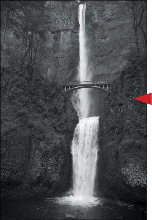
Figure 3.27. Darkening the right wall
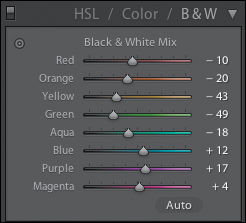
Figure 3.28. The sliders after using the Target adjustment tool
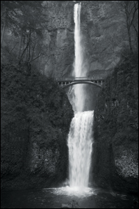
Figure 3.29. After darkening the right wall
4. Move back up to the Basic dialog box, zoom into the right side of the rock face in the foreground, select the Clarity tool, and increase the clarity to +20 (Figures 3.30, 3.31, and 3.32).
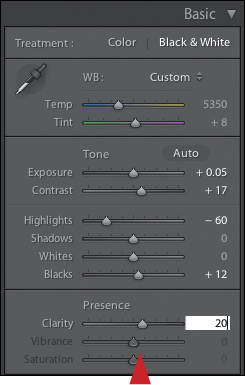
Figure 3.30. Increasing the Clarity

Figure 3.31. Before increasing Clarity
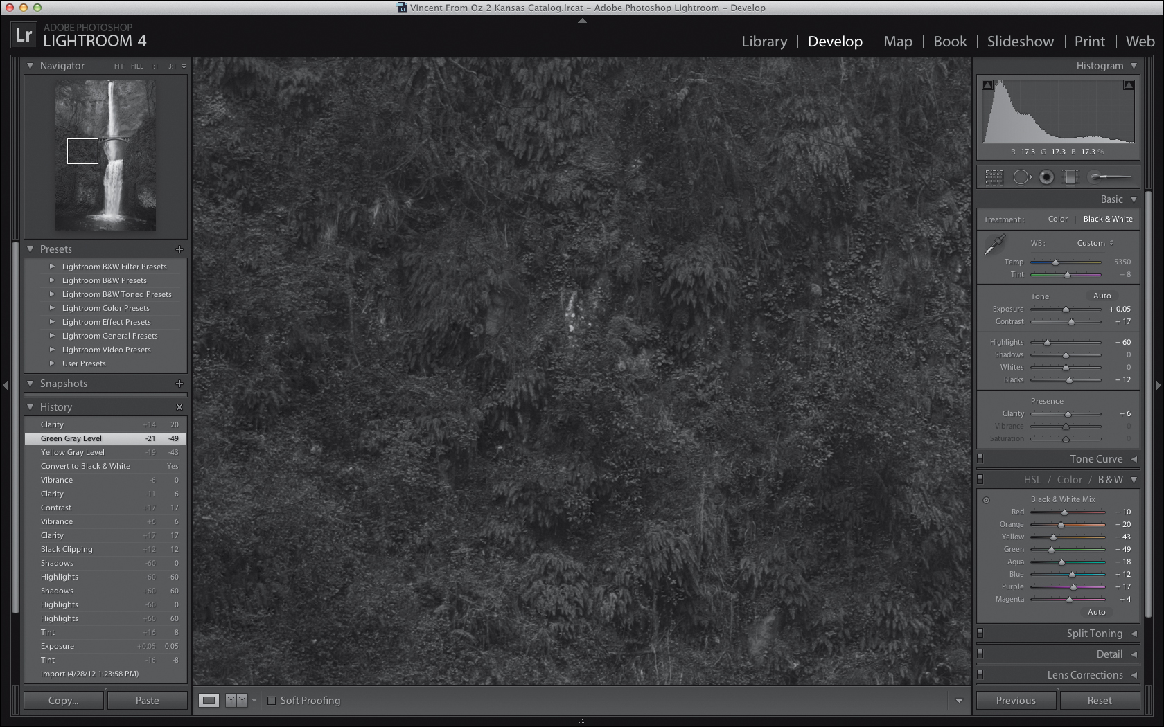
Figure 3.32. After increasing Clarity
There is a lot more to the Adjustment Brush tool that what you see at first glance. If you click on “Exposure” in the upper middle of the dialog box (Figure 3.33), you can access the Effects pull-down menu that gives you access to a series of other tools that you can use.
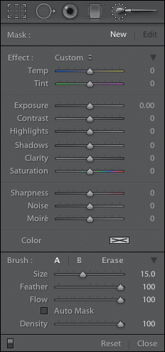
Figure 3.33. Adjustment Brush options
You can change the settings of the Adjustment Brush at any time, e.g., the amount of exposure, brightness, or contrast. Just because you have picked one setting does not mean that you are married to it once you have done your brushwork.
You can reset any of the sliders in the Adjustment Brush dialog box by double-clicking on one.
You can increase or decrease the brush size by using the size slider in the Brush dialog box, the left and right bracket keys, two fingers (the “gesture” for scrolling up and down on an Apple Laptop Trackpad or Magic Trackpad), or the mouse wheel on a PC.
Holding down the Option / Alt key and repeating any of the above actions allows you to subtract from the area on which you have painted.
One of the peculiarities of Lightroom 4 is that each brush has its own brush characteristics. For example, the Erase brush’s sizes are different than the Adjustment brush’s, so if you want to have both the Adjustment Brush and the Erase brush the same size, you have to set each separately.
Pressing the “O” key gives you an overlay view (like the one that comes up in Photoshop when you hit the “\” key). This allows you to better see the amount of brush feathering and the intensity of the brush opacity.
The “AB” brush setting allows you to apply two separate localized adjustments.
“Auto Mask” confines brush strokes to areas of similar color.
One of the profound draw backs of the Adjustment brush tool (and this is true of all RAW processors that have a Brush tool) is that you have no ability to repair the mask. So if you miss a spot, you have to start over. This is why using the Overlay functionality (“O”) is very helpful.
You can reset any of the sliders in the Adjustment Brush dialog box by double-clicking on any one of them.
The Clarity algorithm looks at an image and increases the luminosity in the targeted pixels that are 50% (50.01% and above) or greater in luminance value and decreases luminosity in any targeted pixels that are 50% (49.99% and below) or lower in luminance value. This effect is controlled by a change in the radius of the sample area - the targeted pixels. A lower radius takes into consideration fewer pixels and a higher radius, more pixels. This translates into a lesser or greater effect. The final result of the Clarity algorithm is that the effect is removed from the highlights and the shadows, so that it affects only the mid-tone values. The net effect is a contrast and contour enhancement of the mid-tone image components.
The Clarity tool is based on two different contrast enhancing techniques. The first, created by Thomas Knoll, employs minimal sharpening and a high radius setting in Photoshop’s Unsharp Mask filter. The other, originally created by Mac Holbert for printing, is the Midtone Contrast technique that employs maximal sharpening, a large radius, and a low opacity, High Pass sharpening of a desatu-rated copy of the image targeted specifically for the mid-tone areas of an image. An action that accomplishes this approach is included in both the OZ_POWER_TOOLS set of actions, as well as the OZ_2_KANSAS_12 set of actions and is called Mid-tone Contouring. This is to delineate it from Mac’s action, because there are some slight differences.
Even though the foreground’s rock face has darkened, because the background’s rock face contains many of the same colors and hues, you have not achieved as much separation as is needed to be able to create an illusion of depth and to optimally control the eye’s travel through the image. This is going to require the use of Lighroom 4’s Adjustment Brush tool to further separate out the background from the foreground.
5. Select the Adjustment Brush tool, located just beneath the Histogram dialog box, that opens the Adjustment Brush dialog box (Figure 3.34).

Figure 3.34. Adjustment Brush options
6. Set the exposure to 0.52. Set the brush size for this image at 7.7 with a feather and a density of 100. Turn Auto Mask off (See the Adjustment Brush sidebar) (Figure 3.35).
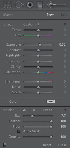
Figure 3.35. Adjusting the settings for the brush
You are using Exposure vs. Brightness because Exposure, though it affects overall image brightness, puts a greater emphasis on the high values of an image (the brighter aspects). Brightness, on the other hand, also affects overall image brightness, but it mainly affects the midtones. You want to brighten up the high value aspects of this image with less emphasis on the mid-tone areas. This will preserve the atmospheric quality of the overcast light and mist caused by the waterfall and rain.
You set the brush to 100% because you cannot see the effect of what you do before you set it. Another issue is that, once you do the brushwork, you cannot change the density of the brush opacity. So, you have to create the mask that you want, and then fine-tune the adjustment. However, with Photoshop and Capture NX2, you set the Effect and then decide what the opacity of the brush density should be.
7. Set Lighroom 4 to Overlay View (keyboard command O). Brush in the entire upper area of the background on either side of the waterfall (Figure 3.36).
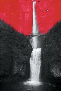
Figure 3.36. The Overlay view
When you are finished, you should notice that there are two dots on the image that are called “pins.” The first pin is where you started brushing, and the second pin is where you finished your brushwork (Figure 3.37).
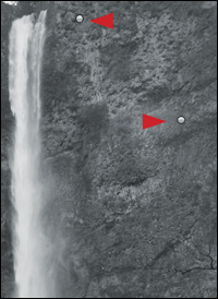
Figure 3.37. The pins for the brushwork
Controlling the edits made to an image in a RAW processor by placing points, or in this case, pins, on the image, was conceptually introduced in Capture NX. You will see this approach to image editing implemented far more elegantly in Capture NX2.
8. Turn off the Overlay view (keyboard command O) and click on the upper pin. You should see an icon that has left and right arrows. To increase the effect of the selected Adjustment Brush functionality (in this case, Exposure), click-drag to the right. To decrease the effect, click-drag to the left. Decrease the effect, or lower the exposure, until you have something that you like. I chose 0.19 (Figures 3.38 and 3.39).
Figure 3.38. The image after adjusting the Exposure slider
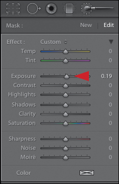
Figure 3.39. Setting the Exposure slider to 0.19
In the course of doing the global brushwork on the background, you lost some of the detail in the trees that are atop the upper left of the darker, foreground rock face. You need to bring back the detail in the trees to maintain the illusion of depth that you want to create.
9. Zoom into the area of the trees in the upper, left-hand corner (Command + / Control +). In the Adjustment Brush dialog box, click on Erase, and then click on Auto Mask (Figure 3.40).
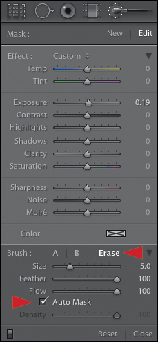
Figure 3.40. The Erase and Auto Mask options
10. With a brush size of 7.7, and a feather of 100, brush in the area of the trees (Figure 3.41).
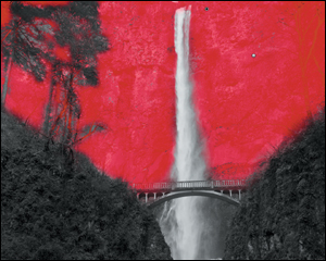
Figure 3.41. Erasing the brushwork from the tree areas
Now it is time to work on the waterfall and the bridge. You will do that using two separate Adjustment Brush corrections. The first will be to darken the waterfall as well as to increase its contrast. The second will be to increase the sharpness, clarity, and brightness of the bridge.
11. In the Adjustment Brush dialog box, click on New. This will give you a new Adjustment Brush. In the Adjustment Brush dialog box, just to the right of the word Effect, select Contrast from the pull-down menu. With a brush size of 5.5 and feather of 100 (Auto Mask on), brush in the waterfall from the top of the image, all the way down the cascade into the pool at the bottom of the image (Figure 3.42).
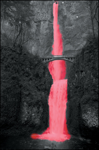
Figure 3.42. Brushing in the waterfall
12. Using the sliders in the Adjustment Brush dialog box, lower the exposure to -0.25 and the contrast to 35 (Figures 3.43 and 3.44).
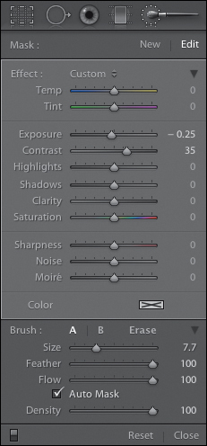
Figure 3.43. The Adjustment Brush settings
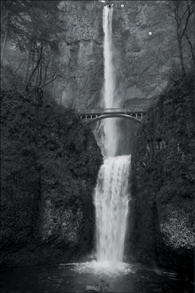
Figure 3.44. The image after the adjustment
13. Zoom (Command + / Control +) into the area of the bridge (Figure 3.45). Set the view to Overlay (keyboard command O).
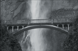
Figure 3.45. The bridge area
14. Again, in the Adjustment Brush dialog box, click on New to get another new Adjustment Brush. In the Adjustment Brush dialog box, again select Contrast from the pull-down menu. With a brush size of 4.0 and feather of 100 (Auto Mask off), brush in the base of the bridge. Then reduce the brush to 1.0 and brush in the rail and posts. Use the Erase function to tighten up the mask. When using the Erase function, turn the Auto Mask on so that when you are done, you have a mask that looks something like Figure 3.46.
Figure 3.46. The bridge selected
15. Now it is time to fine-tune the bridge. Turn off the Overlay view mode (keyboard control O), increase the Exposure to +0.25, Contrast to 71, Clarity to 35, and Sharpness to 24 (Figure 3.47).
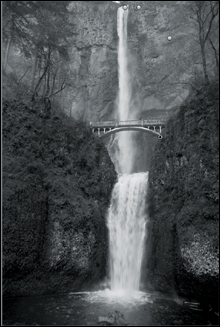
Figure 3.47. The final image after adjustments
16. Export the file (Command + Shift + E / Control + Shift + E) and name it _DSC0886ACR.nef.
Adding an underscore “_” will cause the file to be moved to the top of the folder order. Underscores work the same way as does adding a space to the beginning of a file name. You should get into the habit of using underscores instead of spaces because underscores are universally read by all operating systems when included in the names of files, whereas spaces are not always read.
You did this so that you would have a separate file that contains all of the XMP data (the edits that you just did). You now have a file that Photoshop can open and that can be made into a Smart Layer.
In ACR
1. Click on Workflow Options located beneath the Image Preview to bring up the Workflow Options dialog box (Figures 3.48 and 3.49).
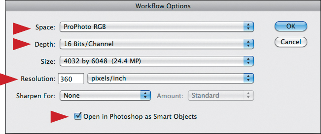
Figure 3.48. The Workflow Options window
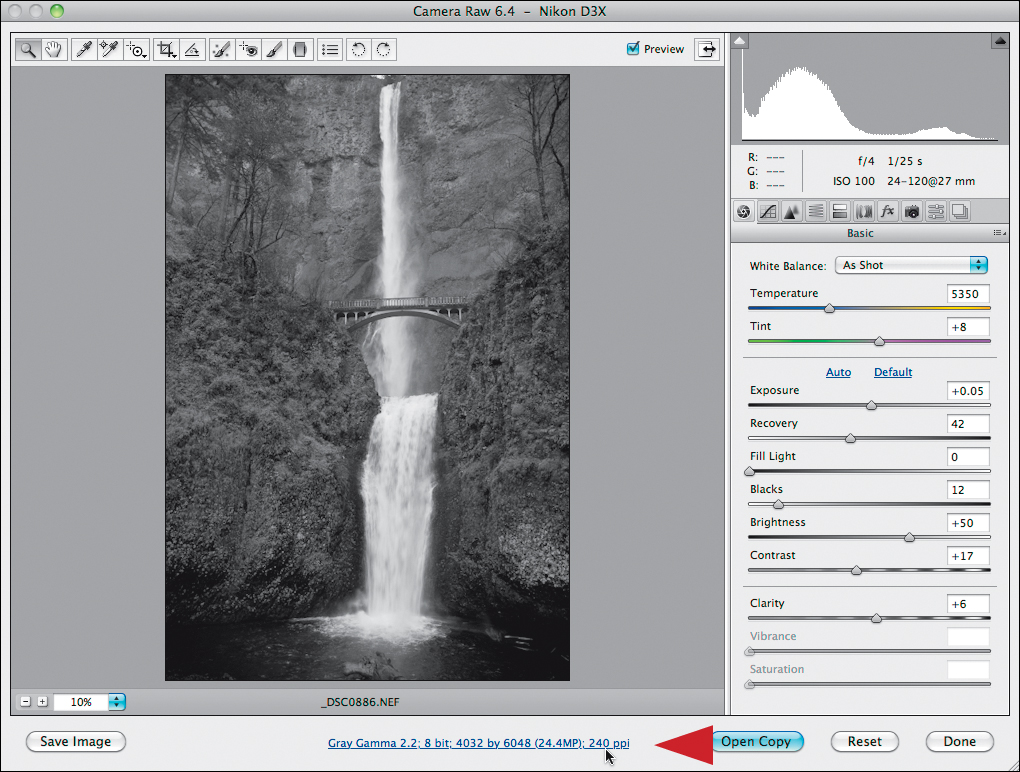
Figure 3.49. Accessing the Workflow Options
2. Change the settings from Gray Gama 2.2, 8-bits/channel, 240 pixels/inch to Prophoto RGB, 16-bits/channel, 360 pixels/inch. Leave the Sharpen For set to None and click on Open in Photoshop as Smart Objects. Then click OK (Figure 3.50).
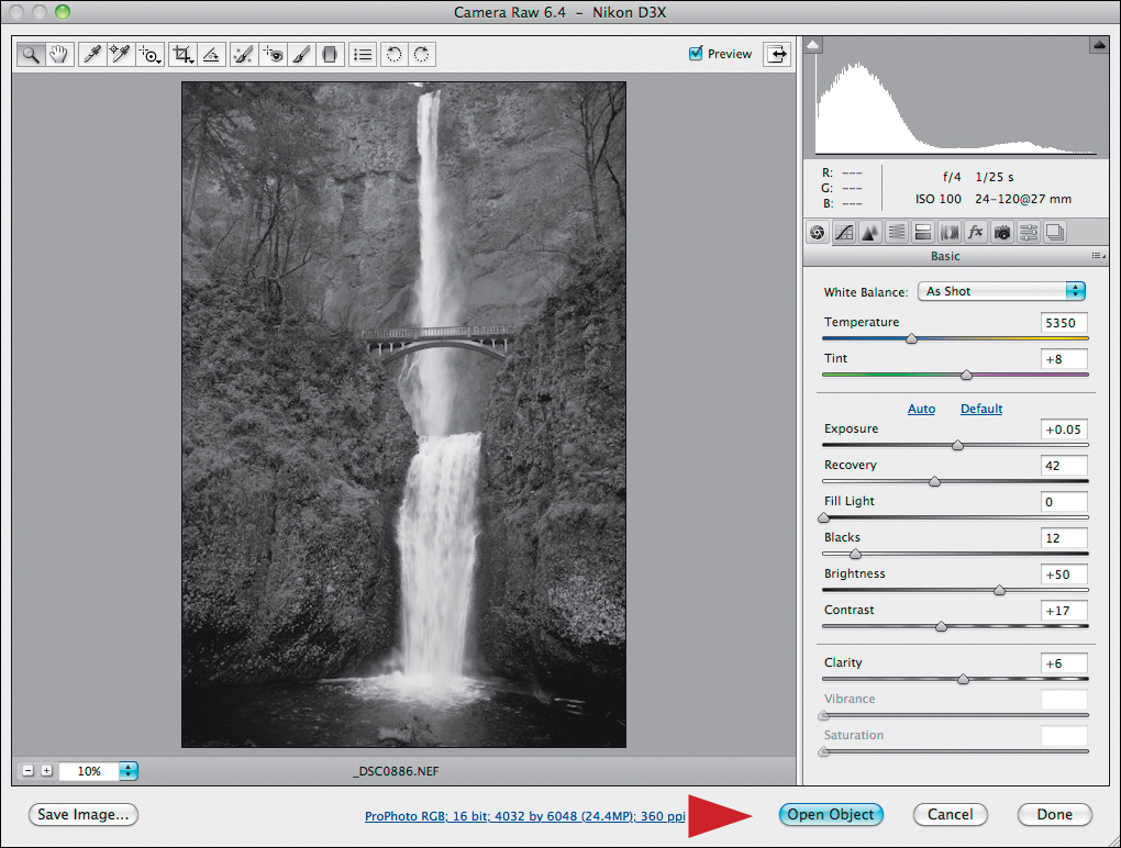
Figure 3.50. Click on Open Object
Leave the Sharpen For option off because that is a one-size–fits-all approach to sharpening your image for either Glossy or Matte papers. Whoever created these presets may not share the same aesthetic sense as you have, and there are more variations in papers than simply Glossy and Matte.
3. Do whatever global image-specific adjustments you feel necessary. I chose Reds = -35, Oranges = -30, Yellows = -24, Greens = +3, Aquas = -96, Blues = -35, Purples = +17, and Magentas = +4 (Figures 3.51 and 3.52).
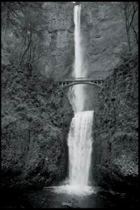
Figure 3.51. The image after converting to black and white in ACR
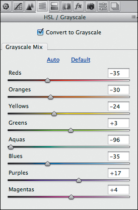
Figure 3.52. The settings used in ACR
You now have a reasonably fast way to create a monochromatic/grayscale image from a RAW file. But at what cost? If all you needed was a rapid way to change an image from color to black-and-white, you could have used Photoshop’s default - Gray Gamma 2.2. But if what you seek is the best possible black-and-white image, then neither the default settings of Photoshop nor the steps I have given you above (which are the most widely accepted and widely taught black-and-white / chromatic gray-scale conversion workflow for this RAW processing software) are necessarily the best option. They may be the best option when “good enough” is just that, good enough.
In Aperture 3
You can download a PDF of the workflow for this software from the download page for this book. I have chosen to include it in the discussion of RAW processors, because Aperture 3 allows for the use of third party plug-ins. I did not, however, include it in the pages of the book because it is a platform specific RAW processor (it only works on the Apple OS), it has a very limited install base, and my publisher has limits on how many pages this book can be.
In Capture NX2
You can download a PDF of the workflow for this software from the download page for this book. I am a Nikon photographer, and if you use a different camera system, this may be a reading that you might elect to skip. I suggest that you not do this, I feel that understanding how it all works will ultimately add to the base of knowledge from which you draw when you create. If, however, you are thinking of changing to a Nikon camera system or already use a Nikon camera system, it is worth the read. The RAW file that is provided for the Capture NX2 lessons is a Nikon RAW file (.NEF) that works in Capture NX2. On the download page for this book, there is also a link to download a demo version of the software.
Herein Lies Yet Another Rub
Lighroom 4 and Capture NX2 tend to crash less than Aperture 3. Also, Lighroom 4 has a far more elegantly designed UI than ACR, Aperture 3, or Capture NX2. Capture NX2, ACR, and Lighroom 4 are cross platform (Windows OS and Apple OS) whereas Aperture 3 is Apple OS only. Capture NX2 (as a RAW processor), though cross platform, will read only Nikon RAW files (.nef). It will, however, both read and generate JPEGs and TIFFs.
Conclusion
Where the spirit does not work with the hand, there is no art.
—Leonardo da Vinci
When it comes to black-and-white conversions, RAW processors are best used when good enough, is just that—good enough. A RAW processor is meant to get you your best starting image, not your final one. If you are looking for a higher level of control and quality, then the use of a RAW processor is just one link in the workflow chain. Even though this is something most of us do not want to believe, because we want to complete our image editing as quickly as possible, it is also true for full-spectrum color images.
This creates an interesting dilemma. Your goal should always be to get it right in the camera, which means that in an ideal world, you would to be able to open a file and print it without manipulation; a goal that is the exception, not the rule, in fine art image creation.
Contrary to a popular belief, RAW processors are not the ultimate answer to this problem because they do not have variable opacity on a layer mask that you can fine-tune. You can do brushwork within ACR, Lighroom 4, Aperture 3, and NX, but once you do it, you cannot go back to it if you miss a spot. Also, adjustments are too coarse and tend to be too global in Lighroom 4 and Aperture 3. In NX2, you have more granular control of the image by using control points, but the more control points you have, the slower the software runs. This means you need a lot of RAM and hard drive space, if you plan to use a lot of control points. So the speed benefit of doing image editing on a RAW file diminishes as the number of control points increase. And while it is wonderful that modern RAW processors allow for the use of third party plug-ins, which extend the functionality of the software far beyond the limits of the original application, to use them requires that the image be rendered in a TIFF file format. What occurs, therefore, is that there is no way to preserve what you did to the image using the plug-in, which means you have to start from scratch if you want to correct something. This makes your workflow highly inefficient and destructive.
I will repeat myself—a RAW processor is meant to get you your best starting image, not your final one. However, if you have an image for which a RAW processor is adequate, stop and call it a day. Let the words of Albert Einstein be your guide, “Make everything as simple as possible, but not simpler.” Never lose sight of the most important goal; to create an image that reflects your feelings at the moment of capture.