Chapter 7. The Black and White on the Channel Mixer Adjustment Layer
I eagerly await new concepts and processes. I believe that the electronic image will be the next major advance. Such systems will have their own inherent and inescapable structural characteristics, and the artist and functional practitioner will again strive to comprehend and control them.
—Ansel Adams
The Soul of the Art of Black-and-White Photography
By his own admission, if Ansel Adams—arguably the most recognized and celebrated of black-and-white, fine art, nature photographers—were alive today, he would be a digital photographer. It was something he eagerly awaited. And if he were alive today, he would be a digital, black-and-white photographer. I doubt that he would totally abandon silver-based photography for digital, but after having studied his books: The Negative, The Camera, and The Print, I can only imagine what level of technical insight he might have brought to the world of digital black-and-white photography.
What Ansel Adams dreamed of doing, you are doing today with technology that you take for granted, and that you have at your fingertips. Over 40 years ago, we sent men to the moon using computers that were nearly the size of the rooms they occupied. Today, the power of those machines is eclipsed by the computing power found in a digital watch.
Aesthetic skills and artistic sensibilities of the photographer aside, much of electronic or digital photography can yield better technical results than can analog photography. But we have a tendency to believe that what was is significantly better than what is, even though the goal of the technical aspects of black-and-white photography is still the same—that being the complete control and mastery of the tonal rage of the printed image. What we must never forget is that the inherent and inescapable structural characteristics of analog and digital image creation are different.
Remember that black-and-white analog photography preceded analog color photography. To this day, in silver photography, a black-and-white silver photograph has more resolution and is, therefore, sharper than a color silver photograph. Also, a silver black-and-white photograph is capable of producing a purer black and better contrast than is a silver color photograph. What is even more interesting is that, even though the primary pursuit of analog photography was to produce ever better color films and papers (the secondary pursuit was to create better black-and-white films and papers), a color photograph has always been less archival than was a black-and-white photograph..
In digital photography, color photography came first and black-and-white photography was second, and now the pursuit seems to be about designing better approaches to creating chromatic grayscale images. Also, when it comes to digitally printing an image with today’s pigmented inkjet printers, we can produce images both in color and in chromatic grayscale that are equal to or better than those made with analog processes.
What we must not do is throw the baby out with the bathwater. There are characteristics of analog black-and-white photography that are precious and important, and those, we must strive to preserve. There are other characteristics that we should work to eliminate. The same holds true for digital photography. The goal should be to take the best of both and marry the two while shedding what is not desirable.
What I am about to discuss in the next two chapters are conversion approaches that do just that. In this chapter, you will learn the conversion approach that started both my, and this book’s, journey into the world of digital chromatic grayscale imagery. This book’s path to becoming a standalone book began when it was first a chapter in the first version of my book, Welcome to Oz. When I started to rewrite the black-and-white chapter for Welcome to Oz 2.0, I realized the revised chapter’s length was likely to be the length of the entire book into which it was going.
Back to the Future: Once Again, Traveling a Circle in a Straight Line
Everything on your journey toward understanding the art of the science and the science of the art of creating a chromatic grayscale image from a full-color one is about to be applied in this next technique. You have learned all of the steps; now it is time to mix them together and do the dance.
First and foremost, keep in mind, whether an image is chromatic grayscale or full-color, it is more important that your image be true to what you felt when you saw it, than to what your eyes saw. Once you understand this, it becomes considerably easier to approach the entire process, from color cast removal to chromatic grayscale conversion to final print, as a way to control the viewer’s eye as it moves through your photograph.
For me, the black-and-white image has always been the core, the essence, and the soul of photography. By training, I am a black-and-white, film-based, Zone System photographer, and I believe that it is my experience as such makes my digital photography what it is today. It is the discipline of 36 frames per role, or two 4 x 5 sheets of film per film holder that taught me how to be open for the decisive moment, the moment that makes itself evident in an instant and compels you to press the shutter.
Today is a decidedly different place than it was when I wrote Chapter 5 on black-and-white conversion in the first edition of Welcome to Oz in 2006. Digital technology, imaging software, and inkjet printers have advanced so far that it is now significantly easier, and frequently much better, to work in the digital darkroom than in the analog version. You can certainly produce an image of equal or greater quality when working digitally, and with no exposure to toxic chemicals and while working in the light of day.
You can create a negative from an image that you manipulated in Photoshop and make a silver print. If you would like to read more about this, see the book, Making Digital Negatives for Contact Printing by Dan Burkholder. You can also go to his website at www.danburkholder.com/Pages/main_pages/book_info_main_page1.htm for his latest thoughts on the subject.
A World of Shadows
The camera doesn’t make a bit of difference. All of them can record what you are seeing. But, you have to SEE.
—Ernst Haas
In the film world, to make a print worthy of showing to others, you must have a worthy negative. In the digital world, the negative is a file. That file has to contain quality information or the print that you create from it will be poor. Without good sheet music, the symphony will be worthless.
But what if you have great sheet music, but can no longer create a great symphony from it? Until recently, this was the sorry state of affairs that existed for the great black-and-white negatives produced by such photographic icons as Ansel Adams, Minor White, Edward Weston, and Wynn Bullock. Their prints—the ones with which we fell in love—were made on papers that are no longer available. Today’s photographic papers no longer contain heavy metals like cadmium and mercury for environmentally sound, but not necessarily aesthetically, good reasons.
Ironically, these same heavy metals made the older papers archivally stable and gave them great maximum densities. Today, when it comes to silver printing, you can achieve a similar result using selenium-toned papers to regain image stability and maximum density.
The traditional photographic papers commercially available today contain less silver than they once did. Unless you are willing to invest the time and expense to create platinum or other alternative-process prints, it is very hard to capture the subtleties and full range of tones within a black-and-white negative on commercially available, silver-based photographic paper. That is the bad news.
The good news is that digital cameras, software, and inkjet printing technologies let us create black-and-white prints that have even greater resolution and dynamic range than we could ever create in a traditional darkroom.
By now, you have observed that a chromatic grayscale image is not purely black and white; it’s monochromatic tones are made up of equal values of red, green, and blue. In analog photography, many variables affect the final tone of a black-and-white print. For one thing, each type of silver-based paper produces a print with a characteristic tone. For example, Agfa Insignia, Agfa Portriga, and Forté Salon are warm-tone papers. Oriental Seagull, Agfa Brovira, and Ilford Galerie are cool- to cold-tone papers. Different developers and developer concentrations can also change a print’s tone, as can selenium toning.
In days passed, when we printed on silver-based papers, we chose a particular paper and processed it in our individual way in order to achieve a specific tonality that only we could achieve in our secret darkroom dance. We wanted to make a warm- or cold-tone print with rich, deep blacks; detail in the textured blacks or deep shadows; and crisp, textured whites in the highlights. We wanted a print that had a complete tonal range from dark black to pure white, and that goal has not changed.
If I have learned anything as a digital photographer, I have learned that when it comes to digital photography, impossible is just an opinion. If I can imagine it, I can create it. Most importantly, if I cannot make it happen today, I know that I will be able to do it tomorrow or the next day. Also, if I allow myself to be open to the thought that knowledge is fluid, and that if I treat each thing that I learn as a grain of sand and let it collide with the other grains, eventually all those grains of seemingly unrelated knowledge will form a beach of epiphany. The next technique you are going to learn demonstrates this.
Absinthe-Minded Artist
If you can dream it, you can do it.
—Walt Disney
I conceived this technique quite some time ago while recovering from my first run-in with an absinthe martini. As I rode in a van on my way to photograph a waterfall in Banff, Canada, I was working on an image, and I accidentally clicked on the Channels tab instead of the Layers tab. All of a sudden I found myself looking at the individual Red, Green, and Blue channels of an image, and noticed that each one of them was a different grayscale image. In the third version of Photoshop, Adobe introduced the Channel Mixer and layers. In the fourth version of Photoshop, the version in which I was working at the time, Adobe had introduced adjustment layers.
The Channel Mixer allowed you to modify a color channel using a mix of the current color channels and adjustment layers (with a layer mask attached). This allowed you to perform the adjustment on its own separate layer. This new tool also had a box called Monochrome, and when you clicked on it, it converted the image into grayscale. If you selected any of the channels (Red, Green, or Blue) from the pull-down menu and selected Monochrome, what resulted was an exact representation of that channel for that image, and it was created as a layer that was separate from the image layer. And you could create as many of them as you wanted! As you saw in Chapter 5, this means that the image as seen in the Red channel in the Channels panel and the image in the Channel Mixer adjustment layer were identical.
Therefore, if you select Monochrome and set any one of the three color sliders—Red, Green, or Blue (which represent each of the three channels)—to 100% and the other two to 0%, you get an exact representation, in grayscale, of the image’s channel for that color.
You can also accomplish this in Photoshop CS3 and above in the Channel Mixer by selecting the Red filer, Green filter, or Blue filter in the pull-down menu in the Channel Mixer adjustment layer.
If you want to create the highest quality chromatic grayscale images with the greatest control of the conversion process, you should use a Channel Mixer adjustment layer. In this lesson, you will not use just one; you will use four. This technique affords you a level of control unmatched by any other Photoshop-only conversion approach. You will use an action here that comes with this book (everything you have done so far has been made into an action) instead of doing the steps manually as you have up to this point. The actions perform the numerous time-consuming steps that you would have to take to get you (and the image) to a place where you have to make some new decisions. If you are unfamiliar with how to load an action, there is a QuickTime video that you can download from the download site for this book that will show you how to do this.
Configurators for Photoshop CS6 are also provided on the download site for this book and there is a QuickTime tutorial video that shows you how to install a configurator. (See the sidebar in Chapter 1: For Every Action You Take, Make an Action.)
What Exactly Is a Channel?
All current digital cameras, displays, and printing methods use a small set of colors to generate the entire range of colors in the image. Digital cameras and video displays use an RGB color system, which is an Additive system. An Additive system starts with no light (black: R:0, G:0, B:0) and mixes in the primary colors (red, green, and blue) in various quantities to create all the intermediate tones and hues that you see, including combining the full values of RGB (R:255, G:255, B:255) to create white.
Printers use a Subtractive approach and start with white (the traditional color of the printing substrate—paper) and then use what are referred to as Secondary colors (cyan, magenta, and yellow inks—CMY) for the same purpose. The more ink you add, the darker the image. Black is added to the mix, because if you mixed CMY together (as is done in analog color photography films and papers, since they are dye based), you would not get black, you would get only a muddy gray. (Black is referred to as “K” because there is no color that begins with the letter K. When you add black ink, you get CYMK.) Black ink is added to the mix because inks are usually not transparent. This has to do with the fact that many of today’s inks, particularly the archival pigment inks, contain particles of pigment that causes the ink to be opaque. Also, by adding black ink(s) is why you have greater density of black and better contrast in both digitally printed color and black-and-white images than in the ones that are printed using an analog process.
Secondary colors are made up of equal values of two of the primary colors. Cyan is made of a combination of green and blue. Magenta is made up of a combination of blue and red, and yellow is made up of a combination of red and green.
Digital cameras record color using something called a Bayer array. A Bayer array consists of a group of 4 pixels, each group containing one red, two green, and one blue filter. Each pixel records one complete piece of color information. The pattern of one red, two green, and one blue filter per pixel group was chosen since it closely mimics human vision. Twice as much green information was included because the human eye is particularly sensitive to green light. Each one of the color filters sits atop the camera sensor so that each pixel captures just one color. When this information is recorded and stored as a RAW file, it is stored as a linearized black-and-white file, that is then interpolated (using post-processing software) into the color image that you see on the screen. This process is referred to as demosaicing. If the image was captured as either a JPEG or TIFF file, the demosaicing process happens in the camera.
The advantage of shooting a RAW file, versus a JPEG or TIFF, is that shooting RAW gives you greater control over contrast, white balance, and exposure. A common analogy for the difference between shooting a RAW file versus a TIFF or JPEG is that if you shoot in RAW, you have the ability to “un-bake the cake,” whereas a TIFF or JPEG file is fully cooked and there is nothing you can do to it.
Each of the primary colors (the red, green, and blue information from the sensor) that make up a digitally captured file is called a channel and can be manipulated separately in post-processing software. A channel in a digital file is a grayscale image of the same size as the color image, and is made of just one of these primary colors. Just as Unsharp masking (the Craik–O’Brien–Cornsweet illusion that I discussed in Welcome to Oz. 2.0 and touched on very briefly in Chapter 1 of this book) is a darkroom technique that existed long before Photoshop, color channels are not new either. There were darkroom processes, like tricolor pigment printing and dye transfer, where you worked with each of the colors individually. They were referred to as separations and are the physical equivalent of channels on the computer.
Four-color, off-set presses also use physical separations/channels for each of the printing plates that are needed to create prints on paper.
What Exactly Is a Channel Mixer Adjustment Layer?
The Channel Mixer adjustment layer is frequently considered to be one of the most intimidating parts of Photoshop. Actually, the Channel Mixer adjustment layer is one of the most powerful and effective ways to work with the colors of your image and is one of the best ways to do a chromatic grayscale conversion. The Channel Mixer adjustment layer allows you to directly effect a change on the Red, Green, and Blue channels of your image. It does this in the form of an adjustment layer, which is a layer of math that sits above the actual pixels of your image. According to Adobe, “The Channel Mixer adjustment options modify a targeted (output) color channel using a mix of the existing (source) color channels in the image. Color channels are grayscale images representing the tonal values of the color components in an image (RGB or CMYK). When you use the Channel Mixer, you are adding or subtracting grayscale data from a source channel to the targeted channel.” For example, a Red-Green setting of 10 increases the value of the Red channel for each pixel by 10% of the value of the Green channel for that pixel. A Blue-Green setting of 100 and a Blue-Blue setting of 0 replaces the Blue channel values with the Green channel values. In other words, the Channel Mixer adjustment layer allows you to blend percentages of the separate channels into one another (Figure 7.1).

Figure 7.1. The Channel Mixer dialog
Because the Channel Mixer adjustment layer does not contain any pixels (it is an algorithm that sits above the layer that contains pixels and, while it affects the layer that contains pixels, it does not physically change them) and can be turned on or off, using one is a nondestructive way to work on your image. Another advantage of using one, with regard to chromatic grayscale conversion, is that you can exactly replicate the Red, Green, and Blue channels in your image without having to split out the channels. This means that you have all the benefits of having the monochromatic grayscale representation of the individual Red, Green, and Blue channels without significantly increasing the file size or destroying the image to get these monochromatic grayscale representations of the individual color channels. You also have complete control over the blend of the three channels and, most importantly, you can fine-tune the mix between the individual Channel Mixer adjustment layers through layer opacity or by using the layer masks that are attached to each Channel Mixer adjustment layer. (You do this by selecting one of the presets from the Channel Mixer Adjustment Layer pull-down menu [Figure 7.2].) This means that you can create an image specific, as well as image structure specific, tonal reproduction curve.
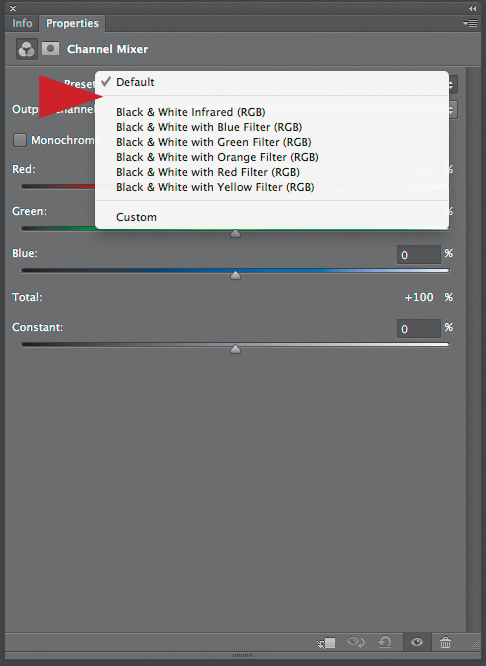
Figure 7.2. The presets for the Channel Mixer
In the Channel Mixer adjustment layer dialog box, you should notice that there is a button for Monochrome (Figure 7.3). According to Adobe, “Monochrome uses the value of the red output channel for the red, green, and blue output channels, creating a grayscale image.“ That means that when you click on Mononchrome, the Black & White adjustment layer will automatically select a mix of +40 red, +40 green, and +20 blue. Adobe’s reason for choosing this specific mix is that it reflects the NTSC standard for video. It does not, however, reflect the human eye’s visual response like a digital camera’s sensor does. By using post-processing software, this difference can be easily corrected by the end user.
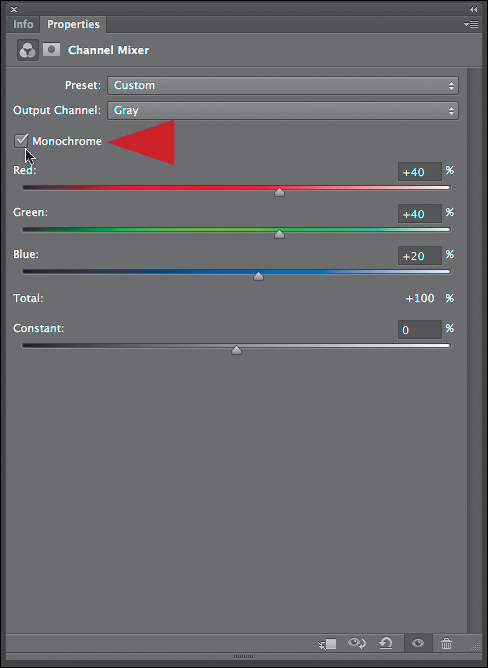
Figure 7.3. The Monochrome checkbox
You have additional control of the dance between the channels in the form of the Constant slider (Figure 7.4). According to Adobe, the Constant slider “increases or decreases the density of the channel mixer effect.” For example, a Red-Constant setting of 100 saturates the “Red channel for every pixel by adding 100% red.” In simpler terms, this means that the Constant slider globally lightens or darkens the Channel Mixer’s effect on your image.

Figure 7.4. The additional controls
How to Dance with Multiple Partners on the Channel Mixer Dance Floor
Just as a musician hears notes and chords in his mind’s “ear” so can the trained photographer “see” certain values, gestures and arrangements in the mind’s eye.
—Ansel Adams
In this chapter, you will convert two images using a Multiple Channel Mixer adjustment layer approach for chromatic grayscale conversion. You will then use the same two files that you create here in the next chapter of this book that discusses the use of Nik Software’s Silver Efex Pro 2.0 plug-in. I am having you do this because I frequently use a combination of these two approaches. For the purposes of teaching, however, I am going to separate them. Also, you may not have the Silver Efex Pro 2.0 plug-in. Prior to the advent of the Silver Efex Pro plug-in, what you are about to see is how I (almost exclusively) converted all of my images. This does not mean that I have not or do not use all of the approaches you have used to this point. I do. Taking the risk of being repetitious, chromatic grayscale conversion is a street fight in which the only rule is that there are none.
Before You Begin This Lesson: Loading an Action in Photoshop
If you have not already done so, please load the actions that come with this book.
1. From the DOWNLOAD_FIRST folder that you downloaded from the download site for this book, put the file O2K_ACTIONS.zip on the desktop and open it. You will see a folder named OZ_2_KANSAS_12.
2. Making sure that Adobe Photoshop is open in the main menu bar, go to Windows, and select Actions (Shift + F9). This brings up the Actions panel (Figure 7.5).
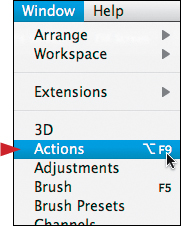
Figure 7.5. Opening the Actions window
3. Choose Load Actions from the Actions panel menu. You do this by clicking on the Actions panel fly-out menu located in the upper right corner of the Actions panel. Select Load Actions to bring up the Load Actions dialog box (Figures 7.6).
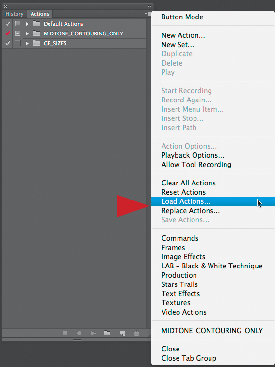
Figure 7.6. Loading the actions
4. From the Load Actions dialog box, select Desktop, and highlight the OZ_2_KANSAS_12 folder. Click on the Open button located in the lower right corner of the dialog box.
5. In the OZ_2_KANSAS_12 folder, select the OZ_2_K_ACTIONS_12.atn folder, and click on the Open button. You have successfully loaded the action.
Image 1: Using a Multiple Channel Mixer Conversion Approach on a Portrait
The photographer must be absorbent—like a blotter, allow himself to be permeated by the poetic moment.... His technique should be like an animal function...he should act automatically.
—Robert Doisneau
As I mentioned previously, the images that you will create in this chapter are the same ones that you will work on in the next chapter. The techniques of the two chapters differ, but dovetail, so while they can be used together, each can stand alone. In the action set, you will see several variations of these two conversion techniques. Once you have mastered the techniques in this chapter and the next, I invite you to play with variations; take them out for a test drive. Also, the two images of this particular lesson are best done if each is done in one sitting, so set aside some time for them.
The action you are about to run, as is the case with every action and action set that comes with this book, is designed to leave you with a flattened image. This is not to say that the layered files are not preserved; they are. The actions are set up this way because we are now capable of producing such profoundly large files that image workflow has to be broken up into multiple files to be able to get things done as expeditiously as possible. In addition, once you have accomplished any particular task, there is no need to keep all of the steps of that task in a file. All you need to move on is the outcome. Maintaining the layers of those steps in individual files preserves an exit strategy.
Since a chromatic grayscale conversion is the outcome of many steps, all you need to keep is that final outcome. This is why all of the actions will first create a Master layer, then save the source file (the one that is being converted to chromatic grayscale), duplicate the file, rename the file, and close the original source file. Because actions can do only what they are told, actions can easily be confused. So it is important, that when you run one of the Oz 2 Kansas actions, that the only file open at the start of running the action is the one that you want to convert. If you do that, the action will take care of most of the heavy lifting.
Step 1: Running the Oz 2 Kansas Action
1. From the folder that you have downloaded for this chapter open the file LILAN_OZCH07.tif.
2. Make sure that the Info panel is open and moved to an area on your monitor’s screen that does not cover up an area of the image that will be critical to the conversion process. Usually, this is an area that contains highlights or bright image structures.
For this conversion approach, the information contained in the Info panel is of utmost importance. Without it, you are just guessing.
3. From the Actions panel, open the OZ_2_K_ACTIONS_2012 action set by clicking on the disclosure triangle located to the left of the folder (Figures 7.7 and 7.8).
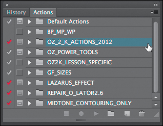
Figure 7.7. Expand the action set

Figure 7.8. The list of included actions
4. Click on the OZ_2_K_WITHOUT_SEP action to make it active (Figure 7.9).
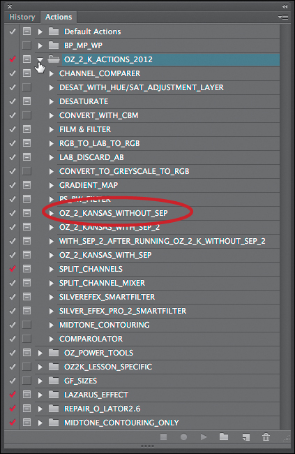
Figure 7.9. Selecting the OZ_2_K_WITHOUT_SEP action
5. Click on the Run Action button located at the bottom of the Actions panel. This will start the action (Figure 7.10).
Figure 7.10. The Run Action button
6. The action will duplicate the file and open the Save As dialog box.
7. In the Save As dialog box, you will see a file named OZ_2_KANSAS_BW.psd. Add the name LILAN_OZCH07_ to the beginning of that file name so that it becomes LILAN_OZCH07_OZ_2_KANSAS_BW.psd.
8. Click on the New Folder button located in the lower left corner of the Save As dialog box. Name this folder OZ_2_K_IMAGES and click Save to save the LILAN_OZCH07_OZ_2_KANSAS_BW.psd file to that folder.
As I have already mentioned, I programmed all of the actions in this action set to work this way so that the imaging workflow is nondestructive. This means that you assure yourself an exit strategy; a way to get back to the beginning.
Secondly, the actions work as they do to minimize the amount of data you store. Because the file sizes generated by modern cameras are so large, this issue is even more important. For example, if you open a file from a 24.5 megapixel camera in 16-bit, that file is approximately 150 MB. If you then do 11 things to the image, and of those 11 things, 8 of them involve actual pixels (not adjustment layers), you will have a file that may be upwards of 1.3 GB. That is a big file! I have found that by separating an image into multiple files that I can speed up the workflow and still preserve a nondestructive approach to image editing.
As amazing as actions are, and they are truly amazing, they are still all about ones and zeros so that there are some things that they cannot do. For example, an action cannot open the Info panel and it cannot name and find the folder in which you want to save a file. Therefore, when you run an action in which you want to choose “Save As,” you will have to stop the action and find the folder to which you want to save the file. Your action can name a file, but you cannot tell the action to copy the name of your file, because it will not be identical for every image, and actions merely record steps. There is no algorithmic logic involved.
When should you create an action? If you find yourself doing the same series of steps for more than three images, it is a good idea to create an action to do those steps. It is better to spend more time behind the camera being taken by an image and less time in front of the computer being taken away from creating images.
Step 2: The Creation of a Midtone Contouring Layer
Now that you have saved the file, LILAN_OZ_OZ_2_KANSAS_SEP_BW.psd, the OZ_2_K_WITHOUT_SEP action will create a layer named MIDTONE_CONTOURING. During the chromatic grayscale conversion process, Midtone Contouring happens “under the hood.” Notice that there is a separate action named MIDTONE_CONTOURING in the action set that you have just loaded into the Actions panel. Midtone Contouring (this approach is also known as Midtone Contrast) is such an important part of all of my image printing workflow that I use this technique 100% of the time as the very last step before printing every image (both color and chromatic gray-scale) that I create. The master printer, Mac Holbert of Nash Editions, created this technique, which is the basis for the Clarity algorithm in Adobe’s Photoshop Lightroom, and taught it to me. Mr. Holbert does this to 100% of the images that he prints.
An in-depth description of this technique is located in the Why To of My How PDF that you can download from the download site for this book. If you have read Welcome to Oz 2.0, then you are already familiar with this technique and action.
Let me reiterate: Midtone Contouring is the final thing that you do before you print, and when you are converting a color image to a chromatic gray-scale one, it is very important to know how using this technique will impact your printed image. This technique targets the midtone areas of an image and applies a high radius, low opacity, High Pass sharpening to the image using the Blend If functionality of a layer. It is helpful to know what happens when you apply Midtone Contouring, because it can slightly lighten the lighter midtone areas and slightly darken the darker midtone areas of the image.
Mac Holbert recommends that the opacity be set between 20 and 40%, but closer to 20%. So both here, and in the separate Midtone Contouring action, I have set the opacity to 30%, which is exactly in between Mac’s recommended 20 to 40. When the action is finished running and makes the final Master layer, the action automatically turns this layer off before merging all of the layers into what will be the final image. Examine the image before and after (Figure 7.11 and 7.12).
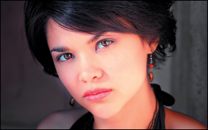
Figure 7.11. Before adding Midtone Contouring

Figure 7.12. After adding Midtone Contouring
Be aware that when you apply Midtone Contrast to an image, you must apply it to the image at the size at which you are going to print it at. This is because Midtone Contouring is a form of image sharpening and, as we all know, image size affects how much sharpening you apply.
The action does not stop to let you adjust the opacity of the Midtone Contouring layer. Adjusting the opacity is not important for the conversion process. So it does not matter if the image is over Midtone Contoured. This layer exists, as a visual aid, to help you create an image that will help you compensate for blown out highlights that may be created when you apply Midtone Contouring. Before creating the final Maser layer, the action will turn off the Midtone Contouring layer.
Step 3: Create a Hue/Saturation Adjustment Layer
The action will create a Hue/Saturation adjustment layer with the Saturation slider moved all the way to the right at 100%. As you did in the previous chapter, this technique is designed to help you analyze the color of an image. By increasing the saturation, you exaggerate the differences between the image’s colors making it easy to see which are dominant. The areas that posterize tend to be those with which you will have the greatest difficulty when it comes to the image editing process.
Notice that the colors in this image are very skewed to the yellows and reds (Figure 7.13). Knowing which colors dominate will help you decide how to adjust the Channel Mixer layers or additional Hue/Saturation layers for the final adjustments.
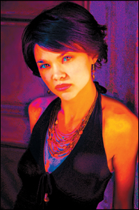
Figure 7.13. The image after increasing saturation to 100%
Step 4: Sample the Highlights
Next, the action shows you a dialog box that states, “Now, use the Color Sampler Tool to sample up to 4 highlights to observe their densities on the different channels. When done selecting the samples, restart the action.”
9. After reading the action instruction, click the Stop button.
10. Using the Color Sampler tool, make sample points of all the highlight areas that are posterized. Do this by Shift-clicking on the area that you want to sample and then releasing the mouse. This creates a set of reference points to help ensure that you do not blow out the highlight areas during the conversion to chromatic grayscale.
To spot potential trouble areas, look for extreme color posterization where smooth color gradations turn contrasty and saturated. Posterization usually occurs in areas where highlights are in danger of being blown out.
Dark areas can also exhibit the posterization effect. One way to tell if a posterized area is dark or light is to be aware that highlights tend to be represented by areas of brighter posterized colors.
In this image, there are four main areas of concern. I approach the decision process of what is or is not critical to the image like this: I decide which areas in an image are most important. For example, in this image I think that Lilan’s face, eyes, and any highlight area(s) on her face, are most important.
I certainly do not want her eyes so white that they appear to glow in the dark, and I want to make sure that they contain pixel information. Because I see a highlighted area on the bridge of her nose, I place a sample point there so that I will be able to see the numerical values of the Red, Green, and Blue channels as I make further adjustments (Figure 7.14).

Figure 7.14. The area of image importance
Since Photoshop allows you to drop only four sample points, you can select only four main areas of concern in any particular image.
My sample points are: Position 1 is in the highlight area of the white of her right eye (toward the subject’s left side). Position 2 is on the bridge of the subject’s nose. Position 3 is in the left side of the white of the left eye, and position 4 is in right side of the white of her right eye. (Figure 7.15).
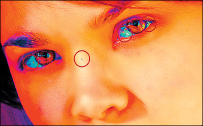
Figure 7.15. The sample areas in her face
11. In the Info panel, you will see the numerical values of red, green, and blue for each sample point (Figure 7.16).

Figure 7.16. The Info panel
When working with a digitally captured image file, you have more information in the midtone to shadow areas than you do in the highlights. Thus, if you blow out a highlight, it contains no information. Knowing this, I balance my images towards the highlights, because I know that I can pull information out of the shadows.
This is based on a notion called “Exposing to the Right.” (See the sidebar: The Right Exposure in Chapter 6.)
It is the RGB values of the sample points that you will be watching during the conversion. The goal is to make sure that you fall between 244-247 and do not exceed 247. I generally aim for 96% saturation, or some value between 244 and 247 (with the target being closer to 244) so that the highlights do not become blown out. (Specular highlights or pure paper white can go up to 255.) Absolutely the most important thing to keep in mind as you do this conversion, is that all four points do not have to equal a value between 244 and 247; just one does. Whichever sample point goes hot first (the one that hits 244 - 247) is the one that matters. The other three are no longer significant.
In the Zone System, the RGB values of 244–247 correspond to the end of Zone VIII and the beginning of Zone IX. These are areas of textured white. Though there may be a small amount of information in the 248–250 range, it tends to register as paper white. Shadow detail begins to appear at an RGB value of 7, which corresponds to the tail end of Zone I and the beginning of Zone II. I chose these values to take into account the greater dynamic ranges of DSLR sensors and the greater Dmax of inkjet printers/papers. (See sidebar: The Dynamics of the Highs and Lows of Dynamic Range in this chapter.) The goal is to hit 244, but with wiggle room up to 247. The risk of losing detail in the highlights increases as you get closer to 255, which corresponds to no data at all / the white of the paper. I will discuss this at greater length shortly.
12. When the sample points are set, restart the action by clicking on the Play button.
Step 5: The Creation of the Neutral Channel Mixer Adjustment Layer (CM Layer 1)
Next, the action will create the first of four Channel Mixer adjustment layers (named NEUTRAL in the layer stack). This first Channel Mixer adjustment layer will be the topmost Channel Mixer adjustment layer and the only one on which you cannot do any brushwork on its layer mask because this is your insurance layer. Monochrome will be selected in the dialog box and the Control sliders are set to equal values of red, green, and blue (+ 33% red, + 34% green, and + 33% blue) that when added together equal +100%. Adding this NEUTRAL layer allows you to do brushwork on the three Channel Mixer layers that are about to be created and that you are about to balance without being concerned that color might bleed through.
Step 6: The Creation of the Green Channel Mixer Adjustment Layer (CM Layer 2)
Next, the action will create the second of the four Channel Mixer adjustment layers (named GREEN in the layer stack). The three Channel Mixer adjustment layers (Green, Red, and Blue) are the key to this approach. The first is for the Green channel, the second is for the Red channel, and the third is for the Blue channel. The Green Channel Mixer adjustment layer will be set to 0% red, 100% green, and 0% blue. The Red Channel Mixer adjustment layer will be set to 100% red, 0% green, and 0% blue; and the Blue Channel Mixer adjustment layer will be set to 0% red, 0% green, and 100% blue. As was the case with NEUTRAL Channel Mixer adjustment layer, Monochrome will be selected by the action when it creates the three Channel Mixer adjustment layers.
You will start with the first of the three Channel Mixer adjustment layers on which you can do brush-work and adjust the balance for green because, as I have previously discussed in this book, the Green channel has twice as much data as either the Red or the Blue channel when it comes to a digital file captured from a digital camera. (Remember, as we discussed in Chapter 1 of this book as well as in this chapter, a Bayer array works in four pixel blocks, with one pixel for red, one for blue, and two for green.) Because the Green channel contains the most midtone data and the human eye is most sensitive to the green/yellow part of the visible spectrum of light, the Green channel is a good one with which to start your adjustments.
Another way to look at this approach to conversion is that the Green channel contains the midtone image structures, the Red channel contains the upper-end image structures (the upper midtone structures to highlight areas) and the lighter, brighter end of contrast, and the Blue channel tends to contain the lower-end image structures (the darker aspect of the midtone areas to the shadows) and the darker aspects of the contrast range of the image.
You are about to balance each individual channel to your visual preference. This is akin to being able to create an image-specific film with a unique tonal reproduction curve. As I discussed in Chapter 5, one of the issues of the Black & White adjustment layer is the amount of color bleed that can occur when using it. This occurs because the Black & White adjustment layer’s six Control sliders control six colors (the three primary [RGB] and three secondary [CMY] colors) and, as you saw, sometimes these controls can work against each other and cause serious issues. With the Channel Mixer adjustment layer technique, you are able to fine-tune the relationships between the three primary (RGB) colors that make up the actual channels of the image.
The question you may want to ask is, “Why not use a multiple Black & White adjustment layer technique instead of the Multiple Channel Mixer adjustment layer approach? More sliders means more control, right?” The answer is best explained in the words of Albert Einstein, “Make things as simple as possible and no simpler,” or (so the story goes) when Mozart said to the musician Antonio Salieri, “The problem with your music is there are too many notes.” For this application, there are too many variables to control to use a multiple Black & White adjustment layer technique, the number of issues would only be amplified. However, the Black & White adjustment layer in Adobe Photoshop is a very useful tool to quickly see where you want to go with an image, and it is a great way to extract hard-to-get-out colors.
When you are using the Channel Mixer adjustment layer technique, as you work on an image, pay attention to the numbers in the Info panel and try to keep them between 244 and 247, staying as close to 244 as possible. As with everything, do not make this dogma. Each image is different, so your choice of percentages will change.
Though it is important to pay attention to all highlight areas, you have to take into consideration the rest of the image. You also have two more Channel Mixer layers (one set for the Red channel and one for the Blue channel), as well as a Hue/Saturation adjustment layer, so that you can further fine-tune the image.
When an image has gone through chromatic grayscale conversion and you look at it from the top down, what has occurred is that the hue has been removed leaving the saturation and varying levels of brightness. If you look at the same image from the bottom up, the base image contains hue, as well as saturation and brightness.
As you have observed when you look at the color channels of an image, frequently there is image structure or image tonality that either is more obvious in one channel than it is in the other two or its tonal aspects are more visually appealing in one or more of the channels.
When using the Multiple Channel Mixer adjustment layer technique, because the Channel Mixer adjustment layer allows you to directly effect a change on the Red, Green, and Blue channels of your image, you will also observe the same differences in image structure and tonality that you saw in the image channels. What the Channel Mixer affords you is the ability to exploit and use those differences. You can also change the layer order and opacity. For example, when it comes to skin tone, frequently a higher ratio of red to green to blue is more desirable. When it comes to clouds and skies, often a balance more towards blue is better. Having the Green Channel Mixer adjustment layer be the first in the layer order frequently produces a more visually appealing image of a landscape. No two images are the same and, therefore, no two workflows are the same.
Many people believe that, when working with the Channel Mixer, the sum of the red, green, and blue values must always add up to 100. This is frequently taught when learning how to use the Channel Mixer adjustment layer. However, when doing a chromatic grayscale conversion using the method described in this chapter, you will find that the sum of those numbers will range from the high 80s to the low 130s. Rather than trying to match some arbitrary number, I recommend that you depend on your built-in spectrophotometer, densitometer, and color-imeter: your eyes.
The reason that you select the highlights areas over the shadows areas to favor in an image for this conversion process is because, in a digital image, if you blow out the highlights you will have completely lost all the information in those areas. This is not necessarily true with the shadows in a digital file. Depending on the ISO at which the image was shot, as well as the file type that was used, if you shot the file in the RAW file format, you have upwards of two-and-one-half stops of detail that can be extracted out of the shadows (keep in mind that though this is true, there tends to be more signal noise in this aspect of the file). Thus, when you balance the image, it is best to begin with the highlights. Also, each Channel Mixer adjustment layer comes with an attached layer mask. This allows you an extraordinary level of granular control over how the Channel Mixer adjustment layers interact with each other.
When you bring up the Channel Mixer adjustment layer dialog box, the image will look like Figure 7.17.
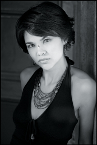
Figure 7.17. With a default Channel Mixer adjustment layer
When running actions, Photoshop CS6 uses the older version of the Channel Mixer dialog box. If you reopen the Channel Mixer adjustment after running the action, the dialog box will have the CS6 interface. There is no difference in functionality—just appearance.
13. Click on the Green slider (which is set to 100%) and move it to the left until the center gray values are slightly less than optimal and appear slightly flat. I selected 79% (Figures 7.18, 7.19, and 7.20).
Figure 7.18. The image at 79% Green
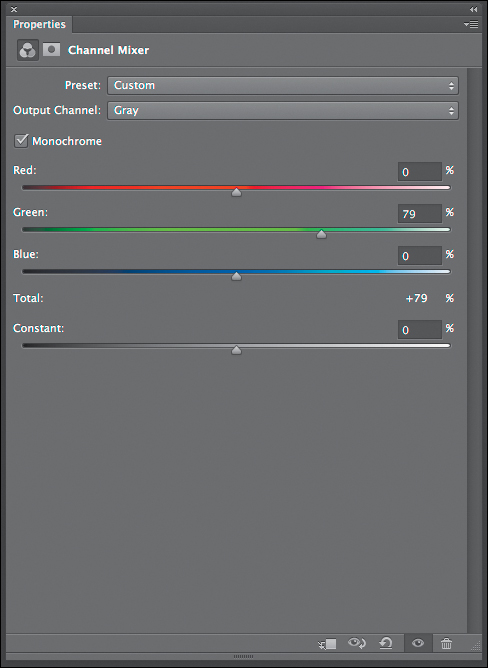
Figure 7.19. The Channel Mixer adjustment layer dialog
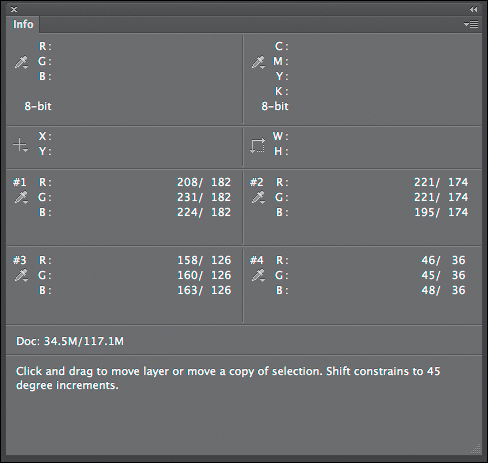
Figure 7.20. The Info panel
When determining which of the three Channel Mixer adjustment layers with which to begin working, do what the musician, Brian Eno, says about how he works, “ Go to an extreme and retreat to usable position.” You do this by moving the sliders back and forth, all the way to the left and then the right, until you find the “usable position.”
Remember, the Green channel usually contains more information about relative image brightness than the Red or Blue channels. Those contain information about relative image contrast, so they should be used to darken or lighten specific areas.
Your next step is to adjust the Red and Blue sliders in the Channel Mixer adjustment layer dialog box. As you make these adjustments, keep in mind that you have already placed four sample points on the image, each of which registers a series of RGB values that show up in the Info panel dialog box. Only one of these sample points is going to matter. Once this sample point goes hot (meaning the sample point reaches between 244-247), that becomes the one to which you will pay most attention. The other three become just information. It is also important to keep in mind that among the three separate Red, Green, and Blue Channel Mixer adjustment layers, which sample point goes hot can change from one Channel Mixer adjustment layer to another. You will find use for all this information in the second phase of this process; doing brushwork on each of the Channel Mixer adjustment layer’s layer masks.
14. Adjust the Red and Blue sliders to create an image with appealing midtone values without blowing out the highlights, blocking up the shadows, or flattening the image with an overall gray cast. I chose +16% red, +80% green, and +13% blue, with the Constant at 0% (Figures 7.21, 7.22 and 7.23).
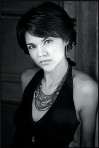
Figure 7.21. The image
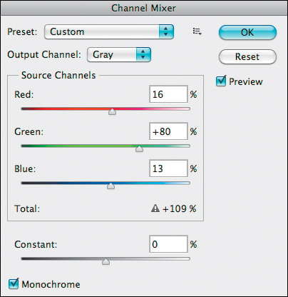
Figure 7.22. Adjusting the Red, Green and Blue sliders
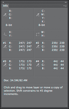
Figure 7.23. The Info panel
You should see that sample point 1 is at 247, the upper limit of the target value. Again, the reasoning for this is based on what is visually important to the image. Sample points 1, 3, and 4 are located in the whites of Lilan’s eyes and sample point 2 is located on the bridge of her nose—the highlight area of her face. Because the decision was made to place the adjustment at the upper limit of the adjustment range, the whites of her eyes should be textured white. By choosing a setting of 247, you place the area of sample point 2 in Zone IX. This choice also gives you the brightness on her face that you desire. As it is with all images, all of the decisions that you make are based on controlling the eye of the viewer and taking it on the visual journey through your image that you have predetermined.
Remember the discussion of White’s illusion at the end of Chapter 1—how you control both the light and dark grays in an image, where you place them in relation to each other, and how you control contrast, sharpness, and blur, will all determine, not only how the viewer’s eye travels through your photograph, but the illusion of three dimensionality as well. You are playing a visual mind game with the viewer of your image that, after all the image manipulation is done, should produce an image to which it should appear nothing was done. Everything dovetails into everything else. What you do with the image at the beginning affects the final print. Just as the artist, Matisse, believed that “black is the queen of all colors,” a black-and-white photograph (a chromatic grayscale) is the queen of all images. It takes a special image to withstand the abstraction to just its gray values and not every photograph is worthy.
In the Channel Mixer adjustment layer dialog box, notice that the total of the three channels equals 109%. One hundred percent is not your goal. Your goal is whatever appeals to your eye.
15. Click OK.
Step 7: The Creation of the Red Channel Mixer Adjustment Layer (CM Layer 3)
Once you click OK, the action turns off the Green Channel Mixer adjustment layer and creates the third Channel Mixer adjustment layer (named RED in the layer stack) that is balanced for red. The Channel Mixer adjustment layer dialog box has the Red slider set to 100% and the image looks like Figure 7.24.

Figure 7.24. The image at 100% Red
16. Click on the Red slider (which is set to 100%) and move it to the left until you reach the center gray values that are slightly less than optimal or that appear slightly flat. I chose 86% (Figures 7.25, 7.26, and 7.27).

Figure 7.25. The image at 86% Red
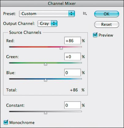
Figure 7.26. The Channel Mixer adjustment layer
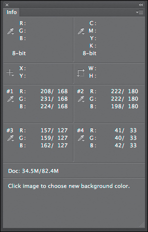
Figure 7.27. The Info panel
17. Adjust the Green and Blue sliders to create an image with appealing midtone values without blowing out the highlights, blocking up the shadows, or flattening the image’s overall gray cast. I selected +86% red, +13% green, and +14% blue, with the Constant at 0% (Figures 7.28, 7.29, and 7.30).
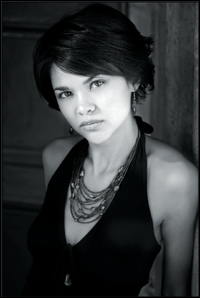
Figure 7.28. The image with the adjusted values from Step 17

Figure 7.29. The Channel Mixer adjustment layer
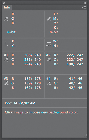
Figure 7.30. The Info panel
Once again, the sum of the three channels is greater than 100%. For this adjustment, they add up to 113%. Also, there was a change in which sample point went hot first. When you adjusted the Green Channel Mixer adjustment layer, sample point 1 was the first to go critical; but when you adjusted the Red Channel Mixer adjustment layer, sample point 2 went critical first. The reason for this, as you observed in Step 3 when you created a Hue/Saturation adjustment layer and increased the saturation to 100%, has to do with the color content of the two areas. One of the things to keep in mind during the Hue/Saturation phase of this process (the one where you determine where the sample points are to be placed) is to use that step to observe the colors that make up your image. Understanding the composition of the colors in an image can greatly inform your decisions on the path to grayscale conversion. I have found that the hue of your image, as it exists beneath the conversion process, matters greatly.
18. Click OK.
Step 8: The Creation of the Blue Channel Mixer Adjustment Layer (CM Layer 4)
Once you click OK, the action will turn off the Red Channel Mixer adjustment layer that you have just adjusted, and the action will create the fourth and final Channel Mixer adjustment layer (named BLUE in the layer stack) balanced for blue. You will see the Channel Mixer adjustment layer dialog box and the image will appear to look like this. (Figure 7.31, 7.32, and 7.33).

Figure 7.31. The image at 100% Blue
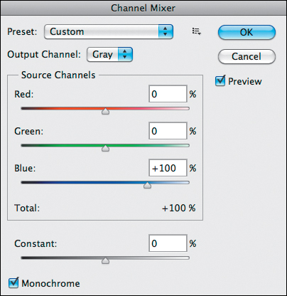
Figure 7.32. The Blue slider set to 100%
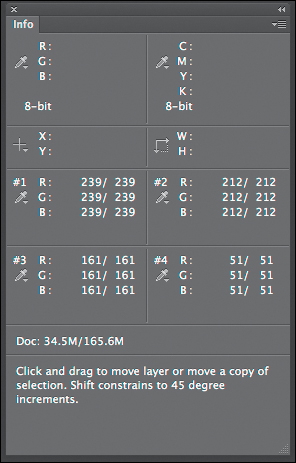
Figure 7.33. The Info panel
Notice that this particular Channel Mixer adjustment layer is decidedly different than the Green and Red Channel Mixer adjustment layers that you have just fine-tuned. The Green Channel Mixer adjustment layer was all about the midtones, the Red Channel Mixer adjustment layer was lighter than the Green one (though more similar to the Green Channel Mixer adjustment layer than the Blue Channel Mixer adjustment layer appears to be), and that the model’s skin in the Red Channel Mixer adjustment layer appears creamier (smoother, with less obvious pores and blemishes) than it did in the Green Channel Mixer adjustment layer. In the Blue Channel Mixer adjustment layer, the skin tones are much darker than they were in the Red and Green Channel Mixer adjustment layers, and the skin is mottled and less creamy than it was in the Red Channel Mixer adjustment layer. So, even though all three Channel Mixer adjustment layers show tonal similarities, they are decidedly different.
19. Click on the Blue slider, which is set to 100%, and move it to the left until you reach center gray values that are slightly less than optimal or that appear slightly flat. I chose 89% (Figures 7.34, 7.35, and 7.36).
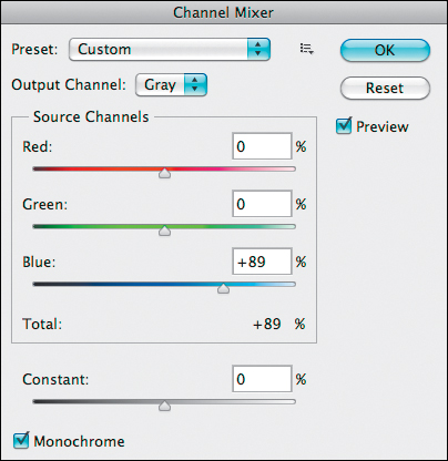
Figure 7.35. The Blue slider set to 89%

Figure 7.34. The image at 89% Blue
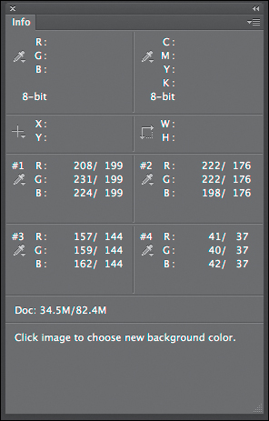
Figure 7.36. The Info panel
20. Adjust the image once again, paying attention to the Green and Red sliders so that you create an image with appealing midtone values without blowing out the highlights, blocking up the shadows, or flattening the image’s overall gray cast. I selected +11% red, +10% green, and +89% blue, with the Constant at 0% (Figures 7.37, 7.38, and 7.39).
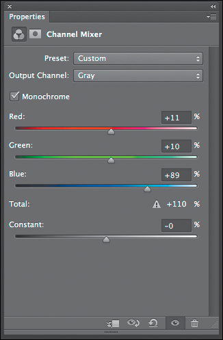
Figure 7.38. Channel Mixer adjustment layer
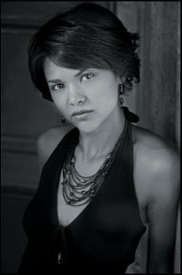
Figure 7.37. The image after Step 20

Figure 7.39. Info panel
Remember that this is a dance, and sometimes you have to readjust your settings. For example, the Blue channel was readjusted after the Red and Green sliders were adjusted. The decision process combines what looks most visually appealing with ensuring that the range of 244-247 not be exceeded.
21. Click OK.
Yet again, the total percentage of the fine-tuned Blue Channel Mixer adjustment layer is greater than 100%; it is 110%. You have just adjusted three channels to your vision of them and created a chromatic grayscale image that preserves the spectral relationships among R, G, and B in the same manner that they would have been recorded if the image had been shot on black-and-white film. To best understand the significance of what you have just done, compare the original source channels before any chromatic grayscale conversion had occurred and what the individual adjusted Channel Mixer adjustment layers look like after conversion (Figures 7.40, 7.41, 7.42, 7.43, 7.44, and 7.45).
Figure 7.40. The Green channel before
Figure 7.41. The Green channel after
Figure 7.42. The Red channel before
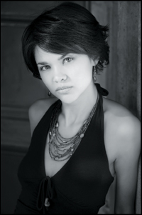
Figure 7.43. The Red channel after

Figure 7.44. The Blue channel before
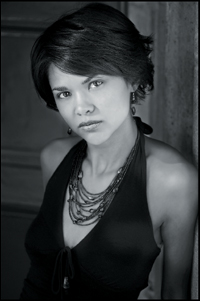
Figure 7.45. The Blue channel after
Located in this chapter’s folder (that you downloaded from the download site for this book) is a file named LILIAN_CM_2_CHANNEL_COMPARE.psd in which you can compare the adjusted Channel Mixer adjustment layers to the actual color channels.
Step 9: Comparison of the Adjusted Red, Green, and Blue Channel Mixer Adjustment Layers
Now that the action has created the four Channel Mixer adjustment layers and you have completed fine-tuning them, the action will show you how they appear individually. This is necessary so that you may determine what aspects of each you like and dislike.
22. A dialog box will come up with the following message: “Now, you’ll be shown each color channel individually. This is the Blue channel.” (Figure 7.46)
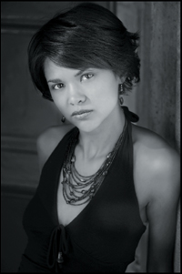
Figure 7.46. The Blue channel
23. Once you determine what aspects of the image you like and dislike, click Continue.
24. A new dialog box will come up with the following message: “This is the Red channel. Click Continue to view the Green channel.” (Figure 7.47)
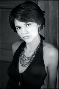
Figure 7.47. The Red channel
25. Determine what aspects of the image you like and dislike, and click Continue.
26. A new dialog box will come up with the following message: “This is the Green channel. Now click Continue.” (Figure 7.48)
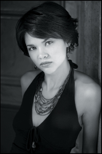
Figure 7.48. The Green channel
27. Determine what aspects of the image you like and dislike, and click Continue.
28. The following dialog box will come up: “Now adjust the opacities for each color channel adjustment layer and selectively paint the desired tonalities in using the layer masks. Also consider switching the order of the layers. Then restart the action.”
29. Click Stop.
Step 10: Further Fine-Tuning the Red, Green, and Blue Channel Mixer Adjustment Layers Using the Attached Layer Masks
One of the great advantages offered by Photoshop to the (as Ansel Adams put it) “artist and functional practitioner” is the fine control that you have over every image. As you have just seen, you can remix the individual Red, Green, and Blue channels to match your aesthetic needs. Then, you can further fine-tune those adjustments using layer masks and layer opacity.
In the next steps, you will address isolated areas in the image so as to allow the colors of the base image to filter upward and through to the layer above and so on. When working with layers, keep in mind that when a layer is at 100% opacity, nothing beneath that layer comes through. As you lower the opacity of the top layer, less of the top layer becomes visible and more of the layer below shows through. Also, the layer masks that are attached to each of the Channel Mixer adjustment layers allow you to even more selectively control the layer’s opacity.
It is important to remember that the bottom-most Channel Mixer adjustment layer (the Green Channel Mixer adjustment layer) is the primary layer, which means that this is the layer that has the most influence on the way this image looks. If you want to change that, you either have to switch the position of that Channel Mixer adjustment layer or use the attached layer masks. Be aware that sometimes it will appear that you are working backwards. For example, my decision process for this image was as follows. I liked the overall appearance of the Green Channel Mixer adjustment layer. I liked the creamy skin tones in the Red Channel Mixer adjustment layer, and I liked the deepness of the skin tones in the Blue Channel Mixer adjustment layer.
What I did not like in the Green Channel Mixer adjustment layer was the level of contrast in the subject’s skin tone and lips. I did not like the flatness in the skin tones of the Red Channel Mixer adjustment layer, and lastly, I did not like the mottled skin tone in the Blue Channel Mixer adjustment layer. The way to address all of these issues is by doing brushwork on the individual Channel Mixer adjustment layer’s layer masks.
To give you a visual guide to what I liked and disliked about this image, look at the image maps that I created as a guideline to the brushwork that you are about to do (Figure 7.49). As I discussed on page 6 of Welcome to Oz 2.0, an image map is a Photoshop layer (that sits on top of the image layer stack) on which you can make notes and lists of what you are planning to do to an image. You can also use it to make notations on the various steps you will take, but what it does best is to teach you how to create image-specific workflows. An image map is basically a planning device that helps you see the trees from the forest.
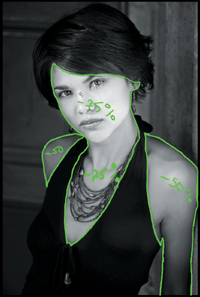
Figure 7.49. The Green channel adjustment layer’s image map
When you create an image map, keep in mind that you are not married to the percentages that you write down. For example, I might write a notation of “75%” in one area, “50%” in a second area, “30%” in a third, and “25%” in a forth. What this means to me is that I want more of the effect in the 75% area than in the 50% area, etc. Also, I use a + or a – to indicate whether I am adding or subtracting an effect. (See the sidebar: Unmasking Layer Masks and the 80/20 Rule in Chapter 2.)
Look at the image map starting with the one for the Green Channel Mixer adjustment layer’s layer mask. The areas in which you will do brushwork is shown in Figure 7.49.
As you can see by the image map, you are going to diminish the amount of the Green Channel Mixer adjustment layer’s effect on the subject’s face and chest more than you should on her arms. I chose -75% on her face and chest, and -50% on her arms and back shoulder.
For all of the layer masks that have been created throughout this book, follow the approach to layer mask creation discussed in Chapter 2 in the sidebar: Error-Free Layer Masks.
Though I recommend that you use either a tablet-based approach to image editing (Wacom Intuos tablet) or, my favorite, a pen display approach (Wacom Cintiq) for the creation of layer masks, you can create reasonably precise layer masks using a mouse, trackball, or track pad. All you need is practice.
To see how to create an image map, there is a QuickTime movie that you can download from the download page for this book.
30. Turn off the Blue Channel Mixer adjustment layer by clicking on the eyeball to the left of the layer.
You should have the Neutral Channel Mixer adjustment layer, the Red Channel Mixer adjustment layer, and the Green Channel Mixer adjustment layer turned on.
31. Make the Green Channel Mixer adjustment layer the active one, and make the Green Channel Mixer adjustment layer’s layer mask active by clicking directly on the layer mask.
32. Making sure that the foreground color is black and the background color is white, select the Brush tool (keyboard command B) in the Tools panel.
33. Set the brush opacity to 50% (keyboard command “5”).
34. Set the brush width to a diameter of 200 pixels and brush in her face, neck, and chest.
35. Bring up the Fade Effect dialog box (Command + Shift + F / Control Control + Shift + F) and move the slider to the right until you reach the desired effect. I chose 78%.
You should see this (Figures 7.50 and 7.51).
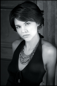
Figure 7.50. The image with just her face and neck brushed in
Figure 7.51. The layer mask
36. With the brush opacity still set to 50%, lower the brush width to a diameter of 125 pixels using the left bracket key, and brush in her back shoulder, front shoulder, and arm.
37. Bring up the Fade Effect dialog box (Command + Shift + F / Control + Shift + F) and move the slider to the left until you reach the desired effect. I selected 42%.
You should see this (Figures 7.52 and 7.53).

Figure 7.52. The image with her face, neck and shoulders brushed in
Figure 7.53. The layer mask
If you were to turn off both the Neutral Channel Mixer adjustment layer and the Red Channel Mixer adjustment layer, you would see an image consisting of both chromatic grayscale and full color areas. The colors have filtered up through the layer mask of the Green Channel Mixer adjustment layer to the next Channel Mixer adjustment layer that is balanced for red. In other words, the colors from the layers beneath the chromatic grayscale conversion process affect the way the conversion process looks as they filter upwards (Figure 7.54).
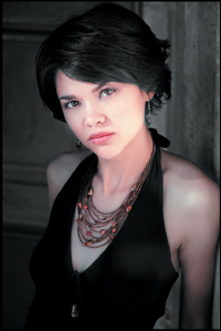
Figure 7.54. The colors beneath the conversion
38. Turn on the Blue Channel Mixer adjustment layer by clicking on the eyeball.
39. Make the Red Channel Mixer adjustment layer the active one and make the Red Channel Mixer adjustment layer’s layer mask active by clicking directly on the layer mask.
40. Using the right bracket key, increase the brush width to a diameter of 200 pixels, and brush in her face, neck, and chest. Bring up the Fade Effect dialog box (Command + Shift + F / Control + Shift + F) and move the slider to the right until you reach the desired effect. I chose 14%.
You should see this (Figures 7.55 and 7.56).
Figure 7.55. The image with her face and neck brushed back on the Red Channel adjustment layer
Figure 7.56. The layer mask
41. With the brush opacity still set to 50%, use the left bracket key and lower the brush width to a diameter of 125 pixels. Brush in her back and front shoulder, and her arm.
42. Bring up the Fade Effect dialog box (Command + Shift + F / Control + Shift + F), and move the slider to the left until you reach the desired effect. I selected 42%.
You should see this (Figures 7.57 and 7.58).

Figure 7.57. The image with her face, neck, and both shoulders brushed back
Figure 7.58. The layer mask
If you were to turn off the Neutral Channel Mixer adjustment layer, and leave on the Red and the Green Channel Mixer adjustment layers, you would see an image consisting of both chromatic grayscale and full color areas. Not only have the colors filtered up through the layer mask of the Green Channel Mixer adjustment layer, they have affected the next Channel Mixer adjustment layer; the one that is balanced for red. Again, the colors of the layers beneath the conversion process affect the way the conversion process looks as they filter upwards (Figures 7.59 and 7.60).
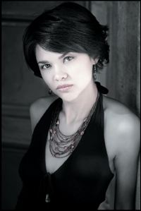
Figure 7.59. The color image with both adjustment layers on

Figure 7.60. The color image with just the Red Channel Mixer adjustment layer on
You are in the home stretch of the Multiple Channel Mixer adjustment layer conversion approach. Next, you will further fine-tune the underlying colors of this image by using the Hue/Saturation adjustment layer that this action created at the very beginning; the one that you used to analyze the color of the image and to find the highlight areas that you wanted to protect.
Step 11: Filters Without Filter Factors: Super Granular Color Control Using Hue/Saturation Adjustment Layers
One of the things that I love most about being a digital still photographer is that not only can I have my cake and eat it too, I can have extra buttercream frosting and not gain any weight. One of the great advantages of digital photography is that the only filters that you need to carry in the field are UV filters to protect your lenses, a polarizer, two gradient neutral density filters, a variable density filter and, perhaps, a close-up filter like the Canon 500D or the Tiffen close-up filter set.
The Canon 500D close-up lens screws onto the front of all but one of my lenses like a filter. (It is referred to as a lens and not a filter, because it is made up of two elements.) All of the filters that I use are Tiffen: specifically the Tiffen polarizer, variable neutral density, UV, and close-up filter set. I use both the Canon 500 D close-up filter and the Tiffen close-up filter set because they have different qualities of bokeh. When I use these close-up filters and lenses, I prefer to shoot with zoom lenses instead of prime lenses because zoom lenses allow me to change my framing without changing my perspective. Also, these filters allow me to convert all my lenses into macro lenses.
You no longer need to carry any of the colored filters that were once required to change what happened to the color of the light as it hit the black-and-white film inside your film camera, and you no longer need be concerned with a filter factor. A filter factor refers to the multiplicative amount of light that a filter blocks. What that means is that when you put a piece of colored glass in front of your lens, you had to either slow down the shutter speed or open up the aperture to allow in more light. And, of course, you could not undo the effect because it was forever cooked into the negative. With digital technology, this is no longer an issue. You can add the same types of effects that you could achieve with color filters without having to actually put one in front of the lens. Other pluses are: you no longer need be concerned with filter factors, you can selectively filter any area of the image, and you can use multiple colored filters selectively.
In this step, you will selectively adjust one area of the image; the subject’s mouth, because something was lost in this area of the image while doing the brushwork on the individual Channel Mixer adjustment layer’s layer masks. In the visual journey that the viewer’s eye takes through this image, I want the journey to begin with her eyes, and end at her mouth. Everything that I did to the image during the image editing process before chromatic grayscale conversion was to reinforce these choices. However, after doing brushwork to the layer masks of the Green and Red Channel Mixer adjustment layers’ layer masks, the detail in the subject’s mouth was reduced, thus lowering its visual appeal. These next steps correct these issues.
43. Zoom into the area of the subject’s mouth (Figure 7.61).

Figure 7.61. The area of the mouth
44. Make the Hue/Saturation adjustment layer the active one.
45. From the Hue/Saturation adjustment layer’s color pull-down menu, select Reds (Figure 7.62).
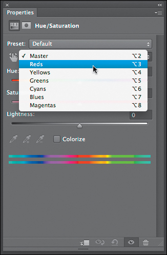
Figure 7.62. The Reds in the pull-down menu
46. Click on the Saturation slider and move it right to 100%. (Remember: Go to an extreme and then retreat to a usable position.) (Figure 7.63 and 7.64)

Figure 7.63. The Hue/Saturation adjustment layer dialog
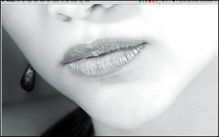
Figure 7.64. The area of her mouth at 100% saturation
47. Click on the Lightness slider and move it left to -63%. (Notice how this darkens her lips and begins to add detail back in.) (Figures 7.65 and 7.66)

Figure 7.65. -63% Lightness slider
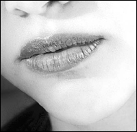
Figure 7.66. The mouth at -63% lightness
48. Click on the Hue slider and move it left to -14%. (Even more detail is added.) (Figures 7.67 and 7.68)
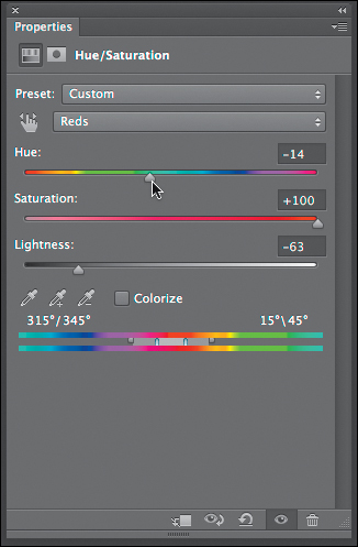
Figure 7.67. -14% Hue slider
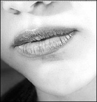
Figure 7.68. The mouth at -14% hue
49. Click on the Saturation slider and move it left until the banding in the image disappears. I chose 77%. (You can still see banding at the edge of her face.) (Figures 7.69 and 7.70)
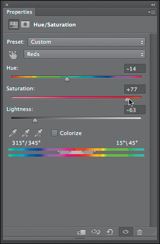
Figure 7.69. 77% Saturation
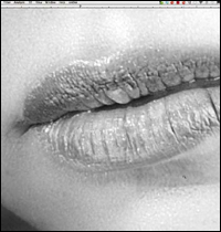
Figure 7.70. The mouth at 77% saturation
This is what the subject’s mouth area looks like in color before and after you made the adjustment (Figures 7.71 and 7.72).
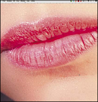
Figure 7.71. The color image before the adjustment
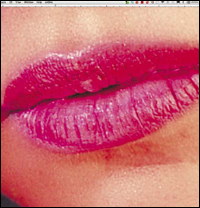
Figure 7.72. The color image after the adjustment
50. Make the Hue/Saturation adjustment layer’s layer mask active and fill the layer mask with black.
51. Making sure that the brush opacity is set at 50%, the foreground color is white, and the background color is black, select a brush width of 25 pixels.
52. Zoom out so that her face fills your screen and click on the backslash key (\). This puts Photoshop in Ruby-Lith mode. (This makes it easy for you to see where you painted on the layer mask.) (Figure 7.73)
Figure 7.73. The image in Ruby-Lith mode
53. Brush in the entire area of her mouth. (Be sure to do this in one pass. Do not brush multiple times. If there are any areas that you missed, they are easily corrected once you achieve the desired final opacity.) (Figures 7.74 and 7.75)
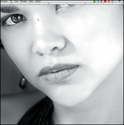
Figure 7.74. The lips after brush back
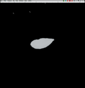
Figure 7.75. The layer mask
54. Click on the backslash key (\) to take Photoshop out of Ruby-Lith mode.
55. Bring up the Fade Effect dialog box (Command + Shift + F / Control + Shift + F) and move the slider to the left until you reach the desired effect. I selected 42% (Figures 7.76, 7.77, 7.78, and 7.79).
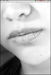
Figure 7.76. The lips before
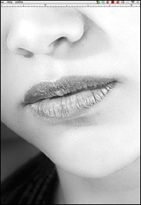
Figure 7.77. The lips after
Figure 7.78. The layer mask

Figure 7.79. The final image
Step 12: The Last Act of the Action
You have already created the relationship between the Red, Green, and Blue Channel Mixer adjustment layers that you find visually appealing. You have also adjusted specific areas of the image with both the individual Channel Mixer adjustment layer’s layer masks and with the Hue/Saturation adjustment layer so that you have what you feel is the optimal interplay of color. From RAW file to output, I recommend that your workflow should always go from global to granular. This means that once you create your desired relationships between layers, adjustments, etc., then you should fine-tune those relationships. When you click on the layer set that contains all of the Channel Mixer adjustment layers, you should see that sample point 1 is now at 251—four points above optimum. (Remember, the goal is to stay between 244 and 247 in the highlight areas of the image.) In other words, the highlight on the bridge of the model’s nose is now blown out. You will address this issue using the Constant slider, which is the fourth slider in the Channel Mixer adjustment layer dialog box.
The Constant slider works by adding a black or white channel of varying opacity to the Channel Mixer adjustment layer. When the slider is negative, it acts as a black channel and globally darkens the Channel Mixer adjustment layer. When it is positive, it acts as a white channel and globally lightens the Channel Mixer adjustment layer. I have found that the latitude of compensation should never be more than plus or minus 10%. If it is over 10%, then you should consider readjusting the mix of the Channel Mixer adjustment layer. You may often get a relationship of red to green to blue that you find appealing, but you also may find that the highlights are blown out or the deep shadows are too dark. The Constant slider lets you compensate for this.
Because the issue in this image is one of blown out highlights, and you have already created relationships among the channels that you like, you can proceed in one of several ways. You could go back to the offending Channel Mixer adjustment layer and selectively brush in the blown out area on that Channel Mixer adjustment layer’s layer mask, but that may cause several new problems. You could lower the opacity of one of the Channel Mixer adjustment layers, but this may change how the colors filter through the individual Channel Mixer adjustment layers. Because I believe in making things as simple as possible, but no simpler, I would change the density of one of the channels. The issue is to determine to which of the three Channel Mixer adjustment layers to add density.
Of the Red, Green, and Blue Channel Mixer adjustment layers, you did brushwork on only two, the Red and Green. Because the Blue was untouched, it is the one in which the areas that have not received brushwork on the Red and Green Channel Mixer adjustment layer’s layer masks have the least effect on the image. Therefore, the only areas that are signifigantly influenced by the Blue Channel Mixer adjustment layer are in the subject’s face, neck, chest, and arms. The Blue Channel Mixer adjustment layer has little effect on the background and her hair.
When you change the Constant percentage in the Channel Mixer adjustment layer, the overall density of the Channel Mixer adjustment layer that you were affecting will lighten or darken. Since you will be darkening to lower the area of the highlight on the subject’s nose, there will be some areas in this image that you will want to protect from darkening; specifically, the deep shadow areas in her hair and dress. If you decrease the Constant value in the Green Channel Mixer adjustment layer, which is the primary Channel Mixer adjustment layer, you will significantly darken those areas. If you also decrease the Constant value in the Red Channel Mixer adjustment layer, which is the secondary Channel Mixer adjustment layer, once again - though not as much - you will significantly darken those areas. By adjusting the Blue Channel Mixer adjustment layer in this image; the one that exerts the smallest effect on the image, you preserve the relationships between the three Channel Mixer adjustment layers that you wanted as well as addressing the issues of the blown out highlights.
I invite you to play with the Constant values of the Red and Green Channel Mixer adjustment layers. Do this so that you can see for yourself what happens when you adjust the Constant value on each of them.
56. Make the BLUE Channel Mixer adjustment layer the active one.
57. In the Channel Mixer adjustment layer dialog box, click on the Constant slider and move it left until you reach the desired effect. I chose -2%.
Even after lowering the Constant you should notice that the Info panel is showing sample point 1 at 255 and sample point 2 at 250. The target is still 244-247, so further fine-tuning of the BLUE layer is needed.
58. Click on the Blue slider and move it to the left until sample point 1 in the Info panel falls into the 244-247 range, which for this image is at 87% (Figures 7.80, 7.81, 7.82 and 7.83).

Figure 7.80. Adjusting the Blue slider to 87%
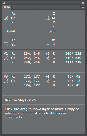
Figure 7.81. The Info panel after the adjustment
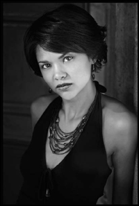
Figure 7.82. The image before the final tweak

Figure 7.83. The image after the final tweak
59. Restart the action. It will create a Master layer and then save the file.
60. The action will then duplicate the file that you just converted.
61. The Duplicate Image dialog box will come up. Replace the word “copy” in the dialog box with “_FINAL” and what you should see in this dialog box is LILAN_OZCH07_OZ_2_KANSAS_BW_FINAL.
62. Click OK.
63. The action will Save As the duplicated file and, in the Save As dialog box, make sure that the name is LILAN_OZCH07_OZ_2_KANSAS_BW_FINAL. The action will then save this file as a TIFF file.
Examine the final image (Figure 7.84).

Figure 7.84. The final image
It is at this point that I normally tone the image. I will not discuss toning of black-and-white photographs, because this book is about converting color images to chromatic grayscale ones. Toning is an aesthetic choice that you make post-conversion.
Image 2: Using a Multiple Channel Mixer Conversion Approach on a Landscape
For the second lesson of this chapter, you will again run an action that converts a color image to chromatic grayscale using the Multiple Channel Mixer adjustment layer conversion approach. But, with this image, you will change the layer order.
In this lesson, I list all the steps (nothing critical is omitted), but I have left out the discussions of why the choices are made; those were covered in the previous lesson. Anything not covered in the last lesson, will be expounded upon here.
Step 1: Running the Oz 2 Kansas Action
1. From the folder that you have downloaded for this chapter, open the file MIST_OZCH7.tif.
Make sure that the Info panel is open and moved to an area on your monitor’s screen that does not cover up an area of the image that will be critical to the conversion process. The information contained in the Info panel is of utmost importance for this conversion approach. Without it, you will be guessing.
2. From the Actions panel, open the OZ_2_K_ACTIONS_12 actions set by clicking on the disclosure triangle located to the left of the folder.
3. Click on the OZ_2_K_WITHOUT_SEP action to make it active.
4. Click on the Run Action button located at the bottom of the Actions panel. This will start the action.
5. The action will create a Master layer, duplicate the file, and open the Save As dialog box.
6. In the Save As dialog box, the file is named OZ_2_KANSAS_SEP_BW.psd. Add MIST_OZCH7_ to the beginning of that name so that the file name becomes MIST_OZCH7_OZ_2_KANSAS_SEP_BW.psd.
7. Open the OZ_2_K_IMAGES folder, click Save, and save the MIST_OZCH7_OZ_2_KANSAS_SEP_BW.psd file to that folder.
Step 2: Creating a Midtone Contouring Layer
The action will create a Midtone Contouring layer. (See Step 2: The Creation of a Midtone Contouring Layer for Image 1: Using a Multiple Channel Mixer Conversion Approach on a Portrait earlier in this chapter for a detailed description of the action.)
Step 3: Creating a Hue/Saturation Adjustment Layer
The action will create a Hue/Saturation adjustment layer with the Saturation slider moved all the way to the right and set to 100% (Figure 7.85).
Figure 7.85. The image set to 100% saturation
Step 4: Sample the Highlights
Next, the action shows a dialog box that states, “Now, use the Color Sampler Tool to sample up to 4 highlights to observe their densities on the different channels. When done selecting the samples, restart the action.”
8. After reading the action’s instructions, click the Stop button.
9. Using the Color Sampler tool, make sample points of all the highlight areas that are posterized.
You do this by Shift-clicking the area that you want to sample and then releasing the mouse. To spot potential trouble areas, look for extreme color posterization where smooth color gradations turn contrasty and overly saturated. If necessary, you can move a sample point that you have already placed by click-dragging a previously placed sample point.
In this image, the four main areas of concern are located in the upper part of the waterfall (Figure 7.86).

Figure 7.86. The areas of importance
10. In the Info panel, you will see the numerical values of red, green, and blue for each sample point (Figure 7.87).
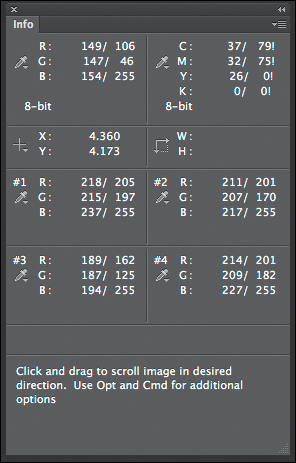
Figure 7.87. The Info panel
Because you have more information in the midtone to shadow areas than you do in the highlights, watch those values during the conversion, and make sure none exceeds 244–247. In the Zone System, 244–247 corresponds to the end of Zone VIII and the beginning of Zone IX. These are the areas of textured white.
11. When the sample points are set, restart the action by clicking on the Play button.
Step 5: Creating the Neutral Channel Mixer Adjustment Layer (CM Layer 1)
The action creates the first of four Channel Mixer adjustment layers (named NEUTRAL in the layer stack). This Channel Mixer adjustment layer will be the topmost one and is the only one on which you cannot do any brushwork.
Step 6: Creating the Green Channel Mixer Adjustment Layer (CM Layer 2)
Next, the action creates the second of the four Channel Mixer adjustment layers (named GREEN in the layer stack). (For further discussion, see Step 6: The Creation of the Green Channel Mixer Adjustment Layer (CM Layer 2) of Image 1: Using a Multiple Channel Mixer Conversion Approach On a Portrait earlier in this chapter.)
12. Click on the Green slider, which is set to 100%, and move it to the left until you reach center gray values that are slightly less than optimal or that appear slightly flat. I selected 79% (Figure 7.88).
Figure 7.88. The image at 79%
You determine the starting level for any one of the three Channel Mixer adjustment layers by moving the sliders back and forth to the extreme left and right until you find the usable position.
Remember, the Green channel generally contains more information about relative brightness than either the Red or Blue channels.
Next, you will adjust the Red and Blue sliders.
13. Adjust the Red and Blue sliders to create an image with appealing midtone values without blowing out the highlights, blocking up the shadows, or flattening the image with an overall gray cast. I chose +13% red, +79% green, and +20% blue, with the Constant at 0% (Figure 7.89, 7.90, and 7.91).

Figure 7.89. The image after adjusting the Channel Mixer
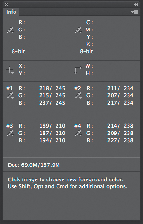
Figure 7.90. The Info panel
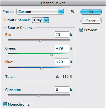
Figure 7.91. The Channel Mixer dialog box
Based on what is visually important to the image, sample point 1 should be at 245.
In the Channel Mixer adjustment layer dialog box, the total of the three channels equals 112%. What looks good to your eye is important, not that the total equals 100%.
14. Click OK.
Step 7: Creating the Red Channel Mixer Adjustment Layer (CM Layer 3)
The action creates the third of the four Channel Mixer adjustment layers (named RED in the layer stack). (For further discussion, see: Step 7: The Creation of the Red Channel Mixer adjustment Layer (CM Layer 3) for Image 1: Using a Multiple Channel Mixer Conversion Approach On a Portrait earlier in this chapter.)
15. Click on the Red slider, which is set to 100%, and move it to the left until you reach center gray values that are slightly less than optimal or that appear slightly flat. I selected 72% (Figure 7.92).

Figure 7.92. The image at 72% Red
16. Adjust the Green and Blue sliders to create an image with appealing midtone values without blowing out the highlights, blocking up the shadows, or flattening the image with an overall gray cast. I chose +72% red, +18% green, and +21% blue, with the Constant at 0% (Figures 7.93, 7.94, and 7.95).

Figure 7.93. The image at 72% Red, 18% Green, 21% Blue
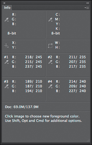
Figure 7.94. The Info panel
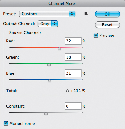
Figure 7.95. The Channel Mixer dialog box
The sum of the three channels is 111%, i.e., it is greater than 100%. Also, there was a shift in which sample point went hot first.
17. Click OK.
Step 8: Creating the Blue Channel Mixer Adjustment Layer (CM Layer 4)
Next, the action creates the last of the four Channel Mixer adjustment layers (named BLUE in the layer stack). (For further discussion see: Step 8: The Creation of the Blue Channel Mixer Adjustment Layer (CM Layer 4) under Image 1: Using a Multiple Channel Mixer Conversion Approach On a Portrait earlier in this chapter.)
18. Click on the Blue slider, which is set to 100%, and move it to the left until you reach center gray values that are slightly less than optimal or that appear slightly flat. I selected 92% (Figure 7.96).

Figure 7.96. The image at 92%
19. As you adjust the image, pay close attention to the Green and Red sliders so that you create an image with appealing midtone values without blowing out the highlights, blocking up the shadows, or flattening the image with an overall gray cast. I chose +9% red, +3% green, and +92% blue, with the Constant at 0% (Figures 7.97, 7.98, and 7.99).
Figure 7.97. The image at 9% Red, 3% Green and 92% Blue
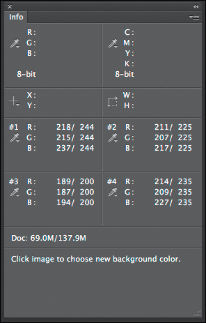
Figure 7.98. The Info panel
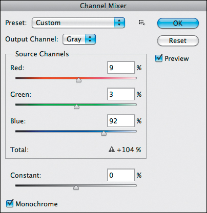
Figure 7.99. The Channel Mixer dialog
20. Click OK.
Once again, the total percentage of the fine-tuned Blue Channel Mixer adjustment layers is greater than 100%; it is 104%. To best understand the significance of what you have done, do a side-by-side comparison of the original source channels before any chromatic grayscale conversion with each adjusted Channel Mixer adjustment layer (Figures 7.100, 7.101, 7.102, 7.103, 7.104, and 7.105).

Figure 7.100. Original Red channel
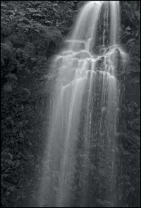
Figure 7.101. Red Channel Mixer adjustment
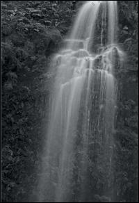
Figure 7.102. Original Green channel

Figure 7.103. Green Channel Mixer adjustment layer
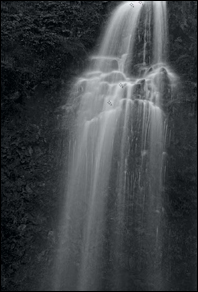
Figure 7.104. Original Blue channel

Figure 7.105. Blue Channel Mixer adjustment layer
Step 9: Comparing the Adjusted Red, Green, and Blue Channel Mixer Adjustment Layers
The action has created the four Channel Mixer adjustment layers and you have fine-tuned them. Next, the action will show you each one. This gives you the opportunity to look at each Channel Mixer adjustment layer and decide what about each you like and dislike. Once you have done that, go to the next step.
21. Click Continue.
22. A new dialog box will come up with the following message: “This is the Red channel. Click Continue to view the Green channel.” Click Continue.
23. A new dialog box will come up with the following message: “This is the Green channel. Now click Continue.” Once you have observed how this adjusted Channel Mixer adjustment layer looks and evaluated what about it you like and dislike, click Continue.
24. The following dialog box will come up: “Now adjust the opacities for each color channel adjustment layer and selectively paint the desired tonalities in using the layer masks. Also consider switching the order of the layers. Then restart the action.”
25. Click Stop.
Step 10: Further Fine-Tuning the Red, Green, and Blue Channel Mixer Adjustment Layers Using the Attached Layer Masks
Now that you have created the individual Red, Green, and Blue Channel Mixer Adjustment layers and balanced each of them to your liking, you will further fine-tune those adjustments using layer masks, layer opacity, and layer order.
Once again, when a layer is at 100% opacity, nothing beneath that layer comes through. As you lower the opacity of the top layer, less of the top layer becomes visible and more of the layer below it shows through.
Currently, the bottom most Channel Mixer adjustment layer is the Green one. This makes it the primary layer and, as such, it has the most influence over the way this image looks. When looking at the individual Channel Mixer adjustment layers, I thought that the Blue Channel Mixer adjustment layer held the most drama, especially in the rock and foliage areas on either side of the waterfall. In particular, I liked that these areas fell solidly in Zone II and III. The combination of the Green and Red Channel Mixer adjustment layers is where I found the greatest detail and texture in the waterfall. Based on these observations, it made the most sense to me to choose the Blue Channel Mixer adjustment layer as the primary one with the Red still as the secondary and the Green Channel Mixer adjustment layer replacing the original position of the Blue Channel Mixer adjustment layer (the one just below the Neutral Channel Mixer adjustment layer).
I decided where to do brushwork based on the following: I liked the appearance of the rocks and foliage in the Blue Channel Mixer adjustment layer, but when just the Blue Channel Mixer adjustment layer was visible, I did not like the overall darkness and flatness. When the Red Channel Mixer adjustment layer was visible, I liked the upper-end details in the foliage and rocks, but not the flatness in the waterfall or aspects of the rocks and foliage in the upper left-hand corner of the image. When just the Green Channel Mixer adjustment layer was visible, I liked the waterfall’s punch and brightness, but I disliked the brightness in the foliage and rocks. I also wanted to pull back some of the brightness and punch from the upper part of the fall as well as from some of the side areas.
Knowing all this, from a workflow standpoint, it made sense to begin with the Blue layer, then go to the Red one, and finish with the Green. I determined how and what to brush back on the individual layer masks as follows: Starting with the Blue Channel Mixer adjustment layer, I decided to brush back some of the image areas to allow some of the underlying colors to come through and be filtered by the Red and Green Channel Mixer adjustment layers. Then I decided to make the necessary adjustments to the Red and Green Channel Mixer adjustment layers. What has changed between what you did with the first image and what you will do with this one is that you will address doing the brushwork on the layer mask differently. In the portrait image, you filled the layer mask with black concealing some of the adjustments that you made, and painted with white revealing others. (See the sidebar: Unmasking Layer Masks and the 80/20 Rule in Chapter 2.) In this image, you will do the opposite. This is because you want to reveal more than you want to conceal. This is the image map of the brushwork on the Blue Channel (Figure 7.106).
Figure 7.106. The Blue Channel Mixer image map
26. Turn off the GREEN and RED Channel Mixer adjustment layers by clicking on the eyeball to the left of the layer.
The NEUTRAL and BLUE Channel Mixer adjustment layers should be on.
27. Make the BLUE Channel Mixer adjustment layer the active one and make its layer mask active by clicking directly on the layer mask.
28. In the Tools panel, select the Brush tool (keyboard command B) making sure that the foreground color is white and the background color is black.
29. Set the brush opacity to 50% (keyboard command 5).
30. Set the brush width to a diameter of 400 pixels and brush in the area to the left of the waterfall, from the top of the image to the bottom.
31. Bring up the Fade Effect dialog box (Command + Shift + F / Control + Shift + F) and move the slider to the right until you obtain the desired effect. I selected 51%. Repeat this on the right side of the waterfall.
You should see this (Figures 7.107 and 7.108).
Figure 7.107. The image with the sides brushed back
Figure 7.108. The layer mask
32. Brush in the area of the waterfall from just below the middle part of the upper fall, down to the bottom of the image. (See the image map in Figure 7.106.)
33. Bring up the Fade Effect dialog box (Command + Shift + F / Control + Shift + F) and move the slider left until you get the desired effect. I chose 31%.
You should see this (Figure 7.109 and 7.110).

Figure 7.109. The lower waterfall brushed back
Figure 7.110. The layer mask
34. With the brush opacity still set to 50%, using the left bracket key, lower the brush width to a diameter of 300 pixels. Brush in the area to the right side of the waterfall from just above the top of its middle to just below the middle (the area of the image map that is marked 75%). Do not bring up the Fade Effect dialog box. In this instance, the re-brushing gives you the desired effect. (See the sidebar: Unmasking Layer Masks and the 80/20 Rule in Chapter 2.) You should see this (Figures 7.111 and 7.112).
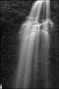
Figure 7.111. The right middle side of the waterfall brushed back
Figure 7.112. The layer mask
If you were to turn off the Red, Green and the Neutral Channel Mixer adjustment layers, you would see an image that consists of both chromatic grayscale and full color areas. (Figures 7.113 and 7.114)
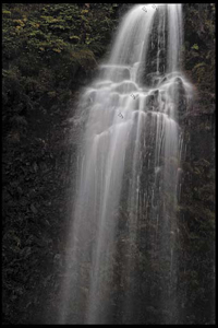
Figure 7.113. The image with both color and chromatic grayscale areas
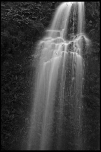
Figure 7.114. The chromatic grayscale image
Once the brushwork on the Blue Channel Mixer adjustment layer is done and fine-tuned, there are still some issues to address on the other Channel Mixer adjustment layers. The layer that needs the most adjustment is the Green Channel Mixer adjustment layer.
There are two ways to approach image-editing workflow: global to granular or granular to global. In the type of image editing where you build the image from the RAW file to finished print, it is best to go global to granular and solve your biggest problems first. If, however, you are ever in the position to have to fix the poor Photoshop technique of others (if you are printing someone else’s image for them), your workflow would be reversed (granular to global) because the cumulative, and frequently multiplicative, aspects of image artifacting can amplify small problems into bigger ones. Once a file has been edited, data has been clipped, so there is just so much damage that you can undo.
Every time you clip data, you introduce artifact. There is an old adage, “measure twice and cut once.” In this lesson, this is what you are doing. You are observing how everything interacts with everything else, so that you can effect the greatest change in the image with the smallest impact on the data. In Welcome to Oz 2.0, I discussed this principle in depth so that you learned an image-editing workflow, the goal of which was to minimize artifact from the pressing of the cable release to final output.
Next, look at what you like and dislike about the Green Channel Mixer adjustment layer. I like the brightness in this layer and the boost of contrast that it adds to the overall image, but there are certain parts of the image in which the brightness and contrast are not appealing to me and interfere with the journey that I want the viewer’s eye to take. These are areas that will require some brushwork on the layer mask. I want the viewer’s eye to be drawn to (and return to) the main part of the waterfall (the part that is just below the top fall where the water hits and appears to protrude outward). Also, I would like to open up some of the shadows in the Zone II and Zone III areas of foliage and rocks that are at either side of the waterfall. If you turn off the Green Channel Mixer adjustment layer before any further adjustment, those areas are a little flat, and when you turn the Green Channel Mixer adjustment layer back on, they pop a little too much. Lastly, I want the back part of the waterfall to appear further back than the main part of the waterfall. I can create that illusion by diminishing the brightness and contrast of that part of the image that popped too much when the Green Channel Mixer adjustment layer was turned back on (Figures 7.115, 7.116, and 7.117).

Figure 7.115. Without the Green Channel Mixer on
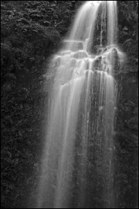
Figure 7.116. With the Green Channel Mixer on
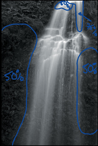
Figure 7.117. The image map of areas to be brushed back
35. Make the Green Channel Mixer adjustment layer active and visible by clicking on the eyeball and then on the layer.
36. Make the Green Channel Mixer adjustment layer’s layer mask active by clicking on the layer mask.
37. With the brush opacity still set to 50%, set the brush width to a diameter of 400 pixels. Brush in the top part of the waterfall and the areas to either side of the waterfall as indicated on the image map.
For this image, 50% opacity was the correct amount. Remember three things about the opacity of the layer mask. It will be more or less or equal to 50%. You do not know which of these it will be until after you do the brushwork. In this instance, 50% was perfect.
38. Next, in the area marked 75% on the image map, set the brush width to a diameter of 175 pixels using the left bracket key, and brush in the area of the waterfall.
There is no need to bring up the Fade Effect dialog box; 50% of 50% is 25%, and 25% + 50% equals 75%. An opacity of 75% appears to be the correct amount. Always trust your eyes to make the right decision for you.
You should see this (Figures 7.118, 7.119, and 7.120).
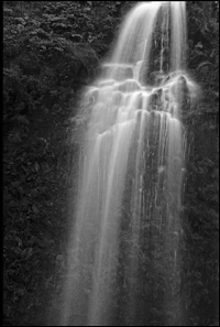
Figure 7.118. With brushwork done on the Green Channel Mixer adjustment layer and the Neutral CM adjustment layer off
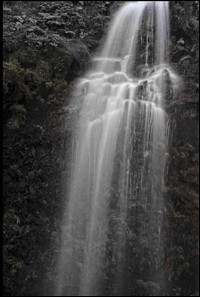
Figure 7.119. With brushwork done on the Green Channel Mixer adjustment layer and the Neutral CM adjustment layer on
Figure 7.120. The layer mask
The next step is to observe what occurs in this image when you turn on the Red Channel Mixer adjustment layer. (There is a 100 PPI version of this file that you can look at in the folder for this chapter from the download site.) If your sample points are placed in the same place as mine in the Info panel, sample point positions 1, 2, and 4 are out of the desired range. Sample position 1 is at 255, sample position 2 is at 250, and sample position 4 is at 255.
Decide what you like and dislike about the Red Channel Mixer adjustment layer. When the Red Channel Mixer adjustment layer is turned on, it adds a lot of pop to the image, however, by adding that pop, the waterfall becomes blown out. Also, there is too much punch in the foliage in the upper left-hand corner (in the lighter gray aspects of the image structures). You will adjust for this by using the Constant slider, the fourth one in the Channel Mixer adjustment layer dialog box (Figures 7.121 and 7.122).

Figure 7.121. The image with the Red Channel Mixer turned on
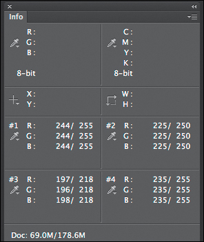
Figure 7.122. The Info panel
39. Make the Red Channel Mixer adjustment layer active and visible by clicking on the eyeball and on the layer.
40. Make the Red Channel Mixer adjustment layer’s layer mask active by clicking on the layer mask.
41. In the Red Channel Mixer adjustment layer, click on the Constant slider and move it to the left (into the black area of the slider) until you reach the desired effect. I selected -9%. Sample point 1 is now at 248. (Figures 7.123, 7.124, and 7.125)

Figure 7.123. The image after using the Constant slider
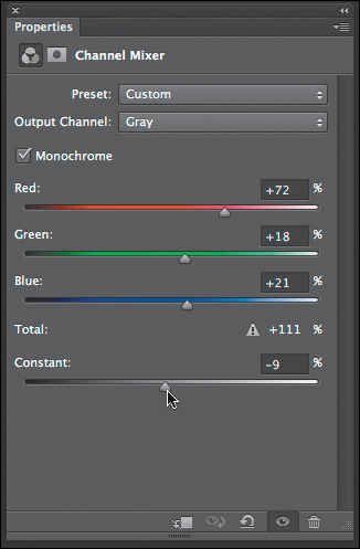
Figure 7.124. The Constant slider
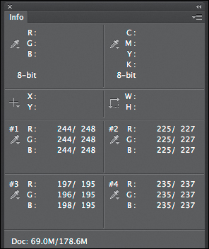
Figure 7.125. The Info panel
42. Click on the Master Opacity dialog box and move the slider until the Info panel shows sample point 1 registering 247. I used 85% (Figures 7.126, 7.127, 7.128, and 7.129).
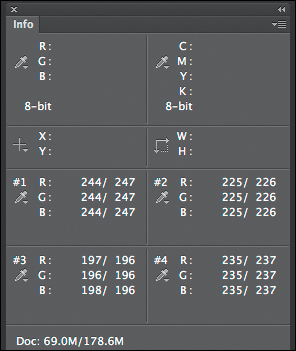
Figure 7.126. The Info panel
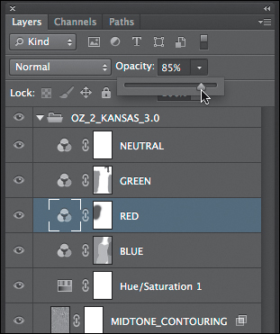
Figure 7.127. The Opacity set to 59%

Figure 7.128. The image before
Figure 7.129. The image after
43. With these simple adjustments, you have addressed most of the issues of the Red Channel Mixer adjustment layer. But frequently, when one door opens, another door closes. (I have taken the liberty of reversing the thoughts in this old adage.) In the process of using the Constant to address most of the issues of the Red Channel Mixer adjustment layer, the area of the rocks to the left of the main part of the waterfall is now blocked up. You will address that issue by brushing back that area on the layer mask of the Red Channel Mixer adjustment layer.
44. With the brush opacity still set to 50%, set the brush width to a diameter of 400 pixels. Brush in the area to the left of the main part of the waterfall (Figure 7.130).

Figure 7.130. The image map
45. Bring up the Fade Effect dialog box (Command + Shift + F / Control + Shift + F) and move the slider to the right until you reach the desired effect. I selected 82%.
You should see this (Figures 7.131, 7.132, 7.133, and 7.134).
Figure 7.131. The image before

Figure 7.132. The image with the Red Channel Mixer on and the Neutral CM off
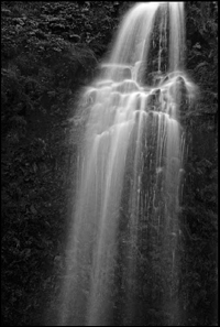
Figure 7.133. The image after brushwork and the Neutral CM on
Figure 7.134. The layer mask
Step 11: Filters Without Filter Factors: Super Granular Color Control Using Hue/Saturation Adjustment Layers
In this image, this step is not needed. Not all images require that all aspects of the action need be utilized. Not all images require brushwork on all of their Channel Mixer adjustment layer’s layer masks. Some images require only lowering of the opacity of one or two of the Channel Mixer adjustment layers. The important thing to remember is that workflow is dynamic, not static, and it is image specific.
Step 12: The Last Act of the Action
46. Restart the action. It will create a Master layer (Command + Option + Shift + E / Control + Alt + Shift + E) and save the file.
47. The action will then duplicate the file that you have just converted.
48. The Duplicate Image dialog box will come up. Replace the word “copy” in the dialog box with _FINAL so that you see MIST_OZCH7_OZ_2_KANSAS_SEP_BW_FINAL in the dialog box.
49. Click OK.
50. The action will Save As the duplicated file. Make sure that the name is MIST_OZCH7_ OZ_2_KANSAS_SEP_BW_FINAL in the Save As dialog box. The action will save this file as a TIFF file.
Conclusion
I do not object to retouching, dodging, or accentuation as long as they do not interfere with the natural qualities of photographic technique.
—Alfred Stieglitz
Instead of one grayscale channel that contains just the luminance aspect of the image or one grayscale channel that is a predefined composite of the color channels, with this approach, you have three separate grayscale channels, each one containing variations of the image. Each one of these channels may contain information that can be decidedly different than in the other two. Also, this technique allows you to refine the Red, Green, and Blue channel information in a way that affords you maximum control over the image. Compared to working with only one channel or shooting on film, this approach gives you a panel of grays that is three times greater and with three times the range.
The technique that I have described in this chapter is certainly the most difficult of the lessons in this book. But once mastered, it is something that you can do in a few minutes. The recipe for attaining mastery (and with mastery comes real understanding) is variation of repetition. Practice does not make perfect. Perfect practice makes perfect. Great innovation does not come by following the rules, but by experimenting with the rules and seeing how they can be bent. You should approach this and any technique as if it is a game, and what you are doing is playing, because playing is fun.
The technique that you have just completed in this chapter (prior to the creation of the software that I will discuss at length in the next chapter) was, for years, my primary way of converting a color image into chromatic grayscale. Frequently, I combine this technique with the one that you will learn in the final chapter. That combination allows me to create images significantly closer to my vision than I ever previously accomplished.
Lastly, before you go to the next chapter, even if you do not have the Silver Efex Pro plug-in or have no intention of acquiring the Silver Efex Pro plug-in, I still suggest that you download the demo version of the software and do the lesson. Doing this allows you to experience the continuing discussion of how aesthetic choices give you control over the viewer’s eye as it travels through your grayscale image.