The strong appeal of Ruttmann’s films lies in the psychological stimuli which make them continually effective…. the viewer is pulled into a whirlwind of motion and integrated into an atmospheric blend of colours that never leave him for an instant. Squares and rectangles shoot forward, multiply, disappear, turn up in unexpected points in space, and exchange energies with one another in the most astonishing fashion. A resonance with the soul is generated, as in an internal combustion fashion. Then wavy motions, now gentle, now violent, overrun the image; they tear off into shapes and join together harmoniously. The colour shading, graded into the tiniest detail, trickles grace and sweetness, passion and agitation, into the viewer’s heart.
—Rudolf Kurtz, Expressionism and Film
In The Glass Architecture (1914), the German science fiction writer and journalist Paul Scheerbart explores the utopian possibilities of color for transforming the material dynamics of the lived environment. The work is a novelistic fantasy made up of 111 aphorisms describing how, in the near future, steel and colored glass would replace wood and brick structures to create an empathetic and technologically infused world around us. Not only would glowing hues illuminate homes and work spaces, but even the skies and waterways would radiate color: boats and aircraft would be equipped to project prismatic lights across landscapes, forming a second nature transformed by technology. In a curious digression in this utopian fiction, Scheerbart reflects upon the occult movement of Theosophy and its approach to color: “I am convinced that every constructive idea will appear in many heads at the same time and quite irrationally; one should therefore not speak carelessly about the seemingly confused and crazy; it generally contains the germ of reason.”1 It is this “germ of reason” pertaining to color that is of interest in this chapter, for what it reflects about how scientific and aesthetic as well as occult knowledge of color circulated in the 1920s through various modernist and avant-garde movements in and around cinema.

Photograph by Armin Herrmann, courtesy of Collection Werkbundarchiv—Museum der Dinge Berlin.
In tracking modernist approaches to color, Scheerbart’s reflections serve as a leitmotif, marking the ways in which color functions as a trope of cosmopolitan visual style.2 Though he died in 1915, his work was posthumously influential both through his writings and through his collaboration with the architect Bruno Taut on the Glashaus (Glass Pavilion), an elaborately colored, glass-dome structure at the Cologne Deutscher Werkbund Exhibition in 1914.3 An architectural work of prismatic splendor, the pavilion used Luxfer Prism glass tiles to cast colored light throughout the space. In addition, it contained a small room in which a projecting kaleidoscope was installed to rear-project abstract color images onto a specially designed four-foot glass screen at the back of the house.4 An expanded form of cinema was thus integrated into the chromatic wonder of the space, creating hybrid medial engagements with projected color, parallel to those we tracked in chapter 3.
Taut, a colorist extraordinaire, would go on to interact with Walter Gropius during the early years of the Bauhaus through the Crystal Chain Letters group, an Expressionist consortium of utopian-minded architects, many of whom were also influenced by the occult—for instance, Gropius’s wife at the time, Alma Mahler, was a well-known Theosophist.5 Across such creative networks, Scheerbart’s ideas about glass and color have been traced at the margins of modernist design through figures such as Taut and Gropius as well as Mies van der Rohe and Le Corbusier. The International Style associated with these architects is by and large monochromatic, yet recovering the syncretic place of color in modernist design, art, and cinema is vital for assessing the technical and aesthetic ideals that proliferated within modernism. Scheerbart’s utopian vision, as Walter Benjamin notes in a perceptive essay, “was of a humanity which had deployed the full range of its technology and put it to humane use”—a counterpoint to what Benjamin described elsewhere as humanity’s “bungled reception of technology.”6
From Scheerbart to Gropius and his collaborators at the Bauhaus and on to various other artists working in the 1920s such as Walter Ruttmann, Fernand Léger, and Sonia Delaunay, what is significant is how, through their innovative uses of color, they outline a new media ecology. Faced with a rapidly expanding chromatic culture that aimed to codify and instrumentalize color’s affective and sensorial role in advertising and mass production in order to sell products more effectively, these artists were often part of this process even as they experimented with more humane forms of color practice: to transform bungled receptions into media architectures worth living in.
Color was integral in these exchanges. It was as important to the international formation of modernism as it was to industrial modernity. The synthetic revolution of colorant production in the nineteenth and early twentieth centuries was quickly adapted for painting. New artist-grade pigments—such as cerulean blue, alizarin crimson, and viridian green—emerged with increasing frequency, enabling chromatic experiments on the modern canvas by Impressionists, Pointillists, Postimpressionists, Fauvists, and beyond.7 The development by the American painter John Goffe Rand in 1841 of premixed pigments, available in portable, tin paint tubes, enabled painting en plein air; Sherwin Williams’s refinement of linseed-oil paints in the 1880s was also groundbreaking for painting. In conjunction with such technical changes, the artistic palette of the nineteenth century produced a standardized and technically refined color image that spurred the chromatic revolution of the twentieth century, particularly in the 1920s. Color became a type of ready-made that no longer required expert preparation before application.
If one topic traced here is the influence of industrial innovation on creative practice, another focus is the circulation of cultural knowledge about color within cosmopolitan networks. Taking a cue from Scheerbart, the best-known instance of this involves Theosophy, with its elaborate theory of color, which sought to standardize occult meaning. In Annie Besant and C. W. Leadbeater’s syncretic, Eastern-influenced work Thought Forms, mental states, emotions, and their auratic emanations are color coded. For example, in their richly illustrated system, variations of red “indicate anger” and “animal passion,” while blues “indicate religious feeling”—meanings that pulse across the spiritual plane as chromatic auras.8 Corresponding to the color guidebooks of the aniline industry discussed in chapter 1, Besant and Leadbeater’s works were lushly illustrated with a standardized color chart that allowed users to identify with ease the occult codes they elaborated. By knowing a color’s standard meanings, one could defend against spiritual and emotional attack and, conversely, project harmonious auras toward others. Even if one might today dismiss such esoteric claims for color, historically they profoundly shaped how color was systemized and deployed in abstract art of the early twentieth century.9 Though idealist in nature, these various artists were also materially oriented and aimed to use color to uplift the spiritual awareness and color consciousness of their audiences through sensory experience, providing a coded way of entering “the spiritual realm through earthly sensations.”10 As Bernard Smith has pointed out regarding early abstraction, “grounded in the hope for and belief in a universal religion, [the occult] provided innovatory content to an art that might have otherwise been dismissed as ‘decorative.’”11 Long denigrated against the rationality of form in Western aesthetic theory, color was a central aspect of this transformation in abstract art—reversing the polarity by giving radical meaning to what had previously been thought of as surface-level ornamentation.
The occult was not the only source of color knowledge among modern artists in the 1920s. Color science, too, was prominent. Chemist Michel Eugène Chevreul’s ideas about color contrast from the nineteenth century remained in currency, as did Albert Munsell and Wilhelm Ostwald’s more contemporary studies that were influential on artists such as Paul Klee, Piet Mondrian, Sonia Delaunay, and Claude Fayette Bragdon, as well as on filmmakers and visual musicians such as Walter Ruttmann, Thomas Wilfred, and Oskar Fischinger. Physiological and psychophysical variants of color science influenced much of the experimental work being carried out by the avant-garde in the twenties and underpinned their engagement with aesthetic theories such as Einfühlung (empathy) and abstraction. Indicative of this, for example, is the emphasis placed on color in László Moholy-Nagy’s influential Malerei, Photographie, Film (Painting, Photography, Film): “The biological functions of colour, its psycho-physical effects, have as yet scarcely been examined. One thing, however, is certain: it is an elementary biological necessity for human beings to absorb colour, to extract colour.”12
The expansive, cross-field, and intermedial nature of these influences was not by chance but was grounded in artistic exchange during the period, which operated in parallel ways to the industrial forms of knowledge transfer discussed in chapter 1. Through the ever-expanding networks of cosmopolitan collaboration and exhibition in the 1920s, color styles, theories, and artistic practices flowed globally in the form of avant-garde polemics, utopian visions, and the emerging International Style. What happened in Germany influenced French, Dutch, British, and U.S. artistic practices, and vice versa, creating transnational circuits of color knowledge and practice across artistic media. This provided the outlines of a new cosmopolitan habitus of modern color, in Bourdieu’s sense—connecting restricted and large-scale modes of cultural production that wove through both the avant-garde and the culture industry.13 Through such connections, ideas about color, as Scheerbart noted, appeared seemingly irrationally in the heads of various artists at the same time. Tracking the exchanges that color fostered allows us to reconsider many of the canonical avant-garde works and movements of the decade. Just as color generated new approaches to painting in the nineteenth and early twentieth centuries, it was also integral to modernist engagement with the moving image, often with Arts and Crafts influences, ranging from the Bauhaus and Expressionism to the French avant-garde and Pictorialist experiments in and on the fringes of Hollywood. As an emerging mass art, cinema’s chromatic palette became increasingly appealing to artists—particularly for the avant-garde, who were by and large fascinated by the vulgar and sensorial attractions of cinematic technology. Focusing on the modernist attraction to color allows us to reassess why and how the 1920s was the decade in which artistic engagement with cinema flourished.
Useful Abstraction at the Bauhaus
Following from Scheerbart, we turn first to the German context of color in the 1920s. Given Germany’s rich industrial history of colorant production, as well as its Romantic traditions of color theory and practice, color provided fertile ground for artistic experimentation throughout Weimar Germany. During the 1920s, this was most readily apparent in the curricular experiments of the Bauhaus, which we use here as context for thinking through the useful, pedagogical functions of color, abstraction, and empathy as they intersected with industrial prerogatives, art education, and the Absolute Film movement. “Usefulness” has recently been theorized in relation to the moving image by Charles Acland and Haidee Wasson, as a category for thinking through the ways in which various nontheatrical institutions have used the moving image as a functional medium for ends other than art and entertainment.14 In examining the practical uses of the moving image, they aim to trace the diverse forms of cultural capital that accrue within various fields of production. Accordingly, we are interested in how color and abstraction in film intersected and functioned within the parameters of the Bauhaus for aesthetic goals particular to the field of art education at the time, related both to the occult and to the notion of Einfühlung as taken up at the school.
Courtesy of Bauhaus-Universität Weimar, Archiv der Moderne.
As has been well established, cinema was an interest, though one not fully realized, at the Bauhaus.15 By contrast, color was fundamental to its curriculum and legacy, and in the limited examples of cinematic experimentation at the school, there are important intersections between the two. A fitting example is Herbert Bayer’s design for a cinema, “Kinogestaltung” (1924–1925, color plate 4.1), which he produced at the end of his time as a student of the Bauhaus in Weimar under the tutelage of Johannes Itten and Wassily Kandinsky, just before he was hired in 1925 as the director of the printing and advertising workshop when the school moved to Dessau.16 Comprising four sketches, Bayer’s imagined cinema is functional and minimalist—a striking counterpoint to the ornate movie palaces that dominated the decade. The theater’s façade is a flat and functional square meant to be plastered with posters—magazine images of Harold Lloyd and Calvin Coolidge are the examples—and the entrance is a modern revolving door, much like the one in Murnau’s The Last Laugh, also from 1924. Passing through the brief foyer into the cinema hall, one is faced with a near op-art design, as the upper left image of Bayer’s plan reveals. Centered in the rear of the theater, one sees a virtual, multistable pyramid (as if viewed from above, or conversely from below) of receding hues stratified in space. Seating perhaps two hundred, the theater is in fact rectangular, with three color-coded sections of flooring and seating that shift, back to front, from light to medium to dark gray, paired with matching colored sections on the walls progressing from yellow to orange to red. On the back wall is the tip of the pyramid reaching into space, which is the white cinema screen surrounded by a black and red proscenium. Though minimal in design, there is an essential dynamism to this cinema space, elaborated through the optical movement of the color pattern and schematically by the illustrated film beams vectoring from projection booth to screen. These still illustrations optically project movement, a key trope of the period among avant-garde artists, and one with which both cinema and color were closely aligned.
The chromatic dynamism of Bayer’s cinema is significant: its colors are ordered as the warm hues of Johannes Itten’s color sphere, a pattern that Itten himself had experimented with in the same flowing order—yellow, orange, red—in the center of his abstract painting Horizontal Vertical (1915). These same three colors were also interconnected and projective in Kandinsky’s color theory: “Warm red, intensified by yellow, produces orange. Through this admixture, the movement of the red becomes the nucleus of the impulse, spreading out towards the spectator.”17 In juxtaposition, the gray flooring of Bayer’s plan recalls the studies carried out in in the 1910s on color value by the German chemist and color theorist Wilhelm Ostwald. Ostwald aimed to quantify and standardize color theory and practice, and he drew from the emerging fields of colorimetry as well as psychophysics to theorize new optical and physiological standards for color harmony. Innovatively, Ostwald argued that harmony is based upon the variation of color values—a hue’s shifting tonality from lightness to darkness as in Bayer’s design—rather than through the balancing of color contrasts, which was the dominant view held since Michel Eugène Chevreul’s delineation in the nineteenth century of simultaneous and successive contrast. Ostwald did not just theorize color harmony, but contentiously, he insisted that artistic practice should be based upon his system and urged that it be incorporated into educational curricula. His color theory was of interest throughout the 1920s to Kandinsky and others at the Bauhaus, yet its prescriptiveness was also scorned by Itten and Klee.18 Ostwald became affiliated officially with the Bauhaus at the end of the 1920s as a member of the school’s board of trustees, and Bayer, along with Gropius and Moholy-Nagy, corresponded with him in 1926, which led to a week of lectures at the Bauhaus in June 1927.19 Later, when Bayer had immigrated to the United States, he worked closely at the Container Corporation of America with Egbert Jacobson, the chief proponent and publisher of Ostwald’s work in the United States.20 In other words, Bayer had a lengthy interaction with Ostwald’s theories, and he brought these various influences together in his three-dimensional sketch for a movie house, a cinema conceived as a geometric color space that dynamically enveloped the spectator as much in its architectural hues as in the filmic space of the screen. Reimagined by Bayer as an immersive color space, cinema functioned as a modern, industrial medium that was conducive to the new abstract language of color, light, and movement being articulated at the Bauhaus and beyond.
Following Bayer’s cinema design, it is worth elaborating further the central role that color played at the Bauhaus and its multivalent associations with science, the occult, aesthetic theory, and moving-image practice.21 Established in 1919 by Walter Gropius, the Bauhaus developed in part out of the Arts and Crafts movement in Germany, in particular from the Deutscher Werkbund—the German Association of Craftsmen that aimed to raise the standard of German labor and humanize industrial craft for the emergent mass society.22 The Werkbund was a crucial meeting point for a number of the figures discussed here. Its first public exhibition in Cologne in 1914 was also the site of Scheerbart and Taut’s Glass Pavilion, alongside a model factory and office building designed by Gropius and Adolf Meyer. Ostwald also made an appearance in Cologne in 1914, as the Werkbund allowed him to arrange a show of German paints and dyes at the exhibition.23 Across this network of relations, Gropius shared the Werkbund’s and Scheerbart’s utopian perspective, which is reflected in the Bauhaus’s aim to rethink art education for an industrial age, particularly as the school developed in the 1920s.
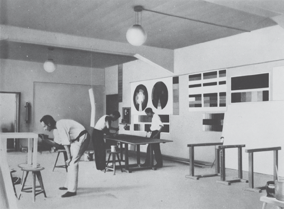
From the beginning, color was crucial for negotiating the relation between art and industry in the curriculum of the Bauhaus, and it helped foster the school’s unique approach to the aesthetics of technology. In Gropius’s initial outline of the curricula of the school in 1919, the “physical and chemical theory of color” is listed as being part of the study of “science and theory.”24 Of the initial instructors hired at the Bauhaus, it fell to Johannes Itten to develop the study of color within the school’s “preliminary course,” which Itten designed as a trial semester for students to help guide them into apprenticeships in more advanced, specialized workshops for the rest of their studies.25
Courtesy of © 2018 Artists Rights Society (ARS), New York / VG Bild-Kunst, Bonn.
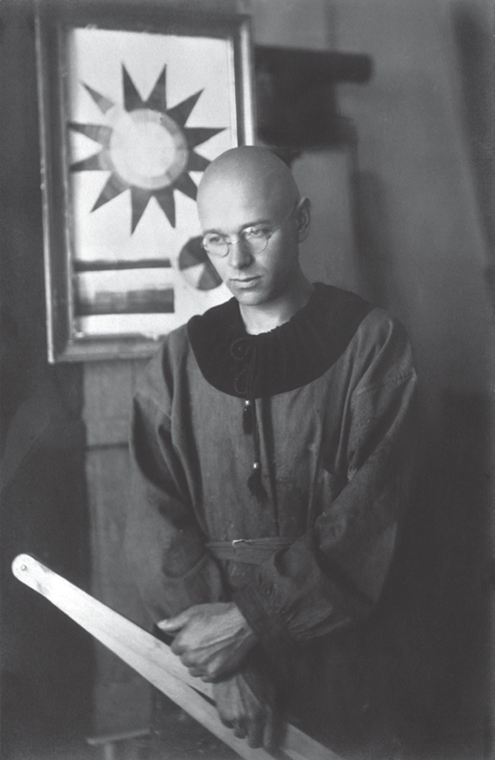
Besides Gropius, Itten was the most experienced pedagogue at the school. In tandem with color studies, he developed a holistic approach that paired theoretical with practical training, alongside physical exercise. His method was steeped in the occult—in part under the influence of Theosophist Alma Mahler, who earlier had encouraged his interest in mysticism while also introducing him to her then husband Gropius in 1918, just as the school was being established.26 Occult influences such as these were relatively common in art education at the time, particularly in relation to color and how it was taken up aesthetically in school curricula as a means of developing the color consciousness of students, as discussed briefly in chapter 1. The expansive nature of the notion of color consciousness allowed it to be interpreted as both a sensory-perceptual capability and a spiritual one, depending on context. Rudolf Steiner, for instance, in his lectures on color and pedagogy, wrote of the ways in which color could expand the spiritual consciousness of students, and this is a crucial component of his Waldorf system, founded in 1919 in Germany and Austria, and rooted in Goethe’s Color Theory as much as it was in the occult. For instance, Steiner notes that the purpose of color instruction is to “awaken in children the feelings that can arise only from a spiritual scientific perspective of the world of color.”27 He aimed to educate students’ spirits as well as their practical skills, and color played a vital, experientially based role in cultivating their sensory abilities. At the Bauhaus, Itten similarly pursued a holistic approach to color pedagogy. He was an adept teacher in the Mazdaznan religion, a form of neo-Zoroastrianism that emphasized the attunement of the body for spiritual enlightenment. As a gifted teacher, he was incredibly influential, converting many to his beliefs, and he famously embodied the role of a mystic, wearing priestly scarlet robes he designed himself and shaving his head. This ultimately led to rifts within the school, and after growing conflicts with Gropius, Itten left the Bauhaus in 1923, marking a relative break from the occult and Expressionist phase of the school. Nonetheless, it is worth dwelling in brief on Itten’s approach to color, as it opens ways for thinking through the Bauhaus’s ongoing engagement with sensory education after his departure in ways that connect to abstract film.
Some of Itten’s earliest lessons guided students to find their own subjective color harmonies through experimentation with color materials—paints and colored sheets of paper. Itten describes one of his opening lessons at the Bauhaus: “I had long chromatic rows of real materials made for the tactile judging of different textures. The students had to feel these textures with their fingertips, their eyes closed. After a short time the sense of touch improved to an amazing degree. I then had the students make texture montages of contrasting materials.”28 In his integration of color with sensory education, Itten’s lessons were broadly synesthetic in nature, mixing the senses—of visual with haptic perception, color with touch—so that the study of color allowed one to feel into chromatic objects and architectural spaces through their textures, an approach he developed in part with musician Gertrude Grunow, who taught influential courses at the school on harmonization.29 Itten’s emphasis was also drawn from German aesthetic theory of the time, specifically the notion of Einfühlung—literally, feeling into (sich einfühlen) something—which is a forerunner to the aesthetic concept of empathy.30 The German philosopher and psychologist Theodore Lipps and art historian Wilhelm Worringer were two of the key theorists of Einfühlung at the turn of the last century, and Itten and others at the Bauhaus were familiar with their analyses of the ways in which humans empathize with inanimate objects as well as with living beings.31 One feels into them, mimicking their physical states, as when a spectator unconsciously sways to the rhythms of a dance performance or taps a foot along with the montage sequence of a film. These types of aesthetic responses provide useful, embodied knowledge. For Itten, color was one of the key entry points to his occult-inflected version of Einfühlung—a synesthetic nexus that allows one to feel into the aura of things.
Courtesy of © 2018 Artists Rights Society (ARS), New York / ProLitteris, Zurich.
Significantly, the concept of Einfühlung was also used to analyze film in the 1920s. In Rudolf Kurtz’s seminal Expressionism and Film from 1926, he draws on psychophysics to describe the embodied and empathetic nature of Absolute Film, in line with Lipps’s understanding of Einfühlung:
The viewer empathizes with [fühlt sich] the mathematical shapes and calls forth corresponding sensations. The procedure takes place unavoidably, subconsciously: the elementary lines and relationships between shapes, together with their movement, direct the emotion along its courses, through their gradations of light, so that an emotional counter-image arises which correlates to the struggle, the harmony, and the reconciliation of those relationships between shapes. Thus, the abstract work of art is unequivocally ranged into the conventional psychological proprieties of the masses. These elemental procedures get even richer colourations from the accompanying feelings that grasp the viewer as a result of memories and associations he has experienced in his concrete life.32
Kurtz exemplifies the ways in which pedagogical notions of color and aesthetic experience were being deployed in film criticism to describe the sensuous nature of spectatorship. Kurtz brings together both psychophysics and Einfühlung in this passage, fühlt sich being the conjugated verb form (sich einfühlen) of Einfühlung—to feel one’s way, or to project into or empathize with an object.33
Such theories of color were central for the moving-image work carried out and viewed at the Bauhaus, particularly following Itten’s departure in 1923. This transition also marked an industrial change in the school’s direction that reshaped its approach to color: away from occult and Expressionist influences toward Gropius’s new unity of “Kunst und Technik” (“art and technology”), his famous motto for the school, as articulated at the Werkbund’s annual conference in 1923. Moholy-Nagy’s work in particular reflects this change toward a more technical and scientific approach to color, and it is from this matrix that educational experiments with moving-image technology were also carried out at the school. Moholy-Nagy was the chief, but by no means the only, proponent of film at the Bauhaus. Though he carried out little actual film work during his time at the school, his interest in the medium is the best known of the Bauhaus, in part because of his later films and also because he engaged extensively with the moving image in his influential writings—even proposing an “experimental film center” (“Versuchsstelle für Filmkunst”) in his 1925 script outline for “Dynamics of a Metropolis,” which could not be realized at the school because of the lack of funding.34 Moholy-Nagy’s critical engagement with film frequently dovetailed with his long-standing interest in color. In fact, the nexus of ideas that Moholy-Nagy developed regarding film and color illustrates their entwined importance at the Bauhaus. For Moholy-Nagy, the moving image as an industrial art was interwoven with the renovations the school was making to its curriculum in painting, sculpture, performance, and architecture, as the faculty and students attempted to synthesize a new unity among them. Across this intermedial engagement with the moving image, color continued as a key device for binding the school’s pedagogical experiments: it was one of the unifying threads that interconnected across disparate media, theories, and creative practices.
Active in Constructivist, Dada, and De Stijl circles, Moholy-Nagy was recruited by Gropius in 1923 specifically to take over the preliminary course after Itten and to direct the metal workshop. He carried out the preliminary-course assignment in collaboration with Josef Albers, who had been promoted from student to teacher, and together they helped institute Gropius’s merger of art and technology within the curriculum.35 As Moholy-Nagy recalls in his “Abstract of an Artist” (1944), discovering color’s nonrepresentational power in 1919 marked “a turning point” in his early aesthetic development: “Color, which I had so far considered mainly for its illustrative possibilities, was transformed into a force loaded with potential space articulation and full of emotional qualities. I started to clarify how different colors behave when organized in relation with each other.”36 Suggesting a confluence with Scheerbart, his work then progressed to incorporating “machine technology” that drew on light, glass, scrap-metal parts, and color to produce new modes of “glass architecture” that would use transparency to recalibrate the viewer’s sense of modern space.37 These dual emphases for color—on systematizing harmony and on engaging humanely with new chromatic technologies—are in part what made Moholy-Nagy such an ideal candidate for the Bauhaus. After Itten, Gropius needed collaborators more open to the new industrial direction of the school, as he sought to prove the practical value of the Bauhaus for manufacturing, ideally to attract corporate sponsorship.
Moholy-Nagy approached color as a Constructivist, thinking scientifically and technically about creative production.38 He was also well acquainted with Ostwald’s scientific work and engaged with it throughout his time at the school. For instance, in 1924, he wrote about the usefulness of “Ostwald color charts” for creating his Construction in Enamel series (aka Telephone Pictures, 1923) in that they allowed one to designate over the phone the exact, standardized colors to be used by a factory printer.39 He was also involved, with Bayer and Gropius, in arranging Ostwald’s visit to the school in 1927, during which he learned of Ostwald’s color organs, which were twofold. On the one hand, as Ostwald had explained in an article in De Stijl in 1920, he constructed his “Farborgel” (color organ) as a cabinet for organizing the harmonies of color powders.40 This was not a color-music device, but rather drew from the musical analogy with color to create an elaborate, three-dimensional boxlike device for charting color harmony. According to Ise Gropius’s diary, he donated a version of the Farborgel to the Bauhaus during his visit.41 In addition, however, she describes a color-music device that Ostwald also developed and offered to the school:
He told us also about a new invention of his, an apparatus for color-light-music which is supposed to become very superior to the one by Laszlo. He only hasn’t the time and inclination to concern himself with the realization of this thing and offered it to G[ropius] who, of course, had to decline since we have neither the people nor the money to successfully get it going.42
In these comments, Ise Gropius provides a remarkable confluence of color standardization with color music through Ostwald’s connection to the Bauhaus. Like Newton, who proposed a harmonic connection between color and the diatonic scale, Ostwald attempted to extend the color-music analogy inherent in his Farborgel into actual practice through a new apparatus for color and light projection.
This was certainly of interest to Moholy-Nagy, for as Ise Gropius indicates, by 1927 he had been engaging with color-light-music in conjunction with cinema for a number of years, as is evident from his dazzling and polemical Painting, Photography, Film. First published in 1925 and revised in 1927, the book brings together color-music, science, and film at the Bauhaus. Assembled, written, and designed in the summer of 1924 at the end of his first year at the school, the book famously called for, and embodied in its layout and imagery, a new mode of seeing and sensing through machine technology, including film and color music. Delving into debates about photography and art, the book was at the forefront of modernist interest in film and photography, and it would prove influential on aesthetic developments in Weimar Germany. It was, for instance, an exemplar of the New Typography movement of the decade and was also taken up extensively by theorists such as Walter Benjamin, from One-Way Street through his seminal writings on photography and film.43
Courtesy of © 2018 Estate of László Moholy-Nagy / Artists Rights Society (ARS), New York.
The first forty-five pages of Painting, Photography, Film are brief essays—some new, some drawn from Moholy-Nagy’s earlier publications. Its second part comprises illustrations, primarily photographs collected from illustrated magazines (and a few by Moholy-Nagy, particularly in the second, 1927, edition of the book) along with filmstrips, with a section in the middle on the score for the Bauhaus color-music experiment Farben Licht-Spiele (Color Light Display) developed by Ludwig Hirschfield-Mack and Kurt Schwerdtfeger. The book concludes with Moholy-Nagy’s unfilmed scenario, “Dynamic of the Metropolis,” which he worked on between 1921 and 1924.
Recent analyses of Painting, Photography, Film have called attention to how its visual design plays a pivotal role in the book’s overall theoretical arguments about photographic and cinematic perception.44 For Moholy-Nagy, new technologies of production and reproduction expanded human perception: the photographic camera could “make visible existences which cannot be perceived or taken in by our optical instrument, the eye; i.e. the photographic camera can either complete or supplement our optical instrument, the eye.”45 Situated firmly within Bauhaus pedagogy, Painting, Photography, Film was meant to educate the viewer into this new mode of perception, not only with its text but fundamentally through its design and visual composition. For Moholy-Nagy, new technologies transformed the style of modern design in tandem with developments in the human sensorium; aesthetically, these are reciprocal changes in his theory and practice.46 The technical abstraction of modernist practice thus served a useful function in the educational reform tradition that Moholy-Nagy, and more broadly the Bauhaus, worked within. He noted of photography (which Benjamin cited several times): “The limits of photography cannot be determined. Everything is so new here that even the search leads to creative results. Technology is, of course the pathbreaker here. It is not the person ignorant of writing but the one ignorant of photography who will be the illiterate of the future.”47 Photography and film were thus useful forms for the production of a basic visual literacy.
Further, the design and organization of Painting, Photography, Film aims reflexively to educate the reader and viewer of the book about the dynamics of the modern pictorial environment—to inculcate a new mode of visual literacy. However, in considering the photographic and pictorial significance of the book, it is also important to recognize what it leaves out: color—an element central to its theoretical work but unrepresented visually, given the technical and financial confines of color reproduction at the time. Moholy-Nagy also positioned photography with the chiaroscuro effects of light, which, along with the technical reproduction of newspapers, had led to a growth of “colourlessness and grey” in the rapidly moving modern world, which Painting, Photography, Film visually replicates.48 This did not diminish the importance of color but amplified its necessity in artistic creation to protect against a diminishing of the color sense through the “atrophying of our optical organs” in a black-and-white medial environment.49 Color, largely beyond the mass reproduction of photography of the time, remained firmly within the domain of painting, as in the abstractions of “absolute painting,” and in an expanded way “kinetic compositions,” “color music,” and Absolute Film. In these ways, the moving image for Moholy-Nagy was surprisingly more aligned with painting, even as it surpassed it, than with photography. While the visual element of the book is rooted in black-and-white photography, color lies visually beyond its static nature within the domain of painting and its successor, the moving image.50
In making these arguments, Moholy-Nagy delineates how photography has transformed image production and reception, and he presents an important and often repeated argument about modern painting: rather than being invalidated by photography, the technology has liberated painting from the confines of realistic representation “to concern itself with pure color composition.”51 Focusing on color thus allows painting to leave the tradition of representational composition behind and focus instead on “the pure inter-relationships of colours and light-values, similar to what we know in music as composition in acoustical relationships; that is, the composition of universal systems, independent of climate, race, temperament, education, rooted in biological laws.”52 It is significant that in Moholy-Nagy’s account of the movement of painting into the nonrepresentational, he draws both on the parallel between color and music and also on science. As examined in the previous chapter, the correspondence between color and music has a long history dating back to the Greeks, but it also takes on particular valences in the 1920s. Before that decade, the notion of color music was predominantly connected to the occult and synesthesia. In line with what Itten developed through the preliminary course, such occult traditions of color continued through the decade and beyond. However, particularly for education, this approach to color was increasingly balanced by science and reconfigured for sensory uplift as a primary means of engaging and training the senses empathically to deal with the modern environment. As Moholy-Nagy delineates, moving images, or “kinetic composition so to speak enables the observer’s desire to participate to seize instantly upon new moments of vital insight” through images that are attuned to “the rhythm which governs our manner of living.”53 Abstract color in this configuration enables the viewer to feel into the rhythms of such kinetic art and realign sensory perception in ways in keeping with the notion of Einfühlung. This approach epitomizes what we have termed useful abstraction, or the practical ways in which nonfigurative color harmony could be used to educate the viewer’s senses, making them more color conscious.
Moholy-Nagy’s secular emphasis on the “biological laws of science” and the “psycho-physical” elements of color furthers such useful claims for abstraction and is indicative of the ongoing transformation of educational approaches to color at the Bauhaus.54 In addition to the liberation from representation brought by photography, such renovations of color allowed for the rise of Absolute painting: “Biologically conditioned expressions of these relationships or tensions—be it conscious or unconscious—results in the concept of absolute painting. In fact these conditions have at all times been the true content of colour composition.”55
In relation to this chromatic mode of education, it is helpful to return to the place of moving-image technology in Painting, Photography, Film. Progressing from a section on color and easel painting, Moholy-Nagy takes up static and kinetic optical works and provides a remarkably contemporary account of color music and Absolute Film. Contextualizing the moving image in relation to painting, he notes the technical basis of recent changes in aesthetic practice:
The development of new technical means has resulted in the emergence of new fields of creativity; and thus it is that contemporary technical productions, optical apparatus: the spotlight, the reflector, the electric sign, have created new forms and fields not only of representation but also of colour composition […] The moving, coloured figures (continuous light displays), however, which are today deliberately screened with a reflector or projector open up new expressional possibilities and therefore new laws.56
Later accounts of filmic abstraction in the 1920s typically begin with color organs and color music, particularly when emphasizing the spiritual roots of these movements. Writing about Fischinger, for instance, William Moritz notes that “having studied Pythagoras, alchemy, and Buddhism, he was fascinated by the notion that every element and object contained an essential personality that could be revealed by the visionary artist who found a technical formula through which the material could speak for itself.”57 These are important connections, and indeed, Moholy-Nagy turns shortly to color music—to Isaac Newton’s, Louis Bertrand Castel’s, and Alexander Scriabin’s use of color organs. However, before doing so, he begins his account with electrical signs and spotlights—with popular culture and advertising technologies—rather than the occult, in keeping with the industrial bent of the Bauhaus that he helped usher in.58 Unlike Itten, Moholy-Nagy’s approach to color pedagogy is related instead to the technical emphasis of the book—that medial innovation transforms sensory-aesthetic practice. This line of argument illustrates the ways in which the historical avant-garde was fundamentally engaged with vernacular practices of the time, interrogating their potentials to transform creative practice and its relation to the public. In fact, the modernist turn to film was part of this vernacular engagement, specifically with a new medium that was becoming one of the most pronounced emblems of interwar mass culture.
It is within this vernacular context that Moholy-Nagy lays out a brief but cogent account of recent experiments with the moving image, drawing connections from Absolute painting and popular light displays through, among others, Scriabin, Ruttmann, Viking Eggeling, and Hans Richter. Even as their work with color emerges from painting, they transform it by incorporating time and motion into their dynamics. As Moholy-Nagy notes of Richter, he “has thus come near to creating a light-space-time continuity in the synthesis of motion.”59 Through this configuration, the stakes of his interest in electric signs and spotlights become clear for his account of moving images: in building from the work of painting, these works expand the place of artistic practice into everyday life, along with the sensory capacity to perceive and empathetically experience it.
Courtesy of © 2018 Estate of László Moholy-Nagy / Artists Rights Society (ARS), New York.
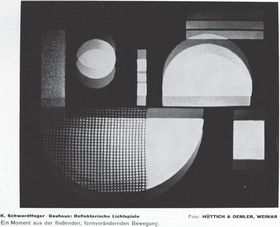
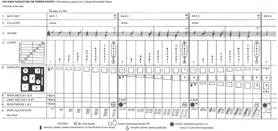
Moholy-Nagy further develops his argument through his discussion of Farbenlichtspiele, the Bauhaus color-music experiments carried out separately by Kurt Schwerdtfeger and Ludwig Hirschfeld-Mack. He notes that Hirschfeld-Mack’s version:
worked with reflected light and shadow plays which in the overlapping and movement of coloured planes represent the most successful practical moving colour-composition yet. Hirschfield-Mack’s intensive work has produced equipment specifically designed for shooting continuous film. He was the first to reveal the profusion of the most delicate transitions and unexpected variations of coloured planes in motion. A movement of planes, prismatically controllable, which dissolves, conglomerates. His latest experiments go far beyond this point, which resembles the colour-organ in character. The establishment of a new space-time dimension of radiating light and controlled movement becomes ever clearer in his spinning and plunging bands of light.60
Hirschfield-Mack has received more attention for these light displays, but it was Schwerdtfeger who initially experimented with colored projection at the school in collaboration with Josef Hartman (color plate 4.2).61 Schwerdtfeger, a student specializing in sculpture developed Reflektorische Farblichtspiele (“Reflecting Colour-Light-Play”), which was first displayed at Kandinsky’s home on June 21, 1922, as part of the Bauhaus Lantern Festival. Schwerdtfeger’s work was conceived as an abstract play in which an operator would manually adjust a cardboard stencil system in front of a light source that would rear-project moving colored shapes onto a screen. Hirschfeld-Mack was a student of the printing workshop who had previously studied color with Adolf Hölzel and concurrently led a color seminar at the Bauhaus. Over the next year, he adapted Schwerdtfeger’s idea, adding additional operators to the projection device. He premiered it in 1923 at the Bauhaus and continued to exhibit versions throughout the 1920s. The most renowned example is Dreiteilige Farbensonantine: Reflektorische Farbenspiele, which was performed at the famous Absolute Film matinee screenings at the sold-out, 900-seat Ufa Palast in Berlin on May 3 and 10, 1925, alongside Eggeling’s Symphonie Diagonale (1924), Ruttmann’s Opus 2, 3, and 4 (1923, 1924, 1925), Richter’s Film Ist Rhythmus (a likely mixture of his Rhythm 21 and Rhythm 23, 1921 and 1923, that was only ready to be screened at the second showing), and curiously shifting to French material as we will discuss later, Fernand Leger and Dudley Murphy’s Ballet mécanique (1924) and René Clair’s Entr’acte (1924). The screening, with variations, was repeated in Hannover on May 22, and yet again at the Bauhaus, in Dessau on March 21, 1926.62
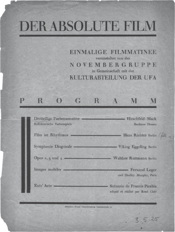
Image courtesy of Deutsche Kinemathek—Museum für Film und Fernsehen, Berlin, Schriftgutarchiv.
Published in the same year as the Berlin screenings, Painting, Photography, Film brings together Schwerdtfeger’s and Hirschfield-Mack’s Bauhaus experiments in color music with Absolute Film and underscores key aesthetic traits shared by these various works. All were invested in the abstract potential of light and movement, though certainly in differing ways, particularly with Entr’acte. Most of the works also brought color into the mix, as with Dreiteilige Farbensonantine: Reflektorische Farbenspiele, the Opus films, Rhythmus 25, and likely Ballet mécanique. These were not viewed as autonomous works of l’art pour l’art, divorced from utilitarian and industrial aims. Indeed, just as the Bauhaus was seeking industrial support at the time, the Berlin screening was cosponsored by the socialist, avant-garde Novembergruppe (with which Gropius, Moholy-Nagy, and Bruno Taut were affiliated) and the educational division of Universum-Film AG (Ufa), the largest and most renowned German studio of the day.63 They are thus cinematic exemplars of the cross-field and intermedial networks around color that we track throughout this book.
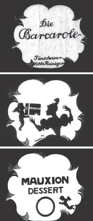
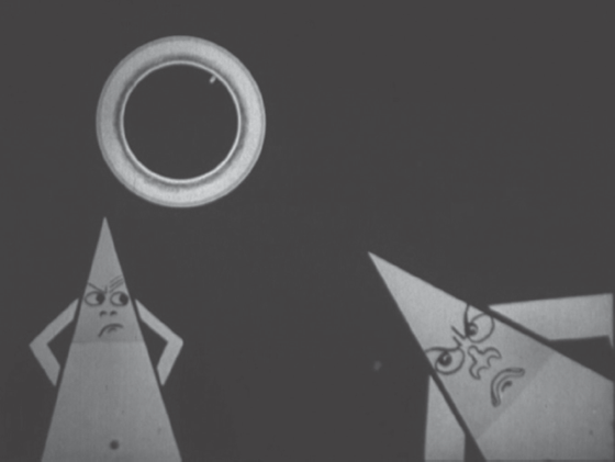
The Berlin screening and the moving-image works that Moholy-Nagy traces in Painting, Photography, Film, are also chromatic exemplars of useful abstraction in the 1920s. These works have significant ties to the aesthetic culture of their time, as well as to industrial production and especially educational pedagogy. The moving image was central to the visual transformation of the urban world of Weimar Germany, as film was a thriving aspect of its intermedial display culture, not only through the feature films produced but also with its incorporation into advertising.64 Filmmakers such as Ruttmann and Lotte Reiniger were important not only for their artistic productions but also for the sponsored filmmaking they engaged in, particularly in collaboration with Julius Pinschewer, who was the most prominent producer and distributor of advertising films in Germany during that era.65 Indeed, as Michael Cowan has examined in detail, rather than being isolated activities, the imbrication of artistic and sponsored filmmaking was key in Germany for the circulation of aesthetic knowledge and practice. Advertising theory turned to educational, aesthetic, and psychophysical research into Einfühlung to pioneer new modes of visual display, and this in turn was appropriated back not only into advertising films but also into Absolute Film and Bauhaus practice.66 Kurtz also noted these confluences in reference to the color in Ruttmann’s works (color plate 4.3):
The colour is particularly exciting. Ruttmann uses an unusually rich palette, with a new mellow hue for every nuance of movement. Sentimental, sharp, happy, and cheerful gradations of colour change with the progression of curves, the lurching forward and the twitching back of his squares and rectangles. One feels that these organically swelling shapes eat each other, devour each other, charge at each other in combat, embrace each other lovingly: it’s a drama of colourful shapes that automatically compels an emotional reaction. Ruttmann has attained considerable success with an industrial advertising film of this sort, which clearly demonstrates how expressive these colourfully-moving shapes are.67
Framing color in Absolute Film in relation to technology, science, and industry illustrates how knowledge transfer, as discussed in chapter 1, was also being adapted for aesthetic and pedagogic ends. Filmmakers and artists such as Ruttmann, Richter, and Moholy-Nagy believed that in order to release the moving image’s power, they had to purify its form, reducing it to the basic, essential technical properties of the medium—light and moving colour—as opposed to espousing an iconic, photographic ontology. Richter argued for the revelatory function of abstract form: “It is obvious that to get to the spirit, the idea, the inherent principle and essence one has to destroy the appearance. Not in a physical way as much as in one’s own eye. To forget about the leaf and to study the oval; to forget about its colour and to experience its sensation.”68 He worked toward realizing this ideal through his experiments with color in Rhythmus 23 (1922)—originally titled Fuge in Rot und Grün (Fugue in Red and Green)—but because of the amount of labor involved in hand coloring, he was unable to complete the film in color. However, he continued to experiment with color in his vertical-roll works on canvas, such as Orchestration der Farbe (Orchestration of Colour, 1923), and in his nonextant film Rhythmus 25 (1925), a work that he meticulously colored frame by frame.69 In these experiments, the pictorial base of the image gives way to the contrapuntal play of contrasting colors and shapes embedded in the emulsion of the films. When experiencing color’s orchestrated movements and transformations in these abstract works, Theo van Doesburg argues:
The spectator will look into a completely new world, he will be able to follow the whole process of this dynamic light-sculpture rather like the orchestral work of Schonberg, Stravinsky, or Antheil. From this it follows that the spectator space will become part of the film space. The separation of “projection surface” is abolished. The spectator will no longer observe the film, like a theatrical presentation, but will participate in it optically and acoustically.70
Doesburg’s relationship with the Bauhaus was critical and tempestuous, even more so than Itten’s, but he was also influential on many of its members, and he and Moholy-Nagy were well acquainted before Moholy-Nagy even came to the school.71 The idea of optical and acoustic participation in the moving image runs through Moholy-Nagy’s work and his theories of color and light projection, and indeed gets to the pedagogical center of the interest in color and the moving image at the Bauhaus. Bayer’s sketch for a cinema in 1924–1925 provides another version of this chromatic space, as does the kaleidoscopic projector in the Glass House of Scheerbart and Taut. Combining the industrial art of film with chromatic abstraction, these utopian works of pedagogy aimed to craft a useful and empathetic forms of aesthetic experience, in which, as Moholy-Nagy puts it, “eyes and ears have been opened and are filled at every moment with a wealth of optical and phonetic wonder.”72 Framed in institutional relation to art education at the Bauhaus, color and the moving image function in this abstract register to produce a sensuous mode of visual literacy—an avant-garde version of color consciousness. Aligned initially with pedagogies rooted in the occult, such as the Waldorf system, and subsequently with more scientific and standardizing approaches of the 1920s such as Ostwald’s, this hybrid avant-garde mode of useful abstraction aimed to train the senses, making them more capable of navigating the chromatic landscapes of the 1920s.
The Saturated Screen of German Expressionism
Alongside the avant-garde works of Absolute Film and the Bauhaus, there was also a range of chromatic experimentation in German narrative cinema of the decade that forms a crucial context for the more abstract work simultaneously being produced. More than simply a background for the avant-garde, it is also worth delineating the aesthetic parallels between such restricted and large-scale forms of chromatic production, particularly in light of Kurtz’s expansive account in Expressionism and Film. To trace these relations, our analysis shifts emphasis formally and technically to take into account the archival legacy of color in German cinema. Given the years of archival disregard for applied forms of color in silent cinema, it is only now, in light of recent restorations such as Das Cabinet des Dr. Caligari (Robert Wiene, 1920), Der müde Tod (Fritz Lang, 1921), Nosferatu (F. W. Murnau, 1922), and Die Nibelungen (Fritz Lang, 1924), that the tinted and toned hues of the iconic works of German Expressionism can finally be assessed in terms of their saturated palettes.
Expressionist cinema is of course a contested category of the Weimar era, as Thomas Elsaesser and others have detailed, and we recognize the various cultural, stylistic, and economic currents at play in these films of the early 1920s that Expressionism does not fully encompass.73 Indeed, for our purposes, it is their hybridized mode that makes these works exemplars of the intermedial style of the decade, for it is through those hybridized junctures that color comes to the fore. The films work across various fields of aesthetic production, and their use of tinting and toning reflects chromatic adaptations of theatrical and painterly Expressionist style, German Romanticism, and modernist design. For instance, as we discuss in more detail below, there are direct continuities between these works and Absolute Film through Ufa’s employment of Walter Ruttmann on Fritz Lang’s Die Nibelungen: Siegfried (1924) to animate the “Dream of the Hawks” sequence—a foreboding dream that Kriemhild has about the tragic fate of her future (yet unknown) husband Siegfried, in which a white/lavender hawk is killed by two black eagles.
In terms of cultural prestige, Ufa producer Erich Pommer’s famous explanation of the Expressionist phase of production was that it was primarily a marketing gambit following the economic hardships of the war: “The German film industry made ‘stylized films’ to make money…. Germany was defeated: how could she make films that would compete with the others? It would have been impossible to try and so we tried something new; the Expressionist or stylized films.”74 In many ways, this was the inverse of Gropius’s charge and Moholy-Nagy’s implementation of the merger of art education and the avant-garde with industrial and scientific practice: Pommer moved in the opposite direction, from the industrial to the avant-garde, yet with similar vernacular modernist results. Economic and industrial pressures certainly shaped artistic style during the decade, and Expressionism served as a useful marketing label of cultural distinction for Ufa, yet at the same time the aesthetic innovations of many of these works were substantial.75 This was not only the case in Germany, for in many ways such economic and industrial pressures on stylistic form parallel what Richard Abel has characterized as the “narrative avant-garde” in France during the same decade, in which modernist techniques were also adapted for narrative cinema, including dynamic color design.76 Such modernist adaptations in Weimar film were relatively more Romantic in nature, invoking Expressionist as well as Vienna Secessionist Arts and Crafts traditions that were more in line with the Bauhaus’s Weimar phase than with its forward-looking Constructivist-scientific approach in Dessau. In practice, though, such distinctions are not always clear-cut, as analyses by critics such as Kurtz and Lotte Eisner demonstrate through their invocation of Romanticism, psychology, and psychophysics to explain both Expressionism and Absolute Film.
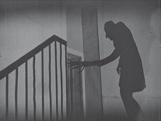
In the popular imagination, the works of Expressionist film were long thought to have been in black and white, in part because of their rich chiaroscuro effects, such as the iconic shadow of Count Orlok climbing the stairs in Nosferatu. Production designer Hermann Warm famously suggested that “the filmed image must become graphic art [Graphik]”—translated as a “drawing brought to life” by Siegfried Kracauer and “engraving” by Eisner, emphasizing the films’ distinctive uses of light and shade.77 Later, in The Haunted Screen, Eisner discusses the black-and-white style of Murnau’s Nosferatu: “the grisaille of the arid hills around the vampire’s castle”—grisaille being a gray, textural style of painting.78 Her influential book and Kracauer’s From Caligari to Hitler were richly illustrated with black-and-white production stills, which coincided with the circulation of black-and-white reduction prints, and eventually video copies, that were the main means through which Expressionist films were accessed and canonized after the 1920s. As a result, the provenance of these works, as of so many silent films, has been stripped of color for much of the past century. Yet, as recent restorations illustrate, these films were intricately colored through tinting and toning effects when they were originally released. In Eisner’s defense, she was one of the first critics to note this, specifically regarding Caligari: “modern prints of this film (originally tinted in green, steely-blue and brown) give no idea of the unity of composition afforded in the original by the images and their titles.”79 In line with her suggestion regarding the unity of chromatic design found originally in Caligari, it is worth examining how the tinting and toning patterns in Expressionist film resonated more broadly with the aesthetic culture of Weimar Germany.
Throughout silent cinema, there were a variety of reasons for tinting and toning films. The monotone or duotone (when tinting and toning were combined) color schemes that dominated the era in part helped distinguish denotatively scenes and settings from one another. A green tint might indicate a shift to a wooded scene, whereas an amber tint could illuminate an interior scene under artificial light, and of course red would often be used for fire and blue for night scenes. This blue tinting was particularly useful, given the amount of day-for-night filming that occurred during an era when the insensitivity of film stocks precluded actual night shooting—hence the use of blue to provide a clear indication of the hour. Beyond such denotative schemes, tinting and toning were also used connotatively, to convey the mood and atmosphere of scenes: pink might indicate a romantic scene, light blue a calm one. In Theory of Film (1960), Kracauer reflects back upon these uses of color in silent cinema, noting that tints were meant to “canali[ze] the spectator’s emotions”: “Shades of red helped amplify a conflagration or the outbreak of elemental passions, while blue tints were considered a natural for nocturnal scenes involving the secret activities of criminals and lovers. The different hues plainly served to establish audience moods in keeping with the subject and the action.”80
Such ideas about the interrelation of color and emotion are ancient, running back at least to the Greeks. However, the proximate connections for Kracauer and Weimar color theory run through psychophysics and Einfühlung, as discussed earlier. The emotive and physiological aspects of color were thought to canalize, shape, and direct spectator reception across the domains of film, advertising, architecture, and art. Such aesthetic approaches to tinting and toning can be seen in various exemplars of Expressionist film. At times these hues function denotatively, at others connotatively, and both of these approaches could be harnessed for narrative legibility. However, given the variability of the coloring patterns in the print records of many of these films, in which competing tinting and toning patterns often exist for the same film across multiple prints, definitive narrative readings of the hues are difficult. It is often impossible to determine what the narrative colors might have been originally when the patterns varied from print to print, particularly between domestic and foreign release versions. Intermedial analysis, though, does bring out much in these films, for even if the specific hues often varied, their saturations and generalized color palettes resonate strongly with their contextual referents and aesthetic paradigms.
Take, for instance, Fritz Lang’s two-part epic Die Nibelungen: Siegfried and Kriemhild’s Rache, which at first seems to be an outlier in terms of its tinting scheme. The film is an adaptation of a thirteenth-century epic poem about the exploits and subsequent murder of Siegfried and the ensuing revenge wrought by his widow Kriemhild. Lang’s two-part adaptation is nearly five hours long, and curiously most (though not all) surviving prints and negatives of the film suggest that it was tinted almost entirely in a golden-orange hue when released.81 The only major alternation found in most of the extant prints is Ruttmann’s brief “Dream of the Hawks” sequence foretelling Siegfried’s death, which was tinted lavender. Considering both parts together, a film of this length that is almost entirely colored in a single tint seems strange, as the standard was to use multiple, alternating tints and tones with black-and-white sequences to create spatial and emotional distinctions. However, Anke Wilkening, who restored the film for the Friedrich-Wilhelm-Murnau-Stiftung, has noted examples of other German features tinted in similar ways at the time: a U.S. export print of Herr Tartuffe (F. W. Murnau, 1925), for instance, was also tinted in a golden-orange hue, as were export prints of Faust (F. W. Murnau, 1926). A technical explanation might be that the hue may have made it difficult for foreign exhibitors to dupe the prints illegally, as orthochromatic stocks would not have easily distinguished the tinted hue from the grayscale image because orthochromatic stocks, unlike panchromatic ones, cannot register the reddish-orange color spectrum.82
Such uniform approaches to tinting may have also resulted from technical changes in print processing during the decade. With the predominate move from shorts to feature films in the 1910s as the international film industry was solidifying, there was a growing need to reduce the number of physical splices in positive film prints. By the mid-1920s, internegative stocks became available that allowed for the duplication of a camera negative, which allowed for easier printing with less wear and tear on the original negative.83 This coincided with various laboratory changes in print production. Negative cutting, print timing, and continuous-contact printing became more refined during the era. Negative cutting—editing a negative into final narrative order—allowed laboratories to produce spliceless positive prints that held up better, with fewer breaks during projection. Companies such as Bell & Howell developed high-precision negative-splicing machines to facilitate this process.84 The timing of internegatives for positive printing—to ensure that each shot of a finished film print was properly exposed—also became much more elaborate and automated. As Kodak technician J. I. Crabtree explains, before the process became increasingly systematized in the 1920s, printing-machine operators carried out print timing by judging the exposure of the image by eye and adjusting the exposure light manually shot by shot.85 Beginning in the 1920s, light sensitometers were deployed to analyze shots in advance for printing, leading to the integration of timing cards (containing exposure information for each shot) with continuous-contact printers that allowed for the mechanical adjustment of light exposure during printing, thus automatically compensating for variations in exposure across shots on the negative.86 Before the development of this relatively automatic printing system in the mid-1920s, negatives were assembled in exposure and tinting order for easier processing, as tinting continuities tended to follow exposure changes—for example, interior versus exterior scenes or day versus night. After duplication, release prints would then have to be spliced individually into continuity, with the shots properly ordered. With the shift to more automated modes of duplication, negatives could be cut into continuity, which simplified the printing and editing process, as the processed positive prints required less editing. However, tinted and toned sequences would still need to be color processed after printing and spliced back in for continuity, along with intertitles. Colored sequences continued to be grouped together in tinting order during printing, but there is evidence that with the move toward automatic duplication and internegatives, tinting and toning patterns became less complex and more uniform to avoid unnecessary splices, as in the examples of Die Nibelungen and Herr Tartuffe and, as will also be discussed, of Caligari and Nosferatu.
For these various technical reasons, single-tinting practices may have been relatively widespread in Germany, though it is difficult to ascertain from surviving print records, as this style of tinting was not seen as being important to preserve. Later copies were typically made in black and white (with panchromatic stock that could register the tinted image into grayscale effectively). In archival practice after the silent era, there was a general disregard for preserving tinting and toning in nitrate prints, as this type of color was by and large believed to be an inessential addition to silent film—the black-and-white shapes and lines were primary, as opposed to the ornamentation of color. Uniform tinting likely exacerbated the archival bias, as it functions largely outside of the denotative or connotative modes that were dominant during the era.
As Wilkening suggests, there may have been additional reasons for the uniform coloring—specifically, the reduction of contrast in the image.87 Lang, with his cameraman Carl Hoffman, had been experimenting for some time with elaborate lighting effects that allowed them to shoot night scenes at night, thus avoiding the predominant mode of day-for-night filming that subsequently required blue tinting to code the scenes as night. As Lang later explained in a letter to Lotte Eisner in 1968, “I never liked the blue paint which was used in those times to ‘tint’ day-for-night scenes so that they became ‘night scenes.’”88 Such an emphasis on dynamic lighting effects and night filming is in keeping with the trend of late silent cinema that Erwin Panofsky identified as a “dynamization of space,” in which the mise-en-scène becomes increasingly expressive through lighting and unchained camera effects.89 In the context of color, such expressive effects would make tinting relatively redundant for a formally innovative filmmaker such as Lang. However, given the nature of orthochromatic stock in the 1920s, night scenes filmed in low light would have suffered from high contrast, and the dominant golden tint may have been used to mute the chiaroscuro effects and reintroduce a level of relative grayscale within the image. In addition, during the silent era, some people believed that exposing viewers to too much contrasting black-and-white imagery for a prolonged period of time might damage their eyesight, much in the way that snow blindness occurs.90 Thus, this technical use of tinting may have been thought to serve specific physiological purposes.
Beyond technical explanations, there is also an intermedial case to be made for the uniform coloring of Die Nibelungen as being in keeping with the “total design” look of the film in which, as Tom Gunning has noted, “Nothing…is natural.”91 In the set and costume designs for the film, Lang famously drew from Carl Otto Czeschka’s eight double-paged, relief-printed illustrations for a children’s edition of the epic poem from 1909.92 Czeschka was part of the Vienna Secession, an Austrian Arts and Crafts movement established in 1897 under the leadership of Gustav Klimt. Like the Bauhaus two decades later, the movement was immersed in a variety of modern styles—including Romanticism, Postimpressionism, Expressionism, and Jugendstil—and aimed for a unity of aesthetic expression across the arts, from painting to architecture to graphic design and folk art. Lang, who was born and educated in Vienna, began his professional career there in the 1910s as a graphic artist, influenced by Viennese modernism.93 His borrowings from Czeschka are readily apparent: the illustrations of Kriemhild’s and her sister-in-law Brunhild’s costumes, with their Jugendstil surface designs, are systematically replicated in the film’s costumes, as are various other architectural and design motifs.
In this sense, Lang’s Die Nibelungen embodies Hermann Warm’s Expressionist dictum that film “should become graphic art.” However, Lang’s intermedial adaption went beyond the formal line art of Czeschka’s illustrations. As the book prints reveal, color too was a vibrant element of Czeschka’s graphic art. Blues and reds are present, but gold is the hue that dominates these illustrations—the color most associated with the Vienna Secession, as in Gustav Klimt’s “golden phase” of paintings that were made with actual gold leaf marking their opulent and critically successful style. Gold is everywhere in Czeschka’s images: in Kriemhild’s hair and necklace, across shields, lances, and boat sails. As with Klimt’s layering of materials to produce a heavily textured and haptic quality across the surface of his paintings—as in his famous Adele Bloch-Bauer I (1907)—Czeschka’s golds, while uniform in their relief-printed application, also shimmer on the page because of the ink used, which was likely produced by trapping golden-hued bronzing powder in printed varnish. It is this type of textural density that the golden-orange tint brings to the grayscale of Lang’s Die Nibelungen, making apparent the film’s chromatic affinity with the prestige of Czeschka and the Vienna Secession.
One must be judicious in such a reading, though, given the apparent usage of uniform tinting in Germany at the time, as the matching colors could simply be coincidental. There is, however, other contextual evidence in the film’s promotional material that its golden aura was designed in reference to the illustrations. One of the iconic posters for Siegfried illustrates a scene from the film in which the hero, astride a horse along with his twelve kingly vassals, crosses a drawbridge over the moat into the castle of Worms. Siegfried is positioned in the upper right of the poster, nearest the castle entrance, and also nearest the sun, against which he is silhouetted. Picking up on the film’s tint and Viennese influence, radiant and dappled golden-orange light flows out from Siegfried across the poster. The scene is also illustrated by Czeschka, but at an earlier moment than the poster: just as the drawbridge is being lowered to welcome Siegfried and his vassals, all clad in gold. Similarly, even in certain editions of Thea von Harbou’s tie-in novel Das Nibelungenbuch (1923), the illustrations, derived from film and production stills, are toned in orange-brown hues, likely through the photogravure or rotogravure printing processes.94
Given the intermedial emphasis on color in and around the film, its golden-orange tints appear to be more than a technical afterthought. Deployed not only to mute the contrast of the image, the color provides a resplendent and shimmering aura grounded in the Viennese decorative aesthetic to illuminate the mythic world of the film. For instance, in an ill-fated scene outside the cathedral of Worms, Brunhild ignores Kriemhild’s and Siegfried’s royal courtly ranks and insists that, as the queen of Burgundy, she should enter before Kriemhild. The confrontation that emerges sets in motion the fated tragedy that climaxes in Siegfried’s murder. This pivotal scene was also illustrated by Czeschka in a double-page illustration, showing Brunhild and her maids-in-waiting on the left page robed in black and Kriemhild on the right page in blue, with her maids in white. With their eyes locked on one another across the double-page layout, Brunhild raises her hand, barring Kriemhild’s way forward. Textured gold paint sparkles across their elaborately designed geometric costumes, triangular jewelry, and crowns, and over the shields and armor of soldiers behind Brunhild (color plate 4.4). In Lang’s version, he both emulates and expands Czeschka’s illustration (color plate 4.5). In a series of shots, the two women confront each other repeatedly, raising their arms in succession to block the other’s way into the cathedral as the confrontation escalates. As in Czeschka, Brunhild is dressed in a black dress, while Kriemhild is in white rather than blue, and their maids are robed similarly. The two women’s triangular jewelry and crowns pick up the golden-orange tints of the film, making the designs shimmer across the shots. These graphic elements are further drawn out in the scene, as in much of the film, through the slow staging of the performance that sculpts the characters into the total composition of the mise-en-scène. In their drawn-out confrontation, the golden aura Romantically illuminates—and allows the viewer empathetically to feel into—a mythic past beyond the natural world yet positioned at its fated point of dissolution: the golden aura of the image is destined to end in the apocalypse that follows in Kriemhild’s Revenge.

As Kurtz describes the film, specifically referring to Ruttmann’s animated contribution, “Decorative space is created through nuance of colour, through rhythmically ordered movement—without a search for counterpart in the organic world.”95 This fits the film’s overall, total design, both in its golden application of the Viennese design aesthetic and in its major digression from it, into the Absolute Film style of Ruttmann’s “Dream of the Hawks.” The shift in tinting, from golden-orange to lavender, marks both the diegetic movement into Kriemhild’s retelling of her dream and the relative change in film style. Lavender was a color that Ruttmann had worked with before—some of the swooping shapes in Opus 1 (1921, color plate 3.6) were momentarily hand colored in the hue—yet it never dominated any of his films as it does in the Siegfried insert, and it is doubtful that the precise tint would have been selected with Ruttmann’s previous films in mind.
Rather than working from Czeschka’s elaborate illustration of the dream, Ruttmann’s sequence picks up visual motifs from the film itself, merging them with the Romantic tendencies of his Absolute style of the time. The preface to the dream sequence entails Kriemhild’s recounting the vision to her mother; the film cuts from an irised-in medium close-up in golden-orange of Kriemhild to the lavender animated sequence. Within Ruttmann’s body of work, the sequence closely aligns with his Opus I (1921) and his parallel, sponsored advertising film Der Sieger: Ein Film in Farben (1922), which he produced for Julius Pinschewer for Hannover Gummiwerke Excelsior.96 The dream begins abstractly against a black background with a rounded, irislike movement upward that reveals a roughly textured, chalk-drawn background, tinted lavender, against which a series of four black pillars with rounded tops pulses upward in the right corner of the frame. Opus 1 similarly opens with a sequential series of rounded, towerlike shapes pulsing upward, though in alternating blues, greens, and eventually reds and against a relatively smoother background. In the dream, the black pillars are then covered by black waves cresting over them, from the left and the right, eventually leaving the frame divided between a black bottom right corner and the left upper corner in lavender. A light lavender circle shape then appears, swirling around the upper left of the frame, moving much like the abstract shapes in Opus I, but as in Der Sieger, it then shifts into a figural object: a lavender hawk flitting through what now reads as the sky, in the upper left, until it rests upon the blackened ground in the bottom right. Two abstract, swirling shapes then begin to flit across the sky, until they stir the hawk from its perch and chase it across the frame. The blackened shapes transform into eagles that attack the hawk, culminating in the finale in which they go in for the kill, driving their beaks into the hawk at the center of the frame, as the frame itself collapses in abstract, triangular shards (similarly found in Opus 1 and Der Sieger) that also stab into the hawk, blackening the image as the dream ends.
The anthropomorphic nature of Ruttmann’s sequence calls attention to the Romanticism of his abstraction. As Gunning argues, the light shading of the hawk reflects the light-colored robes that Siegfried wears throughout the film, whereas the black eagles correspond to the dark robes and winged helmets of Brunhild and Hagan, who conspire against him.97 What unifies the sequence with the broader film, across the shifting tints and aesthetic styles, is the abstract surge toward total design in both line and color, exemplified by the back-and-forth merger of figural and abstract design elements in Ruttmann’s sequence, as well as in the film. These textured images craft empathetic spaces that are meant to resonate and emote through their elaborately constructed material effects. As detailed earlier, Ruttmann’s other works of Absolute Film are much more polychromatic, yet Die Nibelungen still works formally through the materiality of color, line, and shape to evoke emotional and empathetic resonances—even through the relatively monotonous yet auratic color design. Embedded in industrial as well as aesthetic codes, the systematic and technical nature of the film’s color effects makes them resonate with the modernist impulses delineated through the Bauhaus. Further, these intermedial and cross-field contexts provide the logic for the film’s color, much more so than narrative concerns.
It is difficult to make similarly dense readings of the colors in films such as The Cabinet of Dr. Caligari and Nosferatu, as their relations to visual works such as Czeschka’s are not as proximate. However, various intermedial connections are certainly present, as scholarship on the films has examined extensively. Kracauer claims, for instance, that Caligari’s set designers—Hermann Warm, Walter Röhrig, and Walter Reimann—were established Expressionist artists associated with the “Berlin Sturm group” and its journal Der Sturm, which “promoted expressionism in every field of art.”98 David Robinson further details the collaborative work that went into the production and resulted in its unique look, though he pointedly notes that Kracauer overstated the designers’ connection to Der Sturm.99 The films’ intermedial context is vital for considering their hues, for Expressionist motifs and colors were widely adaptable at the time. Kurtz explains: “Wherever the decorative elements of Expressionism can be applied, people appropriate them. Wallpaper patterns wander about in jagged, garish colours, blankets are embroidered with cubes and cylinders, lamp shades light up secret expressionist signs in lurid yellow and icy blue.”100 Such garish and sensational hues derive from Expressionist theater and paintings. In this stylistic mode, as J. L. Styan delineates, “décor was often made up of bizarre shapes and sensational colours” that dramatized the subconscious as a kind of “scripted dream.”101 It is this type of intermedial dream imagery that suffuses the tinted hues of Caligari and Nosferatu, as is evident in the recent restorations. However, with both films, there are no surviving nitrate prints that were originally tinted for the German market. As discussed in detail by Anke Wilkening and Barbara Flueckiger regarding Caligari and by Enno Patalas and Luciano Berriatúa regarding Nosferatu, the prints used for their recent restorations derive from various export (non-German-market) sources.102 With Nosferatu, the recent restorations in 1995 and 2006 derive from a faded export print preserved at the Cinémathèque française. Patalas points out, though, that this export print was made and tinted in Germany, so its coloring may have been close to what was originally distributed in Germany.103
For Caligari, six different tinted and sometimes toned prints from around the world served as the basis for reconstructing its tints in 2014 (color plate 4.6).104 The restoration also used the incomplete, but pristine, camera negative that was newly available, and the colors were digitally reapplied. Missing material—the film’s first act and scattered frames—was supplemented from other sources, and Wilkening, in conjunction with Flueckiger and her research team, carried out research on the six surviving colored prints. They determined that the earliest surviving prints, dating from between 1920 and 1923, were two export copies from Montevideo, now housed at the Filmmuseum Düsseldorf and at the Cineteca di Bologna, which provided the basis for the color reconstruction. The tints and tones of these Latin American prints deployed blue-green-toned and yellow-orange-tinted sequences for the frame story in the garden, with night scenes in blue-green, Jane’s room in yellow (though pink in the restoration, drawing from the Cinémathèque française print), and the other interiors primarily in orange. These hues, as Wilkening explains, more closely matched the color schemes and saturations of other Decla Filmgesellschaft productions of the early 1920s than did the nitrate prints of the film produced later in the decade.105 The two Latin American prints also showcase the signs of manual printing, with many more splices than the later ones, such as those at the British Film Institute and the Cinémathèque Royale, which show signs of negative editing, automatic contact printing, and simplified color schemes in which night scenes are tinted blue and most of the rest of the film is tinted orange, similar to Die Nibelungen.106
As these cases illustrate, silent films vary significantly from print to print, particularly when it comes to color. Cinema is, after all, an art form produced as a multiple. With these caveats, then, what is one to make of the hues of Caligari in light of Expressionist style of the time? In terms of intermedial production, it is worth noting that the promotional materials for the film also reflected the garish and sensational hues of Expressionist art. This is exemplified in particular by the film’s original posters, created by Erich Ludwig Stahl and Otto Arpke. One of their iconic posters from 1919 features an empty, candlelit room with a distorted table and chair, and as Stephen Eskilson has noted, the artists “introduce a fiery palette of reds and oranges that complements the distorted space and eerie lighting.”107 Another Stahl-Arpke poster for the film features, in the same hues, a man grasping at the words “Du musst Caligari werden” (“You must become Caligari”). In both cases, the posters’ reds, oranges, and yellows contrast strongly with their greenish-blue background, heightening the sickly madness of the image. Although Eskilson claims that these colors are particular to the graphic designers and assumes that the film’s production team could only work in black and white, clearly this was not the case.
The colors of the film are in fact closely aligned with the posters—at least in the Latin American prints, which use similarly hued, sensational colors. In the film’s famous opening story frame set in an asylum, the aforementioned green-blue toning and yellow-orange tinting provide a remarkable contrast of hues, much in the way that the Stahl-Arpke posters work. Through simultaneous contrast, these complementary colors visually amplify the subjective contrast of the image, creating a saturated and sickly atmosphere that undergirds the introduction of Francis and Jane, and Francis’s recounting to an older man of the horrors that led them there. When the film returns to the garden at the end, the color scheme has shifted to a simpler blue tint used elsewhere in the film to indicate nighttime—the evening has passed during his long retelling of the horrors of Dr. Caligari and Cesare. In the concluding shots, the film then moves inside what the audience quickly comes to discover is an asylum, and the orange tint that was used previously for interiors returns. Thus, instead of a simultaneous contrast of blue and orange, as in the opening, the film creates successive contrast from shot to shot.
There are certainly films from the period that are more complexly tinted and toned, but complexity is not the point. Caligari deploys certain conventional approaches to tinting and toning—the shift to blue at the end to indicate the darkness of night—but what is significant about its coloring is the way in which it interacts with the film’s total design. Fused to the angular and painterly mise-en-scène of Caligari, the heavily saturated tints and tones amplify the expressive force of the film. As Kurtz explains in his chapter on Caligari, Expressionist art and film base their aesthetic work on the emotional effects of their formal elements: “It is a simple law of psychological aesthetics that out of empathy with shapes, precisely analogous aspirations arise in the soul. A straight line leads the emotions differently than a slanted one; bewildering curves have different emotional correlations than harmoniously gliding lines.”108 As has often been commented on, many of Caligari’s pictorial effects were achieved by painting the mise-en-scène—creating the illusion of light and shadow through brush. In many ways, the painted-on tints and tones of the shots double this work, enhancing the empathetic power of the film by facilitating one to feel into its visceral dream world. The combination of design and color in Caligari is remarkable for how it embodies Expressionistic color aesthetics of the time. Yet of course, not all were enthralled. In France, Blaise Cendrars famously derided it for being “hybrid, historical and pernicious,” “pictorial” rather than “optical.”109 Similarly, Jean Epstein issued a polemic against the film, arguing that its use of painting on the set is “an unpardonable sacrilege in the cinema” as it is “nothing more than a still life, all its living elements have been killed by the strokes of a brush.”110 These painterly, hybrid effects, though, were exactly the point of Expressionist style, and as Kurtz points out, it is through this intermedial nexus that color’s empathetic and emotional valences come to the fore, just as they do in the abstraction of Absolute Film. However, with such critiques by Cendrars and Epstein in mind, we shift now to examine parallel cinematic approaches to color in the experimental and narrative avant-garde work of France during the 1920s.
France, Cinéma pur, and the Narrative Avant-Garde
To return to the earlier discussion of the Absolute Film screenings at the Ufa Palast in May 1925: the program was a curious amalgamation of German and French films, exemplars of both German Absolute Film and French avant-garde works that are associated with Dada and Cinéma pur—the supposedly “pure” elements of cinema, including form, motion, rhythm, and composition.111 These French films were Fernand Léger and Dudley Murphy’s Ballet mécanique (1924), credited as Images mobiles in the program, and René Clair’s Entr’acte (1924, written by Francis Picabia). Like the Bauhaus’s interest in the industrial medium of film and, conversely, Erich Pommer’s adaptation of avant-garde style to narrative filmmaking, French filmmaking of the era points to parallel attempts to merge various intermedial registers of cultural production—between the high and the low, the restricted and the large-scale. Thus, similar motifs emerge around color relating to its industrial and scientific as well as occult and utopian energies.
Two points can be made specifically about Ballet mécanique and Entr’acte that provide insight into the broader chromatic horizon of French avant-garde cinema of the time, in both narrative and experimental veins. First, just as these French films were screened alongside German Absolute films, they point to the collaborative networks that generated an expansive circulation of films, styles, and techniques across national boundaries—again, to invoke Scheerbart, similar ideas in the heads of many at the same time.112 Significantly, both Entr’acte and Ballet mécanique were themselves products of intensive collaborations: for the former, Clair and Picabia along with Eric Satie and numerous others who appeared in the film, such as Marcel Duchamp, Man Ray, and Georges Auric; and for the latter, Léger and Murphy with Man Ray, Katherine Hawley Murphy, Alice Prin aka Kiki de Montparnasse, and Ezra Pound, who brought together Murphy, Ray, and Léger.113 Ballet mécanique’s title was likely related to a 1917 cover of the Dada periodical 391 designed and edited by Picabia. As this diverse range of artists suggests, both films were also indicative of the cosmopolitan collaborations occurring at the time among the avant-garde. French and U.S. artists were explicitly involved with the production of Ballet mécanique, while the cast of cameo appearances in Entr’acte give it a similarly international pedigree.
Courtesy of the International Dada Archive, University of Iowa Libraries.
Second, these films—particularly when examined in relation to the Absolute films that screened with them—point to different aesthetic valences of color during this era. In many ways this parallels the distinctions that Cendrars and Epstein made about Caligari and that Moholy-Nagy made between the black-and-white optical world of photography and the chromatic world of abstraction in Painting, Photography, Film. Ballet mécanique in part and Entr’acte in its entirety are photographically based. Entr’acte was almost certainly presented in black and white. While it is not known which, or whose, print of Ballet mécanique screened in Berlin, there are extant versions that were colored during the 1920s, primarily with the film’s abstract geometric sequences of circles and triangles brush-tinted in blues, yellows, greens, oranges, and reds. This is the case in the nitrate version preserved at the EYE-Filmmuseum, Netherlands, the provenance of which derives from the Netherlands Filmliga, a film society that promoted avant-garde film from 1927 until 1931 (color plate 4.7).114 The film’s colored shapes resonate strongly with German Absolute films of the time. Calling attention to the psychophysical aspects of color, the abstract shapes resemble the types of color tests used in psychology labs of the time to study sensory perception. In contrast to these sequences, the film’s black-and-white photographic montage of objects and people pairs well with the Dadaist elements of Entr’acte, as well as the city symphony aspects of Moholy-Nagy. Of course, while Ballet mécanique sets up these differences between color and black and white and between abstraction and objecthood, fundamentally it challenges such divisions through its associative montage, just as the film’s very name juxtaposes two seemingly incongruous things, mechanization and balletic grace. The inherent hybridity of the film is in fact a microcosm of the broader mixing of chromatic styles found in the Absolute Film screenings of 1925.
Ballet mécanique’s investment in crossing boundaries also delineates a debate in French filmmaking practice and criticism in the 1920s regarding color that in some ways aligns with the critique of the painterly and pictorial effects of Caligari as opposed to the praised optical aspects of cinematography. As Bregt Lameris has shown, this debate spilled into the pages of the film journal Cinéa-Ciné pour tous in 1926 and 1927 when the young critic Bernard Brunius called for a “Ligue du noir et blanc”—a league established polemically, and perhaps somewhat facetiously, to promote black-and-white cinema while attacking photographic color cinema.115 Brunius explained in his initial 1926 article: “Let’s save the cinema from theatre after having saved it from literature. Let’s save it from the postcards after having saved it from painting. I expect many more protesters, and I suggest to create the ‘Ligue du noir et blanc.’”116 Signatories to his league included filmmakers and critics such as Jean George Auriol, Jean Mitry, Jean Tedesco, Alberto Cavalcanti, and René Clair. For context, the 1920s was an era when debates began in earnest about the aesthetic specificity of film—that is, claims about what made the medium a specific type of art.117 For some, including Brunius, the medium’s specificity was grounded in its photographic, black-and-white base, and the league sought to champion this filmic ideal. Color at the time, in France and elsewhere, was becoming increasingly connected to advertising and consumer culture. Within the cinematic field, American Technicolor was expanding rapidly, with Douglas Fairbanks’s The Black Pirate (1926) making international waves. For French cinema, which had previously dominated color film production through Pathé and Gaumont’s stencil films, this was a technical reversal of fortune that, as Lameris suggests, likely informed Brunius’s polemics. Though predating the Ligue du noir et blanc by two years, Ballet mécanique’s black-and-white footage resonates with a certain monochromatic emphasis on the photographic image.
Still, Ballet mécanique is by no means thematically opposed to consumer culture, and its Dadaist underpinnings in many ways embrace the blurring of popular and avant-garde art rather than espousing a regressive black-and-white art cinema. Indeed, the early upside-down images in the film of Katherine Hawley Murphy, sitting on a swing while wearing elegant but antiquated Victorian garb, counter any backward glance at traditional, auratic notions of beauty—such conceptions are literally turned on their head in these shots. The film’s contrary emphasis on the flapper-modernism of Kiki and its interest in mass-produced kitchen objects, newspaper headlines, and Charlie Chaplin epitomize the vernacular-modernist underpinnings of the film. Its use of color functions along these lines as well, yet in ways that still harmonize with the emerging black-and-white aesthetics of French film criticism. In French discourse of the time, proper use of color was in fact seen as having an affinity with Cinéma pur. Critic and historian René Jeanne makes this exact point in his article on “La controverse de la couleur,” which was published on the same page as one of Brunius’s polemics: color in cinema should be aligned with the tradition of abstraction, Cinéma pur, and Cubism.118
Cinéma pur was a contested and variable concept, yet most of the works associated with it were in black and white—for example, Cinq minutes du cinéma pur (Five Minutes of Pure Cinema, Henri Chomette, 1926), Emak-Bakia (Return to Reason, Man Ray, 1926), Anémic cinéma (Marcel Duchamp, 1926), and Thèmes et variations (Germaine Dulac, 1928). However, Dulac in particular articulated a conceptual thread found in Cinéma pur that connects broadly to color, an idea that can also be found in the writings of Léon Moussinac and Henry Fescourt. Dulac’s ideal aspired to “a visual symphony made up of rhythmic [representational] images.”119 Her emphasis on representational images—ones that are iconic rather than abstract and nonrepresentational—aligns with notions of filmic specificity and black and white, but her invocation of a musical analogy also connects Cinéma pur to the tradition of color music, which, as discussed in chapter 3, was tightly interconnected in the French avant-garde context with color cinema. A touchstone for Cinéma pur was Léopold Survage’s painterly experiment with color music and film in Le rythme coloré (Colored Rhythm) between 1912 and 1914, which resulted in a sequential, moving series of abstract paintings that were meant to be photographed as film frames, but never were.120 Further, just as Ballet mécanique engaged in a vernacular-modernist approach to its material, Survage’s experiments also delineated an intermedial blurring of highbrow and lowbrow production. As the influential poet and critic Guillaume Apollinaire famously noted of Survage’s project, “it draws its origins from fireworks, fountains, electric signs, and those fairy-tale palaces which at every amusement park accustom the eyes to enjoy kaleidoscopic changes in hue.”121
The critical place of color in this strand of French avant-garde cinema is further delineated by Marcel Duchamp, whose Anémic cinéma was also an exemplar of Cinéma pur, given the film’s distilled exploration of depth and motion. The work developed out of a series of psychophysical experiments that Duchamp carried out in the early 1920s, initially with the assistance of Man Ray, to test the notion of persistence of vision.122 In 1920, Duchamp and Ray built a motorized device, Rotary Glass Plates (Precision Optics), that spun a painted glass plate that created optical, three-dimensional pulsations for the viewer when in motion, akin to numerous advertising windows displays that would come into use during the era, such as those portrayed in Fritz Lang’s M (1931).123 Duchamp continued this work, producing in 1923 a series of ink-and-pencil-drawn cardboard discs, Disques avec spirales (Disks Bearing Spirals), that could be played on a turntable. This would develop into his Rotoreliefs of the 1930s, in black and white and color, and a revised device in 1925 like the one from 1920, Rotary Demisphere (Precision Optics). A further version of this optical play with movement and depth is found in Anémic cinéma (1926), which continued Duchamp’s experimentation with persistence of vision, moving spirals, and punning texts.
If Duchamp’s cycle of optical experiments drew from color theory and physiology, even when the works were mostly in black and white, his preceding painterly canvas works from the 1910s foreground the contemporary world of color more concretely. His rectified ready-made Apolinère Enameled (1916–1917) and his final painting Tu m’ (1918) literalize the intermedial context of color during the era.124 In Apolinère Enameled, Duchamp modified a paint advertisement for Sapolin Enamel, changing the title to dedicate it to Apollinaire, whose poetry, art criticism (regarding Survage and Picasso), and plays (for example, Color of Time) were richly chromatic in nature.125 Addressing issues of consumption, gender, domesticity, and mass-produced color, Apolinère Enameled presents a girl painting a white bed frame, presumably in her bedroom, with enamel paint—reds, yellows, blues, and pinks. The white bed frame, through its stark contrast with the background, stands out from the image, abstracted and almost stereoscopic, in a play with depth that his later rotary experiments explore. The addition of the painted slats of the bed frame create flat, modernist, and codified surfaces that further contrast against the bourgeois interior of the room, with its lace curtains, Art Nouveau wallpaper, and oriental rug.
Duchamp’s critical attention to the mass production and standardization of color continues in Tu m’, which was made on commission for his close friend, patron, and collaborator Katherine Dreier to adorn her home in the United States. Its title, like most of Duchamp’s titles, is a linguistic pun in French—an open-ended fragment that has most often been interpreted as being short for “tu m’embêtes” (you bore me), though numerous other constructions work, for example, “tu m’aimes” (you love me), or “tu m’emmerdes” (you annoy me). Who the “tu” is in this case is unclear—perhaps Dreier, or even painting itself, given that it was Duchamp’s final work of painting. As a swan song, it is a tour-de-force assemblage of materials, an inventory of many of his works: shadows of past and potential ready-mades (a bicycle wheel, a corkscrew, and a hat rack); an homage to his earlier Three Standard Stoppages (1913–1914) in the bottom left of the painting; a real bolt and safety pins holding together a physical gash in the center, from which an actual bottle cleaner sticks straight out, casting a shadow on the canvas, depending on the lighting; and prominently, a series of paint swatches, on both the left and right sides of the image, that recede into cosmic depth.126 As Ann Temkin points out, part of the thrust of the paint swatches connects back to Apolinère Enameled, in that Duchamp again draws attention to the ways in which modern color itself is a mass-produced and standardized ready-made; as he explained later, in 1961: “Since the tubes of paint used by an artist are manufactured and readymade products we must conclude that all the paintings in the world are ‘readymades aided’ and also works of assemblage.”127 In these works produced on the cusp of the 1920s, Duchamp presciently took up the industrialized and standardized nature of modern color in ways that paralleled his interest in the ready-made aspect of physiological perception in his subsequent rotary experiments. The chromatic modernity that ensued in the interwar period followed in Tu m’s wake.
To return to Ballet mécanique, against this backdrop of the ready-made as well as emerging notions of Cinéma pur, there is a certain logic to the incorporation of abstract color shapes into the mixture of mechanically reproduced objects in the film. Like the swatches of Tu m’, the chromatic sequences are also types of found objects, with specific aniline roots in the standardized colorants available at the time. These geometric color swatches were clearly planned into the structure of the film from an early stage. As Léger’s description of the film in 1924 indicates, color was used to weave together the corresponding structures of the film: “The film is dived into seven vertical parts (flat, without depth, moving surfaces) which go from slow to rapid…. To inspire variety in each of these parts they are crossed by rapid horizontal penetrations of similar forms (colour).”128 In other words, at least at the planning stage, the color tints were meant to create interstitial harmonies across the rapid montage of objects.
Color was important to both Murphy’s and Léger’s other works. Tinting played an integral role in Murphy’s earlier films made in the United States, such as The Soul of the Cypress (1921) and Danse Macabre (1922), discussed below. Color was also famously central to Léger’s aesthetics of the time—a “vital necessity,” as he repeated often in his writings. His approach to color was steeped in the artistic design culture of the era. He first studied color at the École nationale des arts décoratifs (National School of Decorative Arts) beginning in 1903, and his career expanded from there amid a resurgence in French design and artistic traditions in the early twentieth century. Reflecting back on the period in 1938, Léger recalled how in France the First World War disrupted many of the creative and chromatic developments: it was “grey and camouflaged; light, color, tone were forbidden on pain of death,” but in the 1920s, as postwar advertising culture exploded,
through the open window, the wall across the street, violently colored, comes into your house. Enormous letters, figures twelve feet high, are hurled into the apartment. Color takes over. It is going to dominate everyday life…. Manufacturers and merchants face each other brandishing color as a weapon of advertising. An unprecedented, confused riot of color explodes on the walls.129
In the midst of this chaotic resurgence of color in everyday life, Léger in 1924, perhaps taking a page from Scheerbart’s The Glass Architecture, wrote an extensive treatise on color and the moving image that bemoans the badly “orchestrated” modern world with “its daily assault on the nerves” leading to “hypertension.”130 The solution for Léger, though, was not a retreat from color but instead a better organization of the chromatic world, to craft a parallel version of what we have termed “useful abstraction” with regard to the Bauhaus color experiments:
Color and light have a social function, an essential function.
The world of work, the only interesting one, exists in an intolerable environment. Let us go into the factories, the banks, the hospitals. If light is required there, what does it illuminate? Nothing. Let’s bring in color: it is as necessary as water and fire. Let’s apportion it wisely, so that it may be a more pleasant value, a psychological value; its moral influence can be considerable. A beautiful and calm environment.
Life through color.
The polychromed hospital.
Léger’s call to tame the new riot of color comes amid an explosion of chromatic design, specifically of Art Deco, as exemplified in 1925 by the Exposition internationale des arts décoratifs et industriels modernes in Paris, discussed in chapter 2. Léger, along with other French Orphists such as Sonia Delaunay, was at the center of the avant-garde collaboration with the Art Deco movement as well as with French filmmaking. This intermedial collaboration is exemplified by another film that Léger worked closely on during the period: Marcel L’Herbier’s L’inhumaine (The New Enchantment, 1924). An exemplar of the French narrative avant-garde of the 1920s, L’Herbier described it as a “fairy play of the modern decorative arts.” As in the French fairy films of the early 1900s, color played a crucial role: it was complexly tinted throughout, at points with rapid bursts of pure color montage.132 Similar to other French narrative films of the era, particularly those produced by Films Albatros, L’inhumaine was planned as a synthesis of a variety of modern design styles that could serve as an introductory manifesto for the Exposition des arts décoratifs, where the exhibit for his company Cinégraphic featured the film.133 To carry out this vision, L’Herbier enlisted a number of collaborators to create the sets and fashions for the film, including Léger, architect Robert Mallet-Stevens, soon-to-be filmmakers Alberto Cavalcanti and Claude Autant-Lara, fashion designer Paul Poiret, jeweler Raymond Templier, and furniture designers Pierre Chareau and Michel Dufet. The resulting interior designs were remarkable, in particular the Art Deco banquet hall by Cavalcanti and the laboratory by Léger in his machine-aesthetic style.
In constructing his histoire féerique, L’Herbier in many ways returned to Georges Méliès’s approach to storytelling, in which the scenario was merely a pretext for presenting a series of dazzling attractions. The film recounts the romance of a famous opera singer, Claire Lescot, and her suiter Einar Norsen, a Swedish scientist. As their relationship develops, another jealous suitor poisons her with an asp, whereupon Norsen performs a scientific miracle and resurrects her in his lab. Through this simplistic narrative, L’Herbier showcased a variety of dazzling designs and colors through an explicitly synesthetic approach in which he deployed the “admittedly poor” scenario as a musical structuring guide: “a little like composers use what they call the bass clef. On this bass clef, I constructed chords, plastic chords, and what was important for me was not the horizontal parade of events but vertical plastic harmonies.”134 Such a Wagnerian outlook, using musical harmony as a metaphor to describe cinema’s ability to unite the arts, was a powerful trope for the emerging aesthetics of Cinéma pur. Developing alongside cinema’s growing institutionalization, the syncretic approach that undergirds Cinéma pur points to the changing structure of intermediality at the time, as discussed in the introduction to this book. Ricciotto Canudo, for example, famously pronounced in 1911 that cinema was the “sixth art” that harmonically brought together spatial forms (painting and sculpture) with the temporal ones (music and poetry), an argument he continued to develop into the 1920s: “we will recognize cinema as the synthesis of all the arts and of the profound impulse underlying them.”135 Rather than being a subservient extension of other media (a relationship that characterized cinema’s intermedial emergence in the nineteenth century from existing technologies and cultural series), cinema, as it developed into an autonomous medium, actively co-opted the other arts into its medial form. This shift of polarity in intermediality defines the structure of cinema’s relation to other cultural fields in the 1920s and delineates the syncretic impulse of L’Herbier’s work. Canudo, though, was not sympathetic to these attempts; he dismissively described L’Herbier’s films as “all creaking under an antiquated aestheticism,” a criticism shared by others of the time and since.136 However, while pointing backward to Symbolist and Decadent traditions, L’Herbier’s aesthetic was not nostalgic in the sense of wanting to return to the past, but rather palimpsestic in how he superimposed a range of new and old aesthetic registers within his work.
This intermedial structure is also apparent in L’Herbier’s use of color tinting and toning in L’inhumaine. Indeed, as with other cases traced in this chapter, intermediality provides the logic for the color design of the film, particularly in its more avant-garde moments, much more so than the parameters of narrative style, though the narrative coding of color also has its place in the film, as we will see. The colors of the film have been difficult to assess historically, as its tints and tones were lost for decades. L’Herbier pointed out in an interview in 1968 that surviving versions were only available in black and white, as the last tinted print housed at the Cinémathèque française was destroyed in a fire.137 However, for the film’s initial release, he explained, “at certain moments of excitement, I inserted fragments of film stock of different colors, so that suddenly you seemed struck by flashes of pure white, and two seconds later, flashes of red, or blue, before the image reappeared.”138 L’Herbier oversaw a restoration of the film in 1972 in black and white by the Centre national du cinéma et de l’image animée (CNC), and Frantz Schmitt carried out a second restoration at the CNC in 1986 in collaboration with Jean Dréville, who had previously assisted L’Herbier on the original production and attempted to reconstruct the tints from memory.139 Although Dréville’s reconstruction was useful for reimagining what the colors might have looked like, Lobster Films undertook a more systematic restoration in 2014 in coordination with the CNC. For this work, they were able to return for the first time to the original nitrate negatives of the film, which had been edited in tinting order in the 1920s with labeled coloring slugs indicating the original tints and tones.140 Lobster Films scanned the negatives at 4K and digitally restored the tints and tones.
Courtesy of Lobster Films.
The colors of the 2014 restoration closely match L’Herbier’s description, particularly in the film’s climactic and most successful scene in the Léger-designed laboratory where Norsen resurrects Lescot. Originally keyed to Darius Milhaud’s percussive score, the rapidly alternating tints illuminate the transformation in rapid montage, akin to “a series of explosions, an over-revving of the machines,” as L’Herbier envisioned the scene.141 The tinted colors of the laboratory’s interior point to a layering of aesthetic registers. Corresponding to the music and montage, the hues form an abstract composition akin to nineteenth- and early-twentieth-century synesthetic experiments from Baudelaire and Rimbaud to Survage, Ruttmann, and particularly Léger and Murphy. As a pair of intertitles describes the scene, “everything is animated…like a symphony of labor” (“tout s’anime…comme dans une symphonie de travail”). Color’s place in this moving symphony, along with much of the sequence’s imagery, aligns closely with Ballet mécanique, which Léger and Murphy produced and released almost simultaneously with L’inhumaine, and according to Freeman, Léger’s experience with L’inhumaine led to further revisions to Ballet mécanique.142 The laboratory itself is a curious amalgamation of two-dimensional painted flats and backdrops in Léger’s signature style with three-dimensional scientific props. Within this mise-en-scène, Norsen and his technicians carry out their ritualistic resurrection among spinning pendulums and bursts of electricity. This mixing of planes calls to mind both the haptical space of Méliès’s féeries, as Antonia Lant has delineated, as well as the mixture of spinning objects and painterly surfaces found in Ballet mécanique.143 Twirling pendulums and rotating cones correspond across the films, and the flexing human arms with moving machinery in L’inhumaine match the machine aesthetic of Ballet mécanique.
The use of tinting also forms a connection between the two films. Throughout much of L’inhumaine, the color scheme is relatively codified in line with established film conventions—applied as a kind of standardized ready-made. At many points, the tints and tones are used diegetically: gold is primarily keyed to the opulent décor surrounding Claire Lescot, purple cues Orientalist scenes, blue corresponds to exterior night scenes, and red dominates Norsen’s laboratory and is seemingly coded to the electrical experiments being undertaken to resurrect Lescot (akin to red for fire). Yet the climactic scene also pushes beyond such staid conventions, as the tinted hues explode in harmonic cadences amid the accelerating montage of close-ups of Norsen’s face, pumping arms at work, spinning machines, pressure valves, and twirling pendulums and cones. Conveying an electric surge of wonder among the montaged images, fraction-of-a-second shock flashes of color appear: blue-, yellow-, lavender-, and red-tinted frames on clear leader (color plate 4.8). These physiological shocks of pure hue and cinema correspond to the abstract color sequences of Ballet mécanique, developing a new, intermedial layer of harmony amid the clatter of moving images.
The sequence significantly precedes the similar experimentation with rapid chromatic montage that Sergei Eisenstein carried out in the ecstatic cream-separator scene of his Staroye i novoye (The Old and the New, 1929). (aka The General Line, 1929). In that scene, Eisenstein intercut tinted shots of water streams, which in their “monochromatic splendor […] leapt into another dimension.”144 If for Eisenstein the chromatic abstraction was meant to dynamize the materialist transformation of cream from milk that resulted from the collective labor of the farm, for L’Herbier the colors leap instead into a mystifying fantasy of labor and resurrection: the hues represent the laboratory miracle of life reborn. The chromatic explosions culminate in L’inhumaine’s final scene: in lavender, Lescot revives with Norsen lovingly at her side. Through the fusion of these colors, as well as the film’s interior designs and various styles, L’inhumaine points to cinema’s potential to negotiate and interweave color’s multiple aesthetic registers in the 1920s, even amid the calls to purify and essentialize the aesthetic essence of the medium. As with Léger and Murphy’s Ballet mécanique, L’Herbier’s tinting and toning, as well as his appropriation of Art Deco aesthetics, strongly counter the desaturated polemics of the Ligue du noir et blanc.
The aesthetic hybridity in L’inhumaine defines the use of color in the modernist moving-image works of France in the 1920s. Related experiments can be seen in other works of the narrative avant-garde, as we explore in more detail in chapter 5—for instance, in the tinting and toning patterns of Albatros films such as Le brasier ardent (The Burning Crucible, Ivan Mosjoukine, 1923) and Gribiche (Jacques Feyder, 1925), and in other features such as Michel Strogoff (Viktor Tourjansky, 1926) and Casanova (Alexandre Volkoff, 1927), both of which add stenciled sequences into the chromatic mix. Although France did not dominate chromatic production in film in the same way that it did before World War 1, the expansion of filmic color through modernist engagement with the medium was dynamic, particularly in how it led to new intermedial and international collaborations with artistic design movements from Orphism and Dadaism to Art Deco.
International Color Culture
This chapter has focused primarily on the German and French contexts of moving-image work during the 1920s, largely because these were the international epicenters of modernist experimentation with the moving image during the decade. Still, there are certainly other examples worth noting in brief, as they point to the increasingly international nature of artistic experimentation with color. At times, these lines of influence were connected through cosmopolitan circulation; at others, they were simply parallel ideas about the occult, science, and technology, as Scheerbart observed. In such repetitions, the contours of the era’s chromatic modernity take shape.
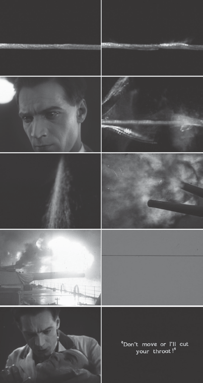
In the UK, for instance, Anthony Asquith’s remarkable A Cottage on Dartmoor (1929) provides a startling example of the use of color in the narrative avant-garde. The film melds Expressionist style with French and Soviet montage in key scenes to convey the mad obsession of a love triangle in which a barber, Joe, is in love with his coworker Sally, who becomes engaged to Harry, one of their salon’s frequent clients. During one of the most dramatic moments, Joe literally sees red—three tinted frames of clear leader—after he spies an engagement ring on Sally’s finger. At the moment, unfortunately, he is also shaving Harry with a straight razor while Sally is giving him a manicure. Through a series of rapid cuts, his mind snaps, literalized in associative montage by a snapping wire and a series of battleship cannons firing (disjunctively flipping the axis of the shots back and forth in Eisenstein-like fashion) before the red tint floods the screen for a fraction of a second. Joe moves his razor closer to Harry’s throat and threatens to slice it. A tense standoff ensues that results in Joe’s cutting Harry in Kuleshov fashion, in which the cut is not actually shown but implied across the sequence’s rapid and repetitive editing. The red rage, literalized through the tinting, metaphorically bleeds over into the unimaged violence, giving particular weight to the final shot of the action when a bottle of hair tonic slowly spills onto the floor creating a dark, viscous mess. The references to Eisenstein are clear, through the associative montage of red, as in the red flag of Battleship Potemkin, as well as through the disjunctive cannon fire. Embedded in a psychological melodrama, however, the red tinting also functions akin to L’Herbier’s pure montage of colors, launching the narration into the abstract dimensions of inner speech and associative imagery.
The influential British-Swiss film journal Close Up critiqued A Cottage on Dartmoor’s overly metaphoric and unnuanced montage, with critic and filmmaker Oswell Blakeston sharply commenting, “To take refuge behind the names of Eisenstein and Pudovkin is natural (and naturally) cowardly.”145 Though Blakeston dismissed what he saw as slavish emulation, the journal was positive overall toward Soviet cinema, and Eisenstein in particular. Indeed, many of Eisenstein’s writings appeared in translation in the journal, including in the same issue the chromatically rich “The Fourth Dimension in the Kino,” along with a rave review of a conversation with Eisenstein at a public screening in Paris of his Staroye i novoye (The Old and the New, 1929). At the screening, Eisenstein discussed color film in detail, predicting that it would soon replace black and white. Perhaps in reference to Brunius’s recent Parisian crusade, he noted, “There will remain only a few isolated enthusiasts who will crusade against colour film in the name of the black-and-white principle.”146
Blakeston showed himself to be attuned to developments in color in a number of other articles for Close Up. During 1929, he reviewed The Colour Symphony, which presumably was a Colorart short film by Tiffany-Stahl Productions. The Hollywood company made a series of shorts under the Color Symphony name using two-color, dye-transfer Technicolor.147 Blakeston relates the film to color music, “which everyone has heard of,” and proceeds to carry out an analysis of its formal properties and how they generate physiological reactions, very much in line with the aesthetics of Einfühlung that held sway in Germany:
In the experiment, under review, there is a flow of kaleidoscopic patterns. There is no cutting; in its place a constant merging, melting, and splitting of figures…. What is so surprising, and important, is the dramatic power of juxtaposed colours. A red that suddenly explodes, a soft green infusing the screen after a wash of scarlet, black stars that unfold from a sea of gold: all react on the spectator in a definite, psychological manner. An audience can be thrilled, soothed, startled, by a transient colour glimpse. A chain of emotions could be inspired by points of luminous shades, growing, converging, sinking back.148
Blakeston’s aesthetic interest in color and form in Close Up delineates the international horizon of chromatic art during the decade and sets the stage for what follows, particularly in the UK with Len Lye’s vernacular-modernist experiments with color and sound in the mid-1930s through the GPO Film Unit, in well-known works such as A Colour Box (1935), Rainbow Dance (1936), and Trade Tattoo (1937).149 The abstract physiology of color in motion thus had a potent, if minor, influence on British art cinema during these years.
In the United States, a limited number of experiments also overlap with the work of the European avant-garde. These works encompass what Jan-Christopher Horak has described as the “first American film avant-garde” made by amateurs, “lovers of cinema.”150 In terms of color, an exemplar in this mode is Alla Nazimova’s Salomé (Charles Bryant and Nazimova, 1923), which Kristen Thompson examines in the context of experimentation on the fringes of Hollywood in Horak’s volume.151 However, no criticism has yet focused on the complex coloring deployed in the film. Produced by and starring Nazimova as Salomé and directed by Charles Bryant with designs by Natacha Rambova, the film is richly Decadent in late Victorian style, adapting Oscar Wilde’s play and its famous Art Nouveau illustrations by Aubrey Beardsley. Beardsley’s illustrations were black and white, but Wilde planned his opening production of the play at the Palace Theatre in 1892 as a synesthetic symphony of color and smells, dressing everyone in yellow but Salome, who was to be either green like a poisonous lizard or naked save for strings of jewels.152 Wilde’s text is replete with synesthetic language, as when Salome describes Jokanaan, sound becoming perfume and vision music: “Thy voice was a censer that scattered strange perfumes, and when I looked on thee I heard a strange music.”153
Nazimova’s film works to adapt these synesthetic motifs not only through its famous composition and design, but also through its use of tinting and Handschiegl, as the 1922 nitrate print preserved at the George Eastman Museum reveals. Primarily tinted in green (perhaps in reference to Wilde’s suggestion), the film also contains briefer yellow-, peach-, blue-, and red-tinted sections, as well as brief Handschiegl sequences, largely inserted for stylistic and symbolic effect. For instance, Handschiegl is used on the opening titles and all ensuing shots depicting the Beardsley-inspired image of Herod’s castle, positioned atop a cliff where the film takes place. Over green tinting, red Handschiegl is applied pictorially to the castle itself, foreshadowing the bloodshed that is to come (color plate 4.9). This is realized in the pictorial juxtaposition of red and green tints later in the film when Jokaanan’s head is severed off-screen. The scene focuses on Salomé’s reactions, shifting from a green-tinted long shot of her brandishing a sword and calling for his execution, to a red-tinted shot of an animated moon slowly being covered by clouds, to a longer framed, green-tinted shot of Salomé walking toward the entrance to the dungeon that is intercut with another red-tint of the moon (color plate 4.10). As the dramatic moment passes of Jokaanan’s execution off-screen, the shot then shifts back from red to green tinting. These changes in tinting—the most pronounced in the film—occur both for dramatic effect, emphasizing the blood-red moment of execution, and for intermedial emphasis, to evoke the synesthetic aura of Wilde’s text using color pictorially to literalize and heighten the composition and its hybrid shifts between photographic action and animated illustrations. As we have seen before, it is in these hybrid, intermedial moments that color moves to the foreground of filmic style.
Color in the first American film avant-garde both evoked the other arts, as in Salomé’s post-Victorian Decadent aesthetics, and was entwined with the origins of American art cinema, specifically in the pictorial strain that Kaveh Askari has explored in Making Movies Into Art. As Askari delineates, the flowering of artistic thinking about cinema in the United States in the 1910s and 1920s was both intermedial in nature (how films and writings about them looked to the other arts and industry for guidance) and grounded in Arts and Crafts aesthetics (which this chapter has traced in an international context, from the Bauhaus to the Vienna Secession to Art Deco).154 These connections are evident, for instance, in the highly composed, sculpted, and tinted-and-toned films of Maurice Tourneur, as in The Blue Bird (1918), and Rex Ingram, as in The Four Horsemen of the Apocalypse (1921) and The Magician (1926). Both filmmakers were deeply imbedded in the aesthetic cultures of their day, as Askari has shown. Tourneur had famously studied under August Rodin and Pierre Puvis de Chavannes in France, and Ingram frequently promoted his background studying sculpture at Yale from 1912 to 1913. This initial grounding in the fine arts provided intermedial context and cultural prestige for the art cinema they both went on to produce.
Dudley Murphy’s U.S. work can also be situated at the fringes of these more established yet also unconventional Hollywood figures. After he returned from France, Murphy even collaborated with Ingram on Mare Nostrum (1926), which Murphy noted in advertisements self-promoting his work, even though the collaboration was not what he had hoped for.155 Like Ingram, Murphy was deeply rooted in cosmopolitan aesthetic culture. His parents, Caroline Bowles Murphy and Hermann Dudley Murphy, were well-established painters in Boston and founding members of the Winchester Arts and Crafts Society. After his parents’ divorce in the 1910s, his mother relocated with him and his sister to Southern California, and it was there, through the Krotona Institute, that Murphy, like so many others in this chapter, came under the occult influence of Theosophy and its theories of color.156 In the early 1920s, Murphy also spent a month at Dartmouth College collaborating on the development of new camera lenses with Adelbert Ames, the founder of the Dartmouth Eye Institute, which was dedicated to researching physiological optics.157 As William Moritz has hypothesized, this is quite possibly where Murphy developed his unique kaleidoscopic lens attachment, which he used in Ballet mécanique and other films.158 During this period, through his Theosophical connections, Murphy also met and interacted with Danish artist and inventor Thomas Wilfred, who developed the Clavilux color organ in the 1910s. Murphy described his reaction to Wilfred’s color experiments as “one of the most ecstatic experiences of my life.”159
These various currents of art, science, and the occult run parallel to those affecting many of the European artists already examined in this chapter, particularly in how they inform the use of color in Murphy’s cinematic work produced in the early 1920s, before Ballet mécanique. Indeed, four of his early films—almost certainly including Soul of the Cypress (1920) and Aphrodite (1920)—were praised as being “beautifully colored” by Sidney Woodward in the Boston Post on September 2, 1920.160 Aphrodite is a lost film (and his first starring Katherine Hawley), but Soul of the Cypress is extant. The surviving version derives from Library of Congress print materials, where two versions are preserved, though in black-and-white safety prints. Film historian and curator Bruce Posner made a reconstruction of the material, and retinted and toned the resulting version based on notes from the library’s original duplication of the nitrates before they were discarded.161 The film is lushly tinted orange through most of its first two-thirds and then shifts to an equally rich blue tone and purple tint. The film Romantically recounts a Greek-inspired myth of a musician who falls tragically in love with a beautiful and diaphanously clad tree dryad who is drawn to his music (played by Murphy’s first spouse, Chase Herendeen). The dryad’s home is a cypress on a cliff above the ocean, and when the musician is unable to possess her, he throws himself off the cliff, so that his song will merge with the sea and be with her forever. Filmed at Point Lobos, along the majestic California coastline near Monterey, the film emulates the style of Pictorialist photography, in particular the work of Anne W. Brigman, who also mystically featured dryad-like women merging into the landscape and trees of the Californian coast.162 The tints and tones work to bring out these connections, emulating the coloring and spiritualist style of Pictorialist photography draped in painterly hues. Murphy also based the film in part on Claude Debussy’s Prelude to the Afternoon of a Faun, and the musician in the film was a composer he had meet in Theosophical studies at Krotona.163
After producing a few other short films, Murphy formed Visual Symphony Productions with Universal financer Claude Macgowan, and it is likely that Murphy also rereleased his earlier films through the company—one of the film’s promoted by the company was “Debussy’s Faun,” which was almost certainly Soul of the Cypress.164 The company aimed to produce short filler films, which exhibitors could use as overtures to begin a screening or to slot in among other musical features. Each would be distributed with an accompanying score for orchestra, to synchronize live sound with moving image. Implicit in Murphy’s project was creating a type of Wagnerian total artwork that synesthetically combined the moving images with classical music. As part of this endeavor, color was also integrated into his total vision, at least from the evidence of the surviving films—Soul of the Cypress, presuming it was repackaged as a Visual Symphony film, and the company’s first production, Danse Macabre (1922), which was tinted, toned, and hand colored, as in the nitrate print preserved at the George Eastman Museum.
Danse Macabre was developed around Camille Saint-Saëns’ symphonic tone poem of the same title and starred well-known ballet artists and choreographers Adolph Bolm and Ruth Page. The film portrays a young couple who hide in a desolate Spanish castle while fleeing the plague, only to have Death appear personified as a superimposed skeleton with a violin who forces them to dance through the night without sleep if they are to survive. As in Soul of the Cypress, the colors of the film are saturated and impressionistic, even as they partially follow tinting and toning conventions of the time. The varying hues register the changing shades of evening, from the opening purple tint at midnight to an amber tint that begins early in the film, mid-shot at the moment the young man lights a candle to illuminate the room he and the woman have just entered in the castle. The amber hue persists throughout most of the film, until the woman begins to pass out from exhaustion, at which point (in a cut-in) the scene shifts to a rich and dramatic blue tone. The man half-wakes her, carrying her to a couch, and the film changes to a light blue tint with sepia toning (much of the light blue tint has faded in these sequences of the nitrate print). As he struggles to wake her, Death dances with joy in superimposition, during cuts back to the rich blue toning. However, as Death is about to claim the woman, the sun rises in an animated shot behind a crowing rooster, and the film cuts to blue toning with pink tinting, which persists through the rest of the film (color plate 4.11). The woman stirs in the man’s arms as they realize they have vanquished Death.
Earlier, in the first appearance of Death, he appears as a still, illustrated image in medium close-up, with distinctly red hand-colored eyes. The hand coloring makes the eyes of the otherwise still image quiver in uncanny and deathly fashion. For such a relatively short film of the time, these various coloring effects are relatively elaborate and go beyond conventional diegetic cues (as in the lighting of the candle and the passing of the night) and, like the effect on Death’s eyes, add an affective, supernatural layer to the film in keeping with the synesthetic aims of Visual Symphony Productions.
Cinematic color was not a major area of interest for Murphy after he returned to the United States from making Ballet mécanique, though racialized color became a core feature of his filmmaking in the African-American-focused works he produced in the late 1920s and 1930s, such as Black and Tan (1929) and The Emperor Jones (1933). Still, his films from earlier in the decade were received as being in line with the chromatic aura of international art cinema. For instance, Murphy was prominently featured in an article from 1926 on the emergence of the Little Cinema movement, which aimed to create in the United States an alternative exhibition network for past and present international art cinema.165 The article delineates the emerging vernacular modernist aesthetics of U.S. cinema practices of the time, noting that in Little Cinema, “Chaplin and Harold Lloyd slapsticks are mingled with German expressionist films, and are equally liked”; further, the aim of such international amalgamations was “uplifting the public taste.”166 This, of course, was not particular to the United States at the time; one could imagine such programming also playing in Herbert Bayer’s envisioned abstractly colored “Kinogestaltung” at the Bauhaus. Amid discussions in the article of L’inhumaine and The Cabinet of Dr. Caligari—chromatic works featured prominently in this chapter—there is a lengthy section on Murphy: “one of the figures in the art-film movement. His revolutionary Ballet of the Machine was booed and hissed and laughed at…. He is home talent which has absorbed the ideas about modern art that are current in Europe.”167 The article proceeds to quote Murphy noting that his next project will explore New York and bring “the fantastic speed and rhythm of this jazz age into a film.” Jazz and rhythm would indeed be the focus of many of his later race films, but in the middle of the decade his work also resonates with the chromatic modernism of F. Scott Fitzgerald and the golden hues of Gatsby’s roaring world.
Ballet mécanique’s early history in the United States also attests to this rhythmic context. When the film first screened in the United States, it accompanied the premiere of L’inhumaine, on March 14, 1926, at the Klaw Theatre in New York City.168 Though New York Times critic Mordaunt Hall frequently commented on color developments in his reviews, he made no mention of color in L’inhumaine in his criticism of the film. However, he did note the use of color in Ballet mécanique: “After [L’inhumaine] had been shown an even stranger production was put forth in which there was everything from pots and pans to a swinging girl, a glimpse of an amusement park and red circles—a film which would make the most confused effort of a futurist or cubistic artist seem as plain as a pikestaff.”169 Futurist, Cubist, and with red circles: the film is a hallmark of the chromatic modernism of its day. Critic William Reilly also contextualized the film as a “cubist painter’s dream,” explaining that “Murphy went to work to give his audiences an emotional kick by utilizing the many powerful qualities that the motion picture possesses and which are used only occasionally today. For instance, the power of shock by percussive effects, the power to soothe by fluent effects, the power to excite by dynamic repetition—contrasts—surprise—repetition to the extent of hysteria-rhythmic suspense as opposed to the usual plot suspense.”170 In New York, though, the hysteria produced by the red circles of the Cubist painter also coincided with Murphy’s future as a race-film producer. For the Cameo screenings, Murphy explained, “There being no score to accompany the film, I got a Negro drummer from Harlem, who played on drums, tin washpans and washboards, and who would watch the film as he played interpretations in his own far-out manner, to the images which excited him on the screen. The audience at these showings got so excited that they would create near-riots in the theatre.”171
This Jazz Age mix of color and cinema surfaces repeatedly during the 1920s and defines the artistic horizon of the decade’s chromatic modernity. Just as classical cinema was solidifying into a medium of its own, modernist experimentation surged in cinema and across the chromatic arts—a phenomenon that challenges the idea that cinema was becoming estranged from other media as it developed its institutional structures. Rather, the nature of intermediality was changing, as cinema absorbed artistic currents into its medial composition, and it is at these junctures that color flourished in film. From Europe to North America and beyond, avant-garde experiments were accompanied by utopian, scientific, and occult thought about the potential of art forms to intermingle and collide. Color cinema was integral to ideas about the arts’ ultimate aesthetic synthesis in dynamic movements such as Absolute Film and Cinéma pur, as well as in the first American film avant-garde. Color provided these works—which emerged sometimes in dialogue with one another, and in other instances simply irrationally at the same time—with an aesthetic logic and aura of cultural prestige within the field of artistic production.