Choose Window→Components, and you see a panel full of built-in components that you can drag and drop into your Flash document. Well, it's almost that easy. You see different components depending on whether your document is based in ActionScript 2.0 or ActionScript 3.0. Like any ActionScript code, you can't mix version 2 components and version 3 components in the same document. This forwardlooking chapter focuses on the ActionScript 3.0 components. The ActionScript 3.0 built-in components fall into three main categories:
Flex components. Flex is a programming tool that, like Flash Professional, creates applications using ActionScript and SWF files. Also, like Flash, Flex programs can make use of prebuilt components, which are saved in SWC files.
User Interface components. Similar to HTML components, Flash User Interface components include buttons, checkboxes, lists, text fields, and windows—everything you need to create a Flash form and collect data from your audience.
Video components. These components give you tools to work with video clips. For example, they work with streaming video (where a movie begins to play before the entire file is downloaded). These components are an indication of Flash's growing role as a tool to provide web-based video.
Note
This chapter focuses on the User Interface components, because they're by far the most popular Flash components. For an introduction to the video components, see Part three.
Similar to HTML form components, Flash's popular User Interface components (Figure 16-1) let you interact with your audience, display information, and gather information. Examples of User Interface components include buttons, checkboxes, text fields, and drop-down lists. In this section, you'll find details about ActionScript 3.0 User Interface components. For each component, there's a Component Parameters subpanel that lets you tweak the component. If you use components a lot, some of the parameters will become very familiar, because they work with several different components. Other parameters are specific to the purpose of a particular component, and you may need to refer to this section for the full explanation. See the box on Learning the Parameters.
Note
There's a companion file for this section, 16-4_Component_Index.zip. You can see it in Figure 16-13 and download it from the Missing CD page (www.missingmanuals.com/cds). The Zip-compressed file holds a Flash document and some other assets used to demonstrate the various User Interface components. Test the document with Ctrl+Enter (⌘-Return), and you'll see buttons for each component, as shown in Figure 16-13. Click a button to see a component in action. Want to see the ActionScript code behind the component? Click the frame code button, and you'll find the code with lots of explanatory comments. Use the button at the bottom of the window to return to the main index.
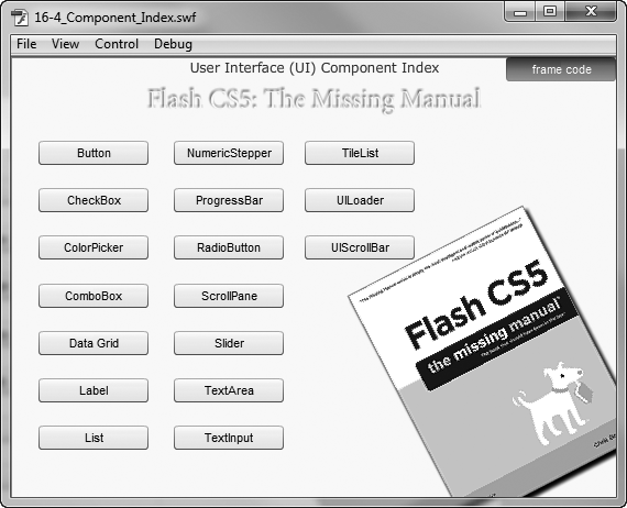
Figure 16-13. There's a lot to learn about components—more than can fit in the pages of this chapter. Working examples can be a big help, so there's a Missing Manual Component Index Flash document that shows how to make each of the User Interface components work. For each component example, you can see the underlying ActionScript code. Just click the "frame code" button.
The Button hardly needs introduction. It's a multipurpose component you can use to receive input from your animation's audience. The process of using a Button component is covered in detail beginning on Adding Components, and you see an example of the clickable Button component in Figure 16-14.
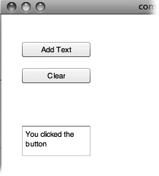
Figure 16-14. Similar to HTML buttons, Button components are straightforward, no-nonsense, clickable buttons you hook up to ActionScript. For example, you can customize a Button component's label to read Add Text or Clear Text, as shown here, and then write the code necessary to carry out those tasks.
You may be wondering when it's best to use a Button component and when it's best to use Flash's button symbol from the Common Libraries. If you're into customizing a button with, say, animations and other snazzy effects, go for the button symbol from the Common Libraries or design your own button symbol. The symbol gives you a movie clip timeline where you can do your magic—for all the details, see Button Symbols. The Button component is a predesigned button that you don't have to fiddle with too much to make it useful. The button is a good alternative if you're using other components, because they'll all have a similar look. As you see in the Button Parameters table, one handy built-in feature of the Button component is the toggle parameter. When you set this parameter to "true", the button displays on/off characteristics. Clicking the button turns it on, and it stays down. Click it again, and it pops back up into position.
Button Parameters | Expected Value | Purpose |
|---|---|---|
emphasized | selected or deselected | Changes appearance of button to stand out from other buttons. |
enabled | selected or deselected | If deselected, the button doesn't accept audience input. |
label | a string of characters | Explanatory text label for button. |
labelPlacement | left, right, top, bottom | Positions label relative to button. |
selected | selected or deselected | Changes appearance of a toggle button to show it's selected. |
toggle | selected or deselected | Give the button on/off functions. |
visible | selected or deselected | If deselected, the component is hidden. |
The CheckBox is another familiar friend to anyone who has completed an online survey or filled out a questionnaire. The CheckBox component lets you offer your audience an easy way to choose multiple options, as shown in Figure 16-15. With checkboxes, folks can make several selections in a group of options. If you want to limit your audience to a single choice, use the RadioButton component. CheckBoxes are common in computer programs, on the web, and in print, so your audience will easily understand how to use them. You can customize the CheckBox component at design time using the following parameters. For example, if you check the "selected" parameter in the Component Parameter subpanel, a checkmark appears in the checkbox when your animation first runs.
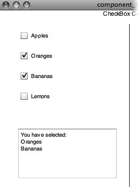
Figure 16-15. Unlike RadioButtons (page 545), CheckBoxes let your audience make multiple selections.
Note
For ActionScript coders, there are two distinct categories for time: design time and runtime. Design time is where you are now, when you have Flash open on your computer and you can control events, drawings, and all details in Flash. Runtime is when your Flash project is out there in the world, where your audience is viewing it and controlling it.
Using ActionScript, you can change components' properties while the animation is running. For example, examine the following code, which could appear at any time within your animation:
cbApples.enabled = false;
cbOranges.visible = false;
cbBananas.selected = true;
This code turns off the CheckBox cbApples, making it appear grayed out and unclickable. The CheckBox cbOranges is hidden entirely, and cbBananas is selected so it sports a handsome checkmark.
CheckBox Parameters | Expected Value | Purpose |
|---|---|---|
enabled | selected or deselected | If deselected, CheckBox doesn't accept audience input. |
label | a string of characters | Explanatory text for CheckBox. |
labelPlacement | left, right, top, bottom | Positions label relative to component. |
selected | selected or deselected | Makes a checkmark appear in the CheckBox. |
visible | selected or deselected | If deselected, the component is hidden. |
The ColorPicker component (shown in Figure 16-16) displays a palette of colors, giving your audience an opportunity to select a single color. You can give your audience a way to customize, say, text, background colors, and just about any other elements in the display. For example, suppose you're selling laptop computer cases. You can limit the colors shown in the ColorPicker to just those you have available. You can learn how to use the ColorPicker tool in detail on Adding a ColorPicker Component. Select ColorPicker, and in the Component Parameters subpanel you see the parameters shown in the following table.
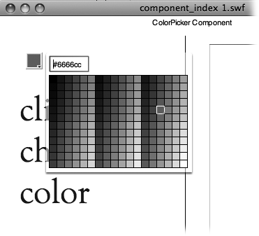
Figure 16-16. The ColorPicker makes it easy for your audience to select a single color from an entire palette of options. Using ActionScript code, you can limit the colors shown in the palette.
ColorPicker Parameters | Expected Value | Purpose |
|---|---|---|
enabled | selected or deselected | If deselected, ColorPicker doesn't respond when clicked. |
selectedColor | hexadecimal color value | The currently selected color that's displayed when the palette is closed. ActionScript code can work with the hexadecimal value of this color. |
showTextField | selected or deselected | If selected, a text field displays the hexadecimal value of the selectedColor, and your visitors can type a new hexadecimal value. |
visible | selected or deselected | If deselected, the component is hidden. |
As Figure 16-17 shows, the ComboBox component lets you display a drop-down list of options. Use this component when you want to offer people an easy way to choose a single option (like which animation they want to play, or which web page they want to hop to) from a predefined list. You can customize the ComboBox component at design time using the Component Parameter subpanel to change the parameter values. Flash automatically adds a scroll bar to your ComboBox component if you create a long list (over five options). Short list or long, the ComboBox lets your audience choose only one option. If you want to offer people a list from which they can Shift-click or Control-click multiple options, use the List component (List). The ComboBox uses a DataProvider as the source for its list. You can point to an external file or create the DataProvider in ActionScript within your document. For more details, see the box on Providing Data.
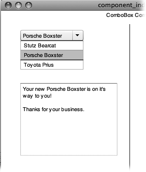
Figure 16-17. Use the ComboBox component to give your audience a single choice from a list of items.
ComboBox Parameters | Expected Value | Purpose |
|---|---|---|
dataProvider | a DataProvider object (for more details see the box on Providing Data.) | Points to a data source to provide the items in the list. The DataProvider object can come from an external source, or you can create one using ActionScript code. You can also manually add values by clicking the Value box in the Component Inspector. |
editable | selected or deselected | If deselected, your audience can't make changes to the ComboBox. |
enabled | selected or deselected | If deselected, your audience can't use the ComboBox. |
prompt | a string of characters | The words that appear before your visitor uses the ComboBox. |
restrict | a string of characters | Limits the characters that a visitor can enter in the text field. |
rowCount | a number value | Sets the number of items displayed in the list. If the list has more items, a scroll bar appears. If the list has few items, the list is sized to fit. |
visible | selected or deselected | If deselected, the component is hidden |
The DataGrid component lets you display a table containing multiple rows and columns of data, similar to a spreadsheet, as shown in Figure 16-18.
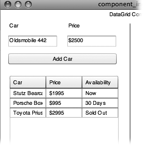
Figure 16-18. The DataGrid component displays information in a spreadsheet-style format with rows and columns.
DataGrid Parameters | Expected Value | Purpose |
|---|---|---|
allowMultipleSelection | selected or deselected | If selected, allows the selection of more than one list item in the data grid. |
editable | selected or deselected | If deselected, your audience can't change the DataGrid. |
headerHeight | a number value | Sets header height in pixels. |
horizontalLineScrollSize | a number value | The amount of content to be scrolled, horizontally, when your audience clicks a scroll arrow. |
horizontalPageScrollSize | a number value | The number of pixels the scroll marker moves when your audience clicks the scroll bar track. Similar to a Page Up or Page Down command. |
horizontalScrollPolicy | ON, OFF, AUTO | Controls whether a scroll bar appears in the component. |
resizableColumns | selected or deselected | If deselected, your audience can't change column widths. |
rowHeight | a number value | Sets the height of the rows in pixels. |
showHeaders | selected or deselected | If deselected, the DataGrid doesn't display headers. |
sortableColumns | selected or deselected | If deselected, your audience can't sort the data in the columns. |
verticalLineScrollSize | a number value | The amount of content to be scrolled, vertically, when a scroll arrow is clicked. |
verticalPageScrollSize | a number value | The number of pixels the scroll marker moves when your audience clicks the scroll bar track. Similar to a page up or page down command. |
verticalScrollPolicy | ON, OFF, AUTO | Controls whether a scroll bar appears in the component. |
Typically, you use this component when you want to transfer data from your server (for example, product names, descriptions, and prices) and display it in Flash in table form. But you can also use it to display the data you collect (or create) in your Flash animation. You can populate the cells in the data grid from an external source, or you can create a DataProvider and store values in it, using ActionScript (see the box above).
A Label component lets you add noneditable, nonclickable text to your Flash creation. To use the Label component, add the text you want displayed to the text parameter in the Component Inspector. If you're using ActionScript code, assign a string to the text property of the label. As an alternative, you can display HTML-encoded text using the htmlText parameter or property.
Tip
For most Flash designers, using Flash's Text tool is easier and keeps .swf files smaller. Even if you want to change text during runtime with ActionScript, you can do that with a text field.
Parameters | Expected Value | Purpose |
|---|---|---|
autoSize | selected or deselected | If selected, the label shows all of its text, regardless of the W and H properties. |
condenseWhite | selected or deselected | When selected, this removes extra white space from HTML text. |
enabled | selected or deselected | If deselected, your audience can't access the component. |
htmlText | HTML-encoded text | Displays HTML encoded text, showing formatting, hyperlinks, and other features. |
selectable | selected or deselected | If checked, your audience can select the text in a label. |
text | a string of characters | The text shown in the display. |
visible | selected or deselected | If deselected, the component is hidden. |
wordWrap | selected or deselected | Controls line breaks in large chunks of text. |
You use the List component (Figure 16-19) to create a clickable, scrollable list from which your audience can Shift-click to select multiple options. The List uses a DataProvider as the source. You can point to an external file, or you can create the DataProvider in ActionScript within your document. For more details, see the box on Providing Data. The items that make up each row in a list consist of a label and data. The label appears in the list display; the data is the part that's invisible to your audience but accessible to ActionScript. So, for example, you can create a list where someone can choose an employee by name; that selection can then pass the employee's ID number to another part of your program.
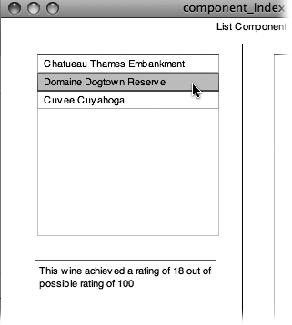
Figure 16-19. The List component is similar to multiple checkboxes (see page 536) in that both let your audience select multiple options (once you customize the List component by setting allowMultipleSelection to true in the Component Parameters). But because List components are scrollable, they tend to take up less screen real estate than checkboxes, and so they're helpful when your stage is already packed with graphics and other components.
List Parameters | Expected Value | Purpose |
|---|---|---|
allowMultipleSelection | selected or deselected | If deselected, your audience can select only one item from the list at a time. |
dataProvider | a DataProvider object (for more details see the box on Providing Data.) | Points to a data source to provide the items in the list. The DataProvider object can be an external source, or you can create one using ActionScript. |
enabled | selected or deselected | If deselected, your audience can't use the ComboBox. |
horizontalLineScrollSize | a number value | The amount of content to be scrolled, horizontally, when your audience clicks a scroll arrow. |
horizontalPageScrollSize | a number value | The number of pixels the scroll marker moves when your audience clicks the scroll bar track. Similar to a Page Up or Page Down command. |
horizontalScrollPolicy | ON, OFF, AUTO | Controls whether a scroll bar appears in the component. |
verticalLineScrollSize | a number value | The amount of content to be scrolled, vertically, when a scroll arrow is clicked. |
verticalPageScrollSize | a number value | The number of pixels the scroll marker moves when your audience clicks the scroll bar track. Similar to a Page Up or Page Down command. |
verticalScrollPolicy | ON, OFF, AUTO | Controls whether a scroll bar appears in the component. |
visible | selected or deselected | If deselected, the component is hidden. |
You use the NumericStepper component to create a clickable list of numbers, as shown in Figure 16-20. Simpler for people to use than a type-in-your-own-number text field, this component makes it easy for you to limit your audience's choices to a predefined set of valid numbers.
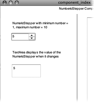
Figure 16-20. When you use the NumericStepper component, your audience gets an easy way to specify a number, and you don't have to use ActionScript to examine the number and see whether it's valid (the way you would if you let them type any number they want).
Parameters | Expected Value | Purpose |
|---|---|---|
enabled | selected or deselected | If deselected, your audience can't use the component. |
maximum | a number value | Sets the highest number the component can display. |
minimum | a number value | Sets the lowest number the component can display. |
stepSize | a number value | Sets the amount the value changes with each click. |
value | a number value | The current value selected by the NumericStepper. |
visible | selected or deselected | If deselected, the component is hidden. |
The ProgressBar component, shown in Figure 16-21, is a visual indicator that a file—like a Flash .swf file—is loading. There are two ways a ProgressBar can work. If you're loading a file and have no way of knowing how big the file is, then you can't very well say the file is, for example, 50 percent loaded. In that case, the progress bar is considered indeterminate. In other words, it provides some motion, kind of like a barber's pole, to show that something's going on. On the other hand, if you know how big the file is, you can give your audience more detail on the process. You've probably seen the ProgressBar in action when Flash animations are loading from web pages. To have the ProgressBar report on the progress of loading a file, type the name and path of the file in the source parameter. In ActionScript, you assign the name to the source property of the ProgressBar. You can also use ActionScript to access the percentComplete property, giving you a way to create a companion line of text.
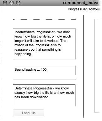
Figure 16-21. The ProgressBar component lets you give your audience a visual indication of how long they have left to wait for an animation (or a web page) to load.
Parameters | Expected Value | Purpose |
|---|---|---|
direction | left or right | Sets whether the bar fills from the left or from the right. |
enabled | selected or deselected | If deselected, your audience can't access the component. |
mode | event, polled, manual, | Selects different methods for providing progress information. Event and polled are the most common modes. |
source | an object that's being loaded; for example, a Loader instance | Sets the source for the object that's being loaded. |
visible | selected or deselected | If deselected, the component is hidden. |
When you want to make sure your audience chooses just one of several mutually exclusive options, use a group of RadioButton components (Figure 16-22). Radio buttons are frequently used in programs and on the Internet, so it's likely your audience will be familiar with them.
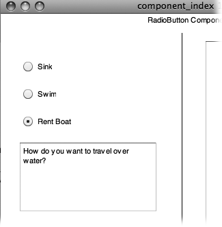
Figure 16-22. RadioButton components let you offer your audience mutually exclusive options, so you never use just one. You always use RadioButton components in groups of two or more. (If you think you want a single RadioButton, you probably want to use a CheckBox.) Turning on one radio button tells Flash to turn off all the other radio buttons with the same groupName.
RadioButton Parameters | Expected Value | Purpose |
|---|---|---|
enabled | selected or deselected | If deselected, your audience can't use the component. |
groupName | RadioButtonGroup | Identifies the group of buttons from which your audience can make a single selection. |
label | a string of characters | Explanatory text for the RadioButton component. |
labelPlacement | left, right, top, bottom | Positions the label relative to the button. |
selected | selected or deselected | Changes the appearance of the RadioButton to show it's checked. |
value | An object like a string or a number | You the designer define the values represented by radio buttons. |
visible | selected or deselected | If deselected, the component is hidden. |
The ScrollPane component helps you include an image that's too big to fit into your animation. Think about some of those map programs that let you move a map image inside a frame. You can let your audience position an image using scroll bars or by dragging in the image. Figure 16-23 shows you the ScrollPane in action, and the table below lists the multitude of parameters you find in the Component Inspector. There are two parameters for each type of scroll bar: horizontal and vertical. These parameters determine how far the window scrolls when you click the scroll bar's arrows and when you click the body or track of the scroll bar. A ScrollPolicy lets you define scrolling behavior and assign that behavior to many objects and components. The ScrollPolicy settings can get a little involved, but in most cases, you can leave horizontalScrollPolicy and verticalScrollPolicy set to AUTO without adverse effects.
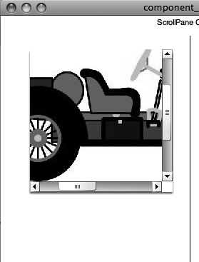
Figure 16-23. When you display an animation or image using the ScrollPane component, Flash automatically tacks on scroll bars that people can use to choose which part of the animation they want to see through the window.
ScrollPane Parameters | Expected Value | Purpose |
|---|---|---|
enabled | selected or deselected | If deselected, your audience can't use the component. |
horizontalLineScrollSize | a number value | The amount of content to be scrolled, horizontally, when your audience clicks a scroll arrow |
horizontalPageScrollSize | a number value | The number of pixels by which to move the scroll marker on the horizontal scroll bar when your audience clicks the scroll bar track. |
horizontalScrollPolicy | ON, OFF, AUTO | Controls whether a scroll bar appears in the component. |
scrollDrag | selected or deselected | If selected, your audience can drag an image within the ScrollPane. |
source | name and path to the file to be displayed; this can be an Internet address | Sets the source for the file to be displayed in the ScrollPane. |
verticalLineScrollSize | a number value | The amount of content to be scrolled, vertically, when your audience clicks a scroll arrow. |
verticalPageScrollSize | a number value | The number of pixels by which to move the scroll marker on the vertical scroll bar when your audience clicks the scroll bar track. |
verticalScrollPolicy | ON, OFF, AUTO | Controls whether a scroll bar appears in the component. |
visible | selected or deselected | If deselected, the component is hidden. |
The Slider component gives your audience an easy way to select a value. Better still, it helps you prevent them from choosing a useless value. (Ever had someone type his name into a box where you expected a number?) Sliders are a natural for controlling volume or sizing an image, and there are lots of creative ways to use them. Use the maximum and minimum parameters to set the range. Use the snapInterval to count by fives or twos if you want. The tickInterval refers to a visual scale that appears above the slider, as shown in Figure 16-24.
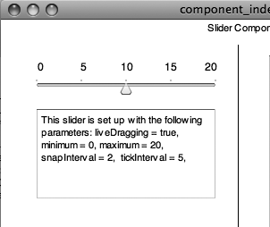
Figure 16-24. The slider component doesn't automatically provide numbers for its scale. Here the numbers were added using Flash text.
Slider Parameters | Expected Value | Purpose |
|---|---|---|
direction | horizontal or vertical | Sets the Slider's orientation. |
enabled | selected or deselected | If deselected, your audience can't access the component. |
liveDragging | selected or deselected | If selected, lets your audience drag to change the Slider's value. If you deselect the parameter, it's up to you to move the Slider through ActionScript to display a value. |
maximum | a number value | The high number on the Slider's scale. |
minimum | a number value | The low number on the Slider's scale. |
snapInterval | a number value | Sets the precision available on the Slider's scale. |
tickInterval | a number value | Shows visual tick marks above the Slider. |
value | a number value | The value represented by the Slider's position. |
visible | selected or deselected | If deselected, the component is hidden. |
The TextArea component (Figure 16-25) is an all-purpose, multiline, scrollable text field that's useful for presenting text to your audience. It's also useful when you want your audience to be able to type a long comment, or any other information longer than a few words. You can modify the text property through ActionScript, which means you can change the text that appears in a text field while your animation is running.
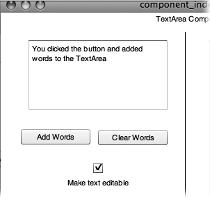
Figure 16-25. The TextArea and TextInput components both let your audience type text, but the TextArea component (shown here) lets them type multiple lines of text. Flash automatically adds scrollbars if someone types in more text than the TextArea component's dimensions can display.
TextArea Parameters | Expected Value | Purpose |
|---|---|---|
condenseWhite | selected or deselected | When selected, removes extra white space from HTML text. |
editable | selected or deselected | If deselected, your audience can't make changes to the component. |
enabled | selected or deselected | If deselected, your audience can't access the component. |
horizontalScrollPolicy | ON, OFF, AUTO | Controls whether a scroll bar appears in the component. |
htmlText | HTML-encoded text | Displays HTML encoded text, showing formatting, hyperlinks, and other features. |
maxChars | a number value | Limits the number of characters that the TextArea component can contain. The setting 0 means there's no limit. |
restrict | a string of characters | Lets you specify which characters your audience can type into the TextArea component. For example, you can limit input to the numbers 0-9 if you expect a phone number. |
text | a string of characters | The text to be displayed in the TextArea. |
verticalScrollPolicy | ON, OFF, AUTO | Controls whether a scroll bar appears in the component. |
visible | selected or deselected | If deselected, the component is hidden. |
wordWrap | selected or deselected | Controls line breaks in large chunks of text. |
The TextInput component lets you create a single-line text field, used mostly as a field in a form. Using this component lets you give your audience a free-form text field just long enough to type what you want them to type (for example, a name, phone number, or email address).
TextInput Parameters | Expected Value | Purpose |
|---|---|---|
displayAsPassword | selected or deselected | When selected, disguises the actual characters in the display. |
editable | selected or deselected | If deselected, your audience can't change the text. |
enabled | selected or deselected | If deselected, the component can't be accessed by the audience. |
maxChars | a number value | Limits the number of characters that can be contained in a TextInput component. If it's set to 0, there's no limit. |
restrict | a string of characters | Used to limit the characters that can be typed into the TextInput component; for example you can limit input to numbers if you expect a phone number. |
text | a string of characters | The text shown on the display. |
visible | selected or deselected | If deselected, the component is hidden. |
The TileList is used to display several images in a grid (Figure 16-26). For example, you may want to show several thumbnail images in a row. When your audience clicks a thumbnail, a larger version of the image is displayed.
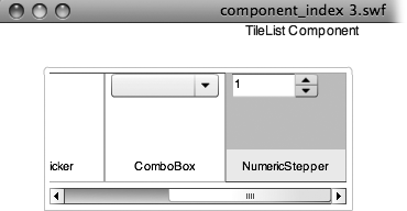
Figure 16-26. Usually TileList components are filled with images and captions. In honor of this chapter's topic, this TileList is filled with other components.
Expected Value | Purpose | |
|---|---|---|
allowMultipleSelection | selected or deselected | If selected, your audience can select more than one image. |
columnCount | a number value | Sets the number of columns in the grid. |
columnWidth | a number value | Sets the width of the column in pixels. |
dataProvider | a DataProvider object (for more details, see the box on Providing Data) | Points to a data source to provide the items in the list. The DataProvider object can come from an external source, or you can create one using ActionScript code. |
direction | horizontal or vertical | Sets whether the TileList scrolls horizontally or vertically. |
enabled | selected or deselected | If deselected, your audience can't use the component. |
horizontalLineScrollSize | a number value | The amount of content to be scrolled, horizontally, when your audience clicks a scroll arrow. |
horizontalPageScrollSize | a number value | The number of pixels by which to move the scroll marker on the horizontal scroll bar when your audience clicks the scroll bar track. |
rowCount | a number value | Sets the number of rows in the grid. |
rowHeight | a number value | Sets the height of the rows in pixels. |
scrollPolicy | ON, OFF, AUTO | Controls whether a scroll bar appears in the component. |
verticalLineScrollSize | a number value | The amount of content to be scrolled, vertically, when your audience clicks a scroll arrow. |
verticalPageScrollSize | a number value | The number of pixels by which to move the scroll marker on the vertical scroll bar when your audience clicks the scroll bar track. |
visible | selected or deselected | If deselected, the component is hidden. |
Think of the UILoader (user interface loader) as a container for images (.jpg, .gif, and .png) and Flash animations (.swf) that are outside of your Flash application. You provide the name and path of the file you want to load into the source parameter. If you're ActionScripting, you can assign the name to the source property of the UILoader. Through ActionScript, you can also access the percentLoaded property.
The UIScrollBar component is a fancy, color-customizable scrollbar you can add to a TextField or TextArea field to make your text fields match your overall color scheme.
UIScrollBar Parameters | Expected Value | Purpose |
|---|---|---|
direction | horizontal or vertical | Sets the orientation of the scroll bar. |
scrollTargetName | instance name of a textArea or textInput component | Identifies the text field to be scrolled. |
visible | selected or deselected | If deselected, the component is hidden. |