Introduction to the Beauty of Response Surface Methods
For a research worker, the unforgotten moments of his [or her] life are those rare ones, which come after years of plodding work, when the veil over nature’s secret seems suddenly to lift, and when what was dark and chaotic appears in a clear and beautiful light and pattern.
Gerty Cori
The first American woman to win a Nobel Prize in science
Before we jump down to ground-level details on response surface methods (RSM), let’s get a bird’s-eye view of the lay of the land. First of all, we will assume that you have an interest in this topic from a practical perspective, not academic. A second big assumption is that you’ve mastered the simpler tools of design of experiments (DOE). (Don’t worry, we will do some review in the next few chapters!)
RSM offer DOE tools that lead to peak process performance. RSM produce precise maps based on mathematical models. This methodology facilitates putting all your responses together via sophisticated optimization approaches, which ultimately lead to the discovery of sweet spots where you meet all specifications at minimal cost.
This answers the question: What’s in it for me? Now let’s see how RSM fits into the overall framework of DOE and learn some historical background.
Strategy of Experimentation: Role for RSM
The development of RSM began with the publication of a landmark article by Box and Wilson (1951) titled “On the Experimental Attainment of Optimum Conditions.” In a retrospective of events leading up to this paper, Box (2000) recalled observing process improvement teams in the United Kingdom at Imperial Chemical Industries in the late 1940s. He and Wilson realized that, as a practical matter, statistical plans for experimentation must be very flexible and allow for a series of iterations.
Box and other industrial statisticians, notably Hunter (1958–1959) continued to hone the strategy of experimentation to the point where it became standard practice in chemical and other process industries in the United Kingdom and elsewhere. In the United States, Du Pont took the lead in making effective use of the tools of DOE, including RSM. Via their Management and Technology Center (sadly, now defunct), they took an in-house workshop called “Strategy of Experimentation” public and, over the last quarter of the twentieth century, trained legions of engineers, scientists, and quality professionals in these statistical methods for experimentation.
This now-proven strategy of experimentation, illustrated in Figure 1.1, begins with standard two-level fractional factorial design, mathematically described as “2k−p” (Box and Hunter, 1961) or newer test plans with minimum runs (noted below), which provide a screening tool. During this phase, experimenters seek to discover the vital few factors that create statistically significant effects of practical importance for the goal of process improvement. To save time at this early stage where a number (k) of unknown factors must be quickly screened, the strategy calls for use of relatively low-resolution (“res”) fractions (p).
A QUICK PRIMER ON NOTATION AND TERMINOLOGY FOR STANDARD SCREENING DESIGNS
Two-level DOEs work very well as screening tools. If performed properly, they can reveal the vital few factors that significantly affect your process. To save on costly runs, experimenters often perform only a fraction of all the possible combinations. There are many varieties of fractional two-level designs, such as Taguchi or Plackett–Burman, but we will restrict our discussion to the standard ones that statisticians symbolize as “2k−p,” where k refers to the number of factors and p is the degree of fractionation. Regardless of how you do it, cutting out runs reduces the ability of the design to resolve all possible effects, specifically the higher-order interactions. Minimal-run designs, such as seven factors in eight runs (27−4)—a 1/16th (2−4) fraction, can only estimate main effects. Statisticians label these low-quality designs as “resolution III” to indicate that main effects will be aliased with two-factor interactions (2FIs). Resolution III designs can produce significant improvements, but it’s like kicking your PC (or slapping your laptop) to make it work: you won’t discover what really caused the failure.
To help you grasp the concept of resolution, think of main effects as one factor and add this to the number of factors it will be aliased with. In resolution III, it’s a 1-to-2 relation, which adds to 3. Resolution IV indicates a 1-to-3 aliasing (1 + 3 = 4). A resolution V design aliases main effects only with four factors (1 + 4 = 5).
Because of their ability to more clearly reveal main effects, resolution IV designs work much better than resolution III for screening purposes, but they still offer a large savings in experimental runs. For example, let’s say that you want to screen 10 process factors (k = 10). A full two-level factorial requires 210 (2k) combinations, way too many (1024!) for a practical experiment. However, the catalog of standard two-level designs offers a 1/32nd fraction that’s resolution IV, which will produce fairly clear estimates of main effects. To most efficiently describe this option mathematically, convert the fraction to 2p (p = 5) scientific notation: 2−5 (=1/25 = 1/(2 × 2 × 2 × 2 × 2) = 1/32). This yields 210−5 (2k−p) and by simple arithmetic in the exponent (10 − 5): 25 runs. Now, we do the final calculation: 2 × 2 × 2 × 2 × 2 equals 32 runs in the resolution IV fraction (vs. 1024 in the full factorial).
P.S. A more efficient type of fractional two-level factorial screening design has been developed (Anderson and Whitcomb, 2004). These designs are referred to as “minimum-run resolution IV” (MR4) because they require a minimal number of factor combinations (runs) to resolve main effects from 2FIs (resolution IV). They compare favorably to the classical alternatives on the basis of required experimental runs. For example, 10 factors can be screened in only 20 runs via the MR4 whereas the standard (2k−p) resolution IV design, a 1/32nd (2−5) fraction, requires 32 runs.
Along these same lines are minimum-run resolution V (MR5) designs, for example, one that characterizes six factors in only 22 runs versus 32 runs required by the standard test plan.
Figure 1.1 Strategy of experimentationStrategy of experimentation.
After throwing the many trivial factors off to the side (preferably by holding them fixed or blocking them out), the experimental program should enter the characterization phase where interactions become evident. This requires higher-resolution, or possibly full, two-level factorial designs. By definition, traditional one-factor-at-a-time (OFAT) approaches will never uncover interactions of factors that often prove to be the key to success, so practitioners of statistical DOE often achieve breakthroughs at this phase. With process performance possibly nearing peak levels, center points (CPs) set at the mid-levels of the process factors had best be added to check for curvature.
As noted in the preface, 80% (or more) of all that can be gained in yield and quality from the process might be accomplished at this point, despite having invested only 20% of the overall experimental effort. However, hightech industries facing severe competition cannot stop here. If curvature is detected in their systems, they must optimize their processes for the remaining 20% to be gained. As indicated in the flowchart in Figure 1.1, this is the point where RSM come into play. The typical tools used for RSM, which are detailed later in this book, are the central composite design (CCD) and Box–Behnken design (BBD), as well as computer-generated optimal designs.
After completing this three-part series of experiments according to the “SCO” (screening, characterization, and optimization) strategy, there remains one more step: verification. We will detail this final experimental stage in Chapter 12.
INTERACTIONS: HIDDEN GOLD—WHERE TO DIG THE HOLES? (A TRUE CONFESSION)
The dogma for good strategy of experimentation states that screening designs should not include factors known to be active in the system. My coauthor Pat, who seldom strays from standard statistical lines, kept saying this to students of Stat-Ease workshops, but I secretly thought he was out of his mind to take this approach. It seemed to me that it was like digging for gold in an area known to contain ore, but deliberately doing so in an area far from the mother lode. Finally, I confronted Pat about this and asked him to sketch out the flowchart just shown. Then it all made sense to me. It turns out that Pat neglected to mention that he planned to come back to the known factors and combine them with the vital few discovered by screening ones previously not known to have an impact on the system.
Mark
It was so dark, he [Stanley Yelnats] couldn’t even see the end of his shovel. For all he knew he could be digging up gold and diamonds instead of dirt. He brought each shovelful close to his face to see if anything was there, before dumping it out of the hole.
Holes the Newberry Award-winning children’s book by
Louis Sachar (1998, p. 199), made into a popular movie by
Walt Disney (2003)
One Map Better than 1000 Statistics (Apologies to Confucius?)
The maps generated by RSM arguably provide the most value to experimenters. All the mathematics for the model fitting and statistics to validate it will be quickly forgotten the instant management and clients see three-dimensional (3D) renderings of the surface. Let’s not resist this tendency to look at pretty pictures. Since we’re only at the introductory stage, let’s take a look at a variety of surfaces that typically emerge from RSM experiments.
PHONY QUOTATION
“A picture is worth one thousand words” has become a cliché that is invariably attributed to the ancient Chinese philosopher Confucius. Ironically, this oft-repeated quote is phony. It was fabricated by a marketing executive only about 100 years ago for ads appearing in streetcars.
Professor Paul Martin Lester’s website
Department of Communications, Cal State University, Fullerton, California
Life is really simple, but men insist on making it complicated.
Confucius
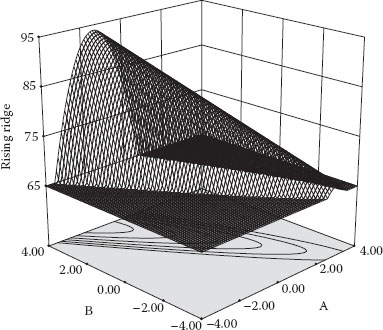
The first surface, done in wire mesh, shown in Figure 1.2 is the one you’d most like to see if increasing response is your goal.
Management and client would love to see this picture showing the peak of performance, but you likely will find it very difficult to attain, even with the powerful tools of RSM. More than likely you will hit operating boundaries well before reaching the peak. For example, the RPM on a machine might max out far short of where you’d like it for optimal response. In such cases, the result is likely to be a surface such as that shown in Figure 1.3. This may be one of the most common geometries an experimenter will see with RSM.
Figure 1.2 Simple maximum.
Figure 1.3 Rising ridge.
Note the contours projected under the 3D surface. The individual contours represent points of constant response, much like a topographical map, shown as functions of two factors, in these cases A and B.
Figure 1.4 shows the most interesting surface that can be generated from standard RSM designs. This one is depicted with a solid exterior (as opposed to wire mesh). It exhibits a saddle, sometimes called a “mini-max.”
Figure 1.4 Saddle.
The model for a saddle varies only slightly from the simple maximum but the surfaces look quite different. More importantly, it presents major problems for finding a maximum point because one can get stuck in the saddle or push up to the lesser peak at left or right. The true optimum may get lost in the shuffle.
IMPRESS YOUR FRIENDS WITH GEOMETRIC KNOWLEDGE
To be strictly correct (and gain respect from your technical colleagues!) refer to this saddle surface as a “hyperbolic parabaloid.” If you get a blank look when using this geometric term, just say that it looks like a Pringles® potato chip (a trademark of Kellogg’s). This geometric form is also called a “col” after the Latin collum or neck collar. According to Webster’s dictionary, a col also means a gap between mountain ranges. Meteorologists use the term col to mean the point of lowest or highest pressure between two lows or two highs. In the last century, daily newspapers typically published contour maps of barometric pressure in their section on weather, but it’s hard to find these nowadays, perhaps because they look too technical.
If you really want to impress your friends with knowledge of geometry, drop this on them at your next social gathering: “monkey saddle.” Seriously, this is a surface that mathematicians describe as one on “which a monkey can straddle with both his two legs and his tail.” For a picture of this and the equations used to generate it, see http://mathworld.wolfram.com/MonkeySaddle.html.
We could show many other surfaces, but these are most common. What if you’ve got a response that needs to be minimized, rather than maximized? That’s easy: turn this book upside-down. Then, for example, Figure 1.2 becomes a simple minimum. Now that’s “RSM Simplified!”
Using Math Models to Draw a Map That’s Wrong (but Useful!)
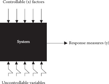
Assume that you are responsible for some sort of process. Most likely this will be a unit operation for making things (parts, for example) or stuff (such as food, pharmaceuticals, or chemicals) that can be manipulated via hands-on controls. This manufacturing scenario dominates the historical literature on RSM. However, as computer simulations become more and more sophisticated, it becomes useful to perform “virtual” experiments to save the time, trouble, and expense of building prototypes for jet engines and the like. The empirical predictive models produced from experiments on computer simulations are often referred to as “transfer functions.” Another possible application of RSM could be something people related, such as a billing process for a medical institution, but few, if any, examples can be found for the use of this tool in these areas. The nature of the process does not matter, but to be amenable to optimization via RSM, it must be controllable by continuous, not categorical, factors. Obviously, it must also produce measurable responses, although even a simple rating scale like 1–5 will do.
It helps to consider your process as a black box system (see Figure 1.5) that gets subjected to various input factors, labeled “x.” After manipulating the x’s, the experimenter quantifies the responses by measurements y1, y2, etc.
For example, when baking a cake you can vary time (x1) and temperature (x2) to see how it impacts taste (y1) and texture (y2). This would be a fun experiment to do (one you should try at home!), but let’s work on a simpler problem—when to get up in the morning and drive to work. Table 1.1 shows commuting times for Mark as a function of when he departed from home (Anderson, 2002). Rather than showing the actual times, it turned out to be much more convenient to set time zero (t0) at the earliest departure time of 6:30 a.m. Central United States. The table is sorted by departure time but the actual runs to work were done in random order to defray the impact of lurking time-related variables such as weather patterns and the like. Also note that some departure times were replicated to generate a measure of pure error. Finally, it must be confessed that Mark overslept one morning due to a random event involving his alarm clock, so the latest departure time was unplanned. He intended to depart at t0, which would’ve provided a replicate, but it ended up being 47.3 minutes later. Such is life!
Figure 1.5 System variables.
x Departure (minutes) |
y Drive Time (minutes) |
0 |
30 |
2 |
38 |
7 |
40.4 |
13 |
38 |
20 |
40.4 |
20 |
37.2 |
33 |
36 |
40 |
37.2 |
40 |
38.8 |
47.3 |
53.2 |
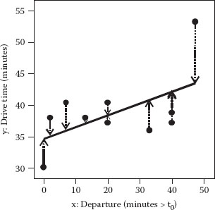
In the area where this study took place (Saint Paul and Minneapolis), most people work in shifts beginning at 7, 8, or 9 in the morning. Roads become clogged with traffic during a rush hour that typically falls between 7:00 a.m. and 9:00 a.m. With this in mind, it makes sense as a first approximation to try fitting a linear model to the data, which can be easily accomplished with any number of software packages featuring least-squares regression. The equation for actual factor levels, with coefficients rounded, is
The hat (^) over the y symbolizes that we want to predict this value (the response of drive time).
CIRCUMFLEX: FRENCH HAT
Statisticians want to be sure you don’t mix up actual responses with those that are predicted, so they put a hat over the latter. You will see many y’s (guys?) wearing hats in this book because that’s the ultimate objective for RSM—predicting responses as a function of the controllable factors (the x’s). However, a friend of Mark recalled his statistics professor discussing putting “p” in a hat, which created some giggling by the class. To avoid such disrespect, you might refer to the hat by its proper name—the “circumflex.” If you look for this in your word processor, it’s likely to be with the French text, where it’s used as an accent (also known as a “diacritic”) mark. If you own Microsoft Word, look through the selection of letters included in their Arial Unicode MS font, which contains all of the characters, ideographs, and symbols defined in the Unicode standard (an encoding that enables almost all of the written languages in the world to be represented). Word provides a handy short-cut key for printing Unicode text. For example, to print the letter y with a circumflex (ŷ), type the code 0177 and then press Alt X. Voilà, you’ve made a prediction!
The line resulting from this predictive model is plotted against the raw data in Figure 1.6. (Note the axis for x being extended 10 minutes from the planned maximum of 40 minutes from the time-zero departure time in order to cover for Mark oversleeping one of the days. If you set this problem up for computer analysis, enter the range as 0–50 rather than 0–40.)
Figure 1.6 Linear fit of drive times.
Table 1.2 ANOVA for Drive-Time Experiment—Linear Model

The dashed, vertical lines represent the error or “residual” left over after the model fitting. The sum of squares (SS) of these residuals, 209.16, is a key element in the analysis of variance (ANOVA) shown in Table 1.2.
However, let’s not get bogged down in the details of ANOVA. We went over this in DOE Simplified. An elegant mathematical explanation of ANOVA and other statistics applied to simple linear regression can be found in Weisberg (2013, Chapter 3).
What does Table 1.2 tell us about the significance of the model and how well it fits the data? First of all note the overall probability (Prob > F or p-value) of 0.0933, which might be interpreted as a marginally significant outcome. This outcome translates to 90.67% confidence (calculated by taking [1 minus the p-value] times 100) that the linear model coefficient is not zero. To keep it simple, let’s just say we’re more than 90% confident that there’s an upslope to the drive-time data. Perhaps, we made some progress over simply taking the overall average of commuting times and using it for prediction.
That’s the good news. Now the bad news: the test for lack of fit (LOF) also comes out marginally significant at a p-value of 0.089. Our benchmark for assessing LOF comes from the pure error pooled from the squared differences between the replicate times. Being based on only two degrees of freedom (df) for pure error, this is not a very powerful test, but notice in Figure 1.6 how the points tend to fall first above the line and then below. Furthermore, even though it slopes upward, the fitted line misses the highest time by a relatively large margin. In this case, taking into account the statistical and visual evidence for LOF, it seems fair to say that the linear model does not adequately represent the true response surface. Maybe it makes more sense to fit a curve to this data!
Neophytes to regression modeling often assess their success very simplistically with R2. (See Appendix 1A entitled “Don’t Let R2 Fool You.”) This statistic, referred to as the “coefficient of determination,” measures the proportion of variation explained by the model relative to the mean (overall average of the response). It’s easy to calculate from an ANOVA table:
The term “Cor Total” is statistical shorthand indicating that the SS is not calculated with zero as a basis, but instead it’s been corrected (“Cor”) for the mean.
For the drive-time case:
A special case occurs in simple linear models like the one we’re evaluating for drive times: the coefficient of determination is simply the correlation coefficient (r) squared:
The r-statistic ranges from −1, for a perfect inverse linear relationship, to +1 for a direct linear relationship. The correlation coefficient for drive time (y) versus departure (x) is +0.559, so
Any way you calculate R2, it represents less than one-third of the SS measured about the mean drive time, but it’s better than nothing (0)! Or is it?
Consider what the objective is for applying RSM. According to the definition we presented at the beginning of the chapter, RSM are meant to lead you to the peak of process performance. From the word “lead,” you can infer that the models produced from RSM must do more than explain what happened in the past—they must be of value for predicting the future. Obviously, only time will tell if your model works, but you could get tricky (using “statis-tricks?”) and hold back some of the data you’ve already collected and see if they are predicted accurately. Statisticians came up with a great statistic that does something similar: it’s called “predicted residual sum of squares” or PRESS for short (Allen, 1971).
Here’s the procedure for calculating PRESS:
1. Set aside an individual (i) observation from the original set (a sample of n points from your process) and refit your regression model to the remaining data (n − 1)
2. Measure the error in predicting point “i” and square this difference
3. Repeat for all n observations and compute the SS
Formulas for PRESS (Myers et al., 2016, Equation 2.50) have been encoded in statistical software with regression tools, such as the program accompanying this book. What’s most important for you to remember is that you want to minimize PRESS when evaluating alternative predictive models. Surprisingly, some models are so poor at prediction that their PRESS exceeds the SS around the mean, called the “corrected total” (SSCorTot). In other words a “mean” model, which simply takes the average response as the prediction, may work better than the model you’ve attempted to fit. That does not sound promising, does it? A good way to be alerted when this happens is to convert PRESS to an R2-like statistic called “R-squared predicted” () by applying the following formula:
You’re probably thinking that should vary from 0 (worst) to 1 (best) like its cousin the raw R2. No so—it often goes negative. That’s not good! Guess what happens when we compute this statistic for the linear model of drive time?
What should you do when is less than zero? Maybe it will help to illustrate PRESS graphically for a similar situation, but with fewer points. Figure 1.7a and b illustrates bad PRESS for a fitting done on only four response values.
Figure 1.7 (a) Residuals from mean. (b) PRESS (each point ignored).
We hope you are not imPRESSed by this picture (sorry, could not resist the pun). Notice in Figure 1.7b that, as each response drops out (starting from the upper left graph), the linear model fits more poorly (deviations increase). Therefore, the PRESS surpasses the SS of the raw residuals (around the mean as reported in ANOVA) shown in Figure 1.7a. You can see that applying the linear model in this case does little good for prediction, so just taking the average, or “mean” model, would be better. It really would be mean to make Mark abandon all hope of predicting his drive time by excluding the connection with departure time embodied in the 0.19× term of the initially proposed model. Then, all he could do is use the overall average of approximately 39 minutes as a predictor, no matter what time he left home. That makes no sense given the utter reliability of traffic worsening over the daily rush hour of people commuting to work.
Mathematics comes to the rescue at this stage in the form of an approximation via an infinite series of powers of x published by the English mathematician Brook Taylor in the early 1700s, but actually used first by the Scotsman James Gregory (Thomas, 2000). For RSM, this function takes the form:
The β symbols represent coefficients to be fitted via regression. It never pays to make things more complicated than necessary, so it’s best to go one step at a time in this series, starting with the mean (β0) and working up to the linear model (β0 + β1x1) and beyond.
HOW STATISTICIANS KEEP THINGS SIMPLE
Statisticians adhere to the principle of parsimony for model building. This principle, also known as Occam’s Razor,* advises that when confronted with many equally accurate explanations of a scientific phenomenon it’s best to choose the simplest one. For example, if sufficient data are collected, an experimenter might be tempted to fit the highest-order model possible, but a statistician would admonish that it be kept as parsimonious (frugal) as possible. More common folk call this the KISS principle, which stands for “keep it simple, stupid.” A variation on this is “keep it simple, statistically,” which probably would be simpler for nonstatisticians to apply than the principle of parsimony. The Boy Scouts provide a nice enhancement with their acronym KISMIF, which means “keep it simple and make it fun.” Unfortunately, most people consider “statistics” and “simple” plus “fun” to be a contradiction in terms.
I have only a high school education but I’m street smart, which can be more effective than college degrees. I operate under [the] rule … Keep it simple and stupid.
Jesse Ventura, former Governor of Minnesota, who made his name on the wrestling circuit as “The Body,” but decided later to be known as “The Mind”
November 1999 interview in Playboy magazine
Try to make things as simple as possible, but not simpler.
Einstein
* Named for the medieval philosopher William of Occam.
Since we don’t want to go back to the mean model for the driving data, but we know that the linear fit falls down on the job, the next step is to add a squared term to form the following second-order (also called “quadratic”) model:
Unfortunately, this higher-order model is not significant (p ~ 0.2), so it appears that we are making things worse, rather than better. Figure 1.8 does not contradict this view.
Figure 1.8 Quadratic fit of drive times.
The final nail in the quadratic coffin is the result for , which again is worse than nothing (just using the mean).
Let’s not give up yet: try expanding the polynomial to the next level—add the third-order term:
According to the ANOVA in Table 1.3, this cubic polynomial does the trick for approximating the surface:
 Highly significant overall model (p < 0.01 implying >99% confidence)
No significant LOF (p ≫ 0.1)
Figure 1.9 shows the close agreement of this final model with the drive-time response.
The is a healthy +0.632. The sharp-eyed statisticians seeing this plot will observe that the cubic model is highly leveraged by the highest drive time that occurred at the latest departure. (Recall that this was not part of Mark’s original experimental plan.) If this one result proved inaccurate, the outcome would be quite different. In such case, the open square at the far right is an unwarranted extrapolation. Unfortunately, the probability of a morning rush hour is nearly on par with the sun coming up, but it’s not documented in this particular dataset.
Table 1.3 ANOVA for Drive-Time Experiment—Cubic Model

Figure 1.9 Cubic fit of drive times.
ASSESSING THE POTENTIAL INFLUENCE OF INPUT DATA VIA STATISTICAL LEVERAGE
Thanks to Mark’s tardiness one morning we can learn something about how a model can be unduly influenced by one high-leverage point. concept of leverage is very easy to grasp when fitting a line to a collection of points.
To begin with, here’s a give-away question: How many points do you need to fit a line? Of course the answer is two points, but what may not be obvious is that this relates to the number of coefficients in the linear model: one for the intercept (β0) plus one for the slope (β1). In general, you need at least one unique design point for every coefficient in the model.
Now for the next easy question: Would it be smart to fit a line with only two points? Obviously not! Each point will be fitted perfectly; no matter how far off it may be from reality. In this case, each of the points exhibits a “leverage” of 1. That’s bad DOE! Leverage is easily reduced by simply replicating points. For example, by running two of each end-point the leverage of all four points drops to 0.5 and so on.
The general formula for leverage can be found in regression books such as that written by Weisberg (2013, p. 207). It is strictly a function of the input values and the chosen polynomial model. Therefore, leverages can and should be computed prior to doing a proper DOE. The average leverage is simply the number of model parameters (p) divided by the number (n) of design points. The cubic model for drive time contains four parameters (including the intercept β0). The 10 runs then exhibit an average leverage of 0.4 (=4/10). However, not all leverages are equal. They range from 0.277 for the two departure times at 20 to 0.895 at the last departure of 47.3. As a rough rule of thumb, it’s best to avoid relying on points with a leverage more than twice the average, which flags Mark for his tardy departure (0.895/0.4 > 2). If he had planned better for running late, Mark would’ve repeated this time of departure, thus cutting its leverage in half. His partner and coauthor Pat could hardly object to this reason for being tardy to work!
Another aspect of the fit illustrated in Figure 1.9 that would wither under a statistician’s scrutiny is the waviness in the middle part that’s characteristic of a cubic model. However, when pressed on this, Mark responds that the drive-time experiment represents a sample of 10 runs from literally thousands of commutes over nearly three decades. He insists on the basis of subject matter knowledge that times do not increase monotonically in the morning. According to him, there’s a noticeable drop off for a time before the main rush. Warning: By taking Mark’s expertise on his daily commute into account, we’ve illustrated biasing in model fitting which should be done only very judiciously, if ever.
Table 1.4 Model Summary Statistics for Drive-Time Experiment
Model |
R2 (Raw) |
PRESS |
||
Linear |
0.312 |
0.226 |
−0.318 |
400.74 |
Quadratic |
0.370 |
0.191 |
−1.177 |
661.83 |
Cubic |
0.898 |
0.847 |
0.632 |
111.77 |
Table 1.4 provides summary statistics on the three orders of polynomials: first, second, and third, which translate to linear, quadratic, and cubic, respectively. This case may not stand up in court, but it makes a nice illustration of the mathematical aspects for model fitting in the context of RSM. As a practical matter, the results proved to be very useful for Mark. That is what really counts in the end.
ANOTHER ATTEMPT TO IMPROVE ON R2
Notice that in Table 1.4, we list an adjusted version of R2 (denoted by the subscript “Adj”). This adds little to the outcome of the drive-time experiment, so we mention this via a sidebar. It’s actually a very useful statistic. However, because the is even better suited for the purpose of RSM, we won’t dwell on . Here’s our attempt to explain it in statistical terms and translate this to plainer language so you can see what’s in it for you.
The problem is that the raw R2 exhibits bias—a dirty word in statistics (with four letters, no less!). Bias is a systematic error in estimation of a population value. Who wants that? The bias in R2 increases when naïve analysts cram a large number of predictors into a model based on a relatively small sample size. The provides a more accurate (less biased) goodness-of-fit measure than the raw R2.
What’s in it for you is that the adjustment to R2 counteracts the tendency for over-fitting data when doing regression. Recall from the equation shown earlier that the raw R2 statistic is a ratio of the model SS divided by the corrected total SS (R2 = SSModel/SSCorTotal). As more predictors come into the model, the numerator can only stay fixed or increase, but the denominator in this equation remains constant. Therefore, each additional variable you happen to come across can never make R2 worse, only the same or larger, even when it’s total nonsense.
For example, suppose that an erstwhile investor downloads all the data made available on the Internet by the US Department of Commerce’s Bureau of Economic Analysis. It will then be very tempting to throw every possible leading indicator for stock market performance into the computer for regression modeling. It turns out that the raw R2 will increase as each economic parameter is added to the model, even though it may produce nothing of value for response prediction. This would create a gross violation of the principle of parsimony.
Now, we get to the details. As you can see from the formula below, the adjustment to R2 boils down to a penalty for model parameters (p):
Going back to the linear model for drive time we can substitute in 10 for n (the sample size) and 2 for p (the intercept and slope), plus the raw R2:
As p, the number of model parameters increases, the penalty goes up, but if these parameters significantly improve the fit, the increase in raw R2 will outweigh this reduction. If falls far below the raw R2, there’s a good chance you’ve included nonsignificant terms in the model, in which case it should be reduced to a more parsimonious level. In other words, keep it simple, statistically (KISS).
As you’ve seen in this example, the process of design and analysis with RSM is:
1. Design and execute an experiment to generate response data.
2. Fit the data to a series of polynomial models using tools of regression.
3. Conduct an ANOVA to assess statistical significance and test for LOF. Compare models on the basis of and , but not raw R2.
4. Choose the simplest model, even if only the mean, that predicts the response the best. Do not over-fit the data.
Figure 1.10 Region of interest versus region of operability.
Remember that with RSM you can only approximate the shape of the surface with a polynomial model. To keep things simple and affordable in terms of experimental runs, the more you focus your search the better. Use your subject matter knowledge and results from prior screening designs (see Figure 1.1) to select factors and ranges that frame a region of interest, within which you expect to find the ideal response levels. For example, as shown in Figure 1.10, it may be possible to operate over a very broad region of the input x. Perhaps by collecting enough data and applying a higher degree of polynomial, you could model the surface shown. But as a practical matter, all you really need is a model that works well within the smaller region of interest where performance (y) peaks.
If you achieve the proper focus, you will find that it often suffices to go only to the quadratic level (x to the power of 2) for your predictive models. For example, if you narrow the field of factors down to the vital two (call them A and B), and get them into the proper range, you might see simpler surfaces such as those displayed earlier in Figure 1.2, for example.
Now that we’ve described some of the math behind RSM, it may be interesting to view their underlying models:
For the simple maximum (shown in Figure 1.2):
For the rising ridge (Figure 1.3):
For the saddle (Figure 1.4):
Notice that these quadratic models for two factors include the 2FI term AB. This second-order term can be detected by high-resolution fractional or full two-level factorial designs, but the squared terms require a more sophisticated RSM design (to be discussed later in this book).
If you need cubic or higher orders of polynomials to adequately approximate your response surface, consider these alternatives:
Restricting the region of interest as discussed in the previous section
A transformation of the response via logarithm or some other mathematical function (see DOE Simplified, Chapter 4: “Dealing with Non-Normality via Response Transformations”)
Looking for an outlier (for guidance, see Anderson and Whitcomb, 2003)
Ideally, by following up on one or more of these suggestions, you will find that a quadratic or lower order model (2FI or linear only) provides a good fit for your response data.
NO PRETENSES ABOUT ACCURACY OF RSM FROM GEORGE BOX
George Box makes no apologies for the predictive models generated from RSM. He says:
All models are wrong. Some models are useful.
Only God knows the model.
Box and Bisgaard (1996)
Other insights offered by Box and Draper (1987, p. 413):
The exact functional relationship … is usually unknown and possibly unknowable. … We have only to think of the flight of a bird, the fall of a leaf, or the flow of water through a valve, to realize that, even using such equations, we are likely to be able to approximate only the main features of such a relationship.
Finding the Flats to Achieve Six Sigma Objectives for Robust Design
We have touted the value of mapping response surfaces for purposes of maximization, or on the flip side: minimization. Another goal may be to hit a target, such as product specifications, on a consistent basis. Decades ago, gurus such as Phil Crosby (1979) defined quality as “conformance to requirements,” which allowed responses to range anywhere within the specified limits.
LONG AND SHORT OF “QUALITY”
“Quality” means the composite of material attributes including performance features and characteristics of a product or service to satisfy a given need.
US Department of Defense
Federal Acquisition Regulation 246.101
Quality is fitness for use.
J. M. Juran
In the early part of the twenty-first century, Six Sigma became the rage in industry. The goals grew much more ambitious: reduce process output variation so that six (or so—see sidebar) standard deviations (symbolized by the Greek letter sigma, σ) lie between the mean and the nearest specification limit. It’s not good enough anymore to simply get product in “spec”—the probability of it ever going off-grade must be reduced to a minimum.
WHY SIX SIGMA? HOW MUCH IS ALLOWED FOR “WIGGLE-ROOM” AROUND THE TARGET?
The Six Sigma movement began at Motorola in the late 1980s. A joke made the rounds amongst statistical types that the slogan started as 5S but this did not go over with management. However, they found it hard to argue against 6S (to get the joke you must pronounce “6S” as “success”). Not only do we have a warped sense of humor, but also those of us in the know about statistics tend to get hung up on the widely quoted Six Sigma failure rate of 3.4 parts per million (ppm), or 99.99966% accuracy. According to the normal distribution the failure this far out in the tail should be much less—only two parts per billion. It turns out that Motorola allowed for some drift in the process mean, specifically 1.5 sigma in either direction (Pyzdek, 2003). The area of a normal distribution beyond 4.5 (=6–1.5) sigma does amount to 3.4 ppm. To illustrate what this level of performance entails, imagine playing 100 rounds of golf a year: at “six-sigma,” even handicapped by the 1.5 sigma wiggle, you’d miss only 1 putt every 163 years!
The objective of Six Sigma is to find the flats—the high plateaus of product quality and process efficiency that do not get affected much by variations in factor settings. You can find these desirable operating regions by looking over the 3D renderings of response surfaces, or more precisely via a mathematical procedure called “propagation of error” (POE). We will get to the mathematics later in the book. For now, using the drive-time example for illustration, let’s focus on the repercussions of varying factor levels on the resulting response.
From the work done earlier, Mark now feels comfortable that he can predict how long it will take him to get to work on average as a function of when he departs from home. Unfortunately, he cannot control the daily variations in traffic that occur due to weather and random accidents. Furthermore, the targeted departure time may vary somewhat, perhaps plus or minus 5 minutes. The impact of this variation in departure time (x) on the drive time (y) depends on the shape of the response surface at any particular point of departure. Figure 1.11 illustrates two of these points—labeled t1 and t2.
Notice the dramatic differences in transmitted variations y1 and y2. Obviously, it would be prudent for Mark to leave at the earlier time (mid-t1) and not risk getting caught up in the rush hour delays at the upper end of t2. The ideal locations for minimizing transmitted variation like this are obviously the flats in the curve. (There are two flats in the curve in Figure 1.11 but Mark prefers to sleep longer, so he chose the later one!) Finding these flats gets more difficult with increasing numbers of factors. At this stage, POE comes into play. However, we’ve got lots to do before getting to this advanced tool.
Figure 1.11 Variation in departure time for drive to work.
PRACTICE PROBLEM
1.1 The experiment on commuting time is one you really ought to try at home. Whether you follow up on this suggestion or do a different experiment, it will be helpful to make use of DOE software for
1. Design. Laying out the proper combinations of factors in random run order.
2. Analysis. Fitting the response data to an appropriate model, validating it statistically, and generating the surface plots.
For design and analysis of practice problems, and perhaps your own as well, we recommend you install the program made available to readers of this book. See the end of the book for instructions. To get started with the software, follow along with the tutorial entitled “*One-Factor RSM*” (* signifies other characters in the file names) which is broken into two parts—basic (required) and advanced (optional). This and other helpful user guides, posted with the program, contain many easy-to-follow screen shots; so, if possible, print them out to view side-by-side with your PC monitor. The files are created in portable document format, identified by the “pdf” extension. They can be read and printed with Adobe’s free Acrobat® Reader program. The tutorial on one-factor RSM details how to set up and analyze the example on drive time. It includes instructions on how to modify a design for unplanned deviations in a factor setting. In Mark’s case, he woke up 47.3 minutes late 1 day, so you must modify what the software specifies for that run.
Appendix 1A: Don’t Let R2 Fool You
Has a low R2 ever disappointed you during the analysis of your experimental results? Is this really the kiss of death? Is all lost? Let’s examine R2 as it relates to DOE and find out.
Raw R2 measures are calculated on the basis of the change in the response (Δy) relative to the total variation of the response (Δy + σ) over the range of the independent factor:
Let’s look at an example where response y is dependent on factor x in a linear fashion:
As illustrated by Figure 1A.1, assume a DOE is done on a noisy process (symbolized by the bell-shaped normal curve oriented to the response axis).
Figure 1A.1 Effect of varying factor levels (x) on response (y).
The experiment is done for purposes of estimating β1—the slope in the linear model. Choosing independent factor levels at extremes of x1 versus x2 generates a large signal to noise ratio, thus making it fairly easy to estimate β1. In this case, R2 will be relatively high—perhaps approaching its theoretical maximum of one.
On the other hand, what if levels are tightened up to x3 and x4 as shown in Figure 1A.1? Obviously, this generates a smaller signal, thus making it more difficult to estimate the slope. This problem can be overcome by running replicates of each level, which reduces the variation of the averages. (This is predicted by the Central Limit Theorem as discussed in DOE Simplified, Chapter 1, “Basic Statistics for DOE.”) If enough replicates are run, β1 can be estimated with the same precision as in the first DOE, despite the narrower range of x3 and x4. However, because the signal (Δy) is smaller relative to the noise (σ), R2 will be smaller, no matter how many replicates are run!
The goal of DOE is to identify the active factors and measure their effects. However, factor levels often must be restricted, even for experimental purposes. This is nearly always the case for studies done at the manufacturing stage, where upsets to the process cannot be risked. In such cases, success should be measured via ANOVA and (hopefully) its significant p-value, which can be achieved via the power of replication. When an experimenter succeeds on these measures, despite an accompanying low R2, they should be congratulated for doing a proper job of DOE, not shot down for getting poor results! It boils down to this: although R2 is a very popular and simple statistic, it is not very well suited to assessing outcomes from planned experimentation.
Don’t be fooled by R2!
DITTY ON R2 CREDIBILITY
O, sing to the glory of stat!
Of sigma, x-bar and y-hat
The joy and elation
Of squared correlation—
Does anyone here believe that?
David K. Hildebrand
Author of many statistically slanted limericks published in Hildebrand and Ott, 1998