9.1
Jill Desimini, Line Typologies, 2014.
Any elongated continuous mark or discontinuous series of marks (as a line of dots) on a map that serves as a sign for some geographical phenomenon or concept.
The definition of line symbol is broad and can be generalized as the cartographic term for line type, where the line type acts as emblematic of another element or quality. In cartography, the line is used for many things, including hachures and contours (SEE CHAPTERS 02 AND 03), boundaries, borders, property lines, rivers, infrastructure, and, finally, routes. This chapter focuses on the latter, on the line as an itinerant device.
Lines are translated into routes for navigation, transit, and travel. They are generalized, approximating lengths and curves, depending on the scale of the drawing. They not only connect precise points but also tie together relational elements. Lines represent both physical features and distances between places. The line typology describes a hierarchy of physical presence and character in the landscape. The density of lines alone can reveal patterns of settlement and urbanization, while choices of type encode information. For example, roads shown in continuous fine lines and railroads shown in broken lines suggest the continuous influence of roads and the discontinuous importance of rail.1 The thickness of the line, too, is embedded with information about use, profile, material, distance, speed, and time.
In route maps, the physical depiction of the ground is thus overlaid with a temporal narrative. This often implies a contrast between maps created from aerial images and those that emerge from a close relationship between mapmaker and terrain. The data collected differs when it is processed remotely than when measurements are taken on foot and sketches are drawn in the field (SEE CHAPTER 05). Maps designed for users traveling at greater speeds and with views mediated by a frame are also functionally different from maps or drawings that include (and depend on) a wider set of perceptual qualities. In situ observation and mapmaking are evident in the cases of the survey and the guided walk. These typologies merge the detail of the physical landscape with that of the narrative. Both phenomenological and material experience are recorded and made legible through the drawing. By contrast, maps intended to be used from the road, train, or air tend to highlight features that can be grasped quickly and from great distances, such as mountaintops, shorelines, and key points of navigation.
Lines have lengths and positions but lack area.2 In the mapping of geographic elements, however, lines represent entities without dimension—boundaries, property lines, ship and bus routes—as well as those with dimension—roads, rivers, dredge channels, rails. In the latter case, changes in scale reveal the areas of the features the line represents. While the data layer may be visualized as a line, zooming reveals a thickened landscape. On a map, the road is a line, but it has a dimension and right-of-way, a spatial territory evaded by the line symbol but included within the classified data set. What is merely a hairline on a map gains measurable and legible dimension in the architectural plan.
Detailed surveys, guides, and plans celebrate human presence in the landscape. In contrast to totalizing views from above, intimate views and fragments provide guidance for the everyday experience of being in a landscape. French philosopher Michel de Certeau likens walking to enunciation, assigning it the triple function of appropriating topography, occupying space, and moving between relational, differentiated positions.3 Walking is improvisational, guided by information, but enacted through choice. It is perhaps a linear act but rarely manifests as a straight or singular line on a plan or map. The experience of walking draws from multiple layers on the map. For example, the line of the route and the lines of the topography together demonstrate steepness and exertion. The route and the built features together describe the orientation and character of the trajectory. The route and the vegetal cover point to the sensorial experiences associated with the climatic and the atmospheric.
A successful guide does not isolate elements of the experience—for example, landmarks and commerce—but instead presents fragments of the landscape where these elements interact on a tangible scale. Time, an hour or a day, is correlated with varied human activity. Through the conflation of line itineraries and pictorial representations, the line is modulated by experience, punctuated to describe the qualitative visual character with the necessary guidance metrics. The line, in these fragments, is no longer a singular entity—with one-dimensional descriptors like railroad or path or highway—but is loaded with information about adjacent monuments, social opportunities, or hydrological features. The fragment, as line and image, accommodates walking, driving, and riding as an informed cultural practice.
The road map or atlas, by contrast, is more pragmatic, showing a network of interconnected transit options and guiding users to and from destination points. Road lines, best exemplified by the oil company–sponsored maps published from the late 1930s through the 1950s, the so-called golden age of roads, take on numerous colors, widths, and line types that distinguish them within the drawing. These maps began as monochromatic line drawings, to which further information, color, and services were gradually added.
The line manifests at multiple scales and configurations: from the length of a mountain range to that of transnational highway, from a web of urban streets to the clarity of a singular approach. The approach to the Parthenon, redesigned by architect Demetris Pikionis, is an example of how the line can exert a distinct grounded and physical presence. [FIG. 9.16] The thinness and variation of this cartographic symbol is merely a code designed to represent actual variation. The line is as old as the map, and this chapter explores its extended and diverse use as a signifier of physical infrastructure. Mobility and temporality are implied, but lines without spatial meaning and dimension—those that point to direction, flow, movement, and data visualization—are intentionally ignored.
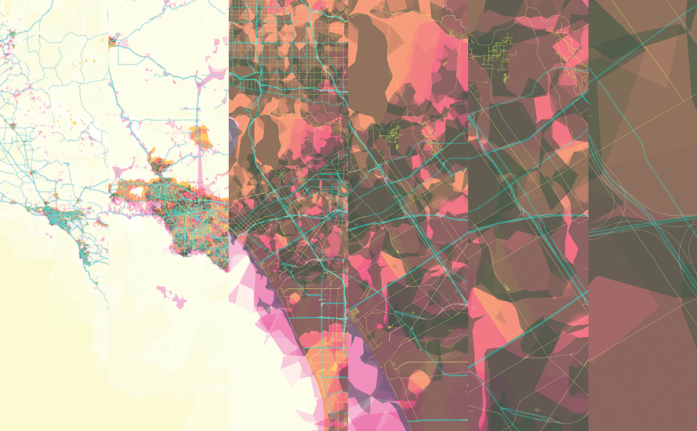
9.2
34.0522° N, 118.2428° W, Aaron Straup Cope/Stamen Design, Pretty Maps, 2010. Scale: zoom levels 6, 8, 11, 12, 13, 15 shown.
Pretty Maps is an experimental map where layers of freely available data are aggregated and rendered as color fields and lines. The white, pink, and blue ghosted shapes represent places where Flickr users have geotagged photos; the blue motorway lines and green path lines are from OpenStreetMap; and the orange shapes denote urban areas as classified by Natural Earth. The sequence pictured describes a progression of zoom levels from the point at which localities appear to the point where interactions among paths are evident.
9.3
34.0522° N, 118.2428° W, Rand McNally, Auto Road Map of Los Angeles and Vicinity, 1926. Scale: 1:24,240 (shown at half size).
The 1926 Rand McNally map of Los Angeles, with its single-minded emphasis on roadways and vehicular access, is exemplary of road map cartography produced in the golden age of the automobile. The roads are printed in dark blue ink, with thicker lines representing “paved” and “main travelled” roads and thinner lines depicting “common” roads. Besides the transportation network, the map has minimal detail, with stylized marks and lines showing topographical relief, rivers, and the coastline.
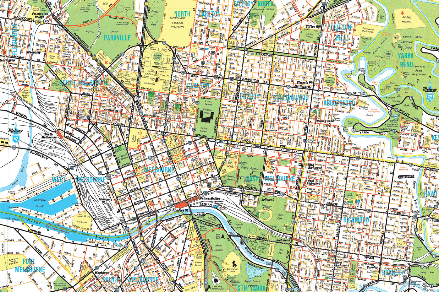
9.4
37.7833° S, 144.9667° E, Melway, Greater Melbourne Street Directory, 1966. Scale: 1:21,120 (shown at half size).
This first edition Melway map of Melbourne is one of the finest examples of roadway-map design. Company founders Mery Godfrey and Iven Mackay drove all of Melbourne to create 106 hand-drawn ink maps. The color palette is inspired by the Pop Art movement: vibrant reds, yellows, greens, and blues. The rendering of the roads departs from the “double casing” standard of streets drawn as two parallel lines with the name in the middle. The Melway roads are solid lines, with the names offset, allowing for color coding to describe typology and usage. The Melway maps, now in their 41st edition, show dual carriageways, slip lanes, service roads, speed bumps, roundabouts, and other roadway features relevant to the motorist experience.
9.5
51.0451° N, 4.2013° E, Bieke Cattoor and Bruno De Meulder, E17: Rhythm Phases of Highway—Landscape Interactions, 2008.
Belgian urbanists Cattoor and DeMeulder’s study of the E17 freeway from Kortrijk to Waregem, describes the rhythmic quality of the route, its interplay with the fluvial landscape, and its impact on urban development patterns. Line types and colors are used to describe the E17 freeway, noted in yellow, and the other parallel infrastructural elements and development areas interacting with the road. White are the feeder routes, red are the bridges that cross the freeway, and orange are the transversal roads interrupted by the construction of the freeway. The dark and light blue lines trace how the local streams and creeks have been ruptured, repaired, or altered to accommodate new development. The thinner, dark gray lines trace the canal and railway lines that disrupt the pattern. The territorial impact of road construction is revealed through the sophistication of the representational language and the fine grain of the drawn elements.
9.6
45.4333° N, 12.3167° E, Bernardo Secchi and Paola Viganò with PhD students in urbanism, Università IUAV di Venezia, Water and Asphalt: The Project of Isotropy, X Biennale of Architecture, Venice, 2006.
This detail from the Italian urbanists Bernardo Sechhi and Paola Viganò’s Veneto study [FIG. 6.8] looks at the intertwined and related networks of water (red), roads (black) and built fabric (gray). It inverts representational standards and thus invokes a nontraditional reading of the infrastructure. Places of system overlap are marked by a convergence and doubling of lines, producing a graphic hierarchy. The language moves away from the idea of the center and the periphery toward a connected matrix across the entire region.
9.7
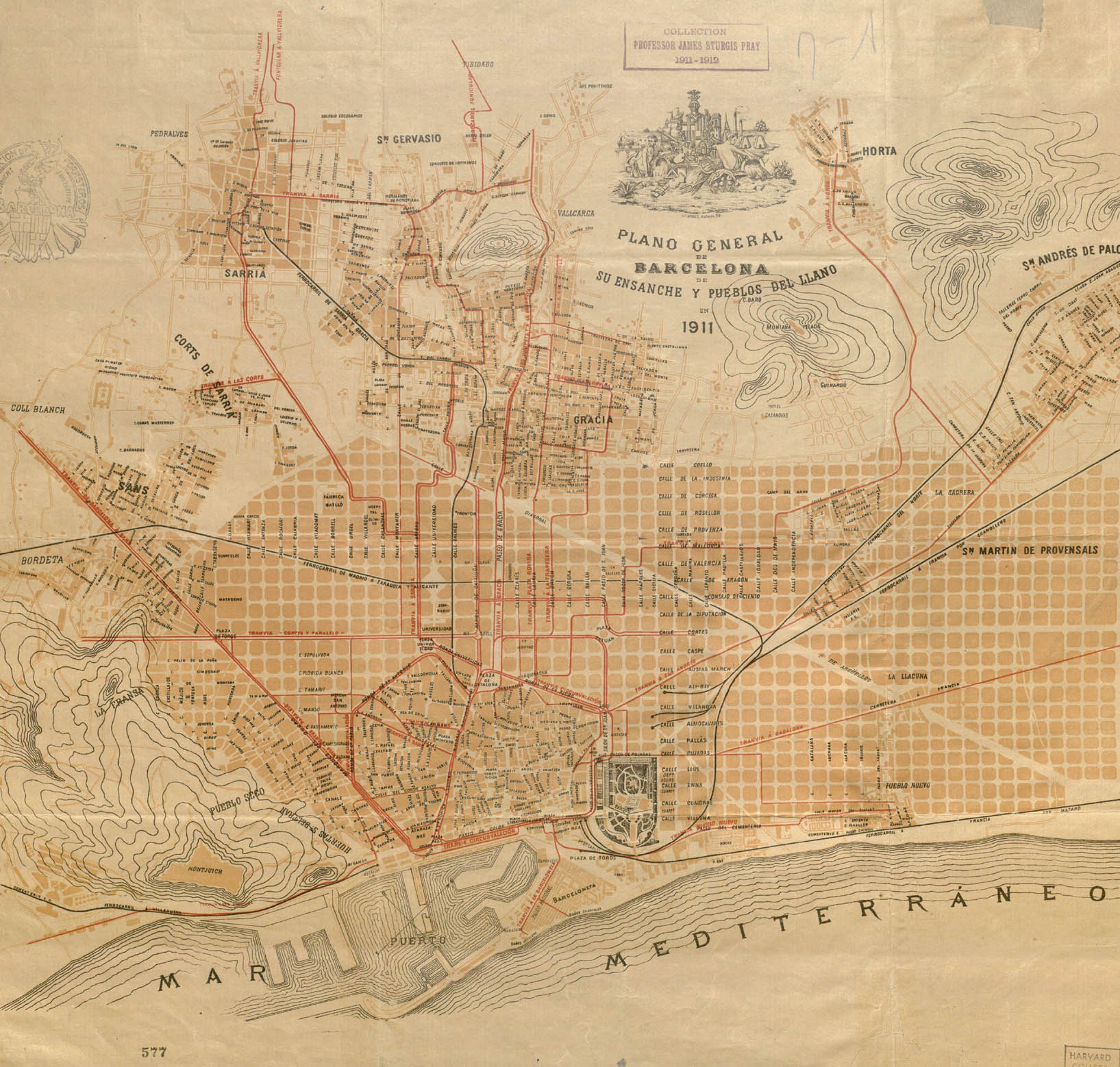
41.3855° N, 2.1687° E, F. Puig, Plano General de Barcelona, 1911.
The 1911 general plan of Barcelona depicts the projects for the widening of streets and the extension of the city toward the surrounding mountains (indicated loosely with contours). The map is dominated by the regularity of the Barcelona blocks [FIG. 6.6], juxtaposed with the organic figures of the older parts of the city. Using the signature color of the route and contrasting nicely with the ochre blocks, the newly electrified tramway lines indicate the pull of urbanization outward. The solid blocks of the Eixample fade to ghosted lines of planned blocks, distinguishing between the inhabited city and the growing city of the future.
9.8
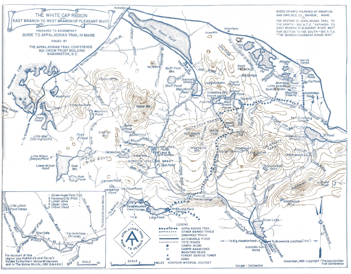
45.5547° N, 69.2466° W, The Appalachian Trail Conference, Guide to the Appalachian Trail in Maine (Washington, DC: The Appalachian Trail Conference, 1936).
Created in the inaugural year of the Maine Appalachian Trail Club—a group that oversaw the 267 miles of trail construction in Maine—this guide was an indispensable tool to direct volunteer efforts. It included relevant access and amenity information, including the automobile roads, tote roads, marked and unmarked trails, active and abandoned camps, fire service towers, and the Appalachian Trail proper. Following the panoramic prioritization method practiced by Benton MacKaye [FIG. 9.9], the mapmakers only illustrated major contour lines and streams, roads, trails, and camps, keeping the maps simple and easy to read, with landmarks clearly recognizable to all levels of map and trail users.
9.9
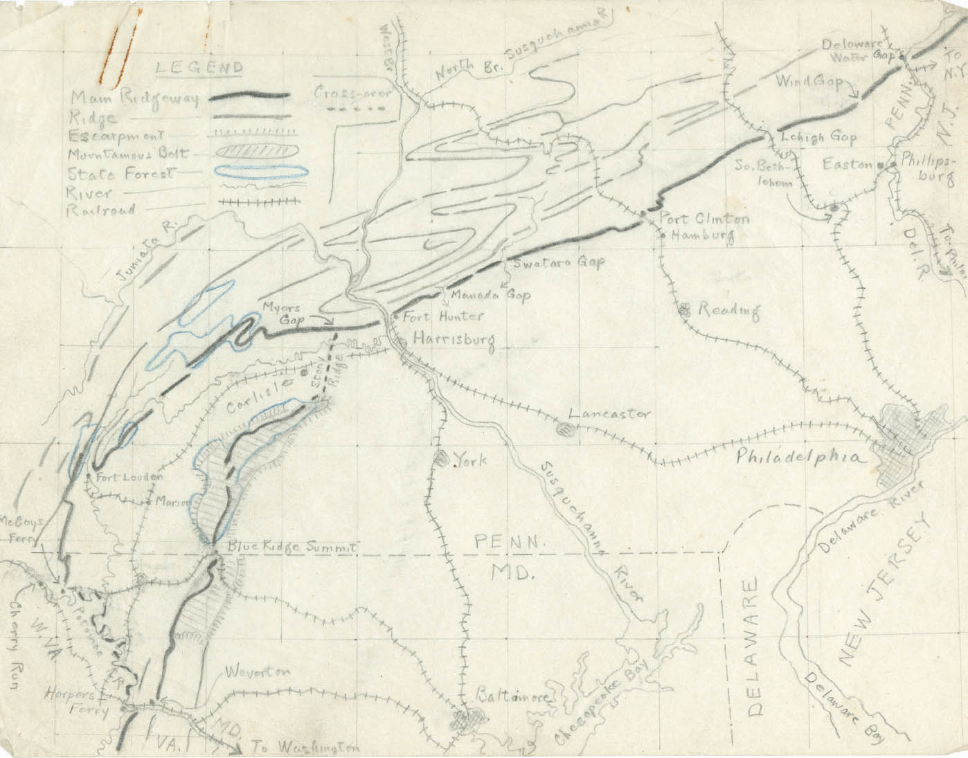
40.2697° N, 76.8756° W, Benton MacKaye, Appalachian Trail Detail Map Showing Mostly Pennsylvania, undated.
Benton MacKaye leveraged his training in geology, forestry, and earth science toward an approach to regional planning that emphasizes the reciprocity between human and environment in large landscape infrastructure projects. His project for the Appalachian Trail merged recreation, conservation, policy, and economics. His working method depended on fieldwork—on immersion in the landscape—and the results are both brilliant for their regional strategies and reflective of a direct engagement with the territory. Rather than filling his drawings, maps, and sketches with elevation data and distant place names, he isolated the key landmarks, which can be understood on foot as a hiker. These include railways and bridges that link to and interrupt the trail as well as streams, tree lines, plateaus, ridges, valleys, and a select few key contour lines to articulate the shape of the land.
9.10
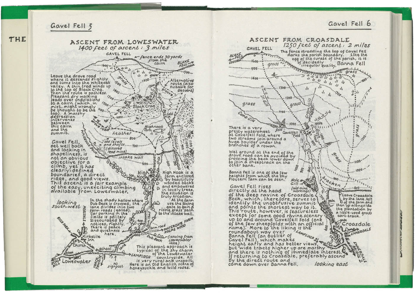
54.5530° N, 3.3680° W, A. Wainwright, Gavel Fells, 1966. Originally published in A Pictorial Guide to the Lakeland Fells: The Western Fells, bk. 7 (Kendal, UK: Westmorland Gazette, 1966), Gavel Fells 5–6.
Alfred Wainwright, an avid walker, cartographer and Lake District devotee, created a seven-volume definitive guide to the fells surrounding the Lake District in northwest England. Originally published between 1952 and 1966 from Wainwright’s hand-drawn ink manuscripts, the guides include a map for each of the 214 fells, with written details and descriptions of the various ascent and descent routes, summit characteristics, and drawings of each notable view. The drawings pictured, of Gavel Fells, present a hybrid plan-perspective view, with the extents expanding and contracting with viewshed and landmark.
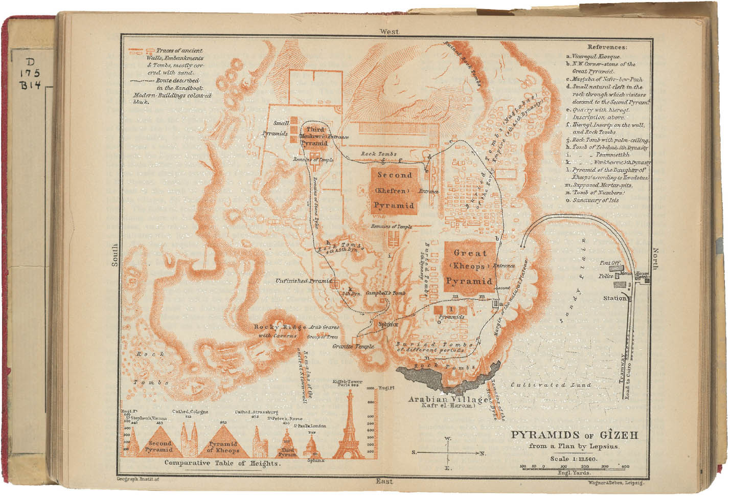
9.11
29.9792° N, 31.1344° E, Karl Baedeker, Egypt and the Sudân: Handbook for Travelers (Leipzig: Karl Baedeker, 1908).
The Baedecker guides are considered the first true mass-produced series of travel guides. This page from the 1908 edition of Egypt and the Sudan shows their exemplary depiction of key building sites. The Pyramids of Gizeh (Giza) are drawn to scale, with a key describing the line-type variations and alphabet indicators of subsites along the recommended route. The route itself is described in the text and inscribed on the map as a dashed line. A graphic comparison of heights of iconic European monuments situates the impressive monumentality of the pyramids for guide users. The Baedeker guides became a definitive reference for key cultural sites. In 1942, Germany’s attacks on English cities followed the guides, since they outlined places of historical and thus military significance.
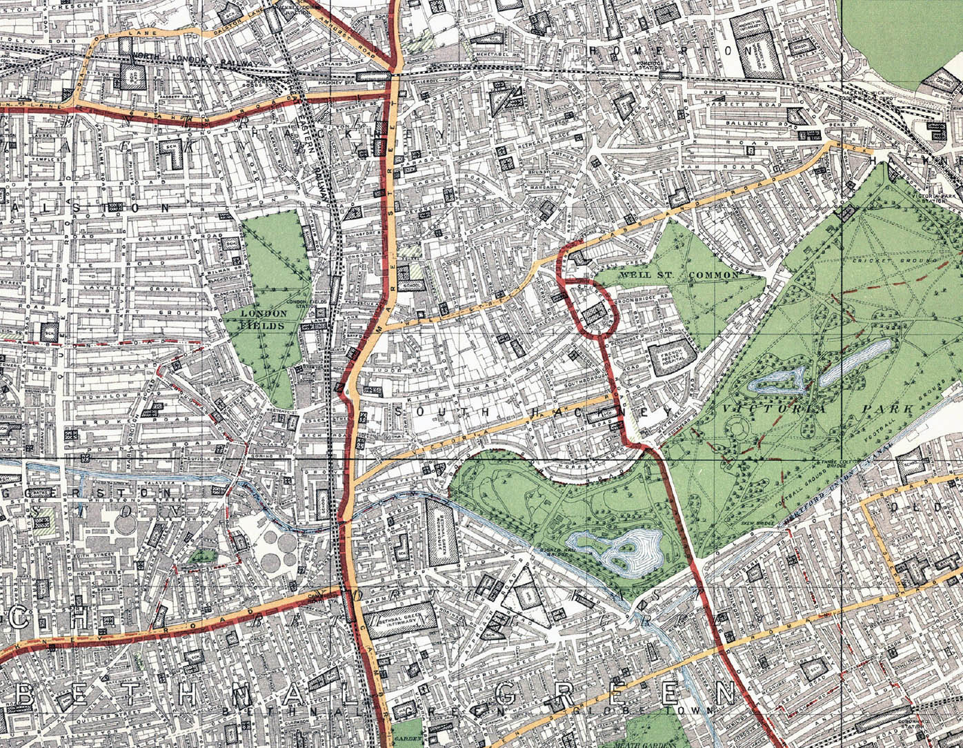
9.12
51.5370° N, 0.0380° W, London County Council, Municipal Map of London, 1913. Scale: 1:10,560 (shown at half size).
The London County Council map is overlaid on a standard Ordnance Survey (six inches equal to one mile) and embedded with detailed information on the political boundaries, open-space jurisdictions, transportation infrastructure, and public buildings of the city. Six boundary types are noted with lines and letters, eight public buildings with hatches and fills, three park systems with color variations and hatches, and three transit systems with colored lines in red, green, and yellow. These last crisscrossing routes read to the contemporary eye as an overlay of traffic information [FIG. 9.13] but here represent the tramways (red), the underground railroad (green), and the omnibus routes (yellow).
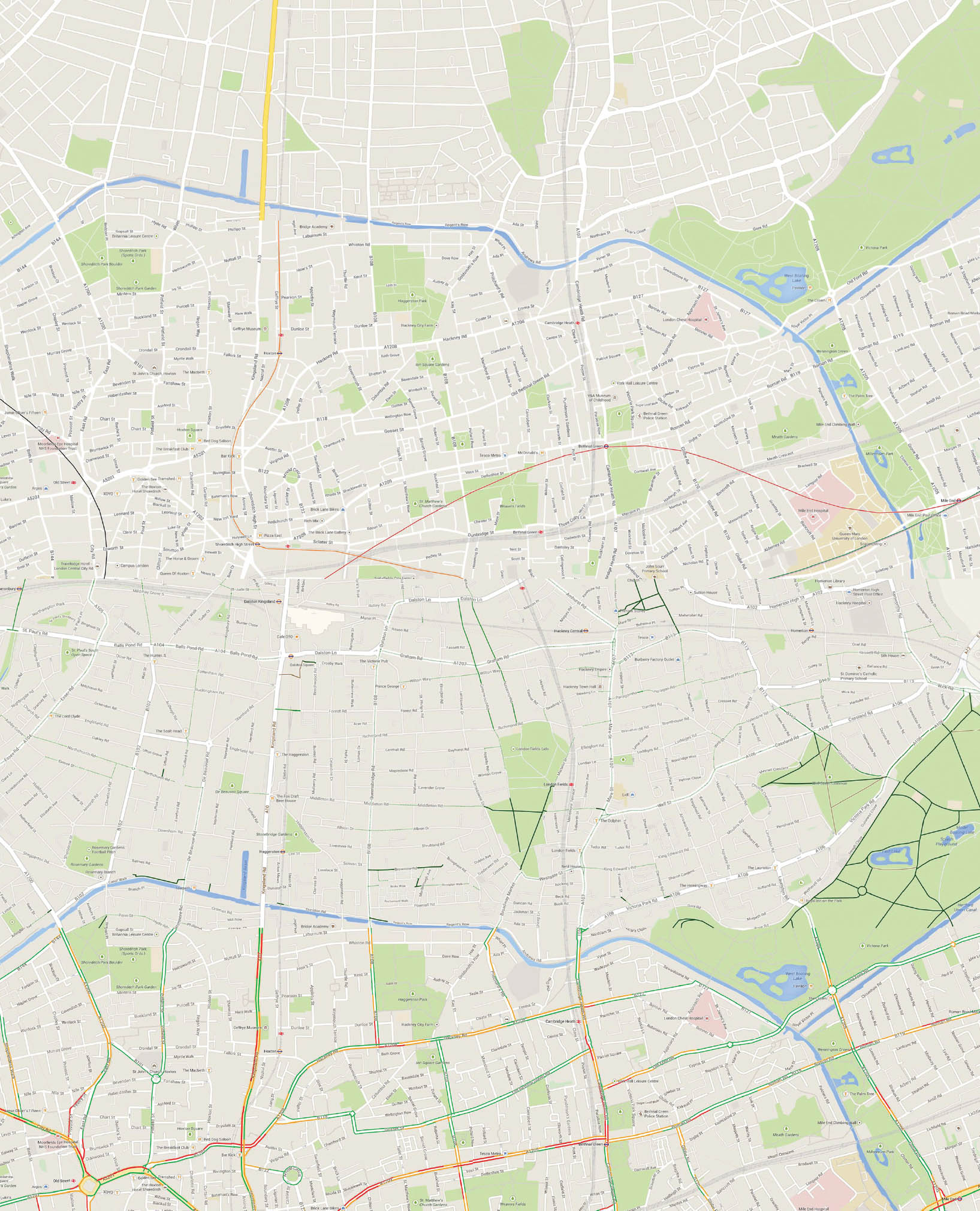
9.13
51.5370° N, 0.0380° W, Google, Standard Map with Transit, Bicycling and Traffic Overlays, 2014. Scale: approx. 1:21,120.
The Google Map—introduced as a Web-based product in 2005—radically changed the map-user experience. The Web-interface allows for mass customization of a dynamic map through zooming, panning, rotating, and changing views and visible layers. The practicality and functionality rate so highly with users that they become desensitized to the underlying representational choices. The continuous integration of additional features—routing, traffic, transit routes, perspectival views, terrain depiction, satellite imagery—pushes the product beyond traditional map capacities. In fact, the map is rarely used for its pure map capacities, and the representation of the roads, for example, has lost some clarity, coding, and specificity in newer versions. The map becomes a repository of linked data rather than a legible depiction of a given geography.
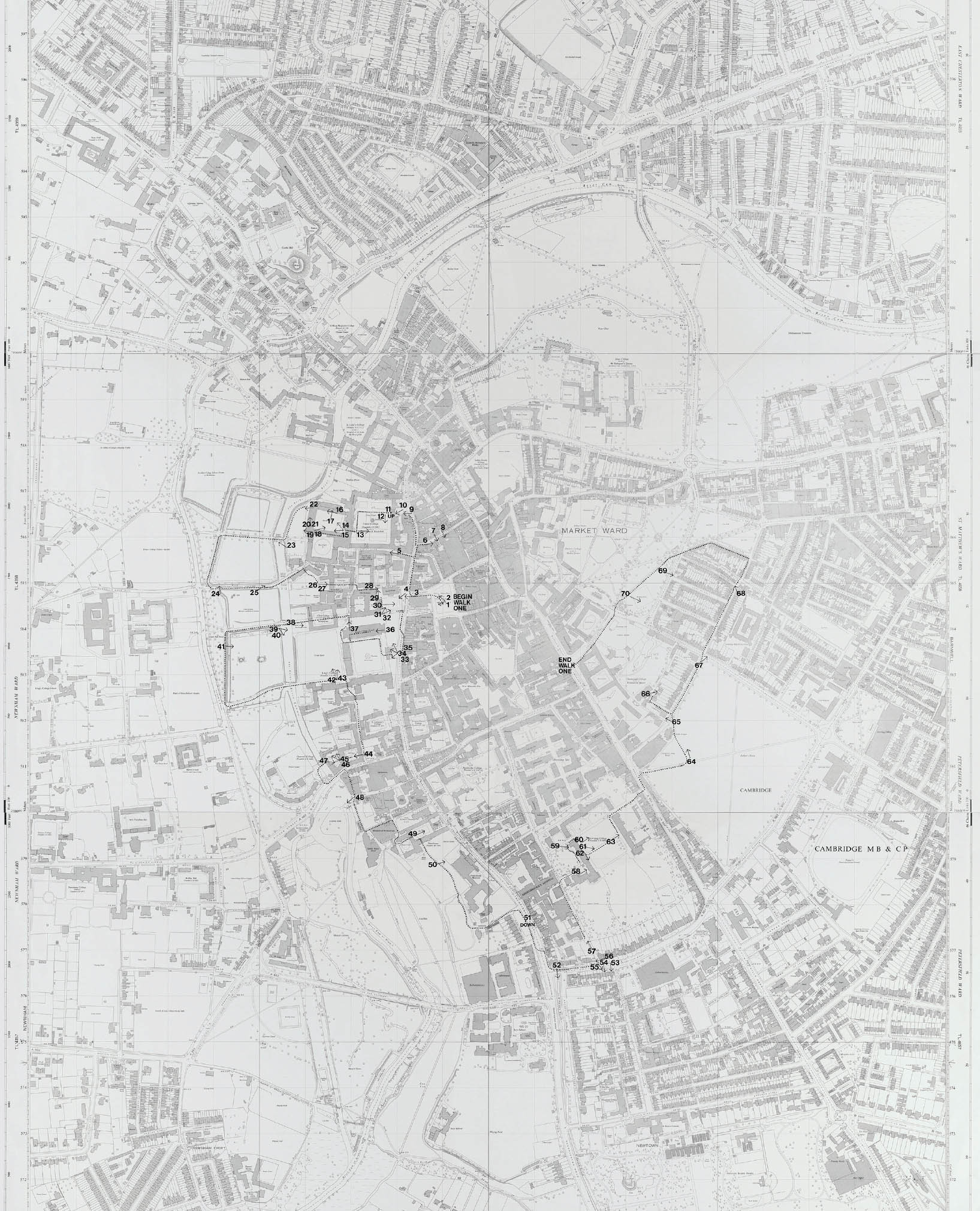
9.14
52.2100° N, 0.1300° E, Alison and Peter Smithson, Cambridge Walks, 1976, Scale: 1:2,500 (shown at quarter size).
British architects Alison and Peter Smithson, in their studies of Cambridge, England, developed a pair of guided walks designed to explore the place from the perspective of the walker, when the city is recognized by its smells, its sounds, and its air “with the intensity we assume an animal knows its burrows and its ways.”1 The routes of the walks were planned using local knowledge and drafted in Mylar over the 1:2,500 Ordnance Survey sheets. The black ink lines are dotted and annotated with arrows and numbers keying in views and photos taken and published with the maps. The map pictured shows the trajectory of walk 1, noting its beginning, ending, and seventy stops.
1Peter Smithson, "Oxford and Cambridge Walks," Architectural Design 46 (June 1976): 343.
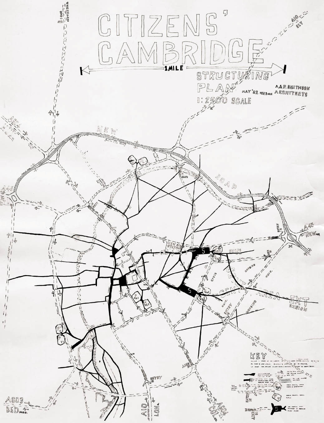
9.15
52.2100° N, 0.1300° E, Alison and Peter Smithson, Citizen’s Cambridge Structuring Plan: the Nature of Place Restored, 1962.
The Citizen’s Cambridge project proposed a restructuring of Cambridge to relieve the pressures of population growth and increased traffic on—and reinstate the character of—the historic center. The idea was to better integrate the residential, civic, and university areas and to redistribute commercial activity to lessen the toll on the historic fabric. A hierarchy of new roadways and walkways is suggested as well as changes to the existing traffic patterns. The drawing conventions cleverly describe the traffic pattern changes, the new car-dominated structures, and the mobility-driven structure of the plan.
9.16
37.9690° N, 23.7290° E, Dimitris Pikionis, Acropolis—Philopappou, The Paved Road Towards Acropolis, 1954–57.
Architect Dimitris Pikionis’s project for a paved pedestrian route between the Acropolis and Philopappos Hill is an orchestrated procession articulated through intricate surfacing. The stonework respects the topography and history of the iconic site. The patterning, represented in this drawing, is rich and diverse. The looping line that guides the visitor is itself a series of lines produced through the jointing patterns, allowing the eye to be engaged at multiple scales. As a drawing and a landscape, the textural variation produced through simple elements—black lines and material and topography—is exemplary.
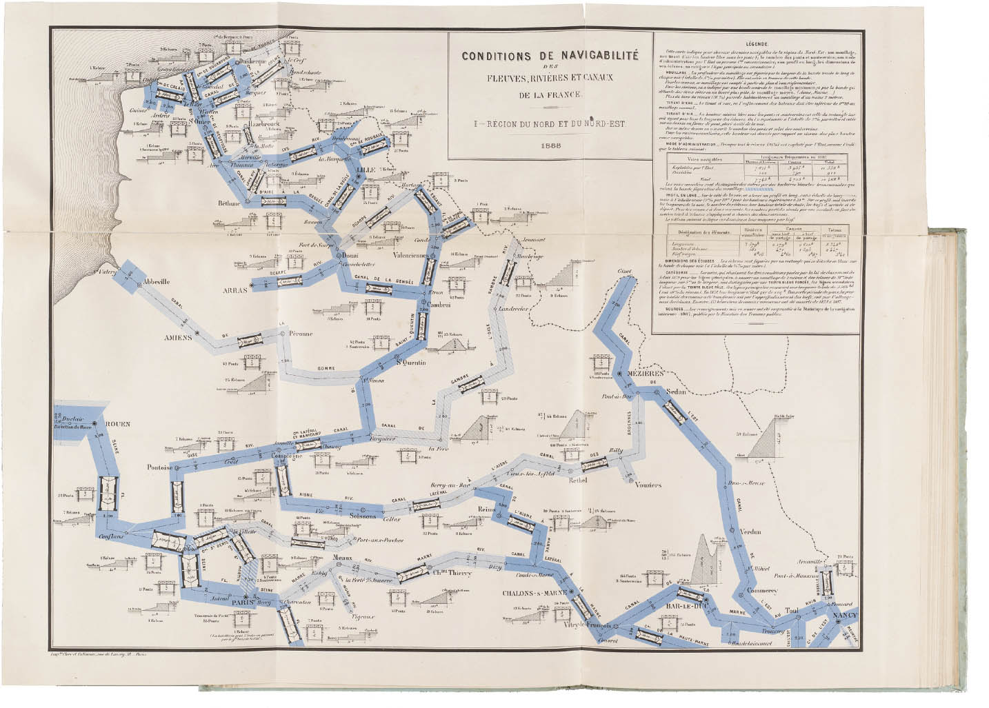
9.17
46.0000° N 2.0000° E, J. J. Emile Cheysson, Ministère des Travaux Publics, Conditions de Navigabilité des Fleuves, Rivières et Canaux de la France, 1888.
The Ministry of Public Works established a map division in 1877 under the direction of John Jacques Emile Cheysson, a follower of Joseph Minard’s methods of mapping and data visualization. In the map of the navigability of waterways, data is represented by its spatial parameters. The routes are shaped by the navigable width, the clearance under each bridge, the number of crossings, the type of administration, the profile along its length, the dimensions of its sluices, and its designation as a primary (dark blue) or secondary (light blue) route. The information is quantified but also drawn to scale, with small cross sections of each clearance and compressed longitudinal sections of the drops along the route.
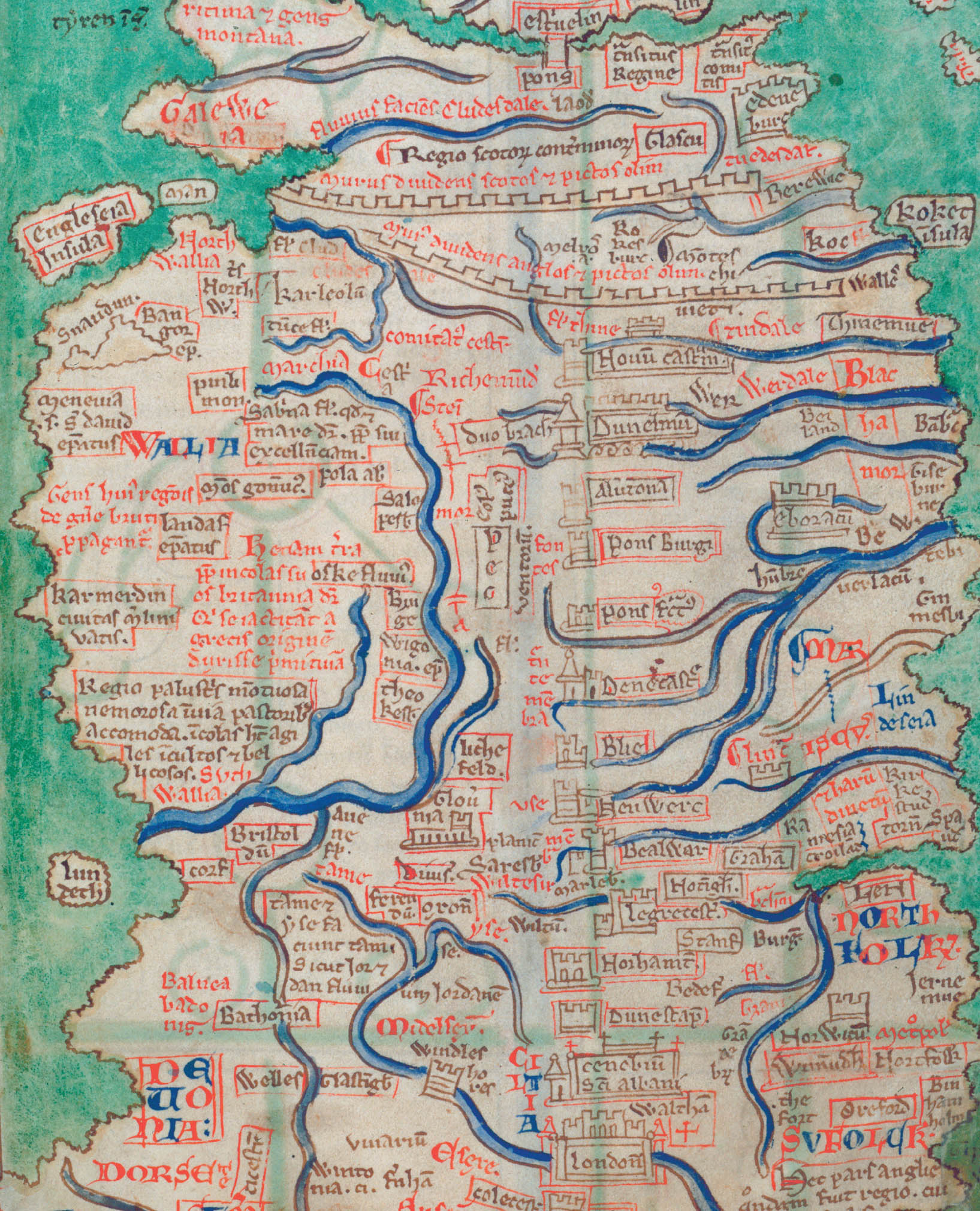
54.0000° N, 4.0000° W, Matthew Paris, Map of the British Isles, 1250.
Matthew Paris, a Benedictine monk and cartographer from Saint Albans in North London, created this medieval itinerary map chronicling the history of the British Isles. It is one of the earliest surviving maps of the area and is remarkable for its attempt to draw the actual physical appearance of the country. The result is a bit misshapen. The island profiles are distorted—likely based on Roman and Ptolemaic maps—and the alignments askew. Yet the rich network of rivers and over 250 place names, marking physical locations and historical events with elaborate pictographs and lettering, give a fantastic and precise qualitative reading to the landscape.
1Jacques Bertin, Semiology of Graphics: Diagrams, Networks, Maps (Madison, WI: University of Wisconsin Press, 1983), 312.
2Ibid.
3Michel de Certeau, The Practice of Everyday Life (Berkeley: University of California Press, 1984), 97–98.