CHAPTER 3
Map outputs for GIS projects
LEARNING GOALS
- Learn about alternatives for sharing maps and information from GIS projects.
- Build map layouts.
- Add visibility ranges for interactive map use.
- Build story maps.
- Make professional-quality tables and charts in Microsoft® Excel (optional).
Introduction
Map outputs start with the interactive maps that you have been creating and using in ArcGIS Pro in chapters 1 and 2. Those maps are fine for you and may be all you need personally, but what about others who need spatial information—your friends, your boss or clients, a group to which you belong, stakeholders in a public policy issue, or simply the public at large? What if they do not have ArcGIS Pro, and if they do, what if they don’t have your GIS files? This chapter focuses on providing maps that others can access, even users who may have no GIS knowledge or software. In addition to accessibility, this chapter also introduces GIS outputs, including map outputs that have nonmap elements to enable map reading and interpretation.
Consider the problem, addressed in this chapter, of college students about to get their undergraduate degrees from fine arts programs. They love their particular field of art, but it’s difficult to find good-paying jobs in fine arts, or in some cases, any jobs at all. They’re willing to relocate to a new city if they can find their dream jobs.
Suppose that a national organization for promoting fine arts education wants you to complete a GIS project—namely, to build a tool for arts students that lets them explore employment possibilities. The tool is an interactive map that displays the number of employees and average incomes in the arts field by state and city in the United States. The tool also addresses the complex but essential issue of cost of living. For example, is a $60,000-a-year job in New York City better financially than a $30,000-a-year job in Columbus, Ohio, after cost of living is factored in? It’s not, if the cost of living in New York City is more than twice that of Columbus, assuming that all income is spent on living expenses.
Suppose further, that you’ve already collected the data and have maps built in ArcGIS Pro. How can you get the results into the hands of arts students across the United States and around the world? In the days before ArcGIS Online and apps such as Esri® Story Maps (that you’ll learn to use in this chapter), there was no easy answer to this question. Now, there are good answers, with a range of old and new options available depending on your map audience’s needs.
In general, to share maps from a GIS project, the map outputs must be accessible and readable, and they must also tell a story, to wit:
- 1.Be accessible: Make your maps available in hard-copy documents, in emailed electronic documents or links, from a website, or from an app. Each form of output is valuable for different circumstances. A lay audience may be best served with static maps (images), printed in a document or on a presentation slide. That form of output does not require an audience to learn how to navigate an interactive map, and the author controls the desired message, with maps designed to share information. More sophisticated users might want to explore spatial information on their own, focusing on items and areas of interest to them (and unpredictable by you in advance) in an interactive app.
- 2.Be readable: Include titles, legends, scales, and other elements that allow direct interpretation of maps. These elements, called map surrounds, are essential.
- 3.Tell a story: Explain as needed the context, sources and quality of data, problem addressed, map solution, analysis, and limitations of the solution. GIS projects include stories that have one or more maps at the center, but the projects also may need text, data tables, charts, images, and hyperlinks.
One solution is to publish maps in ArcGIS Online and make them publicly available in an app such as Explorer for ArcGIS®. Then anyone can search for and interactively use your maps, or you can send anyone the URLs of the maps. That solution takes care of most accessibility and readability issues, and you already know how to publish maps online.
Another option is to create map layouts that include one or more maps and surrounds for interpretation. Then you can export a layout as an image file (for example, JPEG) and paste the file in a Microsoft Word document report or a PowerPoint slide in a presentation. You also can embed a layout in a web page to cover all three issues noted earlier, albeit with static maps. You’ll learn how to create a layout in this chapter.
A third option is to use one or more maps you published in ArcGIS Online in a story map. Esri Story Maps include many apps that not only have one or more interactive maps but also allow you to include map surrounds, text, images, hyperlinks, and other materials. Story maps require little or no knowledge of website hosting, publishing, or underlying web programing.
This chapter includes two additional, supporting topics for you to use in GIS outputs. The first topic is visibility ranges, which enhance interactive map output for complex or detailed maps. The basic idea of visibility ranges is simple. When zoomed far out or at full extent (at small scales), you can automatically have major map layers turned on but detailed layers turned off. Then when you zoom in (to large scales), you can have detailed layers turned on when you need to see them. The second topic focuses on creating tables and charts in Microsoft Excel for use in Story Maps. Tutorial 3-4 is optional for those who do not have Microsoft Excel skills and want to make professional tables and charts, and then save them as screen captures to be used as resources in building story map content.
Tutorial 3-1: Layouts
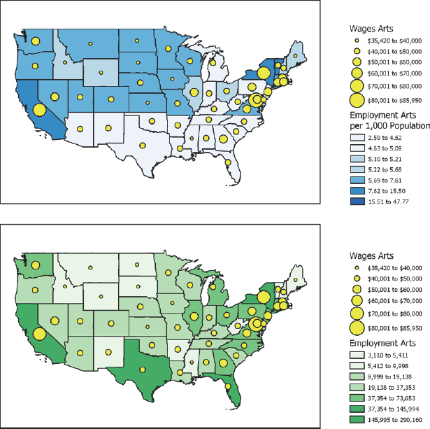
In this tutorial, you will build a map layout with two maps. Once you learn this skill, you can build any kind of layout, with one, two, or several maps, plus other elements. The purpose of the layout you will build next is to provide state-level information on the location of jobs in the arts field and average annual wages.
The layout you’ll build doesn’t have a layout title (at the top such as “Maps showing arts employment, 2015”). The reason is because this layout, like most you’ll produce, is destined to be used as a figure in a report, a slide in a presentation, or an image in a website. The layout title is better created in a word processer as a figure caption, in a presentation package as a slide title, or on a website.

Open the Tutorial 3-1 project
Both maps for which you will need to build a layout already exist and are ready for use in the Tutorial 3-1 project file that you are about to open.
- 1.Open Tutorial3-1.aprx from Chapter3\Tutorials, save it as Tutorial3-1YourName.aprx, and zoom to full extent.
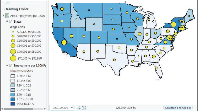
- 2.Open the second map, Arts Employment, and zoom to full extent.
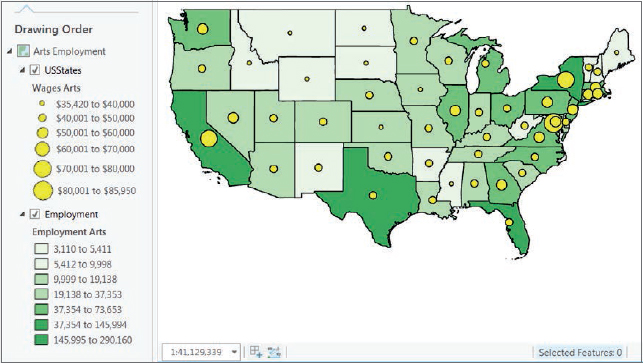
Create a new layout
A layout starts as a blank canvas to which you can add one or more maps, surrounds, and other elements of your choice and design. Although it’s possible to add images of tables and charts to layouts, tables and charts are better placed in reports, presentations, and websites as separate tables and figures. Therefore, you can keep your layouts fairly simple and just include maps, legends, and other common map surround elements.
- 1.On the Insert tab, click the New Layout button
 > Letter 8.5” × 11”. You can widen your ArcGIS Pro window if you don’t see the New Layout button.
 - 2.In the Catalog pane, rename the layout as Arts Employment Layout.
Add maps to the layout
- 1.In the Contents pane, right-click Arts Employment Layout, and click Zoom to Page.
- 2.On the Insert tab, click the Map Frame arrow
 , and select the Arts Employment map. This step adds the Arts Employment per 1,000 Population map to the layout.
 - 3.Likewise, insert the Arts Employment map from the second row.
Resize and place the two maps
Next, you must resize the two maps in the same dimensions, and then set their positions. Setting the dimensions is not an exact determination, except that the maps should be the largest elements in the layout. Planning and trial and error are involved in getting a layout to look right. This exercise simply provides a set of dimensions and placement locations to save you time and to ensure your results match those of the finished layout shown at the start of this tutorial. In a later exercise to add legends to the layout, you’ll use an alternative, graphic method of sizing and locating layout elements.
- 1.Right-click the Arts Employment per 1,000 Population map (blue color scheme), and click Properties.
- 2.In the Format pane, click the Placement button
 , and type 5.5 for width and 3.5 for height, type 0.5 in. for X and 5.75 in. for Y, and then press Tab.
 - 3.With the Format pane still open, click the second map (Arts Employment, green color scheme), type its dimensions to be the same (5.5 by 3.5), and type 0.5 in. for X and 1.50 in. for Y. Close the Map Frame pane.
Next, you’ll change both maps in the layout to full extent.
- 4.On the Layout tab in the Map group, for each map click the Full Extent button, and click the Fixed Zoom-In button
 once so that the maps fill their frames.
 - 5.Save your project.
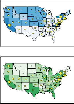
Add guides
In this exercise, you’ll use guides to position objects in a layout (legends, in this case). The guides are available from the horizontal and vertical rulers bordering the layout. When you drag objects, such as a map frame, they snap to guides. If there are intersecting vertical and horizontal guides, you can snap a corner of an object to the intersection.
- 1.If your layout does not have horizontal and vertical rulers, right-click in the white area of the layout and select Rulers and Guides.
- 2.Right-click the vertical ruler at 5, and click Add Guide. Do the same at 8 (you may have to count tick marks to find the “8” and other locations on the ruler). Finally, do the same at 9.25 (at two tick marks above 9, because each tick mark is 1/8 of an inch).
- 3.Right-click the horizontal ruler at 6.25 (two tick marks to the right of 6), and click Add Guide, and then do the same for 8. You’ll place legends within the guides and bottoms of maps.
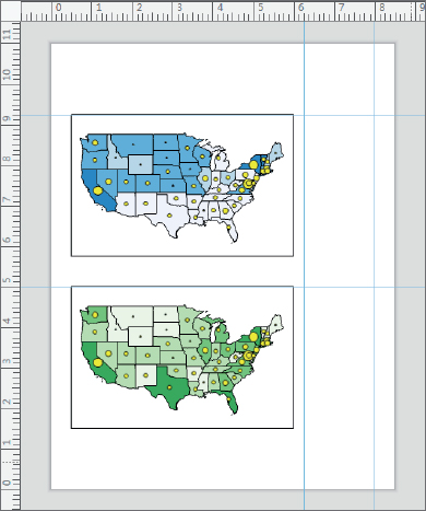
Insert legends
Using ArcGIS Pro, you’ll build a legend for all layers of a map that are turned on (all layers are turned on, in this case). The legend is dynamic: if you change symbolization on the map, turn on or off layers, and so on, the legend automatically updates in the layout.
- 1.Click the top map to make it active.
- 2.On the Insert tab in the Map Surrounds group, click the Legend button
 , and then drag a rectangle with the upper-left corner at the intersection of the 9.25 horizontal and 6.25 vertical guides and the lower-right corner at the 8 in. vertical guide and bottom of the top map. ArcGIS Pro creates and draws the legend, but it does not draw completely as indicated by the red dots in parentheses. The labeling for the choropleth map for the legend is too wide to fit in the layout. In the next exercise, you’ll fix this problem so that the entire legend is visible.

- 3.Click the bottom map in the layout, and create its legend as shown. This legend’s labels are not too wide, so the legend draws completely within the available space.

Modify legends
Next, you will convert the top legend to a static graphic, ungroup legend elements, edit them to be narrower, and regroup them.
- 1.Click the top legend, drag a grab handle on its right side to the right beyond the edge of the layout, and release the handle so that the entire legend draws.
- 2.Right-click in the top legend, and click Zoom to Selected.
- 3.Right-click the top legend again, and click Convert to Graphics. This action causes the legend to be static so that it no longer automatically updates if you turn layers on or off on maps or make other changes to the map. Ensure that you complete step 4 next so that step 5 works.
- 4.Click anywhere in the white area outside of the legend to deselect the legend.
- 5.Right-click the top legend again, and click Ungroup.
- 6.Right-click and click Ungroup again so that each legend line is a separate graphic.
- 7.In the top part of the legend, click States, and press Delete.
- 8.Click Employment per 1,000 Population, and press Delete.
- 9.Double-click the Employment Arts/Population (Thousands) text box, and in the Format Text pane, click the Options button
 .
. - 10.In the Text box, place your cursor after Employment Arts, press Shift and Enter, and close the Format Text pane.
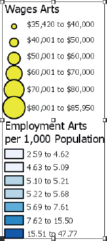
- 11.Finally, select all elements of the legend by dragging a rectangle, right-click the selection, and click Group. Now the legend is back to being one graphic.
YOUR TURN
Modify the bottom legend, deleting the USStates and Employment text boxes. Move the top half of the legend down a bit to eliminate the extra space between the two halves. Regroup the legend. Zoom to Page when you finish. Save your project.
Insert text
Next, you’ll insert text, titling each map (but not the whole layout).
- 1.On the Insert tab in the Text group, click the Text button
 .
. - 2.Click above the top left corner of the top map.
- 3.Double-click the new text element to open Format Text.
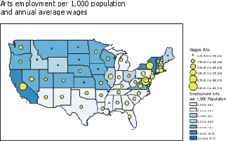
- 4.Under Text, click in the text box, and type Arts employment per 1,000 population, press Shift and Enter, and type and annual average wages.
- 5.In the Format Text pane, click text symbol > Appearance. Change the size to 16 pt, and click Apply.
- 6.Move the text to right above its map and left aligned to the map.
YOUR TURN
Insert text for the bottom map. Type Arts employment, press Shift and Enter, and type and annual average wages. Change the font to 16 pt. To finish up, press the Shift key, select both text boxes and the two maps (but not the legends), right-click the selection, click Align > Align Left. Close the Format Text pane, and save your project.
Tutorial 3-2: Visibility ranges
This tutorial will show you how to set visibility ranges for map layers and feature labels. GIS uses visibility ranges to automatically turn map layers on and off, depending on how far you’re zoomed in or out of your map. Before you work with visibility ranges, you will learn about map scale, the underlying measure that controls visibility ranges.
Suppose that you have two points on your map, A and B, which are one inch apart on your computer screen. Map scale is the ratio of the distance between A and B (1 inch) on your computer screen divided by the distance between the same two points in inches on the ground. An example scale for displaying the lower 48 states is 1:50,000,000, meaning that one inch on your computer’s map corresponds to 50,000,000 inches on the ground. Map scale is unitless, being a ratio that divides out units, so for example 1:50,000,000 can also mean 1 foot on your map equals 50,000,000 feet on the ground. Any distance unit can be used. The map terms “small scale” and “large scale” are counterintuitive, so understanding the next three sentences is important. The scale 1:50,000,000 is called “small scale” because the ratio 1/50,000,000 is small, even though the map shows a large area. And the scale 1:24,000 is considered “large scale,” because its ratio is relatively large, even though the map shows a small area. All map scales are considerably less than 1 because 1:1 is life size, and all maps represent land areas much larger than the maps themselves.
Next, you’ll set visibility ranges to view arts employment at the state level when the map opens at full extent, so when you zoom in close enough, employment at the metropolitan (city) level will turn on. First, you will work on arts employment across the United States, and then you can zoom in to a state of interest to get employment in a metropolitan area.
Open the Tutorial 3-2 project
- 1.Open Tutorial3-2.aprx. The project opens with all layers turned on and in a jumble. You’ll set a visibility scale to automatically turn off the metropolitan points at the full map extent.
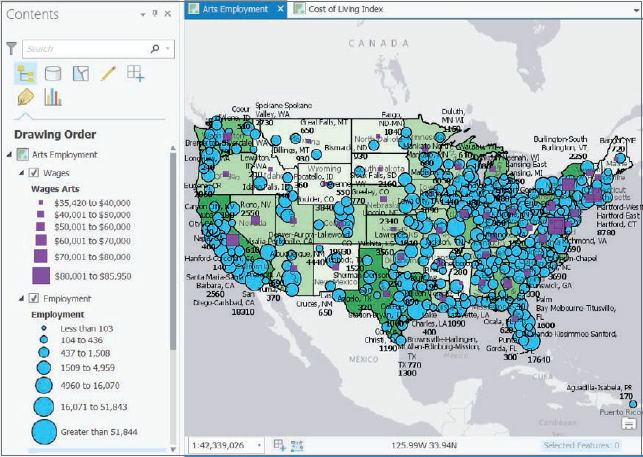
- 2.Save the project as Tutorial3-2YourName.aprx in the Tutorials folder.
Set visibility ranges for map layers
Map scale depends on the size of your computer screen and the size of your map view (the larger your map view, the larger the map scale), so the steps that follow cannot use specific map scales for triggering visibility ranges. Instead, the project has spatial bookmarks you’ll use to get appropriate map scales for your particular screen.
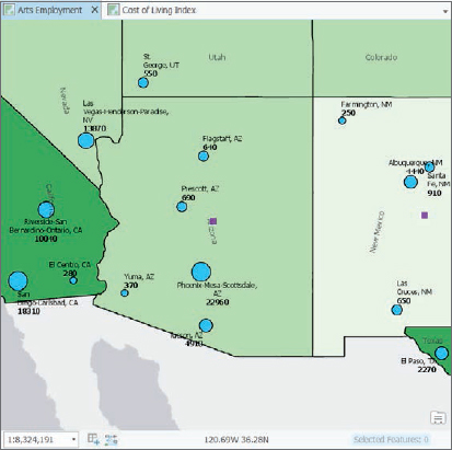
- 1.Use the Arizona bookmark. At this map scale (1:8,600,131 in the figure that follows but different on your computer) and further zoomed in, you’ll set visibility ranges to display the Employment point layer and turn off the display of Wages. You can turn off Wages when you zoom in, because if you were the map user, you’d already know Arizona’s average wages in the arts industry from the map of the 48 states, which is the starting view. If you were to add up the metropolitan arts employment points from Arizona, you’d get a total of 29,570. The difference, 30,930 −29,570 = 1,360, is nonmetropolitan arts employment. Most of the arts employment, 74 percent, is in the Phoenix area with 16 percent in Tucson, accounting for 90 percent of the state’s arts employment.
- 2.In the Contents pane, right-click the Employment Layer, and click Properties.
- 3.On the General tab in the Visibility range section, click the Out beyond (minimum scale) arrow, select <Current>, and click OK. So, when you’re zoomed out beyond the current scale of the Arizona bookmark and up to full extent, Employment will be turned off. If you zoom in closer than the Arizona bookmark, the layer will turn on.
- 4.In the Contents pane, right-click the Wages layer, and click Properties.
- 5.On the General tab, in the Visibility range section, click the In beyond (maximum scale) arrow, select <Current>, and click OK. Now Wages will display when zoomed out farther than the Arizona bookmark and turn off when zoomed closer in than the bookmark. Next, you’ll test the two visibility ranges.
- 6.Zoom to full extent. Employment Arts has no visibility range and so is always on. Wages is on because you’re zoomed out from Arizona, but Employment is turned off for the same reason.

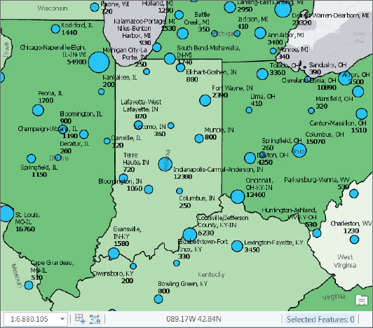
- 7.Use the Indiana bookmark. Indiana is smaller than Arizona (while filling the computer screen, Indiana has the larger map scale of 1:6,880,105 in the next figure compared with Arizona’s 1:8,600,131); therefore, Indiana has Employment points turned on and Wages turned off.
- 8.Zoom to full extent, and save your project.
Set a visibility range for labels
You can turn a feature layer’s labels on and off using visibility ranges, too. For example, when at full extent, it’s helpful to have state names displayed as labels, but when zoomed in, the labels are no longer needed and amount to a small amount of clutter.
- 1.Use the Arizona bookmark. The objective is to turn off the state name labels when zoomed in closer than Arizona.
- 2.In the Contents pane, select the Employment choropleth map. The Feature layer contextual tab for this layer appears at the top of the ArcGIS Pro application.
- 3.On the Feature Layer contextual tab, click Labeling. This label already has labeling on and configured but so far does not have a visibility range.
- 4.For In Beyond in the Visibility Range group of the Labeling tab, select <Current>.
- 5.Zoom to full extent. The state labels are on.
- 6.Zoom to Indiana. The state labels are off, even though the Employment choropleth layer remains on.
- 7.Save your project.
YOUR TURN
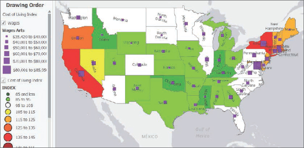
Open the Cost of Living Index map. For now, it’s sufficient to say that certain West and East Coast places are a lot more expensive to live in than other parts of the country, as seen on the map that follows. Here your tasks are to set visibility ranges similar to those you just did. Turn on Cost of Living Index for cities and turn off Wages when zoomed in to Arizona and beyond. Turn off state name labels when zoomed in closer than Arizona. Save your project when finished.
Tutorial 3-3: Story maps
The Esri® Story Maps apps have different configurations, including one or more interactive maps. Story maps also allow you to include map surrounds, paragraphs of text with extensive formatting, images, hyperlinks, and other content. The maps in story maps are fully interactive, including the usual navigation, plus pop-ups and visibility ranges that you create in ArcGIS Pro.
You will use this plan for building a story map on arts employment.
- 1.You’ll publish two of the three arts employment maps that you’ve been using in this chapter to your ArcGIS Online account. Left out will be the Employment per 1,000 population map, which does not play a major role.
- 2.You’ll use a Story Maps app for presenting the two maps, the Side Accordion layout of the Esri® Story Map SeriesSM app. This layout allows you to have large amounts of nonmap content for each map. The content expands like an accordion and has scroll bars.
- 3.With the maps in place, you’ll copy and paste text and images (for telling the story) that are already written and created, and available in your Chapter3 folder data files.
In general, you will use this workflow for building a story map:
- You’ll author your maps in ArcGIS Pro, providing aliases for attributes, adding and symbolizing map layers, and creating visibility ranges.
- You’ll share, or publish, your maps in your ArcGIS Online account where you configure pop-ups and do some labeling.
- You’ll launch an online wizard to guide you through the construction of a Story Maps app, which includes adding maps from your ArcGIS Online account, and adding nonmap content.
The next guidelines will help you successfully publish your ArcGIS Pro story maps to ArcGIS Online. Some of these guidelines use material from chapters 4 and 5, so you can refer to this paragraph after you finish those chapters and whenever you create story maps.
- Keep ObjectID and Shape fields visible in all layers (open Fields View and ensure those fields are checked). See chapter 4.
- Make your joins of tables to maps permanent (right-click the layer with a join, click Data > Export Features, and use the result for mapping). See chapter 4.
- Share your map and any resources (for example, JPEG images) with everyone. In ArcGIS Online, navigate to My Content, select all files included in your story map, and click Share > Everyone (public).
- Although not essential, it’s a good idea to give your maps and all feature classes the WGS 1984 Web Mercator (Auxiliary Sphere) projection. This projection will guarantee that your map layers display online and will publish your map faster online. Use the Project tool to change projection of a map. See chapter 5.
- Also, although not essential, you can make a new map layer using the Feature To Point tool to map center points of polygons if you are symbolizing center points of polygons (for example, with graduated size point symbols for a quantitative attribute). This process will speed up rendering your map online. Check the Inside option to make all centroids lie inside their polygons. See chapter 4.
Open the Tutorial 3-3 project
- 1.Open Tutorial3-3.aprx. This tutorial has two of the maps from the finished tutorial 3-2, with visibility ranges added to maps.
- 2.Save the project as Tutorial3-3YourName.aprx in the Tutorials folder.
- 3.Right-click each layer in the Contents pane, and click Disable Pop-ups for all map layers of the Arts Employment map. Pop-ups slow the map-sharing process you are about to carry out next. You’ll configure pop-ups in ArcGIS Online after the map is published.
- 4.Similarly, click Disable Pop-ups for the Cost of Living Index map.
- 5.Save your project.
Create label fields for use online
Your maps need labels for metropolitan areas that combine data from more than one field. Next is an example of the Metropolitan Employment layer of the Arts Employment map:
Cleveland-Elyria, OH, Employment = 10890, Wages = $46150
Here “Cleveland-Elyria, OH” is from the Name field, 10890 is from the employment field, and “46150” is from the Wages field of Metropolitan Employment. All characters not mentioned in the previous sentence are hardwired text that are constant. The Python scripting language expression that creates the label value, stored in a field named Label, is as follows:

The + sign is the concatenation operator that concatenates (or adds together) text from different sources to create a new text value. Any string of text enclosed in exclamation points, such as !NAME!, retrieves values from a field—the Name field, in this case. Any string of text enclosed in double quotes is constant. It’s only possible to concatenate text values, but Employment and Wages are floating point numbers. The int()function converts floating point values to integers (to eliminate decimal places), and the str()function converts numeric values to text. You’ll label layers in ArcGIS Online, where it’s convenient to have data for a label already assembled in a field, so you’ll calculate label fields before publishing web layers.
- 1.Open the Arts Employment map and the attribute table for Metropolitan Employment. This table already has a text attribute named Label with the correct labels computed, and a second text attribute named LabelPractice, in which you will re-create the labels for practice.
- 2.In the table, right-click the LabelPractice heading, and click Calculate Field.
- 3.Create the expression as shown in the figure. You can add fields by double-clicking in the Fields panel and clicking the + from the list of operators, but you must type everything else including spaces as seen in the figure.
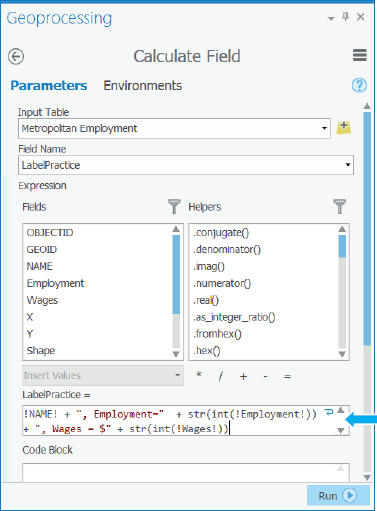
- 4.Run the Calculate Field tool. If you get an error message, review your expression carefully. If needed, you will correct the errors and run it again. You should see values such as the values shown in the figure.

- 5.Close the Geoprocessing pane, and close the table.
YOUR TURN
Open the Cost of Living Index map, and compute these values for the LabelPractice field of the Metropolitan Cost of Living Index map layer:

Label already has the values from the expression computed, but recomputing them in LabelPractice is good practice.
Share maps in ArcGIS Online
You must first share (publish) maps for use in Story Maps (and other ArcGIS Online apps) in ArcGIS Online. You have two maps to share: Arts Employment and Cost of Living Index.
- 1.In Windows or File Explorer, navigate to Chapter3\Tutorials\Resources, and double-click StoryMapManuscript.docx to open that document in Microsoft Word. The document starts with text for you to copy and paste into ArcGIS Pro when you share the employment maps. Additional text is for the content that accompanies maps that you’ll use in the next tutorial for creating a story map. Each section for copying and pasting is numbered for easy reference. Note that it is common practice to compose content in Microsoft Word, and then copy and paste the content to apps or websites. If you have collaborators, it’s helpful to use Word’s Review capabilities to collect feedback, corrections, additions, and so on.
- 2.With the Arts Employment map open, click Share > Web Map.
- 3.Zoom your map to full extent. This step is necessary at this point so that the default extent for the map in ArcGIS Online will be full extent.
- 4.Add your name after Arts_Employment (for example, Arts_Employment_Mary_Smith). All maps stored in an organizational account must have unique names, and if your work is being graded in a class, adding your name makes it easy for an instructor to identify your work as well as make your map’s name unique.
- 5.Copy and paste the summary text from item 1 of the Word document into the Item Description Summary text box.
- 6.Type the tags as seen in item 1 into the Item description tags, pressing Enter after typing each tag. Copy and paste does not work for tags, so you must type them in.
- 7.Under My Content, for sharing options, select Everyone. You must share your maps and all other resources used in a story map with everyone; otherwise, only you will be able to view your story map. If you have an organizational account, you can share only with your organization instead of the general public. Note that instead of Carnegie Mellon University as seen in the figure, your sharing options include the name of the organizational account you are using.
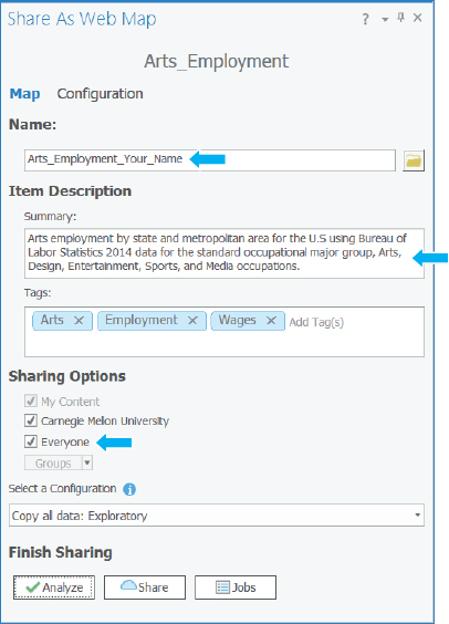
- 8.Click Analyze. No problems are anticipated in uploading the map.
- 9.Click Share. Publishing the map could take a few minutes.
YOUR TURN
Similarly, share the Cost of Living Index map, copying and pasting text from item 2 of the StoryMapManuscript.docx. Remember to click Share > Web Map, then zoom to full extent, and then fill out the Share As Web Map pane.
Move online maps to a new folder
You’ll publish more maps in future tutorials and assignments, so to avoid clutter in My Content in ArcGIS Online, you’ll create a new folder for all the maps and resources of the Arts Employment story map. Then you’ll move the three maps published online to the new folder. Note that even though you’ll have files in different folders, all files stored in your organizational account must have unique names (including files of other users in the same organizational account). In contrast, files in different folders in your Windows file system can have the same names.
- 1.Open ArcGIS Online (arcgis.com) in a browser, and sign in.
- 2.Go to My Content, click the New Folder button
 , type Arts Employment Story Map Your Name for the folder name, and click Create. Notice that the new folder is added to the upper-left corner of My Content.
 - 3.Select the check boxes on the left of the six Arts_Employment_YourName and Cost_of_Living_Index_YourName files in the item list.
- 4.Click the Move button
 > ArtsEmploymentStoryMapYourName.
 - 5.Click the ArtsEmploymentStoryMapYourName folder. Your six files are there.
Add labeling
Next, you’ll use one of the Label fields created in ArcGIS Pro to label a map layer.
- 1.Open the Arts_Employment web map in the map viewer.
If you are not happy with the default extent of this map or your other map, you can change it online. Go to My Content, and click the web map in question to open its details pages. On the top banner, you can click Edit and click the Settings tab. Click Set Extent. You can either type extent coordinates (useful if you want two or more maps to match extents exactly) or draw an extent. Then click OK and Save. Click the Overview tab, and click the Open in Map Viewer button.
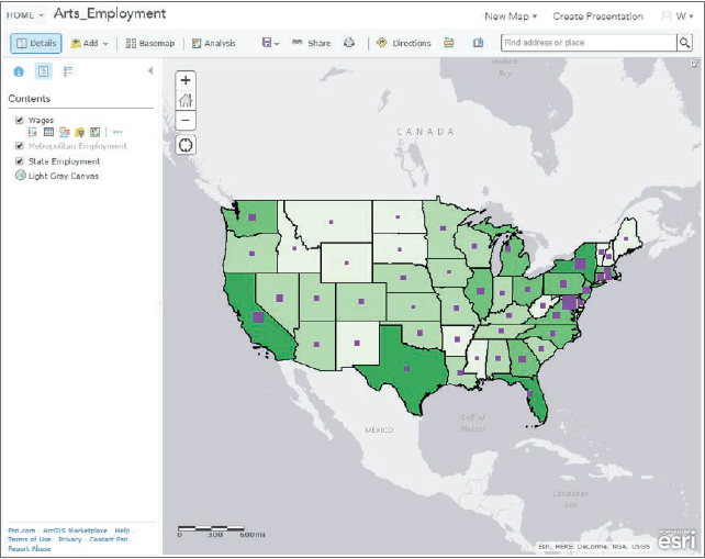
- 2.Zoom and pan into Southern California so that the Metropolitan Employment layer becomes visible.
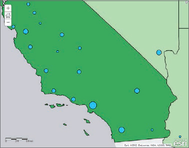
- 3.In the Contents pane, click Metropolitan Employment, and then click its More Options button
 > Create Labels.
 - 4.Select Label as Text, change the font size to 11, and click OK.
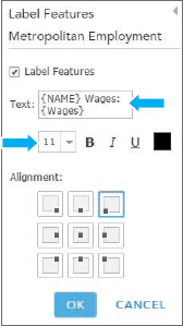
- 5.Click OK.

- 6.Click the Default Extent button
 to zoom to full extent.
 - 7.In the Contents pane, click State Employment.
- 8.Click State Employment’s More Options button, click Create Labels, for Text select Name, change the font size to 11, and click OK.
- 9.Save the map.
YOUR TURN
Open the Cost_of_Living_Index map. Label the State Cost of Living layer with Name and a size 11 font. Label the Metropolitan Cost of Living Index, also with Name and a size 11 font. Save your map.
Configure pop-ups
- 1.Open the Arts_Employment web map in the map viewer.
- 2.In the Contents pane, click State Employment, and then click its More Options button > Configure pop-up.
- 3.In the Configure pop-up panel, click Configure attributes, and toggle Display so that all attributes are cleared.
- 4.Select the rows with these field aliases (scroll far down to get Population): Name, Population, Employment Arts, Wages Arts.
- 5.Click OK > OK.
- 6.Click any state to try out the pop-up.
- 7.Save the map.
YOUR TURN
Configure pop-ups for the Cost_of_Living map. For State Cost of Living Index, use Name, Employment Arts Wage Arts, and Index. Use 0 decimal places as the format for Index. Save your map.
Create a story map
The maps are ready to use, so next you’ll build a story map, add the maps to it, and then add nonmap content. You’ll remain in ArcGIS Online with My Content open and have your ArtsEmploymentStory Map folder open.
- 1.Open a browser, and go to https://storymaps.arcgis.com/en/app-list/. This web page is a catalog of all available Story Maps apps.
- 2.Scroll to Presenting a Series of Maps, and for the Story Map Series side accordion layout, click the Build button.
- 3.Type Arts Employment in the United States by Your Name as the title, and click the Next button
 .
. - 4.In the Add Entry window, type Arts Employment as the title, click Select or create a map > Select a map.
- 5.With My Content selected, select Arts Employment, and then select the Legend check box > Add. The Map Series Builder adds your map to the accordion layout. The left pane of the layout has an editor for adding and formatting content, including text, numbered or bulleted lists, hyperlinks, images, and video. For now, you’ll leave this area blank and later copy and paste content into it.

- 6.Click Save. The story map is saved in My Content in the home folder.
YOUR TURN
Click the Add button (lower-left corner of window), add the Cost_of_Living_Index map with the title Cost of Living Index. Ensure that Legend is selected. Try clicking both numbered panes on the left. If the maps are not both the same size and position, click the Home button for each map. If you made a mistake and want to start over with a map or change the order of maps, click the Organize button at the bottom left of the page. Save the story map.

Copy text to map 1
Text and other content are already created and available in StoryMapManuscript.docx. Note that when you build your own story map, you should write content in Microsoft Word first, and then copy and paste it into the web editor, just as you are doing here. Likewise, you should create tables and charts in an external package, such as Microsoft Excel (see optional tutorial 3-4 on how to create tables and charts in Excel and save them as images).
- 1.In StoryBookManuscript.docx, select all of item 3, Map 1 Arts Employment, from “Where are the jobs in the Arts Field?” up to and including “Copy and paste Table 2 from Chapter3\Tutorials\Resources\ArtsTables.xlsx”.
- 2.Press Ctrl+C to copy the selected material to the clipboard.
- 3.Click 1 Arts Employment in the Map Series Builder, click in the “Add text, links, and small graphics here” pane, and press Ctrl+V to paste the content.
This step pastes all the text as well as much of the formatting from Word. Nevertheless, there is some touching up to do with the formatting, which is what you’ll do next.

Edit and format the copied text
The trick to using the editor in the Map Series Builder is to scroll down, select text in need of formatting, scroll back to the top, make the needed format change, and scroll back down to see the results.
- 1.Select the URL in the first paragraph (http://www.bls.gov/soc/2010/soc270000.htm), and press Ctrl+X to cut that text. You’ll use the URL to create a hyperlink in the next step.
- 2.Select the text, “broadly speaking,” click the Link button
 , press Ctrl+V to paste the URL, and click OK. That step turns the text, “broadly speaking,” into a hyperlink.
 - 3.Place your cursor after the end of the first paragraph (ending with the word “prospects”), and press Enter to add a blank line between the two paragraphs.
- 4.Put a blank line before the Disclaimer heading and before all headings in the text.
- 5.Under the Map use and Navigation section, select the bulleted text, scroll to the top, and click the Bulleted List button
 . Scroll down and delete the original bullets.
 - 6.In the section, “About the data on maps,” create hyperlinks for “Arts, Design, Entertainment, Sports, and Media Occupations” and “subgroups” using the URLs that follow each link text.
- 7.In Windows or File Explorer, navigate to Chapter3\Tutorials\Resources, and double-click ArtsEmploymentTables.xlsx to open the workbook in Microsoft Excel. This workbook has four tabs, each containing data exported from ArcGIS Pro, and then sorted and limited to the top (or bottom) 10 states or metropolitan areas. Next, you’ll copy and paste the tables directly from Microsoft Excel to Map Series Builder to create tables there.
- 8.Click the Table 1 tab, copy the highlighted rows and columns, paste where instructed in the map 1 text, and delete the instruction. If you need to make columns wider, you will do that in Microsoft Excel before copying. Also widen your browser window to widen the content column that you are editing in your story map. You can delete copied material and try pasting again if needed.
- 9.Similarly, copy and paste Table 2 where indicated, leaving the Microsoft Excel workbook open.
- 10.Save your story map.
YOUR TURN
Copy and paste the map 2 text (item 4) from StorybookManuscript.docx to the map 2 section of the story map. Use the URL there to create an appropriate hyperlink, and replace the bullets with bullets from the Story Map editor. Copy and paste tables 3 and 4 as directed in the text. You’ll finish up map 2 in the next exercise.
Copy text to map 2 and add images
The Story Map editor, of course, does not have capacity to generate charts, but you can always create a chart in another package, take a screen capture (a JPEG picture) with the Windows Snipping Tool (search Help in Windows or work through tutorial 3-4) or one of the many other similar tools, and upload the image. The bar chart, CostOfLivingWeights.jpg in Chapter3\Tutorials\Resources, was created using Microsoft Excel and saved as a screen capture. You’ll insert that image at the bottom of the content for map 2.
- 1.In your story map, go to the bottom of content for map 2 and delete the instruction to add the CostOfLivingWeights.jpg image.
- 2.With the cursor at the bottom of the content, scroll up and click the Insert Image button
 .
. - 3.In the Insert An Image, Video Or web page window, click Upload, click browse for an image, browse to Chapter3\Tutorials\Resources, select CostOfLivingWeights.jpg, and click Open.
- 4.Edit the Image caption to Cost of Living Weights.
- 5.Click Apply.
- 6.Scroll in the content to see the inserted image.
YOUR TURN
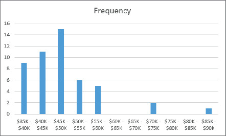
Find a place in map 1 to insert ArtsWagesChart.jpg from Chapter3\Tutorials\Resources, and type some appropriate text describing the chart; for example, the mode of wages is interesting to know for this distribution, $40K to $50K (the mode of a bar chart is the highest bar). Save your story map when you finish.
Share and check your story map
If you finish and close your story map and then need to edit your work, you can open your story map from My Content (View application) and click the Edit button  at the top of the application.
- 1.In the Story Map builder, click the Share button and select Public.
- 2.Copy the story map’s URL, and use it to open the story map in a web browser. Of course, you can share the URL with anyone, and then they can use your story map.
- 3.Try every map, legend, pop-up, visibility range, and hyperlink, making notes of any problems and correcting them if needed. You can use the Story Maps app in edit mode to make corrections.
- 4.Close the Story Maps app and your browser.
Tutorial 3-4: Making charts for feature attribute data in Microsoft® Excel (optional tutorial)
Microsoft Excel works well in story maps for creating charts and tables to report project results. If you need these skills, the next tutorial will help you create professional-quality tables and charts. You’ll learn how to export attribute data from a map layer in ArcGIS Pro; import the data to Excel; clean up and sort the data; make bar and scatter plots; and screen print the charts as images using the Microsoft Snipping tool for insertion into a Word document, PowerPoint slides, website, or story map.
Open the Tutorial 3-4 project
- 1.Open Tutorial3-4.aprx in Chapter3\Tutorials and save it as Tutorial3-4YourName.aprx.
- 2.Use the Lower 48 states bookmark.
Export data from ArcGIS Pro
- 1.Open the USStates WageArts attribute table.
- 2.Click the Options button > Export.
- 3.Click the Browse button of the Output Table and browse to Chapter3\Tutorials.
- 4.For Name, type USStates.txt, and click Save > Run. The text table, USStates.txt, is exported.
Import data to Microsoft Excel
Next, you’ll import USStates.txt to Excel.
- 1.Launch Microsoft Excel.
- 2.Click File > Open, and browse to Chapter3\Tutorials\Resources.
- 3.In the Open window, select All Files to the right of File name at the bottom, select USStates (not USStates. txt), and click Open.
- 4.In the Text Import wizard, ensure that the Delimited Option button is selected, and click Next.
- 5.Select the Comma check box > Finish. The table is imported into the USStates tab of the Microsoft workbook.
- 6.Click File > Save As > in the folder under Current folder, change the Save As type to Excel workbook, and click Save.
Delete unneeded columns
You will need only three columns of data: Name, WageArts, and Index. So you’ll delete unneeded columns to make further processing simple.
- 1.Click in the A column heading cell, press and hold the Shift key, and click the B column heading cell to select those two columns.
- 2.Right-click in the selection and press Delete.
- 3.Click the B column heading cell (which now has the ObjectID attribute), scroll to the right to the BF column (which has EmpArts data), press the Shift key, click the BF column heading cell to select the range from B to BF, right-click in the selection, and press Delete.
- 4.Likewise, delete all additional unneeded columns, keeping only the three columns as shown. If you make a mistake and delete a needed column, you can click the Undo button at the top of the Excel window.

Sort the table
Creating a bar chart from raw data requires manual work, but it is not too difficult. The preparation process requires sorting data by the column being used to make the chart, taking notes, counting frequencies, and typing some information.
- 1.Select columns A, B, and C. You must select all columns of a table when you sort; otherwise you’ll destroy the data.
- 2.Click Data > Sort.
- 3.Ensure that you select the “My data has headers” check box, and then select WageArts as the Sort by Column. Click OK.
Create a bar chart
- 1.Now count the frequencies in these WageArts classes: $35,000–$40,000, $40,000–$45,000, $80,000–$85,000. Counting is not actually needed in this case because those statistics are available in the bar chart to save you time. The left side of each class (for example, the $35,000 in $35,000–$40,000) is included in the class if there are any states with that value, but the right side ($40,000) is not. The $40,000 is in the next class, $40,000–$45,000.
- 2.To create a new spreadsheet, click the + to the right of the USStates tab at the bottom left of the spreadsheet.
- 3.Double-click the tab, Sheet1, and rename it Bar Chart.
- 4.Type the data into the Bar chart sheet as shown.
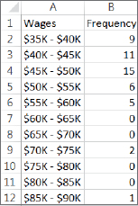
- 5.Select all the data in the Bar chart sheet: click in cell A1, press the Shift key, and click in cell B12.
- 6.Click Insert > the Insert Column Chart button
 > the first 2D chart. This step creates the chart as shown.
Create a scatterplot
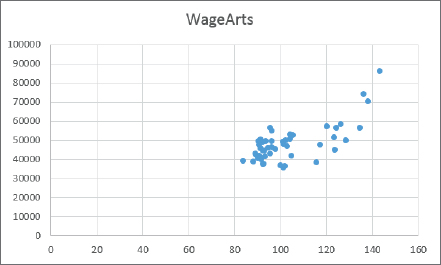
You can easily create a scatterplot with two attributes by ordering the columns of the attributes from left to right in the spreadsheet so that the horizontal axis attribute appears first. Your objective here is to investigate if the higher cost of living (Index attribute) correlates with higher wages for workers in the arts field (WageArts attribute), so it’s natural to place the cost of living index on the horizontal axis. You’ll move the Index attribute to the left of the WageArts attribute.
- 1.At the bottom of the Microsoft Excel window, click the USStates tab.
- 2.Select column B (with Wages Arts data), right-click in the selection, and click Insert. This step creates a new blank column, now B, to the left of WageArts data, which is now in column C.
- 3.Select column D (with Index data), right-click in the selection, and click Cut.
- 4.Select column B, right-click in the selection, and click Paste. Now the columns are ordered Name, Index, and WageArts.
- 5.Select data in the range B1 to C50.
- 6.Click Insert > the Insert Scatter Plot button
 > the first chart type. This step produced the chart, which needs some refinements.
Modify the scatterplot axis ranges
Next, you will limit the ranges of the vertical axis and horizontal axis to those of the data so that you can see its pattern more clearly.
- 1.Right-click any vertical axis number (such as the 40000), and click Format Axis.
- 2.Change Bounds Minimum to 35000 and Bounds Maximum to 90000. Close the Format Axis panel.
- 3.Right-click any horizontal axis number, and click Format Axis.
- 4.Change Bounds Minimum to 80 and Bounds Maximum to 150. Close the Format Axis panel.
- 5.Adjust the size of the chart so that it’s about square.
Format an axis
- 1.Right-click any vertical axis number, and click Format Axis.
- 2.In the Format Axis panel, click Number (you may have to scroll down), select Currency for Category, and type 0 for Decimal Places. Close the Format Axis panel.
Label each axis
Your user interface may vary from the one used in this exercise, depending on your Microsoft Excel version.
- 1.Click anywhere in the chart.
- 2.Click the Chart Elements button
 , select Axis Titles, and deselect Chart Title.
 - 3.Edit the axis labels so that the horizontal axis is Cost of Living Index and the vertical axis label is Average Arts Income.
Modify the point symbol
- 1.Click anywhere in the chart, and under Chart Tools, click Format, and under File on the upper left, select Series “WageArts.”
- 2.Click Format selection under Series “WageArts.”
- 3.Click the Fill and Line button
 > Marker in the Format Data Series pane.
 - 4.Expand Fill, click Solid Fill, and black for the color.
- 5.Expand Border and select No Line. Close the Format data series pane. This step completes the chart, which is now informative as well as professional looking in appearance. You can see that wages in the arts profession increase when the cost of living increases, and even at an increasing rate for states with a higher cost of living. The chart has no title because it’s better to type the title as a figure with number and caption in a report or as a slide title in a presentation.

- 6.Save your Microsoft Excel workbook.
Screen print each chart
You can directly copy and paste Microsoft Excel tables and charts into Microsoft Word or PowerPoint files. For some destinations, however, such as Story Maps, you’ll need to capture images of charts and paste the images. You can use the Windows Snipping Tool for that purpose, which is available on every Windows computer.
- 1.On your computer, search for Snipping Tool, and launch the program.
- 2.Drag a rectangle around your chart in Excel.
- 3.In the Snipping Tool, click File, and click Save As to your chapter 3 tutorial folder with the name ScatterPlot and the JPEG file type.
- 4.Click the Bar Chart tab in Microsoft Excel, click New in the Snipping Tool, snip the chart, and save as BarChart. You can easily paste one or both charts into a Word document or PowerPoint presentation.
- 5.Close the Snipping Tool, save your changes to Microsoft Excel, and then close Excel.
Assignments
This chapter has four assignments to complete that you can download from this book’s resource web page, esri.com/gist1arcgispro:
- Assignment 3-1: Build a layout with income versus educational attainment in Washington, DC.
- Assignment 3-2: Build a map layout for comparing 2D and 3D maps for urgent health care clinics in Pittsburgh.
- Assignment 3-3: Build a story map for locating charter schools in New York City.
- Assignment 3-4: Build a story map for income versus educational attainment in Washington, DC.