Digital images are great, but one distressing fact about them is that the same code values do not mean the same thing from one type of digital image to another. This chapter is about the weird and wonderful world of digital color and its impact on our work in visual effects. We start out with a look at Color Spaces, just to understand a bit about the terms and issues that will be used in later sections. This is important material as it entails universal principles that permeate virtually everything we do in visual effects.
This is not a book on color science, but a bit of color science is required for the next section on working in linear as it requires some understanding of color spaces. A color space is a very specific thing and it requires three components – a set of primary chromaticities, units of measure, and a transfer function. Here we will look at two important color spaces, sRGB for workstation and home computer monitors and P3 for digital cinema projectors. HDTV uses rec709 color space, which shares the same primary chromaticities as sRGB but has a slightly different transfer function, so most references to sRGB color apply to rec709 as well. For purposes of this discussion we will treat sRGB and rec709 as equivalent.
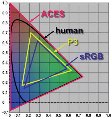
This is simply the technical specification of exactly what red, green and blue primaries a color space is using. Not all greens are created equal, for example, so the CIE chromaticity chart in Figure 12.1 is the world standard for specifying a color. This chart represents the full range of human vision so all colors are represented. To define the chromaticity (color) of the three primaries of a color space, they are spec-ified by their xy coordinates on this chart. For example, the P3 green primary xy location is 0.265, 0.690. The primary colors for sRGB/rec709 and the P3 color spaces are charted here. Note that the P3 color primaries cover a wider area than sRGB. This will become an issue shortly.
These are the code values for each primary that describe the amount of that color for a pixel. For an integer 8-bit system that’s 0 to 255 and for a 16 bit system that’s 0 to 65,535, where code value 0 means 0% of that primary color and (for 8-bit systems) 255 means 100% of the color. In linear space that becomes 0 to 1.0. The code values in-between are evenly spaced, dividing the color intensity into equal steps.
The transfer function is a fancy name for the mathematical description of how a display device like a monitor maps the input signal to the resulting brightness on the screen. Many think it is just the gamma value but there is a bit more to it than that. The slope of a gamma curve approaches infinity as the curve approaches zero, which would introduce infinite signal scaling near zero. This is impossible for a practical display device, so to avoid this the transfer function includes a tiny straight line segment between 0 and 0.018. The slope of this straight line segment hooks up to the gamma curve at that point to define the remaining transfer function between 0.018 and 1.0. Software designed to apply the sRGB or rec709 transfer function to images includes this short line segment but a simple gamma curve does not. However, the error is small and most just refer to the gamma value. While sRGB and rec709 share the same primary colors their gamma corrections are different – sRGB uses a gamma correction of 2.2 while rec709 has a bit more contrast with a gamma correction of 2.4. Your sRGB workstation monitor will have a contrast ratio of around 1:000 to 1 while your HDTV flat panel will be more like 4:000 to 1.
Gamut is a very important concept that will haunt your compositing efforts as your shots are played on different display devices. The gamut of a display device is the full range of all possible colors that it can display. After the three primary chromaticities for a color space are selected and plotted on the CIE chart (Figure 12.1) a line connecting all three primaries defines an enclosed triangle of colors that defines the full range of all possible colors that that display device can emit.
Two important gamuts are plotted in Figure 12.1 – sRGB for workstations and personal computer monitors and P3 for digital cinema theater projectors. Two things to notice here. First, the three primaries for the two color spaces are somewhat different. That means if the same image is displayed on an sRGB monitor and projected in a digital cinema they will look different. The second thing – which is much more serious – how do you map one gamut into the other in order to display the same image on two devices but maintain the same appearance?
This is done using a process called “gamut mapping” and it is a difficult art. Consider, for example, the green primary for the P3 gamut is outside of the sRGB gamut. This means that the P3 color space can make a more saturated green than sRGB. If you want to map a larger gamut into a smaller gamut do you clip, clamp, or clump it? Can you take a smaller gamut and just “stretch” it to fit the larger gamut or will there be color distortions? These are the exciting questions that keep color scientists up at night.
These are not color spaces but instead convenient user controls for adjusting RGB values. HSV and HSL do not have their own primary colors. They simply remap the RGB values into a more convenient form for us humans. For example, to darken in image in RGB you would have to very carefully dial down the red, green, and blue code values equally, but in HSV just lower the V control. And just try reducing the saturation of an image with RGB controls. Can’t be done. We humans think in terms of hue, saturation, and value (brightness) so this allows us to manipulate color more conveniently. HSV and HSL are for humans and RGB is for computers.
These are also not color spaces but are data-encoding schemes to describe color. While technically incorrect, we still might say that we store the data in “log space” but work in “linear space”. However, it is truly correct to talk about “display space” such as sRGB and rec709 as these both are real color spaces. You can find out all about log images in Chapter 15: Digital Images.
With fresh eyes we can now revisit the diagram from Chapter 9 here in Figure 12.2. The “CRT gamma” in panel (2) is specified by a gamma value to quantify its darkening effect. Panel (3) illustrates the gamma correction applied to the image to reverse the CRT gamma-darkening so it will display correctly.
Now here is an interesting observation – if you ask a video engineer if rec709 is a linear color space they will say “yes, of course it is”. They would be wrong. Both rec709 and sRGB are a gamma corrected linear spaces, not, strictly speaking a true linear space. ACES is a true linear color space, not these things. Why worry about the distinction? You will see why in the following section about working in linear.
Let’s face it – working in linear is weird. The pictures look way too dark and the code values are far too low. For example, in linear, a 50% grey is no longer code value 0.5 but more like 0.18. Instead of familiar flesh tone values like 0.54 0.45 0.42 they read as 0.24 0.17 0.15 – way darker. Visual effects lives in the world of physical modeling like its CGI brethren while sRGB and rec709 lives in the less scientific world of “what looks nice on TV”.
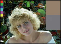
All images that you bring in to your compositing software should be linearized as soon as they are read in. Of course, they will look dark and hideous like Figure 12.4 so you need an sRGB viewer LUT so the pictures will look nice like Figure 12.3. The key is that you work in linear but view in sRGB. At the end of the comp your linear images are written to disk. If you output them as a jpeg or tif for example, the software needs to bake in an sRGB LUT. If you output them as a Cineon or log DPX image a log LUT needs to be baked in, and if outputting an EXR image no LUT at all as EXR images are by definition linear.
Even though we will see shortly why linear is the “right space” to work in, many vfx artists routinely work in sRGB or rec709 all day long without apparent harm. You can get away with this if, for example, you are working in sRGB for internet content or anything that is to be displayed on ordinary monitors such as your workstation or home computers. You can work in rec709 if you are working in video and viewing your work on a TV monitor. The errors introduced will usually be small and often unnoticeable because these are limited dynamic range color spaces. However, when working on a feature film you absolutely must be working in linear.
In the following section I crudely lump rec709 and sRGB color spaces together and refer to them generically as sRGB to simplify the discussion. Know that everything said here about sRGB applies equally to rec709.
The short answer is linear data is a one-to-one relationship between the code value of a pixel and its brightness. That means if you double the code value you double the brightness. As we saw in the color space section above, sRGB is not truly linear – it is a gamma-corrected linear. Let’s see what happens with a “double the code value” test with sRGB vs. linear data.
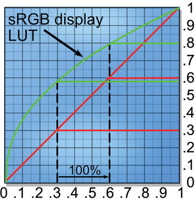
Figure 12.5 is a typical LUT graph with data input along the bottom and brightness output on the right edge. The input code value (black dashed lines) of 0.3 is doubled to 0.6, a 100% increase. Following the red linear lines, the output brightness also doubled when it went from 0.3 to 0.6 – very linear. However, for the same input data change the green sRGB curve output went from 0.58 to 0.79, an output change of 0.21 compared to the input change of 0.3, for an increase of only 70% (0.21 ÷ 0.3). Worse, if we look in the darks where the slope of the line is very steep and double a small code value such as 0.02 to 0.04, the input difference of 0.02 becomes an output difference of 0.06, a whopping 300% increase (not graphed). So, for linear images the brightness increase is constant everywhere on the graph but for sRGB images the brightness increase is variable depending where on the curve you sample.
Now that we have established exactly what linear data means we can switch to looking at why it is the correct space to work in for compositing. We will look at three scenarios – color operations, transformations and filtering, and finally CGI.
Here we will look at the affect of the working color space on color correction operations. We start by comparing the results of a simple color correction by applying a gain of 1.5 to both a linear and sRGB images in Figure 12.6. Starting with the original image on the left, the center pictures shows the results of applying a gain of 1.5 to the linear version and the picture on the right shows the same gain applied to the sRGB version.

Figure 12.6
Comparison of gain operation in linear vs. sRGB
Clearly the results are very different, but is the sRGB version actually wrong? Yes, it is wrong. It is wrong because the gain applied to the linear version replicates a natural photographic exposure increase. The gain applied to the sRGB version is also brighter, but not in any way that replicates any natural process.
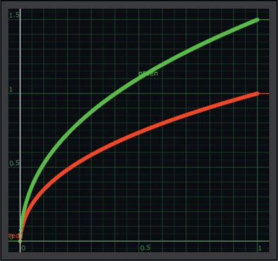
We can see the different effect of the gain operation on a linear vs. sRGB image in Figure 12.7 and Figure 12.8. Two ramps are drawn, one linear the other with the sRGB gamma curve baked into it. Starting with the linear ramp in Figure 12.7 the red line represents the original linear ramp. The blue line shows the ramp after the gain of 1.5 is applied in linear space and the green line shows the final shape after the sRGB viewer LUT is applied to the blue ramp. This green line represents what will be seen on the screen for the linear ramp which is the “linear with gain 1.5” in Figure 12.6.
Figure 12.8 shows what happened to the sRGB ramp. The red line is the original sRGB ramp and the green line is after the gain of 1.5 is applied. No viewer LUT is required because the image is already sRGB. The green line is again what will be seen on the screen and you can see that it is very different than the comparable green line in Figure 12.7. You can also see that these two green graphs comport exactly with the visual results of the picture in Figure 12.6 where the same gain was applied to both linear and sRGB images.
WWW Marcie linear.tif and Marcie sRGB.tif – with your viewer LUT turned off, load these two images into your software with no conversion to linear. Apply a Gain of 1.5 to brighten both images, then convert the brightened Marcie linear.tif to sRGB and compare it to the brightened Marcie sRGB.tif. Do they look like Figure 12.6?
There are also big differences in image-processing results when working in linear vs. sRGB. Figure 12.9 shows the effect of a rotation transformation on a fairly fine grid. Comparing the close-ups of the linear and sRGB grids, the sRGB grid on the right appears thinner. Upon close inspection the reason is that some of the dark pixels of the anti-aliasing were improperly darkened. When seen full size this grid will appear thinner and more “jaggy” than the linear version.
Figure 12.10 shows the effect of a filtering operation, a small blur on the same fine grid. Comparing the close-ups of the linear and sRGB versions, the sRGB grid on the right appears thinner and has those weird “knobby knees” at the intersections. This again is because the darker pixels have been lowered, which thins the lines and thickens the intersections.
WWW Grid linear.exr and grid sRGB.tif – with your viewer LUT turned off, load these two images into your software with no conversion to linear. Apply a rotation of 10 degrees to both images then convert the rotated linear grid to sRGB and compare the two versions. Then try the blur test.
The third big reason for working in linear is to be compatible with multi-pass CGI renders. In the discussion in Chapter 7: Compositing CGI it was explained that all CGI renderers work in linear for their rendering calculations. The reason for this is that CGI is actually a simulation of the real world and the real world is linear. The CGI department sends the compositor lighting passes along with the beauty pass so the compositor can manipulate the passes to dial in the comp. The various lighting passes were combined inside the renderer to build the beauty pass and all those passes were combined in linear space. If you try to recombine or subtract them from the beauty pass in sRGB color space you will not duplicate the CGI environment and your results will not match. You should be able to combine all of the lighting passes and replicate the beauty pass exactly. In order to do that you will have to be working in linear space.
When the CGI department gets a texture map or an HDR image for image-based lighting the first thing they do is linearize them by backing out their baked-in gamma corrections. This is called “linear space lighting” and is the industry-standard approach. The linearized texture maps are rendered in the linear space of the CGI renderer (Renderman, V-ray, etc.) so the final results are also linear. When the CGI software writes the rendered results to disk it will also bake in whatever gamma correction is appropriate for the chosen file format. If it’s a tif for, example, it will get the sRGB gamma correction, but if it is an EXR file it will go to disk directly as linear.
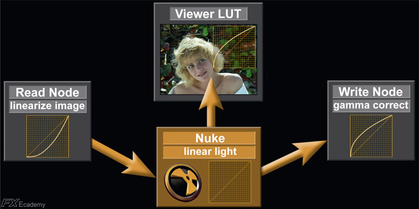
Figure 12.11 illustrates the complete linear workflow color management for a professional compositing app like Nuke. If your CGI comes to you in a tif file, for example, it has been written to disk with the sRGB gamma baked in for viewing purposes. When you load it into your compositing software (Read Node) the sRGB gamma needs to be backed-out first thing to put the image back to linear. If the render comes in an EXR file the CGI data is, by definition, already linear and you are ready to comp (Nuke linear light). The linear data will be too dark for viewing so an sRGB LUT is added to the viewer to make it look nice for viewing (Viewer LUT), but all internal work is done in linear space until your comp is written to disk. As with the CGI rendering software, if you write your comp out as a tif (Write Node) your software will give it an sRGB LUT. If you write it out in a video format it will get a rec709 LUT. If you write it out as a Cineon or log dpx it will get a log LUT, and if written out as an EXR it will remain linear.
Metadata means “data about the data” and is all the rage now in visual effects. Metadata is information about a clip and it is carried in the file header. Figure 12.12 shows the metadata from a RED clip. While metadata can carry a lot of information that you do not care about, it can also carry some useful information such as:
- Bits per channel
- Image resolution
- Camera model
- Clip aspect ratio
- Frame rate
- Lens aperture
- Lens focal length
- Focal distance
- Pixel aspect ratio
- Camera sensor type
- Shutter angle
Much of this information is what a vfx supervisor on location would have to collect by hand with written notes then bring back to the studio. Now it is automatically and accurately collected by the cameras.
When the image is read into an app it looks at the metadata to find, for example, the image width and height. The pixel aspect ratio tells the software whether the image is anamorphic or not, and what the squeeze ratio is. Most software will use this information to leave the squeezed version in memory for processing but stretch it correctly to the viewer so it will look nice for the operator. This is transparent to the operator who may not even know the original clip was squeezed.
The metadata is generated by the image-creation device, which can be a camera, or an app such as Photoshop or Nuke. One of the big problems in our industry is apps that do not bother to generate or read the metadata. An editing program might load an anamorphic clip and stretch it correctly so it looks fine on the monitor, but that same clip loaded into another app may not read the metadata so the clip is displayed squeezed. Confusion and disarray ensue. Some apps can display the metadata for you, others allow you to edit it, and others will edit it themselves when they operate on the image. Still others discard it. It’s a jungle out there. Camera manufacturers that support robust metadata in their cameras are good. Manufacturers that do not are bad.
OpenColorIO (OCIO) is a color-management system designed to allow artists to convert incoming clips to the house color workspace from a simple popup menu to avoid artist-induced color management errors. The color scientist of a facility installs a configuration at the back end to properly convert incoming footage such as REDLog to the in-house linear workspace so the artist can then just pick “REDLog” from a dropdown OCIO menu in his app. The color scientist also provides the viewer LUTs that the artists use at their workstations so the images are properly displayed as well as the encoding at the back end when the artist writes the finished shot to disk in a REDLog format.
OCIO was developed by Sony Pictures Imageworks and released to the vfx industry for general adoption. It is geared towards the motion picture industry with an emphasis on visual effects and computer animation. The OCIO workflow is designed to accommodate the production practice of setting up specific color space conversion for each show and delivering finished shots back to the client in the same format as was delivered to the studio – ARRI in / ARRI out, as it were. A given show may have several different camera inputs each of which gets its own configuration to convert it to the workspace. Opencolorio.org offers a library of configurations that are easily installed in software that supports OCIO. Since a color scientist, or at least a color manager, is required to set up OCIO for the studio it is usually only seen in larger vfx studios.
One of the most vexing problems in modern feature-film production is the wild mix of different cameras that can be used on the same movie. Remember when everything was just shot on 35mm film? Of course you don’t. You were born listening to an iPod. A modern visual effects shot might be made up of a background plate shot with a RED Dragon, the greenscreen shot with an ARRI Alexa, CGI rendered from RenderMan, and a digital matte painting created in Photoshop. Each and every one of these has its own “look”, and you, the modern digital compositor, must make them all look like they were shot at the same time under the same lighting conditions with the same camera (sound familiar?). This is a mighty difficult problem to solve, but ACES has the solution.
If you are compositing visual effects for feature films then ACES is coming at you so it is important to be aware of it. ACES stands for Academy Color Encoding System and is a new and powerful workflow for the color management of feature-film production pipelines. It is a large and complex subject on its own and warrants its own book, so suffice it to say that we will just try to get an understanding of what it is, not how to actually work with it. My objective here is to give you enough of an understanding of ACES and a few key terms so that when the subject comes up you won’t have that “deer caught in the headlights” look. This was a huge engineering project produced by the Academy of Motion Pictures Arts and Sciences, and I suspect that it was the Science department here.
I like to think of ACES as the Grand Unified Field Theory of color management. The fundamental concept of ACES is to convert all incoming images to a single, huge internal linear color space that is so large that no image will ever get clipped or gamut be crushed. And note that ACES is a linear light space, so you need to be comfortable with working in linear float.
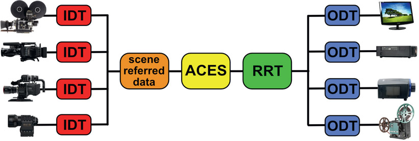
As mentioned above, every digital camera “sees” the same scene somewhat differently. What we need to do is back-out the camera’s influence on the captured image in order to reconstruct the original light of the scene – which is true linear light data. Referring to Figure 12.13, the images captured by the camera are called the “capture referred data” because it has the capturing camera characteristics baked into it. The capture referred data is put through the IDT (Input Device Transform) for that particular camera in order to produce the “scene referred data” (orange box). Scene referred data means that it now represents that actual light from the real scene without the influence of the capturing camera. Simply linearizing the camera data backs out any log, sRGB or rec709 LUTs baked into it, but that does not quite put it back to the true original scene data. The camera’s “fingerprints” are still all over the images.
Once we have the scene referred data it is then converted into the ACES color space (yellow box) – a color space with a gamut so vast that no physical camera or projector today or in the future could possible exceed it. It actually far exceeds the human visual system. This is intended to future-proof every feature film today so they will always be able to work on any future equipment, real or imagined.
From the ACES color space the raw data is given its artistic “look” by the colorist, which is captured by the RRT (Reference Rendering Transform). The next amazing trick is to preserve the “look” defined by the RRT for multiple display devices, each – like the cameras – having their own characteristics. That is accomplished with the ODT (Output Device Transform), which modifies the RRT data to look correct on each display device. And like the camera manufacturers, the display device folks must provide the data for each device so an ODT can be constructed for it. Of course, we still have the exciting problem of gamut mapping if the movie has to go out to a low gamut display device like HDTV.
You may recall from above that the gamut of a color space is the full range of colors that it can support. Common color spaces you already work in are sRGB for your workstation monitor, rec709 for video, perhaps SWOP for print, and if you are a photography buff you may have played in AdobeRGB. Figure 12.14 shows the huge ACES gamut (red) compared to other common gamuts. The black outline is the full range of the human visual system, which is smaller than the ACES gamut. Far smaller than that is the puny P3 gamut for digital cinema and the even dinkier sRGB gamut of your workstation monitors. The point of the huge ACES gamut is so that every possible color, even those outside of the human visual system, will always be preserved without clipping or round off errors despite heavy mathematical manipulation.
With the ACES workflow you can mix cameras on a film or even within a single shot and know that they will all work together. Further, within the ACES workflow the ACES gamut is so large that no image data will ever be clipped or distorted. Then, at the back end, when the colorist has given the movie its final “look” it will be faithfully projected or displayed regardless of what display device is used. This workflow will also future-proof the studio’s movies for any upcoming technology improvements in display devices, a concept near and dear to the studio executive’s hearts.
You might think that if you are a compositor working only on video jobs that ACES is not coming at you. Not true. Even though the job is rec709 video and most of the footage might be captured with rec709 video cameras there could still be some RED footage to integrate as well as CGI and digital matte paintings. Today we muddle through the mixed image source problem by eye, but as the ACES technology becomes more accepted within the industry virtually all equipment will become ACES compliant so you will eventually see the ACES workflow even in video production.
The next chapter is about image-blending operations. First there is a discussion about how working in linear affects image-blending ops compared to working in sRGB or video color spaces. Next is a review of the various alpha-compositing ops such as in, out and over, which is followed by a detailed explanation of non-alpha channel image-blending ops such as the Screen operation. Finally, the secrets behind the Adobe Photoshop blend modes are revealed in case you need to match them in your comp, followed by a little wrap-up about what slot gags are and how to use them.


