Compositing is all about blending images together so here we will take a close look at image-blending operations. There are two classes – the alpha compositing operations such as the Over or Inside, and image-blending operations such as Screen or Multiply. For the alpha-compositing ops we will look at the six most common, how they work, and when to use them. For the image-blending ops we will look at their six most common, how they work, and how to modify their results.
We will also take a look at “slot gags”, a time-honored technique for easily creating some really cool light animation effects. There is also an extensive section on speed changes because their big issues all involve image blending. The chapter finishes with a large section on VR and how to use generic compositing software to stitch multi-camera shots together into the LatLong image required for viewing with a head-mounted VR display.
But this chapter starts off by looking at the issues of color space when blending images. The comparison of a simple image blending operation done in both linear and sRGB color space demonstrates the big difference in results. This difference must be understood by the modern compositor. Techniques are also provided for how to properly match the look of an sRGB composite even when working in linear space.
Our industry is becoming schizophrenic. If you are a compositor working on a feature film you are hopefully working in linear. If you are working on a video project it is likely to be sRGB or rec709. For the purposes of this discussion, we will be illustrating with sRGB which is your monitor’s color space, rather than rec709 which is video color space. The two are very close so the difference is small. However, neither is very close to linear, and that is the conundrum. When blending images together there will be huge differences in results depending on which color space you are working in. To work in linear means that all of the image data is converted to linear for image-processing operations then converted to sRGB only for viewing purposes or writing files to disk. To work in sRGB means the images are left in sRGB color space for image processing and the results viewed directly. This workflow difference has a huge impact on the results. There is a detailed explanation of linear light space and its virtues in Chapter 12: Digital Color. So now let’s look at those huge differences.
There are two classes of image-blending operations – compositing operations that use an alpha channel (Over, Under, In, Out, etc.) and image-blending operations that do not (Add, Screen, Multiply, etc.). Here we will look at those image-blending operations that do not use an alpha channel to see how working in linear vs. sRGB affects the results.
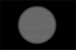
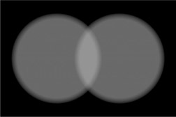
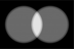
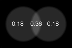
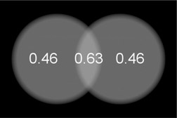
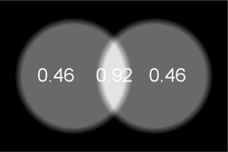
Starting with the 50% gray image in Figure 13.1, if two overlapping copies are summed in linear we get the results in Figure 13.2. Note the brightness of the overlap. However, if the same 50% gray spots are summed in sRGB light space we get the much brighter overlap zone in Figure 13.3. This illustrates how very different the blending mode results are between linear and sRGB. It is important to note that the linear results in Figure 13.2 are the results you would get in the real world if you shined two spotlights on a wall and overlapped them. The point here is that working in linear is how we get photorealistic results and this example underscores the importance of working in linear.
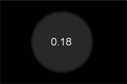
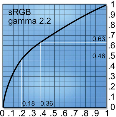
To understand why the huge difference between the linear and sRGB results we need to look at the raw linear images. Starting with Figure 13.4 the gray spot has code value 0.18 in linear, which becomes a 50% gray to the eye when viewed with an sRGB viewer LUT. In Figure 13.5 two copies of the spot are summed (0.18 + 0.18) so the overlap becomes the expected code value 0.36. When the summed linear image is put through the sRGB LUT for viewing the code values are shifted up (from 0.18) to 0.46 and (from 0.36) 0.63 as shown in Figure 13.6. Why this happens is illustrated in Figure 13.7, where the finished linear image is converted to sRGB with the LUT. This happens because the sRGB LUT has remapped the code values for display. But this is not what will happen if you work in sRGB.
When working in sRGB color space the 50% gray code value is already 0.46 (Figure 13.8) so when the two spots are summed together the total becomes (0.46 + 0.46 =) 0.92 (Figure 13.9), which is way too bright. This is why we should work in linear light space.
The sad truth here is that Photoshop works in sRGB color space – which looks nice, but not photorealistic for high-end image-processing. The problem is when layers are combined in Photoshop – regardless of blend mode – you will not be able replicate their appearance if you try to combine those same layers in linear light space. This is a huge problem if the art department whips up a “look dev” on a shot in Photoshop, gets a buyoff from the nice client, but then you won’t be able to match it in linear. Unless you read the following sections to learn how to, of course.
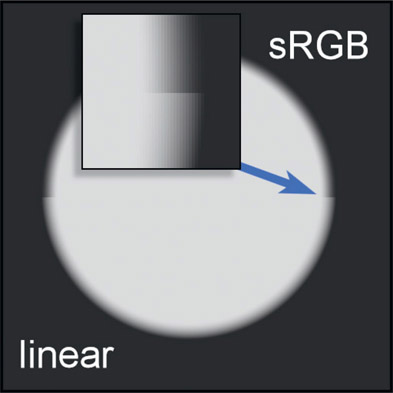
These are the compositing operations that require an alpha channel. As we saw above, image blending in linear vs. sRGB color spaces makes a very big difference in the results. The same applies to compositing, but more subtly. Figure 13.10 illustrates a composite “over” operation of a light gray disk over a dark gray background. The image is a split screen with the sRGB comp on the top half and the linear comp on the bottom, so the differences can be seen at the seam (blue arrow). The inset shows an enlargement of the seam.
What this means is that the edges of your comp will look different. The sRGB comp (top) chokes in on the soft edge a bit compared to the linear comp (bottom). The difference is not as extreme as the image-blending example in Figure 13.3 but troublesome none the less.
So which is right? Linear, of course. But why is it right? Because the linear comp is what the edges would look like if these same two elements were rendered together in a CGI renderer like RenderMan, V-Ray, or Arnold and that is the gold standard for compositing visual effects. Further, in the quest for our eternal goal of photorealism, image processing should be done in linear. To be sure, if the comp were done in sRGB color space it would be close and could be jiggered to look right. But is that any way to comp?
The above discussion was the difference in results when working in linear vs. sRGB for both image blending and compositing. Here we will look the situation where you are in a linear workflow environment but need to replicate the results of some image blending done in sRGB. Professional compositing software that works in linear space will linearize the very sRGB images that the Art Director used to create the shot when you read them in. If you wish to match the look you have to match both the math AND the working color space.
There are two scenarios here. The first one is that you need to merge your sRGB images using professional software designed to work in linear space and the second scenario is that you have a large linear comp and you need to insert a few sRGB ops somewhere in the middle. Both cases are covered here.
This is the scenario where the only thing you are doing is merging the sRGB images so you have to “turn off” your software’s built-in linear features. The first step is to make sure your software is not linearizing the incoming sRGB images. The second step is to disable your viewer LUT that makes the linear images look nice on the monitor by using an sRGB viewer LUT. So, you want to read in the sRGB images without conversion and view them without a LUT.
You are now both working and viewing in sRGB color space just like Photoshop. Next, perform the blending mode operations to produce the finished shot. Last, when writing the results to disk you need to make sure that the write operation does not add an sRGB LUT to the results because they are already sRGB.
To make sure you have things set up correctly I suggest you “wash” an image through your comp pipeline. Take an sRGB image into your comp software then write it to disk, then read the output image back in. The output image should match the input image exactly and both should appear the same in your comp software that they do in Photoshop.

Figure 13.11
Flowgraph of an sRGB operation within a linear comp
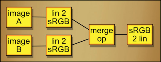
Another case might be that you have a substantial comp built in linear but you need to merge some images in sRGB color space in the middle of it. No problem. The workflow is diagramed in Figure 13.11. The two images A and B to be merged are linear, so the first step is to convert both of them from linear to sRGB colorspace (lin 2 sRGB). From there the required merge op is performed (Screen, Over, etc.) then convert the results from sRGB to linear (sRGB 2 lin).
If you need to view the intermediate results of the merge op, which is sRGB, there are three approaches. First, you could attach a separate sRGB 2 lin operation anywhere you want to view and use your viewer with its sRGB LUT. The second approach is to simply view the results of the final sRGB 2 lin operation. The third option is to connect the merge op to your viewer and disable the viewer’s sRGB LUT. Either way, all three views should appear identical.
Image-blending operations are designed to combine two images directly so no alpha channels are needed or used. The following are typical image-blending operations that will be available in virtually all compositing software packages with the sole exception perhaps of the screen operation. To cover that base the exact setup to build your own screen operation is provided.
The Screen operation was designed to cope with the problem of merging images in the limited dynamic range world of sRGB and rec709, so should not be used when working in linear. The reason it was invented is if you take a lens flare, for example, and add (sum) it with the background there will be a lot of pixels that blow over 1.0 and get clipped. Not pretty. The Screen operation prevents this and offers a rather elegant, inherent soft clip to the results. However, it may look fine but is mathematically incorrect and does not work photorealistically for high dynamic range images in linear. It’s fine if working in all sRGB but not fine for linear. When working in linear the elements that would otherwise be Screened should be Added (Summed) instead, then a soft clip applied to the end results if needed.
The Screen operation is a very elegant and important image-blending op for sRGB work. Perhaps the best way to describe its purpose is when you want to combine the light from one image with another, like a double exposure. One example would be a lens flare. Other examples would be the beam for an energy weapon (ray gun), or adding a glow around a light bulb, fire or explosion. The time to use the screen operation is when the element is a light source that does not itself block light from the background layer. Fog would not be a screen operation candidate because it obscures the background, blocking its light from reaching the camera. Kindly composite your fogs.
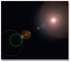
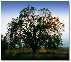
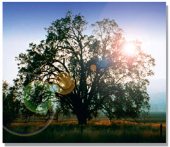
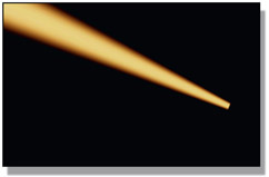
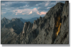
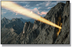
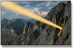
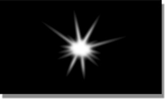
Figure 13.13 shows an example of a lens flare element for screening. One key point about the screen layer is that it is always over a zero-black background. If any of the pixels are not zero black they will end up contaminating the background plate in the finished picture. Figure 13.14 shows the background plate, and Figure 13.15 shows the results of screening the lens flare over the background plate. Notice that the light rays are mixed with, but do not actually block, the background image. The dark pixels in the
background plate behind the hot center of the lens flare may appear blocked, but they are just overexposed like a double exposure of a bright element with a dark element. The bright element dominates, but the dark elements are retained.
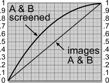
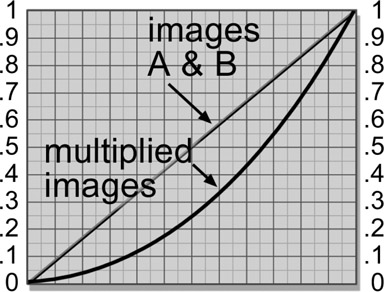
Figure 13.16 illustrates the “double exposure” behavior of the screen operation. It depicts two identical gradients, images A and B, screened together. The key characteristic to note here is how the maximum brightness approaches, but does not exceed 1.0. As the two images get brighter the screened results also get brighter, but at a progressively lesser rate. They become “saturated” as they approach 1.0, but cannot exceed it. When black is screened over any image the image is unchanged, which is why the screen object must be over a zero-black background. But remember, when working in linear use Add instead of Screen.
You cannot “adjust” the screen operation to alter the appearance of the results. It is a hard-wired equation somewhat like multiplying two images together. If you want the screened element to appear brighter, dimmer, or a different color, then simply color grade it appropriately before the screen operation. Again, be careful that none of your color grading operations disturb the zero-black pixels that surround the light element, because any black pixel values raised above zero will end up fogging up the output image.
Some compositing programs actually have a screen op, but for those of you not so blessed we will see how to use either your channel math node or discrete nodes to create the perfect screen operation. But first, the math. Following is the screen operation equation:
| Equation 13.1 |
In plain English it says “multiply the complement of image A by the complement of image B, then take the complement of the results”. In mathematics the complement of a number is simply one minus the number. In this case it is one minus the image. Again, note that there is no matte channel in a screen operation. It just combines the two images based on the equation. This equation can be entered into a channel math node to create your own screen node.

Figure 13.17
Flowgraph of discrete nodes for building a screen operation
In the event that you do not own a math node or don’t want to use the one you do have, Figure 13.17 shows the flowgraph to “roll your own” screen operation using simple discrete nodes in your compositing software. The screen element is first color-corrected if needed, then both images are inverted (some software may call this operation “negate”). They are then multiplied together and the results inverted. That’s all there is to it. You can build this into a macro and save it out as your own personal screen op. You could even share it with your colleagues. Or not.
A composite blocks the background layer, and the screen operation doesn’t. There are times, however, when you would like to have the “glow” of the screen operation, but still suppress the background layer a bit. This is the time to use the weighted screen operation. The idea is to create a matte for the screen element (the light source) and use it to partially suppress the background layer prior to the screen operation. The matte can be generated any number of ways. Most commonly it is a luminance version of the screen object itself, or perhaps the alpha channel in the case of a CGI element. However it is done, a matte is needed for the weighted screen.
We can compare the results of a regular screen operation vs. the weighted screen operation starting with Figure 13.18, the screen element. Comparing the two background plates in Figure 13.19 and Figure 13.21, you can see the dark region where the screen element was used as its own matte to partially suppress the background layer by scaling it towards black. Comparing the final results in Figure 13.20 and Figure 13.22, the normally screened image looks thin and hot, while the weighted screen has greater density and saturation. While the weighted screen is more opaque, this is not a simple difference in transparency. A semi-transparent composite would have resulted in a loss of contrast for both layers.
The only difference between the two results is that the background plate was partially scaled towards black using the screen element itself as a mask prior to the screen operation. The increased opacity results from darkening the background so that less of its detail shows through, and the darker appearance of the final result stems from the screen element being laid over a darker picture. It’s a different look. And of course, as explained in the previous section, the screen element itself can be increased or decreased in brightness to adjust its appearance even further.
The flowgraph for the weighted screen operation is shown in Figure 13.23. The screen element is used to create a mask to moderate the scale RGB operation that darkens the BG layer. The screen mask could be generated any number of ways, such as making a simple luminance version of the screen element. The screen element is then color-corrected if needed, then screened with the scaled background image.
WWW sRGB Screen ops – this folder contains the screen element and original BG used in Figures 13.18 & 13.19 above, so you can try screening them in both linear and sRGB color space. There are also completed versions for linear and sRGB that you can compare your results to. As an additional challenge you could try the weighted screen technique too.
The multiply operation simply multiplies two images together and is another “matte free” way of combining two images. Like the screen operation it simply mixes two images together mathematically without regard to which is “on top”. The multiply operation is analogous to “projecting” one image over the other, somewhat like putting a picture in a slide projector and projecting it over some object in the room. Of course, if you really did project a slide onto some object the projected image would appear quite dark because it’s not projecting it on a nice white reflective screen, but some darker, poorly reflective and probably colored surface. The multiply op is a simulation of that.

Figure 13.26
Multiplied layers
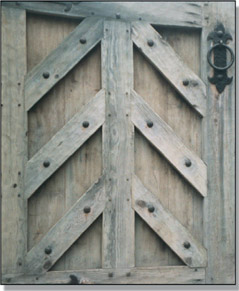
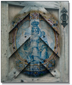
Figure 13.24 and Figure 13.25 show an example of two images for multiplying. The ceramic tile painting in Figure 13.25 is surrounded by a 100% white border in order to leave the wooden gate unmodified in this region. With a multiply operation any 100% white pixels in one layer will leave the other layer unmodified. This is because the white pixels are treated as 1.0, and one times any pixel value results in the original pixel value. Note that the multiplied results are darker than either original layer, as we would expect from “projecting” a slide on a less-than-100% white surface. We will deal with this issue momentarily.
While the results of the screen operation universally lighten the images, the results of the multiply operation universally darken. The reason for this can be understood by taking an example. If you multiply 0.5 by 0.5 you get 0.25, a much smaller number. And so it is with all of the numbers between zero and 1.0.
Figure 13.27 illustrates two identical gradient images A and B multiplied together and the resulting darker image. It is actually a diagonally mirrored version of the screen operation graph in Figure 13.16. You could even think of the screen operation as an “inverted multiply” which results in a brighter output, where the regular multiply results in a darker output.
Like the screen operation, you cannot “adjust” the multiply operation. The two images are multiplied together and that’s it. But, like the screen operation, you can pre-adjust the images for better results. Normally you will want to brighten up the results, so the mission is to brighten the “foreground” layer prior to the multiply. Although neither image is really the foreground or background, I am using that convention here to help tell the story. The key to this foreground brightening is that no matter how much it is brightened it has to end up on a 100% white surround. So the foreground brightening must be done before the white surround.
The procedure is shown in the Figure 13.28 flowgraph. Starting with the ceramic tile painting in Figure 13.25 as the foreground image (FG) it is first brightened (gain) then masked (mask) to clear the surround. It is then composited over a 100% white background (over white). This setup allows the FG to be brightened as much as desired without affecting the white surround. Once prepped, it is multiplied (mult) with the background (BG).

Figure 13.29
Increasing the brightness of the multiply results
Figure 13.29 shows four different brightness settings for the gain operation in the flow-graph. The first one on the left is the original with no change, then the gain is increased towards the right. To be honest, a little gamma down was also added to punch up the contrast for aesthetic reasons. But the point remains that with this workflow you can increase the brightness of the otherwise darkening multiply operation with total control. This will only work in float as an 8- or 16-bit integer system would clip the FG brightness long before reaching the brightest version on the right.
WWW Multiply – this folder contains the door and tile painting used in this section. Try your hand at increasing the brightness of the multiply results using the techniques shown here.
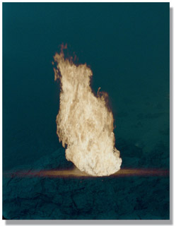
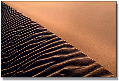
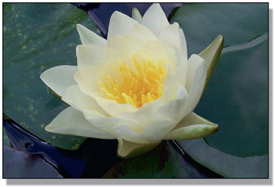
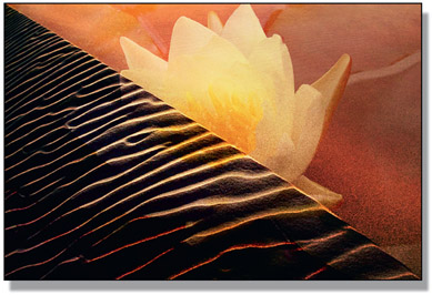
Another “matte-less” image-combining technique is the maximum operation. The maximum op is given two input images and it compares them on a pixel-by-pixel basis. Whichever pixel is the maximum, or brightest, between the two images becomes the output. While commonly used to combine mattes, here we will use it to combine two color images. Who among us has not tried to composite a live action fire or explosion element over a background only to be vexed by dark edges? The fire element is in fact a poor source of its own matte.
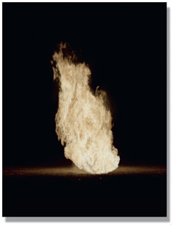
The virtues of the maximum operation are that it does not need a matte and it usually produces very nice edges. The problem with the maximum operation is that it requires very specific circumstances to be useful. Specifically, the item of interest must not only be a bright element on a dark background, but that dark background must be darker than the target image that it is to be combined with. The basic setup can be seen starting with the fireball in Figure 13.30.
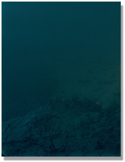
The fireball is on a dark background and the target image in Figure 13.31 is also a dark plate. When the two images are “max’d” together in Figure 13.32 the fireball comes “through” the target image wherever its pixels are brighter. Since there is no matte there are no matte lines, and even subtle detail such as the glow around the bottom of the fireball is preserved.
One problem that you can have with the maximum operation is that there might be internal dark regions within the fireball that will become “holes” through which the target image can be seen peeking through. To fix this, a luminance matte can be generated from the fireball, then eroded to pull it well inside the edges. The original fireball can then be composited over the max’d image (Figure 13.32) to fill-in the interior, somewhat similar to the soft comp/hard comp procedure we saw in Chapter 6, The Composite. What you end up with is the nice edges of the maximum operation and the solid core of the composite operation.
The appropriate use for this operation is when the “hot” element is live action where you have no control over its appearance. If it is CGI or a painted element then you do have control and can have the hot element placed over zero black for a screen operation or generate a matte for compositing. With a live action element you have to take what you are given and make it work.
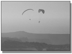
The minimum operation is, not surprisingly, the opposite of the maximum. When presented with two input images it selects the darkest pixel between them as the output. While this may not sound very exciting, it can occasionally be very useful as another “matte-less” compositing technique. The setup for the maximum operation is that the item of interest is a dark element on a light background and the target image is also light – just the opposite of the setup for the maximum operation.
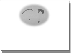
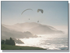
Take, for example, the paragliders in Figure 13.33. They are fairly dark, and the sky is fairly light, but there are dark regions near the bottom of the screen. To solve this little problem the plate has been masked with a white surround in Figure 13.34. With the minimum operation the white surround becomes the “no change” region that will not come through the target plate. The masked version is then “min’d” with a background plate to produce the very nice “composite” in Figure 13.35. No keys, no edges, nothing but a great comp.
Of course, the minimum operation suffers from all the same limitations as the maximum operation in that you must have suitable elements, you may have to pull a matte to fill in the core, and you may have to mask the item of interest to clear the surround. However, when it works it can be a very elegant solution to a tough problem.
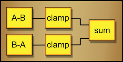
The absolute difference operation is not intended for blending two images together for a shot but rather to be used as a “diagnostic” operation for confirming the integrity of a composite. Given two photographic images A and B, if one is subtracted from the other there will be a mix of both positive and negative code values in the results but the negative code values will be displayed as black in the viewer. With the absolute difference the negative code values are simply flipped positive so all the differences are positive and made visible.
Figure 13.36 illustrates the workflow. The absolute difference is taken between the original background plate and the final comp, with the resulting absolute difference shown on the right. If the comp is properly done the background plate is unaltered in the comp so the difference between the original background and the comp will be zero, or black. If the background has been altered in some way it will show up as contamination in the background’s black region like the results in Figure 13.36.
If your software does not have an absolute difference op you can make one. For the math fans the expression for images A and B would be:
If you would rather roll your own the flow-graph in Figure 13.37 shows you how.
In many visual effects studios there will be an art-director type that will invariably use Adobe Photoshop to prepare test composites with a variety of “looks” for the clients’ selection and approval (look development or “look dev”). The Photoshop artist might even create elements that the compositor will actually use in the shot, up to and including a matte painting that is the basis for the entire shot. When finally approved, the finished Photoshop test image will be handed to you as a reference for matching. Of course, the Photoshop artist will have used several clever and subtle Photoshop blending modes to add the smoke, snow, clouds, and lighting effects, all the while oblivious to the fact that you may have no such matching operations in your compositing package. Tough pixels – you have to make your composite match anyway.
Wouldn’t it be grand if your compositing program had matching operations to the Adobe Photoshop blending modes? Well, for the most part, it can. In this section we will look at how several of the most important Photoshop blending modes work and how you can replicate them in your compositing software. Photoshop has many blend modes but we will only concern ourselves with the seven most useful ones (a real artist would not actually use the “Pin Light” blending mode). The good news is that four of the seven are very simple, and, of course, the bad news is that three of them aren’t. They will require the entry of an equation into a math node that supports two input images. It isn’t practical to construct these more complex blending modes from discreet nodes such as multiply and screen because it takes a hideous mess of nodes. Better to “byte” the bullet and do the math.
Here are the first four easy ones. Note that these operations are “symmetrical” (“commutative” in mathematics), which means you can swap the two input images on the blending node and it will not affect the results. All four of these operations were described above in Section 13.3: Image-blending Operations but are listed again here to collect the list of Photoshop operations all in one place for handy reference.
Screen – this is the same screen operation that was discussed back in Section 13.3.1 above. Oddly, both we and they use the same name for this operation.
Multiply – their multiply is the same as our multiply, which was covered in Section 13.3.3 above.
Lighten – this is actually just our “maximum” operation by another name. It was discussed in Section 13.3.4 above.
Darken – another of our operations by another name, this is actually the “minimum” operation described in Section 13.3.5 above.
Here are the three complex Adobe Photoshop blending modes. Note that these operations are NOT symmetrical, which means that if you swap the inputs the results will not match the examples. If you should forget this critical fact you will be severely punished by a cruel and unyielding universe.
Photoshop refers to the “blend” and “base” layers, but in keeping with our traditional compositing nomenclature where we refer to compositing image A over image B, let us refer to the blend layer as “A” and the base layer as “B”. This makes it easy to remember because in the Photoshop palette the blend layer (A) is “over” the base layer (B). If we wanted to say, for example, “take the complement of the base layer (B) then multiply that by the blend layer (A)” we would write such an equation thusly:
You, however, must convert these general image equations into specific channel equations for your software’s channel math node. Your math node will not be referring to image A and B, but rather to the color channels of input images 1 and 2. Assuming A is connected to the image 1 input and B is connected to the image 2 input of the math node, the image equation above ((1 – B) * A) might be entered into a mythical math node as three channel equations that look something like this:
R channel out (1 – r2) × r1
G channel out (1 – g2) × g1
B channel out (1 – b2) × b1
where r2 is the red channel of image 2 (our B image) and r1 is the red channel of image 1 (our A image) and so on. One further issue is the syntax used by your particular math node. While virtually everybody uses “*” for multiply and “+” for addition, there are differences for more complex operations such as square root and “if/then” statements, so don’t try to copy the equations written here literally. They are all written in “pseudo-code” as a template that you must convert to the syntax of your particular math node.
The following blending mode examples use the blend layer and base layer shown in Figure 13.38 and Figure 13.39 and the results shown were done in sRGB as we are typically trying to match work done in Photoshop. Linear results will, of course, look different.
Overlay – the overlay operation actually changes its behavior depending on the pixel values of the base layer color. If the base color pixel is less than 0.5 a multiply operation is done. If it is more than 0.5 it switches to a screen type of operation.
| Equation 13.2 |
Hard Light – the hard light operation changes its behavior depending on the pixel values of the blend layer color. If the blend color pixel is less than 0.5 a multiply operation is done. If it is more than 0.5 it switches to a screen type of operation.
| Equation 13.3 |
You may have noticed that the hard light equation looks very like the overlay equation above. In fact, the only difference is which image the test for less than 0.5 is done on. This actually means that you can take an overlay equipped math node and just switch the input images to get the hard light – but don’t tell anybody.
Soft Light – the soft light operation also changes its behavior depending on the blend layer color. It’s visual results are similar to the overlay operation, but its Byzantine equation is much more complex.
| Equation 13.4 |
Someone at Adobe stayed up very late cooking this one up. Actually, Adobe does not publish its internal math equations, so they have been reverse engineered by various clever people. In fact, the soft light equation above is actually slightly off in the very darks, but is very close. You can get the rundown on this and all the other Photoshop blending modes on a wonderful website by a little German software company at:
WWW Photoshop Blends – this folder contains the blend and base layers used in the section above so that you can try building the Photoshop Blend ops with your compositing software.
Visual effects often require either the speed or the length of a clip to be changed using a Retimer. Speed changes can either be a constant, such as running at 50% speed, or variable, where the speed of the clip is changed with some kind of animation curve. The variable speed changes can be a bit confusing until you become clear on how the speed curve affects the overall length of the shot. But the big issue is the interpolation methods – the method of computing the in-between frames. It is important to understand how they work, when to use them, and what artifacts they will introduce. Speed changes landed in this chapter because they are actually all about image blending.
The notion of a constant speed change is that the amount of speed change is constant over the length of the shot – for example, a 20% speed-up of a shot. There are two different ways that the desired speed might be specified. First is the obvious one where the new speed is declared as a constant value relative to the original clip, such as declaring the new speed will be 50% of the original clip for a slow down, or 150% for a speed up. The question this raises is what will be the length of the new clip? When a clip is slowed it obviously will get longer and when sped up it will get shorter. Sometimes this clip length change will limit or even dictate the speed change.
A second method of declaring a speed change is what may be called the “in/out” method because you are selecting in and out points in the clip. In some cases the issue may not necessarily be the new speed but what frames are to be used because they contain the desired action. Let’s say you have a 100-frame timeline and a 100-frame clip but only want to use frames 17 to 91 from the clip. The Retimer needs to be told to start with clip frame 17 on timeline frame 1 and end with clip frame 91 at timeline frame 100. By declaring the in and out frames to use, the Retimer will calculate the necessary speed change to fit the clip into the timeline. Selecting frames 17 to 91 uses only 75 clip frames over 100 timeline frames resulting in a calculated speed change of (100 / 75 =) 0.75 or 75% for a slowdown. And simply declaring a 75% slowdown will not tell the Retimer to start on frame 17. Setting in and out points covers both specifications.
The next question is the motion blur, or shutter setting. The original clip will have motion blur baked into it from the camera during principal photography. With a speed change there should be a matching motion blur change – slower speed with less motion blur, faster speed more. Sophisticated Retimers will offer shutter controls to set the new motion blur.
For variable speed changes a speed curve is used to map the clip frames to the timeline, which gives total control of the speed changes over the length of the shot. You can think of it as a “temporal LUT”. How it affects the frames used may be a bit strange at first but the following illustrations of speed change curves from Nuke may help.
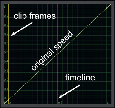
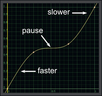
Figure 13.48 shows the general layout of speed curve controls. The vertical axis on the left is for the clip frames where 0 is the first frame and 1 is the last frame of the clip. The horizontal axis at the bottom is for the timeline frames where 0 is the first frame and 1 is the last frame. The default speed curve shown would map all of the clip frames to all of the timeline frames resulting in the original speed. Note that the slope of the speed curve is 1:1 so it is a “no change” curve.
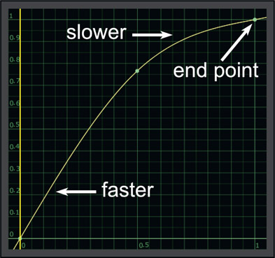
Figure 13.49 illustrates the effect of the slope of the speed curve on the playback speed. Where the line slope is steeper than 1:1 the clip plays faster and where it is shallower the clip plays slower. The length of the clip is unchanged because the speed curve end points are at 0,0 and 1,1 – which maps the first and last frames of the clip to the first and last frames of the timeline. Only the in-between frames are affected.
Let’s say we want to do that classic speed change gag where the action pauses at a key point for visual impact then resumes speed. The speed curve for that is shown in Figure 13.50. The pause in the action is where the speed curve is horizontal as that represents zero speed. However, this has also introduced some velocity changes that we didn’t want, namely the clip moves faster at the beginning of the shot and slower at the end. The length of the shot is unchanged because the end points are still at 0,0 and 1,1 as before.
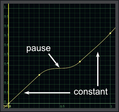
The solution to the unwanted speed changes is shown in Figure 13.51 where the control points have been adjusted to preserve a constant speed at the head of the shot, then the pause, then a constant speed at the end of the shot. However, the end point is no longer at 1,1 but now it’s at 1,0.74, which means we are now using only 74% of the frames of the clip. This makes sense because if we keep the rest of the speed constant but pause in the middle while keeping the timeline the same length then we must be using less frames than before. If we need to use all of the frames then the length of the timeline will have to be increased.
So here is the image-blending part – Retimers use three basic technologies for interpolating the new frames for a speed change, each with its own quality, compute speed, and of course, artifacts. Here we will look at all three interpolation methods along with their strengths and weaknesses, as well as suggestions on when to use which method. The demo clip is shown in Figure 13.52 where a 10-frame clip will be retimed to stretch to a 16-frame timeline. The top row shows the original clip with the clip frame numbers and the timeline frame numbers, while the second row shows the retimed clip.

Figure 13.52
Speed change a 10-frame clip into a 16-frame timeline
The fun starts in the second row where the clip frames are being remapped to the time-line frames. In the original clip (top row), clip frame 2 is mapped to timeline frame 2 and so on. But the speed-changed clip in the second row shows, for example, clip frame 1.6 is mapped to timeline frame 2. But what does that even mean? And how do we make it happen? And how do we make it look nice?
The nearest neighbor interpolation simply grabs the nearest whole frame to the interpolated frame number. It’s really a temporal impulse filter. For example, in the retimed clip (second row) timeline frame 2 gets clip frame 1.6. The nearest neighbor interpolation will simply jump to clip frame 2, the nearest whole frame to 1.6. Here is a table of what the output clip would look like for the 16 frames of the timeline using nearest neighbor interpolation:
Suffice it to say that when the retimed clip is played back the motion would be jerky as it stumbled and jerked from frame to frame. Poor quality would be its weakness. Its strength is that it is computationally cheap – in fact, free – as there is no actual frame interpolation being done. From a practical production standpoint there is almost no situation where using nearest neighbor interpolation would deliver a good shot. However, because of its fastness to compute it is useful for testing the timing of a speed change until it looks right, then switch to a more effective interpolation scheme for the delivered shot. You might think of it as a temporal proxy.
Table 13.1

Frame averaging is the next step up in quality, but it is a small step. Frame averaging is effectively a “rolling cross-dissolve” between adjacent frames to achieve the speed change. Using timeline frame 2 of the retimed clip again with its interpolated value of 1.6, the retimed frame would be 40% of clip frame 1 cross-dissolved with 60% of clip frame 2. Here is the table to give you an idea of how that would be computed for the first 5 frames:
Table 13.2

Figure 13.53 shows what timeline frame 5 would look like as a frame average with 60% of frame 3 plus 40% of frame 4. Not very nice, but it would flow a bit smoother than the nearest neighbor interpolation. The weakness of this interpolation method is the poor results, and the strength is the compute speed as it is a very cheap compute. Having said that, frame averaging can be useful when the action is fairly slow. The dissolving between frames becomes less objectionable the slower the action is and it can even look downright good in some situations.
You may have noticed in Figure 13.52 that the interpolated frame value is a whole number for timeline frames 1, 6, 11, and 16. What that means is that on those frames the frame averaging returns a single crisp, clean frame, but on all the other frames they are a blurry cross-dissolve like Figure 13.53. When this is played at speed the sharp frames would stand out from the blurry frames with sort of a throb-bing effect that would degrade the overall appeal of the shot. This could be avoided if the Retimer was cleverly designed to avoid whole frames by, for example, shifting the entire clip timing half a frame left or right. For example, timeline frame 1 becomes 50% frame 1 plus 50% frame 2, rather than 100% of frame 1.
Motion estimation (optical flow) is the highest quality of all the interpolation schemes and can produce truly amazing results. The frames are divided into small blocks then very sophisticated algorithms analyze each frame of the clip producing “motion vectors” that indicate which way the small blocks of the image are moving from frame to frame. The pixels are then moved along the motion vectors’ path an appropriate fraction of the distance in order to create the new interpolated frame. Motion estimation can also be used to alter the motion blur along with the speed change.
Figure 13.54 shows the motion vectors from the analysis stage of a motion analysis process. The motion vectors for each block have both a direction and length with the length indicating the speed of the local pixels. Static pixels have vectors of zero length and show up as just a dot on the screen. The results are truly spectacular, as demonstrated by comparing the same interpolated frame from motion estimation (Figure 13.55) to frame averaging in Figure 13.56. Since the pixels are being shifted to their new in-between locations there are no “double exposure” frames like frame averaging. And because the interpolated frames are a bit softer than the original frames, well-designed Retimers offset the clip by half a frame to avoid the periodic sharper frames from an integer interpolation introducing the throbbing mentioned above.
Motion estimation is computationally expensive so I recommend that you run timing tests using the much-faster nearest neighbor or frame-averaging interpolation schemes until you are certain you have everything set up correctly. After everything looks good switch to motion estimation for the final pass and render the speed-changed clip to disk. The new speed-changed clip is then used as the input clip for the shot, to avoid having to run the motion estimation again and again.
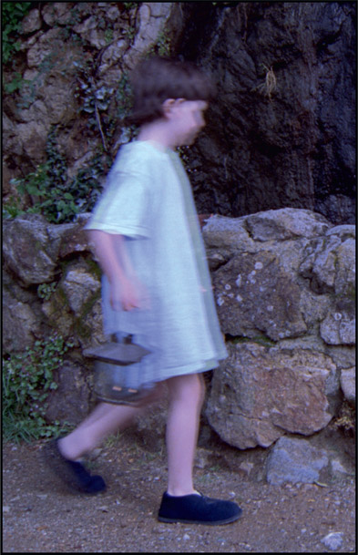
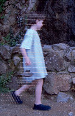
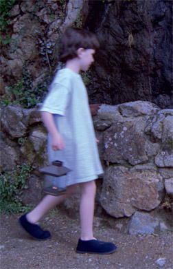
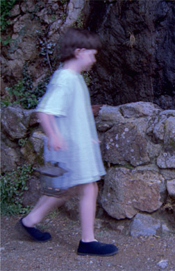
Now for the bad news. Motion estimation often introduces artifacts that have to be cleaned up either with paint or compositing techniques. The basic problem stems from a foreground object moving in front of a background such as the boy moving in front of the rock wall in the pictures above. It results in the moving object pulling on the background at the moving edge, stretching it until it snaps back as the foreground object passes. When using motion estimation Retimers be prepared for some artifact repair before releasing the shot. Sophisticated Retimers will allow you to mask off the foreground object to prevent this, but then you have added the onerous task of rotoscoping the character for the entire shot. Pick your poison – roto or repair.
WWW Speed Change – this folder contains 60 frames from the clip used in this section for you to try your Retimer on. Most important is to use a motion analysis (optical flow) type of Retimer to see the artifacts.
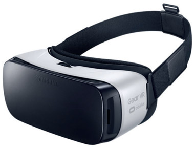
VR (Virtual Reality) is defined as a realistic immersive simulation of a three-dimensional environment generated by a computer, and controlled by movements of the body. Beyond its entertainment value, VR has found its way into industry, education, and scientific research as a valuable adjunct to more-limited displays and controls such as monitors, keyboards and mice. VR is viewed through a Head-Mounted Display (HMD) equipped with motion sensors (Figure 13.57) to feed head movements back to the computer, which responds by matching the projected scene orientation to the viewer’s head direction. While VR has found a number of novel markets it is struggling to find its role in narrative storytelling – i.e. movies. However, a lot of compositors are hired for creating VR footage, so here we go.
There are two different classes of VR – game engine based and cinematic. Game engine based VR consists of 3D worlds generated in real-time by powerful game engines that players can walk through and interact with the virtual inhabitants. That is not what this section is about. It is about cinematic VR, which is live action captured with a 360-degree camera array that films a scene in all directions at once. The multiple camera clips are then integrated and projected onto the interior of a sphere where the viewer can then look around in any direction to see the action. Cinematic VR only allows the viewer to move through the virtual world if the original footage was captured with a moving camera rig. This section is about how to create cinematic VR that has been shot by a 360-camera array in a processes called “stitching”. Here is the entire concept behind cinematic VR; imagine you are standing in a location – a city street, a covered sports stadium, the middle of the desert – and are looking around in all directions without moving. If you took 360 degrees of pictures, then projected them inside a large sphere and stood at the center of that sphere looking around in all directions without moving, it would appear identical to the original physical location. All the issues involved with VR stitching are the practical issues of doing this without distortion or misalignment. As compositors, our job starts after the principal photography, where the footage from the various cameras are re-projected, aligned, color corrected, and merged into a single image for VR viewing.
The short form of the story of how to prepare a VR clip is illustrated in Figure 13.58. A 360-degree camera rig is placed in the scene with cameras aimed in all directions (see Camera capture). Next, a 3D model of the original rig is built and each camera clip is projected onto the interior of a sphere (see Spherical projection). The spherical projections are then “stitched” together then “peeled” off the sphere as a LatLong image (see LatLong image). It is this LatLong image that is used by the VR display equipment to project the scene for the viewer. In this section we will walk through the entire workflow of creating the VR viewable LatLong image from the original camera footage.
As this is a software-agnostic book we will see what to do, but not how to do it, as how to do it is software-dependent. For example, we will talk about removing lens distortion but cannot tell you how to remove it with your software. The entire process will be described in terms of using generic compositing software rather than any of the many specialty “stitching” software packages available today – although dedicated stitching software will make it faster and easier to do the work, it is an extra expense.
This understanding of how to prepare VR images will be very helpful even if using dedicated stitching software, and of course, you can use this information to build VR images directly using any general compositing software such as Nuke, Digital Fusion, or After Effects without purchasing specialized stitching software at all. For this type of work the compositing software must be able to do camera projections to the inside of a sphere (spherical projection), then unwrap that sphere to produce a LatLong image. Beyond that, all the operations herein are generic for visual effects compositing.
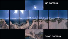
360-degree camera rigs (aka spherical cameras, omnidirectional cameras, VR cameras) that are used to film VR come in a wide variety of configurations with cameras pointing in all directions, including up and down cameras to capture sky and ground (Figure 13.59). Some have many cameras with flat lenses and others have few cameras with fisheye lenses, both of which provide overlapping coverage. Many of the cameras are actually mounted sideways so that their wide fields-of-view cover top to bottom more than left to right, since the left to right coverage is managed by overlapping multiple cameras.
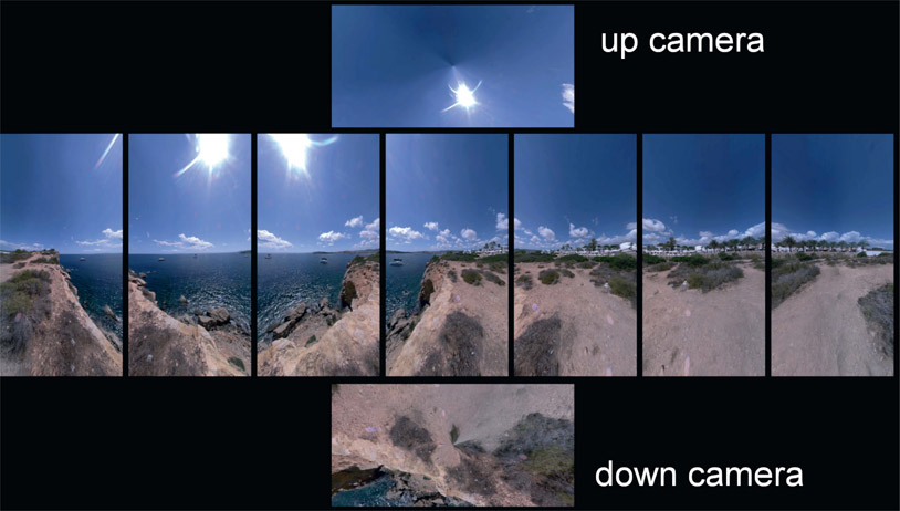
Here we will walk through the complete stitching workflow for creating a LatLong (aka equirectilinear, equirectangular) image suitable for VR viewing from the raw camera clips of a 360 camera rig. Figure 13.60 shows a typical set of clips from such a rig. In this example there were 7 cameras equally spaced around a horizontal ring plus an up camera to shoot the sky and a down camera to shoot the ground. Ideally, the camera views will overlap by 20–30% or more. This is necessary to provide sufficient overlap in shared features between the views so that features can be lined up to stitch the views into a single image. Note that the clips are much taller than they are wide. Because the cameras are often laid on their sides in order to get more top-to-bottom coverage don’t be surprised to see all of the clips laying sideways when you first open them.
The very first step is careful database management because there are a lot of moving parts to building a VR shot. Make certain you have the images correctly sorted and labeled as to which camera they came from, frame counts, formats, plus camera and lens information – if provided.

Figure 13.60 Raw camera pictures from a 360-degree VR camera array
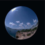
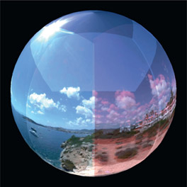
A quick overview of the entire workflow would be to first remove the lens distortion from all of the raw camera clips (Figure 13.61) which we will refer to as “lens corrected” clips which are now rectilinear images (all straight lines). Next, a 3D model of the original 360-degree camera rig is built and the lens corrected clips are projected through the 3D rig model onto the interior of a sphere to make a spherical panorama like the example in Figure 13.62. We will call this panorama sphere the “panosphere”. If the lens correction was perfect and the 3D camera model was exact the projected images would all line up perfectly. Never going to happen, but it’s a nice thought.
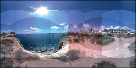
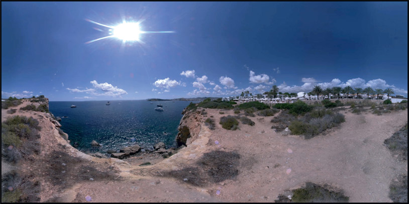
The spherically projected images are then color corrected so that they all match each other for exposure and color. The refined spherical panorama is then “peeled” off the panosphere to a format called a LatLong image (Latitude, Longitude) like Figure 13.63. At the user end this LatLong image is projected onto the interior of a sphere to be viewed through the Head-Mounted Display (HMD) to thrill the VR viewer.
Stitching software can be purchased that provides customized tools and convenient spatial transformations between the various views (rectilinear, spherical, LatLong) to facilitate the alignment and color correction of all the different camera clips into a seamless LatLong map ready for VR viewing. Again, if the lens correction and 3D camera rig were a perfect match to the original camera rig then there would be no need for stitching as all of the pieces would fall together and line up perfectly. Of course, that will never happen, but the better the lens correction and more accurate the 3D rig model, the less warping and distorting will be needed to stitch the LatLong map together.
There are two classes of problems to be addressed when stitching the LatLong map together – geometric problems and imaging problems. Geometric problems refer to the shape and position of the images and are caused by lens distortion and camera mis-alignment. Imaging problems stem from variations between camera imaging systems and include exposure, vignetting, image sensor variations, focus, and depth of field. Here, then, are the steps for creating your own LatLong map ready for VR viewing.
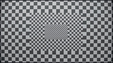
The first step on the long path to the final LatLong image is to remove the lens distortion from the captured images shown in Figure 13.60. We are hoping that all of the cameras use an identical lens so that one lens distortion map fits all. Ideally, a representative camera will be used to shoot a camera lens chart like the example in Figure 13.64.You really do not want to try to get the lens distortion information from the camera footage as it will often not contain a sufficient number of features for the lens analysis software to do an accurate job.
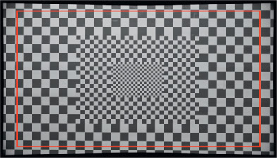
Important tip – don’t let your lens-correction software trim away the corners of the undistorted plates as they contain useful information that will help with registration and lineup. Figure 13.65 shows an undistorted lens chart with a red outline showing the original image frame. You can see how much outlying image information would be discarded if trimmed away. Every pixel counts. Also, if there is any noticeable chromatic aberration in the camera clips this is the time to fix it. If you are unsure how to do this you will find it covered in Chapter 11: Camera Effects.
This is the gnarly part of the stitching problem. The lens-corrected camera plates must be projected through a matching 3D camera rig in order to be accurately projected onto the interior of the panosphere. If using generic compositing software you can model the original camera rig in 3D by taking dimensions off the original rig. One of the virtues of using dedicated stitching software is that it builds a 3D camera model for you based on an analysis of the camera footage.
It helps if your computer model is set up with real-world units of measure that match the original camera rig. If the original rig is 0.7 meters in diameter then set the CG world units to meters and size the 3D rig to 0.7 units. There are two advantages to this. First, all subsequent measurements in the scene will also be in real-world units. Second, it is easier to spot that something is amiss. If an object is supposed to be 3 meters from the camera but the CG units read 0.012728 it’s hard to know if it is right or not.
The 3D rig must be an accurate replica of the original camera rig to avoid massive alignment problems during stitching. This means accounting for each and every camera’s individual position and orientation. Assuming that the entire rig is perfectly symmetrical and all cameras are correctly aligned would be a mistake. One camera may be mounted a bit crooked and another one has a stripped mounting screw from an overzealous camera tech. The best solution is to shoot a “rig chart” which is analogous to the lens chart for the lens.
The idea is to take the original rig into a room that is rich with fixed feature details on each wall, ceiling and floor. Ideally it would be wallpapered and carpeted with a checkerboard pattern, but that may be asking too much. Such a rig chart would then be used to “characterize” the rig so that an accurate 3D rig model can be built. We can call this characterized rig the “rig template” which we can re-use to line up the real shot. We can only hope that the original rig did not get bumped or a camera replaced before the shoot, which could knock something out of alignment relative to the rig template.
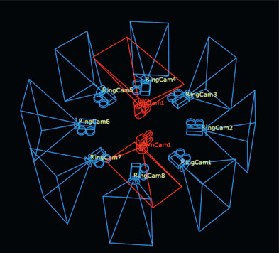
Figure 13.66 illustrates what you might see with a finished 3D rig model. The blue ring of cameras match the original rig in size, position, and orientation, with the red “up camera” and “down camera” completing the coverage. Note that the cameras are on their sides like the original rig in order to get the tall, thin images. Figure 13.67 is a top view of the rig showing the camera frustums (fields of view). The key point here is that the geometry of the camera rig means that the fields of view do not overlap until you get a certain minimum distance from the cameras, as marked by the red ring. As objects in the scene get closer to the rig the amount of overlap shrinks until you do not have enough to stitch. Also, the closer an object gets to the cameras the greater the difference in parallax between two cameras on the same object, which further complicates stitching. If the object gets too close to the cameras the parallax can become so severe that heroic repair efforts are required on the part of the compositor to fix the footage, resulting in costly budget and schedule overruns. More about parallax shortly.
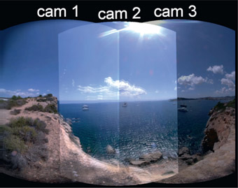
This is the process of projecting the lens corrected clips onto the interior of the pano-sphere using the accurately modeled 3D rig with their overlapping regions. Any errors in the lens distortion or rig model will result in misaligned overlapping regions, which results in “ghosting” caused by a double-exposure. Each lens-corrected clip is projected onto the interior of the panosphere and takes on the spherical distortion like cam 1 illustrated in Figure 13.68. Note that the cam 1 plate also has some vignetting in the upper and lower left corners.

Figure 13.70
Cameras 1, 2 and 3 overlapped with plus operation
A second spherically projected camera plate is merged with an “Add” operation to cam 1 in Figure 13.69. The Add operation was used here to make the overlap region brighter and easy to see. Unfortunately, cam 2 is somewhat rotated and shifted down a bit, resulting in a double-exposure or ghosting in the cloud and on the ground. Notice that this camera rig has an excellent overlap of perhaps 40% of the frame. A good-sized overlap like this is essential so that the stitching software (or you) can find many matching features to use for alignment.
Figure 13.70 shows a third camera plate added to the first two, but it is darker due to the exposure being inconsistent between the cameras. It will have to be gained up to correct the exposure. All of these issues will need to be corrected before the final LatLong image can be produced. The remaining raw camera images are projected onto the panosphere until it is completely covered like Figure 13.71. Once all of the 3D projection cameras have their images projected onto the interior of the panosphere it is “unwrapped” so that we get the raw LatLong map shown in Figure 13.72. Exactly how this is done varies from software package to software package, but either way we need to transform the spherical projection into a LatLong image.
Now that the projection phase is done we are ready for the “stitching” process, which is the process of precisely aligning the overlapping regions of the spherically projected clips. The ultimate objective is to produce the LatLong image shown in Figure 13.72 with all alignment errors corrected and covering 360 degrees around the “equator” and 180 degrees pole to pole. Alignment errors are caused by errors in size, shape, or position of the spherically projected camera plates. They stem from a mismatch between the 3D rig model and the physical rig, such as misaligned cameras – again, assuming accurate lens correction. There are two approaches to fixing these. The rig model can be adjusted to, for example, correct the camera roll that caused the rotation of the image for cam 2 in Figure 13.69. Alternately, the rig can be left as is and the projected image itself rotated to correct it.
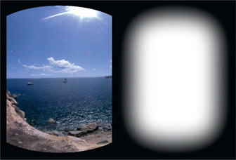
Image warping is the “fudge factor” that is used to align the images for either geometric or lens distortion problems. Of course, given accurate lens correction and 3D rig modeling the spherically projected images will line up perfectly in their overlap regions without warping. However, in the real world there will always be errors, so warping to match the features in the overlap regions will normally be needed. Each camera projection is given a very soft-edged mask in the alpha channel, like the example in Figure 13.73, to allow for a very soft transition between camera clips. The raw LatLong image in Figure 13.72 now looks like the example in Figure 13.74 – all lined up and ready for exposure correction.
Stitching the camera projection panels together, whether by hand or using dedicated software, can be hampered by several different types of problematic image content.
Featureless image content such as a clear blue sky provides no reference points for feature matching. Repeating patterns such as a brick wall become confusable as to which features to match. Specular highlights are misleading because they shift position based on the viewing angle of each camera so are not reliable feature matches. Lens flares are another problem, as they too change appearance based on the viewing angle between cameras. These viewing-angle-dependent problems often have to be completely removed from one view to avoid conflict. After all the feature matching has been done there often needs to be a global horizon line correction. Yet another source of trouble with the footage can be frame sync. If all of the shutters are not perfectly synchronized there may have to be temporal adjustments to one or more of the camera clips to sync it with the main group.
There is an intrinsic problem with 360-degree camera rigs in that they introduce parallax into the different views. To understand parallax, pick a target on a wall on the other side of the room and hold your thumb up in front of it. Now focus on the wall target and close one eye then the other to see how the foreground object – your thumb – hops left and right. That is parallax – the horizontal shift in position of foreground objects relative to the background, due to a shift in the point of view.
As we have seen, building the LatLong map requires overlapping regions in the different camera views for alignment, to stitch them together. The nodal points (lens optical centers) of the cameras that capture these views are invariably separated by a few inches so the overlap regions are seen from slightly different points of view, introducing the parallax in those overlap regions. When the overlap regions are stitched together there will be a double exposure of near-camera objects due to this parallax.
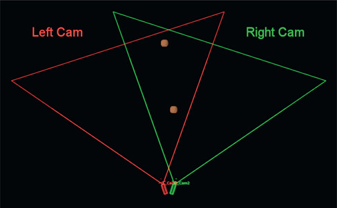
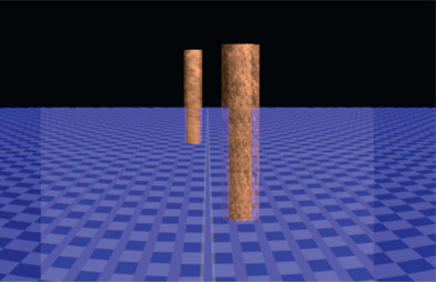
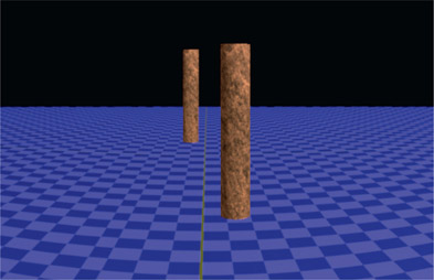
I have modeled a little 3D test rig here to demonstrate the problem and the solution. The problem is illustrated in Figure 13.75, which shows a top view of two adjacent cameras and their overlapping fields of view. The brown dots in the overlap region are two brown posts that appear in both camera views. Figure 13.76 shows the camera captures for the left and right cameras. The two brown posts appear in both views in different parts of the frame as expected, but they are also shifted horizontally relative to the background due to parallax, which can be seen by noting how they occlude the far background circles differently which were put in as position references.
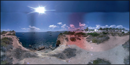
Figure 13.77 shows what happens when the two camera views are spherically projected and converted to a LatLong image using the Add operation to highlight the overlap region. The parallax has caused the two posts to appear in slightly different positions, which introduced ghosting. Note also the ground plane where you can see the parallax increasing as the ground gets closer to the cameras. Parallax increases as objects get closer to the cameras or if the distance between the cameras increases. These differences cannot be corrected with a warp because the problem is not the shape of the images but their different perspectives.
The solution to this problem is to pick one view to use as the “hero” view and mask off the other view with a soft-edged split. There will still be a discontinuity at the split so choose somewhere in the weeds to hide the seam. The seam can be further hidden by reducing it with a modest warp to one or the other views (or both). To eliminate parallax altogether there are special camera rigs available that aim the cameras at mirrors so that all cameras share the same nodal point, so no parallax. However, these types of rigs tend to be large, complex, and expensive. You should expect to have to solve parallax problems yourself.

Figure 13.77
Spherical projections merged with a plus operation

Figure 13.78
Masked and merged with an over operation
This otherwise annoying problem can actually be turned into an advantage when it comes to removing camera tripod legs. Remember the blinking eyes thumb demo above? Repeat that exercise, only this time note that the part of the far background that is covered by thumb in one view is revealed in the other. A clean plate of the far background with no thumbs could be made by combining thumb-free sections of the background. This is the principle used to remove the tripod – a soft edge split of the views such that the tripod is completely removed. Removing the tripod this way may not be possible with some rig designs so there often needs to be a patch created to cover the rig. Patches may also be needed for the zenith and nadir holes (north and south poles) of the LatLong map, depending on the camera coverage.
The exposure problems are much easier to address after the stitching is done so that the issues can be seen in context. Differences between the camera exposures as well as imaging sensor variations guarantee that the camera clip exposures will not be identical. Hopefully these can be fixed with a simple exposure (gain) adjustment. Even the two clips in Figure 13.72 that are a bit off color are easily corrected by dialing in the gain of each channel individually.
A more insidious exposure problem is uneven lighting such as vignetting or exposure gradients where, for example, the exposure on the left side of the frame does not match the right side. These are very difficult to balance out by hand, but stitching software includes the ability to match unevenly lit plates procedurally and usually does a fine job. Usually.
One big challenge in VR cinematography is managing exposure during principal photography. The main problem being that with a 360-degree view you are invariably shooting into the sun on one side and into the shade on the other. A correct exposure for the sunny side will likely be underexposed on the shady side. We can only hope that the camera operators did not leave the AGC on (Automatic Gain Control) so each camera ends up with a completely different exposure as it struggles to personally correct for its particular lighting, and even fluctuating when the lighting changes. Chasing all of these different and fluctuating exposures is both time-consuming and maddening.
With all of the spherically projected camera clips aligned and color corrected the finished LatLong image (Figure 13.79) is ready for VR fun.
Beyond stitching the multiple camera clips together into a beautifully integrated Lat-Long image, the modern digital compositor must also be able to add visual effects to VR images. The main challenge here are the spatial transforms – converting images from rectilinear to spherical to LatLong and back without distortion or excessive filtering losses. The image capture space is rectilinear, the stitching workspace is spherical, and the display space is LatLong. The fundamental problem with doing visual effects for VR is that they must be done in rectilinear space. You cannot do visual effects (other than trivial painting fixes) in either the spherical or LatLong spaces as lines are not straight and transformations are not linear.
What you need to be able to do is crop an arbitrary section out of a LatLong image to flatten into a rectilinear image, do your thing, then re-project it seamlessly back into the original LatLong image. Once the image section is flattened, the usual visual effects techniques can be used to either add or remove picture elements. This would include removing the film crew or other undesired content, or the keying and compositing of greenscreen elements into the scene. Point tracking, for example, can only be done on the rectilinear image. In this section we will see a general workflow for isolating an arbitrary section of the LatLong image, flatten it for visual effects work then re-project it back into the LatLong image.
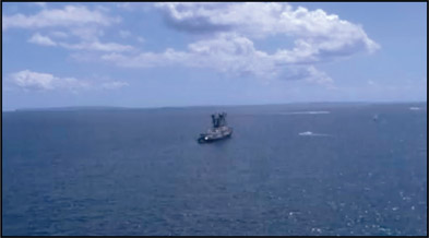
For the purposes of this exercise let us assume that we want to work on the area with the boat circled in red in Figure 13.80. Note that we are looking at a window cropped out of the finished LatLong map in Figure 13.79 so that the target region is bigger for printing in this book. The cropping has no effect on the actual procedure.
Step 1 – render a flattened version of the area of interest.
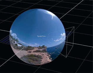
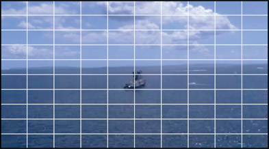
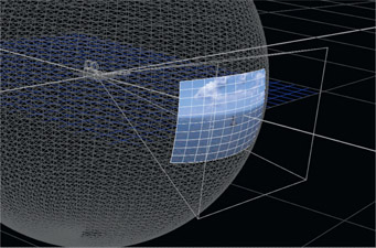
Texture map the finished LatLong map around a sphere and place a camera at the sphere center (Figure 13.81). Rotate the camera around the Y axis until the target is centered in frame. If you need a camera tilt then rotate around the X axis. Increasing or decreasing the camera focal length will zoom in and out of the image, and adjusting the camera aperture width and height will adjust the shape of the flattened image. When everything is framed correctly, render the flattened version of the area of interest as shown in Figure 13.82. Make certain that the rendering resolution is a bit larger than the original section of the LatLong map. For example, if the original area of interest is 1000 × 500 then render this flattened version at 1200 × 600. If rendered at or below the correct resolution the replaced section will look soft. The diameter of the sphere does not affect the results.
Step 2 – operate on the area of interest.
Now that we have a flattened, rectilinear image to work with we can do our thing to add or remove elements. For development purposes I recommend that you first get a reference image working for the entire process, then go back and do the visual effects when everything is set up correctly. A simple grid was placed over the entire flattened section in Figure 13.83 as a temporary stand-in to represent the visual effects work to be done. Let us refer to this as the vfx section.
Step 3 – project the vfx section onto the inside of a sphere.
Figure 13.84 illustrates the setup. The projecting camera must, of course, be identical to the rendering camera in Step 1 else the render will not match. The diameter of this sphere can be the same or different than the one used in Step 1.
Step 4 – convert the spherical projection of the vfx section to a LatLong map.
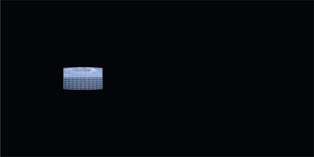
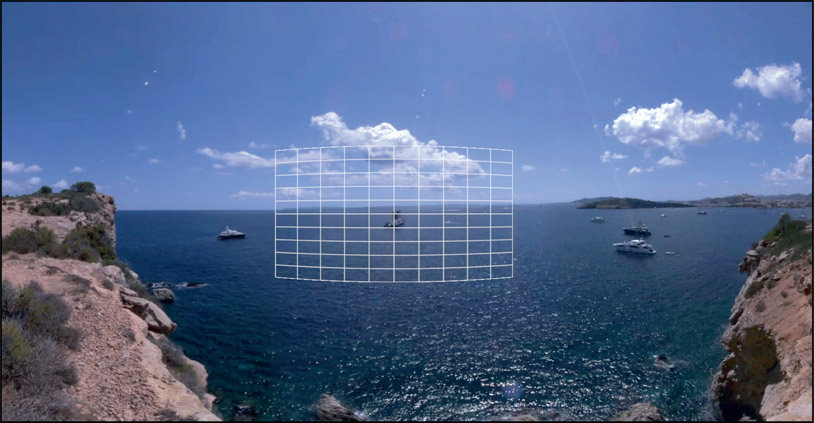
Referring to Figure 13.85, this LatLong map must be the exact same resolution as the original in Figure 13.79 and rendered with an alpha channel. This LatLong image is then composited over the original LatLong image, with the results shown in Figure 13.86.
Again, this is a crop of the full LatLong so that the item of interest would not be too tiny to be seen in print. Once you have successfully achieved the comp and everything lines up, go back and do the actual visual effects work. And don’t forget to turn off the grid.
The next chapter is all about changing the position and shape of images – 2D transforms, warping and tracking. In the transforms section we will learn about managing motion blur, as well as all about filters, an important but oft-ignored topic. There is a large section on warps, both mesh and spline, along with some production tips and tricks. There is also a large section on getting better point-tracking results, plus another section on how planar tracking works and how to get best results.
