Speaking in Code
In This Chapter

In this chapter, we explore some of the flashy features of Reporting Services. These are the features that get us techies excited. If you do not say “Wow!” after seeing at least one of these features in the reports created in this chapter, then we (the developers at Microsoft and I) are not doing our jobs. Just to clarify, the “Wow!” does not need to be said out loud. Simply thinking “Wow!” in your head counts just as much.
Getting you to say or think “Wow!” is not ultimately the goal of the Microsoft developers who created Reporting Services or the goal of this author as he writes this chapter. The developers who create games for Microsoft can be satisfied with eliciting a “Wow!” from their clientele and consider it a job well done. The developers who create business intelligence tools for Microsoft have to aim a bit higher.
If you develop business intelligence tools, you need to go beyond the “Wow!” to the “Ah-ha!” The “Wow!” comes when you see a feature of a software product and think, “Wow! That is really cool!” The “Ah-ha!” comes when you see a feature of a software product and say, “Ah-ha! That is how we can make that report work just the way we need it to,” or “Ah-ha! That is how we can turn that bit of data into meaningful business intelligence.” Only when we hear the “Ah-ha!” can we be satisfied.
So, don’t be shy when that moment comes along. When you get to that “Ah-ha!” feature you have been searching for, say it nice and loud. I want to hear it so I can go home happy.
One of the features of Reporting Services that gives it a tremendous amount of power and flexibility is its capability to speak in code—Visual Basic .NET code, that is. Valid Visual Basic .NET expressions can be used to control many of the properties of report items. They can even be used to control the query you are using to create your dataset.
For more complex tasks, you can embed whole Visual Basic .NET functions in your report. If that isn’t enough, you can access methods from .NET assemblies. These assemblies are not limited to Visual Basic .NET. They can be written in any .NET language, such as C#.
Let’s write some

and have some

 NOTE
NOTE
For those of you who may not be familiar with it, the previous sentence contains two words in Morse code. If you want to know what it says, do what I did: look it up on the Internet.
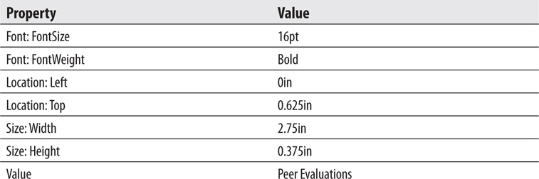
Using the label property of a parameter
Using multiline headers and footers
Using Visual Basic .NET expressions to control properties
Specifying scope in aggregate functions
Business Need The customer service department at Galactic Delivery Services (GDS) would like a report to check on the status of deliveries for a customer. The customer service representative should be able to select a customer and a year and then see all the deliveries for that customer in that year. The hubs each package went through as it was in transit should be listed as well.
The status for packages that have been delivered should show up in green. The status for packages still en route should be blue. The status for packages that have been lost should be red. In case of a problem, the name and e-mail address of the person to be contacted at that customer site should appear below the entry for each lost package.
1. Create a New Report and Two Datasets
2. Set Up the Report Parameters and Place the Titles on the Report Layout
3. Add a Tablix to the Report
4. Add the Expressions
 SSDT and Visual Studio Steps
1. Create a new Reporting Services project called Chapter09 in the MSSQLRS folder.
2. Create a shared data source called Galactic for the Galactic database.
3. Create a new report called DeliveryStatus using the GDSReport template.
4. Create a new data source called Galactic that references the Galactic shared data source.
5. Create a new dataset called DeliveryStatus that calls the stp_DeliveryStatus stored procedure.
6. Create a second dataset called Customers that uses the following query:

 Report Builder Steps
1. Create a new folder in the Galactic Delivery Services folder. Enter Chapter09 as the name of this folder.
2. Launch Report Builder and create a new report from the GDSReport template. Call this report DeliveryStatus and save it in the Chapter09 folder.
3. Create a data source called Galactic that references the Galactic shared data source.
4. Create a new dataset called DeliveryStatus that calls the stp_DeliveryStatus stored procedure.
5. Create a second dataset called Customers that uses the following query:

Task Notes You probably noticed the instructions are a bit sketchy here. Now that you have reached the level of advanced report authoring, you can handle these basic tasks on your own. If you have any trouble with these steps, refer to the previous chapters for a refresher.
SSDT, Visual Studio, and Report Builder Steps
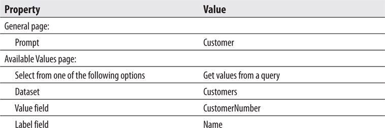
1. The stored procedure triggered the creation of two report parameters. Configure the properties of the CustomerNumber parameter as follows:
2. Configure the properties of the Year parameter as follows:
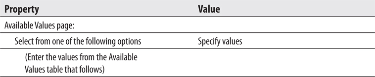
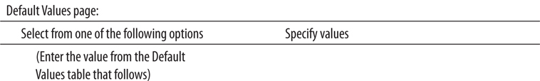
On the Available Values page, add the following rows to the grid at the bottom of the dialog box:
On the Default Values page, add the following row to the grid at the bottom of the dialog box:
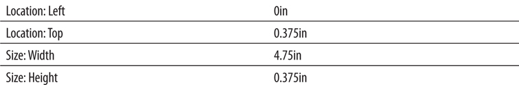
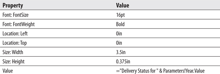
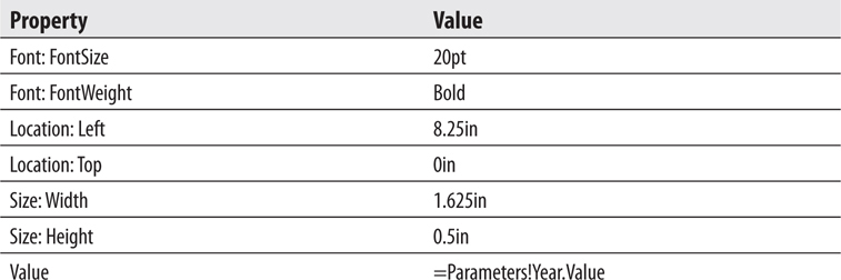
3. Place a text box onto the body of the report. Modify the following properties of this text box:
4. Place a second text box onto the body of the report. Modify the following properties of this text box:
5. Right-click this text box and select Expression from the context menu. The Expression dialog box appears.
6. Select Parameters in the Category pane, and double-click CustomerNumber in the Parameter pane.
7. Use the BACKSPACE key to remove the word “Value” at the end of the expression. (Do not delete the period.) If you are using SSDT or Visual Studio, you see a context menu showing you the available properties of the CustomerNumber parameter.
8. If you are using SSDT or Visual Studio, double-click Label in the context menu. If you are using Report Builder, type Label.
9. Click OK to exit the Expression dialog box.
Task Notes We have two parameters for this report. The CustomerNumber parameter is selected from a drop-down list created by a dataset. The customer names are displayed in the drop-down list because Name was chosen as the Label field. However, the customer number is the value assigned to this parameter because CustomerNumber is chosen as the Value field. The Year parameter is selected from a drop-down list created by a static list of values we entered. The Label and Value are the same for each entry in this list.
The items placed on the report thus far were put there to provide a heading for the report and to indicate which parameters were selected to create the report. This is pretty straightforward for the Year parameter. All we need is a text box that displays the value of this parameter, with a little explanatory text thrown in for good measure.
The CustomerNumber parameter presents a bit of a problem, though. When we select a parameter in an expression, the value property of the parameter is selected by default. The value property of the CustomerNumber parameter contains the customer number of the selected customer. However, it makes more sense to the user if the customer’s name is displayed at the top of the report. To accomplish this, we use the label property rather than the value property. The label property contains the text that appears in the parameter drop-down list for the selected item. In this case, the label property contains the customer’s name.
SSDT, Visual Studio, and Report Builder Steps
1. Use the table template to add a tablix to the body of the report immediately below the text boxes.
2. In the leftmost cell in the data row of the tablix, select the Hub field from the DeliveryStatus dataset.
3. In each of the two remaining cells in the data row of the tablix, select the TimeIn and TimeOut fields.
4. Right-click anywhere in the data row, and select Tablix: Add Group | Row Group: Parent Group from the context menu. The Tablix group dialog box appears.
5. Select [DeliveryNumber] from the Group by drop-down list. We are now grouping the information in the table by the values in the DeliveryNumber field.
6. Check the Add group header and Add group footer check boxes.
7. Click OK to exit the Tablix group dialog box.
8. A group header cell is added along the left side of the tablix. This cell contains a text box, which, in turn, contains the DeliveryNumber field. (Don’t confuse this with the group header row across the top of the tablix.) Modify the following properties of the text box containing the DeliveryNumber field:
Remember, you can set these text box properties using the Properties window or the ribbon/toolbar buttons.
9. We need to move some of the labels in the table header row to the group header row. Select the text box that contains the word “Hub” (not the text box containing the field reference “[Hub]”). Do this by clicking once in this text box. If you can see a text-editing cursor blinking in this cell, you clicked too many times. If you see the blinking cursor, click elsewhere and then try again.
10. Press CTRL-X to cut the text box from this table header cell. Click in the group header cell immediately below it and press CTRL-V to paste the text box there.
11. Repeat this for the text boxes containing Time In and Time Out.
12. Right-click the gray square to the left of the table header row. (This row now only contains the text “Delivery Number.” Only “Delivery” may be showing if the column is too narrow for the entire header text.) Select Delete Rows from the context menu. This removes the table header row from this table.
13. Right-click anywhere in the group header row, and select Tablix: Insert Row | Inside Group – Above from the context menu. An additional group header row appears. This is not a new grouping, but rather an additional row for the current grouping.
14. Select the ServiceType field in the leftmost cell in the new group header row.
15. Select the StatusName field in the next cell in the new group header row.
16. Right-click anywhere in the new group header row, and select Tablix: Insert Row | Inside Group – Above from the context menu. Another group header row appears.
17. Double-click the leftmost cell in the new group header row and type Pickup:.
18. Select the PickupPlanet field in the next cell to the right in the new group header row.
19. Select the PickupDateTime field in the rightmost cell in the new group header row.
20. Double-click in the group footer cell below the [Hub] field, and type Delivery:.
21. Select the DeliveryPlanet field in the next cell to the right in the group footer row.
22. Select the DeliveryDateTime field in the rightmost cell in the group footer row.
23. Right-click anywhere in the group footer row, and select Tablix: Insert Row | Inside Group – Below from the context menu. A new group footer row appears.
24. Double-click in the group footer cell below “Delivery:” and type Problem Contact:.
25. Select the ProblemContact field in the next cell to the right in the new group footer row.
26. Select the ProblemEMail field in the rightmost cell in the new group footer row.
27. Right-click anywhere in the new group footer row, and select Tablix: Insert Row | Inside Group – Below from the context menu. A new group footer row appears. This row is left blank.
28. Click the cell in the second column of the top group header row. Hold down the SHIFT key and click the rightmost cell of the bottom group header row. You have selected the nine cells in the three group header rows.
29. Modify the following property for these cells:

30. Repeat Steps 28 and 29 for the six cells in the two group footer rows.
31. Click in the cell containing the [DeliveryNumber] field. Hold down the SHIFT key and click the cell in the lower-right corner of the tablix. You have selected all of the cells in the tablix.
32. Modify the following properties for these cells:
33. Click the gray box in the upper-left corner of the tablix to select the entire tablix. Use the sizing handle on the right side of the tablix to make it as wide as the design surface. Your report layout should appear similar to Figure 9-1.
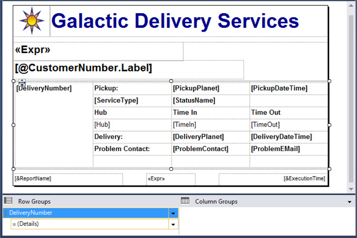
Figure 9-1 The Delivery Status report layout after Task 3
34. Preview/run the report. Select Bolimite, Mfg from the Customer drop-down list. Confirm that 2015 is selected in the Year drop-down list. (The year 2015 should be selected because you set it up as the default value for the Year parameter.) Click View Report.
35. You may want to return to the Design tab and adjust the size of some of the columns so the data does not wrap within text boxes. Hint: The DeliveryNumber column can be made narrow in order to gain space for some of the other columns. After making size adjustments, your report should appear similar to Figure 9-2.
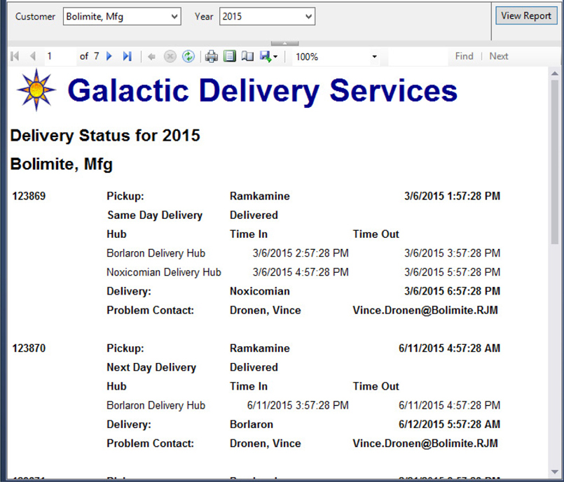
Figure 9-2 The Delivery Status report preview after Task 3
Task Notes The default behavior for the tablix is to create a light gray border around all of the cells. In our previous reports, we have stuck with that behavior. For this report, however, we are going to deviate from that approach and not have any border around most cells. The approach you use for your report authoring depends on your preference and that of your report users. What is appropriate and looks the best will probably vary from report to report.
We were able to add rows to both the group header and footer. This let us create more complex group header and footer layouts. In the same fashion, you can add rows to the table header, table footer, or data lines, as needed.
We now have the proper layout for our report, but we do not have the proper behavior of some of the report items. The delivery status is supposed to appear in color. The problem contact information is only supposed to be displayed with lost deliveries. Some additional formatting lines would also make the report more readable. All of this is accomplished in the next task with the aid of expressions.
SSDT, Visual Studio, and Report Builder Steps
1. Return to design mode.
2. Select the entire tablix, if it is not selected already. Modify the following properties of the tablix:
3. Enter the following expression for the Color property of the cell containing the StatusName field:

NOTE
When entering each of the expressions, you probably want to select <Expression…> from the drop-down list for the property and enter this expression in the Expression dialog box. Also, remember the Expression dialog box offers help for finding the correct function and for inserting fields and parameters. Expressions involving the Built-in Fields, Parameters, and Fields collections are case sensitive.
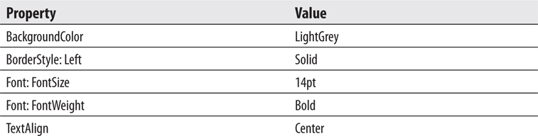
4. Click the gray square to the left of the top group header row so the entire row is selected. Modify the following properties for these cells:
5. Click the cell containing the word “Hub.” Hold down the SHIFT key and click the Time Out cell. Three cells should now be selected. Modify the following property for these cells:

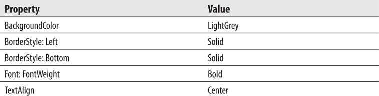
6. Select the following three cells using the same method as in Step 5: “Delivery:”, “[DeliveryPlanet]”, and “[DeliveryDateTime]”. Modify the following properties for these cells:
NOTE
“StatusName” is case sensitive in this expression.
7. Select the following three cells: “Problem Contact:”, “[ProblemContact]”, and “[ProblemEmail]”. Modify the following properties for these cells:
8. Preview/run the report. Select Bolimite, Mfg from the Customer drop-down list and 2015 from the Year drop-down list, if they are not already selected. Click View Report. Your report should appear similar to Figure 9-3.
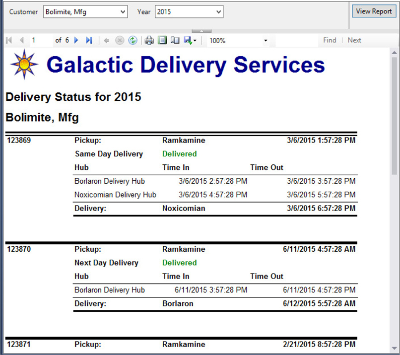
Figure 9-3 The Delivery Status report preview after Task 4
9. Save the report.
Task Notes If you scroll through the pages of the report, you see the report now meets the business needs specified. Let’s look at what each expression is doing. The expression entered in Step 3 returns green when the status is Delivered, and blue when the status is In Route. Otherwise, it returns red.
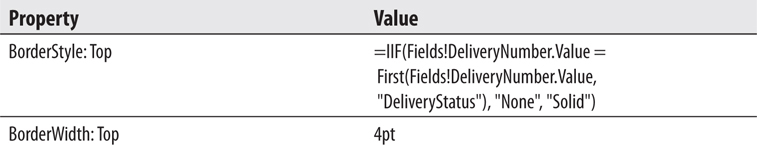
The expression in Step 4 is a bit more complex. It checks whether the current value of the DeliveryNumber field is equal to the first value of the DeliveryNumber field in the DeliveryStatus dataset. As you saw in Chapter 8, aggregate functions act within a scope. By default, the First() aggregate function would return the value for the first record in the current scope. Because this expression is in the group header, by default, it would return the value for the first record in each group.
However, in this expression, the First() aggregate function includes a second parameter that specifies the scope it should use. This parameter specifies that the First() aggregate function should use the scope of the entire DeliveryStatus dataset rather than just the current group. Therefore, it returns the first record in the dataset. When the current delivery number is equal to the first delivery number in the dataset, no border is created across the top of these text boxes. This prevents the border across the top of the text boxes from interfering with the border across the top of the tablix. When the current delivery number is not equal to the first delivery number in the dataset, a border is created across the top of the text boxes.
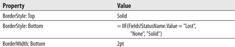
The expression in Step 6 and the first expression in Step 7 use the value of the StatusName field to control the border across the bottom of each grouping. If the problem contact text boxes are displayed, the border should appear across the bottom of these text boxes. However, if the problem contact text boxes are not displayed, the border should appear across the bottom of the text boxes in the row above. The second expression in Step 7 controls whether the text boxes containing the problem contact are displayed. This is also based on the value of the StatusName field.
As you can see, expressions can be useful when the formatting, or even the visibility, of a report item needs to change depending on some condition in the report. Expressions can also be used to calculate the values to appear in a text box, as you see in the next report.
Using Visual Basic .NET expressions to calculate values in a text box
Adding static columns to a tablix functioning as a matrix
Adding totals to a tablix functioning as a matrix
Business Need The quality assurance department at Galactic Delivery Services would like a report to help them analyze the packages lost during delivery. The report should show the number of packages lost each year at each processing hub. It should break down these numbers by the cause for each loss. It should also show the number of losses by cause as a percentage of the total number of packages lost for each hub.
1. Create a New Report, Create a Dataset, and Add a Tablix to the Report
2. Add a Calculated Column to the Tablix
3. Add an Indicator and Totals to the Tablix
SSDT, Visual Studio, and Report Builder Steps
1. Create a new report called LostDelivery using the GDSReport template.
2. Create a new data source called Galactic that references the Galactic shared data source.
3. Create a new dataset called LostDelivery that calls the stp_LostDeliveries stored procedure.
4. Use the matrix template to place a tablix onto the body of the report.
5. Select the Cause field in the Rows cell. Select the Hub field in the Columns cell.
6. Select the DeliveryNumber field in the Data cell. Use the Expression dialog box to edit the aggregate function in the resulting expression by changing it from Sum to Count.
7. Click in the upper-left cell of the tablix. Hold down the SHIFT key and click the lower-right cell. All four cells in the tablix should be selected.
8. Modify the following properties of the selected cells:
9. Click outside of the tablix to unselect the cells.
10. Right-click the Hub cell and select Tablix: Add Group | Column Group | Parent Group. The Tablix group dialog box appears.
11. Click the Expression (FX) button. The Expression dialog box appears.
12. Type the following in the Set expression for: GroupExpression area to group the values by year:

13. Click OK to exit the Expression dialog box.
14. Click OK to exit the Tablix group dialog box.
15. Select the empty cell in the upper-left corner of the tablix. Hold down the SHIFT key and click the cell immediately below it. Right-click in this same cell and select Tablix: Merge Cells from the context menu.
16. Modify the following properties of the text box in the merged cell you just created:
You may need to click elsewhere to unselect the newly merged cells and then reselect the newly merged cells to get some of the properties to function properly.
17. Modify the following property of the text box in the lower-left corner of the tablix:

18. Modify the following properties of the text box in the upper-right corner of the tablix:
19. Modify the following properties of the text box in the center of the right-hand column of the tablix:
20. Modify the following property of the text box in the lower-right corner of the matrix:

Task Notes So far, we have a fairly straightforward matrix report. Let’s see what happens when we add another column and totals to the matrix.
SSDT, Visual Studio, and Report Builder Steps
1. Right-click the text box in the lower-right corner of the matrix, and select Tablix: Insert Column | Inside Group – Right from the context menu. A new column is created inside of the Hub group.
2. Right-click the same text box, and select Tablix: Insert Row | Outside Group – Above from the context menu. A new row appears above the Cause group.
3. Modify the following properties of the new text box in the lower-right corner of the tablix:
4. Modify the following properties of the text box immediately above the text box modified in Step 3:
5. Modify the following properties of the text box immediately to the left of the text box modified in Step 4:
6. After adjusting row heights and column widths, your report layout should appear similar to Figure 9-4.
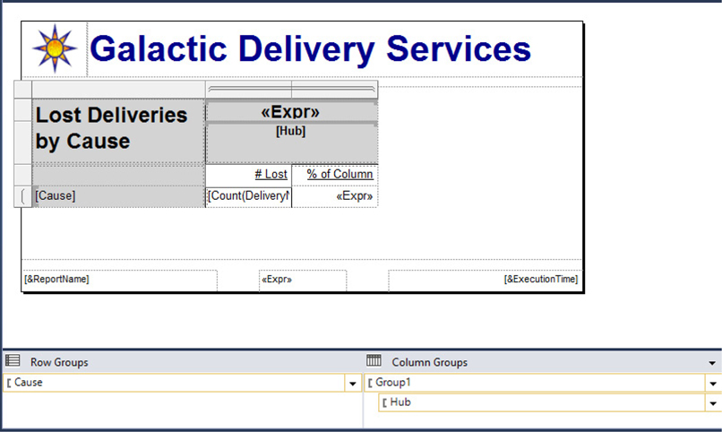
Figure 9-4 The Lost Delivery report layout after Task 2
7. Preview/run the report. Your report should appear similar to Figure 9-5.
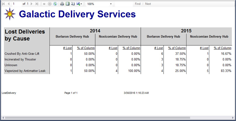
Figure 9-5 The Lost Delivery report preview after Task 2
Task Notes In the previous report, we created a multirow group header and a multirow group footer. In this report, we created a multicolumn detail section. We did this by adding a second column inside of the column groupings. We also created headings for our columns by adding a new row outside of the row grouping. We want one set of columns for each column grouping. However, we only want one set of headings at the top of each row group.
The row containing the column headings is a static row in the tablix. We took our first look at static rows and columns in Chapter 8. Here they are, back again, to help us do more creative formatting within our tablix. In Task 3 of this report, we will use additional static rows and columns to include an indicator and to provide totals.
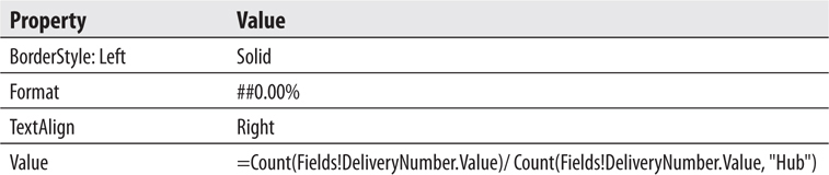
Our new column takes the count from the current row and calculates it as a percentage of the total for the column. This is done, once again, through the magic of scope. The first Count() aggregate function does not have a scope parameter, so it defaults to the scope of the current cell. In other words, it counts the number of lost deliveries in the current cell.
The second Count() aggregate function has a scope parameter of Hub. This is the name of the column group that creates the column for each hub. Therefore, this aggregate function counts the number of lost deliveries in the entire column. We then divide and use the ##0.00% format string to create a percentage.
SSDT, Visual Studio, and Report Builder Steps
1. Return to design mode.
2. Right-click the text box containing “# Lost” and select Tablix: Insert Column | Inside Group – Right.
3. Select an Indicator from the Toolbox or Insert tab and place it in the lower of the two new cells you just created.
4. The Select Indicator Type dialog box appears.
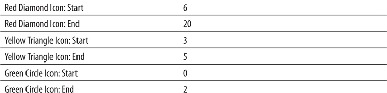
5. Select “3 Signs” as shown in Figure 9-6.

Figure 9-6 The Select Indicator Type dialog box
6. Click OK to exit the Select Indicator Type dialog box.
7. Modify the following properties of the indicator you just created using the Indicator Properties dialog box:
8. Narrow the column containing the indicator so it is just wide enough for the indicator itself.
9. Right-click the text box in the lower-left corner of the matrix, and select Tablix: Add Total | After from the context menu. A total row is added at the bottom of the tablix.
10. Modify the following properties of the text box containing the word “Total”:
11. Modify the following properties of the text box at the bottom of the column containing “# Lost”:
12. Modify the following properties of the text box at the bottom of the column containing the indicator:
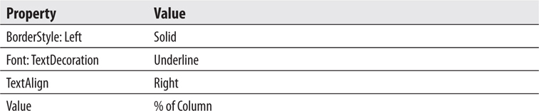
13. Modify the following properties of the text box at the bottom of the column containing “% of Column”:
14. Right-click the text box in the upper-right corner of the matrix. Select Tablix: Add Total | After from the context menu. A set of three columns is added at the right of the tablix.
15. Right-click the gray rectangle above the middle of the three new columns. Select Delete Columns from the context menu.
16. Right-click the cell in the lower-right corner of the tablix. Select Expression from the context menu. The Expression dialog box appears.
17. Modify the expression to match the following:

The change is the scope parameter in the second Count() aggregate function.
18. Click OK to exit the Expression dialog box.
19. Right-click the cell immediately above the cell you modified in Steps 16–18. Select Expression from the context menu. The Expression dialog box appears.
20. Modify the expression to match the following:

The change is the scope parameter in the second Count() aggregate function.
21. Click OK to exit the Expression dialog box.
22. Enter % of Column in the text box immediately above the text box you modified in Steps 19–21.
23. Enter # Lost in the text box to the left of the text box you modified in Step 22.
24. When completed, your report layout should appear similar to Figure 9-7.
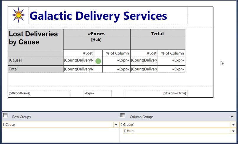
Figure 9-7 The Lost Delivery report layout after Task 3
25. Preview/run the report. Your report should appear similar to Figure 9-8.
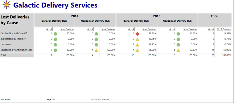
Figure 9-8 The Lost Delivery report preview after Task 3
26. Save the report.
Task Notes This is the first use of the indicator item in a report. An indicator enables us to graphically show the state of a particular value. If it is in the range that we want it to be in, then the “good” indicator is shown. If it is in the range where we should start to show some concern, then the “caution” indicator is shown. If it is in the range where we need to really address the factors behind this number, then the “bad” indicator is shown.
The Select Indicator Type dialog box and the Indicator Properties dialog box allow us to pick the symbols that will be used for good, caution, and bad. They also allow us to set the range of values for good, caution, and bad. Although the three-level indicator symbols are most often used, you should note that there are sets of indicators on the Select Indicator Type dialog box that can represent four and even five states.
Adding totals to our report involves creating additional static rows and columns in our tablix. We first added a total row at the bottom of the tablix. The cells in this total row are inside of the column groupings on year and hub but outside of the row grouping on repair cause. Therefore, these cells give us the totals for each hub across all of the repair causes as we expect. The second set of totals we added are inside of the row grouping on repair cause but outside of the column groupings on hub and year. These cells give us the totals for a repair cause across all hubs and years. The two cells in the lower-right corner of the tablix are outside of all column and row groupings, so they provide totals for the entire tablix.
We had to use a different scope for the totals in the rightmost columns because, as we just said, these columns are outside of the hub grouping. An aggregate function must be inside of a scope in order for it to be used as the scope parameter. Instead of using the hub grouping, we use the scope of the entire LostDelivery dataset to create these totals.
Copying a report between projects/launching Report Builder from a report
Using Visual Basic .NET expressions to specify a dataset query
Business Need The Customer List Report you developed for the Galactic Delivery Services accounting department in Chapter 4 has proved to be popular. Several other departments would like similar reports to help them track their own lists of e-mail contacts. Rather than create separate reports for each department, which would be hard to maintain, the IT manager has asked for one report that enables the user to select which type of contact they want to view.
1. Copy the Report from Chapter04 for Use in Chapter09
2. Add a Report Parameter and Modify the Dataset to Use the Report Parameter
SSDT and Visual Studio Steps1. Use Windows Explorer to copy the report definition file for the Customer List Report (Customer List.rdl) from the Chapter04 project folder and paste it in the Chapter09 project folder. Both of these folders should be found under Documents in the Visual Studio 2010\Projects\MSSQLRS folder.
2. In SSDT or Visual Studio, reopen the Chapter09 project, if it was closed.
3. Right-click the Reports folder in the Solution Explorer, and select Add | Existing Item from the context menu. The Add Existing Item – Chapter09 dialog box appears.
4. Make sure you are looking at the Chapter09 folder in the dialog box, and select the Customer List.rdl file. Click Add to exit the Add Existing Item – Chapter09 dialog box.
5. Double-click the Customer List.rdl entry in the Solution Explorer to open the report definition.
6. Click the Preview tab to show this report is functioning properly in the Chapter09 project.
Task Notes for SSDT and Visual Studio Because the entire definition of a report is contained within a single Report Definition Language (RDL) file, it is easy to copy reports to different locations. As you saw here, we can even add them to a project other than the project within which they were originally created. The Customer List report uses a shared data source called Galactic. We did not need to copy the shared data source because we already have a shared data source with the same name and the same properties in the Chapter09 project. If this was not the case, we could have copied the shared data source file (Galactic.rds), along with the report file, and added that to our new project as well.
Report Builder Steps1. Close Report Builder, if it is open.
2. In the web portal, navigate to the Chapter04 folder.
3. Click the ellipsis button (…) for the Customer List report.
4. Select Manage from the menu. The Edit Customer List page will appear.
5. Click the Edit in Report Builder button. The Report Builder application will start up and load the Customer List report definition.
6. Click the File tab of the ribbon and select Save As from the menu. The Save As Report dialog box appears.
7. Navigate to the Chapter09 folder on the report server.
8. Click Save to exit the Save As Report dialog box.
9. Run the report to show it is functioning properly in the Chapter09 folder.
Task Notes for Report Builder The Edit in Report Builder menu option in the web portal allows us to both launch the Report Builder application and open a report definition for editing with a single click. As we have seen before, the Save As menu choice allows us to save a report definition in a different location—effectively making a copy of that report. The report can still access the Galactic shared data source from the new location in the Chapter09 folder, so there is no need to make any changes to the report definition to have it run properly.
SSDT, Visual Studio, and Report Builder Steps
1. Return to design mode.
2. Right-click the Parameters item in the Report Data window. Select Add Parameter from the context menu. The Report Parameter Properties dialog box appears.
3. Modify the properties for this new report parameter as follows:
On the Available Values page, add the following rows to the grid at the bottom of the dialog box:
4. Click OK to exit the Report Parameter Properties dialog box.
5. In the Report Data window, right-click the entry for DataSet1 and select Dataset Properties from the context menu. The Dataset Properties dialog box appears.
6. Click the Expression (FX) button next to the query area. The Expression dialog box appears.
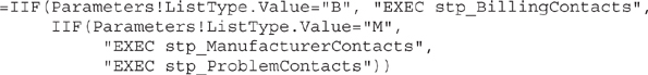
7. Replace the entire SELECT statement with the following expression:
CAUTION
If you use this method to build a SQL statement by concatenating parameter values into the query text, you must take care to guard against query injection attacks on your SQL server.
8. Click OK to exit the Expression dialog box.
NOTE
In the Dataset Properties dialog box, the only way to edit our query expression now is to click the Expression (fx) button next to the query area on this dialog box.
9. Select the Fields page.
10. Change the table on the Fields page to match the following:
11. Click OK to exit the Dataset Properties dialog box.
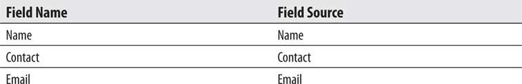
12. In the text box that currently says “[BillingContact],” select the Contact field using the Field Selector.
13. Double-click the table header cell directly above the text box from Step 12, and change the text to Contact.
14. In the text box that currently says “[BillingEmail],” select the Email field using the Field Selector.
15. Double-click the table header cell directly above the text box from Step 14, and change the text to Email.
16. Preview/run the report. Try selecting each of the list types. Remember to click View Report each time after changing your parameter selection.
17. Save the report.
NOTE
The database does not contain a contact name for each manufacturer, so no contact names are in the manufacturer list.
Task Notes Rather than specifying a query to be executed, we used an expression to choose among three possible queries (in this case, three stored procedure calls). This is known as a dynamic query. The name comes from the fact that the query that is run depends on input from the user at the time the report is run.
Because the content of the query is not known until run time, the Report Designer cannot “pre-run” the query to determine the fields that will result. Instead, we need to manually specify the fields that will result from our dynamic query. All the possible queries that could be run must return result sets with the same field names for your report to work properly.
At this point, you may be ready to suggest two or three alternative approaches to creating this report. It is certainly not unusual to come up with a number of possible ways to meet the business needs of a report. When this happens, use the following criteria to evaluate the possible solutions:
Efficiency of operation
Your comfort with implementing and debugging a given solution in a reasonable amount of time
Maintainability
Your need to illustrate a certain point in a book chapter
Well, maybe that last point won’t apply to you, but it was, in fact, the overriding reason for choosing this approach for this particular report.
Using the Sparkline report item
Grouping in the details row of a data region
Business Need The marketing department at Galactic Delivery Services would like a compact report showing customer delivery trends. The report should show the total number of deliveries for each customer along with a chart showing deliveries by month for each customer. The report should be as small as possible so it can be used as part of a company intranet page.
1. Create a New Report, Create a Dataset, and Create a Report Layout
SSDT, Visual Studio, and Report Builder Steps
1. Create a new report called DeliveryTrend. Do NOT use the GDSReport template. (If you are using Report Builder, remove the “Click to add title” text box and the page footer.)
2. Create a new data source called Galactic that references the Galactic shared data source.
3. Create a new dataset called DeliveryTrend that calls the stp_DeliveryTrend stored procedure.
4. Use the table template to place a tablix onto the body of the report.
5. Modify the following properties of the tablix in the Properties window:
6. Change the size of the report body so it is the same size as the tablix.
7. Select the Name field in the left-hand Data cell.
8. Use the Details drop-down button in the Row Groups area to select Group Properties. The Group Properties dialog box appears.
9. Click the Add button in the Group Expressions area.
10. Select Name from the Group on drop-down list.
11. Click OK to exit the Group Properties dialog box.
12. Select the DeliveryCount field in the center Data cell.
13. Change the heading for this center column to Total Deliveries.
14. Place a sparkline in the right-hand data cell. The Select Sparkline Type dialog box appears.
15. Select Area as shown in Figure 9-9.
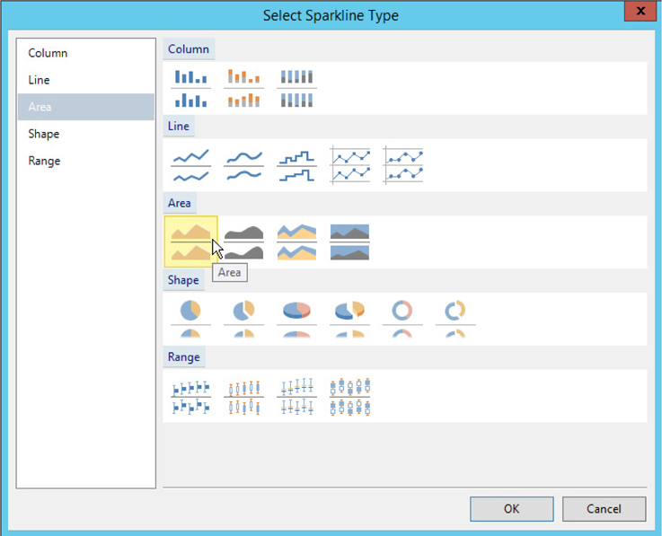
Figure 9-9 The Select Sparkline Type dialog box
16. Click OK to exit the Select Sparkline Type dialog box.
17. Click the sparkline item to activate the Chart Data window.
18. Click the green plus sign next to the Values area, and select DeliveryCount.
19. Click the green plus sign next to the Category Groups area, and select YearMonth.
20. Enter Delivery Trend Over Time in the text box above the sparkline.
21. Click the gray rectangle to the left of the tablix header row.
22. Modify the following property in the Properties window:

23. Select the gray rectangle above the center column.
24. Modify the following property in the Properties window:

25. Preview/run the report. Your report will appear similar to Figure 9-10.
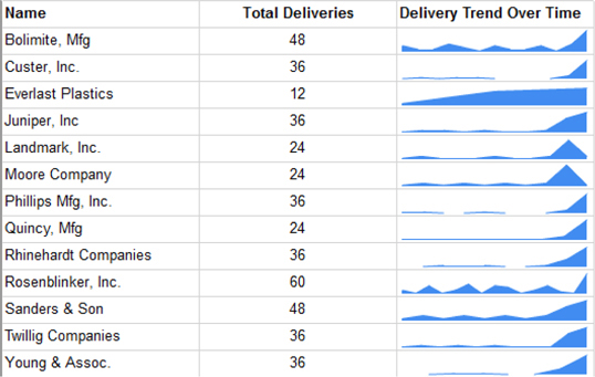
Figure 9-10 The Delivery Trend report
26. Save the report.
Task Notes As we saw with the data bar in Chapter 8 and the indicator earlier in this chapter, the sparkline is a way to provide a compact data visualization within a tablix. Essentially, it is a line or area chart without any axis labels. Similar to the data bar, the sparkline can be converted to a regular chart item, if desired.
Where the data bar and the indicator graphically represent a single value in their tablix scope, the sparkline represents a series of values. For this reason, a sparkline can only be used in an area of the tablix where grouping is taking place. A sparkline cannot be used in the detail row of a tablix unless grouping is set up at the detail level, which is the case in the Delivery Trend report.
Using Visual Basic .NET functions embedded in the report to create reusable code
Using a stored procedure that updates data
Using nested data regions
Resetting the page number
Business Need The Galactic Delivery Services accounting department needs a report to print payroll checks for its hourly employees. The checks should have the check portion in the top one-third of the page and the check register in the bottom two-thirds of the page. The check register should list the work hours included in this check. The user should be able to select a week for which unpaid time is entered and receive the payroll checks for that week. Once checks have been generated for a given week, that week should no longer show up in the drop-down list. The planetary system tax amount (25 percent) and state tax amount (5 percent) must be deducted from the amount being paid.
1. Create a New Report, Create Two Datasets, Add a Tablix to the Report Layout, and Populate It
2. Add a Second Tablix to the Report Layout and Populate It
3. Configure the Report Parameter and Add Embedded Code to the Report
SSDT, Visual Studio, and Report Builder Steps
1. Create a new report called PayrollChecks. Do not use the GDSReport template. (If you are using Report Builder, remove the Click to add title text box and the page footer.)
2. Create a new data source called Galactic that references the Galactic shared data source.
3. Create a new dataset called PayrollChecks that calls the stp_PayrollChecks stored procedure.
4. Create a new dataset called WeekNumbers that calls the stp_WeekNumbers stored procedure.
5. Use the list template to place a tablix onto the body of the report. Modify the following properties of this tablix in the Properties window:
6. In the Row Group pane, select Group Properties from the (Details) drop-down menu. The Group Properties dialog box appears.
7. On the General page, click Add to add an item to the group expression.
8. Select [PayrollCheckNumber] from the Group on drop-down list.
9. Click OK to exit the Group Properties dialog box.
10. Add text boxes to the list to get the layout shown in Figure 9-11. Make sure the rectangle in the tablix is selected each time before you drag a field or text box onto it. Remember, the square brackets around an item indicate that a field is being displayed in that text box. You can create text boxes containing fields by dragging the fields from the Report Data window. Enlarge the report body and the tablix, if necessary.
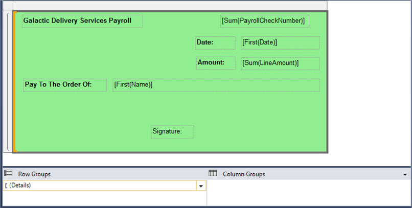
Figure 9-11 The Payroll Check layout after Step 10
11. Click the text box containing the PayrollCheckNumber field to select it. Right-click the text box and select Expression from the context menu. The Expression dialog box appears.
12. Remove the Sum() aggregate function so the expression is as follows:

13. Click OK to exit the Expression dialog box.
14. Right-click the text box containing the LineAmount field, and select Textbox Properties from the context menu. The Text Box Properties dialog box appears.
15. Modify the following properties of this text box:
16. Click OK to exit the Text Box Properties dialog box.
Task Notes Our payroll check has two separate parts: the check itself and the check register. The check register contains a line showing the amount paid for each day worked during the selected workweek. The check is essentially a summary of the information in the check register. The check amount is the sum of the amount to be paid for all the days worked.
We could use two different datasets to provide data to these two areas. To be a little more efficient with our database resources, however, we are going to use a single dataset. The dataset includes all the detail information required by the check register. It is going to have one row for each date worked. However, we do not want to create a check for each date worked. We only want one check for all the days worked by a given employee in the week.
To accomplish this, we need to group the detail data to print the check. We did this by grouping the DetailsGroup on the PayrollCheckNumber field in Steps 7 through 10. Because we want one check per check number, the PayrollCheckNumber field seems an obvious choice for grouping. (The number in the PayrollCheckNumber field is generated by the stored procedure.) With this details grouping, our tablix receives one record for each check number; therefore, we get one check per check number.
SSDT, Visual Studio, and Report Builder Steps1. Increase the height of the report body and the tablix. For the remainder of the report, we will refer to this tablix as the “list tablix.”
2. Use the table template to place a tablix inside the list tablix. The new tablix should be below the signature text box. We will refer to this new tablix as the “table tablix.”
3. Make the table tablix almost as wide as the list tablix.
4. Select the WorkDate, HoursWorked, and LineAmount fields in the cells in the data row of the table tablix.
5. Right-click anywhere in the lower row of the table tablix, and select Tablix: Insert Row | Outside Group – Below from the context menu. This new row will serve as a total row.
6. Using the field picker, select the LineAmount field in the rightmost cell of the row we just added to the table tablix. Set the following properties for the text box in this cell:
7. Set the following property for the text box in the cell immediately above the cell modified in Step 6:

NOTE
Entering C for the Format property is the same as selecting Currency in the Text Box Properties dialog box.
8. Set the following properties for the table tablix:
9. Drag the bottom of the list tablix and the bottom of the report body up so they are the same as the bottom of the table tablix.
10. Right-click anywhere outside the report body but inside the design area. Select Add Page Footer from the context menu.
11. Place a text box in the center of the page footer.
12. Right-click the text box and select Expression from the context menu. The Expression text box appears.
13. Select Built-in Fields in the Category area. (Take note of the OverallPageNumber and OverallTotalPages fields in the Item area. We won’t be using these items, but they will be discussed in the Task Notes.)
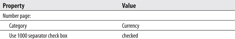
14. Double-click Page Number.
15. Click OK to exit the Expression dialog box.
16. Drag the bottom of the page footer up so it is not quite so tall.
17. Your report layout appears similar to Figure 9-12.
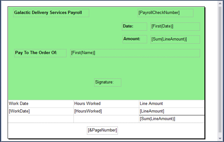
Figure 9-12 The Payroll Check layout after Task 2
Task Notes In Task 1, we created a tablix from a list template with a detail grouping to create the check portion of our payroll checks. In Task 2, we created a tablix from a table template to provide the detail information for the check register. The table tablix data region must be nested inside of the list tablix data region so that we get one set of detail information for each check. If the table was placed below the list, we would get all the checks first and then all the check register information at the end.
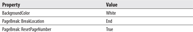
The PageBreak: BreakLocation property was set to End on the table tablix, so there is a page break immediately after the table. This starts each check on a new page. It is possible, however, that a long check register section could cause an employee’s check to wrap to a second page. For this reason, we want to put a page number in the footer of the report, and we want to reset the page number as we start each new employee. The PageBreak: PageNumberReset enables us to do that.
When the PageNumberReset property is set to true, the page number returned by Globals!PageNumber and the total pages returned by Globals!TotalPages is reset. If, for some reason, you also want to show page number and/or the total pages for the entire report, you can use Globals!OverallPageNumber and Globals!OverallTotalPages.
SSDT, Visual Studio, and Report Builder Steps
1. Expand the Parameters entry in the Report Data window.
2. Right-click the WeekNumber entry and select Parameter Properties from the context menu. The Report Parameter Properties dialog box appears.
3. Modify the following properties for the WeekNumber parameter:
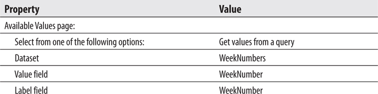
4. Click OK to exit the Report Parameter Properties dialog box.
5. Right-click anywhere outside the report body but in the layout area. Select Report Properties from the context menu. The Report Properties dialog box appears.
6. Select the Code page.
7. Enter the following in the Custom code area:
8. Click OK to exit the Report Properties dialog box.
9. Right-click the text box in the list tablix (but not in the table tablix) containing the [Sum(LineAmount)] value, and select Expression from the context menu. The Expression dialog box appears.
10. Replace the contents of the Set expression for: Value area with the following:

Ignore the red line under “TaxDeductions” if one appears.
11. Click OK to exit the Expression dialog box.
12. Repeat Steps 9–11, with the text box in the table tablix containing the sum of the LineAmount values.
13. Right-click the text box in the details row of the table tablix containing the LineAmount field, and select Expression from the context menu. The Expression dialog box appears.
14. Replace the contents of the Set expression for: Value area with the following:

15. Click OK to exit the Expression dialog box.
16. Preview/run the report.
17. Select 10-2016 from the Week Number drop-down list, and click View Report. Your report should appear similar to Figure 9-13. Remember, once checks have been run for a given week, you cannot produce checks for that week again. Each time you run the report, the Week Number drop-down list only contains entries for weeks that have not been run. (The check number you see on the first page in your preview may be different from the check number shown in the figure. This is normal.)
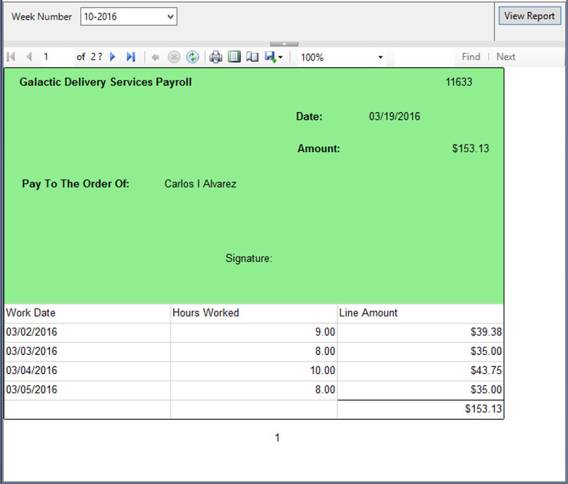
Figure 9-13 The Payroll Check preview
18. Save the report.
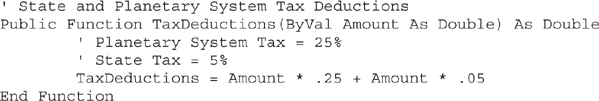
Task Notes Payroll tax calculations are straightforward on the planets where Galactic Delivery Services operates. Everyone pays 25 percent of their pay to the planetary system government and 5 percent of their pay to the state government. Even though this is a simple formula, we need to use it in three different places. Using the embedded code feature of Reporting Services, we are able to put this formula in one location and use it in several locations. This also makes things easier to change when one or the other of these tax rates is increased.
We created a function called TaxDeductions on the Code page in the Report Properties dialog box. This is simply a valid Visual Basic .NET function definition. We access this function by using the key word “Code” followed by a period and the name of the function. You can see this in the expression we entered in Step 10.
The stp_PayrollChecks stored procedure selects the payroll information for the selected week and returns that information in its result set. However, before this stored procedure returns the result set, it also updates a table in the database. It sets a flag to show the checks for the selected week have been run. This prevents the user from running payroll for the same week twice.
Using an Analysis Services cube as a data source via a Multidimensional Expression (MDX) query
Parameterizing an MDX query
Business Need The Galactic Delivery Services long-range planning committee is working on forecasting the equipment and workforce needs necessary for future growth. They need a report showing the number of deliveries and the average weight of those deliveries grouped by customer by quarter. They would also like to select whether the data includes next-day deliveries, same-day deliveries, previous-day deliveries, or some combination of the three. The data for this report should come from the GalacticDeliveriesDataMart cube hosted by Microsoft SQL Server Analysis Services.
1. Create a New Report and Create a Dataset Using the MDX Query Designer
2. Add a Tablix to the Report Layout, Populate It, and Localize the Report Strings
SSDT and Visual Studio Steps
1. Create a new report called DeliveryAnalysis using the GDSReport template.
2. In the Report Data window, select New | Data Source from the menu. The Data Source Properties dialog box appears.
3. Enter GalacticDM for the Name. Select Microsoft SQL Server Analysis Services from the Type drop-down list.
4. Click Edit next to the Connection String text box. The Connection Properties dialog box appears.
5. Enter the name of the SQL Server Analysis Services server for Server name.
6. Select GalacticOLAP from the Select or enter a database name drop-down list. You can test the connection if you like, but if GalacticOLAP shows up in the drop-down list, the connection has already been tested.
7. Click OK to exit the Connection Properties dialog box. Click OK to exit the Data Source Properties dialog box.
8. Right-click the GalacticDM entry in the Report Data window, and select Add Dataset from the context menu. The Dataset Properties dialog box appears.
9. Enter DeliveryInfo for the Name.
10. Click the Query Designer button. The MDX Query Designer appears as shown in Figure 9-14.
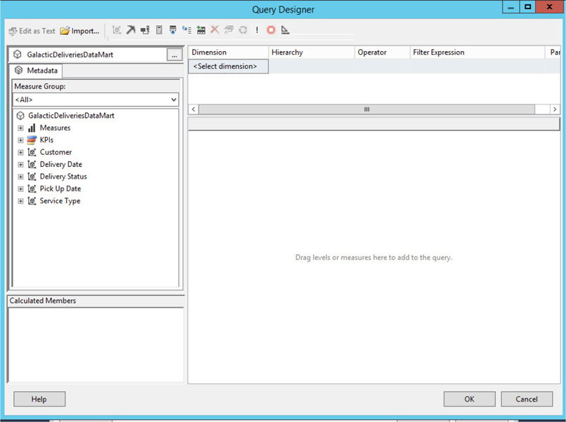
Figure 9-14 The MDX Query Designer
11. Expand the Measures entry in the Metadata pane. Expand the Delivery measure group.
12. Drag the Delivery Count measure onto the Results pane (the pane with the words “Drag levels or measures here to add to the query” in the center). The total count of all deliveries currently in the GalacticDeliveriesDataMart cube is shown in the Results pane.
13. Expand the Customer dimension in the Metadata pane. Drag the Customer Name attribute onto the Results pane to the left of the Delivery Count. The Results pane now shows the total count of all deliveries for each customer.
14. Expand the Delivery Date dimension in the Metadata pane. Drag the Delivery Quarter attribute onto the Results pane to the left of the Customer Name column. The Results pane now shows the total count of all deliveries for each customer for each quarter.
15. Right-click in the Calculated Members pane, and select New Calculated Member from the context menu. The Calculated Member Builder dialog box appears.
16. Enter AvgWeight for the Name.
17. In the Expression area, enter ROUND(. Expand the Measures in the Metadata area, and expand the Delivery measure group. Double-click Package Weight to add it to the expression.
18. Enter / at the end of the expression. Double-click Delivery Count to add it to the expression.
19. Enter ,2) at the end of the expression, and click Check to check the syntax of the expression. Click OK to close the Check Syntax dialog box. Make any corrections to the expression if a syntax error is encountered.
20. Click OK to exit the Calculated Member Builder dialog box.
21. Drag the AvgWeight calculated member onto the Results pane to the right of the Delivery Count.
22. In the Filter pane (the pane in the upper-right corner of the MDX Query Designer), select Service Type from the drop-down list in the Dimension column.
23. Select Service Type from the drop-down list in the Hierarchy column.
24. Equal should be selected from the drop-down list in the Operator column.
25. Examine the values in the drop-down window in the Filter Expression column, but do not make a selection. The Filter Expression column enables us to select one or more values for the right side of our filter expression. Instead of doing this at design time, we let our users make the selection at run time. Click Cancel to exit the drop-down window.
26. Check the box in the Parameters column. This selection enables the user to select the values of the filter expression at run time. (You may have to scroll right to see the check box.) The MDX Query Designer should appear as shown in Figure 9-15.
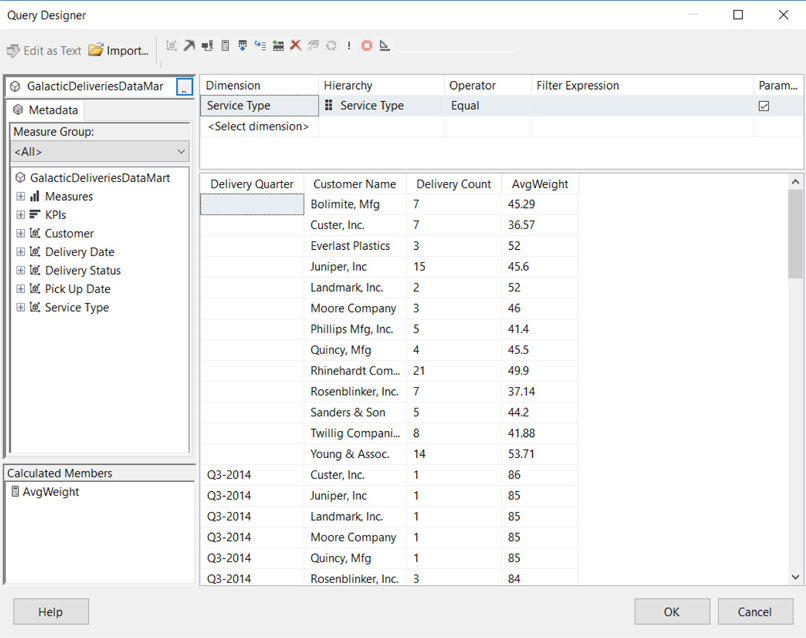
Figure 9-15 The MDX Query Designer containing the query for the Delivery Analysis Report
27. Click OK to exit the Query Designer window. Click OK to exit the Dataset Properties dialog box.
Task Notes The MDX Query Designer works almost entirely through drag-and-drop. We drag measures, dimensions, and hierarchies from the Metadata Browser pane and drop them in the Results pane to create our query. We can define calculated members and add them to the Results pane as well.
At the top of the Metadata pane is the name of the cube being queried. To select a different cube, click the . . . button and make a selection from the Cube Selection dialog box that appears.
In SSDT and Visual Studio, the toolbar button with the pickaxe icon switches from the MDX Query Designer to the Data Mining Expression (DMX) Query Designer. (This is not available in Report Builder.) The toolbar button with the X and Y axes switches back to the MDX Query Designer. Where the MDX Query Designer is used to query cubes in an Analysis Services database, the DMX Query Designer is used to query data mining models in an Analysis Services database. Because the same Analysis Services database may contain both cubes and data mining models, the Report Designer may not be able to tell which query designer you need simply by examining the database. Therefore, it is necessary to have a way to switch between the two.
The Show Empty Cells toolbar button toggles between showing and hiding empty cells in the results pane. An empty cell is a combination of dimension and hierarchy members that have a null value for every measure, calculated or otherwise, in the results pane. If empty cells are hidden in the results pane, they are also hidden in the final report query. The Design Mode toolbar button enables you to toggle between the design view and the query view of the MDX query. If you are comfortable with MDX query syntax, you may want to type your queries into the query view rather than creating them through the drag-and-drop programming method of the design view. The Auto Run toolbar button toggles autoexecute mode in the Query Designer. When autoexecute mode is on, the cube is requeried and the results pane is updated every time an item is added or removed.
The Filter pane enables us either to hardcode filter expressions at design time or use report parameters for the user to make selections at run time. When the Parameters check box is checked, a parameterized filter is created. Several things happen when we exit the MDX Query Designer dialog box for the first time after a parameterized filter has been added to the query. When this occurs, the authoring environment creates a new dataset for each item being used in a parameterized filter. This dataset includes all the valid members of that item.
In addition to the datasets, new report parameters are created for each parameterized filter. The datasets are used to populate the available values for these report parameters. The report parameters are multivalued. Using this mechanism, the user is allowed to select one or more valid members to be used in the parameterized filters at the time the report is executed.
SSDT, Visual Studio, and Report Builder Steps
1. Place a text box onto the body of the report and set its properties as follows:
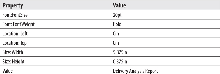
2. Use the matrix template to place a tablix onto the report body.
3. Select the Delivery_Quarter field from the DeliveryInfo dataset in the Columns cell. Click the Bold button and the Center button on the toolbar.
4. Select the Customer_Name field in the Rows cell. Click the Bold button on the toolbar.
5. Select the Delivery_Count field in the Data cell.
6. In the Report Data window, drag the AvgWeight field into the same cell where Delivery_Count was placed. Drag to the right side of the cell. This creates a second data column to the right of the first.
7. Right-click the cell that was just created, and select Tablix: Insert Row | Outside Group – Above from the context menu.
8. Enter Number of Deliveries in the text box above the cell containing the DeliveryCount field.
9. Enter Avg. Weight in the text box above the cell containing the AvgWeight field.
10. Select the cell in the upper-left corner of the tablix, and press DELETE to remove the heading created here.
11. Expand the Parameters entry in the Report Data window.
12. Right-click the ServiceTypeServiceType entry in the Report Data window, and select Parameter Properties from the context menu.
13. Enter Select Service Types for the Prompt.
14. Click OK to exit the Report Parameter Properties dialog box.
15. Preview/run the report. Check All in the Select Service Types drop-down list, and click View Report.
16. Scroll left and right. You will notice the quarter headings are in alphabetical order rather than in chronological order as they should be.
17. Return to design mode.
18. Use the Delivery_Quarter drop-down button in the Column Groups area to select Group Properties. The Group Properties dialog box appears.
19. On the Sorting Page of the dialog box, select the Sort by [Delivery_Quarter] entry and click Delete. This Sort by row is removed, leaving no sorting done for this group.
20. Click OK to exit the Group Properties dialog box.
21. Preview/run the report. Check All in the Select Service Types drop-down list, and click View Report. The report appears as shown in Figure 9-16.
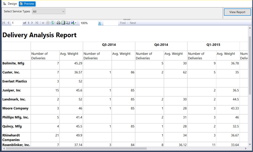
Figure 9-16 The Delivery Analysis report
22. Save the report.
Task Notes The Delivery Analysis report makes use of a special type of parameter that allows for more than one value to be selected. Rather than requiring the user to select a single value from the Available Values drop-down list, a multivalued parameter enables the user to check off a number of values to be used when creating the report. When parameters are specified for an MDX query, multivalued report parameters are always created. We can use multivalued parameters with T-SQL queries and stored procedures as well, as we will see later in this chapter.
The properties of the report parameter change when that parameter becomes multivalued. Instead of containing single values, the Value and Label properties become arrays. The arrays have one element for each of the items selected by the user. If the user checks three items in the drop-down list, the Value and Label arrays each have three elements. (These are zero-based arrays, so they are elements 0, 1, and 2 in this case.) The Length property of each array contains the number of elements in that array. The MDX Query Designer knows how to deal with these parameter arrays without any intervention from us. That is not the case with T-SQL queries and stored procedures. As we will see later in this chapter, when using multivalued parameters with datasets from these, we will have a bit more work to do.
Thus far, we have placed report items within report items and data regions within data regions. In this section, we look at putting whole reports inside one another. This is done using the subreport item.
The subreport item is simply a placeholder in a report. It sits in the parent report and shows the space to be occupied by another report when the parent report is run. Nothing is special about a report placed in a subreport item. Any report can be used as a subreport.
The report placed in the subreport can even contain parameters. These parameter values can be passed from the parent report to the subreport. Any field value, parameter value, or expression in the parent report can be passed as a parameter value to the subreport.
Subreports are used for many reasons. They can provide an easy way to reuse a complex report layout within a parent report. They can also be used to implement a more complex form of drilldown.
The following subreports are anything but subpar!
Using a subreport as reusable code
Creating a landscape report
Using a rectangle for grouping
Using rich formatting
Business Need The Galactic Delivery Services personnel department has created an application for employees to conduct peer reviews as part of each employee’s annual review process. They are also collecting a review and comments from each employee’s manager. They need a report that can be used to present the results of the peer review at the employee’s meeting with their supervisor.
The manager’s review and comments should be noted as coming from the manager. The peer reviews, however, should be presented anonymously.
1. Create a New Report, Create a Dataset, Add a Tablix to the Report Layout, and Populate It
2. Create a New Report, Create a Dataset, and Populate the Report Layout
3. Add a Rectangle
4. Add Rich Formatting
SSDT, Visual Studio, and Report Builder Steps
1. Create a new report called EvalDetail. Do not use the GDSReport template. (If you are using Report Builder, remove the Click to add title text box and the page footer.)
2. Create a new data source called Galactic that references the Galactic shared data source.
3. Create a new dataset called EvalRatings that calls the stp_EvalRatings stored procedure.
4. Use the table template to place a tablix onto the body of the report.
5. Select the Goal, Rating, and GoalComment fields in the data row of the table.
6. Add a parent row group to the table that groups by EvaluatorEmployeeNumber. The group should have a group header and a group footer.
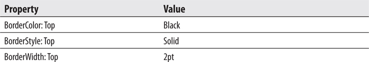
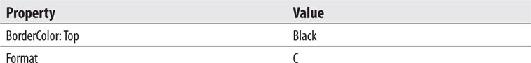
7. Complete your report layout so it is similar to Figure 9-17. The top row has the BorderColor: Top property set to Black. The bottom row has the BorderColor: Bottom property set to Black and the BorderWidth: Bottom property set to 5pt. Also note that the column headings were moved to the group header row, and the table header row and EvaluatorEmployeeNumber column were deleted.
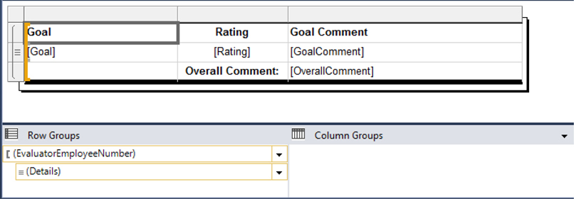
Figure 9-17 The Employee Evaluation Detail report layout
8. Save the report.
Task Notes The EvalDetail report is going to be used in two subreports in our parent report. It is going to be used in one location to display the peer reviews and in another location to display the manager review. We can create this layout for displaying review information and then use it in multiple places.
Subreports have several uses. One use is to serve as reusable layout, as we are doing here. Second, subreports can create nested reports from multiple data sources. Finally, subreports can be used to display multiple one-to-many relationships.
Subreports, however, can be inefficient if overused. Every time a subreport executes, its dataset queries must be run. When a subreport is embedded in a data region, it can be executed many times, perhaps once for each record in the parent report. This can result in a long-running report that puts a good deal of stress on your database server. So use those subreports, but use them wisely.
SSDT, Visual Studio, and Report Builder Steps
1. Create a new report called EmployeeEval using the GDSReport template.
2. Create a new data source called Galactic that references the Galactic shared data source.
3. Create a new dataset called EvalPerformance that calls the stp_EvalPerformance stored procedure.
4. Open the Report Properties dialog box.
5. Modify the following properties of the report:
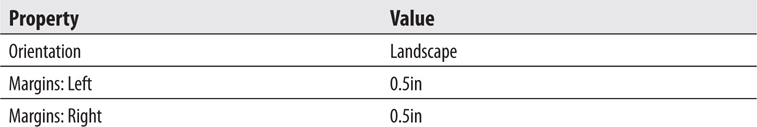
6. Click OK to exit the Report Properties dialog box.
7. Click the design surface to select the report body. Set the following property of the report body:

8. Drag the EmployeeName field onto the report body. Modify the following properties of the text box that results:

9. Place a text box onto the report body. Modify the following properties of this text box:
10. Place a text box onto the report body. Modify the following properties of this text box:
11. Place a subreport onto the report body immediately below the text box. Modify the following properties of this subreport:
12. Right-click the subreport and select Subreport Properties from the context menu. The Subreport Properties dialog box appears.
13. If you are using SSDT or Visual Studio, select EvalDetail from the Use this report as a subreport drop-down list. If you are using Report Builder, click Browse, and then double-click EvalDetail in the Select Report dialog box.
14. Select the Parameters page.
15. Click Add to add parameters to the grid. Configure the parameters as shown here:
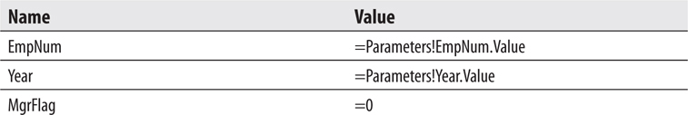
16. Click OK to exit the Subreport Properties dialog box.
17. Select the Peer Evaluations text box and the subreport. Press CTRL-C to copy these two items. Press CTRL-V to paste a copy of these items on the report body. Drag the two copied items so they are immediately below the original subreport.
18. Modify the new text box to read Manager Evaluations. Adjust the width of the text box as needed.
19. Open the Subreport Properties dialog box for the new subreport, and select the Parameters page.
20. Change the parameter value for MgrFlag from = 0 to = 1. This causes the second subreport to contain the manager’s evaluation rather than the peer evaluations.
21. Click OK to exit the Subreport Properties dialog box.
22. Place a text box onto the report body. Modify the following properties of this text box:
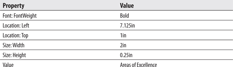
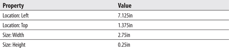
23. Drag the AreasOfExcellence field onto the report body. Modify the following properties of the text box that results:
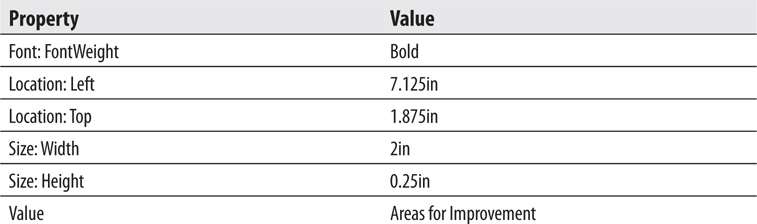
24. Place a text box onto the report body. Modify the following properties of this text box:
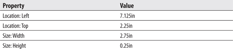
25. Drag the AreasForImprovement field onto the report body. Modify the following properties of the text box that results:
26. Preview/run the report. Enter 1394 for EmpNum and 2015 for Year, and then click View Report. Your report should appear similar to Figure 9-18.
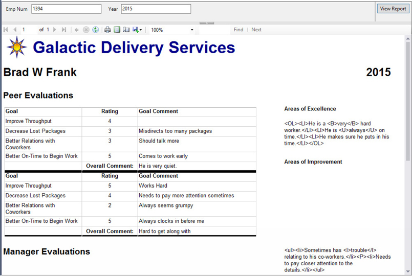
Figure 9-18 The Employee Evaluations report preview after Task 2
Task Notes We used the Report Properties dialog box to change this report’s orientation from portrait to landscape. When you are creating your report templates, you may want to create one template for portrait reports and another template for landscape reports.
Two steps are required to get each subreport item ready to use. First, you have to specify which report is going to be used within the subreport item. Once this is done, you need to specify a value for each of the parameters in the selected report. With these two tasks completed, your subreports are ready to go.
In this report, we are using several fields outside of a data region: the EmployeeName field, the AreasOfExcellence field, and the AreasForImprovement field. Remember, data regions are set up to repeat a portion of their content for each record in the result set. When a field value occurs outside of a data region, it is not repeated; it occurs only once. Therefore, one record must be selected by the authoring environment for display in these fields. It happens that the first record in the dataset is selected in these situations.
In this particular report, the EvalPerformance dataset has only one record. Of course, the authoring environment does not know at design time how many records the dataset will have at run time. (Even if the dataset has only 1 record at design time, it could have 100 records at run time.) Therefore, the authoring environment always uses the first record for references outside of a data region.
Finally, you may have noticed a little problem with the text box that contains the contents of the AreasForImprovement field. (Not the HTML formatting tags—we will deal with those in Task 4.) It seems to be sliding down the page. In actuality, it was pushed down the page when the subreport grew.
The text boxes that contain the Areas of Excellence title, the AreasOfExcellence field value, and the Areas for Improvement title are all even with the first subreport. However, the text box containing the value of the AreasForImprovement field starts below the bottom of the first subreport. When the subreport grows because of its content, the text box is pushed farther down the report, so it remains below the bottom of the subreport.
In Task 3, you see a way to prevent this problem.
SSDT, Visual Studio, and Report Builder Steps
1. Return to design mode.
2. Select the Areas of Excellence text box, the AreasOfExcellence field value text box, the Areas for Improvement text box, and the AreasForImprovement field value text box. Press CTRL-X to cut these four text boxes.
3. Place a rectangle on the report in the area just vacated by these four text boxes.
4. With the rectangle still selected, press CTRL-V to paste the four text boxes into the rectangle.
5. Arrange the rectangle and the four text boxes as needed. Your layout should appear similar to Figure 9-19.
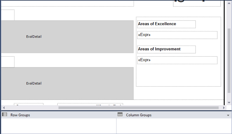
Figure 9-19 The Employee Evaluation report layout with a rectangle
6. Preview/run the report. Enter 1394 for EmpNum and 2015 for Year, and then click View Report. Your report should appear similar to Figure 9-20.
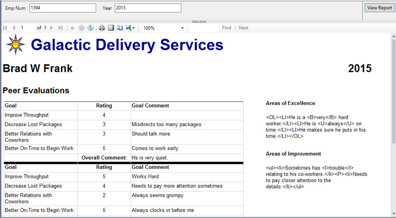
Figure 9-20 The Employee Evaluation report preview with a rectangle
7. Save the report.
Task Notes The rectangle report item comes to your rescue here. Once the four text boxes are inside the rectangle, they remain together no matter how much the subreport grows. As your report designs become more complex, rectangles are often necessary to keep things right where you want them.
SSDT, Visual Studio, and Report Builder Steps
1. Return to design mode.
2. Double-click the text box containing the expression for the employee name (the large text box right below the Galactic Delivery Services logo and heading). The text edit cursor will be to the left of the “<<Expr>>” placeholder in the text box.
3. Type Employee: as shown in Figure 9-21.
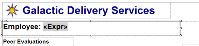
Figure 9-21 Adding text to the Employee field text box
4. Highlight the text just entered in Step 3.
5. Click the bold button on the ribbon/toolbar to unbold the selected text.
6. Select “12pt” from the font size drop-down list in the ribbon/toolbar (see Figure 9-22).
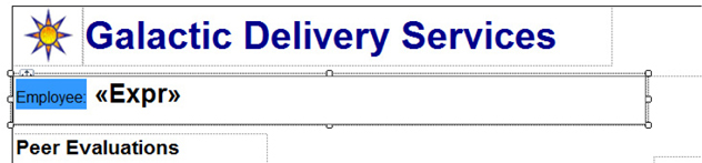
Figure 9-22 Adding rich formatting to text
7. Double-click the text box containing the Year parameter. The text edit cursor will be to the left of the “[@Year]” placeholder.
8. Type Year: and press ENTER.
9. Highlight the text entered in Step 8.
10. Click the bold button on the toolbar to unbold the selected text.
11. Select “12pt” from the font size drop-down list in the toolbar.
12. Click outside of the Year parameter text box to unselect it. Single-click the Year parameter text box to select it.
13. Modify the following property of this text box:

14. Double-click the text box for the AreasOfExcellence field.
15. Click “<<Expr>>” to highlight it.
16. Right-click the highlighted text and select Placeholder Properties from the context menu as shown in Figure 9-23. The Placeholder Properties dialog box appears.
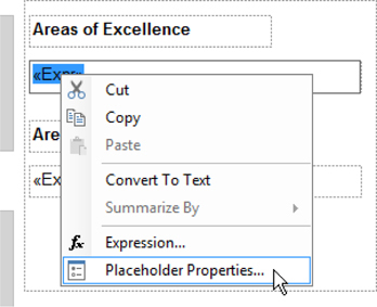
Figure 9-23 Setting placeholder properties
17. On the General page, select the HTML – Interpret HTML tags as styles radio button.
18. Click OK to exit the Placeholder Properties dialog box.
19. Repeat Step 14–Step 18 for the AreasForImprovement field text box.
20. Preview/run the report. Enter 1394 for EmpNum and 2015 for Year, and then click View Report. Your report should appear similar to Figure 9-24.
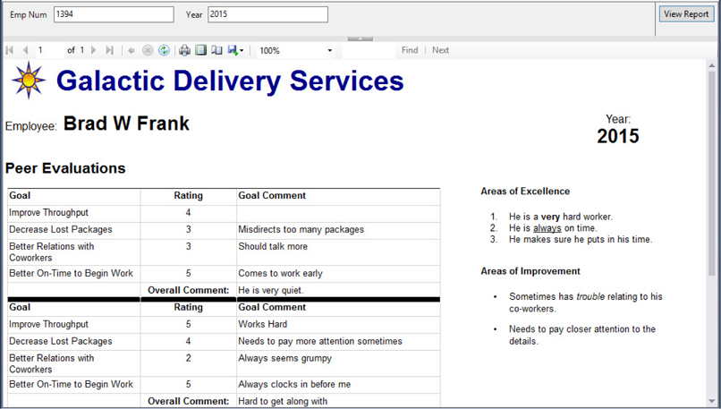
Figure 9-24 The Employee Evaluation report with rich formatting
21. Save the report.
Task Notes In previous reports, we have used Visual Basic expressions to combine static text, such as labels, with dynamic text from fields and parameters. As an alternative, we can type text into the text box before or after the field, parameter, or expression placeholder. In fact, we can combine several placeholders in a single text box, just as we have sometimes combined several fields in a Visual Basic expression. To manually add a placeholder to a text box, right-click while editing text in the text box, and select Create Placeholder from the context menu.
Use the Visual Basic expressions or the combination of static text and placeholders. Either method works just fine. Note, however, once you use a placeholder/static text combination in a text box, you can no longer view the expression for that text box, only for an individual placeholder.
In addition to combining static text and placeholders in a single text box, we combined different formatting within a single text box. This is called rich formatting. Rich formatting enables us to treat different parts of the contents of a text box as distinct items and allows us to apply different formatting to each of these items.
One of the bits of formatting we can apply to a placeholder in a text box is the ability to interpret HTML tags embedded in the content of the field or parameter represented by that placeholder. In our report, the content of the AreasOfExcellence field is:

Note the embedded HTML formatting tags. By selecting the HTML – Interpret HTML tags as styles radio button in the Properties dialog box for this placeholder, we can have the HTML tags embedded in this text used as formatting characters. The result is a numbered list containing bold and underlined text. The content of the AreasForImprovement field is:

These HTML tags produce a bulleted list with italicized text and a paragraph break.
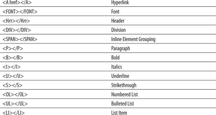
The following HTML tags are handled by Reporting Services rich formatting:
Using a subreport in a table
Using a subreport to facilitate drilldown
Using RenderFormat.Name
Exporting to PDF
Business Need The Galactic Delivery Services accounting department wants an interactive Invoice report. The Invoice report needs to show the invoice header and invoice detail information. The user can then expand an invoice detail entry to view information on the delivery that created that invoice detail.
1. Create a New Report, Create a Dataset, and Copy the Layout from the DeliveryStatus Report
2. Create a New Report, Create a Dataset, and Populate the Report Layout
3. Improve PDF Export
SSDT, Visual Studio, and Report Builder Steps
1. Open the DeliveryStatus report.
2. Select the tablix in the DeliveryStatus report, and press CTRL-C to copy it. (Make sure you have the entire tablix selected and not just a single cell in the tablix.)
3. Close the DeliveryStatus report.
4. Create a new report called DeliveryDetail. Do not use the GDSReport template.
5. Create a new data source called Galactic that references the Galactic shared data source.
6. Create a new dataset called DeliveryStatus that calls the stp_DeliveryDetail stored procedure.
7. If you are using Report Builder, delete the Click to add title text box and remove the page footer.
8. Press CTRL-V to paste the tablix into the report body.
9. Move the tablix to the upper-left corner of the report body. Size the report body so it exactly contains the table.
10. Save the report.
Task Notes Instead of re-creating a layout for the delivery detail, we borrowed a layout created previously in another report. This works because the stp_DeliveryDetail stored procedure returns the same columns as the stp_DeliveryStatus stored procedure used for the previous report. The other requirement needed to make this cut-and-paste operation successful was to use the same name for the dataset in both reports.
When you have a layout that is nice and clean, reusing it whenever possible is always a good idea. In Chapter 12, we look at another way to share layout items using published report parts. This method allows us to share layout among multiple authors. Something to look forward to in a future chapter!
SSDT, Visual Studio, and Report Builder Steps
1. Create a new report called Invoice using the GDSReport template.
2. Create a new data source called Galactic that references the Galactic shared data source.
3. Create a new dataset called InvoiceHeader that calls the stp_InvoiceHeader stored procedure.
4. Create a second dataset called InvoiceDetail that calls the stp_InvoiceDetail stored procedure.
5. Use the list template to place a tablix onto the report body.
6. Size the tablix and add fields to create the layout shown in Figure 9-25. The fields come from the InvoiceHeader dataset. The black line across the bottom is a solid bottom border on the tablix with a border width of 10 points.
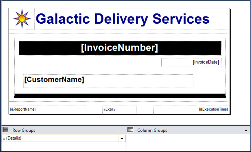
Figure 9-25 The Invoice report layout with an invoice header
7. Drag the report body to make it larger.
8. Use the table template to place a tablix onto the report body immediately below the existing tablix.
9. Select the LineNumber, Description, and Amount fields from the InvoiceDetail dataset in the data row of the tablix.
10. Size the table columns appropriately, but ensure the tablix has a Location: Left of 0in and a Size: Width of 6.5in exactly. Type the letter C for the Format property of the text box containing the Amount field value.
11. Delete the table header row.
12. Select all three of the remaining cells in the tablix and set the following property:

13. Add a second details row below the existing data row. (In other words, insert a second row inside the details group.)
14. Merge the three cells in this new details row.
15. Place a subreport in the merged cell.
16. Open the Subreport Properties dialog box. Set the subreport to use the DeliveryDetail report.
17. Select the Parameters page and configure it as follows:

18. Click OK to exit the Subreport Parameters dialog box.
19. Right-click the gray box to the left of the row containing the subreport and select Row Visibility from the context menu. The Row Visibility dialog box appears.
20. Modify the following properties in the Row Visibility dialog box:
21. Click OK to exit the Row Visibility dialog box.
22. Preview/run the report. Type 73054 for InvoiceNumber, and click View Report.
23. Expand one of the invoice detail entries and observe how the subreport appears. Your report should appear as shown in Figure 9-26.
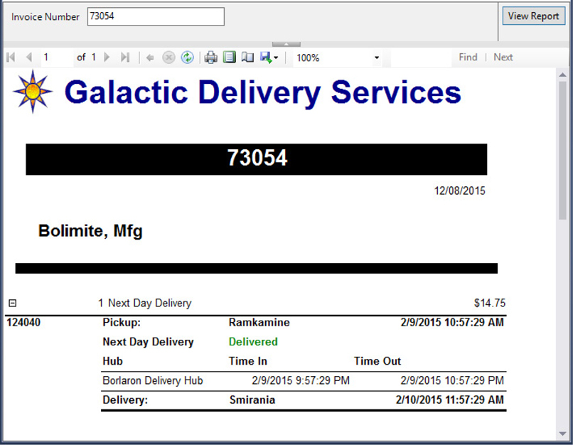
Figure 9-26 The Invoice report
Task Notes In the Invoice report, we placed our subreport right in a table cell. A field from the table’s dataset is used as the parameter for the subreport. Because of this, the subreport is different for each detail row in the table.
We chose to have the subreport initially hidden in our report. The reason for this is the subreport contains a large amount of detail information. This detail would overwhelm the users if it were displayed all at once. Instead, the users can selectively drill down to the detail they need.
In our next report, you look at another way to manage large amounts of detail by using the drillthrough feature of Reporting Services.
SSDT, Visual Studio, and Report Builder Steps
1. Click the Export drop-down button, as shown in Figure 9-27 for SSDT and Visual Studio, or as shown in Figure 9-28 for Report Builder. Select PDF from the drop-down menu.
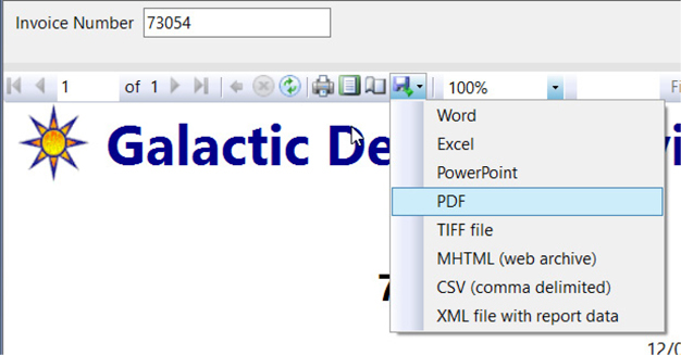
Figure 9-27 The Export drop-down button in SSDT and Visual Studio
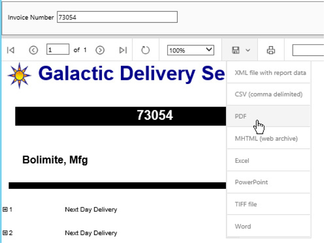
Figure 9-28 The Export drop-down button in Report Builder
2. Save the resulting PDF file, and open it with Adobe Reader. The PDF format does not support the drilldown activity, so we are not able to view the detail of any of the invoices, except the one we had displayed. It would be helpful to have the invoice detail expanded when the report is exported to a PDF file.
3. Close Adobe Reader and delete the PDF file.
4. Back in the report authoring environment, return to design mode.
5. Click anywhere in the table tablix on the report.
6. Right-click the gray box to the left of the row containing the subreport and select Row Visibility from the context menu. The Row Visibility dialog box appears.
7. Select the Show or hide based on expression option under the When the report is initially run prompt.
8. Click the expression (FX) button. The Expression dialog box appears.
9. Replace the content of the Set expression for: Hidden entry area with the following expression:

10. Click OK to exit the Expression dialog box. Click OK to exit the Row Visibility dialog box.
11. Preview/run the report. Type 73054 for InvoiceNumber, and click View Report. The invoice detail is initially hidden when the report is viewed in the authoring environment.
12. Click the Export drop-down button, and select PDF from the drop-down menu.
13. Save the resulting PDF file, and open it with Adobe Reader. The invoice detail is not hidden when the rendering format is PDF.
14. Close Adobe Reader and delete the PDF file.
15. Save the report.
In many cases, your reports can be much more effective when users can view them electronically. Reporting Services offers a number of options for enabling the user to interact with the reports when viewed in this way. You have already seen several examples of drilldown interactivity. This type of interactivity hides detail information until the user needs it.
In this section, you learn additional methods for navigating within reports and even moving between reports. You also see how to link a report to Internet content. Finally, you look at a way for your report to interact with you by always keeping its data current.
So don’t be shy: interact!
Using drillthrough navigation to move between reports
Using the document map to navigate within a report
Using bookmarks to navigate within a report
Using links to navigate to Internet content
Using the page name property and built-in field
Exporting to Excel
Business Need The Galactic Delivery Services accounting department is pleased with the Invoice report. They would now like a front end to make the Invoice report easier to use. The front-end report should list all invoices by customer and let the user click an invoice to see the complete Invoice report. The front end should have each customer start on a new page. In addition, the front end should provide a quick way to navigate to the page for a particular customer and a way to move from a customer to the page for its parent company. Finally, the front end should include a link to the customer’s website for further information.
1. Create a New Report, Create a Dataset, and Populate the Report Layout
2. Add the Navigation
3. Improve Excel Export
SSDT, Visual Studio, and Report Builder Steps
1. Create a new report called FrontEnd using the GDSReport template.
2. Create a new data source called Galactic that references the Galactic shared data source.
3. Create a new dataset called CustomerInvoices that calls the stp_CustomerInvoices stored procedure.
4. Use the table template to place a tablix onto the report body.
5. Select the InvoiceNumber, InvoiceDate, and TotalAmount fields in the Data row of the table.
6. Type the letter C for the Format property for the text box containing the TotalAmount field value.
7. Delete the table header row.
8. Add a parent row group to the table using the CustomerName as the group expression. The group should have a group header, but not a group footer.
9. Use the Page Breaks page of the Group Properties dialog box to set a page break between each instance of a group.
10. Drag the cell containing the CustomerName field wide enough to contain the customer name without wrapping. Set the FontWeight property of this cell to Bold.
11. Merge the left and center cells in the group header row. Select the ParentName field in the newly merged cells.
Task Notes We have the layout for the Invoice Front-End report. However, it is not really a front end because it does not lead anywhere yet. Let’s continue to the good stuff.
SSDT, Visual Studio, and Report Builder Steps
1. Right-click the cell containing the Invoice Number field, and select Textbox: Text Box Properties from the context menu. The Text Box Properties dialog box appears.
2. Select the Action page.
3. Select the Go to report option under the Enable as an action prompt.
4. Select the Invoice report for the Specify a report prompt.
5. Click Add in the parameters area and configure the parameter as follows:

6. Click OK to exit the Text Box Properties dialog box.
7. In the Row Groups pane, use the CustomerName drop-down menu to select Group Properties. The Group Properties dialog box appears.
8. Select the Advanced page.
9. Select [CustomerName] from the Document map drop-down list.
10. Click OK to exit the Group Properties dialog box.
11. Select the cell containing the CustomerName field. Set the following property in the Properties window:

12. Right-click the cell containing the ParentName field, and select Textbox: Text Box Properties from the context menu. The Text Box Properties dialog box appears.
13. Select the Action page.
14. Select the Go to bookmark option under the Enable as an action prompt.
15. Select [ParentName] from the Select bookmark drop-down list.
16. Click OK to exit the Text Box Properties dialog box.
17. Right-click the rightmost cell in the group header row, and select Textbox: Text Box Properties from the context menu. The Text Box Properties dialog box appears.
18. Type Website Link for Value.
19. Select the Action page.
20. Select the Go to URL option under the Enable as an action prompt.
21. Select [CustomerWebsite] from the Select URL drop-down list.
22. Click OK to exit the Text Box Properties dialog box.
23. Preview/run the report. Your report should appear similar to Figure 9-29.
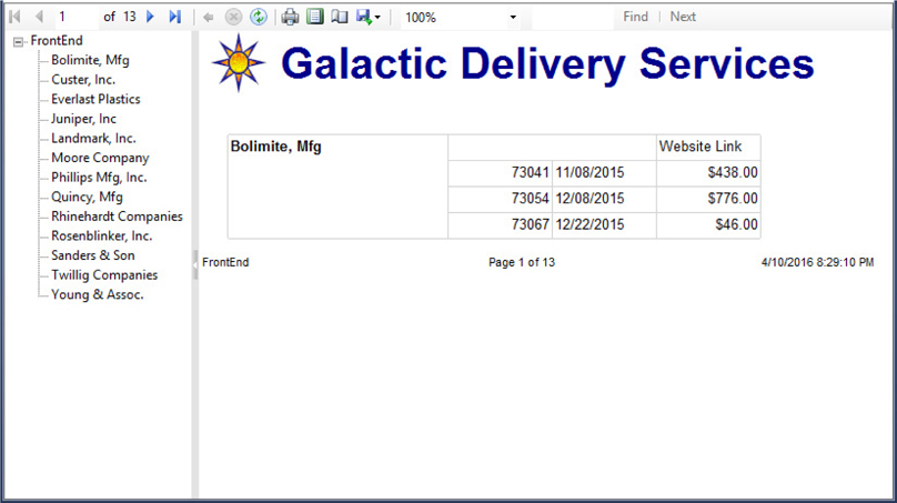
Figure 9-29 The Front-End report
Task Notes When you look at the report preview, you notice a new feature to the left of the report. This is the document map, which functions like a table of contents for your report. We created entries in the document map when we selected a field from the Document map drop-down list in Step 9.
Because you used CustomerName as the document map field, you see a list of all the customer names in the document map. When you click a customer name in the document map, you are taken directly to the page for that customer.
If you are not using the document map, you can hide it. This is done by clicking the small white arrow in the middle of the bar separating the document map from the report. In Report Builder, you also have the option of clicking the Document Map button, which is in the Options section of the ribbon. Clicking either of these items a second time causes the document map to return.
In addition to creating document map entries for each customer name, we created bookmarks for each customer name. This was done in Step 11. We are using these bookmarks to link child companies to their parent company. We are creating a Go to bookmark link using the value of the ParentName field. This was done in Steps 14 and 15.
When a customer has a value in the ParentName field, a Go to bookmark link is created on that parent name. The bookmark link jumps to the page for the customer with the matching name. To try this out, use the document map to jump to the page for Everlast Plastics. Everlast’s parent company is Young & Assoc. Click the link for Young & Assoc., and you will jump to the page for that company.
We also created a Go to URL link for each customer. This link was placed in the cell that reads Website Link and was created in Steps 20 and 21. Clicking this cell is supposed to take you to the website for each customer. However, we are unable to connect to the Inter-galactic-net used by GDS and its customers. Instead, clicking this link opens a browser and takes you to the Superior Consulting Services website.
Earlier in the process, we created a Go to report link. This was done in Steps 2 through 6. Clicking an invoice number jumps you to the Invoice Report and passes the invoice number as a parameter. This enables you to see the detail information for the invoice. When you finish looking at the invoice, you can return to the Invoice Front-End report by clicking either the Back to Parent Report button (blue arrow) in SSDT and Visual Studio or the Back button in Report Builder.
SSDT, Visual Studio, and Report Builder Steps
1. Click the Export drop-down button. Select Excel from the drop-down menu.
2. Save the resulting Excel workbook file and open it in Excel 2007 or later. Each page of the report appears as a separate spreadsheet tab. The first spreadsheet functions as the document map and the name on the tab says “Document map.” The other tabs have generic names: Sheet2, Sheet3, and so on. What would make this even better is to have each tab show the name of the customer whose information it displays.
3. Close Excel and delete the workbook file.
4. Back in the report authoring environment, return to design mode.
5. Click the CustomerName item in the Row Groups area to select it. The Properties window says “Tablix Member” at the top.
6. Set the following property:

This will name each page after the Customer Name.
7. Right-click the text box containing “[&ReportName]” in the lower-left corner of the footer, and select Expression from the context menu. The Expression dialog box appears.
8. Add to the expression in the Set expression for: Value so it matches the following:

9. Click OK to exit the Expression dialog box.
10. Preview/run the report.
11. Page through the report and note the page name is now shown with the report name in the report footer.
12. Export the report to Excel and save the worksheet file as you did before.
13. Open the Excel workbook file. Note the names on the tabs now reflect the value of the PageName property.
14. Close Excel and delete the worksheet file.
15. Save the report.
Task Notes Our Front-End report works well when it is exported as an Excel workbook file. Excel provides features that allow all of the interactivity to be preserved. As we look at our initial worksheet export, it is obvious that the one thing missing is better naming of the spreadsheet tabs. This is especially true once you navigate away from the Document map tab. You really can’t navigate directly to another customer’s tab without first going back to the Document map.
The PageName property allows us to associate a name with each page of the report. We can use the PageName built-in field (Globals!PageName) to display that page name anywhere on the report, including the page header or page footer. When the report is exported in the Excel format, we get the added bonus of having the page names show up on the spreadsheet tabs.
Using a chart as the data section of a tablix
Indicating values over a set maximum on a chart
Using the autorefresh report property
Using a multivalued parameter with a WHERE clause
Business Need The Galactic Delivery Services maintenance department needs a report to assist in monitoring transport operations. Each transport feeds real-time sensor data back to the central database. The maintenance department needs a report to display this information for a selected set of transports. Because the sensor data is updated every minute, the report should refresh every minute. The sensor data should be displayed in a graphical form, with a highlight of any values that are above the normal maximums.
1. Create a New Report, Create a Dataset, Populate the Report Layout, and Set Report Properties
SSDT, Visual Studio, and Report Builder Steps
1. Create a new report called TransportMonitor. Do not use the GDSReport template.
2. Create a new data source called Galactic that references the Galactic shared data source.
3. Create a new dataset called TransportMonitor that calls the stp_TransportMonitor stored procedure.
4. Create a second dataset called TransportList that calls the stp_TransportList stored procedure.
5. Configure the TransportNumber Report Parameter as follows:
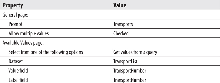
6. Click OK to exit the Report Parameter Properties dialog box.
7. If you are using Report Builder, delete the Click to add title text box and remove the page footer.
8. Place a text box on the report body, and set its properties as follows:

9. Use the matrix template to place a tablix onto the report body. Set the properties of the tablix as follows:
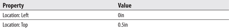
10. Select the TransportNumber field from the TransportMonitor dataset in the Rows cell. Set the following properties of the text box created in that cell:
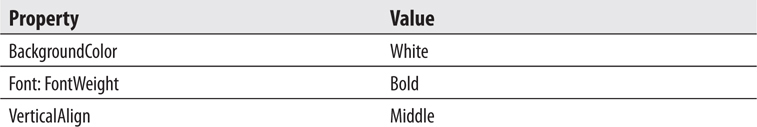
11. Select the Item field in the Columns cell. Set the following properties of the text box created in that cell:
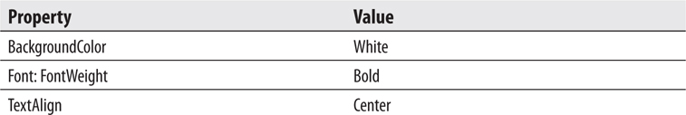
12. Open the Tablix Properties dialog box. Set the following properties:
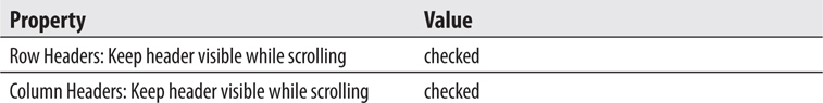
13. Click OK to exit the Tablix Properties dialog box.
14. Select the Data cell of the tablix, and set the following properties:
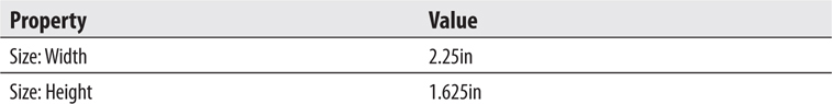
15. Place a chart in the Data cell. The Select Chart Type dialog box appears.
16. Select the stacked column chart, and click OK.
17. Click the chart to view the Chart Data window. Use the green plus sign next to the Values area to select the Value field.
18. Use the green plus sign next to the Category Groups area to select the Reading field. Use the green plus sign next to the Series Groups area to select the ReadingPortion field.
19. In the Chart Properties dialog box, set the following property:

20. In the Vertical Axis Properties dialog box, set the following property:

21. Right-click the chart title, and select Delete Title from the context menu.
22. Right-click the legend area of the chart, and select Delete Legend from the context menu.
23. Click anywhere outside the report body to bring up the report properties in the Properties window. Set the following property in the Properties window:

24. Preview/run the report.
25. Select several transport numbers from the drop-down list, and click View Report. Your report appears similar to Figure 9-30.
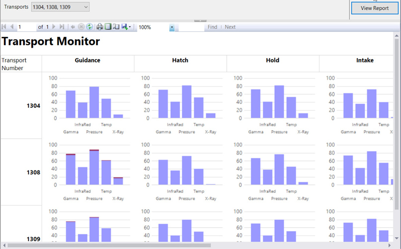
Figure 9-30 The Transport Monitor report preview
26. Save the report.
Task Notes A number of interesting things are going on in this report. First, a multivalued parameter is being sent to SQL Server for use in a stored procedure. The stored procedure uses the contents of this multivalued parameter to build a query string on the fly. The SELECT statement in the stored procedure is a bit complicated because it is using some random number generation to simulate the Transport telemetry. Here is a more straightforward version of the content of the stored procedure:
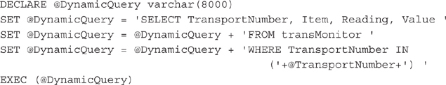
This stored procedure code builds the SELECT statement in the @DynamicQuery variable. It uses the IN operator to look for the content of the TransportNumber field in a list of values. The values must be comma-separated and enclosed in parentheses to be used with the IN operator. The values in the multivalued parameter are being passed to the @TransportNumber stored procedure parameter. Because these values are already comma-separated, all we have to do is place them inside the parentheses to use them with the IN operator.
We placed a chart in the data portion of the matrix data region. Because the data portion of a matrix is an aggregate, the chart has a set of values to use for charting. When the report is rendered, the chart is repeated in each data cell in the matrix. Each chart then acts within the scope of its data cell and charts the data in that scope.
The chart contains two series. The first series is a value up to the maximum normal value for that reading. The second series is the amount of the reading above the maximum normal value. The second series value is zero if the reading is below or at its maximum normal value. The stacked column chart puts these two series one on top of the other. The result is any readings that are above their maximum normal value have a maroon section at the top of the column. This should be enough to get the attention of any technician monitoring the readings.
Finally, we used autorefresh to meet the business requirements of the report. When the AutoRefresh property is set, the report is automatically rerun on the schedule you specify.
We have now touched on almost all the report authoring features for Reporting Services. It is time to move on to a mobile report authoring environment.