
174 Chorus, Principals, Narrator, Orchestra and Masks from Oedipus Rex, 1981
With Mulholland Drive and related paintings Hockney sensed that his goal no longer lay in verisimilitude but in remaking appearances in a way that revealed their essence. Such an ambition, he realized, had its roots in the discoveries of Van Gogh, Matisse and Picasso, who nearly a century earlier had taken a similar course following the example of Japanese and other non-western art. Always one to make his own opportunities, Hockney directed much of his energy in the early 1980s to a personal reinterpretation of oriental art, not only in his designs for a triple bill of works by Stravinsky, premièred at the Metropolitan Opera House on 3 December 1981, but also in a three-week visit to China at the instigation of his publishers, Thames & Hudson, in May of that year.
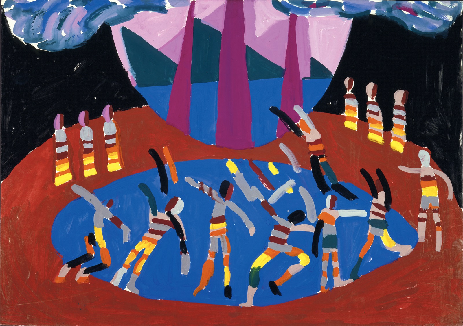
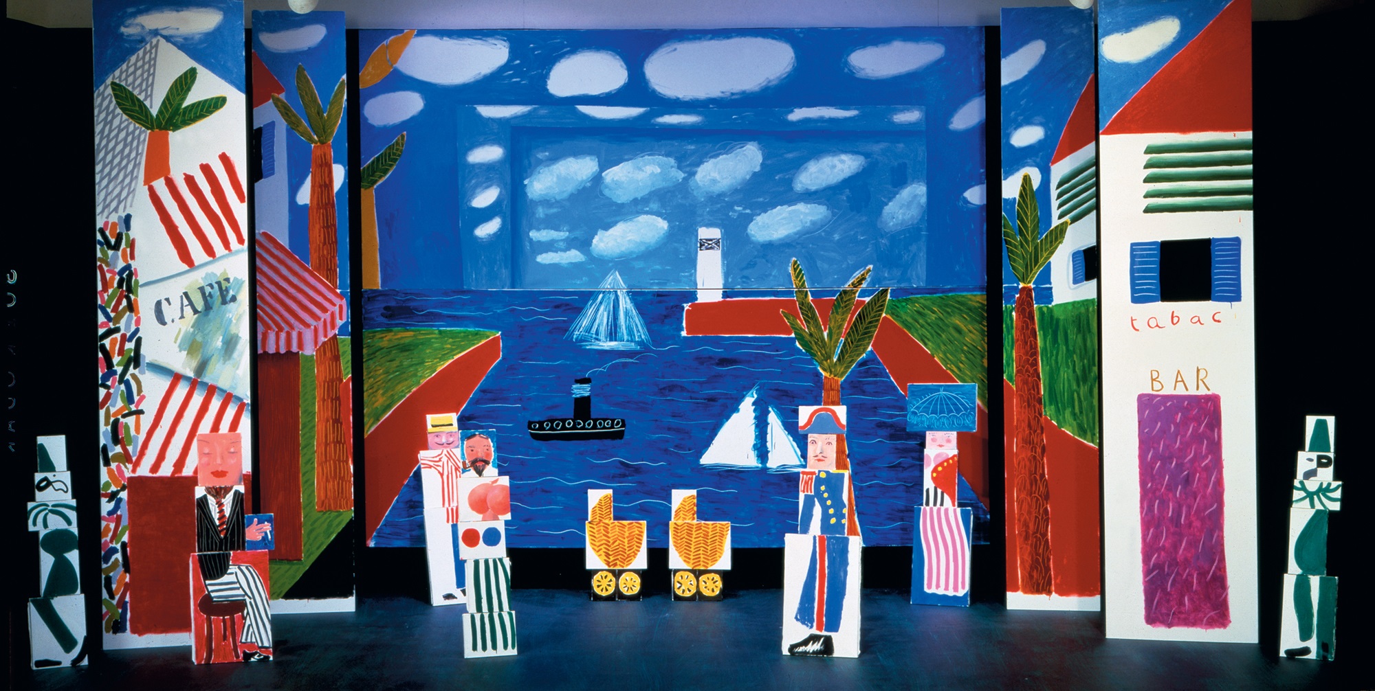
The Stravinsky programme posed a rather different challenge from Hockney’s previous work for the theatre, comprising as it did three works of unequal length that were distinct musically, dramatically and in mood. In Hockney Paints the Stage, published in 1983 to accompany the large touring exhibition of the same name, the artist characterized the evening’s first piece, the ballet Le Sacre du printemps (The Rite of Spring), as ‘kinetic’, the second, Le Rossignol (The Nightingale), as ‘more like conventional opera’ and the final work, Oedipus Rex, as ‘a static narrative with music’. Hockney’s response to these contrasts was to devise an appropriate visual parallel for each, linking them through the use of strong colour and by the simple device of circular motifs [174].
Le Sacre du printemps, long recognized as a major twentieth-century work, seems to have presented a daunting prospect at first but after discussions with John Dexter and the conductor James Levine, Hockney was able to think in terms of the ‘cold landscape’ which close listening of the music suggested to him as the most appropriate setting. The designs are fundamentally of two circular motifs, one – a bleak and stylized northern landscape – presented frontally as a backdrop, and the other – a blue disc representing ice or a lake – viewed in perspective on the floor as the focus of the dancers’ ritualized actions [175]. Coloured lights transform the saturated hues of the backdrop (cobalt blue, purple and ultramarine) into much warmer tones to indicate the transition from winter to the life-giving forces of spring.
174 Chorus, Principals, Narrator, Orchestra and Masks from Oedipus Rex, 1981
175 Set for Sacre with Dancers II from Le Sacre du Printemps, 1981
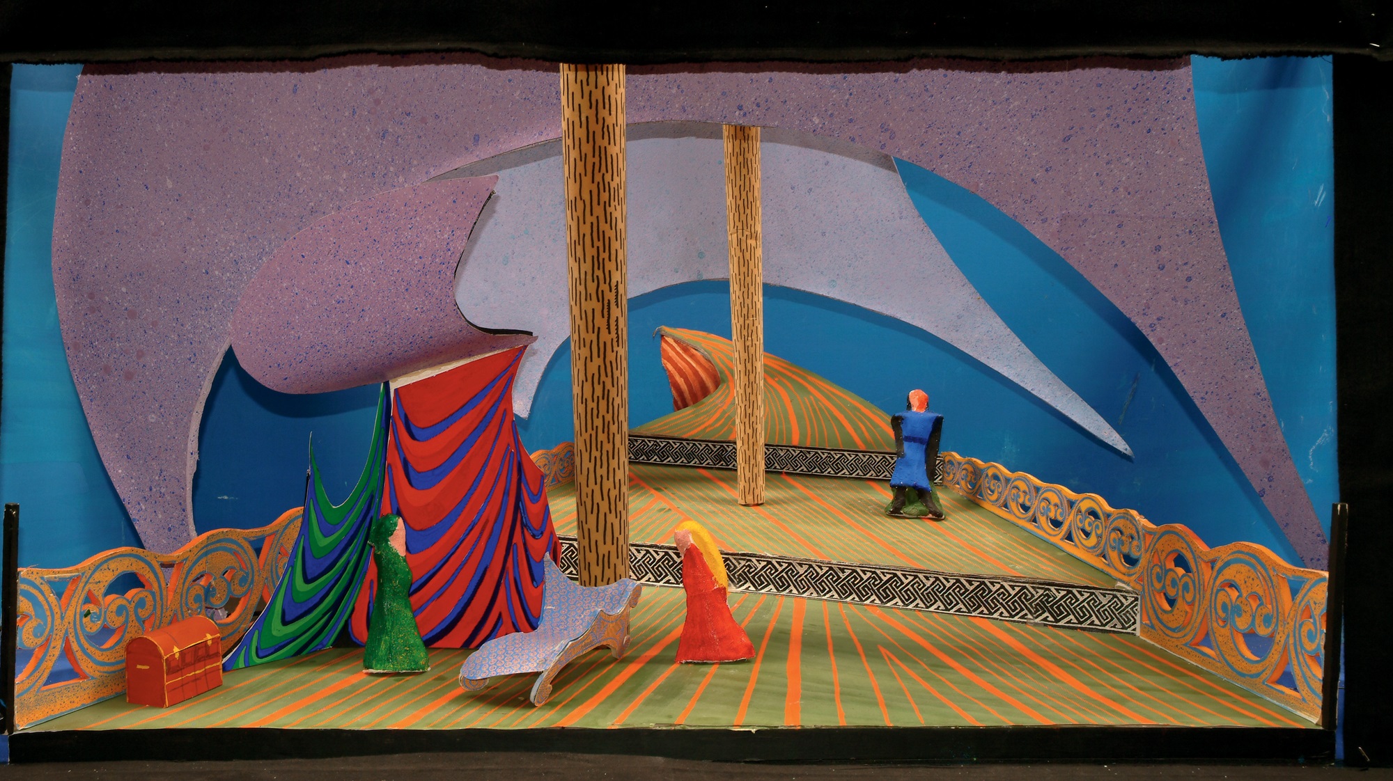
The circular sphere of action features prominently also in the adaptation from Sophocles, Oedipus Rex [174], for which Hockney devised a dignified and austere setting. The colour scheme of red, black and gold was borrowed from the interior of the Metropolitan Opera itself, transforming the whole of this huge space into a part of the stage, as would have been the case with performances of the original drama in outdoor amphitheatres. By such means, as well as through masks with large features, clearly visible even at a great distance, Hockney was able to bridge the gulf between performers and audience and to bring to the tragedy a sense of intimacy without sacrificing its grandeur and formality.
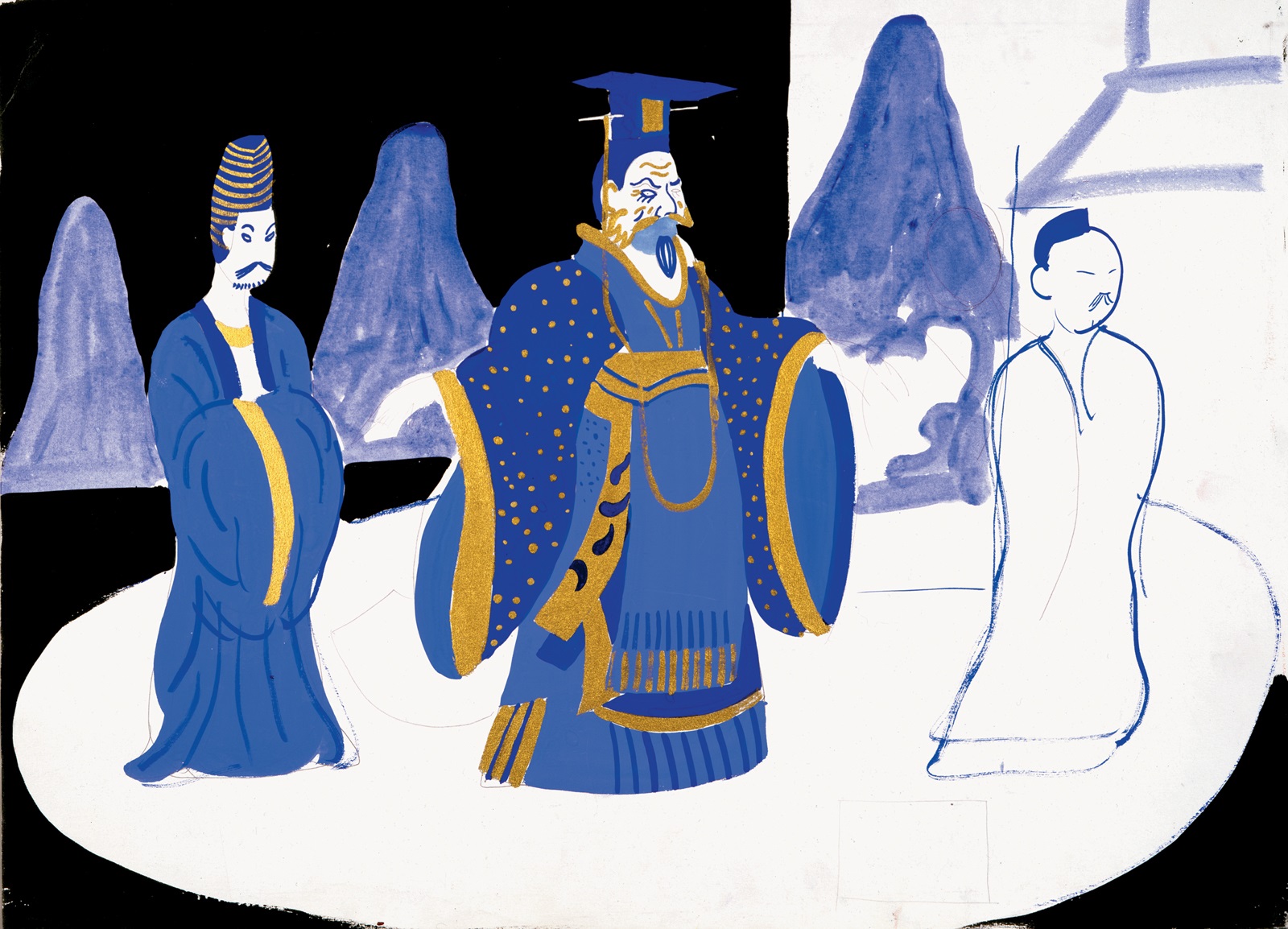
Neither the Rite of Spring nor Oedipus Rex, however, provided Hockney with the kind of material that could bring out his real inventiveness as a designer. In the first piece the stage design had to be kept necessarily simple as a backdrop to the dancing, and the elemental imagery of nature was perhaps too generalized for an artist so habitually stimulated by specific visual experiences. Oedipus Rex likewise provided no real opportunity for the kind of detail in which he delights, in addition to which one senses that he was inhibited by its solemn tone and lack of action. The short opera Le Rossignol, however, sandwiched between these two pieces, was much more obviously suited to his turn of mind with its fairy-tale story and atmosphere of enchantment [176]. Armed with his camera, Hockney visited the Victoria and Albert Museum’s collection of early eighteenth-century blue and white porcelain to gather sources for his twentieth-century chinoiseries. As with the two other pieces, the centre of the stage was again marked by a circular motif, this time in the form of a platter representing the floor of the emperor’s palace. Hockney’s decision to present the spectacle fundamentally in the blue and white of his reference material convincingly transformed the stage into a setting for dreamlike action. In this context the sudden appearance of the gilded mechanical nightingale on a bright red cart is deliberately jarring, an abrupt intrusion of a different order of experience. Colour is the unifying agent and most insistently physical presence throughout the programme, the identity and mood of each piece defined as much by its boldly simplified colour scheme as by the character of its imagery.
176 Emperor and Courtiers from Le Rossignol, 1981
177 Figure with Red Wall. China, 1981
On 19 May 1981, having already begun work on the Stravinsky triple bill, Hockney left Los Angeles for a three-week visit to the People’s Republic of China in the company of Gregory Evans and the poet Stephen Spender, who had known Hockney for many years and who had worked with Nikos Stangos on the translations of Cavafy’s poems for the book published in 1966. It was Stangos’s idea to commission the artist and poet to record their observations as Westerners, in images and text respectively, with the express intention that the results be published in book form. China Diary, lavishly produced with eighty-four colour illustrations, appeared in the following year. Circumstances prevented Hockney from producing as many drawings as he would have liked, not only because of the brevity of their journey but also because of the intense curiosity aroused on almost every occasion that he attempted to work in public. For the most part, therefore, Hockney contented himself with the camera, producing a mixture of casual snapshots and landscape or still-life studies of great formal elegance; the admittedly attractive selection of these reproduced in the book, however, gives little indication of the innovations with the medium which he was to undertake early in 1982.
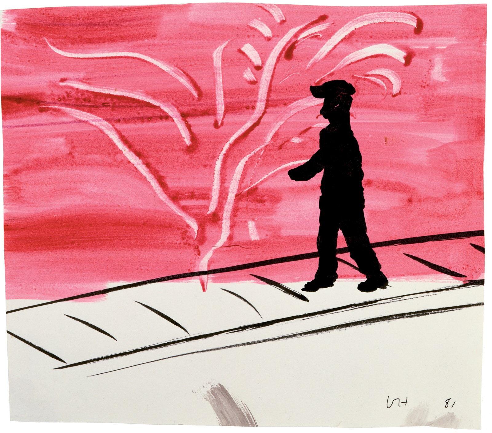
More interesting in terms of its repercussions on Hockney’s future work was the effect of the trip on his drawing style. In being forced to devise a rapid system of notation with which to record his sensations, Hockney allowed himself a looseness and spontaneity of execution which in retrospect seems a logical development from his devotion to the achievements of Picasso. Inspired no doubt by his growing curiosity for Chinese brush paintings and by his direct confrontation with the country’s scenery, he produced during this trip his first fully convincing watercolours; their apparent slightness masks a confidence in what can be achieved with just a few bold gestures of the brush to record something quickly glimpsed. The daring simplicity of the tiny watercolour Figure with Red Wall. China [177] – in which a dark human silhouette and a pavement indicated by a few cursory lines are superimposed on a broadly brushed wash – indicates the extent to which Hockney had by now freed himself of worries about what was expected of him. Of equal importance to Hockney’s future work was his recognition of the value of memory as an adjunct to a direct recording of observations. The interrelationship of all these factors, and in particular his long-standing concern with the function of time in both handmade and photographic images, emerged as an obsessive theme first in his photography and soon after in his drawing, printmaking and painting.
Hockney’s activity as a draughtsman has for many years encompassed both essentially private jottings and more finished works on paper – what one might once have referred to as ‘exhibition drawings’ – either in the form of pen and ink line drawings or unashamedly decorative studies in coloured crayons. It is in the more private work that one would naturally expect to find the evidence of experimentation, as seems to be borne out by the evidence of the sketchbooks which Hockney began to keep in 1981. One of these, published in facsimile in 1985 as Martha’s Vineyard: My Third Sketchbook from the Summer 1982, contains a mixture of media, techniques and styles, of highly structured compositions and absent-minded fragments and doodles. The results, although uneven in quality, as one might expect in a sketchbook, confirm Hockney’s continuing attraction to a variety of stylistic approaches. Some of the crayon drawings and those executed purely in pen and ink are in styles associated with much earlier work, indicating that for Hockney the goal is to widen his range of possibilities and, like Picasso, to regard previously favoured methods and techniques as part of an ever expanding repertoire.
It is rarely a simple question, however, of returning to a former style. The former insistence in the pen and ink drawings on a considered, unbroken contour has given way to a preference for patterns of impulsive marks charged with a nervous energy; the crayon drawings, similarly, are often deliberately smudged or combined with watercolour techniques, lending them a slightly expressionist aspect. The combination within a single image of different media – black and coloured inks, crayon, felt-tip pens and brushed paint – is part of the same bid for a flexible approach to drawing marked by lively and unexpected contrasts. Even in a drawing as apparently improvised as the double-page Slow Driving on the Way to Skowhegan Airport [178], Hockney appears determined to achieve a synthesis of approaches which might once have seemed irreconcilable, using new materials and methods to fuse the marriages of style and technique of his early work with the observations from life of his naturalist phase. The urge to strip away appearances to their essence, which Hockney so appreciated in oriental and early Modernist art, also finds form in the almost swashbuckling confidence of another drawing from this sketchbook, Boy in Baseball Cap Wearing Adidas Sweatshirt and Shoes [179].
178 Slow Driving on the Way to Skowhegan Airport, 1982
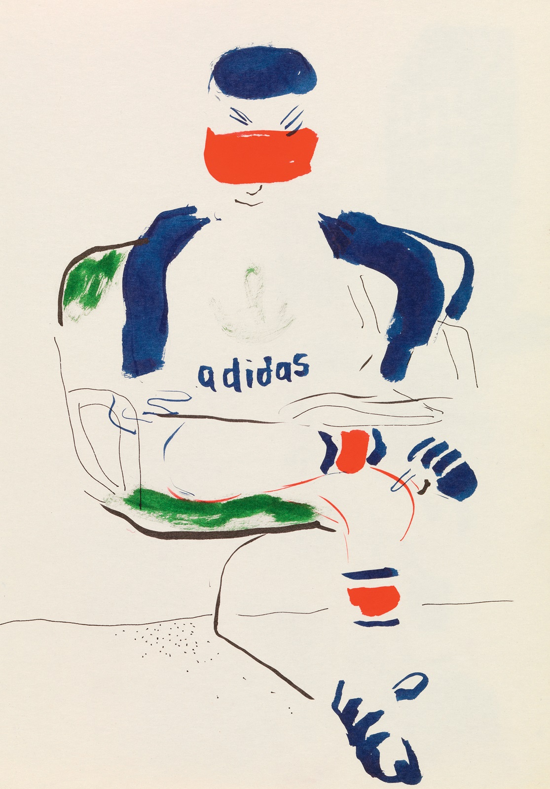
179 Boy in Baseball Cap Wearing Adidas Sweatshirt and Shoes, 1982
Hockney’s determination in the 1980s to delve under surface appearances also has a psychological dimension: this is particularly evident in the series of self-portraits which he undertook as his first act of virtually every day of a six-week period in the autumn of 1983. The subject is one which he had previously shunned, admitting as late as 1980 that the scarcity of self-portraits in his work may have indicated a refusal to examine himself too closely. He assumed that he would come to the subject when he was ready for it, and when he finally did so it was with characteristic zeal. ‘I discovered I was getting older’, he recalled matter-of-factly in the autumn of 1986. ‘I discovered that my face didn’t quite look how I thought without scrutinizing it. Somehow they were quite revealing to me.’
The self-portraits provide insights previously rarely glimpsed into the inner life of an artist with an unusually high public profile. We find that even such an eternal optimist, at the height of his fame, is susceptible to dark moods and to fluctuations in his self-esteem. In some of the drawings Hockney presents himself deep in concentration as if engaged in a scientific investigation, in others he is a figure of almost romantic aloofness. The most moving images, however, are those in which he sweeps aside self-consciousness and reveals himself emotionally naked and vulnerable. The importance of this group of drawings lies not only in their broaching of a new subject but in the demands their execution presented to Hockney’s technical inventiveness and ingenuity as a draughtsman. Waking up bleary-eyed is an unremarkable occurrence but what is extraordinary is Hockney’s ability on the spur of the moment to invent a system of notation to represent himself in that state, as he did in his charcoal drawing of 25 October 1983 [180]. Certain contours, such as that of his cheek or the rim of his glasses, are drawn more than once and with varying pressure, giving an effect similar to an unfocused image from a printing press. There is, moreover, a striking contrast in clarity between the boldly delineated bow tie, with its clearly visible pattern of polka dots, and the faintness of his hairline, which seems barely to have materialized. All these devices support the gesture of the artist’s upraised hand and contribute to the sense that we are re-experiencing his effort to focus his eyes on his image in the mirror.
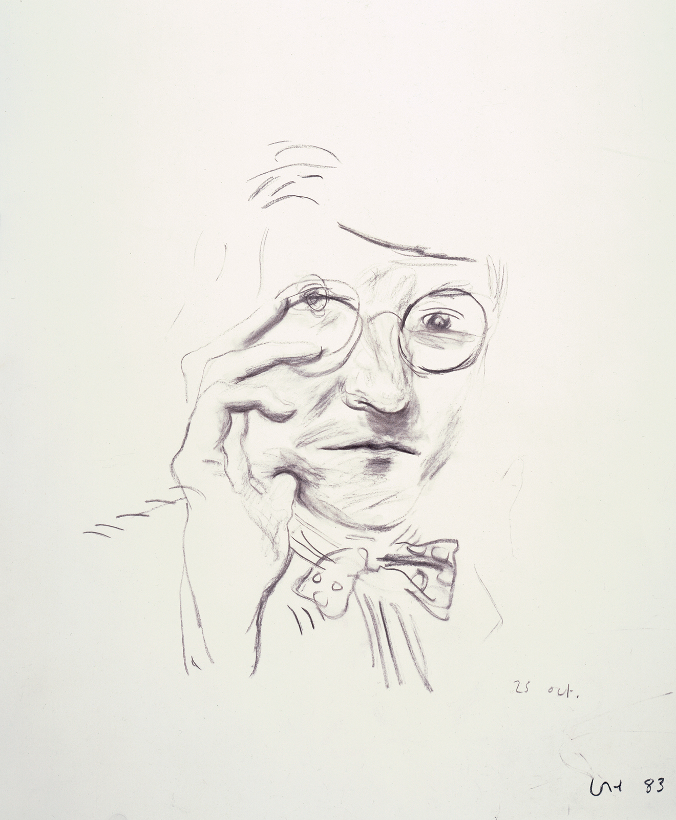
180 Self-Portrait, 25th Oct., 1983
181 Hollywood Hills House, 1981–82
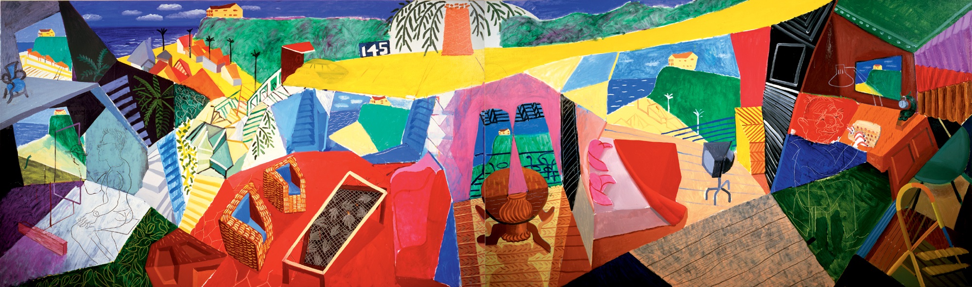
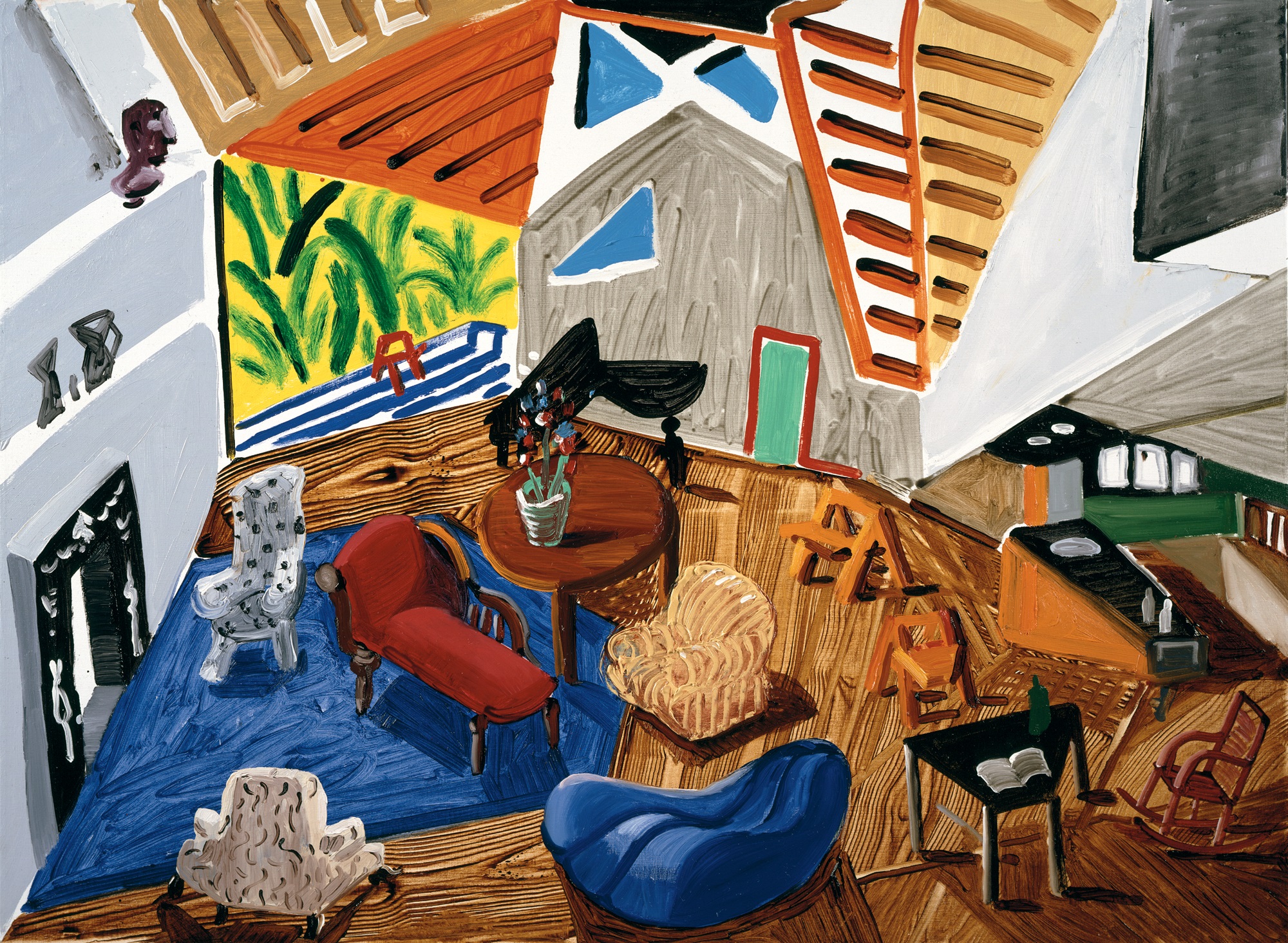
Throughout the 1980s Hockney’s prime concern was to investigate how our eyes collect visual data over a period of time and how this is then interpreted by the brain in terms of distance and three-dimensional form. His primary tool in this research has been the camera, which from February 1982 for a period of two years became an obsession that dominated all his other work. He was set on this course almost by chance, motivated by the fact that he purchased a number of rolls of Polaroid film to document his work and then wished to dispose quickly of the remainder. The first of the more than 140 composite Polaroid pictures that followed, an image of the living-room, terrace and swimming pool of his Los Angeles house, laid out in the form of a rectangular grid, came about as much through play as by plan. Both this work and a slightly later, more subtly engineered composite titled Blue Terrace, Los Angeles March 8th 1982 [173], were closely related to the memory painting of the house which Hockney had produced on a visit to London [181]. The function of the painting had been to recreate the sensation of wandering through his Hollywood Hills house, a nostalgic bid for California open-plan architecture and sunshine in the midst of a grey British winter. Three separate canvases defined the imagined movement first from the interior to the porch – the narrow gap between the panels also functioning as the glass wall separating the two spaces – and then from the porch to the swimming pool and garden. In the photographs this movement was made actual, the whole architectural structure built up by means of fragments photographed in succession at different angles.
Hockney was excited by the implications of these photographs and pursued the technique relentlessly through to July, obsessed by what he perceived to be the inadequately understood Cubist discoveries about pictorial space. The main issue, as he stressed in November 1983, in his lecture ‘On Photography’ at the Victoria and Albert Museum, London, was that of dispensing with the one-point perspective from a fixed position established in the Renaissance, in favour of a system which he felt more accurately conveyed human perception, marked by ‘many points of focus and many moments’. Wishing to overcome the limitations of the instant photographs – their lack of negatives from which to reprint, their tendency to fade and the restrictive grid system they imposed – Hockney had begun in May 1982 to produce photocollage joiners’ from 35 mm prints, some of which were later published in limited editions. Through these he became increasingly absorbed in the lessons of Cubism and particularly in the device for representing a three-dimensional form on a two-dimensional surface by means of fragmentary views of its different sides. The vivid portrait of Stephen Spender produced in 1985 [182], although small in scale and structurally much less complex than the elaborate landscapes produced during these years, demonstrates well the benefits of the system in capturing truth to experience. Once the viewer has become accustomed to the fracturing of the image, there are evident advantages in terms of its animation as a portrait and in the information yielded about the variety of textures and about the sitter’s features and facial structure.
With the Polaroids the results could be studied gradually during the process of constructing the image, but Hockney was frustrated by the grid format which he felt interrupted the spatial flow. The landscapes, still lifes and portraits produced with the 35 mm camera, on the other hand, relied heavily on memory, first in the actual shooting of the pictures – since the artist had to bear in mind how they would fill the field of vision when pieced together – and later in the physical reconstruction of this composite image seen through time. The culmination of these experiments was the 41-page section of photographs and hand-drawn images especially produced and designed by Hockney for the December 1985 issue of Paris Vogue. The experiences gained through such techniques clearly confirmed Hockney’s conviction not only about the interrelationship of sight and memory, which had struck him as early as the Canyon Painting of 1978 [160], but also about the selectivity of vision, which had been an essential feature of his paintings and drawings at least as far back as the Domestic Scenes of 1963 [34, 36, 37].
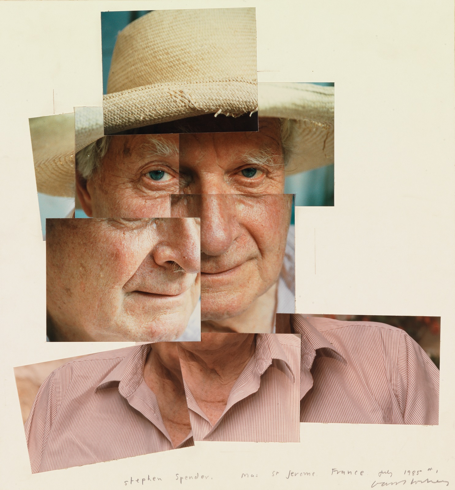
182 Stephen Spender, Mas St. Jerome I, 1985
183 Large-scale painted environment with separate elements based on design for Poulenc’s opera Les Mamelles de Tirésias, 1983
184 A Visit with Christopher & Don, Santa Monica Canyon, 1984
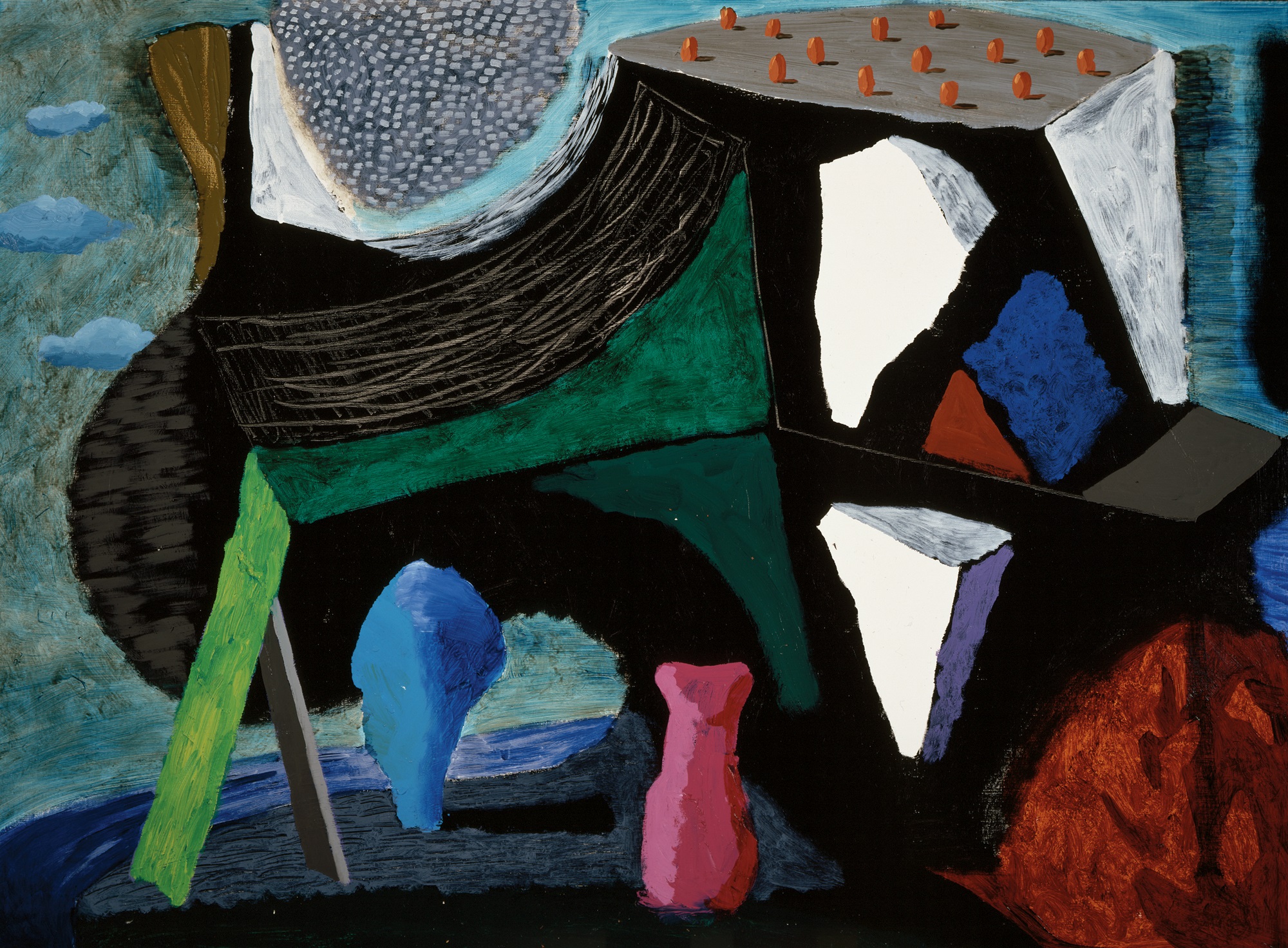
Those of Hockney’s supporters who were alarmed at his prolonged love-affair with the camera during this period need not have worried, for the investigations which this work represented were clearly of a piece with all Hockney’s art and were soon to have repercussions on his hand-wrought images. The large-scale painted environments which he produced in 1983 for the Walker Art Center touring exhibition, ‘Hockney Paints the Stage’, based on his earlier set designs, incorporated witty conceits translated from the photographic work. These environments as a group must be counted as Hockney’s most significant painted work of the mid-1980s. Among them was a landscape based on The Magic Flute populated with stylized animals painted in acrylic on laminated foam board: the artist’s first essays for a post-Cubist sculpture. The actors within the environment based on Les Mamelles de Tirésias [183], each reconstituted from a series of small canvases defining the parts of the body as in a Surrealist ‘exquisite corpse’, rephrase in painterly terms the recent experiments in photographic form. In the context of this spectacle, the sense of people being pieced together from separate parts seems particularly apposite as a speculative aside on the interchangeability of personality and identity. In later paintings such as Self-Portrait with David and Ann, 1984, in which the artist pictured himself on several disconnected canvases, Hockney has continued to play with such formal devices as another strategy for reinventing the human figure as a convincing physical presence.
The sense of travelling through an interior or exterior space which is an essential feature of Hockney’s photographic work of the mid-1980s is manifest also in the ‘moving focus’ prints which he produced at the same time. Some of these prints veer dangerously close to pastiche in their stylistic appropriations from Picasso’s drawing and in their sometimes lurid variants of Fauvist colour. One of the most successful in its restraint is Pembroke Studio Interior, 1984 [185], drawn entirely on one surface but openly acknowledging the sources of its splayed-out representation of space and form in the kind of photocollage exhibited on the easel.
Similar concerns shaped the major painting of the period, A Visit with Christopher & Don, Santa Monica Canyon, 1984 [184]. In this vast panoramic view Hockney returned to the subject of one of the best of his double portraits of the late 1960s by way of a more recent painting of the same size, the 1980 landscape Mulholland Drive [172]. The photographic and drawn studies for the 1968 portrait of Isherwood and Bachardy [89–91] had all conformed to the assumption of a pre-established pose and composition. By contrast, this new portrait, completed in the year before Isherwood’s death, was based on a number of informal sketches of the two men engaged in their separate activities, supplemented by memories of many visits to their house overlooking the Pacific. The immense scale of the picture, twenty feet in width, demands that the spectator literally walk across the space, thus encouraging a physical sense of identification with the domestic situation represented. The fact that the portraits, moreover, occur at the two extremes of the picture reinforces our role as the link between them, introducing an intimacy and sense of involvement all the more remarkable given the mural-like scale of the work.
185 Pembroke Studio Interior, 1984

186 David Graves Reading and Drinking, 1983
‘Cubism is a style, but not in an ordinary sense’, Hockney mused late in 1986. ‘It’s a very different way of looking and depicting, and as such it’s not very well understood yet. People still refer to an ordinary, conventional picture as if it’s very real.’ As far as Hockney is concerned, therefore, his increasingly personal reinterpretation of Cubism is neither a retrograde act nor a Post-Modernist joke but a still valid approach to representing experience. The liveliness with which discrete actions in quick succession are depicted in David Graves Reading and Drinking, 1983 [186], vindicates Hockney’s commitment to such methods.
The results of Hockney’s experiments in printmaking with colour photocopiers in 1986 also provide their own justification. Working within the limitations of sheet size and standard colours available on the three office-quality machines which he had installed in his studio, Hockney discovered that by drawing each component separately and photocopying it in a chosen colour on to a single sheet of paper he was able to make limited-edition ‘home-made prints’ in direct response to the process, without the need for assistants or elaborate procedures. Challenging conventional definitions of what constitutes an ‘original’ print, Hockney has used the photocopier not as a reproductive medium but as a printer of great flexibility. As the Self-Portrait, July 1986 [187] indicates, the hues produced by the heat fusion of the coloured powders (toners) are of particular brilliance and intensity, especially if the paper is passed through the machine more than once. There are further advantages. One can combine, for instance, facsimiles of actual things – in this case a fragment of a striped shirt cleverly fulfilling the function of the artist’s bust – with hand-drawn images. The latter, moreover, can be printed on the same kind of paper on which they were originally drawn, thus preserving their distinct qualities of line and surface according to whether they were drawn with ink, charcoal or crayon, painted on as a watercolour wash or applied in some other fashion. In his design for the book/catalogue of portraits, Faces, published in 1987 to accompany a retrospective exhibition of his portrait drawings, Hockney applied the photocopying technique to create virtually new works by selecting and manipulating details from original drawings.
187 Self-Portrait, July 1986, 1986
In a two-page spread printed in the December 1986 issue of Andy Warhol’s Interview, Hockney took even further these ideas about technology harnessed to the subjectivity of the personal touch. Rather than send a drawn or painted image to be reproduced photomechanically by offset lithography, he decided to supply the editors of the magazine with four separate pieces of artwork corresponding to the four colours of the printing process: yellow, magenta, cyan and black. Only when recombined in printed form does the image exist as intended. This, of course, is as good a definition as any of what constitutes an original print. The startling immediacy of the marks and the brilliance of the colour are the things one notices first. The implications of such a method for personalizing the otherwise anonymous, apparently neutral, products of mass-produced printing are enormous, since it unmasks the lie and pretence of ‘objectivity’.
In the final section of David Hockney: A Retrospective, the catalogue for the major exhibition organized by the Los Angeles County Museum of Art in 1988, Hockney employed similar methods to create a sequence of new images in vibrant colours [188]. The twenty-three pages of pictures are preceded by a title page on which he printed the bold declaration ‘COMMERCIAL PRINTING IS AN ARTIST’S (direct) MEDIUM’, adding in his own hand, as a kind of afterthought: ‘layers can be removed’. The images are followed by a more detailed, oddly punctuated, explanation that typifies his increasing concern with philosophical and theoretical issues:
The pictures on the previous 23 pages were conceived of using the medium of printing ink on paper. I constructed them by drawing the four colours separately. Each colour was drawn in black-and-white on separate sheets of paper with the thought of the coloured ink in my head. The picture only exists when all four separations are put together. This happens here on this surface. They are therefore not reproductions in the ordinary sense but the original work (ie. this is the only form they exist in.
They were proofed first on an office copying machine, without which it would not have been possible to construct them. New technologies have started revolutions that need not frighten us They can be humanized by artists. The office copier has opened up commercial printing as a direct artist’s medium.
There is a certain crudeness about these images that is a sure sign of a novice coming to grips with the possibilities of an unfamiliar medium. There was no need for him to have imitated the shrill colours of four-colour process printing – magenta, cyan blue, yellow and black – at full strength, nor to have overlaid them quite so obviously or with such apparent disregard for the exact registration of one colour over another. Nevertheless, as with the ‘home-made prints’ he had produced two years earlier, the directness and simplicity of his approach provides the resulting images with their exuberant boldness and decorative appeal. The interlocking of shapes into a unified design, the blatant superimposition of one set of coloured forms over another, even the thin outlines of pure colour created by the slight misregistration of one plate over another also call attention to the process by which they have been created. As a result, they draw the viewer into the creative act in a way that would be unthinkable with a conventional reproduction of an existing image. The variety of textures, moreover, some of them created through the dissolution of form inherent in the photocopier, endows these pictures with a physicality generally absent in such commercially printed images.
Just as Hockney’s experiments with photography from 1982 to 1985 provided him with the impetus to make discoveries that were fed back into his painting, so his prolonged investigation into new technologies through to the 1990s has helped to broaden his conception of art, to reshape his ideas about drawing and the handmade image and to question received ideas about what constitutes an original work of art. When he acquired a colour laser-copier, he began using it to create direct reproductions of his paintings, which excited him because they were much more vivid – both in their colours and in the subtlety with which they registered the brush-strokes – than conventional reproductions printed from photographs. As he was quick to realize, it was not simply that one layer of interpretation had been removed in doing away with the camera as an intermediary; since the copy was made by laying the painting directly onto the copier’s glass top, it also eliminated a layer of space, bringing our eyes into much more immediate contact with the surface of the original.
188 Self-Portrait with Stanley, 1987, for retrospective catalogue, 1988
Hockney’s excitement at this discovery led him to embark on a series of portraits of friends and family, painted very rapidly from life with a strong concentration on the face, on canvases that corresponded in size to the dimensions of the copier’s surface. Paradoxically, given that they were made with a view to being mechanically replicated, these are among the most straightforwardly naturalistic pictures made by him since the mid-1970s, but they have a confident looseness that would have been unthinkable two decades earlier. Some of the colour laser copies that he made from these paintings, printed in sections so that the handmade depictions could be shown vastly enlarged, were hung at the Tate Gallery showing of the Los Angeles retrospective in October 1988; in addition, two single-page copies of portraits he had made in 1988 of his mother and of Ian Falconer [189] were included as loose sheets in the catalogue published for his exhibition ‘Recent Paintings’ at the Galerie Neuendorf in Frankfurt in May 1989, where they were paired with conventional colour reproductions of the paintings so that one could see the difference for oneself.

189 Ian, 1988
190 Even Another, 1989, 1989
It was in October 1988 also that Hockney began to create drawings that could be sent to friends and acquaintances on his recently acquired fax machine. Although limited to black and white, through a process of trial and error and by adapting procedures he had used in his home-made prints, he succeeded quickly in turning a utilitarian machine into yet another medium for making art. In particular, he discovered ways of enriching the tonal range and texture of the pictures by mixing different greys and by collaging together shapes from a variety of printed sources [190]. Since his hearing was continuing to deteriorate, he was immediately attracted to the discovery of what he termed ‘a telephone for the deaf’, particularly as it allowed him to communicate his perceptions of the world around him not just through words but in images. Most of these early faxes were sent from the Malibu beachside house that he had acquired earlier that year, so the subject-matter naturally reflected his new preoccupations with still lifes and especially with views of the sea outside his window. Hockney was thrilled to have found such a direct way of communicating with his friends through his art, and of democratizing further the dissemination of his work through channels that were by definition uncommercial, since the image received at the other end had no financial value and could be preserved only by being photocopied. (Plain-paper fax machines, rather than those using thermal paper prone to fading, were introduced only towards the end of the six-month period in which Hockney was most assiduously involved with the process.) There was a subversive appeal in the production of images that could not be turned into commodities for the art market. Sharing his art in this form was an act of pure love and aesthetic appreciation, returning him to the innocent pleasure of picture-making for its own sake, which he had stubbornly and consistently maintained as his first priority.
As he succumbed to the obsession with sending faxes of increasing complexity to all corners of the globe, Hockney’s telephone bills mounted astronomically, demonstrating conclusively the extent to which he was prepared to fund this activity from his own pocket. The most extreme applications of the technology included several public events: the faxing of a composite image consisting of 144 sheets, Tennis, to the 1853 Gallery at Saltaire, near Bradford, as a live event witnessed by spectators on 10 November 1989; his participation in the São Paulo Bienal from October to December 1989 exclusively in the form of faxes, and a large solo exhibition from October 1990 through to January 1991 at the Centro Cultural Arte Contemporáneo, Mexico City, which was again sent entirely by fax. While the fax drawings could not, in the end, be an adequate substitute for paintings, Hockney had succeeded in making some shrewd and provocative points about the nature of making and exhibiting art. To send an exhibition of paintings or framed drawings from one country to another involves huge expenditure on transport and insurance. Why not, therefore, send an entire show down the phone lines, making the art accessible, at much more modest cost, to even the most remote parts of the world? At an even deeper level, the fax drawings posed difficult questions about the value we ascribe to the ‘unique’, ‘original’ work of art. The fax drawings are the end product, not the reproduction of existing drawings with an independent existence, since the sheets to be faxed have been constructed from various combinations of materials with the express intention of being transmitted in that way. There is consequently no single ‘original’: not only can the same picture be faxed to different numbers, it can also only be physically preserved, as I said earlier, by being photocopied on receipt on to more stable paper.
Similar questions are posed by the ‘computer drawings’ and still video images that Hockney began to produce in his studio in 1990, with the images generated either on a still video camera or on a Macintosh computer using Oasis software and then printed out on a Canon Color Laser copy machine [192, 197]. He had briefly experimented with such technology in 1987, when he and other artists, including Richard Hamilton and Howard Hodgkin, were invited to create images using the Quantel Paintbox for a series of television programmes, ‘Painting with Light’, made by Michael Deakin of Griffin Productions and screened on BBC2. It was only in summer 1990, however, when he and his assistant Richard Schmidt attended a three-day conference about computers and printing, that he became sufficiently convinced that there were possibilities here for him to acquire the necessary hardware and software. As when investigating the possibilities of any new medium, including even watercolour or a new type of acrylic paint, Hockney began not with the intention of producing finished pictures but simply by trying to discover what could be done with that medium; in this case, the kinds of marks and textures that could be created, the qualities of the colours and the crispness of the photographic image. He began in August 1990 by turning the camera on his immediate environment for a series of 40 Snaps of My House, which he produced for his own enjoyment, rather than for sale, in the spirit of his earlier private snapshots. As decoratively appealing and formally constructed as the best of his earlier single-image photographs made with a 35 mm camera, these have a sumptuousness of colour that vividly captured the intense hues of his redecorated Hollywood Hills house and that have in turn influenced his preference in his paintings for saturated colours in delirious proximity.
Soon Hockney began also to make still video portraits of anyone visiting that house, posing each person against one of his large recent landscape paintings and then recording their body in four or five sections so that the laser-printed images could be pieced together again in the manner of a Surrealist ‘exquisite corpse’. Both the space and the figure are here treated in a more conventional way than in the composite photographs of the early to mid-1980s, with the component parts allowing more detail rather than a variety of points of view or repeated glimpses of a particular part of the figure. The resulting series of 112 L.A. Visitors, 1990–91 [191], published on seven sheets in an edition of twenty, demonstrates that even with a mechanical tool and the simplest compositional strategy, the artist’s subjectivity and responses to his subject remain the overriding shaping forces. Taken together, these portraits of a wide cross-section of society – including assistants, artists, gallery owners, writers, curators, collectors, delivery men, friends and the cleaning lady – provide ample evidence, too, of the frantic comings and goings with which Hockney appears to be constantly surrounded, despite his protestations about the quiet life that he leads.
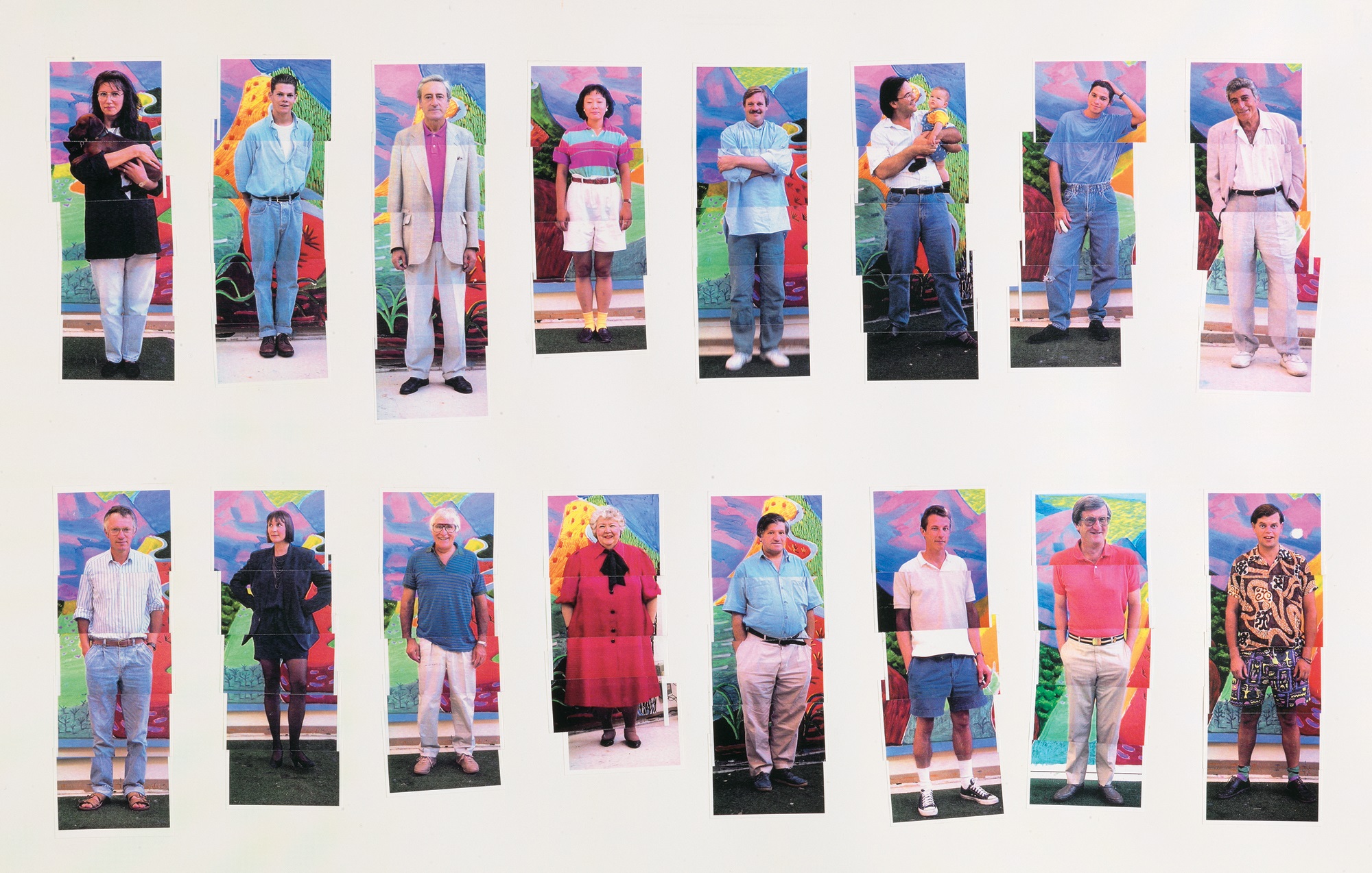
191 112 L.A. Visitors (detail), 1990–91
While the still video photographs could be described as something of a diversion, there were more lasting lessons to be learned from the computer drawings to which Hockney devoted himself with particular energy in 1991. As with the fax drawings, they were primarily for the artist’s own amusement and for the entertainment of his friends, since he tended to give them away: he could see no reason to sell them, since an infinite number of identical images could be printed, without any loss of quality, from the same computer file. Only by erasing the file and any copies of it could one justifiably propose to produce a limited edition from it that would have any credibility in the marketplace. He had no hesitation in taking advantage of the freedom given to him by these essentially private circumstances and by the knowledge that any mark he made on screen could easily be obliterated or replaced. As a painter he had once envied the much greater risks that he felt able to take when making drawings, finding it much less inhibiting to work on paper than on canvas. Now he was in a position of being able to try out anything, secure in the understanding that no mark was irreversible and that he could continue reworking a picture, without any loss of the freshness of mark or vividness of colour, until he was satisfied.

192 Untitled, 1991
Some of the first fruits of his labours with the computer, such as Untitled, 1991 [192], bear comparison with earlier paintings that he had made in a similar frame of mind, notably Canyon Painting, 1978 [160]. Once again landscape serves as the armature for an investigation into the essentially abstract properties of a repertoire of brightly coloured marks. There are intimations of sea, cliffside, winding roads and vegetation under intense sunlight, not openly described in an illustrative manner but suggested through colour and form alone in such a way that they act as mnemonic devices, triggers to memories and associations. Such images were very much rooted in his experience of the Pacific coastline as viewed from his house at Malibu, and of the nearby Santa Monica Mountains where he had begun to take friends and acquaintances on hair-raising drives orchestrated to the music of Wagner. Such references had appeared on his canvases as early as Big Landscape (Medium Size), 1987–88 [193], and in a more naturalistic fashion in a group of small, Fauve-coloured landscapes such as Thrusting Rocks, 1990 [194]. It is telling, however, that this most extreme move towards abstraction, paralleled but not quite equalled in paintings such as What About the Caves?, 1991 [195], seems to have occurred first in the computer drawings. It may well be that the physical distance between the motif and the Hollywood Hills studio that housed his computer, and also the fact that he worked there in an enclosed, essentially windowless, room, contributed to the more synthetic treatment of landscape and spatial sensations that he was able to devise using this process. Only in 1992, in his series of Very New Paintings, did this new approach take hold fully in his painted work.
193 Big Landscape (Medium Size), 1987–88
194 Thrusting Rocks, 1990
195 What About the Caves?, 1991
The stylistic freedom that Hockney had long claimed for himself is much in evidence in his work since the late 1980s, which ranges backwards and forwards from the robust and brightly hued naturalism of portraits, still lifes, landscapes and interiors to pictorial conceptions that on first glance would tend to be labelled ‘abstract’. Yet as the artist explained in his book That’s the Way I See It, edited by Nikos Stangos from five years of conversations and published in 1993 as a companion volume to David Hockney by David Hockney, the distinction between abstraction and representation no longer seemed to him a valid one. ‘I think, in fact, the more you go on the more you realize there’s actually only abstraction.’ Returning several times to this issue as one central to his thinking since at least as far back as the early 1980s, Hockney cites the example of oriental art in support of his argument: ‘Looking at Chinese scrolls, at ancient Chinese paintings, had made me realize that if you were to ask the painters who made them, Are there two different kinds of painting, is there representation and abstraction?, the old Chinese sage painter would have said, No, it’s all one; it’s either all an abstraction or all representation. And I’m coming to believe that quite strongly…’
196 Beach House by Night, 1990
197 Beach House Inside, 1991
To ask whether a work of art is abstract – that is to say, self-sufficient and separate from the world that can be perceived through our eyes – or whether its function is representational is thus, in a sense, to pose the wrong question, since most if not all cases will involve an element of both. Taking Hockney’s own recent paintings as the evidence, even the most closely observed depictions of his surroundings, such as the most elaborate of the computer drawings, Beach House Inside, 1991 [197], or related paintings such as Beach House by Night, 1990 [196], or Livingroom at Malibu with View, 1988 [198], work as much on an emotional or physical level as they do on an intellectual one. They transmit not only information, in an illustrational sense, but also sensations through the relationships of painted forms. Conversely, any conjunction of forms, however rigorously it may appear to exclude outside references, is inevitably conditioned by the experience of the person who made it. Hockney ascribes his own growing concern with the representation of spatial sensations, for example, as a compensation for his increasing deafness, another way of situating oneself in the world.
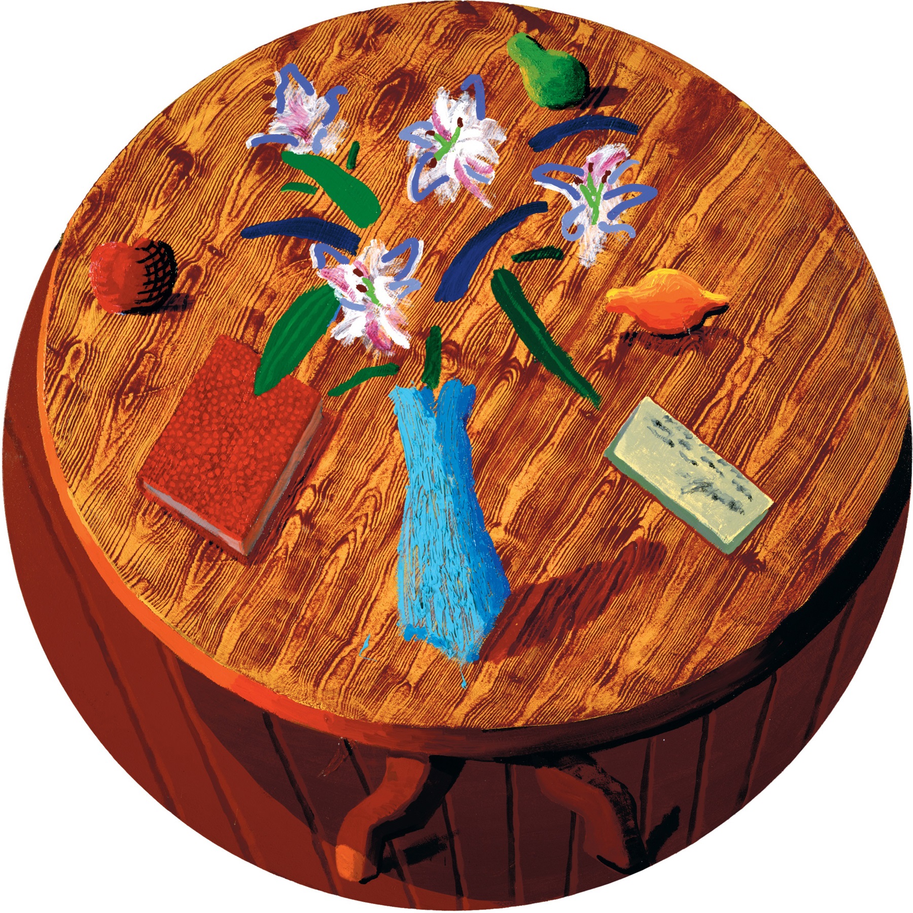
In any case, every convention that has been devised to represent the world, including photography, can only work as a substitute for the real thing insofar as a pact has implicitly been made between the artist and the viewer. Without such an agreement, it would simply not be possible to read the image. With a teasing humour, Hockney reminds us in Still Life with Book on Table, 1988 [199], of the extent to which we have trained ourselves to accept, as real, pictorial illusions that are self-evidently artificial. By choosing to depict a round table on to a round canvas in such a way that their upper edges coincide, and by conveying its material substance through a painted imitation of wood grain, Hockney provides us with highly physical and tactile sensations that heighten our experience of the subject as tangibly present. At the same moment, however, we remain conscious of these and other means that have been used to draw us in through our imagination. As with Hockney’s playful games with artistic devices in his pictures of the mid-1960s, not even the most gullible of viewers could believe, after a moment’s reflection, that these disconnected flat strokes of colour actually constitute an arrangement of flowers and leaves in a vase. Yet even when we recognize that we are being duped, all the more cheekily given the artist’s patent disregard for a highly wrought illusionism, the forms continue to work their magic as a plausible equivalent for something seen. The affectionate references to earlier art – to Renaissance tondos in the format chosen, to the ‘tilting forward of the picture plane’ achieved in the still lifes painted by Cézanne and, under his influence, by the Cubists, and to the trompe-l’oeil wood-grain also featured in Cubist paintings – contribute further to our willing collusion.
198 Livingroom at Malibu with View, 1988
199 Still Life with Book on Table, 1988
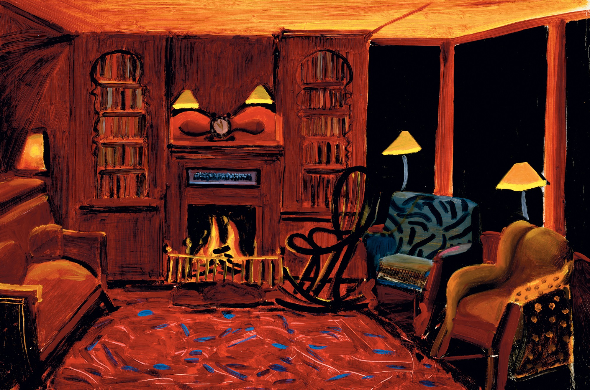
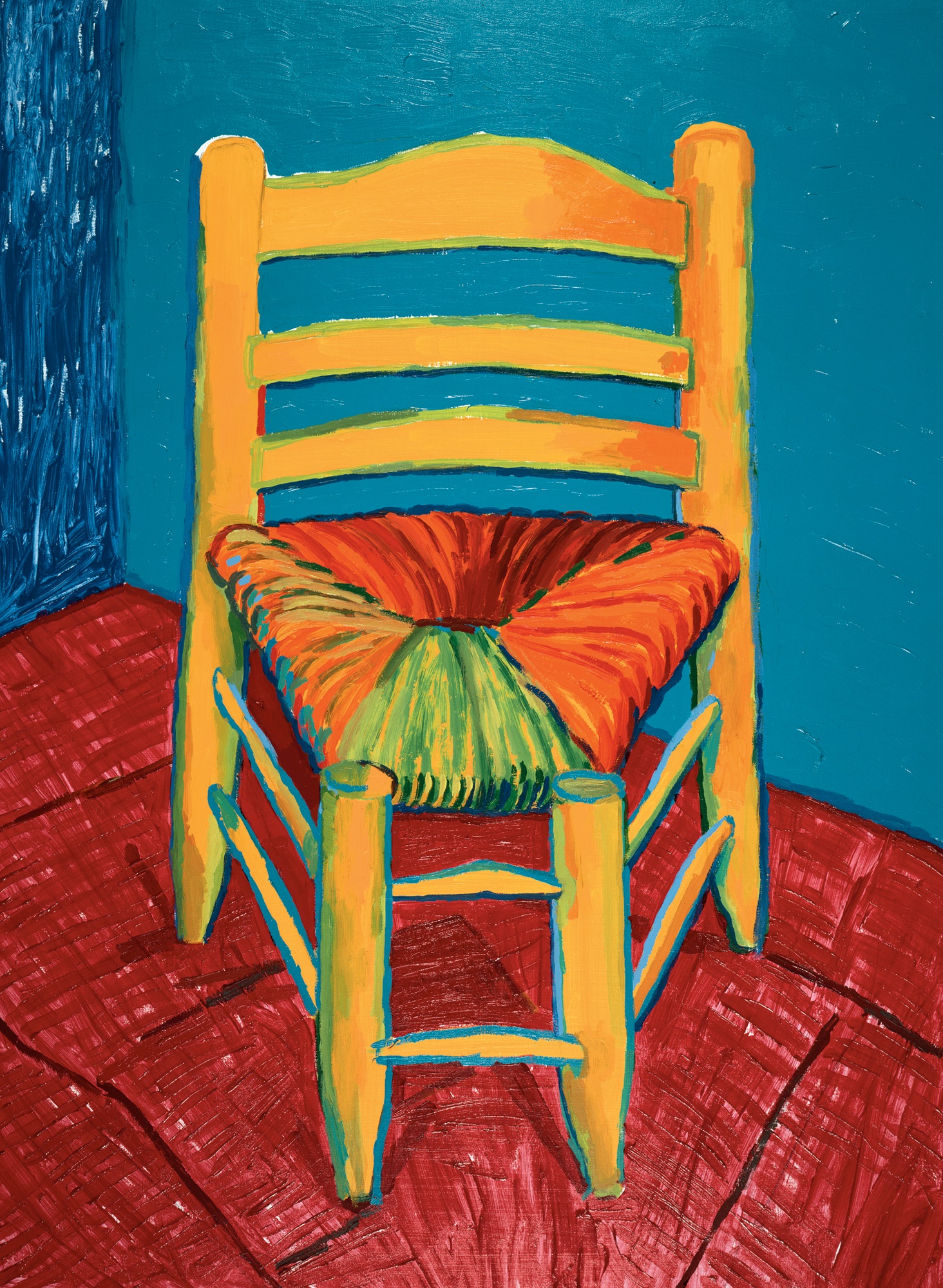
In the latter part of 1988, after the opening of his Los Angeles touring retrospective, Hockney spent much of his time at his new beach house in Malibu, where he embarked on an intense period of painting. Among the works made at this time were three paintings of chairs inspired by Van Gogh and a series of dazzling interior views of the living-room of his Hollywood Hills house. Van Gogh Chair, 1988 [200], was one of a number of works commissioned from leading contemporary artists by the Van Gogh Foundation in Arles to mark the centenary of the artist’s arrival in that town. Hockney was so pleased with his reinterpretation of Van Gogh’s The Chair and the Pipe, 1888–89 [120] – the Arles-period canvas called to mind by a painting he had made more than fifteen years earlier, Chair and Shirt, 1972 [118] – that he decided immediately to paint another one for himself, as well as a version of a companion painting, Gauguin’s Chair. In all of these he sought to emulate the immediacy of the Dutch artist’s depictions of chairs as substitutes for human presence by exaggerating the very qualities that helped attract him to these pictures in the first place: their high-keyed primary and secondary colours and chromatic contrasts, the tangible forms created by the use of strong outlines, a highly tactile presentation of the paint surface and the adoption of a point of view that appears to catapult us towards the object represented. Rather than recreating Van Gogh’s language, however, Hockney has rephrased these elements in his own voice, particularly through the use of the reverse perspectives that he had employed earlier in the decade for paintings such as A Visit with Christopher & Don, Santa Monica Canyon, 1984 [184].
200 Van Gogh Chair, 1988
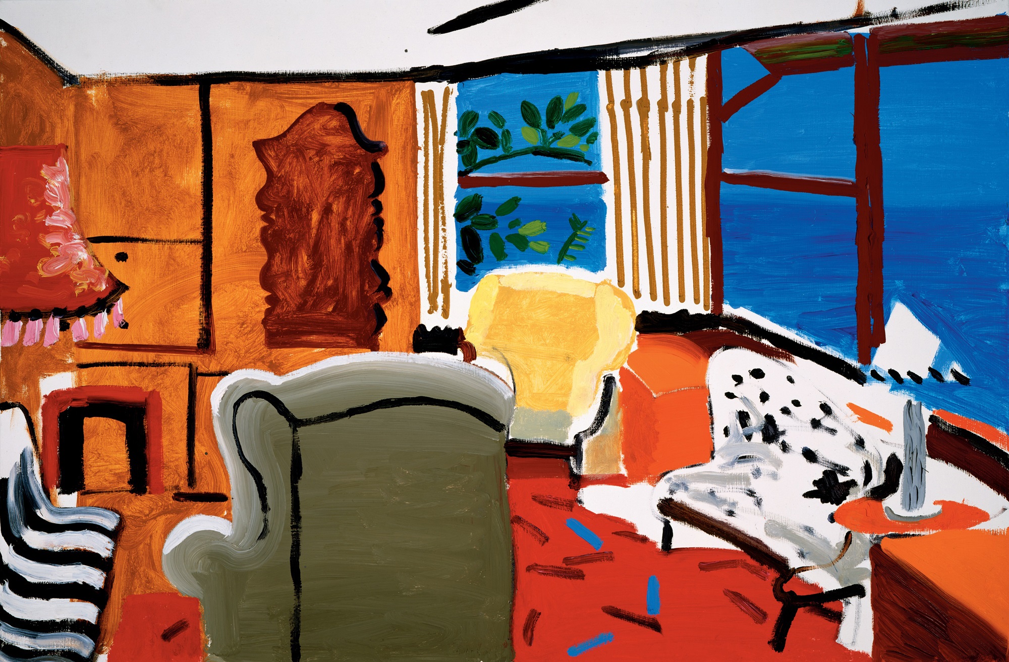
Complex spatial games are employed to particular effect in the various interiors painted by Hockney during this period, such as Small Interior, Los Angeles, July 1988, 1988 [201]. He had been making pictures of this room since 1980, when he painted Hollywood Hills House, and the assurance born of his familiarity with the subject is much in evidence. Space is treated now in a far more fluid way, taking a cue from the ‘moving focus’ prints of the mid-1980s but now leading the eye on a delirious dance up, down and around the nooks and crannies of his daringly remodelled living-room. In spirit and in the principles by which they are put together, these paintings have much in common with works by Hockney dating from as far back as 1962, governed as they are by notions about the selectivity of vision, by the coexistence of different modes of representation in demonstrations of astonishing versatility, in their plays on illusion and in their unabashed theatricality. But these new pictures could certainly not have been painted by him a quarter of a century earlier. Their stage-like appearance, for example, has been immeasurably enriched by the in-depth experience he had had by this time in designing for opera, most recently for a new production of Wagner’s Tristan und Isolde for the Los Angeles Music Center Opera in 1987. Illusions take many sophisticated forms, through style, texture and not least by the use of multiple perspectives that draw us fully into the space. The selectivity of vision, generally treated in the pictures of the 1960s through the careful placement of a small number of motifs against a bare canvas ground, is now conveyed in a much more confident manner that allows the viewer far greater control, thanks to the large number and diversity of the resting points for the eye. The abundance of styles through which appearances are remade contribute to the boisterous atmosphere, proclaiming the freedom of being able to picture the world in such a variety of ways, but rather than jarring with each other they are pieced together with such deftness as to coexist happily as elements of a coherent and persuasive conception.
201 Small Interior, Los Angeles, July 1988, 1988
Hockney’s intense involvement with opera design over an almost continuous period of five years from 1987, with the staging of Tristan und Isolde [202], through the preparation of a new production of Puccini’s Turandot [203], which had its première at the Lyric Opera of Chicago in January 1992, to the opening night of Strauss’s Die Frau ohne Schatten [204] at the Royal Opera House, Covent Garden, on 16 November 1992, had radical and far-reaching effects on his art in general. What these three productions of grand opera most obviously had in common was their astonishing use of space and colour to draw the audience mentally and emotionally into the action taking place on the stage. Sweeping vistas and plunging perspectives characterize, for example, the shipboard scene designed for Act I of Tristan and the dramatic cliffside created for Act III of the same opera; the fractured Chinese architecture, envisaged by Hockney in terms of ‘harsh edges’ and ‘strong diagonals’, against which the action of Turandot takes place; and Die Frau’s distant landscape, stretching out towards the horizon and animated by the sparkling play of light on spheres suggestive of shrubbery, a view that recalls, perhaps unconsciously, the breathtaking sweep of the San Fernando Valley as presented in the upper register of his painting, Mulholland Drive, 1980 [172].
Although the three operas were commissioned by different companies, Hockney worked with two of the same close associates on all of them, ensuring a continuity and consistency of purpose: Ian Falconer designed the numerous costumes, taking the burden of this detailed work off Hockney while remaining mindful of the overall conception, and Richard Schmidt served as technical advisor, proving particularly useful in the preparation of the complex lighting changes that so startlingly alter the hues and the moods of each set. For the third opera, Gregory Evans also assisted him on the set designs, as he had first done for the French triple-bill in 1980. Even by the scrupulous standards that Hockney had set himself since designing The Rake’s Progress in the mid-1970s, the degree of detailed planning involved in these three stage productions was overwhelming. Hockney was no longer content to make accurately scaled but small cardboard models; now he had a massive model of the stage erected in the studio, so that there was barely any room, let alone time, in which to paint, and he rigged up a miniaturized lighting system so that he could study precisely the effects wrought on the painted drops by the superimposition of shafts of light through coloured filters. He went so far as to make home video recordings of these changes to his models, accompanied by the full score, so as to prepare himself as extensively as possible in advance of the rehearsals in the theatres themselves. A perfectionist in such details, he knew from previous experience that the rehearsal period would never be long enough if these increasingly elaborate stage directions were left to the last minute.
202 Scale model for Tristan und Isolde (Act I), 1987
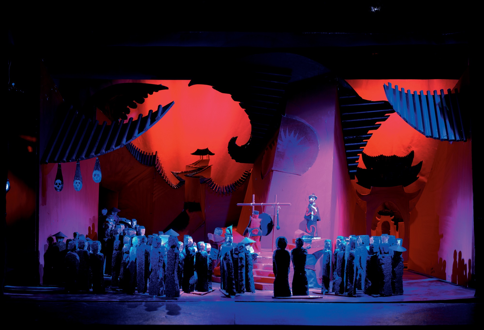
203 Scale model for Turandot (Act I), 1990
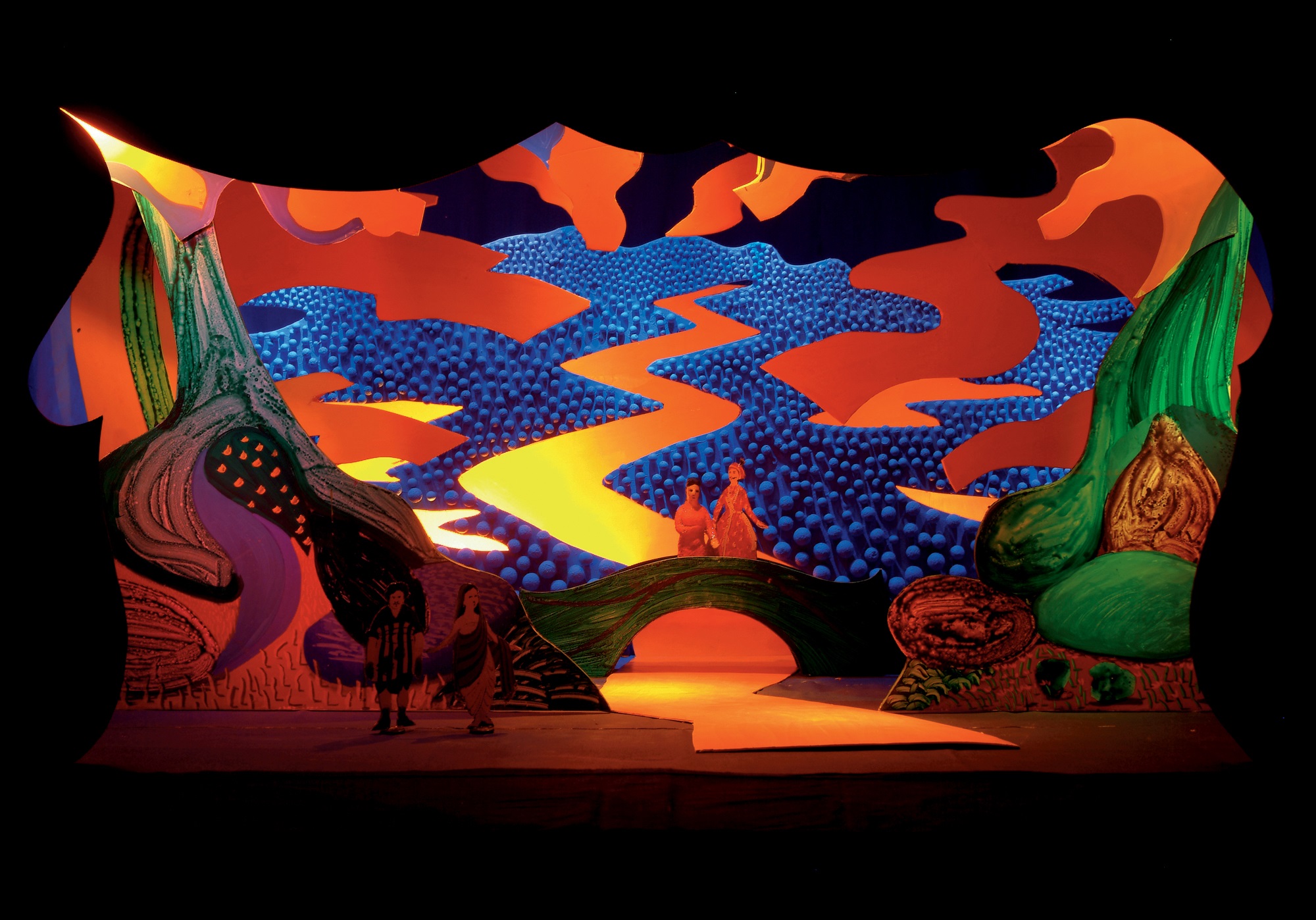
204 Model for Die Frau ohne Schatten (Act III), 1992
Somehow, in the brief gaps in all this frantic activity, Hockney continued to find time to paint, and on these occasions to direct all his energies and new ideas into the studio with a passion and enthusiasm that were surprising even by his own sometimes manic standards. The designing of Turandot occupied him from September 1990 to March 1991, with a visit to Chicago to work out the lighting in July 1991. Leading up to this he produced an extended series of small canvases, exhibited as ‘Things Recent’ at the André Emmerich Gallery in December 1990, in which he expressed his delight in the environment in and around his Malibu beach house; and the extension of his landscapes into more experimental territory in a group of more abstract paintings such as What About the Caves?, 1991 [195], which were shown together at the Richard Gray Gallery in Chicago in January 1992 to coincide with the opera’s première.
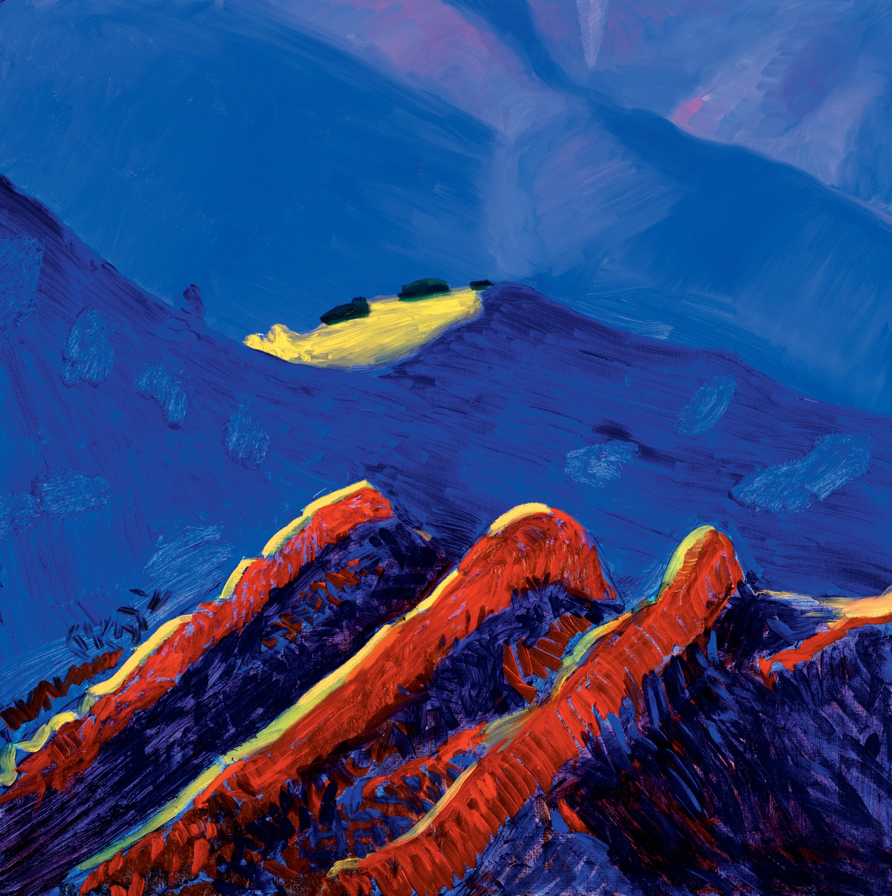
While the labour-intensive work on the operas may have taken him away from his paintings for prolonged periods, the discoveries that he made while working for the stage clearly once again fed back into his work on canvas. The dialogue between the studio and the theatre, which culminated in the investigations into space and colour of the Very New Paintings, can be traced at least as far back as Big Landscape (Medium Size), 1987–88 [193], an experimental work that he had put aside to study at his leisure but later agreed to donate to an AIDS auction. Here, and more obviously in later works such as Under and Out of the Arch, 1989, and What About the Caves?, 1991 [195], Hockney investigated ways in which he could convey the vertiginous sensations of the mountains and sea in a pictorial language that is notionally more abstract and ambiguous but still filled with numerous specific clues. There are frequent glimpses in these works of the foamy sea, whipped by the wind; of caves and cliffs and steep inclines; of an exuberance of plant life, with decorative patterns created by the deep shadows cast by objects in intense sunlight. Shapes derived from ordinary elements observed in the landscape, such as the railing featured in Under and Out of the Arch and other works, have both a descriptive function and a more purely formal one in leading us on a zig-zagging pictorial journey through the space of the picture.
The Very New Paintings, or the V.N. Paintings as he decided to title them, come even closer to the opera designs in their stylized, enveloping spaces, in the exaggerated intensity of their colours and in the complexity of their combinations within a single scene, recalling the precision of his stage lighting. The spherical forms that contribute so much to the representation of space in the landscape used as a backdrop for Die Frau, conversely, can be understood in relation to the similar shadow-casting shapes featured on such canvases as The Fourteenth V.N. Painting, one of three canvases in the series produced in June 1992 during a stay with his mother and sister in their new house in Bridlington, on the Yorkshire coast. There is little in these paintings to indicate whether they were painted near the motif from which they were inspired, or at some distance from it. They are, after all, synthetic images, distilled from memories as much as from direct observation.
While the V.N. Paintings might at first appear to form an unexpected, even bizarre, departure from the styles that we have come to associate with Hockney, they are in fact very much the culmination of his recent investigations into landscape as the product both of optical perception and visceral experience. Yet his experiments with the latest technology, too, paradoxically infiltrate these paintings in which he has most startlingly reshaped his response to the natural world. The variety of texture within them, while suggesting a contrast of different substances – air, water, rock, foliage, dirt, scrubland – owes a strong debt to the solutions that he had devised in his fax drawings for representing colour and form through tone and pattern. The colours, while credible as observations of the southern Californian scenery at sunset, have at least as much in common with the artificial and exaggerated hues of the still video camera and laser printers with which he had begun to experiment in 1990. Through these various means, Hockney makes real for us a transcendent experience of beauty and pleasure magnified to the point of satiation.
In April 1995 Hockney presented the largest and most ambitious variants on his V.N. Paintings, measuring up to twenty feet in width, as the culmination of this development in a solo exhibition at L.A. Louver with the amusingly cumbersome title of ‘Some Very Large New Paintings with twenty-five dogs upstairs and some drawings of friends’. The return here to a panoramic format used previously for such paintings as A Visit with Christopher & Don, Santa Monica Canyon, 1984 [184], provides a first taste for a project yet to be realized of paintings that come off the canvas and on to the walls and floors of the galleries in which they are shown. As early as 1983, when he painted a series of walk-in environments as recreations of his set designs for the exhibition ‘Hockney Paints the Stage’ [183], he had been curious about the possibility of extending his paintings into three dimensions, but only a decade later did he return to this investigation with the thought of making works that would exist in their own right, if only temporarily, rather than as elaborate props for an exhibition. The first products of this more deliberate experiment with painted installations were Painted Environment 1–3, 1993 [205], a set of multi-partite limited-edition colour laser prints from still video photographs documenting the earliest of these experiments in his Hollywood Hills studio. In each case, a recent painting is hung in the corner of the studio against walls and floor coated in a colourful pattern that seems to have emanated from the canvas at the centre. The sense of a transcendent force or source of energy billowing outwards into our space, when translated back into two dimensions, can only be hinted at. But the prospect of an exhibition in which visitors would walk through such a brightly painted space, surrounding themselves with coloured forms on all sides, promised to provide an experience of pure sensation that could in theory combine the dreamlike vision of Judy Garland’s Wizard of Oz movie with the blissful trancelike state normally induced only by drugs.
205 Painted Environment III, 1993
206 Dog Painting 19, 1995
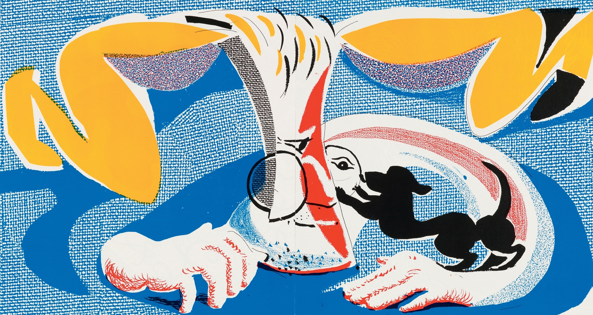
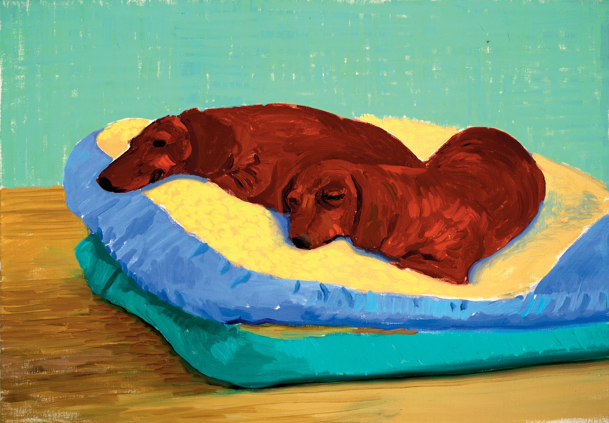
Neither Hockney’s versatility, nor his hunger to keep extending his repertoire, show any sign of waning. After devoting himself from 1993 to 1994 to yet another intense period of life drawing, both as a change of pace from the more abstract paintings and in anticipation of the retrospective of his drawings due to open at the Hamburger Kunsthalle in August 1995, he produced a series of forty-five marvellously fresh little paintings from life of his two faithful companions, his dachshunds Stanley and Boodgie [206]. These pictures, quickly painted by necessity because of the refusal of their subjects to sit still unless asleep, stylistically take as their point of departure the loosely naturalistic portraits that Hockney had been painting since 1988. Their tenderness, intimacy and good humour, however, exceed those qualities as conveyed in all but a few of those portrayals of his human friends. When they were exhibited together at the 1853 Gallery in Saltaire over the summer of 1995, after their first partial showing at the L.A. Louver Gallery, Hockney remarked that dogs took no notice of art but had only two overriding interests: ‘Food and love, in that order.’ What else is there? After all the theorizing, and notwithstanding his genuine excitement about new ideas and new ways of making pictures, Hockney retains a sense of proportion about what really matters and about the purpose of his art, however dangerously mawkish it may sound: to communicate the pleasure of being alive.

207 Self-Portrait with Charlie, 2005