Chapter 10. AI and ML Methods
In Part I and Part II we focused on the very practical and largely task-focused side of artificial intelligence. The other side of AI is theory, and the processes involved in making machine learning actually work. Thus, now that we have covered the how to implement a collection of AI and machine-learning features, this chapter will briefly discuss some of the many underlying methods that are used to give a system the appearance of intelligence.
Be aware there is no need to memorize the mathematics sometimes featured in this chapter; this is a practical book, as promised on the cover. A deep understanding of data science or statistics is not necessary, and skipping this chapter entirely would not make you any less equipped to follow the steps in later chapters to make an application with functional AI features. But to follow our mantra of effective, ethical, and appropriate use of AI, having an understanding of these basic principles is crucial.
Scary-looking algorithms are worked around with visual examples and metaphors that communicate the fundamental principles with small working examples. These demonstrate at a low level how each method goes about making decisions.
When applying this knowledge in future projects, having a broad understanding of how different methods work and what kinds of data they are most and least compatible with can allow better decisions to be made. Decisions that can be made in the design phase—when the cost of changes is lowest—will benefit a system throughout its lifetime.
Knowing the kinds of errors and behaviors different methods are prone to can also help prevent unseen biases. So although you will most likely ever employ only one or two of the methods detailed in this chapter anyway, this will allow you to better use the methods that you do choose.
Following this chapter are two more in-depth chapters: one looking at the inner workings of the specific approaches taken throughout this book (Chapter 11) and one on building a neural net entirely from scratch in code (Chapter 12).
Terminology
A few common terms appear in descriptions throughout this chapter; for example.
AI/ML Components
-
Observations refer to a set of past data collected that future knowledge will be derived or assumed. An observation is a single entry in this past data, say a line in a table.
-
Input refers to the single entry that is yet to be processed—sorted, placed, or classified. This is the thing for which you are trying to get new knowledge.
-
Attributes are the things known about each entry, both observation and input.
-
Outcome or class are used interchangeably to refer to the thing you want to know about each entry, present in the observations but still required for the input. This is often one of a set of prechosen options.
So, given a set of observations, you can process input with the same attributes to get its assumed class. For example, given a set of cat and dog pictures, I processed a new image, extracted its features and color composition, and found the computer thought it was a dog.
This is what happened when we built an image classifier in “Task: Image Classification”.
AI/ML Objectives
Next, let’s discuss three simple terms used to describe some purposes for machine learning. Basically, these are the types of questions you can answer using different methods:
- Descriptive
-
Asking “what does my data say has happened in the past?” This is the aim of methods such as clustering that describe and summarize your data, often with the explicit purpose of identifying significant or anomalous observations.
- Predictive
-
Asking “based on what has happened in the past, what will happen now?” This is the aim of methods such as classification or regression, which seek to apply more information to some input based on the information associated with past observations.
- Prescriptive
-
Asking “based on what has happened in the past, what should I do now?” This often builds upon predictive systems, with the addition of contextual knowledge that dictates appropriate response to predicted outcome.
Types of Values
Moving on to different kinds of values that you would encounter when discussing the strengths and applications of different algorithms, let’s begin with numerical versus categorical values. This is a pretty intuitive distinction: numerical is number, categorical is category. If you are crunching an online store with a database full of movies, the price of each movie would be numerical, whereas the genre of each would be categorical.
A third type of value common in observations is unique identifiers, but these are not discussed here, because they should be omitted during analysis.
These numerical and categorical value types can then be broken down further: each has two subtypes that should be regarded differently in many cases. Numerical values can be discrete or continuous. The difference is that if there is a set number of values something can be, it is discrete. If not, it is continuous. For example, a set of all whole numbers between 0 and 100 would be discrete, whereas a set of every decimal between 0 and 1 would be continuous, because it is theoretically infinite.
This becomes a bit more complicated when you consider that mathematics defines sets such as natural numbers—which contain all positive integers—as discrete. This is because even though they theoretically go on forever, you can take two numbers from within it and count all numbers that go between them. In the case of real numbers—effectively any number of any length and decimal that occurs at any point along the number scale—you can fit an infinite amount of other real numbers between any two you pick.
For the purposes of machine learning, different methods will work better depending on whether, after defining an upper and lower bound, all the values between them can be counted or not.
Categorical values can be either ordinal or nominal, where ordinal refers to values that have some order or relations between them that would imply connections between some are closer than others. For example, if you’re doing some analysis or prediction based on data from several locations to predict something in one place, places near to it should be considered heavily while places far away should only be considered if very similar in demographic. This creates a concept of weighting or order among these values, even though they are not numbers, that would be beneficial for your analysis to be aware of. Though locations often cannot be simply swapped out for numbers because it would be difficult to map relations that occur in three-dimensional space, the underlying system will often replace many other types of ordinal values with representative numbers for ease of calculation during analysis.
Nominal is the opposite; each value is equally different to all others. For example, in the set of primary colors each is equally and immeasurably different from the other. Another popular example of nominal values is binary categories, such as true/false. These are incompatible with methods that rely on a measure of similarity or proximity between values, as many do.
Some values are not so easy to intuit. For example, postcodes or zip codes should be treated as Categorical>Nominal values, because although they are represented as numbers and have some vague order, their proximity to each other in the scale of numbers is not always true in the real world.
Take, for example, Australian capital cities: you would not want to train a system to think that the distance between, say, Adelaide (postcode 5000) is closer to Brisbane (4000) than it is to Hobart (7000), which is almost 600 km closer. Depending on what you are using the input data for, it might be more useful to replace postcode entries with new state and suburb columns, or abstract ranges for each state that correspond to inner city, suburban, and rural areas.
Because some states are adjacent and traveling from rural areas to a city almost always passes through the suburbs, these would then have become theoretically ordinal values if done correctly.
Knowing how to classify your input values in this way—and recognizing where another type of value would serve you better—is a key part of method and data selection that will allow the creation of more robust and useful machine-learning models.
Classification
Classification is the application most commonly associated with machine learning in the eyes of the broader public, particularly in the case of one of the most widely used methods: neural networks.
Many of those around us who are aware of technological trends but not particularly technical themselves even believe that neural networks are how all machine learning works, that this is the only method you can use. It’s not. This one just has a catchy name that people can use cool stock art of brains with and claim that “no one knows how it works” because it’s the most difficult of which to expose the internal processes.
Note
We built things that did classification in “Task: Image Classification”, “Task: Drawing Recognition”, “Task: Style Classification”, “Task: Sound Classification”, “Task: Language Identification”, “Task: Sentiment Analysis”, “Task: Custom Text Classifiers”, “Task: Gestural Classification for Drawing”, and “Task: Activity Classification”.
There are many other methods of classification, many of which are simple enough to demonstrate on paper. They are used to drive many systems, such as recognizers made to interpret voice input, label images, or video content; recommendation systems present in online stores, social media, streaming platforms and more; as well as a number of decision-making components that allow large and complex systems to work more efficiently. There are so many clever and varied applications, the list could go on forever—basically think of everything that could benefit from responding dynamically based on experience.
Methods
Let’s look at a handful of approaches to classification and compare.
Naive Bayes
Naive Bayes is a good place to start because it’s simple; it’s very similar to the first kind of probability you learn in school: (specific outcome / all possible outcomes).
Naive Bayes is the method of taking some input I and some set of classes {C1, C2, … , Cn} and guessing the class that I should be based on a set of previously-classified instances. This is done by using Bayes’ Theorem to calculate the relative probability P of it being each class from the set of options (Figure 10-1).

Figure 10-1. Bayes’ Theorem
For example, suppose that you have a table of different types of food you have eaten lately. A friend has proposed you go out for Thai food again tonight, but you might disagree if you don’t think you’re going to like it. So you employ the Naive Bayes method to classify the likely outcome of their Thai food experience from the options {,
} (Figure 10-2).
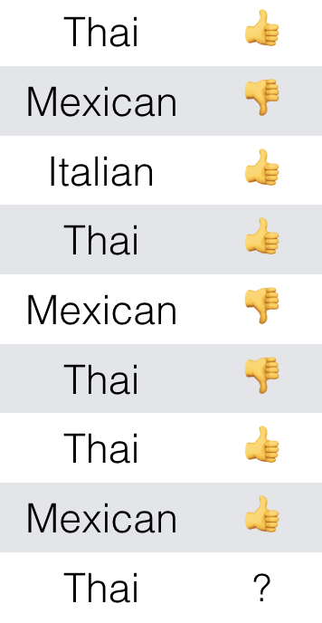
Figure 10-2. Input to use with Bayes’ Theorem
First you use Bayes’ Theorem to work out the relative probability of Thai being (Figure 10-3).

Figure 10-3. Calculation for positive rating
This is calculated by ((how many past s have been Thai ) * (how many past entries have been
)) / (how many past entries have been Thai) (Figure 10-4).

Figure 10-4. Probability of positive rating
Then, you work out the relative probability of Thai being , in the same way (Figure 10-5, Figure 10-6).

Figure 10-5. Calculation for negative rating

Figure 10-6. Probability of negative rating
Now it’s simple. The most probable is whichever one has a greater relative probability. In this case it is , so you can fill that in and say you’re probably happy with your friend’s choice of food (Figure 10-7).

Figure 10-7. Outcome of Bayesian calculation
But if you look at the input again, you probably could have just asked which outcome most commonly corresponded with the given input (Thai) in the past data. You would have gotten the same answer from many people, just from visual inspection. It is a very straightforward assumption: the outcome that has most often corresponded with this input in the past will be the outcome in this case.
The only reason this is called “artificial intelligence” is because it’s a method often employed with complex parametric input that would be unfeasible for a human to do on paper over and over again for each input. So this AI is really just automated math, and as you’ll soon see even the most mysterious and complex machine intelligence always is.
With most classification approaches being this type of probabilistic classification, it’s handy to make educated guesses. But this understandably falls apart for cases in which outside context changes or there are too many input or output options to get a significant measure. They cannot distinguish between valid observations and anomalies in past data, and will perpetuate each with equal consideration.
This is unlike an approach such as a neural network that will amplify differences in input distribution, minimizing this effect. Probabilistic classification methods also suffer significantly with continuous values in their input or output, such as in cases in which you are trying to classify things with numbers out of a large set of possibilities.
In these cases, a related approach to classification is needed: regression.
Decision trees
Decision trees are like those flow-chart quizzes you sometimes see in magazines, that proclaim to answer questions like What type of X are you? and Should you X? They make sweeping generalizations that incrementally partition the population.
This might seem logically unsound, but it’s just a rephrasing of that discussed previously: the generalizations made in machine-automated classifications are that what is yet to occur will reflect what has most often occurred before under similar circumstances.
So, suppose that you had some data. In this case, we’ll need a little more than before because this method is good at reducing the complexity of its input. Figure 10-8 represents some data that you might use to predict whether someone is going to have a good day at work, using past observations of good and bad days. Relevant data was chosen to record what the weather was like and whether the person’s friends were at work each day (Figure 10-8).
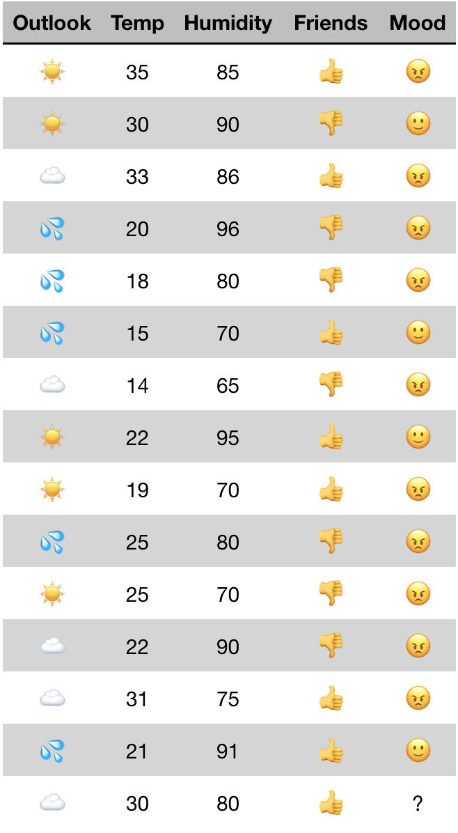
Figure 10-8. Input to use with decision-tree algorithm
How the decision tree method works is that an algorithm will assess the input data and identify relationships where certain attribute values are linked to certain outcomes. The attribute most closely linked to the outcome is the one for which its different values most often correspond with different outcome values. If in the given data every single time friends were present () the person had a good day (
) and the inverse were also true (
were always
), then that would be the only attribute you needed. The tree would look like Figure 10-9.
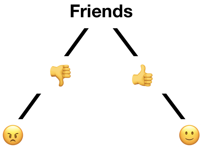
Figure 10-9. Hypothetical decision-tree representation
It’s basically the visual representation of a rule-based approach that could be simply defined in code:
iffriends=="{ return""} if friends ==""{ return""}
But because it’s not always so easy to see the presence and absence of links between certain attribute values and different outcomes, some math is required. There are a few different methods used to rate the relative level of determination each attribute has (Figure 10-10).

Figure 10-10. Some equations no one should be expected to memorize
One will select the attribute to partition the output by at each point based on the relative purity of the groups that would produce, and the other will select based on the amount of new information that is gained by grouping this way.
A simpler explanation of this is that each node has a poor opinion of its fellows.

So this method acts with no foresight, it makes no immediate sacrifices for overall efficiency, it has no big picture—it just gives each attribute column a rating of how closely it is linked to the outcome, picks the highest, and repeats.
So with our whole input, it will first assess all cases. It will find the most determining factor to be outlook, as splitting on this attribute will result in three partitions and one will be entirely pure: will be mixed,
will be mixed, but
directly corresponds to a single outcome (Figure 10-11).
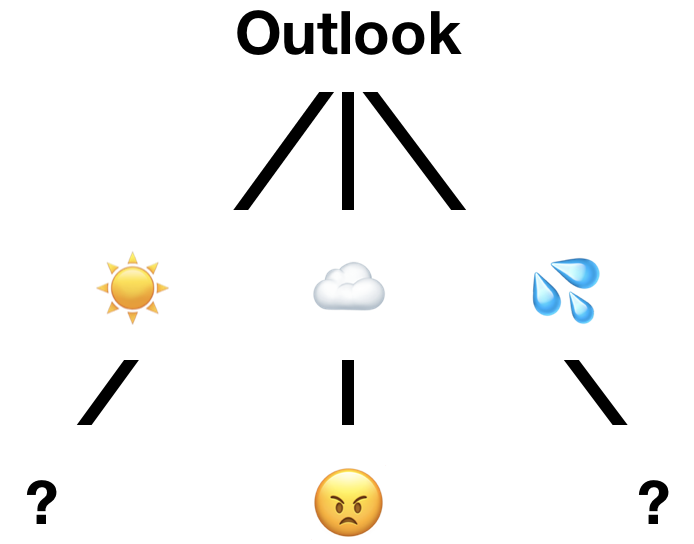
Figure 10-11. Partial decision tree representation
Now, for the righthand tree—now consisting only of entries in which outlook is —will do the same. It will find a split that is not perfect but is the best it’s got: the presence of friends.
The lefthand tree, however, requires some more work. Its most significant determinant is humidity, but you cannot account for every possible value of a numerical attribute. In fact, at each of the points discussed previously an extra step would have been done when assessing the relevance of humidity: variance reduction. This is the means by which a value that was once a wide range of values is sorted into ranges or buckets that discretize them for use as the categorical values some methods require.
This involves the very threatening-looking equation shown in Figure 10-12.

Figure 10-12. Another equation that no one should be expected to memorize
But it describes a relatively simple question you are asking of your data: “where along this continuous scale of values can I make partitions that will result in the purest outcome groups?” And you might recognize this as pretty much the question this decision tree method is asking all along. It is simpler in this case because there are only two outcomes, so you need only one split. You would select 85, as shown in Figure 10-13, because it results in pure outcome groups following the split at this value.

Figure 10-13. A visual way to identify the ideal partition point(s)
This method will then determine that the temperature has no significant impact on the outcome, producing a final tree something like Figure 10-14.
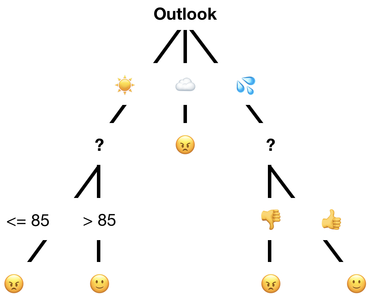
Figure 10-14. Possible complete decision tree representation
This is sufficient to be correct for the 14 prior observations, and classification of our mystery 15th is done by following the lines. In this case, the result would be due to the
outlook.
Good enough? Sure. Or so says the decision-tree method. This is great for simple visualizations, explainable classification models, and quick generalizations of otherwise complex data. It’s not great for anything you care much about, because it is susceptible to underfit and overfit and deems any majority as sufficient. Whereas other methods have mechanisms to recognize that something being the case even 51% of the time is not significant enough to predict this will always be the case, this does not.
There is also no way to affect where the tree decides to split—short of some major and targeted restructuring of input data. Where choices appear equal they will be chosen at random because decision trees see all attributes as equally relevant and related/unrelated. This is often not sufficient to model the full complexities and interrelations among attributes that are present in real-world problems.
Random Forest is a name given to a method used to reduce inaccuracies in decision trees introduced by random selection of branching points where there were options of equal validity. Instead of making just one tree, they will use the same past data to make many, each using different seeds or weights to mix up the random selection made at any points of equality. Then, they will classify the same input with each tree and take the most common outcome—or sometimes the average of the outcomes—depending on its purpose.
Distance metrics
Here, let’s take a moment to discuss a concept required for some of the classification methods to follow: distance metrics. Because so many methods of machine learning rely on taking a set of input attributes—basically one row of a table, missing its class or outcome entry—and transforming it into a point that can be compared in some n-dimensional space, we require a way to measure the distance between points that might not be able to be visually represented or conceptualized.
These metrics are a point of much contention between experts regarding which is most effective or correct under different circumstances, so we will just discuss some very common ones. Know that there are many more, both derivative of these and entirely different.
First, we have a method used to compare inputs with nominal inputs. Because their possible values have equal similarity and dissimilarity, comparisons are made on whole sets of values at once to produce a rating of their similarity.
The most common one by most metrics, and likely the most straightforward, is Jaccard distance. This takes two inputs and calculates the “distance” between them as a score of overlap divided by difference (Figure 10-15).

Figure 10-15. The equation for Jaccard distance
Let’s imagine that we’re looking at two data entries: say, two people, each with a specified value for their gender, education level, and country of origin (Figure 10-16).
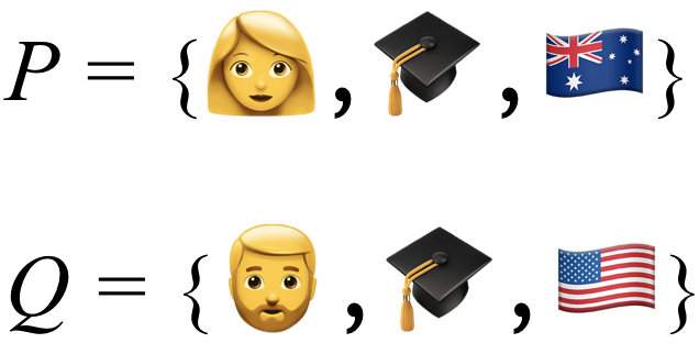
Figure 10-16. Input to use with Jaccard distance metric
You can then out the set representation (basically don’t list duplicates) of what they have in common and what they have between them overall (Figure 10-17).

Figure 10-17. Subsets of those inputs that are similar between the two original sets and their total combination
This is then a simple division of similarity, subtracted from one to get the inverse or dissimilarity (Figure 10-18).

Figure 10-18. Subset sizes put into the original equation to calculate distance
Second, we have methods used to compare inputs that are either numerical or ordinal in some way.
One possible metric for this is Euclidean distance. (Figure 10-19).

Figure 10-19. The equation for Euclidean distance
The Euclidean distance between two sets of values is equal to the square root of the squared distance between first value in each set, plus the squared distance between the second value in each set, plus the squared distance between the third value in each set, and so on. The distance between two single values is usually just the numerical difference, or degrees of separation for ordinal values that can have their proximities mapped or be assigned corresponding indices.
Represented in only two dimensions for simplicity, this forms something like what you see in Figure 10-20.

Figure 10-20. Euclidean distance represented on a two-dimensional plane
Another possibility is Manhattan distance (Figure 10-21).

Figure 10-21. The equation for Manhattan distance
The Manhattan distance between two sets of values is equal to the distance between the first value in each set, plus the distance between the second value in each set, plus the distance between the third value in each set, and so on. The distance between two single values is still just the numerical difference or degrees of separation.
This forms something like that shown in Figure 10-22.
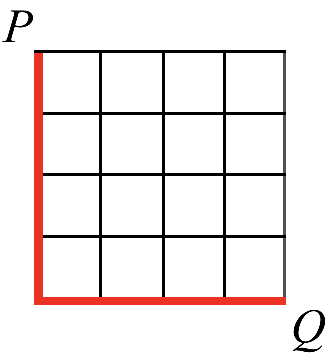
Figure 10-22. Manhattan distance represented on a two-dimensional plane
Let’s use a well-used example in data science: flower measurements. You have some flowers that for some hypothetical further AI purpose, you first want to know which pair are the most similar or closest to one another among them (Figure 10-23).

Figure 10-23. Input to use with various distance metrics
You can normalize the values, so that they have an equal range to compare. This is done by changing the upper and lower bounds of possible values to 1 and 0, respectively, leaving all values in between them (Figure 10-24).

Figure 10-24. Input after value normalization
Now, you can use our two distance metrics from before for numerical values. First, you get pairs of values for each pair of flowers (Figure 10-25).
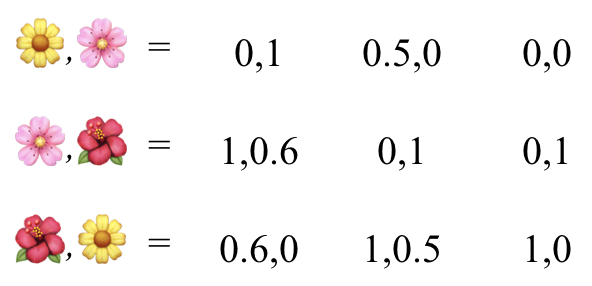
Figure 10-25. Combined attributes between input pairs
Then, you can try with our Euclidean distance, using the square root of the squared difference between each pair of values (Figure 10-26).

Figure 10-26. Distances using the Euclidean distance measurement
And you can try with our Manhattan distance, using the absolute value (ignore any negatives) of the difference between each pair of values (Figure 10-27).

Figure 10-27. Distances using the Manhattan distance measurement
At this point, you might see that Euclidean distance smooths differences, whereas Manhattan distance is good for enhancing differences. These are suited and used for different purposes with different accompanying algorithms and machine-learning methods (Figure 10-28).
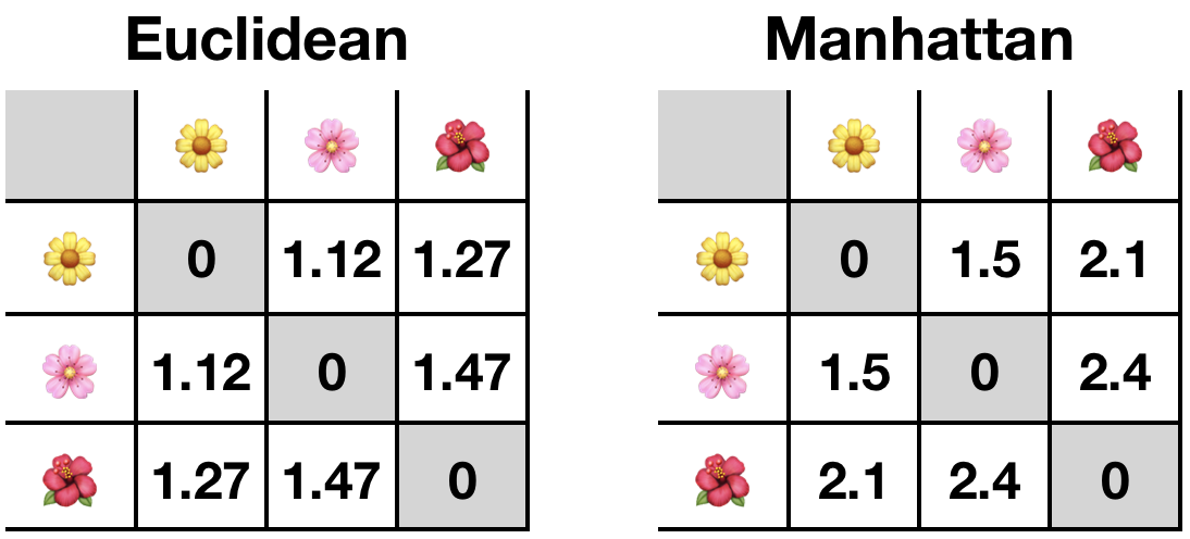
Figure 10-28. Comparison between calculated distances
Either way, our most similar flowers are the yellow one and the pink one. Simple.
Using the types of calculations covered in this section, you can now calculate the distances between abstract sets of multiple, possibly even nonnumeric, values.
Nearest neighbor
Nearest neighbor (or K-nearest neighbor [KNN]) is a method that uses a theory similar to the old saying “show me who your friends are and I’ll tell you who you are.” Its core assumption is that the class that applies to new input will be the class that most applied to past instances with the most similar attributes. This is really just a reframing of the probabilistic approach covered earlier.
It works like so: let’s plot some observations visually—this requires something with very few attributes. Given the example in Figure 10-29, in which some workers’ annual incomes and average hours worked per week are represented, and the colors/shapes correspond to something like whether or not they have joined the worker’s union. The company just hired a new employee, marked by a question mark, and the workers want to know whether the new employee is likely to join.

Figure 10-29. Input to use with nearest neighbor algorithm
So, you can say the new employee’s behavior is likely to correspond to the current employee with the most similar circumstances. If the red triangles are not joined and the blue triangles are joined, and their nearest neighbor is a red triangle—the same distance measured like those discussed earlier—you can say they’re likely to be the same (Figure 10-30).

Figure 10-30. Nearest one neighbor by distance
However, this method of just using a single neighbor would be incredibly prone to outliers. So, what do we do when faced with outliers in data science? We average!
In this method, you take more than one neighbor and use the most common class found. The number of neighbors you select, K, is effectively random and can result in vastly different classifications, as shown in Figure 10-31.

Figure 10-31. Nearest K neighbors with various values for K
Tip
This use of an effectively random value is termed bootstrapping in data science, likely due to experts not wanting to say that a method requires you to select something at random because they’re equally likely to work or not.
This selection can be made less error prone in a few ways. Though there are arguments that the best K is an odd number around the square root of the total number of points in your past data, there are other methods that employ what is effectively trial and error. But, no matter what you do, it should be known: accuracy of both nearest neighbor and a method for selecting K will vary wildly when applied to different datasets, and with complex input it is often difficult to see when it has gone wrong.
Note that this method can also be used to classify between a set of more than two class options, but will very likely become much less accurate as the number of options grows. This is termed the curse of dimensionality.
Support vector machine
Similar to nearest neighbor, support vector machine (SVM) is an approach that uses theoretical placement of each observation in an n-dimensional plane, where n is the number of attributes.
It combines this with a method similar to the variance reduction discussed in decision trees: finding a partition point within the data that will result in groups of the highest purity.
This method is great for partitioning data because it focuses only on observations at the edge of their classification groups—the points most difficult to reliably classify.
In practice, it’s drawing a line where one group ends and another one begins. This is done by taking the observation points that are nearest to points with different classifications to themselves. These are called the support vectors, giving the method its name (Figure 10-32).
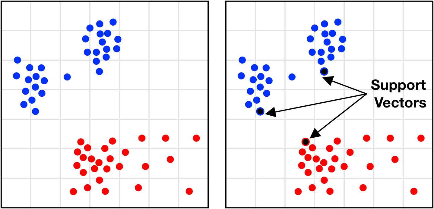
Figure 10-32. Identifying the support vector points
A line is then drawn to bisect the observations. This line is called a hyperplane, as though these visual examples have only two attributes/dimensions and the hyperplane need only be a line. In fact, it is a conceptual division that bisects each dimension at a point in space no matter how many dimensions there are.
In three-dimensional observations, the hyperplane would be a bisecting sheet; in higher dimensions, it would be impossible to visualize, though the principle is the same.
The space in which the hyperplane can be positioned can be broad, encompassing all the space between the support vectors where a line could separate only them (Figure 10-33).

Figure 10-33. Possible region of hyperplane intersection
However, from the theoretically infinite options within this space, the hyperplane is positioned with the goal to maximize the width of the margin between itself and its nearest points on either side. It is then centered between these margins.
This involves some math, but basically looks like Figure 10-34.

Figure 10-34. Comparing margins of hyperplane intersection points
Classifying a new observation then becomes a process of plotting it and seeing which side of the hyperplane it falls on (Figure 10-35).
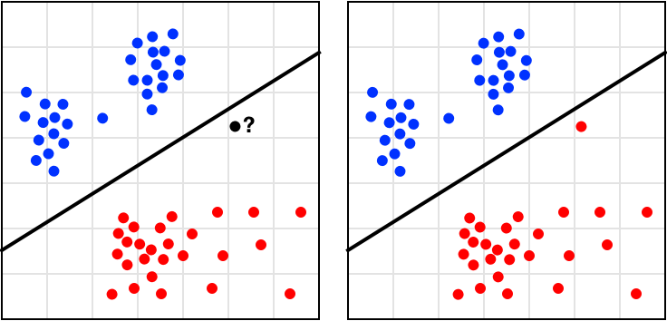
Figure 10-35. Classification of new points with SVM
However, due to the constraints of the method, SVM can be used only to reliably predict for binary classes: true/false, yes/no, postitive/negative, valid/invalid, approve/disapprove, and so on. Although it is quite good at this, this hard restriction makes it much less used in the field where constraints or available classifications might need to change and grow.
This method also has a variant used for data with more complex distributions—making them not easily separable by class—by adding a dimension to the plot and performing a nonlinear separation, but this involves some more difficult math that we don’t cover here.
Linear regression
Linear regression differs when compared to other classification methods in that it avoids many of the difficulties others have with continuous data—as you might remember, there were times in previous examples in which we had to generalize or discretize a range of values to be able to use them.
It works as if a form of classification could be open ended: could classify input with outcomes it had never seen before that it had inferred must exist due to the previous outcomes it has seen.
Our favorite example is that regression is like those pictograph quizzes you sometimes see on Facebook (Figure 10-36).

Figure 10-36. A stimulating burrito quiz
A classification algorithm that had never seen three burritos before would just decide it was closest to two burritos so it must be $20 just the same. A regression algorithm pays more attention to the difference between observations and can abstract forward as a human would: in the past, adding a burrito made the price go up $10, so adding another burrito here would make the outcome $30.
Note
We looked at how easy it was to practically implement regression using Apple’s CreateML framework in “Task: Regressor Prediction”.
Linear regression methods are often represented as a line chart, as featured in many a stereotypical representation of a projections-based board meeting discussion (Figure 10-37).
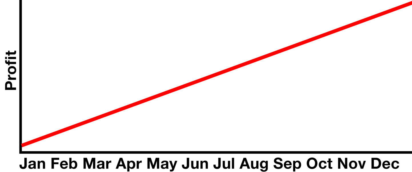
Figure 10-37. This line means profits will be up!
But these would have been formed from a large number of past observation points, making a “fit” line that can be used to predict events yet to come. Something like that in Figure 10-38 could have been used to project the previous graph’s profits for December, an approach given relative confidence, especially in the world of high finance.
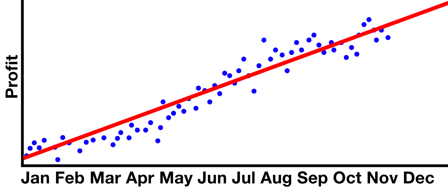
Figure 10-38. A possible truth to justify the assumption
The prediction for a specific new set of variables then requires only to find the corresponding point on the line (Figure 10-39).

Figure 10-39. Prediction using past observation
The actual method to linear regression is how you place the line.
Simple linear and polynomial linear approaches are common, sometimes just called linear and polynomial regression, respectively.
Where linear regression produces a straight line, polynomial regression can vary in degree. This basically defines the elasticity of the curve: higher-order polynomials will eventually result in overfit, whereas lower-order will usually result in an underfit similar to a linear approach.
What you’re looking for is something in the middle that generalizes a little bit, but still appropriately summarizes the distribution tendencies in your data (Figure 10-40).

Figure 10-40. Our method needs to be just the right amount of wibbly-wobbly
The way this line is placed is an algorithm core to graph theory: in y = wx + b where y is a point on the y-axis and x is a point on the x-axis, which w weight and b bias values will make for the lowest combined inaccuracy for all x and y values featured.
To un-math that, the weight is basically the angle and the bias is an offset from zero. So the question becomes “at what height and angle does a line most represent all of these points?”
Linear regression is a sound approach to many problems, but like methods discussed in the previous sections in this chapter, it is susceptible to errors due to outliers or unsuitable datasets. The English statistician Francis Anscombe constructed four datasets—thereafter called Anscombe’s quartet—that best demonstrate the pitfalls of these methods. The four sets shown in Figure 10-41 have identical summary statistics, including their simple linear regression line, but when visualized it becomes clear that they vary dramatically.
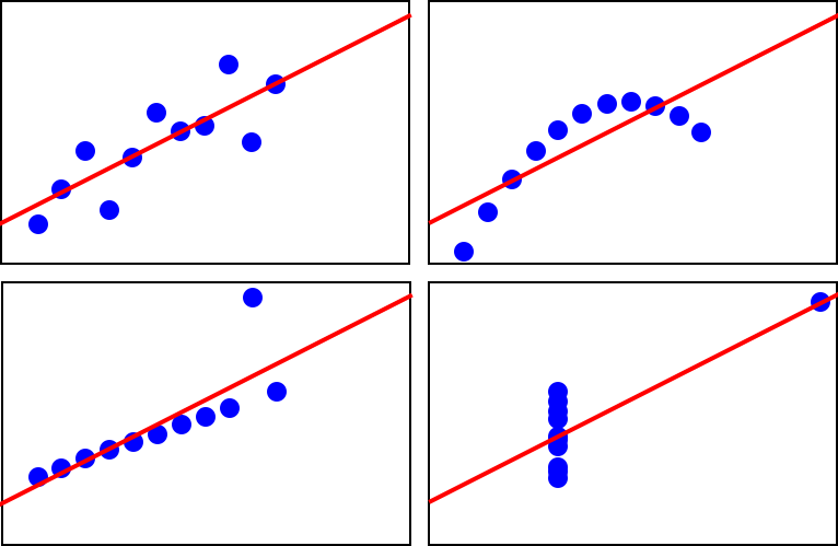
Figure 10-41. Less-than-useful generalizations from mal-applied regression
Logistic regression
Logistic regression combines the linear regression approach with a sigmoid function to produce an S-shaped line. Figure 10-42 shows the differing performance between simple and logistic for an identical dataset.

Figure 10-42. Comparison of simple linear regression
However, this approach is more often used to partition data while generalizing. Constraints of this approach require discrete variables, but produce output similar to the support vector machine method discussed in “Classification”.
With the given dataset, you might decide that the difference in behavior of the top and bottom groups should rightfully have them be treated as different classes. The same curve can then be used to indicate the midpoint where a new line can be drawn that will separate these classes (Figure 10-43).
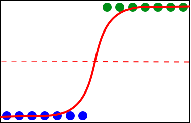
Figure 10-43. Partitioning at the pivot
Neural network
Finally, we get to the method at the center of the machine-learning hype: the artificial neural network. We mentioned this earlier, way back in Part I; here, we’re going to unpack how it works a little more.
This approach gets its catchy name due to an underlying structure that has been compared to the human brain, a web of interconnected nodes—called neurons--which fire in different sequences to cause different output.
Note
Despite often being compared to a human brain, a neural network really doesn’t have that much in similarity outside of the basic idea of interlinked neurons.
As fun as that sounds, at its core it is similar to a method like the decision tree. Input is led down different paths based on attributes that determine direction at points of divergence until a classification endpoint is reached.
Note
A neural network is the thing that’s at the core of most of the models we built earlier in the book.
The difference in the case of a neural network is that the tree structure that is formed during model training is obscured. The abstract representation of its internal details that determine the classifications it produces are, for the most part, regarded as impossible to present in a human-comprehensible form, and thus neural networks are blindly trusted as long as they appear to be producing accurate output.
Needless to say, problems arise. As those working in statistics quickly become aware, correlation does not always imply causation. A neural network during training will automatically identify features unique to each label, and will look for those in future input to determine the label to apply. It has no conceptual understanding or capacity to judge what are relevant unique features.
For example, if trained on a set of images in which half were cats and half were dogs, but the background of all cat pictures were light and the background of all dog pictures were dark, the pattern evaluation would likely make it quite accurate at classifying its training and testing data.
But if a dog picture was labeled as a cat because it had a light background and the human wrote it off as random error, it might never be caught that the main determinant the model inferred during training was the picture’s background color. There is no way to know.
The explainability of neural network models is a growing area of research, so it might not be long before this glaring flaw is no longer the case, but the accuracy gained by an intelligent and adaptable system that draws its own conclusions about what is relevant beyond what a human might be able to identify is too good to pass up. The many kinds of neural networks created in the past few decades are making it into new widely used and commercial technologies each day.
The type of neural network most typically associated with the term are feed forward neural networks (FFNNs), or more specifically, the convolutional neural network (CNN).
The way these work is with a series of nodes that take input and perform some calculations on it to determine which output path to take. A layer of initial input nodes is connected to one or more layers of hidden nodes that each apply a calculation to their input to make branching decisions before eventually reaching an output node (Figure 10-44).
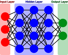
Figure 10-44. The generalized architecture of a neural network
Most neural networks are like a fully connected graph, with every node in each layer being reachable from all others in the previous layer. Connections between node pairs have different weights that basically dictate some threshold of values that input must exceed to “fire” that connection and activate the node on the other end.
Input nodes receive some input from the outside world. These are multiplied by some weight and processed with some function—called an activation function—to better distribute inputs. In this way, it is similar to logistic regression. Then, the value that is produced is weighed against the required threshold value for each outgoing path from the current node. The ones it exceeds are activated.
So, say you have some fruit... (Table 10-1)| Citrus | Spherical | |
|---|---|---|
| 1 | 1 | |
| 0 | 1 | |
| 0 | 0 |
…and a trained neural net… (Figure 10-45)

Figure 10-45. Neural network trained on fruit attributes
…and it is given the input (0,0) (Figure 10-46).

Figure 10-46. Activation of input nodes
The first hidden layer will then have one or more nodes each receive one or more values down different paths. Again, these are weighted and processed and compared with outgoing paths to activate some paths to the next layer.
On and on it goes until the output layer is reached, where the node or combination of nodes activated here correspond to some class label (Figure 10-47, Figure 10-48).
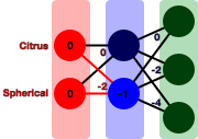
Figure 10-47. Activation of hidden layer nodes
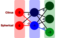
Figure 10-48. Activation of output nodes
And behold, our output corresponds to .
During the training phase, the weights of each node’s paths are randomly selected. Each time some input is classified, the error is measured and the weights in its path are adjusted. After some time, adjustments will converge on a point where they cannot classify the training input any more accurately and the model is deemed trained. These weights are used thereafter.
Here, overfit occurs when the neural net is given enough nodes or layers that generalization does not occur in the training phase. In this circumstance, some or all training cases become individually trained instead of identifying similarities between them.
In some cases, models are trained on an ongoing basis. This can be done with some function whereby a human can indicate that the network incorrectly classified some input. This would adjust weights along its path as a pretrained model would have done. In this way, neural networks differ from other forms of classification because they are able to get much more accurate over time and beyond deployment.
Applications
Now that you have a better picture of the relative simplicity of classification algorithms, let’s briefly look at some of the ways in which we can apply and combine them to imitate intelligence in a machine, as we did in an applied practical manner in Part II.
Image recognition
Similar to how we have used examples of tabular data, images can be analyzed as tables, as well. Take a very minimal example, such as the 4 x 4 image represented on the left in Figure 10-49. It can be represented by a set of three arrays of values: one containing the R (red) values for each pixel, one containing the G (green) values, and another the B (blue) values—as demonstrated on the right in Figure 10-49.
Tip
We looked at a practical implementation of image classification in “Task: Image Classification”.
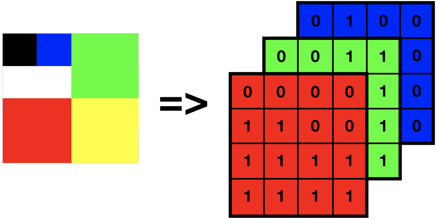
Figure 10-49. A tiny sample image and its potential RGB representation on disk
In a photograph, this might be millions of pixels/values in size, or require more tables for a more complex color space such as CMYK. Analysis of composition might use this only for features such as Google Image Search’s search by color functionality. Detection of image contents requires some additional information, such as where edges are present or the likely depth placement of various segments to ascertain where separate objects begin and end. We can improve this with some matrix math performed on the raw pixel data—used to enhance edges and lines—then making new attributes that detail the size, shape, and location of features in the image.
This is a complex way of saying that much like many of the methods you have seen so far for categorizing input, systems that use categorization at a low level are often employing many layers of it that each handle very specific decisions, which then form the basis for the single output presented to the user. For images, it might be the case that each pixel is classified into a region, each region is classified as an edge or depth, each set of edges of regions of a certain depth are classified as an object, and then the image is classified.
The common use of neural nets for such purposes obfuscate the multitude of decisions made in between, but other methods can be used to piece together a similar output that can explain each of the component processes that lead to a final decision.
Sound recognition
You might think of sound recognition as more complex, but in reality sounds are often analyzed by making a visual representation and then assessing that as you would any image. This is not always true, nor is it necessarily a good idea, but it works well enough for many applications.
Note
We looked at a practical implementation of sound classification in “Task: Sound Classification”.
Figure 10-50 shows a spectrogram, a visual representation of how a machine registers a sound. Phonemes (segments of words) can be detected by a computer given training knowledge of rise and fall of comparative frequencies occurring in the spoken voice and then pieced together to form words. Some gender detection is even possible due to the density of lower-frequency sounds.

Figure 10-50. Spectrogram of a male voice saying the words “nineteenth century”
Note
Forming individual phonemes into words will often use another form of classification method to smooth inaccuracies, weighting different possible sounds with likelihoods by attempting to form known words in a selected language.
For example, if a sound could either be “ab” or “ap” but the rest of the sounds make “there was an <???>le tree growing in the yard,” a natural language processing system trained on English will quite reliably select the option that makes a sensible statement—as our brains do when listening to speech.
Other approaches may use large tabular records of sound frequencies and durations to represent the same thing, instead analyzing them more directly as the numbers they represent.
Estimation
Methods like linear regression—which is especially useful due to not being constrained only to outcomes it has seen before—can be used to make magic numbers. Common in finance, linear regression is used most notably for profit/loss and stock market projections as well as price quoting for goods and services. A common everyday use for regression is predicting the selling price of real estate that is not currently on the market. Though every house is different, patterns can be seen in the number of bedrooms, size of the property, or proximity to amenities.
Decision making
Decision making might seem intuitive when discussing methods that implicitly make selections, but the applications of classification methods to more tangible real-world decision making are broad. Classification techniques are often used in systems that should alert specific behaviors but whose criteria are too complex and varied to employ a simpler rule-based approach.
Classification could be used to manage a server farm and decide when a device is exhibiting behaviors that necessitate maintenance. In this case, it would be classifying at given intervals whether each device should be labeled as needs maintenance or doesn’t need maintenance based on a multitude of attributes that summarize its current state.
Similarly, classification is used in many online fraud detection systems, analyzing complex human behaviors to decide whether a session appears to be normal human behavior or cause for suspicion of fraud attempt.
Recommendation systems
Recommendation engines are a particular interest of ours. Two common methods used by recommendation engines are content-based and collaborative filtering: one is based on the theory that something is likely to be relevant to a user if it is similar to what they have interacted with or liked in the past, whereas the other thinks something is likely to be relevant if it is interacted with or liked by other users with similar behavior patterns or preferences.
So, although the first might recognize in an online store that if you like a science-fiction book you might like another science-fiction book, the second could go as far as predicting you might like video games or dinosaur books—given that these are frequent overlapping interests with those who like science-fiction books.
Note
We looked at a practical implementation of a recommendation system earlier in “Task: Recommending Movies”.
Recommendation systems are used in everything, including search engines, online stores, social media, dating sites, blogs, and targeted advertising across the web. They are designed to be invisible but are a powerful tool for customizing a user’s experience.
They might use the same methods as classification methods covered previously; however, with a recommendation engine, the class is a group of related observations or objects and a score of predicted relevance.
Clustering
Clustering is like a form of classification that places observations or data points into groups of those with similar attributes. It is a practice used for generalizing or summarizing data, often to reduce storage requirements (such as in compression) or for the purpose of getting to know a dataset that is too large to observe or visualize.
Different methods are good for different applications: some clustering approaches work best with certain distributions of data, and many differ in their handling and consideration of outliers. Nonetheless, all methods acknowledge the subjectivity of desired outcomes between what the data and its clusters are to be used for.
Methods
Let’s look at a handful of clustering methods and compare.
Hierarchical
Hierarchical clustering is a method of iteratively grouping data points based on a given distance around each point. There are two methods of doing this: agglomerative and divisive.
Agglomerative hierarchical clustering looks like that shown in Figure 10-51.

Figure 10-51. Glomming points together into clusters
Each point will start out in its own cluster with a distance of zero, and then as the accepted distance grows farther and farther, points will slowly group together until all points are in one large cluster. This will make a tree of groupings, from which a cutoff point can be selected by a human or some other algorithm with consideration for what the data represents and what the clusters are to be used for (Figure 10-52).

Figure 10-52. Stop glomming wherever is sensible
Divisive hierarchical clustering is the same process but in reverse. All points start out in one cluster, and then separate as the accepted distance reduces until all points are in a cluster on their own. Again, a cutoff is selected.
Theoretically this would always have the same output as the agglomerative method, but if you have an idea already of how many clusters you want, you can save compute time by selecting the process that begins closest to the desired point.
The problem with this kind of clustering is that it does not support clusters of mixed densities. It turns out this is not a trivial problem for a computer to solve.
For example, in the first image of Figure 10-53 it is likely trivial for a human to distinguish clustering of three or four groups of differing densities, with a few outliers. The second and third show something like what would be produced with hierarchical clustering depending on the threshold at which you chose to stop.

Figure 10-53. Clusters of varied usefulness due to threshold value chosen
K-means
This method addresses the failings of hierarchical clustering in mixed-density clusters by working in the opposite way. Instead of grouping by proximity of points and eyeballing a cutoff distance, K-means requires you to eyeball the number of clusters you want in advance (K) and will form those from points with variable distances between them. This happens as follows (see Figure 10-54):
-
Select K random starting locations for your centroids (represented by X).
-
Assign each data point to belong to its nearest X.
-
Move each X to the center point of its assigned points.
-
Repeat steps 2 and 3 until covergence (they no longer move).
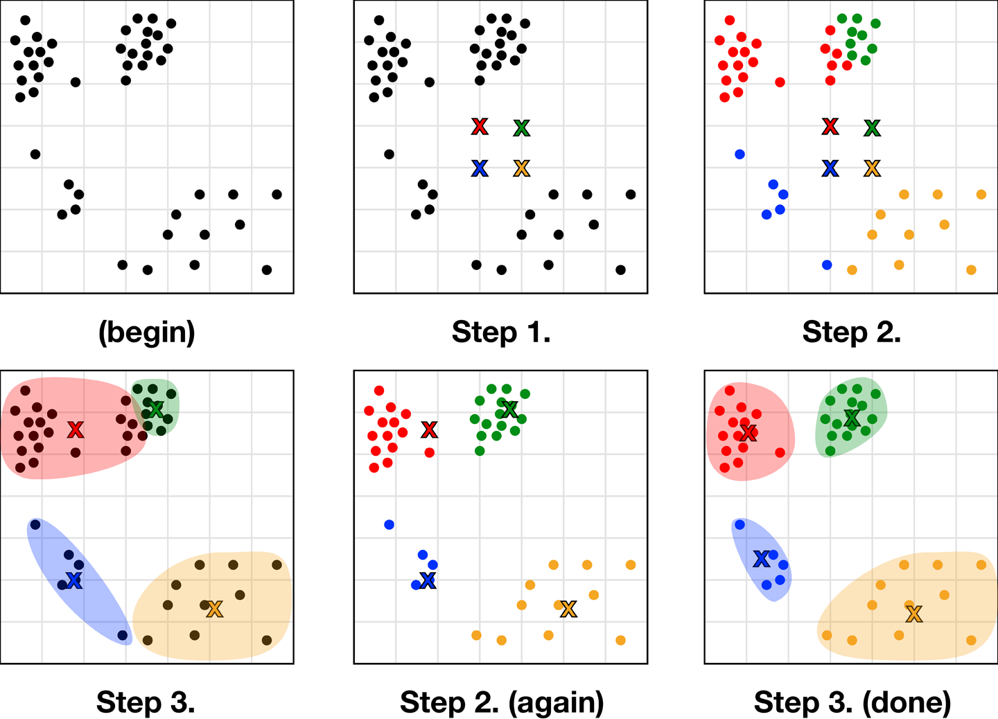
Figure 10-54. The elegant process of K-means convergence
It is a simple, elegant algorithm that results in almost the same output given any random starting points. The downside is that it is heavily affected by the K selected at the beginning; this is quite counterintuitive because clustering is usually a method of getting to know your data, but knowing how many groupings best describe different patterns or outcomes that occur in your data requires you to know it pretty well.
Blindly selecting numbers at random might appear equally well performing in many cases for which data is too high dimensional to clearly visualize. You might never know whether you chose well or are arbitrarily either grouping together distinct observation groups or splitting related ones. K-means also suffers from the clustering every point problem, in that it will equally consider even the most extreme outliers. Just like any other point, an outlier will be put in a cluster, treated as one of the group, and possibly drastically sway your centroids (which are frequently used to summarize cluster members, as shown in Figure 10-55).
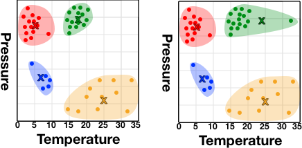
Figure 10-55. The potential effect of one outlier on the centroid of a cluster
In the first instance in Figure 10-55, you might summarize the green cluster as the high-pressure 17-degree group—and this would be an accurate estimation of all members. In the second instance, we’d summarize its temperature at 24 degrees, which is inaccurate for all members and is swayed by the presence of a single 34-degree incident that righfully should not be included in the cluster.
Unlike hierarchical clustering, the use of centroids as determinants also makes K-means unsuitable for nonglobular clusters (Figure 10-56).
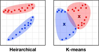
Figure 10-56. The unsuitability of K-means for nonglobular clusters
DBSCAN
DBSCAN (Density-Based Spatial Clustering of Applications with Noise) is another form of clustering that, like hierarchical, assesses the distance between all points to account for nonglobular clusters. Unlike hierarchical, however, DBSCAN has a form of regulation that aims to ensure tighter clusters of significant size by implementing a minimum number of points that must be nearby for a point to be considered.
So two figures are needed: an epsilon value (or distance at which two points are considered close to each other) and a minimum points value (min pts). Then, for each point the number of points nearby—or within epsilon distance—is counted. If a point has more than min pts nearby, it is a center point. If it has less, but one or more of the points nearby are themselves center points, it is a border point. Points with none nearby, or less than min pts nearby where none are center points, are disregarded. Clusters are then made with the labeled points, both center and border.
This could be represented as something like:
ifpoint.nearbyPoints.count>=minPts{return.center}forneighbourPointinpoint.nearbyPoints{ifneighbourPoint.nearbyPoints.count>=minPts{return.border}}return.other
This is shown in Figure 10-57, with center points highlighted and border points outlined. As you probably notice, this is another method that’s not tolerant of mixed-density clusters.
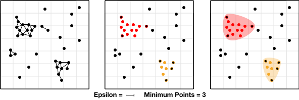
Figure 10-57. Visualized steps of the DBSCAN process
Mean shift
Mean shift clustering is another method that, like K-means, takes steps toward a final convergence that will be its final outcome. In this case, a selection is made of a distance around each point to consider and for each point you select, the point within its selected radius with the greatest density of other points—its local mean point. From this new location you then find its local mean point, and so on (Figure 10-58).
Tip
A threshold value should be becoming clear as a component of many data science practices that requires human expertise; this is why even if you aren’t writing out your own versions of these algorithms every day, it’s still better for your outcomes if you at least know how they work.
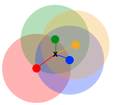
Figure 10-58. The mean of various points
This should soon naturally converge on multiple points that have greater density than their surrounds. In this way, mean shift has the robustness and repeatability of a method like K-means, but will determine for itself how many clusters are present for a given threshold and can still handle nonglobular clusters (Figure 10-59).

Figure 10-59. Convergence on local means
This method can also be applied outside of clustering, and is one of the ways object tracking can be done in video footage—clustering regions of colors likely to be objects as they move between frames.
Applications
Now that you know the inner workings of some popular clustering algorithms, let’s briefly look at some of the ways in which we can apply and combine them to improve and manipulate data—or form the basis for future classification activities.
Data exploration
Clustering can be used to get an initial idea of patterns present in a large dataset. Along with visualizations, clustering plays a crucial part of the initial data exploration/familiarization stage of analyzing an unfamiliar dataset.
Having a general idea of how data is distributed—such as the presence or absence of groupings, or the overall density of observations—can aid in selecting the appropriate analysis methods to use moving forward.
We can also use clustering to group and label previously unnamed behaviors, even if just as Behavior Group A, etc. Given a label, we can now use these with typical classification techniques for predicting outcomes for future observations.
Behavior profiling
The idea of a group of data points that share attributes but cannot be intuitively named might be difficult to conceptualize. That is, until you think of people. People can be clustered by a multitude of characteristics and behaviors, but outside of broad stereotypes these sets of attributes will rarely have a name.
In the case of recommendation engines, as discussed earlier, people are grouped by having similar interests, but each person within a group can overlap in a broad number of tiny ways that cannot be easily quantified. Clustering techniques form new attributes for each data point—such as which individuals are similar to them, which cluster threshold would be needed to link this individual with another, and so on—that can be used to make intelligent decisions about the similarities between complex human behavior attributes.
Behavior profiling is especially beneficial when developing rules for online fraud-detection systems. To define what is normal and what is suspicious behaviors from characteristics as broad as session length and country of origin to order of interactions and type of contact details, a system can seek to derive observations from past fraudulent behavior. In this case, clustering behaviors and then assessing where fraudulent behaviors overlap, some unrelated behavior might allow the system to identify much more complex and reliable traits than a human is able to recognize or infer.
Compression
Given clustering’s potential for identifying places where multiple values could be generalized to one, we can use it very effectively for compression. This is particularly clear in examples of image compression: usually, storing an image would require each pixel have a long value that corresponds to one of the more than a billion colors supported by modern color profiles.
Instead, you can represent each color present as a point in, say, three-dimensional space—with an axis each for its RGB values—and then cluster them. You then replace all colors present in each cluster with the cluster’s centroid color. This can be done with very small threshold values for lesser color changes that may not even be visible to the human eye, all the way to reducing an image to only a handful of colors that are extensively dithered (Figure 10-60).

Figure 10-60. The same image reduced to an increasingly limited palette
This now reduces not only the size of the lookup table, but also the size of the value needed to store the table index of the color in each pixel.
Next Steps
So now you should have an idea of the kinds of assumptions AI and machine-learning methods are based on and hopefully be a little demystified with the way some systems work. As anyone with any programming background will know, a complex thing in technology is always just made up of many simple steps done very fast.
Next up, we look at what happened under the hood for some of the practical tasks we built earlier in Part II.