> Creating and Saving Your Own Templates
> Using Other People’s Layouts for Inspiration
Most photo book software has a similar look and feel. The center of the program window is dominated by a preview of a double-page spread, and preview images of the other pages are located above or below the center window. (Blurb offers a link to the other pages rather than a preview.) Some programs also include tabs or menu options in this view. Import options for photos are usually located on the left or the top of the window, along with tabs that contain layout and background adjustment options. Blurb has its major function buttons located above the main page layout window.
Figure 6.1: Most photo book software is organized like the Blurb interface shown here. The current page layout is displayed in the center and is surrounded by layout options and photo import tools.
Most programs also have a zoom slider or button located below the main window for viewing a page detail.

Figure 6.2: A zoom slider like this one used by Blurb makes it easy to check detail views of a page layout
Tools for fine-tuning can generally be found at the top of the window, although MyPublisher and AdoramaPix have separate palettes for making adjustments to individual layout elements. We will go into detail on each type of adjustment later.
All photo book software arranges the individual elements of a page in frames, known variously as Image Boxes, Photo Boxes, Text Boxes, or Text Containers. Some providers simply call these elements Photo, Text, and Caption. These boxes don’t necessarily have visible outlines and are usually created using obviously named buttons or menu items.
These boxes are placeholders for the text and images that make up your page layout. For new users, it appears odd that the software allows you to create boxes without any content. However, this is a pro-grade feature that can be very useful.
TIPS & TRICKS Some programs can automatically generate a box with the same dimensions as the one you were previously using. At Smile-Books, this works by selecting the current box and clicking the Add new image area button (i.e., create a new image box). Alternatively, you can simply copy the object you want to duplicate. 

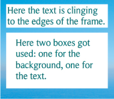
Figure 6.3: Text and image boxes are placeholders for the actual text and photos that make up your book, and can usually be set up independently of their content
The boxes used by photo book software are just like real picture frames—once you have “hung” them in position, they stay where they are, even if you change their contents. This means you don’t have to redesign a whole page just because you want to swap out a single image. In this case, the box stays put, and you can place whatever you want in it.
Boxes and their contents can be moved together, or you can independently move an object within its box. At SmileBooks and MyPublisher, you must click on the edge of a box before you can move it. You will then see a four-point arrow cursor, and you can shift the box (along with the object inside) by dragging it with the mouse button pressed. An object can be moved within the box by clicking on the object within the box and dragging it. MyPublisher has a dedicated Move button in the image-processing panel that lets you alter which section of the photo is visible within the box.
Figure 6.4: At Smile-Books, you have to click on the edge of an object’s box before you can move it
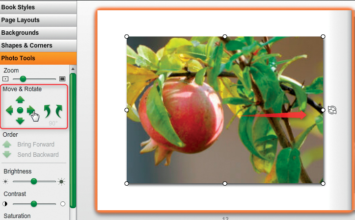
Figure 6.5: Some provider software has dedicated tool panels for resizing and moving objects (the illustration here shows the Picaboo interface)
Other programs, such as Blurb, have a special Edit Layout mode for changing the attributes of a box. The contents can be moved by double-clicking and dragging within the box in normal layout mode.
Providers like Picaboo and AdoramaPix allow you to move a box and its contents by dragging it with the mouse button pressed. You can then adjust the attributes of the object by using a dedicated tool panel.
The size of a box can be altered by dragging its edges or corners. At Picaboo, AdoramaPix, and SmileBooks, objects are automatically scaled if you adjust the box’s size using the corner handles. Most objects can be rotated, too, by using the rotation icon located at the top or the side of the box.

Figure 6.6: Most software allows you to rotate objects, too. This is usually achieved by using a dedicated rotation icon, like those used by MyPublisher (left), AdoramaPix (center), and SmileBooks (right).
SmileBooks includes functionality for performing precise custom rotations on complete objects, while Blurb only offers a choice of 90-degree rotations for the contents of a box (via right-click).

Figure 6.7: If you right-click on an object in Smile-Books and select the Edit Object Position option, a comprehensive object rotation dialog appears
Object boxes can usually be freely located anywhere on or beyond the edge of a page. However, some providers require you to switch to a dedicated editing mode before you can adjust object positions. This is called Edit Layout at Blurb and Freeform mode at Picaboo. The My-Style option at MyPublisher has to be switched on before you can make any alterations. Simpler programs, like those offered at convenience stores, only allow you to switch between preset layouts and don’t provide any custom editing options.
Boxes can usually be stretched to cover a double-page spread. However, this functionality is sometimes part of a software update, so check to see if you have the latest version if your program doesn’t seem to support it.
TIPS & TRICKS Most software automatically checks for new versions at startup and offers you updates if available. Always keep your software up to date—later versions correct errors from previous releases and often provide useful new features.
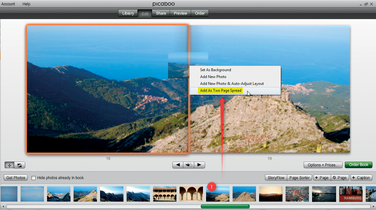
Figure 6.8: At Picaboo, you must select the Add As Two Page Spread option if you want a photo to cover both sides of a spread. Otherwise, the image will only display on one page, even if the box covers both.
The latest version of Blurb software doesn’t allow you to freely arrange boxes across multiple pages. You can work around this limitation by creating two image boxes containing the same image that meet in the center of the spread. You can then alter the position of the images within the boxes using the Pan and Zoom functions so that the two halves look like a single image.
Sometimes, a small margin of an image that spans across two pages may get lost at the inside gutter. Therefore, you should avoid placing important image elements, such as a person’s face, at the center of the double-page spread. If you are using dedicated layout software, you may want to ask your provider for their suggestions on how to manage your borders, since each provider may handle cropping and binding differently.
PRO-GRADE SOFTWARE InDesign and Scribus offer many more ways to create boxes than most provider software and online book creation tools. They also offer smart guides (like the one from InDesign shown below) that appear automatically when you draw a new box that lines up with an existing one, helping you to quickly and easily create multiple boxes on a single page. Pro software also includes tools for drawing boxes of a preset size or with a specific aspect ratio. 
If you are working with multiple boxes on a single page, grouping functionality allows you to move and sometimes scale them as a single unit. AdoramaPix and SmileBooks offer grouping as a standard feature. At AdoramaPix, the Select all elements on spread button allows you to move (but not scale) groups of objects, while SmileBooks lets you group objects by selecting them one after another with the mouse button pressed. Once you have selected your objects, a box appears around the entire group, which you can then move as a single object. Groups created in this way are automatically ungrouped as soon as you click on one of the objects within the group.
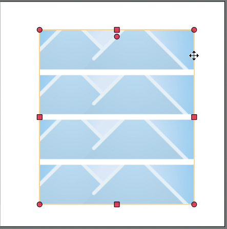
Figure 6.9: SmileBooks software allows you to group multiple objects by selecting them one after another with the mouse button pressed. You can then move or scale the grouped objects as one.
You can group objects at Blurb, AdoramaPix, MixBook, and MyPublisher by holding the Shift key down while selecting them. Unfortunately, MixBook doesn’t support scaling of grouped objects.
Most provider software allows you to place objects on top of one another in the same way that transparencies can be layered on an overhead projector. Layers can be transparent or opaque, and show or hide lower layers accordingly. If you have already worked with Photoshop or other high-end image processing software, you are familiar with the layers principle.
WARNING! Blurb and some other providers don’t support multiple text layers that overlap directly. This is not usually a problem, but it can make some special effects difficult to apply. 
Most providers let you alter the order of the layers you create. There are various ways to do this. MyPublisher has a dedicated button, while SmileBooks and Blurb include the function in a popup menu that you can access by right-clicking on an object.
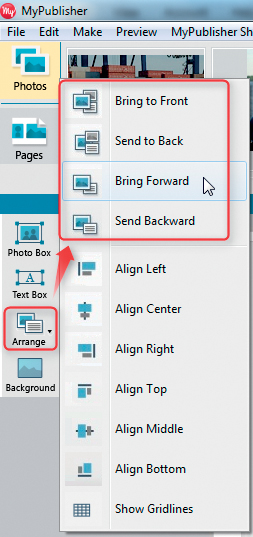
Figure 6.10: The Arrange menu in MyPublisher can be used to alter the order of the layers on a page
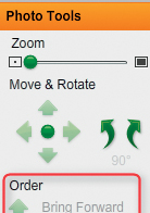
Figure 6.11: Picaboo has dedicated buttons for altering the order of layers
TIPS & TRICKS SmileBooks uses the <ALT +> and <ALT -> keystrokes as a quick way to alter the position of objects. Other providers have their own keystrokes for performing various functions.
It’s easy to lose track of the layers on a page, so stay calm when you are clicking through your objects looking for the one you want to bring to the top! Some programs include Bring to front or Send to back functions, which can be very useful when you are working with large numbers of objects. Pro software like InDesign has a wide range of functions to help you navigate around multiple objects. See section 6.3, “Understanding Other People’s Layouts,” for more details.
TIPS & TRICKS Work from back to front. Begin by creating the objects that will be farthest back in your final layout and lay all subsequent objects on top of each other, step by step. Imagine you are laying a table, starting with the tablecloth (i.e., the background) followed by the cutlery, plates, and decorations. If you leave the background until last, it will cover everything else and you will have to rearrange the whole setup.
Not all providers include page-numbering tools. SmileBooks offers comprehensive numbering options, including various fonts and font sizes, and allows you to select where the numbers should be positioned on the page. You can also add short text (such as the word “page”) to your page numbers.
WARNING! If you want to include page numbers but your provider doesn’t offer automatic numbering tools, the best approach is to use your own page templates with predetermined positions for the numbers. Otherwise, you can spend hours fine-tuning the positions of individual numbers once the rest of the layout is finished. If you don’t want to position your page numbers in the center of each page, you will need to create right-hand and left-hand versions of your template.
Figure 6.12: SmileBooks offers comprehensive page numbering functionality
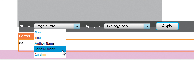
Figure 6.13: At Blurb, page numbers are part of the page footer or header
Some providers allow you to save your page layouts as templates that you can recall for use in subsequent pages or projects.
TIPS & TRICKS It saves time during the final quality control phase if you design your templates as accurately as possible. For example, make sure that all of the objects on each page adhere to the bleed margins you have set up. See also chapter 11, “Quality Control.”
Templates are especially useful if you want to use design elements that are not part of your provider’s templates (page numbers, for instance) on multiple pages.
Blurb includes the simple Apply & Save to My Layouts button in Edit Layout mode. Templates thus created are then available (with previews) in the My Page Layouts menu.

Figure 6.14: Blurb lets you save your layouts as templates for use on other pages or in other projects
WORKAROUND If your provider doesn’t allow you to save your own templates, you can always add extra pages to your layout and copy duplicates of page layouts there. You can then copy individual pages from your “pattern” pages when you need them. If your provider’s software doesn’t support copying entire pages (as is the case with SmileBooks), you can still copy all the objects from a finished page to a new, blank page. 
PRO-GRADE SOFTWARE Unlike most free software, pro layout programs like InDesign and Scribus support the creation of preset style templates for text and graphics. For example, you can create preset object boxes with rounded corners or drop shadows that you can apply to multiple pages later on. Once you have defined a style, it can be applied to an object with a simple mouse click. [Fig. 6.15, 6.16]

Figure 6.15: InDesign includes functionality for creating style templates that you can then apply quickly and easily to subsequent layouts

Figure 6.16: InDesign includes user-definable object styles that can be applied to objects at the click of a mouse
Figure 6.17: A layout like this double-page spread from VIEW magazine is constructed from a number of distinct text and graphic elements
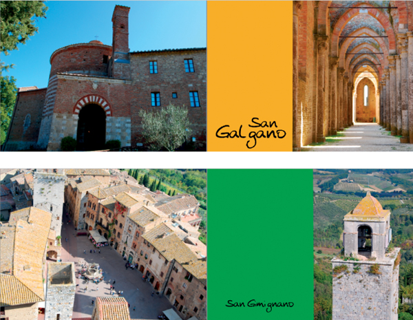
When you are designing photo books, you are sure to run out of ideas at some point. The simplest way to gain fresh inspiration is to look at other print media. Spend an afternoon at a bookstore or magazine stand. Magazines like National Geographic, Esquire, The New Yorker, Wired, and I.D. use particularly original layouts. Specialty magazines like Wedding Style are also a great source of inspiration for niche photo books. Professionally produced advertising flyers can provide fresh views of familiar subjects. You can use media about any subject to gain visual inspiration, as the example below illustrates.
But what is the best way to go about understanding a layout? The first thing to do is to separate it into its basic elements (i.e., photos, text, and graphics) and assess how much space is devoted to each.
The example above is from the German VIEW magazine and is constructed as follows:
 Two photos: the main page-filler and a small one at the bottom of the text box
Six blocks of text: the main title, the subtitle above the text box, the text within the text box, the smaller colored text box, the page number, and a miniscule photo credit
Three colored shapes: the page number background, the background for the main text, and the orange text background
It’s also important to note which elements conceal which parts of the others.
Let’s talk about how to duplicate the main elements of this layout for a spread in a travel book about Iceland.
TIPS & TRICKS If you want to duplicate a layout, build it up from bottom to top—i.e., start with the background and work “up” to the top layer. Working the other way around (from top to bottom) is perhaps more intuitive but much more complicated.
Start with the background image. The background in our sample spread doesn’t quite fill the page, leaving thin white borders on all four sides. You can, of course, vary the layout in your own version and scale the background image to completely fill the page, as you wish. The aim of this exercise is to gain inspiration, not simply to copy someone else’s work.

Figure 6.18: The background image is the first element to be placed. Here, it is scaled to almost completely fill the two-page spread.
The next step is to create the colored boxes that shape the graphic look of the page and provide the background for the text. First, draw a box with a white background for the main text; then, a smaller, colored one for the subtext; next, an even smaller one for a ranking number for our Island Top 10 (originally the background for the page number in the VIEW magazine layout).
TIPS & TRICKS Depending on the options offered by your software, you can either create a separate colored box as a background for the text and then overlay another text box, or create a simple text box with a colored background, as supported by Picaboo and SmileBooks. [Fig. 6.19] Most providers don’t allow you to alter the margins within a text box, so the only way to produce a decent layout using a single text box involves clumsy workarounds with manually set tabs and spaces. SmileBooks is one of the few exceptions that offer custom indents.
Picaboo allows you to alter the color of the text background, but not the size of the margins. The solution is to use one box for the background and a separate one on top for the text.
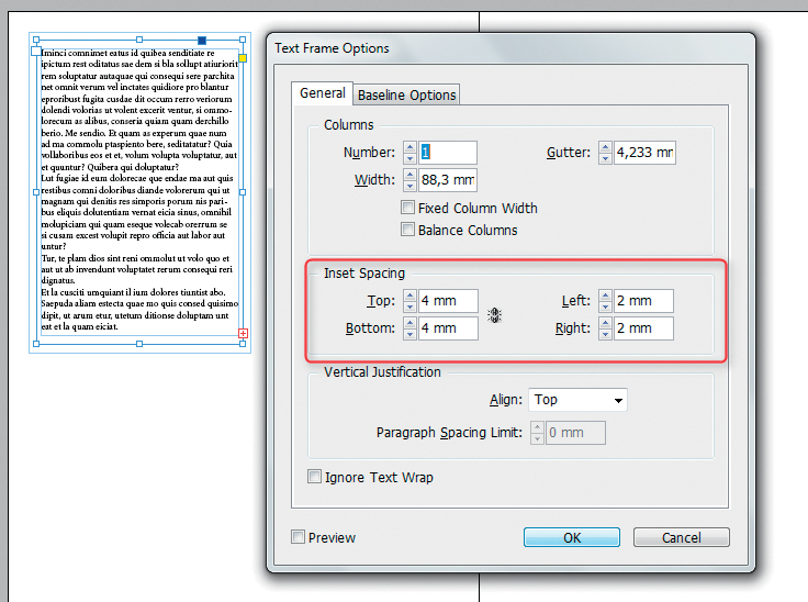
If the software you are using isn’t flexible enough, the simplest alternative is to create and name separate boxes for the colored background and the text. You can then quickly and easily alter the spatial relationships between the two. Pro layout programs like InDesign allow you to preset your margins (or indents/insets as they are also called) to within a fraction of a millimeter. [Fig. 6.20]
Figure 6.19: InDesign allows you to precisely define the margins within text boxes
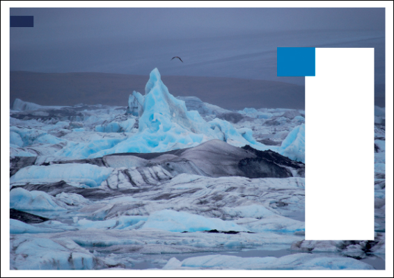
Figure 6.20: The next step is to create the colored background boxes for the text
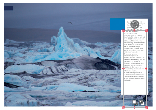
Figure 6.21: We must use two separate text boxes to create the text flow around the blue box

Figure 6.22: This is the point at which we can insert the main title and the subtitle
The next step is to create a slightly smaller white box for the text within the white background box. If your software doesn’t support text flow around other objects (which is usually the case), you will have to create two separate text boxes to produce text in two different widths surrounding the blue quote box. [Fig. 6.22] It’s also possible to shift text using spaces and tabs, but this can be quite fiddly.
We can now insert the main title and the subtitle into their respective boxes. [Fig. 6.23]
To round out this section, we can now insert the smaller photo as a separate object into the bottom of the text box and scale it precisely to fit the available space. [Fig. 6.24]

Figure 6.23: The small photo at the bottom of the main text box completes the layout of the text element
The final step is to insert our extra element at top left. The number is placed in a new text box on top of the blue background that we created earlier, and the inscription “Island Top 10” completes the layout. We could have created this element before working on the large text box, as the two boxes don’t influence one another. However, it is easier to find the right sizes and proportions for smaller elements once the main elements of a page are laid out.
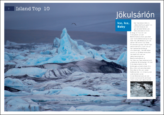
Figure 6.24: The finished layout
You can now fine-tune your layout as much or as little as you wish. Our sample VIEW magazine layout includes the location in bold at the beginning of the main text, and a reference to the source of the photos is printed vertically beside the main text box.
As already mentioned, this exercise is not about slavishly copying an original, but rather about using it as inspiration for our own design. In this case, we stuck closely to the original to illustrate the principles involved. You can design each element as freely as you like when creating your own layouts.
If you don’t want to use someone else’s design as a starting point, you will simply have to get creative. This might appear simple at first: all you have to do is arrange some photos and perhaps a little text on a page. But that’s exactly what is so tricky. Once you have made your first few attempts, you will discover that it’s not quite as simple as you thought to create a balanced design, especially over the course of an entire book.
Most readers know immediately and instinctively if a layout is cluttered or simply “doesn’t look right.” This is because we are constantly bombarded by visual information. Professionally produced books, magazines, and advertising are the yardsticks of what we perceive as “attractive” media. When we look at a photo book, we often apply subconsciously learned precepts of proportion.
Creating layouts is largely, but by no means completely, a matter of taste. The following sections are intended to increase your awareness of the basic rules of layout creation and help you to apply them to your own work.
Let’s take a look at relationships between the basic elements of a layout. In addition to the design elements themselves (i.e., images and text), we are also have to consider the space surrounding these elements. A layout that includes large amounts of white space has a more lavish appearance than one that is packed full of images. The effect is similar to the one produced by listening to music, which is constructed of sounds and the spaces between them. A full page is like a piece of music composed of many short sounds—it can be quite exciting, but quickly becomes tiresome if overdone. White space helps to produce a feeling of calm and underscores the visual rhythm of a page. [Fig. 6.26]

Figure 6.25: Generous amounts of white space give a layout a lavish look
(Photo: Werner Pluta)
The interplay between the individual design elements also plays a significant role in determining the look of a page. A successful layout is like an orchestra: the individual elements produce a harmonious whole, and no single element jars the overall effect, even if the melody contains interesting accents. Certain design rules have been handed down over the generations in the same way as musical rhythms.
You have probably already heard of the golden ratio, but even if you haven’t, you are sure to have seen it in action. It’s an integral part of the natural world: for example, it can be seen in the proportions of a hen’s egg, the arrangement of leaves on a sunflower’s stem, or the patterns in the veins of an ivy leaf.

Figure 6.26: The basic proportions of a hen’s egg conform roughly to the rules governing the golden ratio
Figure 6.27: These sample layouts from Lutz Schnier’s book Hagenbeck adhere approximately to the rules of the golden ratio (i.e., proportions of 1:1.6). The lion images as a group adhere to the ratio’s proportions, whereas the originally symmetrical image of the peacock has been cropped and printed so that the bird’s body and the surrounding feathers display the ratio’s proportions within the bounds of a single image. The center of interest (i.e., the peacock’s head) is positioned where the imaginary lines intersect.
(Photos: Lutz Schnier)
We often instinctively perceive patterns in nature as pleasing and harmonious. The proportions these patterns display have a ratio of approximately 1:1.6. This ratio has been known since ancient times as the golden ratio, and it has served throughout history as an artistic yardstick.
The longevity of this concept has molded our ideas of visual beauty and harmony. If you are interested in art, you have seen the golden ratio so often that you probably use it without thinking when you take photos or create layouts.
Another well-known compositional concept is the Rule of Thirds. This involves dissecting both the vertical and horizontal lengths of your frame into thirds, and positioning your main subject at one of the intersection points created by the horizontal and vertical lines.
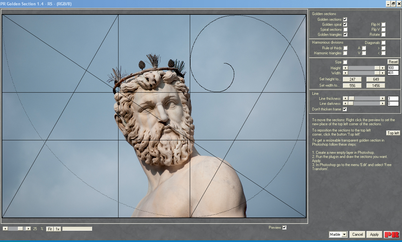
Image processing tools can be used to improve your design instincts and to help you crop images effectively. The Photoshop Crop tool includes a Rule of Thirds grid that you can superimpose on your image. The Power Retouche plug-in includes grid layers that aid composition according to the golden ratio and the golden spiral. To give you an idea of how it works, the free demo version of the software allows you to display the grids but doesn’t allow you to work with them on a separate layer. [Fig. 6.29]
The selection tool built into the free GIMP image processing suite includes a function for making selections based on the golden ratio. [Fig. 6.30]
Figure 6.28: The Power Retouche Photoshop plug-in includes golden ratio and golden spiral grids that you can superimpose on your images and page layouts

Figure 6.29: The GIMP image processing suite includes a selection tool that can be adjusted to adhere to the ratio
While the golden ratio is based on natural proportions, gestalt theory is based on observations of how human perception works. The human brain is constantly subjected to a large number of visual stimuli, and the use of clear design principles helps it to distinguish important parts of a scene from less significant details. This is also true for an individual photo—for instance, depth of field can be used selectively to guide a viewer’s attention to a particular element. The place where an image is sharpest automatically attracts the most attention. Such mechanisms relieve the brain of the work involved in deciding which part of an image is most important. [Fig. 6.31]

Figure 6.30: Selective use of shallow depth of field makes it easier for the viewer to concentrate on the main subject
Gestalt theory developed from studies of the psychology of perception at the beginning of the 20th century. These studies examined why we perceive certain visual elements as forming a cohesive whole (or “gestalt”) while we perceive other elements as bearing no apparent relation to one another.
One of the main principles in gestalt theory is the concept of figure and ground. In prehistoric times, the ability to tell a mammoth from the forest behind it enabled our ancestors to hunt—an ability that was far from trivial. [Fig. 6.32]
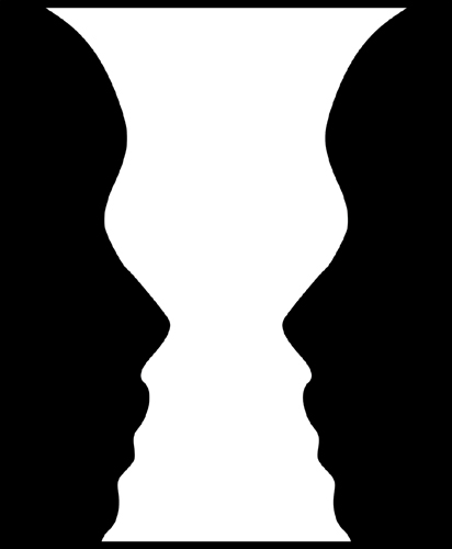
Figure 6.31: This well-known example illustrates the difficulties involved in distinguishing figure from ground. The image shows either two faces or a vase, depending on which of the two main shapes we perceive as being in the foreground.
(Illustration: Bryan Derksen)
A layout that leaves no doubt as to the subject is pleasing to look at because it saves the brain effort—the same principle as using shallow depth of field to guide the viewer’s attention to a photo’s subject. We can use this principle to clearly separate the foreground from the background when creating a book layout—for example, by giving the background a lighter color or by placing a border around each photo. [Fig. 6.34]
Figure 6.32: In this example, the foreground and background compete for our attention and make it difficult to tell which elements are most important
(Photos: Werner Pluta)
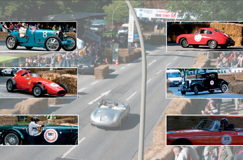
Figure 6.33: A lighter background and borders around the individual foreground images make it much simpler for the viewer to distinguish between background and foreground, and thus the relative significance of the various elements.
(Photos: Werner Pluta)
According to the gestalt principle of simplicity, we tend to perceive shapes and objects in their simplest possible form. For example, a circle and a triangle superimposed on one another will always be perceived as such, and not as a complex polygon. Adapted for use in photo book layouts, this principle suggests that we should not create layouts that include too many different shapes or colors that compete for a viewer’s attention. Elements without an obvious, single meaning are more difficult to perceive. [Fig. 6.33]
In addition to the principle of figure and ground, various other gestalt principles can help us create better photo book layouts. For example, the principle of proximity states that we perceive objects as belonging together when they are located close to one another. [Fig. 6.35] Translated for use in a photo book context, we could, for example, arrange the photos of a day trip taken during a vacation to emphasize the fact that they form a substory within the main narrative.
Figure 6.34: Visual proximity signals togetherness. Even without photos, it is obvious which elements belong to which groups.
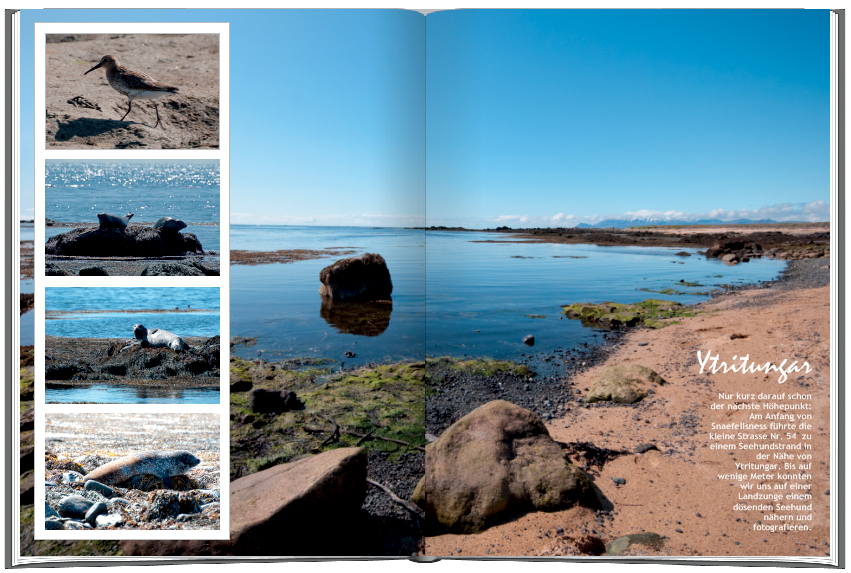
Figure 6.35: Closed shapes like the white box in this example turn the smaller photos into a visually compelling group
A special form of visual proximity is the direct connection of multiple objects. This can be achieved in a photo book by allowing images to overlap or by using closed (or almost closed) shapes to group multiple images or objects. [Fig. 6.36]
Similar shapes and colors create a feeling of cohesion. It’s relatively simple to group photos according to the colors they contain, and you can also create groups using similarly shaped subjects or identically sized crops. [Fig. 6.37, 6.38]
Figure 6.36: We instinctively group together similar shapes and colors
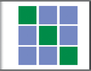
Figure 6.37: In a photo book, colors usually play a more central role than the shapes of photos. Sequences of photos that contain similar colors tend to produce a feeling of mutual context.
WARNING! Make sure that you don’t let similarity and proximity compete for your viewer’s attention. Instead, use the two factors to complement each other in your layout. If you select images that have a common theme but group them randomly, the viewer will initially find the layout confusing. In other words, make sure that how you arrange your images doesn’t communicate nonexistent disparities.

Figure 6.38: Similarity and proximity are principles that should complement each other (top) rather than compete with each other (bottom)
Figure 6.39: A single object that differs from the others in a sequence can be made to stand out
The principle of similarity can be used to bring a particular object into focus if it differs from the others in a sequence in some subtle but fundamental way. But remember to use this effect sparingly—too many objects that don’t adhere to a basic rule create a restless feeling, causing the brain to work harder to distinguish between more and less important elements.
Another variation on the theme of similarity is the principle of common destiny that applies to the relationships between dynamic objects. In other words, objects moving in the same direction are perceived as belonging together because they share a common dynamic. Photo books do not (yet) contain moving images, but relationships are nevertheless subconsciously formed between images of moving objects and subjects looking in the same direction. For example, if you arrange two photos of a man and a woman so that they look away from each other, our subconscious assumes that some kind of discord exists between them. If, however, you arrange the same two photos so that the people look toward each other (or in the same direction), the overall feeling is positive and harmonious.
The same is true when photos show people looking toward the center of the page rather than “out of” the book. Viewers instinctively look in the same direction as those they are observing to see what they are looking at. If you guide your readers to a place outside the page, they will subconsciously leave your book, which is definitely not the desired effect! [Fig. 6.42]
Figure 6.40: The principle of common destiny generally applies to moving subjects, although it can also be applied to photos of moving subjects or of human subjects that are looking in a common direction. Subjects looking in too many different directions in a single layout can be confusing for the viewer.

Figure 6.41: Photos of human subjects standing back-to-back guide the viewer’s eye off the page and produce an impression of dissonance. However, if the subjects look toward each other, the viewer’s attention is guided toward the center of the page and remains within the book.
Figure 6.42: A symmetrical arrangement on two sides of a single axis—the center of a double-page spread, for example—attracts the viewer’s attention and produces a harmonious look

Figure 6.43: Asymmetrical layouts can appear slightly chaotic, but produce tension and can be quite effective for contemporary themes like this section on Modern Reykjavik
According to gestalt theory, a symmetrical arrangement of objects on two sides of a single axis is particularly attractive to the human eye. If a double-page spread has one symmetrically arranged page and one page that is more chaotic, we automatically feel attracted to the page that displays symmetry. [Fig. 6.43, 6.44]
Symmetry generally produces a harmonious look but can sometimes appear dull. On the other hand, asymmetry creates tension and excitement, which can be desirable depending on the style and theme of your book.
According to gestalt theory, the use of a small number of standardized layouts establishes a visual connection between the various sections and helps to give a book a unified look and feel. [Fig. 6.45]
A simple but effective way to create a unified look is to use the same typeface throughout, and to vary its size according to recognizable rules (e.g., 10 point for general text, 20 point for headings, etc.). This underscores the feeling that the book forms a balanced, harmonious whole.
Standardized section headings, too, can give a book a cohesive feel, even if the contents of the individual sections are quite diverse—for example, a book of panoramas from all over the world (see the panorama book section in chapter 13) or a book that documents the various stages of a wedding day. [Fig. 6.46]
Figure 6.44: Using just a few basic page layouts and standardized typefaces contributes to the feeling of cohesion within a book
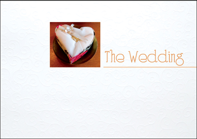
Figure 6.45: Unified title pages help to create a connection between thematically varied sections
We have already learned that similarity creates a connection among objects. A logical consequence of this assumption would be to design all the pages in a book to look the same. However, if every page used exactly the same layout, the result would be a book with a very static and possibly even boring look. So, how can we combine the principles of variation and similarity in a single layout? This is where a layout grid comes into play.
A layout grid is a system of guides that can be shown or hidden as necessary and that divide a page into predetermined blocks. These guides are used to line up the various elements in the design, with each element fitting into one or more of the preset boxes. This approach ensures a degree of regularity among the various elements in the layout, even if they are of different sizes or have different proportions.
Most photo book software doesn’t include layout grid functionality, and often doesn’t even include guides or rulers to help you position your objects. Blurb does, however, display the position of each element on the page to the nearest millimeter. This at least allows you to work within the confines of a grid that you can calculate yourself using the given measurements.
The most flexible alternative for creating precise layouts is to use pro-grade software such as InDesign or Scribus.

Figure 6.46: A layout grid and some of the options it offers
PRO-GRADE SOFTWARE InDesign and Scribus use flexible guides to help you create a baseline grid for your layout. InDesign supports multilayer documents, enabling you to show or hide your grids at will. [Fig. 6.48]
Whichever method you use to design your layout, you still have to make sure that it suits your subject. A book of exotic orchid photos requires a very different layout from one that presents a war report from Afghanistan.
Layouts that include few photos surrounded by plenty of empty space appear more classy and calming than ones that use full-page photos as backgrounds and fill the rest of the space with details or crops. Photos with subtle colors work well with narrow borders and traditional typefaces, whereas photos with bold colors often work well with wider borders and eye-catching fonts.
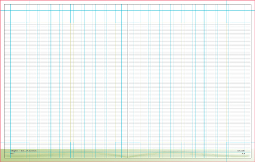
Figure 6.47: This illustration shows the InDesign baseline grid used to create this book
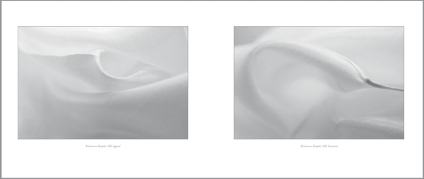
Figure 6.48: A layout must suit the subject. The portfolio shown in the upper example uses plenty of white space to underscore the artistic look of the book.
(Photos: Marianne Koepke)

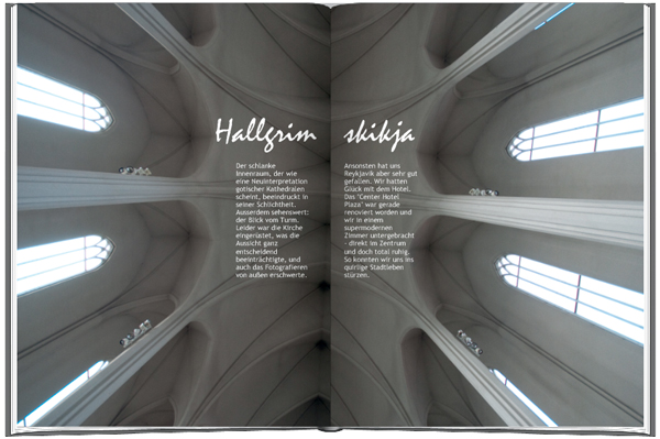
Figure 6.49: The full-page background image and the multiple detail images in this Iceland travel book produce more of a magazine-style look
Figure 6.50: Unusually small title fonts represent a trend that is currently making its way through the publishing world

Figure 6.51: Unusually large title fonts can also create a splash
The rules and ideas discussed so far cannot, of course, be applied directly to the cover and title page design, as these both play a special role within the overall layout. The cover image is the first thing the reader sees, and it announces (often subconsciously) the theme of the book and its mood. Skillful cover design can be used to emphasize this effect.
EXPERT ADVICE FROM DIETMAR BÜHRER: DESIGNING A COVER

Good cover design isn’t easy. When it comes to creating covers, my motto is: “a discreet design is always better than a conspicuous one.” Go to a bookstore, check out some professional designs, and don’t be afraid to use them as inspiration for your own. Don’t use over-large fonts on the back cover. Finally, try placing your draft cover design on your desk for two weeks and see if you can stand looking at it for that long. If you can, then it’s off to the printer!
In contrast to commercially produced books, the cover of a personal photo book is not designed primarily to enhance sales. You and your friends will look at such a book no matter what the cover is like. This fact gives you a lot of freedom when it comes to cover design. For example, instead of creating a traditional cover with a title and a relevant image, you could use no words at all with a single strong image.
The most important elements of a cover design are the photo(s) and the type, and perhaps also a colored background. See the expert advice from Mat Thorne for tips on finding a suitable cover photo (see also chapter 10, “Text,” for detailed information on the use of fonts and text boxes). The rules for text inside the book apply just as well to the cover text—although the title font must be chosen very carefully, as it uses just a few characters to convey the mood of the whole book. Book designer Alan Rapp suggests that you write down a couple of adjectives—“technical,” or “heartwarming,” for example—for each of your potential cover photos and then see if those same adjectives apply to the font you have chosen.
The size of the font you use is a particularly important aspect of cover design. You can create spectacular effects with unusually large or small fonts. If you use a very large typeface, making it partially transparent can help it appear less overbearing. Many providers limit font sizes (often to 127 point), and only a few support font transparency. You can work around these limitations if you use an image processing program to design your cover page, but make sure your chosen font isn’t too pixelated in a 100 % print-resolution view. [Fig. 6.51, 6.52]
EXPERT ADVICE FROM MAT THORNE: FINDING A SUITABLE COVER IMAGE
The selection of a cover image is a very important process. I apply three criteria when choosing an image:
The cover of your book is a very important place, so if you keep these three things in mind, you are already on your way toward creating a fantastic-looking book.